|
| Group |
Round |
C/R |
Comment |
Date |
Image |
| 11 |
Aug 21 |
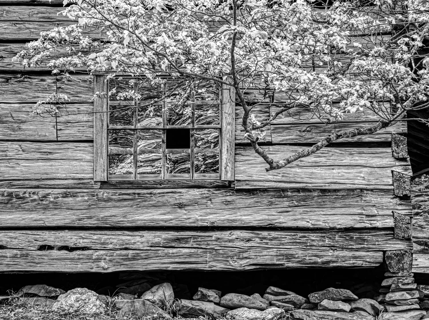
Reply |
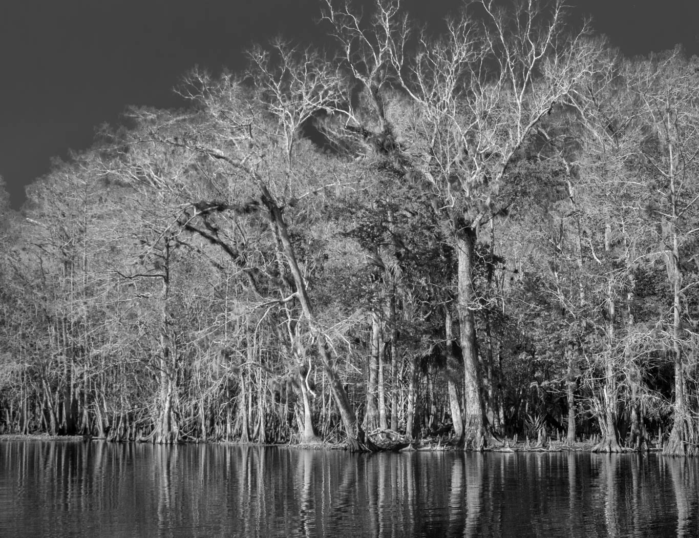
Much improved Albert. I like it.
|
Aug 20th |
| 11 |
Aug 21 |
Reply |
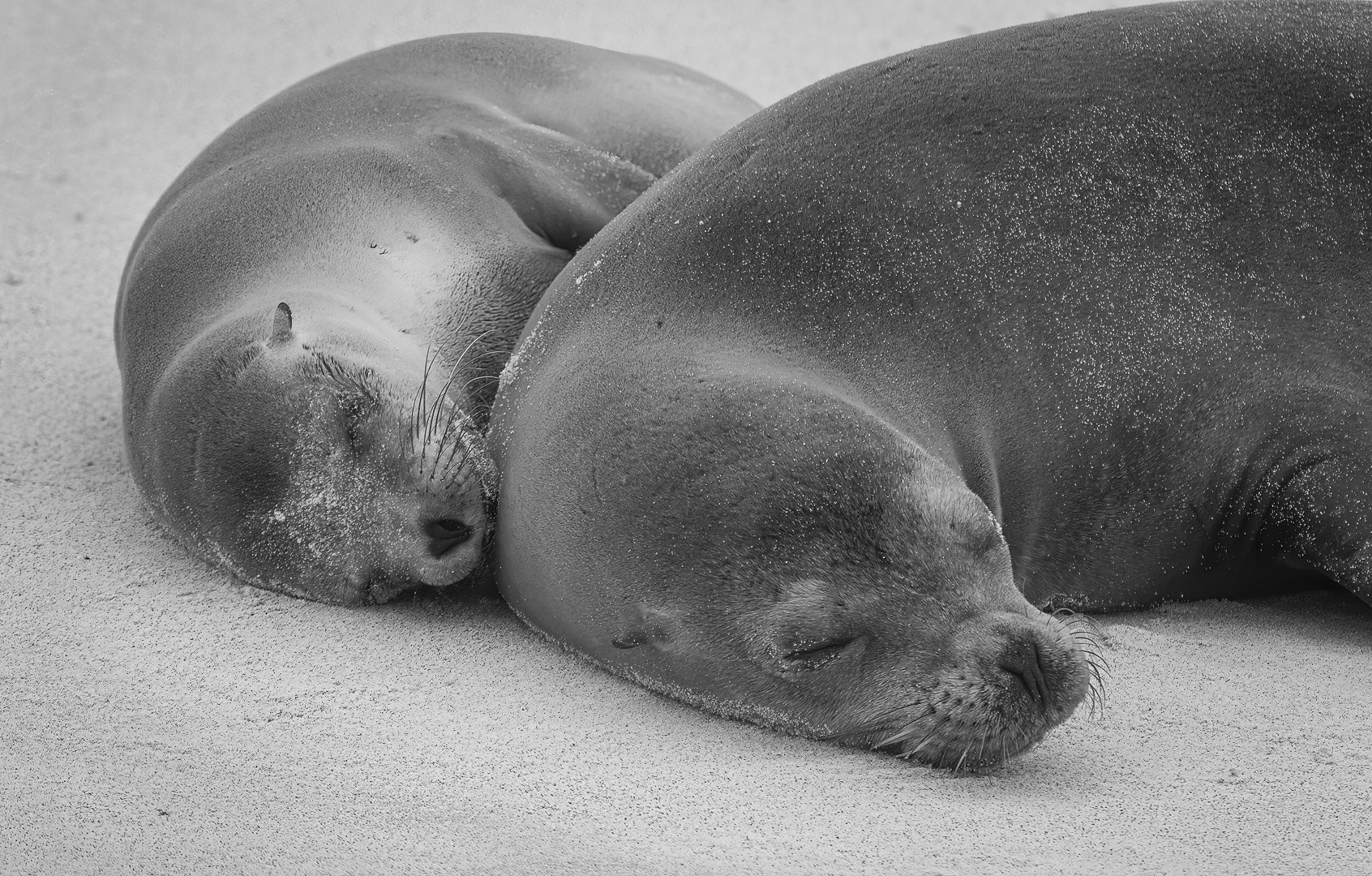
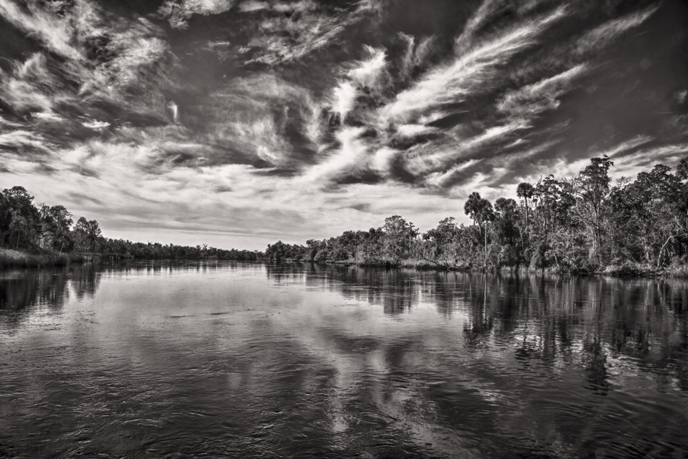
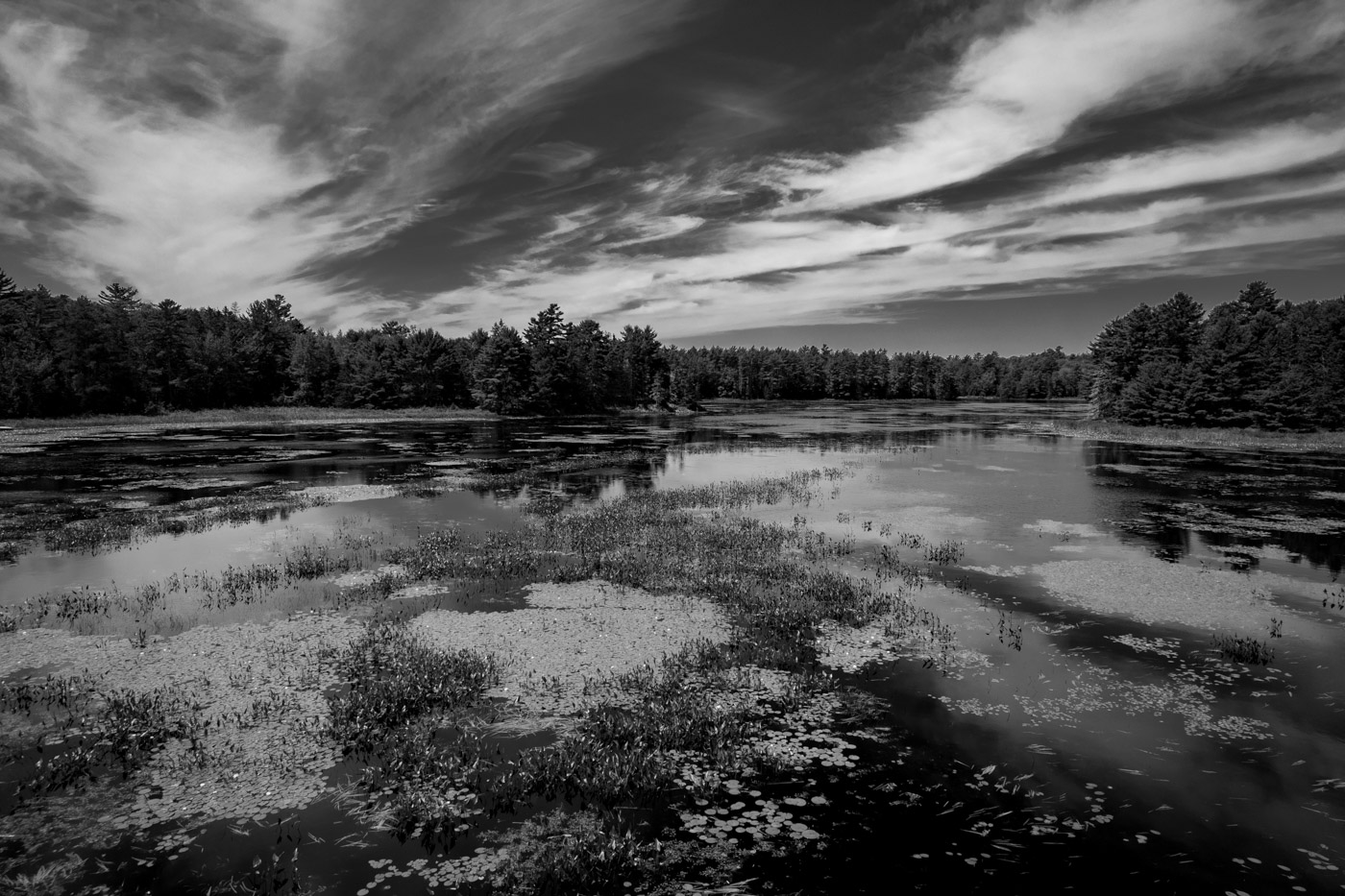
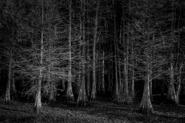
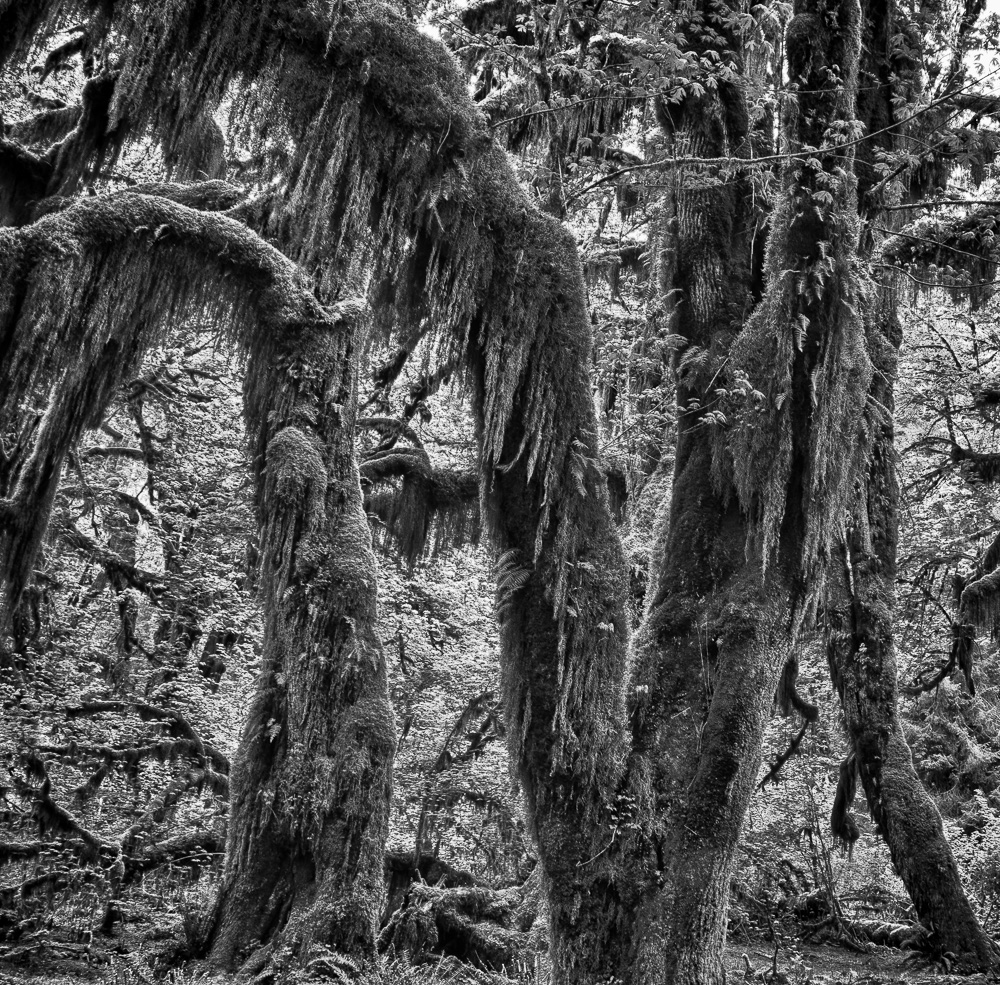
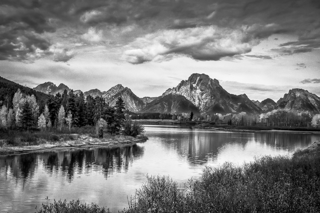
Thanks, Jim. I was thinking that I should dodge the trees at the shoreline about 0.5 stop bring out some more detail. You demonstrated that it is a good idea.
|
Aug 18th |
| 11 |
Aug 21 |
Comment |
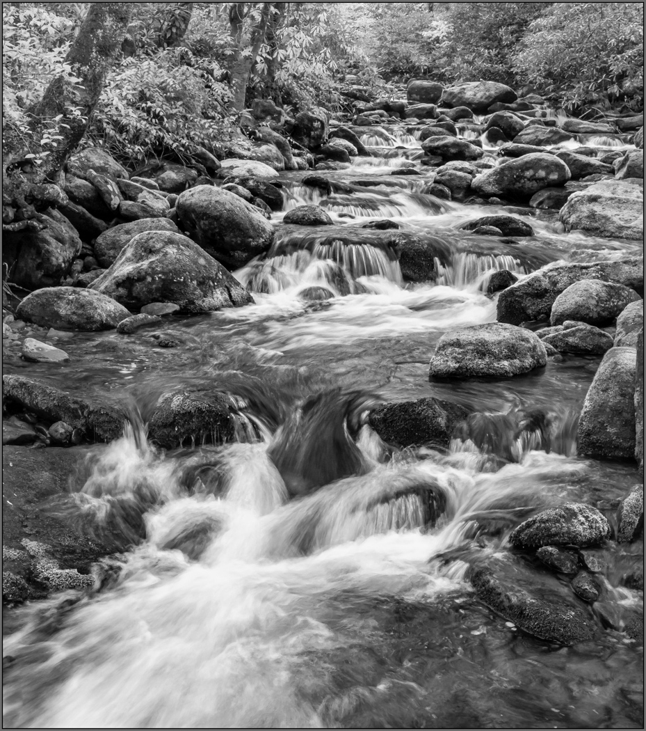
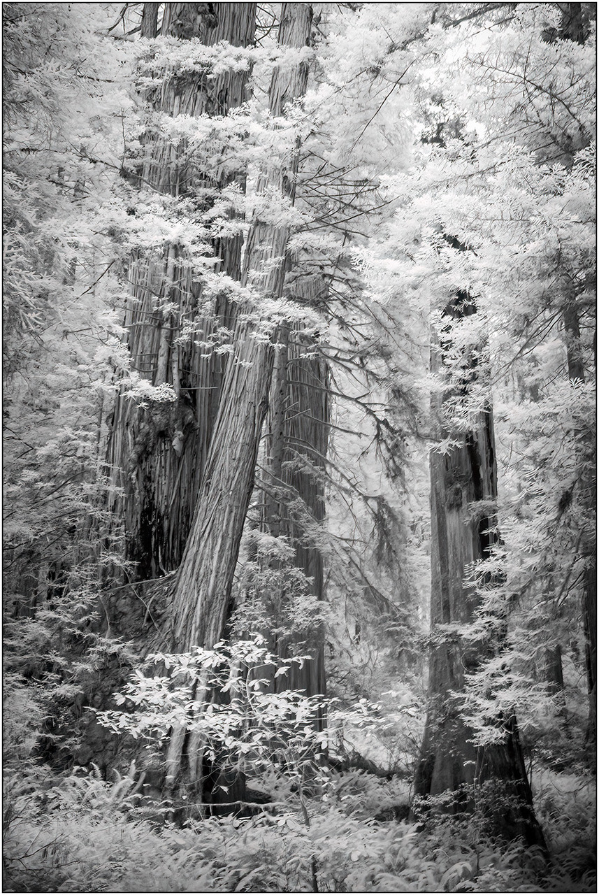
Wow, Henry!
Great use of black and white contrast and detail. I have tried focus stacking, but 90 shots is beyond my level of patience. No suggestions. You did great!
|
Aug 18th |
| 11 |
Aug 21 |
Comment |
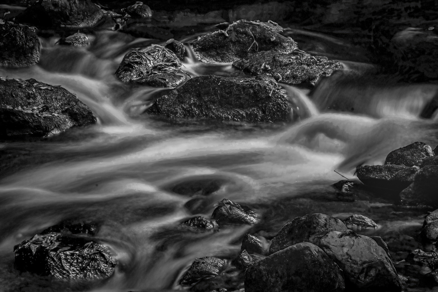
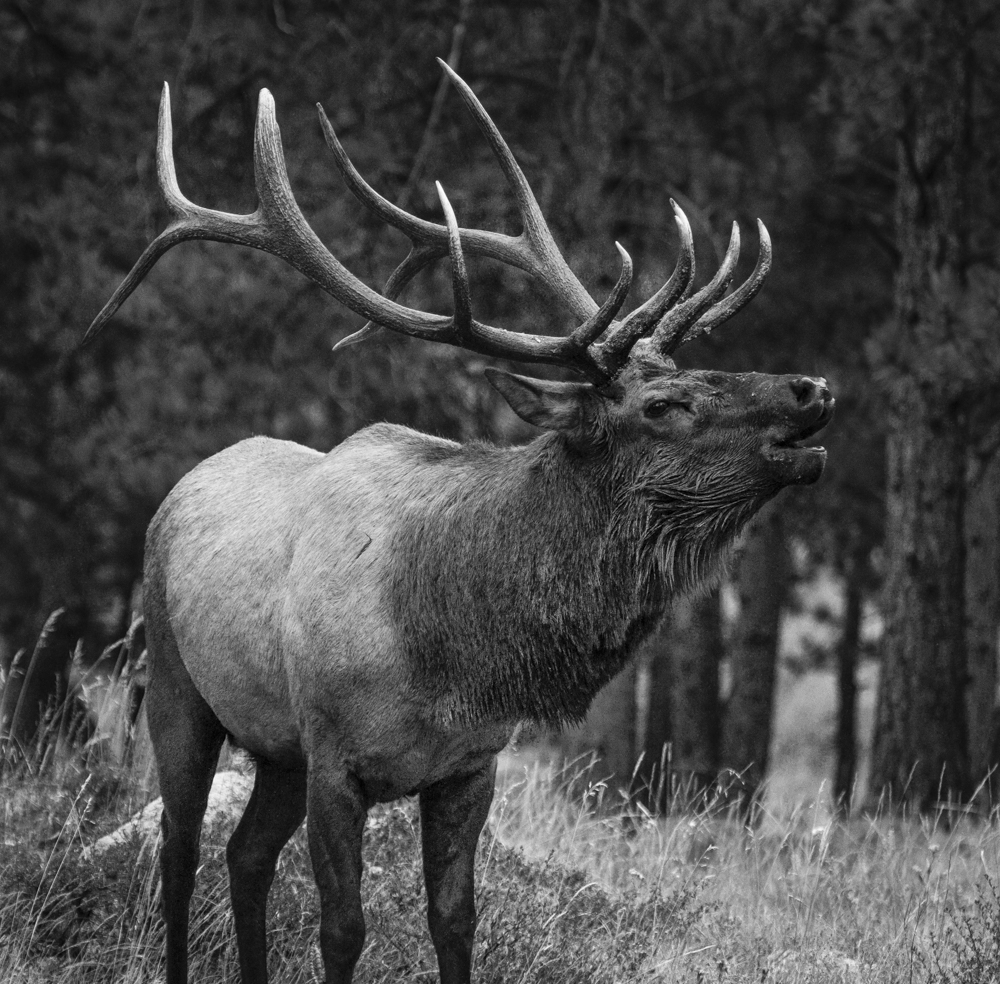
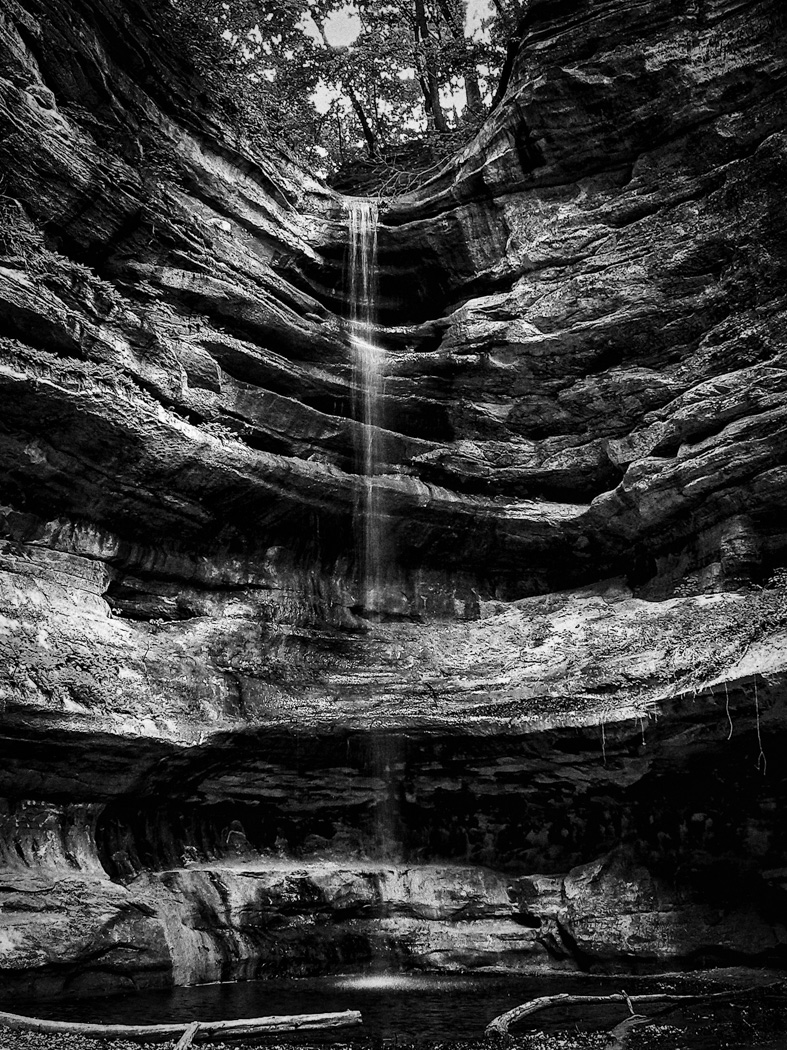
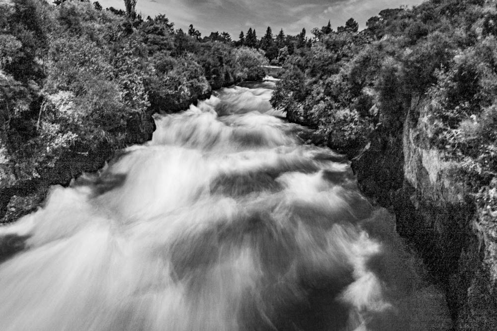
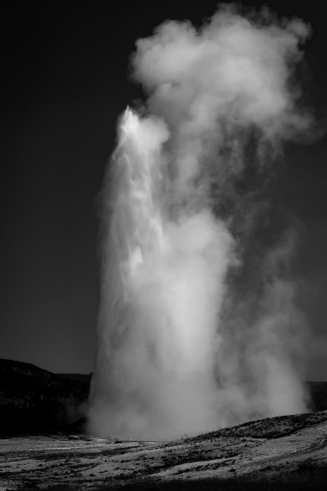
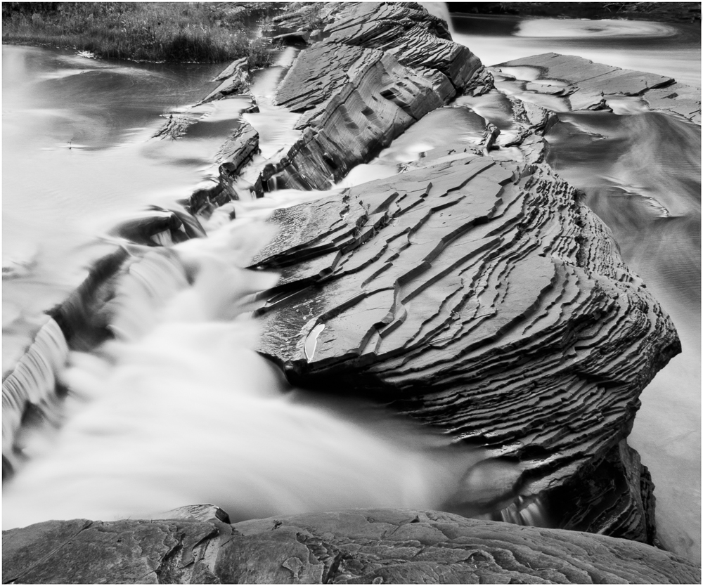
Excellent image, Jim.
I really like the composition which was greatly improved with the branch removal. The increased contrast enhances the visual flow through the image by separating the light and the dark areas and accentuates the waterfall detail.
Well done!
|
Aug 18th |
| 11 |
Aug 21 |
Comment |
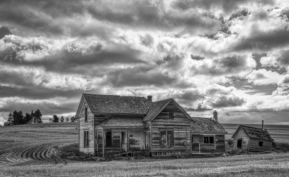
Hi Henry, welcome to the group also.
You captured an excellent image to emphasize all of the details of this Victorian house, as was your goal. The bright directional sunlight created well defined shadows to aid you.
I am personally torn between the image as you submitted and one slightly darkening the yellows (only) to differentiate the the multi-color paint schemes of the era. I agree with all of the other comments about edge spacing, clean-up and perspective.
Excellent capture.
|
Aug 18th |
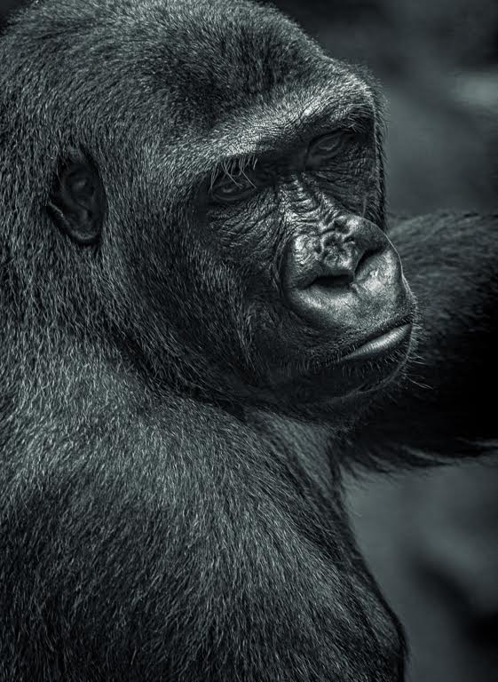
| 11 |
Aug 21 |
Comment |
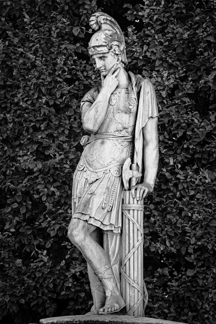
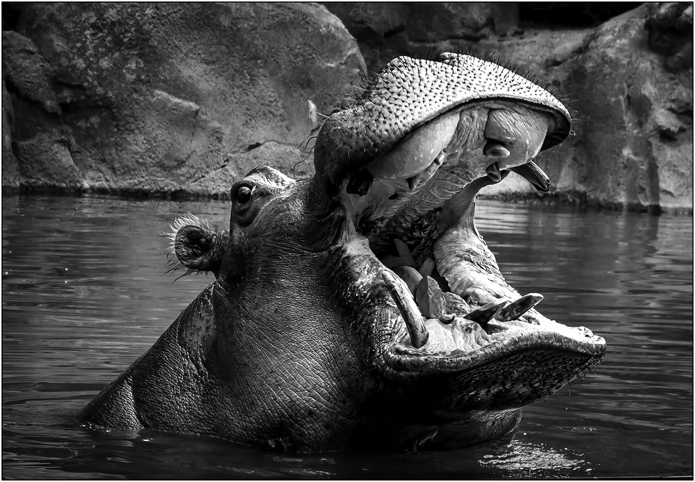
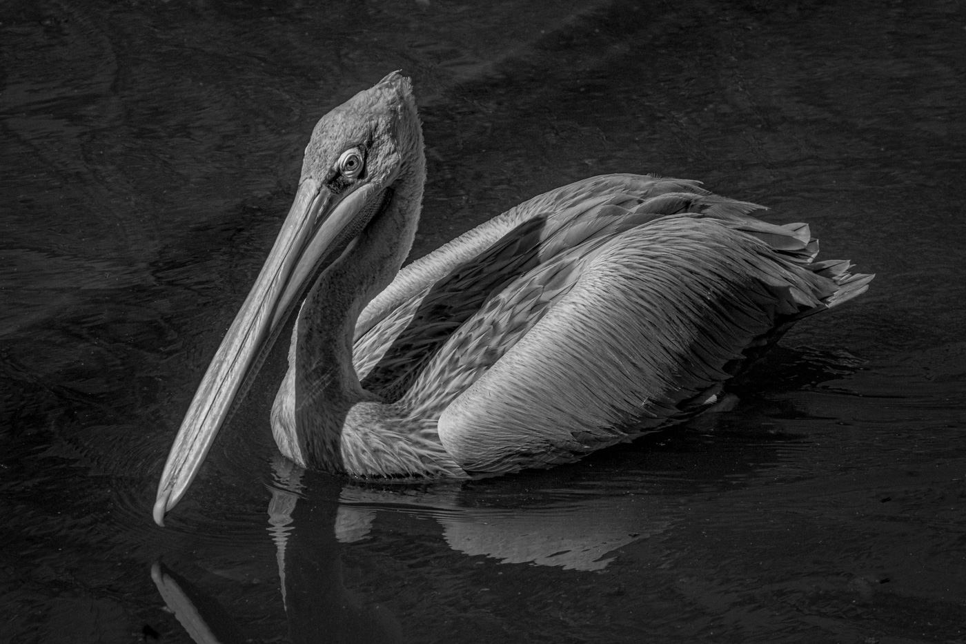
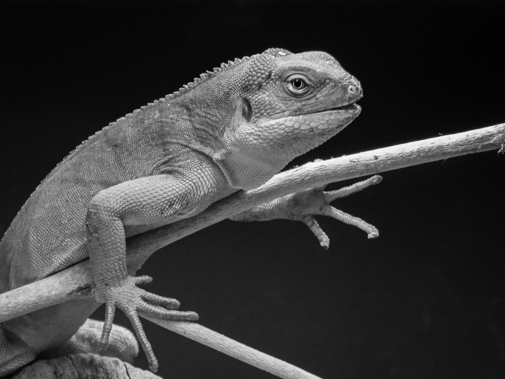
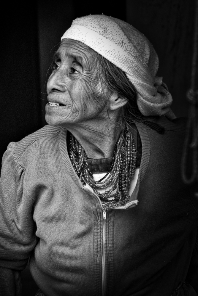
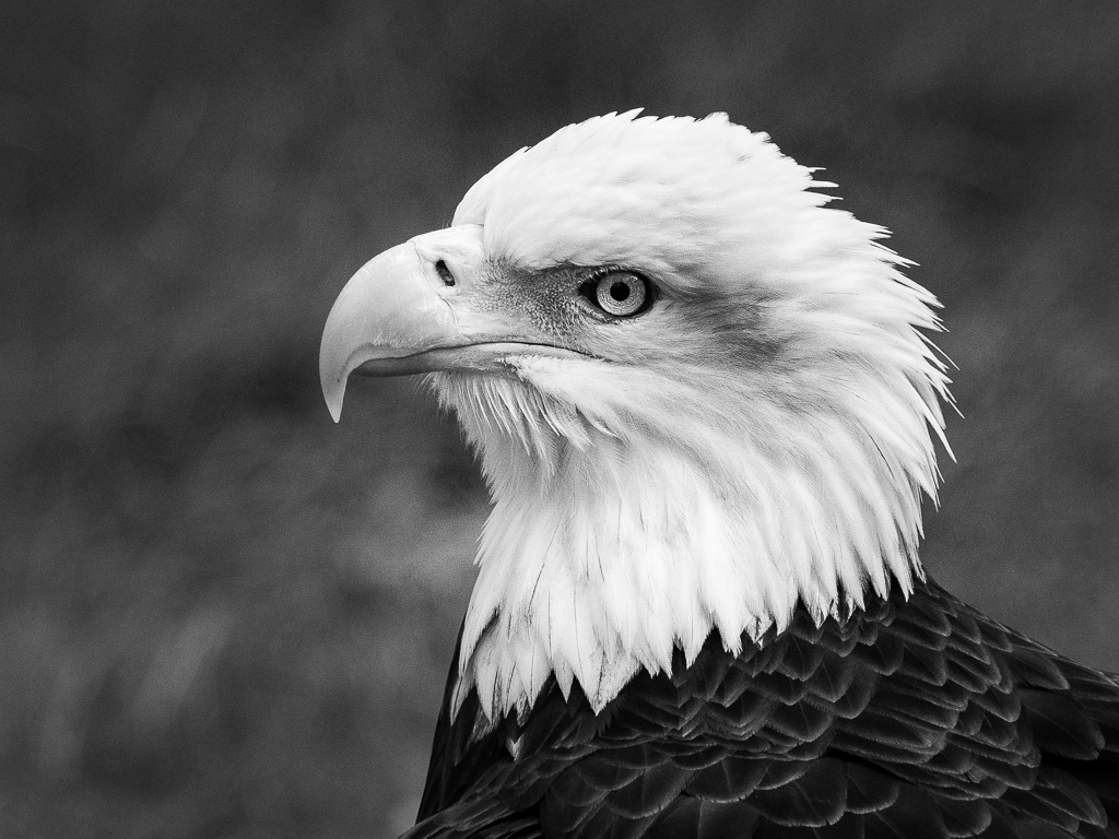
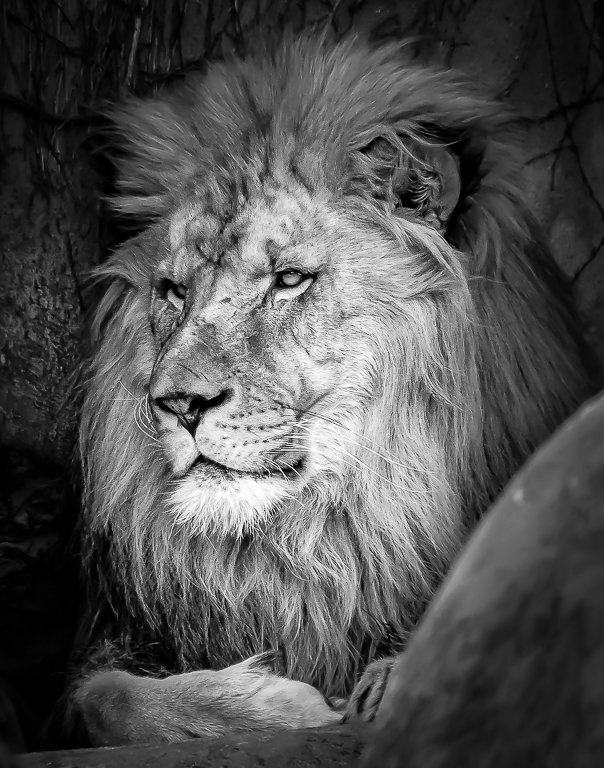
Welcome to the group Albert. It is interesting to hear all of the different paths that got each of us here.
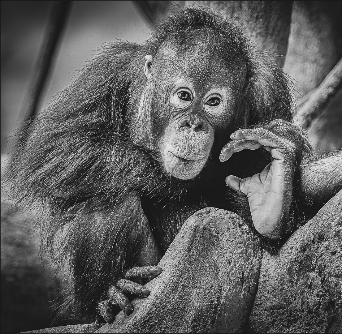
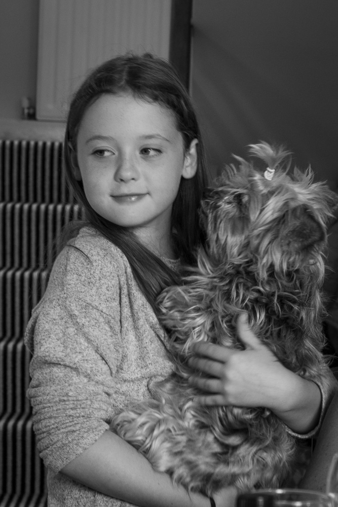
I enjoyed your image, but think that you have too much contrast and sharpness and burned-out the highlights on the head and face. Overall, I like your darker version as it conveys a different, more formal, feeling than Jim's version. I also like your creative effect with the bell and attractive frame.
|
Aug 18th |
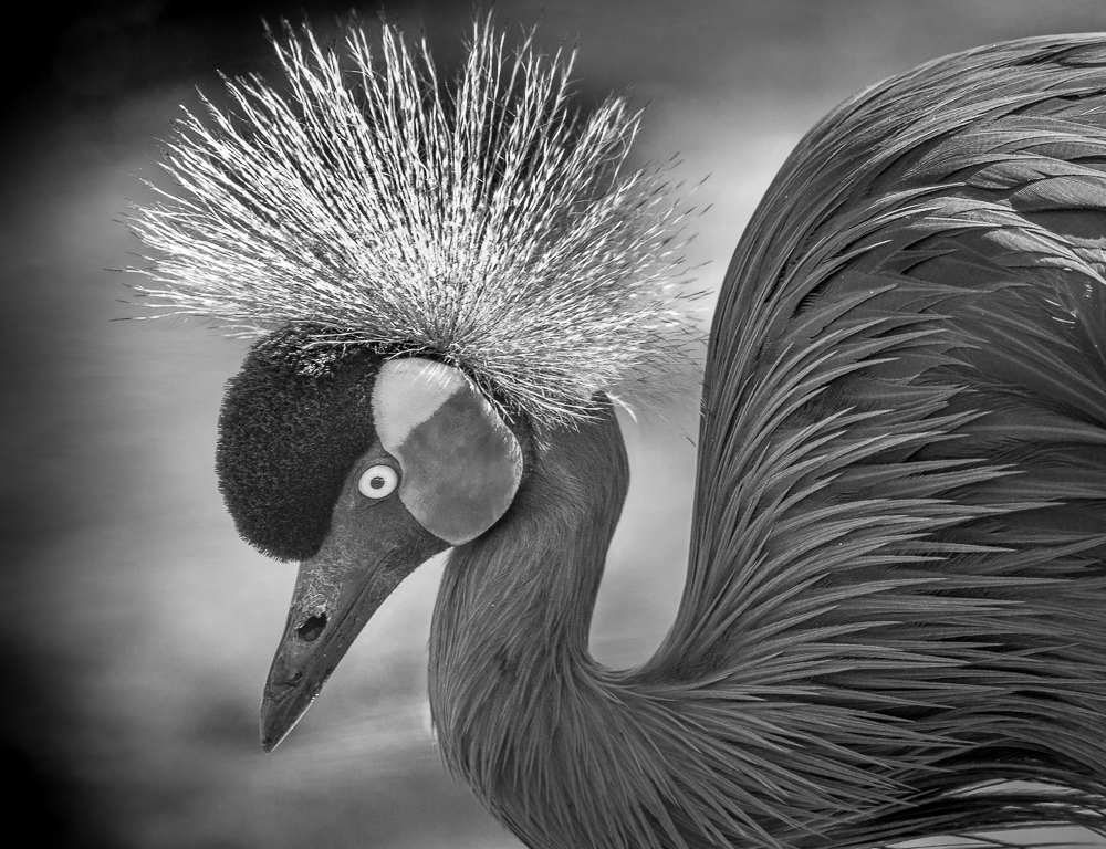
| 11 |
Aug 21 |
Comment |
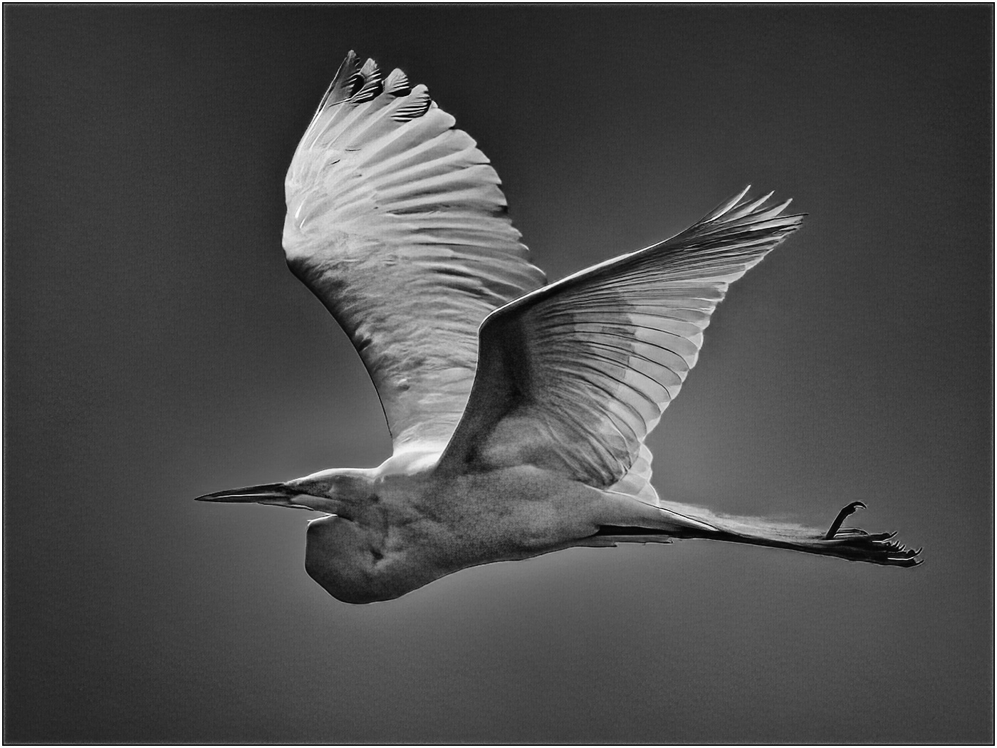
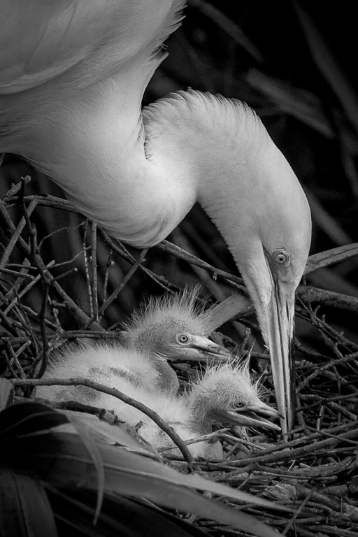
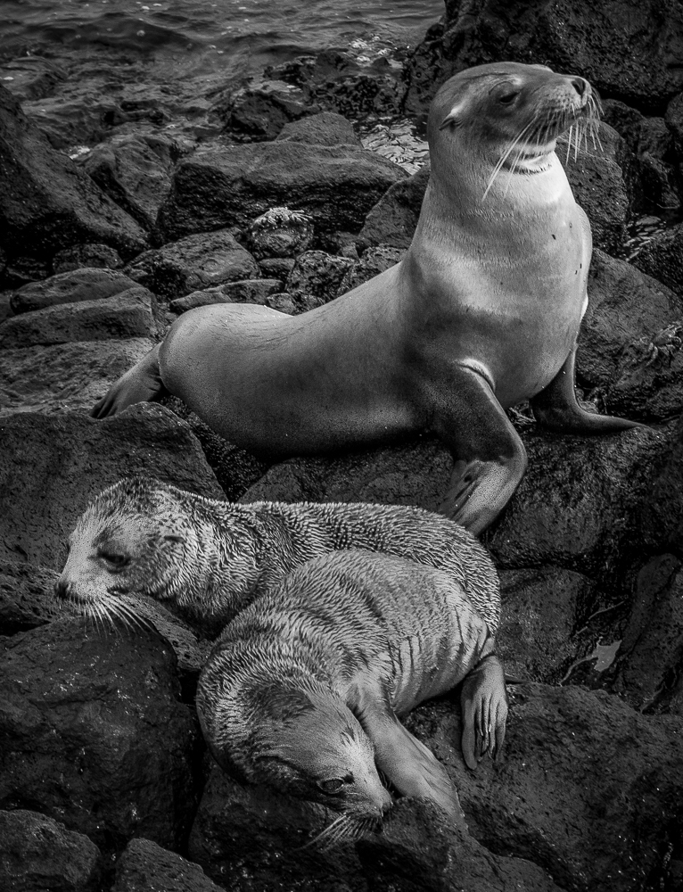
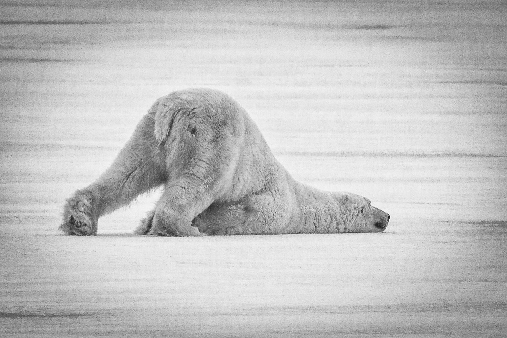
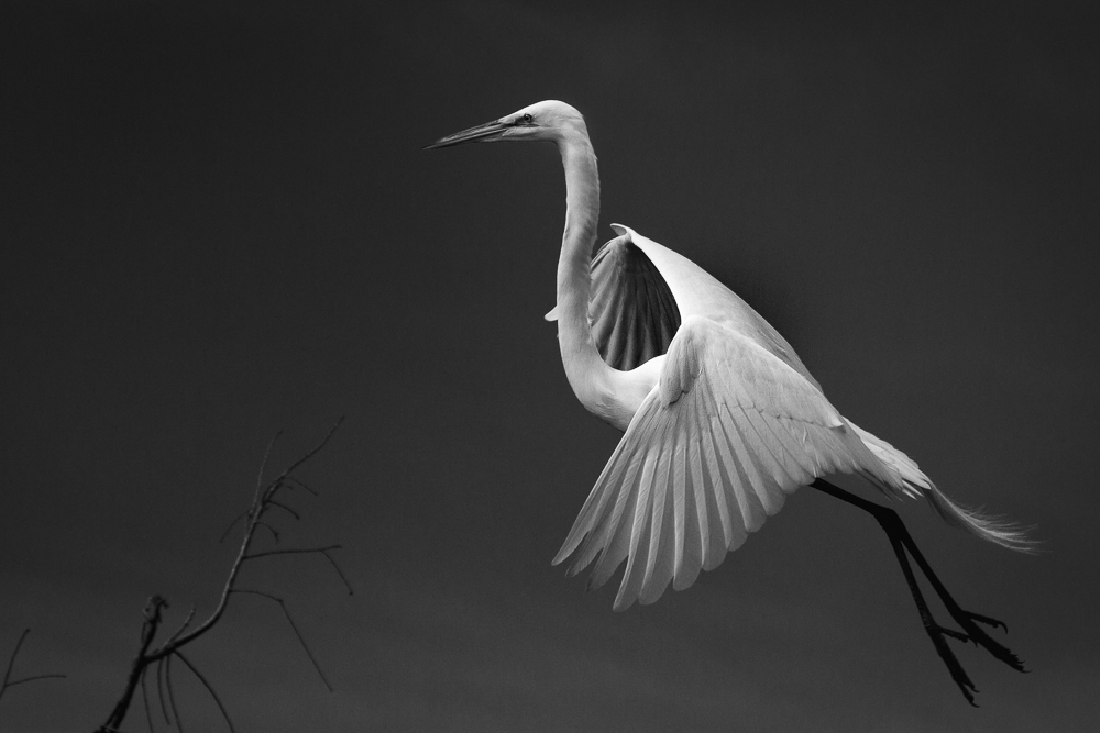
Excellent capture, Peter.
I really like the pose and the simplicity of the image. MY kudos to you for hand-holding the 600mm at 1/400 and getting a very sharp image from a moving boat.
Did you consider making this a vertical and still keeping breathing room around it like this? This crop changes the dynamics of the image, but highlights the beauty and sharpness of the Heron.
|
Aug 18th |
 |
| 11 |
Aug 21 |
Comment |
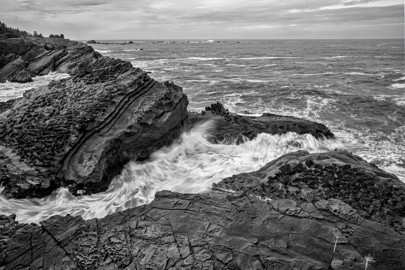
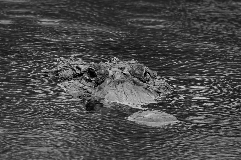
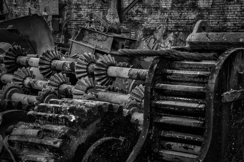
Great image, Alan.
I like the extra grain that you added, but am concerned it may be too much. Before I read your write up, I thought it was the rain reflecting on the window and shiny surfaces from the overhead plastic roof, but then you cleared it up. Is there a way to make it 'softer' grain and still capture the antique look?
Overall, excellent composition and capture.
|
Aug 18th |
| 11 |
Aug 21 |
Reply |
Thanks, Allen. We will keep as is for now.
|
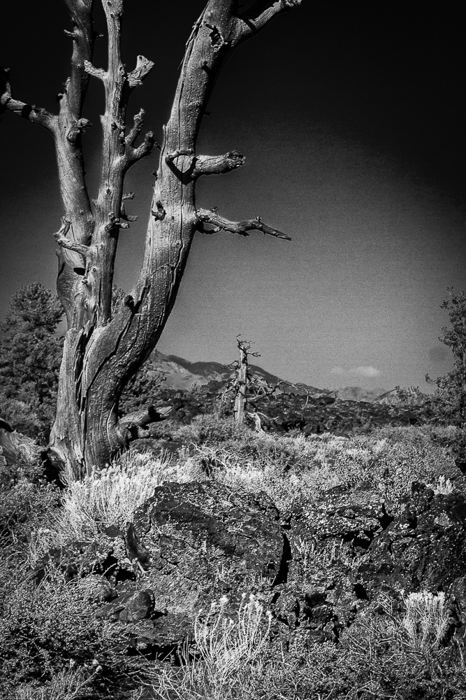
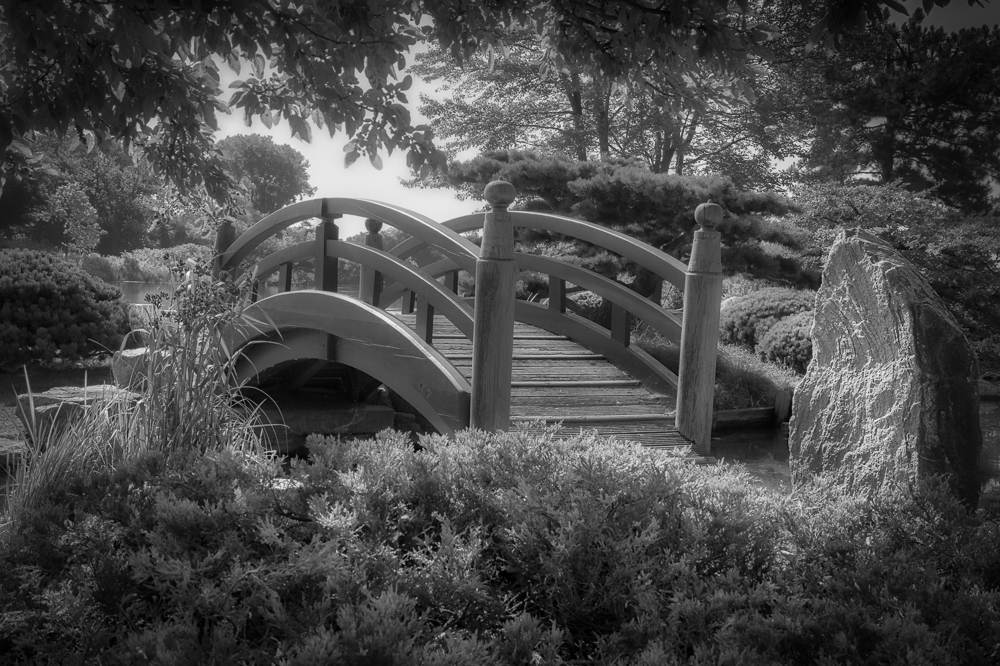
Aug 7th |
| 11 |
Aug 21 |
Reply |
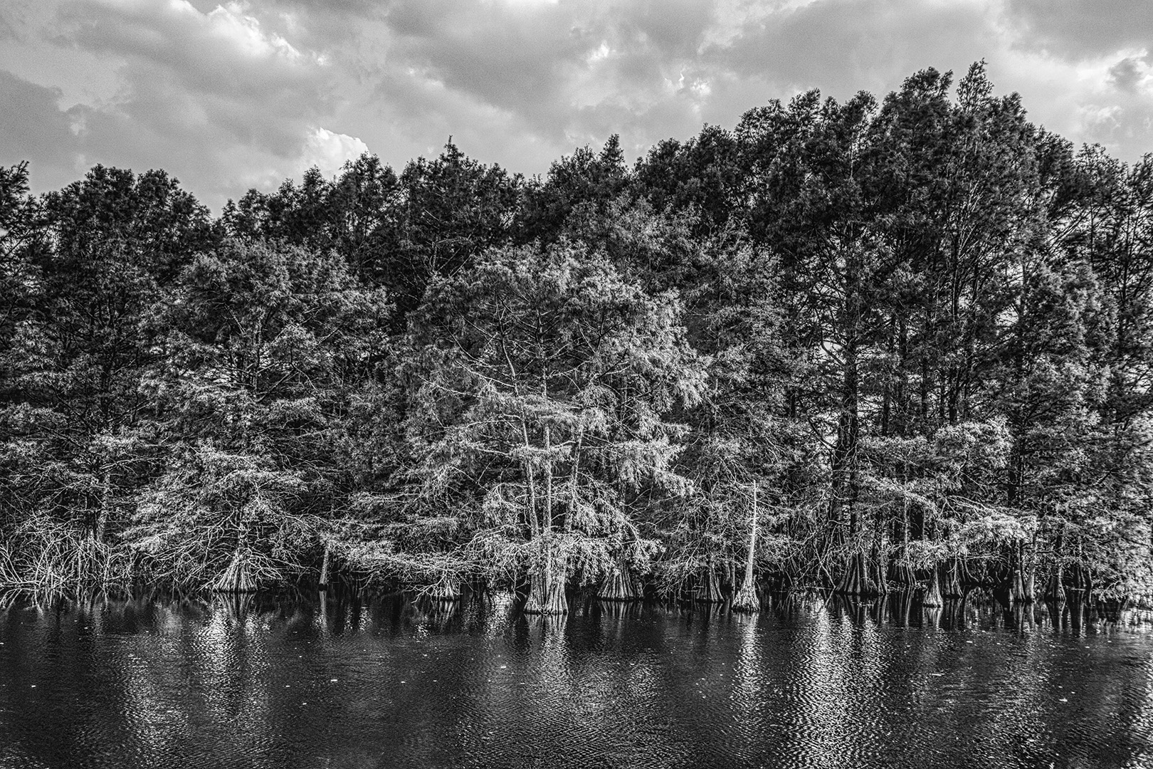
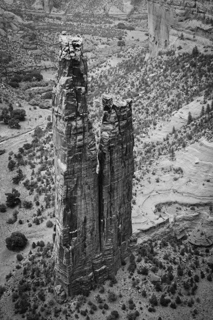
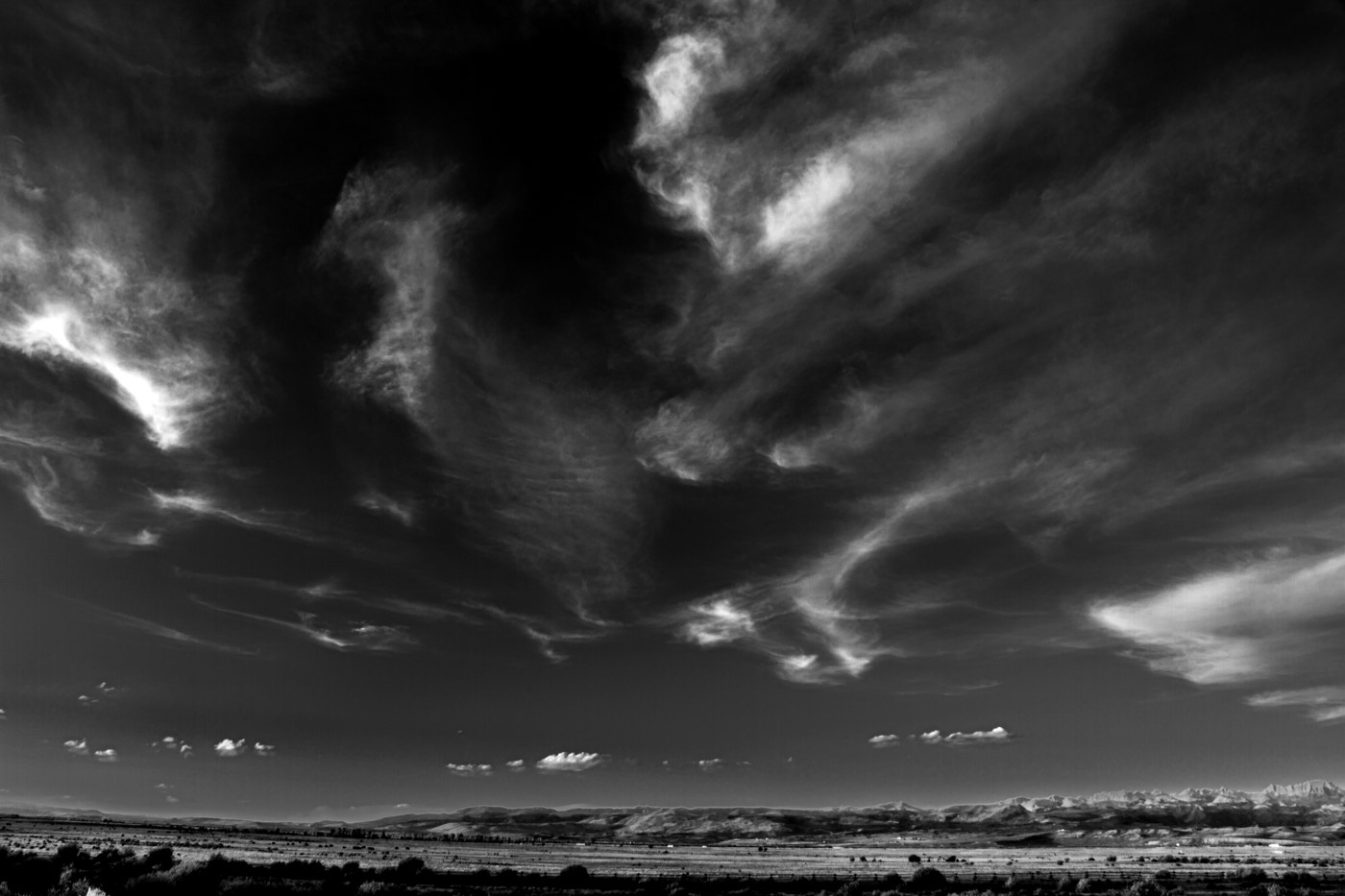
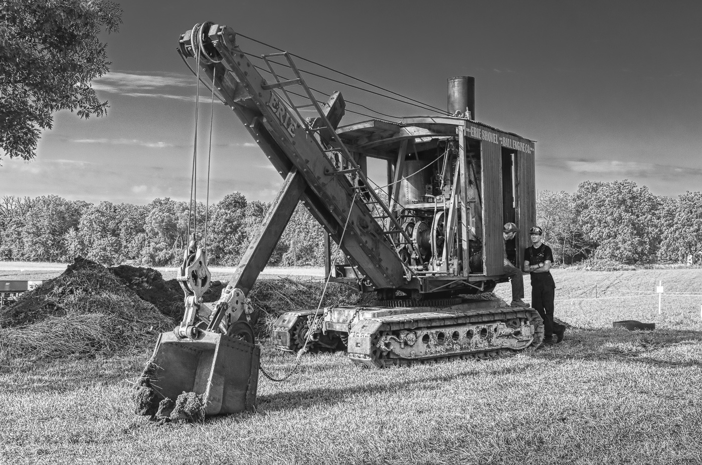
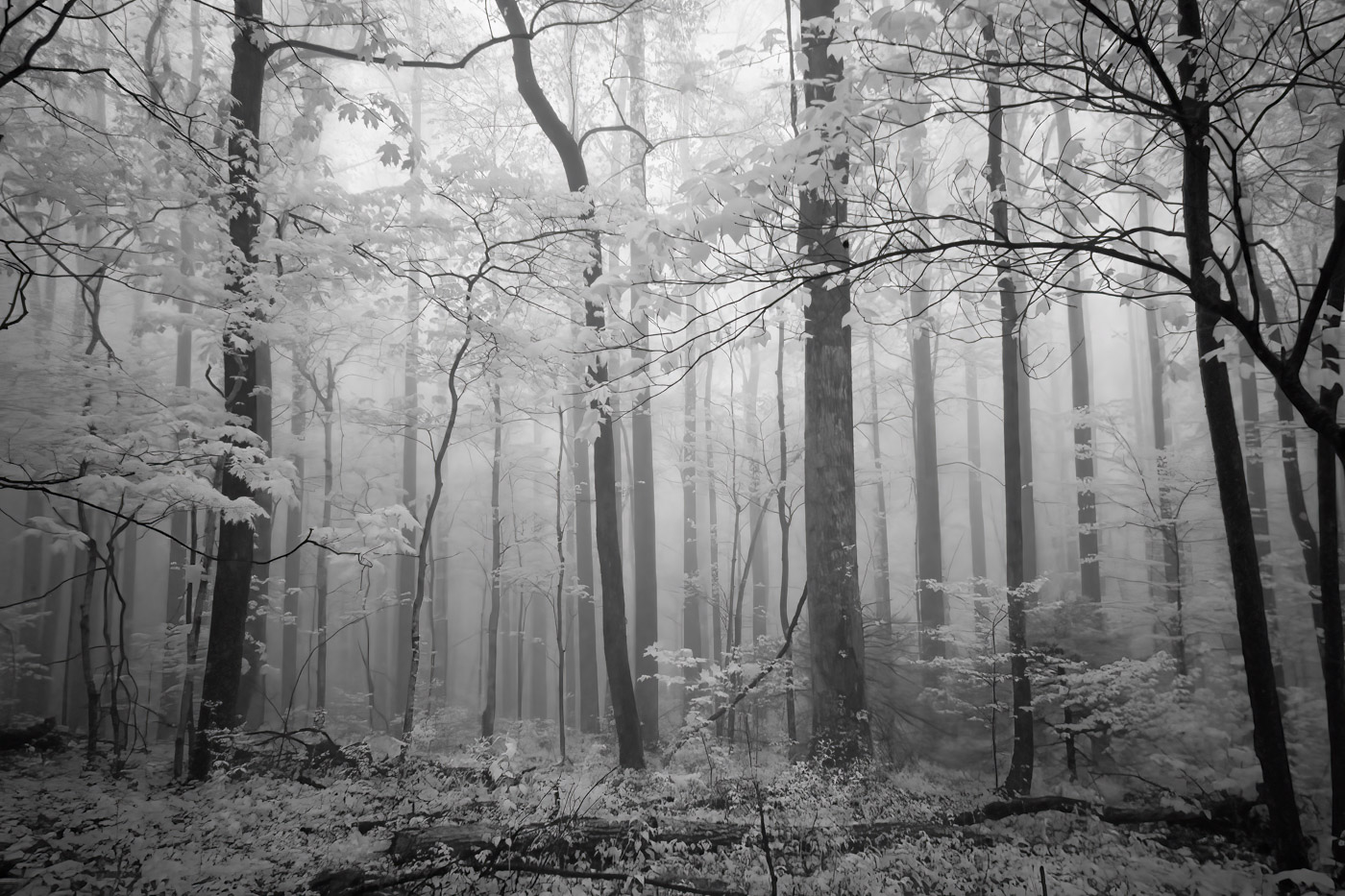
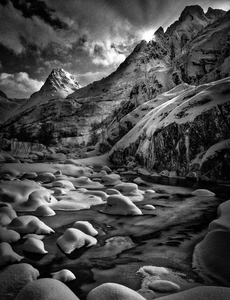
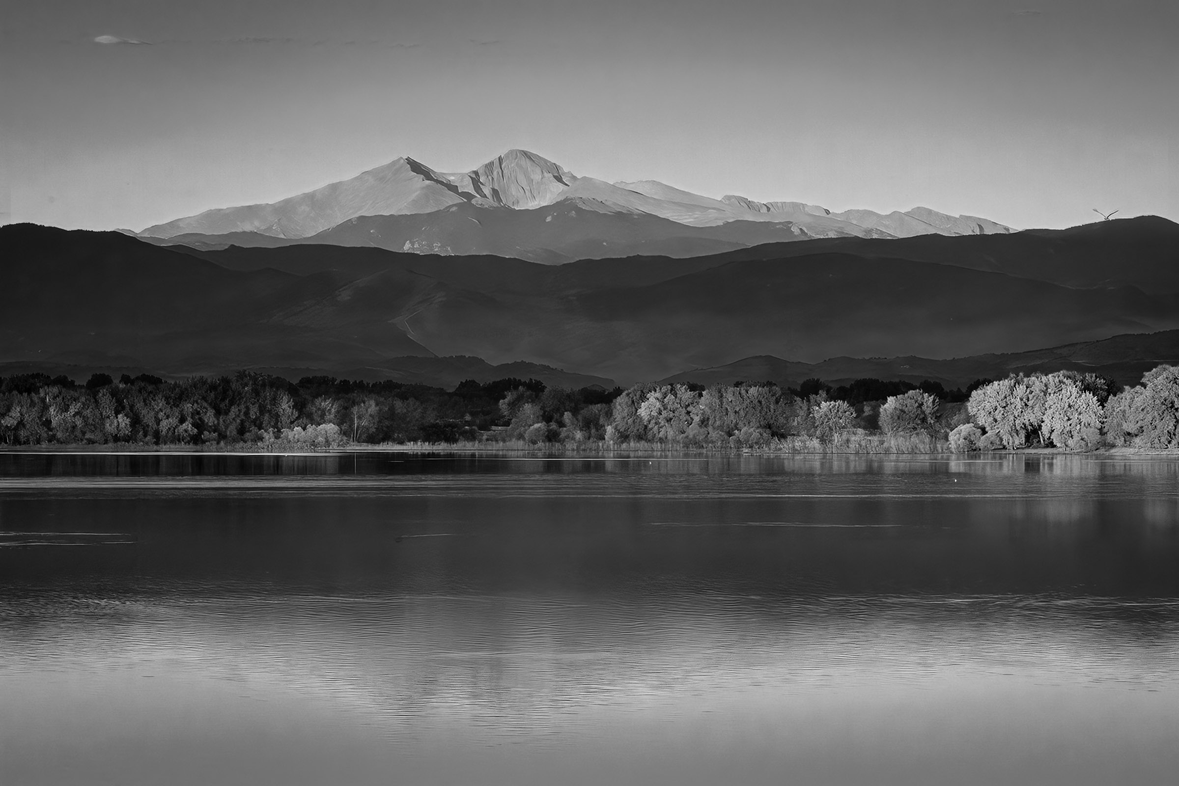
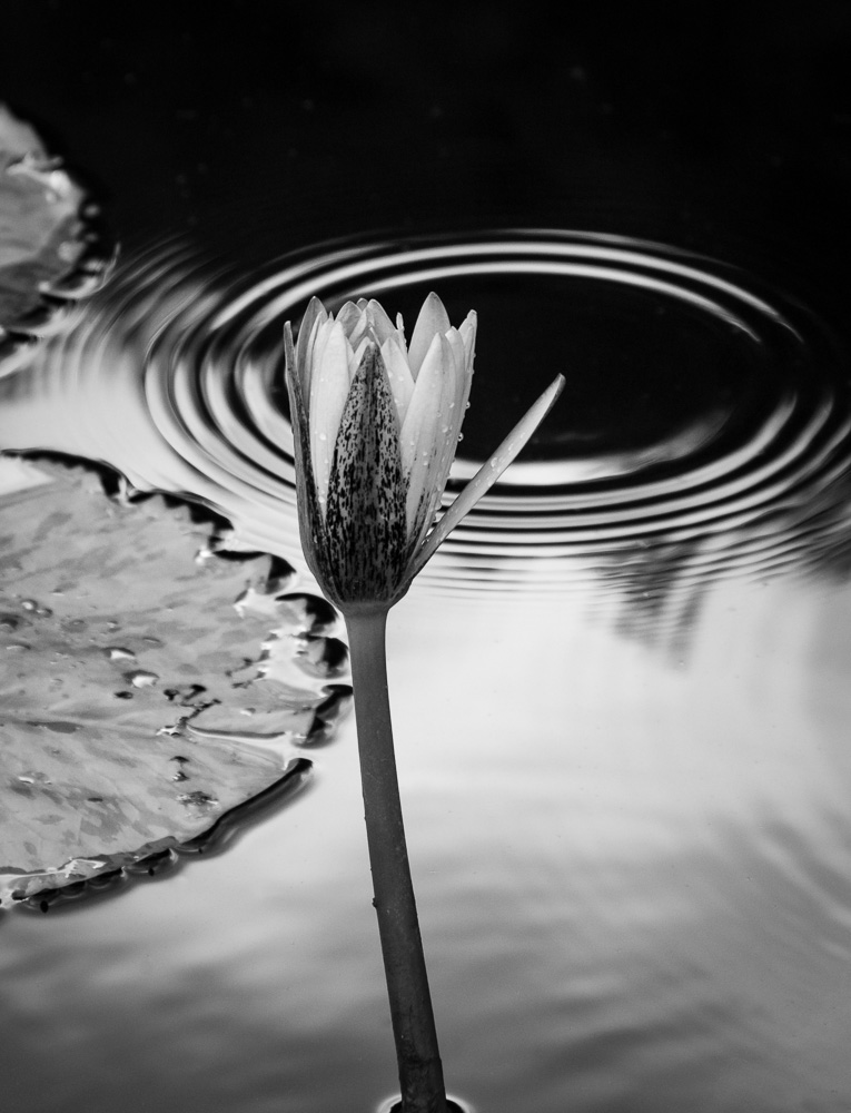
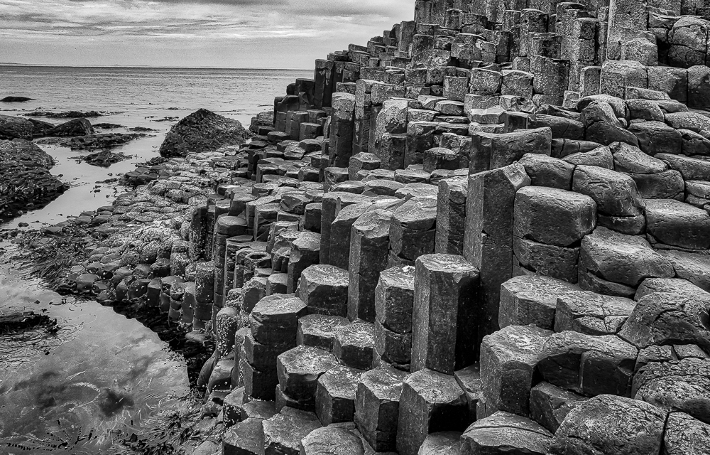
Thanks, Allen. In another area I tried higher shots, but was thinking it would be better to make it a more 'natural' perspective. Really what I was trying to do is get over some brush/trees that was blocking my view and try different camera locations to get a pleasing composition. In looking at it posted, I am wondering if I should do some burn & dodge to bring out detail and make it less contrasty. Your thoughts?
|
Aug 6th |
6 comments - 4 replies for Group 11
|
6 comments - 4 replies Total
|