|
| Group |
Round |
C/R |
Comment |
Date |
Image |
| 11 |
Feb 21 |
Reply |
Thanks, Allen. |
Feb 15th |
| 11 |
Feb 21 |
Reply |
I took the liberty to do a rough improvement on your image in line with my earlier comments.
I used the Adobe Camera Raw filter in Photoshop, which is the same as the tools in Lightroom. Other photo editing software have similar capabilities.
I mainly used the brush tool with both light and dark settings, but also the radial tool to make a large vignette and the gradient tool to darken the upper right corner.
It is definitely not perfect as I only spent 15 minutes on it, but should illustrate some of my earlier comments.
Enjoy and good luck
|
Feb 11th |
 |
| 11 |
Feb 21 |
Comment |
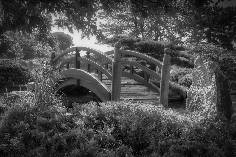
Hi Jim,
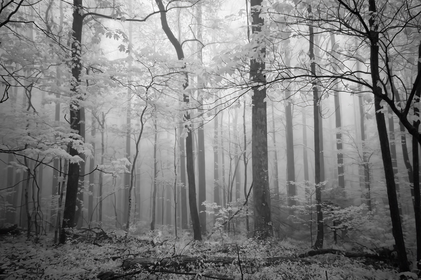
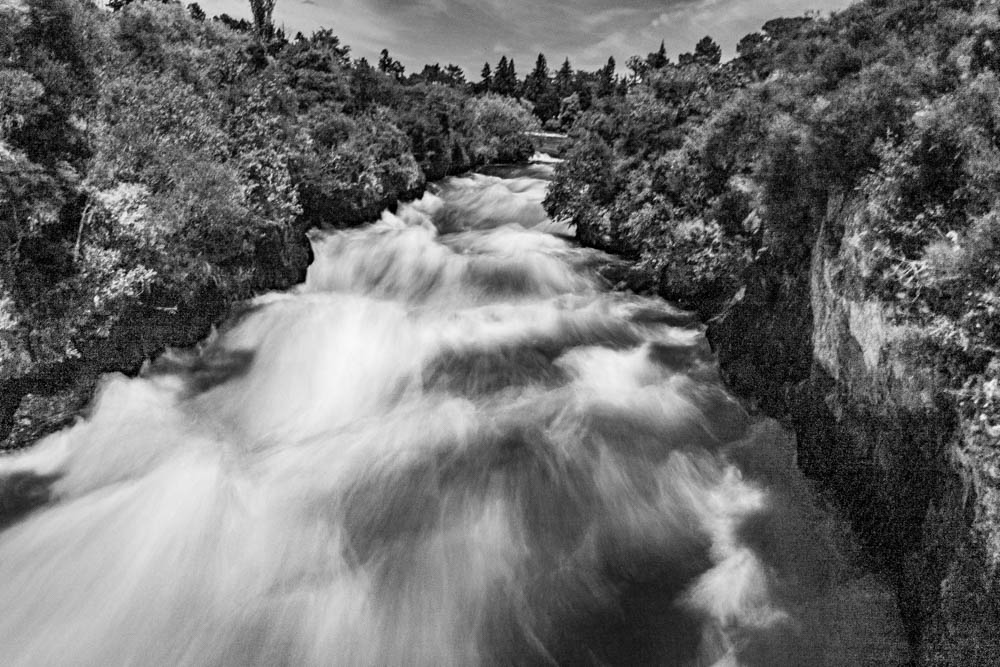
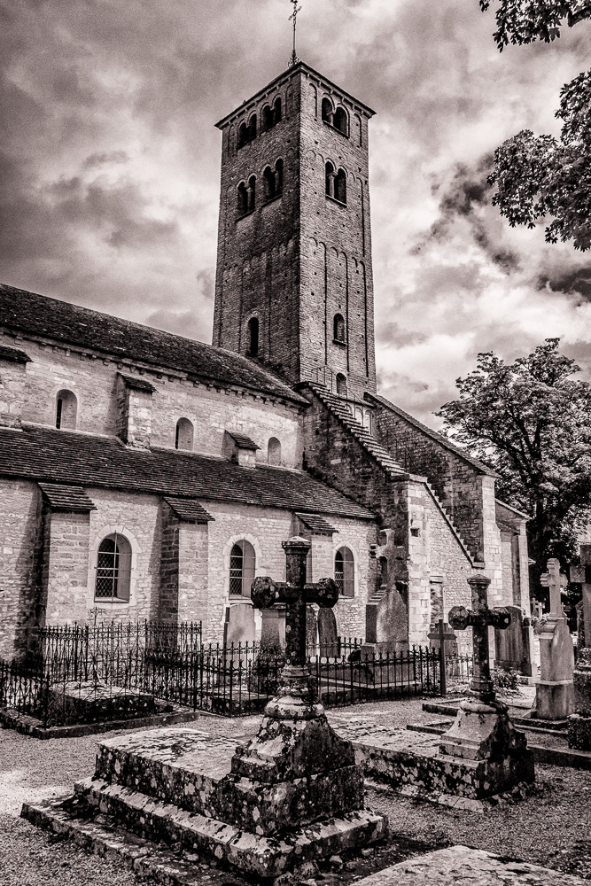
Another unusual subject that you captured perfectly. I might suggest that since it was IR that you take the sky darker and brighten/sharpen the structure of the bridge to emphasize the bulk and details to contrast against the sky.
|
Feb 10th |
| 11 |
Feb 21 |
Comment |
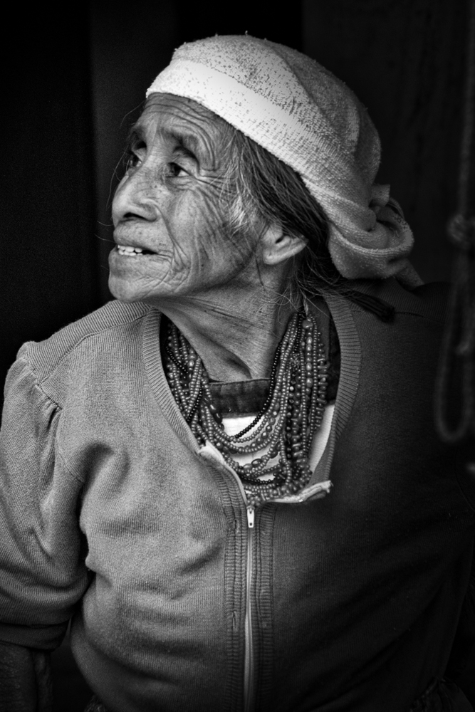
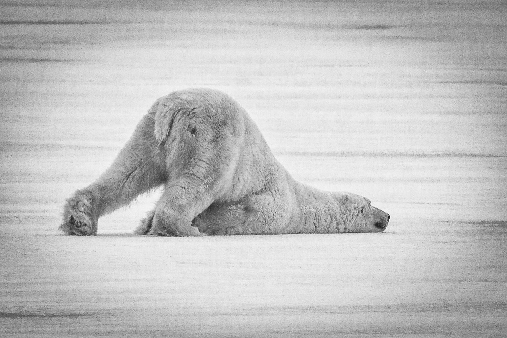
Hi Sharron, again, welcome back.
Your description indicates a generally challenging outing. I guess you could call this a 'behind the scenes" shot from the horse's position and and showing the side of the tent. While 'we take what we are given' as far as opportunity, I didn't think this one lived up to your norm; of course you are not always shooting from horseback ;-).
It appears very hot and dusty. As far as improvements, I suggest more contrast and general decrease in exposure to bring out some richer tones, that may not have been there.
|
Feb 10th |
| 11 |
Feb 21 |
Comment |
Hi Wes, I liked that you emphasized the sky/clouds more to add drama and utilized leading lines to direct the viewer through the image.
I think Jim Hagan's tighter crop improves the image as it increases focus on the important elements. You might also benefit by an off center vignette that would direct the viewers eye to the main interest of the image, rather than the brighter sky on the right. By using Lumenzia and selecting the correct mask, you may be able to add a curves adjustment layer to brighten the lighthouse slightly to make it more prominent in the image.
Iceland is an impressive location, so I hope to see more of your images in the future.
|
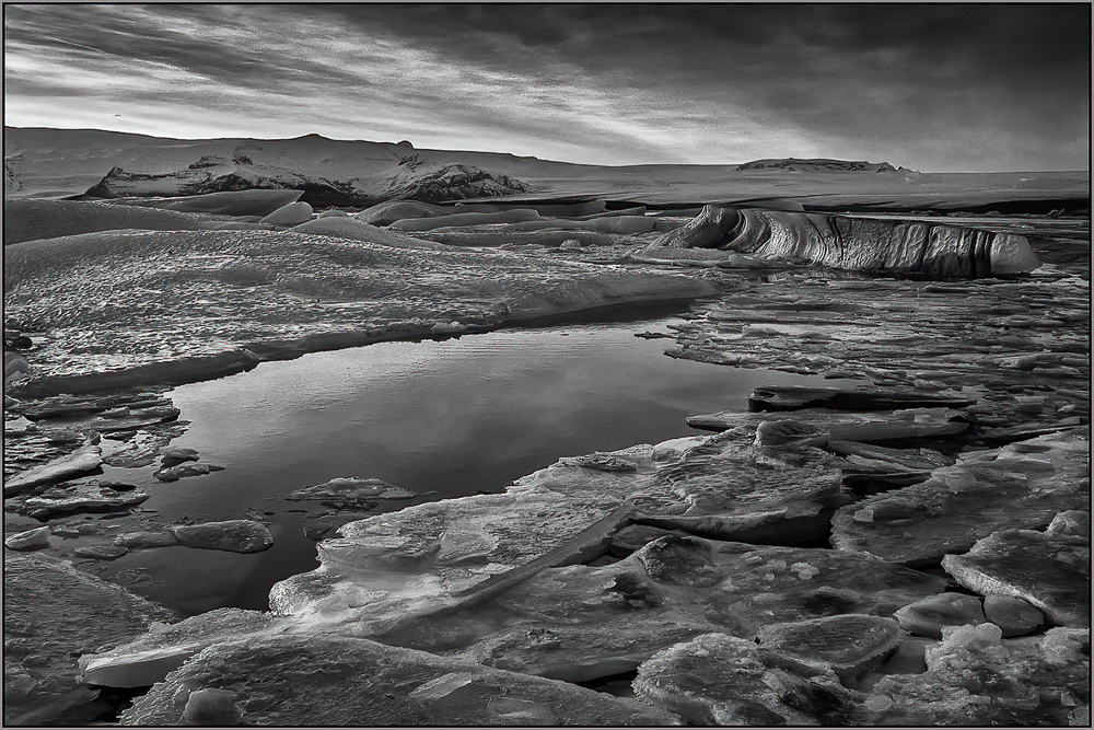
Feb 10th |
| 11 |
Feb 21 |
Comment |
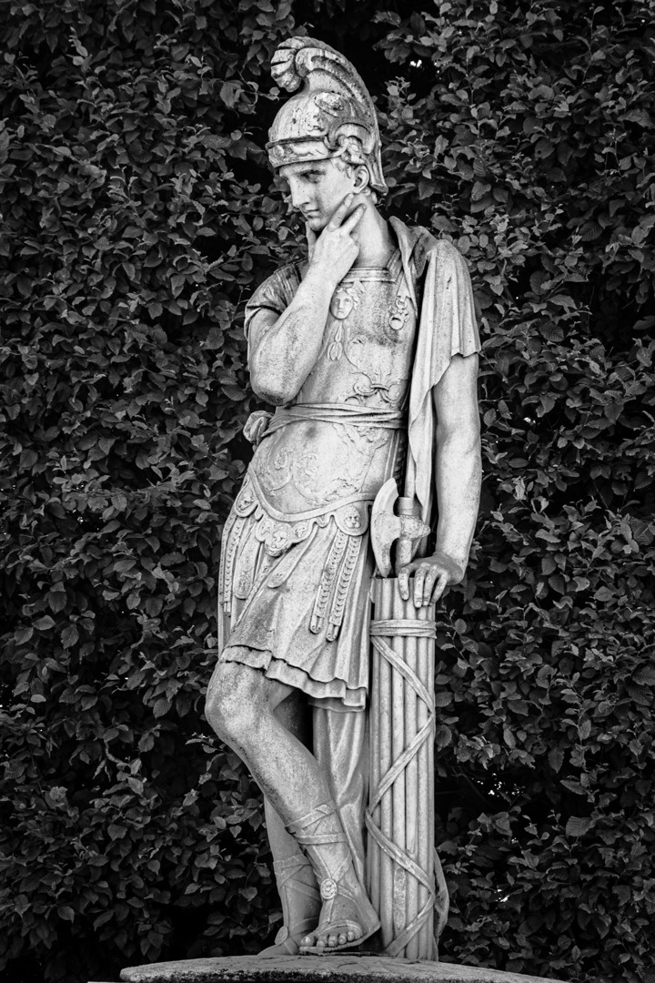
Hi Peter,
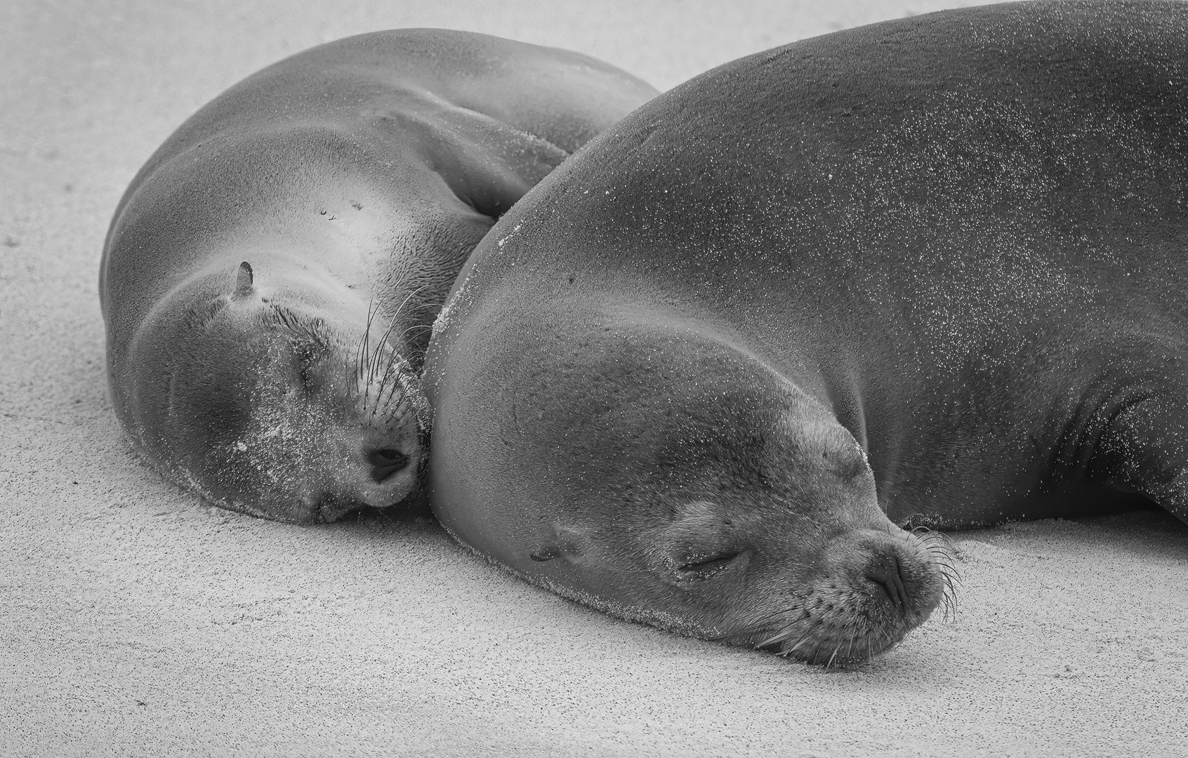
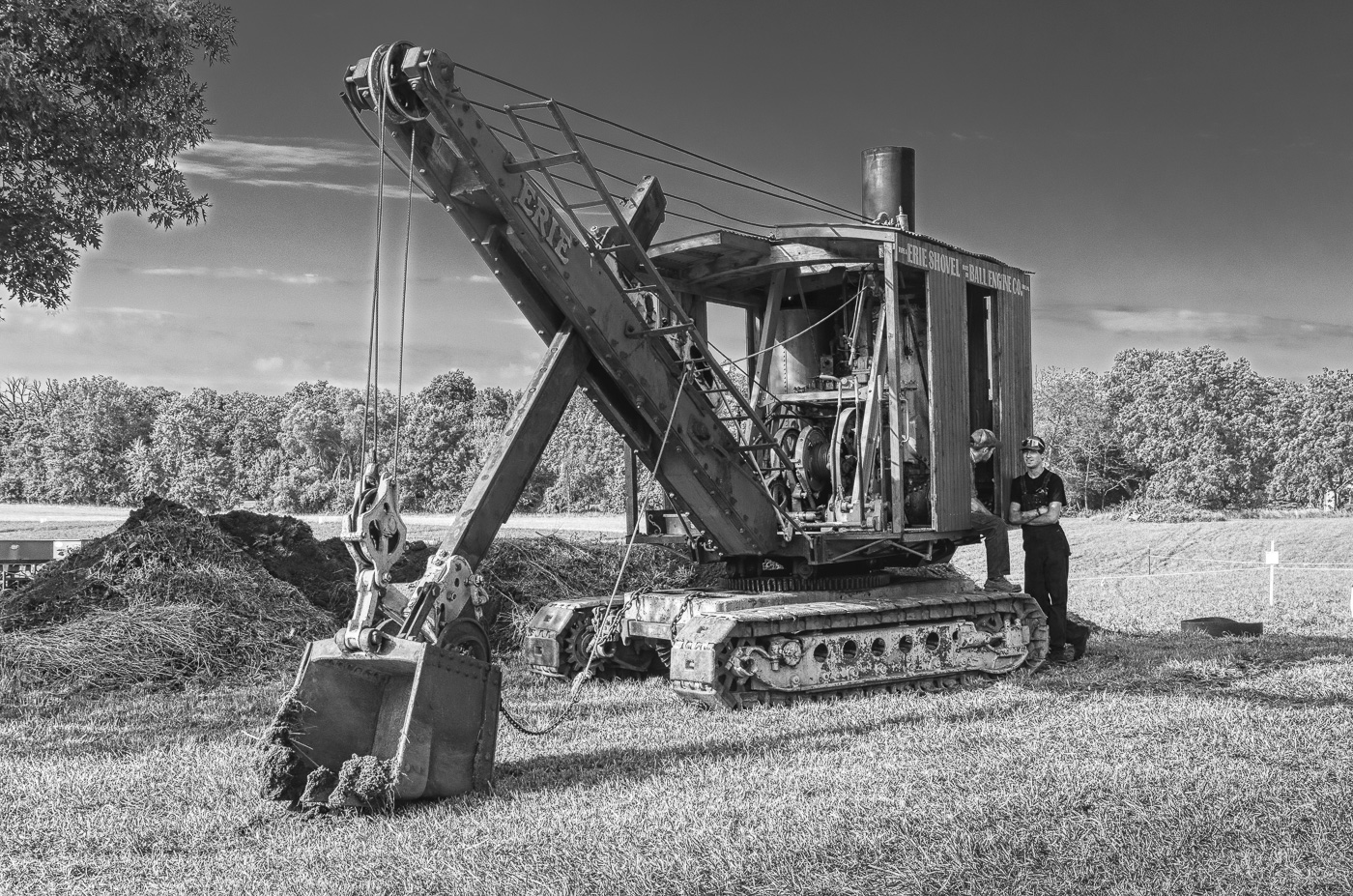
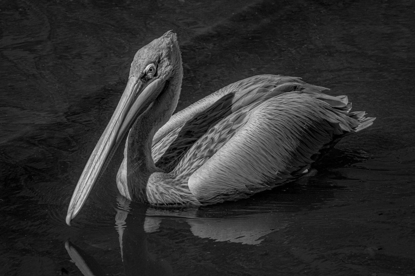
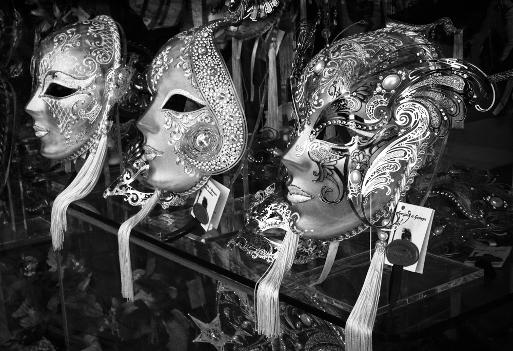
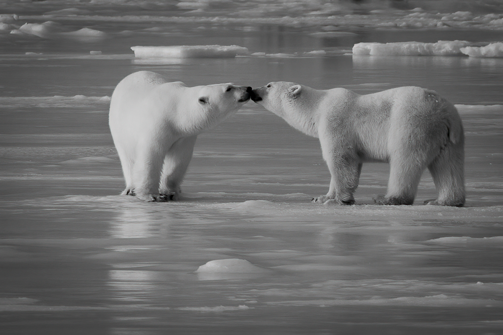
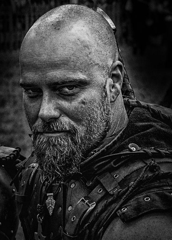
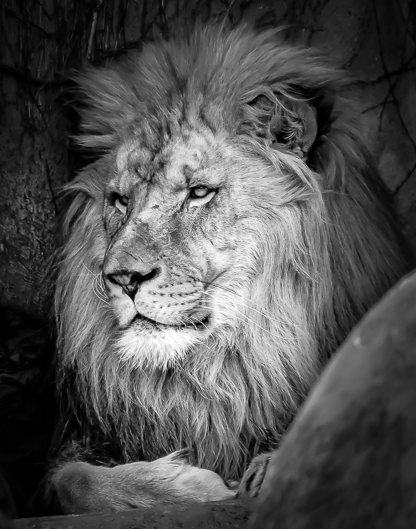
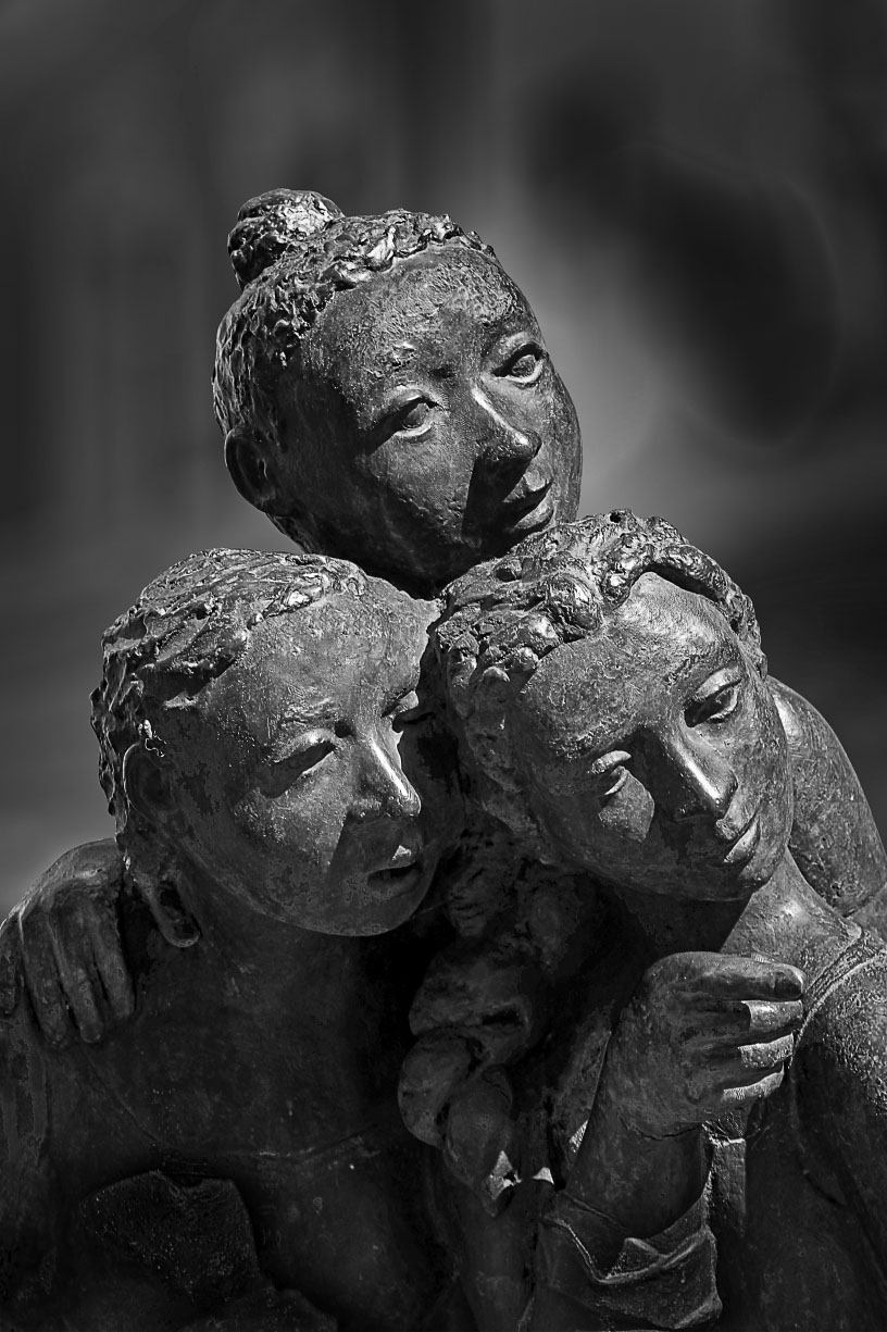
One of the problems with mono in competition is the presence of hot spots. These can be overcome with selective burning and dodging of the image, which can also create a visual flow to the image. With B&D you can direct the attention of viewers where you want them to focus their attention.
With that in mind I would burn the lower left edge, and lightly burn the upper right area. The chest of the figure on the left and the forearm of the figure on the right could also be slightly burned. The hand on the shoulder and the pointing hand could be slightly dodged as that is a major part of the composition. Overall, the exposure appears good, but you may want to experiment with the contrast to get the exact image you want to convey to the judges.
I like that you used the side lighting to bring out the detail in the figures, and that you have the full gray spectrum represented.
I would be interested in seeing your improved version.
|
Feb 10th |
| 11 |
Feb 21 |
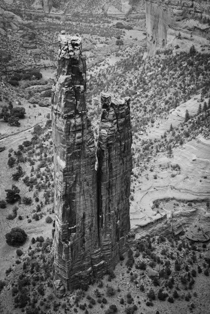
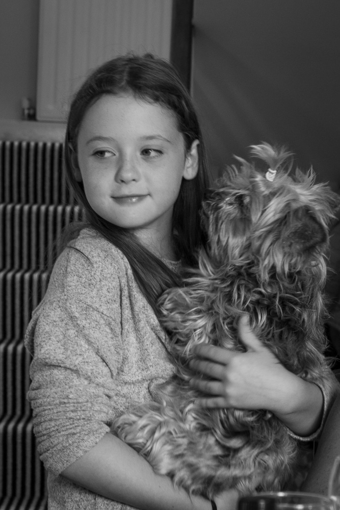
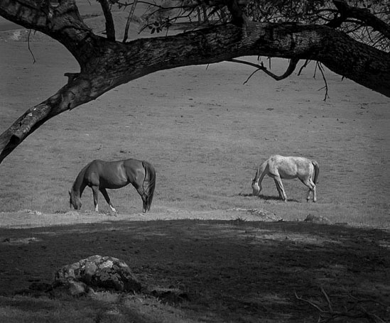
Comment |
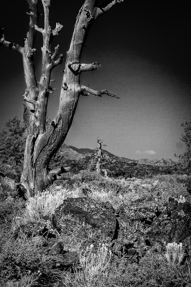
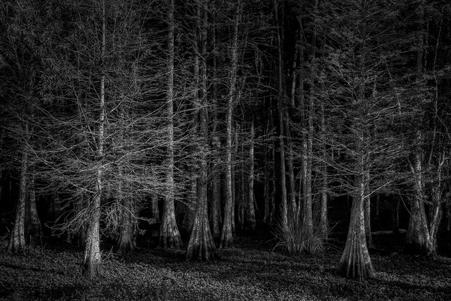
I understand the desire to change the organization of the foreground and making a better arch of the tree limb by rotating the image clockwise, but, to me, the stance of the horses didn't seem natural. I didn't realize it originally, so I did a similar crop of the original image and realized that the shadows and horses seemed off. My interpretation is attached.
I like that you brought out detail of the dark bark and emphasized the rock in the foreground to give some character to the foreground. I was concerned with the open triangle of grass on the upper left that could be toned down slightly/significantly.
A seemingly simple image turned more complex.
|
Feb 10th |
 |
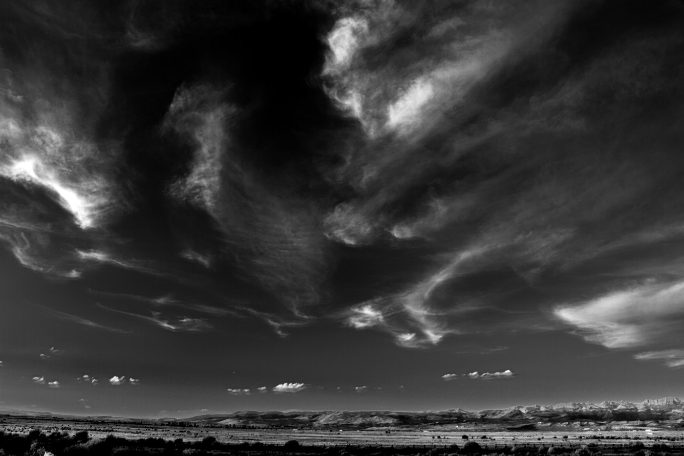
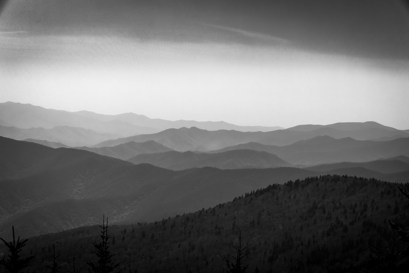
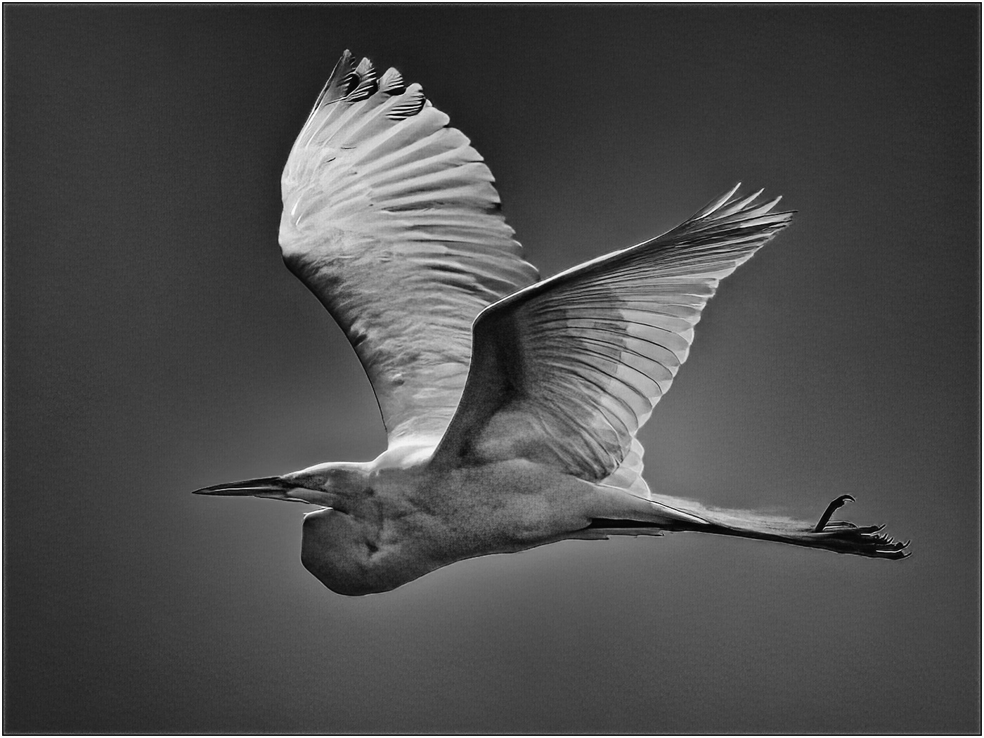
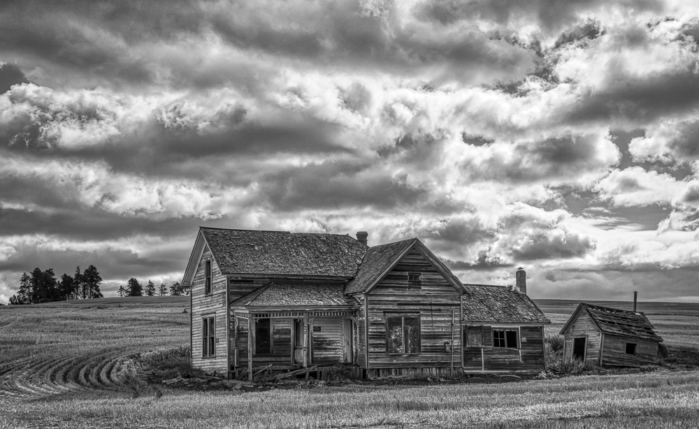
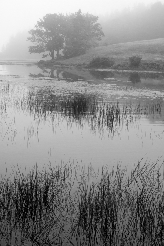
| 11 |
Feb 21 |
Comment |
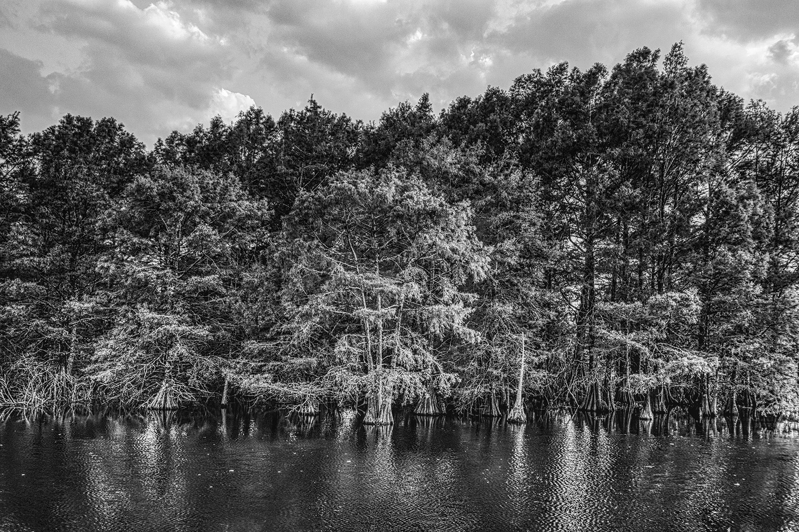
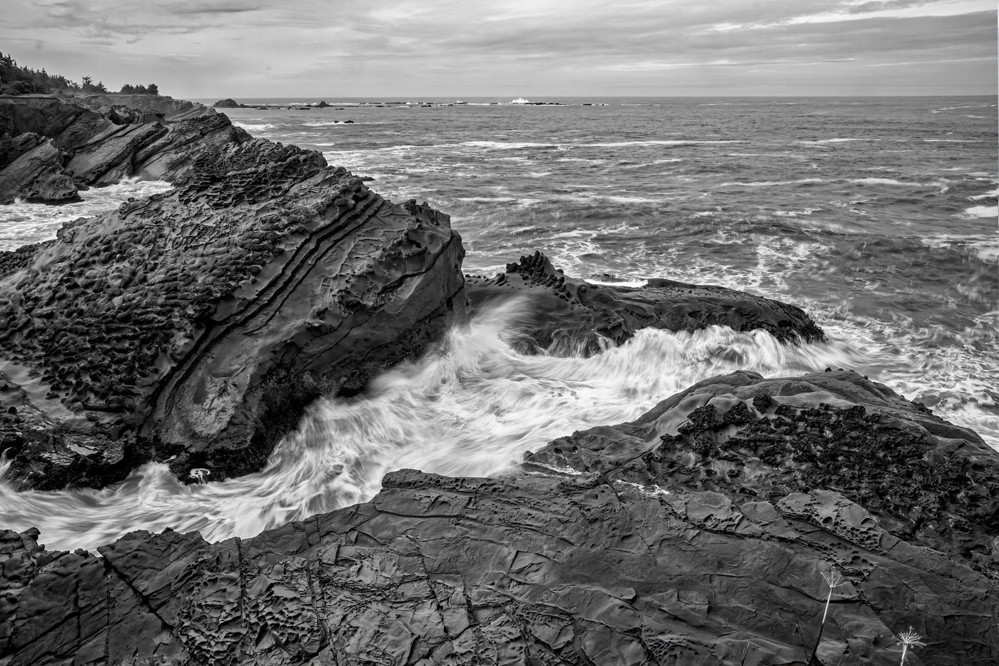
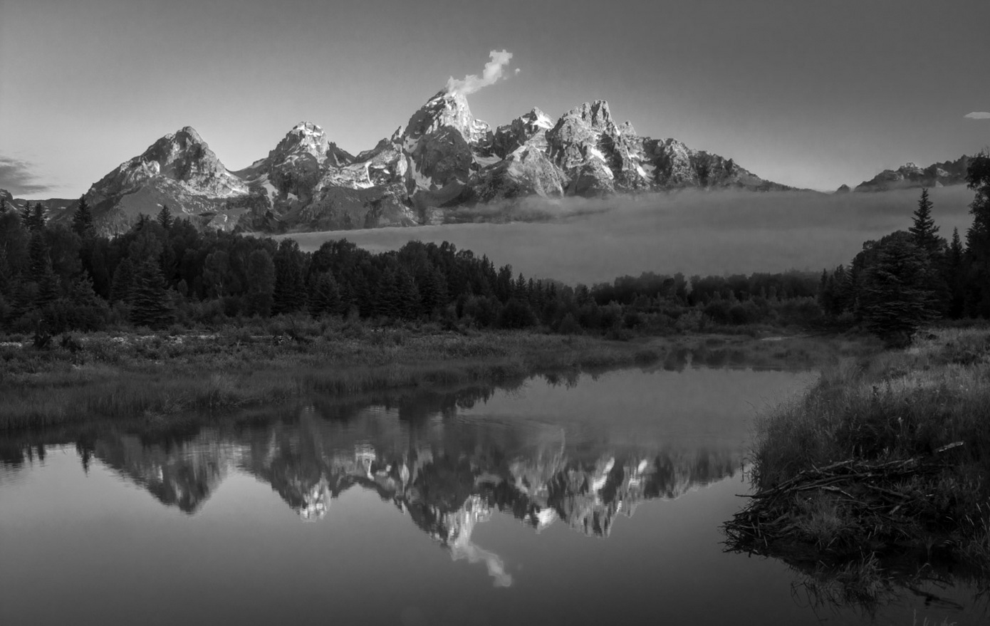
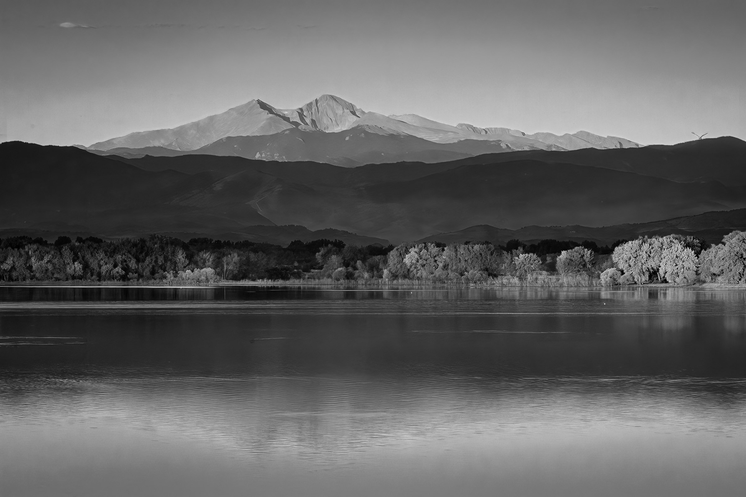
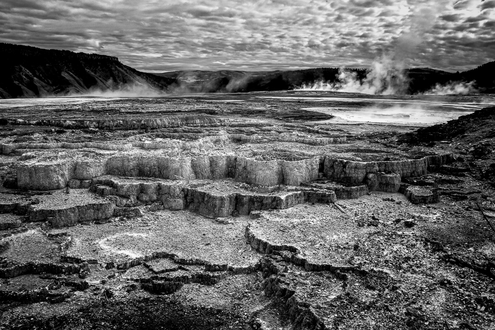
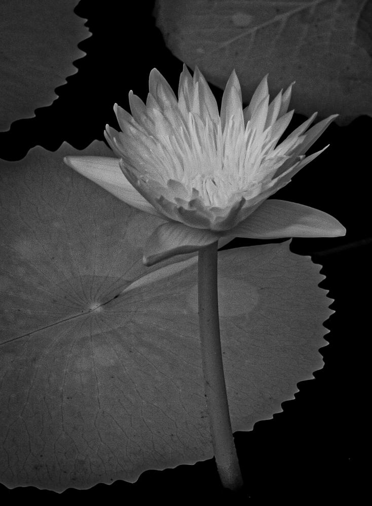
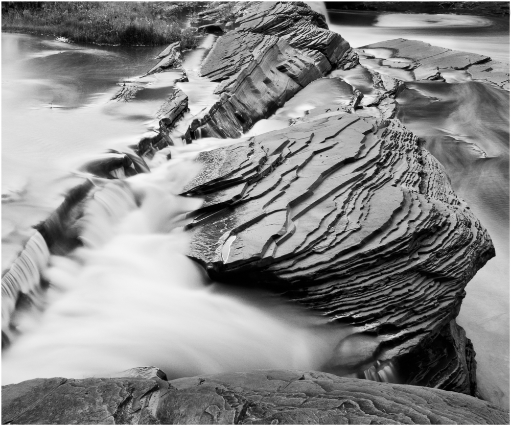
To me B&W photography is all about tones and textures. I enjoyed the upper 2/3 of the image, but find the foreground too bright and lacking substance. I appreciate the slow speed that generates the pleasing blur, but reducing the exposure on the foreground, and increasing contrast and sharpening would, to me, improve the image, since the viewers eye is drawn to the brightest portion of the image. My eyes were so locked on the foreground, that it took me a while to appreciate the exciting detail of the other 2/3 of the image. I like the overall image and composition, but think the tones could be adjusted.
|
Feb 10th |
6 comments - 2 replies for Group 11
|
6 comments - 2 replies Total
|