|
| Group |
Round |
C/R |
Comment |
Date |
Image |
| 11 |
Apr 20 |
Comment |
A great area to visit, Henry. I was also lost while viewing the picture and trying to determine the subject. At one point I was going for the color version because it added the emphasis on the bike. I think Jim's crop and dodging the man solved the problem for me as it emphasized the key elements of the image. I wish there was more real estate on the left border of the frame, to move the man inward slightly.
|
Apr 29th |
| 11 |
Apr 20 |
Reply |
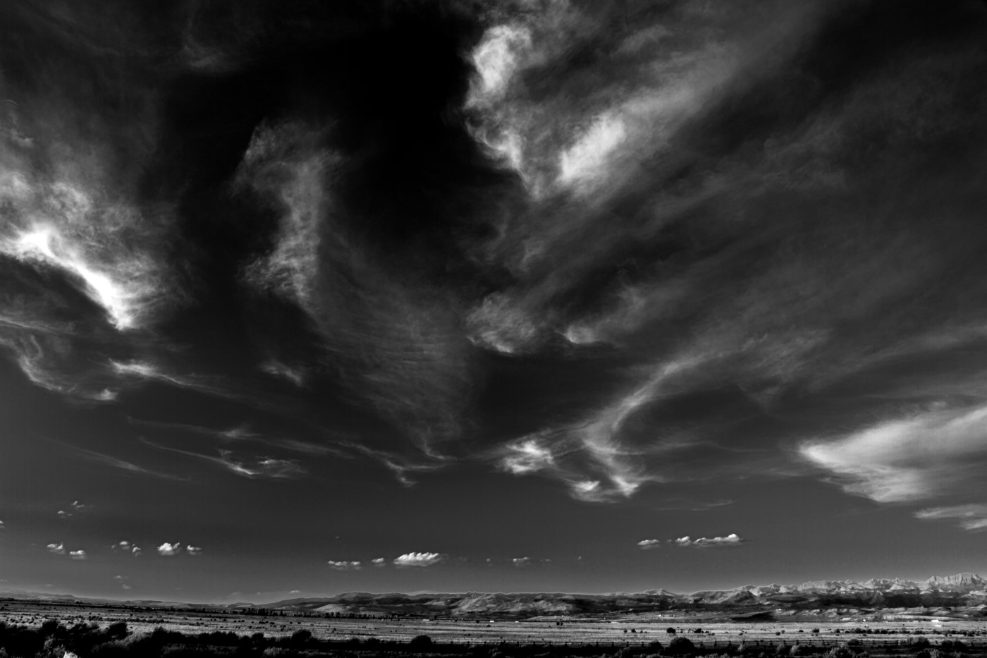
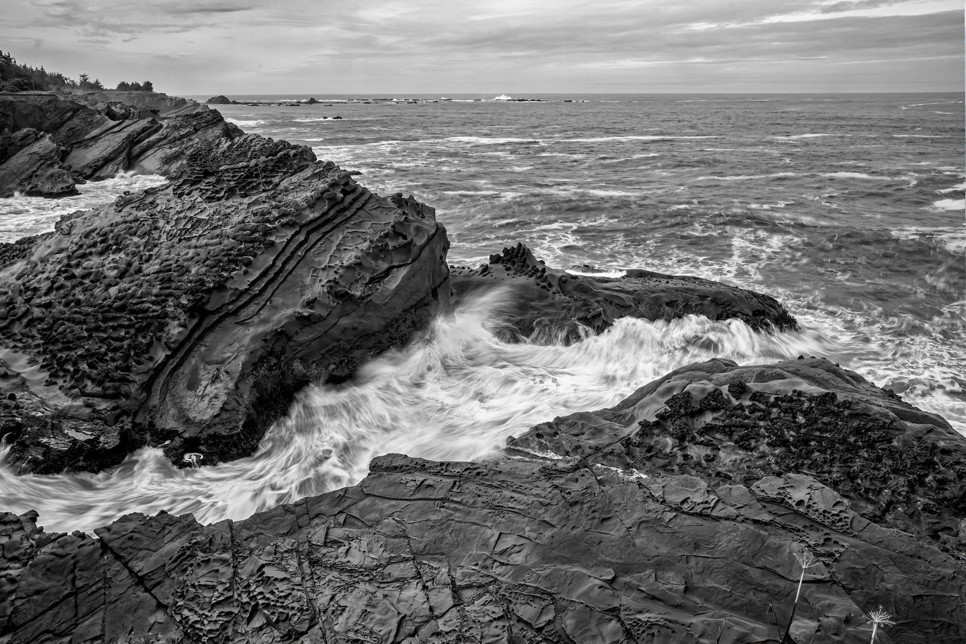
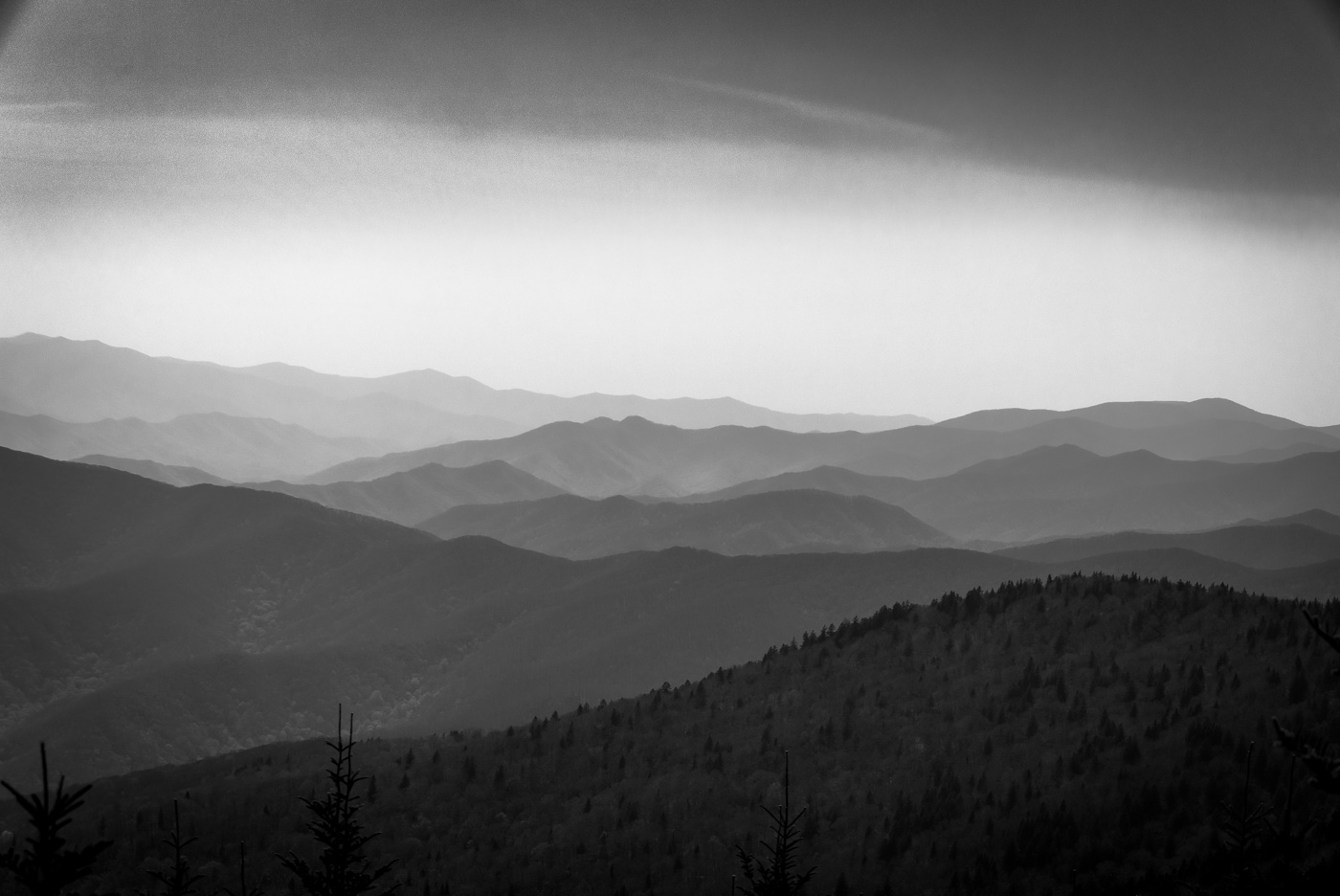
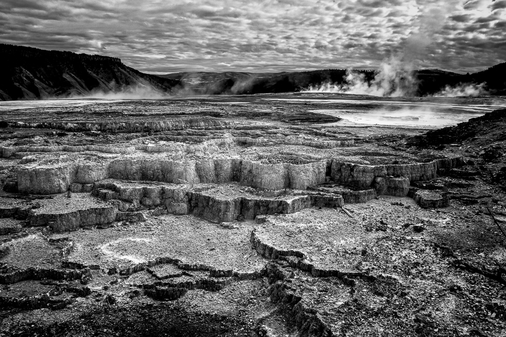
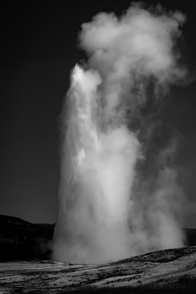
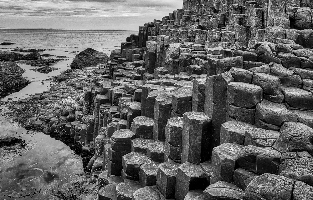
This is in the northern part of Yellowstone called Mammoth Hot Springs. The results of many centuries of mineral deposits from thermal springs. Closer to you, the most similar location that I found in New Zealand was Orakei Korako Thermal Park. Not quite as drastic nor large, but has the same forces at work. I will look for the dinosaurs next time.
|
Apr 29th |
| 11 |
Apr 20 |
Reply |
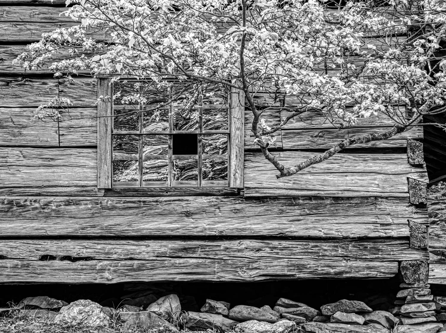
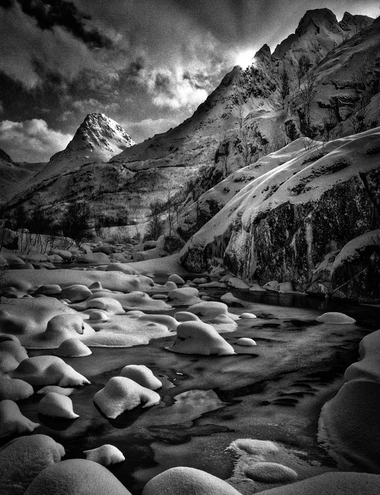
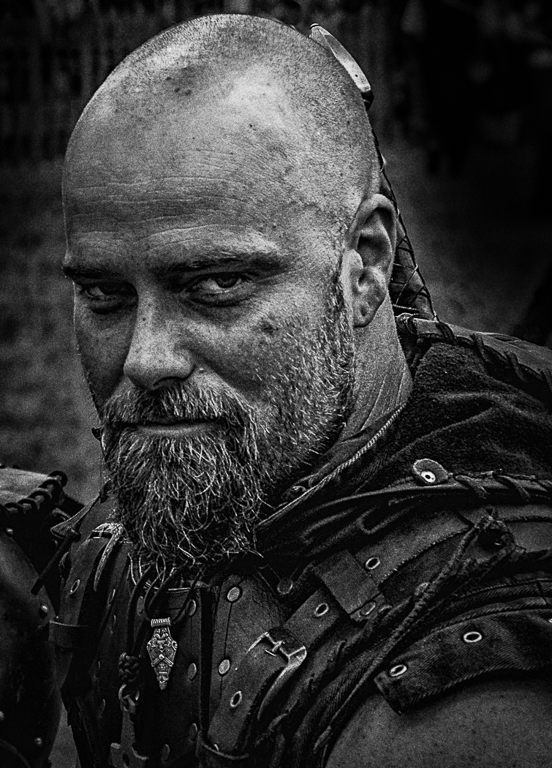
Thanks, Allen. I was going for the high contrast, somewhat gritty look, but still trying to make it look natural. I that environment, it was easier.
|
Apr 29th |
| 11 |
Apr 20 |
Comment |
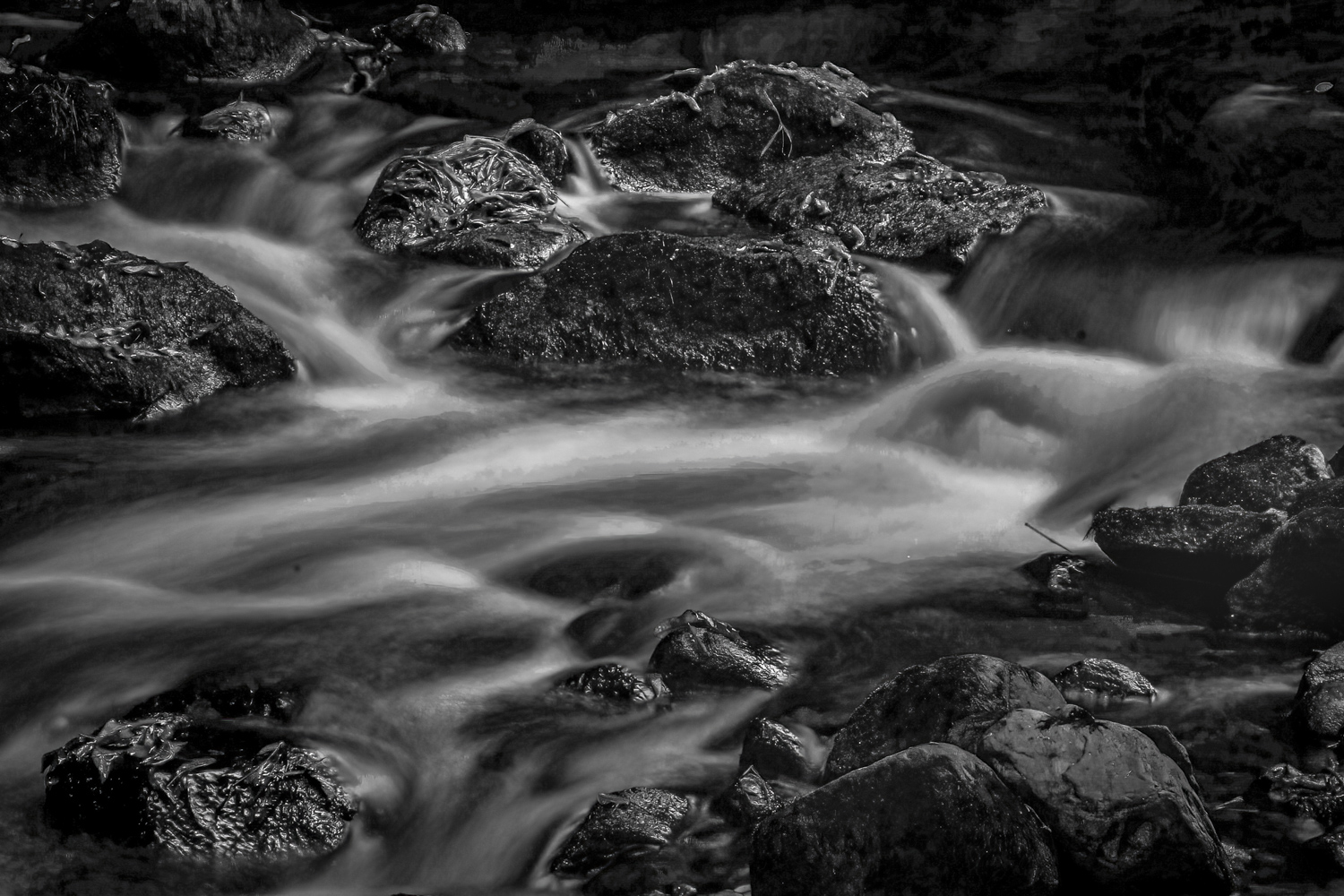
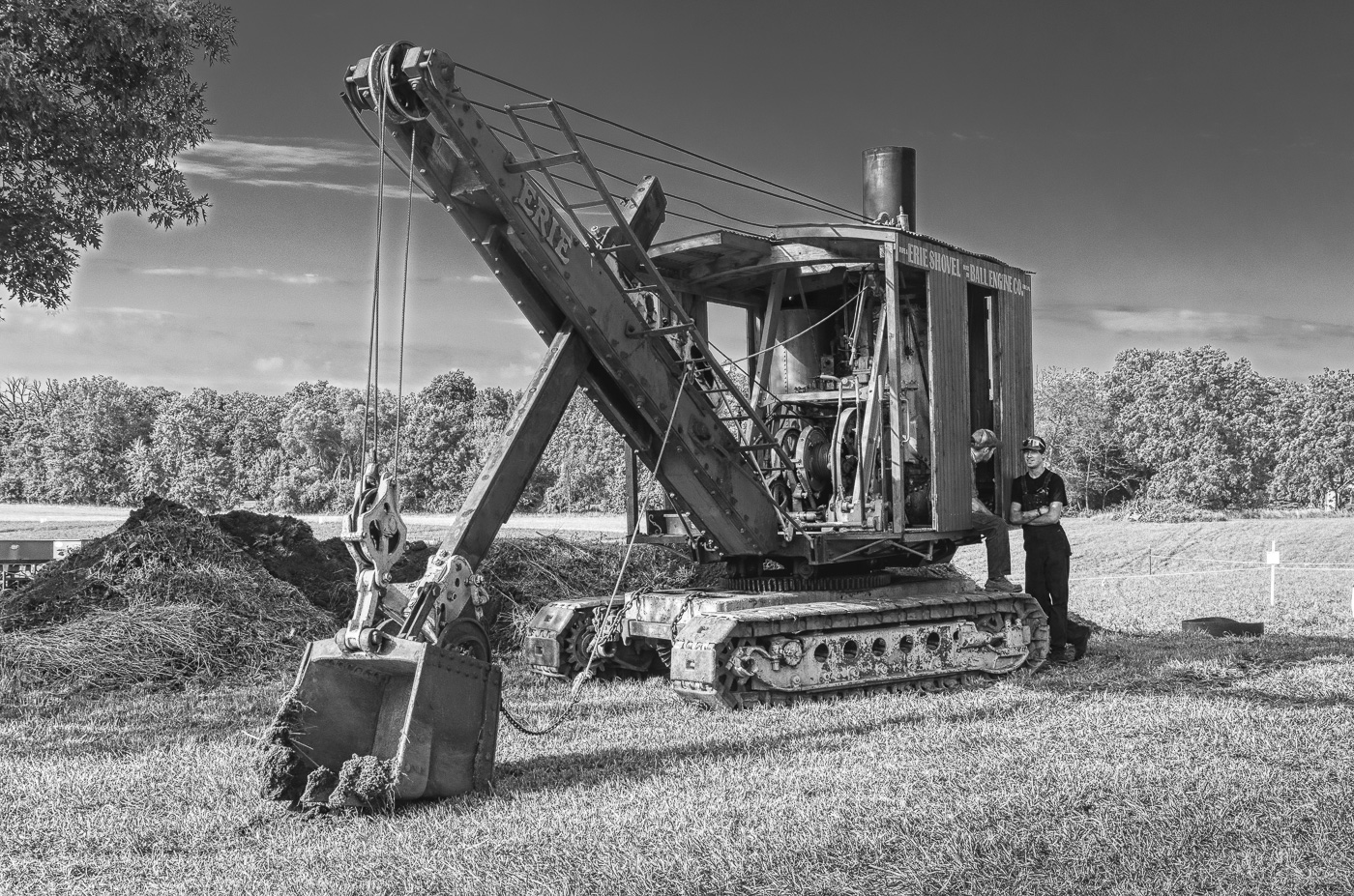
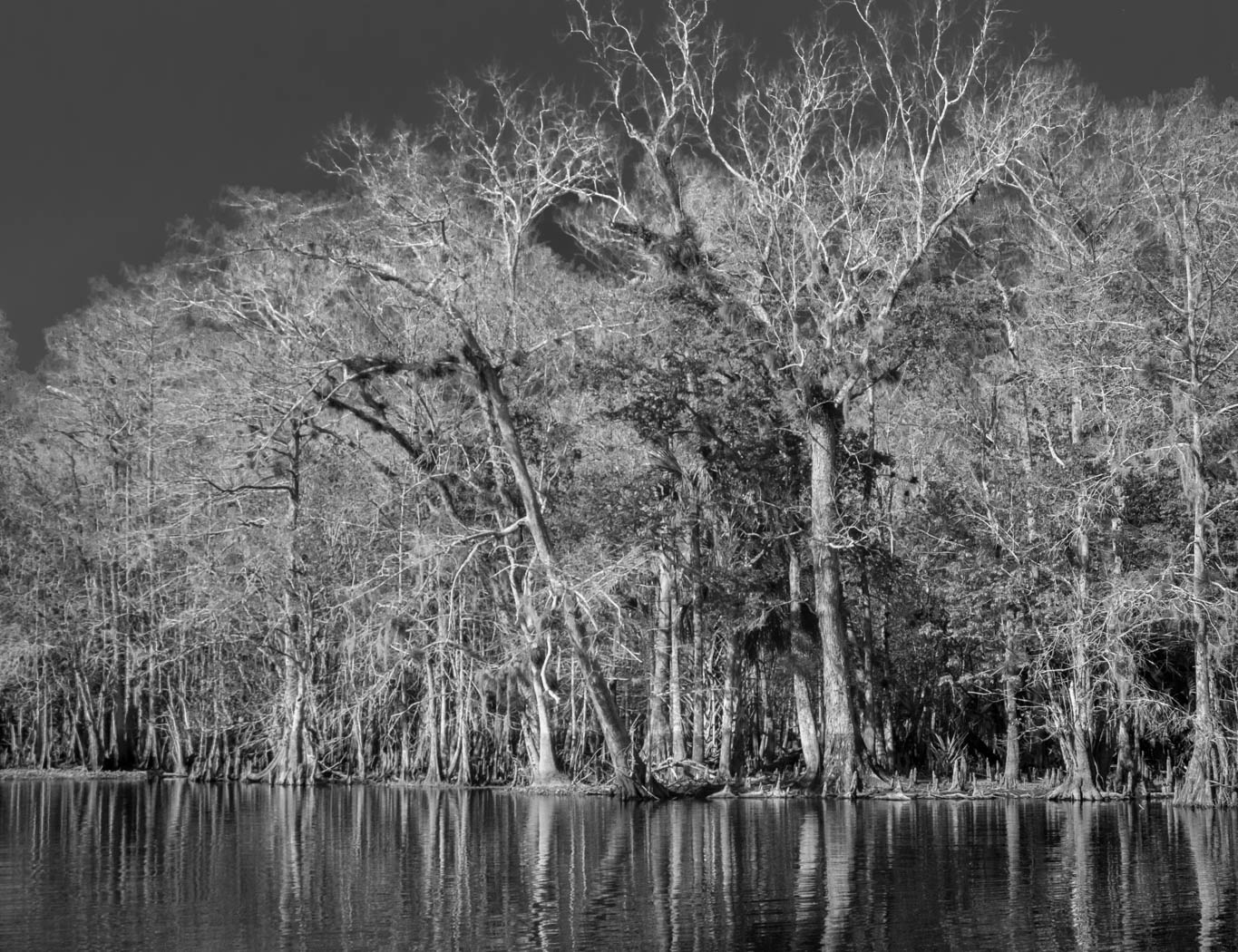
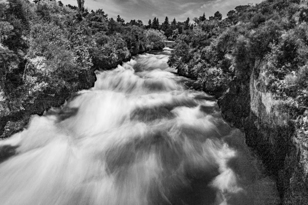
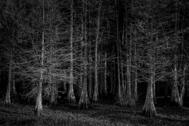
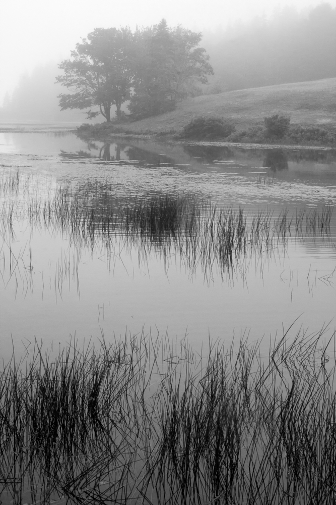
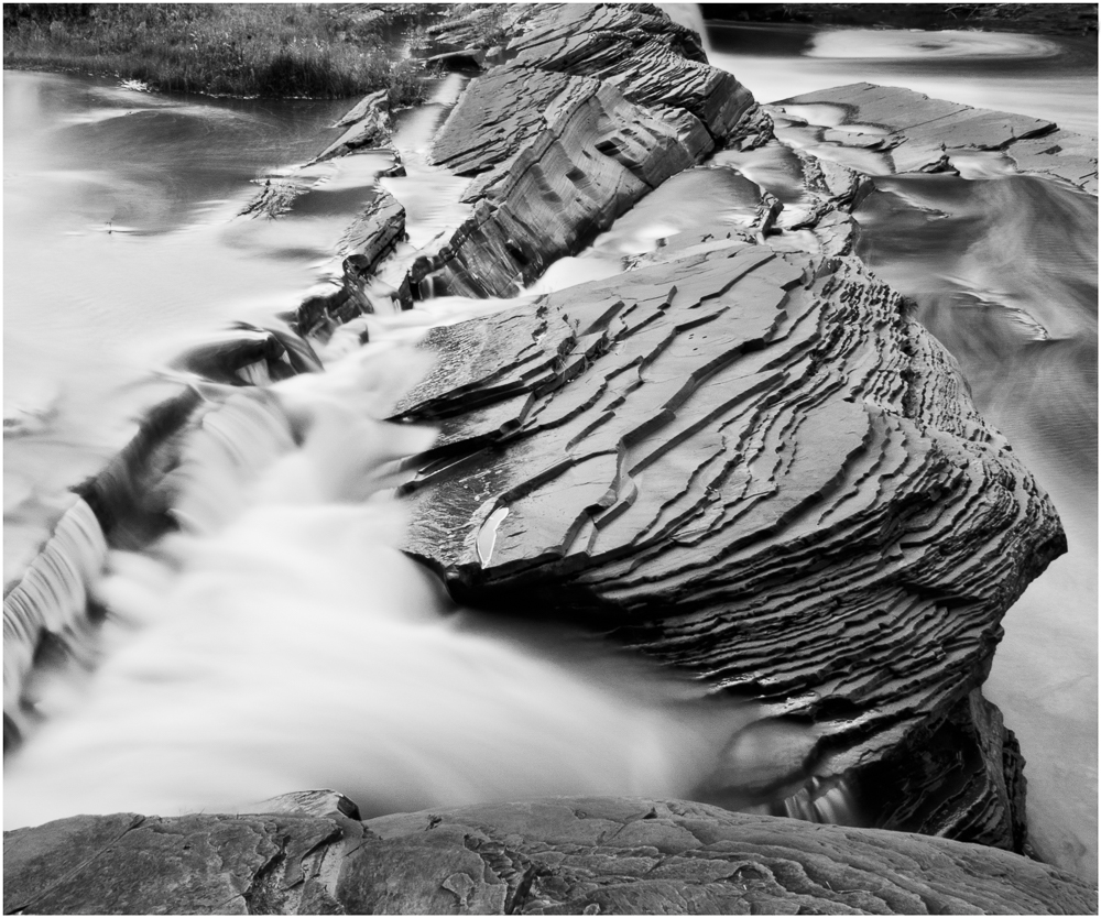
Great moving image, Jim. When comparing your first B&W to the original, I liked the detail and contrast that you captured. Now seeing your revised version, with a blend of a greater amount of 'fog' and yet retaining some detail, that is my favorite of all of the various suggestions. Good image!
|
Apr 29th |
| 11 |
Apr 20 |
Comment |
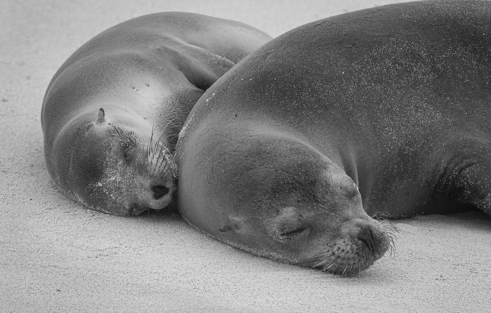
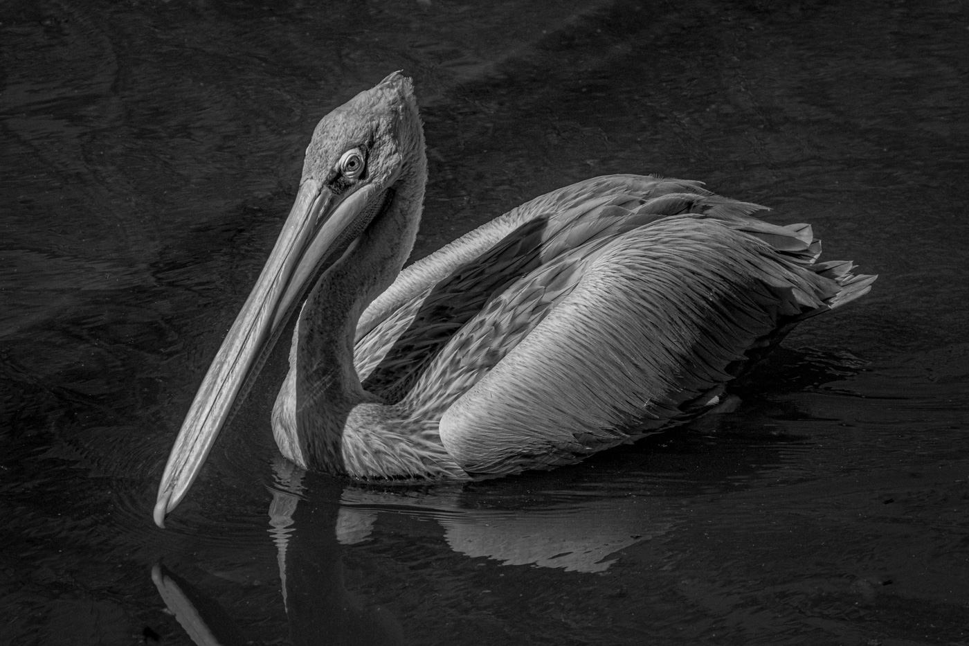
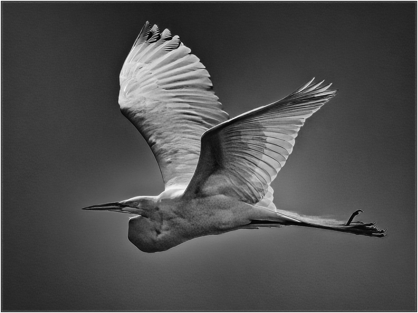
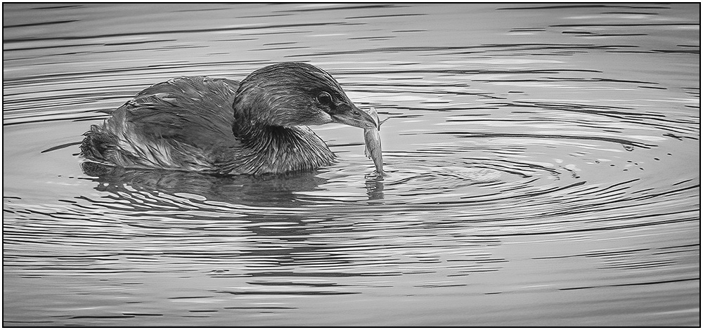
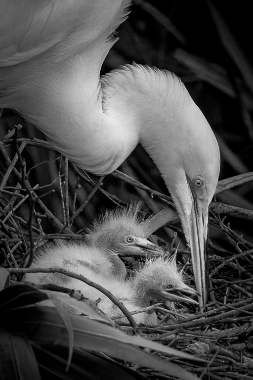
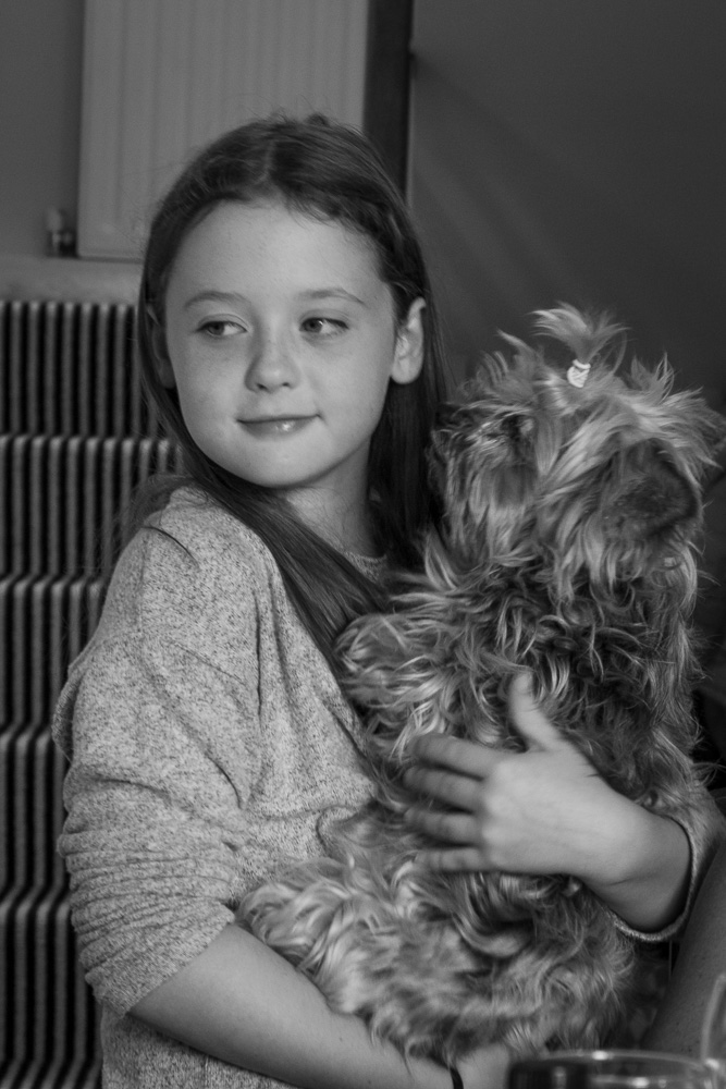
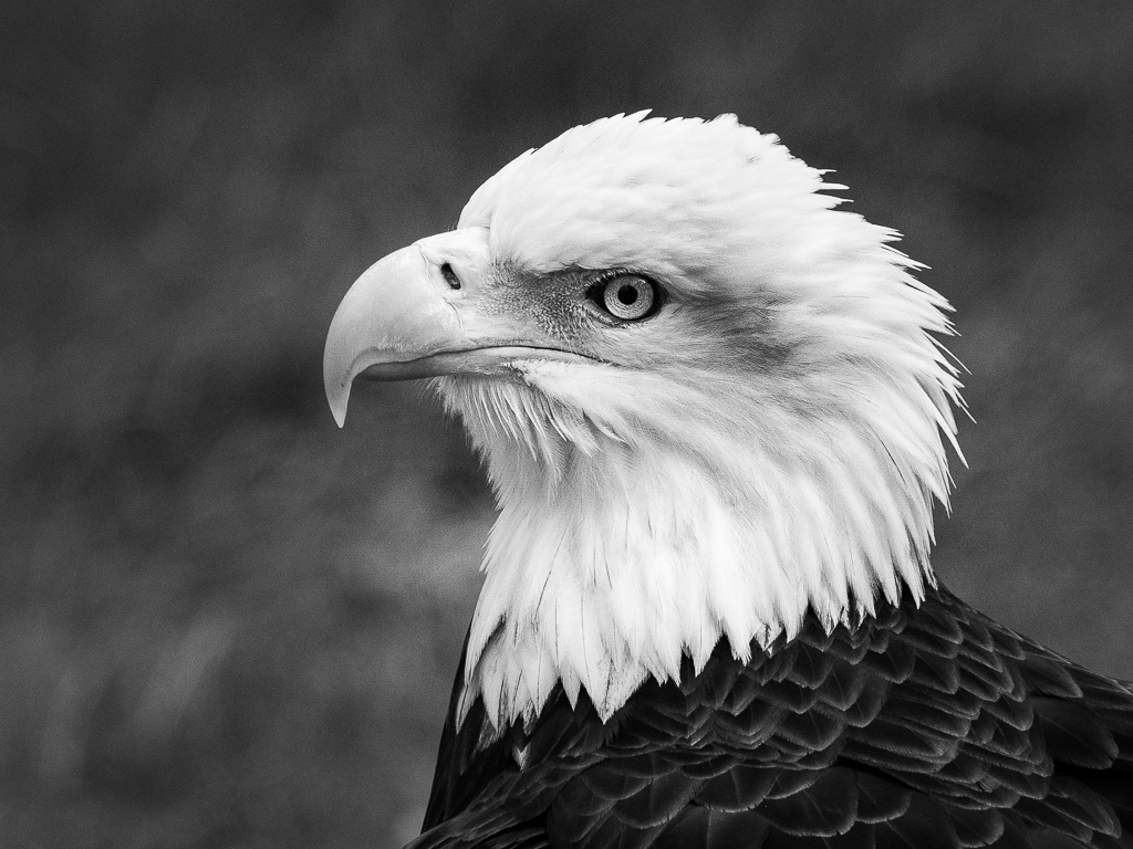
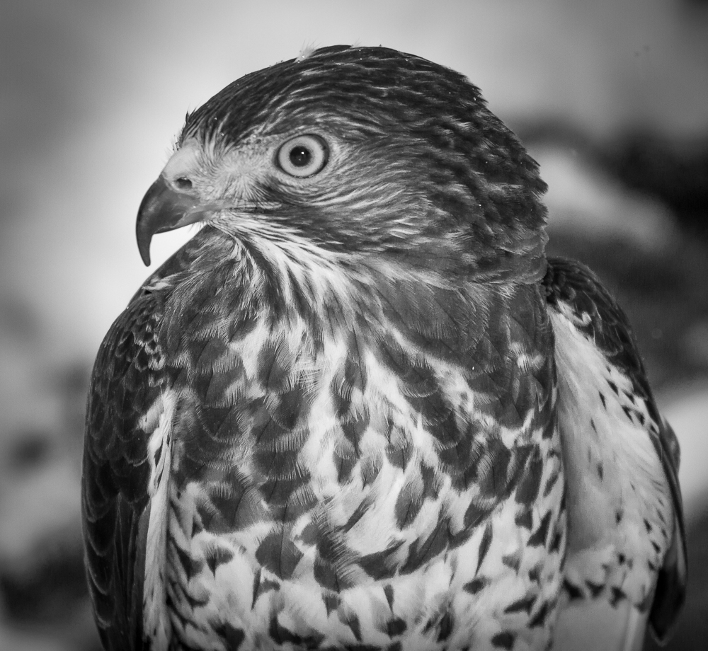
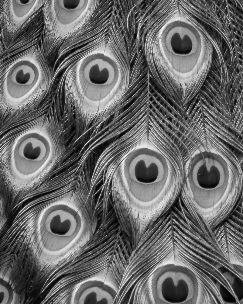
A very cool specimen! I really like the texture and flow of the chest feathers - - very unreal. I like your high key treatment of the monochrome version and feel that the slight burning of the head would improve the image. Because of the lack of background and that the subject is looking into the picture, almost either direction would work. If forced to make a decision, I like the flipped version. Nice image!
|
Apr 29th |
| 11 |
Apr 20 |
Comment |
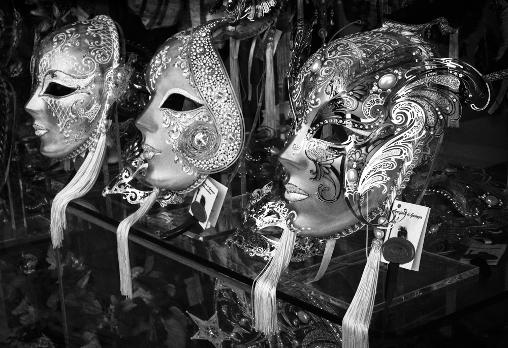
Victor, I like the way you used the high contrast to bring out the details in the bike. I always look at the original image first and saw the challenge that you faced. You were able to extract and separate the bike and table from the myriad of brick patterns. You also accentuated the wheels and flow of the bike frame which contrasts with all of the straight lines in the image. Very nice job!
|
Apr 29th |
| 11 |
Apr 20 |
Comment |
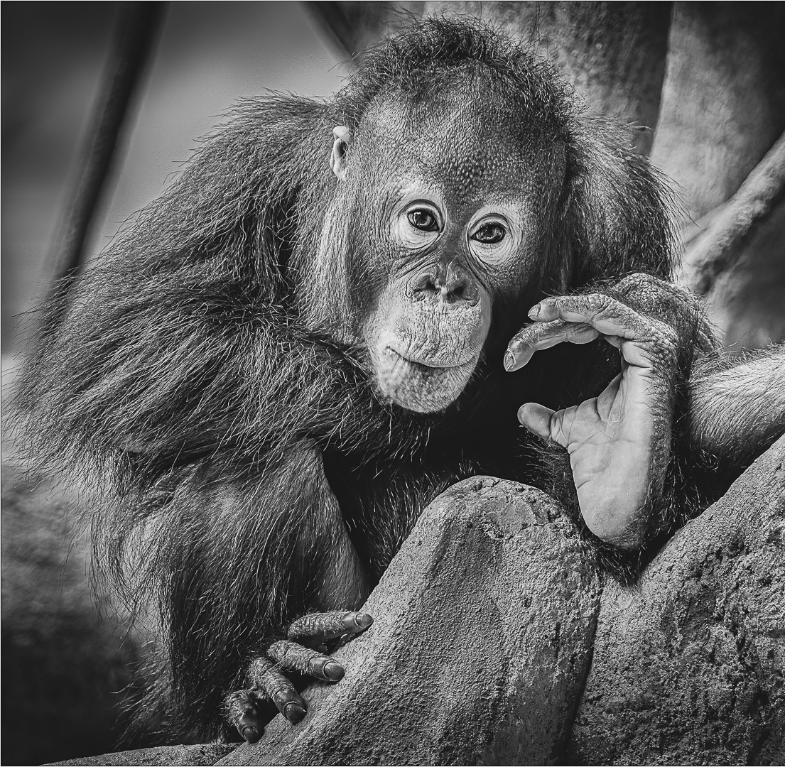
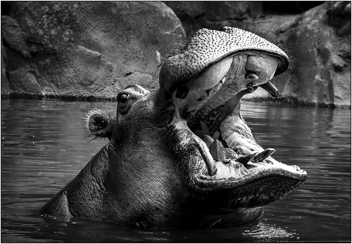
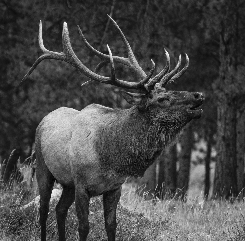
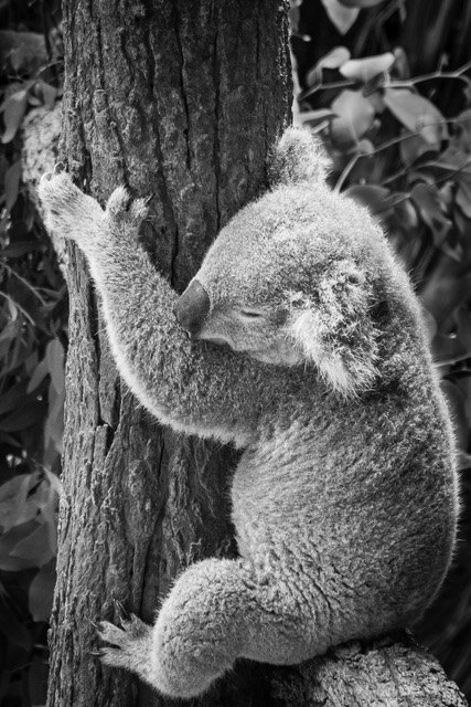
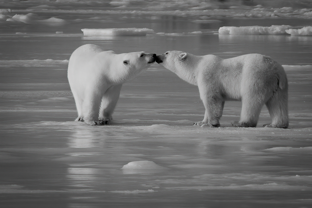
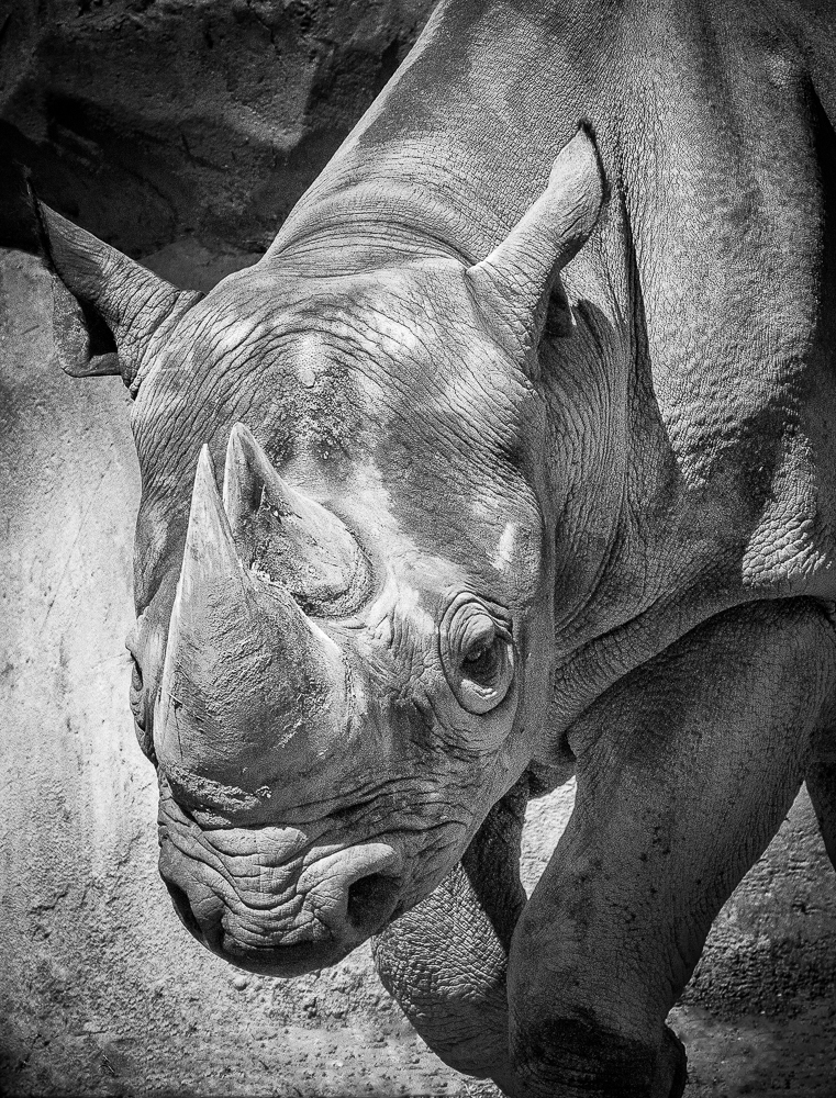
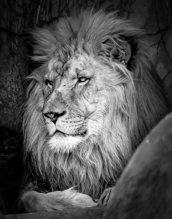
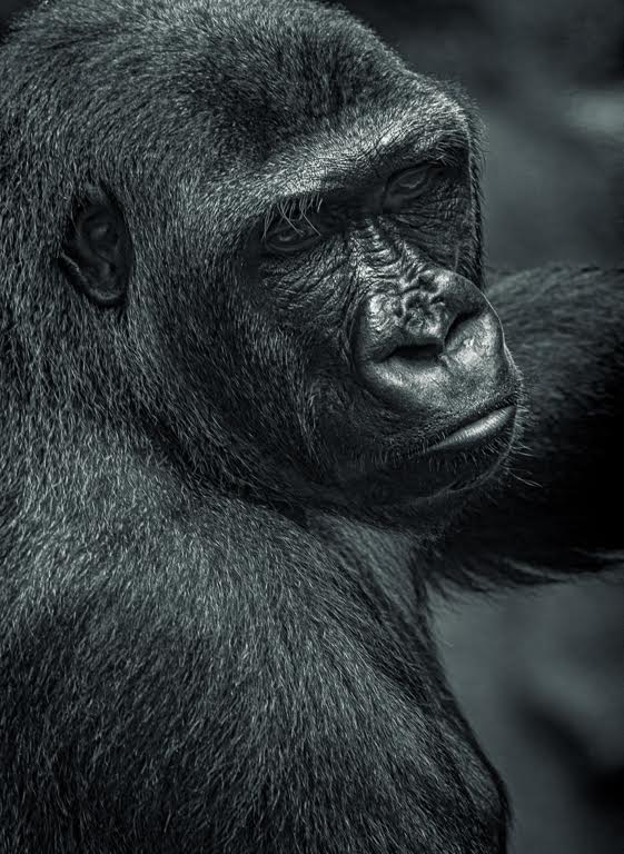
You captured a very interesting and interested subject in less than ideal conditions. I like your mono conversion, but you definitely need the ears to complete the image. I find the bars very distracting and was trying to think of ways to de-emphasize them. I think Tom hit upon the proper solution, especially removing the top bar, giving a natural open space above the ears.
|
Apr 29th |
| 11 |
Apr 20 |
Comment |
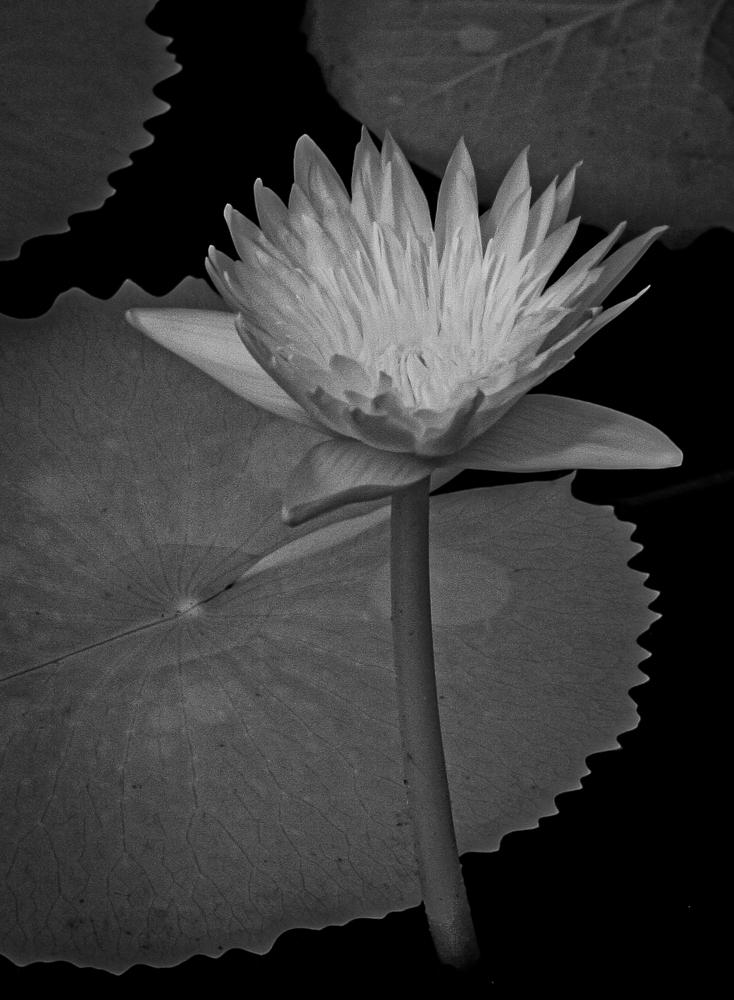
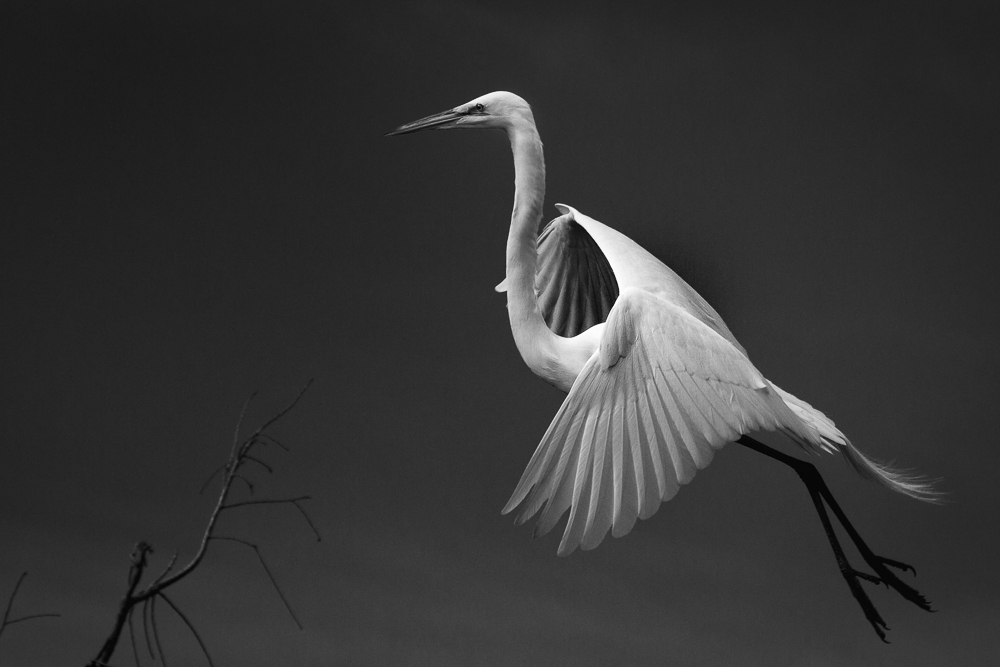
To me the sepia doesn't seem natural, so I would go toward a true B&W. While I like the blurred background, I agree with Tom and argue for a pallet of tones IN BETWEEN Original 2 (Tail too bright) and Jim's (body without rich blacks).
|
Apr 29th |
| 11 |
Apr 20 |
Comment |
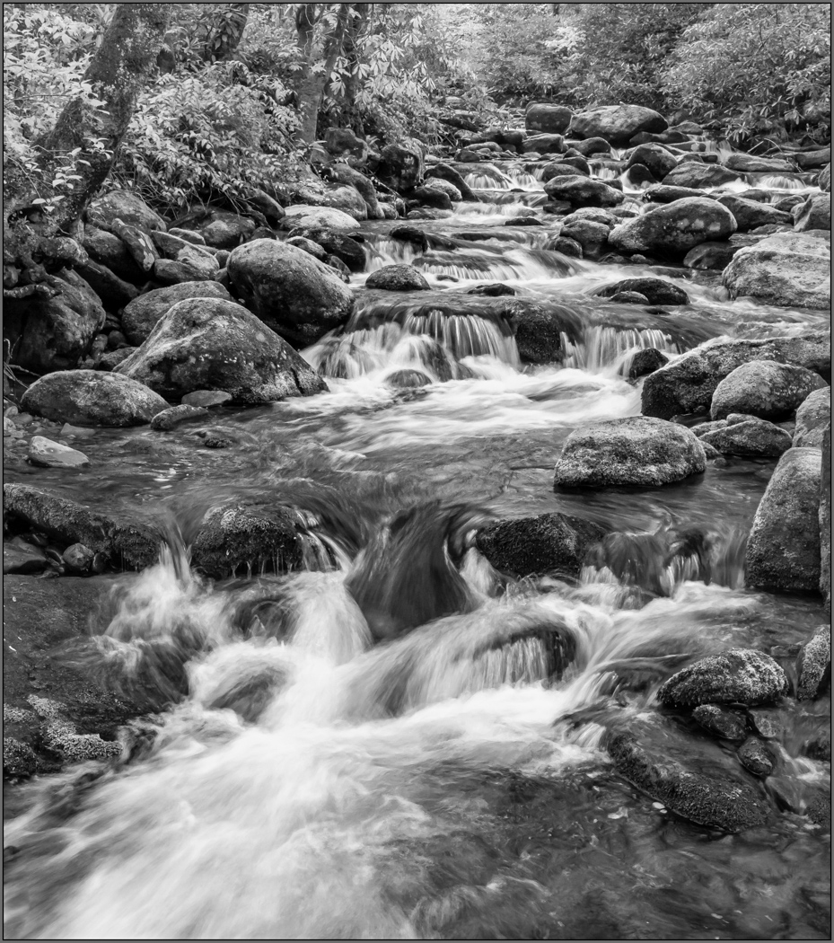
Thanks, Allen. I believe that it could be improved a little (maybe exposing it +0.5-1.0 stops), but like the dramatic sharpness and gritty, dark feel. Thanks again.
|
Apr 14th |
| 11 |
Apr 20 |
Reply |
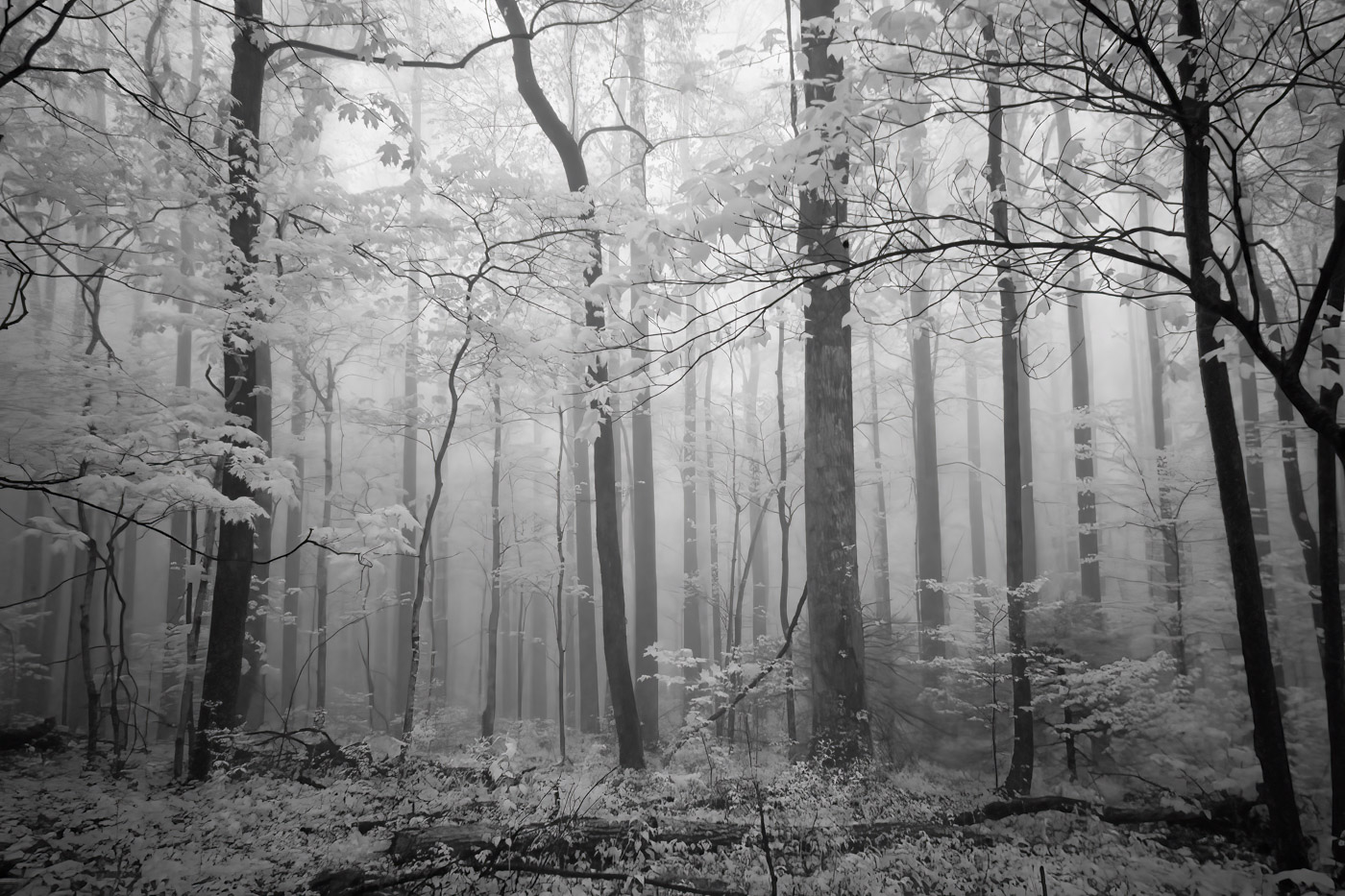
Thanks for your rework, Jim. I enjoy how others interpret a scene to help me learn and broaden my vision. I agree with your excellent interpretation and work, but it was not the mood I was trying to create. Thanks.
|
Apr 14th |
| 11 |
Apr 20 |
Reply |
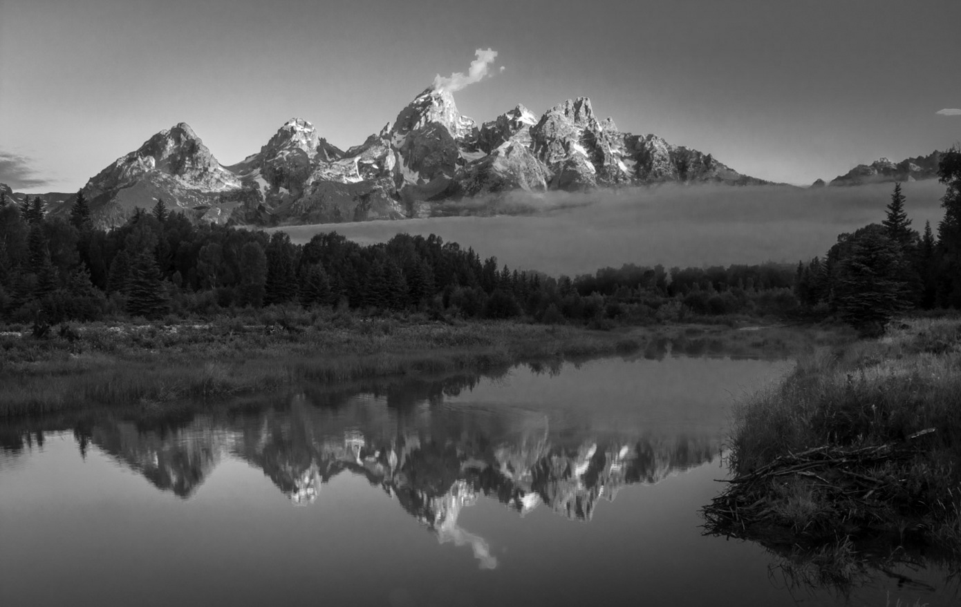
Thanks for your reply and rework, Henry. I copied your rework and my submitted one to the desktop where I have had them displayed for several days to soak in the differences and the overall 'feeling' of both. While I still like my original concept, I agree some of it was a little too much. My focus was the foreground, while trying to show the depth to the darkened hills with highlighted steam plumes. I always enjoy how others treat the same scene. Thanks again.
|
Apr 14th |
7 comments - 4 replies for Group 11
|
7 comments - 4 replies Total
|