|
| Group |
Round |
C/R |
Comment |
Date |
Image |
| 11 |
Dec 19 |
Reply |
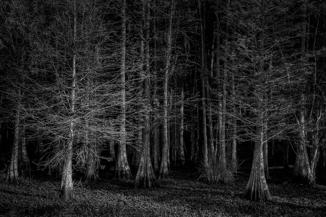
Thanks, Victor. Between the two, I like the single shade better also, as it keeps the viewer's eye concentrating on details and shapes, rather than the colors/shades of the protective camoflauge. |
Dec 30th |
| 11 |
Dec 19 |
Comment |
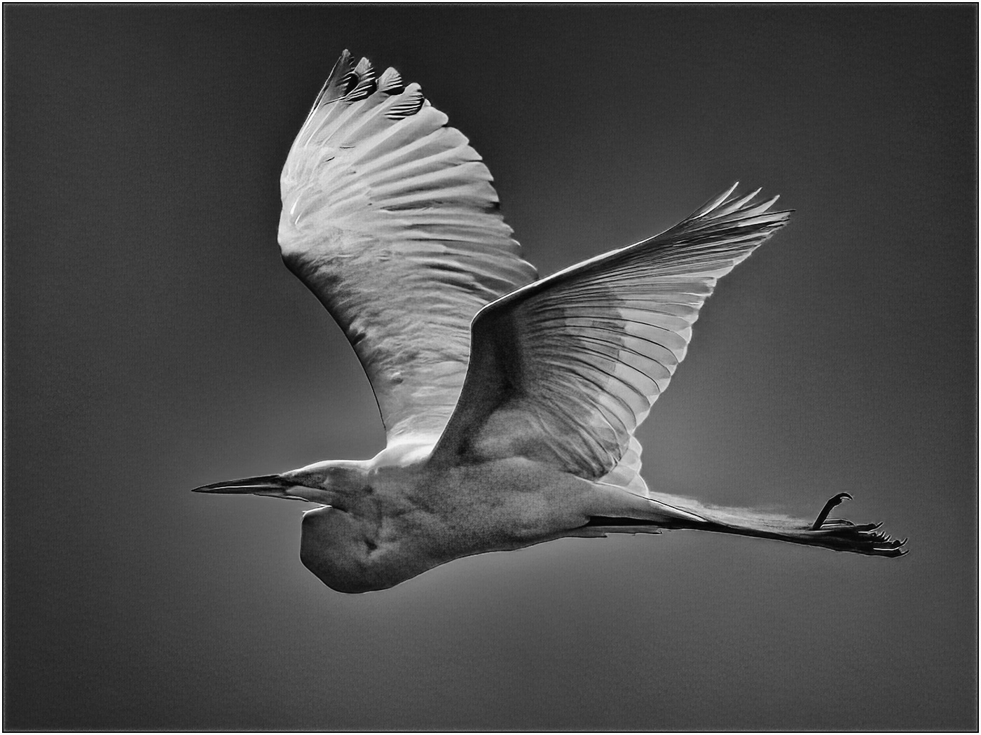
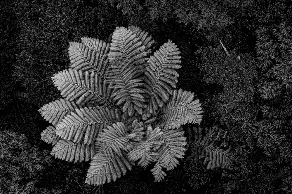
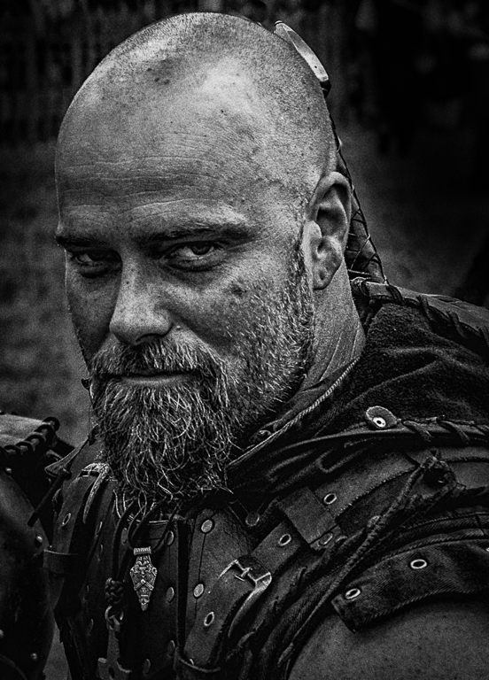
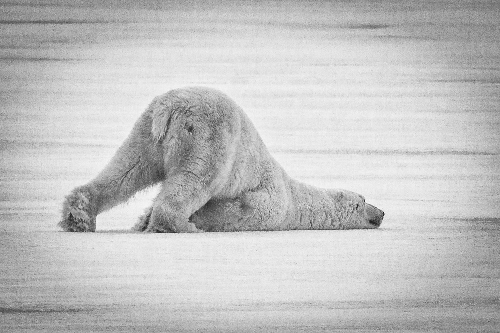
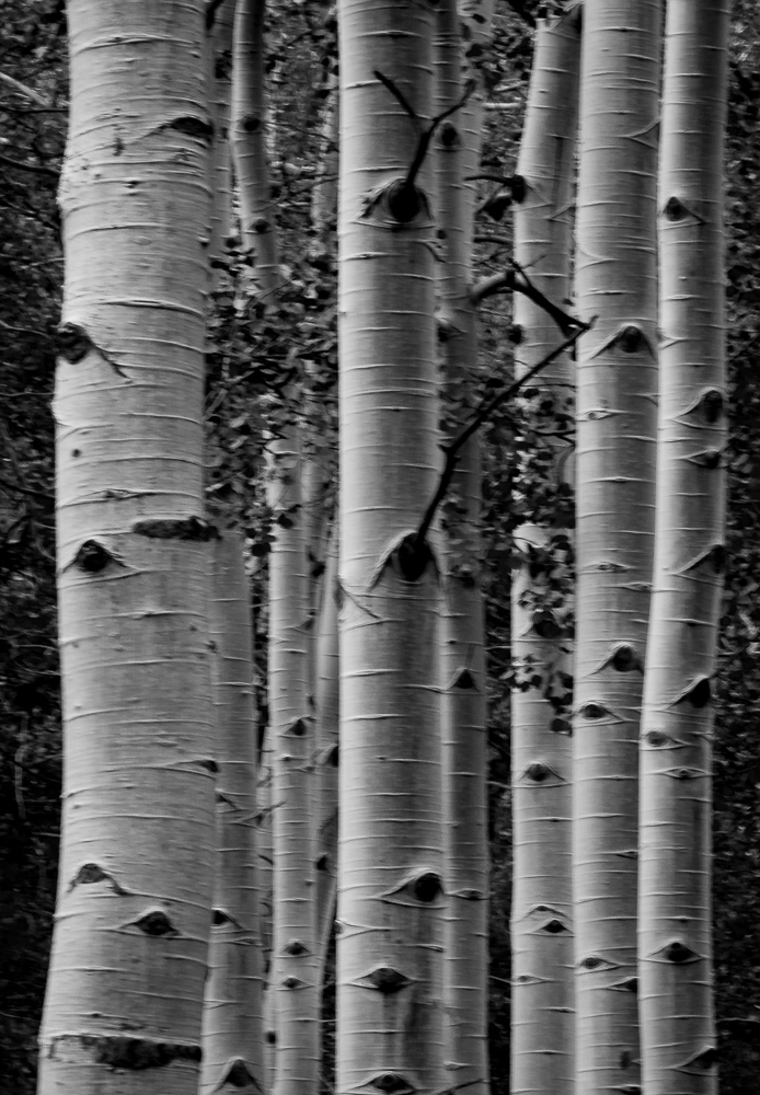
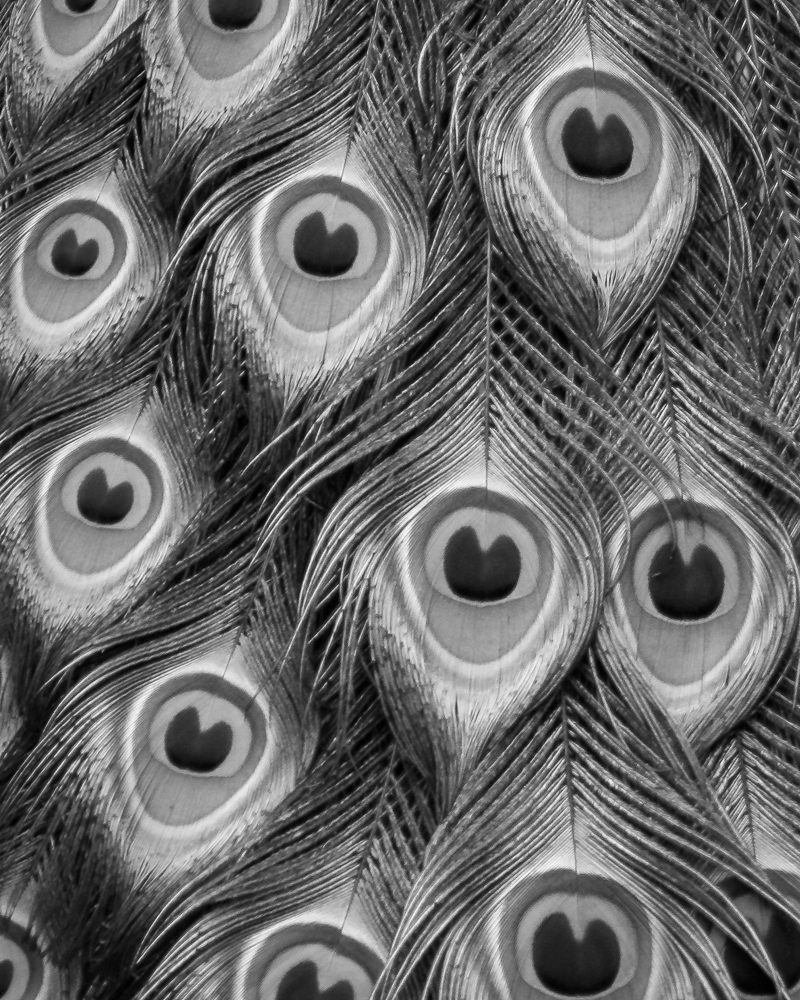
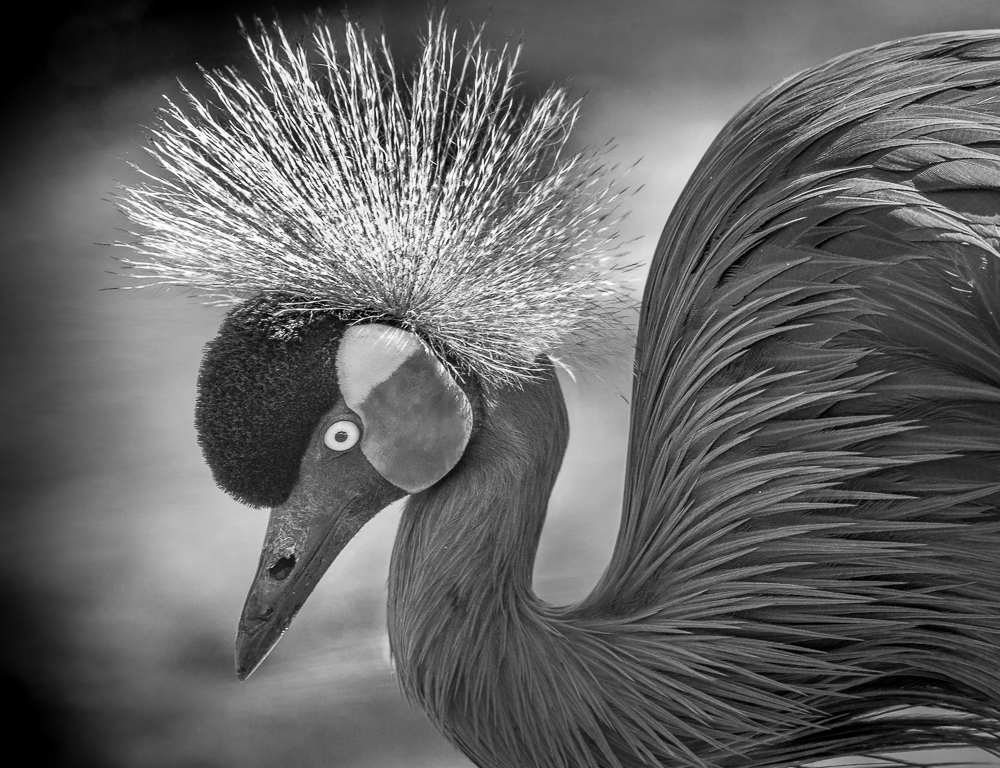
Excellent image, Jim. As others have stated, the monochrome adds to the image quality and impact. I really like the sharpness and detail.
|
Dec 30th |
| 11 |
Dec 19 |
Comment |
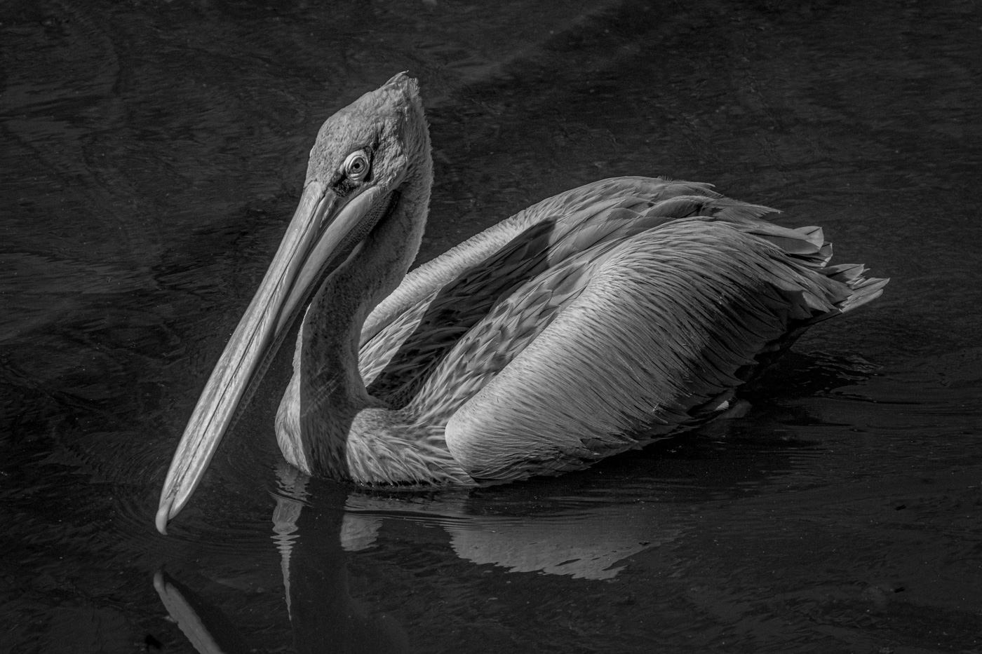
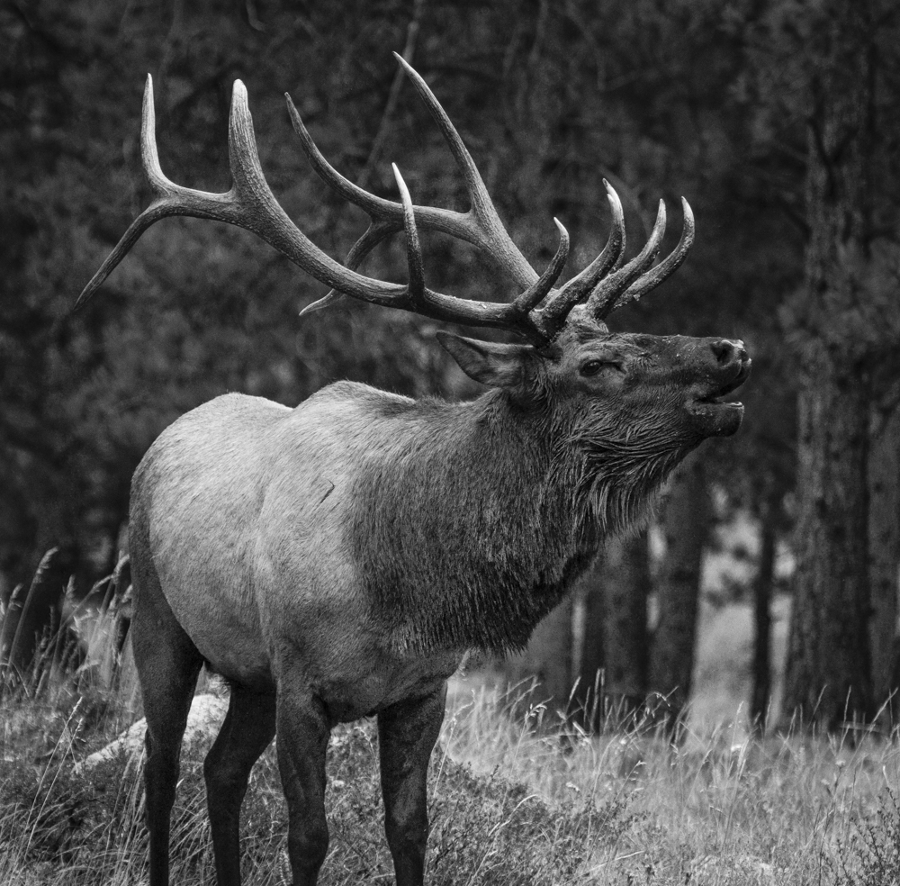
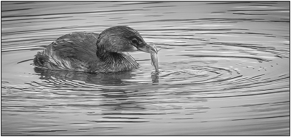
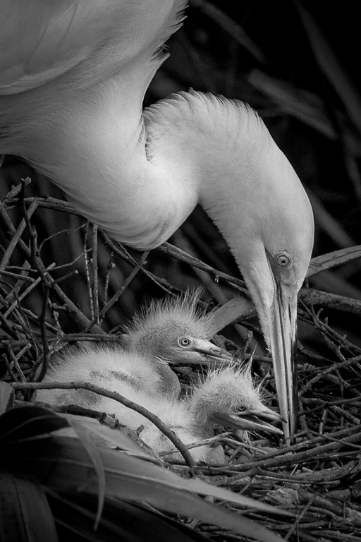
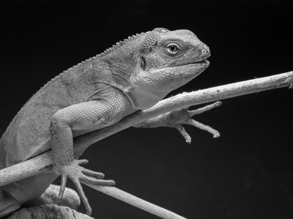
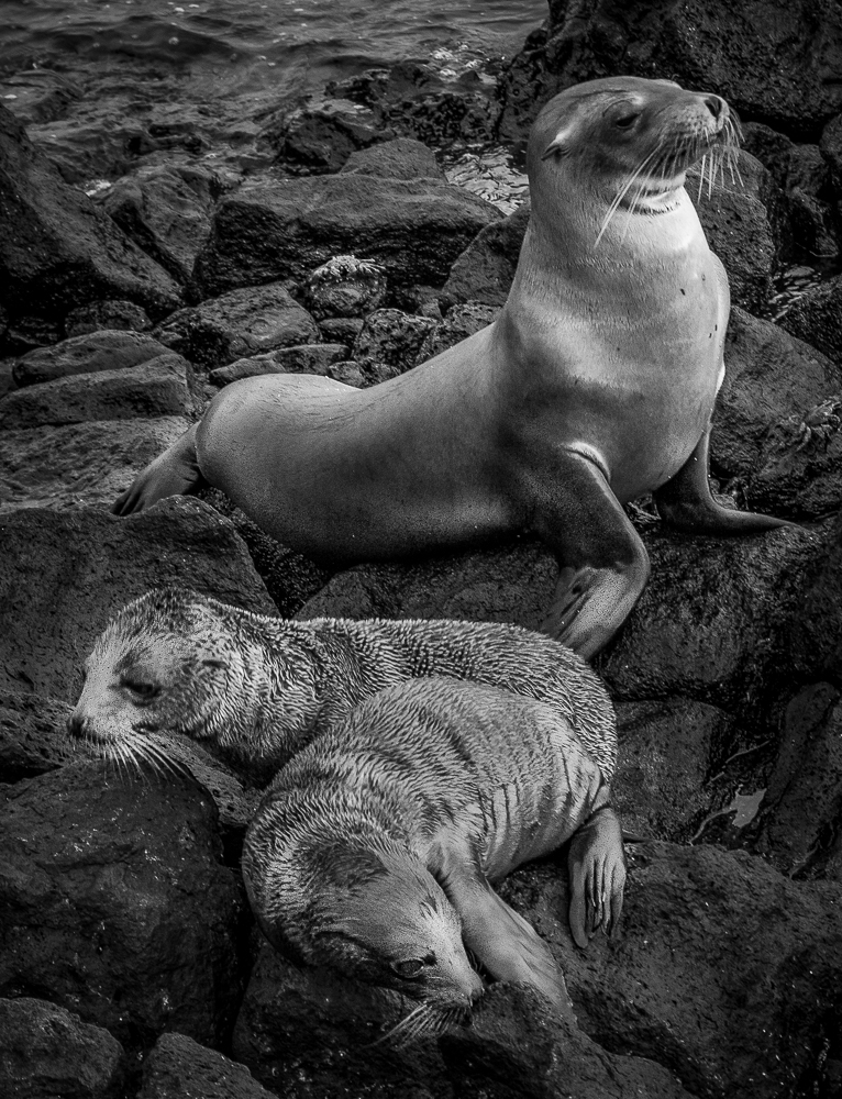
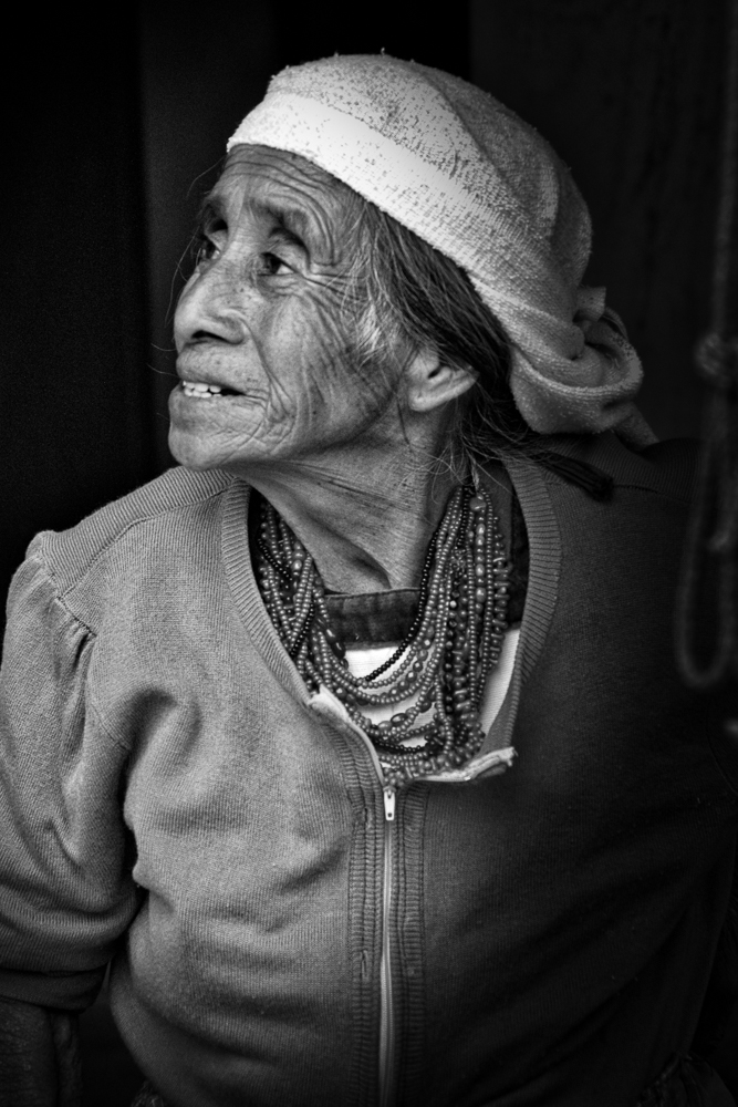
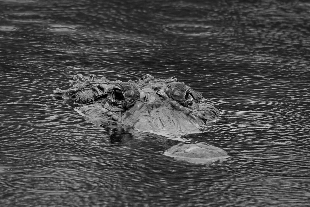
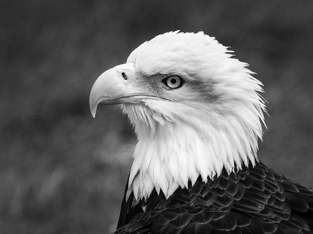
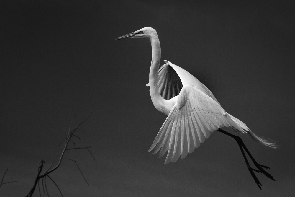
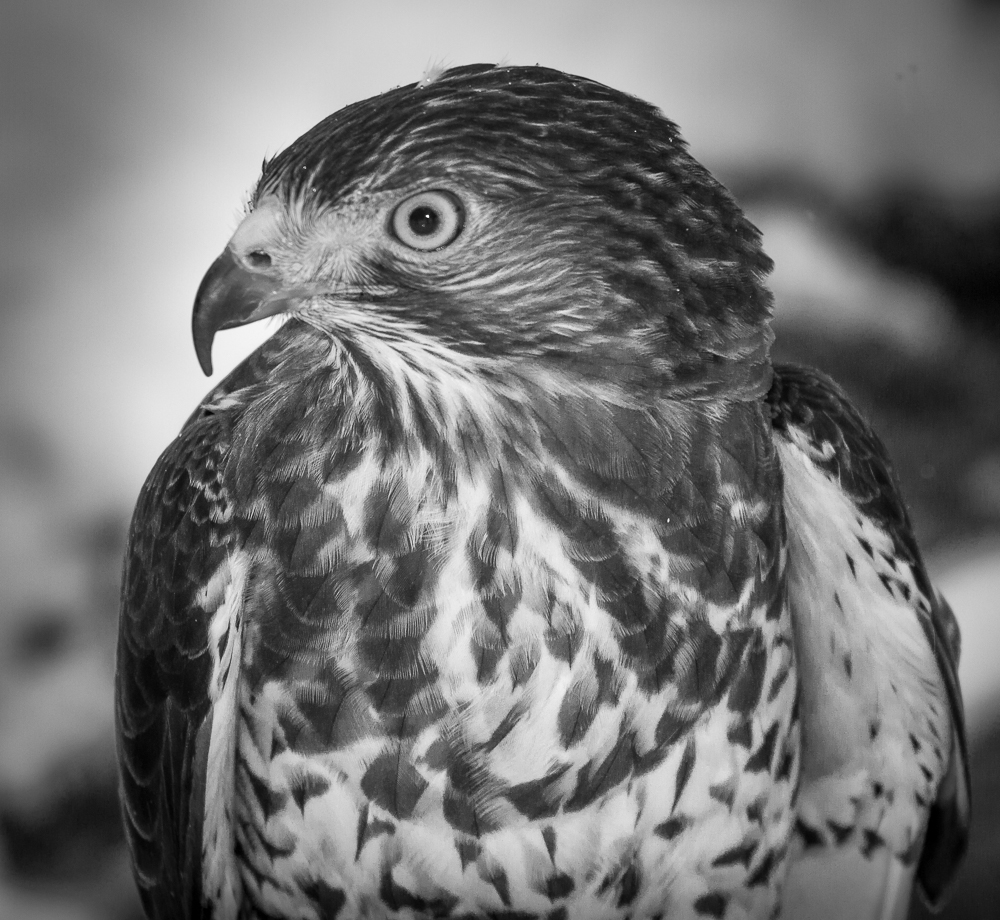
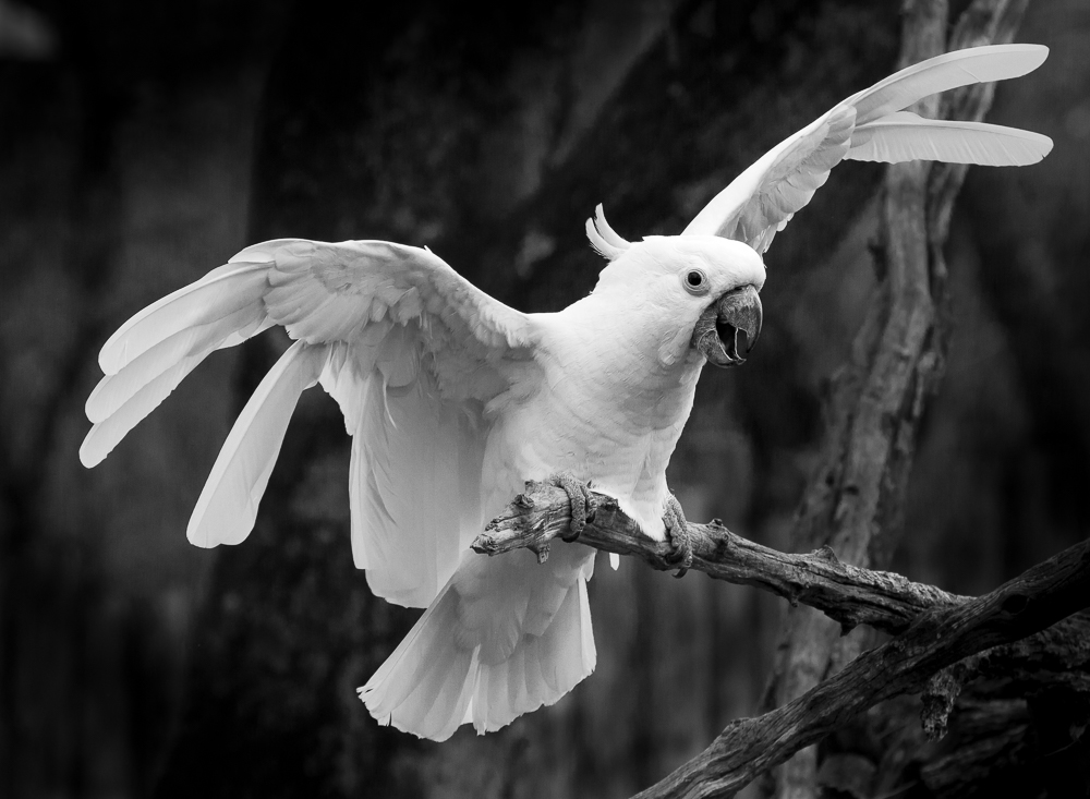
A most excellent image, Sharron. Like others, I prefer the wider crop and darker background as they increase the dramatic quality. Visually, I can live with either the tree background or the more even blended version. You captured wonderful detail in all of the feathers and eye, which translates well in a monochrome. Good work!
|
Dec 30th |
| 11 |
Dec 19 |
Comment |
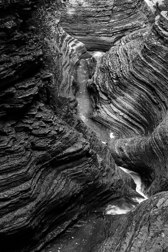
While I enjoy abstract images, Tom, the original image was too abstract to be recognizable, and too detailed to be what I consider a good abstract. I was very confused as to which way I should view it. Henry's rendition solved the ambiguity of it for me by providing more definition while still keeping the abstract quality.
|
Dec 30th |
| 11 |
Dec 19 |
Comment |
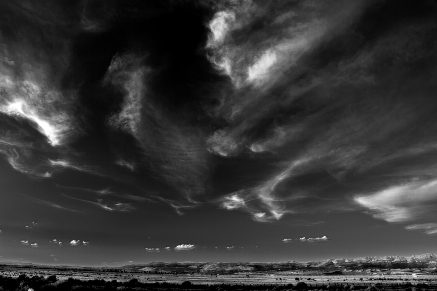
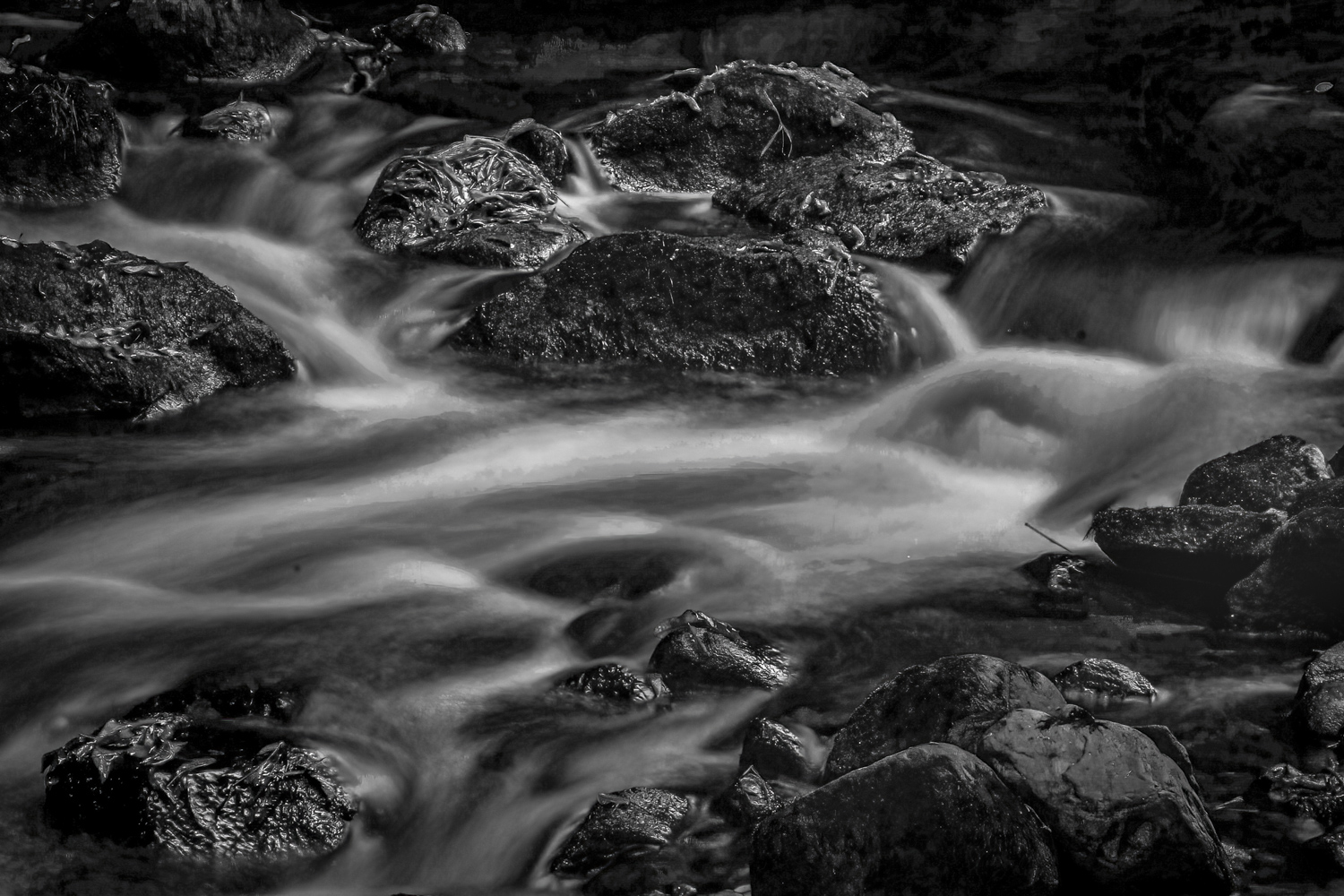
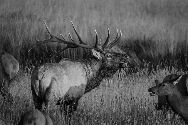
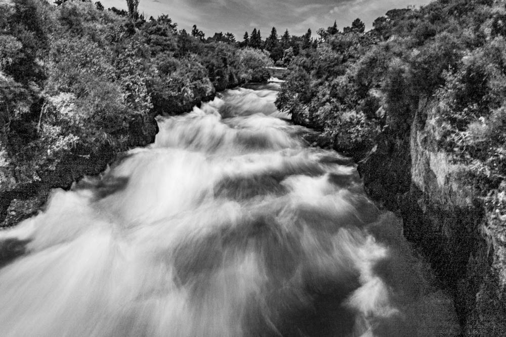
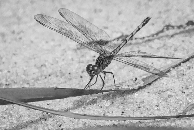
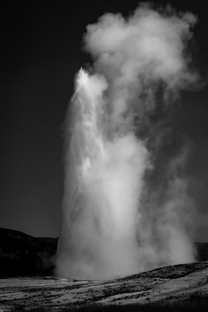
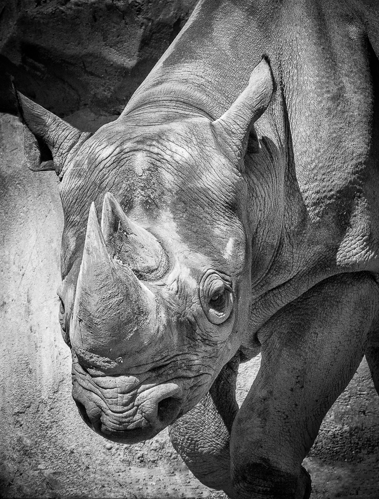
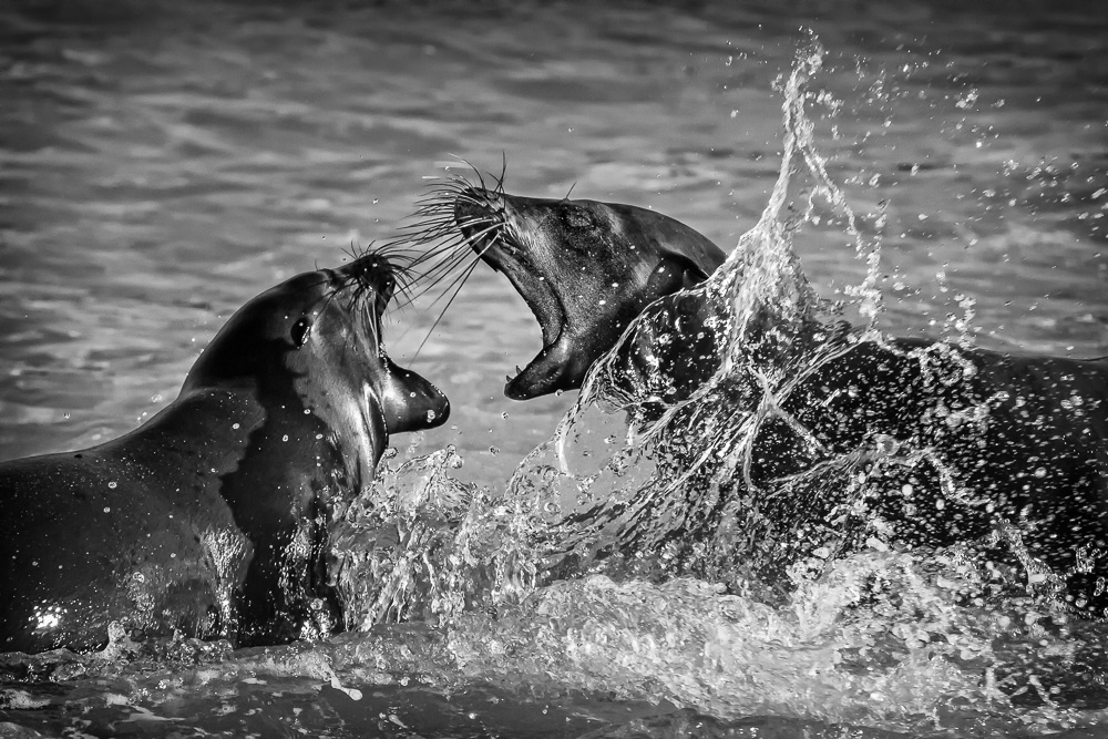
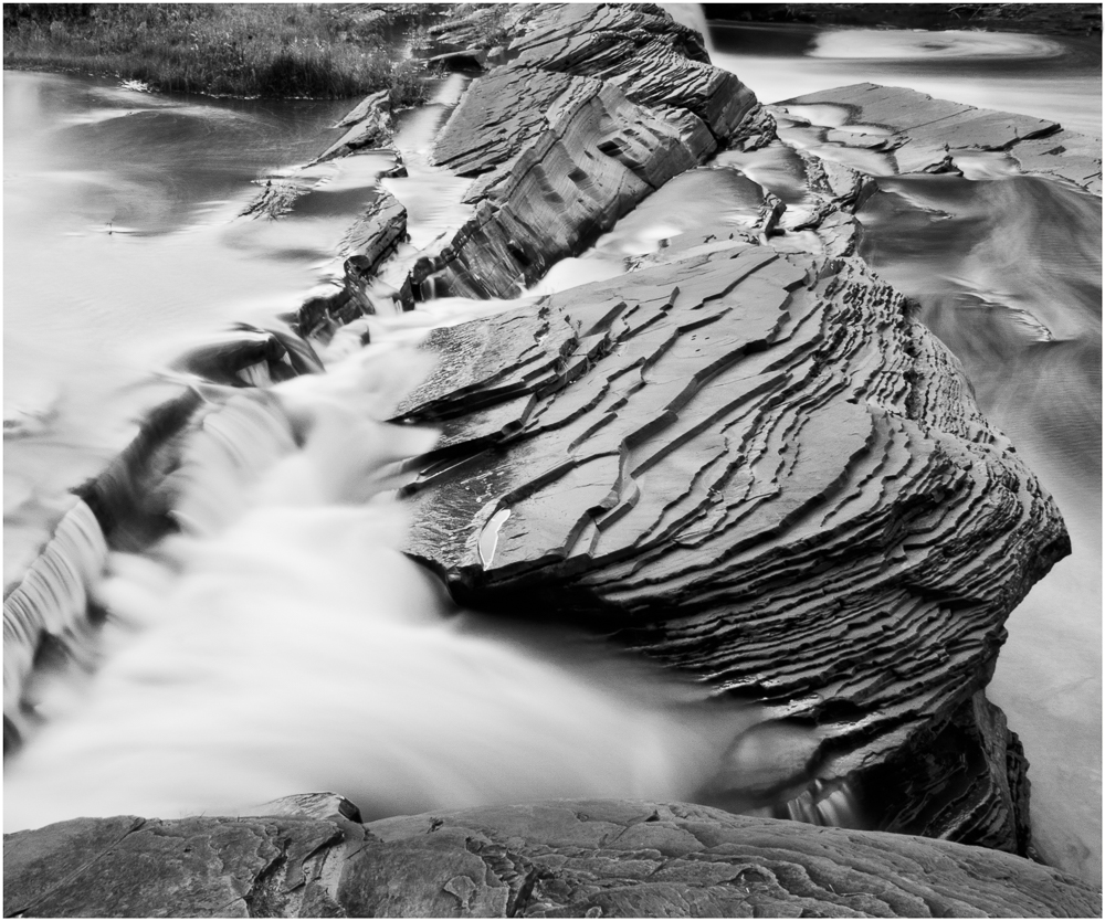
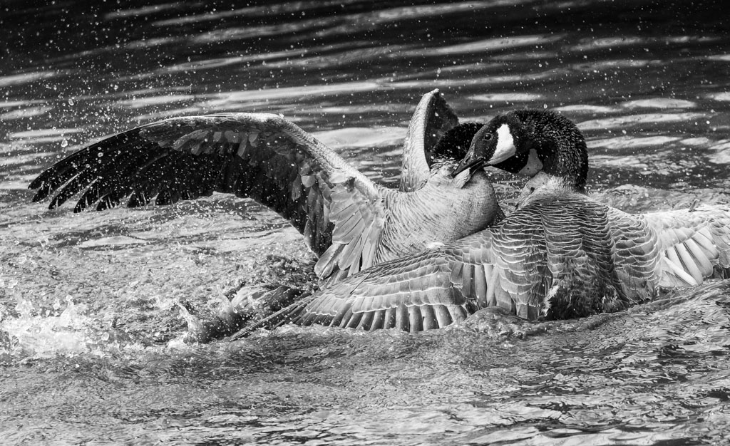
A very exciting image, Lisa and ideal for monochrome. I really like the action depicted, but I am a little concerned about the bright spot in the central area. I reworked the photo to diminish the exposure and add some contrast, while keeping the rest of the image intact.
|
Dec 29th |
 |
| 11 |
Dec 19 |
Comment |
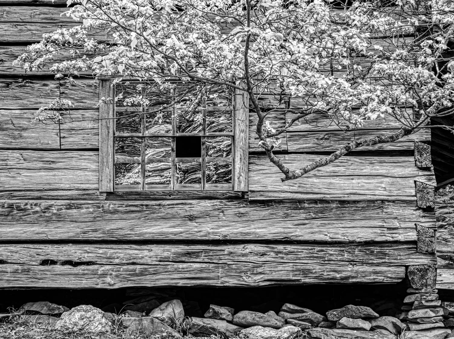
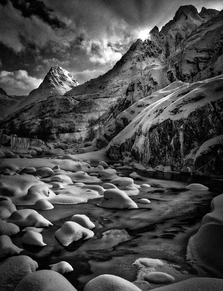
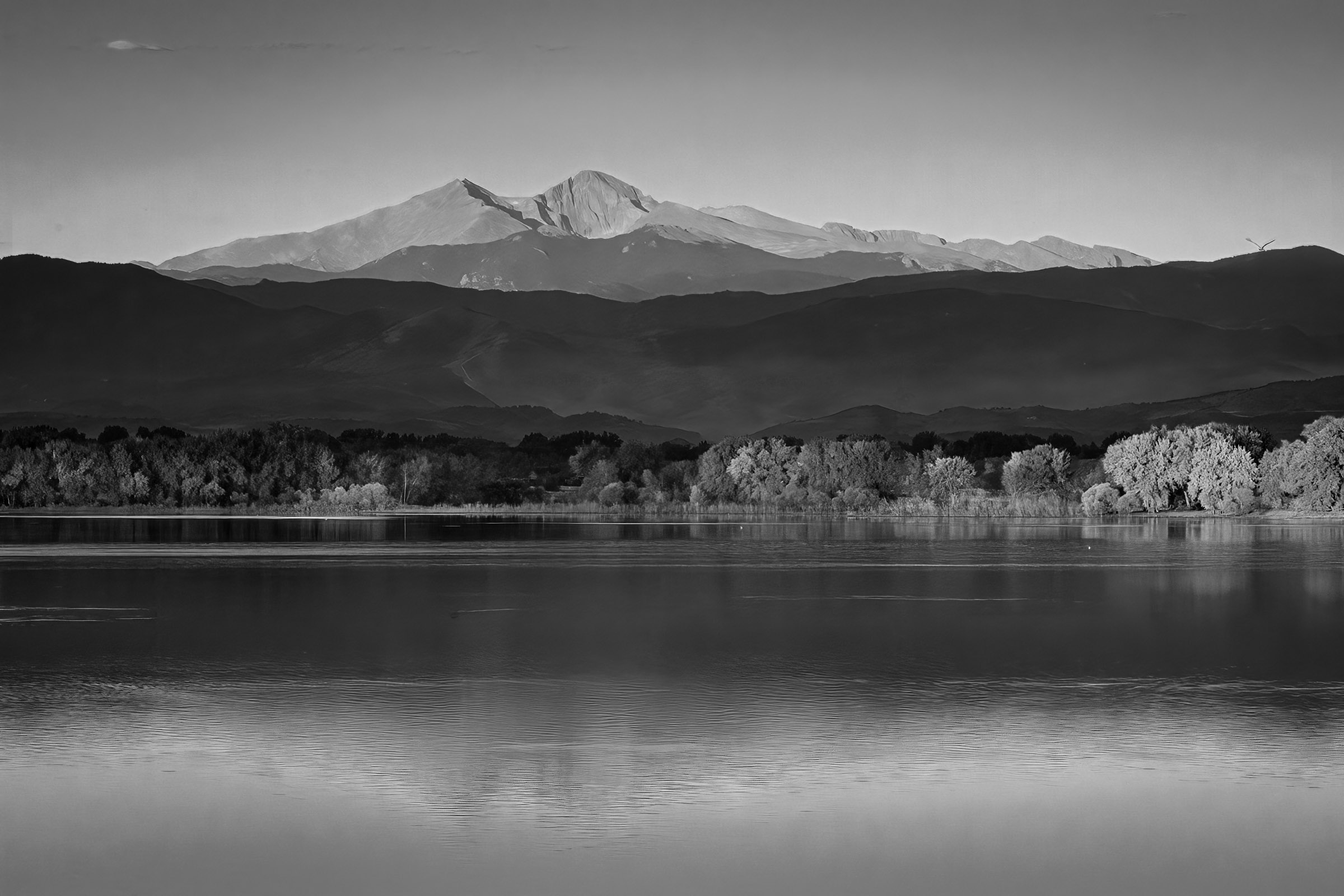
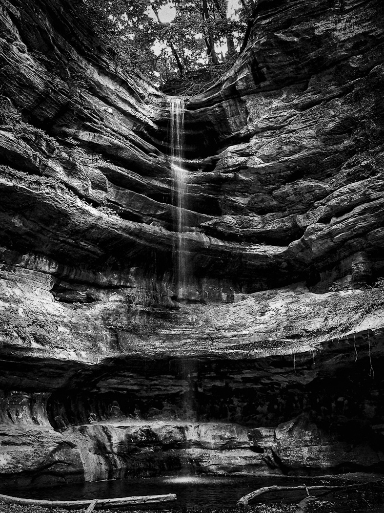
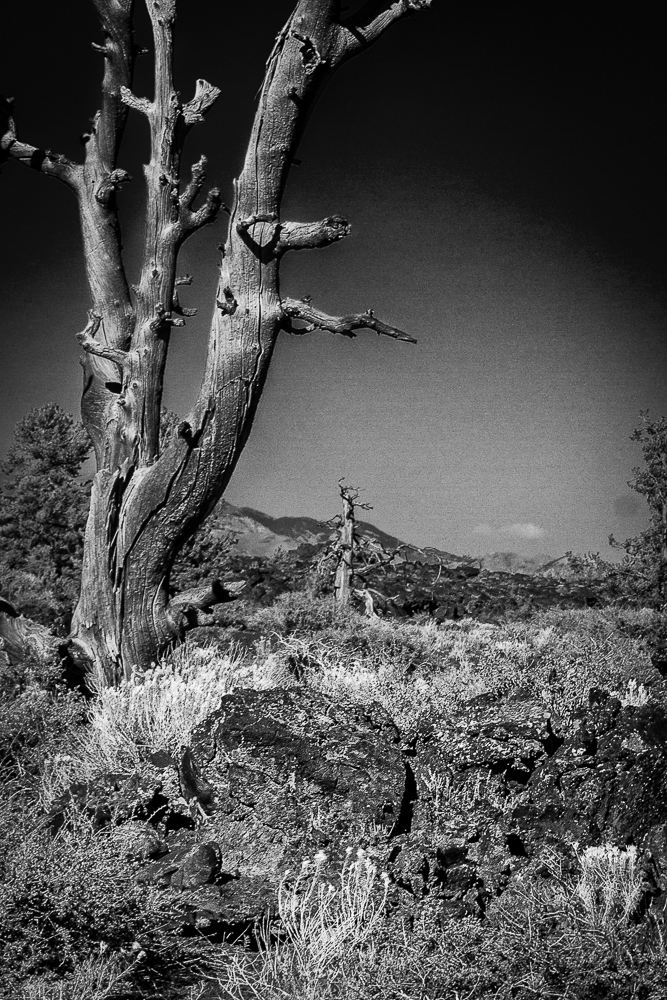
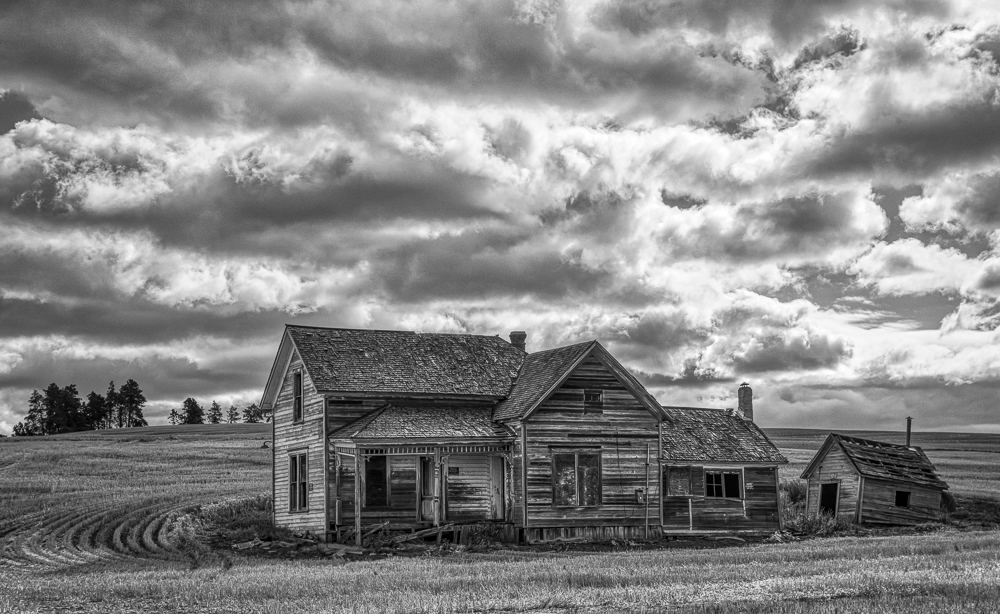
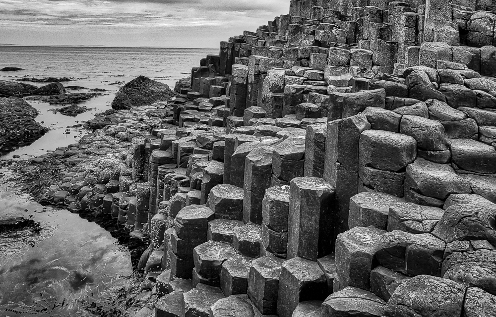
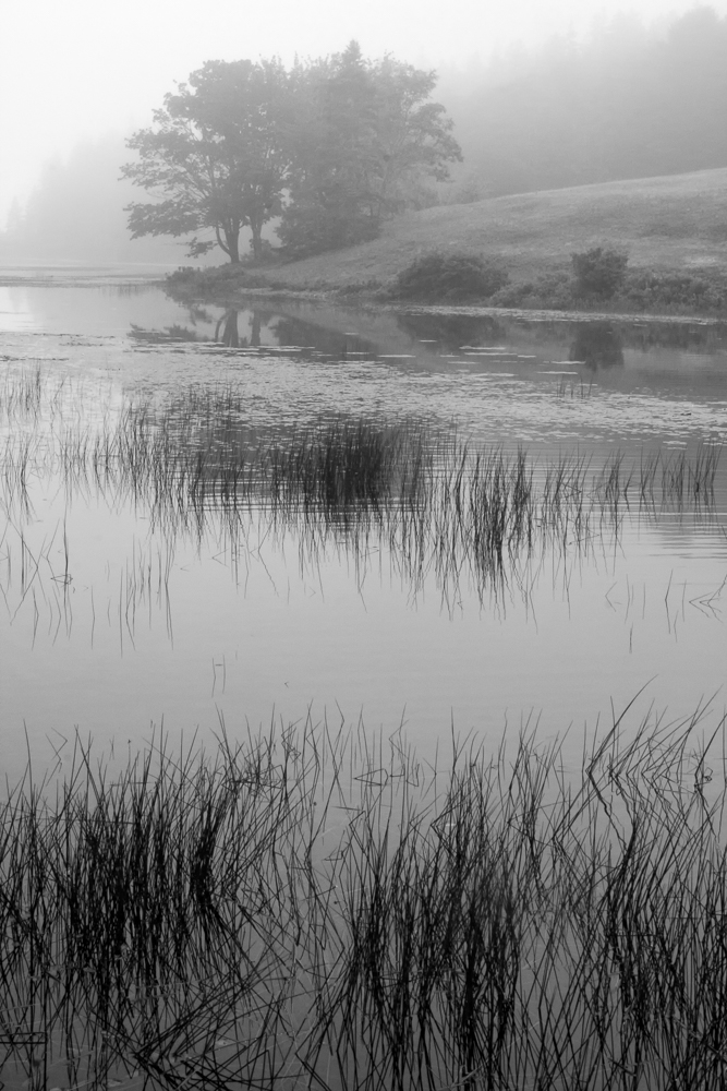
I prefer the Original 2 image, with the darker sky because of the increased drama (maybe, while not looking as natural) of the highlighted detail and wood texture. While I agree that there are several mini-scenes possible within the original image, I defer in providing yet another crop.
|
Dec 29th |
| 11 |
Dec 19 |
Reply |
Thanks, Jim. I will have to try more contrast next time.
|
Dec 18th |
| 11 |
Dec 19 |
Reply |
Amazing, Allen. I hardly noticed that there were two colors and now that you emphasized them, it it obvious. I have used that technique on other images to bring out different tones, but didn't realize that it would work so well on such similar colors. I will have to try it again.
|
Dec 18th |
| 11 |
Dec 19 |
Reply |
Thanks, Lisa.
|
Dec 18th |
| 11 |
Dec 19 |
Reply |
Thanks, Sharron. One of the benefits of the group is to find ways to improve your images.
|
Dec 18th |
| 11 |
Dec 19 |
Reply |
Thanks, Tom. I really like the way that you add the definition with the dodge and burn. I did a little of that, but obviously did not go far enough to make a difference. I appreciate your skills.
|
Dec 18th |
| 11 |
Dec 19 |
Reply |
Thanks, Henry. I didn't realize that the small branch was there. I agree that it is better without it. It is an easy crop to remove. I appreciate your observation.
|
Dec 18th |
| 11 |
Dec 19 |
Reply |
Thanks, Beverly. I think I prefer the mono version also.
Sorry, no (known) relationship to Evelyn.
|
Dec 5th |
5 comments - 8 replies for Group 11
|
5 comments - 8 replies Total
|