|
| Group |
Round |
C/R |
Comment |
Date |
Image |
| 11 |
Oct 19 |
Reply |
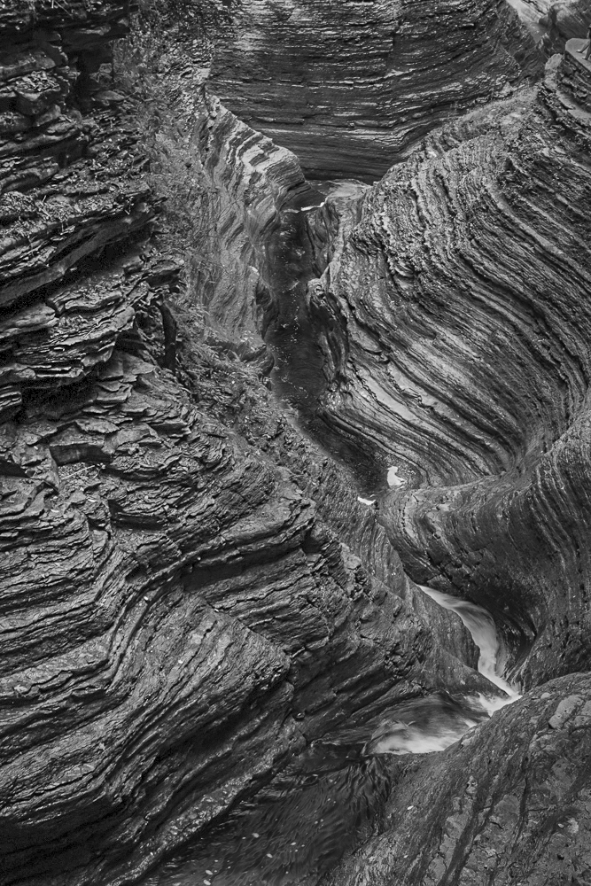
I was trying to add something to differentiate the two sides and make sure the 'water' was noticeable. Other suggestions?
|
Oct 21st |
| 11 |
Oct 19 |
Comment |
As others have commented, the bright contrast of the spots on the leaves is too prevalent in the image. I like the darker leaves, but somehow reducing the bright spots would benefit the overall picture. It might be a good use of a luminosity mask after blocking out the flower.
|
Oct 20th |
| 11 |
Oct 19 |
Comment |
Excellent milky way image, but the real story is your inspiration to use the flashlight and husband model. (Note that I could have said 'model husband' but that might have resulted in inflated ego syndrome). The color image is outstanding, but the B&W is fine also. No suggestions to improve either image.
|
Oct 20th |
| 11 |
Oct 19 |
Comment |
Excellent composition, Jim. The centering of the viewer's focus and the converging leading lines make a great photo. To me, the diminished green contrast only increases the effect of the bright horizontal lines convergence.
|
Oct 20th |
| 11 |
Oct 19 |
Reply |
Thanks, Jim. Yes the color version is greatly improved by the lightening of the left side as you have demonstrated. In your opinion, is that technique equally effective for the B&W version?
Using Jim's color image as a guide, I made a B&W copy and darkened the flowing water to provide separation between the two banks. Your thoughts?
|
Oct 20th |
 |
| 11 |
Oct 19 |
Reply |
Thanks, Tom. It is a tricky image for me as I really struggle with with the effective lighting to show the best structure and definition. This shot is also somewhat confusing to the viewer as they are not sure what they are looking at.
|
Oct 20th |
| 11 |
Oct 19 |
Reply |
That's what I get when rushing - - partial results! |
Oct 20th |
| 11 |
Oct 19 |
Comment |
I like the crop that you performed as it focuses the attention on the rider than the horse. For a wow factor, the dramatic color of the tree is difficult to beat, especially with a white horse. You did an excellent job on converting a difficult image to monochrome, and the red filter did a good job with the leaves. The Æ’/4 setting blurred the background enough to visually separate the rider/horse. I am pleased that you didn't crop it any tighter as you would have lost some of the environmental factor and the necessary room for the horse to move toward. Good image!
|
Oct 15th |
4 comments - 4 replies for Group 11
|
4 comments - 4 replies Total
|