|
| Group |
Round |
C/R |
Comment |
Date |
Image |
| 11 |
Jul 19 |
Reply |
Good point! Thanks Tom.
|
Jul 26th |
| 11 |
Jul 19 |
Comment |
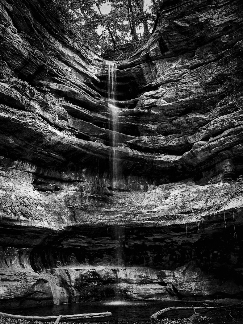
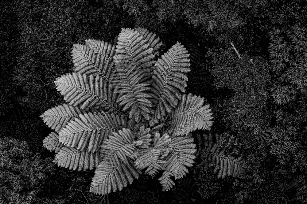
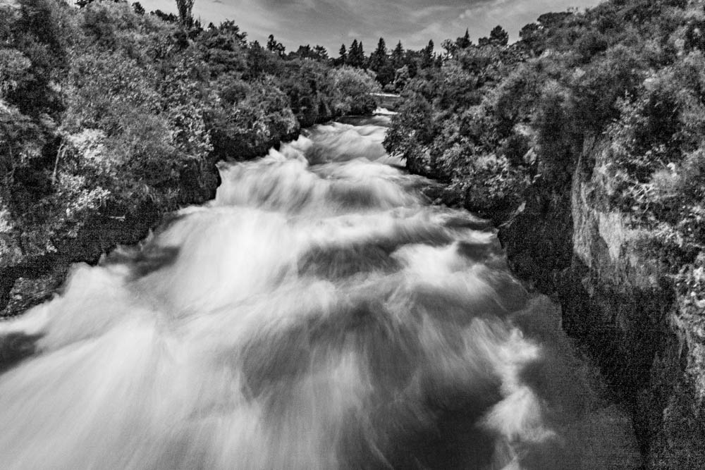
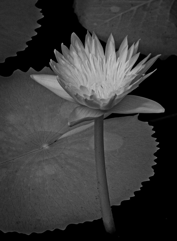
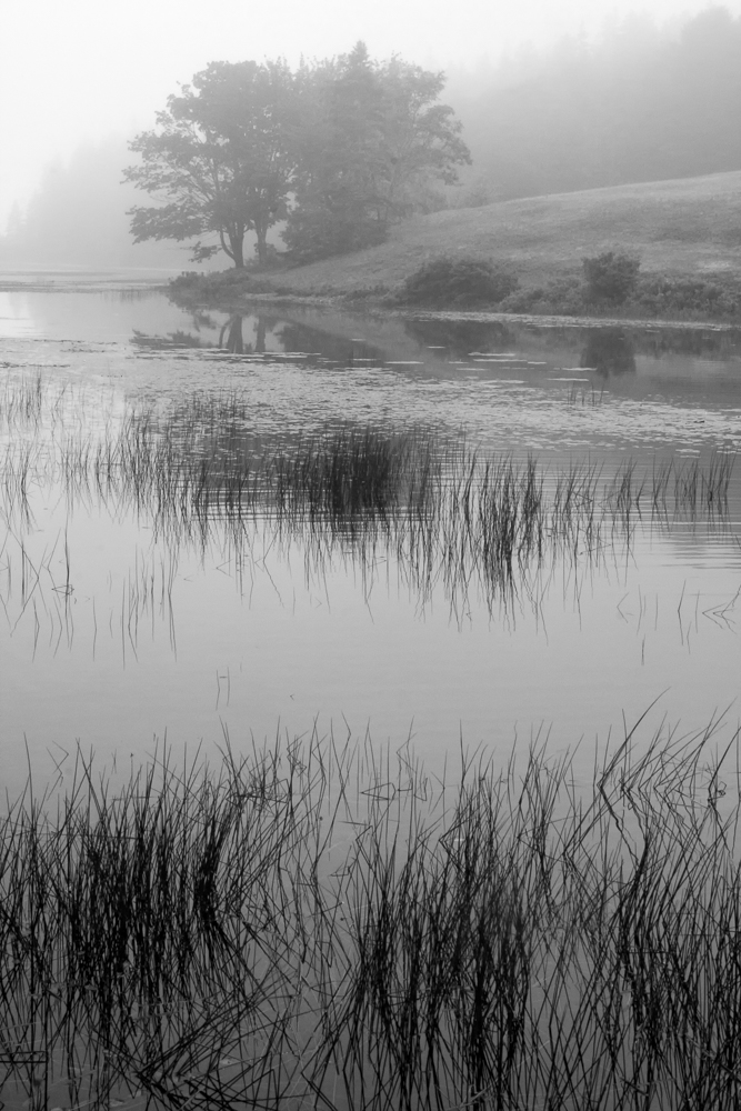
Like several others, Jyoti, it took me a moment to determine what I was looking at. To me, Allen's crop and brightening the waterfalls removes the confusion, still maintains the basic concept and subject of the image.
|
Jul 26th |
| 11 |
Jul 19 |
Reply |
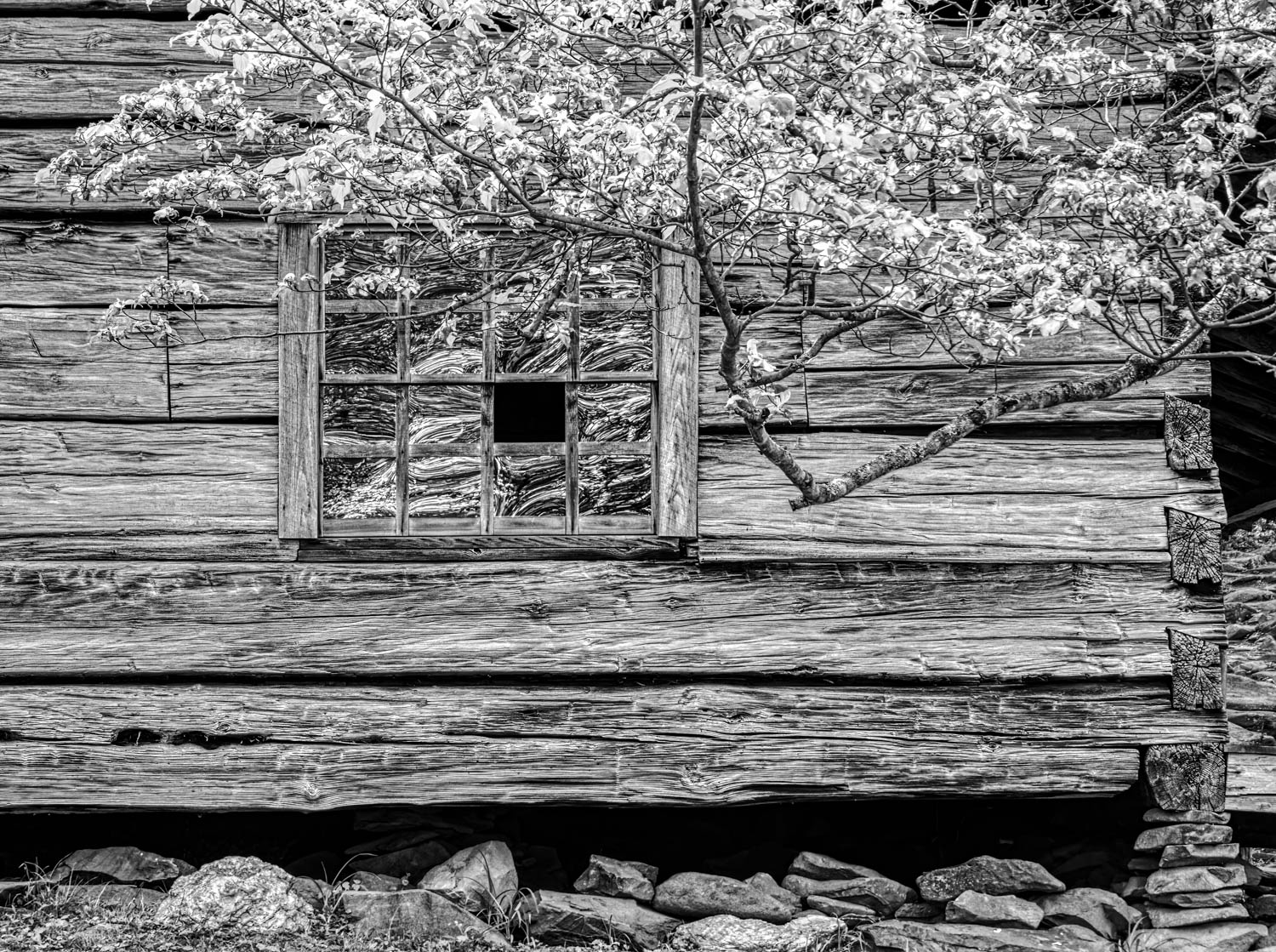
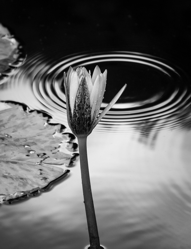
Thanks, Allen. I darkened it leaf to gain more detail in the leaves. How do you decide the best balance between the elements?
|
Jul 26th |
| 11 |
Jul 19 |
Reply |
Thanks, Tom. Do you find the partial leaf on the bottom of the frame distracting? I thought the left top leaf was too small and thus had a wider crop to give breathing room to the blossom and the top leaf. Your thoughts?
|
Jul 26th |
| 11 |
Jul 19 |
Reply |
Thanks, Jyoti. I agree that it needs less brightness and more contrast.
|
Jul 26th |
| 11 |
Jul 19 |
Comment |
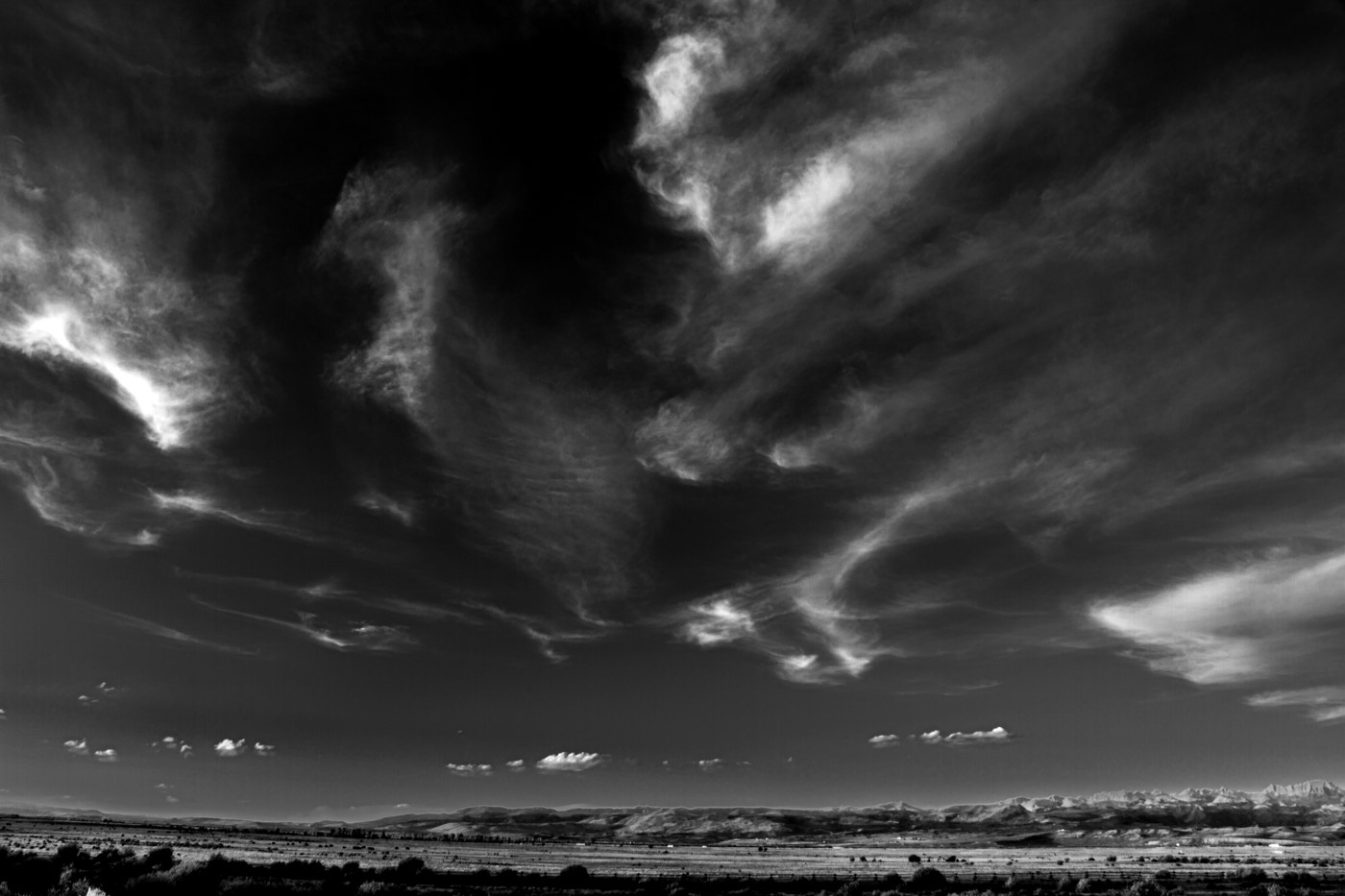
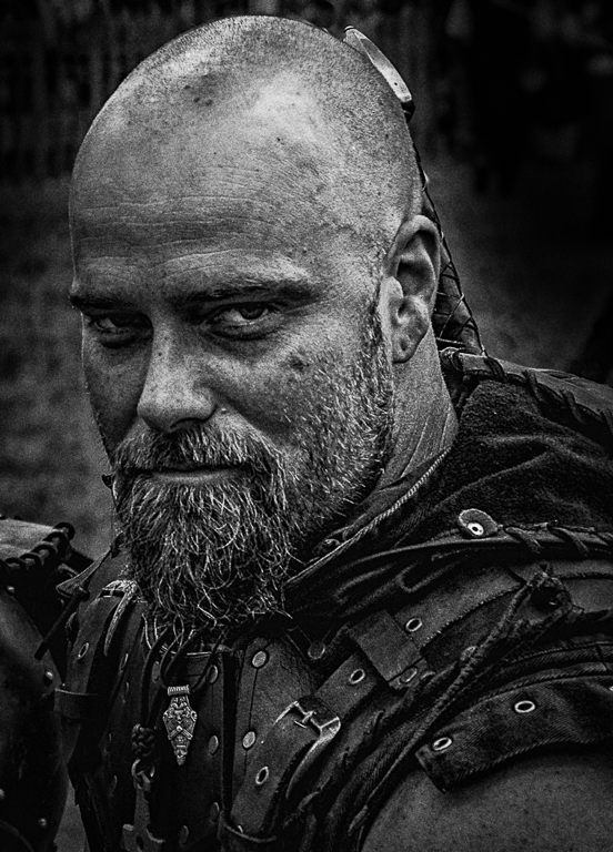
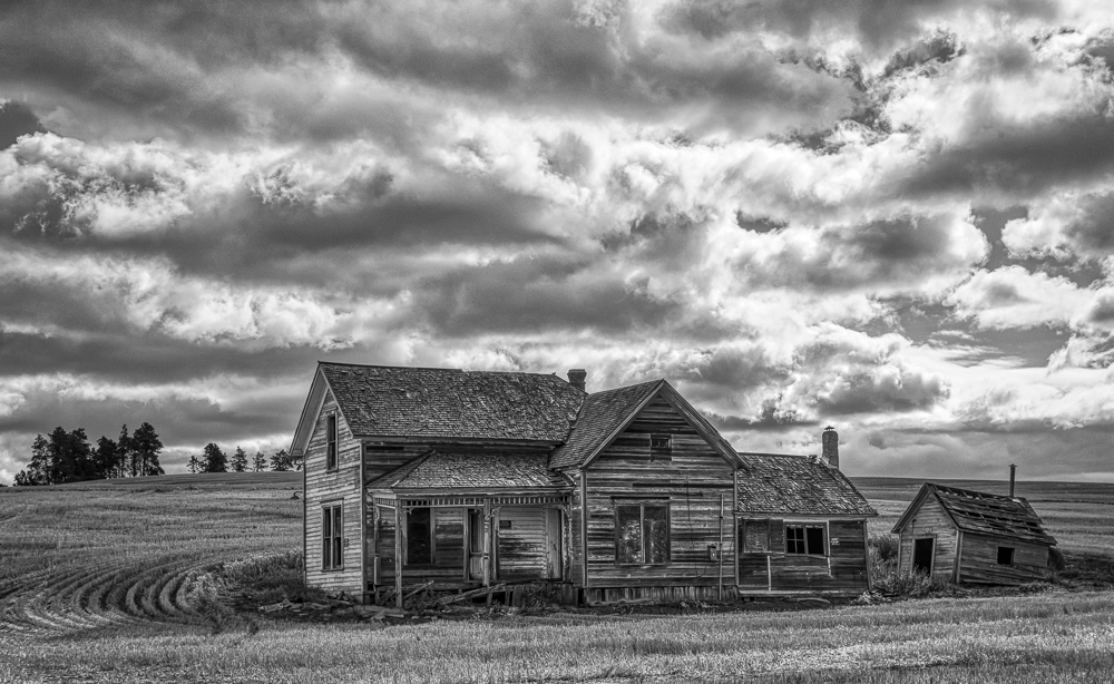
Excellent composition and choice of processing with darker sky. It makes for a sharp image with loads of detail. I like the cloning out the gate as I was a distraction and you don't want to crop out the tall tree on the right edge. Well done.
|
Jul 26th |
| 11 |
Jul 19 |
Comment |
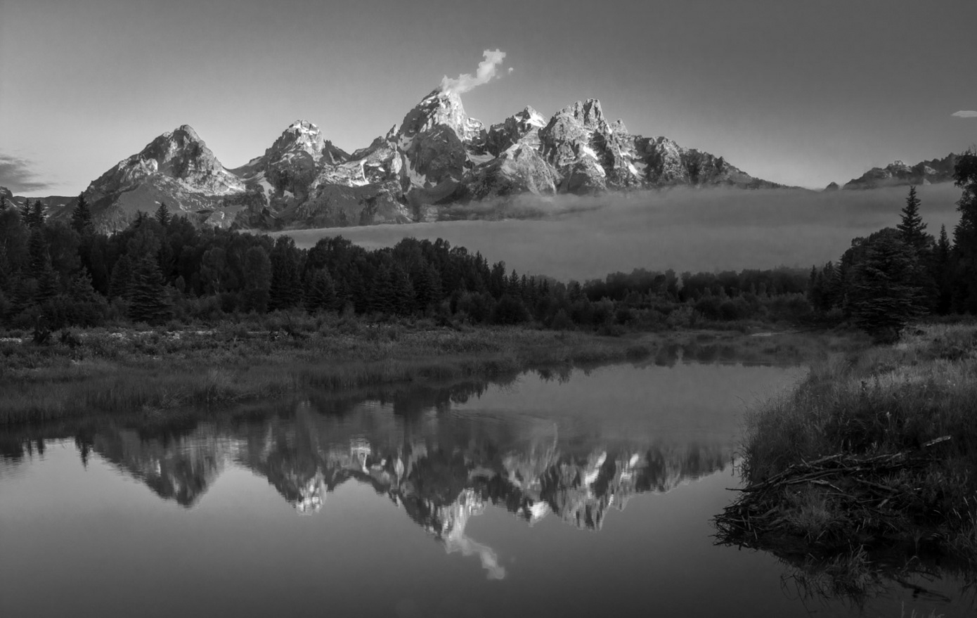
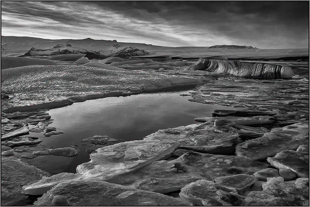
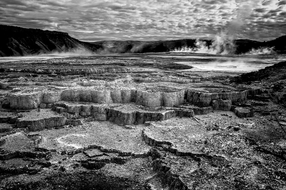
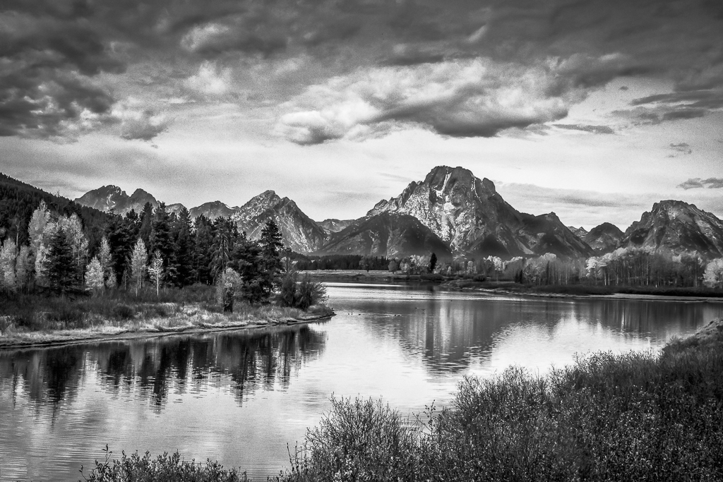
Your images have so many different moods. While I like the color version, the mono version has such striking detail and contrast. Jim's improvement of original 2 is striking as a landscape, but Tom's cropped version is my favorite. It is easy to see why it is so popular a location. I accepted your challenge to see other photographs and you are right - - - there are 5000 different moods, lightings, seasons and methods to photograph this scene. I like your choice of composition of the many available. [BTW, we be going to New Zealand in January for 2 weeks, but will probably miss it. Maybe I can convince the tour guide to take a side trip when we are in Queenstown ;-) ]
|
Jul 26th |
| 11 |
Jul 19 |
Comment |
I think the image turned out exactly how you thought it would! Another perfect image from Tom.
|
Jul 26th |
| 11 |
Jul 19 |
Comment |
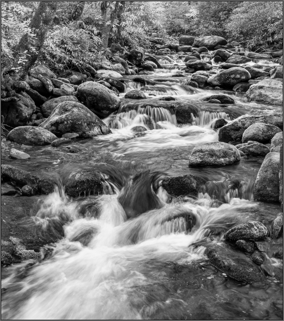
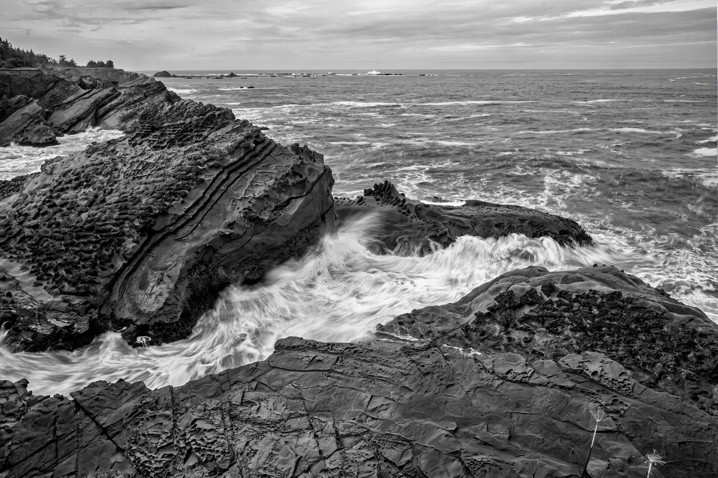
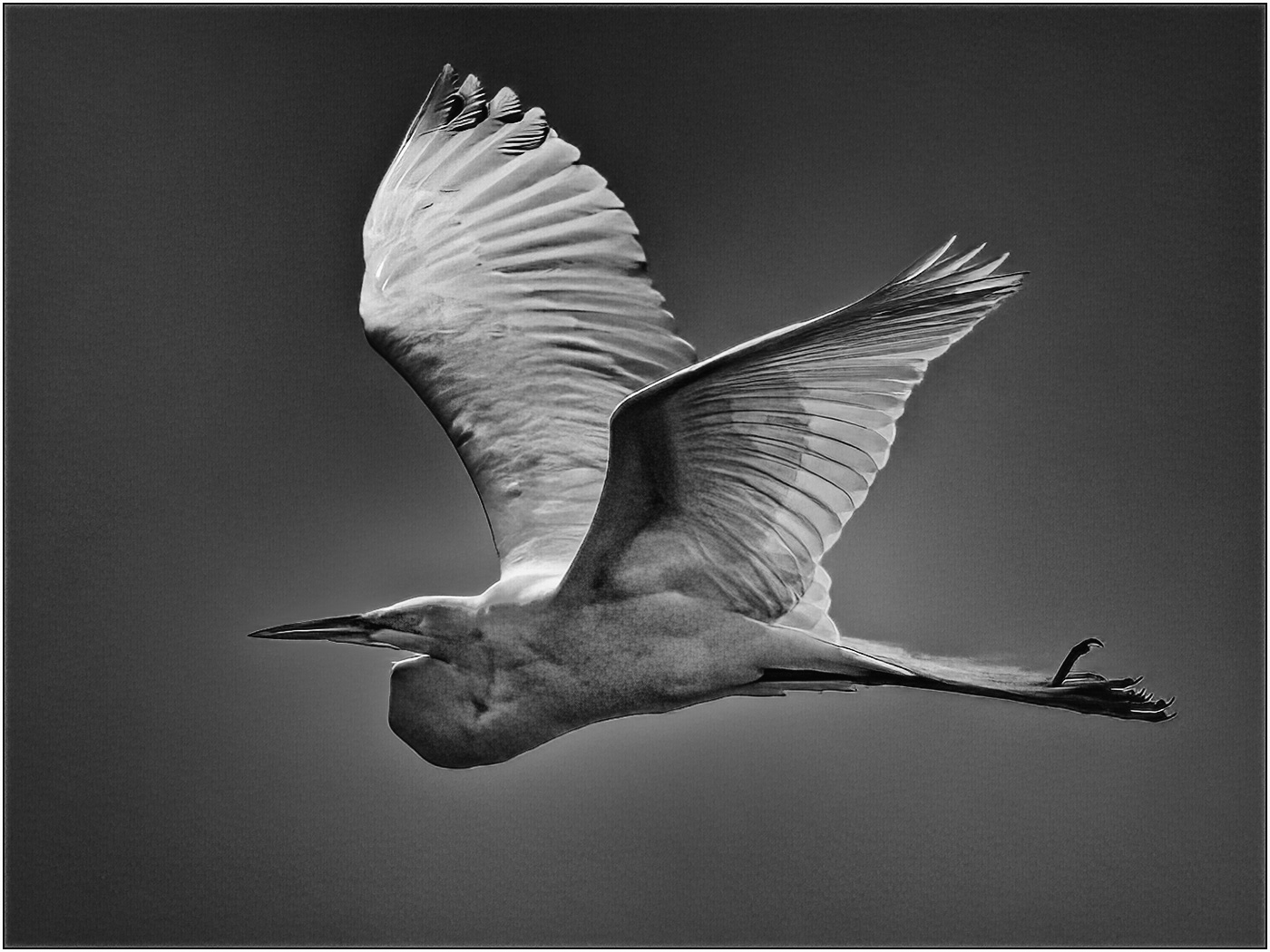
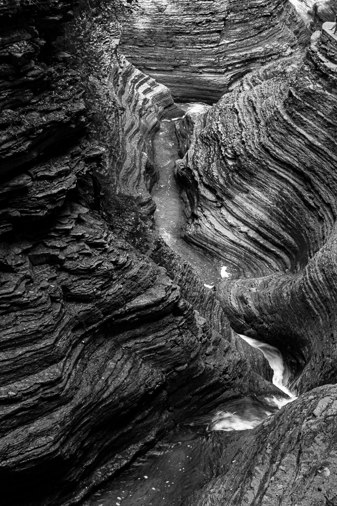
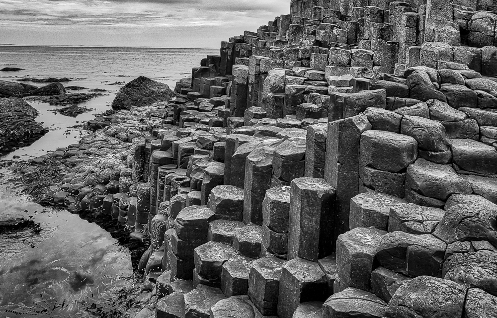
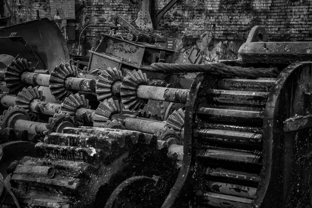
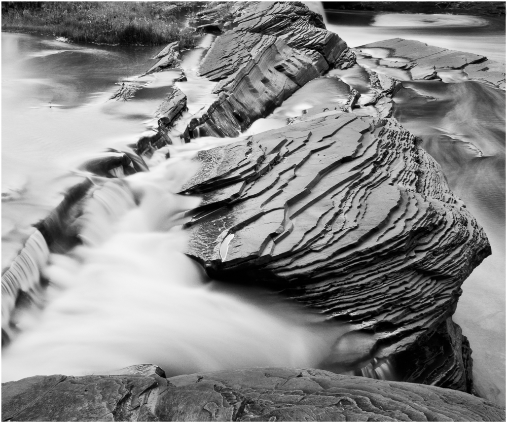
Excellent save of an undistinguished image. I like the convergence of the different leading lines to the bright rock at the center which demands the viewer's attention. Well done composition.
|
Jul 26th |
| 11 |
Jul 19 |
Comment |
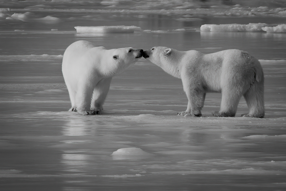
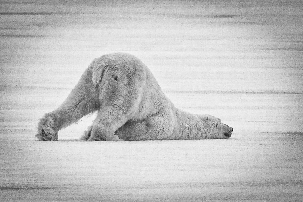
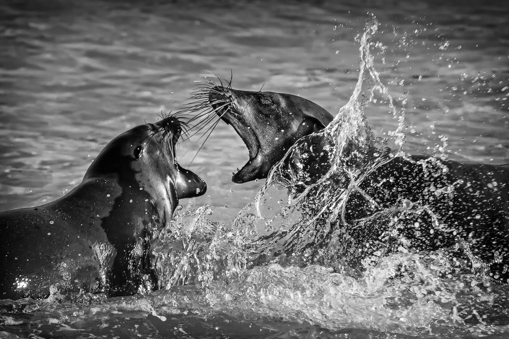
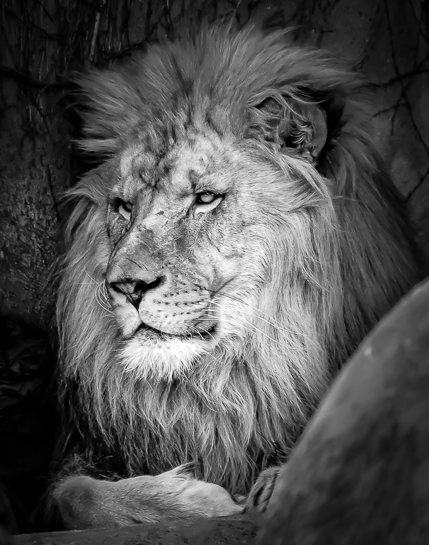
Great composition and perspective, Allen. I think the mono version is more striking than the color. I like Jim's edit with no trees and his interpretation with the brighter horses and burning the area near the crowd on the left edge to provide more contrast with the horses, the main subject.
A fun photo.
|
Jul 26th |
| 11 |
Jul 19 |
Reply |
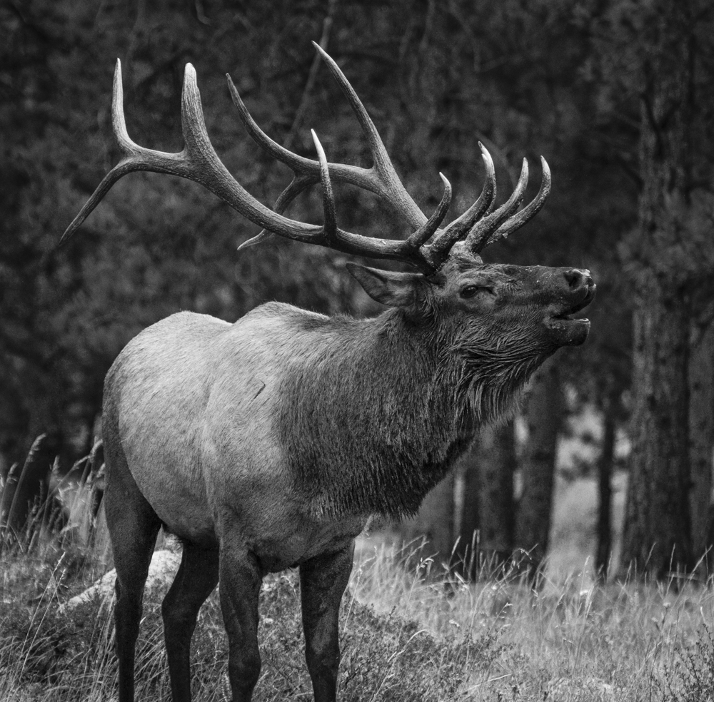
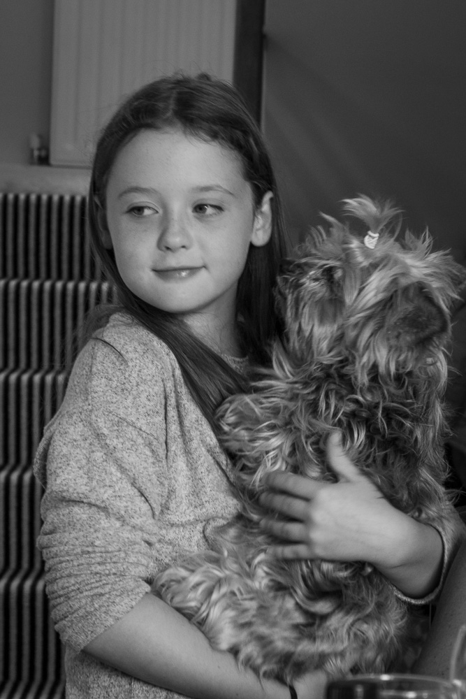
Thanks, Jim. I am always in a quandary on how bright/dark exposure or higher/lower contrast to create an ideal image. I had that problem with this image and decided to keep the contrast medium and exposure lower to preserve the detail in the blossom.
|
Jul 8th |
6 comments - 5 replies for Group 11
|
6 comments - 5 replies Total
|