|
| Group |
Round |
C/R |
Comment |
Date |
Image |
| 11 |
Dec 18 |
Reply |
Thanks, Tom. That's not Spooky . . . its downright SCARY!!
|
Dec 16th |
| 11 |
Dec 18 |
Reply |
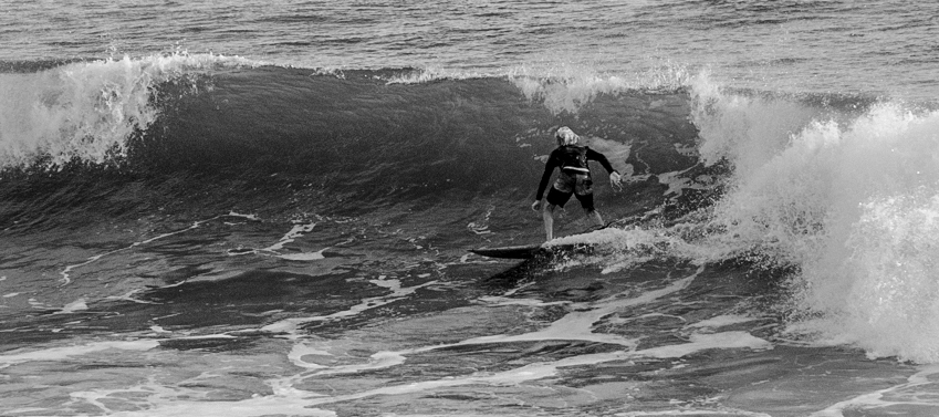
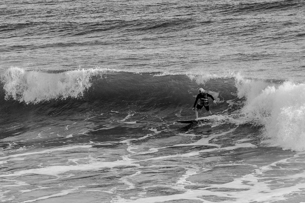
If the main subject is the surfer, I would tend to crop the image differently to emphasis the surfer as shown here: |
Dec 9th |
 |
| 11 |
Dec 18 |
Comment |
While a color version might have a different color to emphasize the surfer relative to the background water, I think that special techniques need to be employed to emphasize the surfer in mono, as the tonal range of the surfer is too similar to the dark waves. Also, the whites are tough as some are in the shadows and other areas in bright sunlight. I would re-balance the blacks and whites, decrease contrast and selectively sharpen the surfer more as shown here. |
Dec 9th |
 |
| 11 |
Dec 18 |
Comment |
It would have been all too easy to make this a mono only image. I like your creative viewpoint of including the spot color of the window. An easy, but often overlooked, detail that raises it to the next level.
Good image, Jim.
|
Dec 9th |
| 11 |
Dec 18 |
Comment |
Good image, Sharon.
I think your totally black background to hide the grass is appropriate for the subject and the highlighting that you did to hair was a nice finishing touch. Also you did NOT over-sharpen the hair, which is a common fault with many photographers and images. I like it.
|
Dec 9th |
| 11 |
Dec 18 |
Comment |
I think the brightening, isolation and sharpening of the sunflower 'raises-it-off-the page' and is only amplified with the new replacement soft sky background. With all of those improvements, the mono version, to me, does not even compare with the original. The fly at the 2 o'clock position, while noticeable in the original, is highlighted as a compelling feature in the mono version. The only suggestion for improvement would be to brighten or darken portions of the leaves and stem to make them more visually contiguous. |
Dec 9th |
4 comments - 2 replies for Group 11
|
4 comments - 2 replies Total
|