|
| Group |
Round |
C/R |
Comment |
Date |
Image |
| 11 |
May 18 |
Comment |
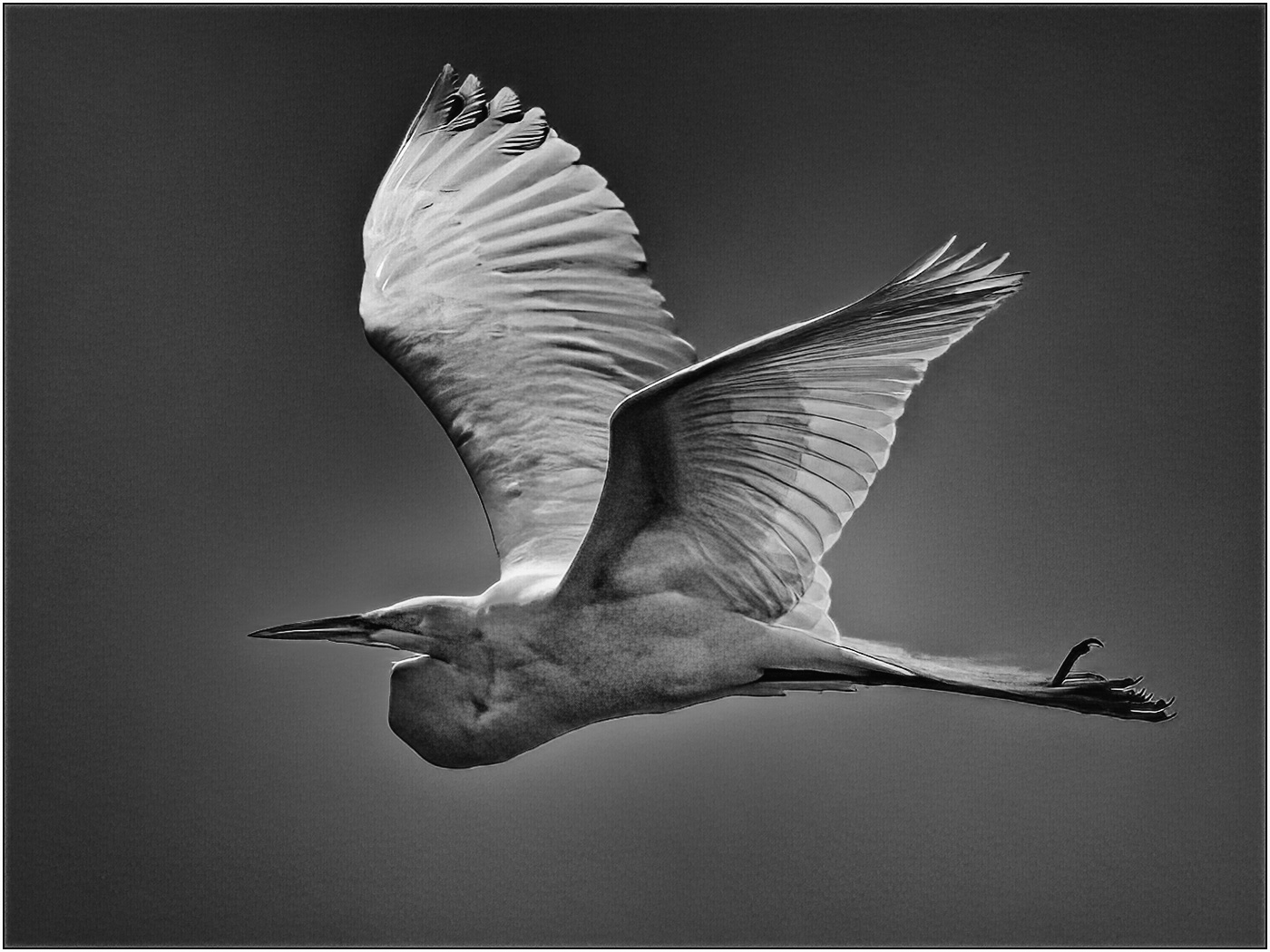
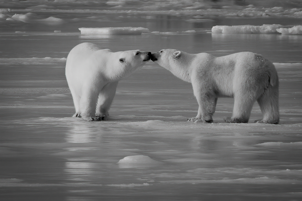
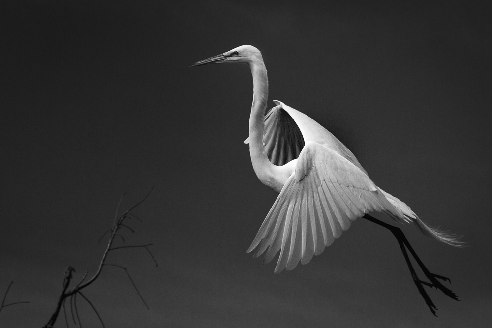
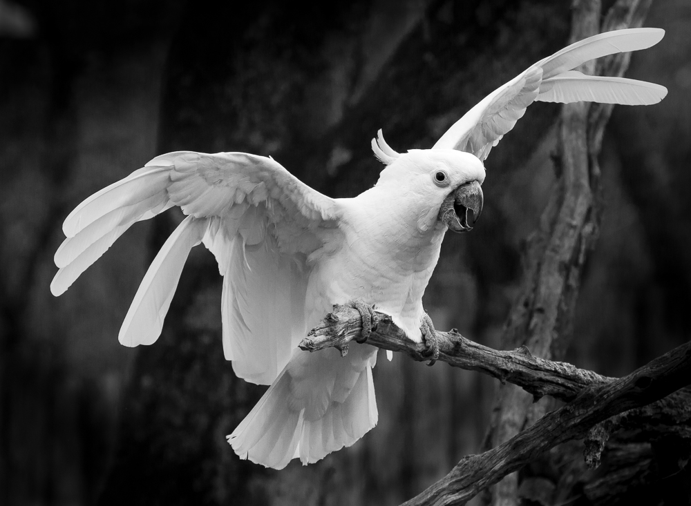
Excellent capture, Jyoti. Sometimes the opportunities are sparse and sudden, so constant readiness is necessary.
I agree with Jim's crop and contrast settings. In this particular image, the whale and boat are the main subjects, so should be emphasized. As Tom mentioned, the LR color sliders in the B&W Panel offer a lot of flexibility in your editing.
|
May 28th |
| 11 |
May 18 |
Reply |
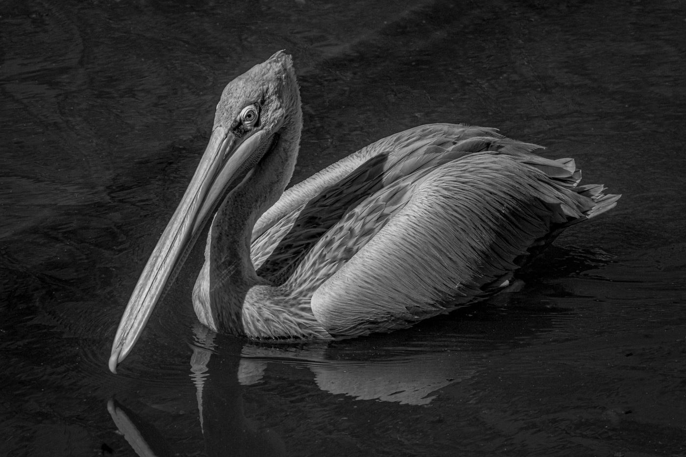
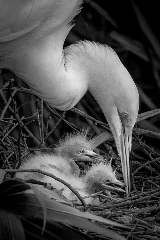
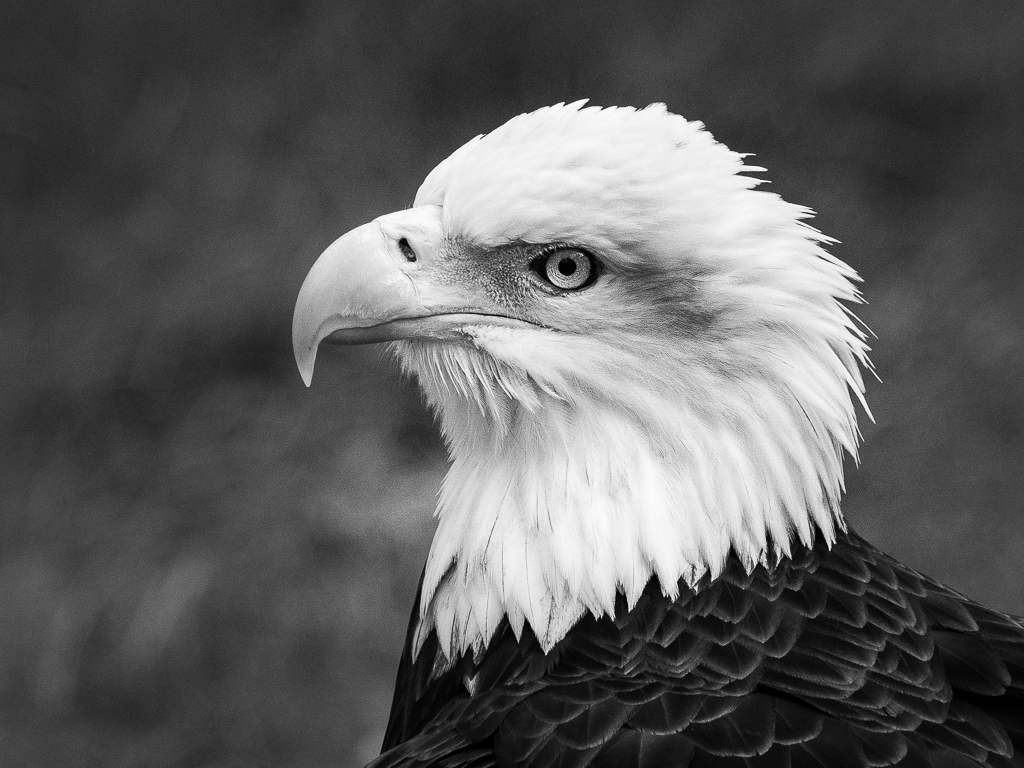
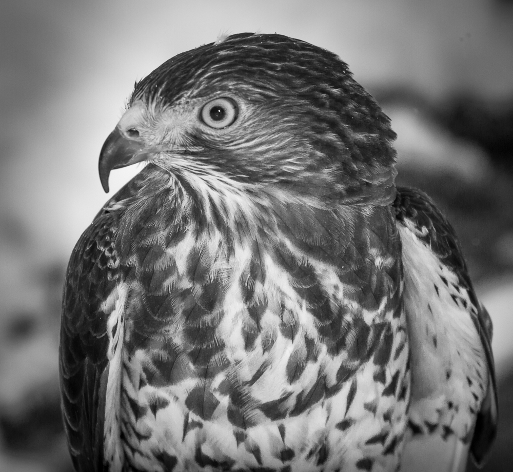
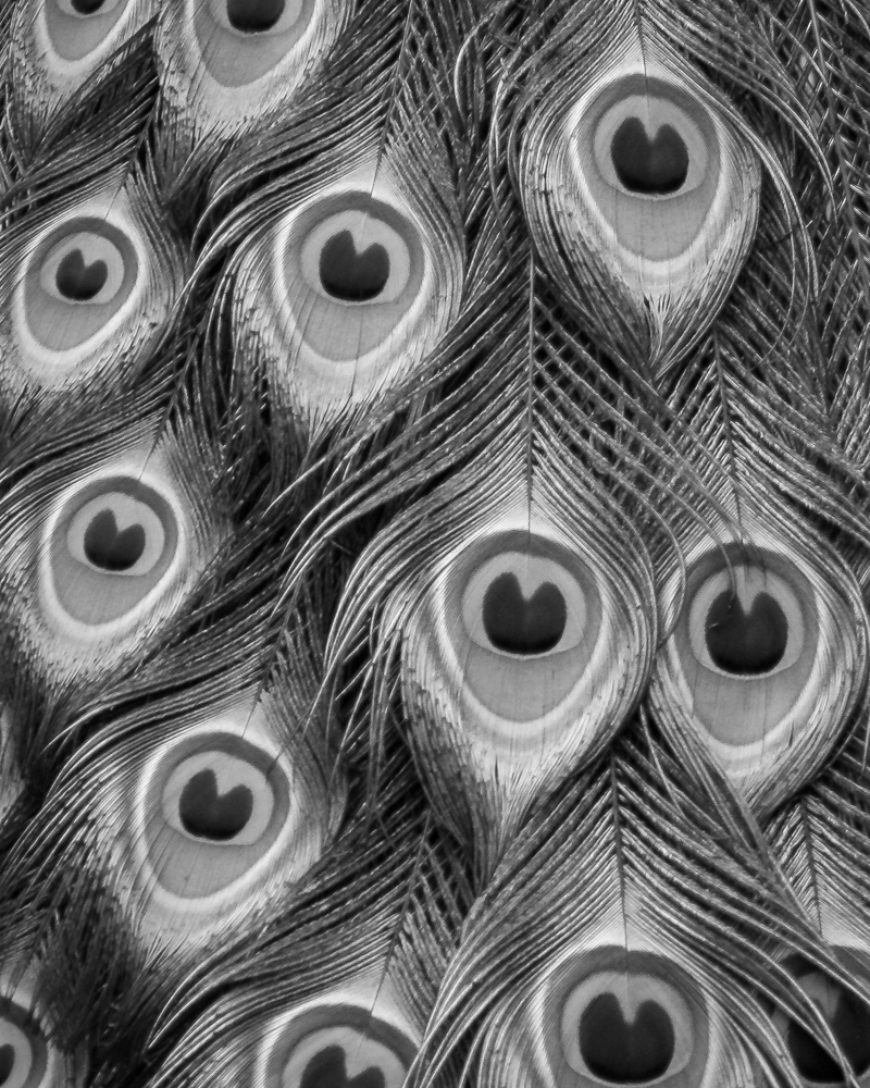
Thanks, Tom.
Of all the suggested edits, I like yours the best!
It increases the contrast in the white feathers in a process that is within the Nature Division limits AND appears very natural. We cannot blur the background, but can de-noise it. Thanks for the idea.
|
May 28th |
| 11 |
May 18 |
Reply |
Great suggestion, Allen.
I would have to crop more off of the top to alleviate the cries of 'wasted space', even though the eye would not be at the 1/3 intersection.
I like the pattern of the dark feathers also. Thanks.
|
May 28th |
| 11 |
May 18 |
Reply |
Thanks, Jim. When you increase the detail in the feathers too much, it doesn't continue to look natural, which is essential in Nature Photography. I do like the darkened background. Thanks.
|
May 28th |
| 11 |
May 18 |
Reply |
Thanks, Sharron.
The white feathers do need some more toning down and structure. The difficulty is keeping it natural looking in the process.
The best time for nature photography is NOT a bright sunny day ;-) .
|
May 28th |
| 11 |
May 18 |
Comment |
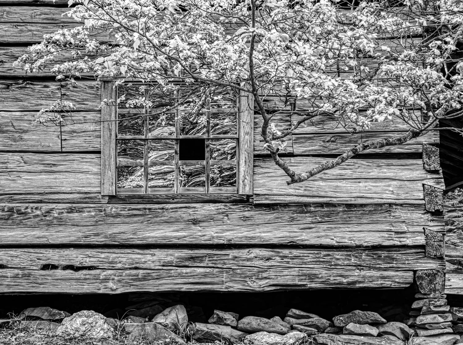
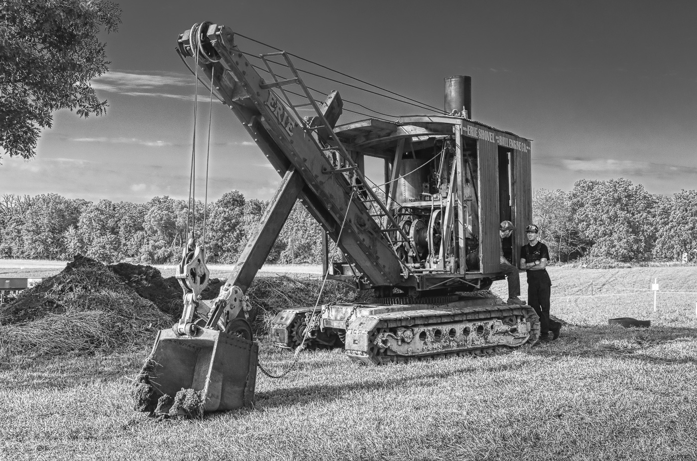
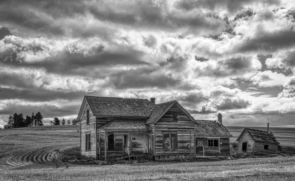
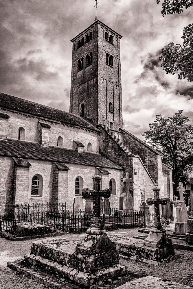
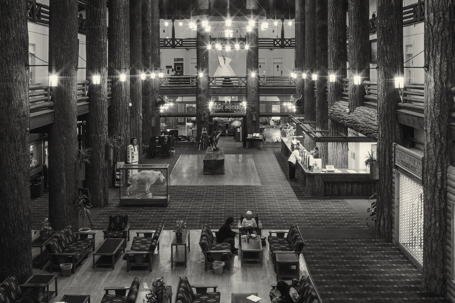
Well done, Jim.
You captured a static scene and made it dynamic with the overlayer of the shadows. I appreciate your treatment of the window (straightening and rebuilding) as it completes the image. The mono version is much more pleasing without the distracting blue color.
|
May 28th |
| 11 |
May 18 |
Comment |
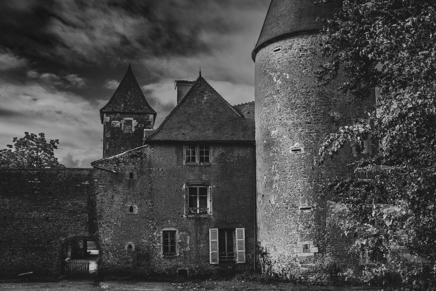
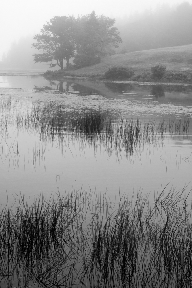
I actually prefer Sharron's original version. The larger crop gives me a sense of space and place, and more of the abandoned nature of the structure. To me, the sign is definitely an 'adder' to the image and the distracting cattle appropriately removed. The slightly washed-out lighting provides an antique effect to the image.
Well done, Sharron, with no suggested changes.
|
May 28th |
| 11 |
May 18 |
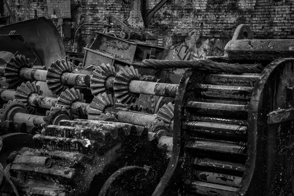
Comment |
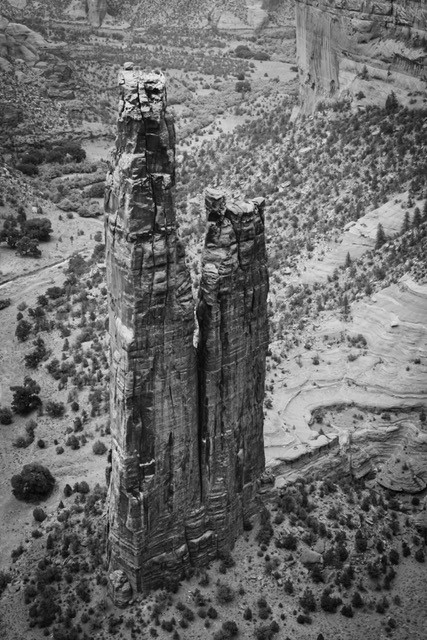
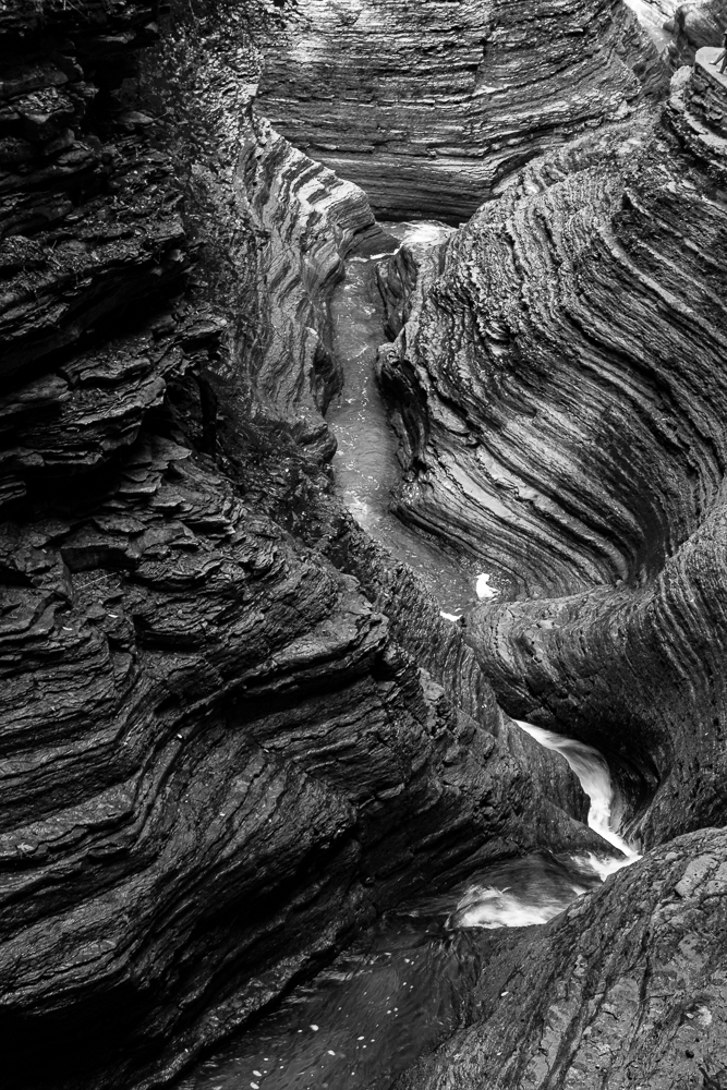
Good composition and an improvement on the color version. You captured the story and the mono version emphasizes the structure. I like the previous suggestions of the more creative title of "Abandoned Web".
(I hope that you are sleeping better now after your traumatic experience! ;-) )
|
May 28th |
| 11 |
May 18 |
Comment |
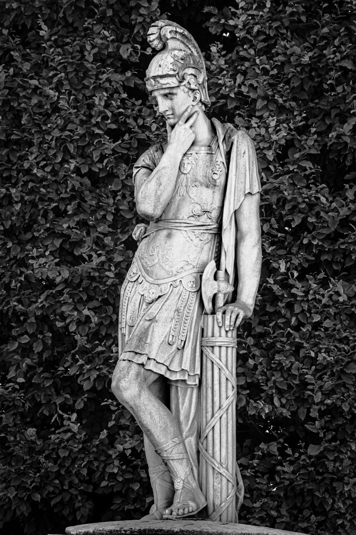
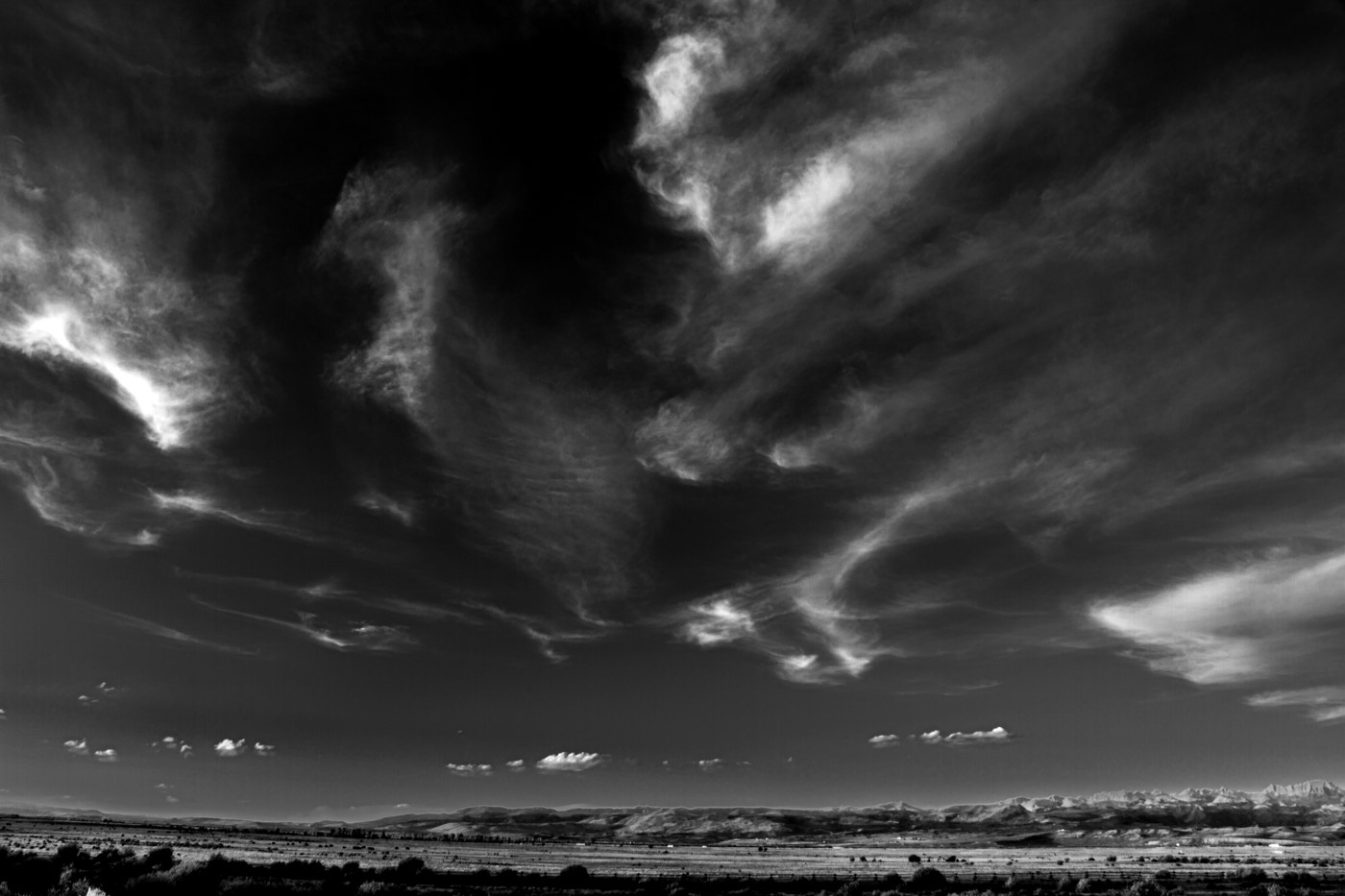
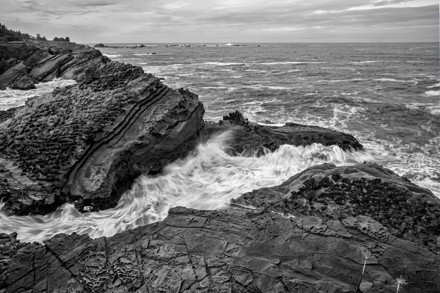
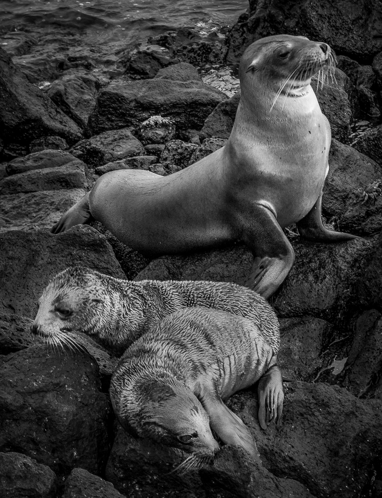
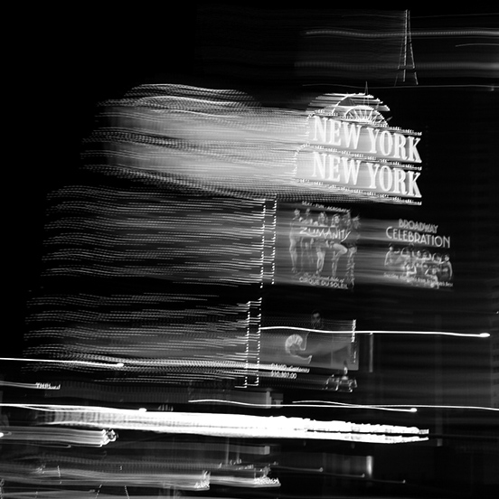
A very creative image beyond my normal range of subjects. I have the advantage of the Monday morning quarterback and find that Tom's crop the most appealing, but maybe a little too tight.
I tried a looser, square format. Your thoughts?
|
May 28th |
 |
| 11 |
May 18 |
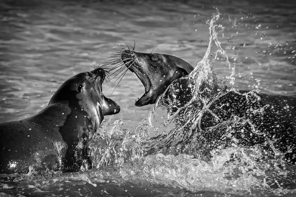
Comment |
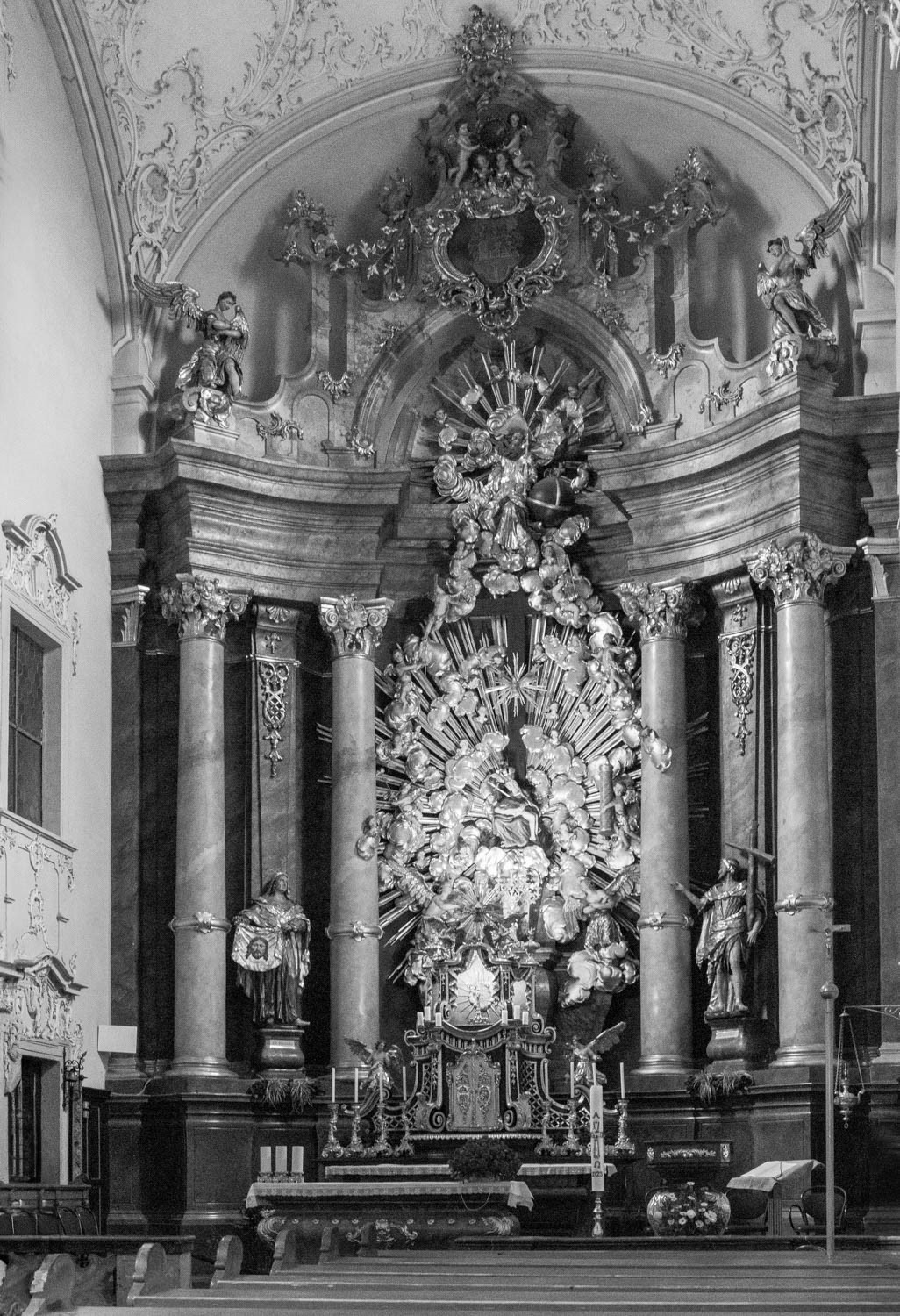
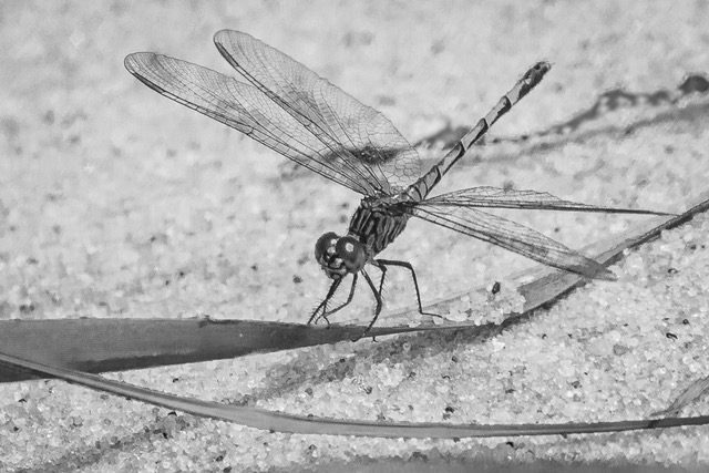
I also enjoy the momo version more. I find the lighting to be too overpowering (even though they were actually that bright) and tried to decrease the lighting effect while trying to preserve the integrity of the image.
I used a 'lights 1' luminosity mask on a curves layer in PS and then boosted the contrast slightly to compensate.
I don't know if this actually improved the image, as some may say it doesn't have the same impact. Your thoughts?
|
May 28th |
 |
6 comments - 4 replies for Group 11
|
6 comments - 4 replies Total
|