|
| Group |
Round |
C/R |
Comment |
Date |
Image |
| 11 |
Sep 17 |
Reply |
Thanks, Tom. I think it is an improvement and a good compromise. I also like the toning that you did. Who knew that such a simple image would have so many variations.
|
Sep 25th |
| 11 |
Sep 17 |
Comment |
Great composition, Maria!
On detailed viewing, the first thing that I noticed was the white halos that Allen mentioned. (I often have to watch for them also, which makes me aware in all photos!)
I particularly like the way you use the reflection to lead the viewer's eye into the photo and the natural looking sky/clouds.
|
Sep 23rd |
| 11 |
Sep 17 |
Comment |
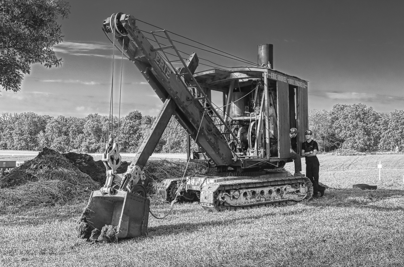
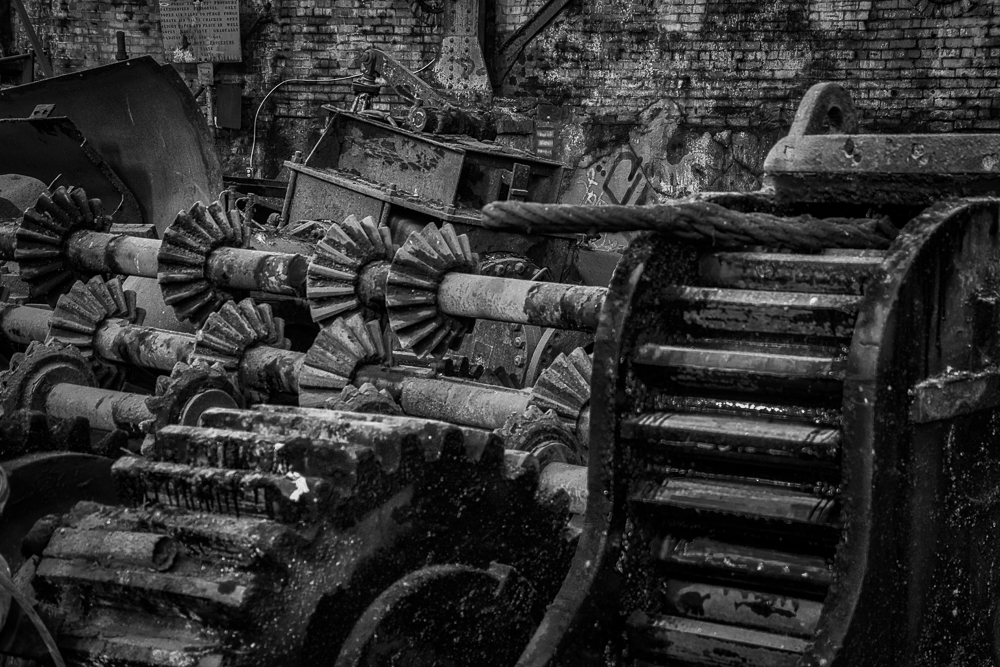
Great composition and outstanding details, Jim. I like what you did with expanding the clouds and simplifying the conveyors. (Hopefully you took it at 1/2000 sec, not 2000 sec as I was wondering what type of sturdy pole you were using!)
I am not a fan of super detailed, overly sharpened images, so I would have done a little less sharpening to make it look more natural. Overall a great shot!
|
Sep 23rd |
| 11 |
Sep 17 |
Comment |
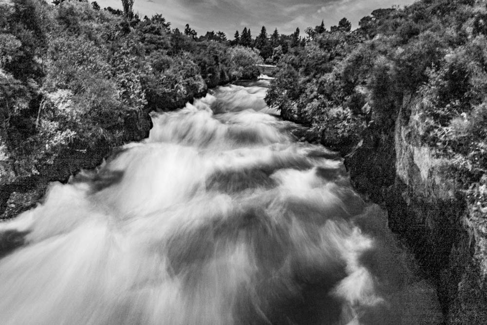
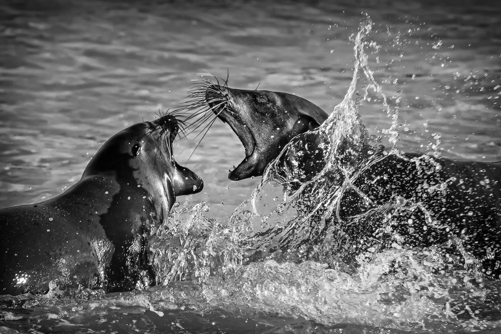
Here I thought only FL and TX got the flooding!
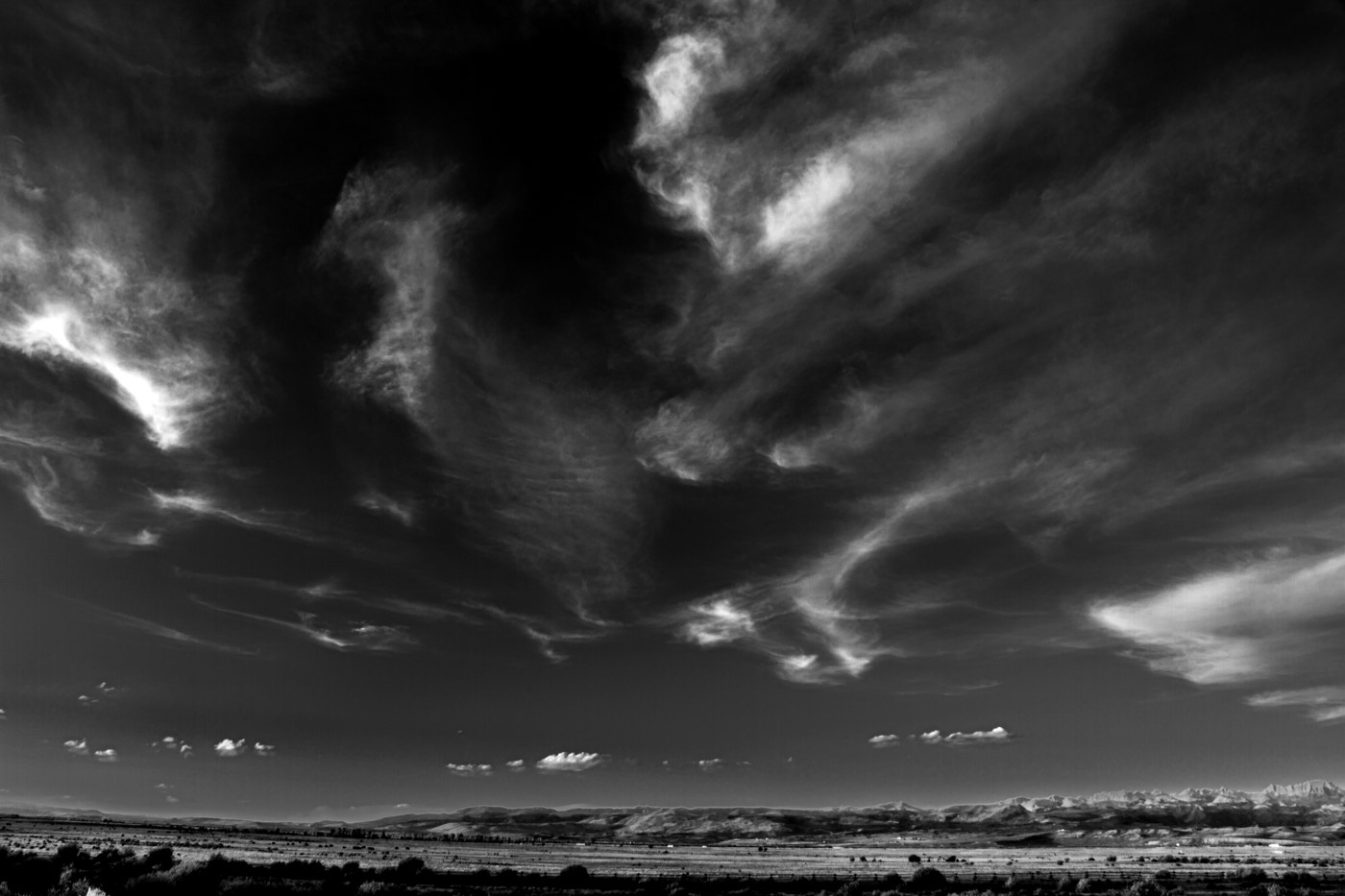
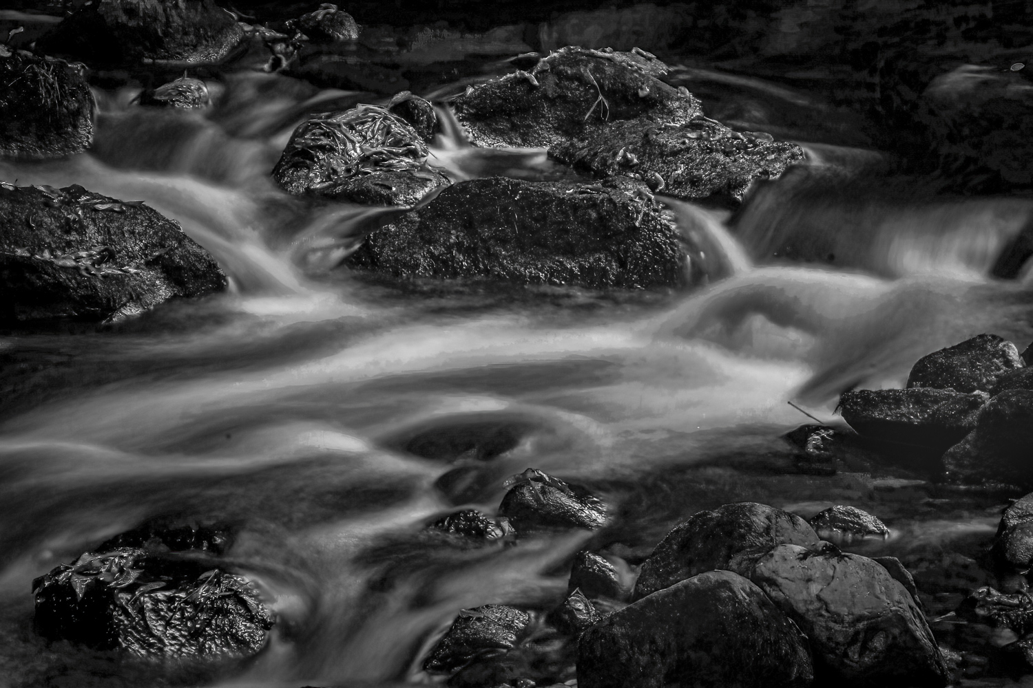
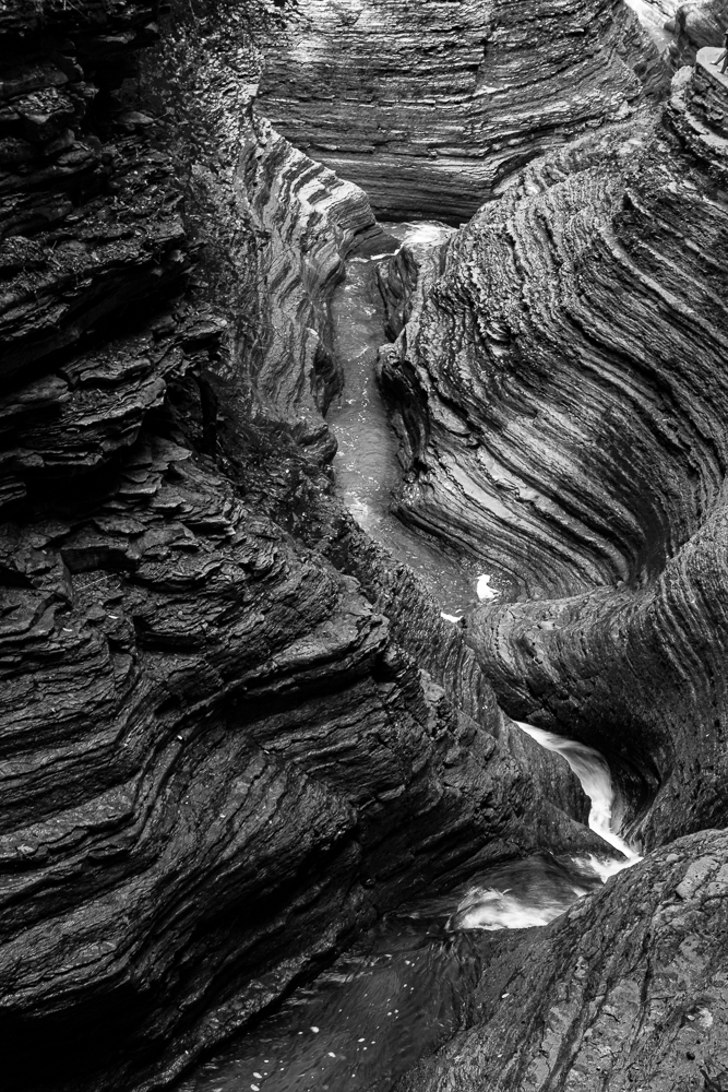
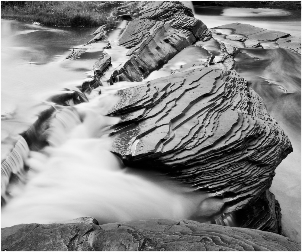
Tom, this is another of your wonderful creative efforts. You did an excellent job of blending in the water and the rock cliffs, and creating cliff and cloud reflections on the water - - it is all very natural looking. The sun and the moon add to the playfulness of the image, while Jim H's revisions make it more serious looking. |
Sep 23rd |
| 11 |
Sep 17 |
Comment |
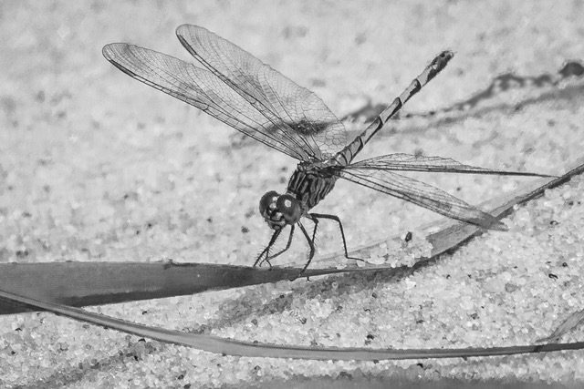
I agree with Jim's horizontal crop for an interesting pattern in the sands.
I also like the long vertical scene of the original, but find the composition troubling, even if the super dark objects in the foreground are lightened.
To me the lower portion of the image lacks the demensionality of the top portion due to lack of shadows which indicate depth and the long distance between the foreground and middleground.
While an imperfect attempt, by slightly burning and dodging that area, additional depth can be added which I believe improves the original image. |
Sep 23rd |
 |
| 11 |
Sep 17 |
Comment |
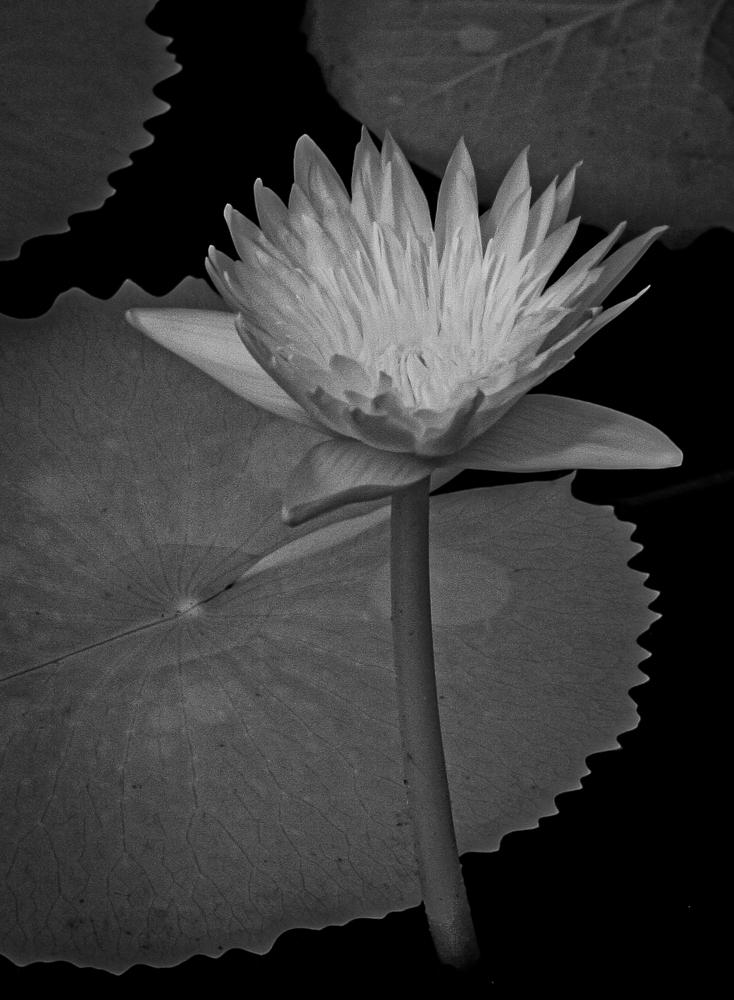
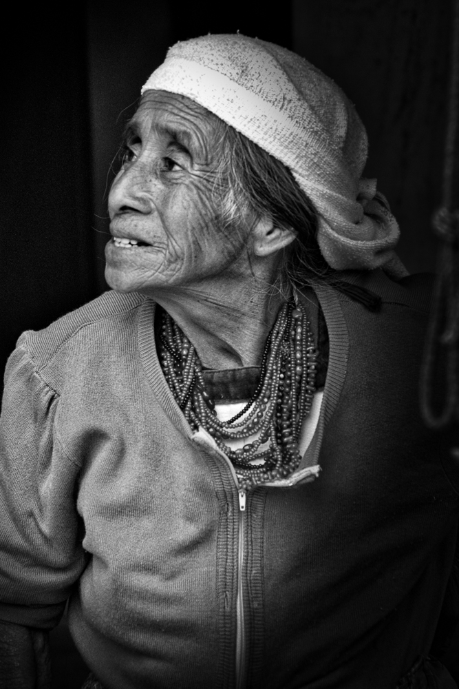
I like the warm tone version for its sense of feeling. To me it is more personal and intimate than the straight B&W.
The 'thought balloon' cloud adds to the uniqueness and another dimension of the image. While Jim H's adjustments are good, they generate a more standard image and which lacks the "specialness" of the cloud version that causes the viewer to add interpretations on their own. |
Sep 23rd |
| 11 |
Sep 17 |
Reply |
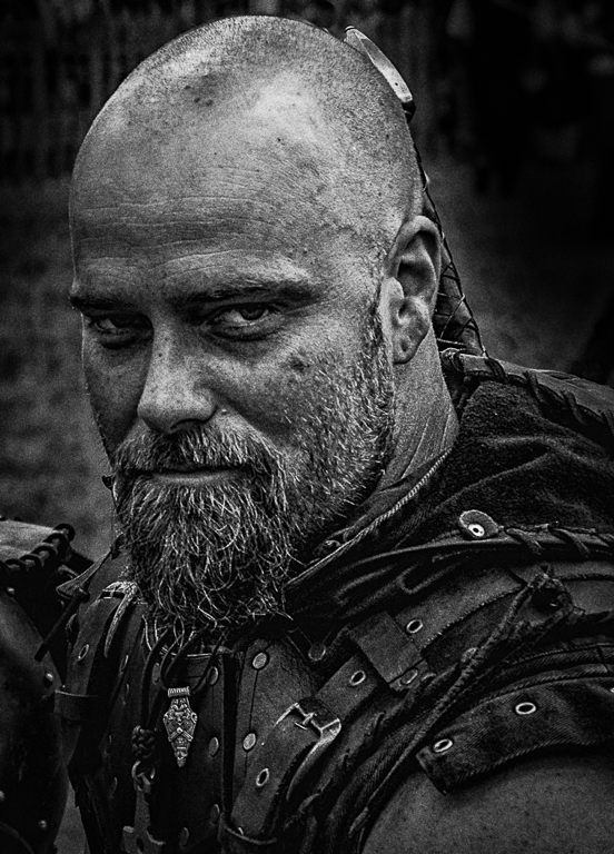
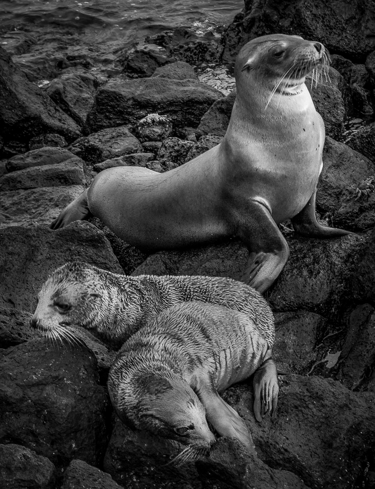
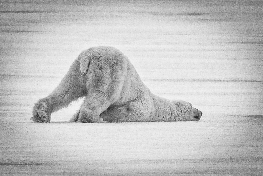
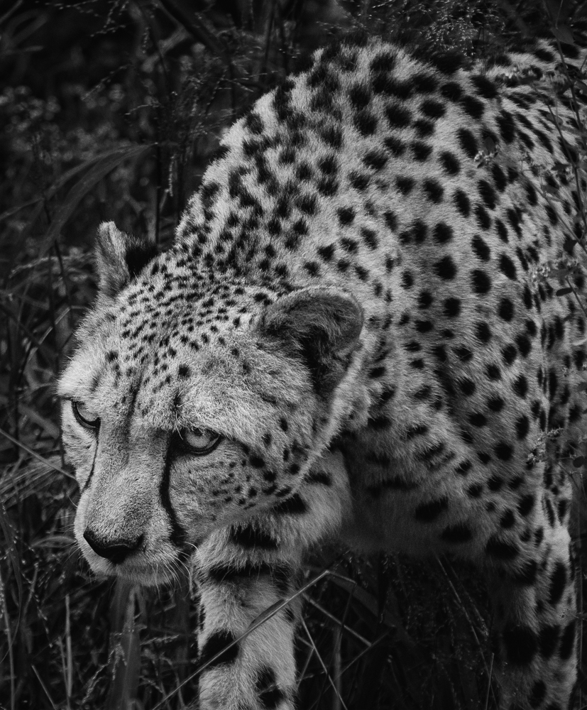
Thanks, Allen. I like the dark borders, so I would darken the main subject to reduce the contrast and make him blend into the surroundings more. |
Sep 23rd |
| 11 |
Sep 17 |
Reply |
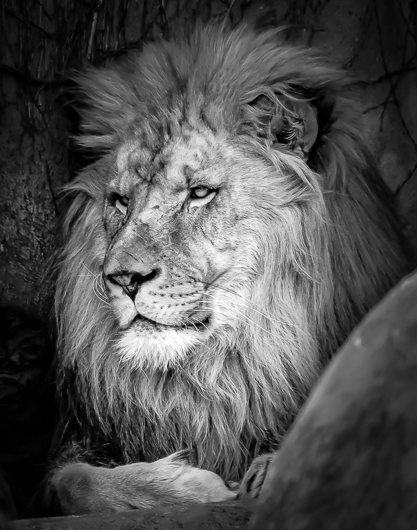
Thanks, Maria. I like the full mane also. See my comments to Jim on the mysterious object in the foreground and a possible solution. I like the dark borders also, but could probably darken the main subject to reduce the contrast. |
Sep 23rd |
| 11 |
Sep 17 |
Reply |
Thanks, Jim. I understand your concerns, especially with the object in the foreground (I was photographing between two boulders to achieve the photograph)but I wanted the full face and paw to be included at sharp focus and thus allowed the foreground to exist out of focus. In retrospect, I should have burned that area more to make it less noticeable. Your image with the less contrast provides me with another direction to take the image. Thanks. |
Sep 23rd |
5 comments - 4 replies for Group 11
|
5 comments - 4 replies Total
|