|
| Group |
Round |
C/R |
Comment |
Date |
Image |
| 11 |
Mar 17 |
Reply |
Thanks, Tom. That does help it.
|
Mar 13th |
| 11 |
Mar 17 |
Reply |
The cropping to me was a method of enlarging the detail of the center and not making it a bullseye image if you showed the whole flower . . . but now you know why I don't judge. I thought your approach was more creative.
|
Mar 13th |
| 11 |
Mar 17 |
Comment |
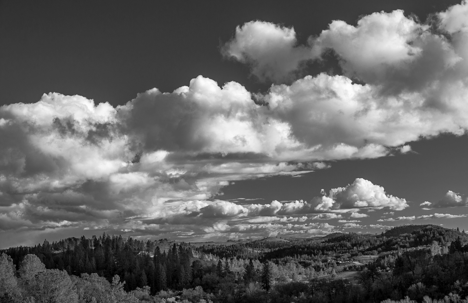
I am sure that you and your neighbors are happy to see blue skies!
I like the B&W version . . . but something was just not clicking with it for me. I couldn't find anything specific, but it was troubling me. Was the cloud shadow too dark? Was the sky not dark enough? Did it need cropping in the foreground? Did the clouds have enough structure?
I thought that I had to experiment to find out for myself. I incorporated those thoughts and made a version of your image. Please see what you think and tell me why. I probably totally messed up your good image by experimenting, but I approached it as a learning exercise, not being critical of your work. I would appreciate your comments.
|
Mar 13th |
 |
| 11 |
Mar 17 |
Comment |
Maria, you certainly got his attention! Maybe you were driving a red car or were smiling a lot.
The back lit lighting accentuates the detail of his fur and gives the wolf shape against the dark background, thus adds a sense of depth in both versions of the image. I think the B&W version eliminates the distracting colors on the right hand side of the images, and therefore improves the focus on the main subject. A well executed portrait with a full range of tonality.
|
Mar 12th |
| 11 |
Mar 17 |
Comment |
A very simple theme executed with great care and attention to detail. The window frame, the glowing leading lines, the back-lit tree silhouette, the detail in the clouds are effective in both the color and the B&W. While the color version has the greater impact due to the beautiful clouds and colorful elements, I find the B&W version similarly impactful due to the strong composition.
|
Mar 12th |
| 11 |
Mar 17 |
Comment |
I like it, Tom.
The subject lifts-off the page because of your sharpening the details and burning/softening the background. Excellent!
I find the cropping on the top to be an improvement so as to enlarge the key elements and not having more dead space around the flower. Because of the subject's symmetry, the viewer can visually complete the missing portions. The background has enough detail to let us know what is there without distracting from the subject. I can't think on how to improve it. Thanks for sharing.
|
Mar 12th |
| 11 |
Mar 17 |
Comment |
Welcome back, Arfan. We missed you.
I find your B&W version more pleasing than the color. The greater clarity and contrast improves the depth/texture of the image and shows details that are hidden in the color version.
I like the depth you capture, where the viewer can visually 'walk' back through the 7 layers starting with the sand texture in the foreground, then the trees, more sand, . . . until reaching the dark blue sky with smoothly textured clouds. Excellent! The composition is balanced on the diagonal from the trees in the lower left to the cloud mass in the upper right, so it works for me on many levels.
Good job!
|
Mar 12th |
5 comments - 2 replies for Group 11
|
5 comments - 2 replies Total
|