|
| Group |
Round |
C/R |
Comment |
Date |
Image |
| 11 |
Feb 17 |
Comment |
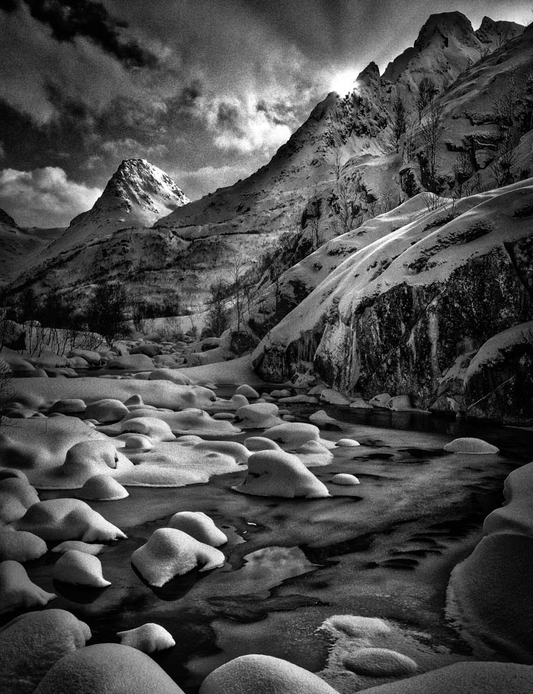
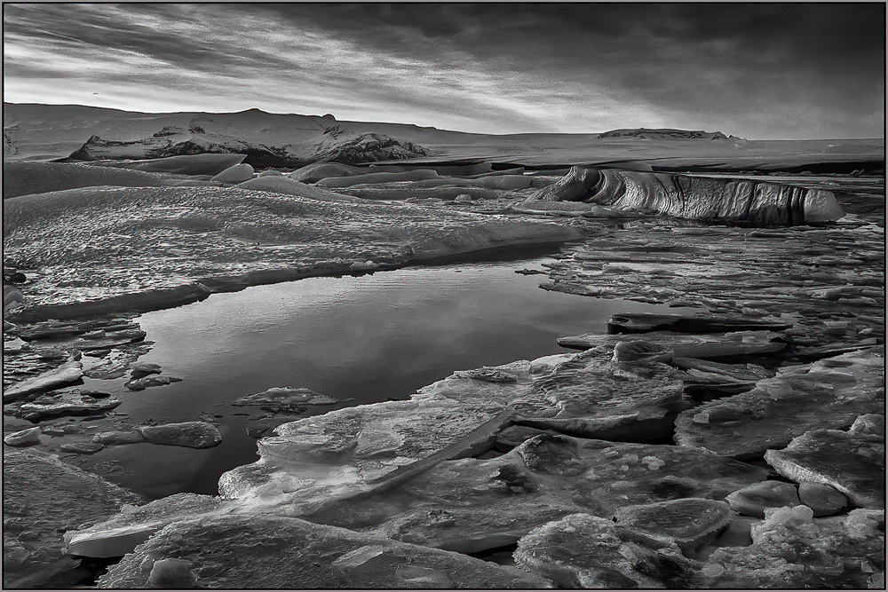
Since I am in Chicago, I can accept this a a normal day, but it does convey your story.
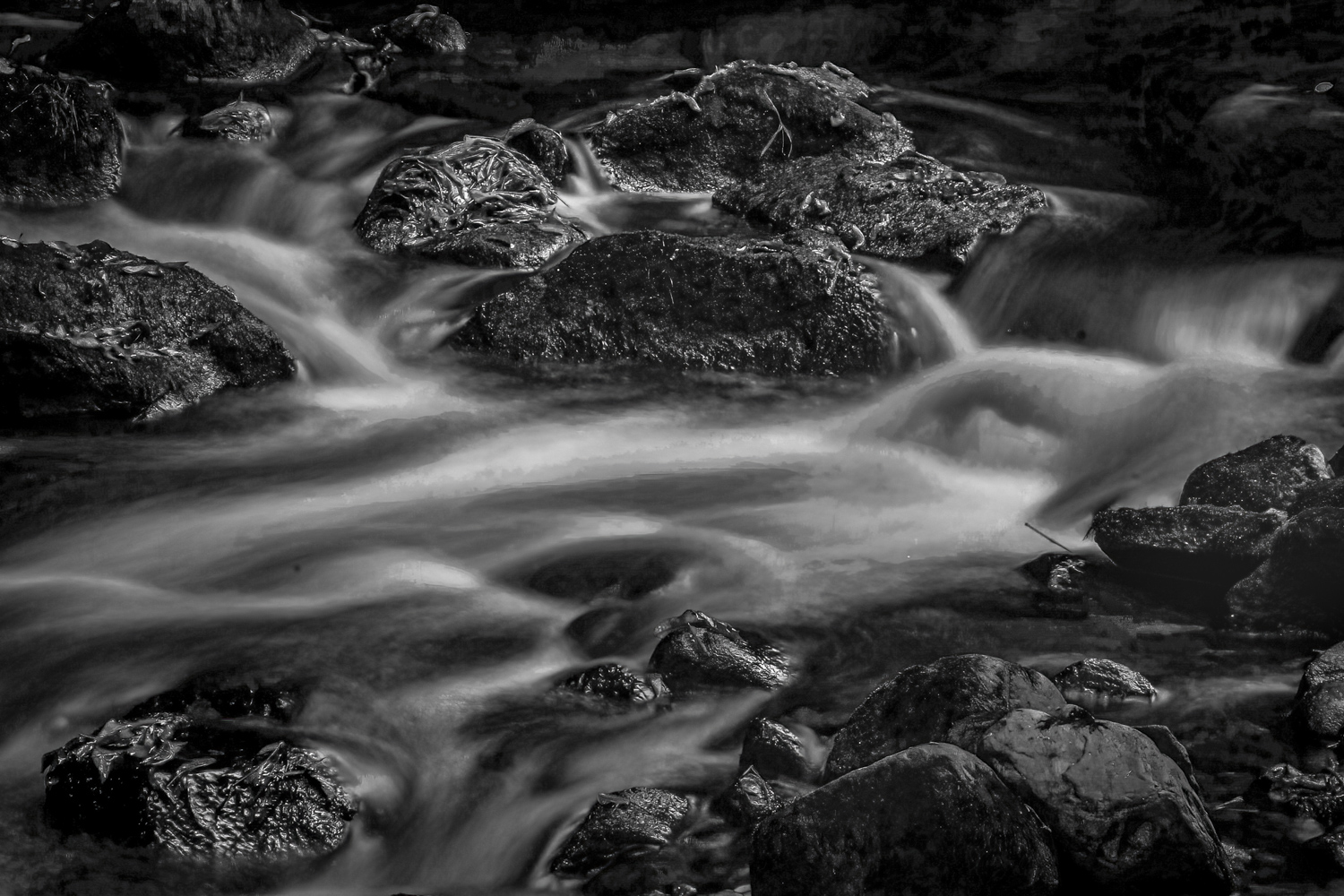
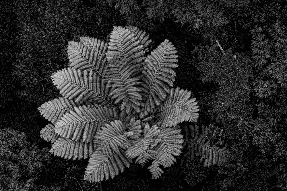
I also looked at the small bush in the center foreground first, then dismissed it in favor of the beautiful textures that you expressed in the stone and ice. To me that is one of the benefits of B&W and you captured it well.
I think the vertical crop tightens the image, but removes some of my favorite stone texture. I tried a square crop, but in the end, I think the vertical crop is best as it keeps the overall balance off-center.
|
Feb 28th |
| 11 |
Feb 17 |
Comment |
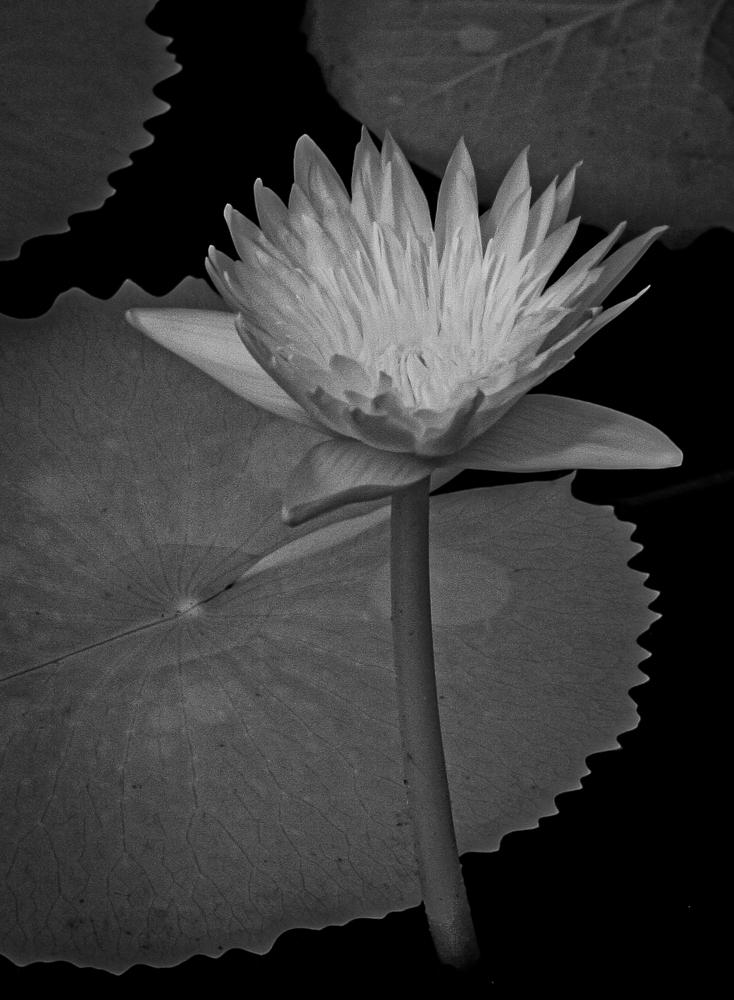
I agree that the beauty of the color version was drastically reduced in the B&W, but since our task it to make it the best B&W possible we must press on.
I have to agree that the tighter crop improves the image by creating a better focus point and removes the spectacular highlights on the leaves that I found distracting.
I was hoping that there was some detail in the pedals which Tom's version displayed and also improved the cropping.
|
Feb 28th |
| 11 |
Feb 17 |
Comment |
I found the composition interesting if I didn't try to relate the items. Like others, I was curious about 'Encre' to the point that I had to look it up (French for 'Ink') to see if that was the link to my confusion in the relationships (it wasn't).
Thinking of the image in pure photographic terms, I like the range of tonal qualities and sharpness that you can even see the dust on the jeweler's magnifiers. Good job. The fading into the background of the piece in the upper left didn't bother me too much, as I couldn't figure out what it was anyway, so that helped.
As far as a mood, you seem to want to convey an antique setting to the arrangement, but that was completely destroyed when you left the "Izod" logo and other text on the glasses frame. I would definitely remove all the text to make it more believable.
|
Feb 28th |
| 11 |
Feb 17 |
Reply |
Thanks, Maria.
|
Feb 24th |
| 11 |
Feb 17 |
Reply |
Thanks, Tom. I like what you did with the sharpening. I think it improves the whole image.
|
Feb 24th |
| 11 |
Feb 17 |
Comment |
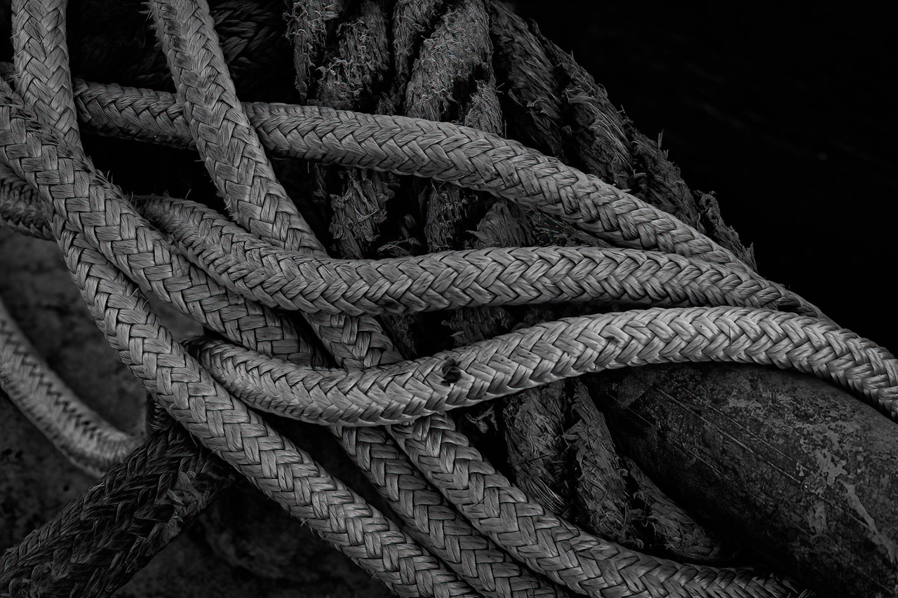
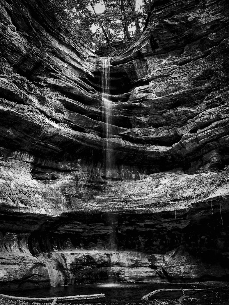
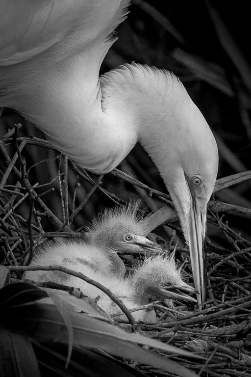
Definitely a great shot technically for the conditions of hand held, 1/10 sec and shallow dof and the limitations of the equipment. Interesting repetitive pattern. I would enjoy it more with the texture/grain/detail of the weave showing and without the highlights/glare of the light. The blue tone probably increases interest. Overall a good effort.
|
Feb 12th |
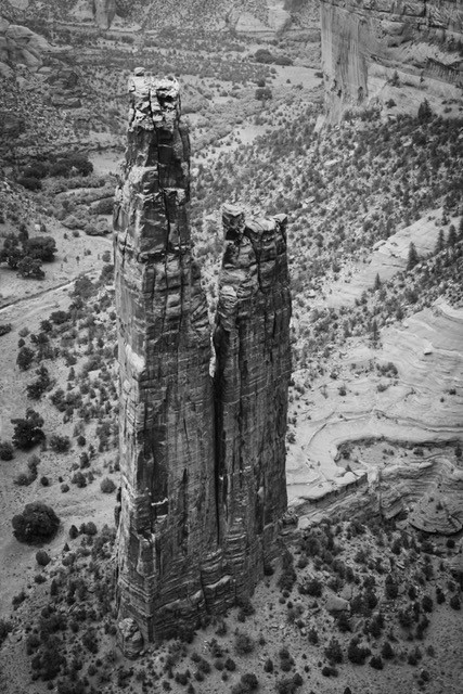
| 11 |
Feb 17 |
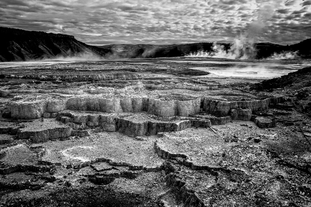
Comment |
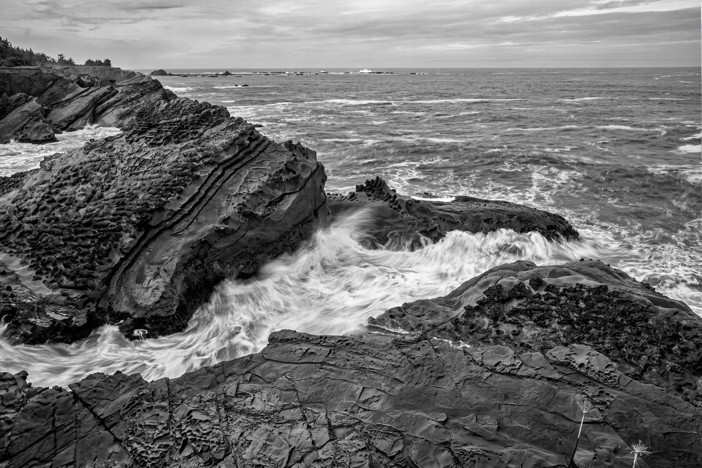
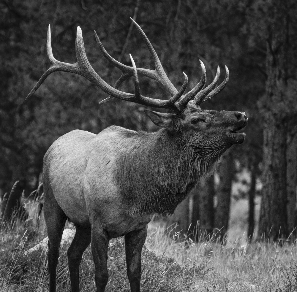
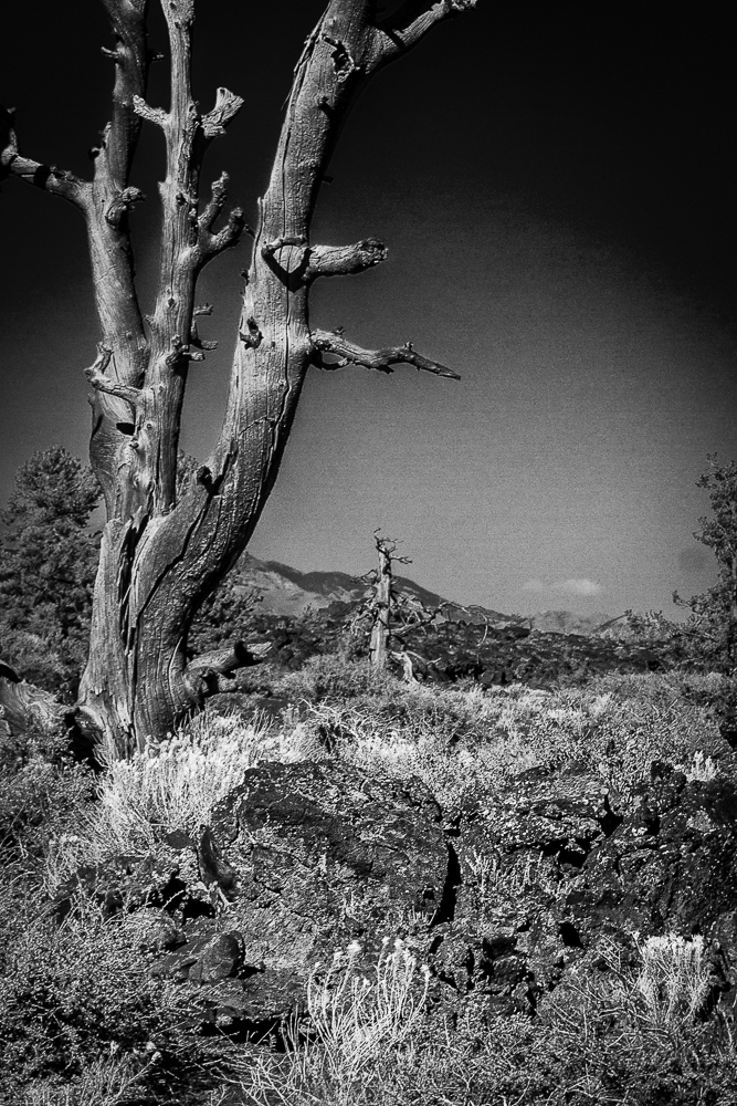
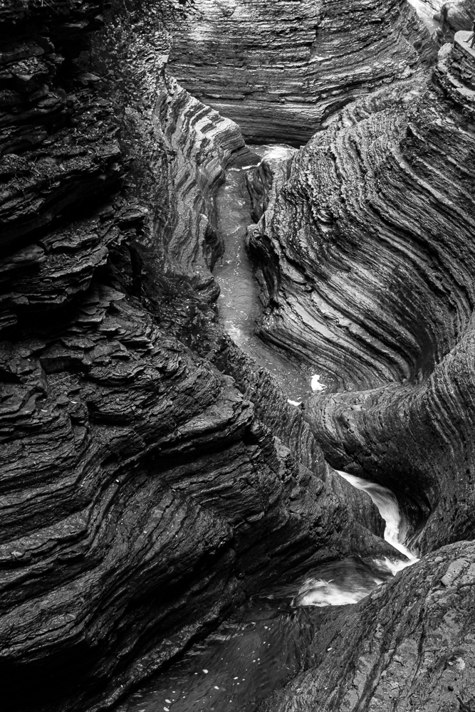
Excellent image! I like the B&W for the crispness and detail that is not as evident in the color version. Great composition and balance. I particularly agree with your decision to enhance and contrast the texture of the juniper trunk and the rock strata which is the focal point of the image.
|
Feb 12th |
| 11 |
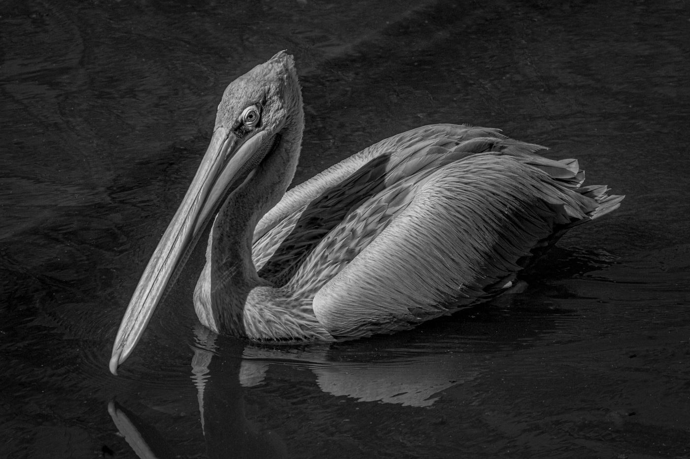
Feb 17 |
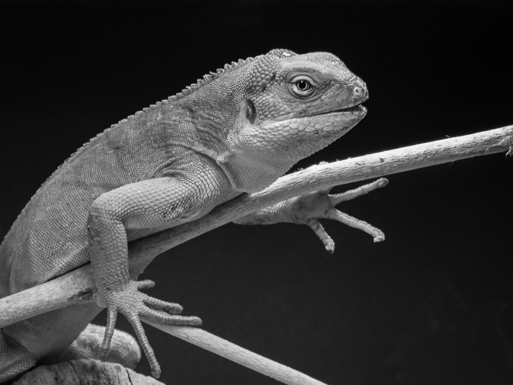
Reply |
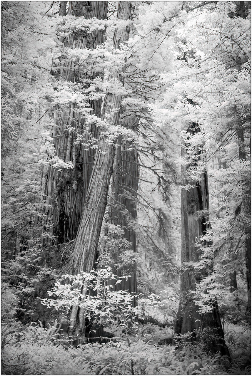
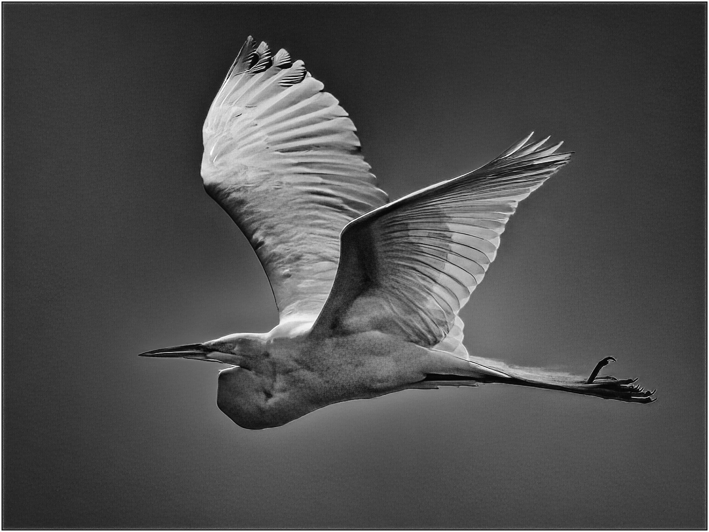
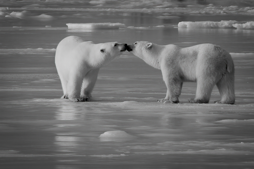
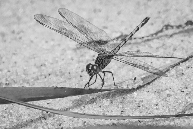
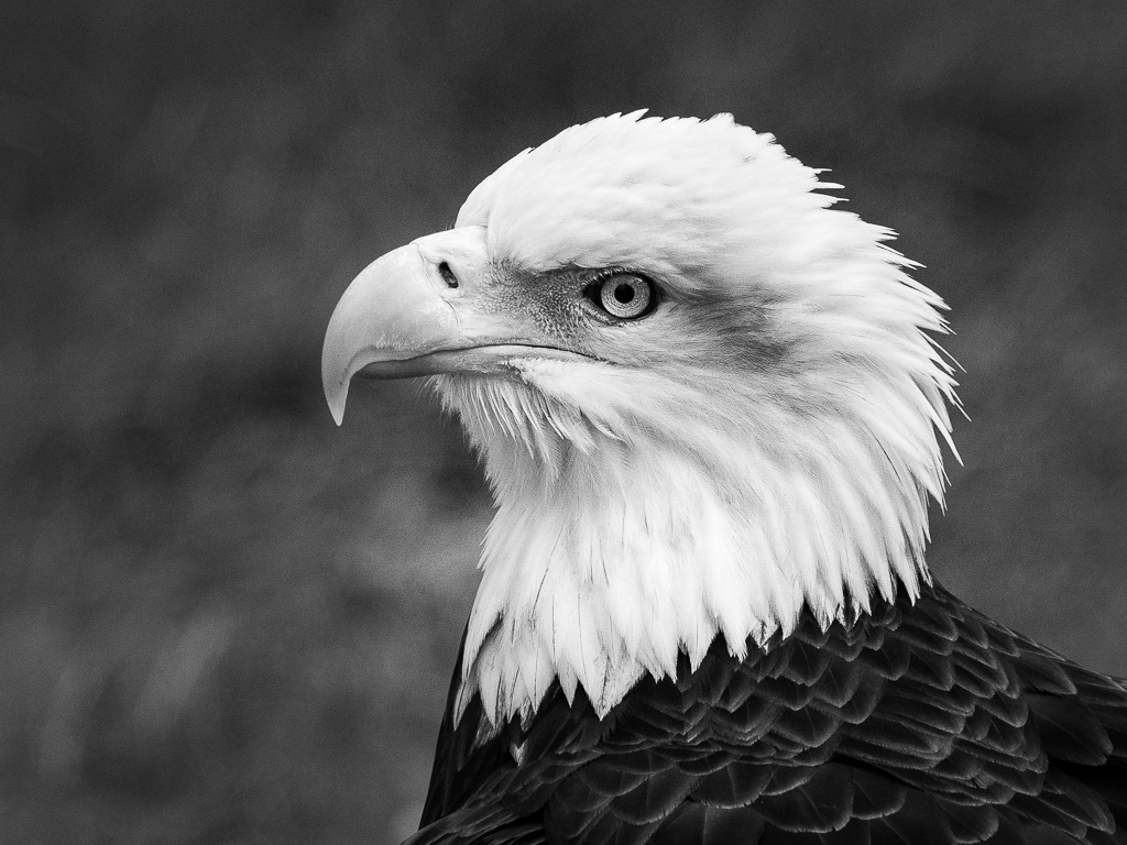
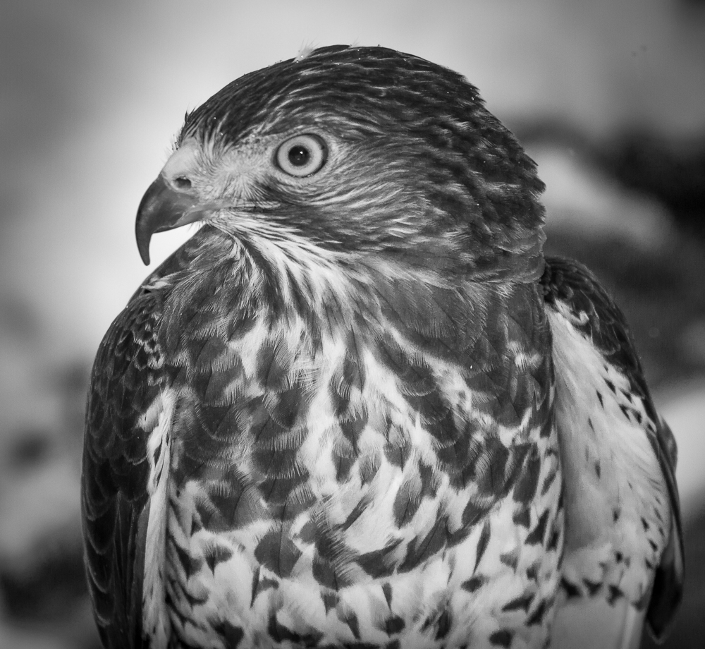
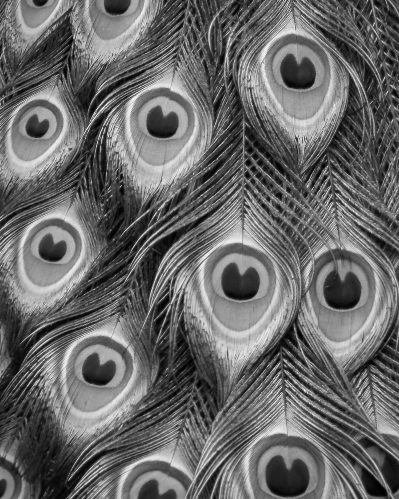
Thanks, Allen. The pattern and structure of the feathers is what made me think B&W.
|
Feb 10th |
5 comments - 3 replies for Group 11
|
5 comments - 3 replies Total
|