|
| Group |
Round |
C/R |
Comment |
Date |
Image |
| 18 |
Jun 21 |
Comment |
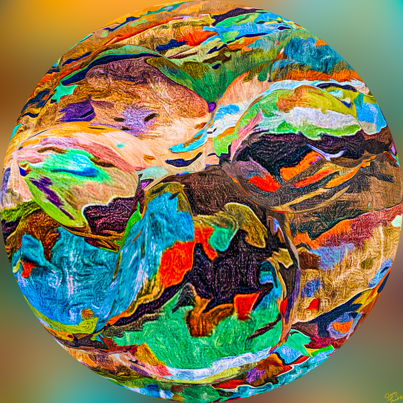
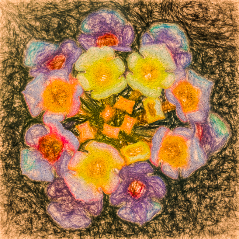
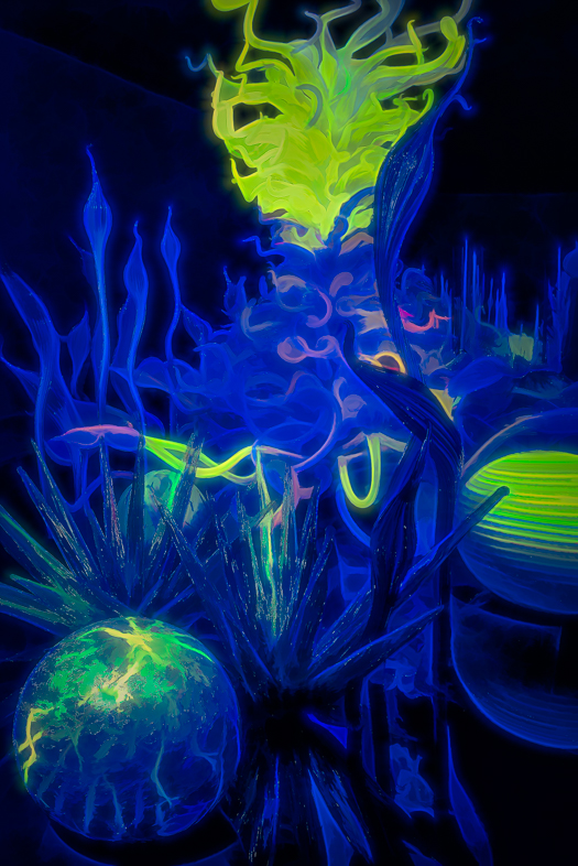
It's interesting to me that you followed the rules and had an odd number of flowers in your original but saw more natural beauty in removing one. I like all you have done with this creative image.
My only suggestion is to simplify the composition further by removing the two reindeer.
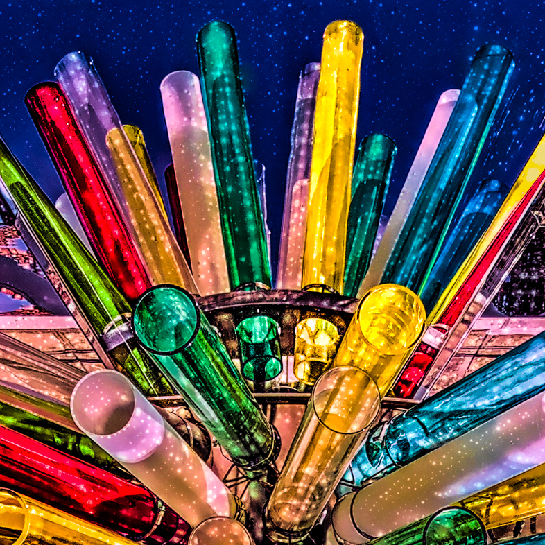
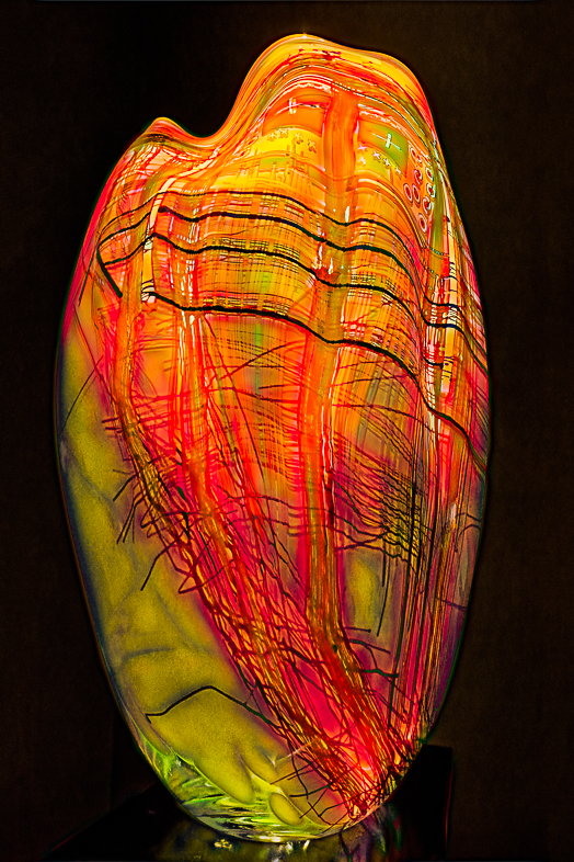
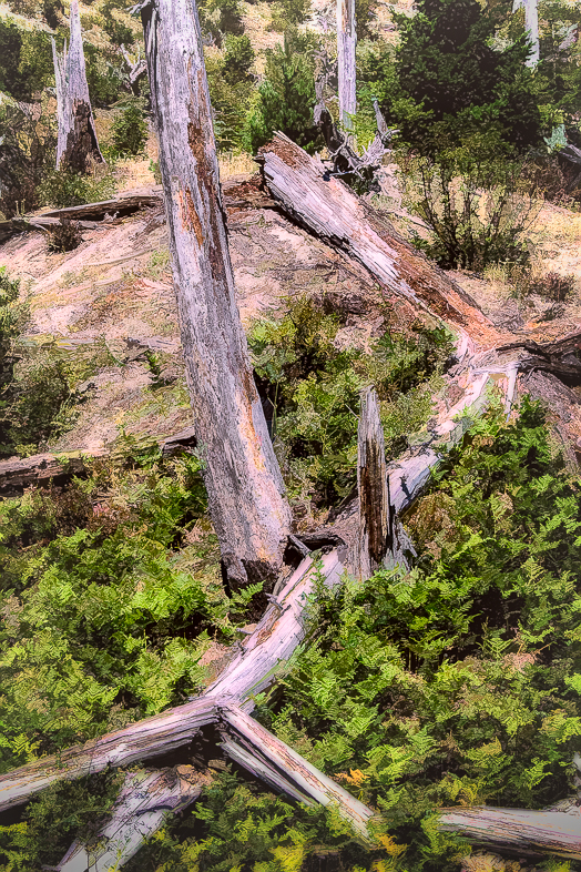
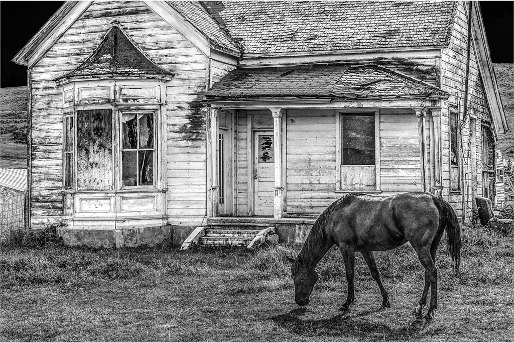
I've never had the patience to do table top photography, but maybe I can use some of your techniques and apply them to iris exhibition photos that I captured last week. They were all displayed on table tops. Hopefully, I can find an attractive vase to clone in and maybe even a contrasting log from my collection. That my fifth project idea that I've gotten viewing DDGs this month.
|
Jun 8th |
| 18 |
Jun 21 |
Comment |
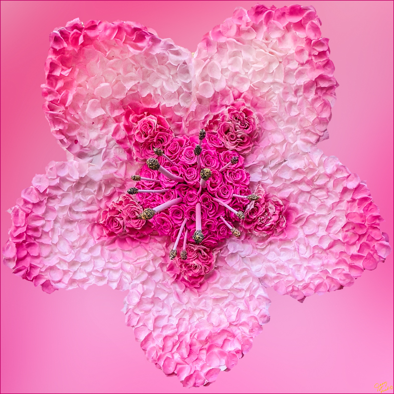
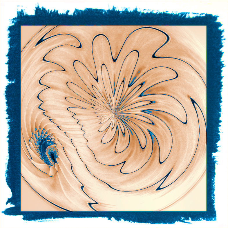
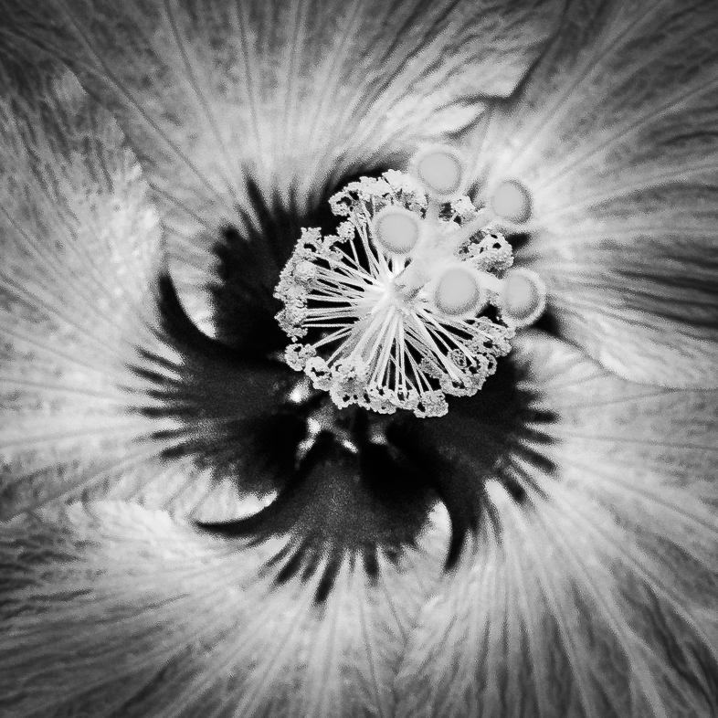
I like your final image a lot, and have a suggestion that I think would provide greater emphasis on the face. Remove the outer flower petals. That will leave an attractive purple frame.
My approach to removing the petals would be to color select the purple, invert that selection and then erase or clone out the petals. |
Jun 8th |
| 18 |
Jun 21 |
Comment |
I like the feeling I get from your use of the expressionism filter. If you want to emphasize the face, I think its a matter of selectively dodging and burning to your taste. |
Jun 8th |
3 comments - 0 replies for Group 18
|
| 20 |
Jun 21 |
Reply |
Your drier has a better light than mine. Maybe, I'll take a few pictures of clothes in my drier. That would be the 6th idea I've gotten from reviewing many of the DDGs this month. |
Jun 10th |
| 20 |
Jun 21 |
Comment |
A beautiful image that demonstrates your photography and creative skills. I agree with the above suggestions. |
Jun 10th |
| 20 |
Jun 21 |
Reply |
I'm glad you are enjoying finding things in my picture. Obviously, I thought it had potential when I took the picture. The filters we have offer us unlimited possibilities. I regret not knowing more about Photoshop in order to advance my creative works further. |
Jun 9th |
| 20 |
Jun 21 |
Comment |
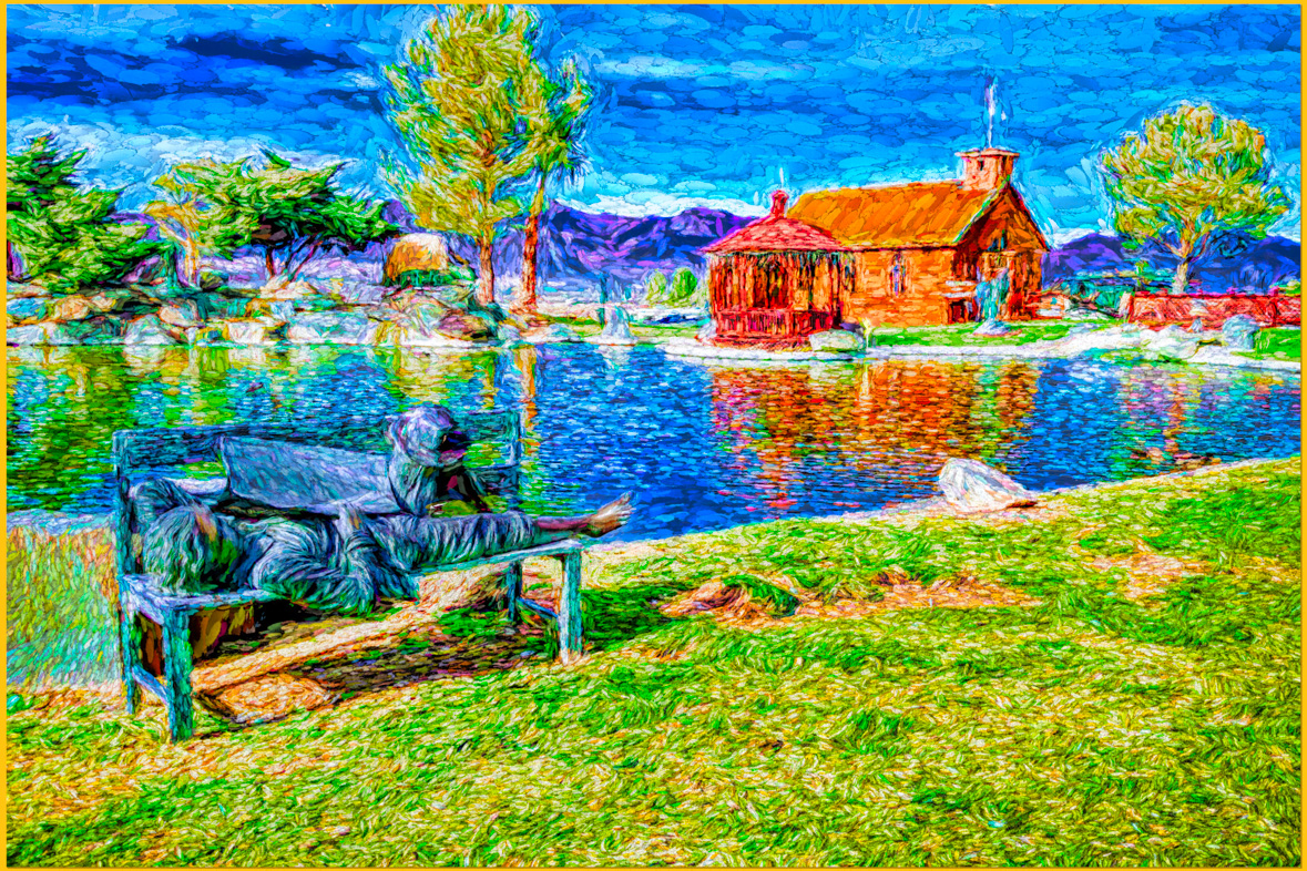
I think you definitely achieved your objectives and produced a very appealing image for me. It makes me wonder.
Yes you could add a person or a few ghost images, but I like it as is. |
Jun 8th |
| 20 |
Jun 21 |
Comment |
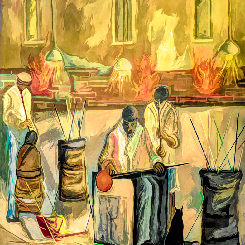
Fred, I think you could be an illustrator for children's book. Maybe not illustrating drinking but I see the necessary talent.
More specifically, the first elements of composites that jumps out are shadows and blending as Tom pointed out. I like the way you composited the fire in the pit, but it too would cast some shadow.
Overall, it remains a fun image, well conceived and well composed. |
Jun 8th |
| 20 |
Jun 21 |
Comment |
I think you make a remarkable, dramatic and interesting transformation of the original to demonstrate your creative imagination and talent.
However, I have mixed feelings about the contrasty top right corner. I conclude that it distracts me from your main subject. |
Jun 8th |
| 20 |
Jun 21 |
Comment |
I never imagined eggplants had a personality! Well done! I like every element of your composition. |
Jun 8th |
| 20 |
Jun 21 |
Reply |
I'll try darkening the background to see if I prefer it. Thanks. |
Jun 3rd |
| 20 |
Jun 21 |
Comment |
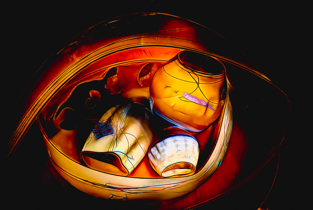
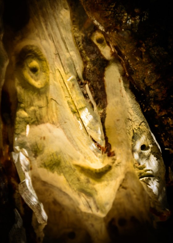
It took me awhile to analyze this to see what you did -carefully joining three rotated layers of slightly different but complimentary sections of the facade. Right? Very creative.
I'm a long time admirer of Escher and like this a lot. You did an excellent job of bringing out the details and the monochrome treatment is perfectly appropriate.
I noticed that right most steeple is slightly brighter, so I would brighten it to equal the exposure of the other towers and enhance the symmetry. |
Jun 2nd |
6 comments - 3 replies for Group 20
|
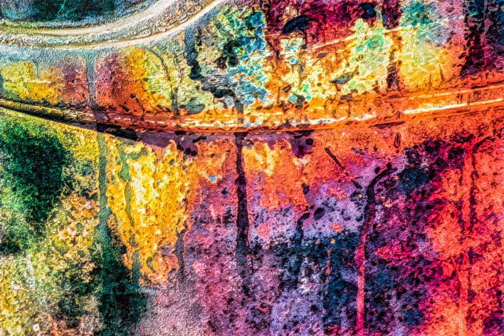
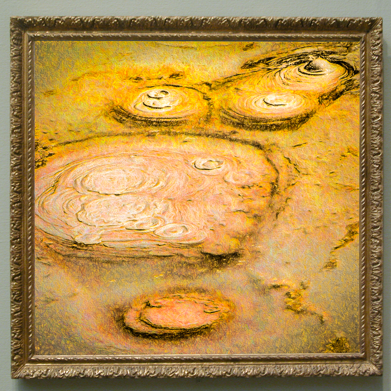
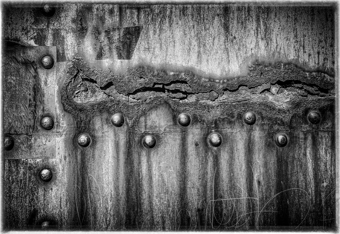
| 21 |
Jun 21 |
Reply |
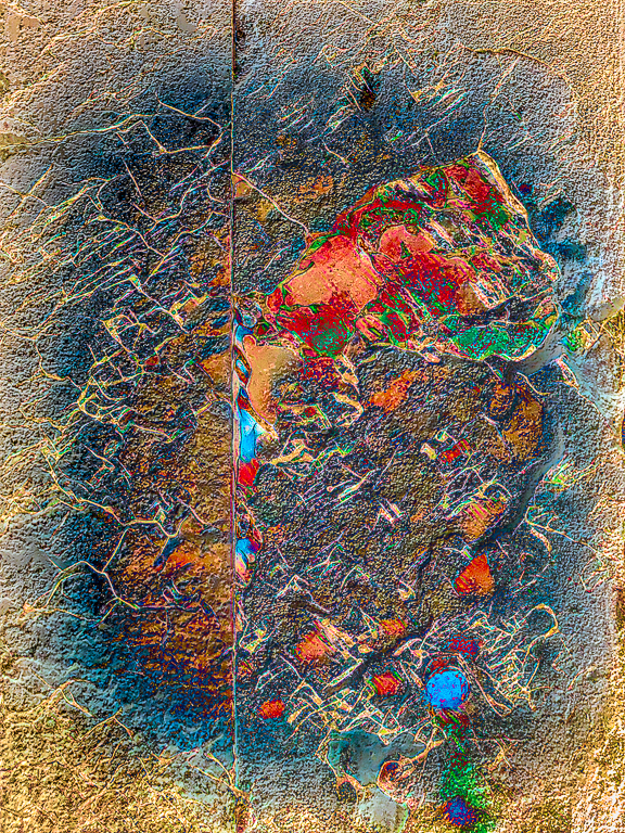
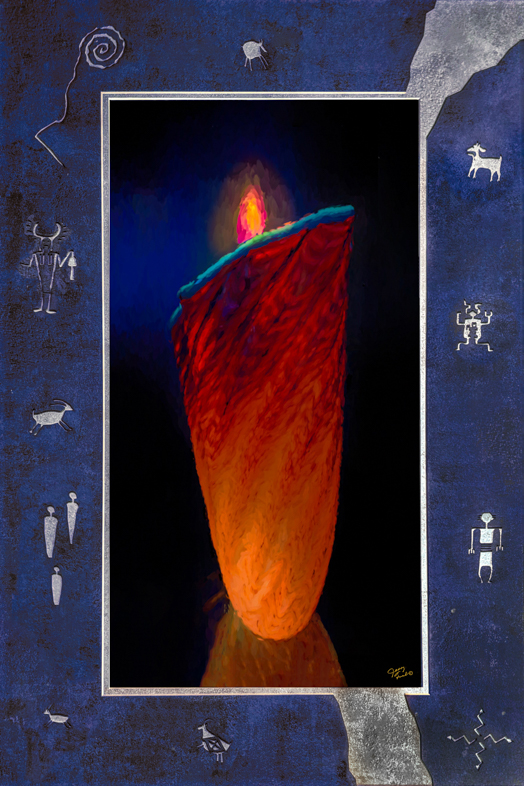
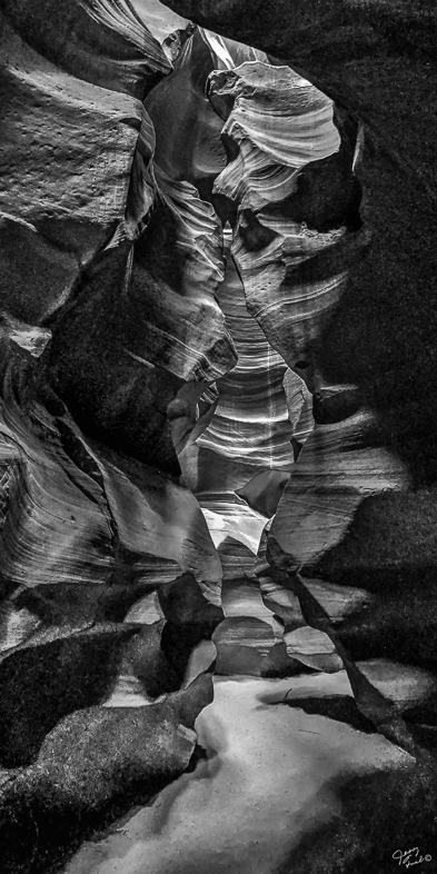
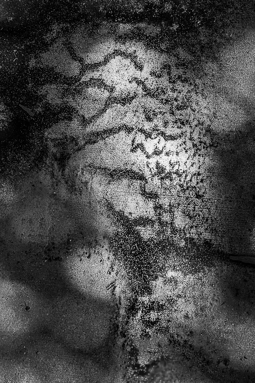
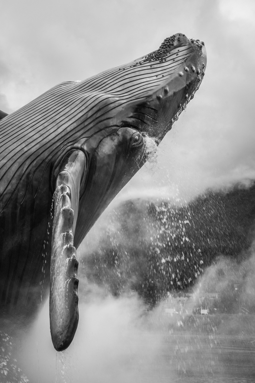
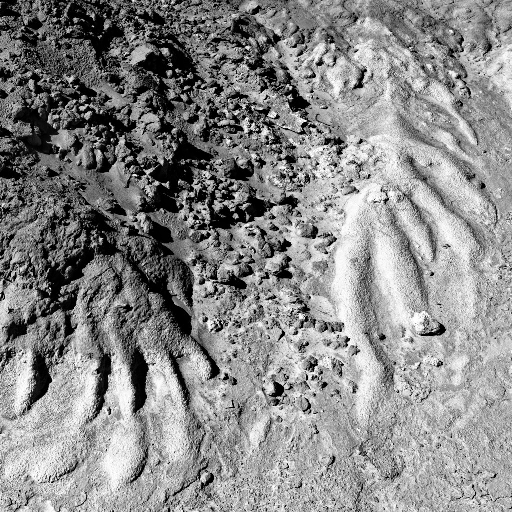
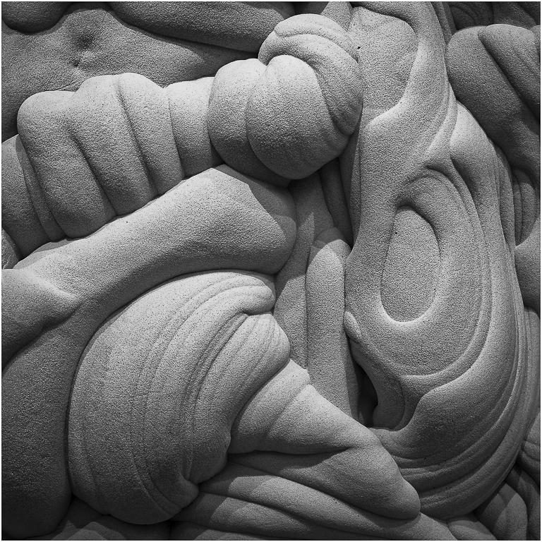
I thought you would appreciate seeing my most recent find. This wall of rust (height approx. 10') is an installation at the Western Spirit Art Museum in Scottsdale, AZ. The patterns were formed by 5 weep holes for water to drip down. It can be studied for hours to find interesting patterns, subjects for further editing and creativity. Of course, I captured many detail shots too. Glare from the bright sun and vertical shooting angles pose photographic challenges. |
Jun 10th |
 |
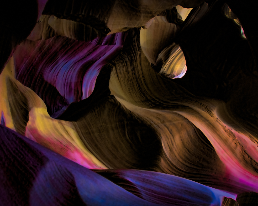
| 21 |
Jun 21 |
Comment |
I think this is outstanding! Both originals interest me and combining them as you did is remarkable to me. I also appreciate the previsualization demonstrated in #1, though I know it required more than one attempt.
I often capture shots like #2, so I see many opportunities for you to use various filters and colors to creatively utilize it further. |
Jun 8th |
1 comment - 1 reply for Group 21
|
| 34 |
Jun 21 |
Reply |
Looks great! |
Jun 9th |
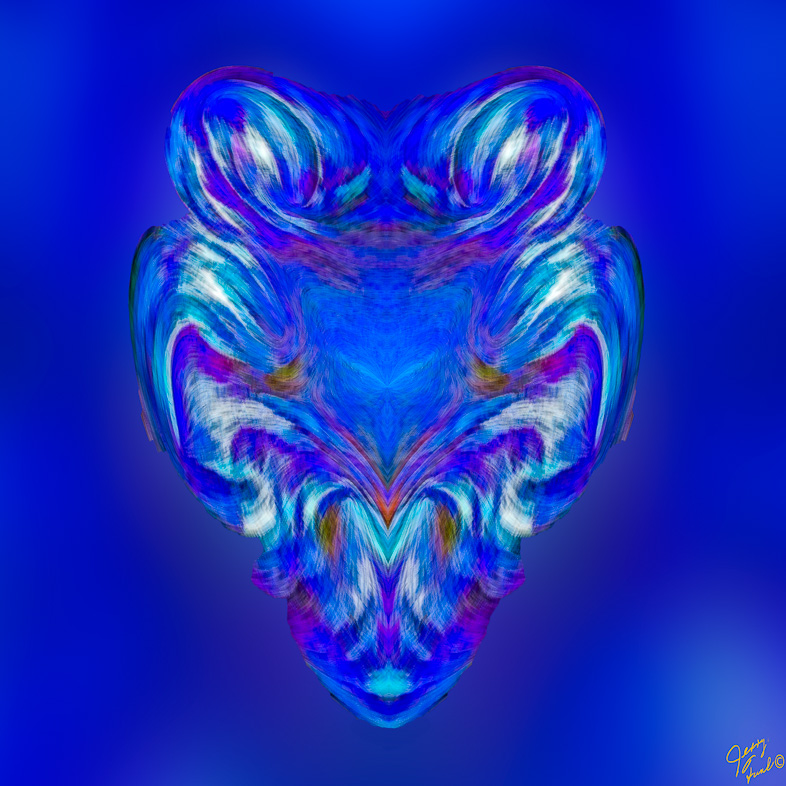
| 34 |
Jun 21 |
Comment |
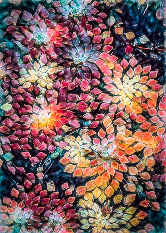
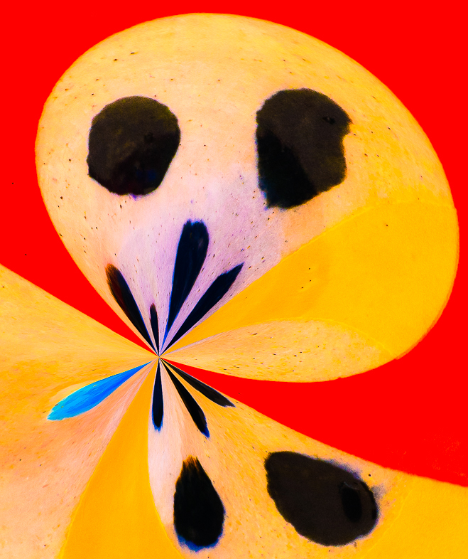
I'm surprised and very pleased to see how well the various flowers blend together. The face is also appealing to me, but I think I would prefer more blue to replace green on the face. |
Jun 8th |
1 comment - 1 reply for Group 34
|
| 39 |
Jun 21 |
Comment |
Outstanding!
I even think the darkened bottom left corner contributes by forcing my eye to the right where you dodged it a bit.
Congratulations. |
Jun 8th |
1 comment - 0 replies for Group 39
|
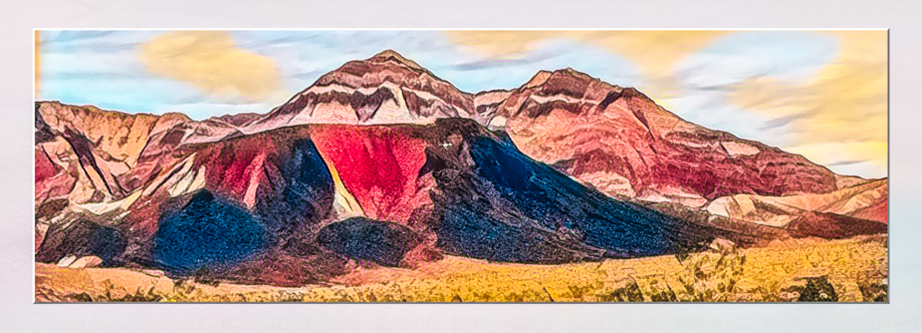
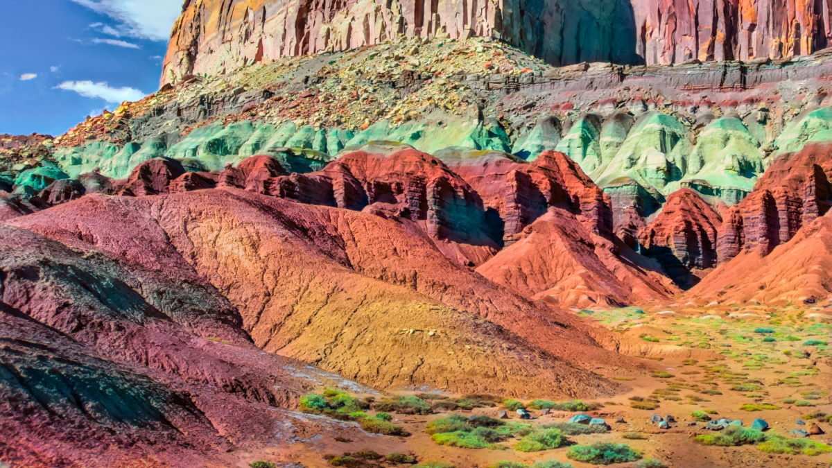
| 42 |
Jun 21 |
Comment |
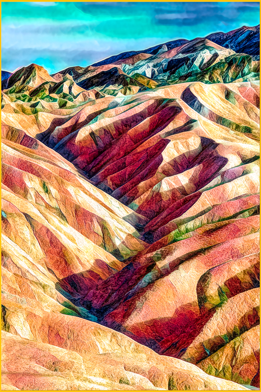
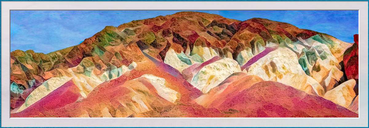
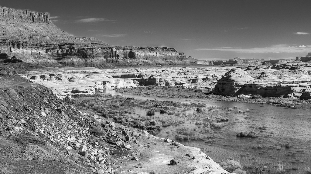
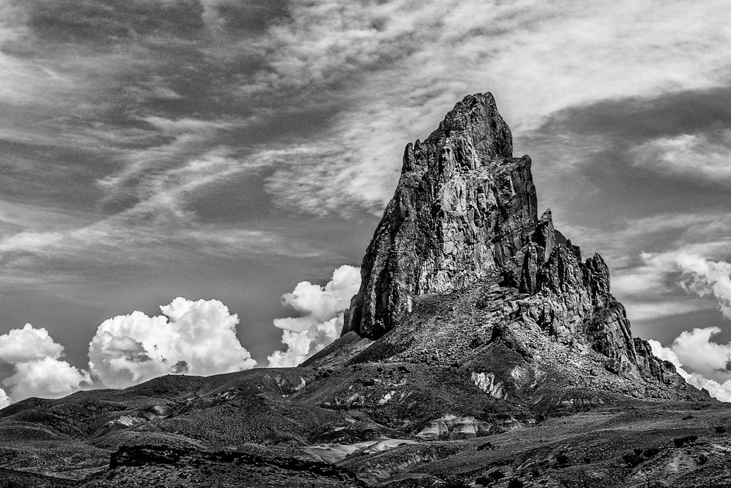
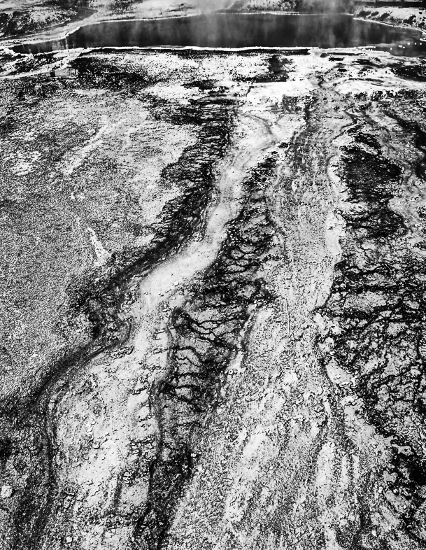
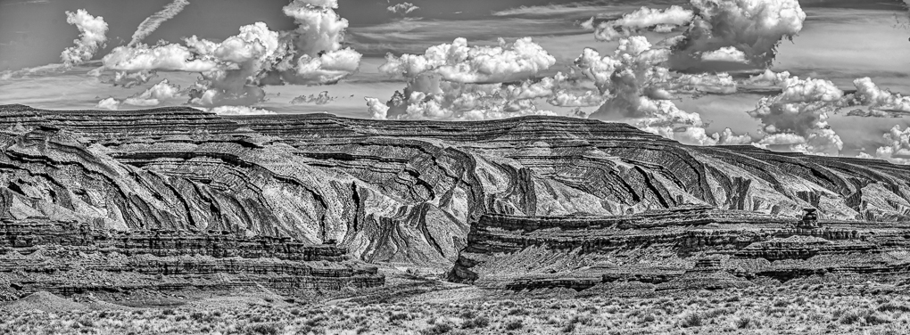
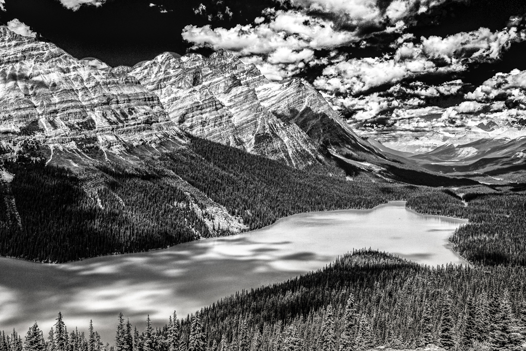
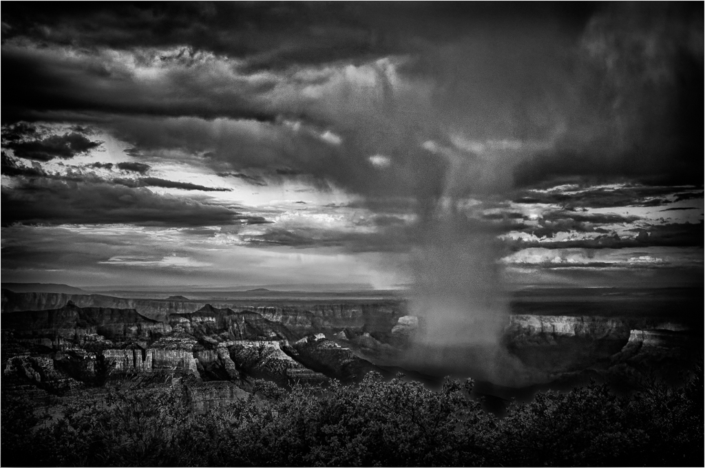
I like this and have photographed many similar landscapes especially in NV, UT and AZ. So, I understand why you probably increased the saturation. However, I've learned this actually would appear natural after a rare, brief shower.
Another way, I've started to enhance my graphic desert landscapes is to convert them to black and white. |
Jun 8th |
1 comment - 0 replies for Group 42
|
| 64 |
Jun 21 |
Reply |
Thanks. All. Going well from ICU in SLC. Food for first time in week. |
Jul 12th |
| 64 |
Jun 21 |
Reply |
Thanks. Perhaps DDGs will occupy mor e of my time now. |
Jun 30th |
| 64 |
Jun 21 |
Reply |
Thanks. All. Going well from ICU in SLC. Food for first time in week. |
Jun 30th |
| 64 |
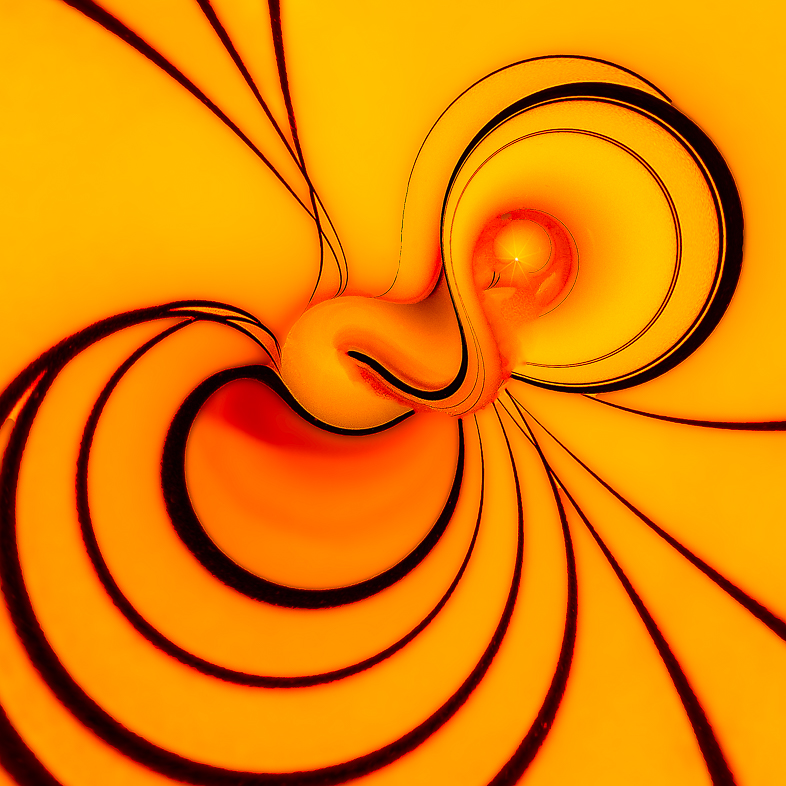
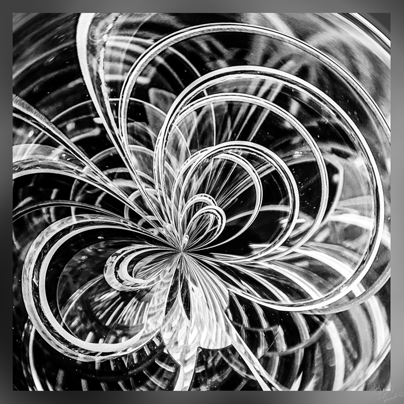
Jun 21 |
Reply |
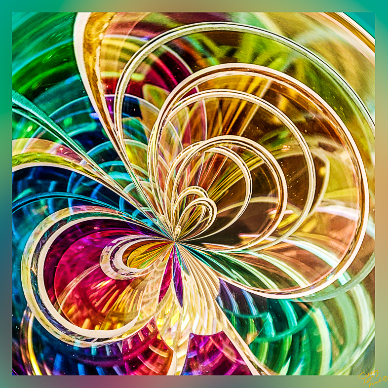
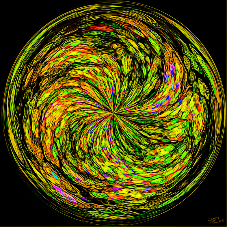
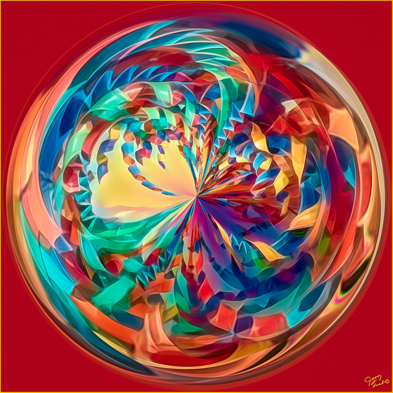
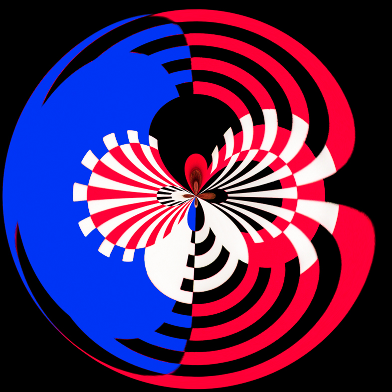
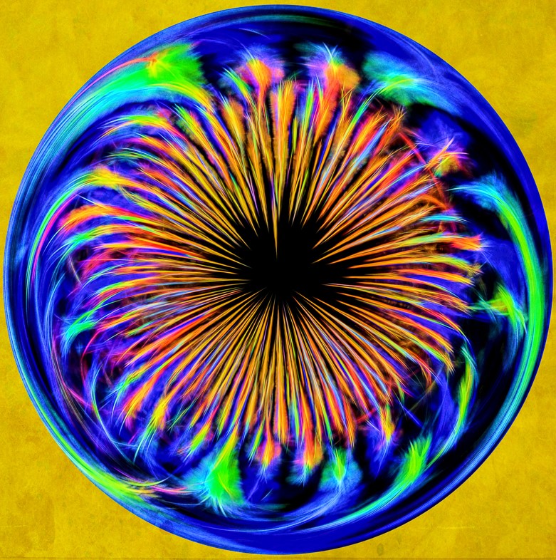
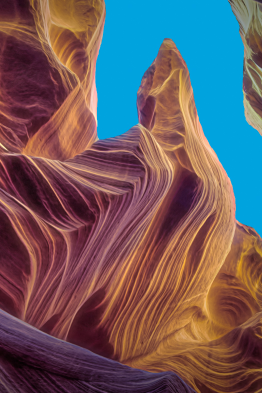
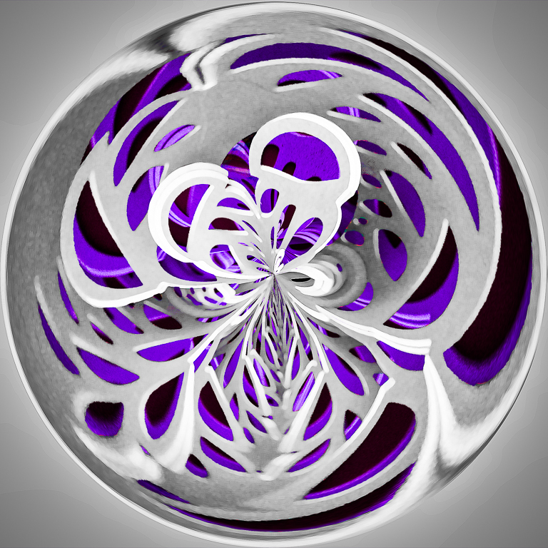
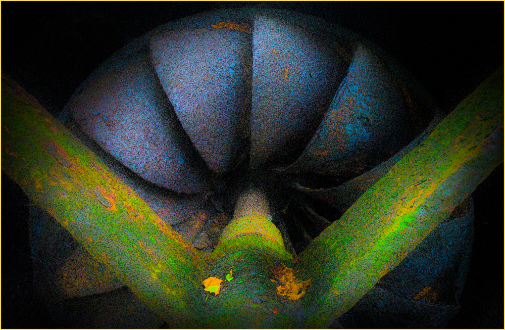
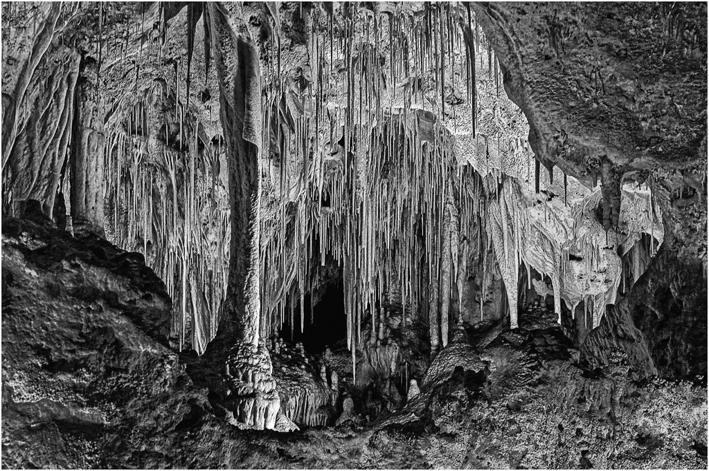
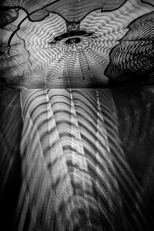
Thanks for your suggestion, but I prefer to see more of the spiral on top although it could be lightened a bit. I tried to draw ones eye to the center by lightening it, but perhaps I overdid it. |
Jun 10th |
| 64 |
Jun 21 |
Reply |
Thanks for your suggestion, but I prefer to see more of the spiral on top although it could be lightened a bit. I tried to draw ones eye to the center by lightening it, but perhaps I overdid it. |
Jun 10th |
| 64 |
Jun 21 |
Reply |
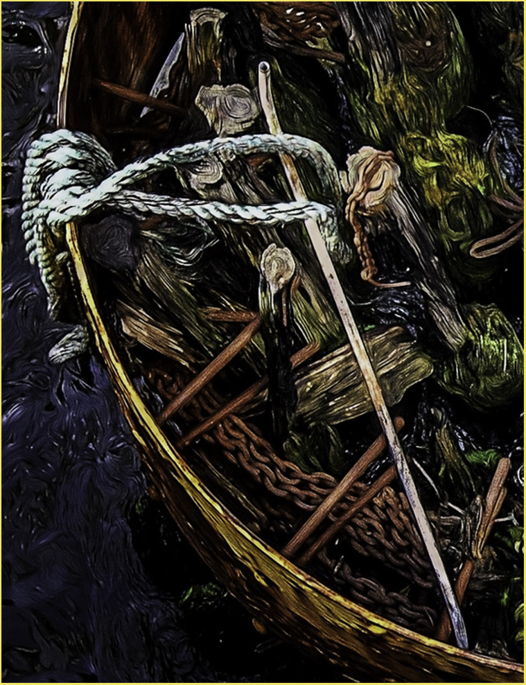
I don't have my full catalog with me, but i think this is close to what I captured. I really liked the lower falls and pond, although it doesn't show the bridge as well as your primary photo or the contrast between the falls.
Seeing these also reminds me of my wife's standard comment. "Why are you taking another picture of the falls". I think I had to merge two photos because my lens wasn't wide enough.
Touring this summer, I think I'll try to slow down and take a little more time to enjoy the moments. |
Jun 10th |
| 64 |
Jun 21 |
Comment |
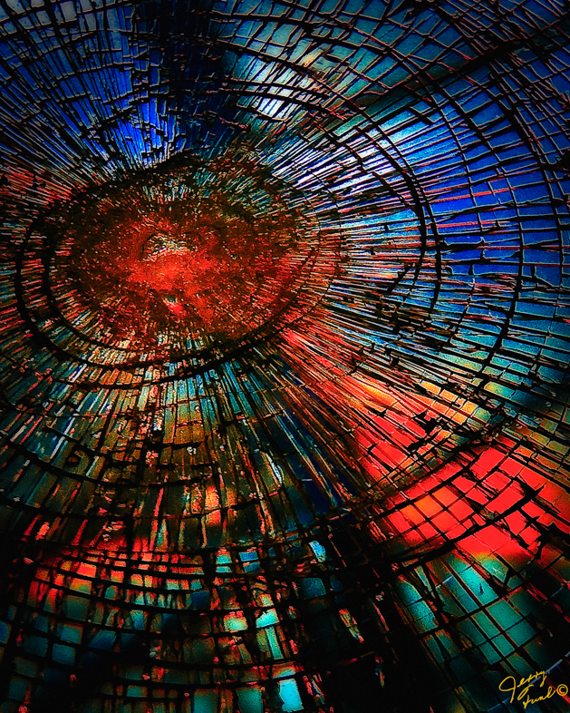
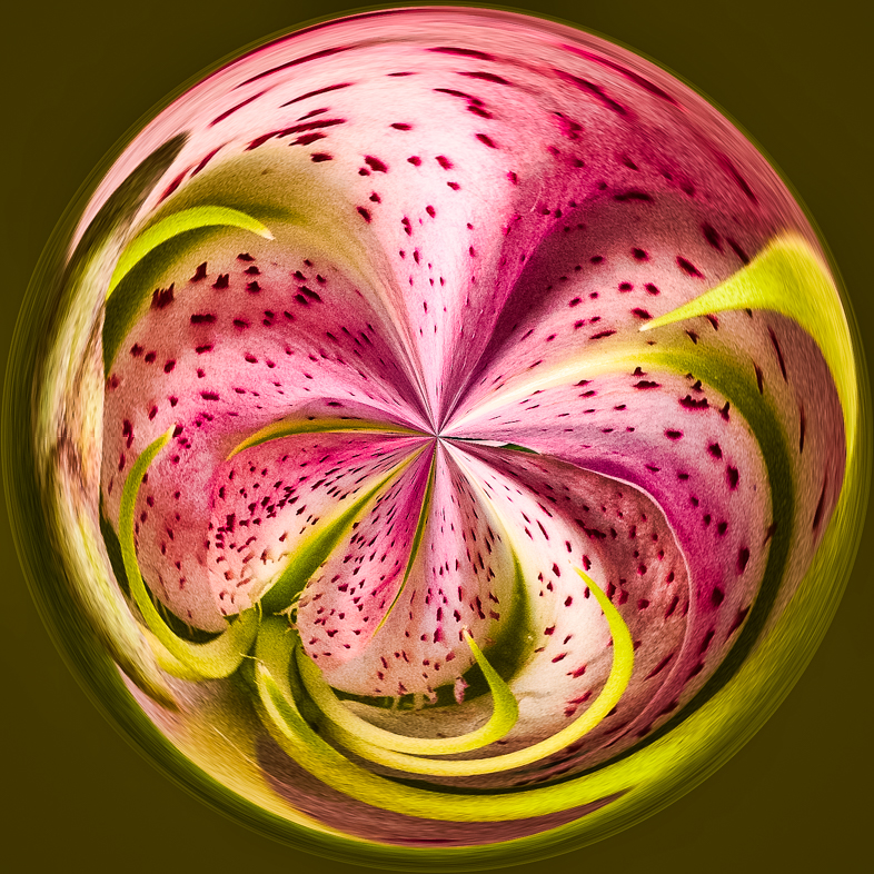
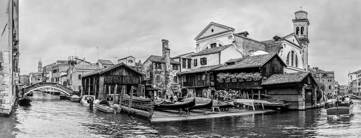
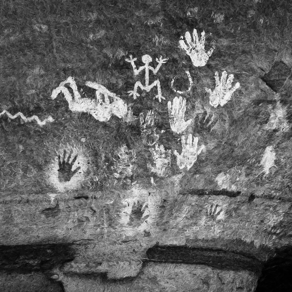
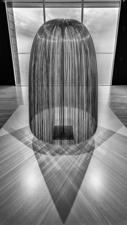
That's very interesting and intriguing. I assume a group of artists banded together to construct it. It reminds me of the spiral jetty in the Great Salt Lake. There too the stones had to transported and carefully placed. |
Jun 8th |
| 64 |
Jun 21 |
Comment |
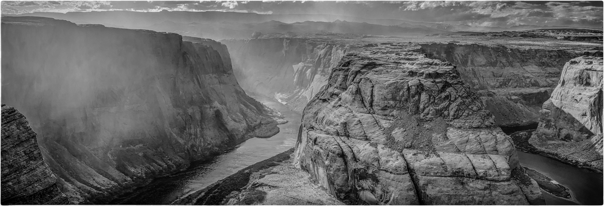
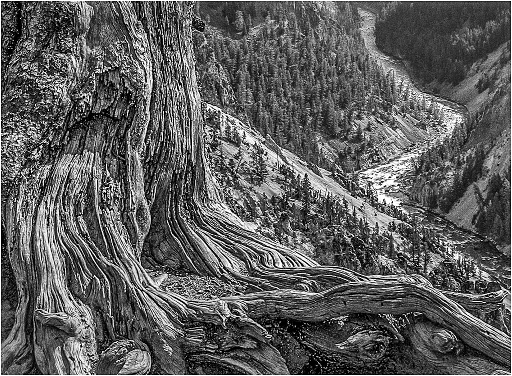
As you said this location is highly photographed, but I doubt anyone has done it better than you. Certainly, I didn't when I visited about 8 years ago. Maybe, I'll revisit my images and use yours as a guide in editing. It could be a good learning exercise for me. I doubt my water is represented as well as yours though. |
Jun 8th |
| 64 |
Jun 21 |
Comment |
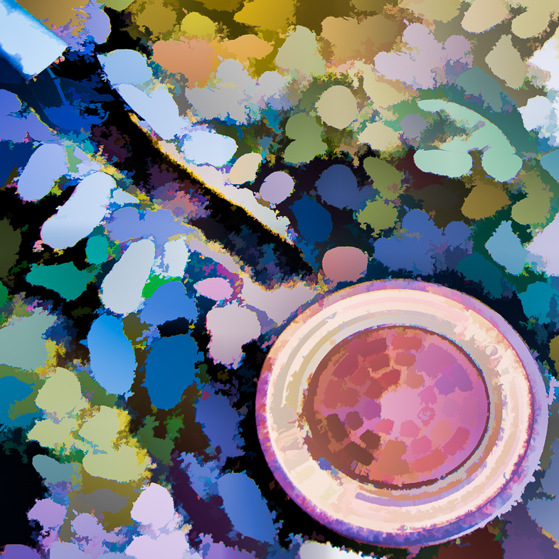
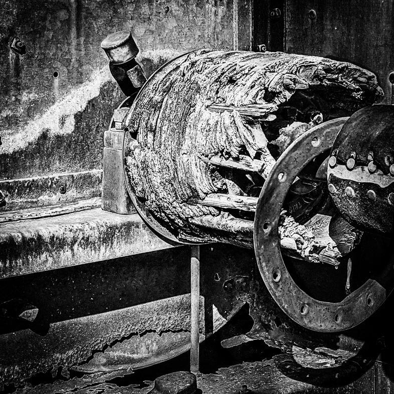
I like your picture, but I pthink the story would be better told if the right half was cropped off. I find the bright object distracting and the partial second gear is left not contributing to it. I would also suggest brightening the vertical support on the left. |
Jun 8th |
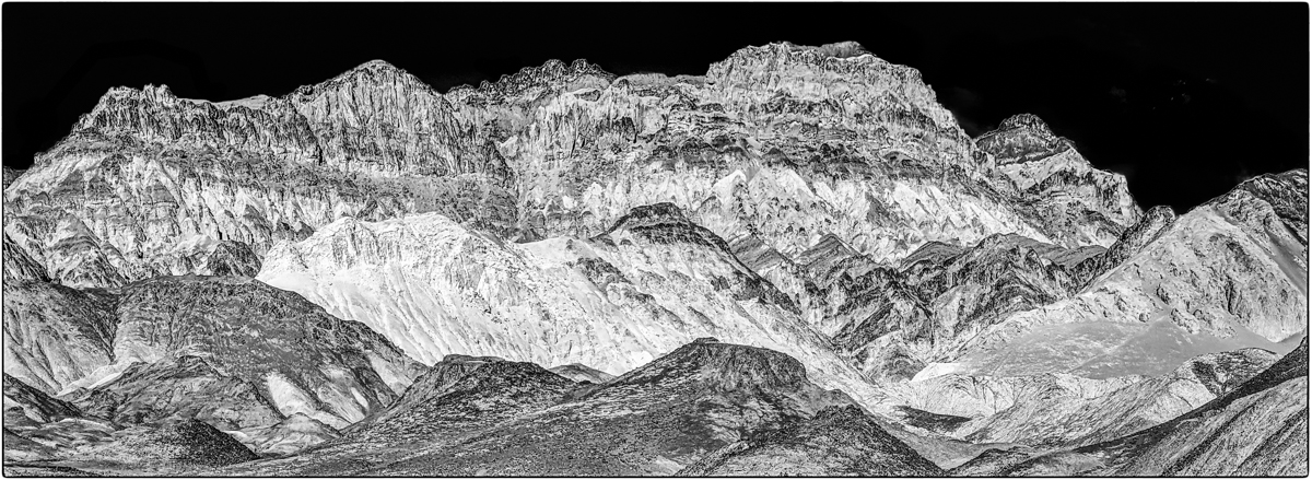
| 64 |
Jun 21 |
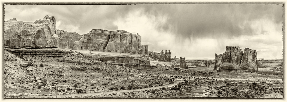
Comment |
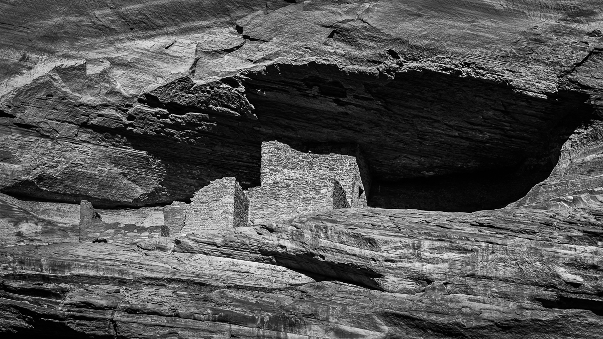
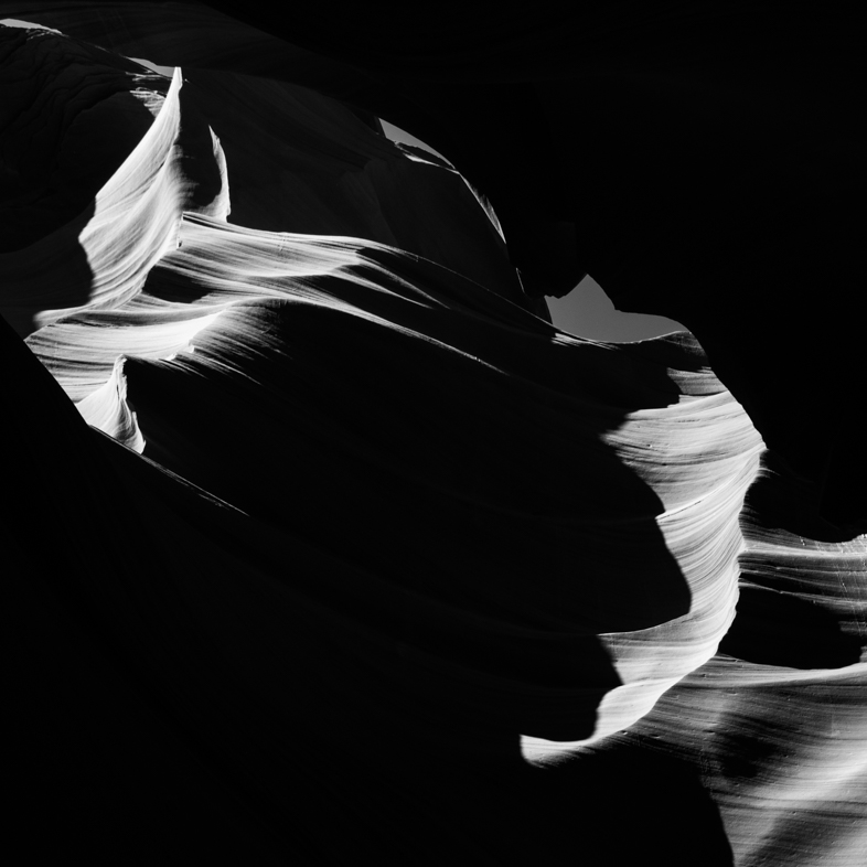
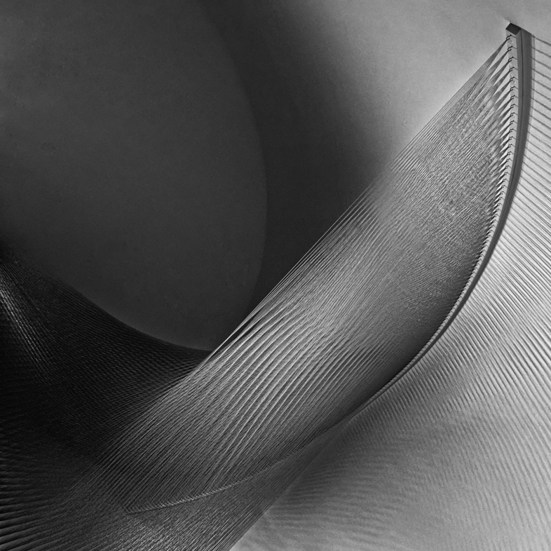
Wonderful architectural landscape photo. Great detail and variety. I'm not sure opening the shadows on the left would add to it for me. That dark area helps frame the picture, just as the much smaller dark area on the right. |
Jun 8th |
| 64 |
Jun 21 |
Comment |
Funny, I view this as I eat my Burger King breakfast!
I like everything about it- composition, detail, contrast. Super shot! |
Jun 5th |
5 comments - 6 replies for Group 64
|
18 comments - 11 replies Total
|