|
| Group |
Round |
C/R |
Comment |
Date |
Image |
| 20 |
Apr 21 |
Reply |
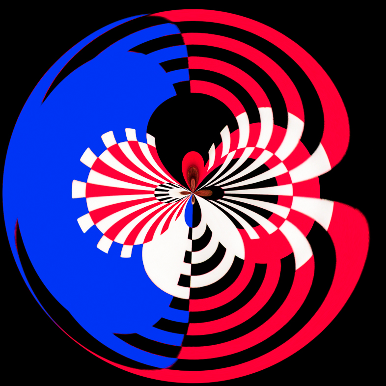
If I was to do it today, I would reduce the saturation. Next week, I may feel differently again. |
Apr 30th |
| 20 |
Apr 21 |
Comment |
Thanks for the link to the instructions. I think I probably thought of an alternative method, but I will read with interest.
I like the mysterious effect and seeing an image in a dark setting is a nice change of pace. I thank its very well done, but given the attractive model and good composition, I would make a brighter version too. |
Apr 10th |
| 20 |
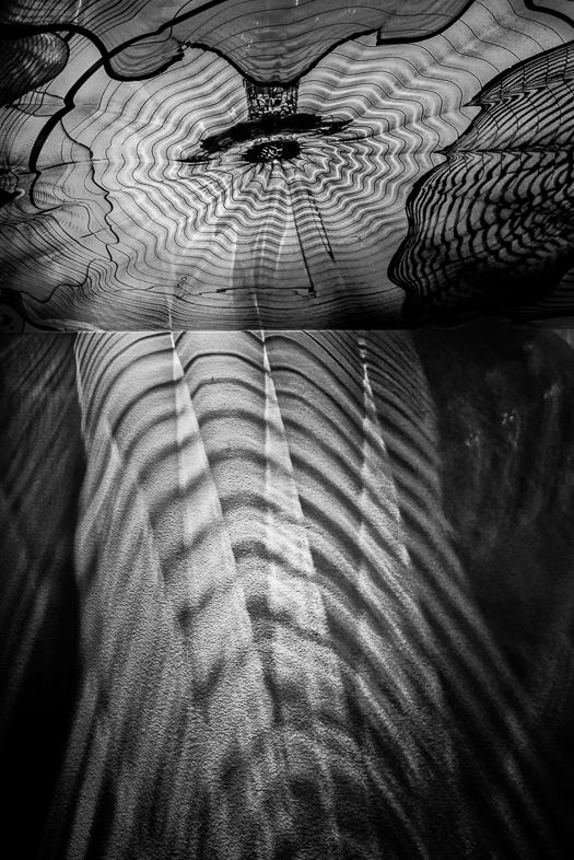
Apr 21 |
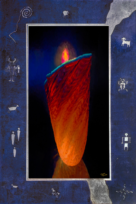
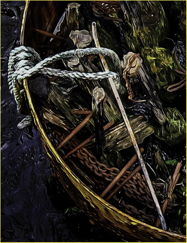
Comment |
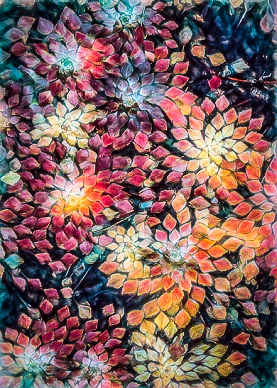
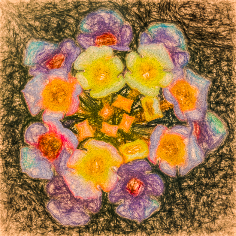
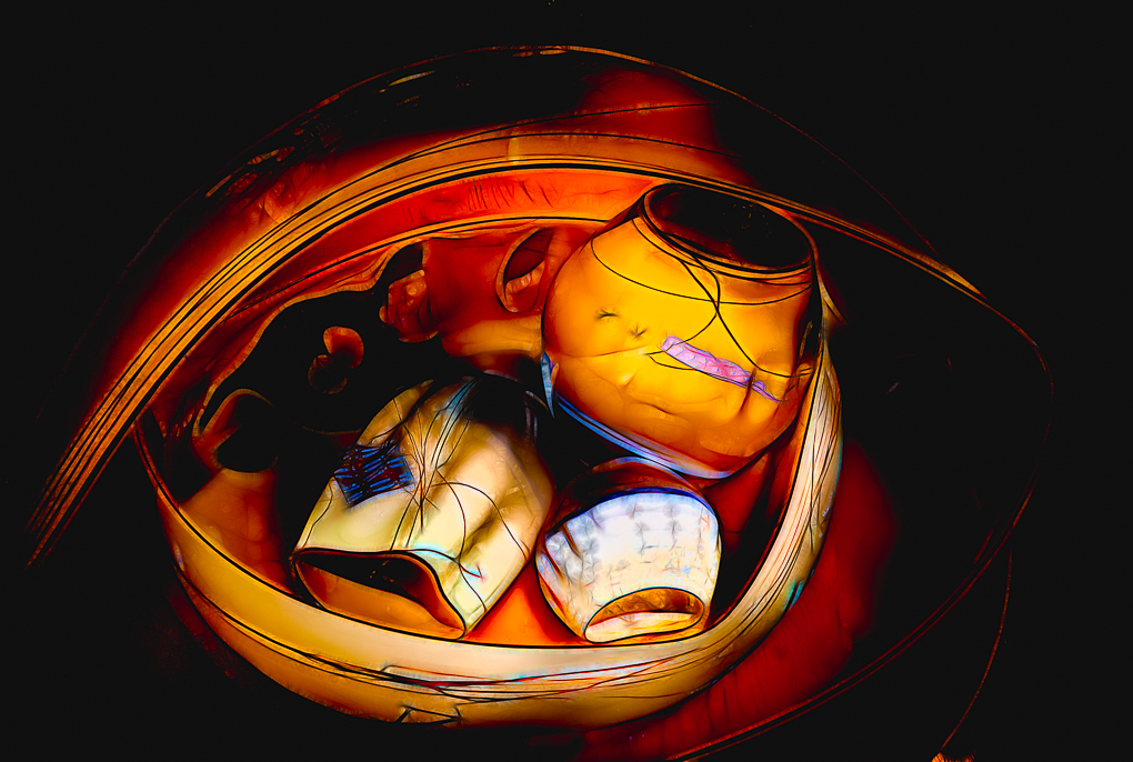
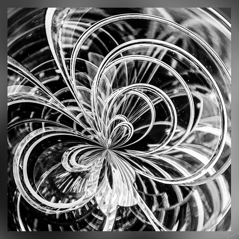
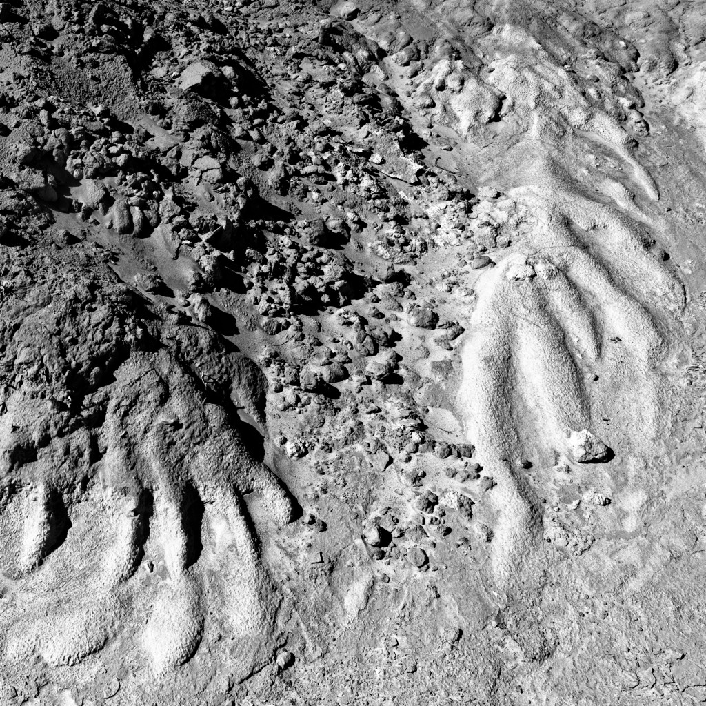
This gives me ideas to try with the many images of succulents that I have. I think it has sufficient movement that may be emphasized more by burning the corners, especially the lowe r left.
I'd probably make a half dozen variations of this because I like the composition and textures.
Thanks for stimulating my ideas for playing with Topaz Studio 2. |
Apr 10th |
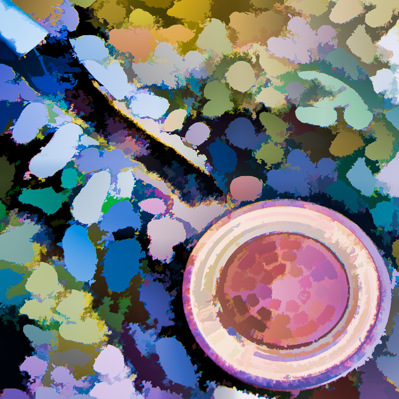
| 20 |
Apr 21 |
Comment |
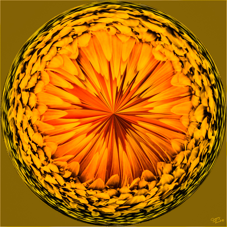
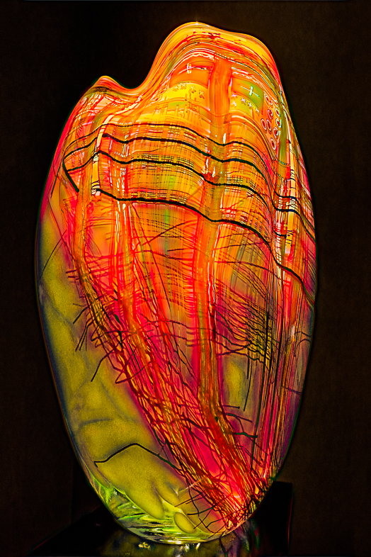
I like the pure white pitcher, but I would prefer a softer background. I think reds are difficult to portray and find myself reducing the saturation a bit. It generally adds some detail too. |
Apr 10th |
| 20 |
Apr 21 |
Comment |
One key to making any good composite is to ground your subjects as you did with the ballerina. I think many people would have left her "hanging in the air".
Yes, cloning out that one swan would make it perfect to me.
I look forward to seeing your next creation. |
Apr 10th |
| 20 |
Apr 21 |
Comment |
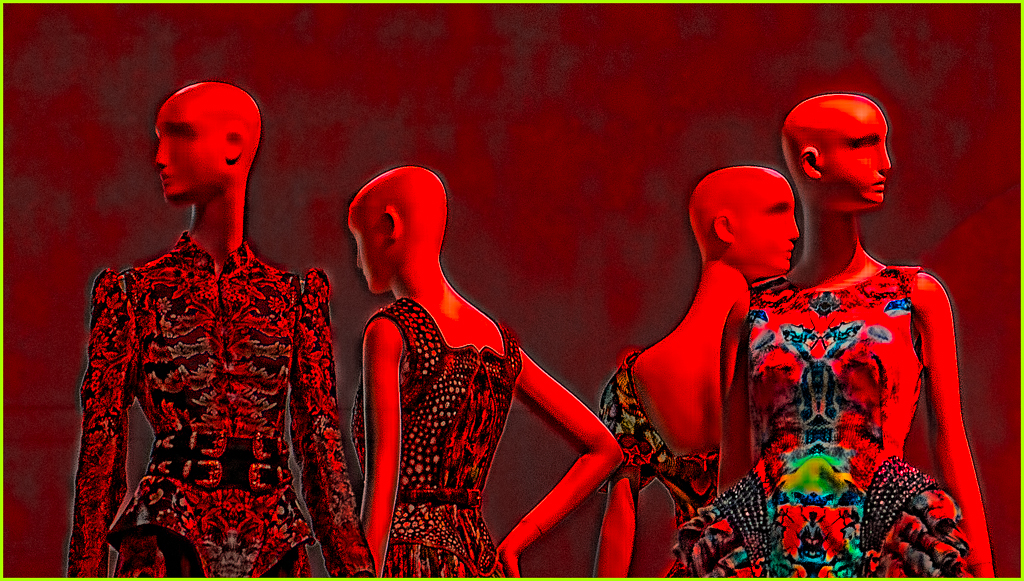
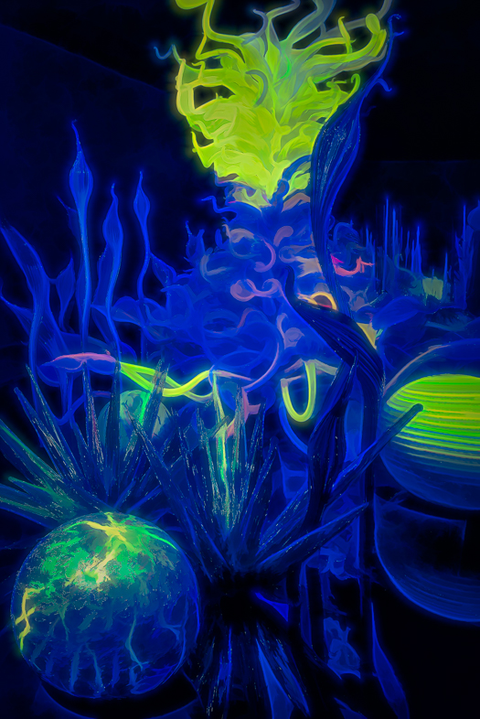
I like your choice of subjects and the merging. But the final effect is too harsh for me. |
Apr 10th |
| 20 |
Apr 21 |
Comment |
I like your choice and application of the vertical movement effect. It has a special look about it to me.
I wonder if it might be slightly more interesting if there was a focused subject on the ground where the boy is looking |
Apr 10th |
6 comments - 1 reply for Group 20
|
| 64 |
Apr 21 |
Reply |
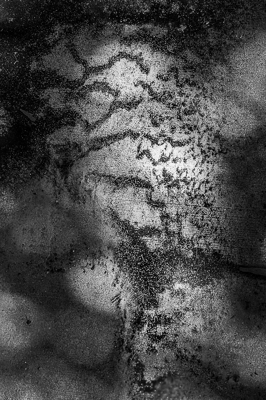
Yes, thank you. I understand. It really is a natural abstract, but I hesitate presenting it as such to a monochrome group. |
Apr 26th |
| 64 |
Apr 21 |
Comment |
Yes, I too like the idea of cropping off the sky. |
Apr 26th |
| 64 |
Apr 21 |
Comment |
The feeling I get from both versions are different, but I like both of them. |
Apr 26th |
| 64 |
Apr 21 |
Reply |
I don't understand your comment, because the base/bottom of both images are identical. |
Apr 26th |
| 64 |
Apr 21 |
Reply |
Yes, the color version is darker, but is much closer to the feeling one has when there. Two versions, two stories for me. |
Apr 19th |
| 64 |
Apr 21 |
Comment |
I like the mood and the composition as is. In my make believe world, I see a cozy cottage instead of an ice house. |
Apr 19th |
| 64 |
Apr 21 |
Comment |
I like this image very much without any changes. Adding contrast to the sky would distract me from the impressive ship. I think the bits to the right are too small to be distracting while helping emphasize its immense size.
Very well done. |
Apr 18th |
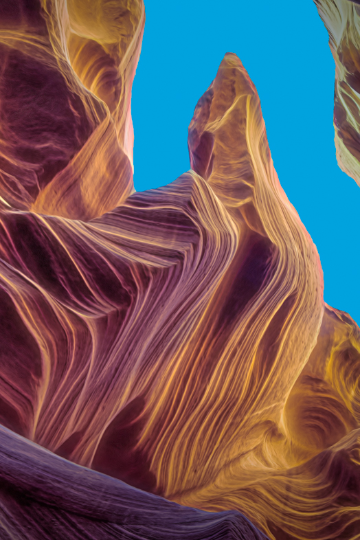
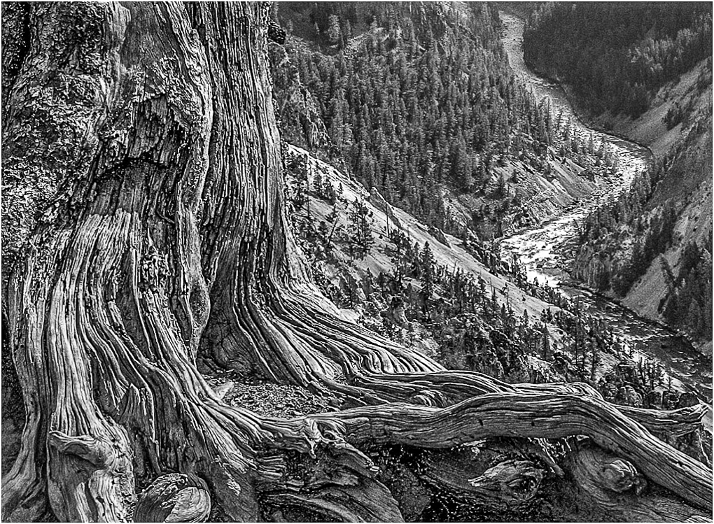
| 64 |
Apr 21 |
Comment |
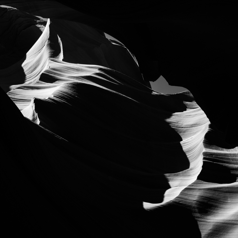
Ordinarily, I prefer perfectly straightened images, but not this time. I like the emphasis on the height. Of votes, the detail and contrast are very pleasing to me too.
If I were to make any change, I would crop off some of the top. This would force my eye to concentrate on the depth of the image rather than first looking at the height. |
Apr 18th |
| 64 |
Apr 21 |
Reply |
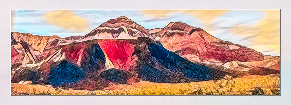
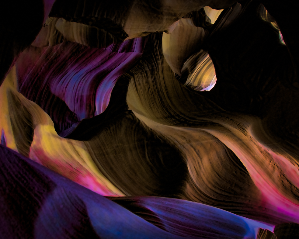
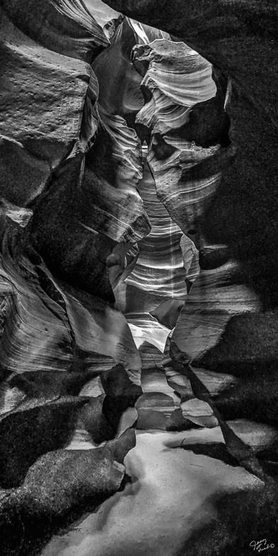
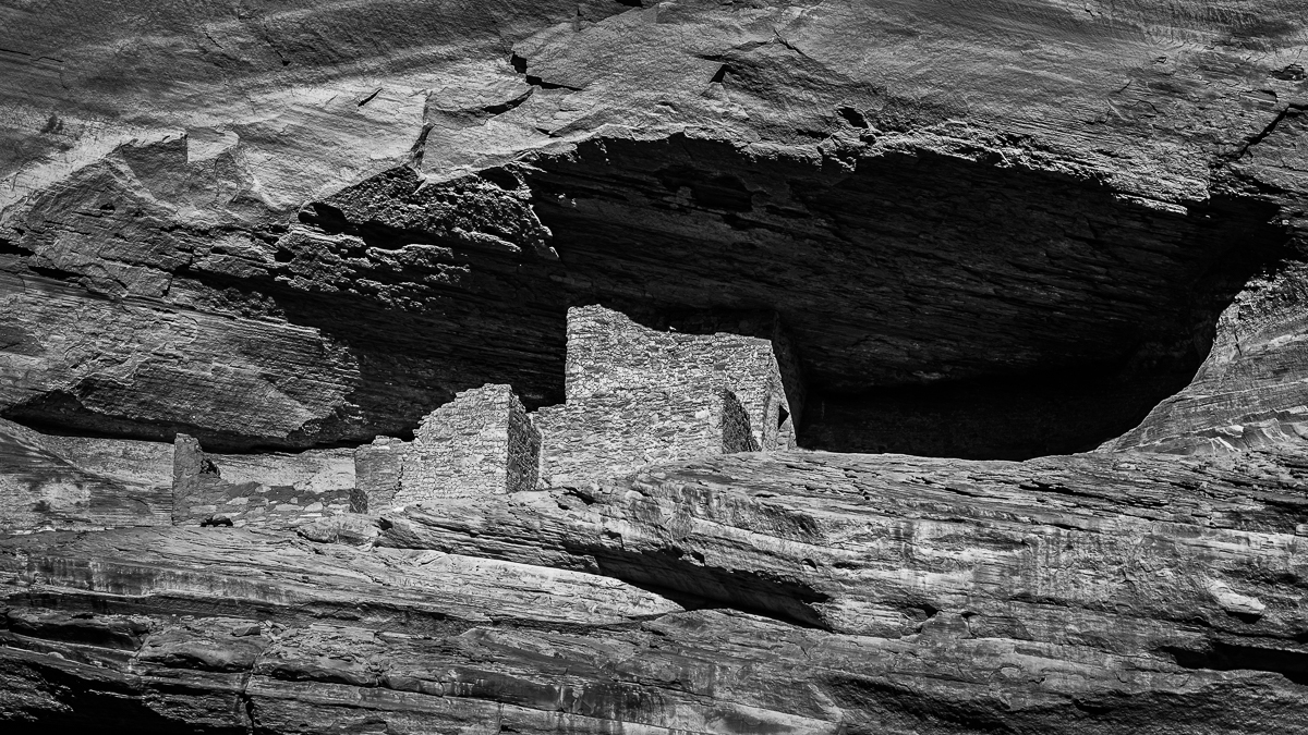
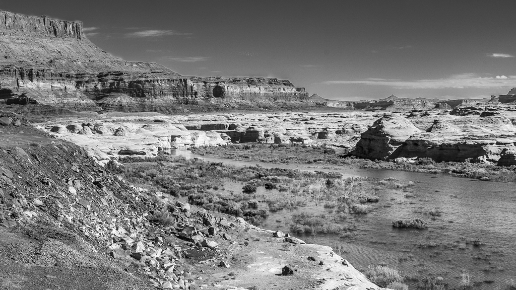
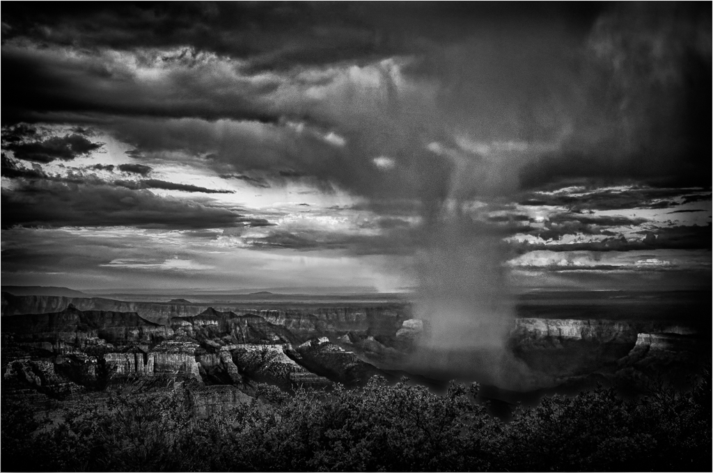
Yes, it was shot at 3:45 on a March afternoon. So, the sun was not high.
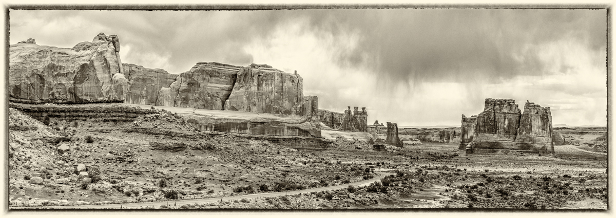
I agree my mono image is not unique but I think my original is a unique ultra wide angle view that shows both a well exposed sky and floor. Unfortunately, I didn't think that would be conveyed in a mono version, so I cropped it.
Personally, I think Photoshop sun rays in the canyon can look more appealing to me than the many versions photographers long to capture with their cameras. I haven't bothered with either because they too wouldn't be unique. |
Apr 6th |
| 64 |
Apr 21 |
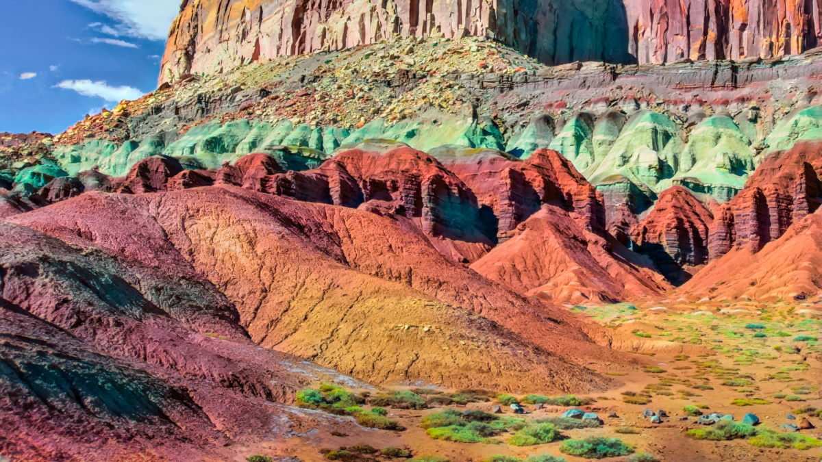
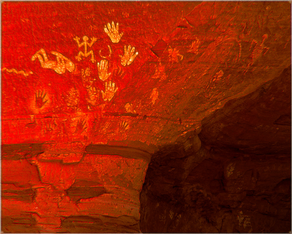
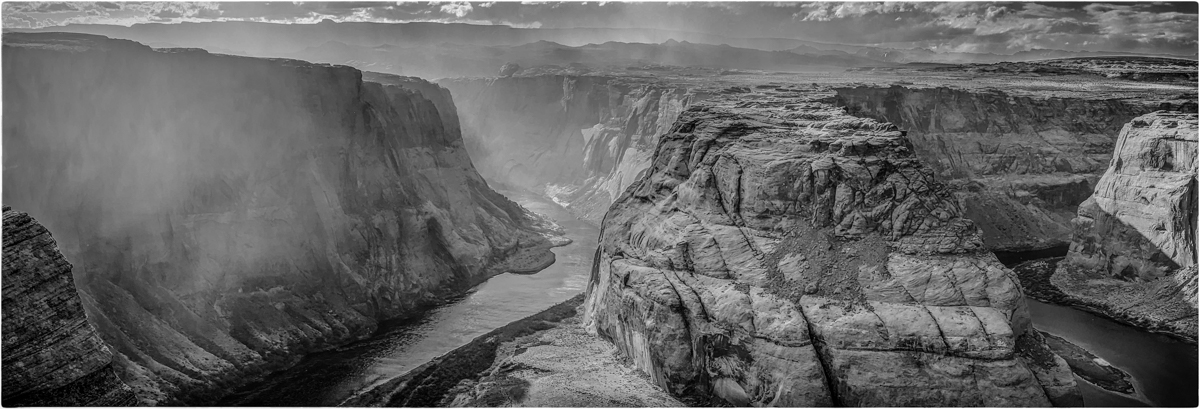
Comment |
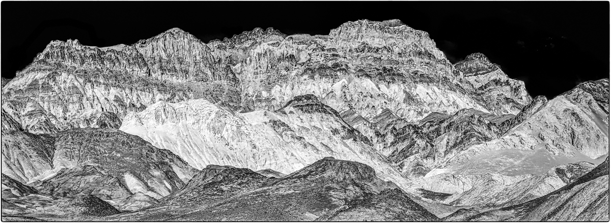
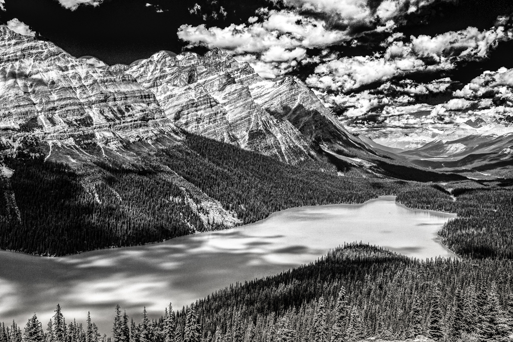
I think this is an unusual image of the Grand Canyon because it appears to be a gray day with the usual dark shadows all opened to reveal a consistent view of grandeur. That however left me with an uninspiring but not distracting view of the distant background and sky. I might crop it off. My compliments also for it not appearing to have any distortions. |
Apr 5th |
| 64 |
Apr 21 |
Comment |
I like the effect of the slower shutter speed because it emphasizes the action for me while the main subjects are sharp enough. I like the composition too because most rodeo images I see have distracting backgrounds. |
Apr 4th |
| 64 |
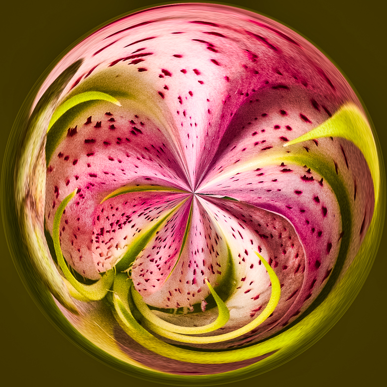
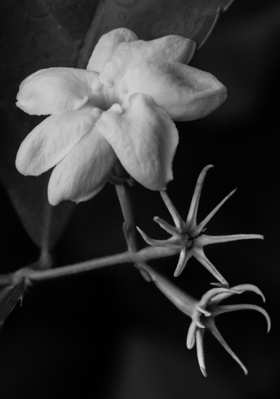
Apr 21 |
Comment |
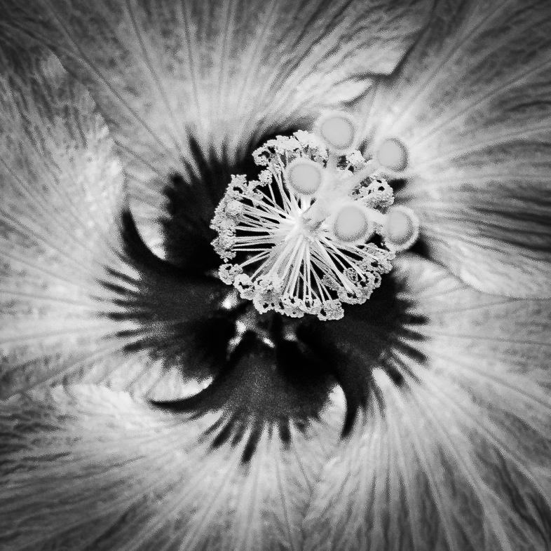
I like the composition because it makes me appreciate the structure of the petals. I also think your conversion and choice of color were also excellent because it maintains the delicacy of the rose. Increased detail and structure would have spoiled it for me. |
Apr 4th |
8 comments - 4 replies for Group 64
|
14 comments - 5 replies Total
|