|
| Group |
Round |
C/R |
Comment |
Date |
Image |
| 18 |
Jan 21 |
Comment |
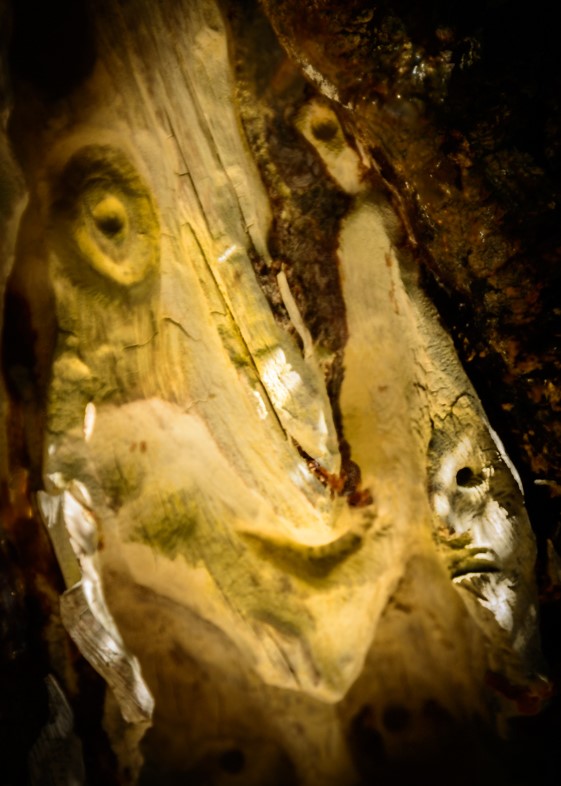
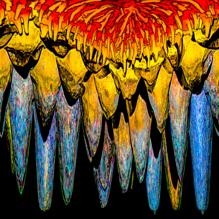
I applaud your creativity. I don't think it even needs a title.
I would prefer to see more detail in the face though. It's too contrasty for my taste. |
Jan 8th |
| 18 |
Jan 21 |
Comment |
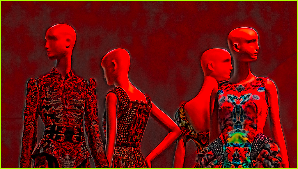
Beautifully done.
Cloning in a full moon would be a nice touch. |
Jan 6th |
| 18 |
Jan 21 |
Comment |
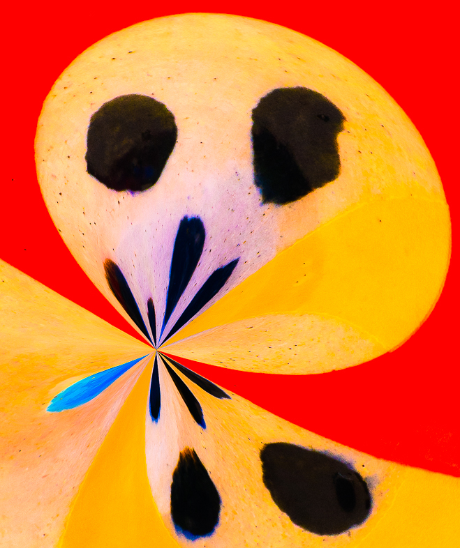
Very interesting.
I'm not familiar with the techniques, but I like what you accomplished and would also like to explore using those tools too.
My one picky suggestion is to break the continuity of the pattern joining the arm and the knee. Cloning could do that and make it appear more like body paint. Just my personal preference. |
Jan 1st |
3 comments - 0 replies for Group 18
|
| 20 |
Jan 21 |
Reply |
I sent you an email description as I posted some months ago. |
Jan 26th |
| 20 |
Jan 21 |
Comment |
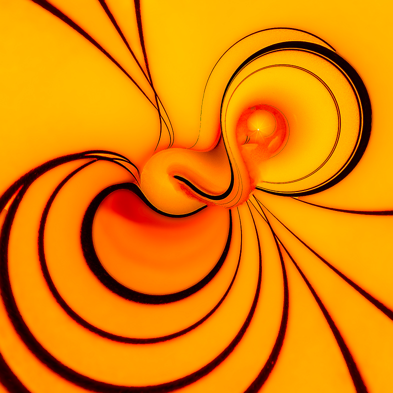
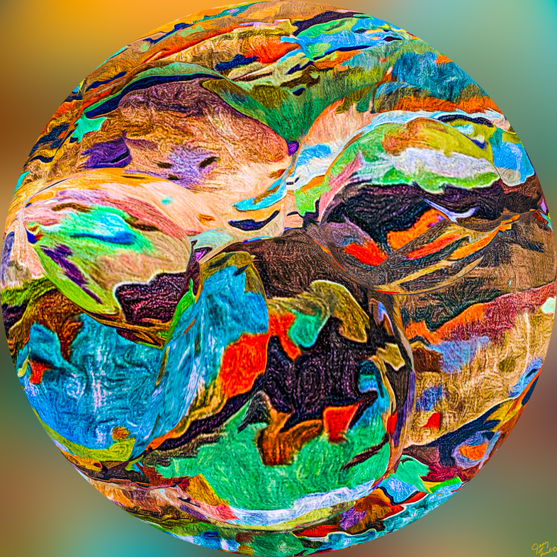
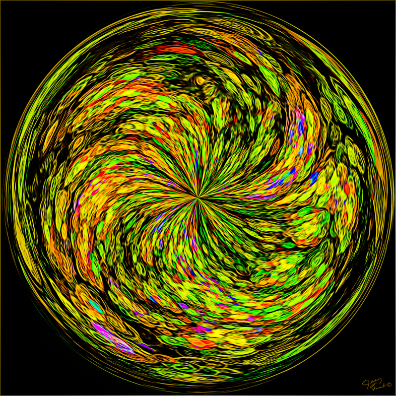
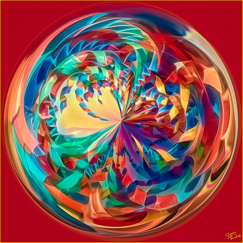
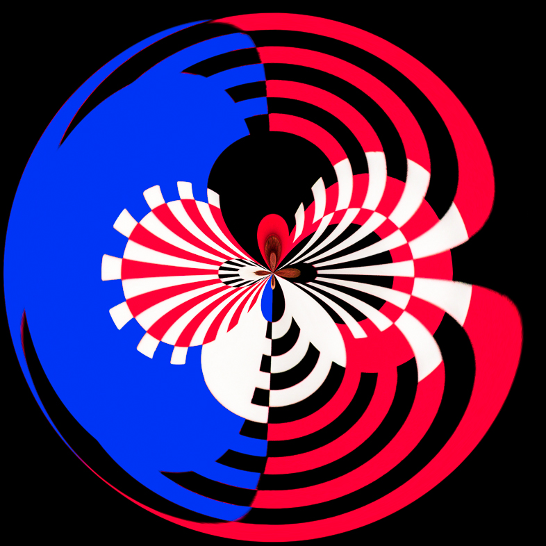
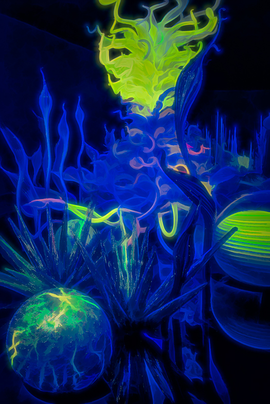
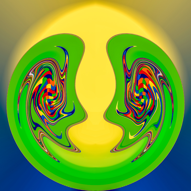
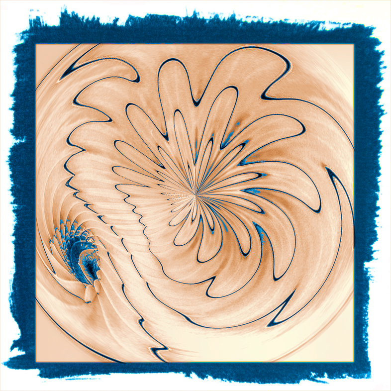
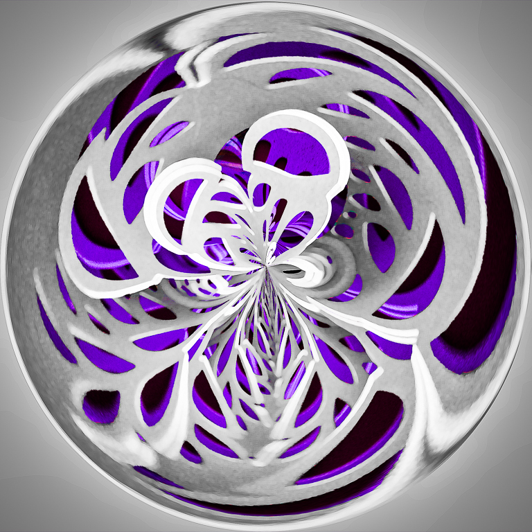
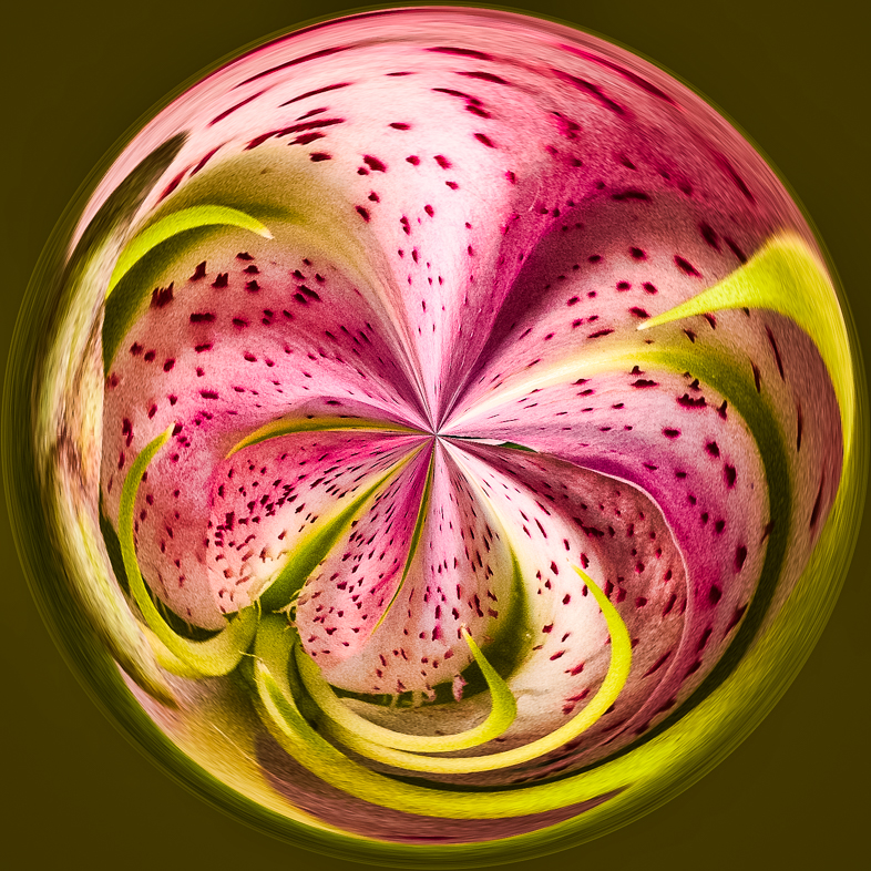
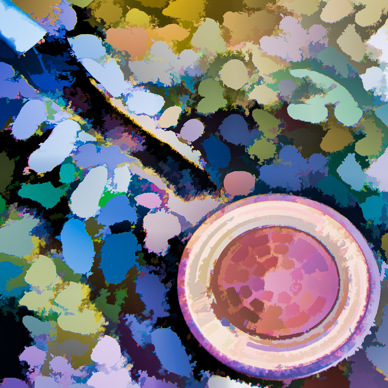
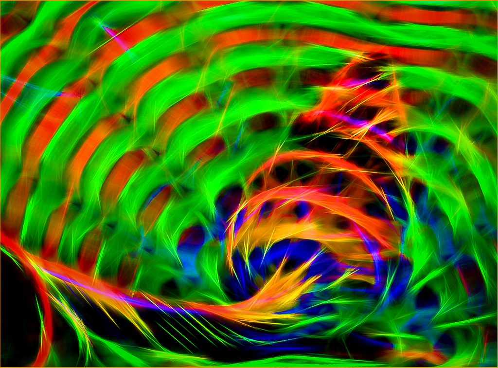
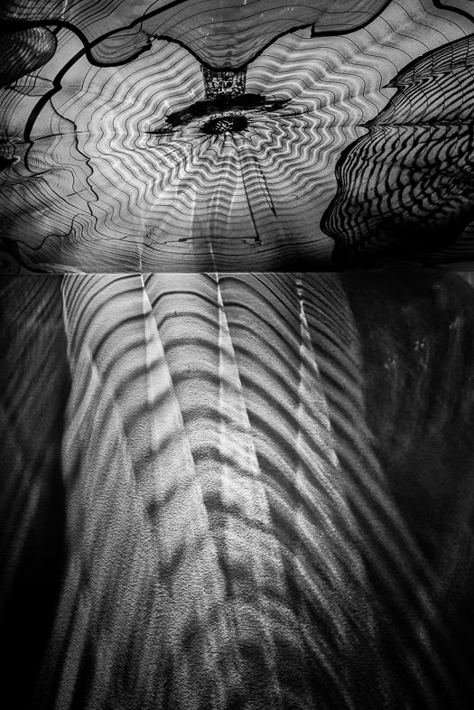
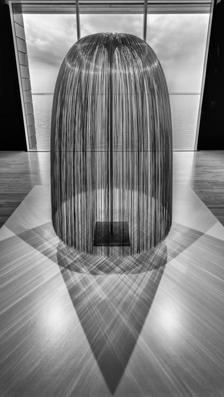
I hadn't previously seen a creative image using mezzotints. When we are stuck for creative ideas, I think this is a good reminder for us that there are many filters we haven't used
I like your graphic design. I wouldn't move the moon but I would increase its opacity. Maybe, the shadows could also be opened so the bottom V would be connected.
I would eliminate the distraction in the bottom left corner.
Your picture with your bio is great. Probably the most creative portrait on the DDG sites. |
Jan 16th |
| 20 |
Jan 21 |
Comment |
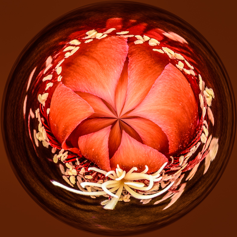
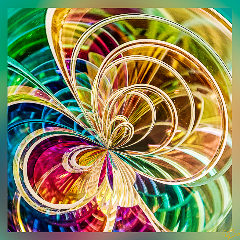
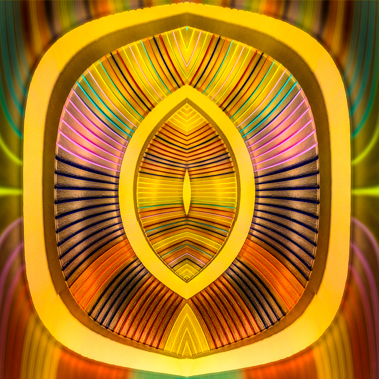
I like the graphic design, but my eyes are drawn to the lighter colors in the corners. I suggest opening the center shadows to start. |
Jan 16th |
| 20 |
Jan 21 |
Reply |
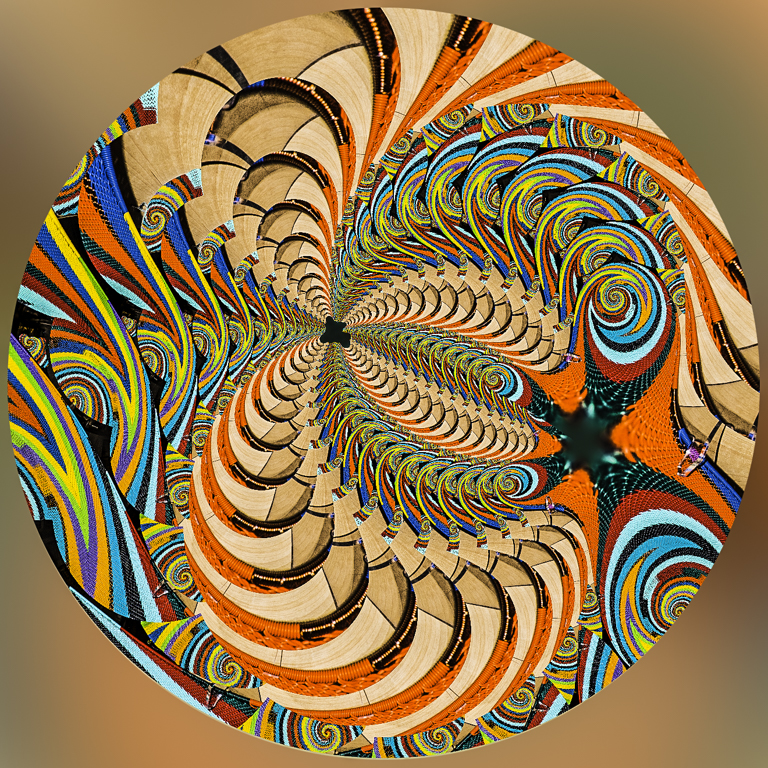
I used PS distort/polar coordinates. |
Jan 16th |
| 20 |
Jan 21 |
Reply |
Thanks. I have a large archive of creative images to share, but this was made recently and I felt compelled to share it now. |
Jan 15th |
| 20 |
Jan 21 |
Comment |
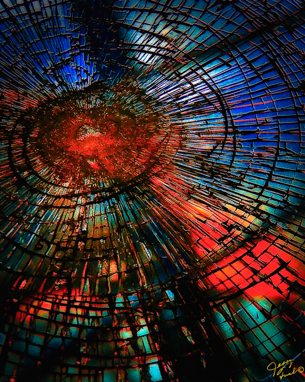
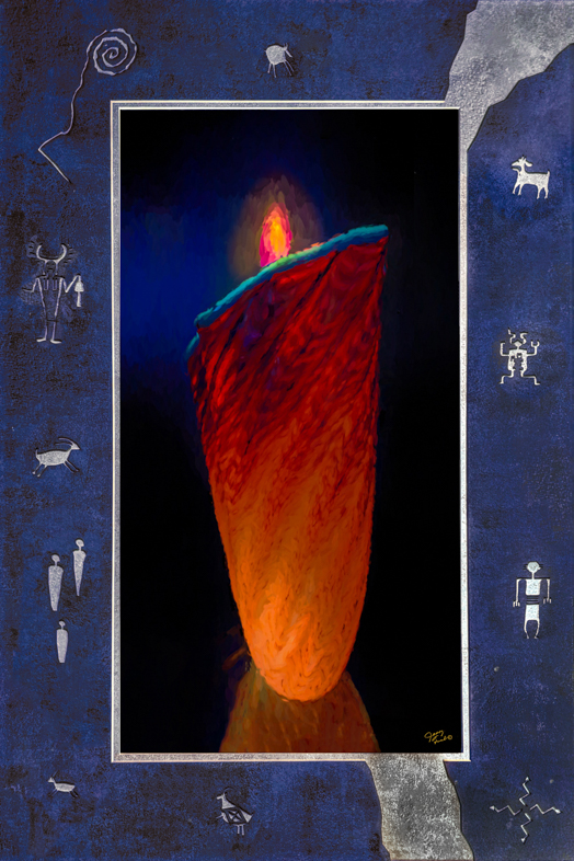
I like the effects created by your use of those filters. However, the hot spot in the middle is bothersome to me and I would prefer to have the head be the center of interest with burning around it. |
Jan 8th |
| 20 |
Jan 21 |
Comment |
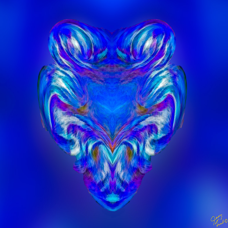
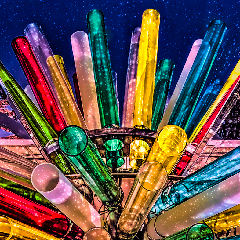
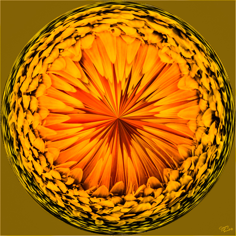
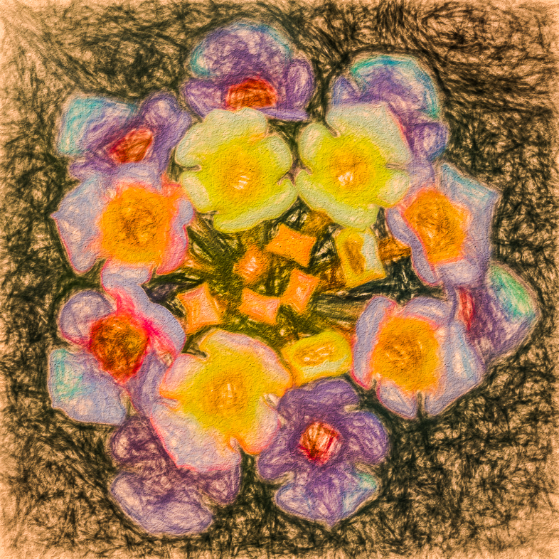
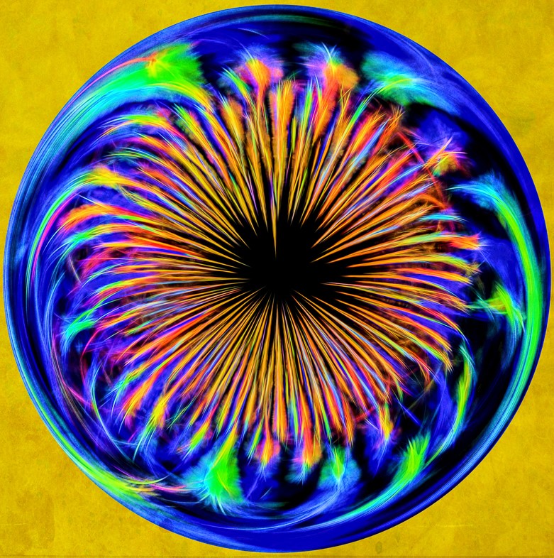
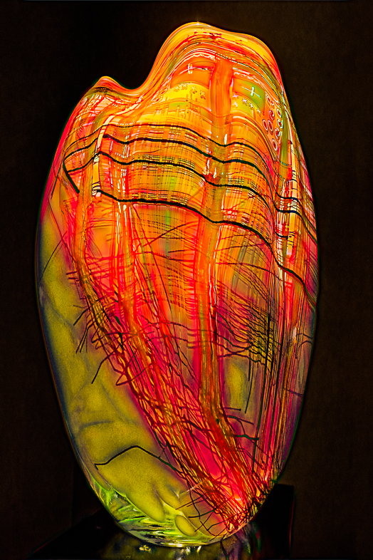
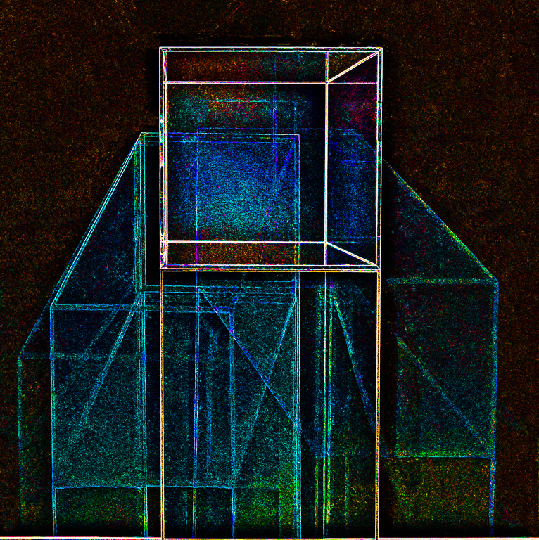
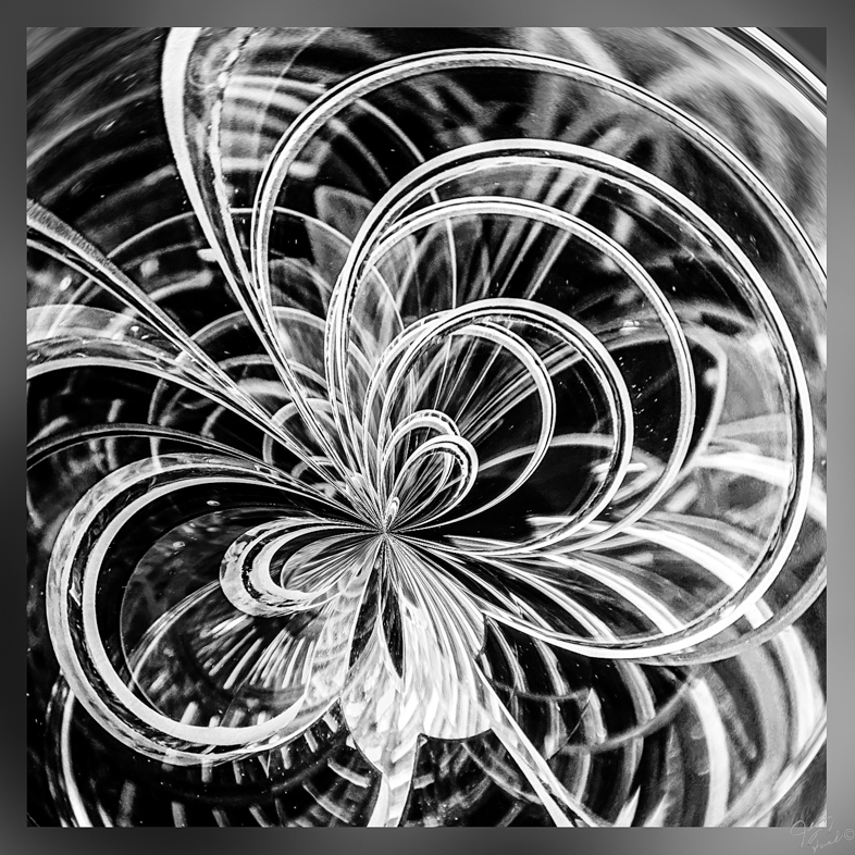
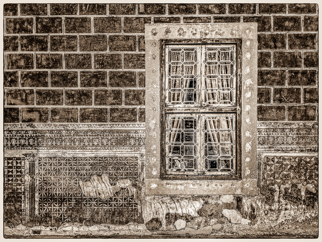
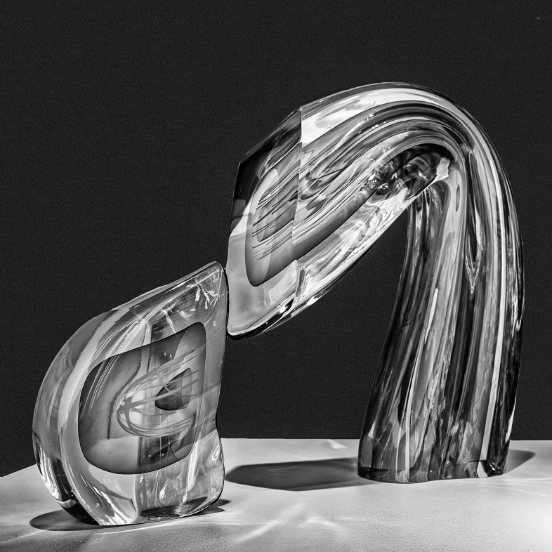
This image makes me think that I'm looking through blocks of glass. The white pattern almost looks like frost to me. Very nice.
It should be reassuring to you being able to easily create a striking creative image. You obviously know your tools very well and like wise easily apply your collected body of knowledge. |
Jan 8th |
| 20 |
Jan 21 |
Comment |
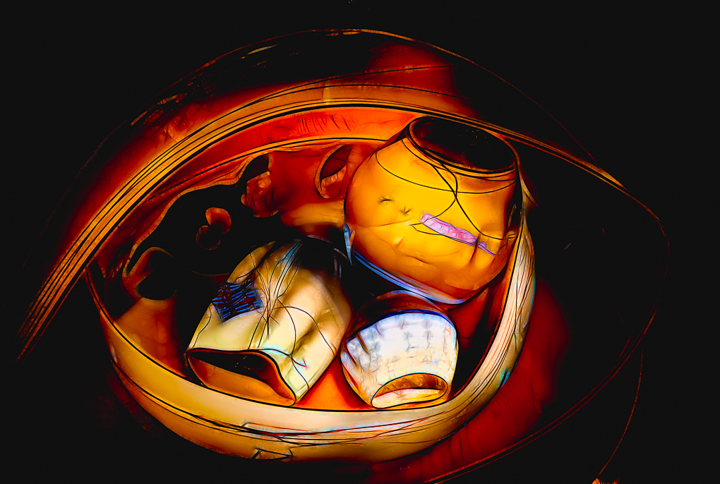
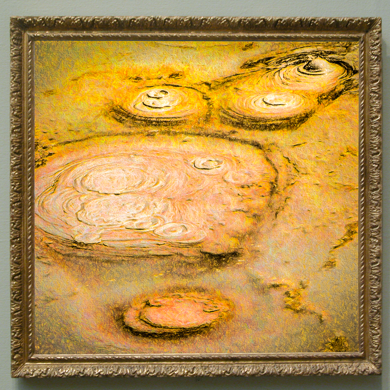
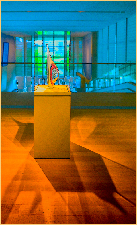
Beautifully done, and Happy New Year to you too.
Two minor thoughts. It looks to me that there is a cork floating towards the rear of the bottle. I also think the mini-lights could be more appealing. Like I said, 2 minor things. |
Jan 1st |
6 comments - 3 replies for Group 20
|
| 34 |
Jan 21 |
Comment |
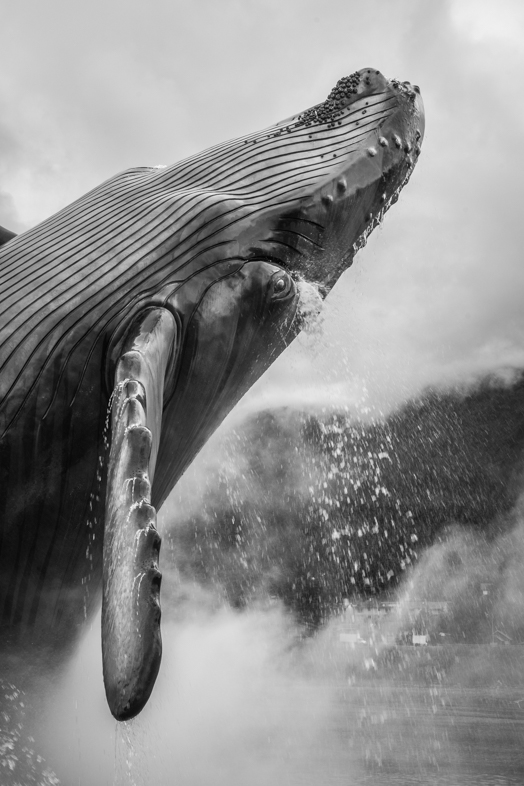
What discipline you show by your attention to detail throughout this image! Great composition and execution. *****
I prefer the bird naturally sized though. |
Jan 8th |
1 comment - 0 replies for Group 34
|
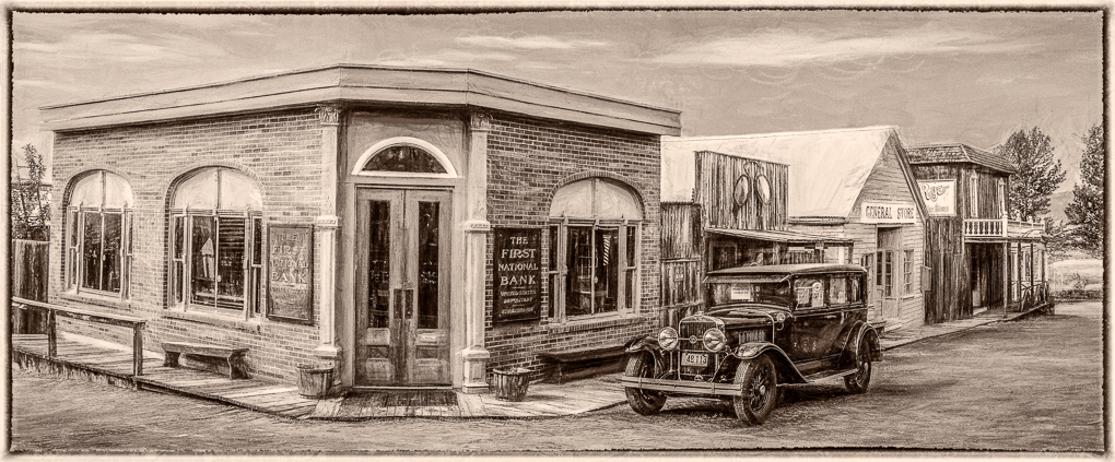
| 43 |
Jan 21 |
Comment |
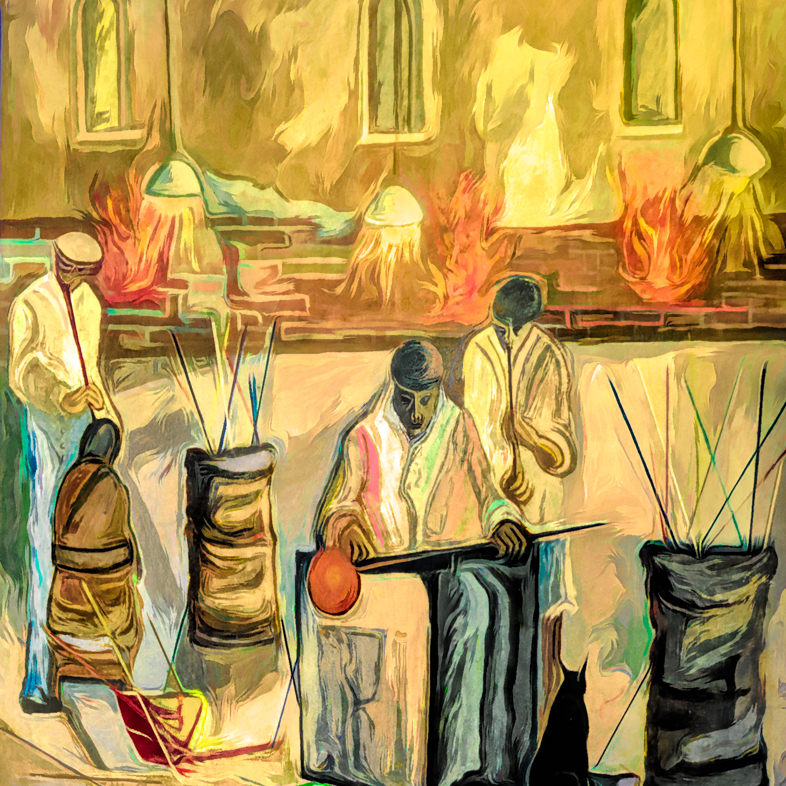
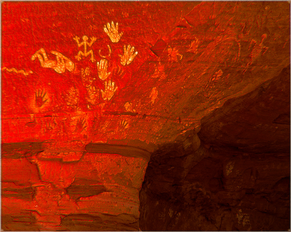
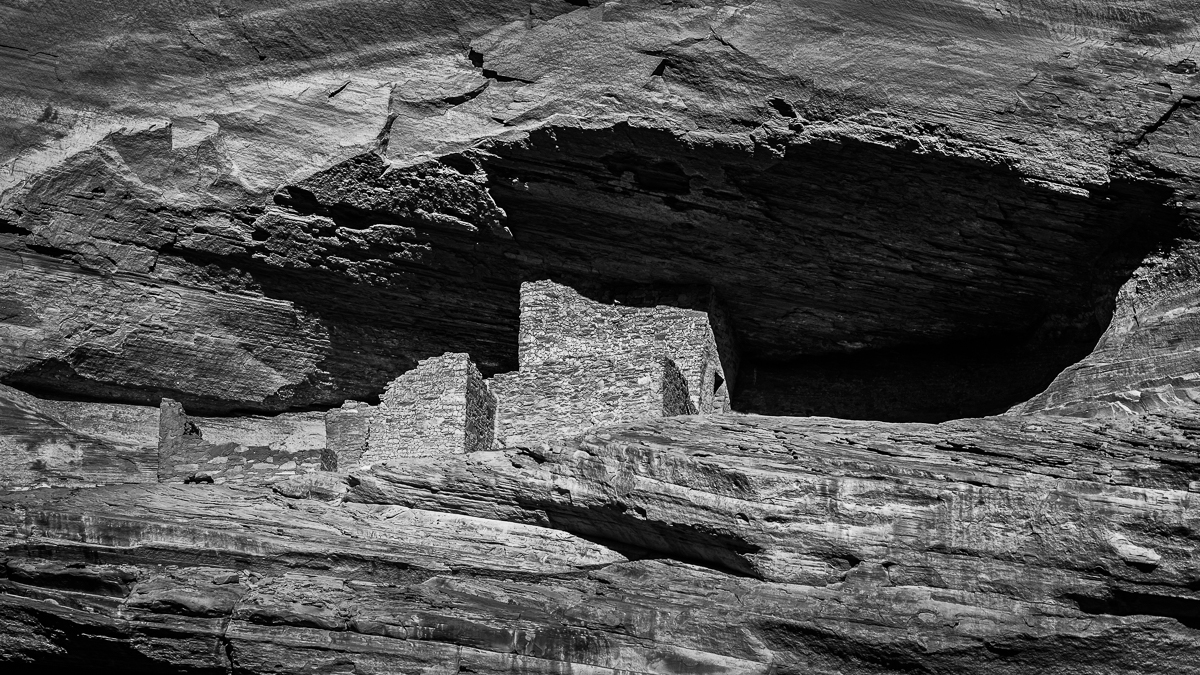
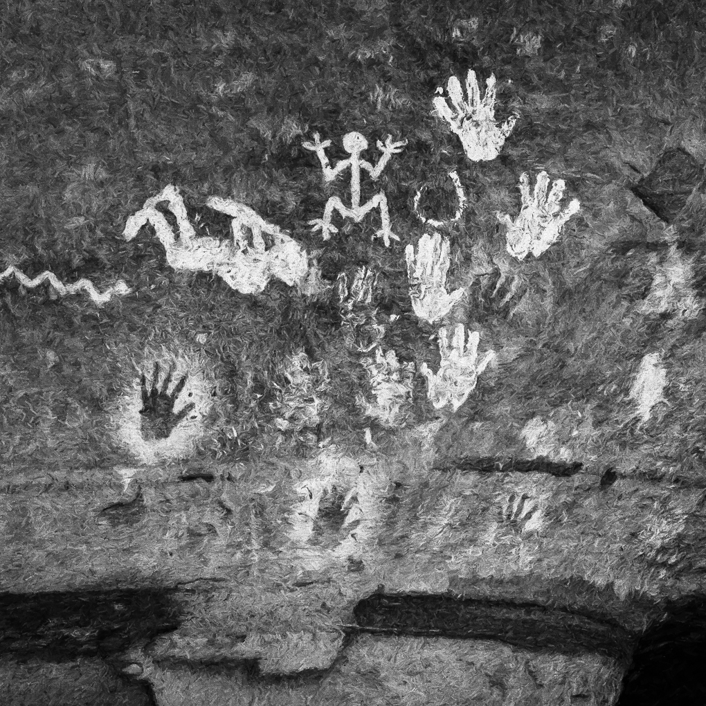
Andrew Henry is the Navajo artist pictured. His specialty is gold inlaid, silver picture bracelets. In June, 2006 I met and talked with him near a Spider rock viewpoint in Canyon Dechelly (his spelling). When I purchased his bracelet, he said he was grateful because he wanted to get back to work. I asked and he wrote a detailed description of the 7 subjects depicted on my bracelet.
He mentioned that his picture had appeared in the April, 2006 Arizona Highways magazine. I luckily found it years later and just read the double-spread photo of him working was made by our friend/presenter Colleen Miniuk-Sperry. I have his contact information if you are interested.
A few of my best pictures were technically mistakes too. |
Jan 8th |
1 comment - 0 replies for Group 43
|
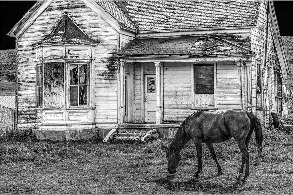
| 64 |
Jan 21 |
Reply |
I considered repairing the chip or making it consistent but couldn't decide how best to do it. I didn't like the cropped version. So, I got lazy and left it alone.
Thanks for taking the time to analyze it. I know competition judges wouldn't bother. |
Jan 8th |
| 64 |
Jan 21 |
Comment |
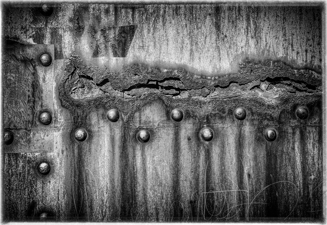
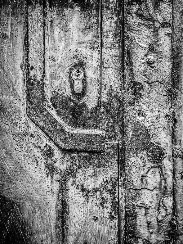
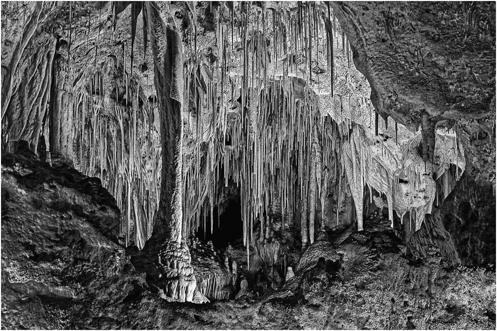
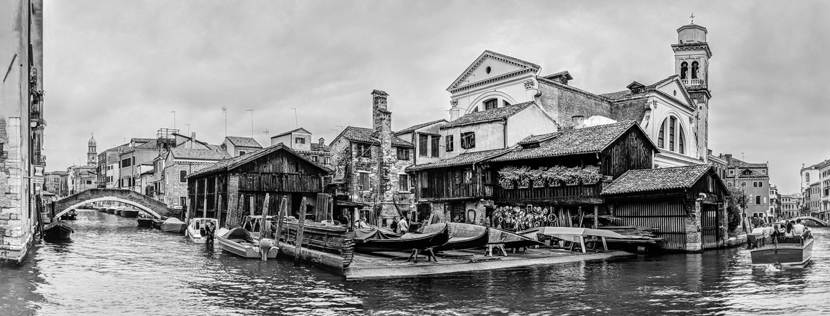
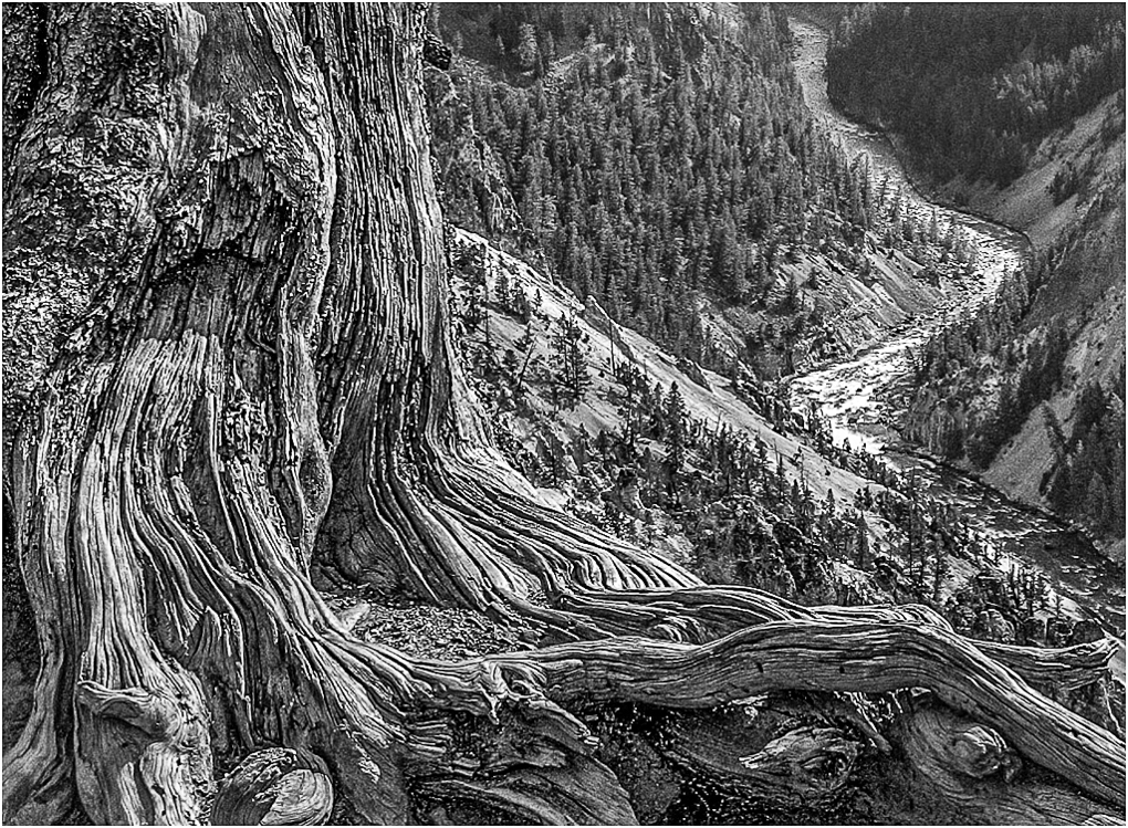
You say you simplified the composition, but you have left me With a wonderfully complex composition none the less with a great range of tones. Super!
I again see an alternate composition that I like with the left cropped off leaving the edge of the building to balance the left side. Personally i'd also clone in dirt to fill the shadow on the bottom. More simple but also appealing to me. |
Jan 8th |
| 64 |
Jan 21 |
Comment |
Yes, the third duck is distracting. You say your main subject is the two ducks, but the two ducks distract me from that too. |
Jan 8th |
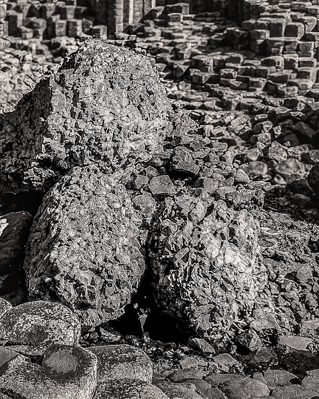
| 64 |
Jan 21 |
Comment |
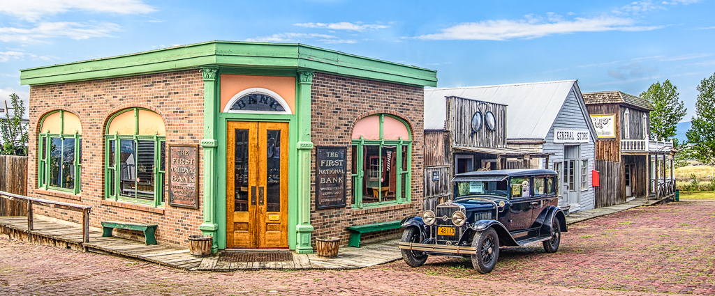
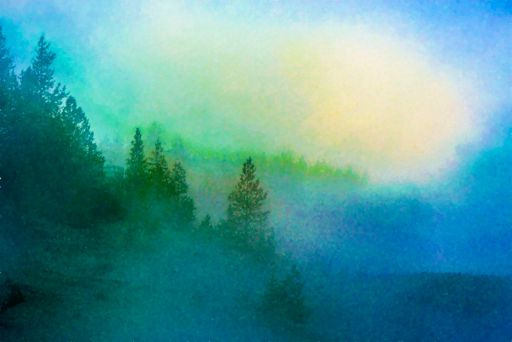
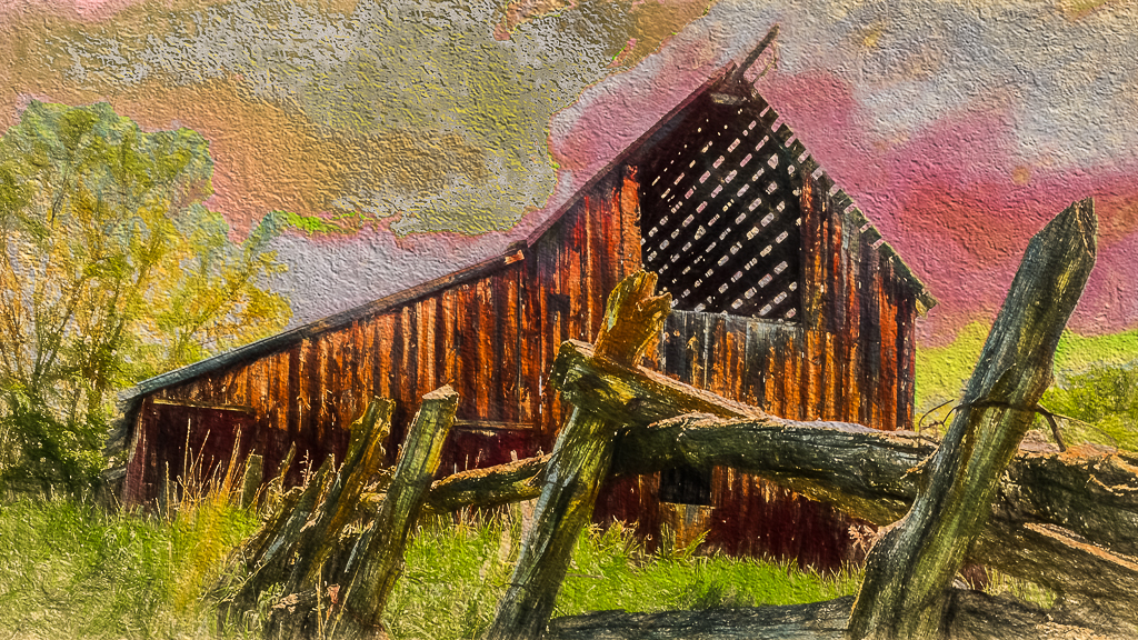
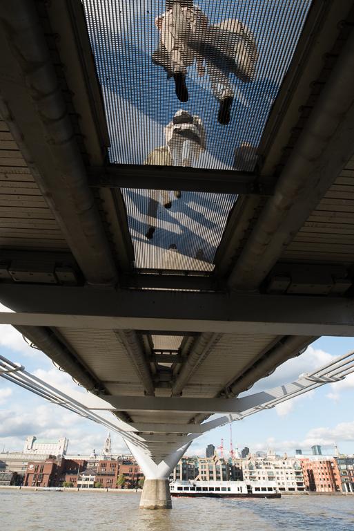
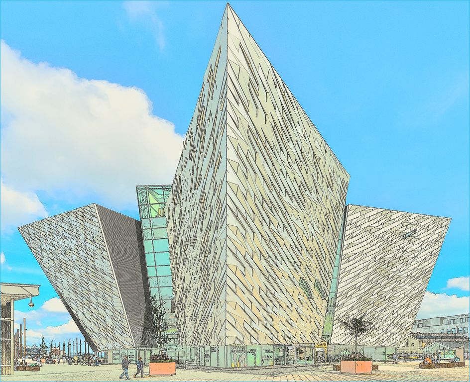
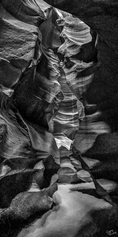
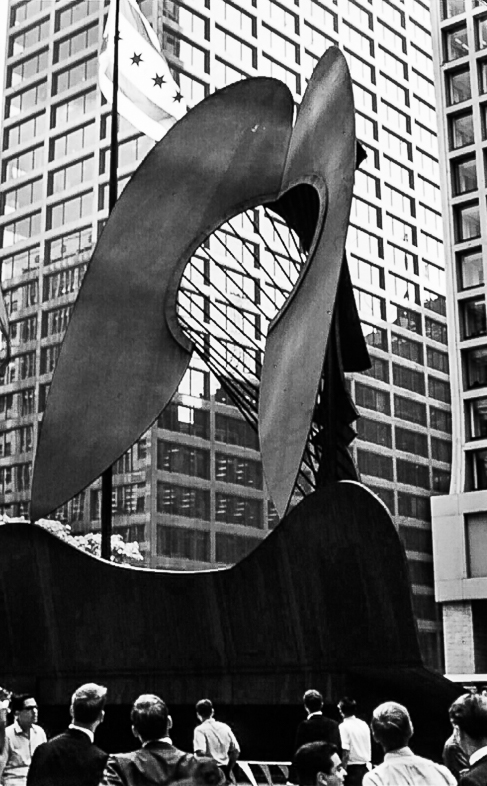
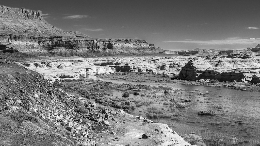
This is very beautiful image of a dramatic architecture. I too am put off a bit by the foreground appearing blurred to me. I think cropping near the shoreline at the left would emphasize both the beautiful leading line and the starbursts to my eye. |
Jan 8th |
| 64 |
Jan 21 |
Reply |
I'm glad your interest matched mine. I often find myself recomposing pictures. I shoot hurriedly and tweak compositions later. "Filling the fame" is too time consuming for me because I always feel there is much more to see and explore. |
Jan 8th |
| 64 |
Jan 21 |
Comment |
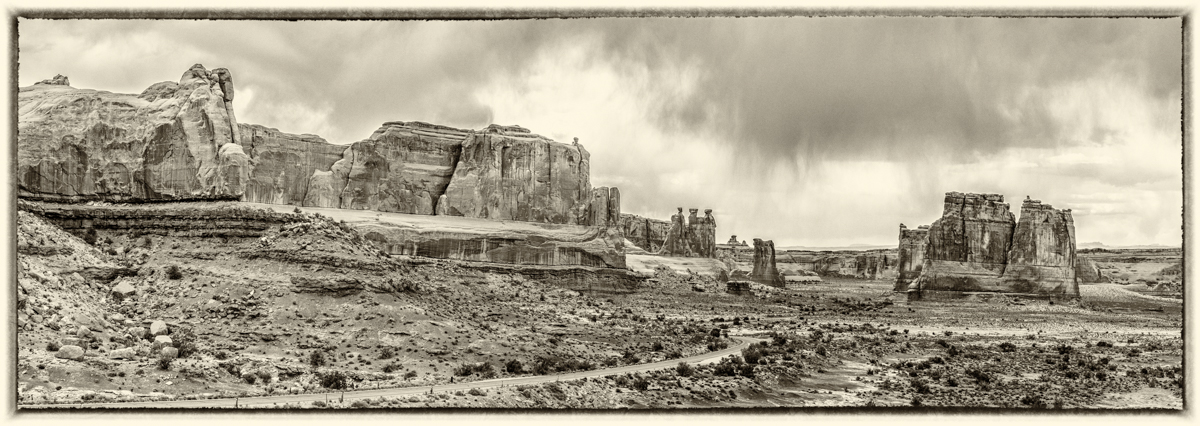
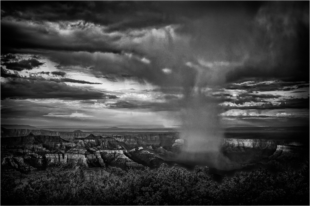
Yes, I feel this is a very dramatic image. Very graphic in nature. The strong contrast is not calming to me even though the water is very still.
I also like a variation of the composition cutting off everything above the piers or maybe the shoreline to emphasize the water. |
Jan 8th |
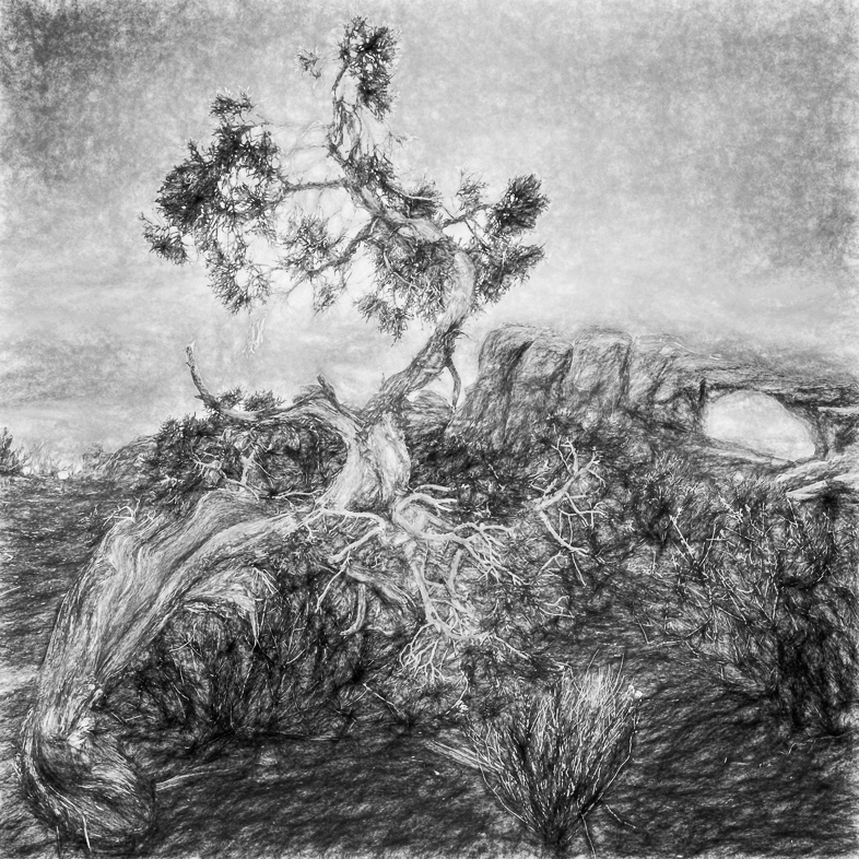
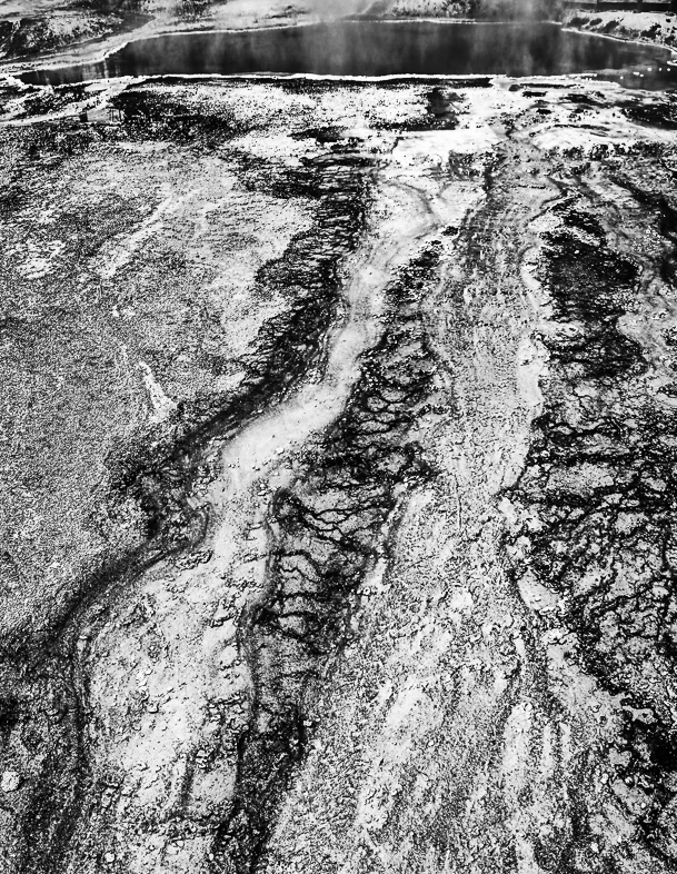
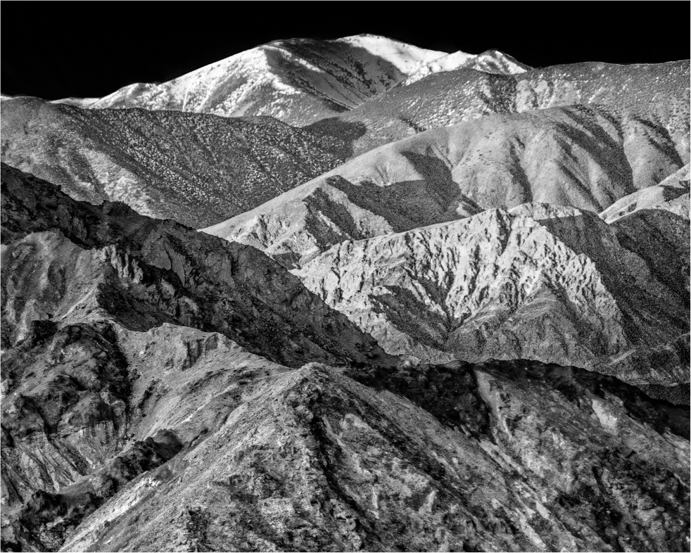
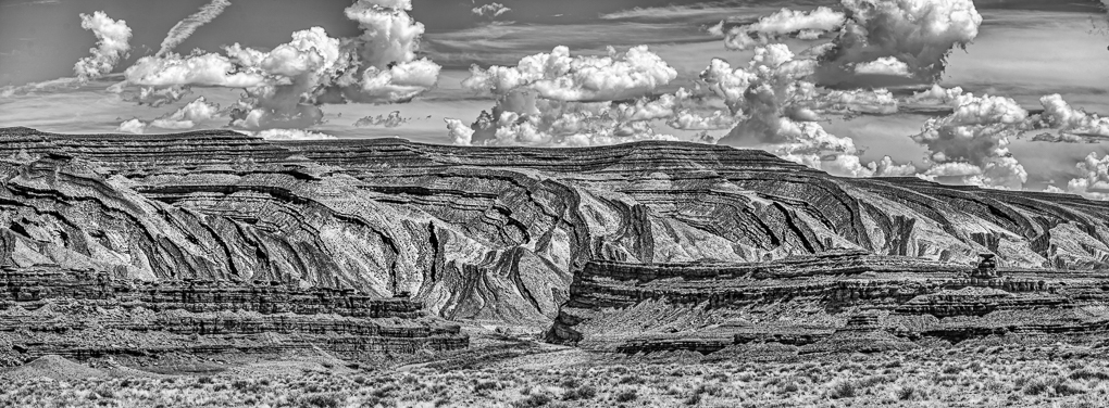
| 64 |
Jan 21 |
Comment |
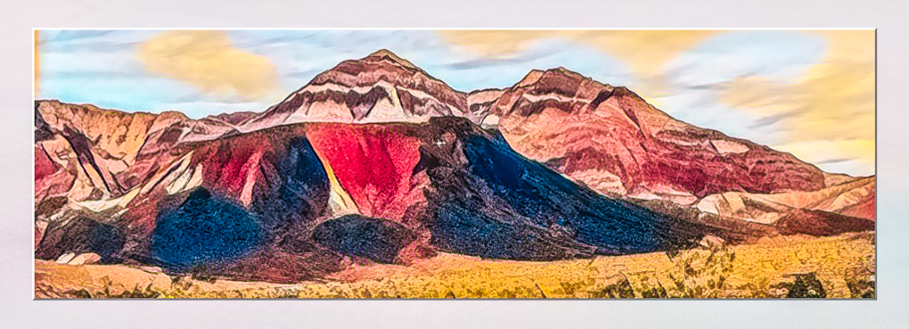
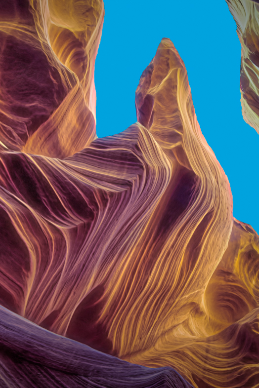
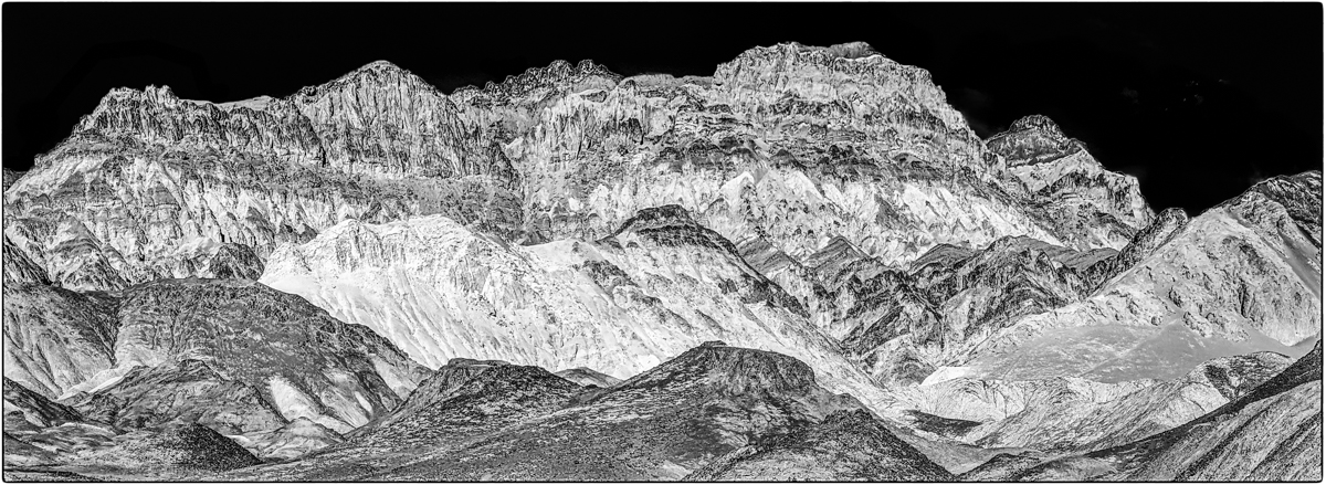
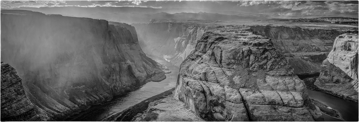
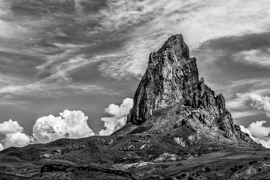
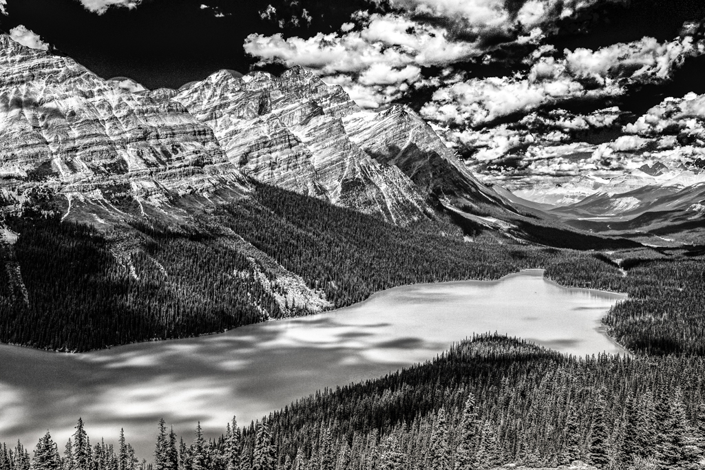
I really like the ruggedness you display. I would also be impressed a bit more with the majesty of your main subject if the peak on the left was not taller than it. So, my preference is to crop the left a bit.
Beautiful image! |
Jan 8th |
5 comments - 2 replies for Group 64
|
16 comments - 5 replies Total
|