|
| Group |
Round |
C/R |
Comment |
Date |
Image |
| 18 |
Oct 20 |
Comment |
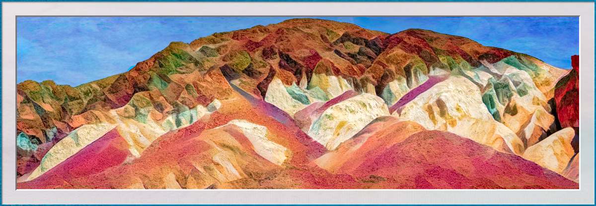
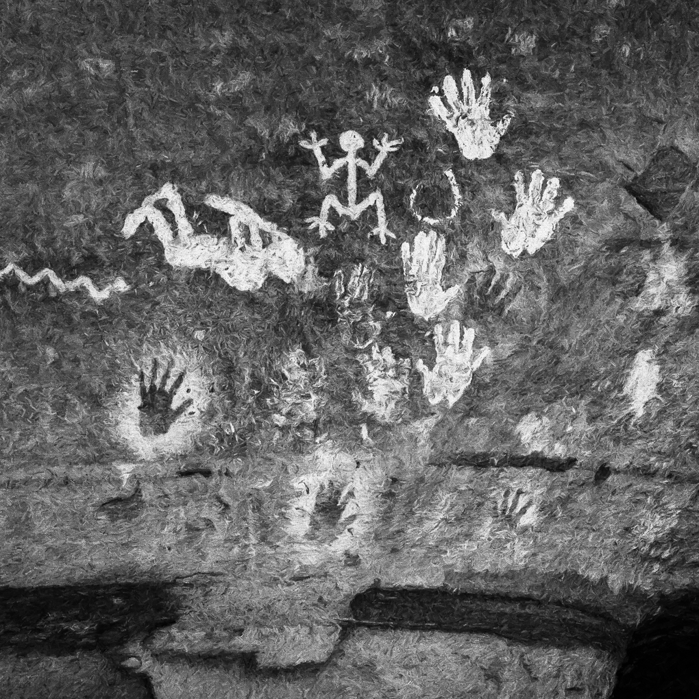
I think this is a great composite.
My eye is drawn to the bottom left, so I would prefer to see the image flipped horizontally. Perhaps the graffiti will still appear ok. |
Oct 10th |
| 18 |
Oct 20 |
Comment |
I find this very interesting, and would suggest adding contrast and clarity to make it pop. That may also draw the attention of judges too. |
Oct 10th |
| 18 |
Oct 20 |
Comment |
I like everything about this masterful composite. |
Oct 10th |
| 18 |
Oct 20 |
Comment |
Very clever. I bet you see many things others overlook and similarly have many interesting and unique thoughts to amuse yourself and others. |
Oct 10th |
| 18 |
Oct 20 |
Comment |
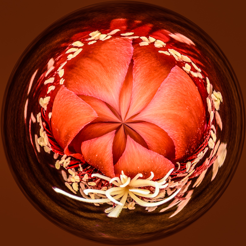
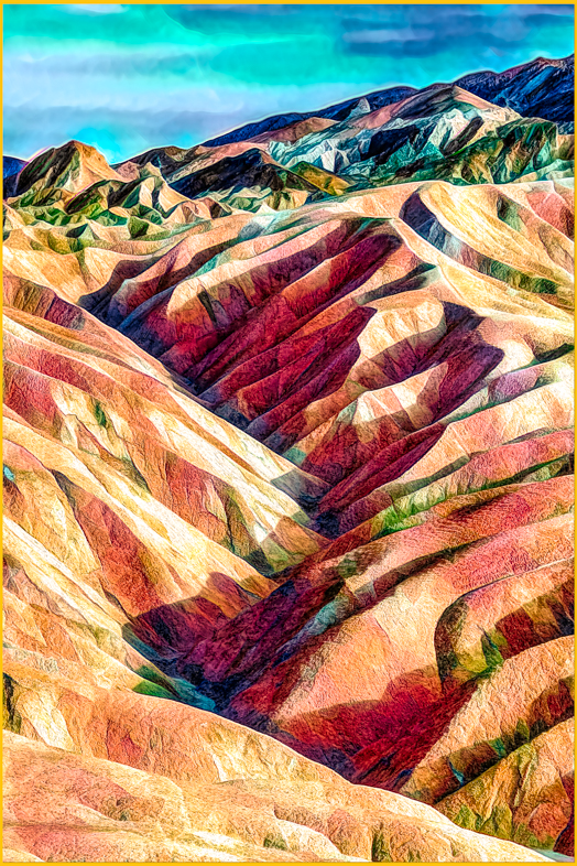
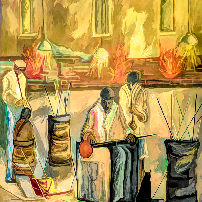
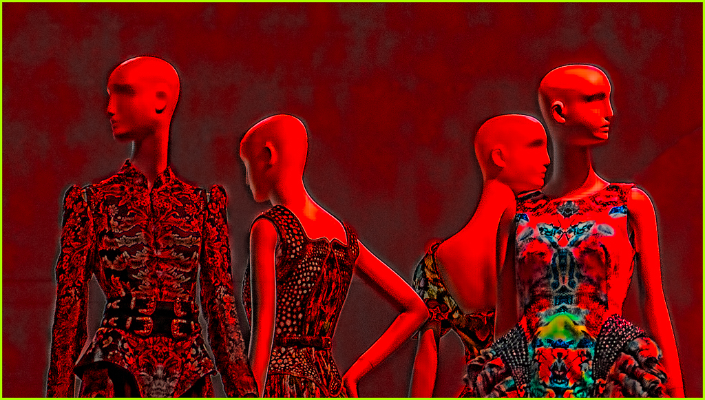
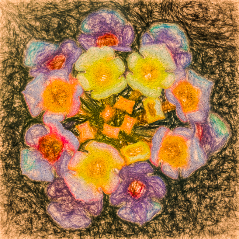
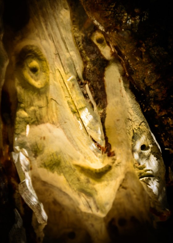
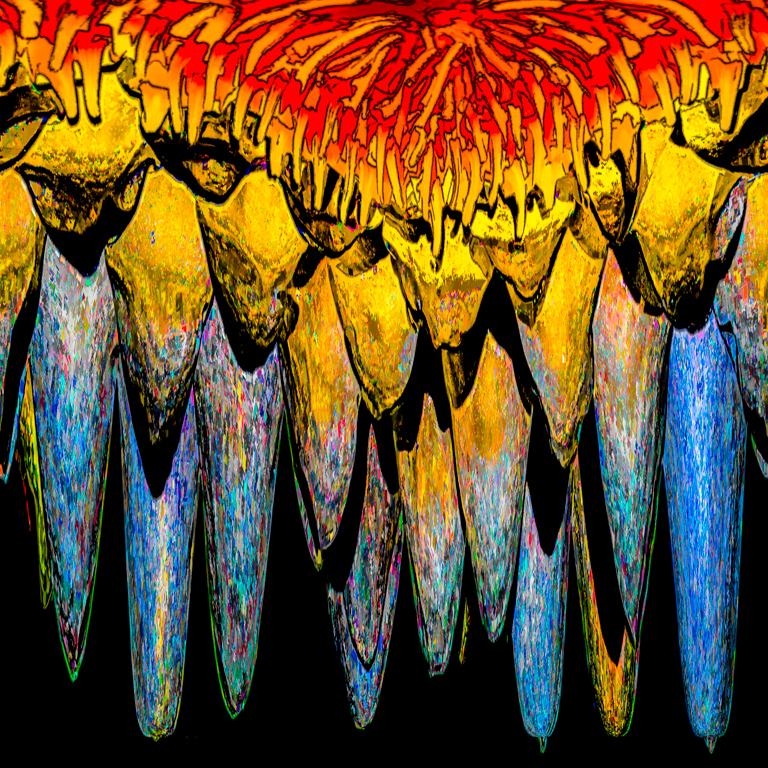
I like your Van Gogh like treatment, but I'm disappointed that the sun flowers that drew your attention are not prominent. Perhaps another version could be a composite featuring Van Gogh like flowers.
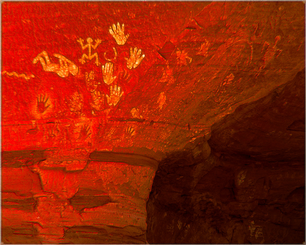
You made me curious about the site, so I Googled it. Very interesting. Nasty Romans! |
Oct 10th |
5 comments - 0 replies for Group 18
|
| 20 |
Oct 20 |
Reply |
I keep experimenting with my tools to learn its capabilities and try to anticipate the results in order to better identify potential subjects and save time. I also hope to encourage others to continue learning and having more fun too.
Thanks for continuing to give details of your workflow. |
Oct 28th |
| 20 |
Oct 20 |
Comment |
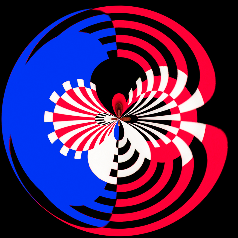
Perhaps one way to selectively bring back greeen would be to create a new channel for it in Photoshop. |
Oct 23rd |
| 20 |
Oct 20 |
Reply |
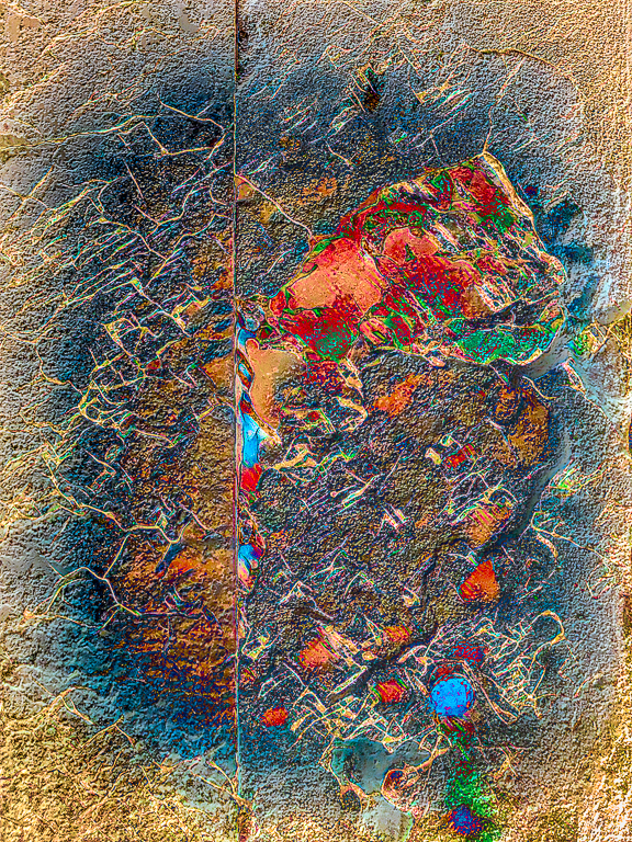
Thanks.
The Topaz preset added a touch of color and texture that I enhanced with some effort.
It seems everyone is bothered in a negative way by the differences between the two sides. I thought it would be too ordinary to make the sides more similar. But if I do that, what's the point of the line?
I'll try it. |
Oct 23rd |
| 20 |
Oct 20 |
Reply |
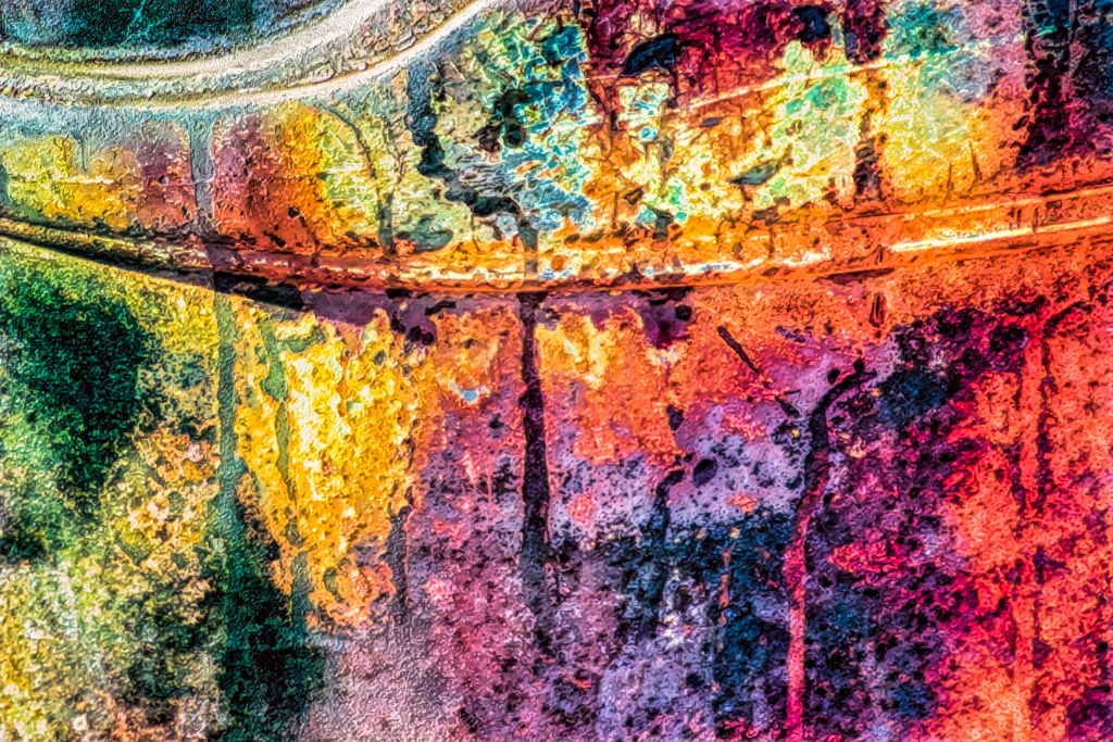
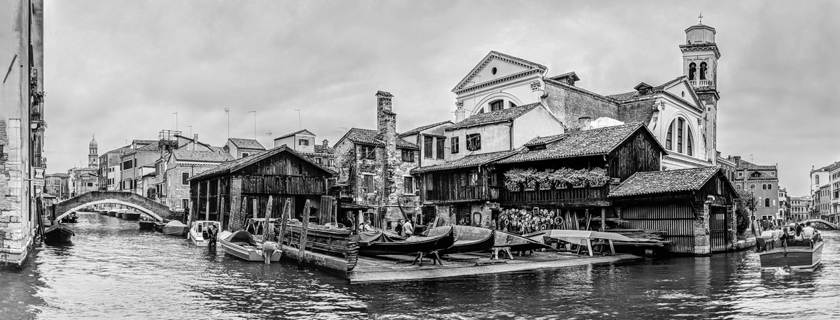
The original photo is detail of 2 adjacent buildings. Both sides were edited equally.so, the color differences are due to small differences in exposure and saturation between the 2 sides.
I decided not to equalize them to try to peak viewers' curiosity. |
Oct 17th |
| 20 |
Oct 20 |
Reply |
Thanks. I've had fun with my many pictures of decay in Venice. Sometimes, I add local color to suit the composition, but in this case, I only enhanced the texture, saturation and contrast offered by Topaz. |
Oct 9th |
| 20 |
Oct 20 |
Reply |
My idea was to have the viewers compare the differences between the two sides. |
Oct 9th |
| 20 |
Oct 20 |
Reply |
I'm learning to use Topaz Studio 2 by experimenting with its many presets as starting points. This preset added some colors which I further enhanced.
If you go to www.topazlabs.com, you can download the software and test it. I think it will all have full functions, but I don't know how long your test may last.
Have fun. |
Oct 9th |
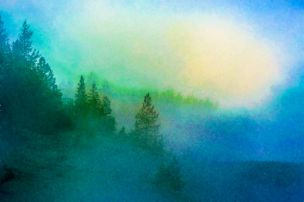
| 20 |
Oct 20 |
Comment |
You added interest and focus for me.
I also like the tree and blue sky. My next version of this would be to add some muted color to one or both of those. |
Oct 5th |
| 20 |
Oct 20 |
Comment |
I really like your composition, masterful brushwork, detail, and choice of background and color. I think Hallmark would like it too. |
Oct 5th |
| 20 |
Oct 20 |
Comment |
I like the crop and soft feeling I have when viewing it. |
Oct 5th |
| 20 |
Oct 20 |
Comment |
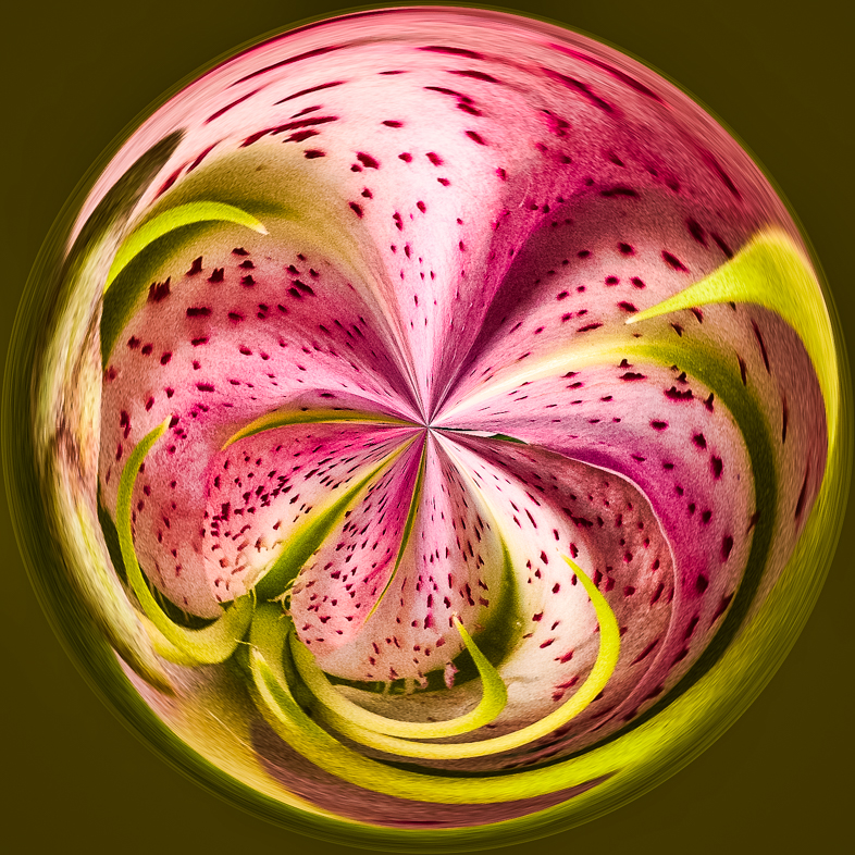
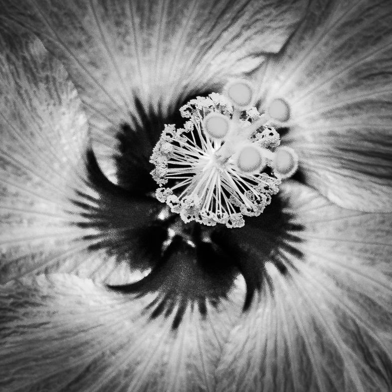
I've captured hundreds of water lily images and lots of creative versions, but I've never captured a feeling as special as I see here. The soft delicate background, I feel, is excellent.
My only preference would be to ground the flower, perhaps by cropping the bottom, just below the flower. |
Oct 3rd |
| 20 |
Oct 20 |
Comment |
I like the overall effect and the local details. I agree with your judgment throughout.
My only minor preferences would be to darken the bright white on the bottom a tad and lighten her face a tad.
Beautiful. |
Oct 3rd |
6 comments - 6 replies for Group 20
|
| 36 |
Oct 20 |
Comment |
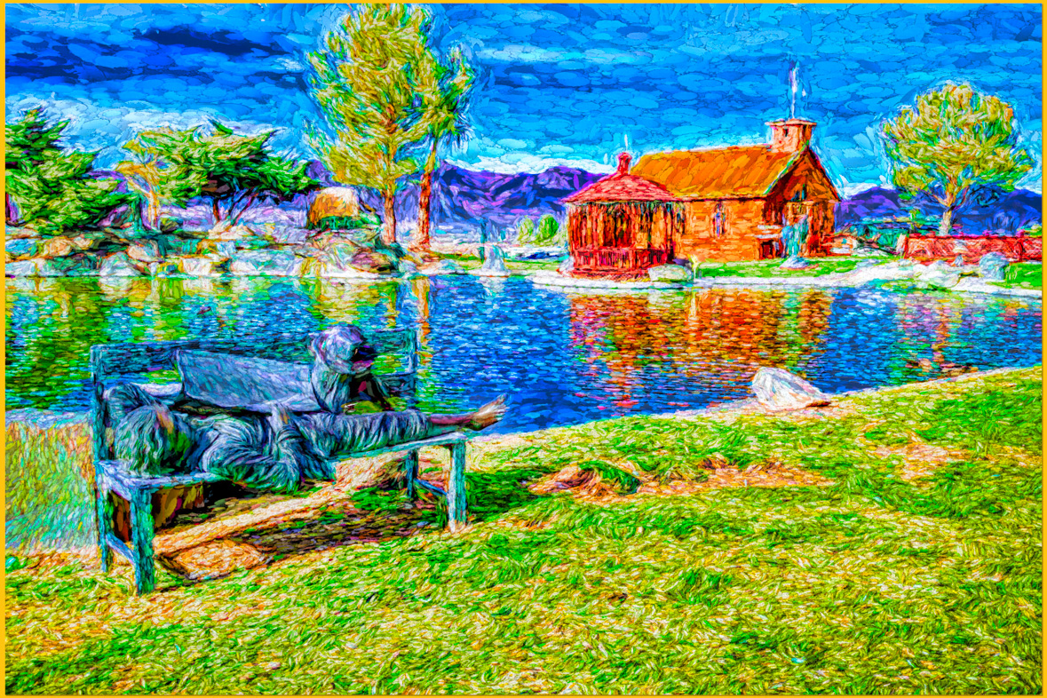
As I quickly reviewed images, yours jumped out at me. Beautiful subject, composition and detail. I'd like to see a hint of a horizon line though. |
Oct 27th |
1 comment - 0 replies for Group 36
|
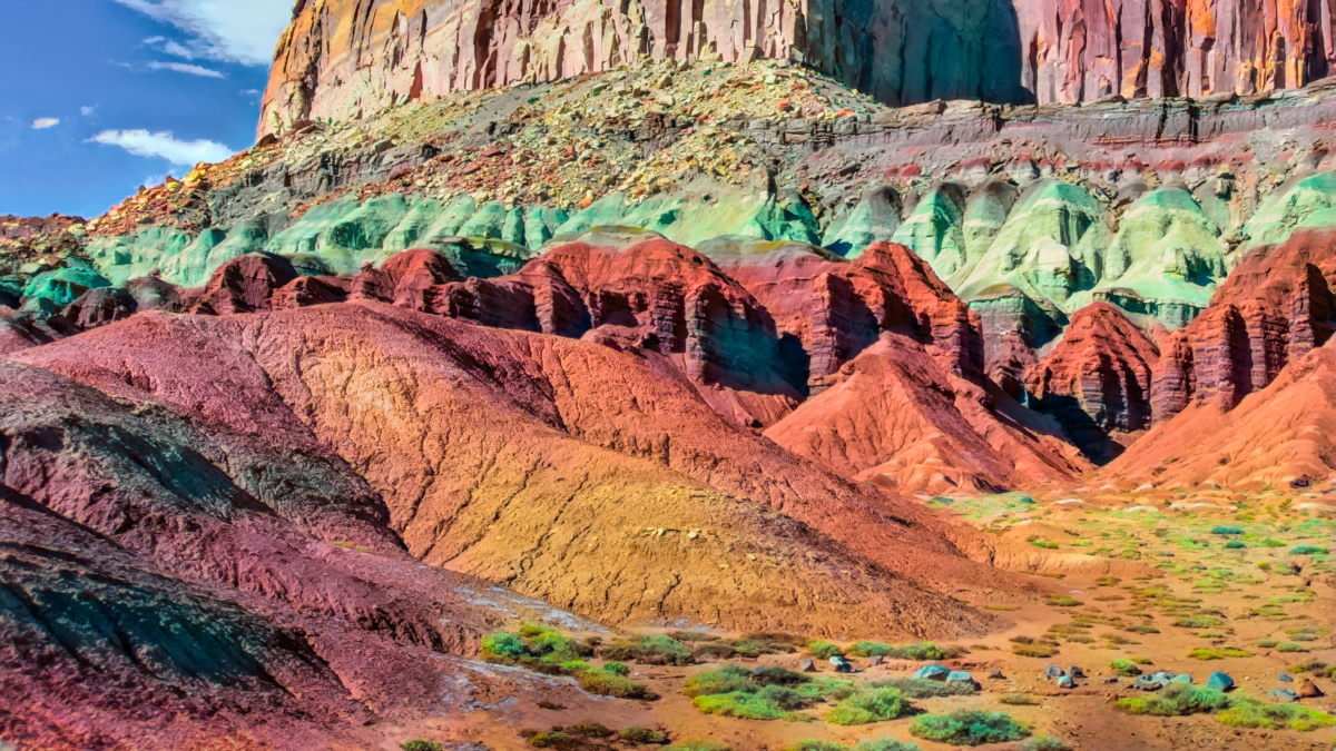
| 37 |
Oct 20 |
Comment |
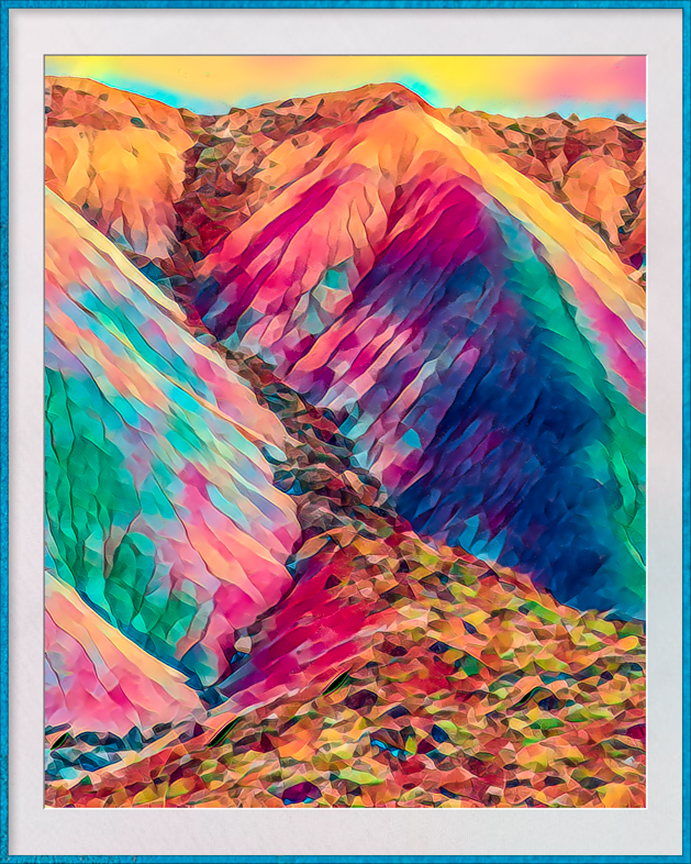
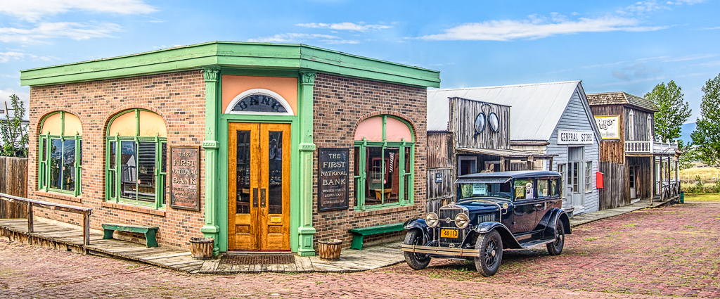
I was drawn to your image because I've photographed the desert SW extensively for the past 16 years. While walking in the Painted Desert isn't restricted, it's rare to see a person doing it.
I also think it's normal to want to show the expansive glory of the place, but I think your story may be better told after cropping 2/3 off the right. That would draw my eye to the path he took and also make me wonder where he will go next.
One of my joys in the area is the feeling of exploring because I needn't walk far before I have the feeling that I may be the first person to be there. I'm always looking for unique vantage points and I bet he's doing the same. |
Oct 27th |
1 comment - 0 replies for Group 37
|
| 39 |
Oct 20 |
Comment |
I think your monochrome image is excellent, but may have added clarity and opened the shadows a bit. That's not better, just personal preference.
I long to see Fall colors absent in the desert. |
Oct 10th |
1 comment - 0 replies for Group 39
|
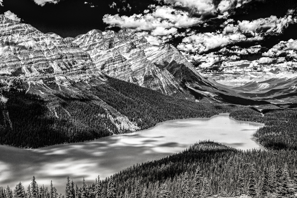
| 52 |
Oct 20 |
Comment |
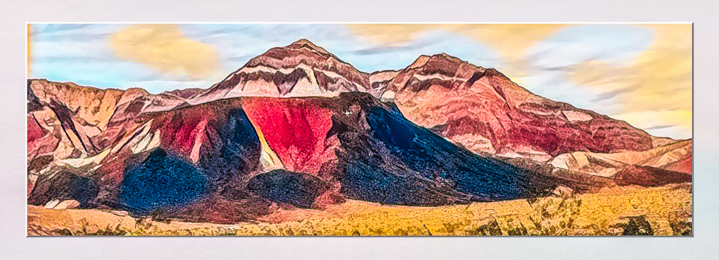
The mix of colors from the large variety of trees is very appealing to me. I like the composition as is but would also like a vertical composition of the middle 1/3. I think the tall foreground trees contribute to it and the dark evergreens lead my eye to the colorful trees in the distance. |
Oct 27th |
1 comment - 0 replies for Group 52
|
| 64 |
Oct 20 |
Comment |
Wonderful! You caught a decisive moment with an excellent composition, demonstrating your technical skills. |
Oct 27th |
| 64 |
Oct 20 |
Reply |
No, I haven't tried that. Everything you are writing is news to me.
I'm sure you would enjoy the Pixel 4a. I think it may have the telephoto lens that has been dropped from the 5. I have found it useful on my 4XL. |
Oct 24th |
| 64 |
Oct 20 |
Reply |
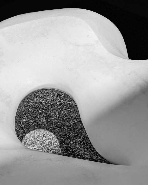
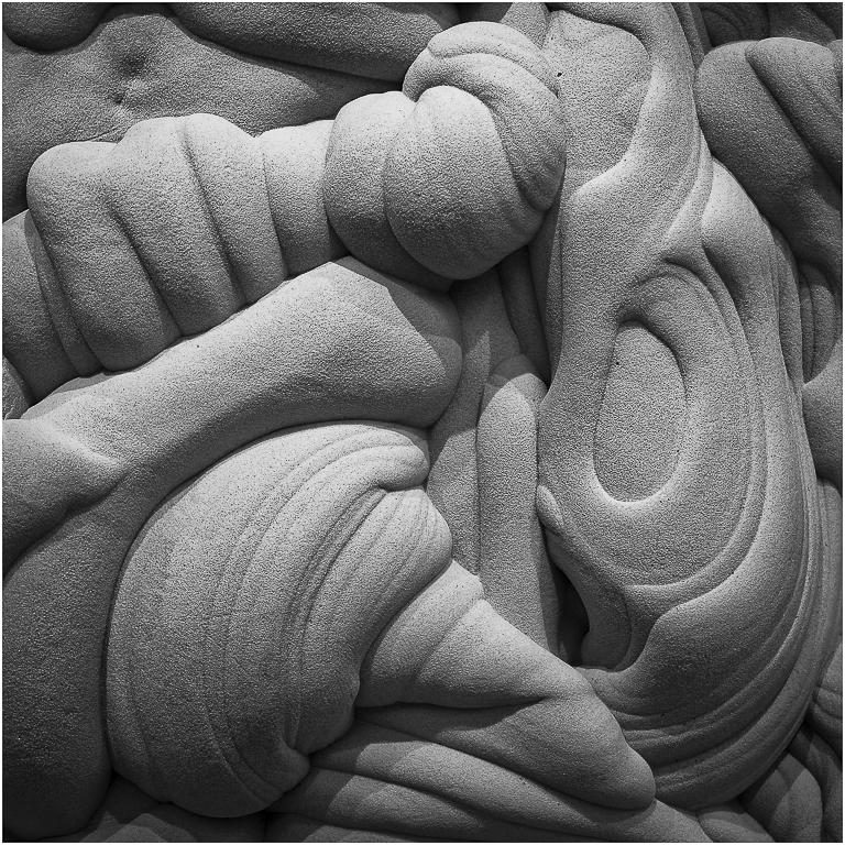
Thanks. I think both compositions work for me.
Can you explain why I shouldn't clean up the natural imprecations in the white marble? Wouldn't that make it stronger in your opinion?. |
Oct 24th |
| 64 |
Oct 20 |
Reply |
I've been telling friends for ages that I won't upgrade my Nikon D810 until Nikon has a camera that has the computational abilities of a Pixel phone camera. For just $349 one can purchase a Pixel 4A with the same camera as the 4XL. I use mine solely as a camera and have kept my Pixel 3 as my phone and backup camera should the 4XL battery drain out.
I once worked in licensing and acquisitions for a major company and have to believe Google would out license it's technology to a major camera manufacturer. |
Oct 14th |
| 64 |
Oct 20 |
Reply |
I didn't enter this picture yet, but with your and Larry's suggestions, I expect it do well ok in the Jan. Competition. |
Oct 14th |
| 64 |
Oct 20 |
Reply |
Thanks. I didn't submit this image for competition yet. With your suggestion, I think it will do better in the Jan. competition. |
Oct 14th |
| 64 |
Oct 20 |
Reply |
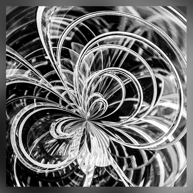
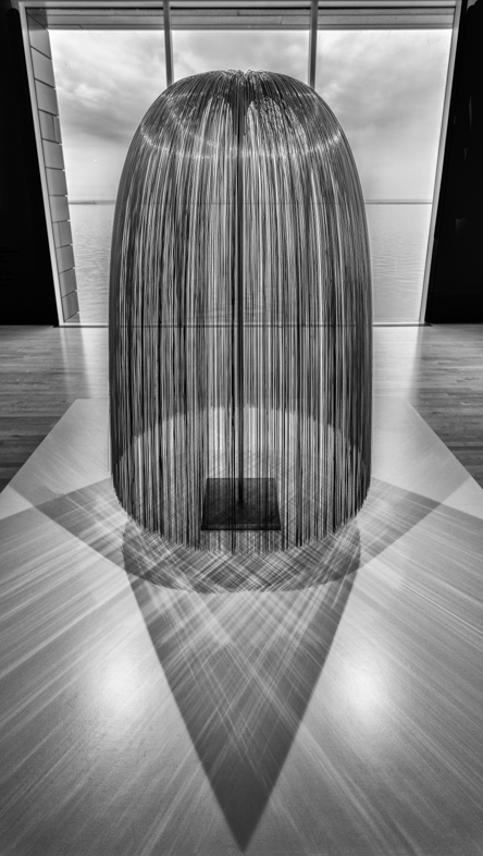
Suddenly, it's even symmetrical. Wonderful!
I like that too |
Oct 14th |
| 64 |
Oct 20 |
Reply |
A hearty thank you for showing me an excellent alternative. I was committed to a square with the strong black contrast,and didn't consider alternatives.
I'll also try a square without the black as you suggest.
Thanks again. |
Oct 13th |
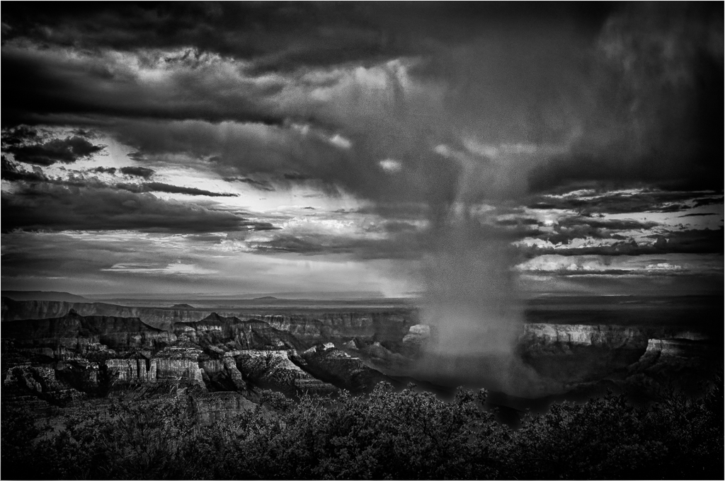
| 64 |
Oct 20 |
Comment |
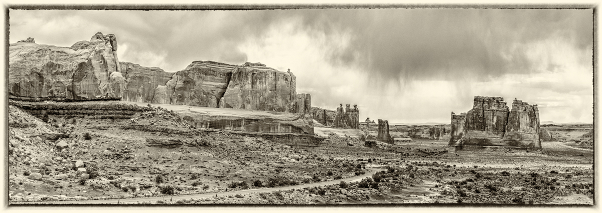
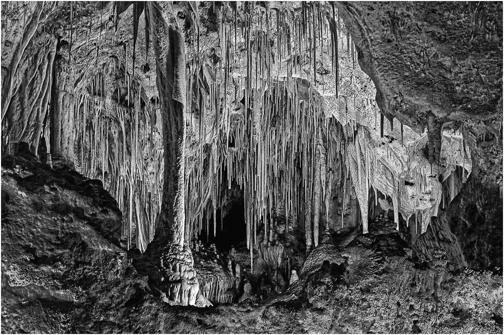
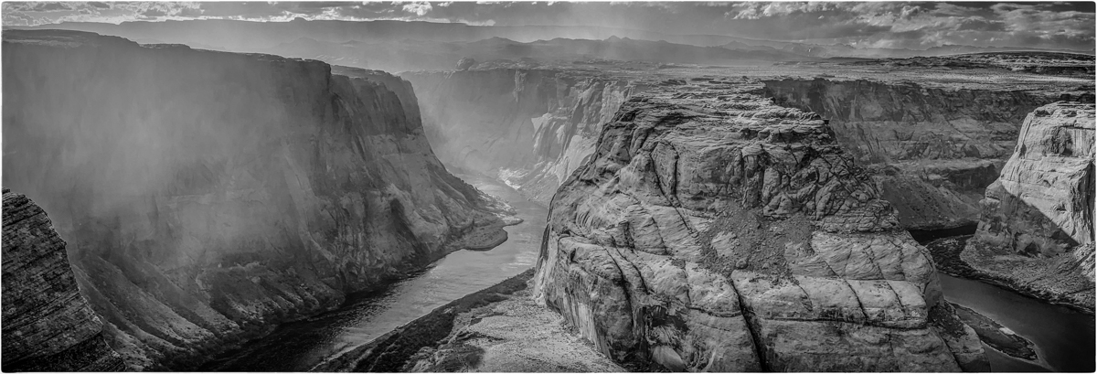
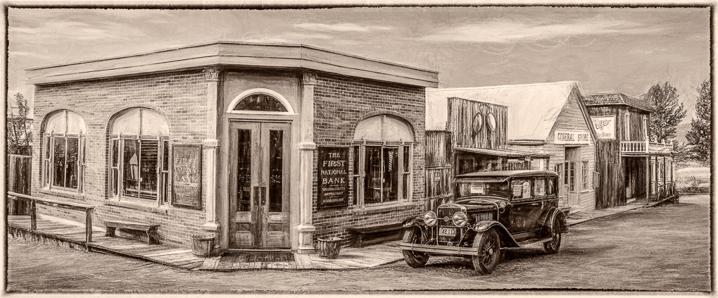
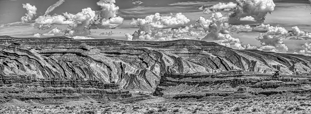
It's a wonderful panoramic view to my eye, but I feel the sky needs a moon or cropping. The foreground really adds a sense of depth for me. |
Oct 11th |
| 64 |
Oct 20 |
Comment |
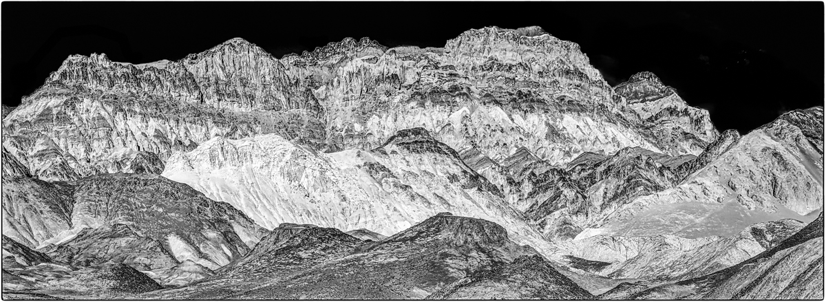
I wish I had found this view when I was there! Excellent!
I flipped it vertically and like it even more. |
Oct 11th |
| 64 |
Oct 20 |
Reply |
Yes, one would expect to see noticeable DOF differences at this distance at f1.8 but Google uses HRD+. It says is merges the best parts of 15 exposures (almost instantly) to produce a final picture. It can be set to allow you to choose 1 of the 15.
I still use my Nikon D810 when I see a need. I miss its greater dynamic range and ergonomics. |
Oct 10th |
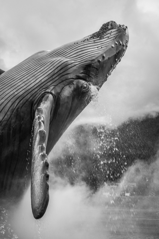
| 64 |
Oct 20 |
Comment |
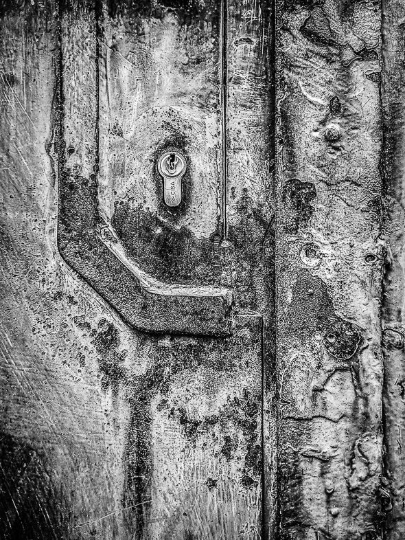
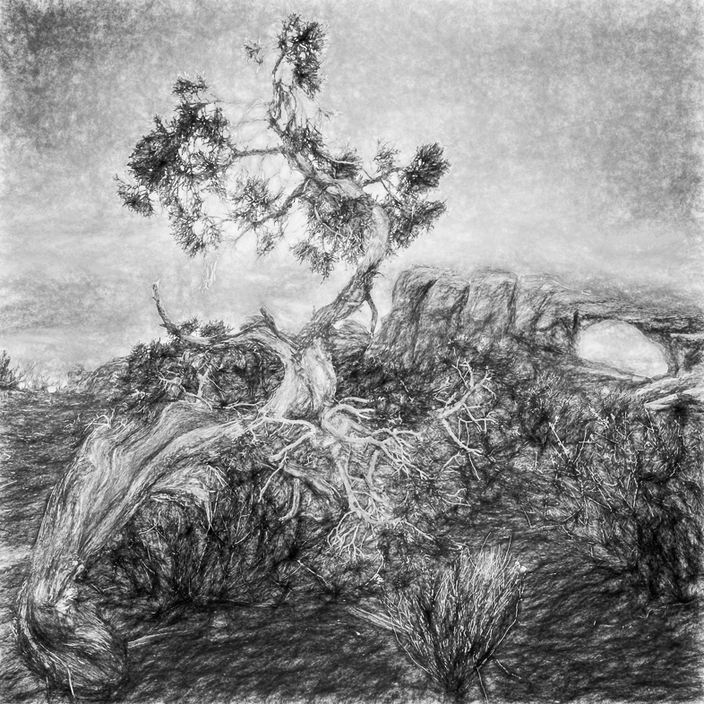
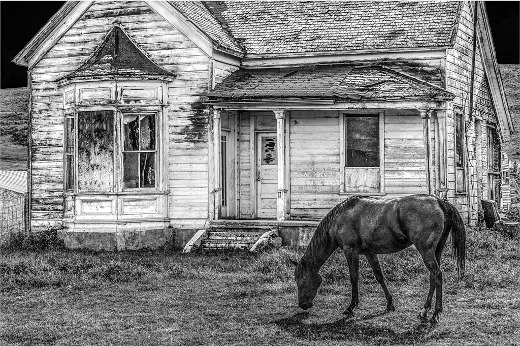
I see excellent texture and detail, but it seems to be glowing around the ears, etc.
I'm ignorant of horses and am left wondering if there is detail missing in its eye. |
Oct 9th |
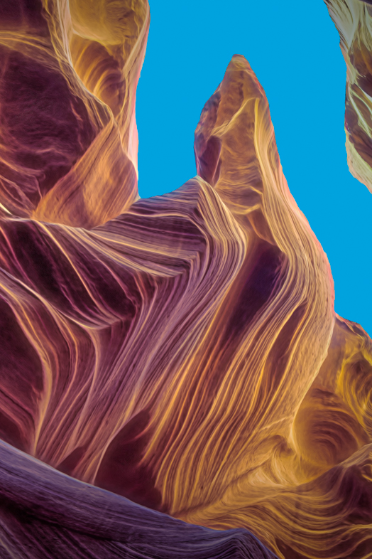
| 64 |
Oct 20 |
Comment |
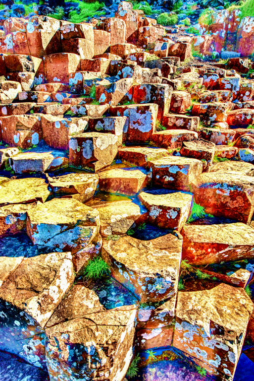
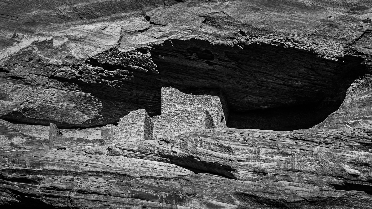
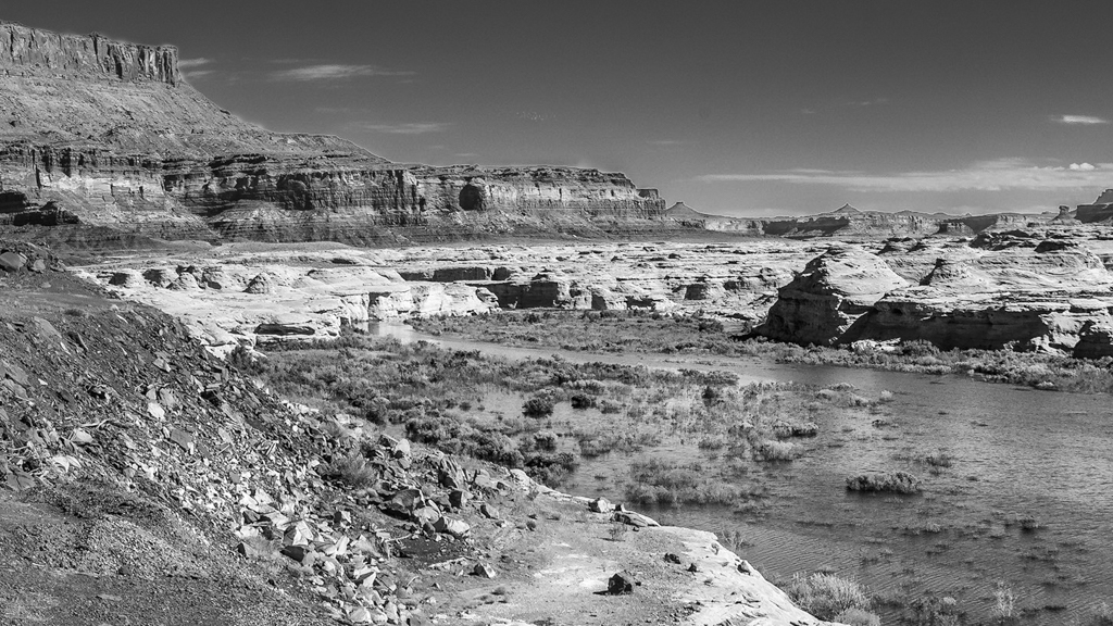
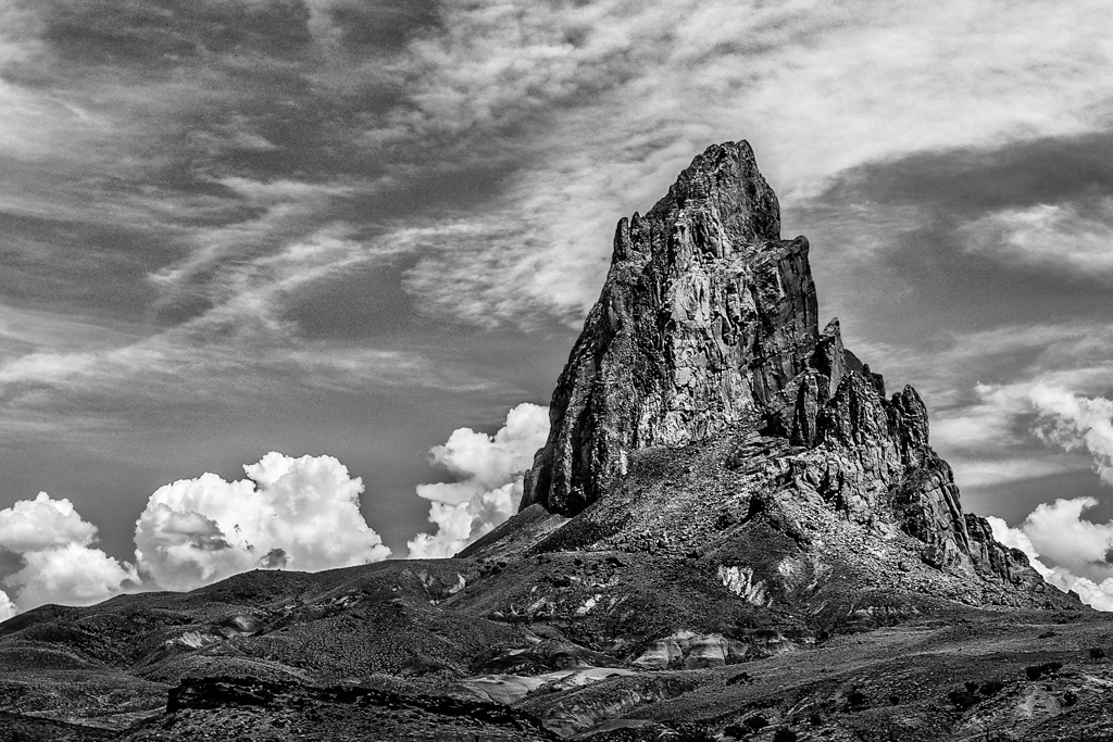
Stuart's comment made me realize that we who live in the desert see this image much differently than most others who see grass routinely.
We almost take the spectacular rock formations for granted, while others are more drawn to them.
I think it's a nice, calming rather than dramatic landscape with good attention to detail, as always. |
Oct 9th |
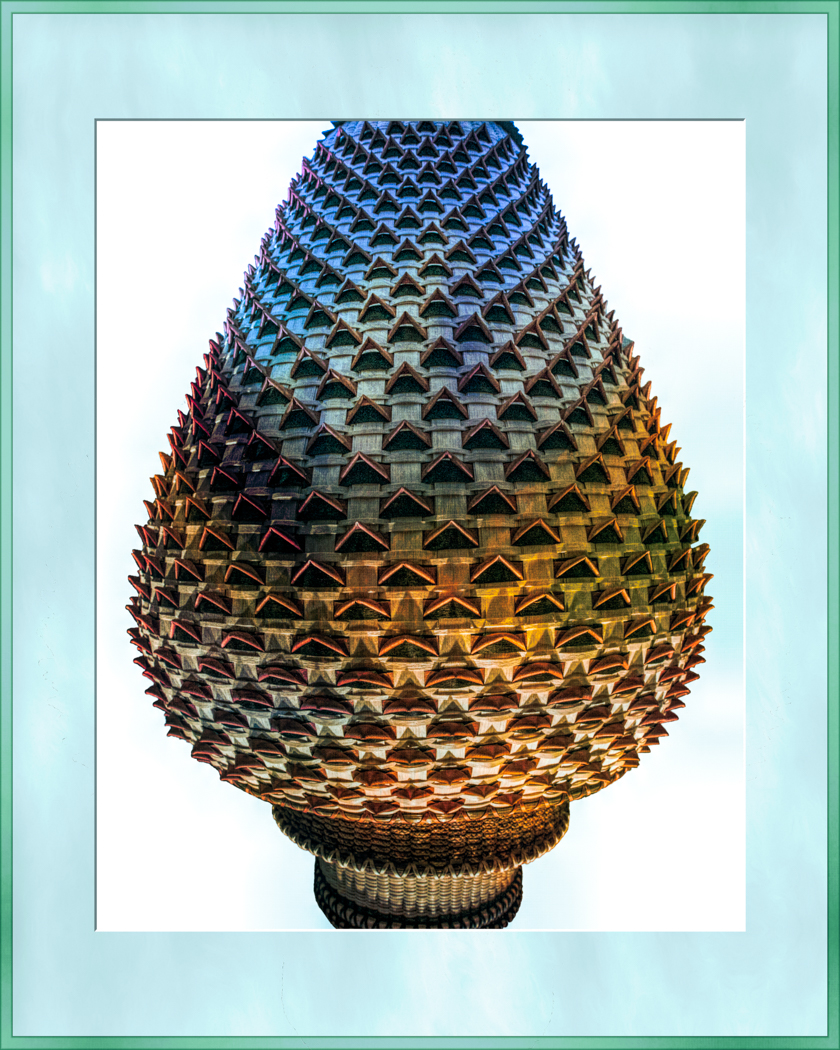
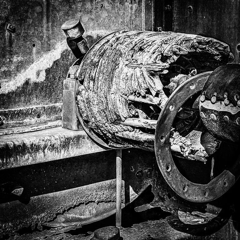
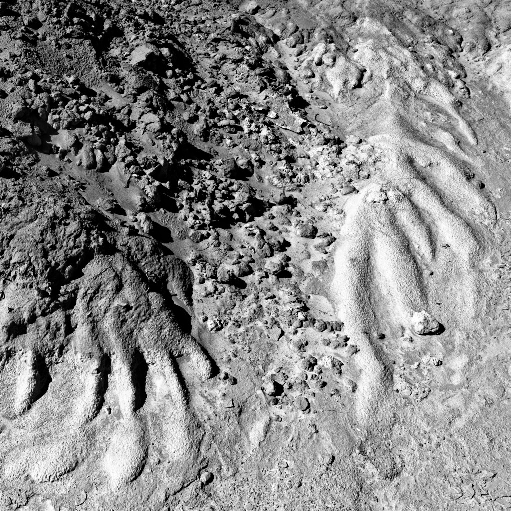
| 64 |
Oct 20 |
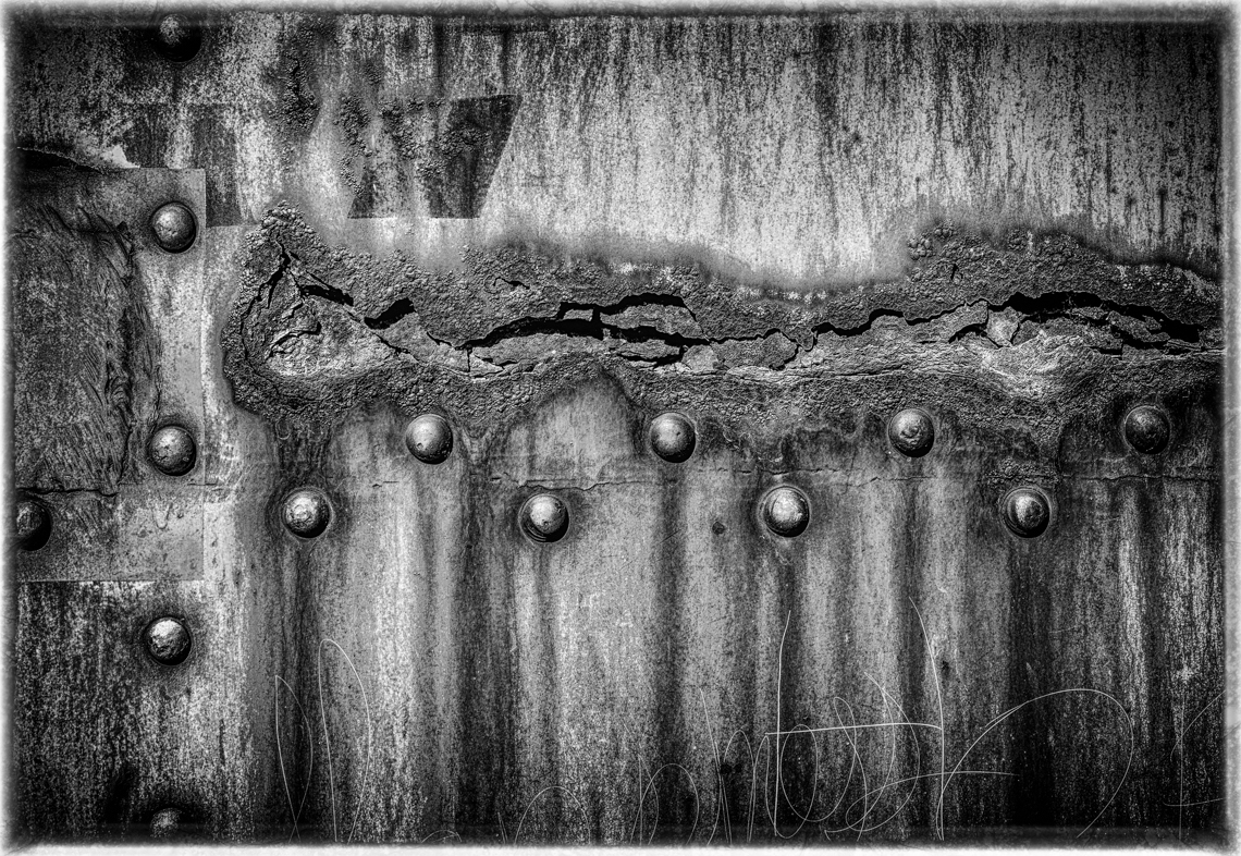
Comment |
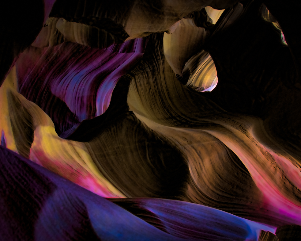
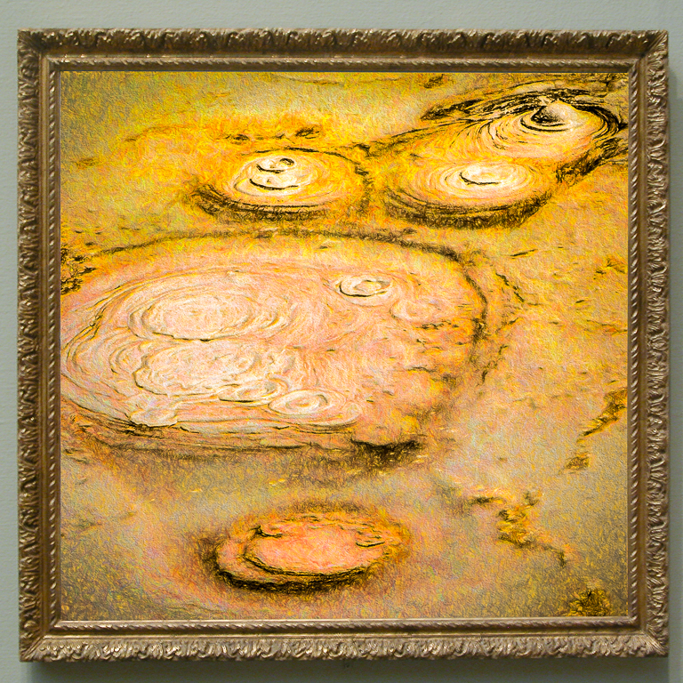
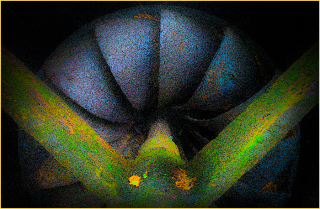
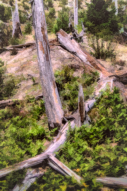
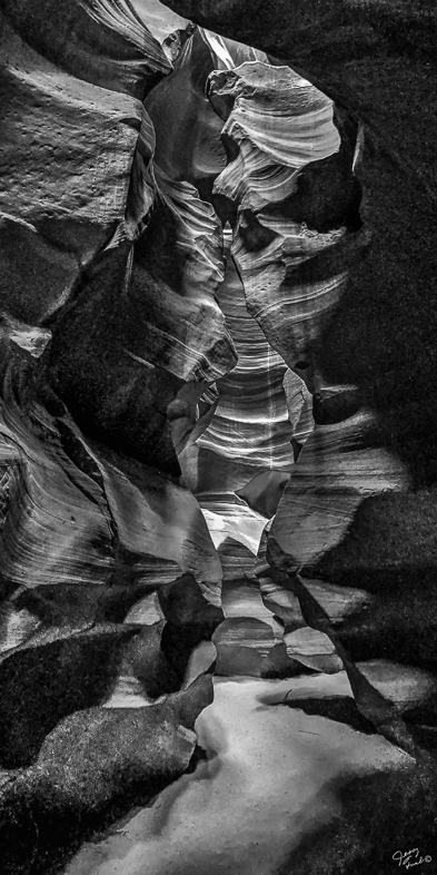
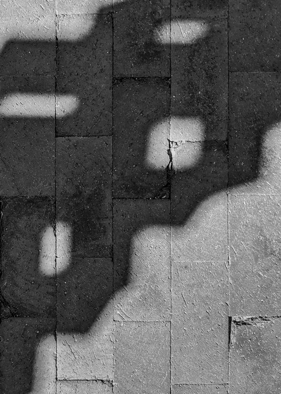
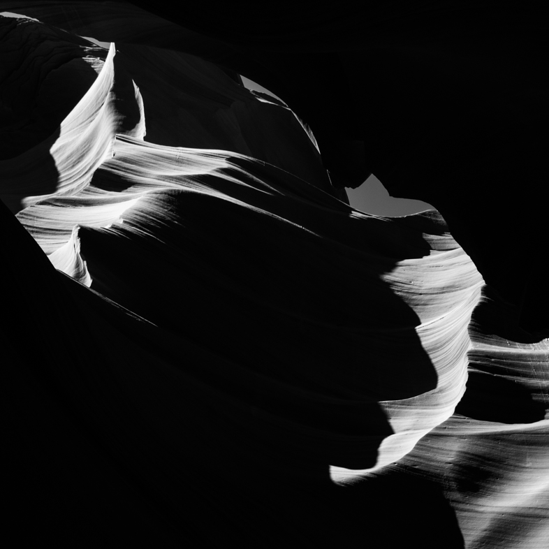
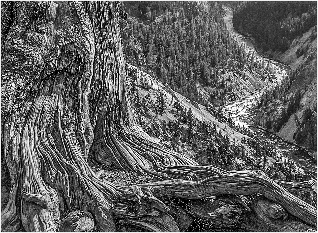
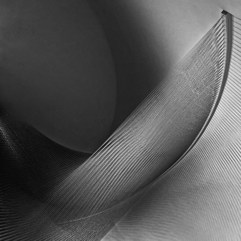
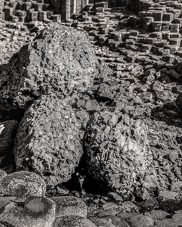
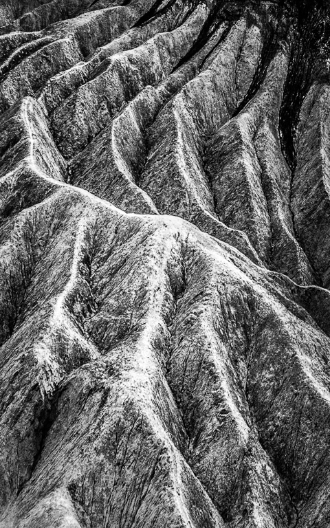
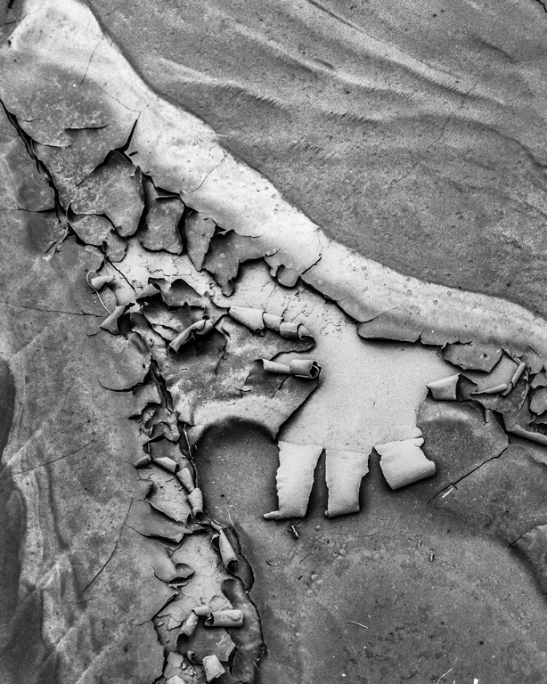
I find this mix of textures and shapes very interesting. My preference is to rotate it 90 degrees clockwise. I think the vertical perspective is more dramatic.
This also makes it clear To me that the slight unsharpness Stuart mentions is a DOF issue. Nevertheless, I really like it. |
Oct 9th |
| 64 |
Oct 20 |
Comment |
I find this mix of textures and shapes very interesting. My preference is to rotate it 90 degrees clockwise. I think the vertical perspective is more dramatic.
This also makes it clear To me that the slight unsharpness Stuart mentions is a DOF issue. Nevertheless, I really like it. |
Oct 9th |
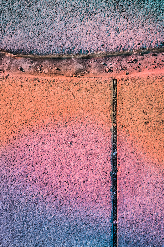
| 64 |
Oct 20 |
Reply |
Oops. It's really needed on the top. Thanks.
Earlier today, I entered an Arizona wide competition and resubmitted my entries because I belatedly remembered to add strokes.
Gravel is actually rough, stony concrete. |
Oct 9th |
| 64 |
Oct 20 |
Reply |
Yes, a smart major camera manufacturer would license Google's software and take advantage of their costly lenses andthe ergonomics of a standard camera body. |
Oct 8th |
| 64 |
Oct 20 |
Reply |
It really distinguishes itself n very low light and it's Unique capability of adjusting shadows and highlights before the image is captured. |
Oct 8th |
| 64 |
Oct 20 |
Reply |
The quality of the image is greatly enhanced by the computational technology developed by Google. I believe Google violates all we have learned about the physics of lenses and sensors. |
Oct 8th |
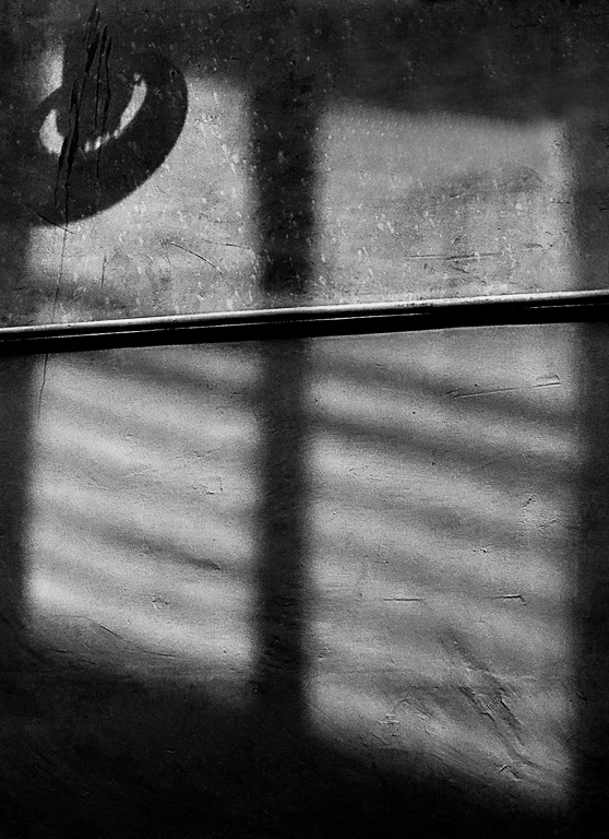
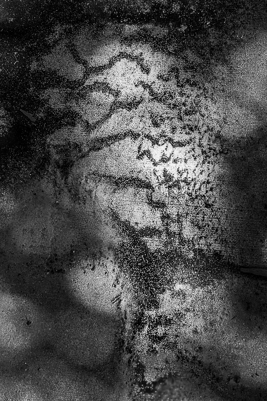
| 64 |
Oct 20 |
Reply |
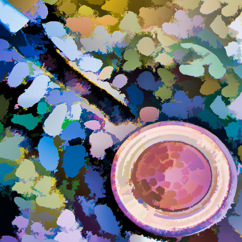
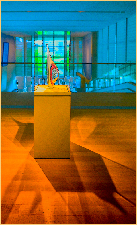
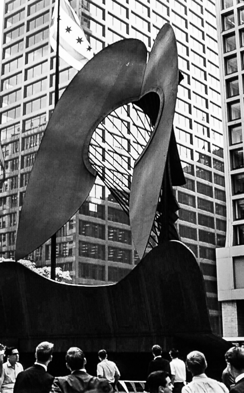
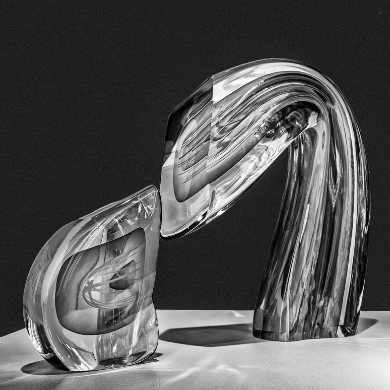
My intention was to have this viewed solely as an abstract. For clarity purposes, the major white subject is the marble sculpture. I'm looking down through a hole in it to view its natural shadow and additional concrete sidewalk. I blackened a distraction on the top. |
Oct 5th |
7 comments - 13 replies for Group 64
|
| 87 |
Oct 20 |
Comment |
I was drawn to your image by the toning and beautiful composition. My closer look shows good detail that might be enhanced a bit more.
I like reflections, so I'd make a version with 1/4 cropped off the top. |
Oct 27th |
1 comment - 0 replies for Group 87
|
23 comments - 19 replies Total
|