|
| Group |
Round |
C/R |
Comment |
Date |
Image |
| 18 |
Sep 20 |
Comment |
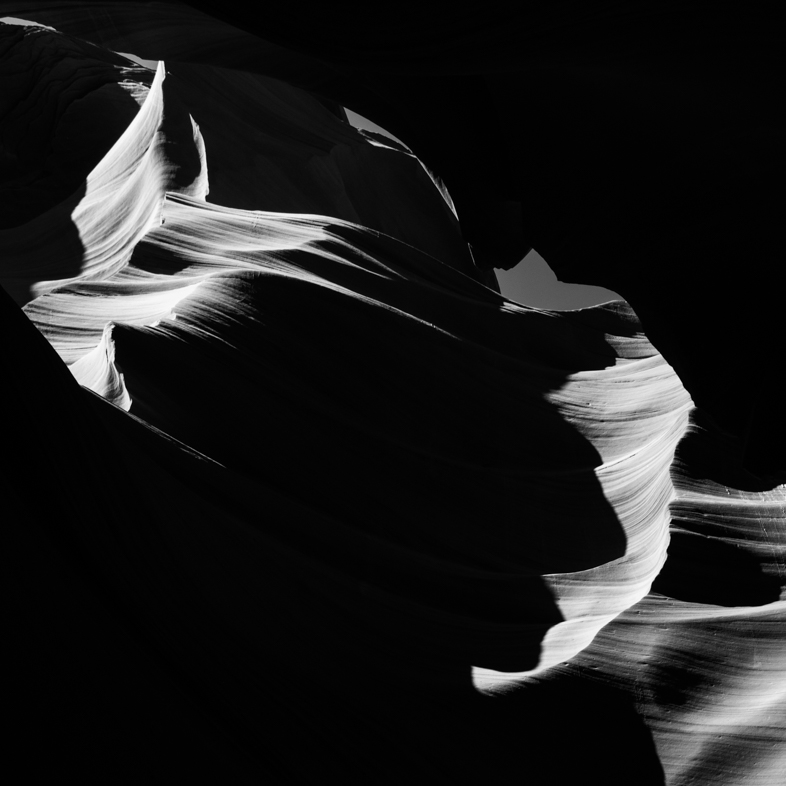
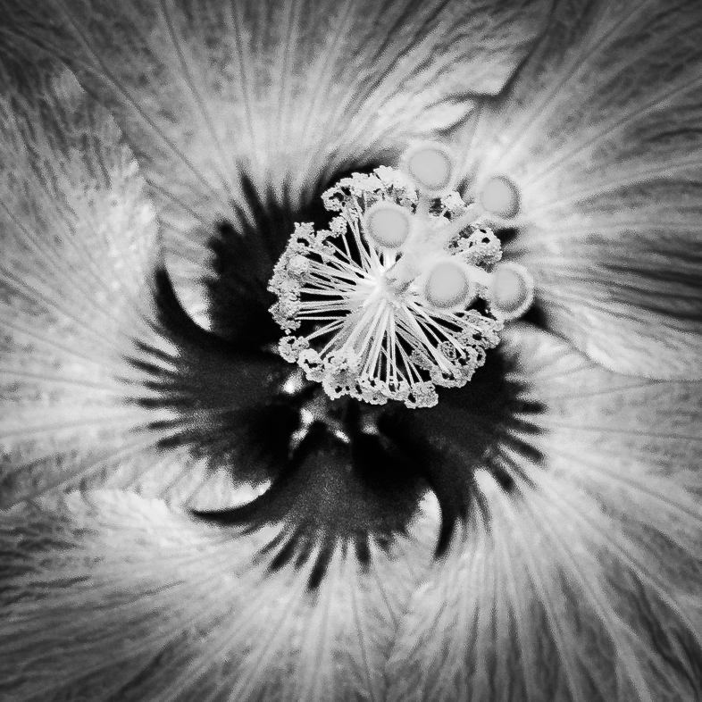
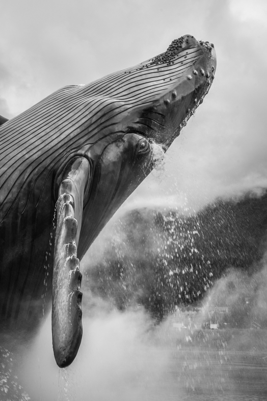
I agree with Mike, but I'd like to see the highlights on the cheek reduced a bit to give even more emphasis to the eye. **** |
Sep 4th |
| 18 |
Sep 20 |
Comment |
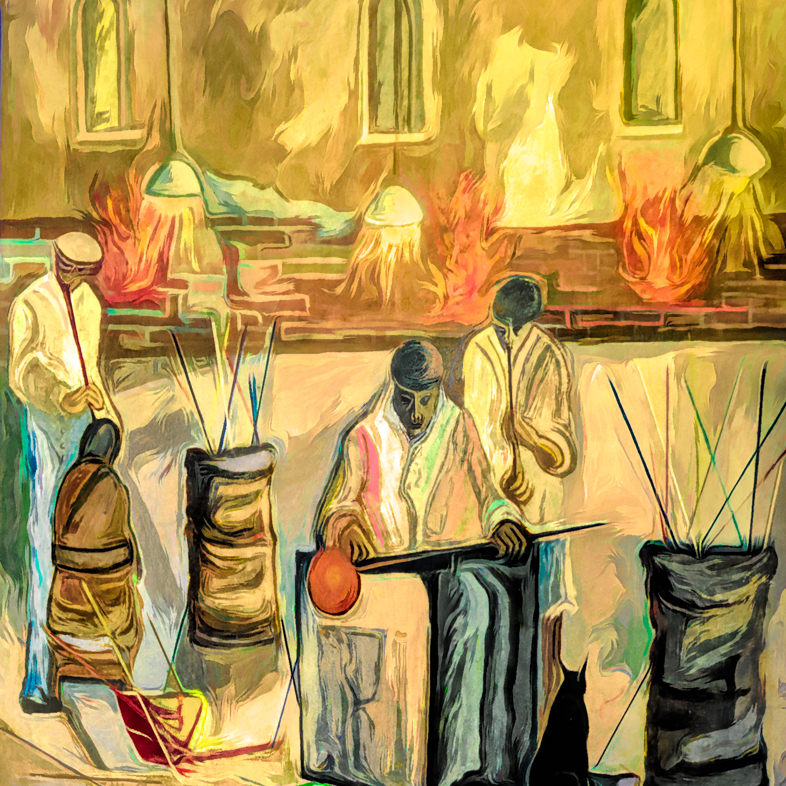
I think this is a beautiful and very creative image. I'd like to see the colors of the trumpet player match the pastels around it though as if it's a mural painted by one artist with a consistent color pallet. |
Sep 4th |
| 18 |
Sep 20 |
Comment |
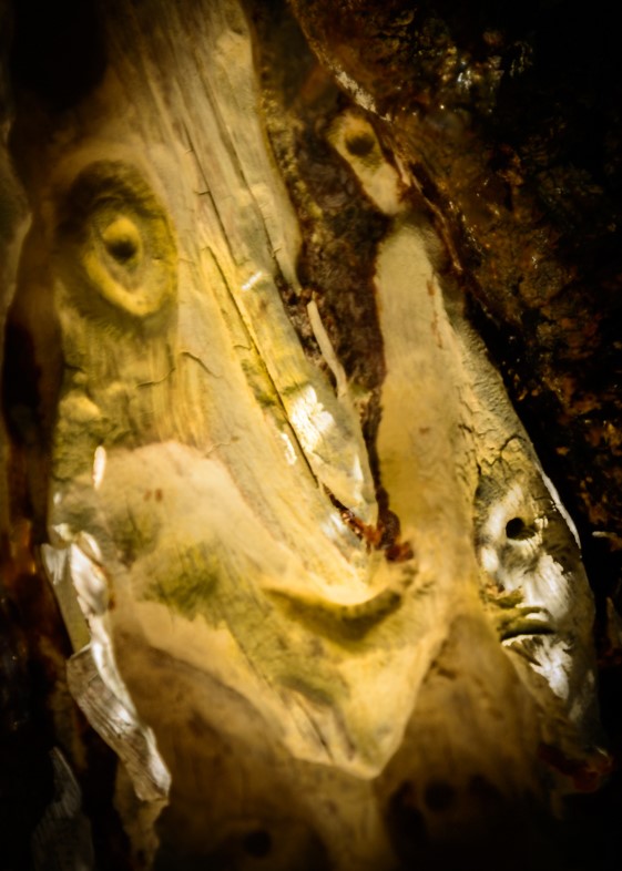
Very good. It reminds me of an African mask. |
Sep 4th |
| 18 |
Sep 20 |
Comment |
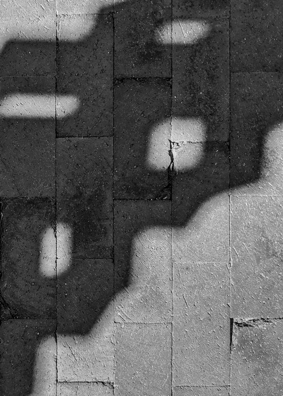
I like it a lot. Why do we overlook an occasional little detail? Hey, that's how these Groups help us.
I like the subtle border too. |
Sep 4th |
4 comments - 0 replies for Group 18
|
| 20 |
Sep 20 |
Comment |
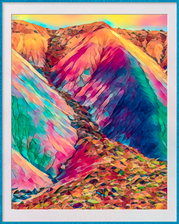
Very beautiful.
Since your bio said you want to become more creative I believe that excellent compositions such as this are a good starting point. I suggest that you download the free test of Topaz Studio 2 and view the tutorials at Topaz labs software.com
The presets in all of Topaz software offer an excellent starting point and you learn to create your own styles by experimenting with the sliders.
Have fun. |
Sep 20th |
| 20 |
Sep 20 |
Reply |
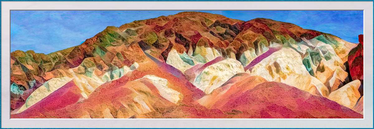
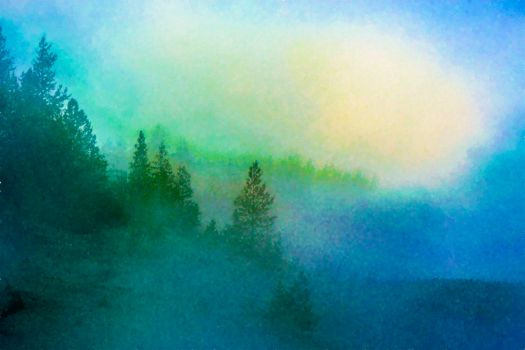
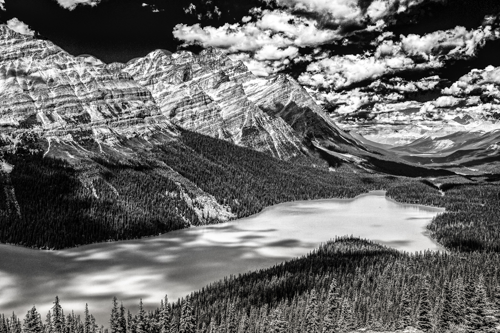
I think I view almost every subject abstractly; this being a landscape was incidental to me. If I do nature its usually has abstract or graphic qualities too.
I was pleased with the lower hills because they reminded me of some works by Georgia O'Keefe and I hope to be able to replicate that effect. |
Sep 16th |
| 20 |
Sep 20 |
Reply |
Do you mean to enhance edges with black? |
Sep 16th |
| 20 |
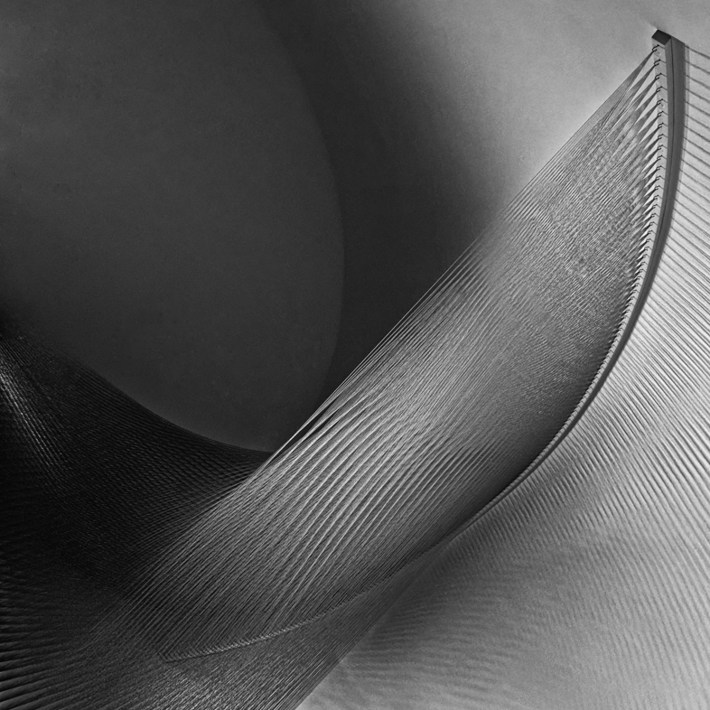
Sep 20 |
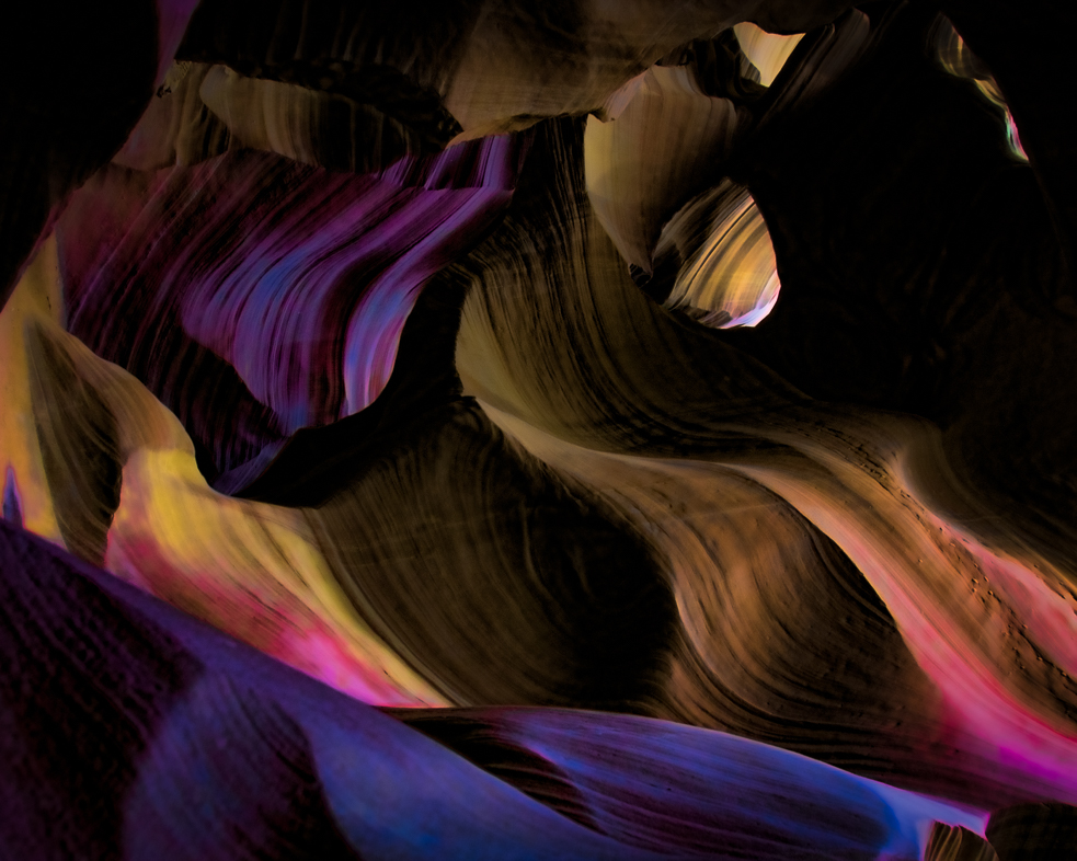
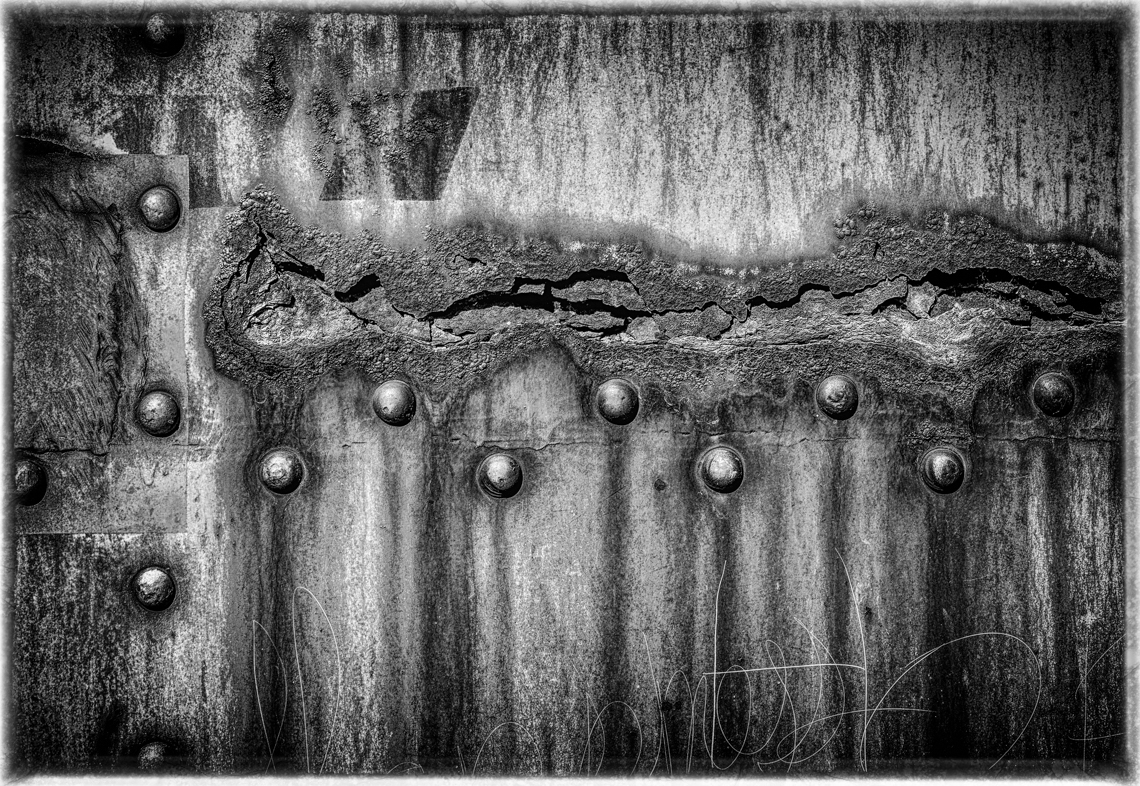
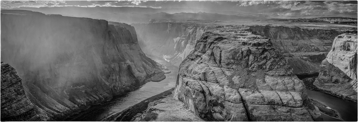
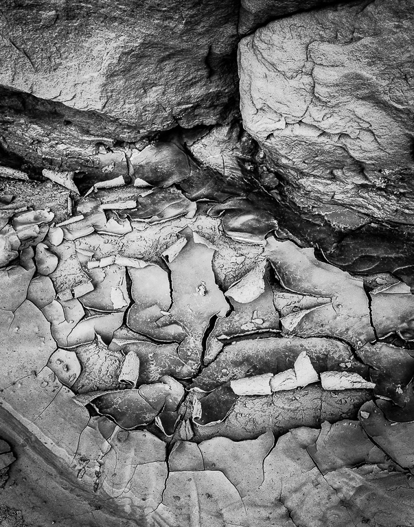
Comment |
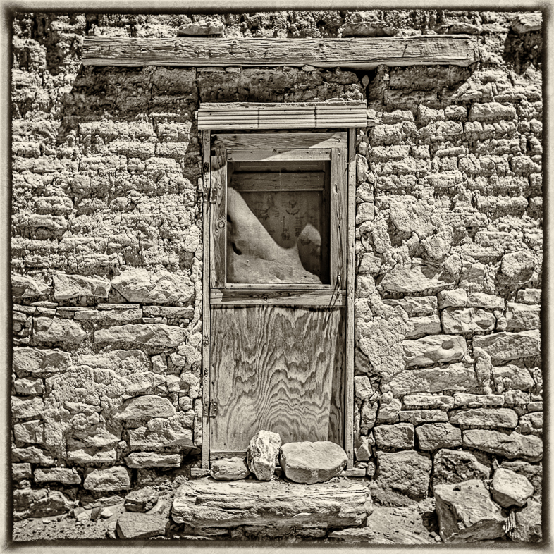
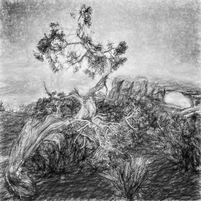
Interesting arch with a nice supporting frame. |
Sep 8th |
| 20 |
Sep 20 |
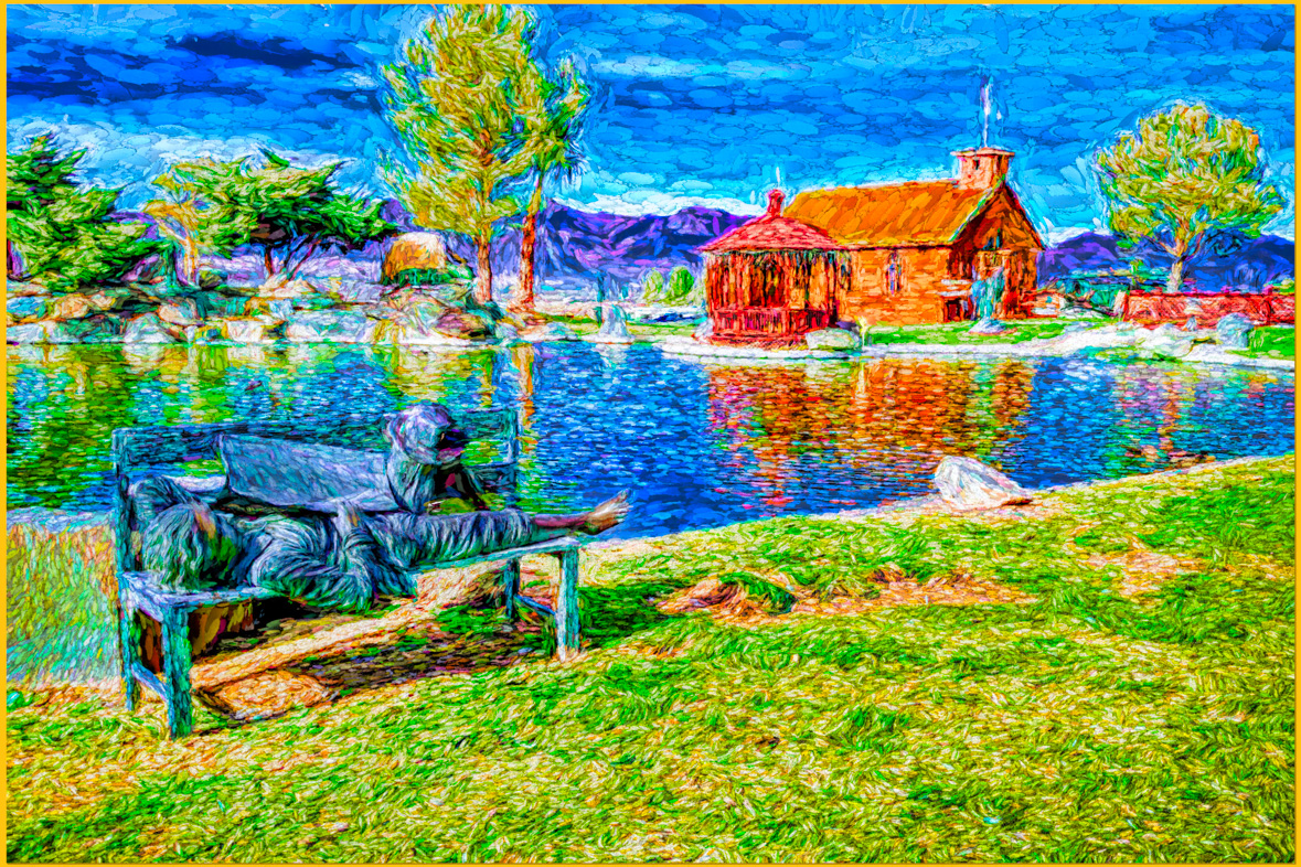
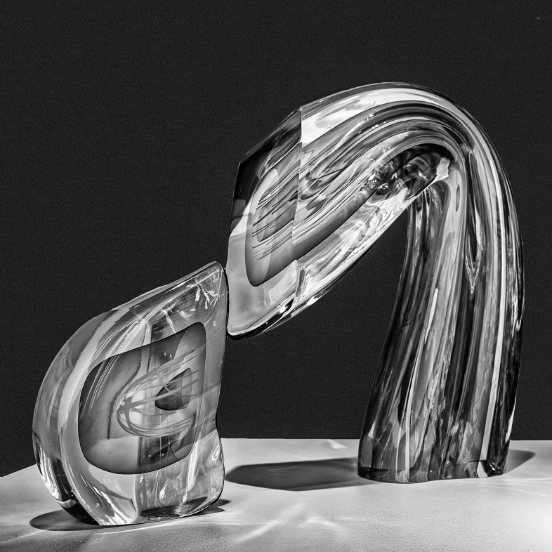
Comment |
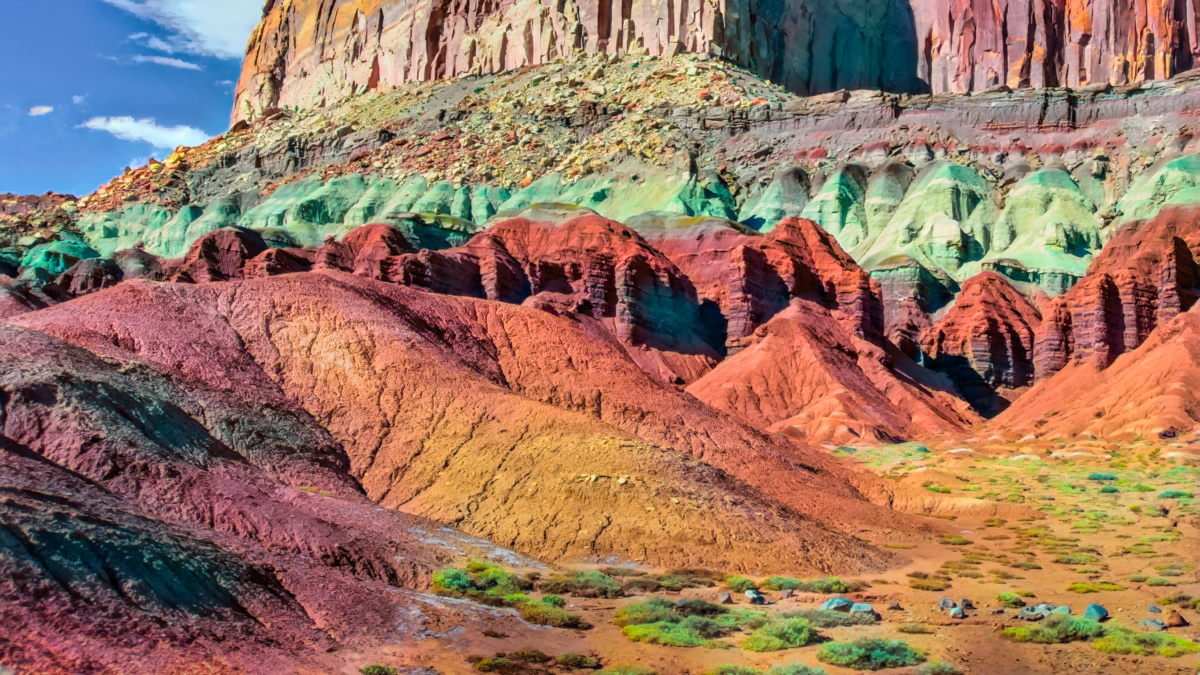
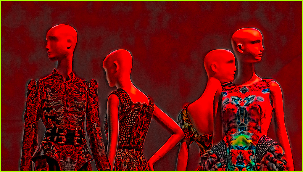
I like the feeling of depth in the composition as well as the texture. Personally, it would be more meaningful if the 2 people were shown more naturally. |
Sep 8th |
| 20 |
Sep 20 |
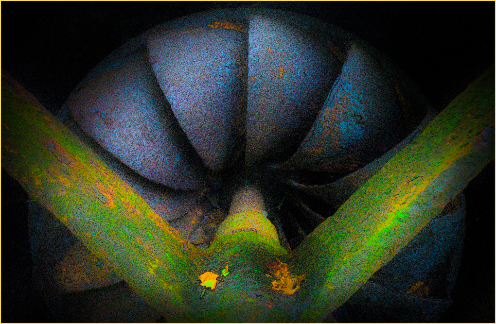
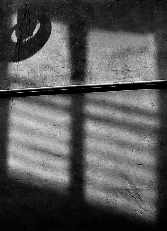
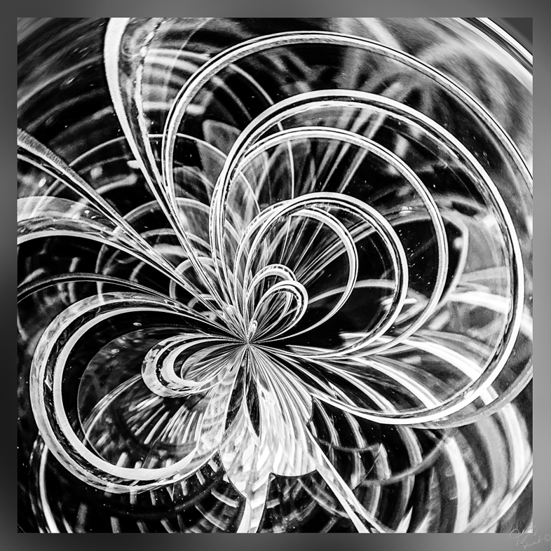
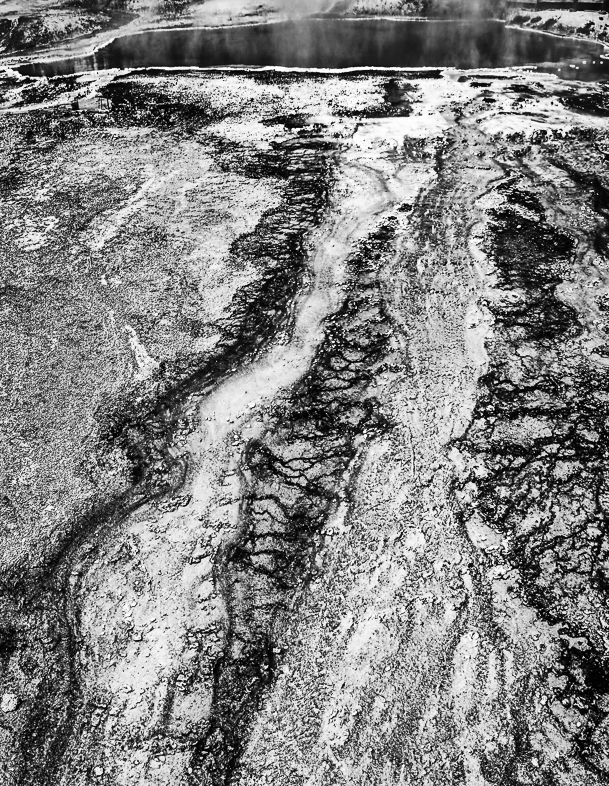
Comment |
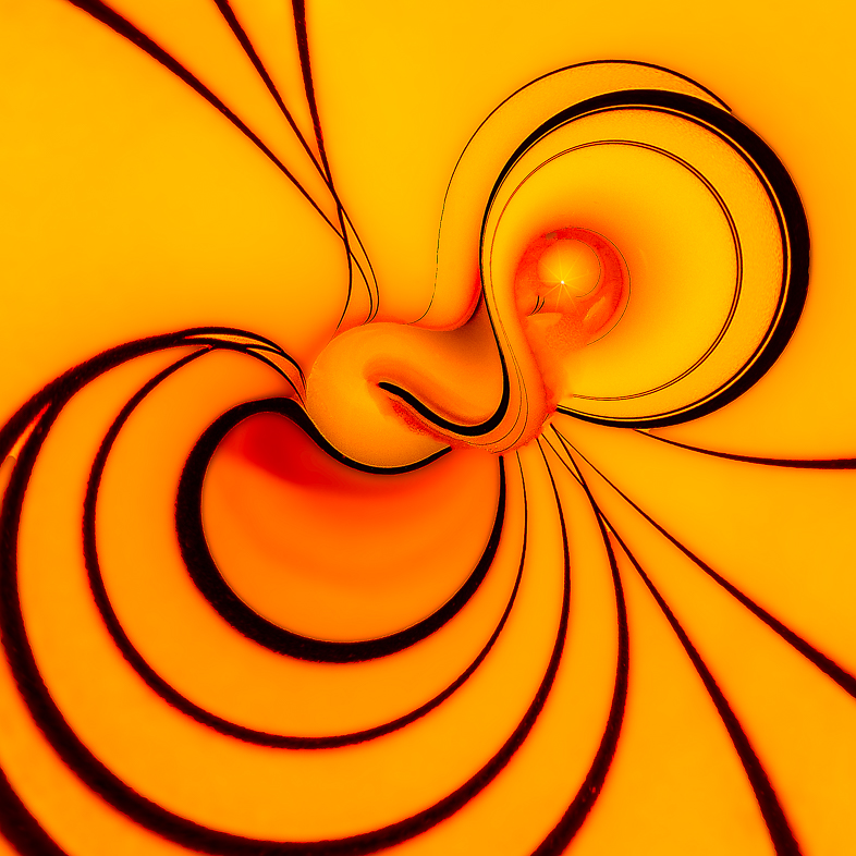
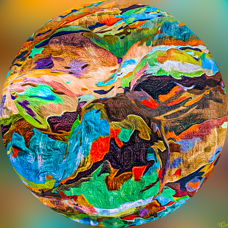
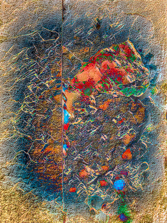
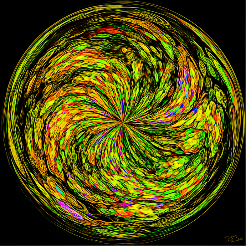
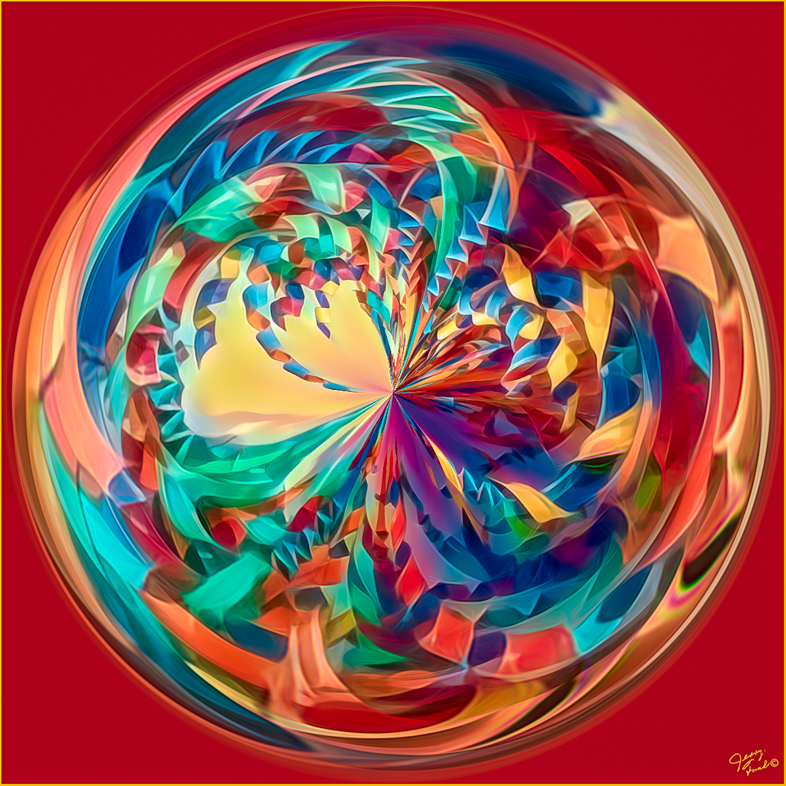
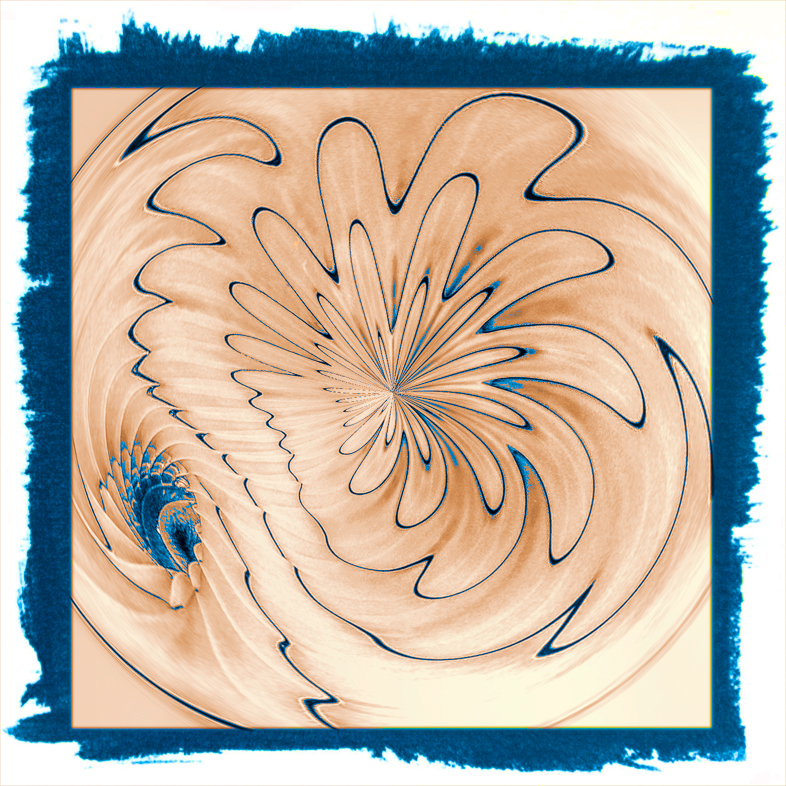
I especially like the pattern in the center area. I think that could also be an excellent creative image after cropping.
Perhaps I would like the final result more if Fred had been added after the distortion was applied. |
Sep 8th |
| 20 |
Sep 20 |
Comment |
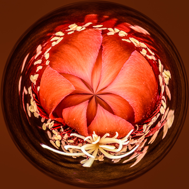
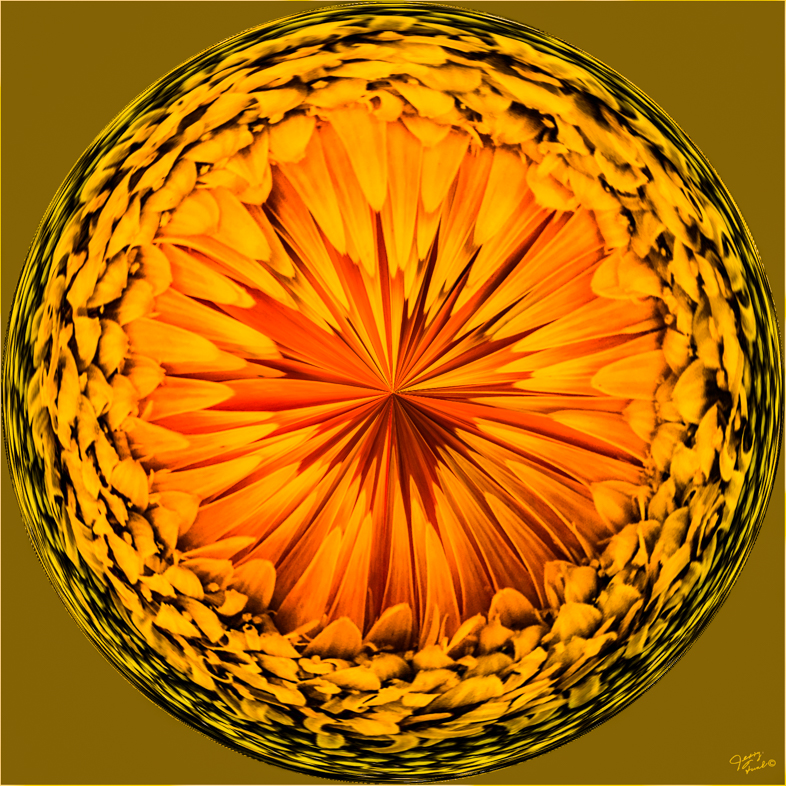
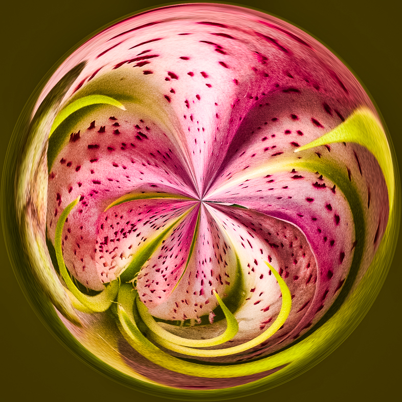
I think that's a great composition and excellent use of all 6 elements. |
Sep 8th |
| 20 |
Sep 20 |
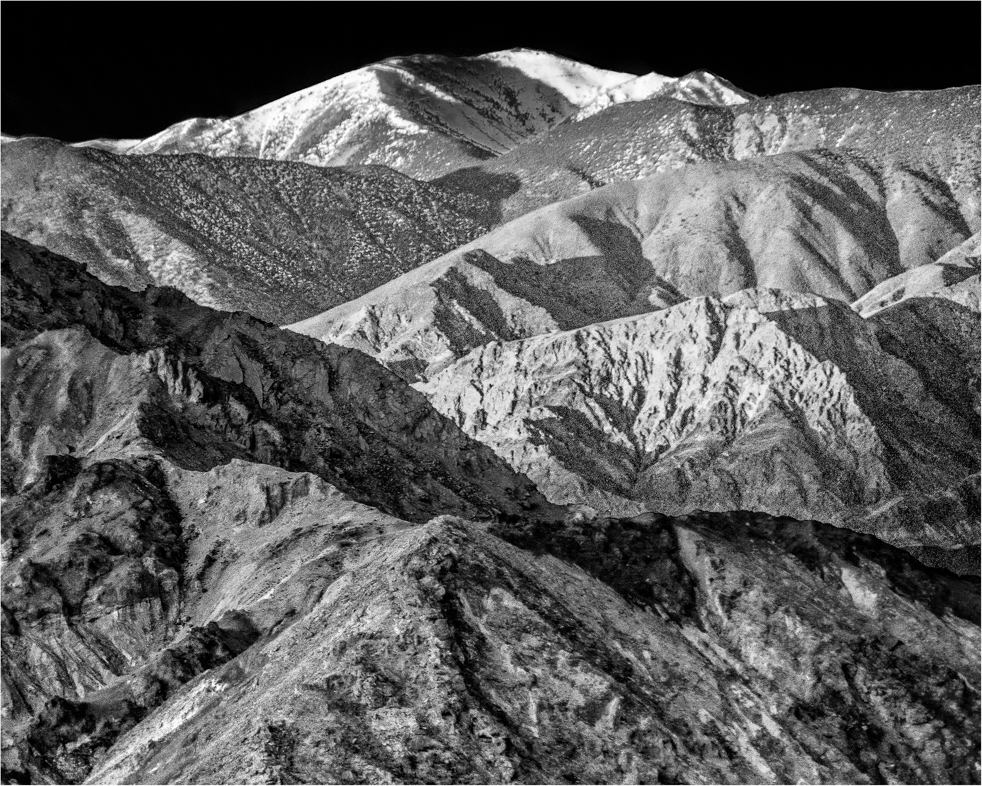
Reply |
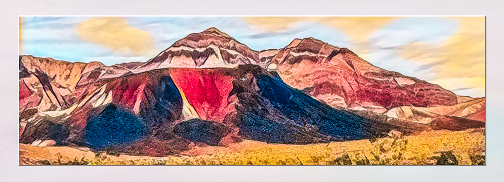
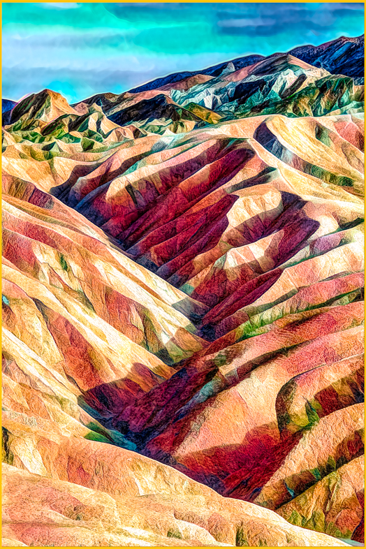
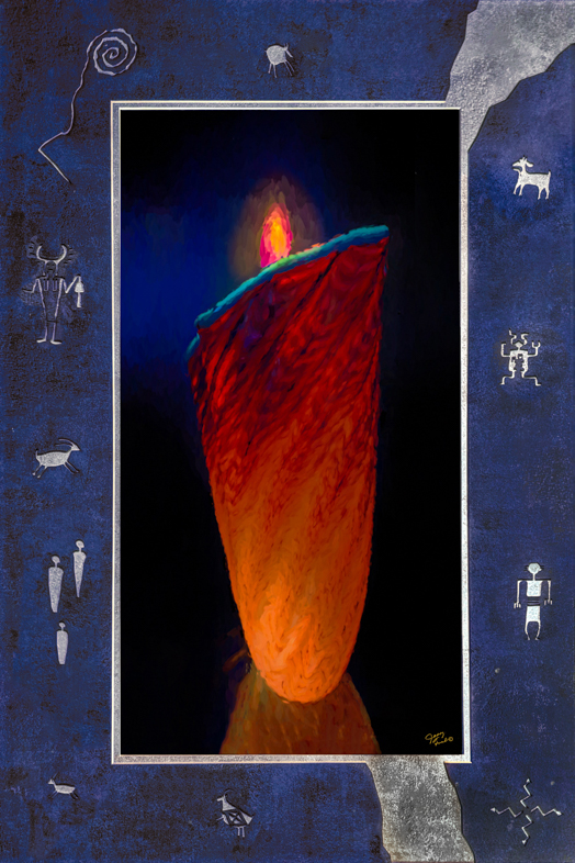
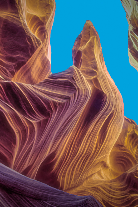
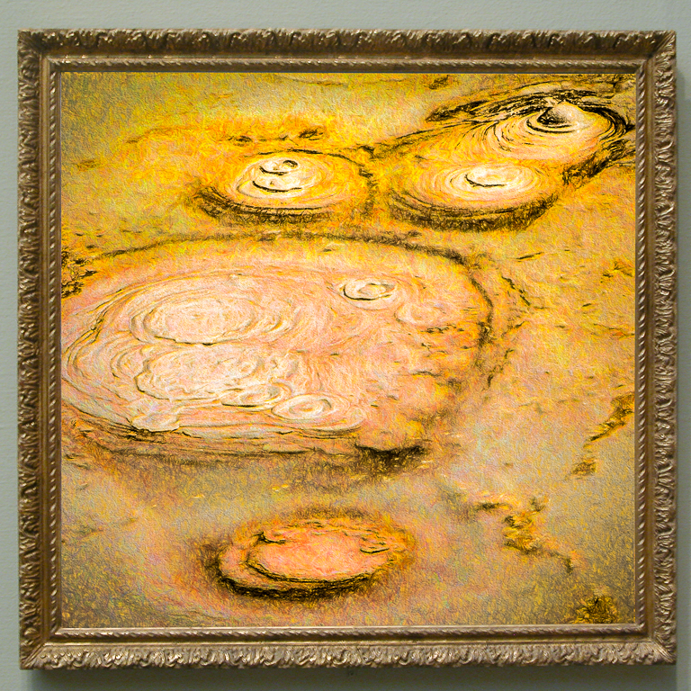
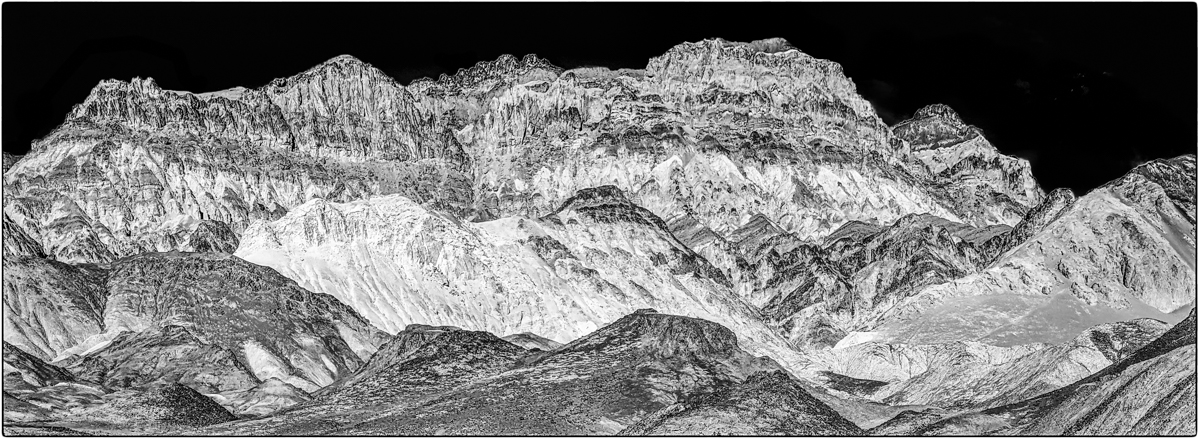
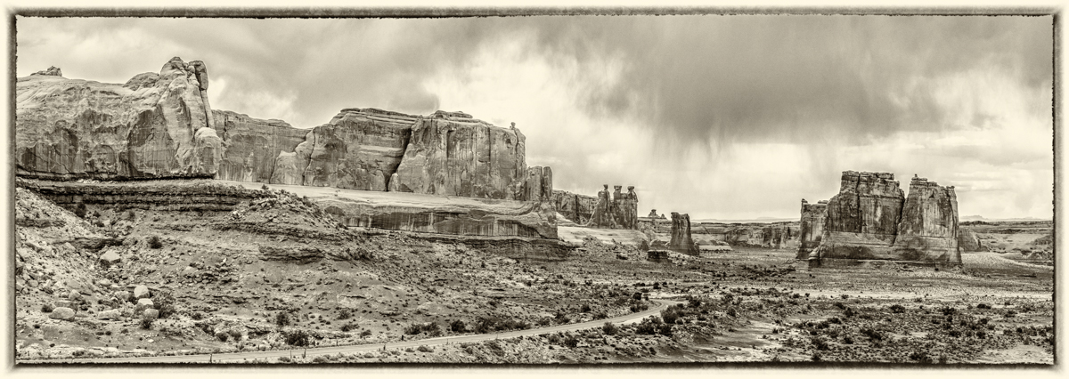
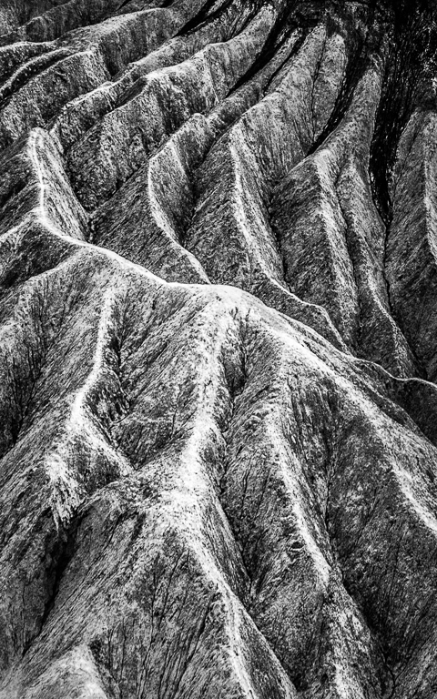
I see your point and should not have titled it Death Valley because that's not my story here. I was trying to show the hidden beauty of its multicolored hills and striations although not realistically. |
Sep 8th |
| 20 |
Sep 20 |
Reply |
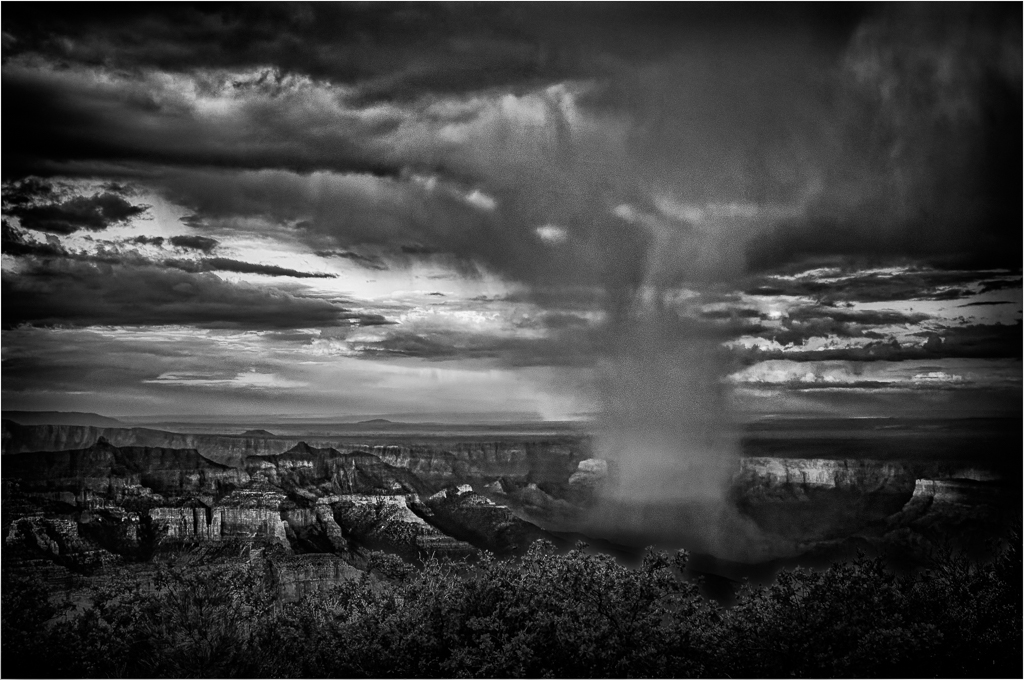
My original photo and almost all others are blah before I apply dehaze, clarity and increase saturation. I believe my result is a natural look after a brief rain shower. |
Sep 4th |
| 20 |
Sep 20 |
Reply |
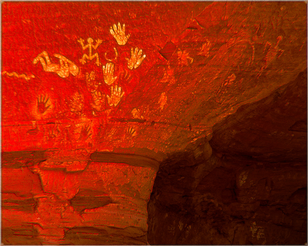
I have always felt Death Valley would benefit In my eyes from added color.
Yes, we are slowly learning when and how to apply the newer Topaz filters. Sometimes lowering saturation in a prese helps. Other times lowering the application of the effect Or brushing out some the effect helps. Sometimes, I like to change a color locally. As you know the possibilities are infinite, so we experiment and have fun. |
Sep 3rd |
| 20 |
Sep 20 |
Reply |
I have had the privilege to visit the Painted Desert after rare rain showers. Those vivid memories with highly saturated and enhanced colors have encouraged me to make images such as this. |
Sep 1st |
5 comments - 6 replies for Group 20
|
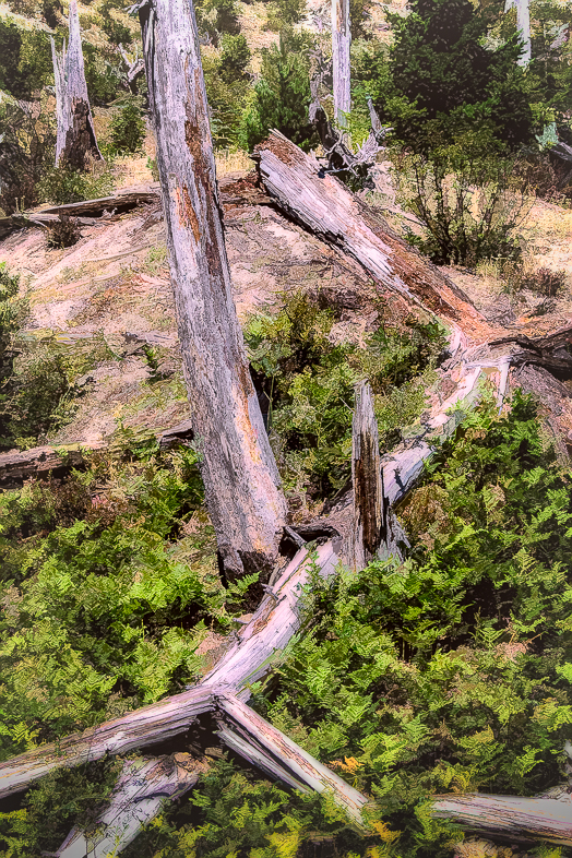
| 64 |
Sep 20 |
Comment |
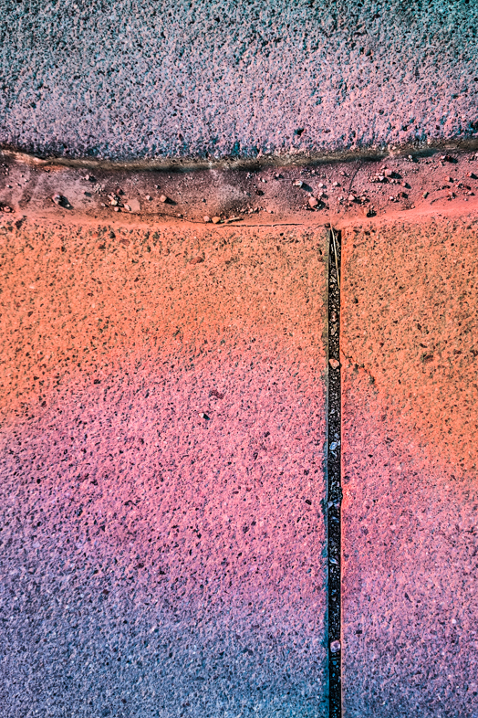
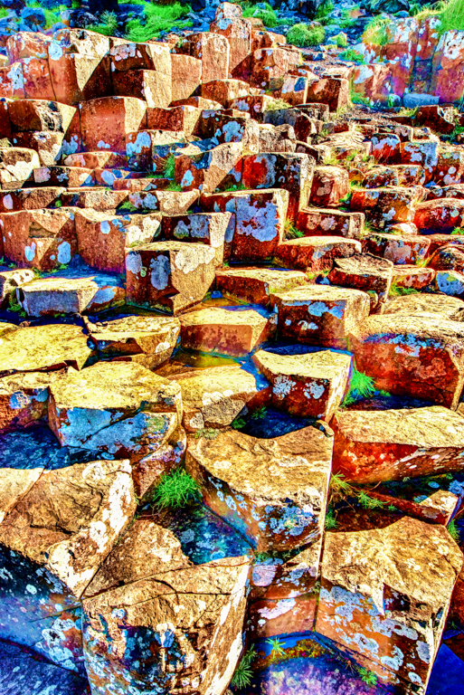
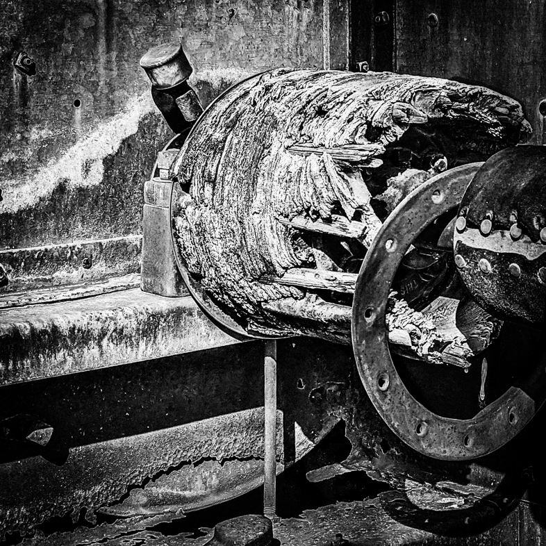
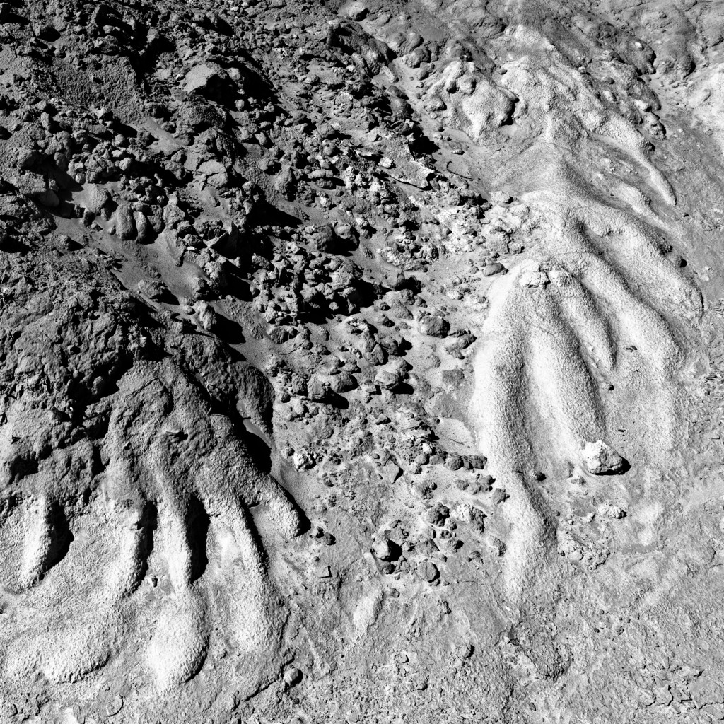
My first I thought was "How could those be real skid marks?" I too find the composition very compelling and have no problem departing from reality by darkening the right and also eliminating the distractions near the bottom right by cloning them away. I would not crop it.
I feel that it took me too many years to be comfortable with what I consider creating art rather than being dissatisfied with reality. My camera is just the first tool I use and I'm always looking and learning new ways to express myself while building on that tool. |
Sep 14th |
| 64 |
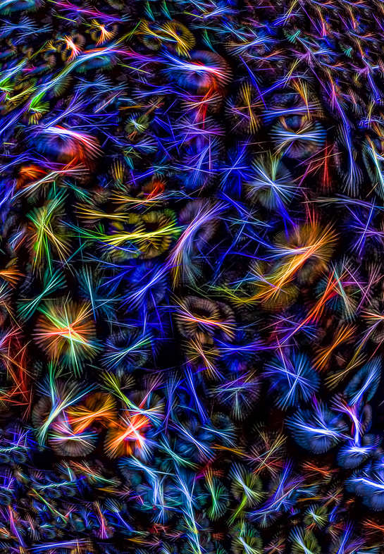
Sep 20 |
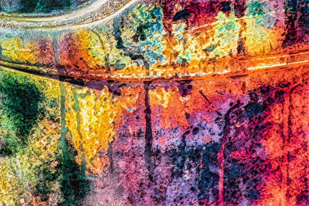
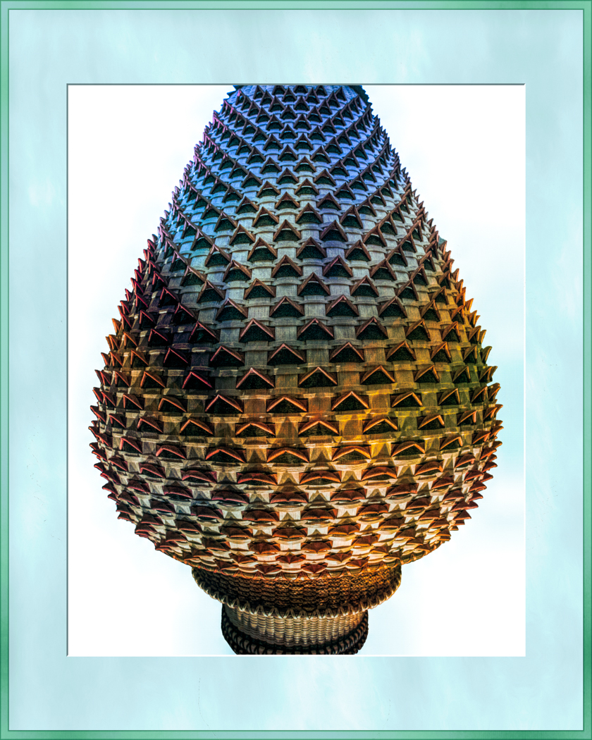
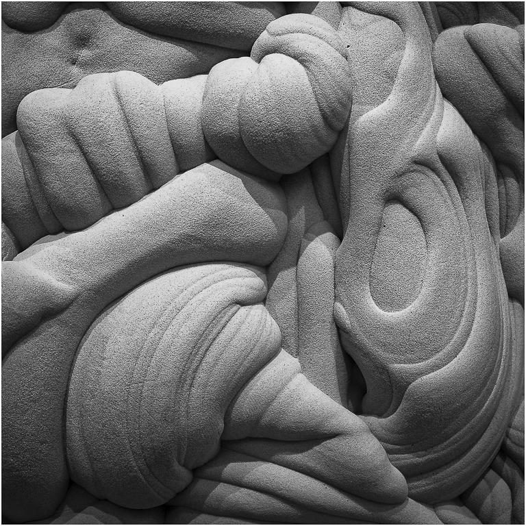
Comment |
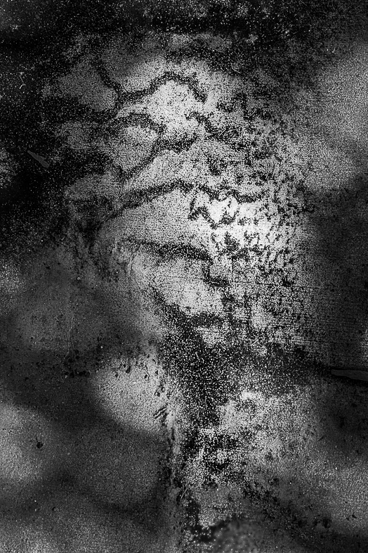
I make fascinating patterns like this, but I too struggle to make them interesting. Sometimes, adding colors produces pleasing results. It has also helped me learn the color wheel in selecting and placing my colors for a creative effect. |
Sep 14th |
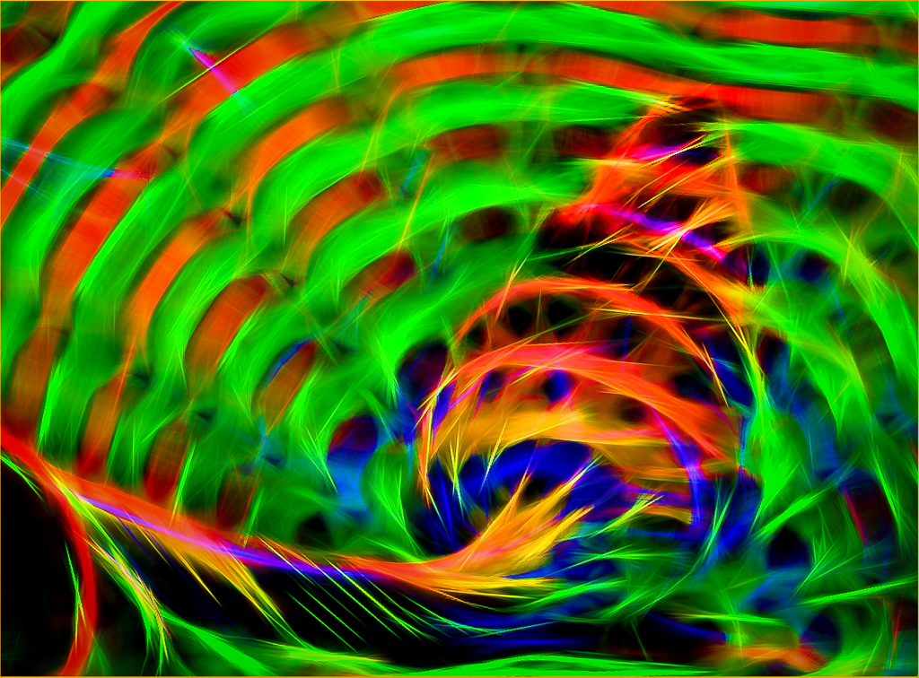
| 64 |
Sep 20 |
Comment |
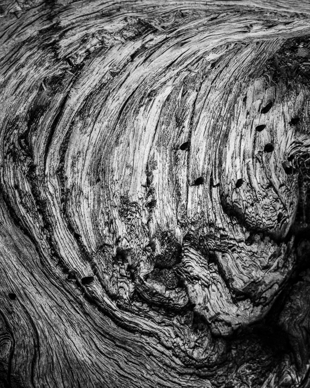
I can't expess how much I appreciate viewing this timeless work of art. You should be proud of it.
Hopefully, it will inspire me to see simple subjects and express them well. |
Sep 14th |
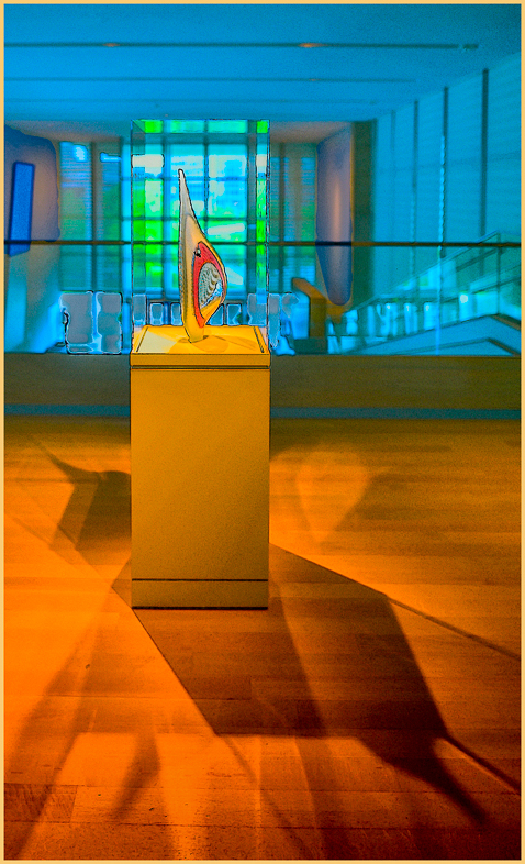
| 64 |
Sep 20 |
Comment |
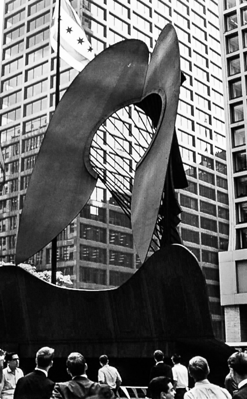
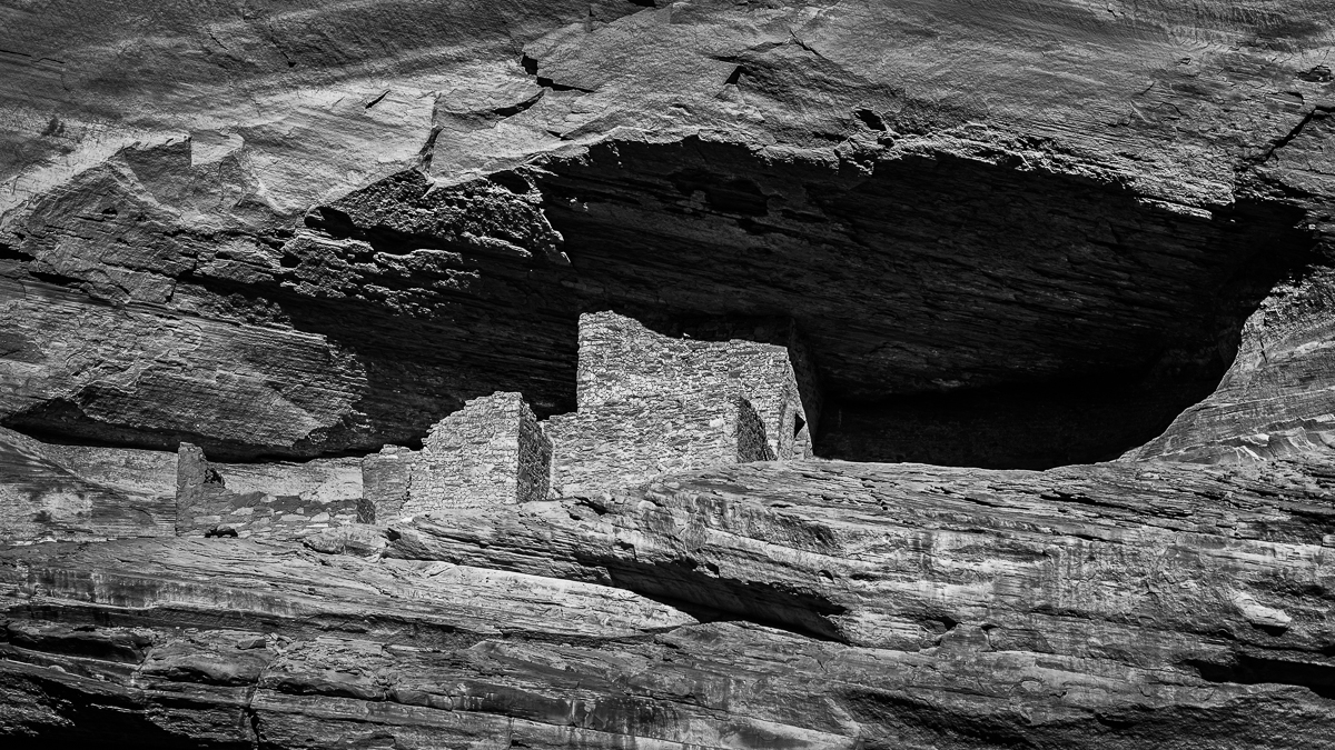
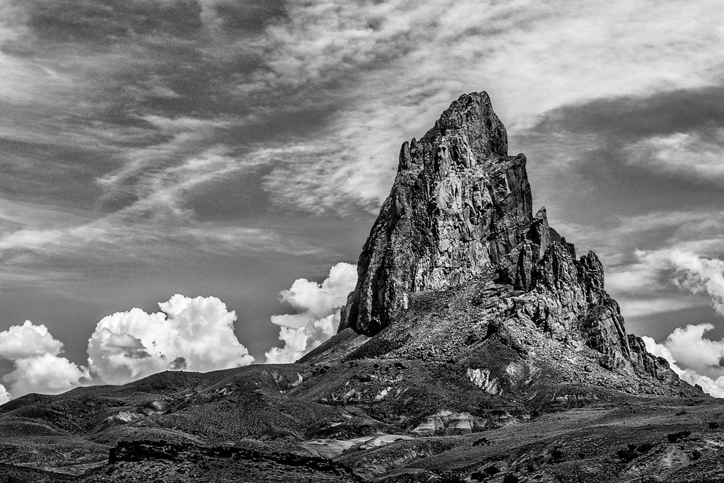
40+ years ago, I went out of my way to repeatedly take this drive while on business trips. I only have slide images, safely stashed away. I felt it a wonderful discovery the first time I saw it. You captured it excellently. I appreciate that your composition perfectly positioned the statue in the background.
Equally, memorable for me was when my wife was driving up there in a surprise June snow storm and nearly killed us as she skidded off the mountain road, turning 180 degrees and onto the narrow gravel siding. |
Sep 14th |
| 64 |
Sep 20 |
Comment |
I like both images very much, but I have a minor suggestion.
I would prefer to see a slightly different composition that would separate the monument from the building for my eye. |
Sep 14th |
| 64 |
Sep 20 |
Reply |
You too have given me additional incentive to make another variation of this photo. My original attempts with lower contrast didn't appeal to me. |
Sep 11th |
| 64 |
Sep 20 |
Comment |
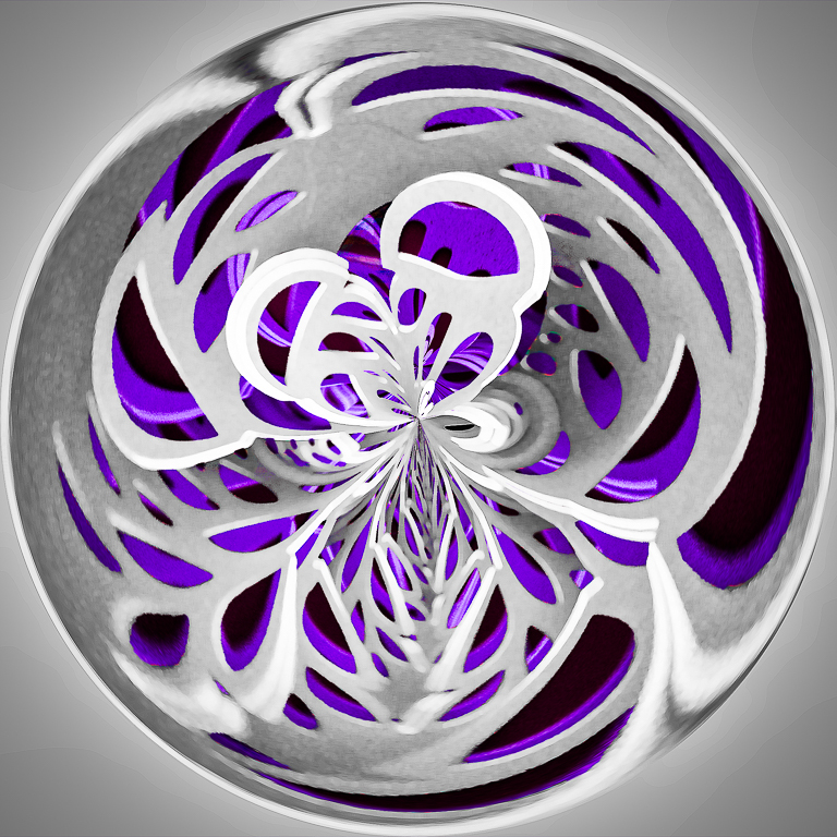
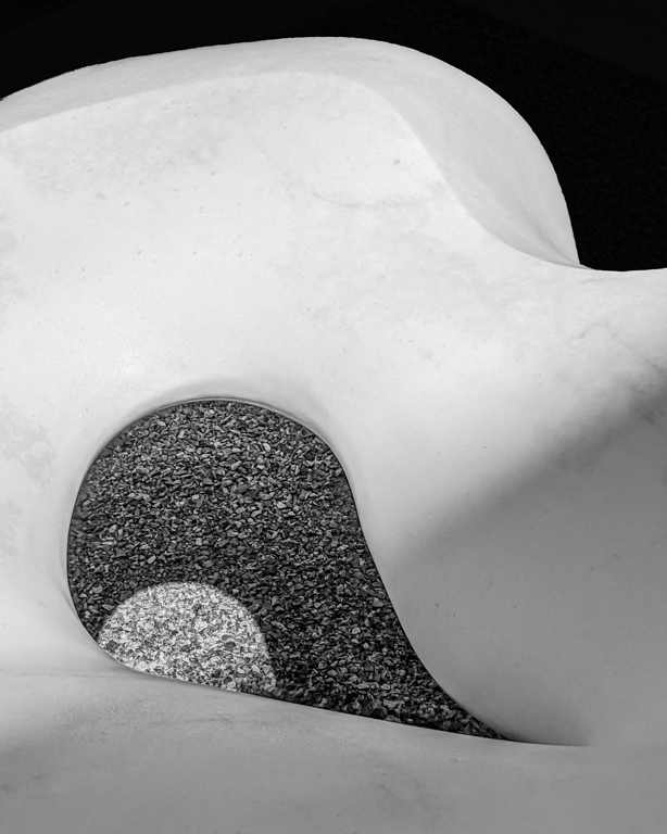
Wow, what a great graphic composition! |
Sep 7th |
| 64 |
Sep 20 |
Reply |
I considered that option, but felt it distracted from my primary area of interest.
Thanks |
Sep 7th |
6 comments - 2 replies for Group 64
|
15 comments - 8 replies Total
|