|
| Group |
Round |
C/R |
Comment |
Date |
Image |
| 18 |
Feb 20 |
Comment |
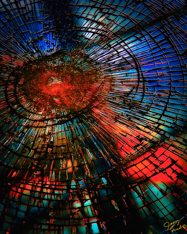
Your image is appealing to me, but I would prefer to use my imagination and not be influenced by a title. |
Feb 7th |
| 18 |
Feb 20 |
Comment |
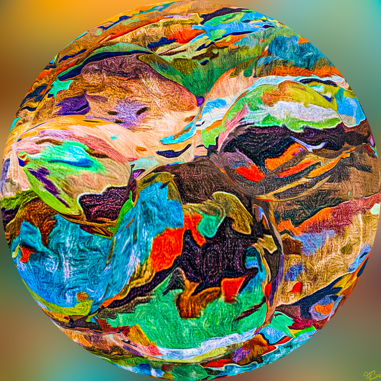
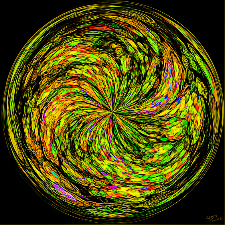
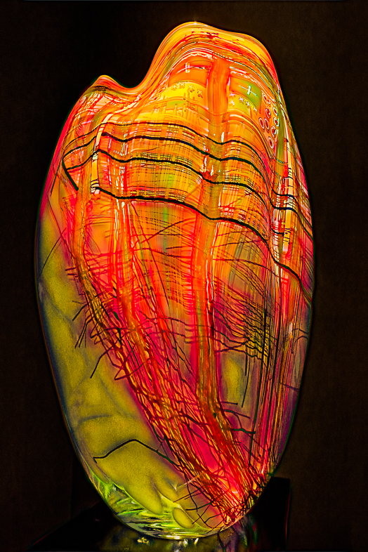
I'm an avid fan of impressionistic art and feel this is the best impressionistic treatment of a photo that I have ever seen. I wouldn't change a thing, every element is just right! |
Feb 7th |
2 comments - 0 replies for Group 18
|
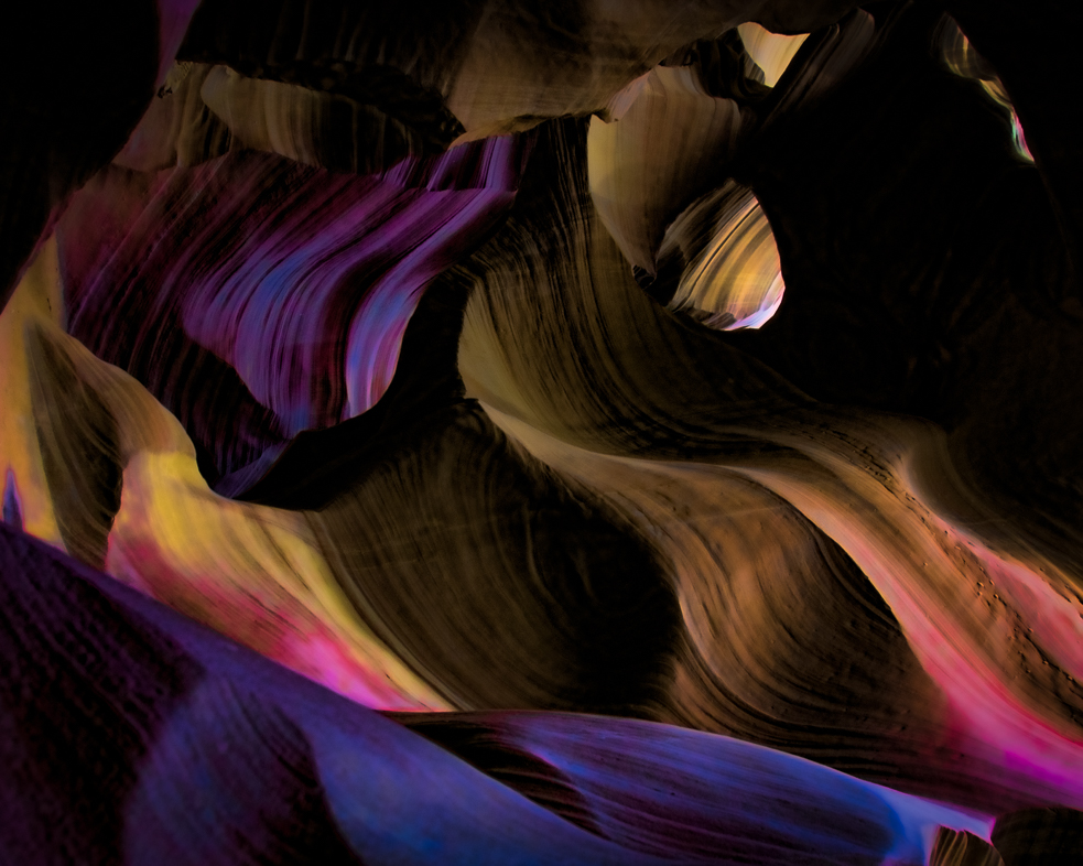
| 20 |
Feb 20 |
Comment |
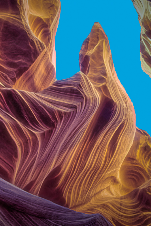
Viewing and enjoying your image again. I must start to experiment with layering. I've collected hundreds of potential backgrounds.
Too many ideas! Not enough time! Must allow time away from PC to exercise.
Daughter and granddaughter visiting for 10 days. Meeting in Las Vegas March 4 and will start 10 days of sightseeing at Death Valley. Probably too early for wild flowers, but great geological patterns and colors. They both enjoy photography too. Fun! |
Feb 29th |
| 20 |
Feb 20 |
Reply |
Yes, that's what I used. I've learned to be precise in the selection of my image and it's cropping before applying the filters. It offers lots of creative variations. |
Feb 26th |
| 20 |
Feb 20 |
Reply |
I would expect the Elements filter to be identical because it was included in the old Photoshop 2 decades ago. The key to using the filter is cropping and positioning. It is best used on a square original image. Good luck. |
Feb 20th |
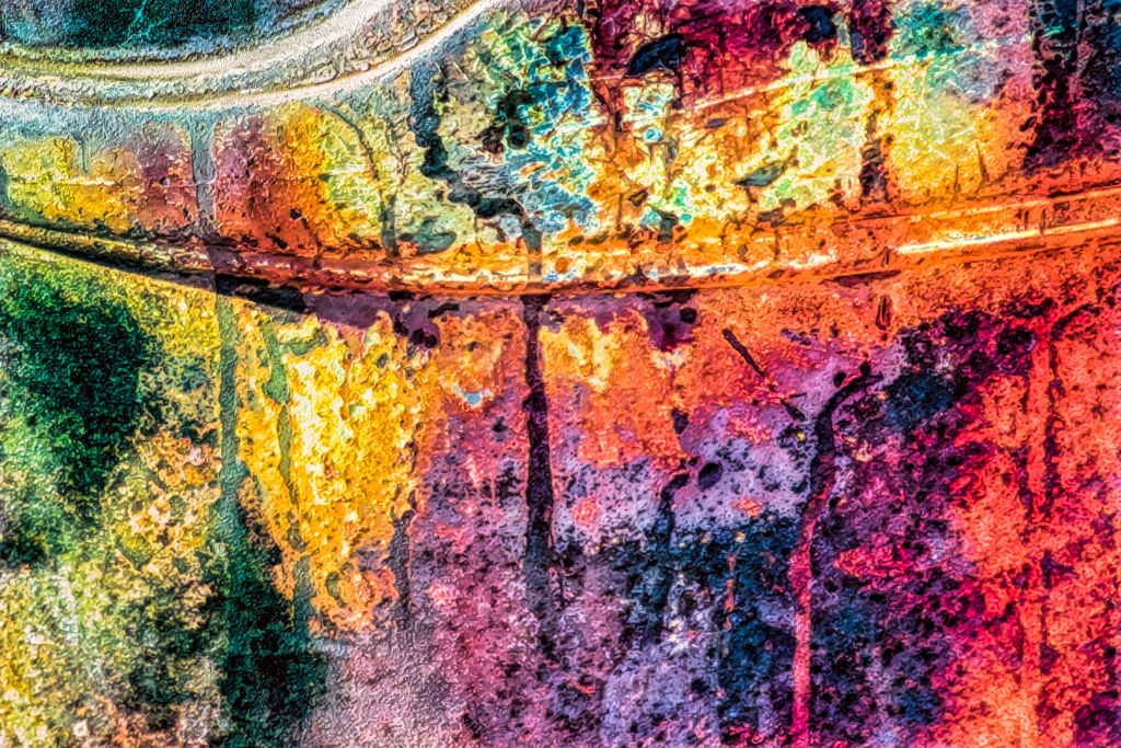
| 20 |
Feb 20 |
Comment |
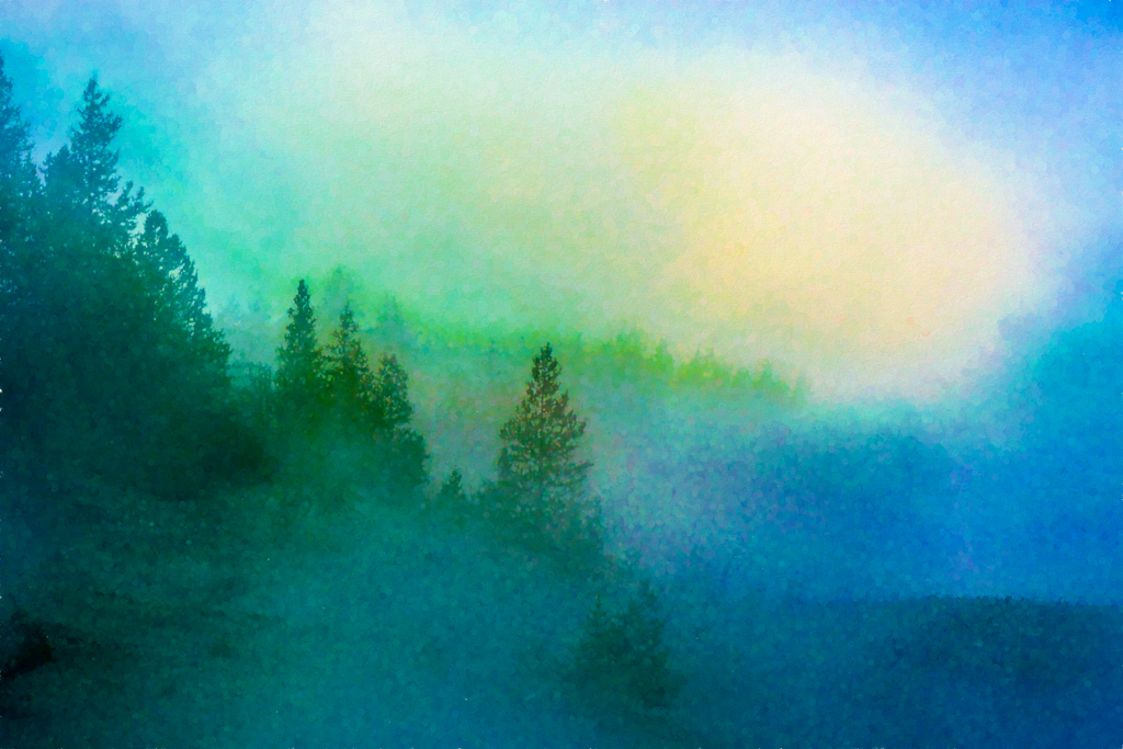
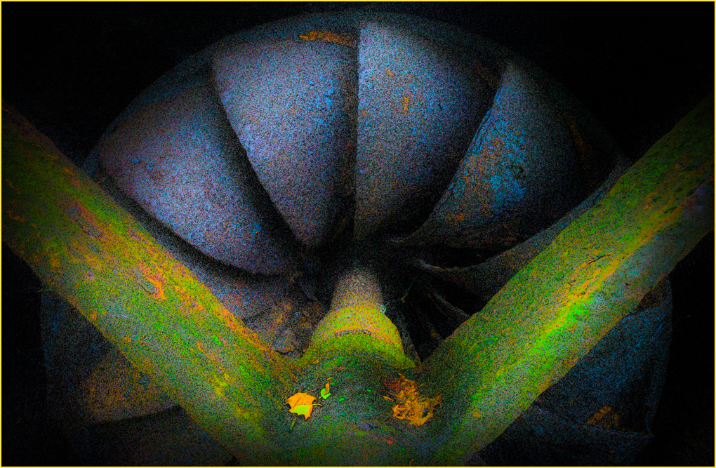
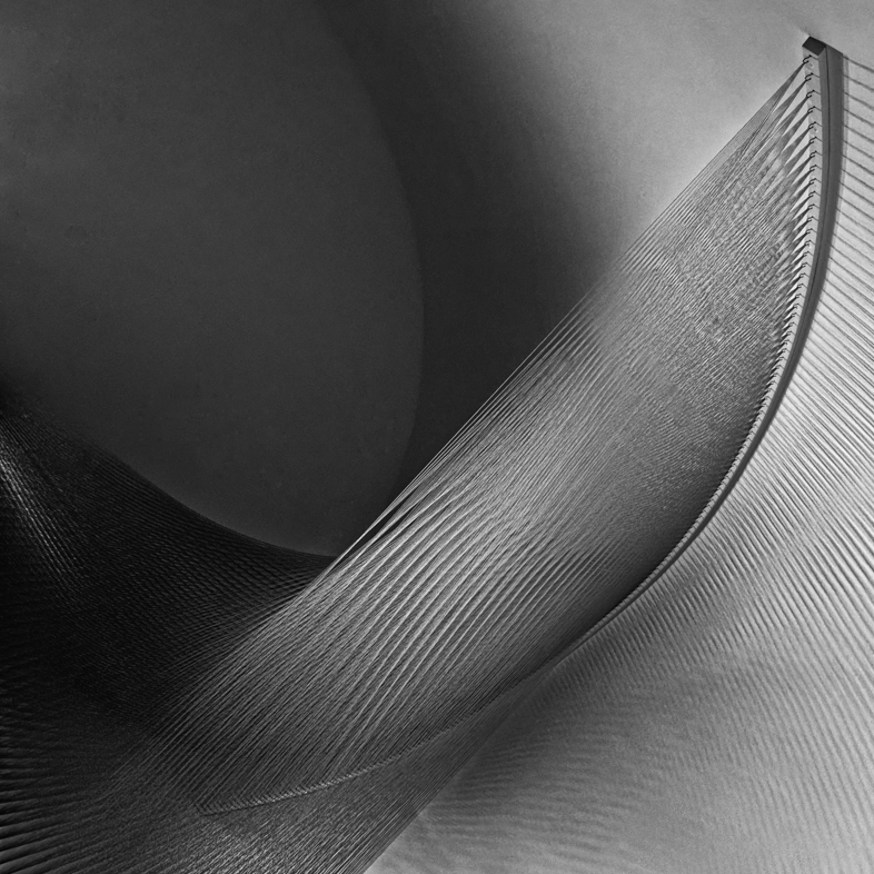
I think it's an interesting effect especially for the bushes and the grass.
My personal preference though would be to erase it from the train and to darken the bright edge along the mountain top.
I enjoy using Topaz filters to also add color to my Desert scenes. Its possibilities are seemingly endless. |
Feb 11th |
| 20 |
Feb 20 |
Reply |
|
Feb 7th |
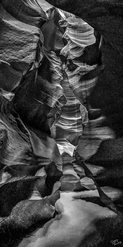
| 20 |
Feb 20 |
Comment |
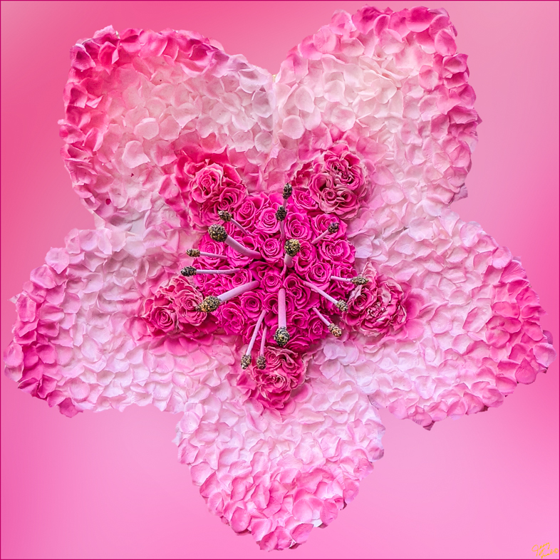
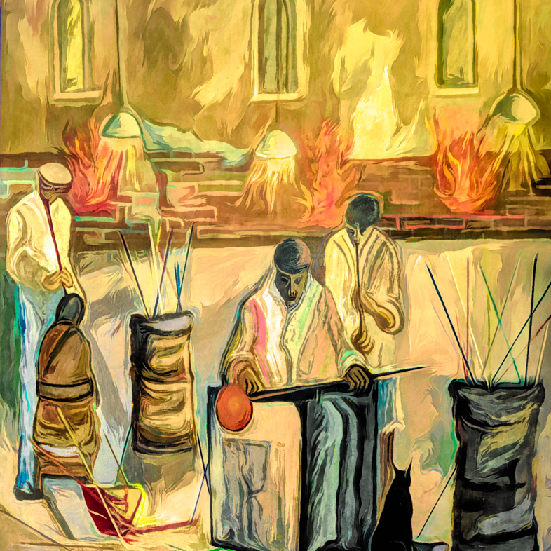
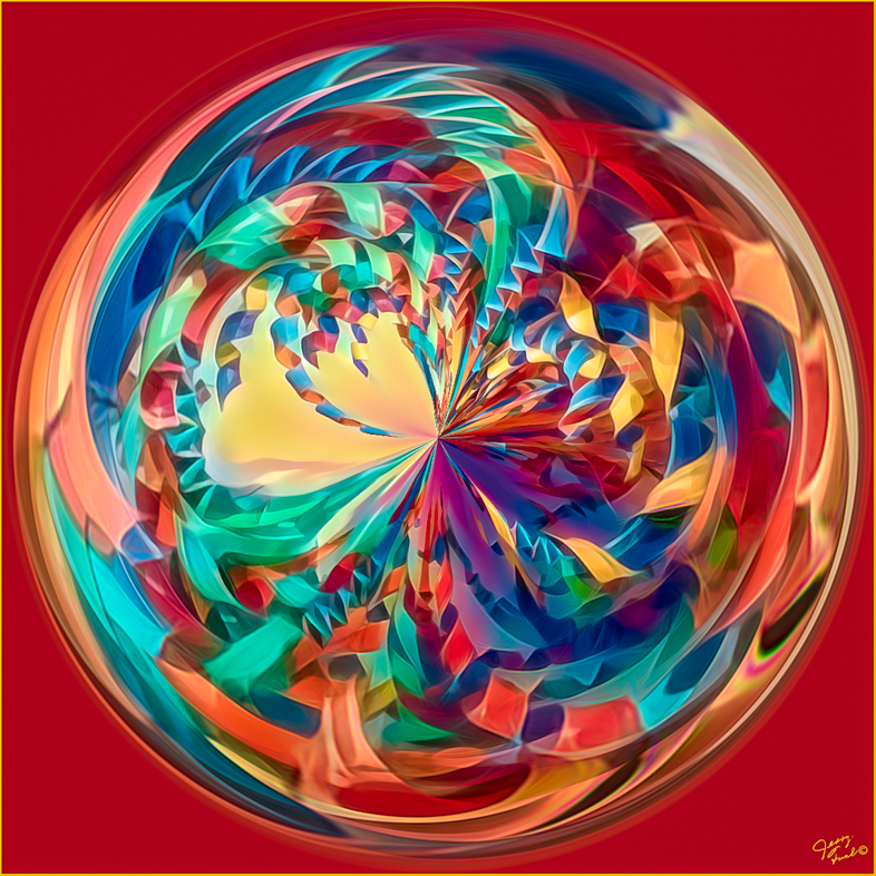
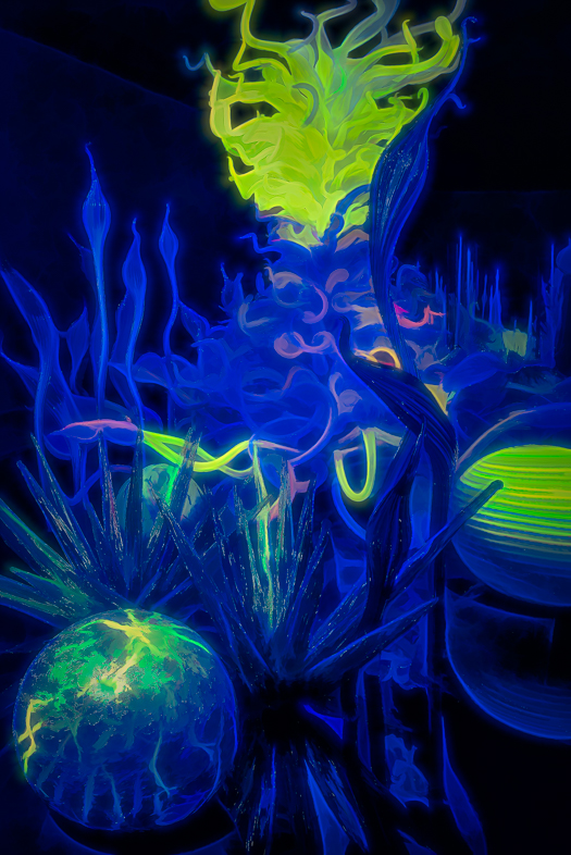
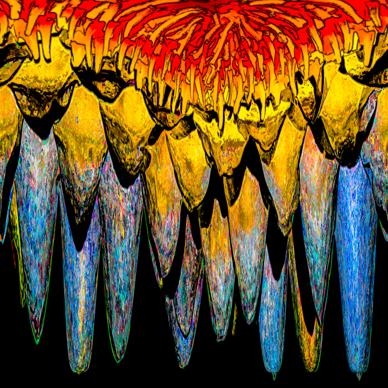
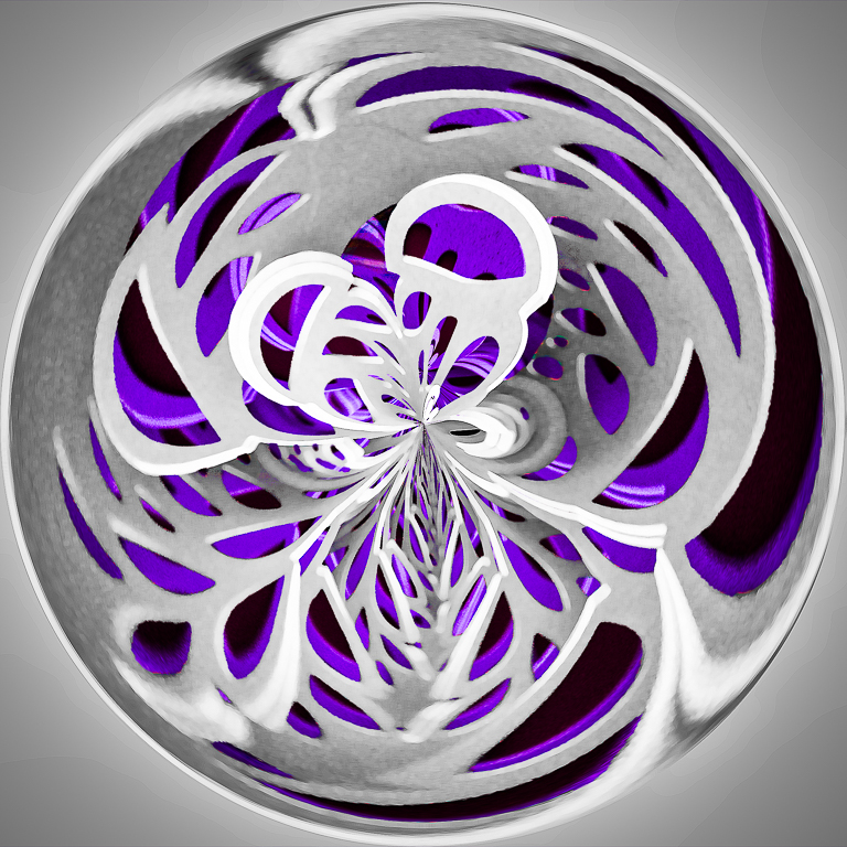
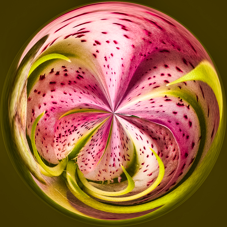
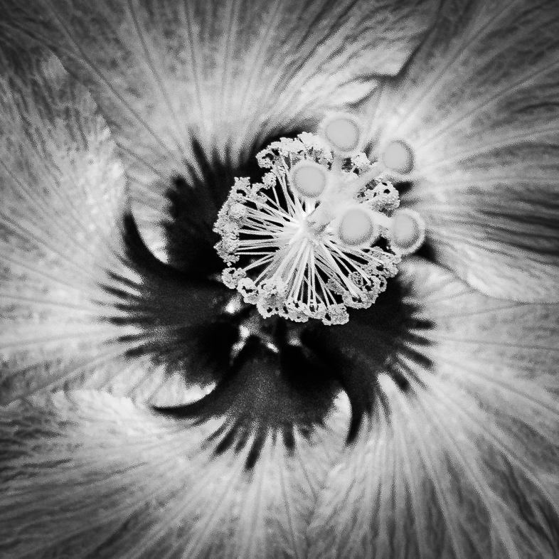
I think you did an excellent job of creating depth. Perhaps the small image file created the distracting detail in the stamen. I find the hand distracting and would clone it out. I think the feeling of depth would be retained.
Thanks for the detailed explanation of your creative process. |
Feb 7th |
| 20 |
Feb 20 |
Comment |
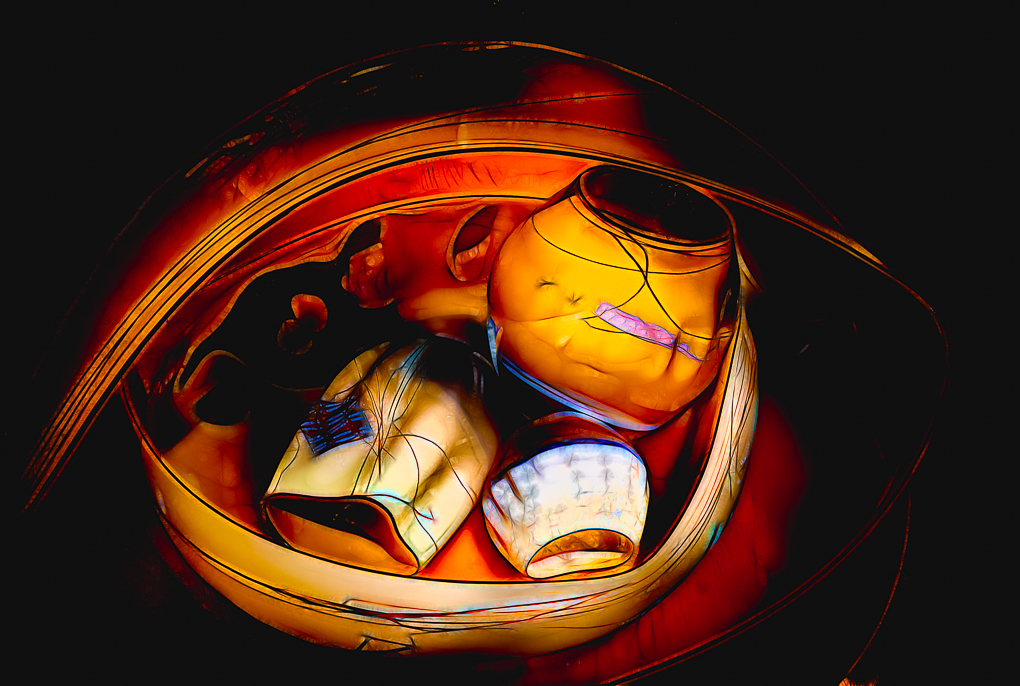
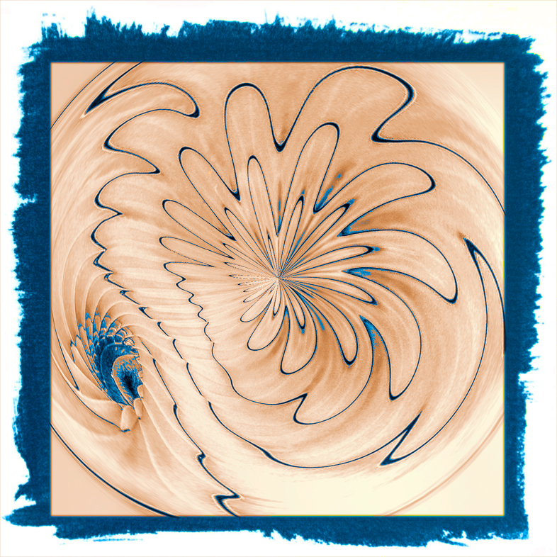
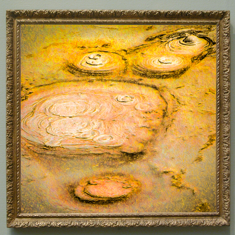
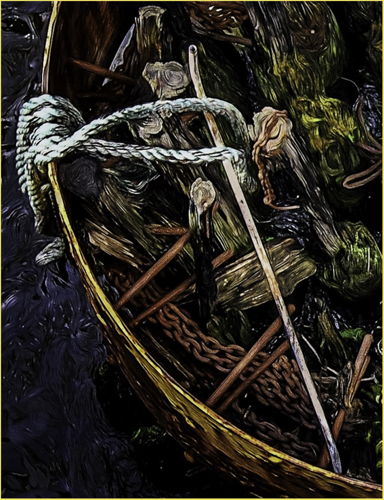
I like the overall effect of soft dreamy pastel colors. Since there is no apparent damage to the boat, it appears to me that the boat rested on the rocks as the tide went out.
I didn't notice the mermaid until I read the title, so I guess I'd like to see more contrast or clarity in the mermaid. Too bad the PSA system doesn't accommodate a fourth original to oshow your original mermaid image.
I'm not familiar with NIC. Did you use NIK? |
Feb 7th |
| 20 |
Feb 20 |
Comment |
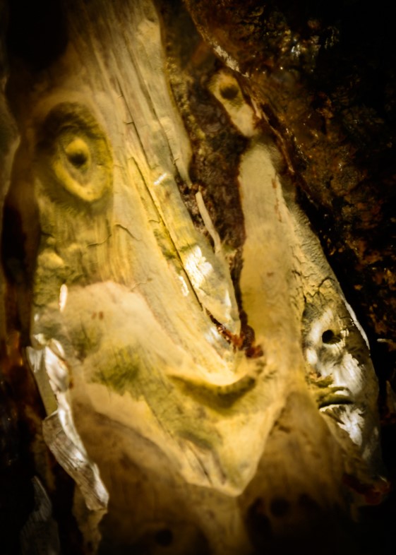
I toured Rome for 5 days last Sept., but my memories are so strong that it seems much more recent. Unfortunately, I didn't see anything noteworthy at night. I guess we were too tired and hungry.
I like that your creative treatment opened the shadows of the background. The lack of detail doesn't concern me. I simply suggest burning in the bright areas that are distracting to me. |
Feb 7th |
| 20 |
Feb 20 |
Comment |
I think you have created an unusual and very beautiful and appealing image. I can't suggest any alternatives that could improve it to my eyes and feelings. Super! |
Feb 7th |
6 comments - 3 replies for Group 20
|
| 21 |
Feb 20 |
Comment |
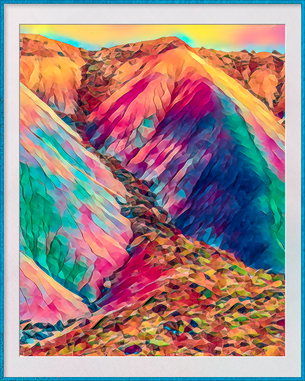
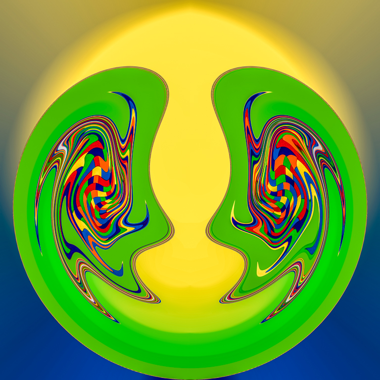
I'll give you 4 stars for creativity. Very appealing to me. |
Feb 9th |
1 comment - 0 replies for Group 21
|
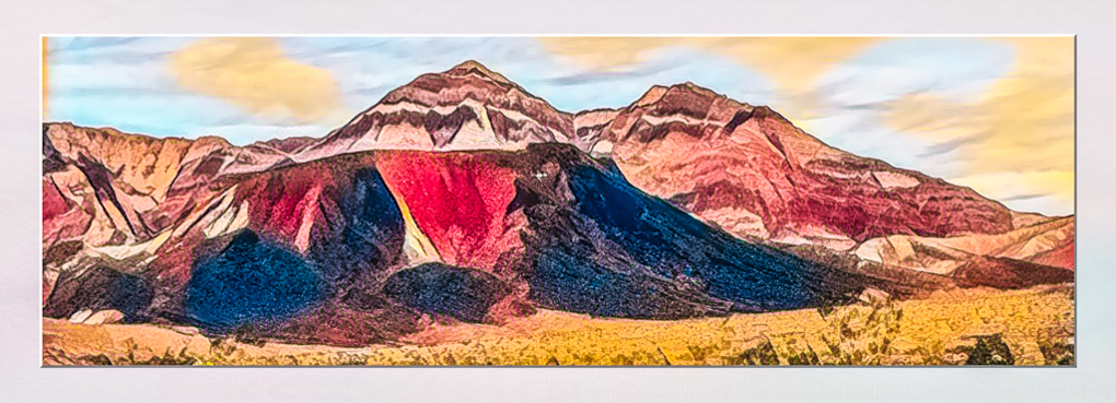
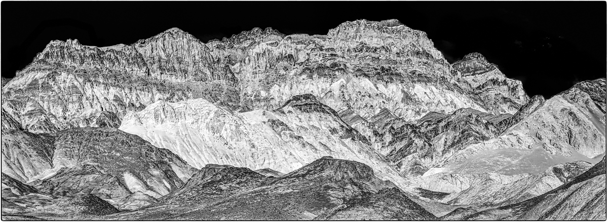
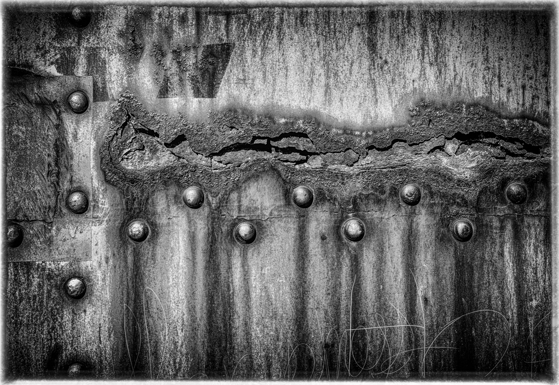
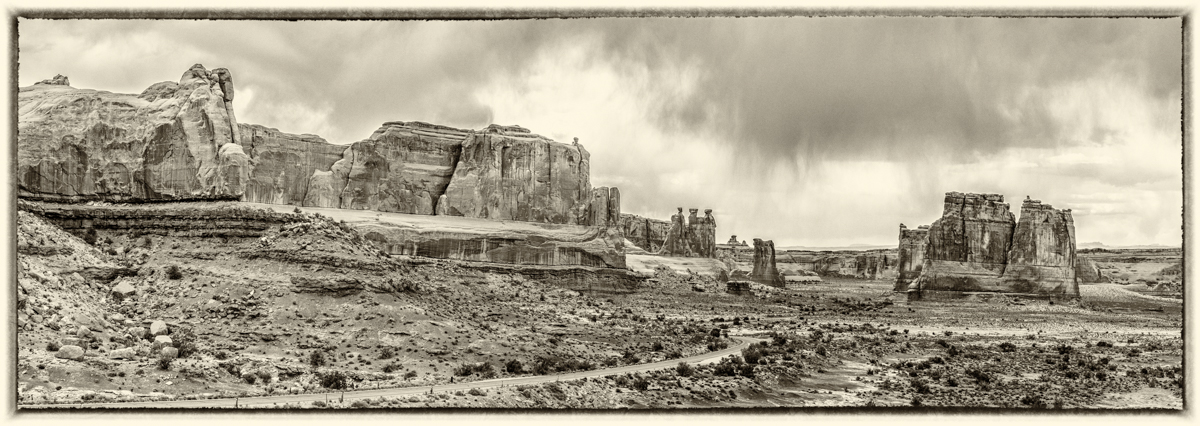
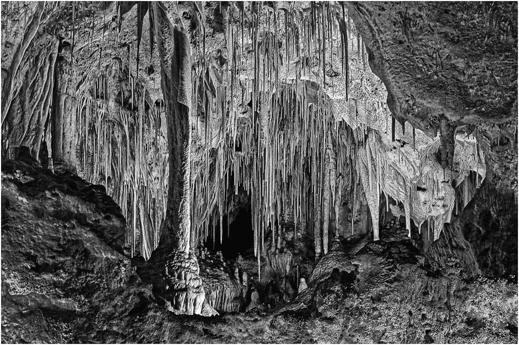
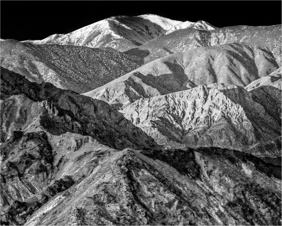
| 64 |
Feb 20 |
Comment |
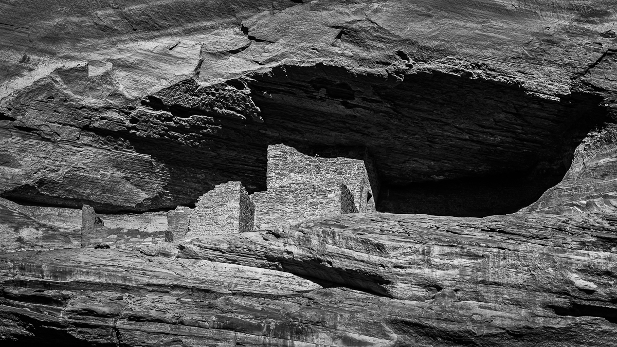
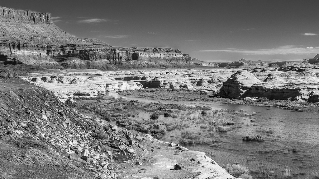
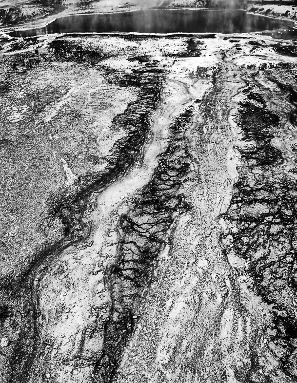
Yes, I checked this mono is a cropped section of the pano. I over dodged the mid section to lead the eye but I will back it off to retain detail and burn the foreground as you suggest. Thanks.
Desert landscapes are all overloaded with midtones, so it's challenging to make appropriate adjustments. I'm learning with the help of this Group. My thanks to all. |
Feb 18th |
| 64 |
Feb 20 |
Comment |
I think it's a wonderful image that could be improved slightly with cropping as Jerry demonstrated above |
Feb 12th |
| 64 |
Feb 20 |
Reply |
I must have deleted the true original. I made the mono by cropping a panoramic. Oops. |
Feb 10th |
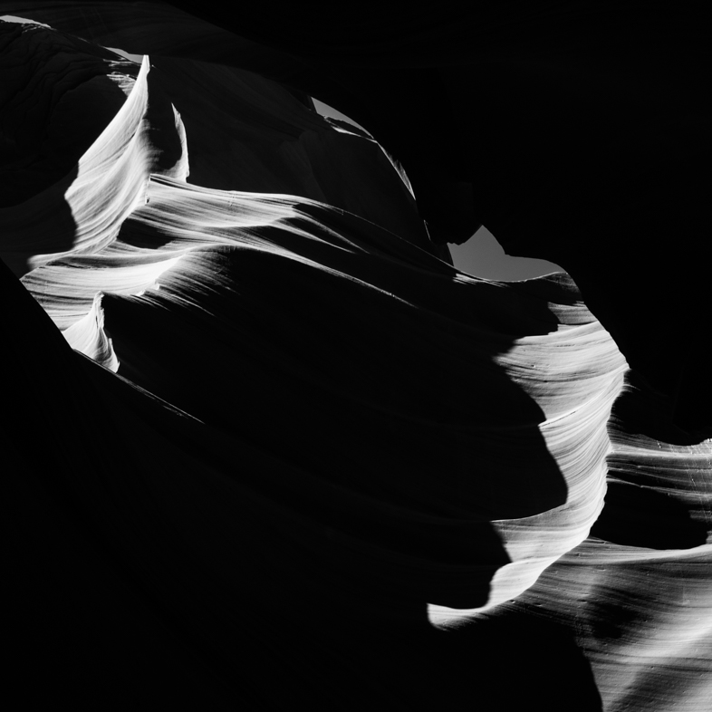
| 64 |
Feb 20 |
Comment |
I like the harsh contrast and detail; i feel it's very appropriate for the subject. |
Feb 9th |
| 64 |
Feb 20 |
Comment |
I like the harsh contrast and detail; i feel it's very appropriate for the subject. |
Feb 9th |
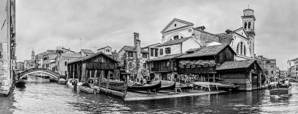
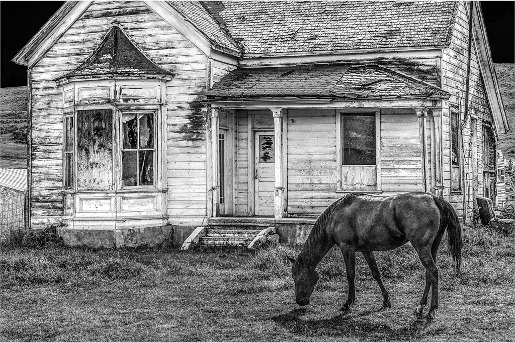
| 64 |
Feb 20 |
Reply |
Yes, this version is better, but the right side of the house is not parallel to the frame. I really like the mosaic pattern created by the vines. I'd capture some images of those details. |
Feb 9th |
| 64 |
Feb 20 |
Comment |
I feel this is well posed and captured, but I am uncomfortable with the head tilt. |
Feb 9th |
| 64 |
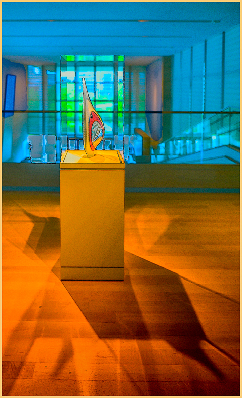
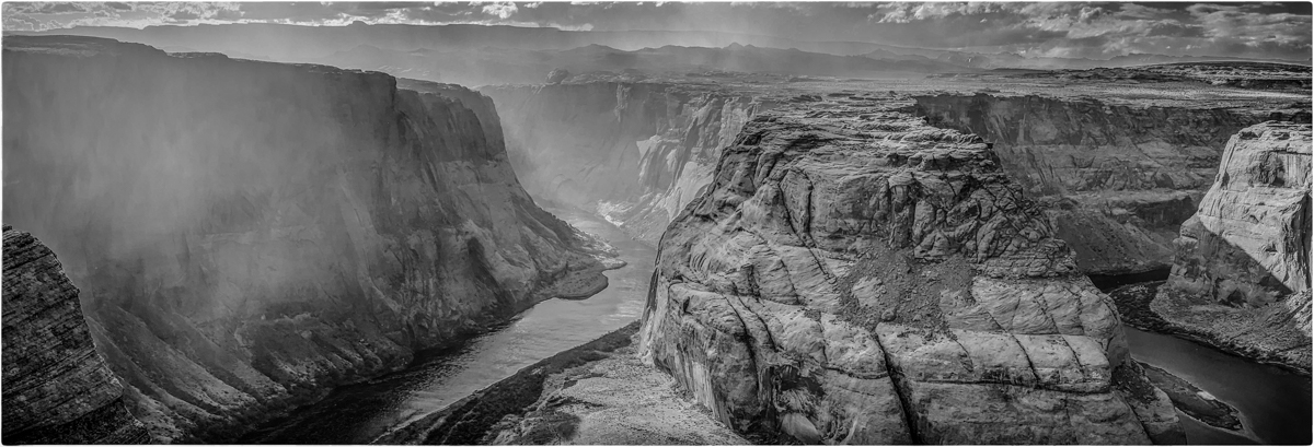
Feb 20 |
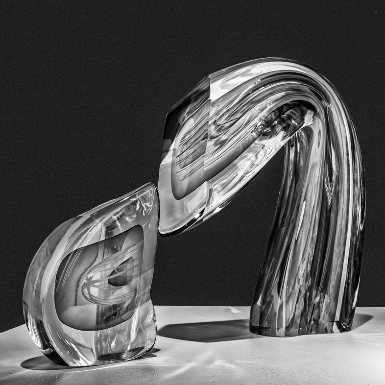
Comment |
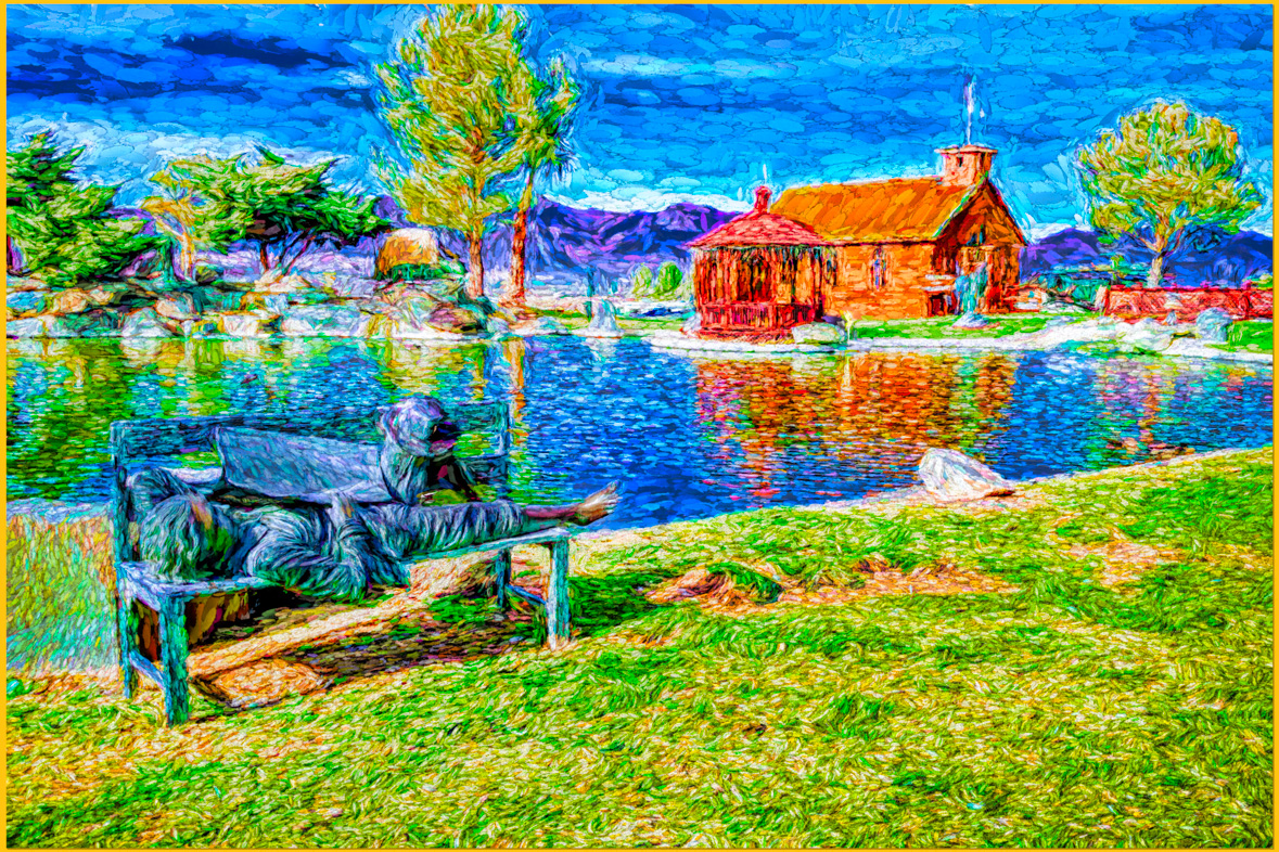
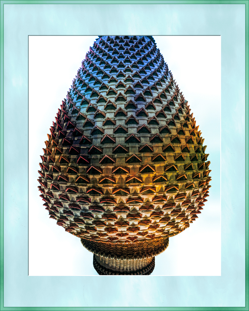
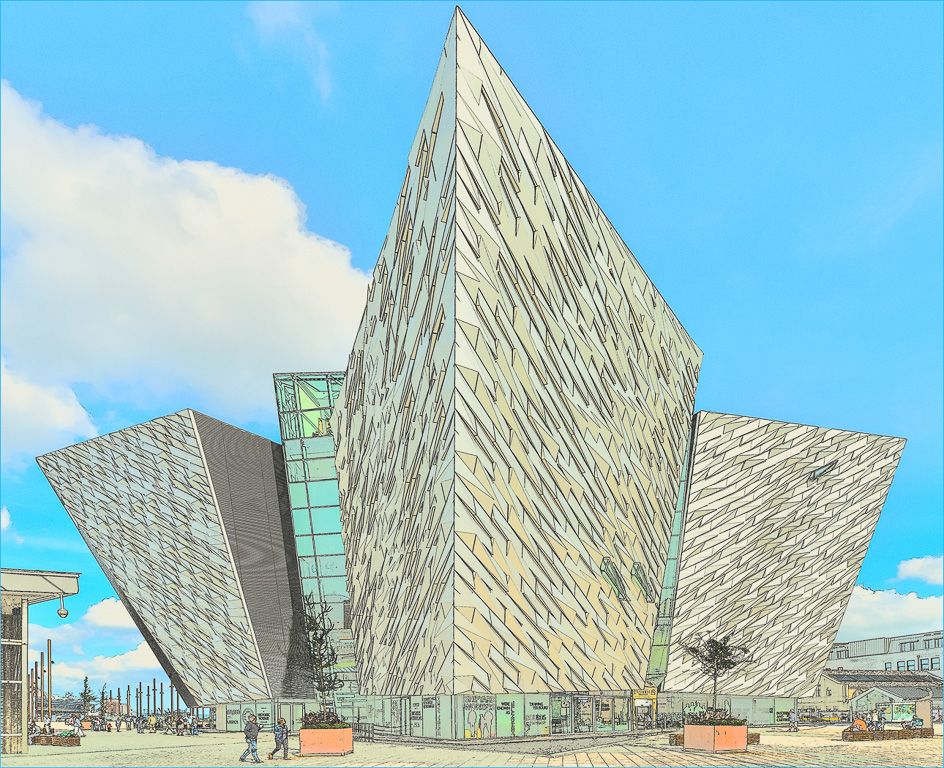
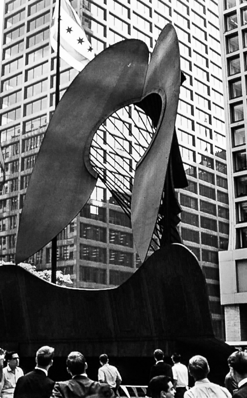
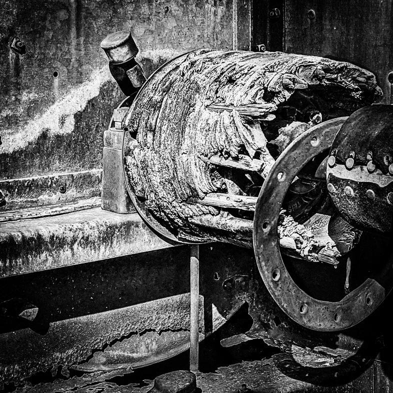
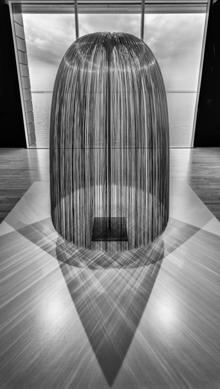
I find the sculpture interesting, but the building on the left is distracting to me. You did well in bringing out detail in the bright water. |
Feb 9th |
| 64 |
Feb 20 |
Comment |
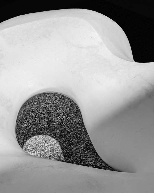
I agree with the others, but would add contrast in the upper areas you brushing in clarity. |
Feb 9th |
| 64 |
Feb 20 |
Reply |
You have a sharp eye for a flaw that I overlooked but will easily correct. Thanks.
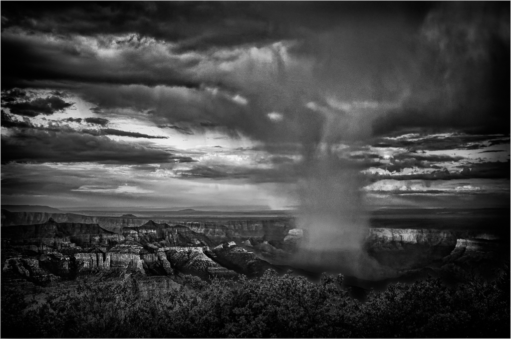
I'm enjoying the GrandCanyon again with family. Sunset was enhanced with a big, bright moon. My phone keeps telling me to take a panoramic picture! That's carrying AI a little extreme. |
Feb 9th |
7 comments - 3 replies for Group 64
|
16 comments - 6 replies Total
|