|
| Group |
Round |
C/R |
Comment |
Date |
Image |
| 18 |
Dec 19 |
Comment |
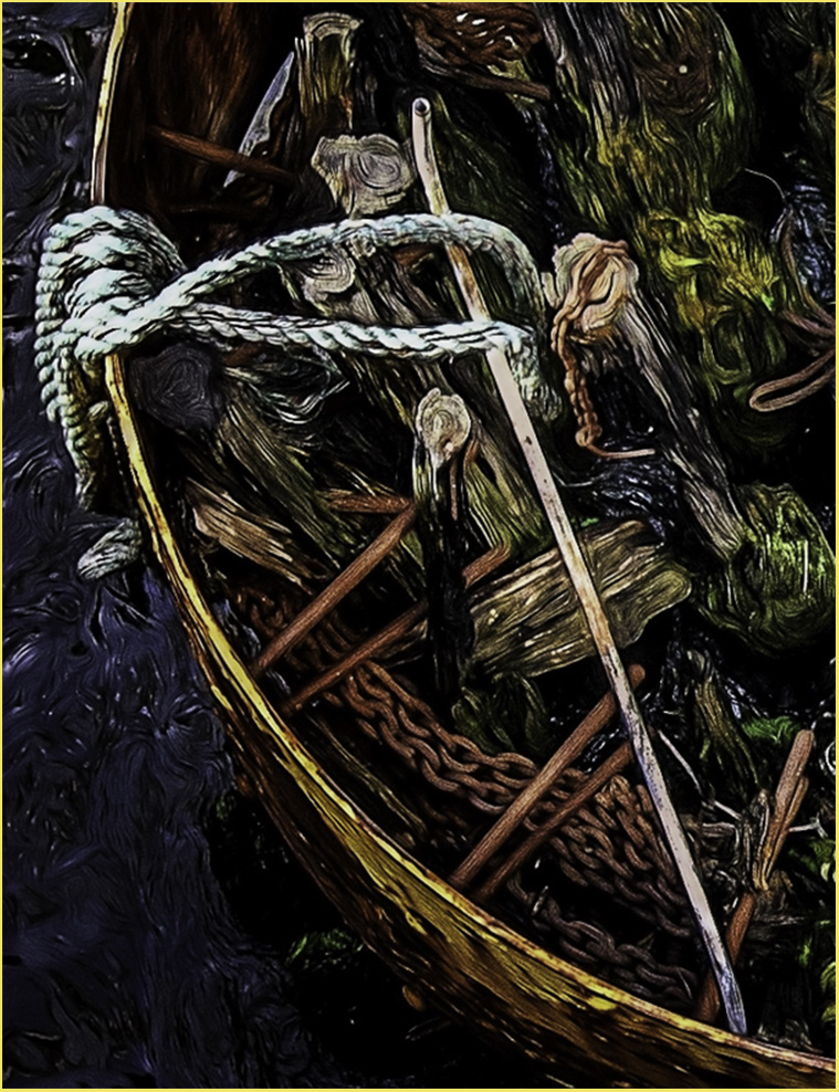
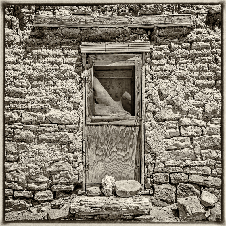
As Mike said, "Very Clever". Very interesting. It encourages me to study the detail.
Your tones encouraged me to make a new version of my lily pond, but I can't seem to make time for routinely adding a complementary frame as you do so nicely. |
Dec 7th |
1 comment - 0 replies for Group 18
|
| 20 |
Dec 19 |
Comment |
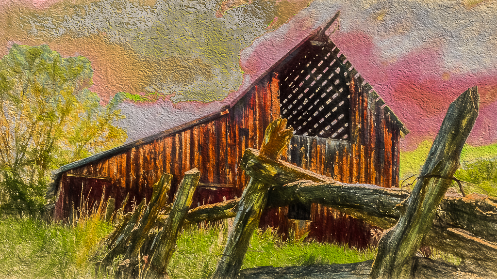
A wonderful composite. A great creative work in my eyes. Wonderful feeling.
Regarding balance in the composition, I would prefer to see the lighthouse moved slightly to the right and slightly lower. Paint it in watercolors and sign it T. Moran! |
Dec 18th |
| 20 |
Dec 19 |
Comment |
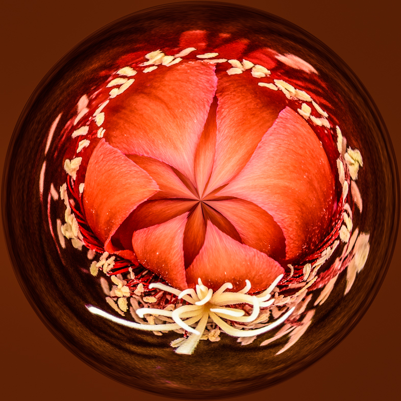
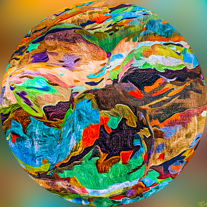
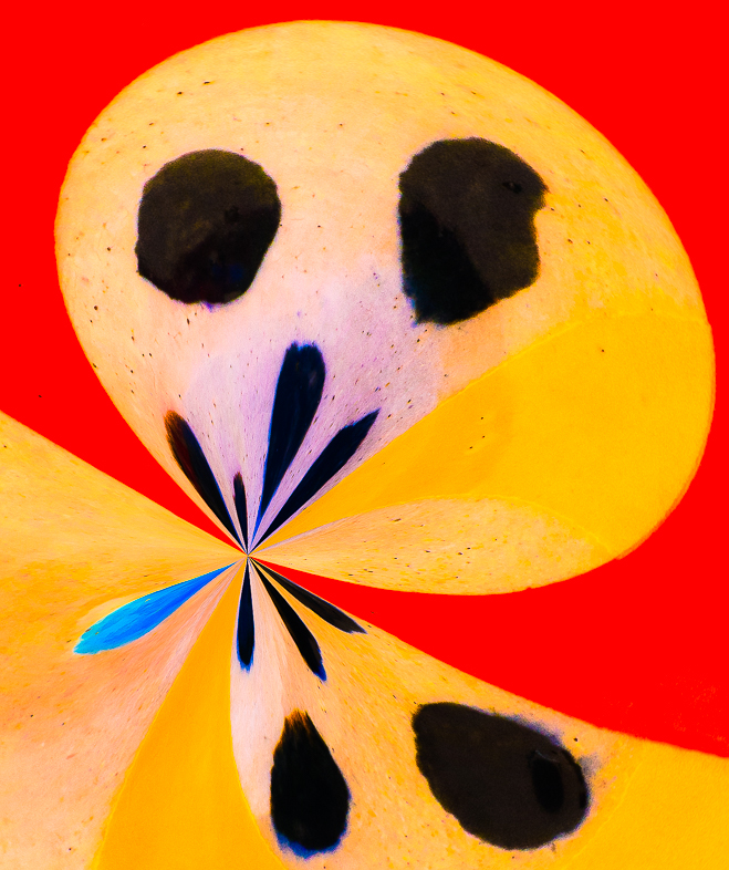
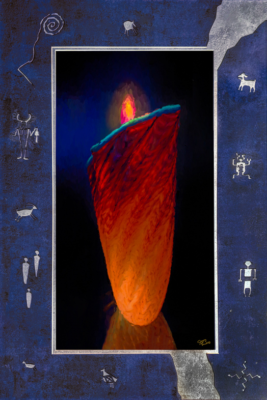
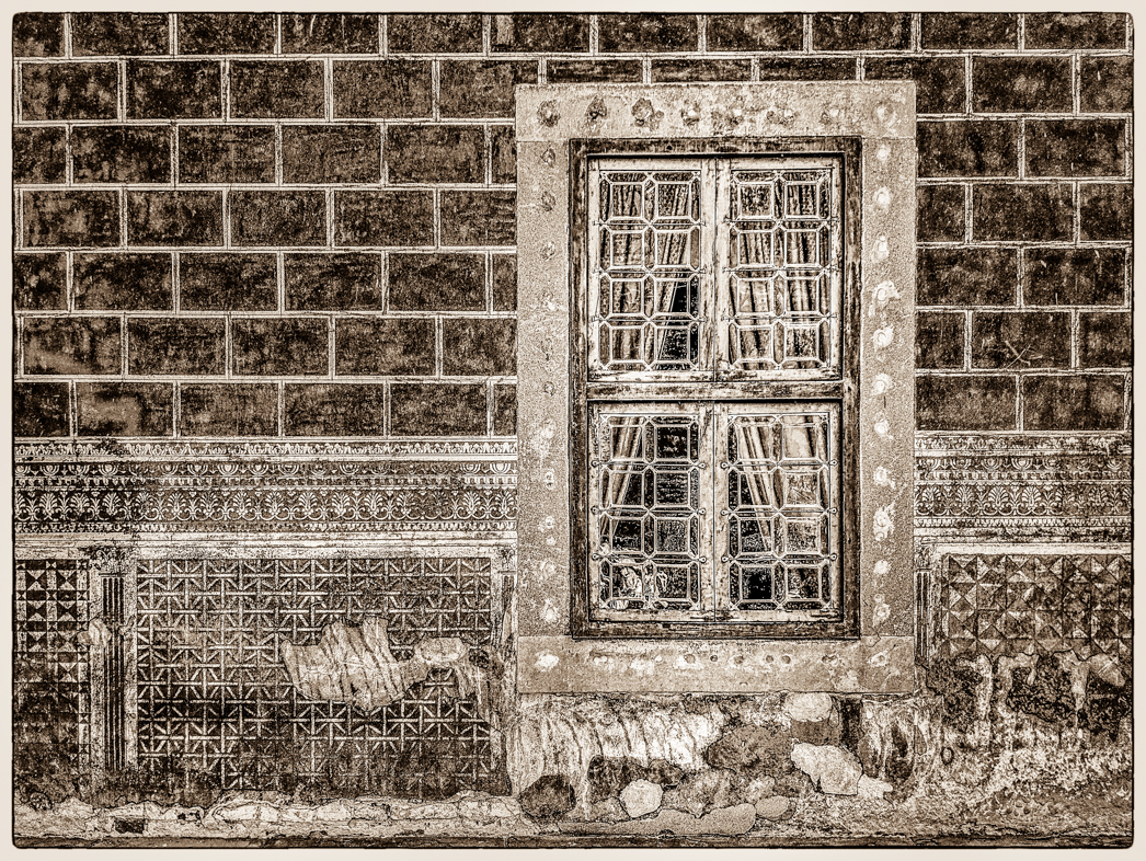
It looks like a beautiful Christmas ornament, almost 3D to me. A nice greeting card. I wouldn't crop the left corner, but replace the red with an adjacent color.
Merry Christmas and Happy New Year!
Maybe, i'll go to an upscale store and look for decorations to photograph? My daughter works in downtown Chicago and she's finding loads to photograph very early in the morning before the crowds arrive. Fun for the holidays, but snow is an hour away from Phoenix. |
Dec 16th |
| 20 |
Dec 19 |
Comment |
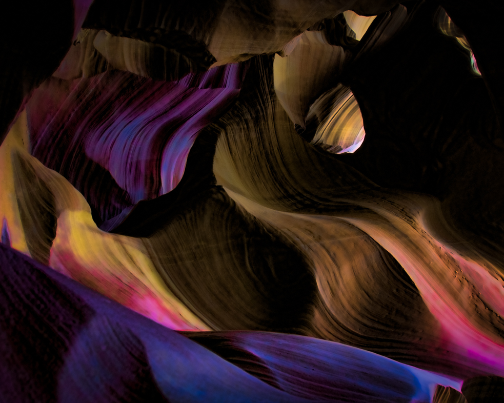
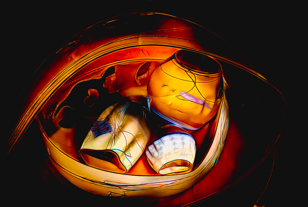
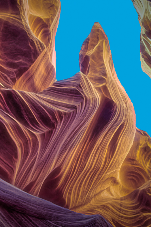
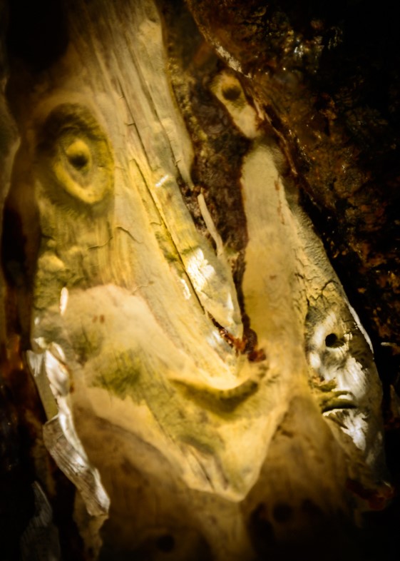
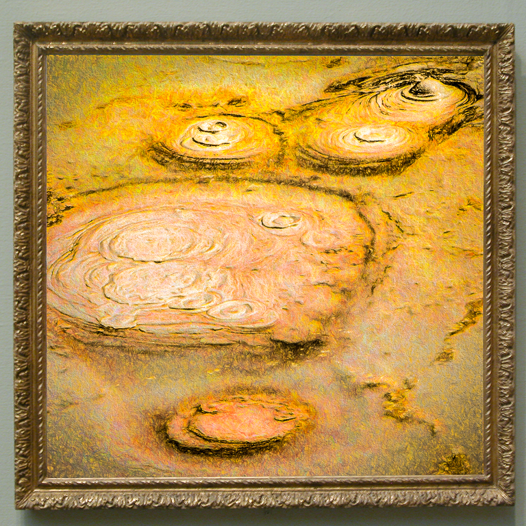
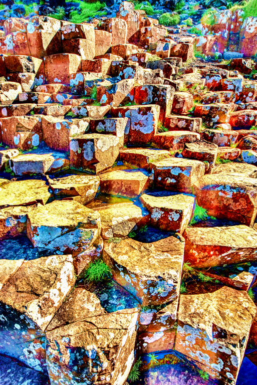
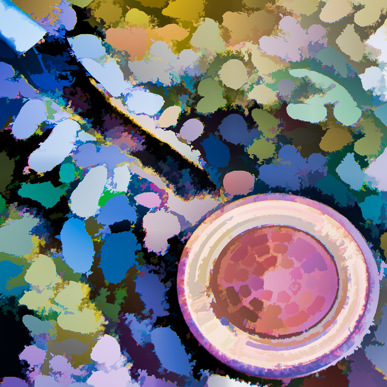
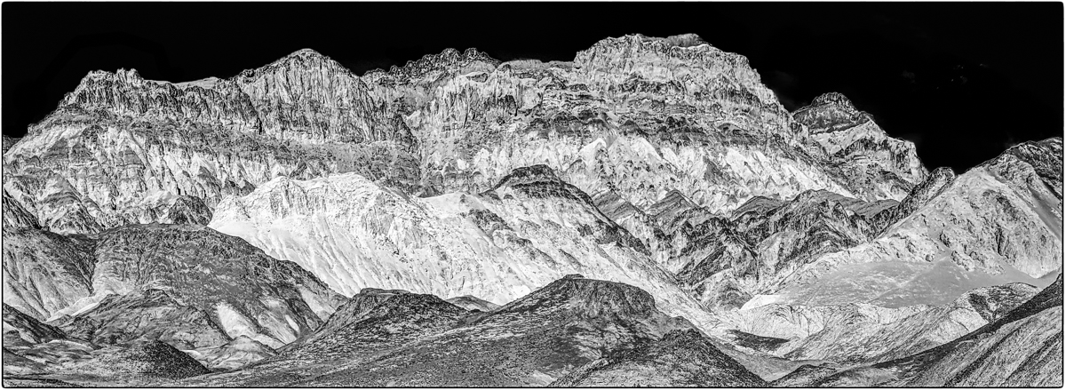
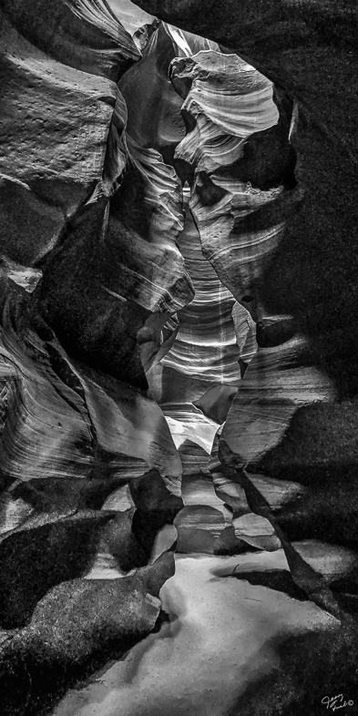
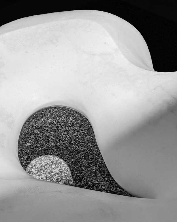
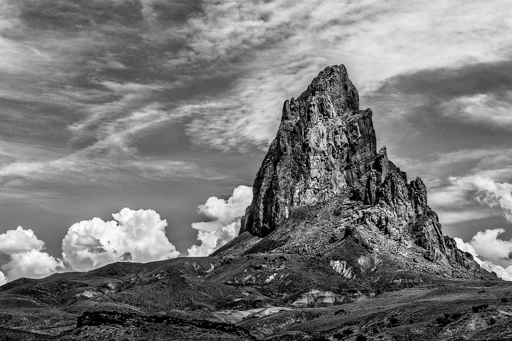
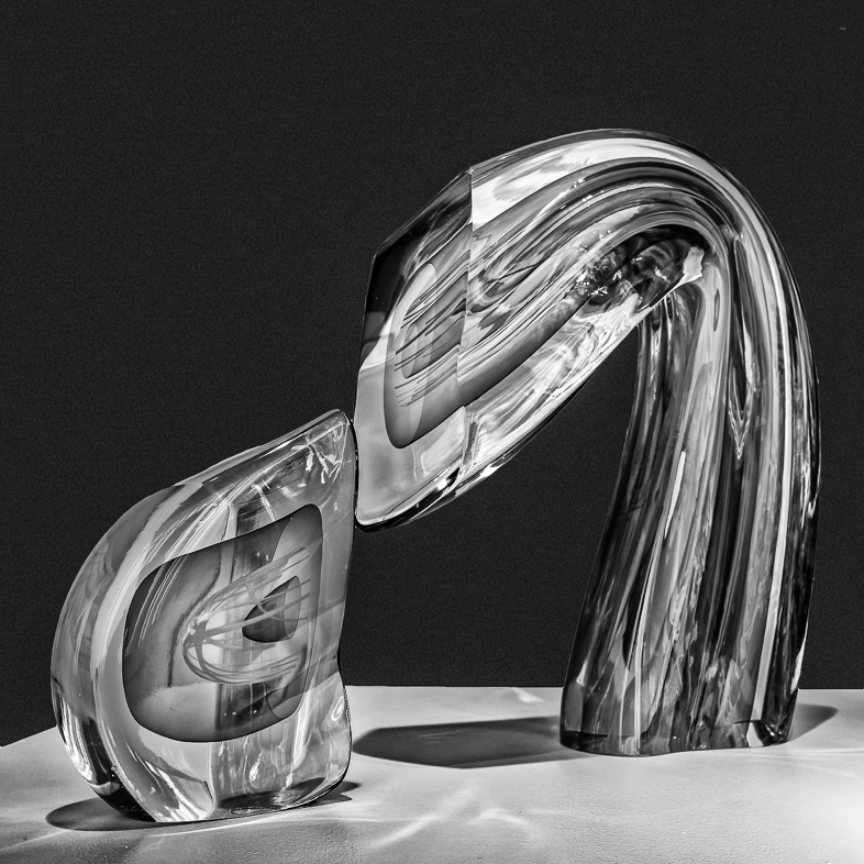
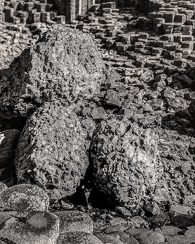
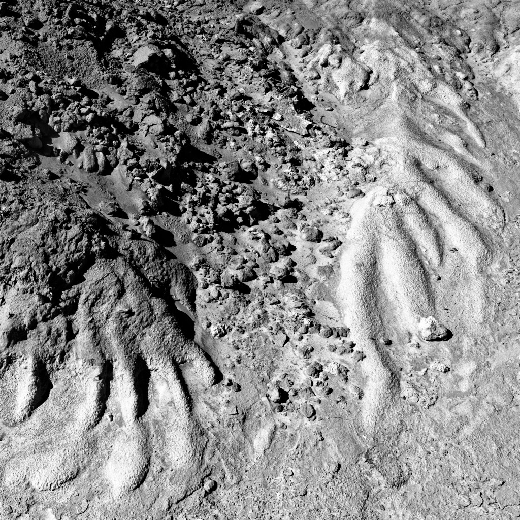
I especially like the dimension shown here. However, I feel the bright area in the center looks like a flash was used.
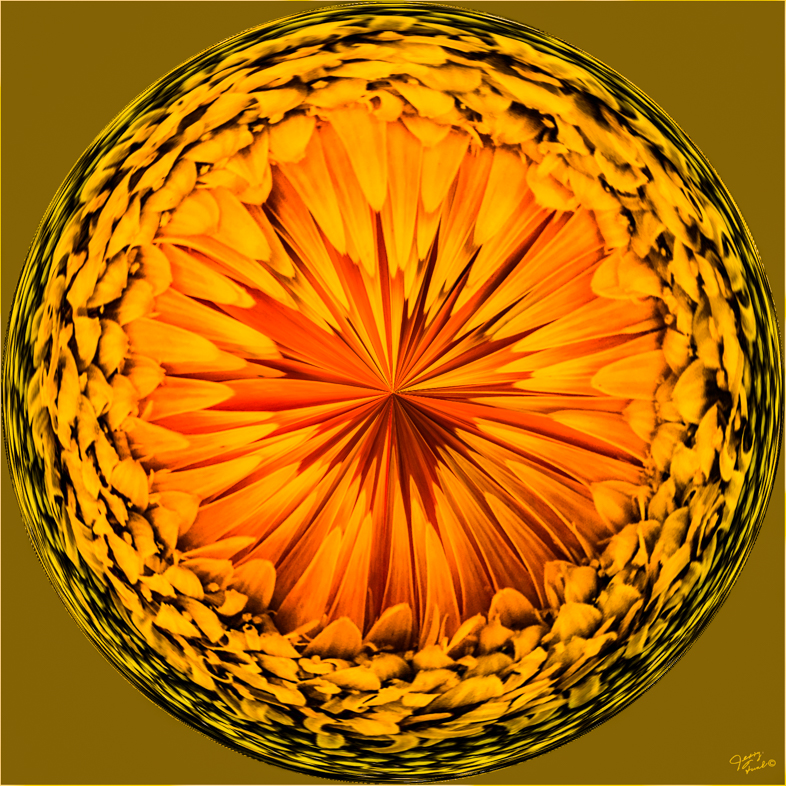
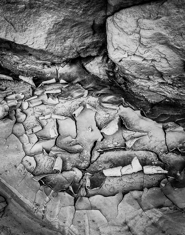
I had never before seen a salt stone, then just yesterday I saw one for sale! |
Dec 7th |
| 20 |
Dec 19 |
Comment |
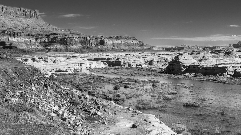
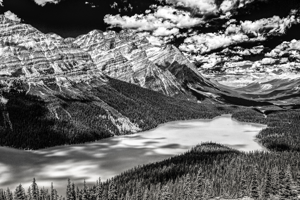
I think gray day subjects need jazzing up. I often change the WB to make them look sunny. Bottom line- I like it and would only tone down the house at the bottom left that I find distracting. |
Dec 7th |
| 20 |
Dec 19 |
Comment |
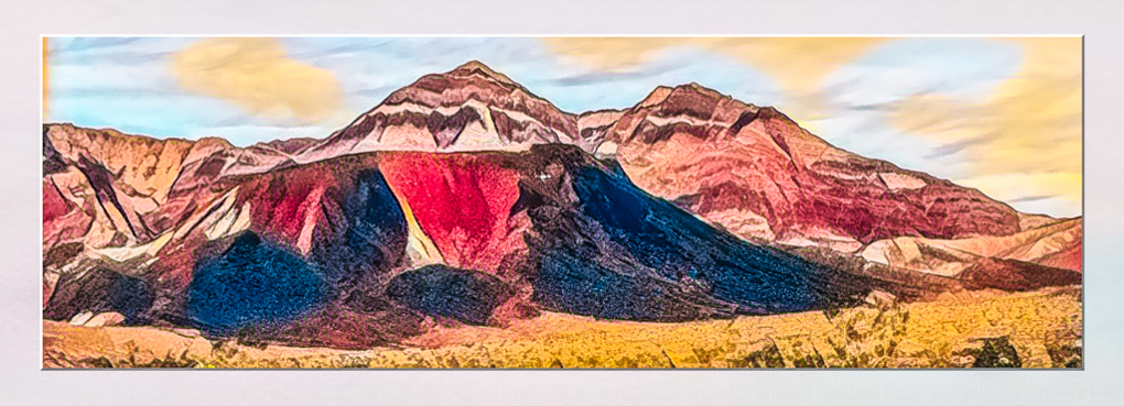
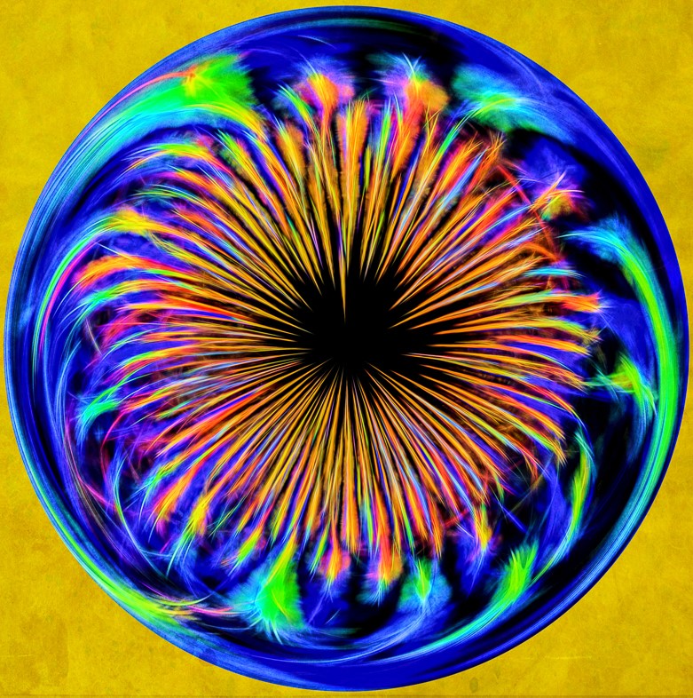
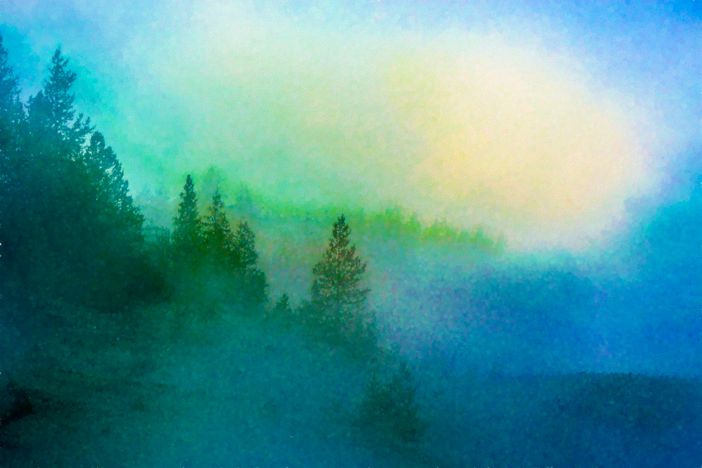
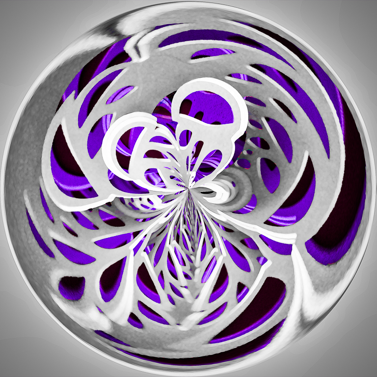
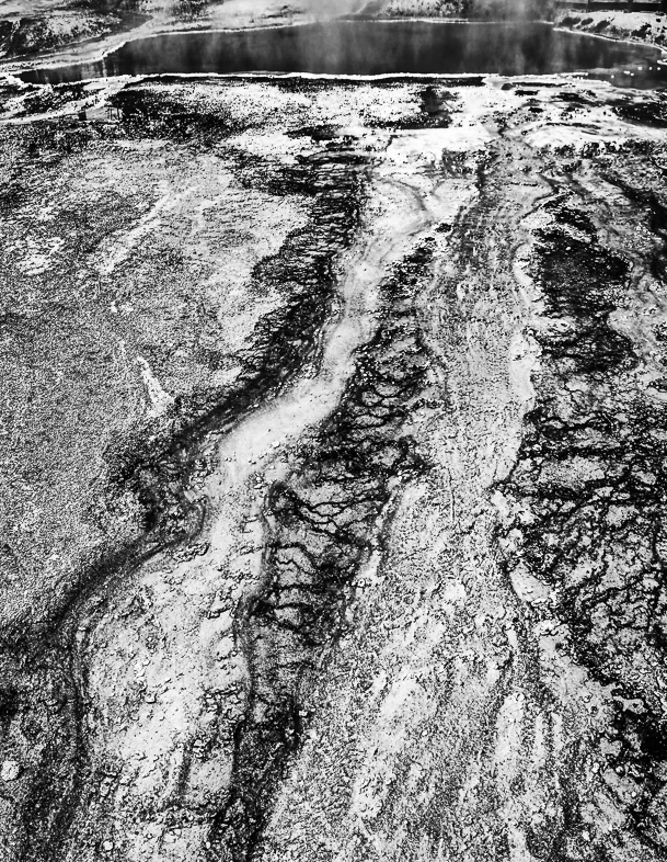
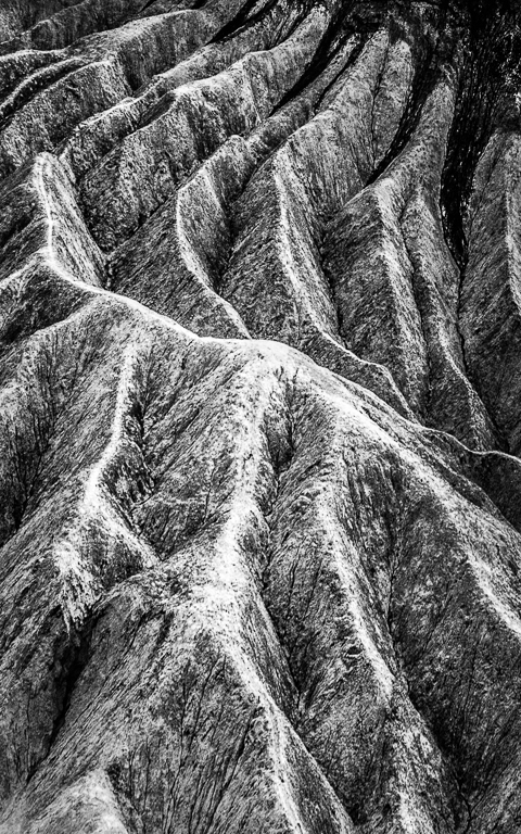
This is an interesting effect that I had never previously seen. I would prefer to see much less white though. I feel the effect is overdone.
I wish I had captured a similar view when I visited there is Sept. I also didn't have much sunshine. |
Dec 7th |
| 20 |
Dec 19 |
Comment |
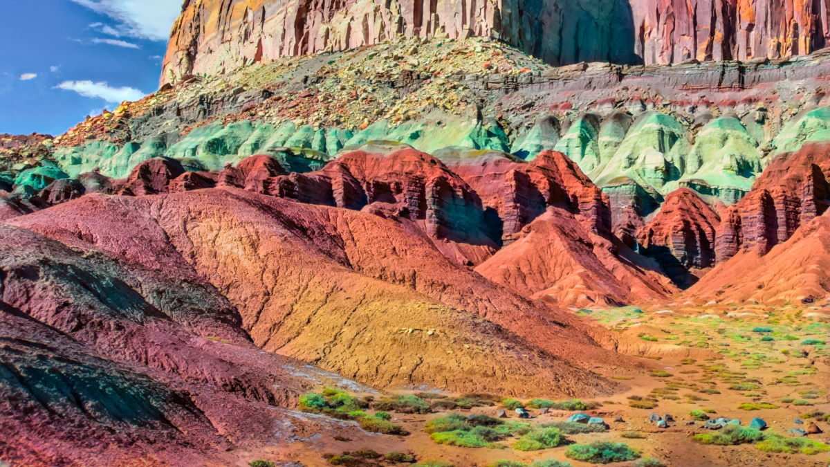
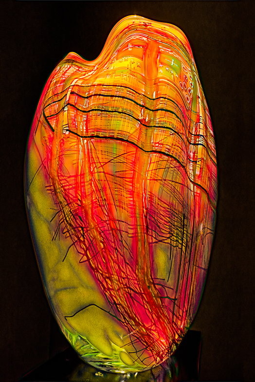
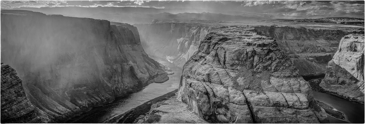
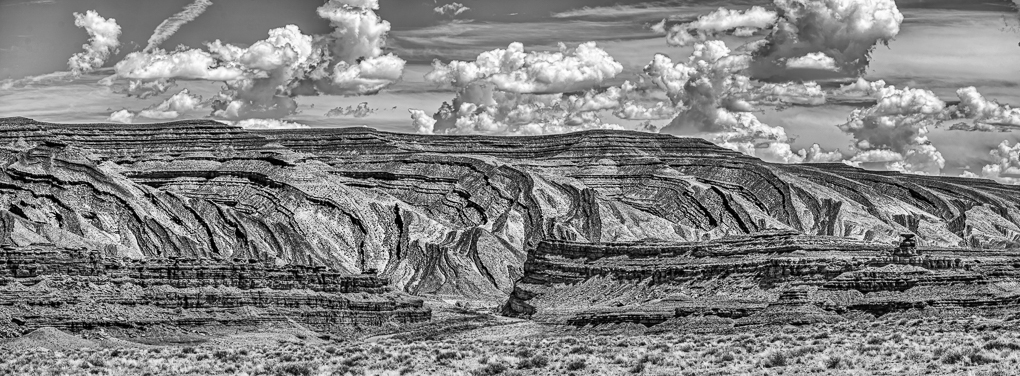
I really like the detail you have in your creative version. I think it's very difficult to show detail and a painterly effect, so that didn't come across to me.
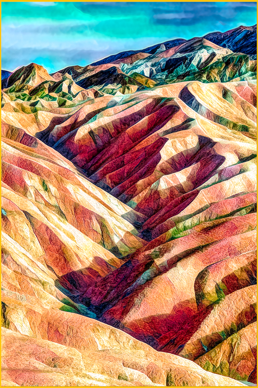
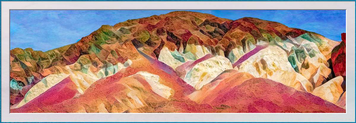
Also, I'd like to focus more on the lagoon and rocks by cropping off about half of the sky. Where is this beautiful location? |
Dec 7th |
6 comments - 0 replies for Group 20
|
| 39 |
Dec 19 |
Comment |
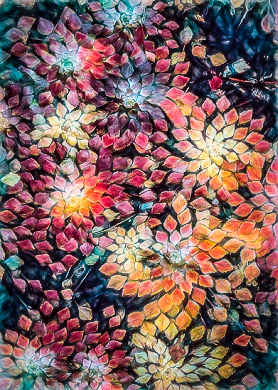
Wonderful images. I think you could have a small business selling colored leaves to your old friends in the desert. |
Dec 18th |
1 comment - 0 replies for Group 39
|
| 63 |
Dec 19 |
Comment |
I agree with you and also like that you lightened the center to further draw in my eye. Beautiful. |
Dec 2nd |
1 comment - 0 replies for Group 63
|
| 64 |
Dec 19 |
Reply |
Thanks for sharing your thoughts.
When I started competing in my club competitions, I talked with a couple "Masters" to learn how to please judges. Since also achieving that status, I only submit images I like and mainly want to share what I'm doing with other members. I guess I shouldn't be surprised that comments I hear from DDG participants are not typical of what I hear from others. All the more reason to continue in my 2 DDGs. |
Dec 30th |
| 64 |
Dec 19 |
Reply |
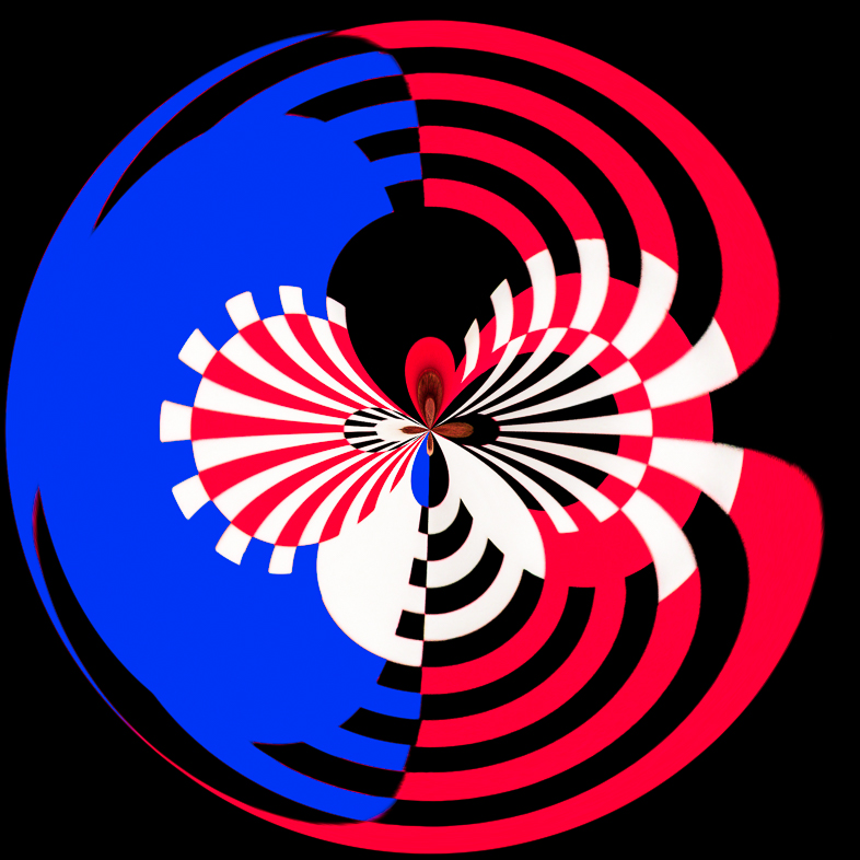
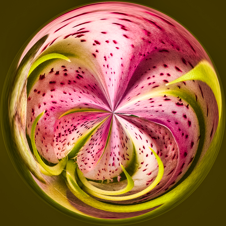
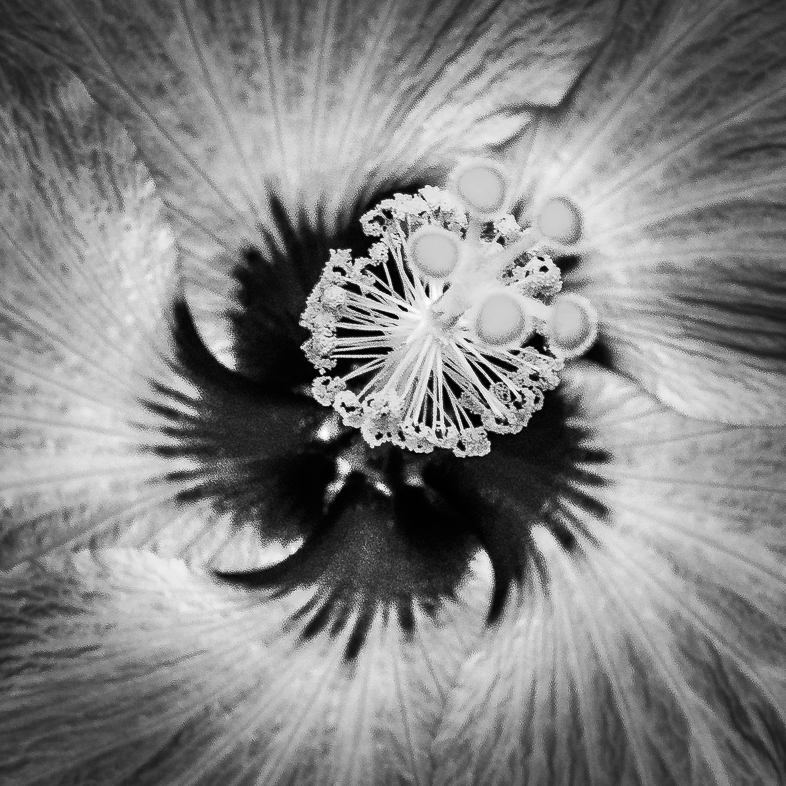
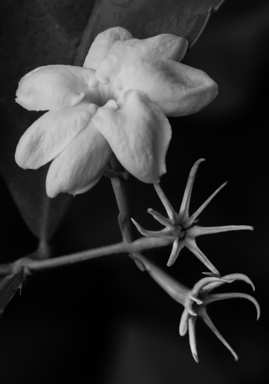
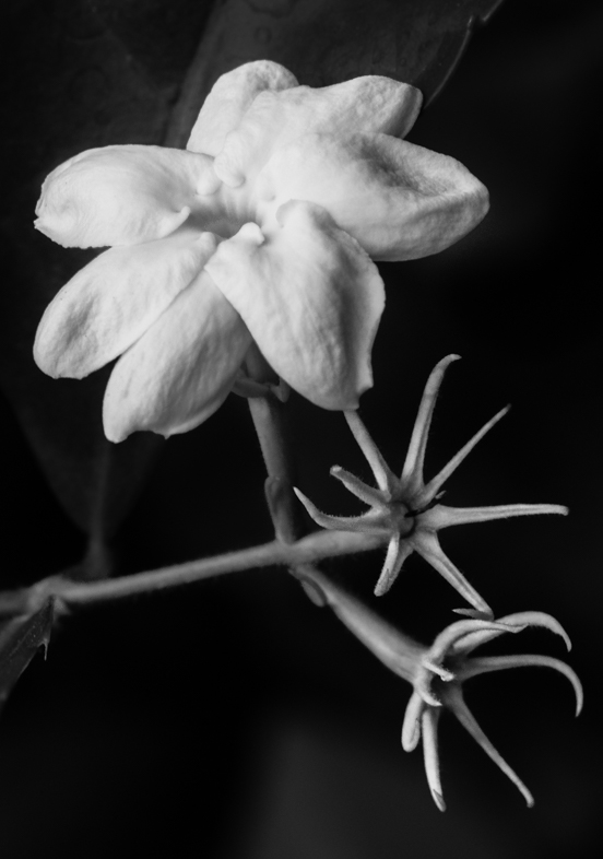
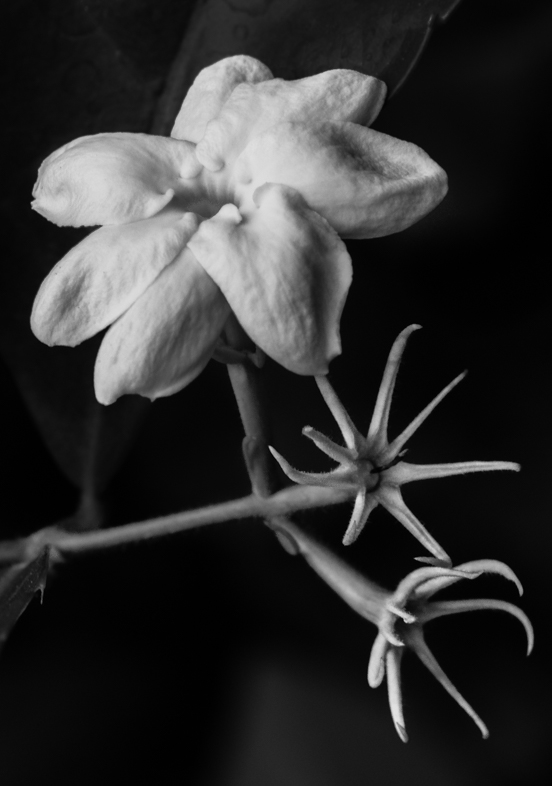
My original intent with the mono was to emphasize the "prongs". Maybe, I should have darkened the flower more or even cropped it to a square. As you say, the story has become the flower. So often, more than one story may be told with one image and everyone tends to see and interpret it independently. I hope one day to be skillful enough to force a single interpretation on the viewers.
I appreciate hearing the comments from everyone. |
Dec 26th |
| 64 |
Dec 19 |
Reply |
Thanks for your comment and taking another look. |
Dec 18th |
| 64 |
Dec 19 |
Reply |
NO PROBLEM |
Dec 13th |
 |
| 64 |
Dec 19 |
Reply |
how's this? |
Dec 13th |
 |
| 64 |
Dec 19 |
Comment |
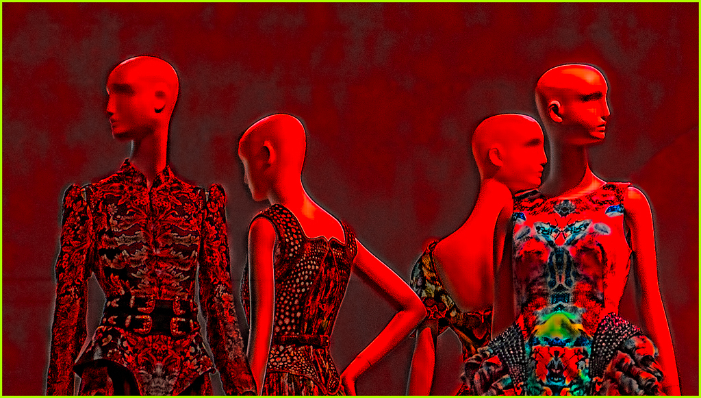
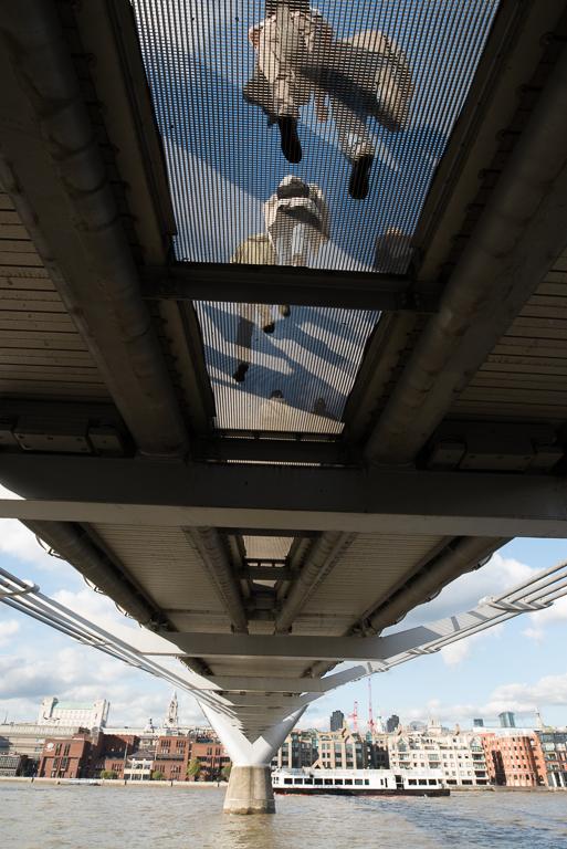
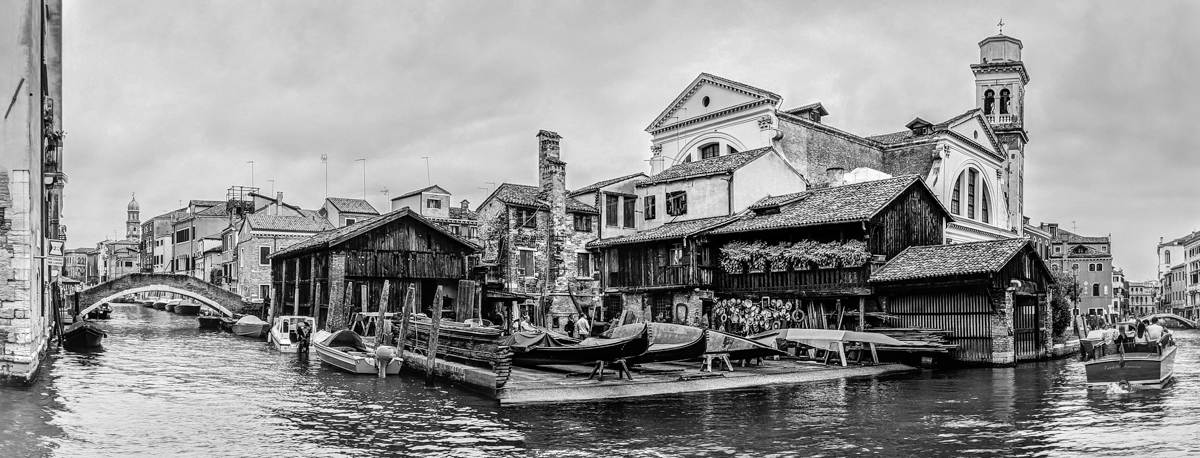
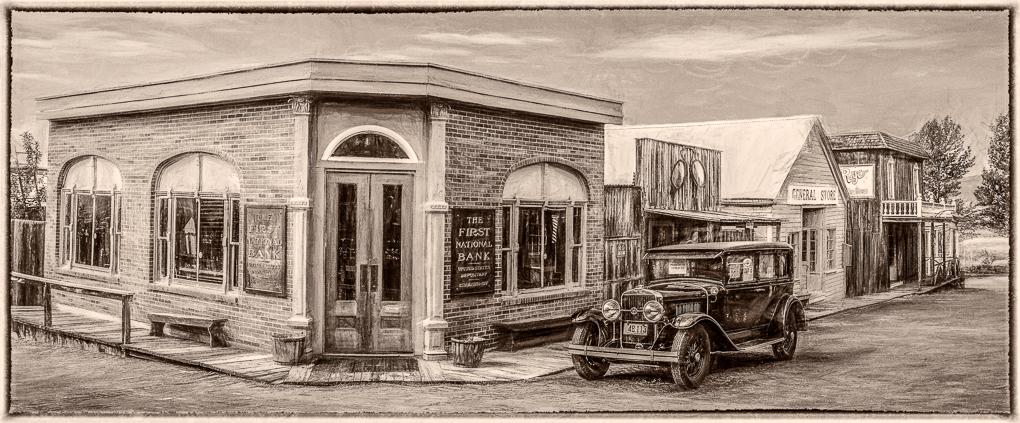
Very interesting composition, but what most jumps out as me is the contrast between the street and the misty looking buildings with the walkers adding interest. Excellent! |
Dec 12th |
| 64 |
Dec 19 |
Comment |
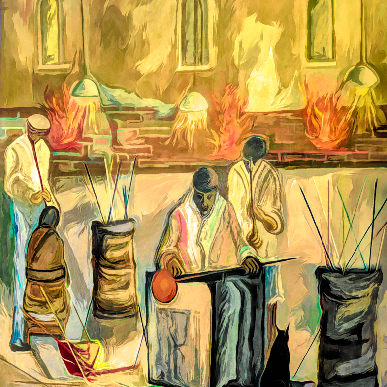
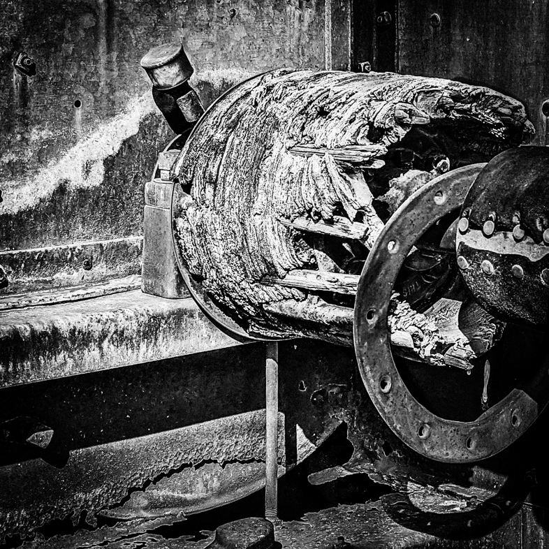
I see lots of interesting details but, as previously said, the fire is a problem with the monochrome while adding interest to the original. Personally, I would just burn it in because the rest of the image has lots of interest. I think the detail on the left could be enhanced with a graduated filter reducing the exposure slightly.
Thanks for the link. |
Dec 12th |
| 64 |
Dec 19 |
Comment |
I think this is a very striking and appealing image. The foreground appears silver toned to me. Wonderful!
Perhaps the star trails would naturally be reflected in the water, but it looks great as is. |
Dec 12th |
| 64 |
Dec 19 |
Comment |
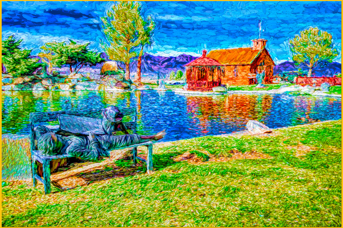
The composition is bothersome to me. The arches lead me away from the church in the background that is prominent with its exaggerated brightness. Other distractions were previously mentioned in part. |
Dec 12th |
| 64 |
Dec 19 |
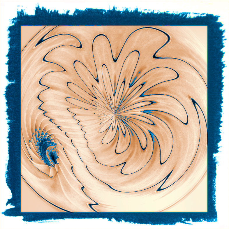
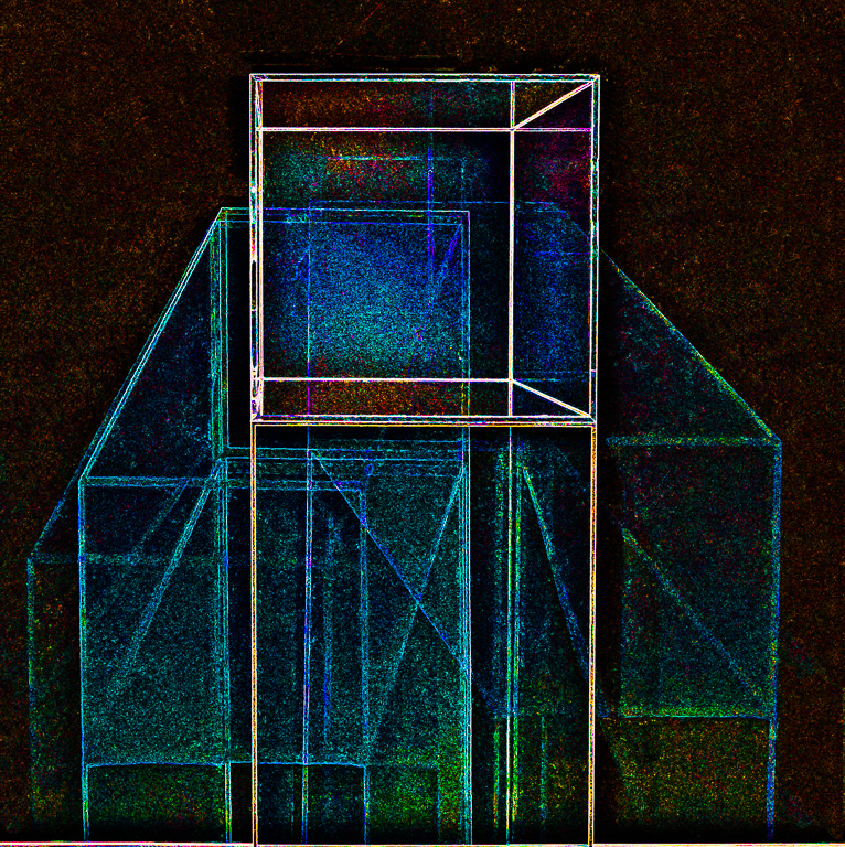
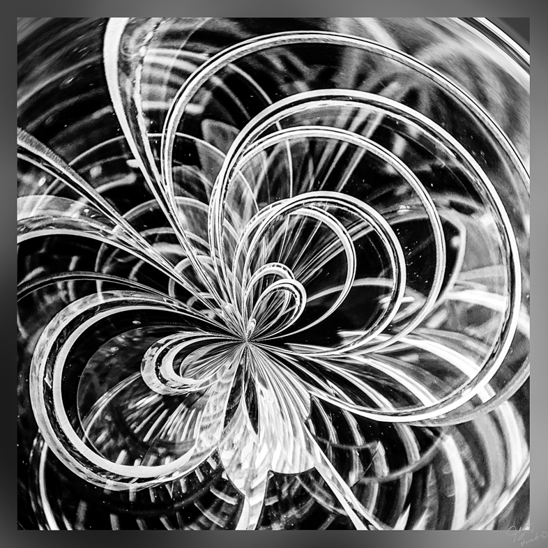
Comment |
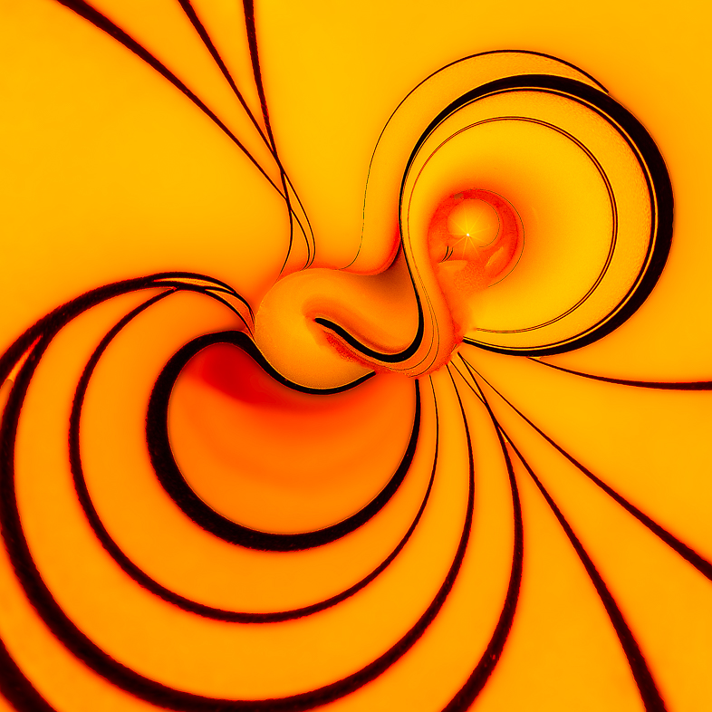
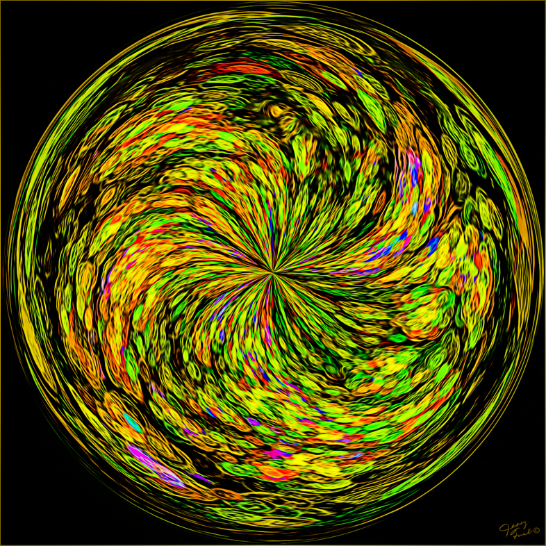
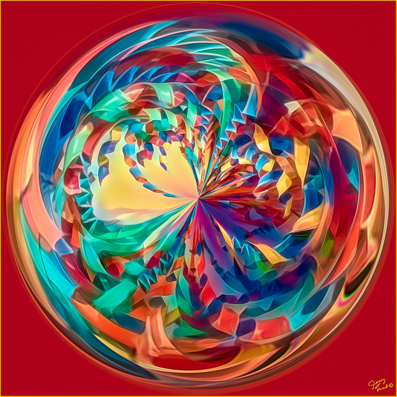
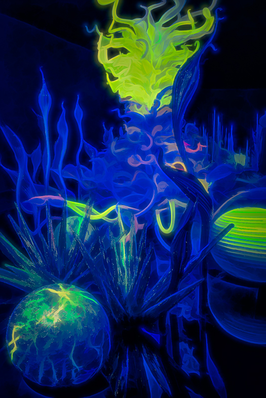
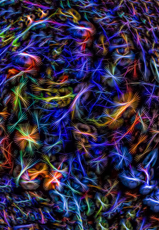
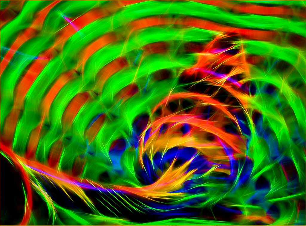
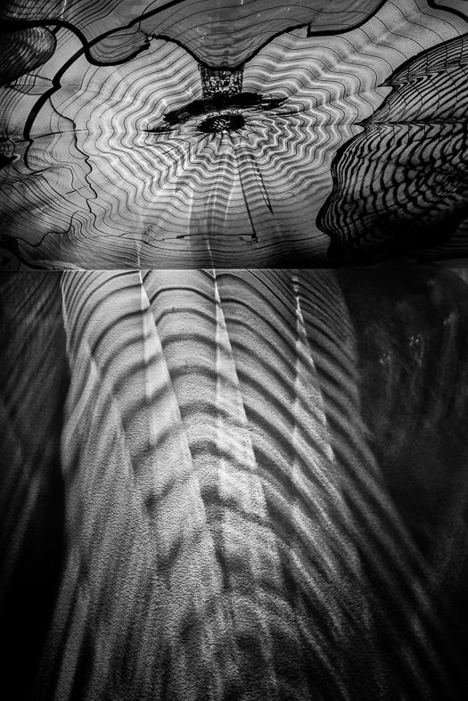
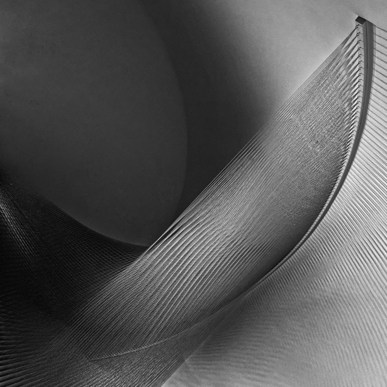
What a great creative abstract! I would have guessed it to have been a multiple exposure and am surprised by your resulting image with camera movement.
You have inspired me to try it with Xmas lights. I'll use both my Pixel 4 and D810 cameras to compare results. |
Dec 12th |
| 64 |
Dec 19 |
Comment |
I see an amazing display of shapes and tones. Very well done and timed with no vehicles. |
Dec 12th |
| 64 |
Dec 19 |
Reply |
How's this?
I used the adjustment brush in Lightroom to add clarity, contrast and sharpness to the flower while darkening and lowering clarity and sharpness the the adjacent background. |
Dec 12th |
 |
| 64 |
Dec 19 |
Reply |
Thanks. That too was deliberate but I accept the recommendation and will change it. I rarely use the radial brush, but I think it's appropriate here. |
Dec 10th |
| 64 |
Dec 19 |
Reply |
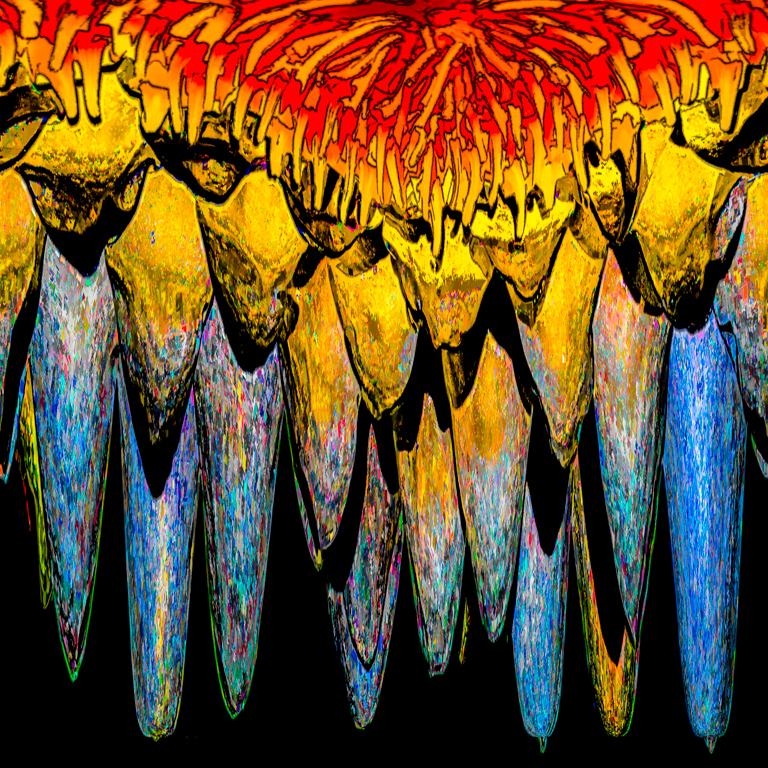
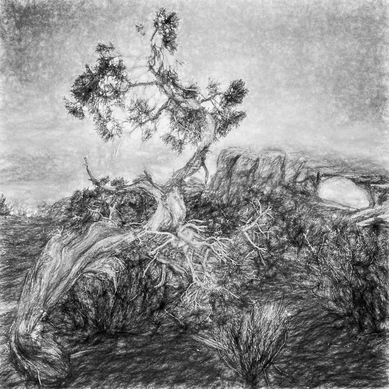
I know we usually look for a single subject, but in this case I wanted to contrast the delicate flower with the foreboding, harsh bare stems. Can you suggest a better way to communicate that feeling? |
Dec 10th |
6 comments - 8 replies for Group 64
|
15 comments - 8 replies Total
|