|
| Group |
Round |
C/R |
Comment |
Date |
Image |
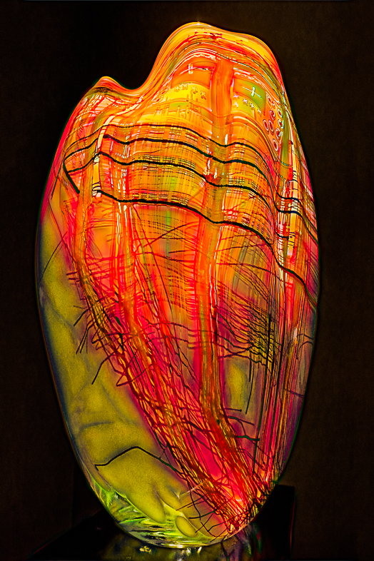
| 1 |
Oct 19 |
Comment |
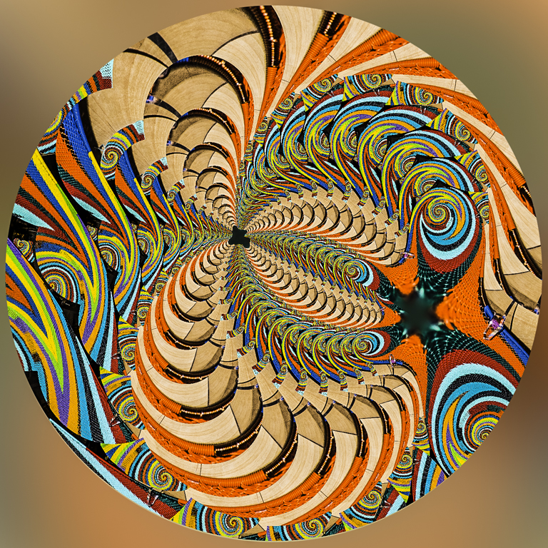
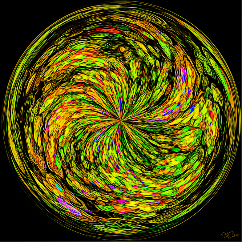
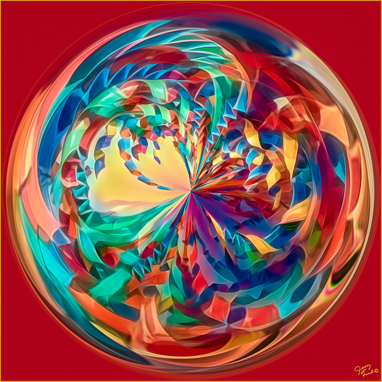
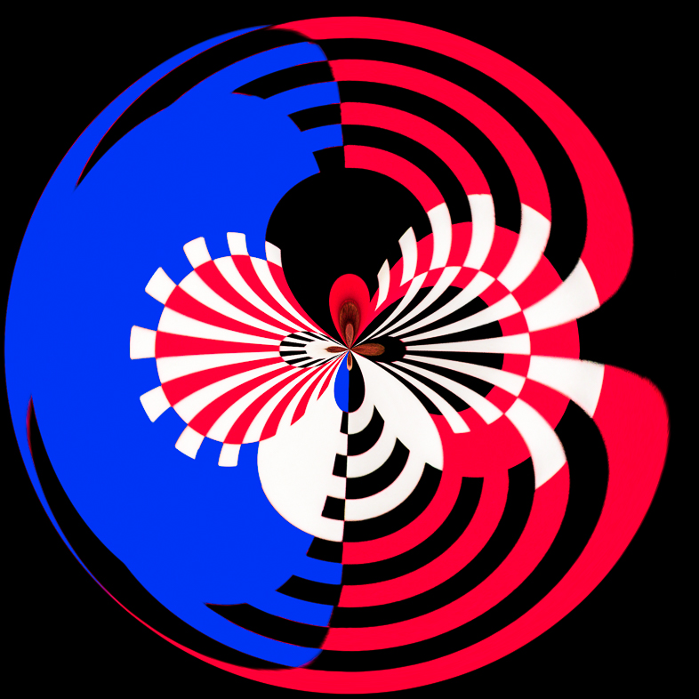
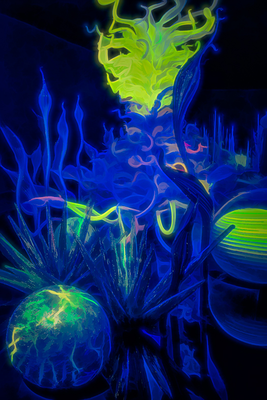
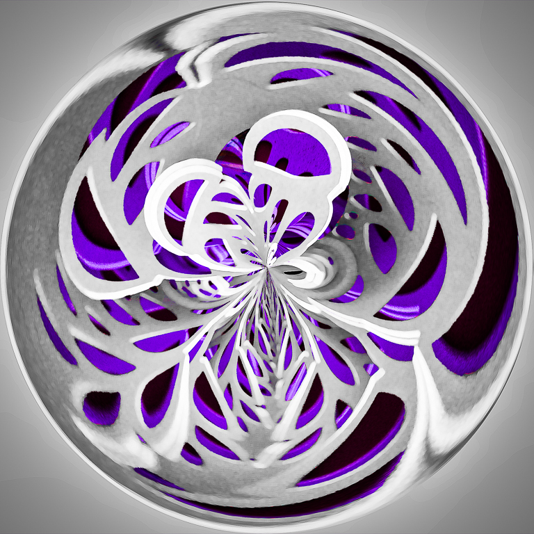
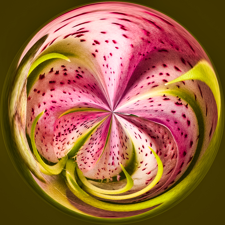
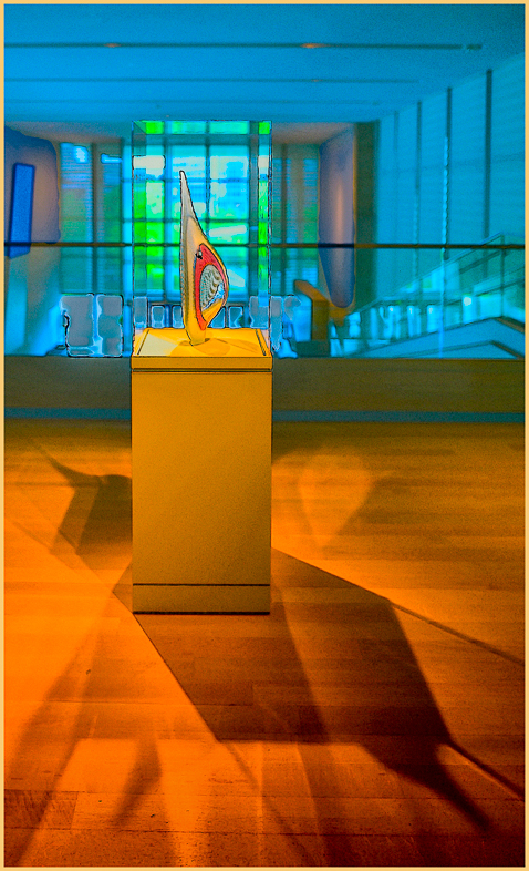
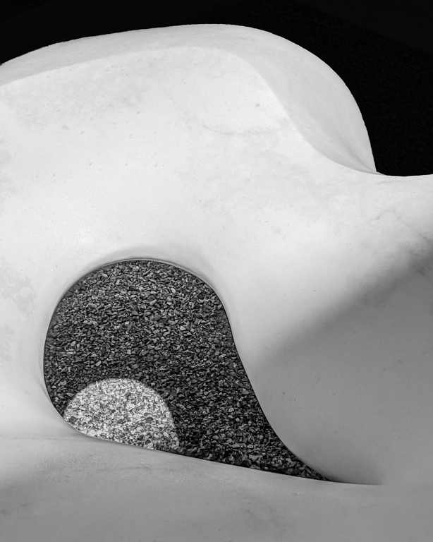
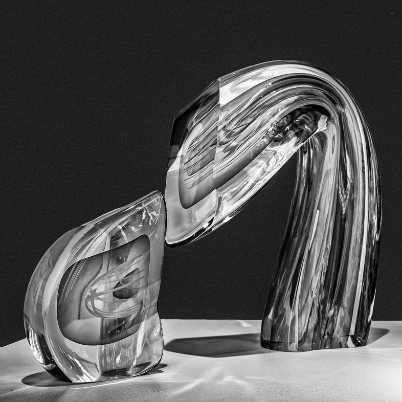
I think you captured an unusual graphic image that is interesting and may be interpreted many ways. I doubt many would identify it accurately without the title.
I suggest you try a monochrome variation since the color is very minor anyway. |
Oct 10th |
1 comment - 0 replies for Group 1
|
| 18 |
Oct 19 |
Reply |
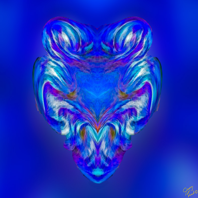
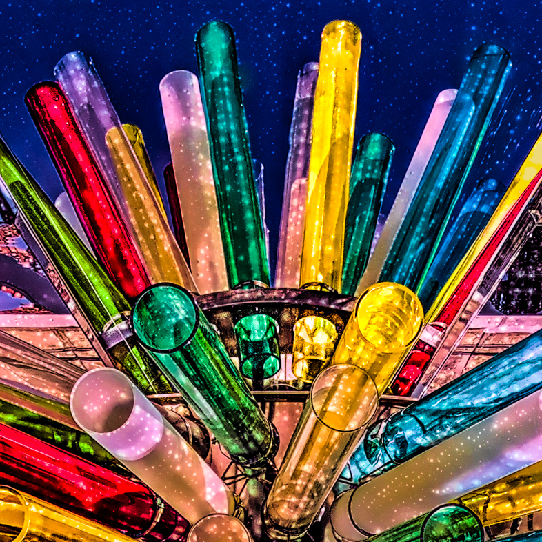
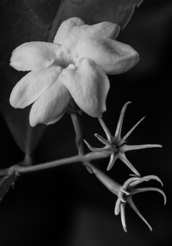
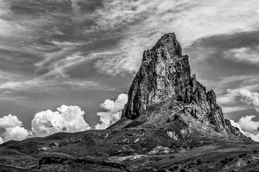
Very good. my autocorrection failed. I meant to say, try a version with warm tones. Of course, another with night light would be nice too. Ahh, the challenges of having an excellent composition and subject to work with. |
Oct 11th |
| 18 |
Oct 19 |
Comment |
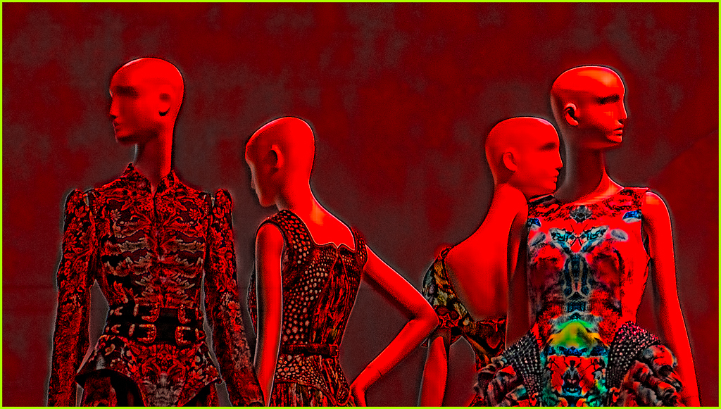
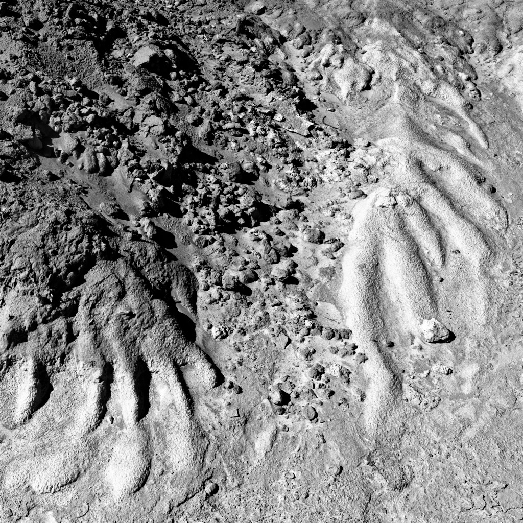
Yes, I find the "fight" between the two sides very interesting. I wouldn't have flipped it though. |
Oct 10th |
| 18 |
Oct 19 |
Comment |
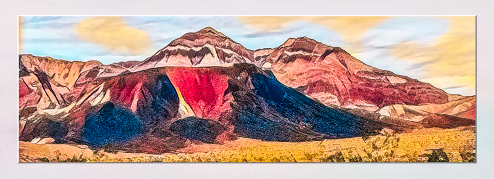
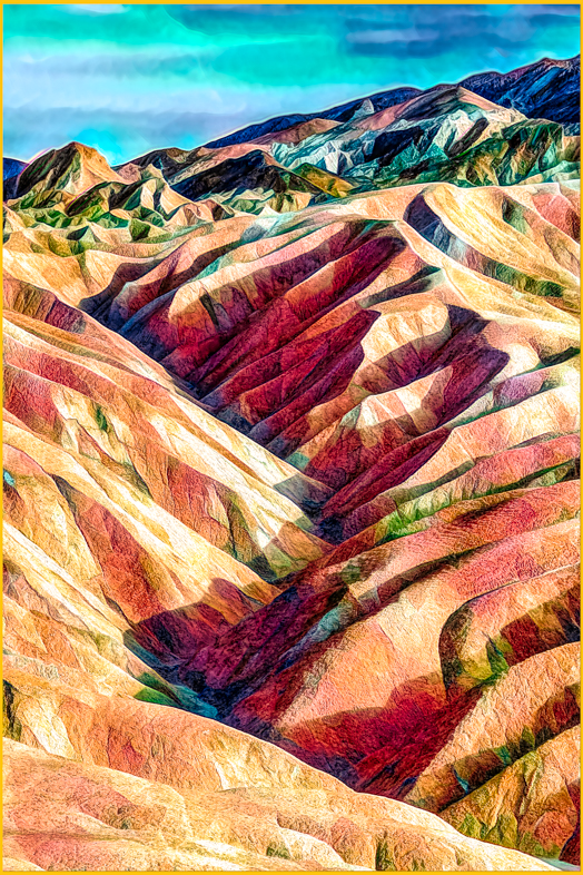
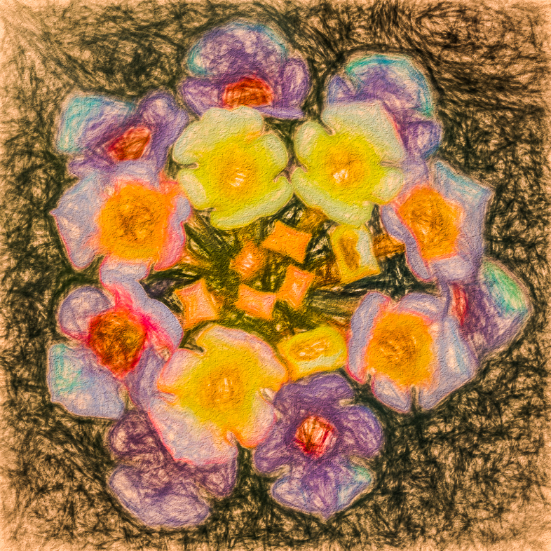
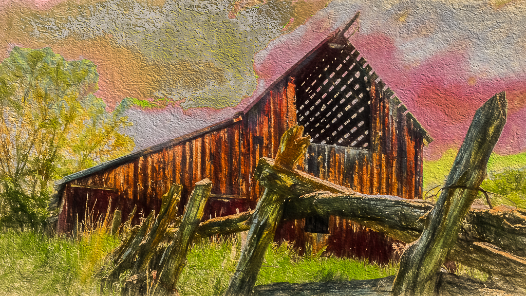
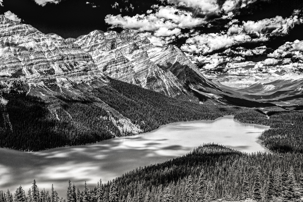
Beautiful! Hallmark could use it. Yes, since Mike mentioned it, I would straighten the top.
Perhaps you could create another winner by waking the tones.
Incidentally, I was scanning the Current Images and picked this one out. Nice job, Ian. |
Oct 10th |
2 comments - 1 reply for Group 18
|
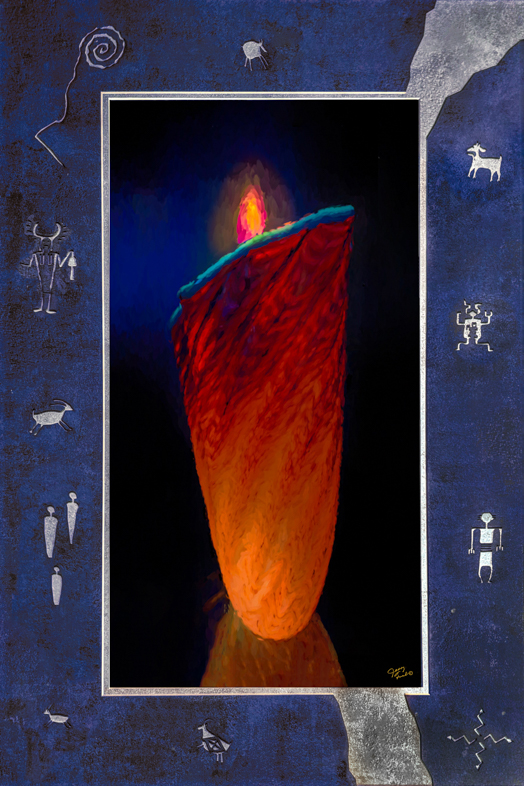
| 20 |
Oct 19 |
Reply |
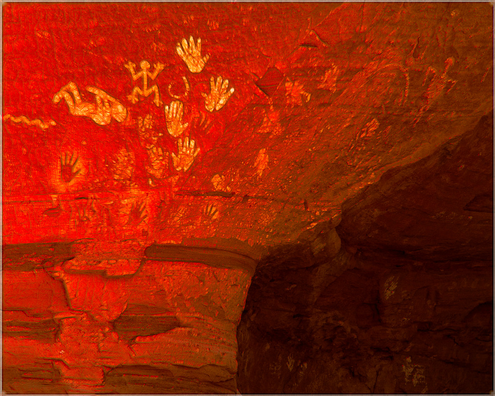
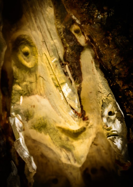
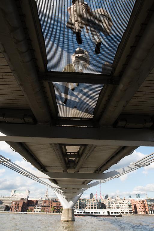
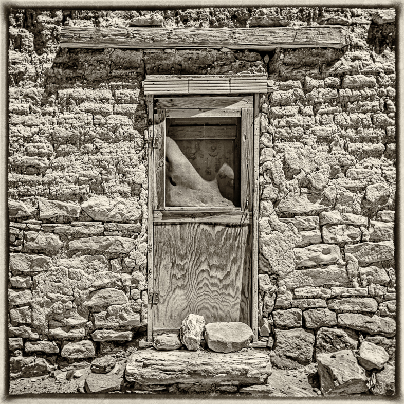
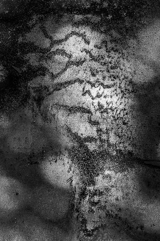
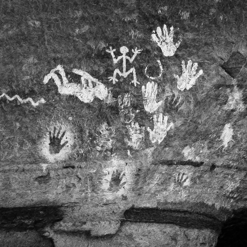
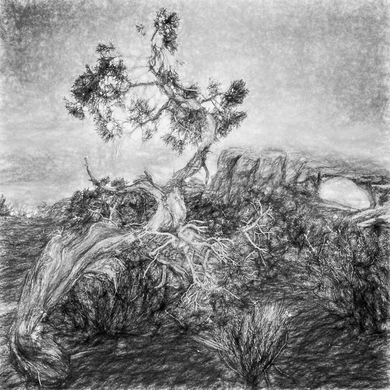
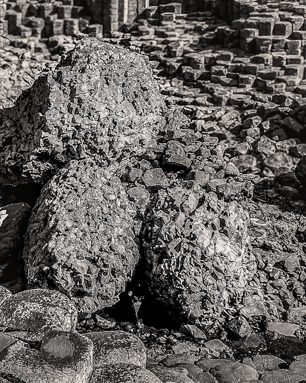
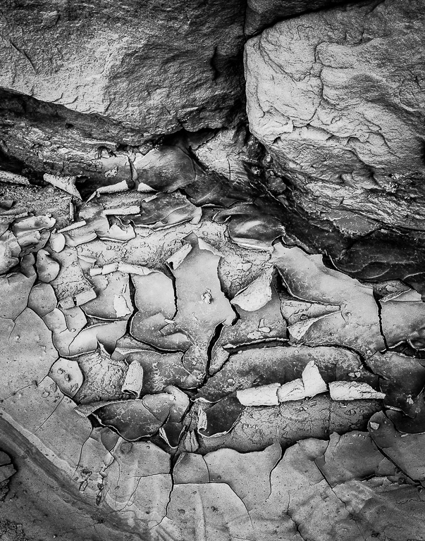
While creative images may not require it. I didn't crop the bottom to retain some sense of place, a cave |
Oct 10th |
| 20 |
Oct 19 |
Reply |
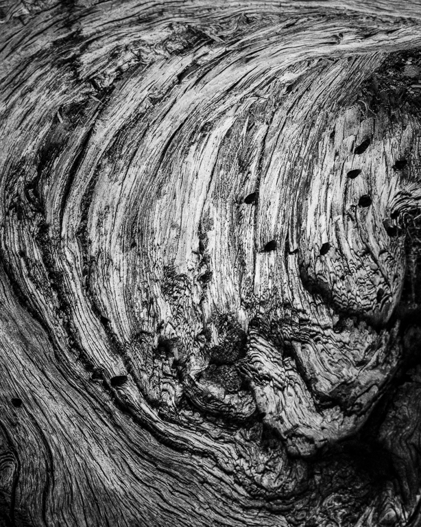
I felt a slight imbalance too, and thought the subtle detail in the dark area might address it. I think i'll try to just brighten that area a bit.
I respect the site too much to alter reality by cloning in more glyphs.
Thanks. |
Oct 3rd |
| 20 |
Oct 19 |
Comment |
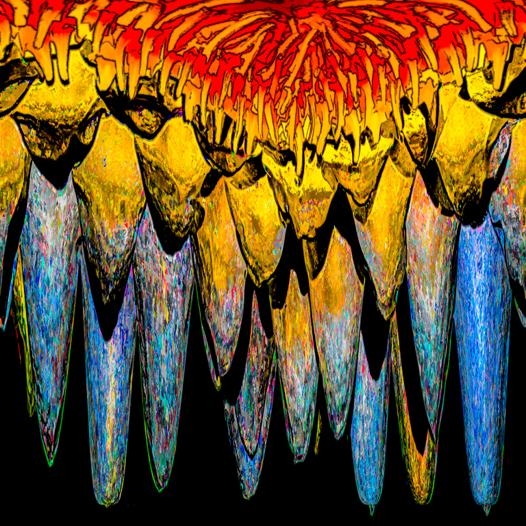
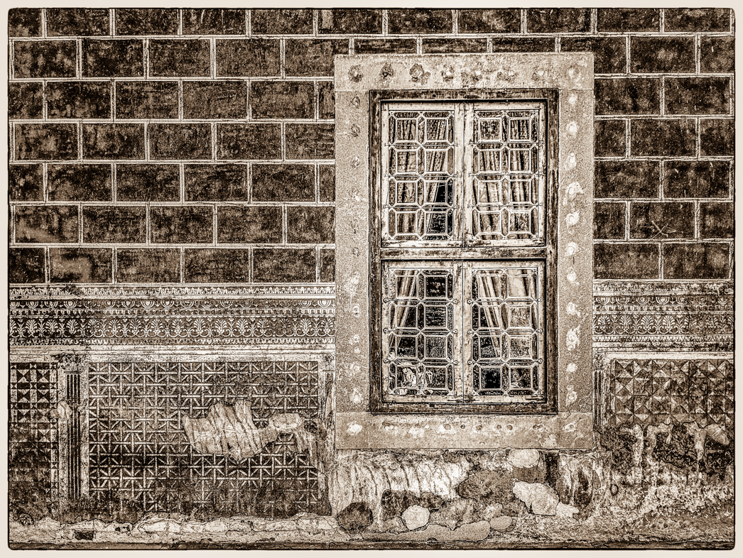
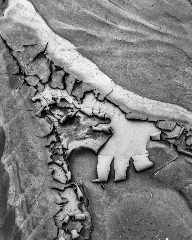
Excellent composite. Very interesting! I cant find 9 and also didn't find Waldo.
I am distracted by the blown out areas though. |
Oct 2nd |
| 20 |
Oct 19 |
Comment |
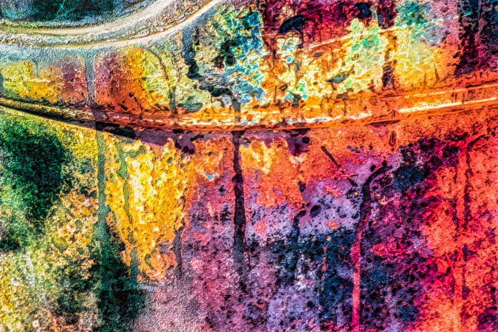
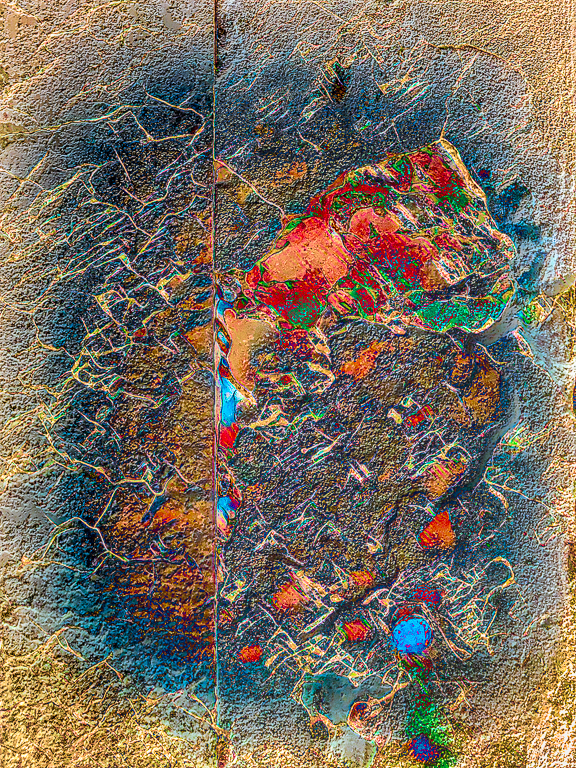
I like the original textures in the background and wish those shapes were more evident in your creative version. Perhaps a mask layer could be used to partially reduce your added affects. Of course, that's just my personal preference. |
Oct 2nd |
| 20 |
Oct 19 |
Comment |
I think you did a perfect job in emphasizing your intended focus. Your choice of subject materials was excellent too. 4**** out of 4! |
Oct 2nd |
| 20 |
Oct 19 |
Comment |
Excellent composite. I always check the shadows and give you a thumbs up for careful work.
I hope you routinely stop by and continue to contribute your valuable thoughts to DDG 20. |
Oct 2nd |
| 20 |
Oct 19 |
Comment |
I like it a lot and am surprised this filter worked so well. My compliments to you.
It appears to me that you may have partially masked out the effect on the right foreground. I would consider making the signs slightly legible but maybe it would detract. Just a thought. |
Oct 2nd |
| 20 |
Oct 19 |
Comment |
Very creative and extremely attractive. Fantastic! Etc. etc.
Perhaps Hallmark should consider using an occasional bee on its cards. |
Oct 2nd |
6 comments - 2 replies for Group 20
|
| 64 |
Oct 19 |
Reply |
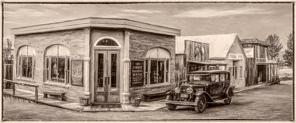
Thanks, I made a similar version as your years ago, but yours may be a tad better. I doubt this is this preferred version of many but i think it tells a strong thou not pretty story.
Do you think it may be even better to crop off the sky? |
Oct 24th |
| 64 |
Oct 19 |
Reply |
Thank you very much for the suggestions. Hopefully, I can learn to use Silver Effexor as well as I know and use other filters.
I still use the original NIK filters but use the other products from DxO. |
Oct 14th |
| 64 |
Oct 19 |
Reply |
I agree. It was a very challenging image b convert, and it needs a lot of work.
Thanks. |
Oct 13th |
| 64 |
Oct 19 |
Reply |
Thanks. I can always rely on you to carefully view and helpfully critique.my images. |
Oct 10th |
| 64 |
Oct 19 |
Reply |
I must add that years from now, viewers can look at this image and remember the significance of this time. A true keeper of historical importance. |
Oct 10th |
| 64 |
Oct 19 |
Comment |
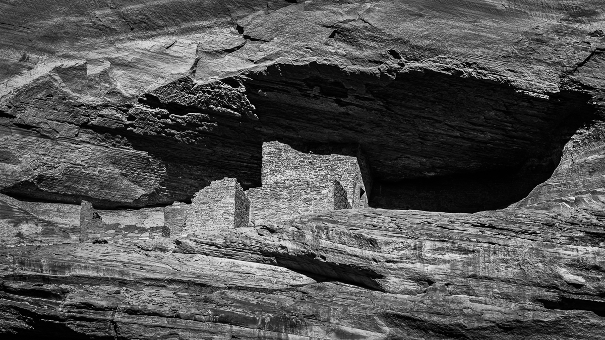
I find the image very pleasing, but the ceiling is distracting me. I think the leading lines are great And the ceiling unnecessary. |
Oct 9th |
| 64 |
Oct 19 |
Comment |
i like the story you captured, but I doubt that Americans would participate in a public vote such as this. One must also wonder if it's accurately what the participants believe or if they were influenced by on lookers.
I think your image would benefit from toning down the sunny area. |
Oct 9th |
| 64 |
Oct 19 |
Comment |
I like the lighting and sense of motion. Perhaps you can add to the lighting effect by selectively brightening the hair on top of the elephants in the middle? |
Oct 9th |
| 64 |
Oct 19 |
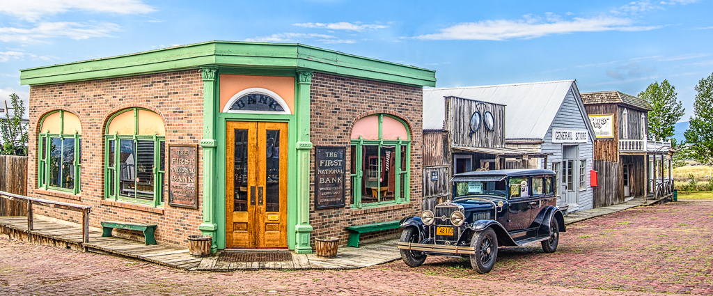
Comment |
I find this a very pleasing image, but I'm surprised that it required more than one image to archive. Perhaps the processing led to the uneven exposure in the sky around some of the buildings. |
Oct 9th |
| 64 |
Oct 19 |
Comment |
I really like the composition, wonderful shapes and contrast. |
Oct 9th |
| 64 |
Oct 19 |
Comment |
I would like the image more with the perspective corrected. Perhaps Snapseed could both rotate it clockwise a few degrees and also tilt it up.
I relied solely on my Pixel 3 for 3 weeks and 7000+ images in Italy this Sept. it has shortcomings but overall I was very happy with my decision. I will consider upgrading to Pixel 4 when it gets released.
I was very impressed with what I saw on my friend's 10+, so I'm sure you will continue to be pleased with it too. |
Oct 9th |
6 comments - 5 replies for Group 64
|
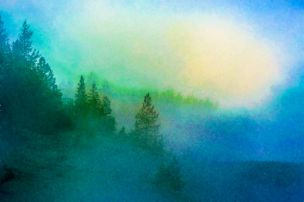
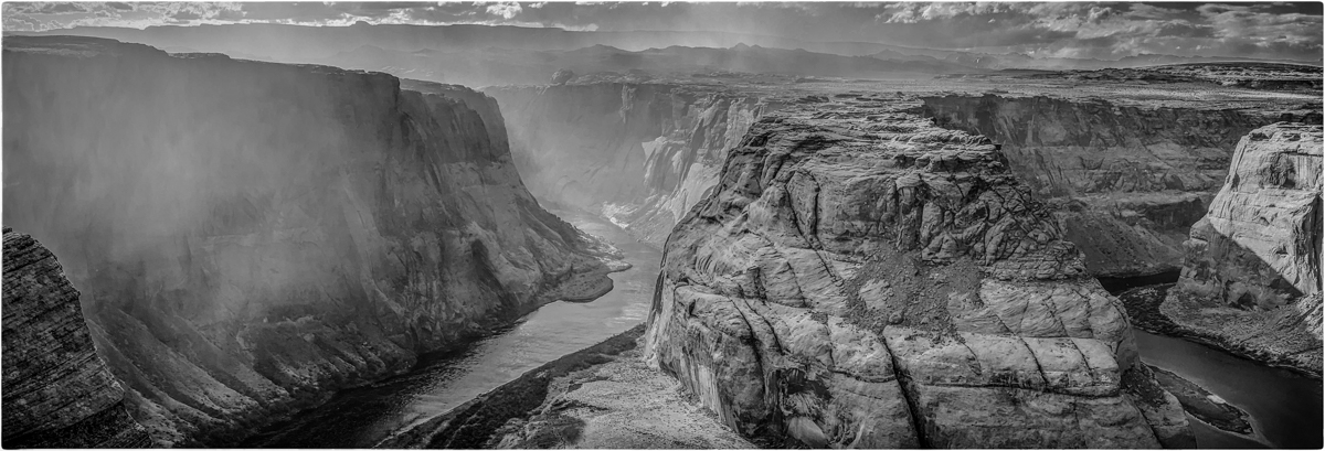
| 83 |
Oct 19 |
Comment |
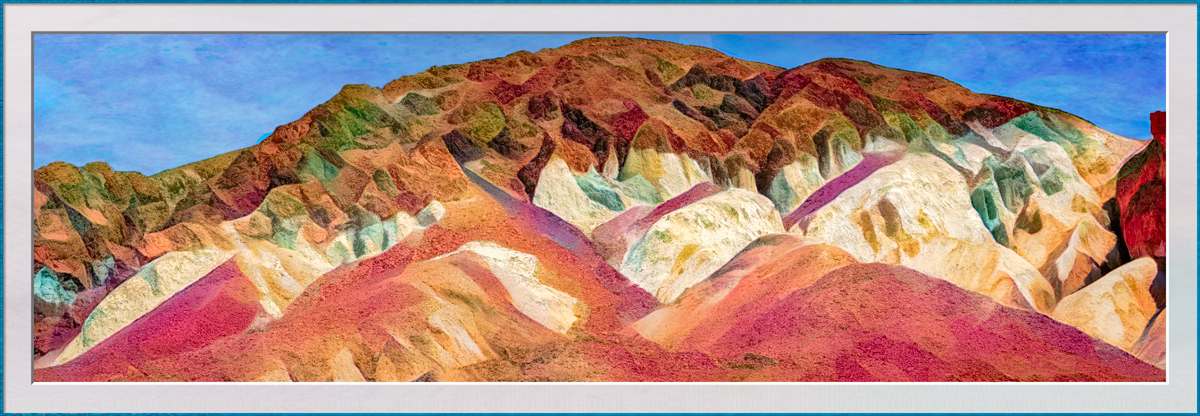
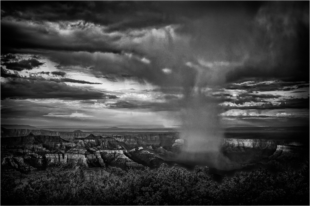
You have a keen eye and a challenging subject. I've never previously seen an image of rolling fog. Well done.
However, I would prefer to see the right side toned down. I would find it more dramatic and perhaps a little closer to your original. |
Oct 14th |
1 comment - 0 replies for Group 83
|
| 87 |
Oct 19 |
Comment |
You captured a wonderful moment and represented it very well. Perhaps a light vignette would add to the focus. |
Oct 14th |
| 87 |
Oct 19 |
Comment |
I think the close crop was necessary for me to recognize birds on the ice. I enjoy the image and agree with Mike on altering the composition slightly. |
Oct 14th |
2 comments - 0 replies for Group 87
|
18 comments - 8 replies Total
|