|
| Group |
Round |
C/R |
Comment |
Date |
Image |
| 20 |
Jun 19 |
Reply |
I'm interested in seeing your views of the Kew expo. Google offers a free service for archiving and sharing photos. If you have jpgs on Google Drive I would appreciate your sharing them with me. Jafunk1941@gmail.com |
Jun 23rd |
| 20 |
Jun 19 |
Reply |
Yes, |
Jun 20th |
| 20 |
Jun 19 |
Comment |
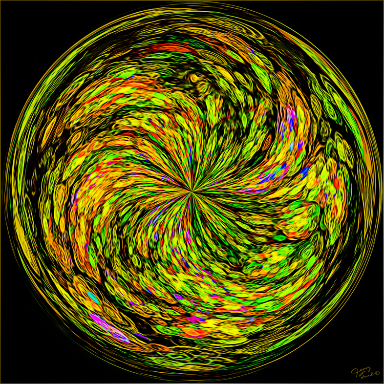
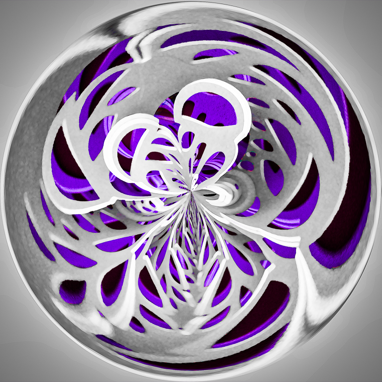
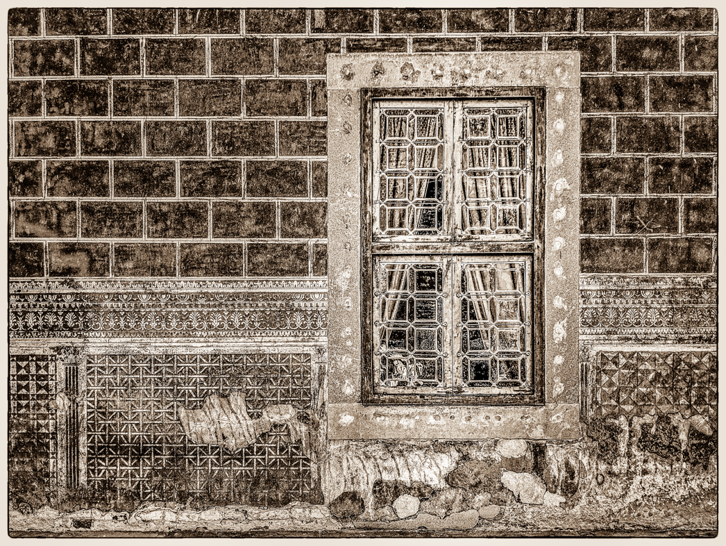
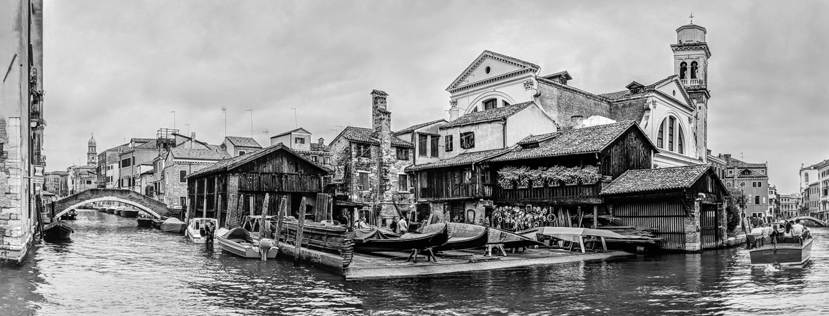
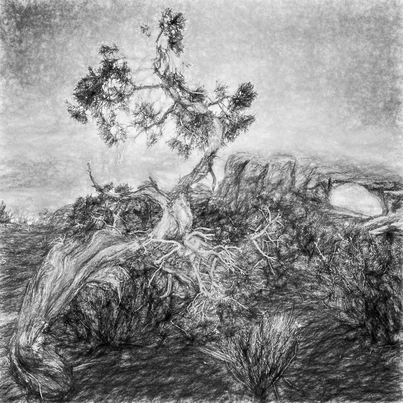
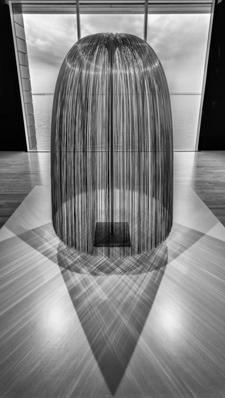
As previously said by others, I think this is a beautiful image with a Japanese look.
As an aside, I am trying to force myself to edit out all small distractions. If I look at my image and say "I wonder if I should remove that or brighten that." I want to act immediately rather than waiting a month or whatever. If something doesn't contribute to my story, I want it out. I am trying to train myself to be more decisive while still experimenting and making variations of many images. |
Jun 20th |
| 20 |
Jun 19 |
Comment |
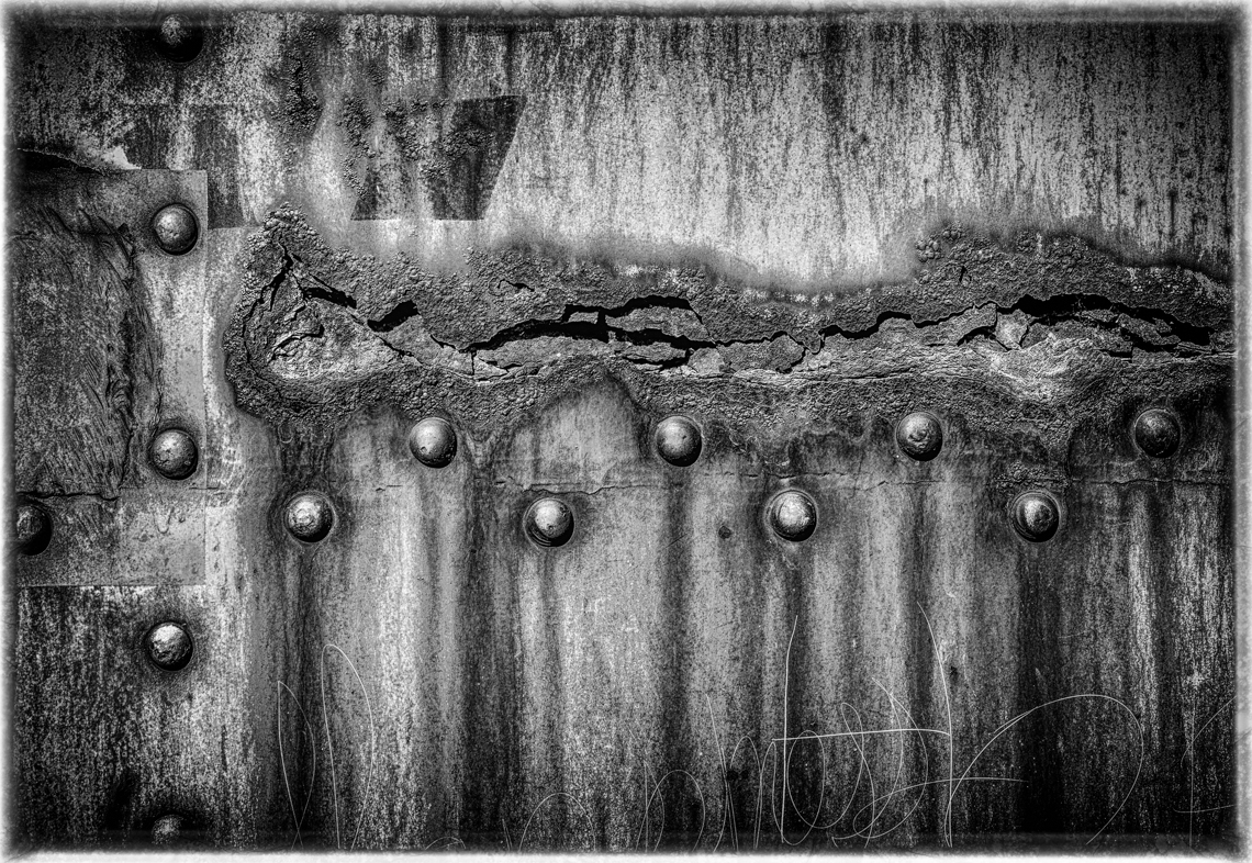
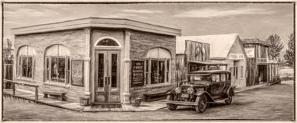
I really like what you have done even though the foreground is a bit distracting.
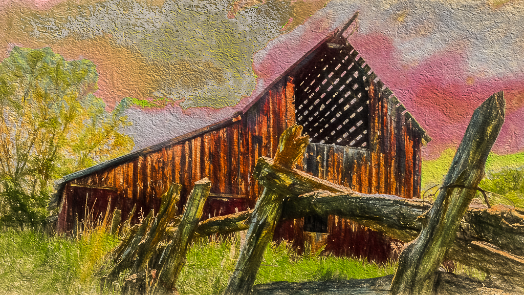
I have one suggestion for you to consider. Clone back in the bump sign. That may provide even more interest. Y |
Jun 7th |
| 20 |
Jun 19 |
Comment |
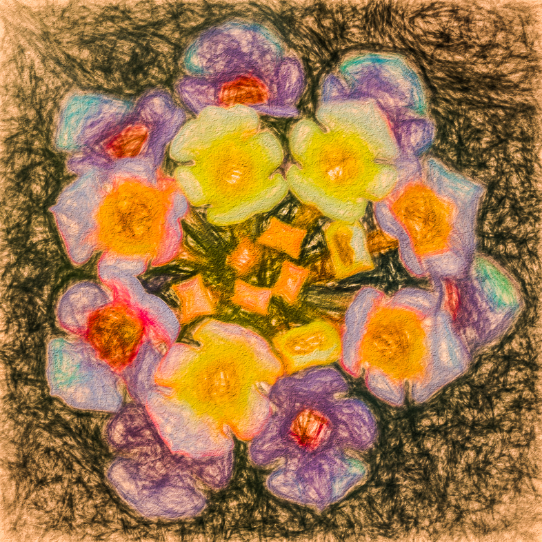
I like your creative concept and composition. The tulips are a good touch to help break up the foreground but the multiple branches on the left don't appeal to my eye. |
Jun 7th |
| 20 |
Jun 19 |
Comment |
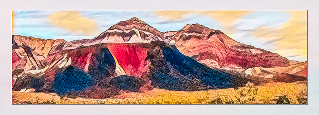
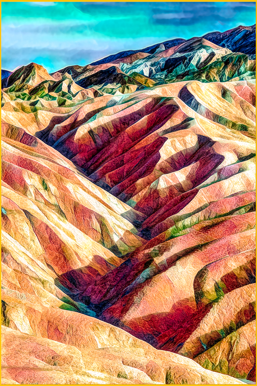
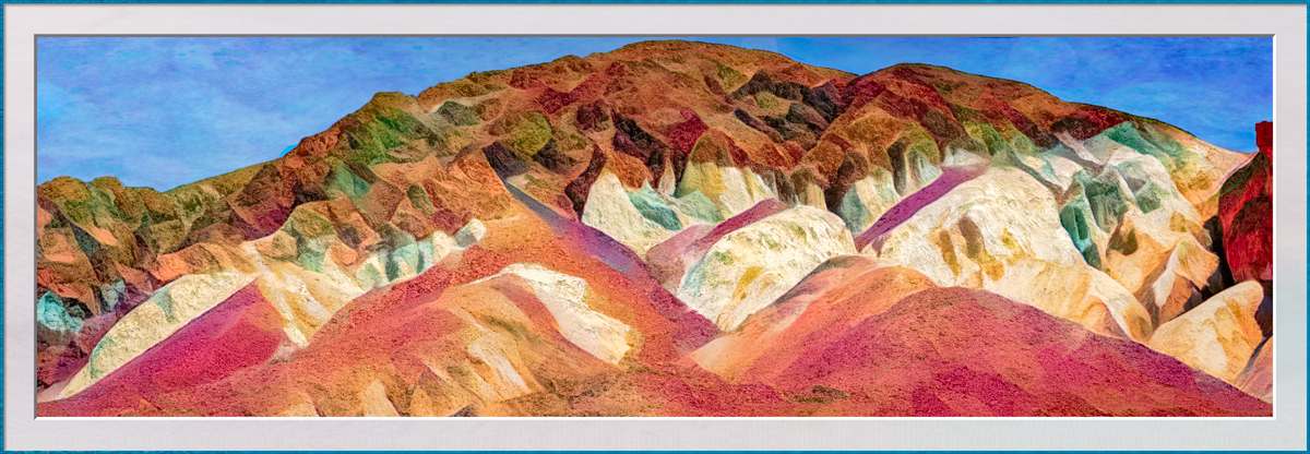
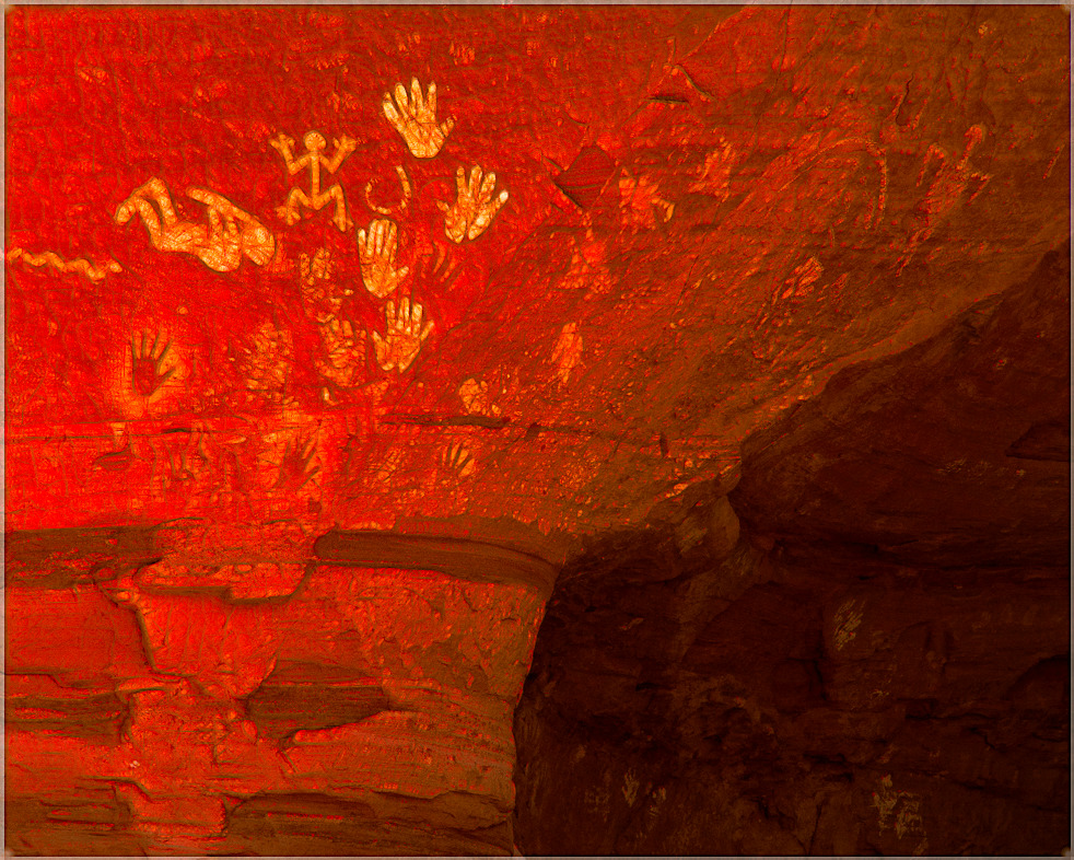
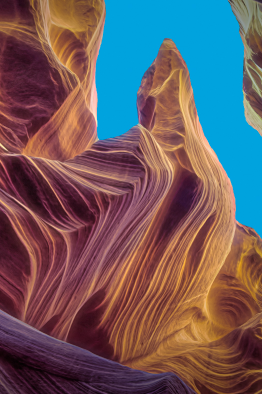
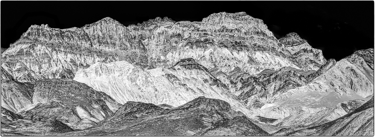
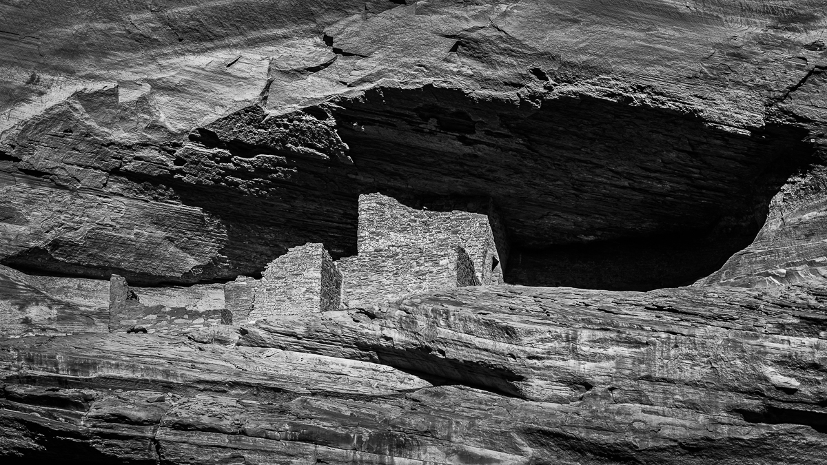
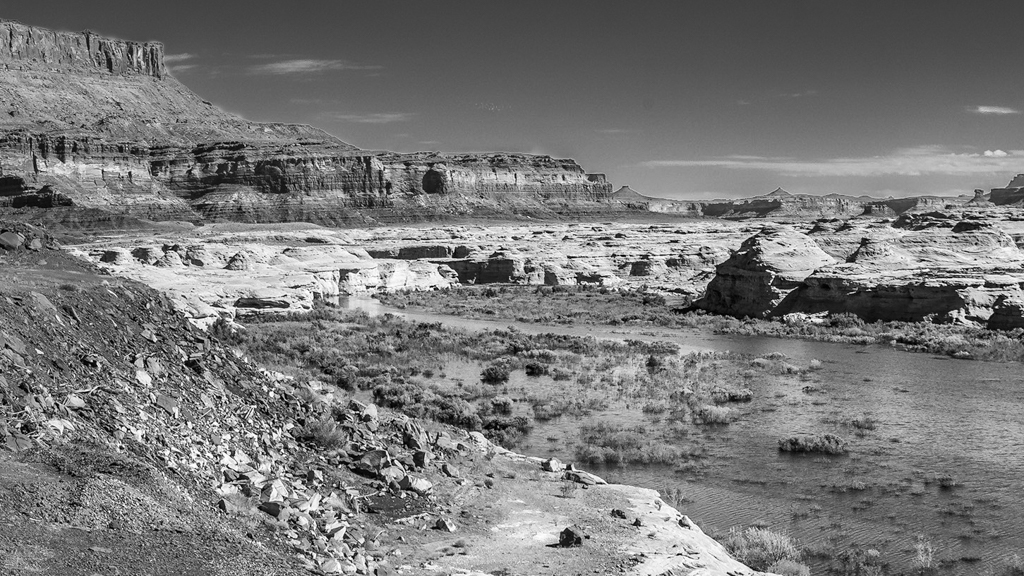
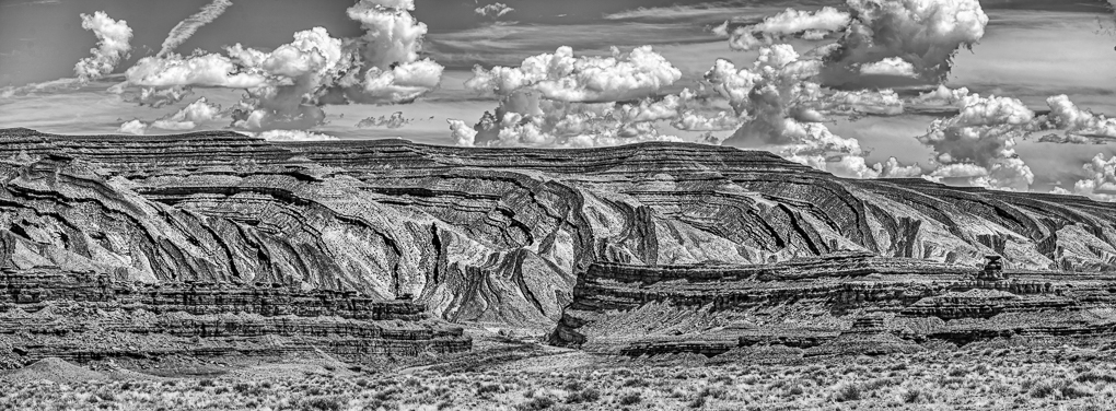
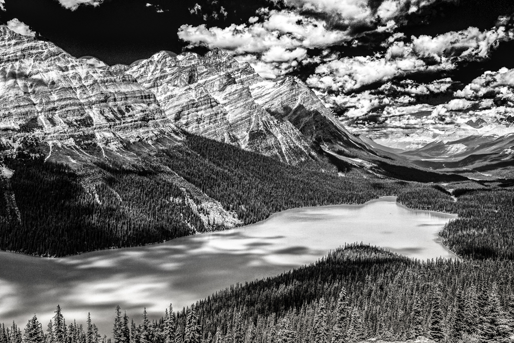
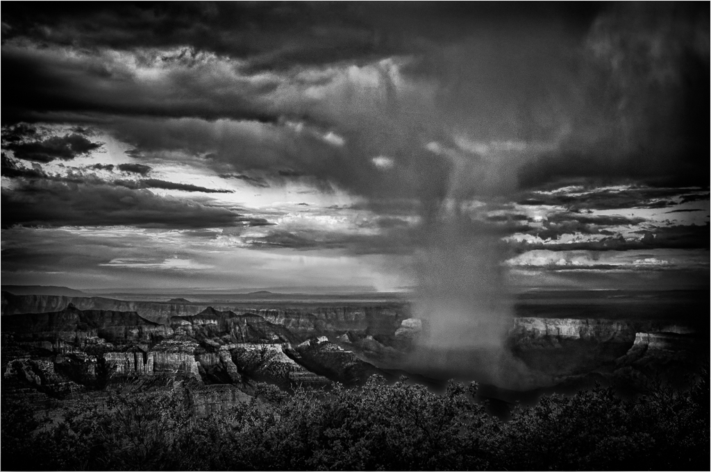
I think everything looks "just right" to my eyes. Even your selection of a Grand Canyon view with a touch of snow adds to its overall appeal for me. |
Jun 5th |
| 20 |
Jun 19 |
Comment |
Yes, a Wonderful image and creative treatment, turning an ordinary image to an excellent creative one. |
Jun 5th |
| 20 |
Jun 19 |
Comment |
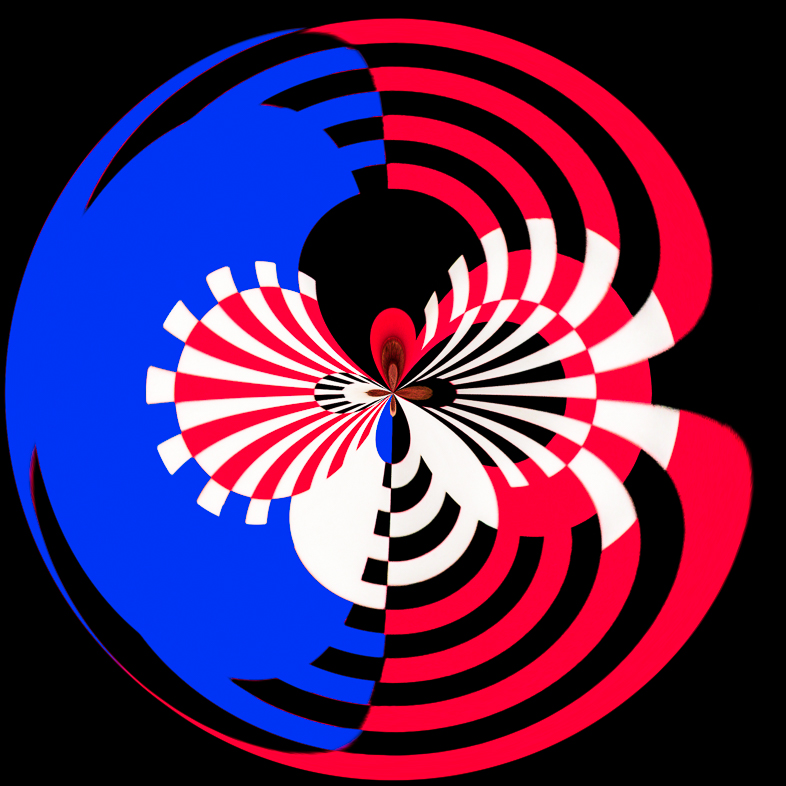
Yes, I prefer my original too. I was experimenting with Topaz and this suited my mood at the time. |
Jun 3rd |
| 20 |
Jun 19 |
Comment |
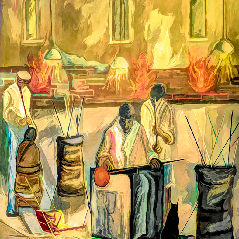
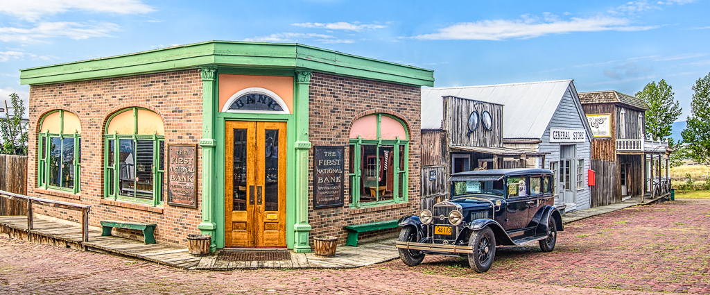
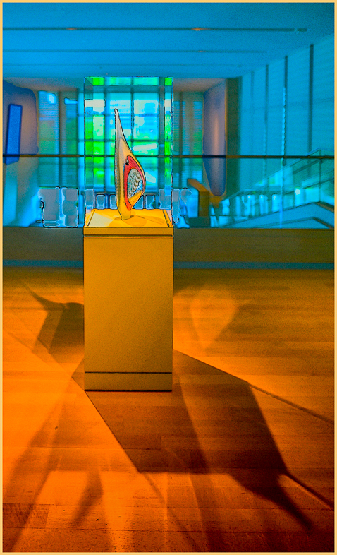
Fantastic! Your subject matter reminds me of Norman Rockwell paintings. More importantly, I think it's an excellent creative effort. You peaked my curiosity so I will investigate Anthropics. |
Jun 3rd |
7 comments - 2 replies for Group 20
|
| 34 |
Jun 19 |
Comment |
Fantastic!!! I like every element and think all are very well done.
Given the comical nature of your image, maybe white socks and a turquoise tie would be appropriate.
You are very lucky to have such a cooperative spouse. I just photographed 40 prize irises at an exhibition and couldn't get my wife to hold a black cloth to isolate my subjects. With all the practice, I'm getting good at changing backgrounds, but it's still time consuming. |
Jun 2nd |
1 comment - 0 replies for Group 34
|
| 64 |
Jun 19 |
Comment |
I think this may become a great historical image, because tastes and business methods will change. That to me is the value of street photography. |
Jun 20th |
| 64 |
Jun 19 |
Reply |
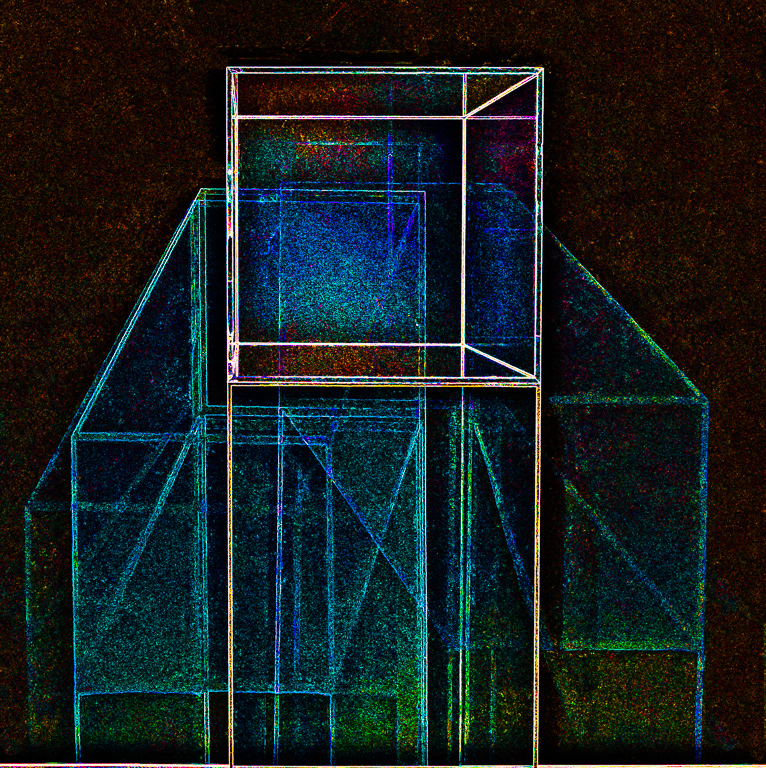
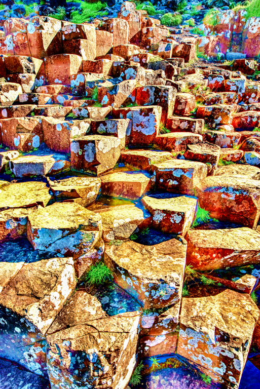
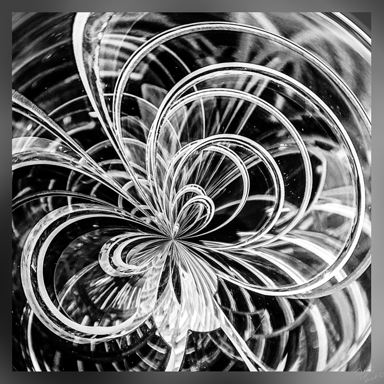
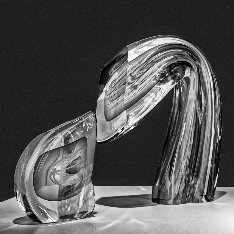
As with most graphic images, I prefer the mono version as is. I would enjoy adding spots of color to make a colorful graphic because there are so many different shapes and forms that are pleasing to me.
I would also like a more highly cropped version leaving the bottom untouched. |
Jun 9th |
| 64 |
Jun 19 |
Reply |
I agree, but first I will see how it looks if I crop further and retain the square format for an aluminum print 2'x2'. |
Jun 9th |
| 64 |
Jun 19 |
Comment |
A nice relaxed pose. Monochrome was a good idea. Overall, very good given the circumstances.
I suggest cropping down to eliminate the light. Crop the bottom to just below his hands and crop the left appropriately to eliminate most of the distractions. The background could also be blurred and darkened to concentrate one's focus on your primary subject. |
Jun 2nd |
| 64 |
Jun 19 |
Comment |
Wow! An excellent subject thoughtfully and expertly executed. |
Jun 2nd |
| 64 |
Jun 19 |
Comment |
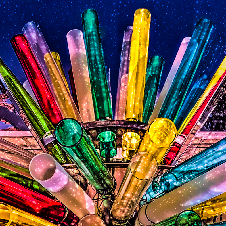
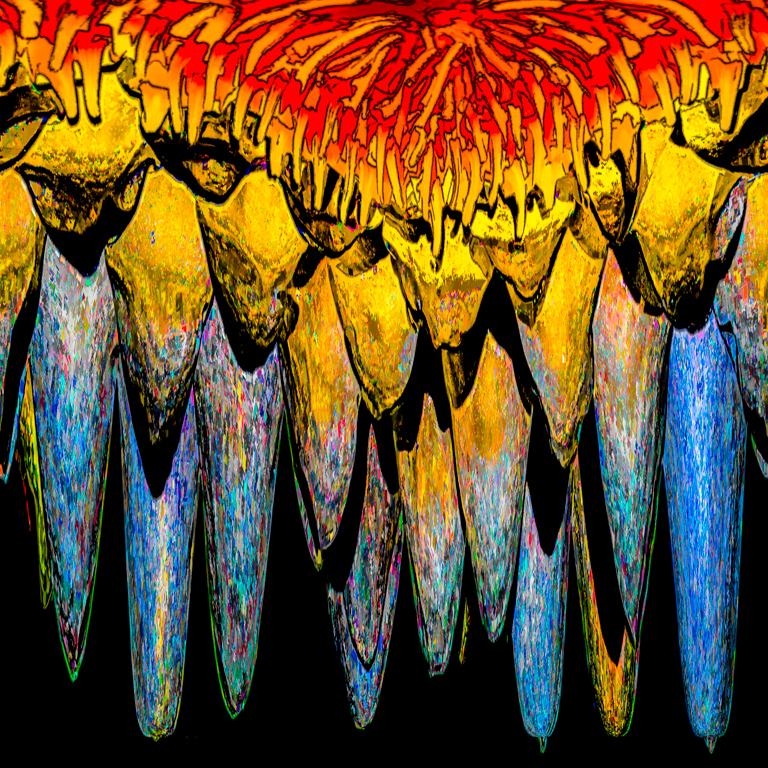
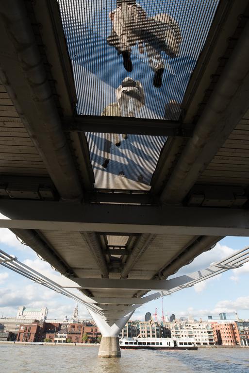
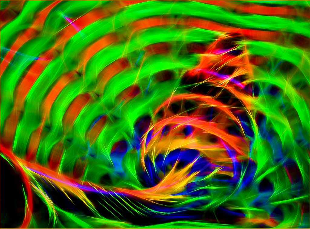
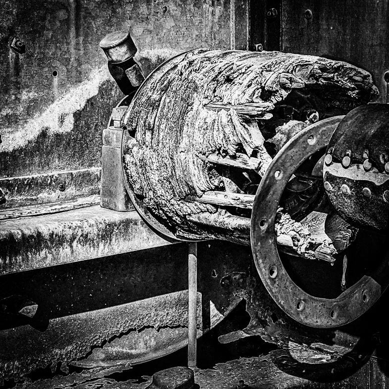
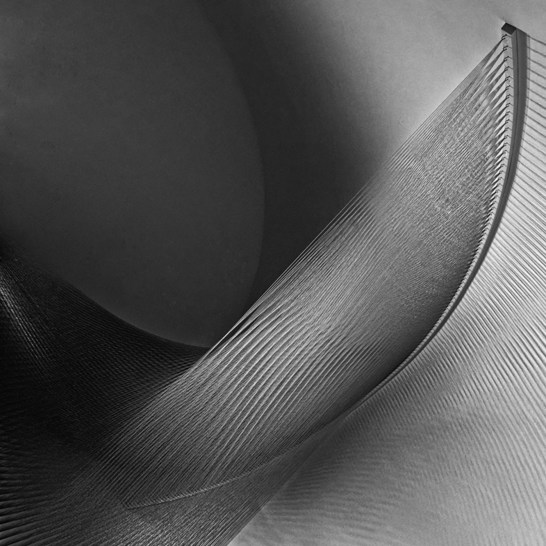
This is an interesting graphic image, but I suspect colorful disks and colorful ed wires would make it more interesting to me. Can we see the original? |
Jun 2nd |
| 64 |
Jun 19 |
Comment |
Someone may suggest that contrast be added, but this image is appealing to me as is. Very good! |
Jun 2nd |
| 64 |
Jun 19 |
Comment |
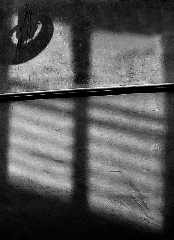
I find this an interesting image, but without the title it was the graphic composition and detail that struck me. I would find it more meaningful if the bars in the distance were made more prominent by cropping the bottom and sides. That would also eliminate the sign. |
Jun 2nd |
6 comments - 2 replies for Group 64
|
14 comments - 4 replies Total
|