|
| Group |
Round |
C/R |
Comment |
Date |
Image |
| 18 |
May 19 |
Comment |
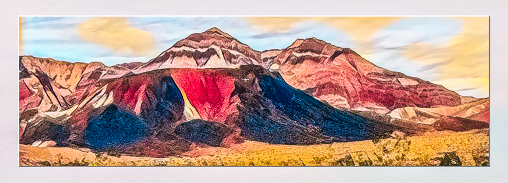
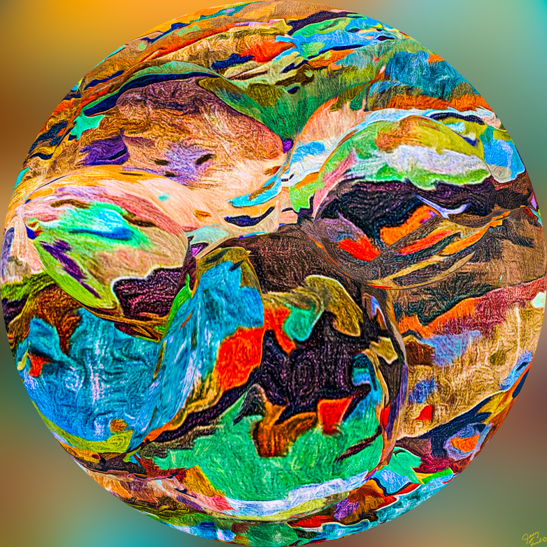
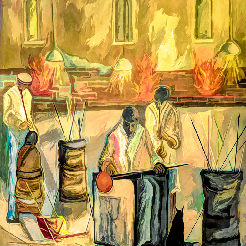
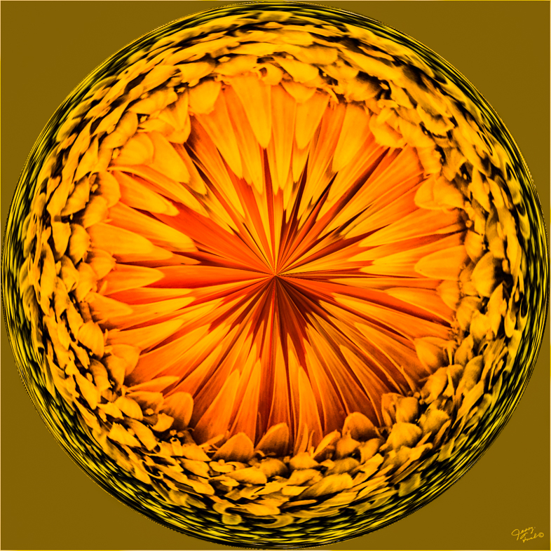
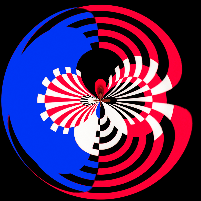
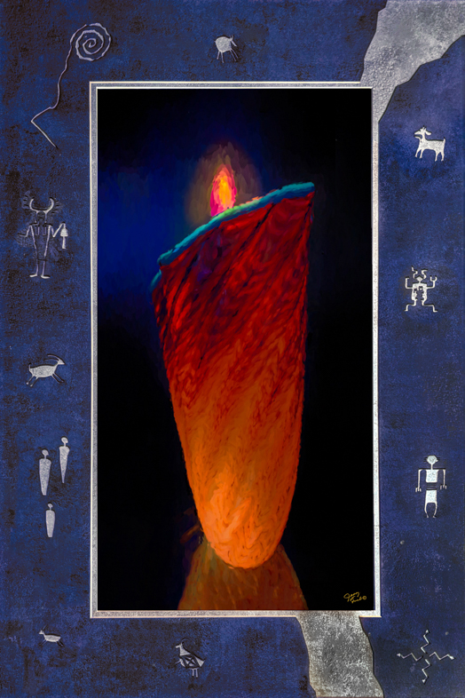
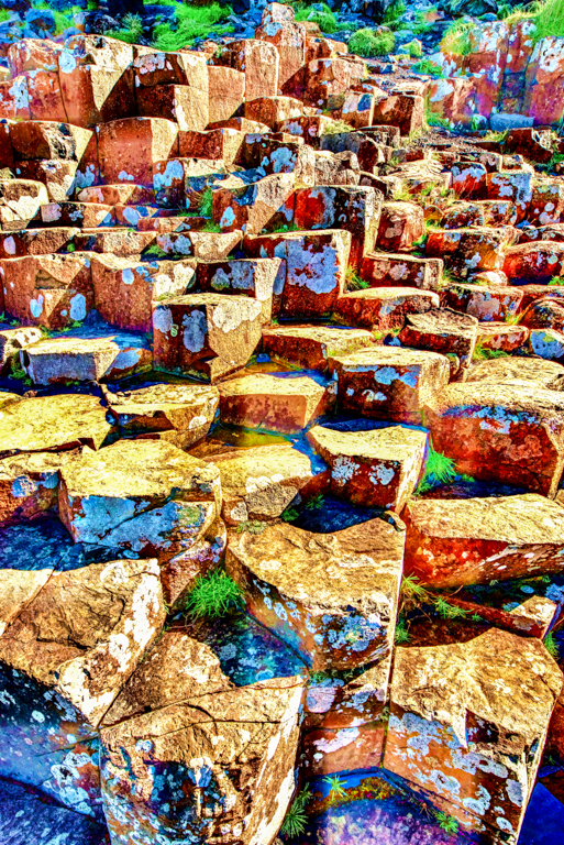
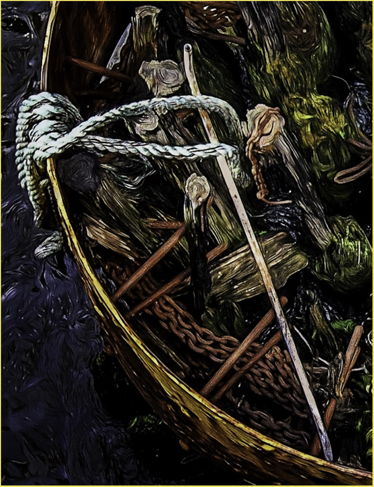
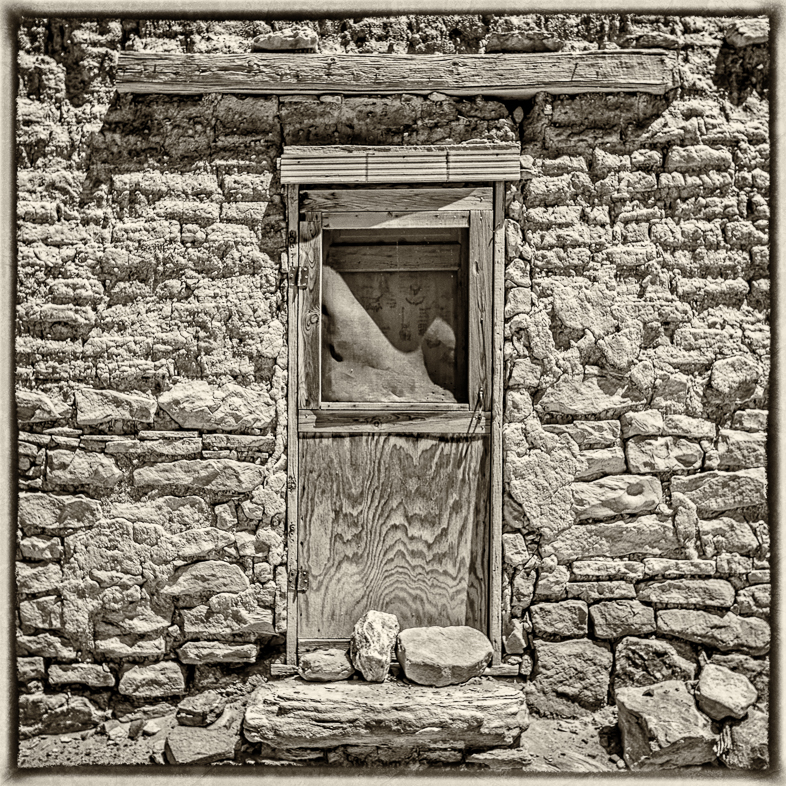
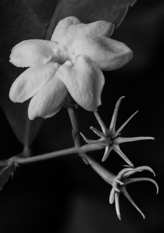
Truly unique and very eye catching! It reminds me of an American Indian with war paint.
Personally, I think I would try resizing to increase the vertical dimension and slim the face a bit. Cropping to a square would still work. |
May 17th |
1 comment - 0 replies for Group 18
|
| 20 |
May 19 |
Comment |
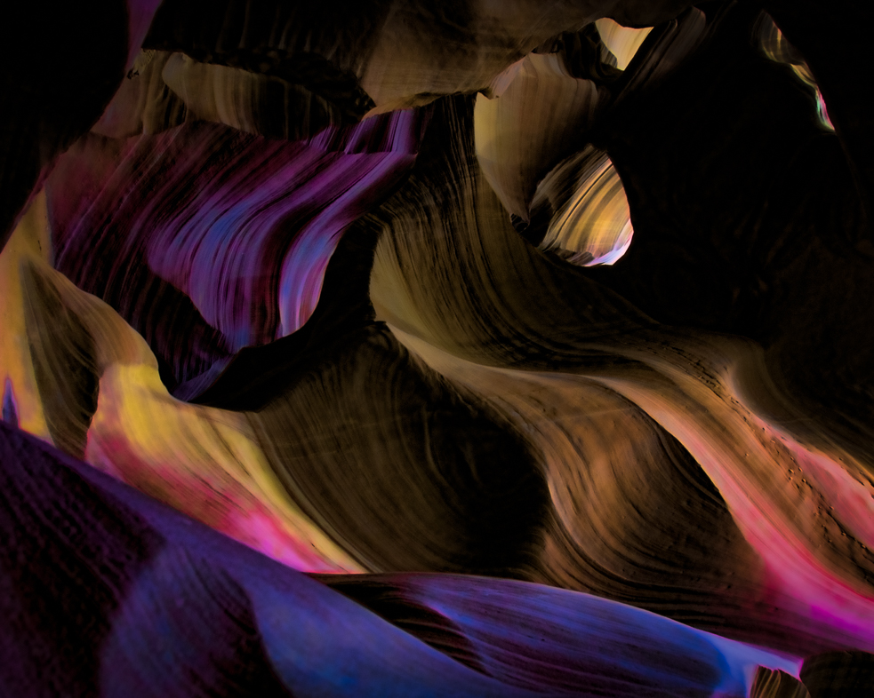
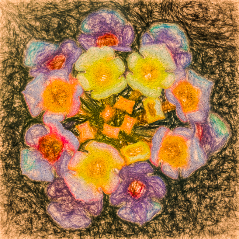
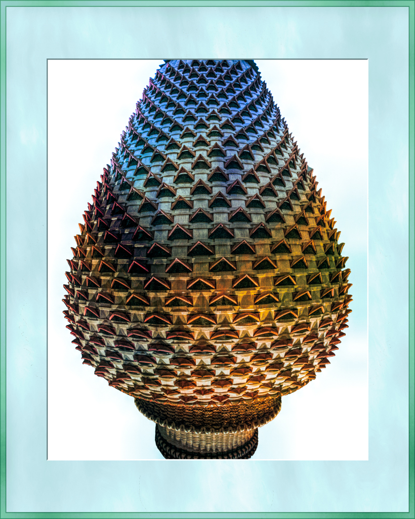
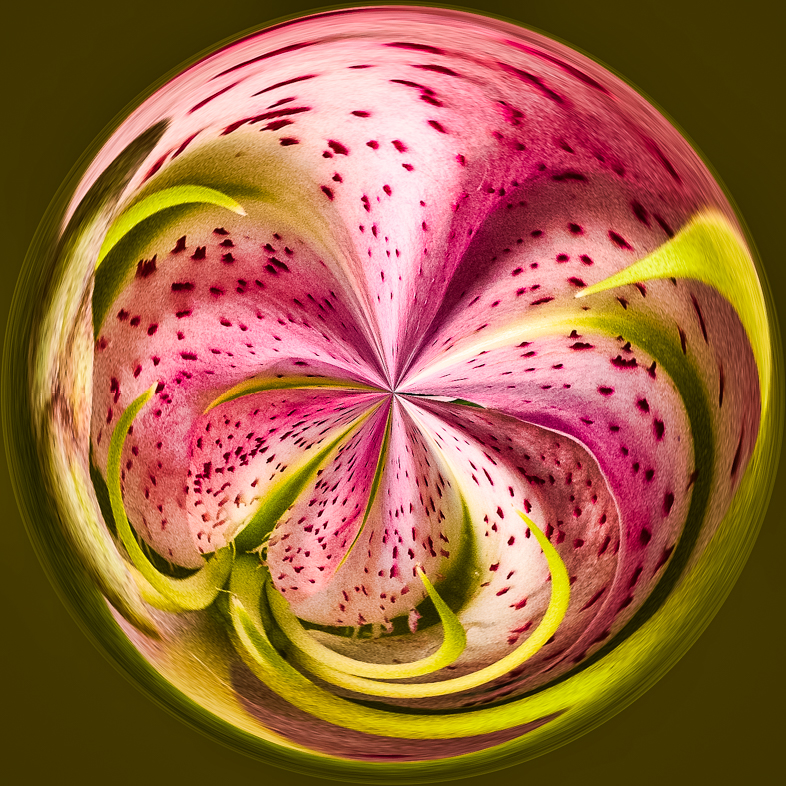
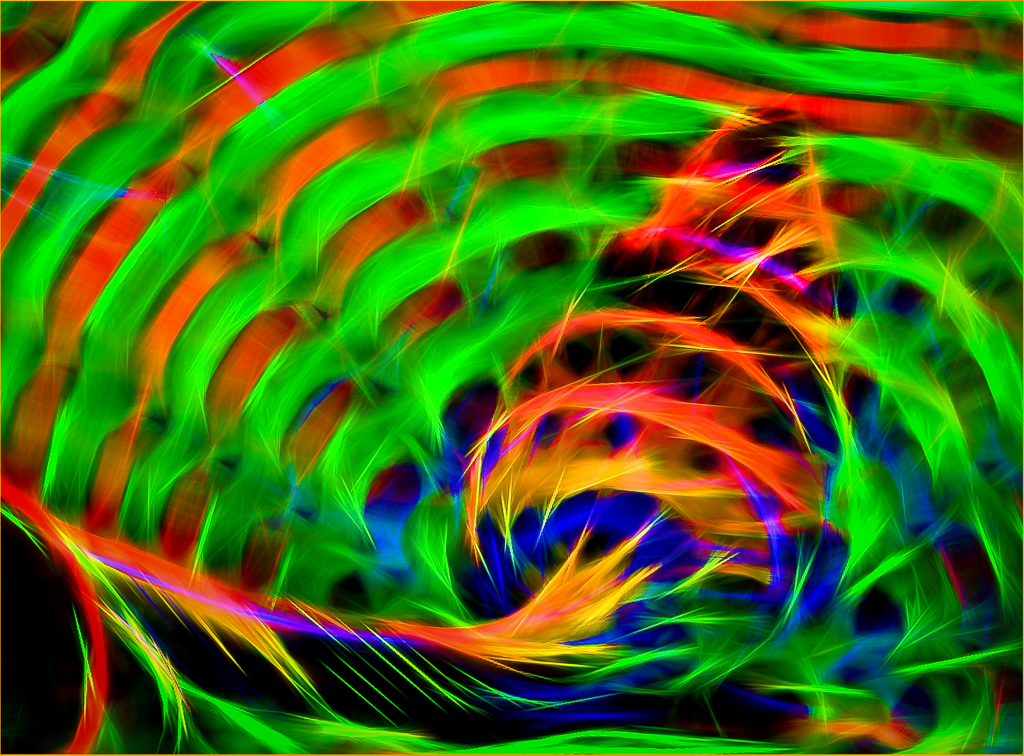
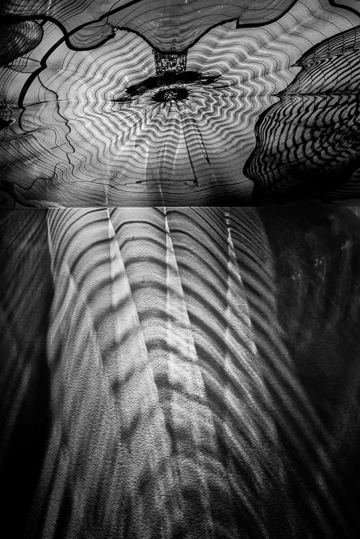
I much prefer the feeling I get from your creative version. I'm very curious to learn what effects were produced by Gugapixel AI.
Nice job!. |
May 17th |
| 20 |
May 19 |
Reply |
Thanks, I have fun experimenting with the endless options available with each of the many filters that are available. |
May 14th |
| 20 |
May 19 |
Reply |
i suggest that you clone from the other shoe. |
May 12th |
| 20 |
May 19 |
Reply |
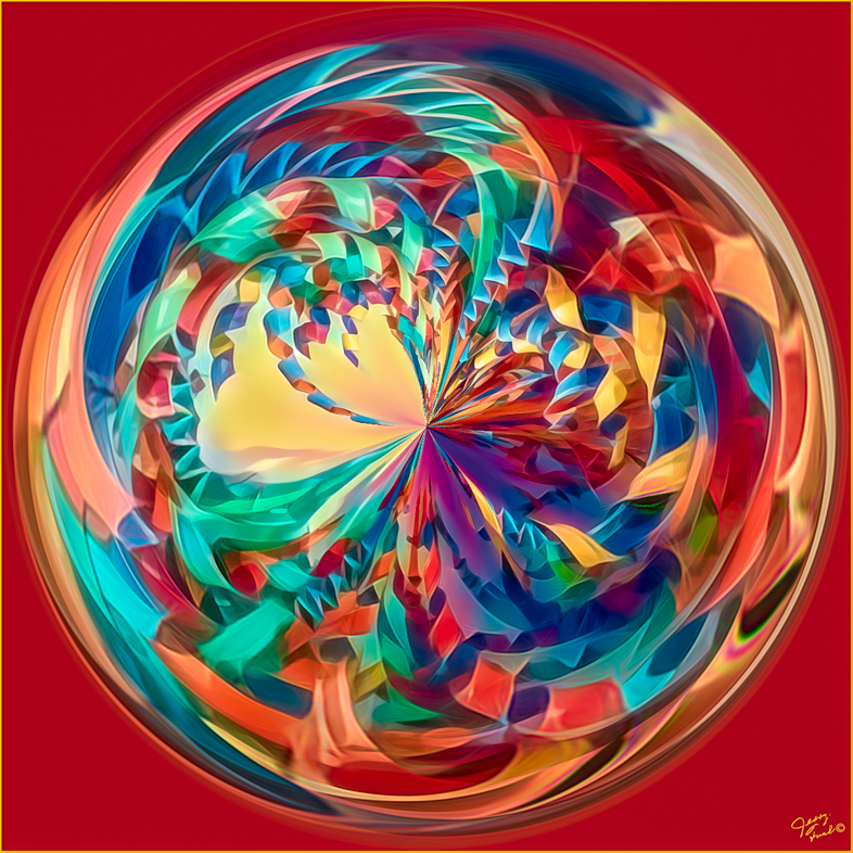
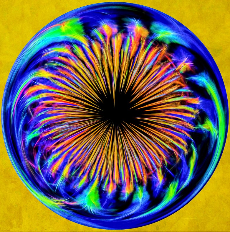
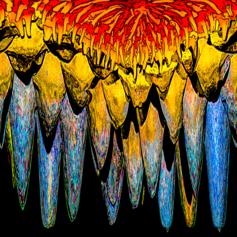
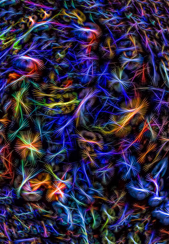
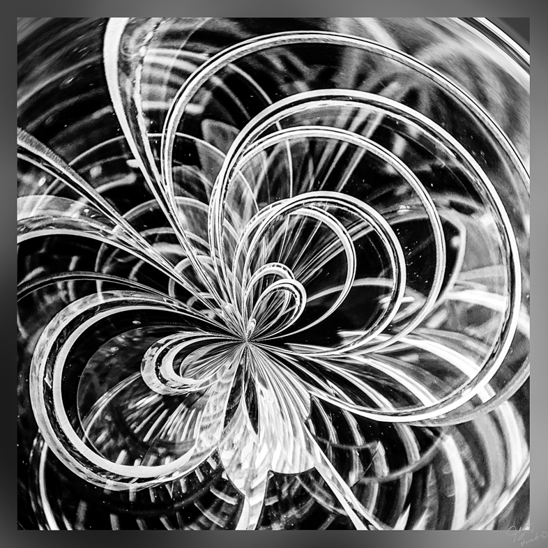
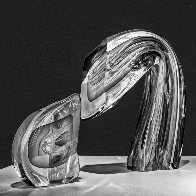
I find that various filters occasionally reveal unseen colors. Sometimes, I radically enhance them while other times I eliminate them. This time, I radically enhanced what I saw to create the feeling I wanted. I think what I enjoy most about the creative process is departing from reality, but I wonder what Mr. Chihuly would say? |
May 7th |
| 20 |
May 19 |
Reply |
Yes, I'm often very lazy about adding that important detail. Thanks. |
May 7th |
| 20 |
May 19 |
Comment |
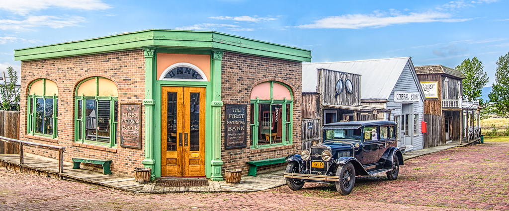
A simple scene but very appealing to my eye. Color choices, composition, everything very well done. All I would suggest is to add a hint of a shadow beneath the ostrich. |
May 7th |
| 20 |
May 19 |
Reply |
Sorry, I was just offering unneeded advice. I routinely encourage everyone to unleash their creativity and enjoy themselves. I hope all of us continue to regain the imagination and creativity we naturally and perhaps unknowingly exhibited when we were very young. |
May 7th |
| 20 |
May 19 |
Comment |
I enjoy your composition and choice of complementary colors. My preference would be to see a soft smooth background though. I especially like the way you have arranged all the elements of the composition. It's a shame though that not even a small apiece of the heal is visible. |
May 6th |
| 20 |
May 19 |
Comment |
Your image is beautiful. I find the tiger and background perfect, but I question the grass. I suggest you find some images of tigers in the wild and change the style of your painted brush strokes of grass to make it more realistic to my eye. |
May 6th |
| 20 |
May 19 |
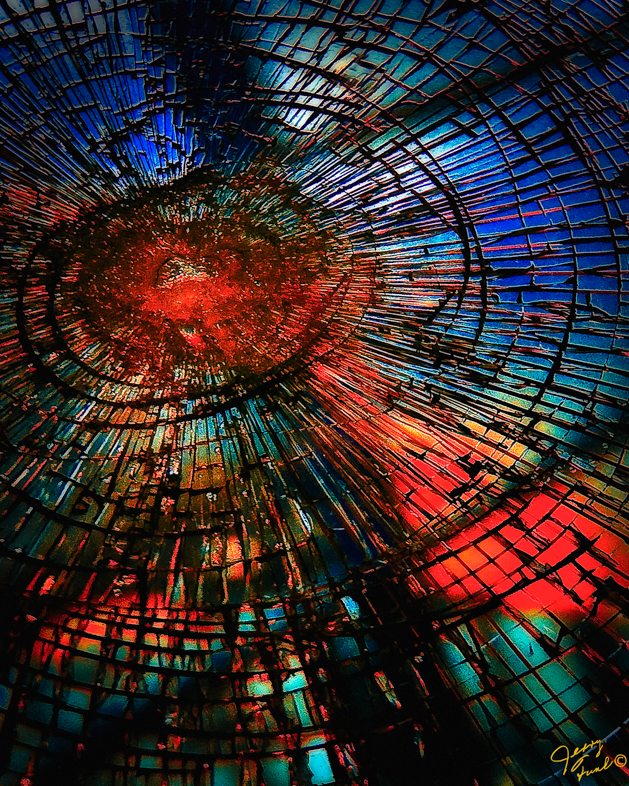
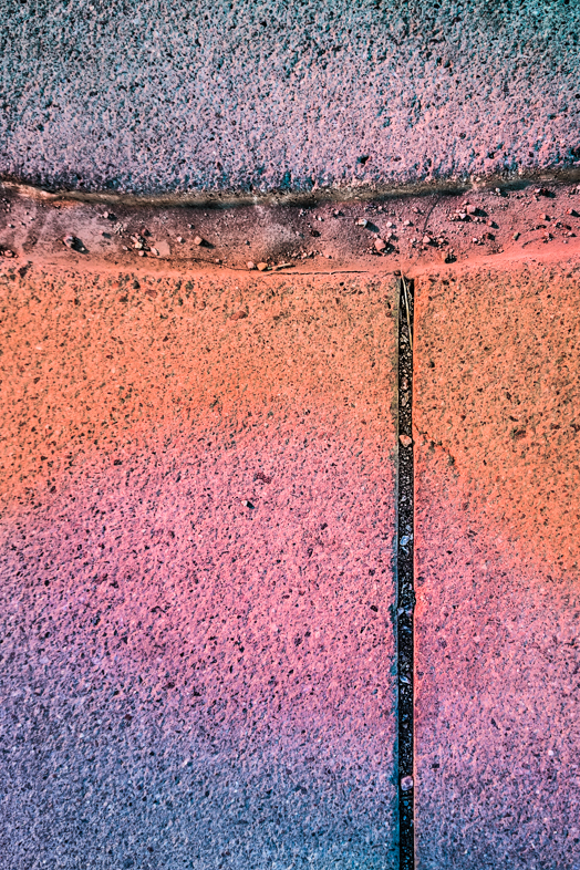
Comment |
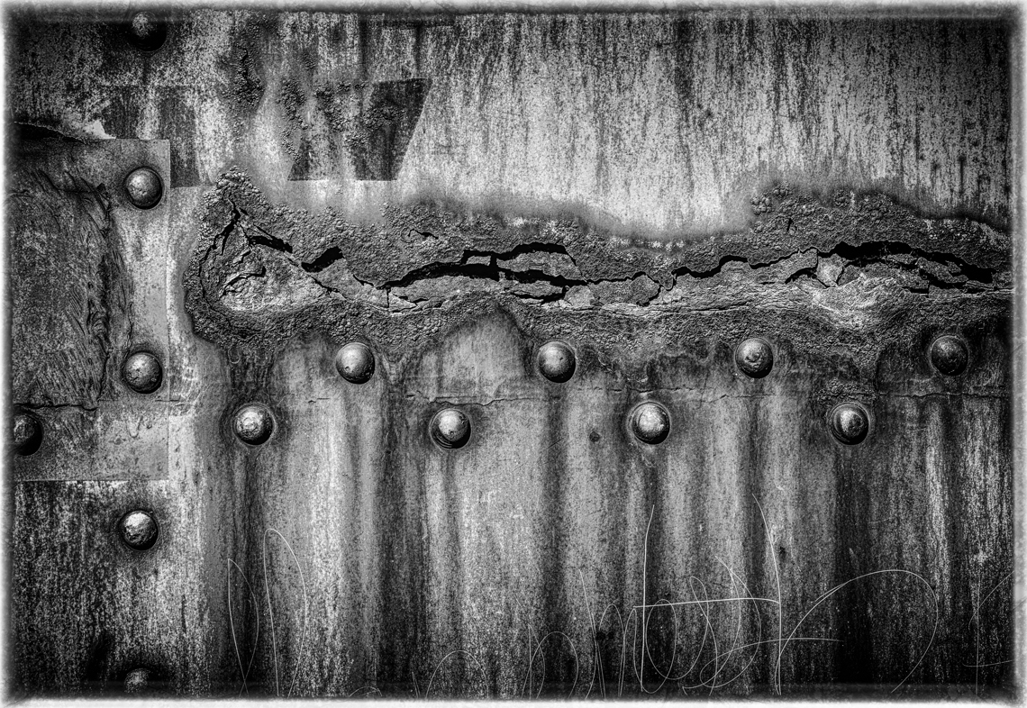
I like your image and the suggestions that have previously been made. Personally, I would draw over all the cracks using the content aware filter, because the cracks are distractions to my eye.
Side note: my photo club and State competitions do not allow the use of stock images. Every element must be original even in creative images. |
May 6th |
| 20 |
May 19 |
Comment |
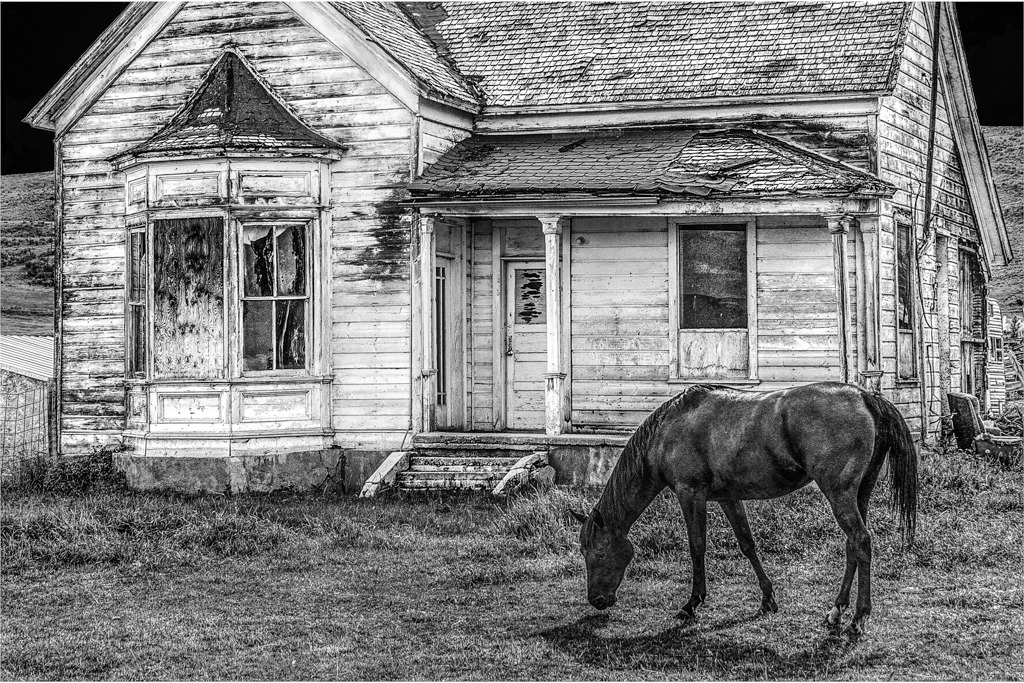
Welcome. Based on your first submission, I will certainly look forward to seeing your future images.
I think you made a masterful composition, and I have to study it very closely to critique it in any way. Having said that, I first look at the woman's shadow and wonder why the basket is not darker and there are no prominent shadows on the dress? The solution is simple. The shadow on the ground should be the same as in your original image. I think that direction of lighting would work without another change in the entire image. Also, I think the house is sized convincingly and the smoke adds a touch of interest for me.
The leading line of the road draws my eye to the tree. It's ok as is, but my imagination leads me to want to see a big tree with branches overhanging the road. Perhaps that would best be accomplished by an artist with a brush and paints. It's certainly far beyond my digital capabilities.
|
May 6th |
| 20 |
May 19 |
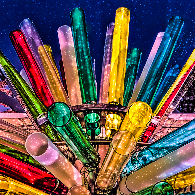
Reply |
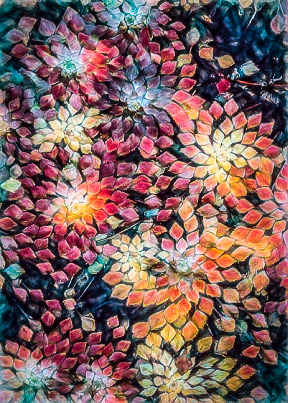
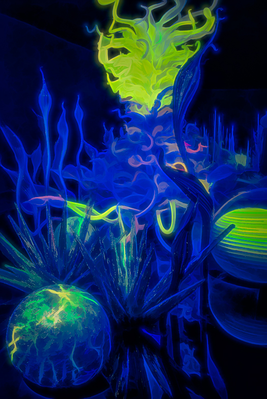
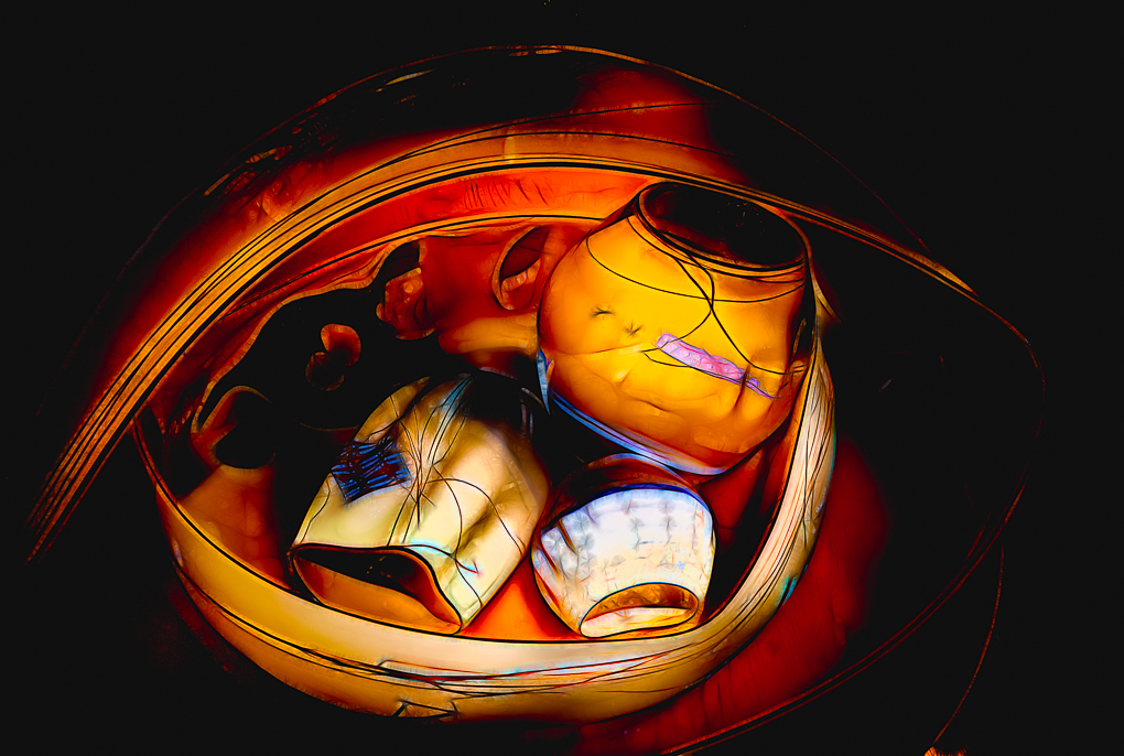
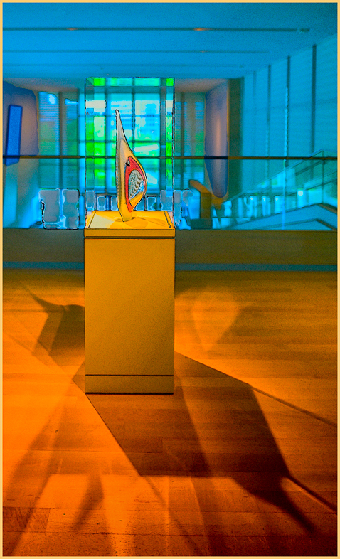
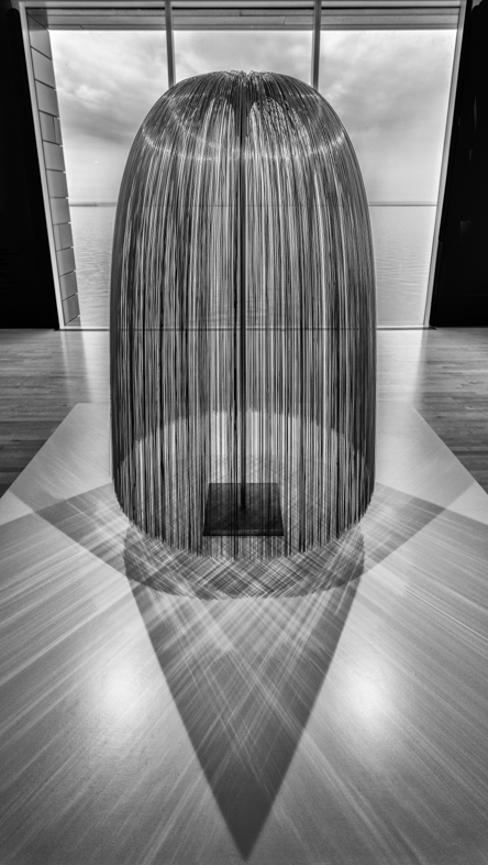
I make an annual presentation of recent photos to my local photo club. This Jan. it included about 23 min. On the Chihuly Art Gallery in Seattle. I think it deliberately makes it very difficult for photographers with its large banks of spotlights. I literally spent months removing and toning done its harsh effects on all my images.
I recommend photographers visit the Oklahoma City Art Museum because it has a large permanent exhibit of Chihuly glass. The lighting in many cases is much better. While the exhibit has perhaps 1/4 the number of pieces, it's still an excellent variety and representation of his work.
My show is available on Google Drive. Anyone wanting to see it can send their email contact to me. Jafunk1941@ yahoo.com |
May 3rd |
6 comments - 6 replies for Group 20
|
| 52 |
May 19 |
Comment |
I think excellent images such as this present lots of options. Currently, the focus is on the heron's head and catch. Cropping 1/3 off the right, I think, increases that focus.
Uncropped, I think the full beauty of the bird's plumage would be enhanced by brighting the feathers.
While I oftentimes add yellow to shadows, I suspect that is not needed here, because the color of the neck looks normal to me.
Great action shot! |
May 14th |
1 comment - 0 replies for Group 52
|
| 64 |
May 19 |
Reply |
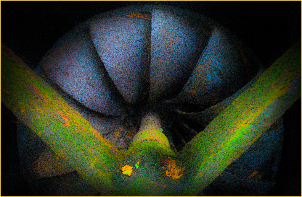
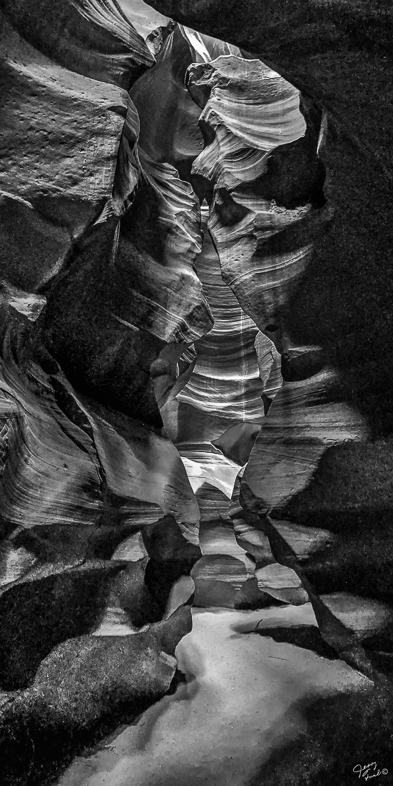
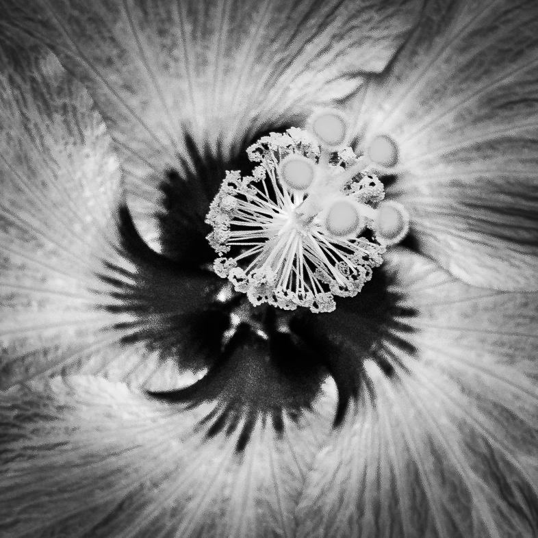
This is my first image in which my wife prefers the monochrome. It is also the first abstract that she didn't ask, "What is it?". Progress? |
May 10th |
| 64 |
May 19 |
Comment |
I like everything about this image, and have no suggestions for you.. super! |
May 8th |
| 64 |
May 19 |
Reply |
Thanks, I'll try to do that carefully. |
May 8th |
| 64 |
May 19 |
Comment |
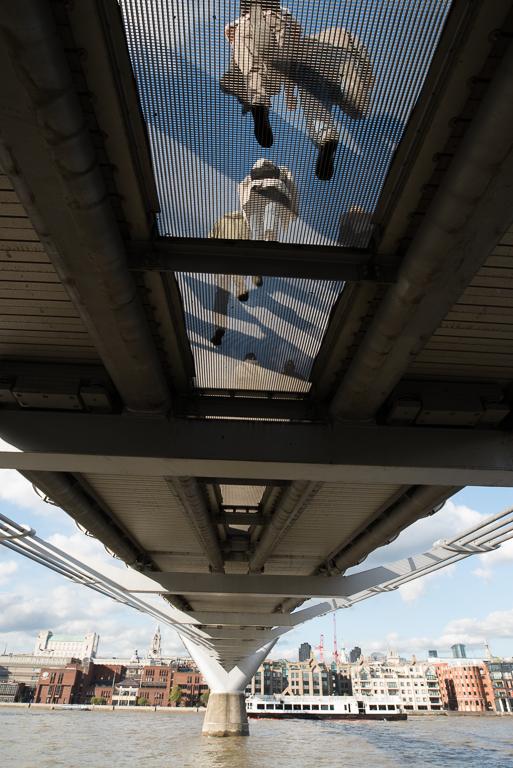
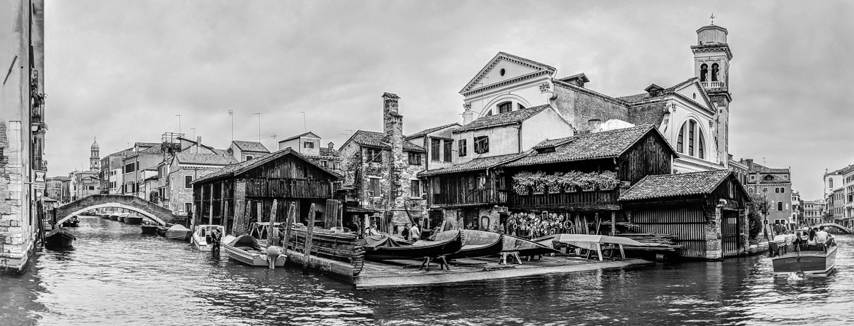
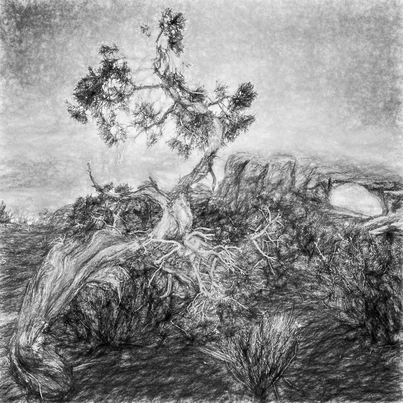
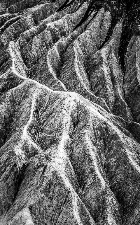
I just checked and saw my post wasn't posted. Somehow, John put his name on it!
Yes, this image must not be straightened. This view helps the viewer appreciate its height. It's too bad the branches block a little more of the building than I think is optimal. Expertly edited, as always! |
May 8th |
| 64 |
May 19 |
Comment |
I like your creative thought and approach, but it just doesn't work for me. Maybe, if I look at it tomorrow, I'll have some other ideas. Sorry. |
May 8th |
| 64 |
May 19 |
Comment |
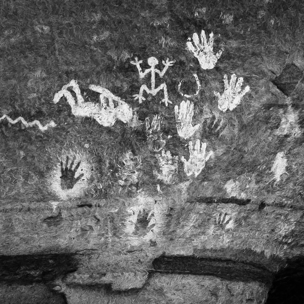
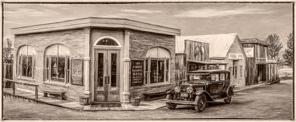
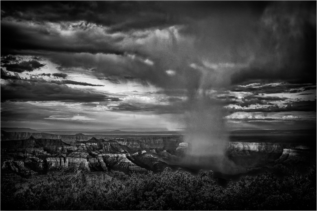
What a wonderful mage! You did a great job making the monochrome image great. The effort to get down on the ground was well worth it. We should all be so patient and fortunate to get all wild animals to look straight into our camera.
I like the image as is. If anything, I would blur everything in the background slightly to only focus on the two primary subjects. Anyway, it's another approach fr you to consider. |
May 8th |
| 64 |
May 19 |
Comment |
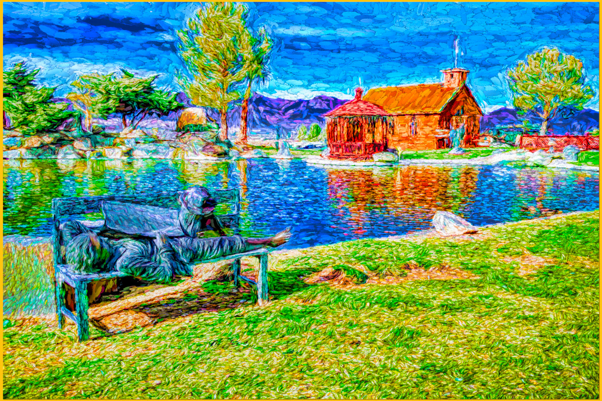
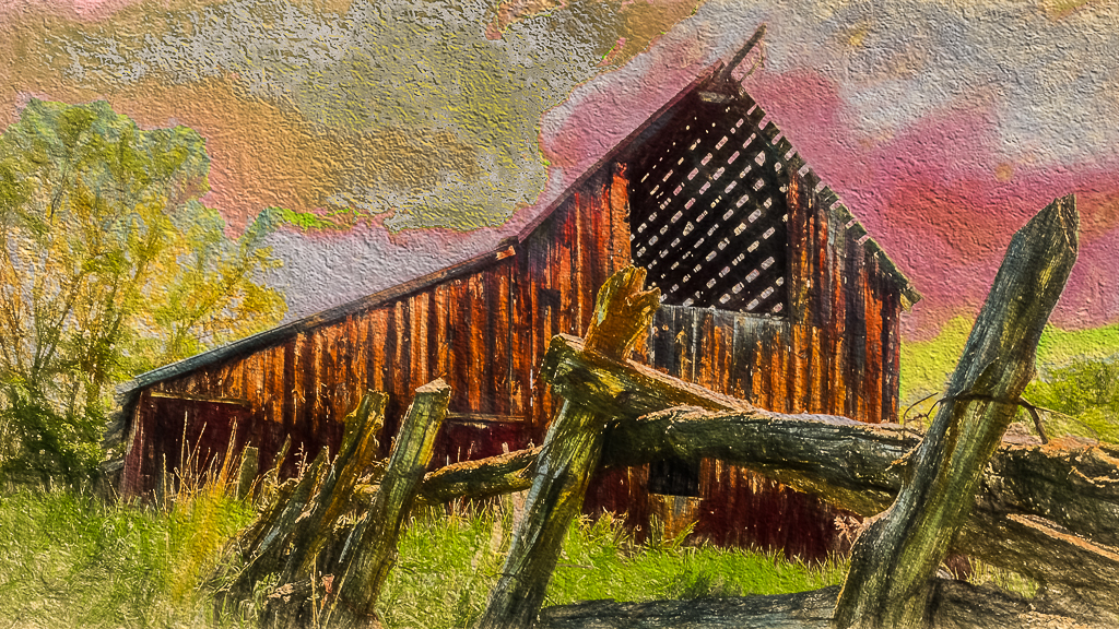
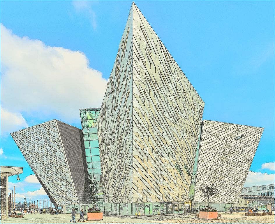
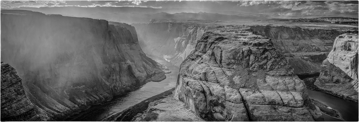
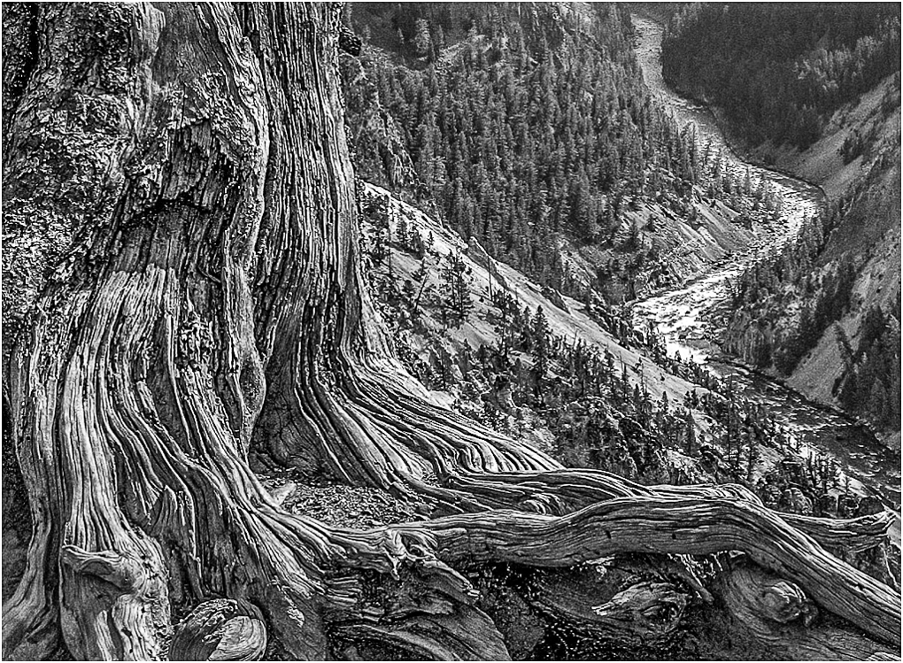
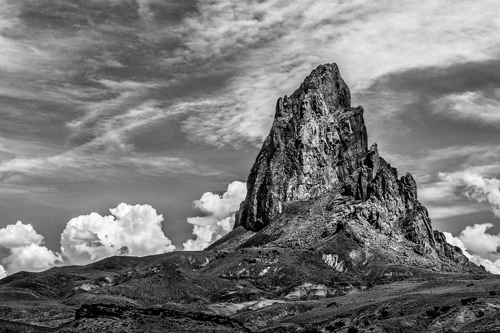
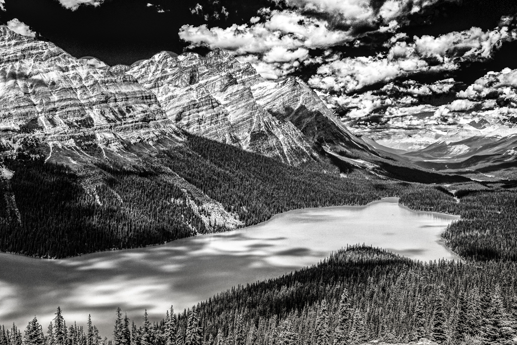
Fantastic! I wish it was mine.
My eye is lead very nicely from the grass to the building, water, mountain and sky.
Being picky, I might add a bit of detail to the building and mountains. |
May 6th |
| 64 |
May 19 |
Comment |
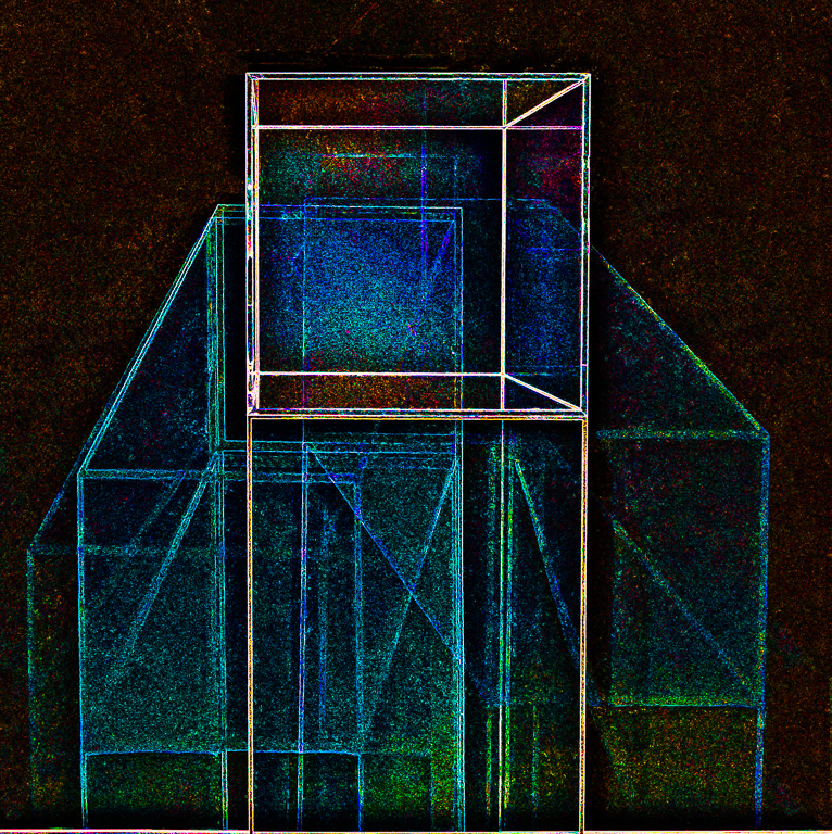
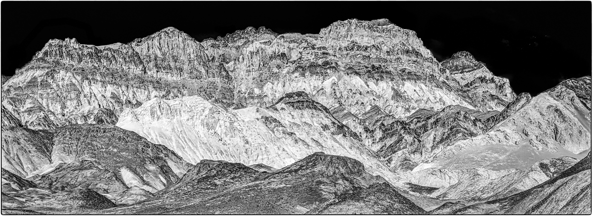
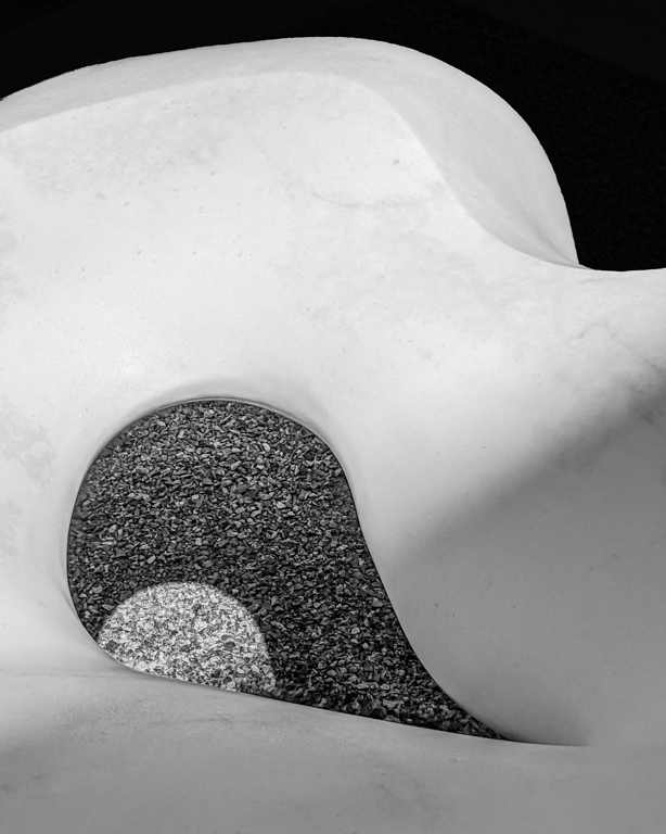
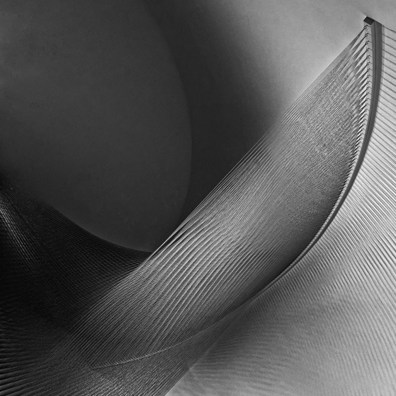
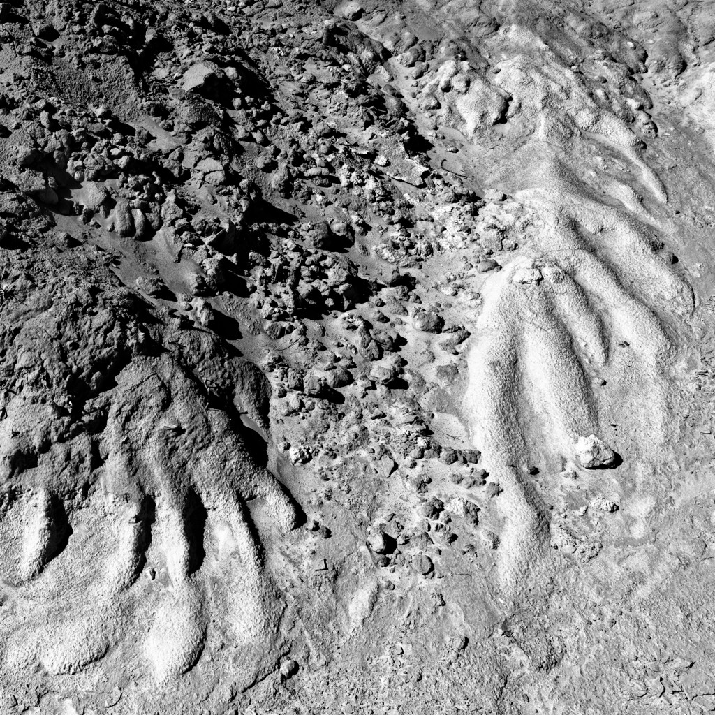
I like your composition and your x-ray effect is interesting, but I think I would prefer other variations reducing the contrast to reveal more detail in both the light and dark areas.
Early each Spring, I have calla lilies in my AZ yard, but only white ones. My photography is limited though because my wife won't let me cut them. I think I'll try making Photoshop color variations. |
May 6th |
6 comments - 2 replies for Group 64
|
14 comments - 8 replies Total
|