|
| Group |
Round |
C/R |
Comment |
Date |
Image |
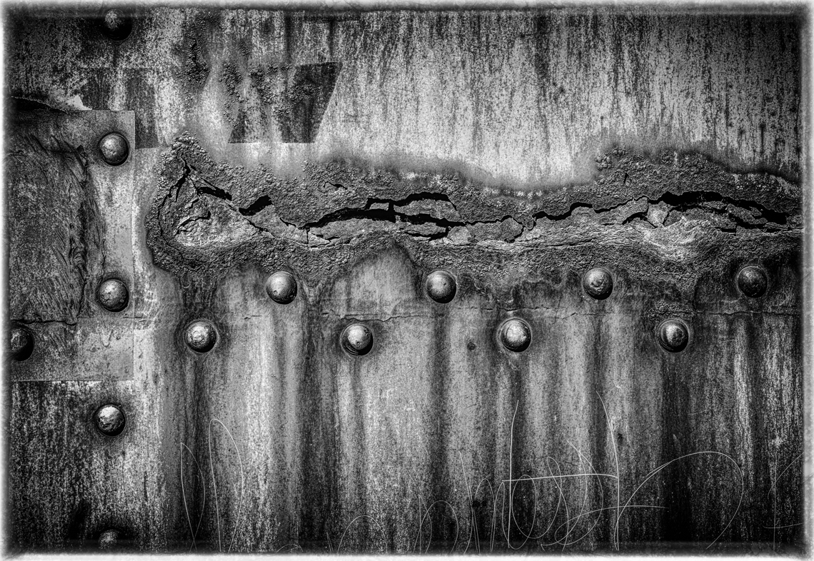
| 18 |
Mar 19 |
Comment |
You had a good vision. I'm sure if someone saw you capturing your photograph they would have wondered, "Why"?
I think you adjusted the Topaz sliders just right. Perhaps the horzontal line at the top could be darkened though.
I don't think either of us are taking too many pills, but I am often thought of that way.
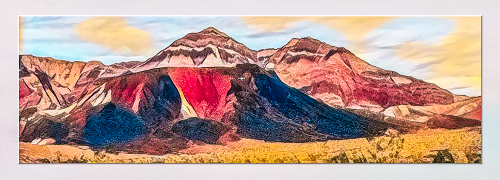
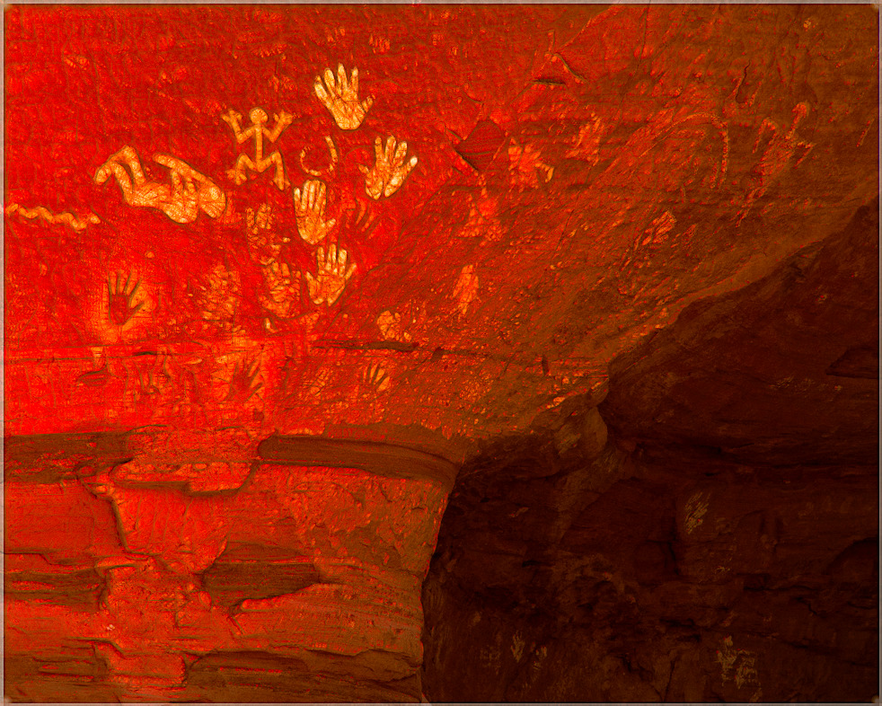
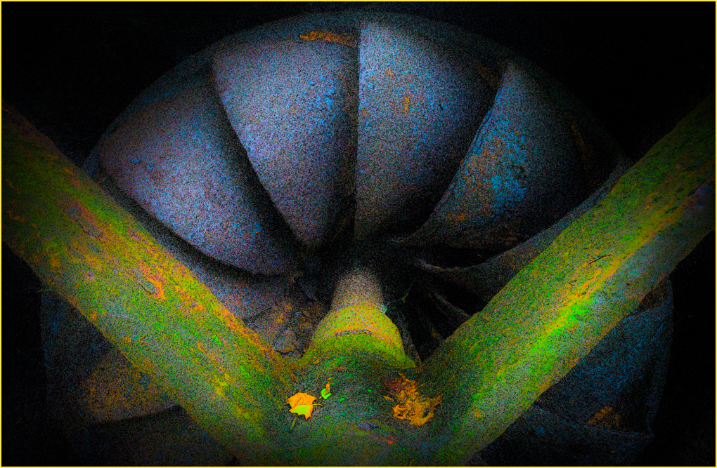
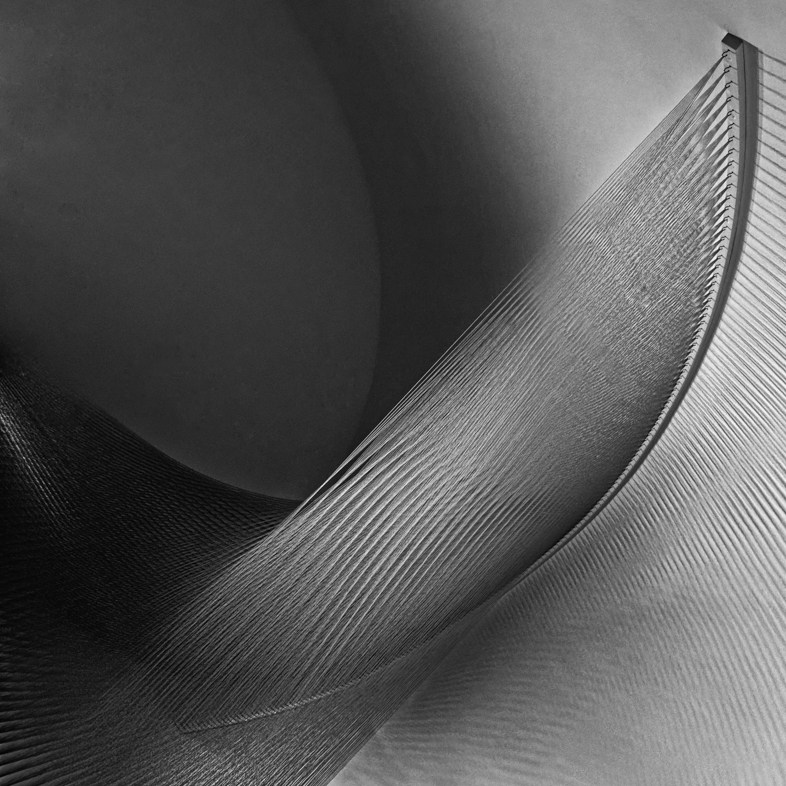
This is one case that I don't suggest straightening the image.
Good work. Keep having fun with your photos. |
Mar 3rd |
1 comment - 0 replies for Group 18
|
| 20 |
Mar 19 |
Reply |
Thanks for all the great suggestions. The white can easily be painted in but the size and placement will be tricky for me. It should be an interesting transformation.
My excuse for often not attending to the other details you mention is that I have too many ideas, many thousands of unprocessed images and even more that need to be re-edited because my software and skills have improved. I thank you and others in this Group for pointing out details and encouraging me to attend to them and overcome my laziness.
Just now I was working on my 2013 trip to Arches NP with 300 high ISO images that i'll edit in DxO to eliminate the noise.
I have all my images for the rest of this year ready to submit, but I will have another look at them for details to polish up.
|
Mar 21st |
| 20 |
Mar 19 |
Reply |
Thanks. I hope to one day be knowledgeable enough in design, color and composition to create truly original works of art with oil paints. I recently took one class using acrylics but I wasn't given enough supplies, so it was frustrating. One day, I will probably try again with a different teacher. |
Mar 4th |
| 20 |
Mar 19 |
Comment |
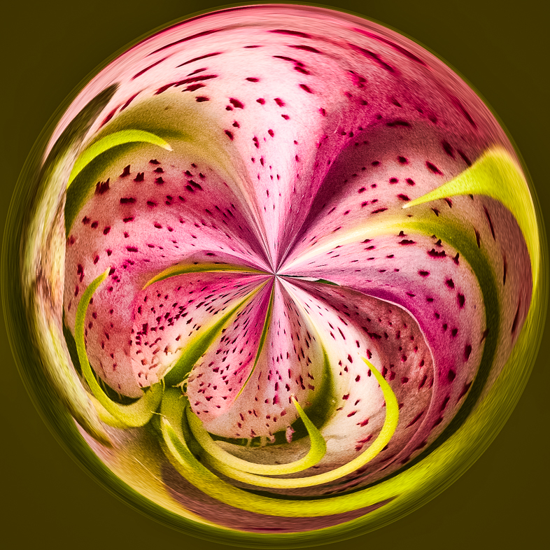
Gosh! I think this is beautiful in every way. |
Mar 3rd |
| 20 |
Mar 19 |
Comment |
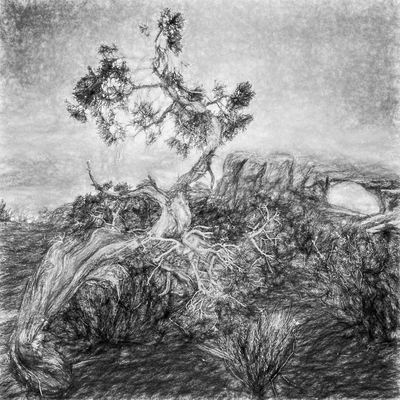
Fantastic! You make excellent use of your artistic talents while most of us cheat and use filters to create painterly effects. Do you use a tablet?
I like the composition and think your rotation and placement of the tree is optimal. The grass grounds it well but I would like to see a very small section near the bottom left, darkened a tad to make it perfect to my eye. Sorry, I can only score you a 99 out of 100.
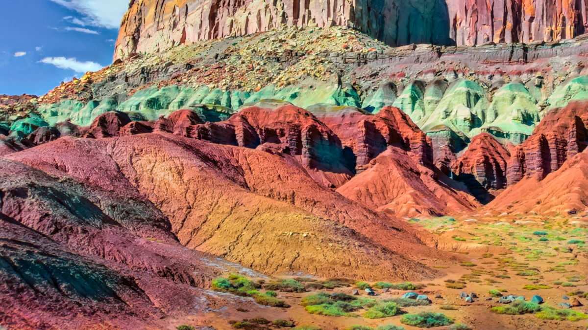
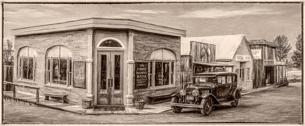
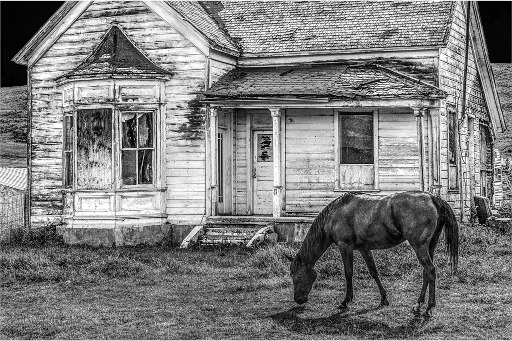
Please tell me the specific location of the ghost town. |
Mar 3rd |
| 20 |
Mar 19 |
Comment |
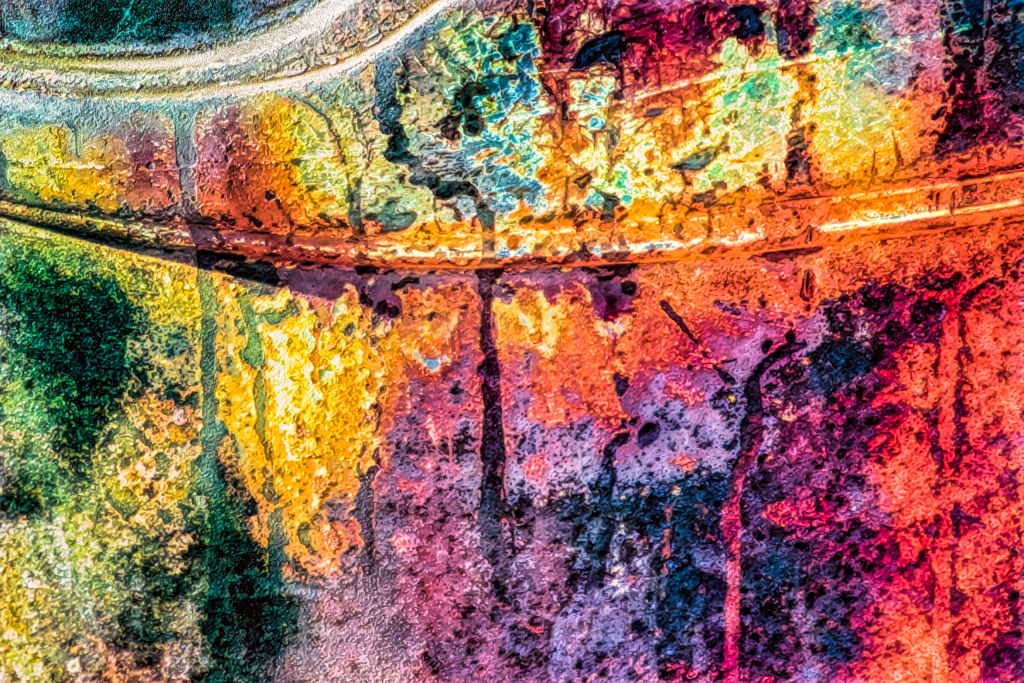
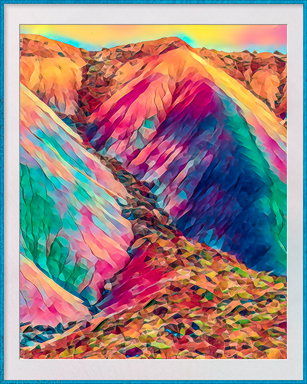
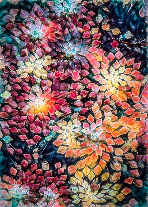
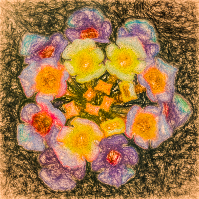
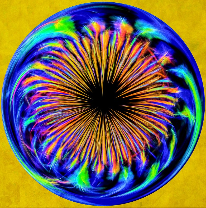
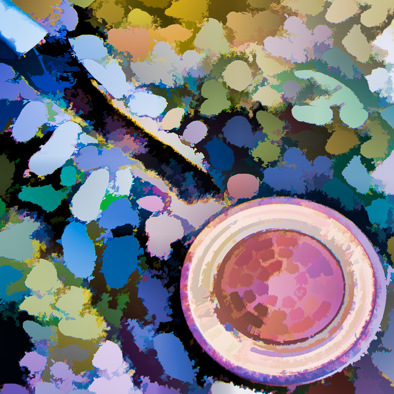
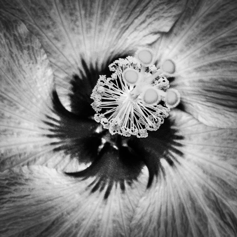
I like your composition and choice of a rick saturated color.i find the bright green and yellow area distracting though and suggest coloring it to blend with the nearby colors. |
Mar 3rd |
| 20 |
Mar 19 |
Comment |
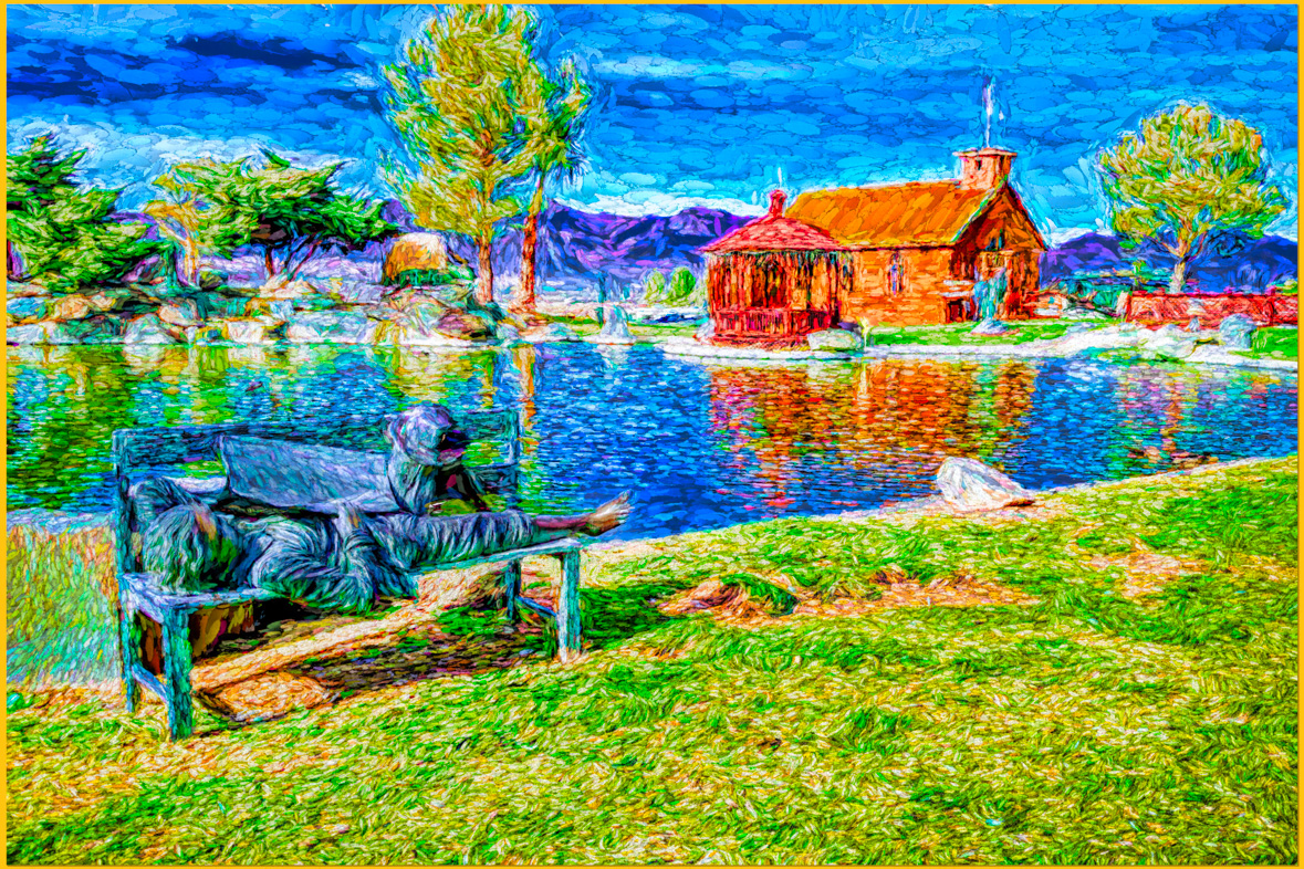
I think your vision resulted in an amazingly pleasing transformation. However, while the walkers are the main focus, my eye is distracted by the third object in the center and its shadow emphasizes it to me. I suggest cloning it out. |
Mar 3rd |
| 20 |
Mar 19 |
Comment |
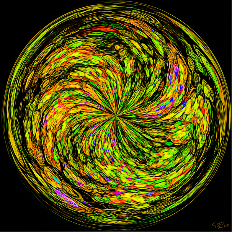
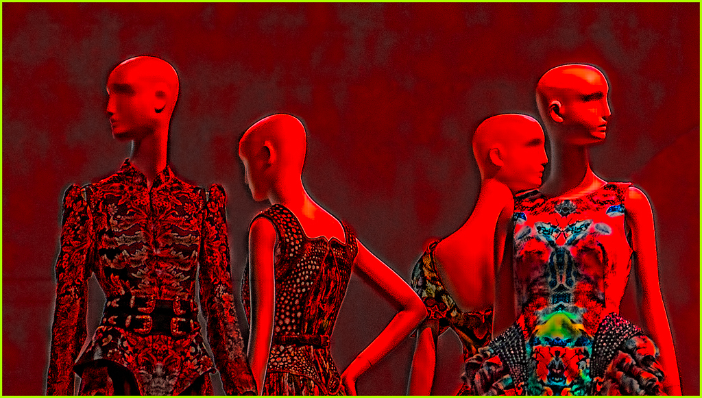
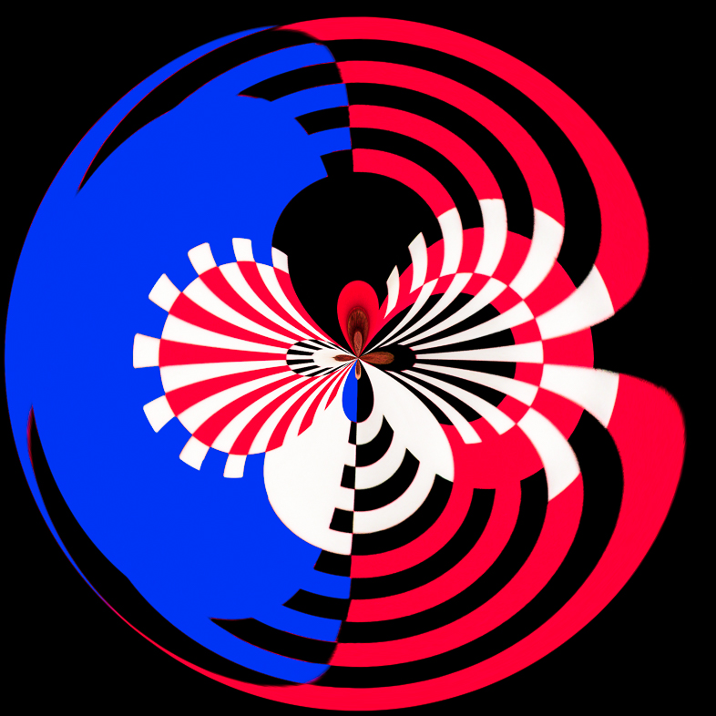
Composites generally don't appeal to me, but I think yours is excellent. Your creative vision shines through to me. I like the composition, your choice of subjects, colors, sense of movement, texture, all but one small thing. The object in the upper right corner is distracting to me and doesn't seem to fit all the other elements. Perhaps, it's the round shape? |
Mar 3rd |
5 comments - 2 replies for Group 20
|
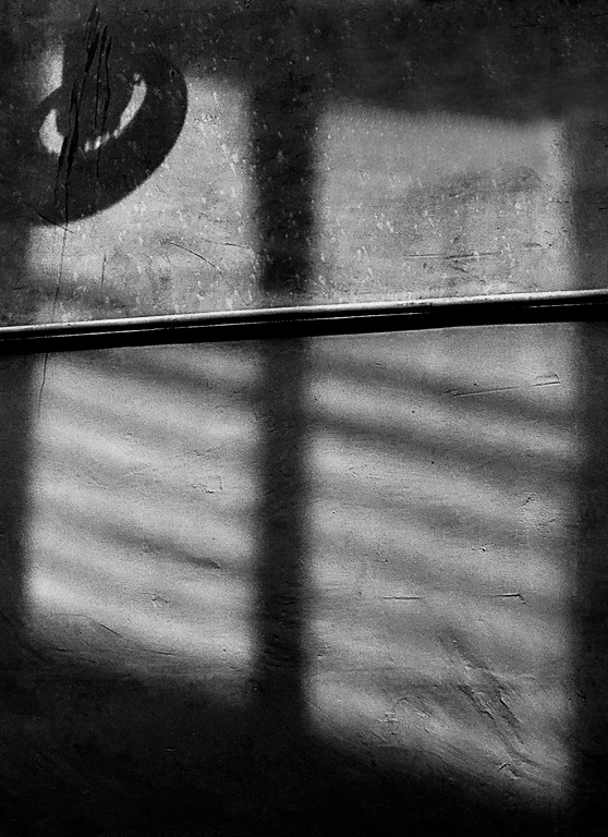
| 64 |
Mar 19 |
Comment |
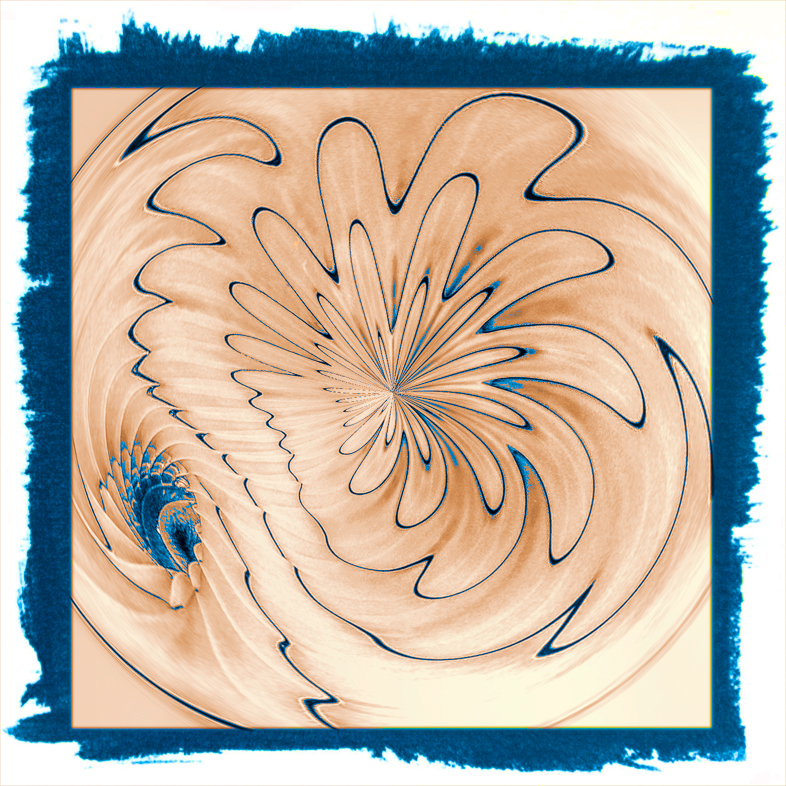
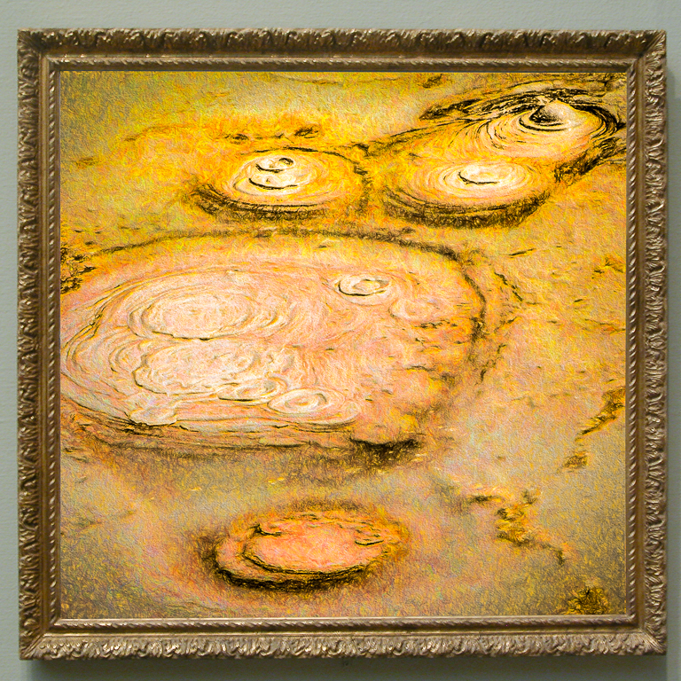
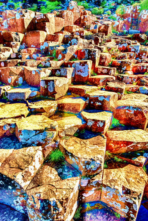
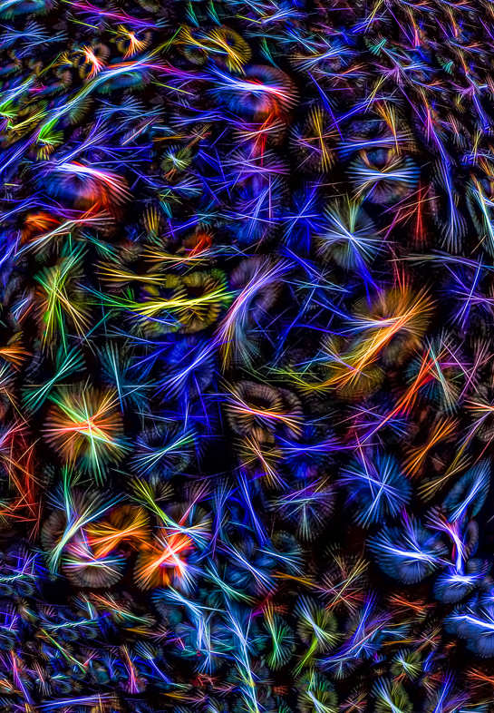
My eye is drawn to the bottom right of the original image, because it breaks the pattern. Nevertheless, Its overall complexity disturbs my senses. I very much like Stan's cropping idea that creates a focus on a much less complex pattern, but maybe a crop that retains the original bottom right would be interesting too. |
Mar 21st |
| 64 |
Mar 19 |
Reply |
I rarely enter competitions any more because so many judges follow the rules. My wife gets aggravated with me because I make daily decisions based on what I think is best. Her response is always, "No one does it that way." i remember once when I agreed with her. |
Mar 11th |
| 64 |
Mar 19 |
Reply |
My attempt to increase contrast and detail, I believe, increased the grain. I need more practice at that and will continue to work on this image although I think the grain may be minimized in a print. Do you think that is likely the case? I have little experience printing. Can others also comment on apparent grain or noise being reduced by printing? |
Mar 9th |
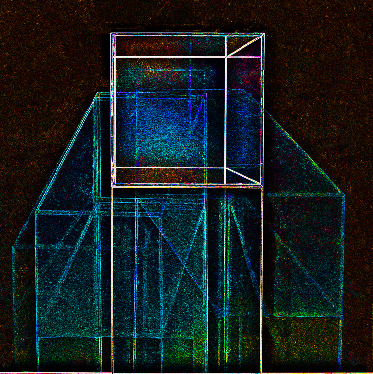
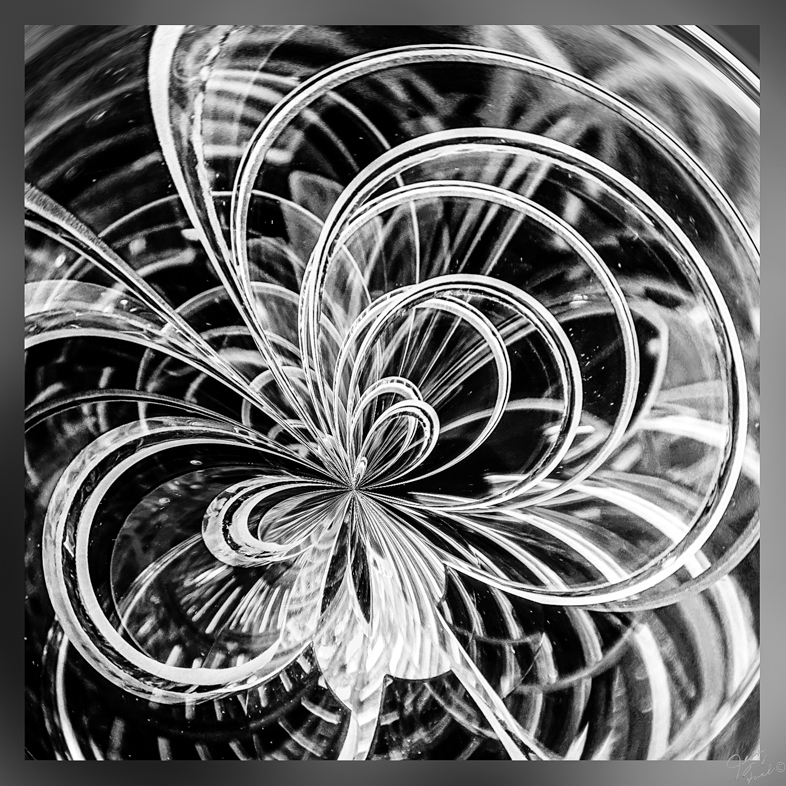
| 64 |
Mar 19 |
Reply |
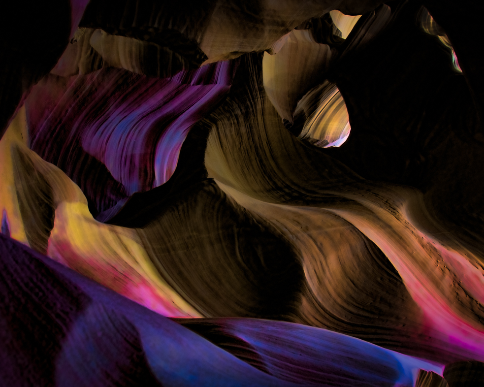
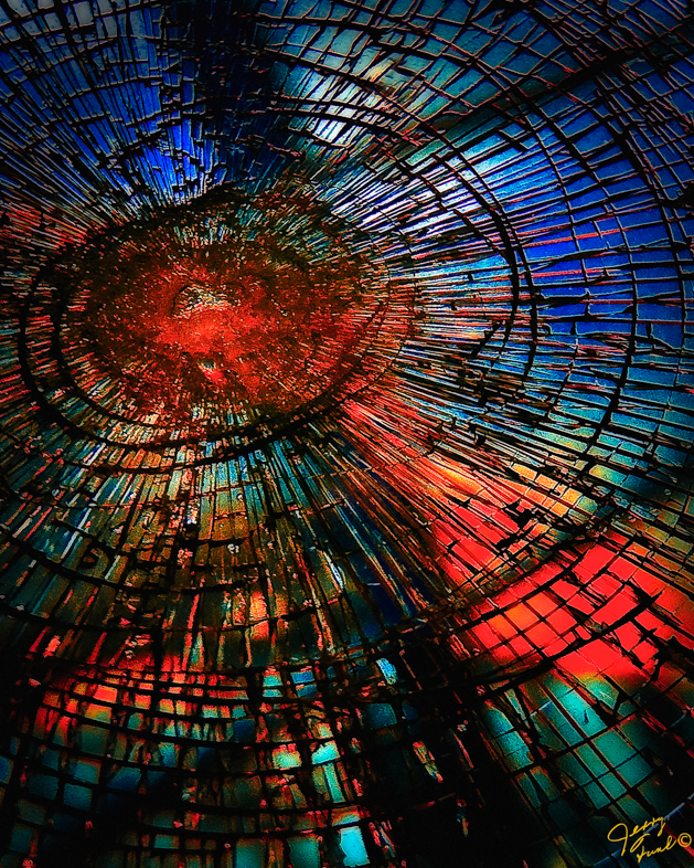
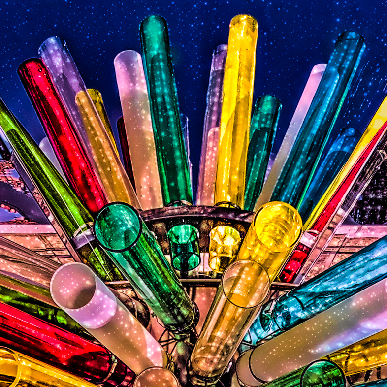
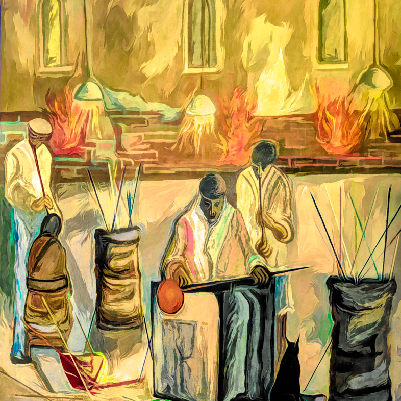
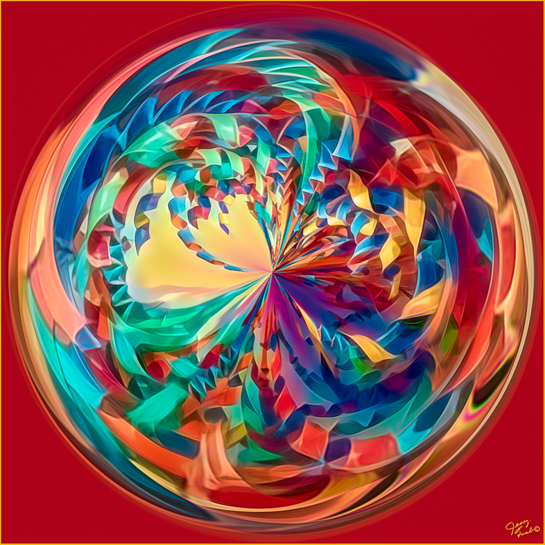
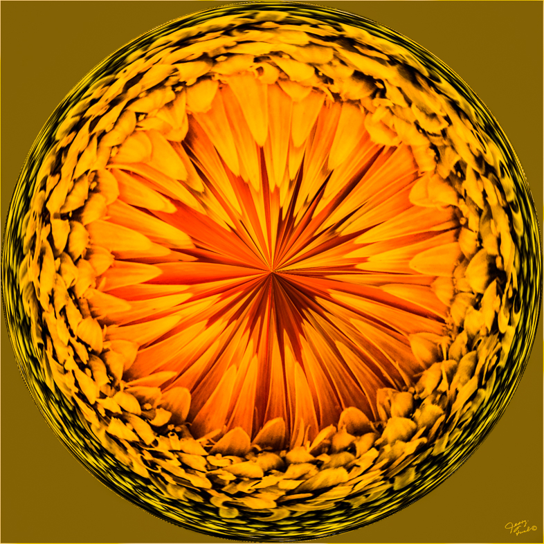
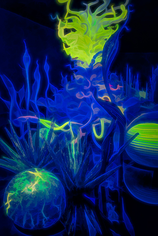
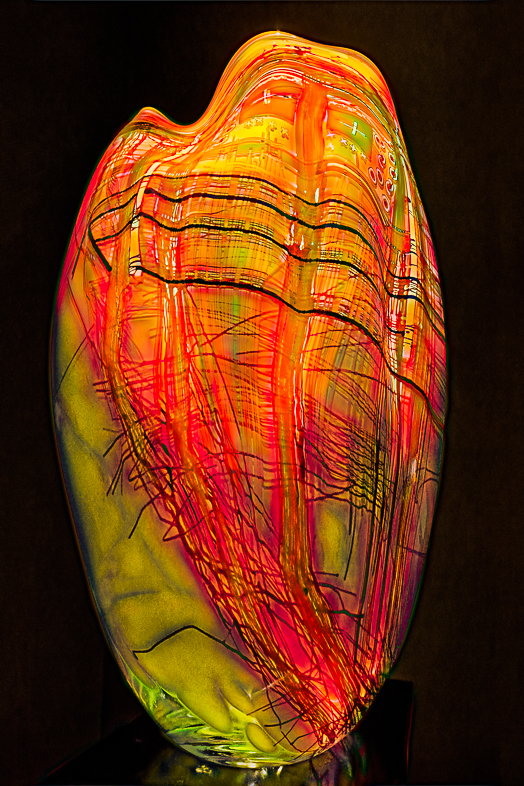
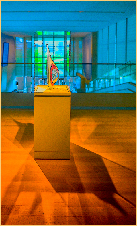
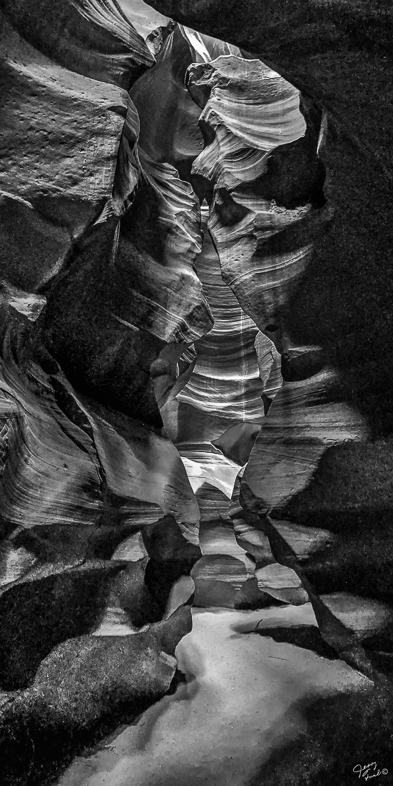
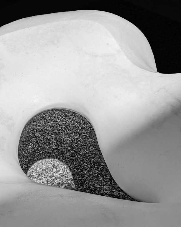
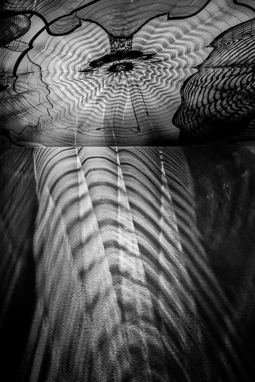
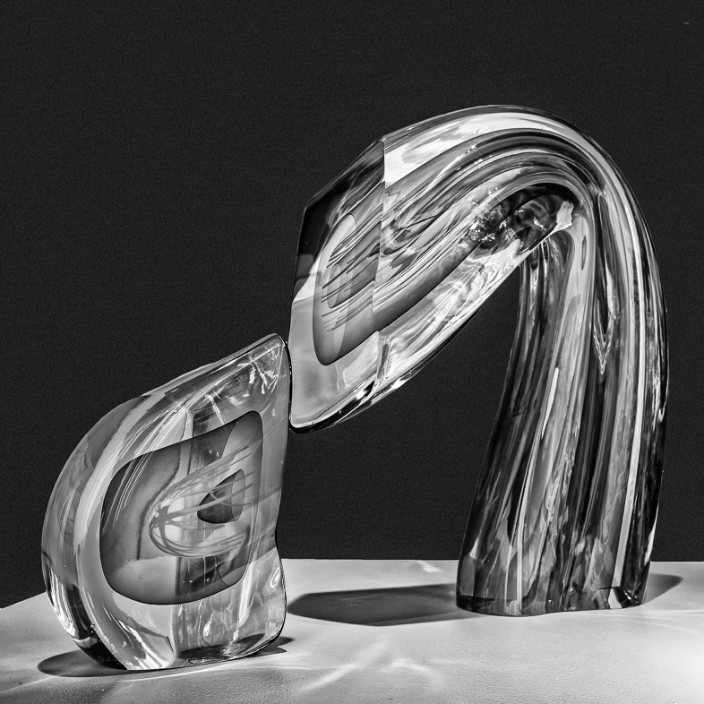
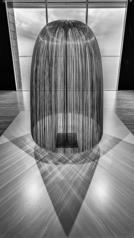
Thank you. I think it's very important to always show the original and technical details. Without that, I think we lose an important part of our learning opportunity here.
A couple years ago before joining this group, I rarely considering monochrome variations. Now, when I see graphic forms, it's my first consideration because the colors ordinarily are unimportant. I think this is the exception because of the brilliant glass.
I am planning to print the cropped color version 2'x2' on glossy aluminum for my home and maybe sales. Since it's Chihuly glass I will have to make some artistic changes to it before offering it for sale. Perhaps someone will want it 3'x3' as I have done in the past. |
Mar 9th |
| 64 |
Mar 19 |
Comment |
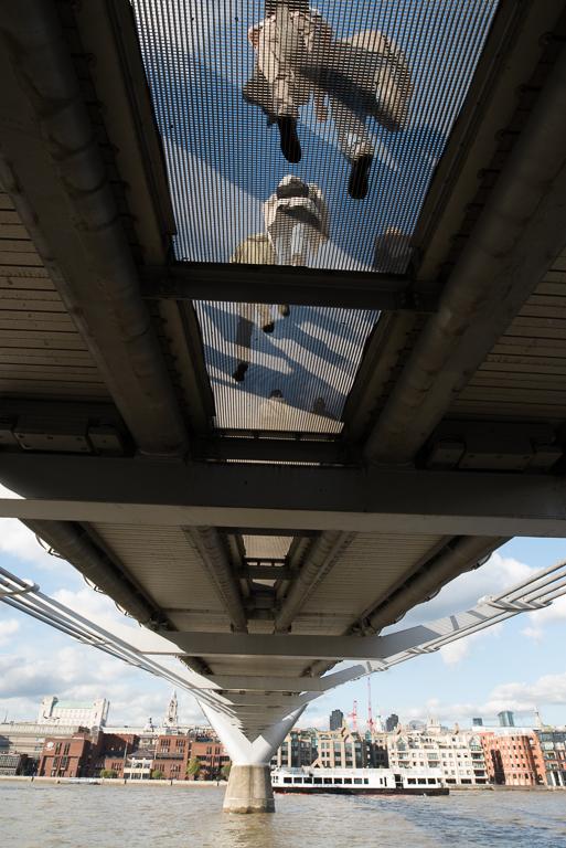
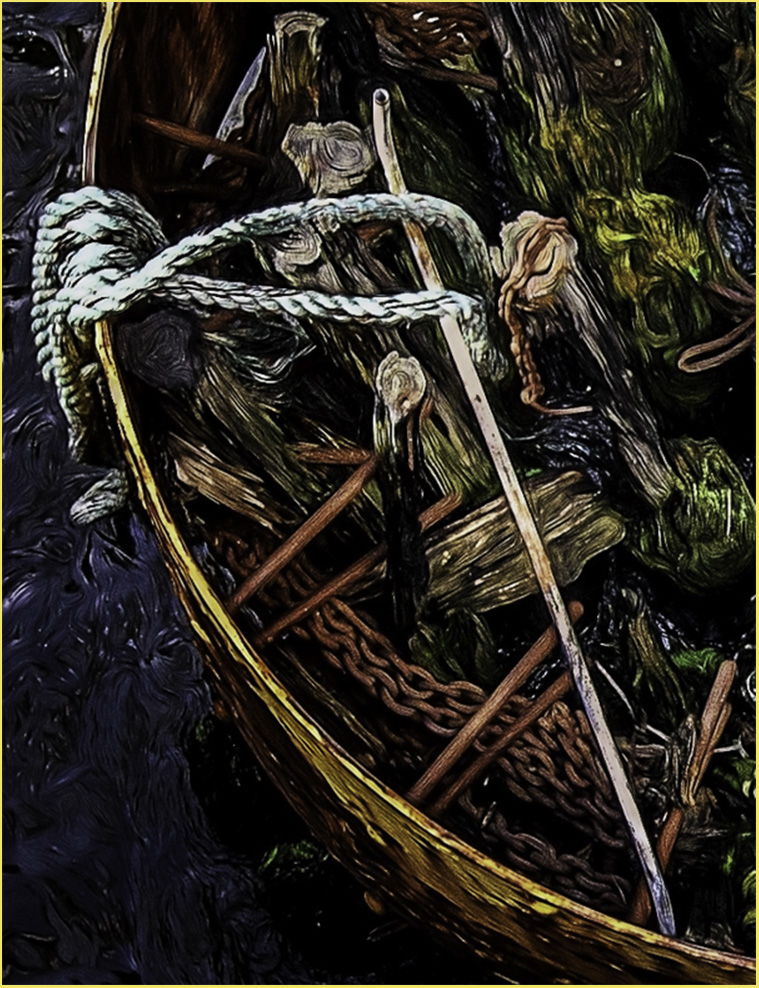
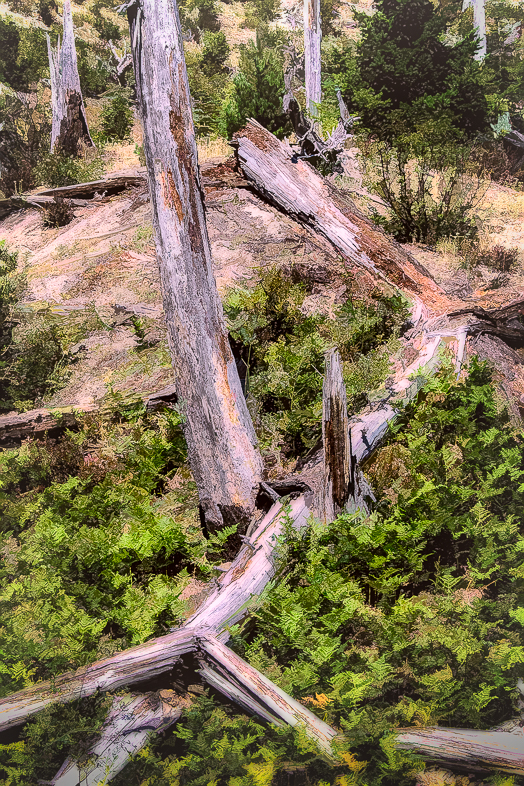
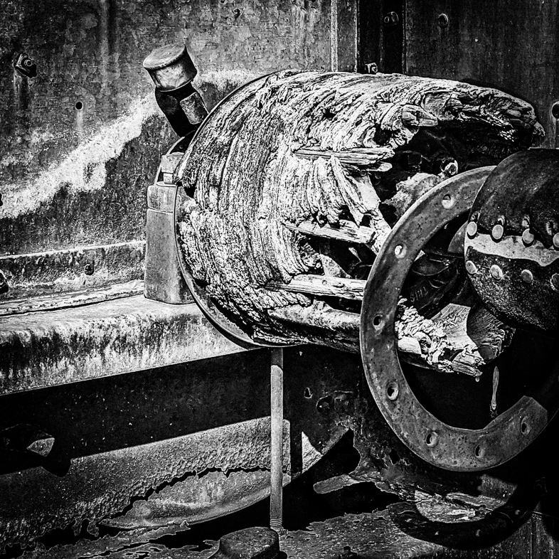
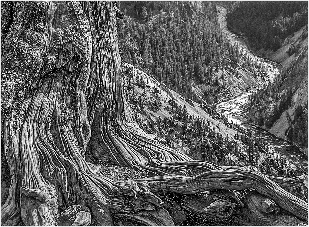
I think it's an excellent subject for your theme, and very appealing to me. I have two problems with it though. The rope can be straightening by first rotating counter-clockwise to straighten the right rope so the true middle of the image is straight. Then the converging lines caused by pointing the camera upwards can be corrected. Perhaps you have a second image in which the base of the tree is not cut off. |
Mar 8th |
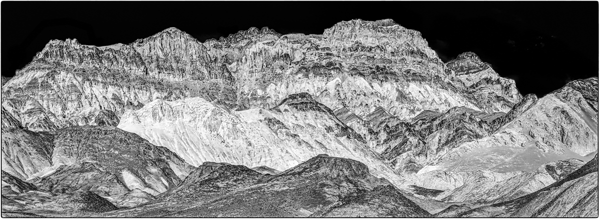
| 64 |
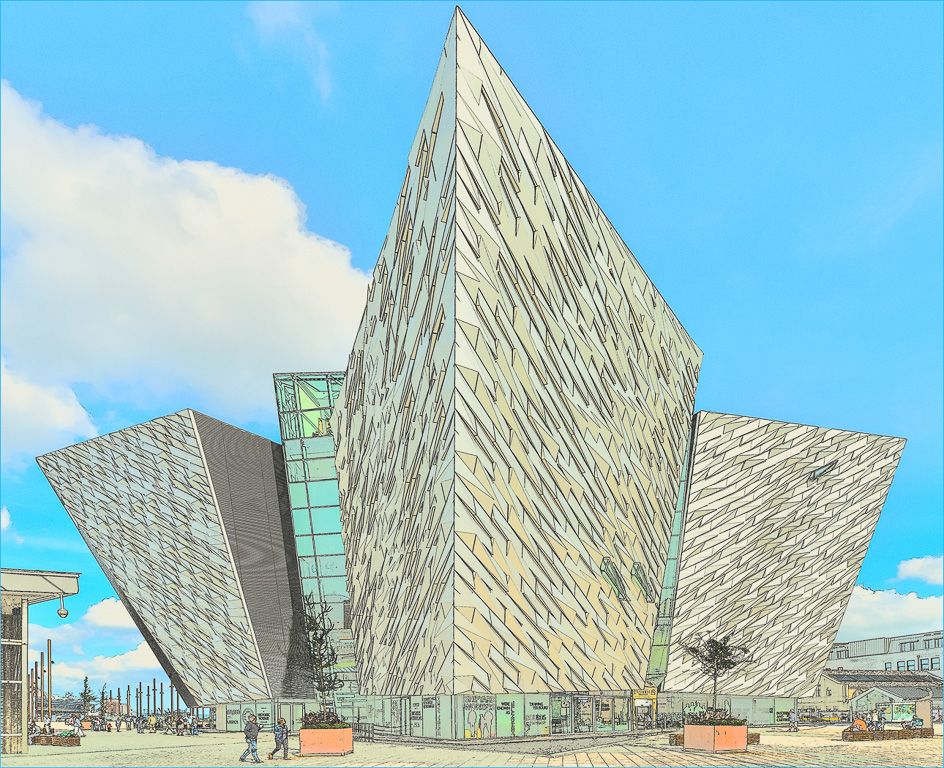
Mar 19 |
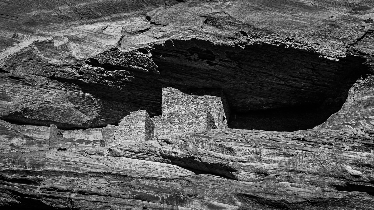
Comment |
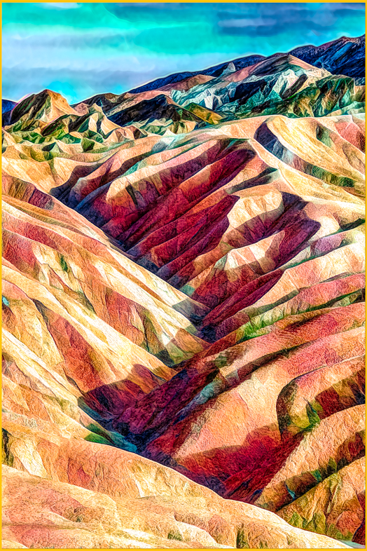
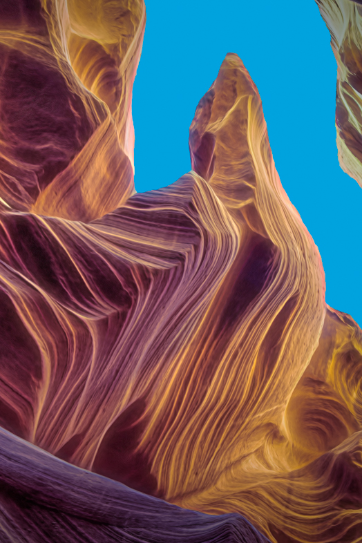
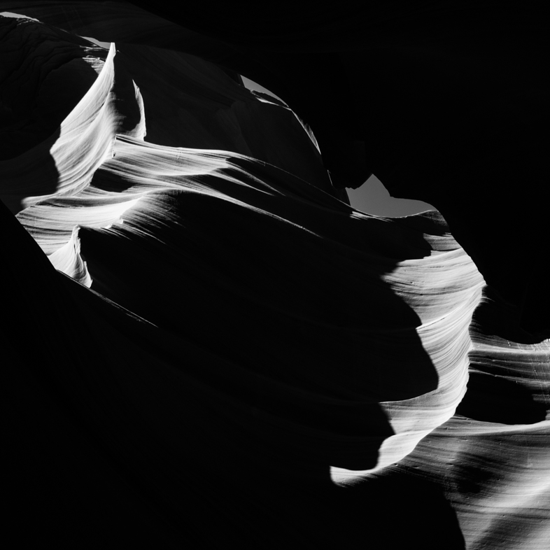
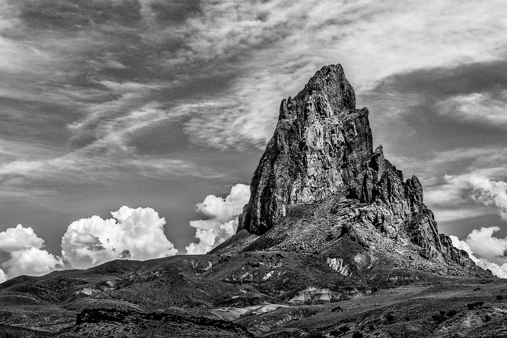
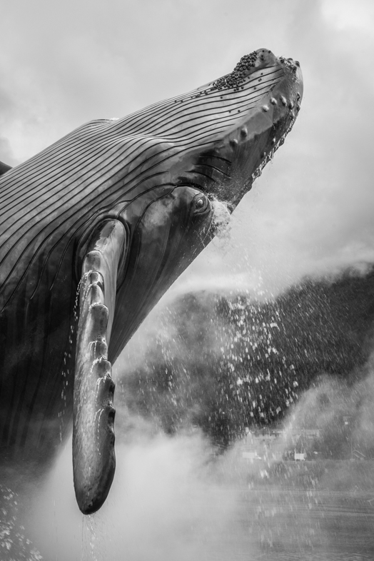
Very dramatic! I think this is the best version i've ever seen of this landmark. |
Mar 8th |
| 64 |
Mar 19 |
Reply |
Thanks, I agree. Sometimes, i'm too quick to choose a square format. |
Mar 8th |
| 64 |
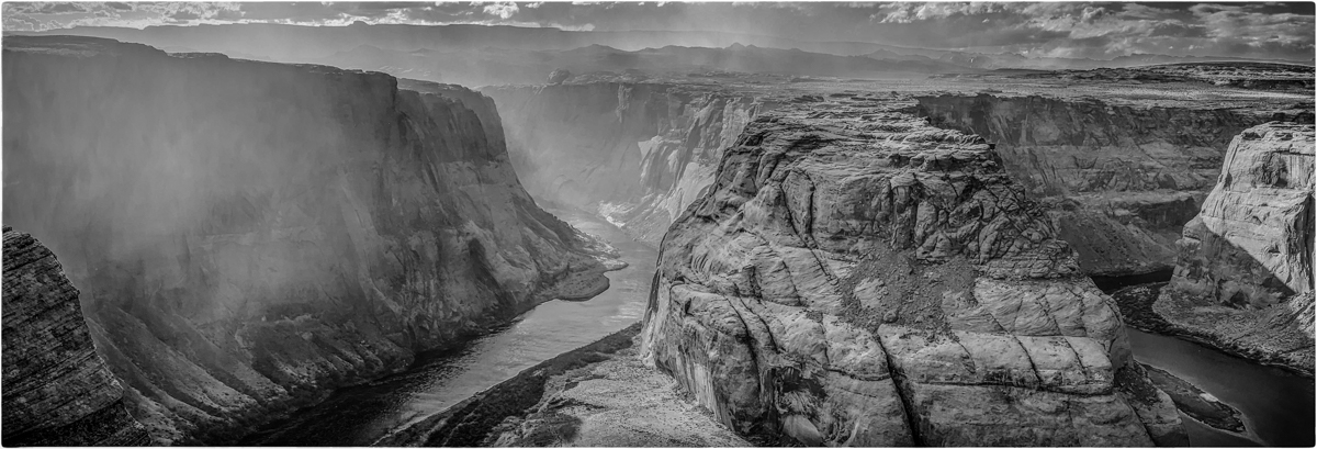
Mar 19 |
Comment |
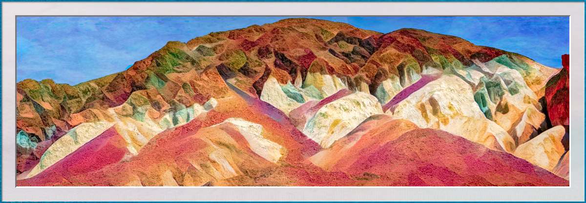
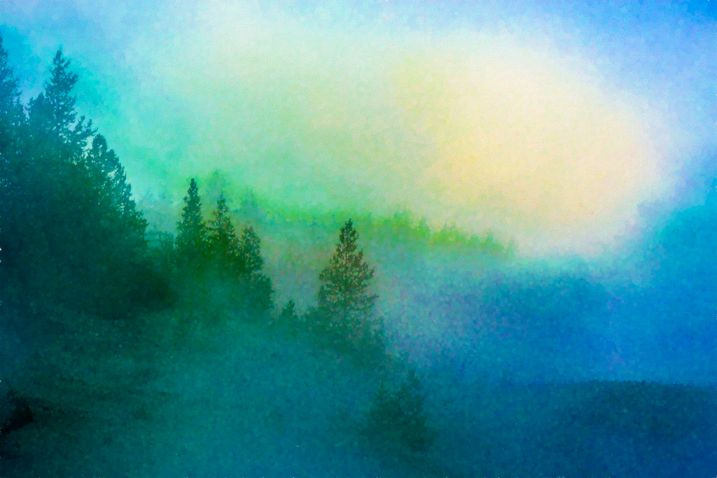
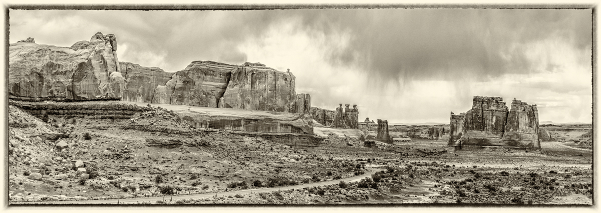
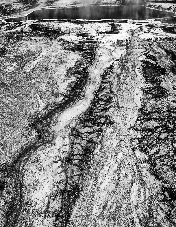
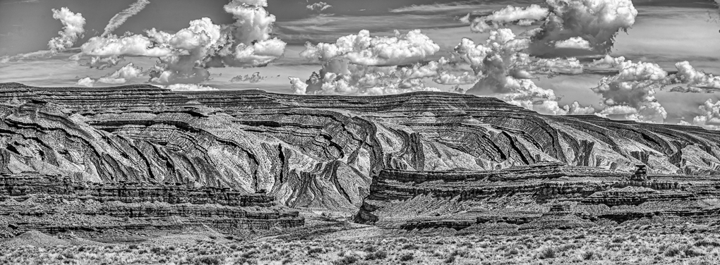
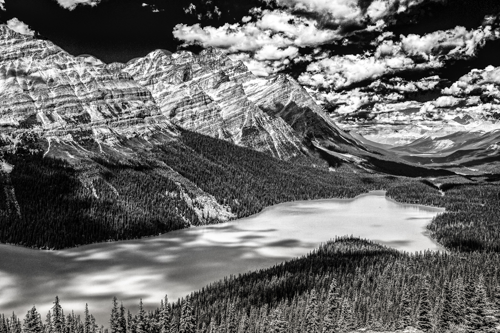
I enjoy the scene you presented, but in this case having the horizon cutting the image in half doesn't work for me. if it was mine my first choice would be to crop the top of the clouds to emphasize the primordal feeeling. I would crop the bottom to emphasize the clouds as a second image. |
Mar 6th |
| 64 |
Mar 19 |
Comment |
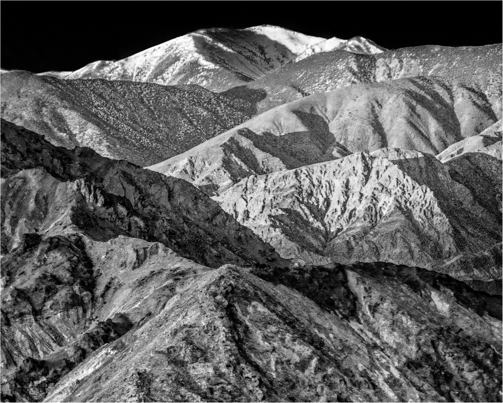
I really like your image. Your treatment of the background and sky are most appealing to me. I would even be happy with just the top half. I think excellent images often present the opportunity to crop and get a second excellent image. |
Mar 6th |
| 64 |
Mar 19 |
Comment |
For me, the vignette sets your image slightly apart from my second choice #2. I would have also enjoyed seeing the full color version. |
Mar 6th |
6 comments - 4 replies for Group 64
|
12 comments - 6 replies Total
|