|
| Group |
Round |
C/R |
Comment |
Date |
Image |
| 20 |
Feb 19 |
Reply |
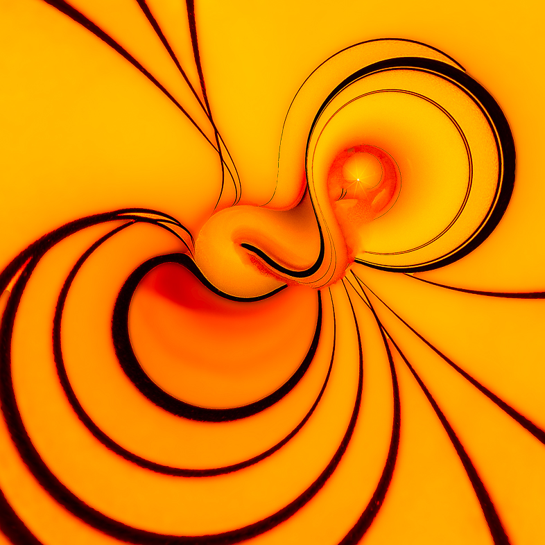
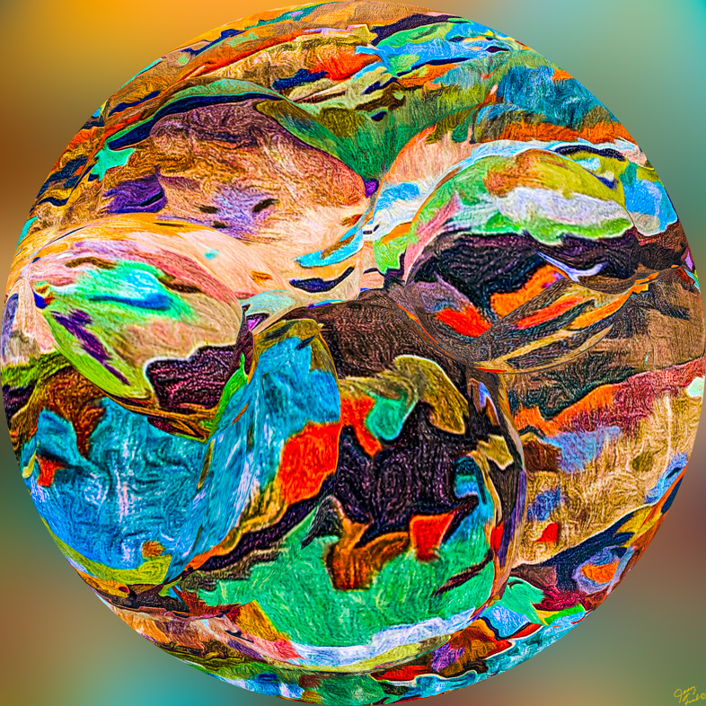
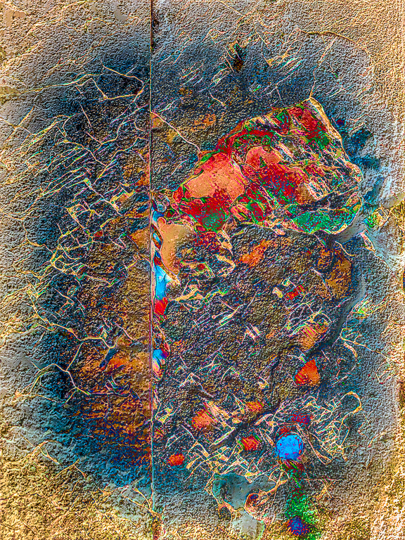
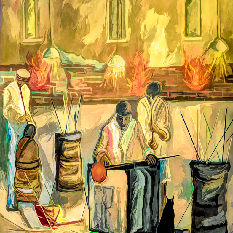
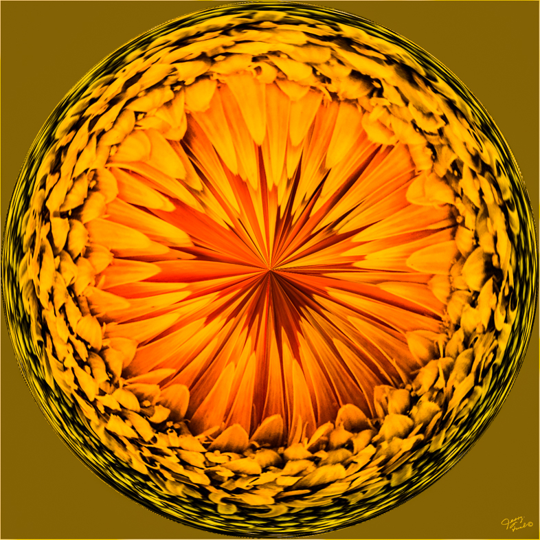
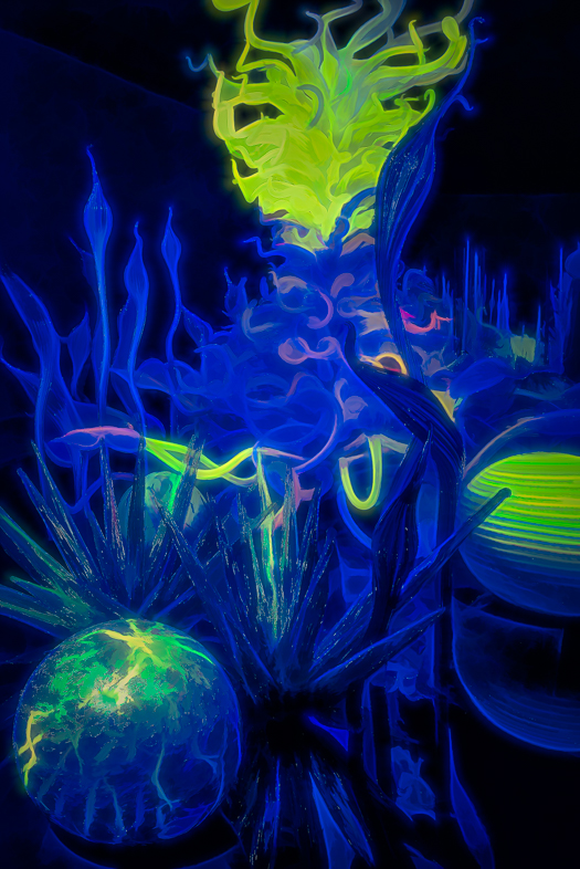
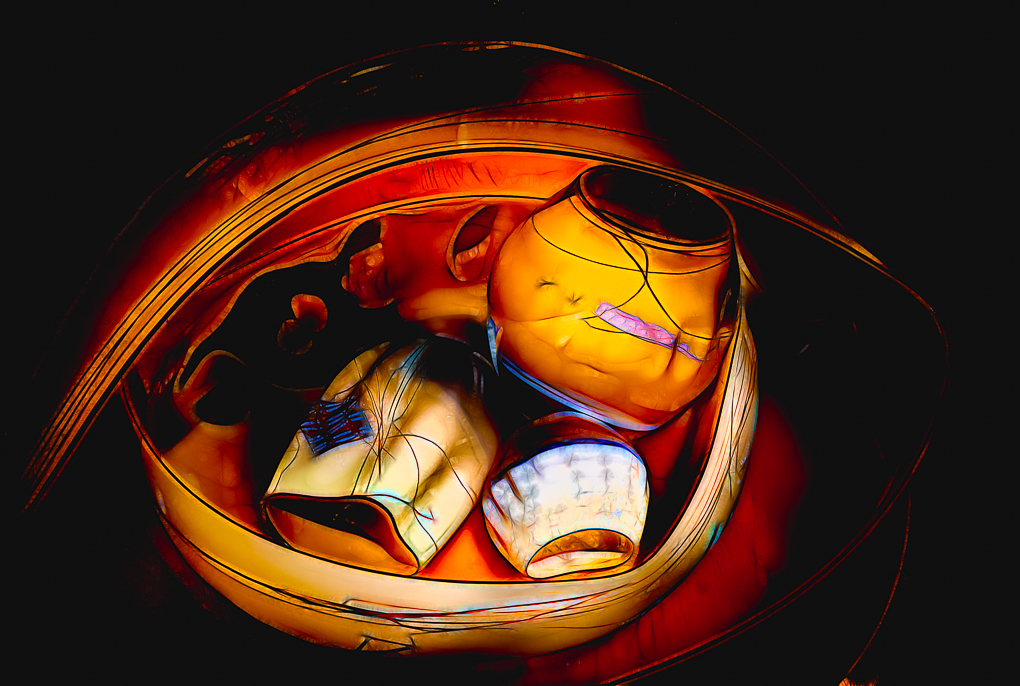
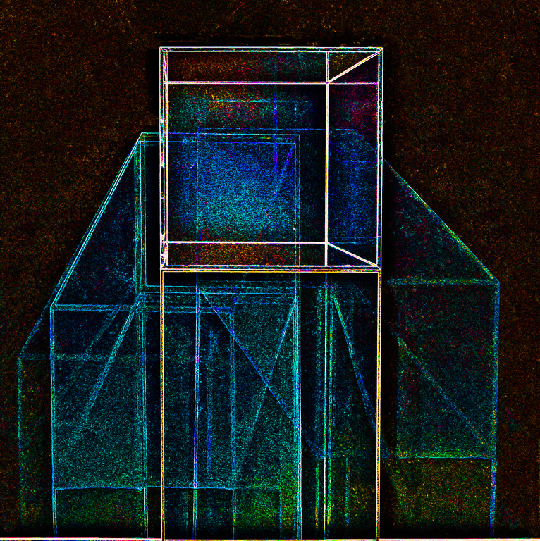
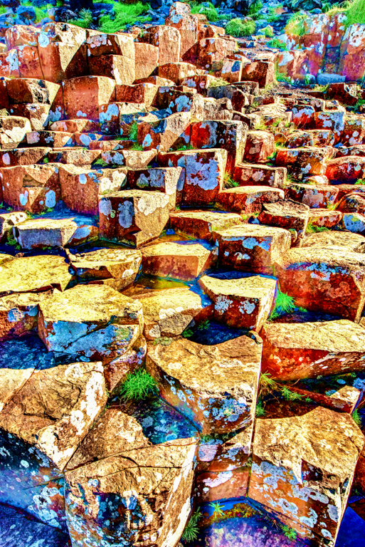
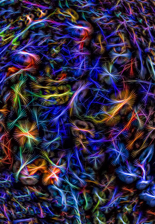
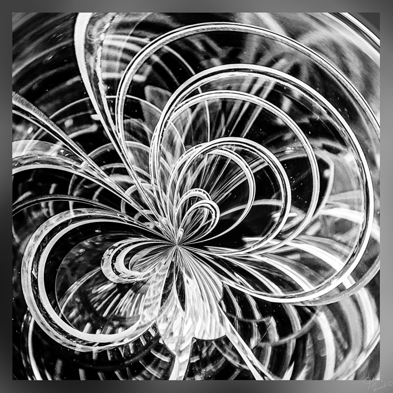
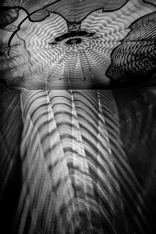
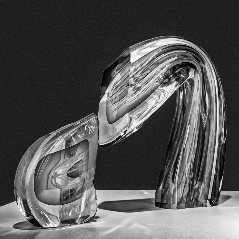
The designs are also glass. The red hot blown glob of glass is rolled on rods of various colors to create the abstract pattern. I manipulated the existing colors in Lightroom. I think working with a 14 bit image reveals colors that are not available with a 12 bit image when extreme changes are made. Of course, if Photoshop were used any color could have been painted on. |
Feb 22nd |
| 20 |
Feb 19 |
Comment |
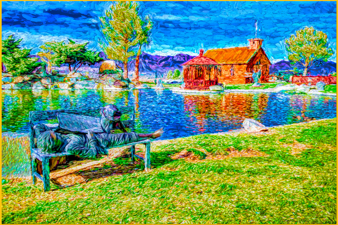
I have another suggestion. When you have a painterly image that you really like have it printed on canvas and hang it on your wall.
|
Feb 14th |
| 20 |
Feb 19 |
Comment |
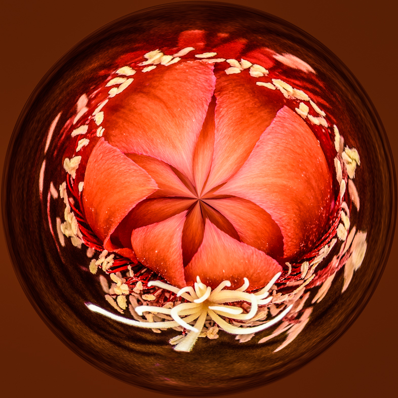
I may send him some of my creative images and ask him to comment.
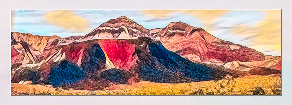
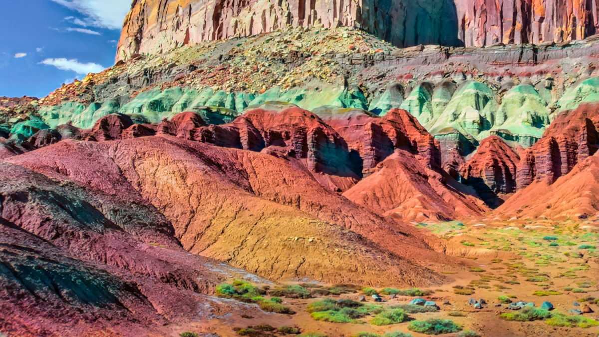
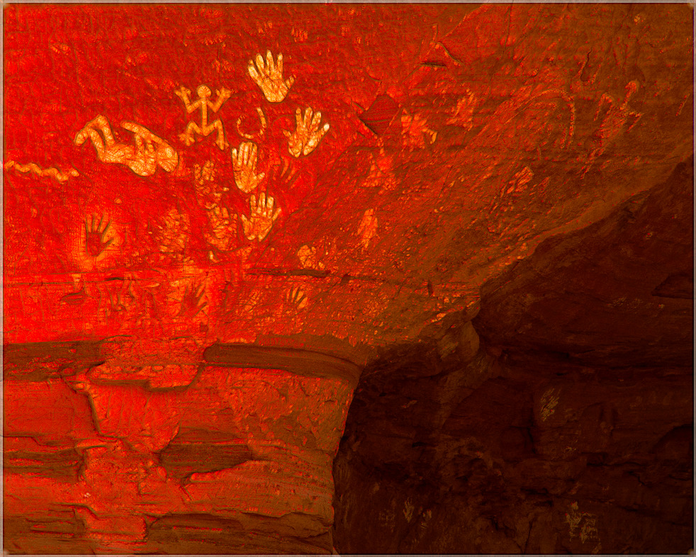
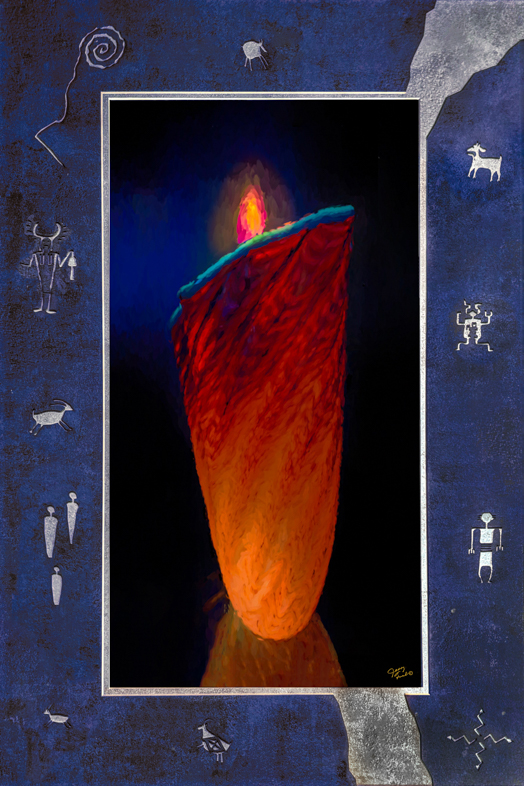
Since this series of his represents interpretations of Indian baskets, I doubt that elongating them fits his criteria. I have never seen a tall narrow American Indian basket.
Given his history of suing, he may not appreciate my interpretations of his art. I would expect to hear a warning to not sell it, even if I legally have copyrights. |
Feb 10th |
| 20 |
Feb 19 |
Comment |
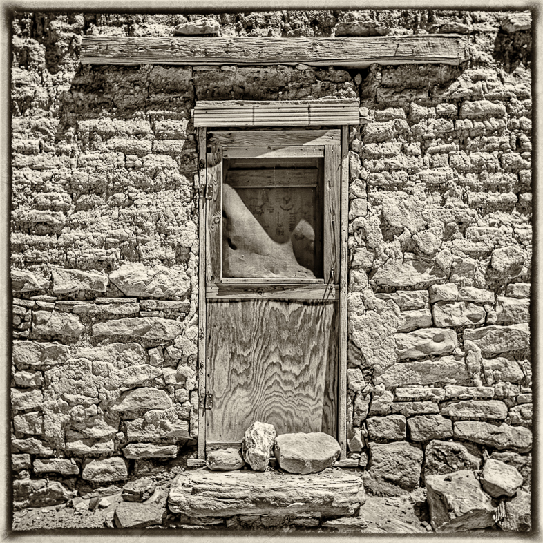
I think Content Aware Fill will satisfactorily fill the small bits of white for you after selecting all of them with Color Range and deselecting the white border. |
Feb 9th |
| 20 |
Feb 19 |
Comment |
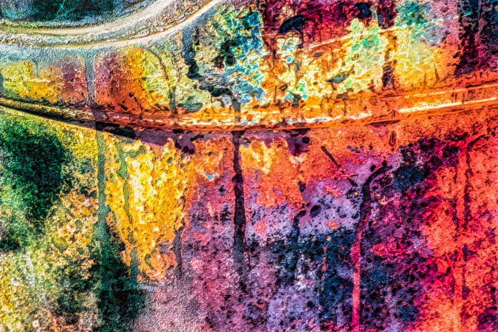
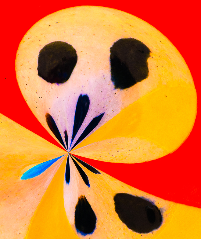
It took me a while to come up with a suggestion for you. Again, I looked to a color wheel for help.
Given red and green, the wheel suggests blue/green as a fill to replace the textured gray. Perhaps adding a bit of yellow to the light and/or dark green would also help, based on my interpretation of the color wheel.
I have no training in art, but whenever i've used a color wheel, i've been surprised and happy with the result. |
Feb 9th |
| 20 |
Feb 19 |
Reply |
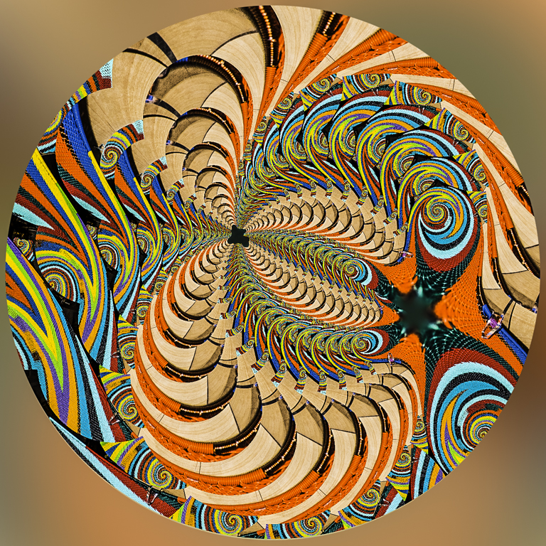
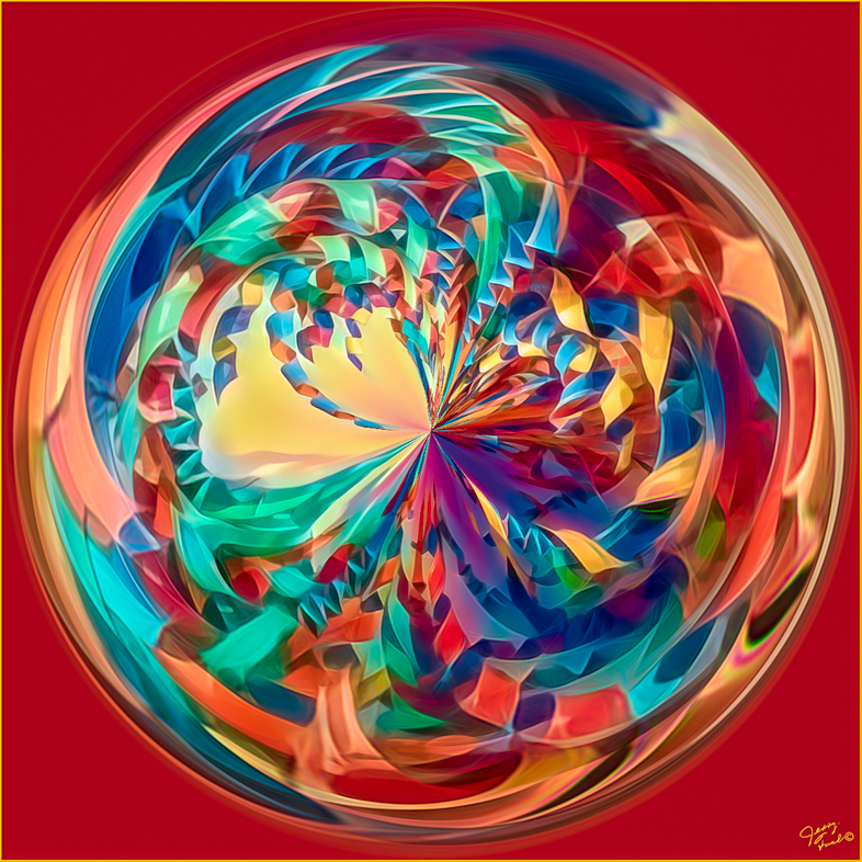
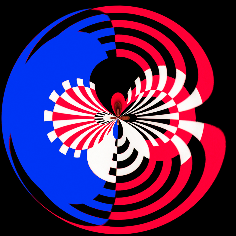
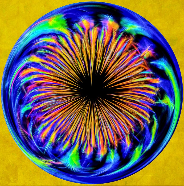
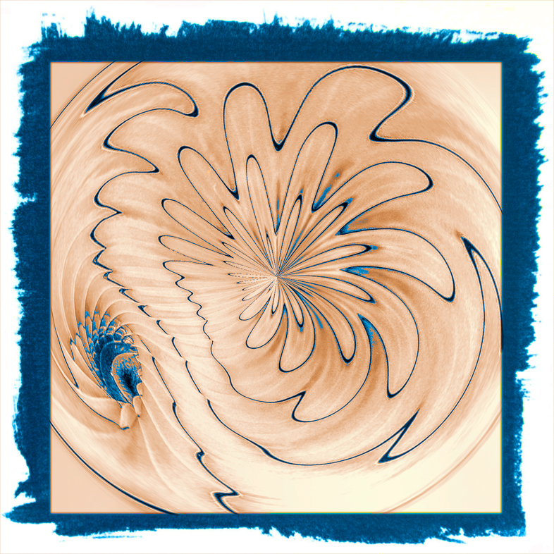
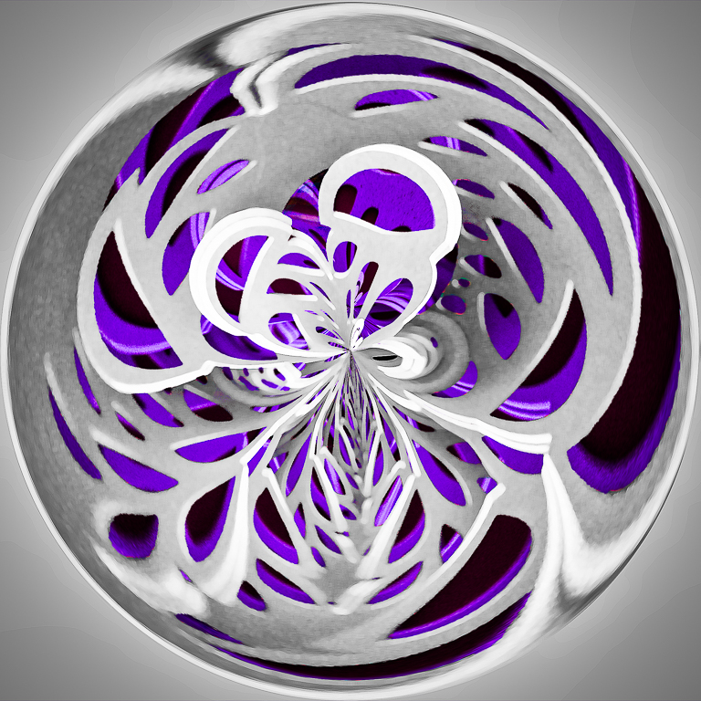
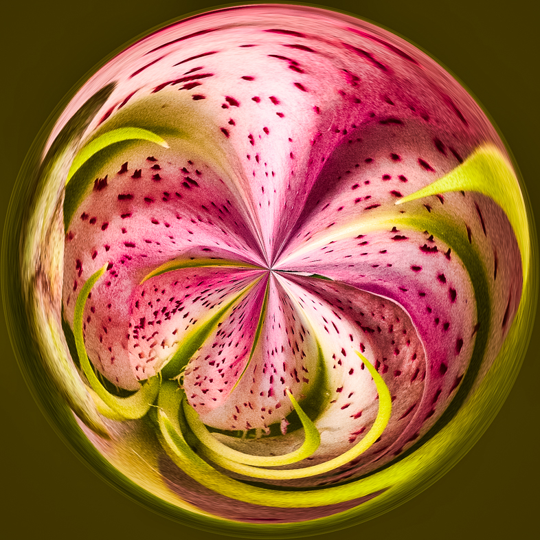
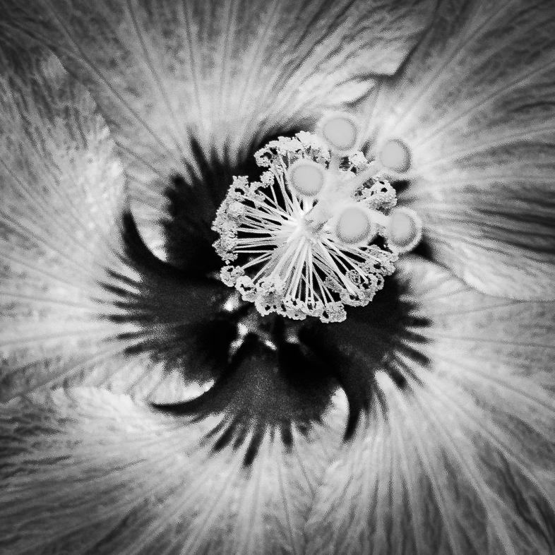
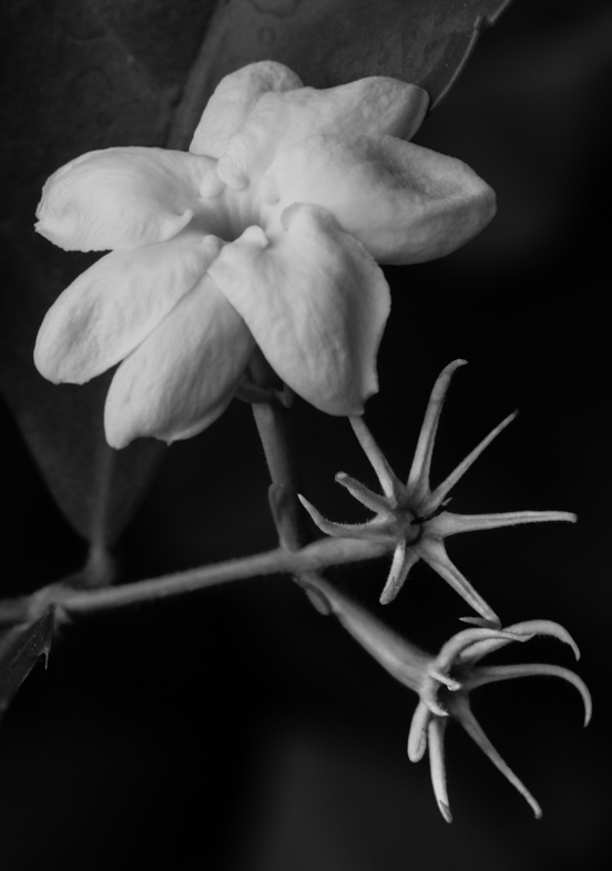
Gosh, that's an interesting idea.
I'm willing to try, but i'll Need to learn how to rotate precisely and shape the contours of a natural flower. It's sounding very difficult unless I do a simple Spirograph type pattern. What did you have in mind? |
Feb 7th |
| 20 |
Feb 19 |
Comment |
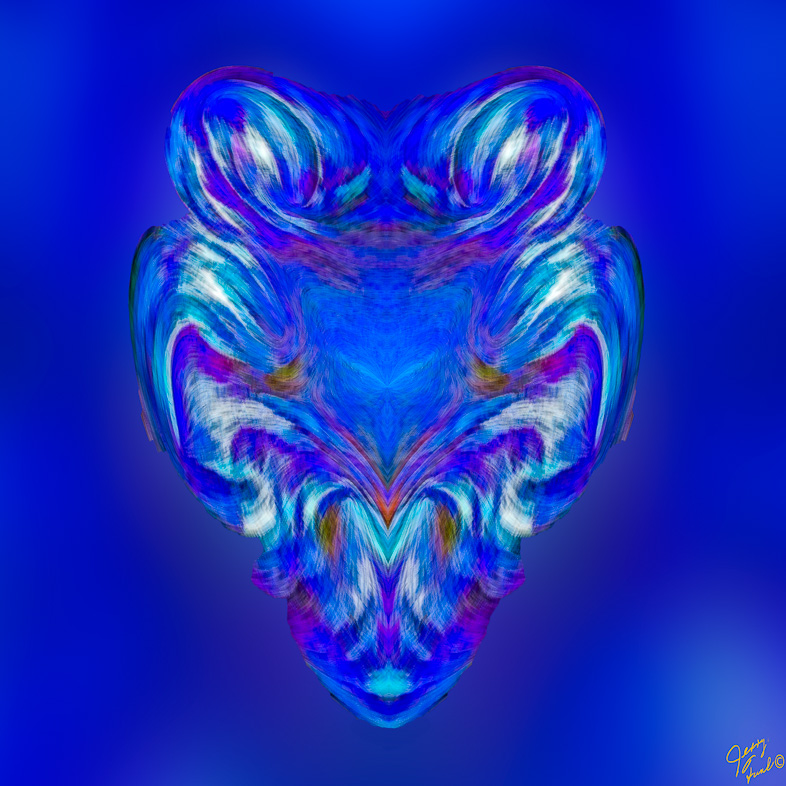
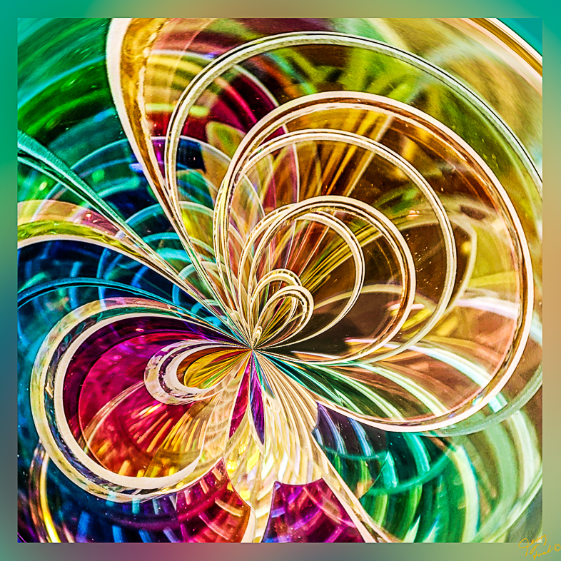
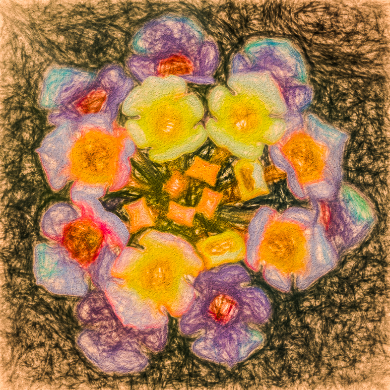
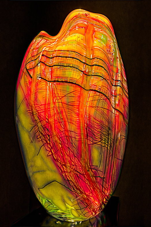
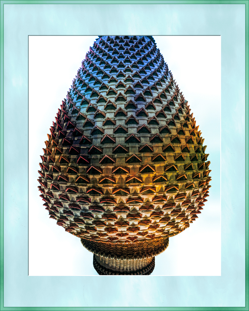
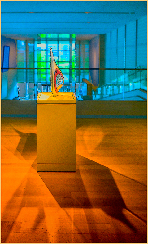
Good idea; i'll do additional variations.
I included this and other variations of the same original vase in a presentation I gave to my large Photo Club to hopefully stimulate the vast majority who have never considered doing a creative variation of any photo.
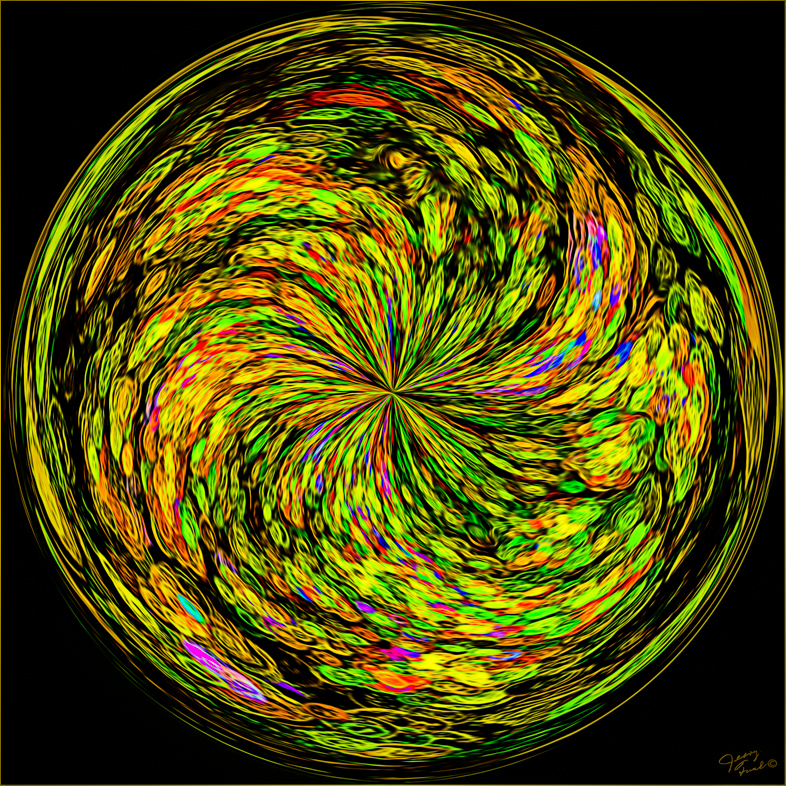
Anyone wanting a free copy of my "Chihuly Gallery" and "Before and After" shows may send me a request Jafunk1941@yahoo.com. |
Feb 4th |
| 20 |
Feb 19 |
Comment |
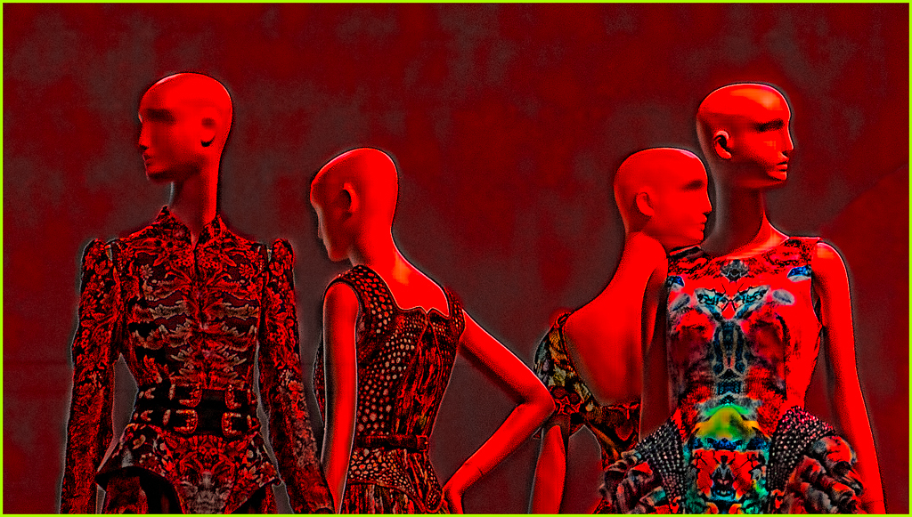
Excellent composition, texture and colors. I also like your blending.
As with portraits, I would try a variation with the eyes of the dolls looking into the camera, if that is possible. Nevertheless, i like it a lot as is. |
Feb 3rd |
| 20 |
Feb 19 |
Comment |
Excellent!
Forgive me, but I use my imagination and see sand and surf replacing the street and cars. |
Feb 3rd |
| 20 |
Feb 19 |
Comment |
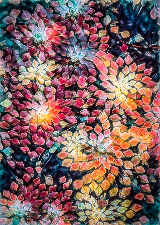
Congratulations! I prefer this version. The only thing I would like different is to color the white spaces. I think it would stil look painterly.
I commend you for your painting. I cheat and use Topaz presets for a big head start. |
Feb 3rd |
| 20 |
Feb 19 |
Comment |
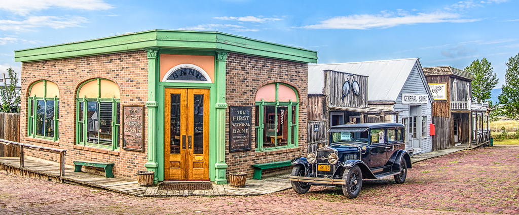
Excellent composite. Very well done. |
Feb 3rd |
9 comments - 2 replies for Group 20
|
| 39 |
Feb 19 |
Comment |
One can imagine a number of different stories looking at the three people, but I find the items on the table distracting. Dodging Jake's eyes might help a bit too.
I'm enjoying using my Google Pixel 3 camera and won't upgrade my professional equipment until it incorporates eqivalent artificial intelligence. I'm hopeful but not holding my breath waiting for it. |
Feb 9th |
1 comment - 0 replies for Group 39
|
| 64 |
Feb 19 |
Comment |
I always carefully straighten my images and assumed you deliberately showed it askew. I saw it contributing to the image because it was complemented by the tilt of the bikes. It could be a comment on the conversation. Was my imagination in overdrive? |
Feb 16th |
| 64 |
Feb 19 |
Comment |
To my eye, since the background is important to your intended story the foreground needs to be darkened. Then your story would more likely come to mind.
Bright areas draw my attention. I think darkening the foreground would make me naturally first look at the outlet and then my eye would be led to the background. |
Feb 16th |
| 64 |
Feb 19 |
Comment |
It's a silhouette, but I still needed to see the name Deere to know the story. So I have to conclude that the angle of view or something more is needed to make it work for me. |
Feb 14th |
| 64 |
Feb 19 |
Reply |
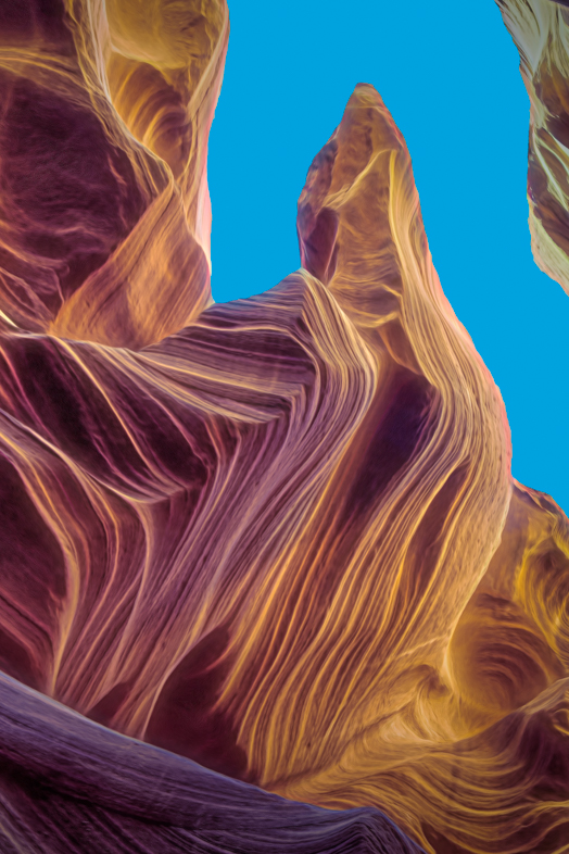
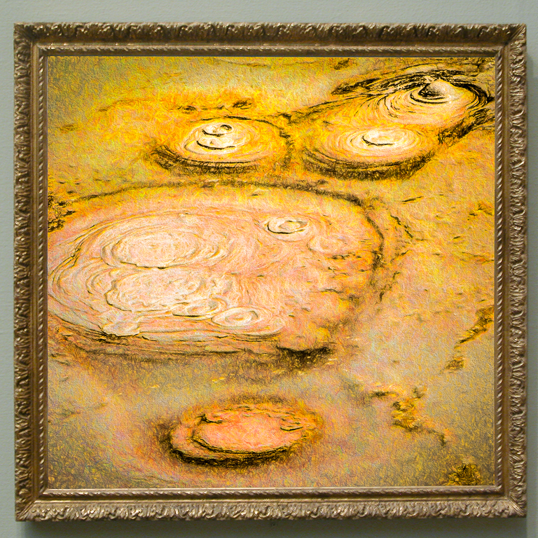
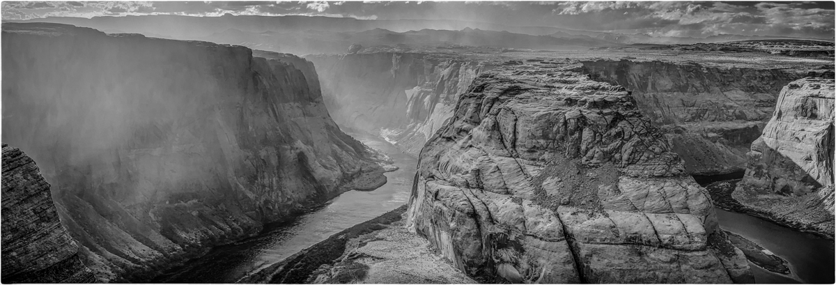
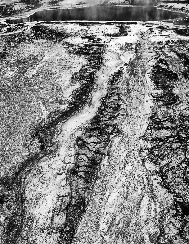
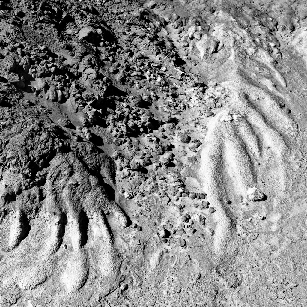
That was a big problem that I saw with my first monochrome conversion, so I did selective burning and dodging to create some separation. I found working with similar colors very challenging and hope to improve my future efforts.
I find it very interesting that a hot spring could be interpreted so differently by removing the color. Fascinating. |
Feb 11th |
| 64 |
Feb 19 |
Reply |
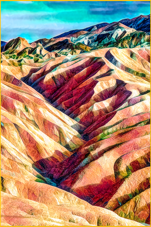
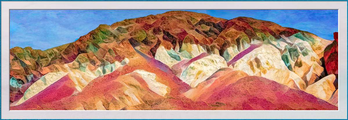
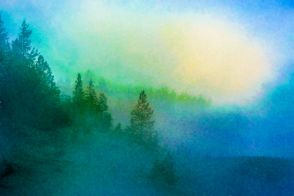
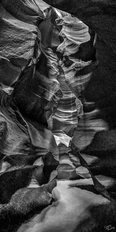
The thought of having only 45 minutes makes me sad for you. This summer, I expect to return for my 8th visit of 4-5 days. Some people ask me why I return, but as with most photographers, I see it through new eyes each time. Of course, I have also learned where and when to be in locations of greater interest. Surprisingly, ground colors with water change significantly with temperature. I enjoy exploring and finding perspectives that I haven't previously seen. |
Feb 11th |
| 64 |
Feb 19 |
Comment |
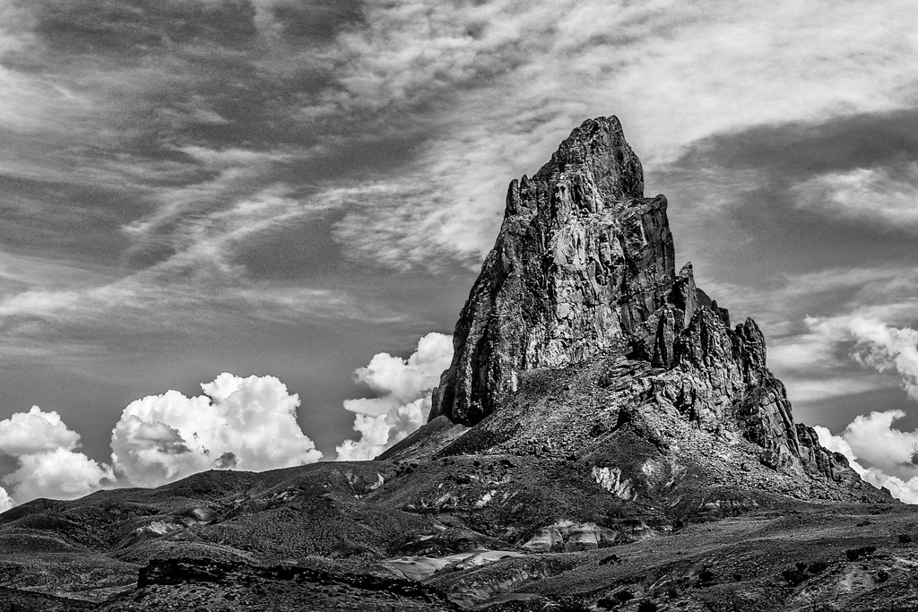
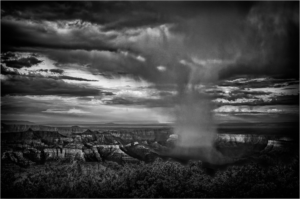
Perhaps this is an opportunity to make the sky black or near black? I would also add a 1/4 moon, as may be appropriate for the region. |
Feb 11th |
| 64 |
Feb 19 |
Reply |
My problem with the top was that it was a distracting fence and tourists on a boardwalk. |
Feb 11th |
| 64 |
Feb 19 |
Reply |
I didn't crop. I changed the aspect ratio to distort and emphasize the leading lines. |
Feb 11th |
| 64 |
Feb 19 |
Reply |
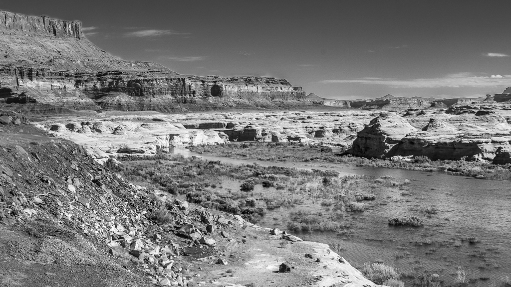
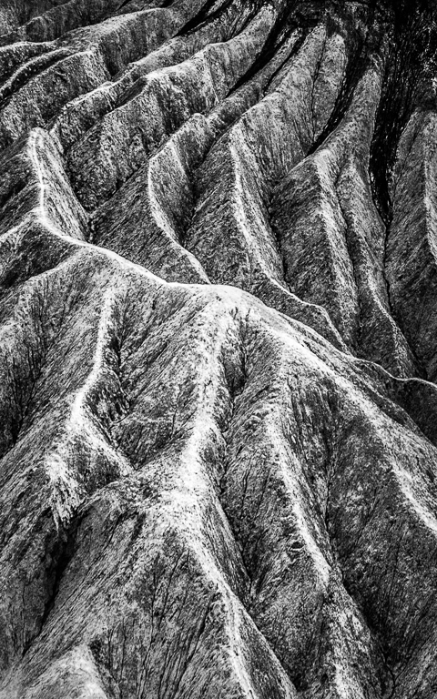
You saw my idea of an abstract. Those who call it an abstract and are then concerned about elements of reality , in my opinion, miss the point.
I left the hot spring to avoid the question asking what the leading lines go to.
Perhaps I should apply a filter to remove all reality? I would prefer that. My wife, however, always says "What's that?" |
Feb 11th |
| 64 |
Feb 19 |
Reply |
I agree with your suggestions.
I forgot to mention the perspective I had. My original is a vertical panoramic of 2 images. I could have taken a third at the top.
Given the fact that I was standing on a narrow boardwalk and using my widest angle lens (20mm), capturing more detail on the sides would have been very challenging. I'll think about your suggestions though when I edit other images.
Thanks |
Feb 10th |
| 64 |
Feb 19 |
Comment |
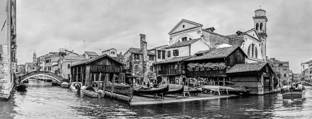
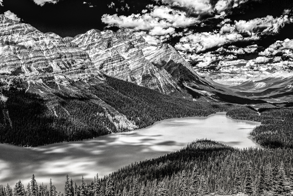
I think many of us would not have left this tranquil and rather flat. Rather we would make a version with much more contrast and detail in the clouds and boats. I like the composition too. |
Feb 9th |
| 64 |
Feb 19 |
Comment |
You have a stunning monochrome image but I prefer the color version, probably because the of the beautiful sky. |
Feb 8th |
| 64 |
Feb 19 |
Comment |
I think this is a strikingly dramatic photo. Too bad about his eyes. I suggest that you simply burn the bright spots along the edges of your frame. |
Feb 8th |
| 64 |
Feb 19 |
Comment |
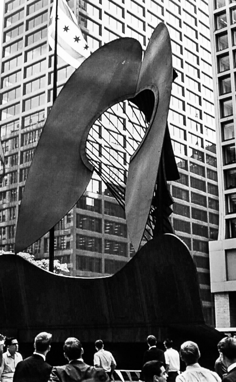
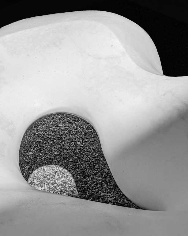
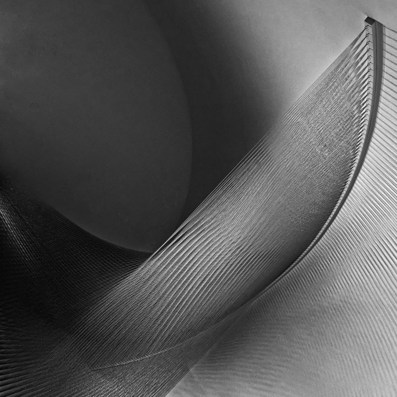
I think it's an interesting subject and composition but I find the shadows and small background bright spots distracting.
It reminds me of a Claes Oldberg sculpture of an oversized electrical extension plug. I think I saw it outside the Art Museum in Pittsburg. |
Feb 8th |
8 comments - 6 replies for Group 64
|
18 comments - 8 replies Total
|