|
| Group |
Round |
C/R |
Comment |
Date |
Image |
| 18 |
Dec 18 |
Reply |
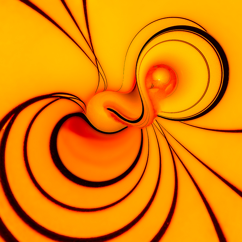
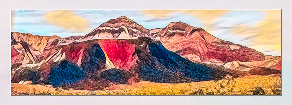
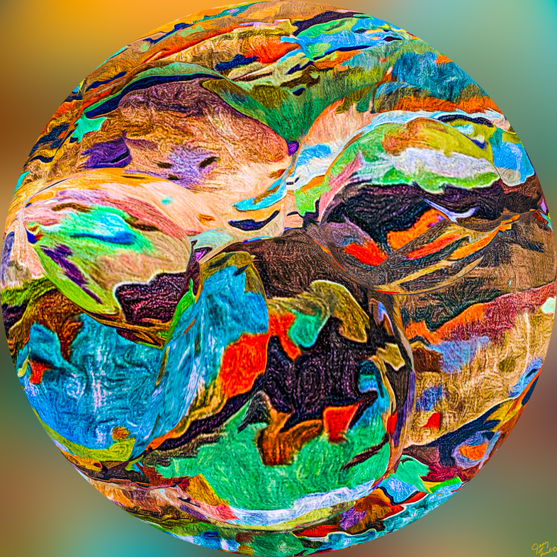
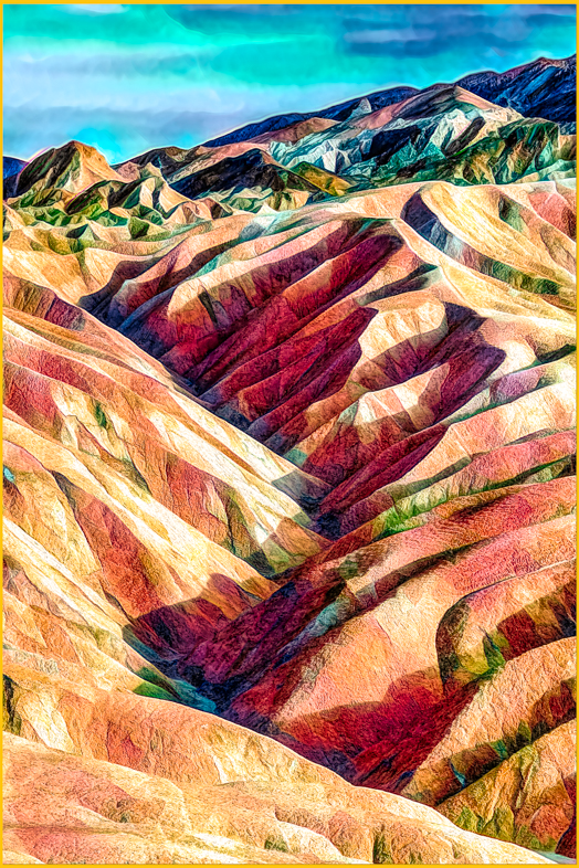
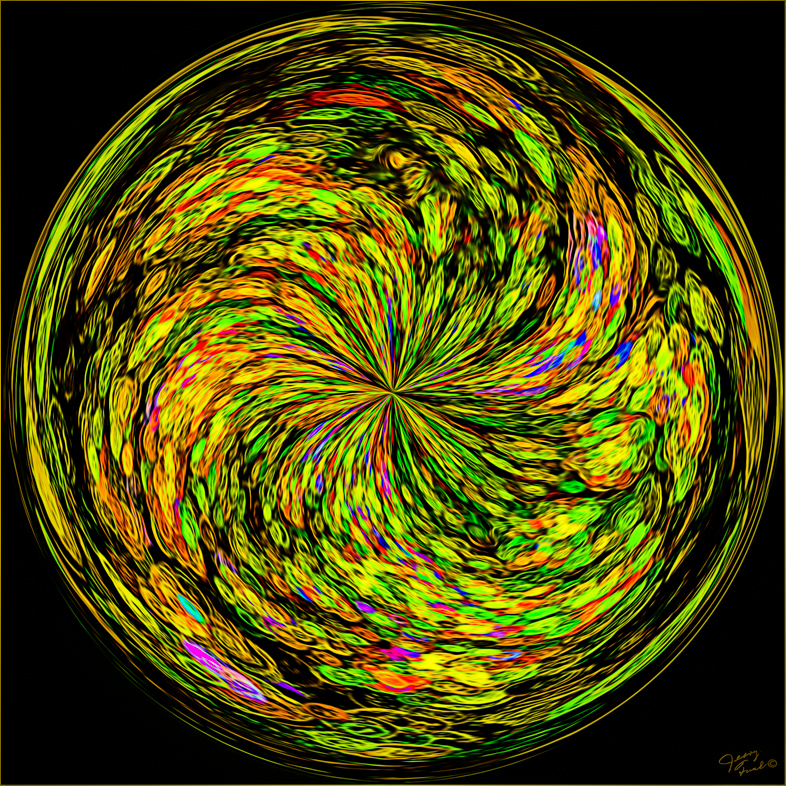
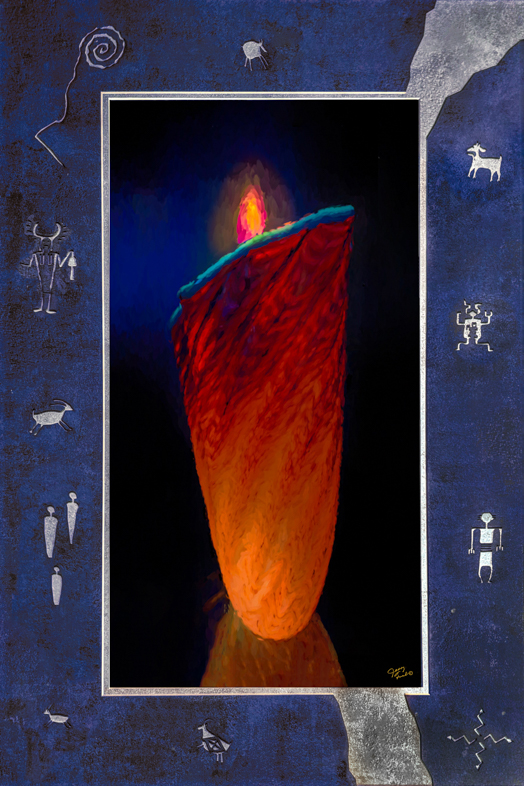
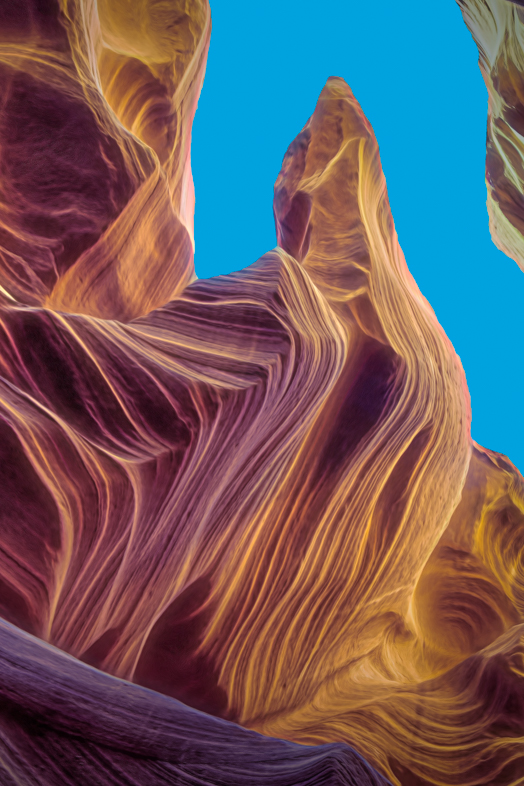
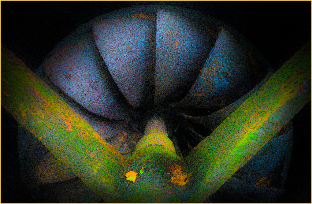
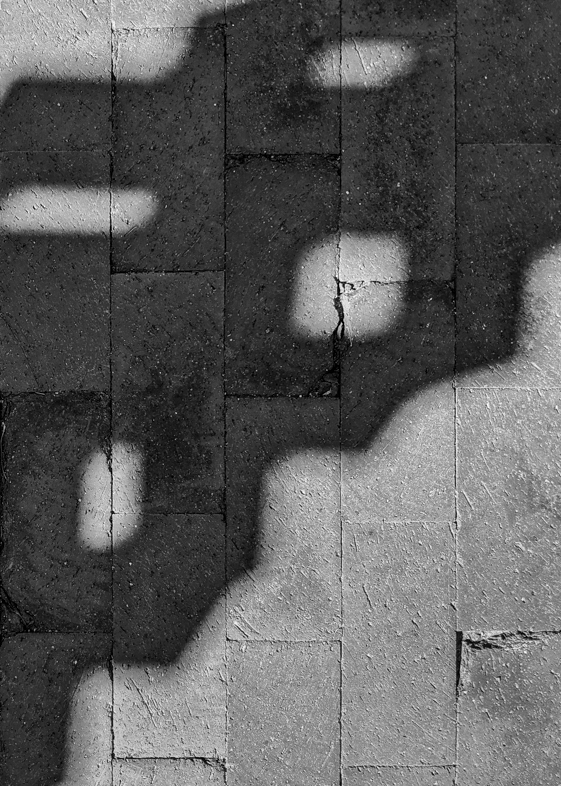
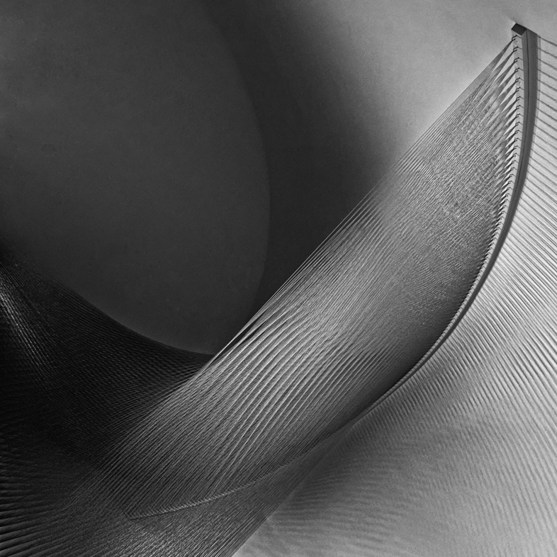
The pattern seems to fit. Personally, I would add blue to that area and try to approximate the dark segments of other sections. Alternatively, increasing the saturation and darkening the section might work well too. |
Dec 7th |
| 18 |
Dec 18 |
Comment |
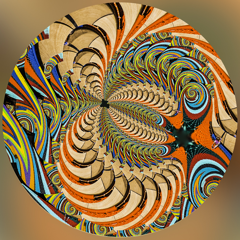
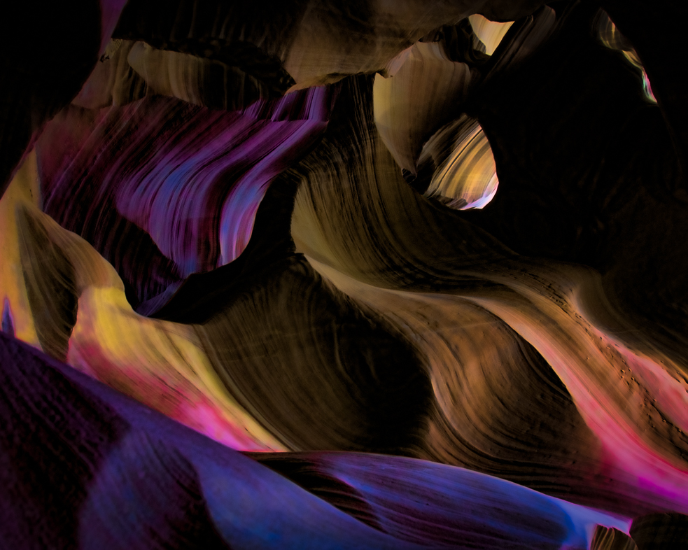
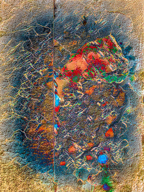
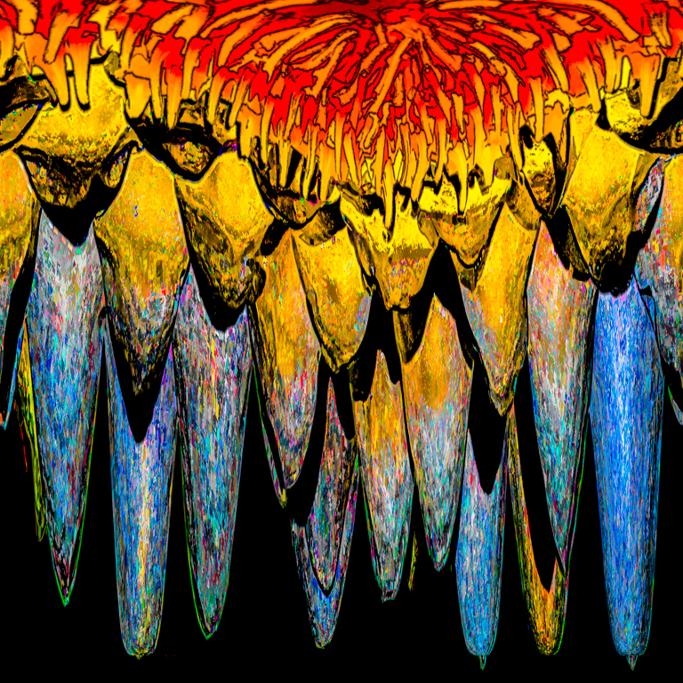
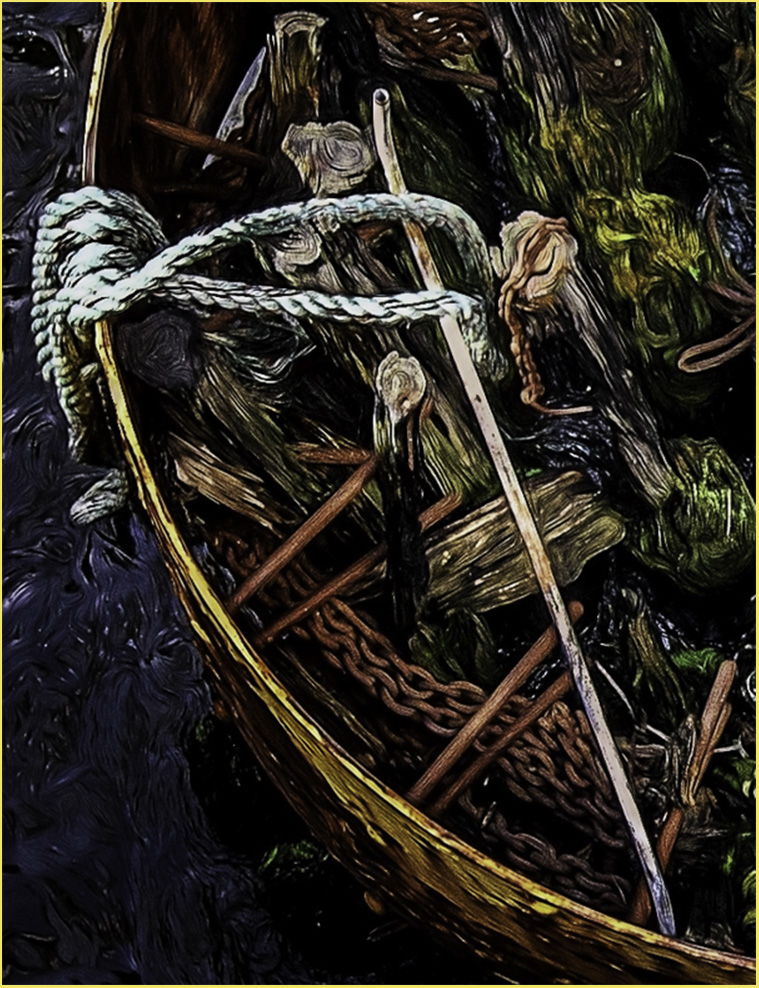
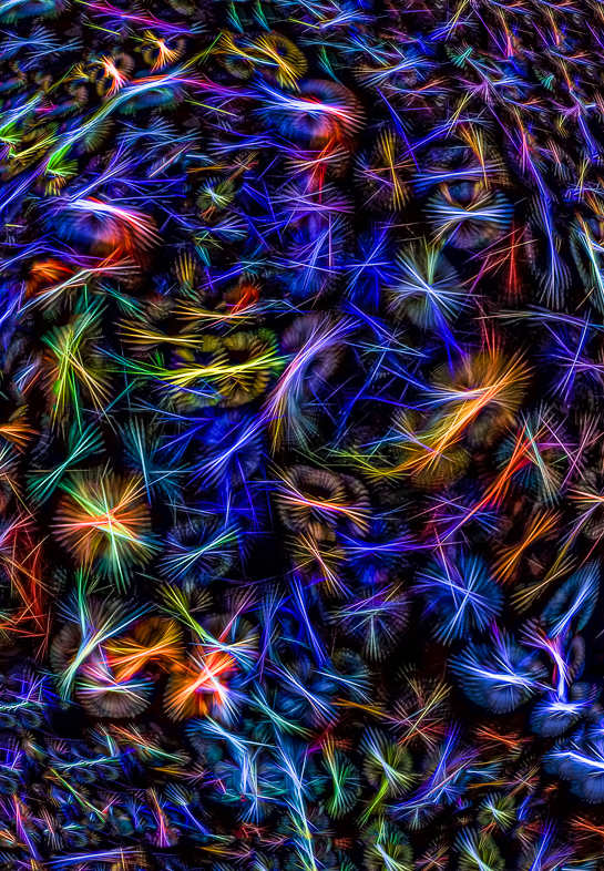
Very colorful and interesting.
If you want to fill in the black space you might try selecting it and using content aware fill. Sometimes that's a good quick fix.
Jerry Funk DDG 20 & 64 |
Dec 6th |
| 18 |
Dec 18 |
Comment |
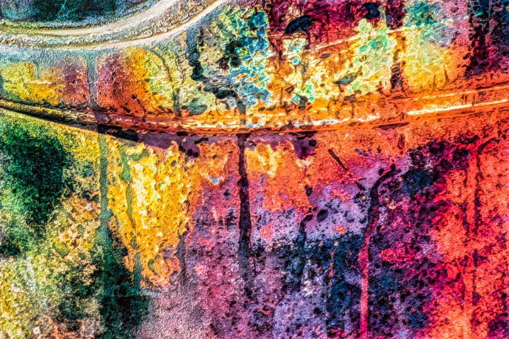
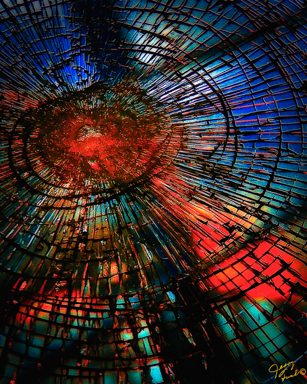
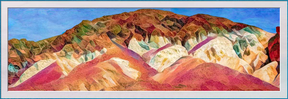
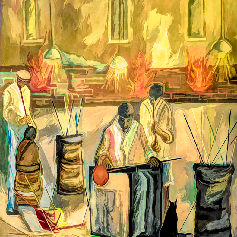
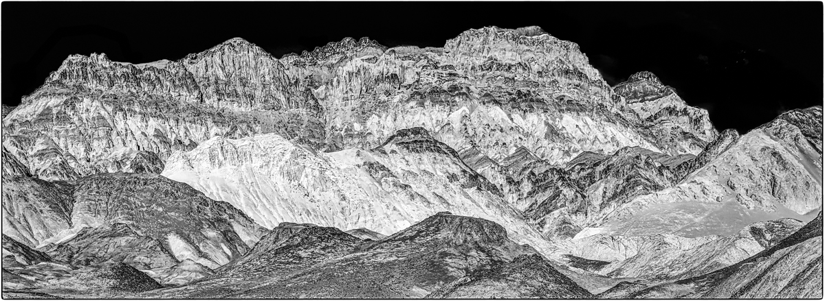
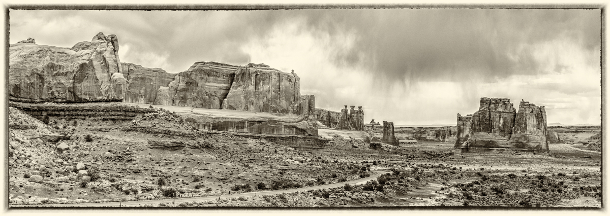
The new version looks excellent to me. Yes, the bright areas of the sky could be darkened a bit and the dark areas could be darkened slightly more to increase contrast, but that's all a matter of taste.
Jerry Funk DDG 20 and 64. |
Dec 6th |
2 comments - 1 reply for Group 18
|
| 20 |
Dec 18 |
Reply |
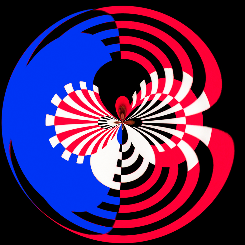
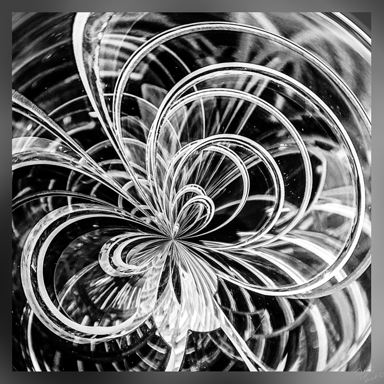
Yes, I made a mono version too and like it.
I am always thinking abstract. I first anhanced the original colors but didn't like it. |
Dec 23rd |
| 20 |
Dec 18 |
Reply |
I'm curious. How would you have treated this image?
Have you ever submitted anything similar to this in competition? |
Dec 21st |
| 20 |
Dec 18 |
Reply |
As i've advanced in age, i've Learned to appreciate almost all forms of art. If I hadn't visited so many museums and seen modern art, i'm Certain that I would have overlooked this subject and certainly wouldn't have added colors. |
Dec 6th |
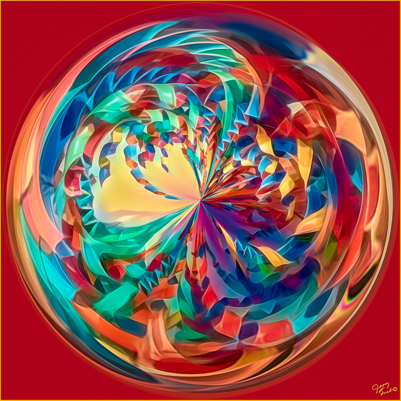
| 20 |
Dec 18 |
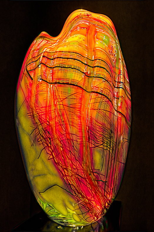
Comment |
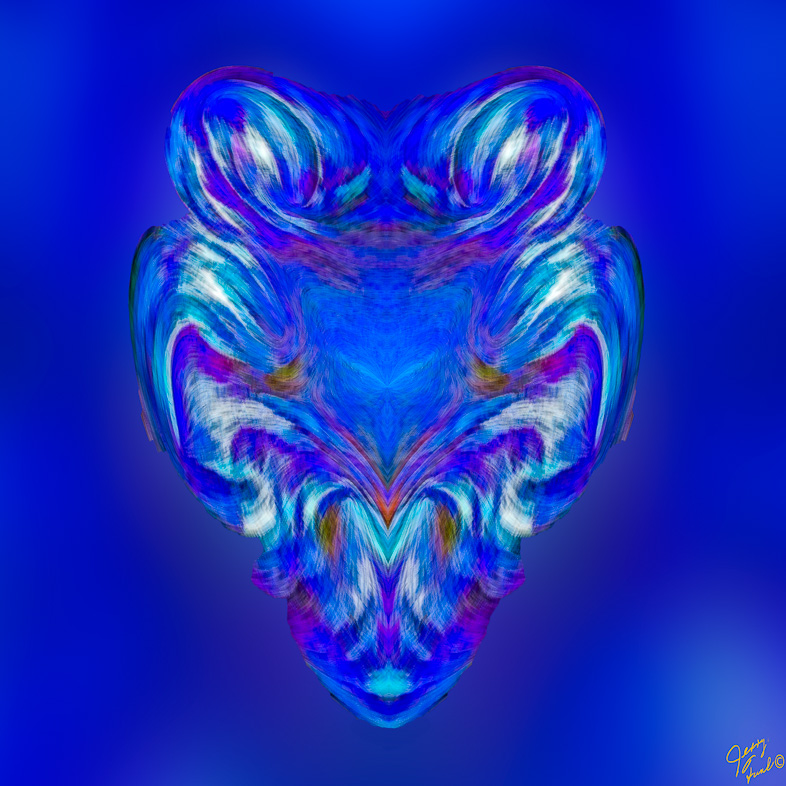
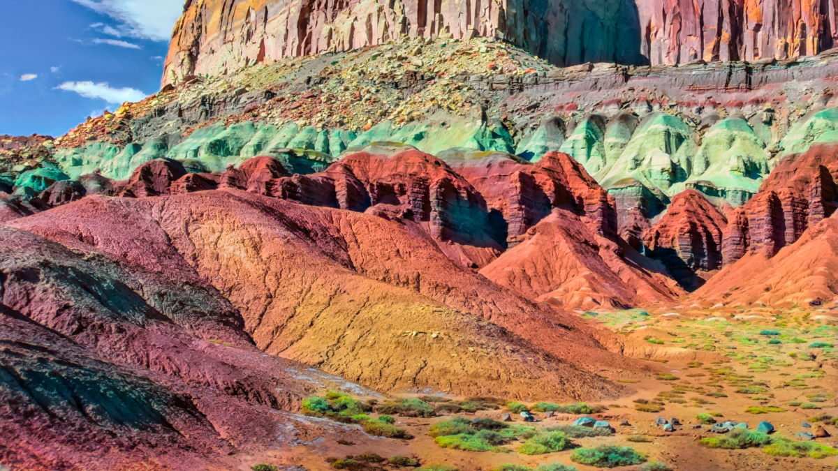
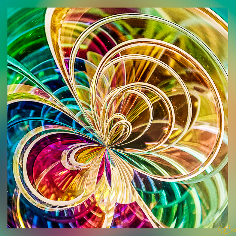
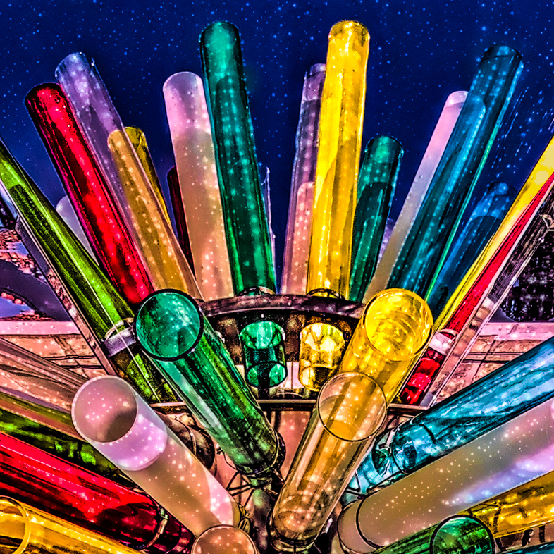
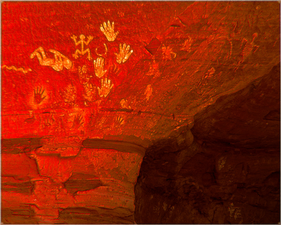
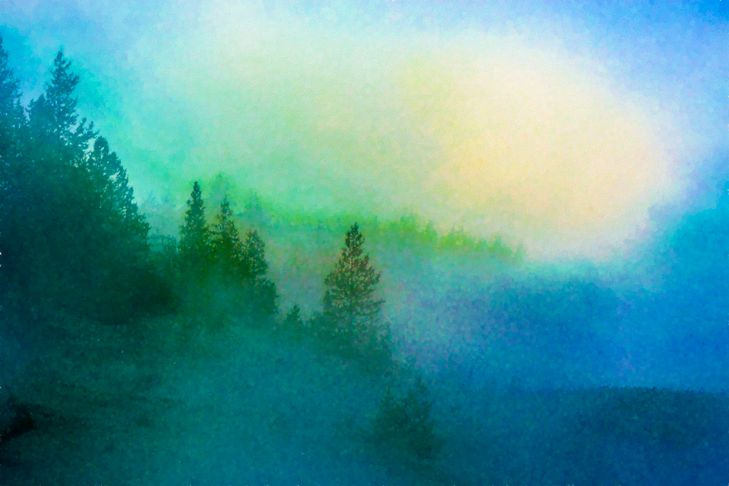
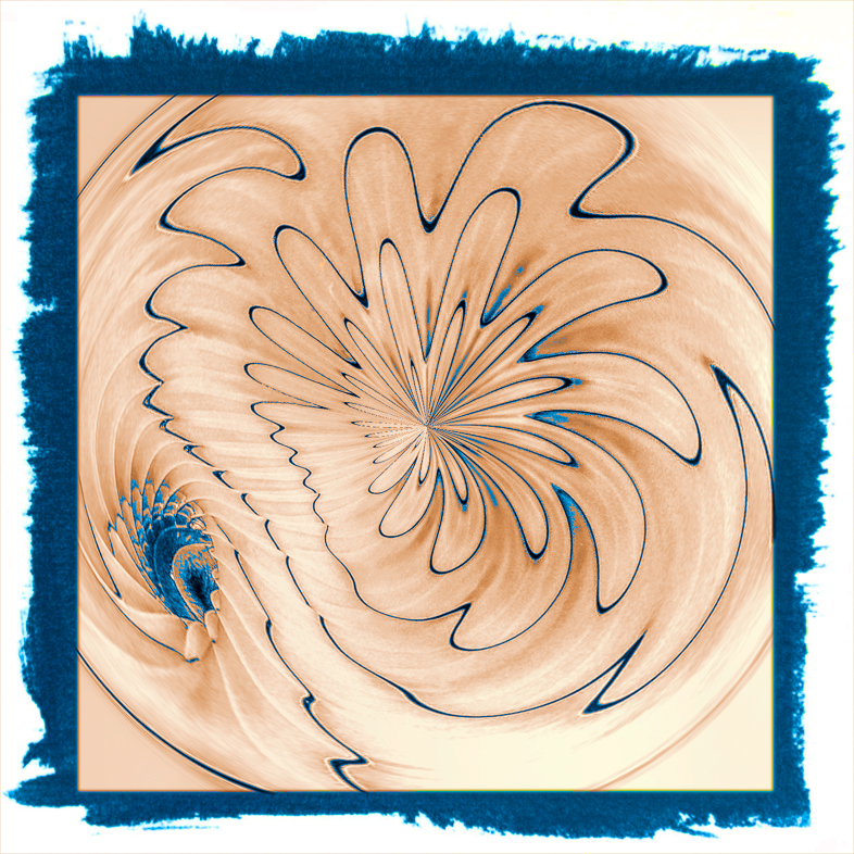
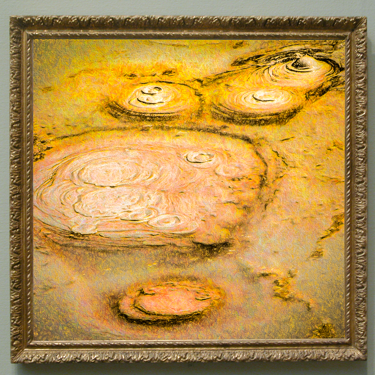
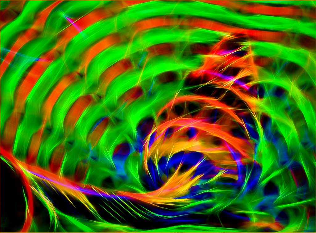
The colors in the original were produced by reflected light in a display of transparent colored circles. I thought it needed more color and settled on a simple straightened design.
Jerry |
Dec 5th |
| 20 |
Dec 18 |
Comment |
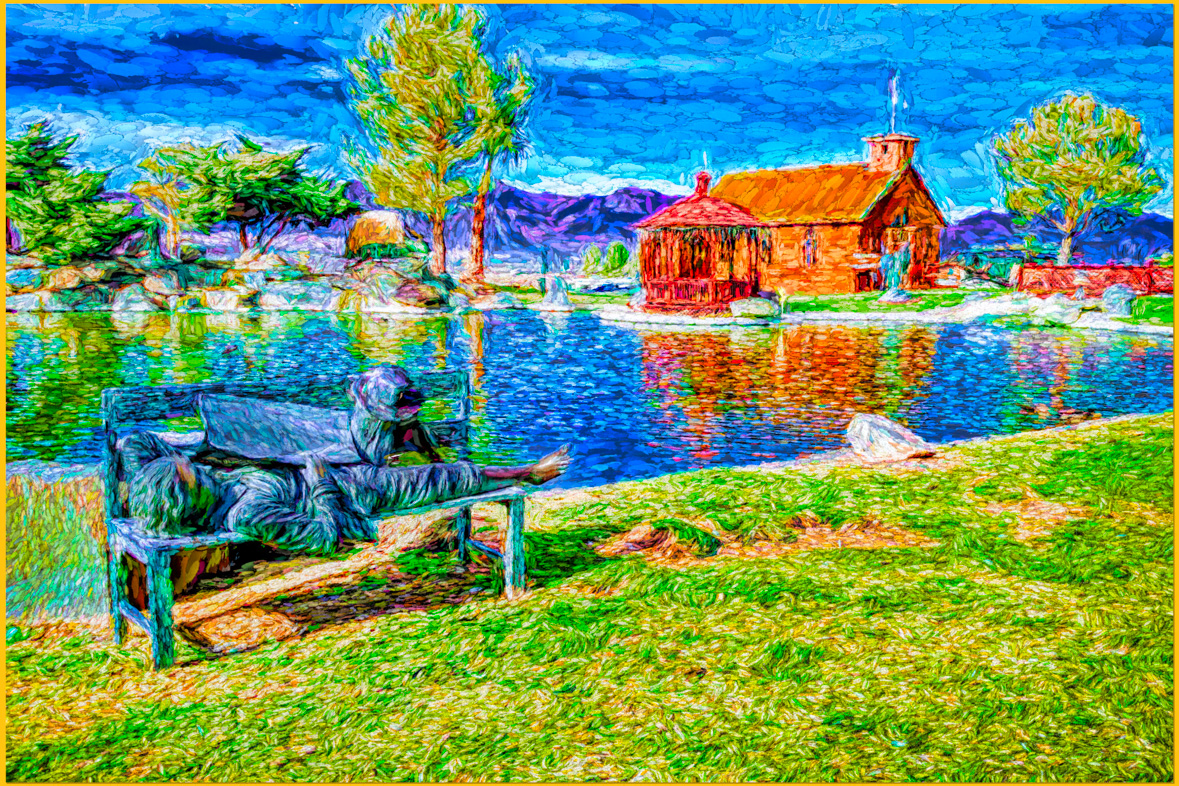
I like this a lot!! Good job.
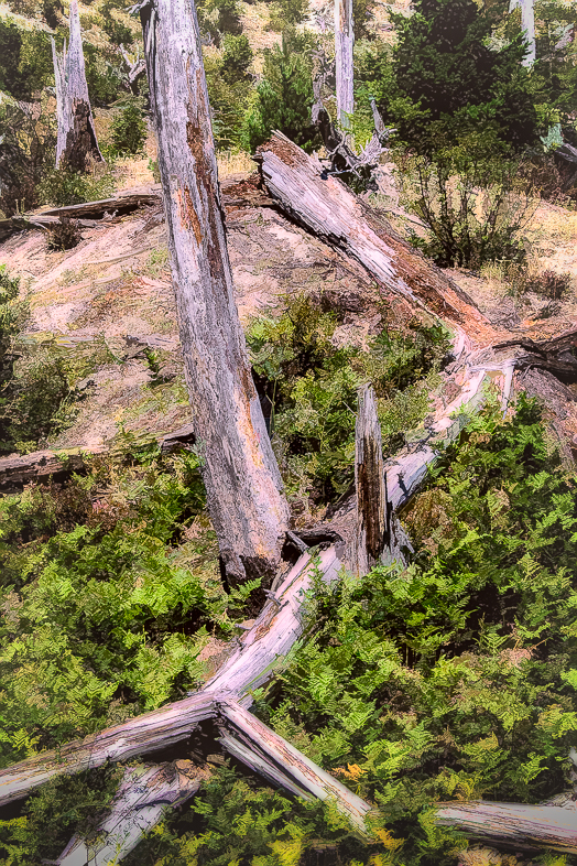
My eye suggests flipping it horizontally, but this certainly features the tree excellently. |
Dec 5th |
| 20 |
Dec 18 |
Comment |
Excellent. I think you expressed your original vision perfectly.
I'm slowly getting used to carrying my Pixel 3 phone with me, but I haven't taken many photos with it outside of my travels. I have found that it often produces images comparable to my D810 with a 20 mm Sigma Art lens. It has its limitations but I feel I need to use it more frequently. |
Dec 5th |
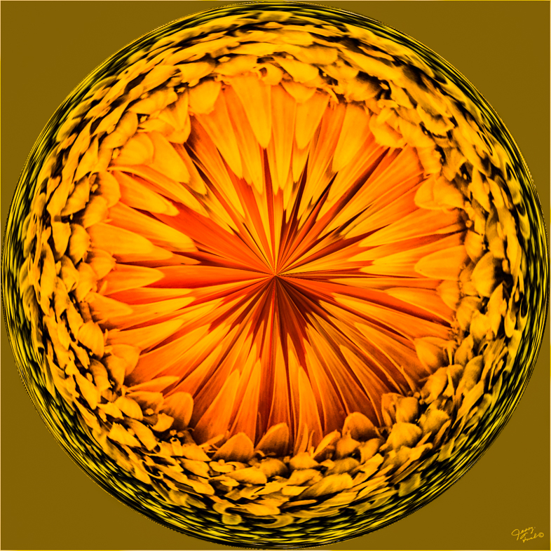
| 20 |
Dec 18 |
Comment |
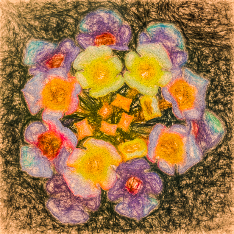
Personally, I feel the poster edge filter is very well suited for cacti but not these flowers. I like your original image and wish my yellow blooming cactus hadn't died. I do have whites, reds and one orange flowering cacti though. |
Dec 5th |
| 20 |
Dec 18 |
Comment |
I think every element was well chosen and beautifully done. I'd buy this card.
Isn't it nice to not have to travel for photographic subjects? We tend to overlook them every day. |
Dec 5th |
| 20 |
Dec 18 |
Comment |
Expertly composed! Very nice. You set a very high standard for all of us to strive for.
Nothing beats an old fashioned jolly Santa Claus though to me. |
Dec 5th |
6 comments - 3 replies for Group 20
|
| 31 |
Dec 18 |
Comment |
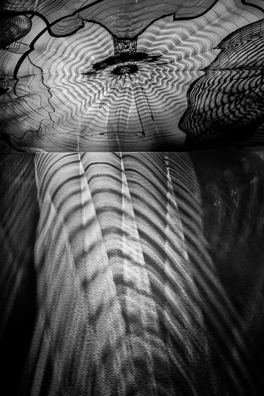
This is far from a failure! Everyone should fail so well.
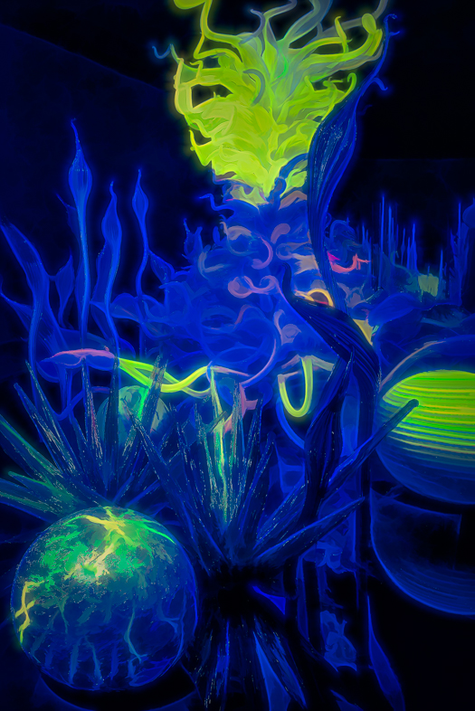
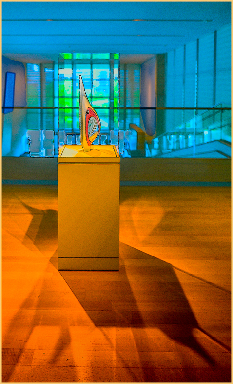
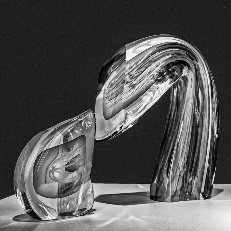
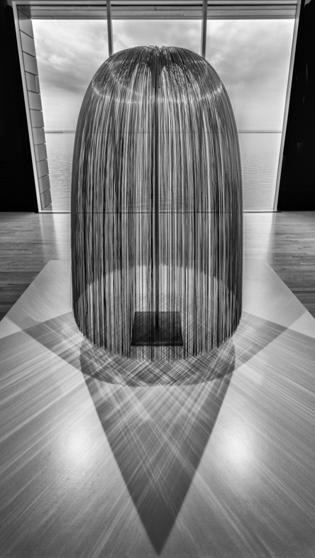
If you send me a sizable file with detail, i'd like to edit it. It will certainly be quick and easy, especially in comparison to your work in creating the excellent composition and lighting. It will be a nice change from the extensive editing i've Been doing on my Chihuly photos for my Jan. 25 Club presentation. Lots of hot spots from the multiple spot lights in his Seattle Gallery! |
Dec 10th |
| 31 |
Dec 18 |
Comment |
This is far from a failure! Everyone should fail so well.
If you send me a sizable file with detail, i'd like to edit it. It will certainly be quick and easy, especially in comparison to your work in creating the excellent composition and lighting. It will be a nice change from the extensive editing i've Been doing on my Chihuly photos for my Jan. 25 Club presentation. Lots of hot spots from the multiple spot lights in his Seattle Gallery! |
Dec 10th |
| 31 |
Dec 18 |
Comment |
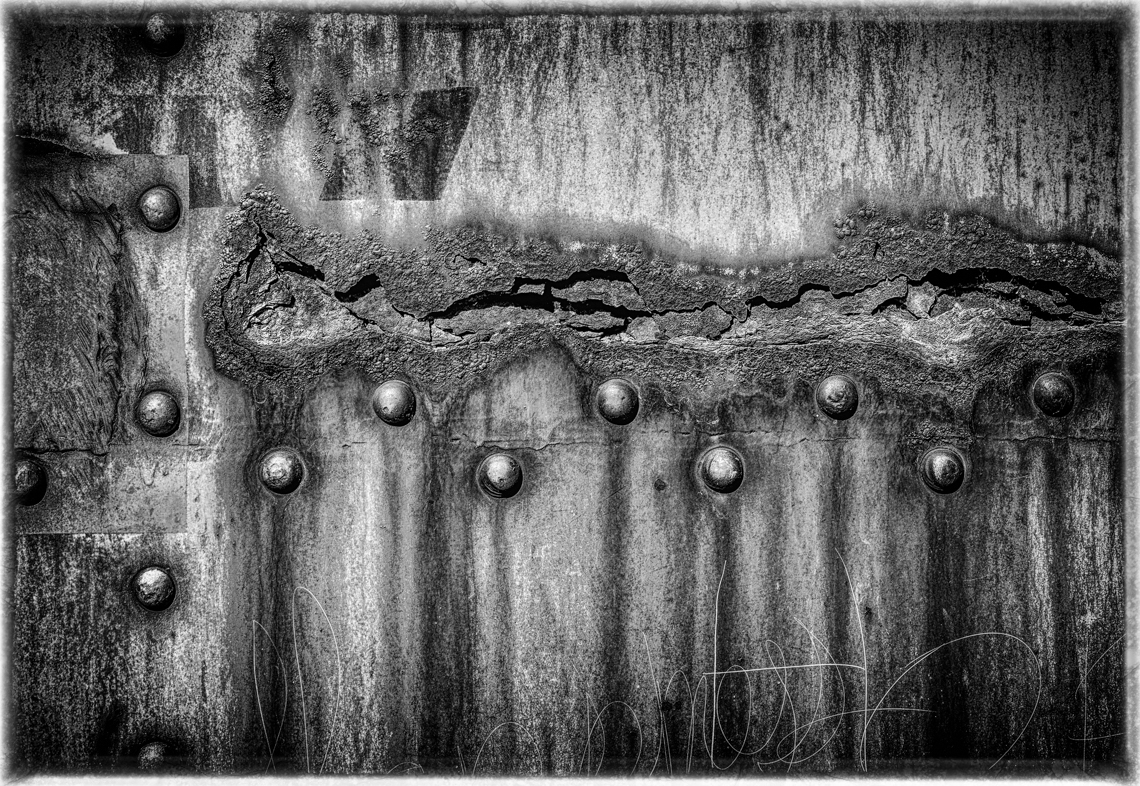
Excellent composition and techniques with the previously noted minor exceptions. I think it's a very appealing monochrome, Ella.
My only suggestion is to straighten the image to make the 2 vertical lines on the wooden base perpendicular to the bottom of the image. |
Dec 10th |
3 comments - 0 replies for Group 31
|
| 64 |
Dec 18 |
Reply |
Wow. You have a very active club and I bet members travel some distance to belong and participate. it's an excellent way to learn and build friendships. |
Dec 14th |
| 64 |
Dec 18 |
Reply |
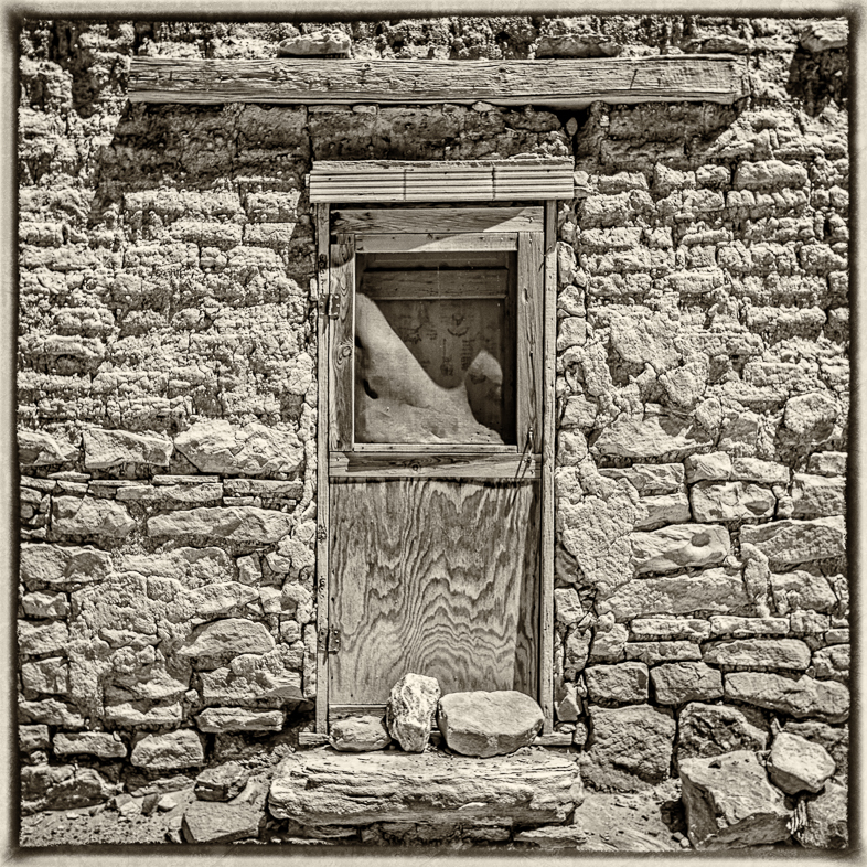
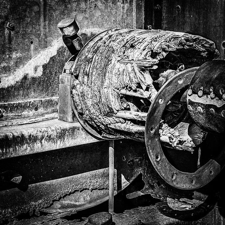
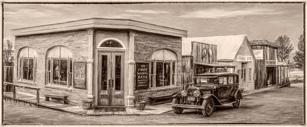
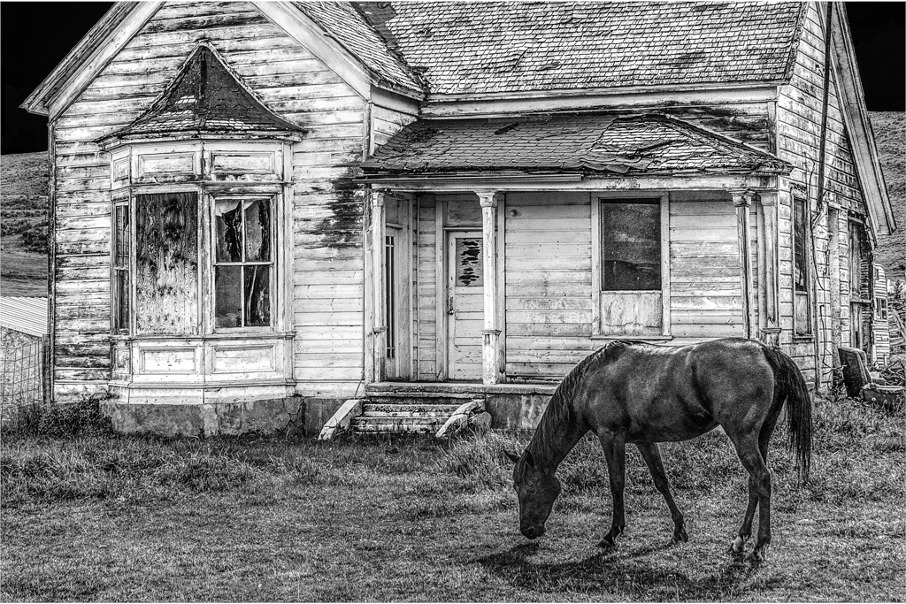
Good question, I just wanted to focus on the front of the house and horse and was uncertain (lazy) about what to do about the pole. The roof contributes too much to exclude it.
I will make a new version excluding the tall pole jutting into the sky and the shack. The color image did nothing in local competition.
Thanks. |
Dec 8th |
| 64 |
Dec 18 |
Reply |
I know you wouldn't Enter it in competition, but some of our members enter images just to be shared, with a note not to score them. These images are then included in the presentation that is later shown to all our members. Our club of over 400 members has dwindling interest in our semi-annual competitions. Only 25 perticipated last month! |
Dec 8th |
| 64 |
Dec 18 |
Reply |
I am flattered that you like it enough to share. Use it however you would like.
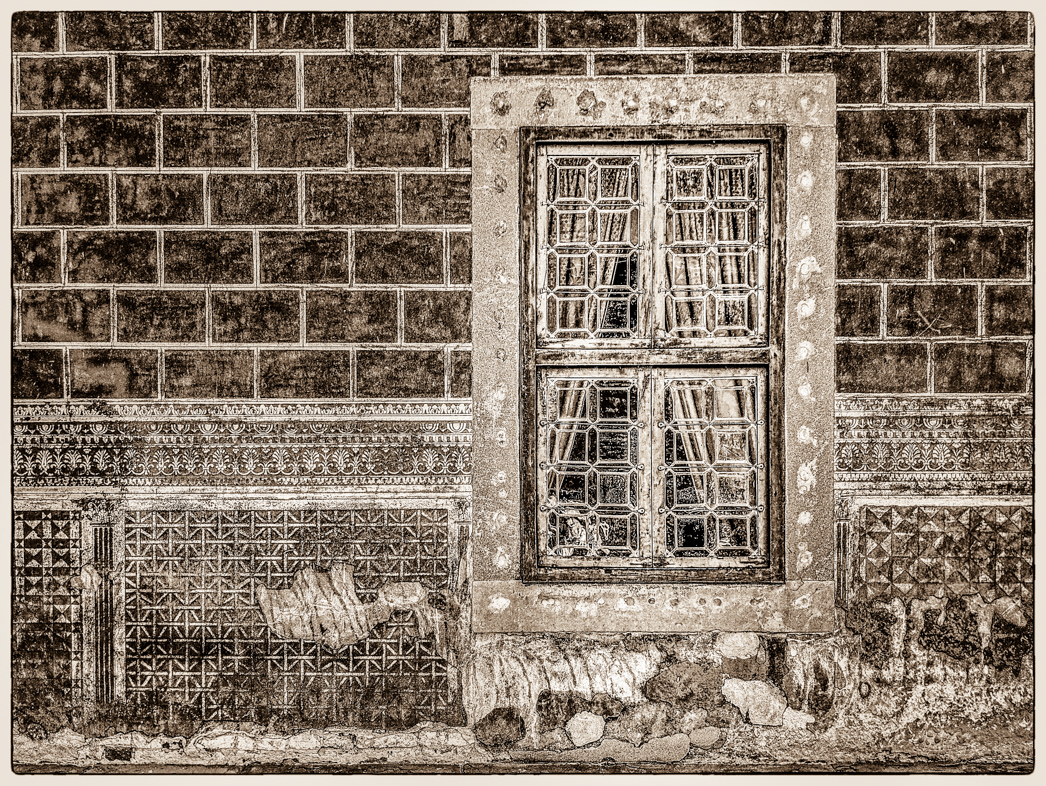
I think the effects you like were produced by localized use of the clarity brush in Lightroom. The building was shaded , so it lacked contrast and I preferred the use of clarity rather than the contrast tool. I chose to not apply clarity to the grass because I didn't want to draw attention away fro the house.
If you would like a higher resolution copy, send me you e-mail address. Mine is jafunk1941@yahoo.com. I'm very busy now but it's ok with me if you clone out tha distraction on the left that I overlooked. I'm sorry I don't recall whether I used NIK or Lightroom for the basic conversion to Mono. |
Dec 8th |
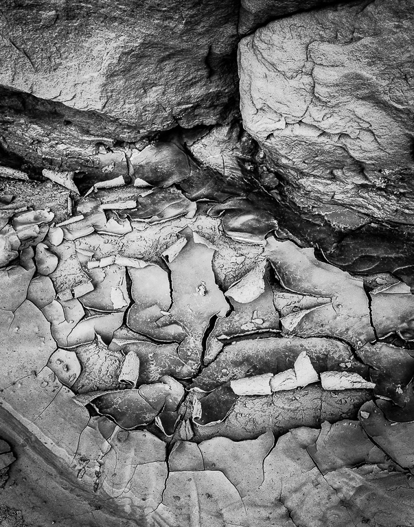
| 64 |
Dec 18 |
Comment |
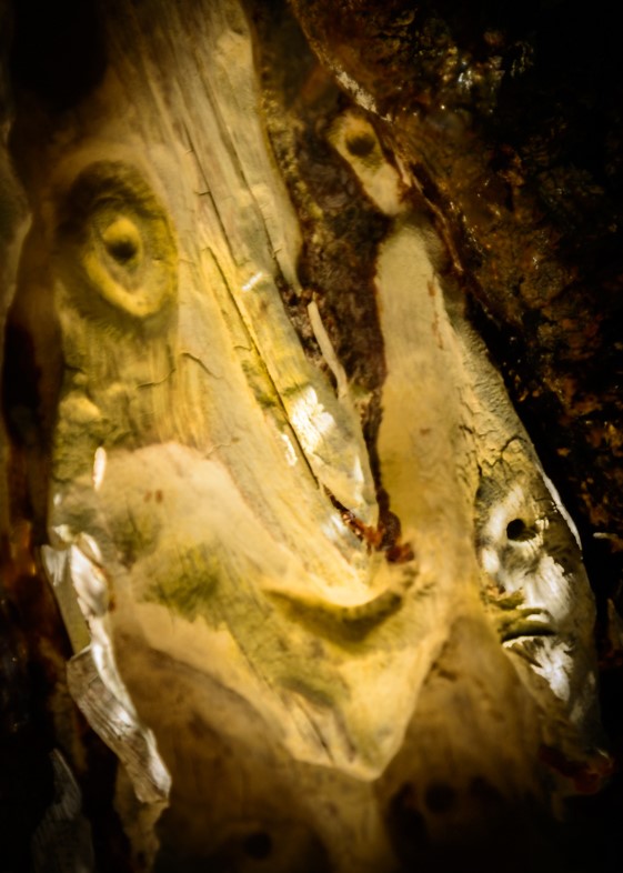
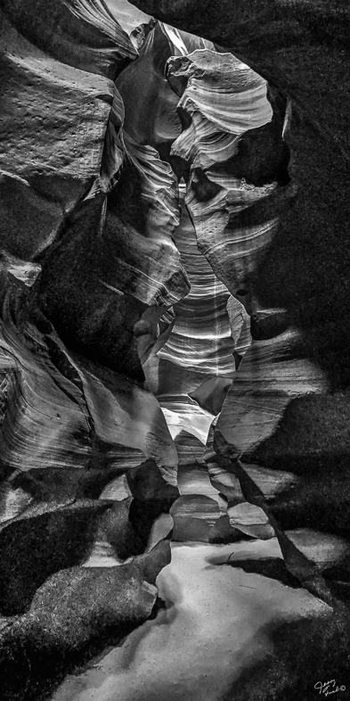
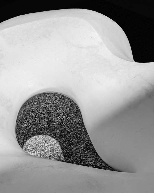
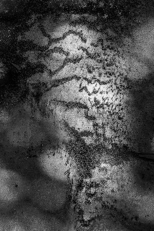
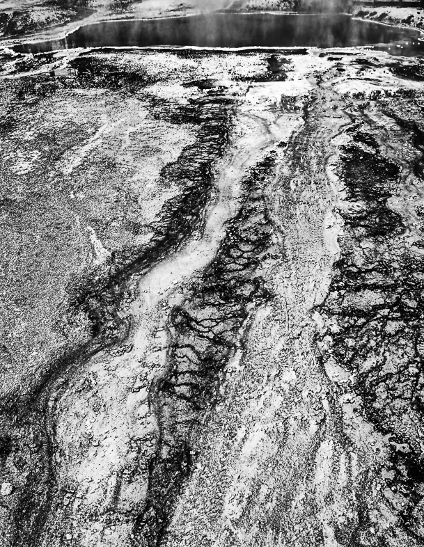
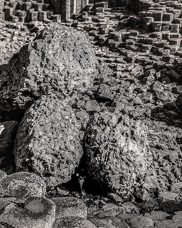
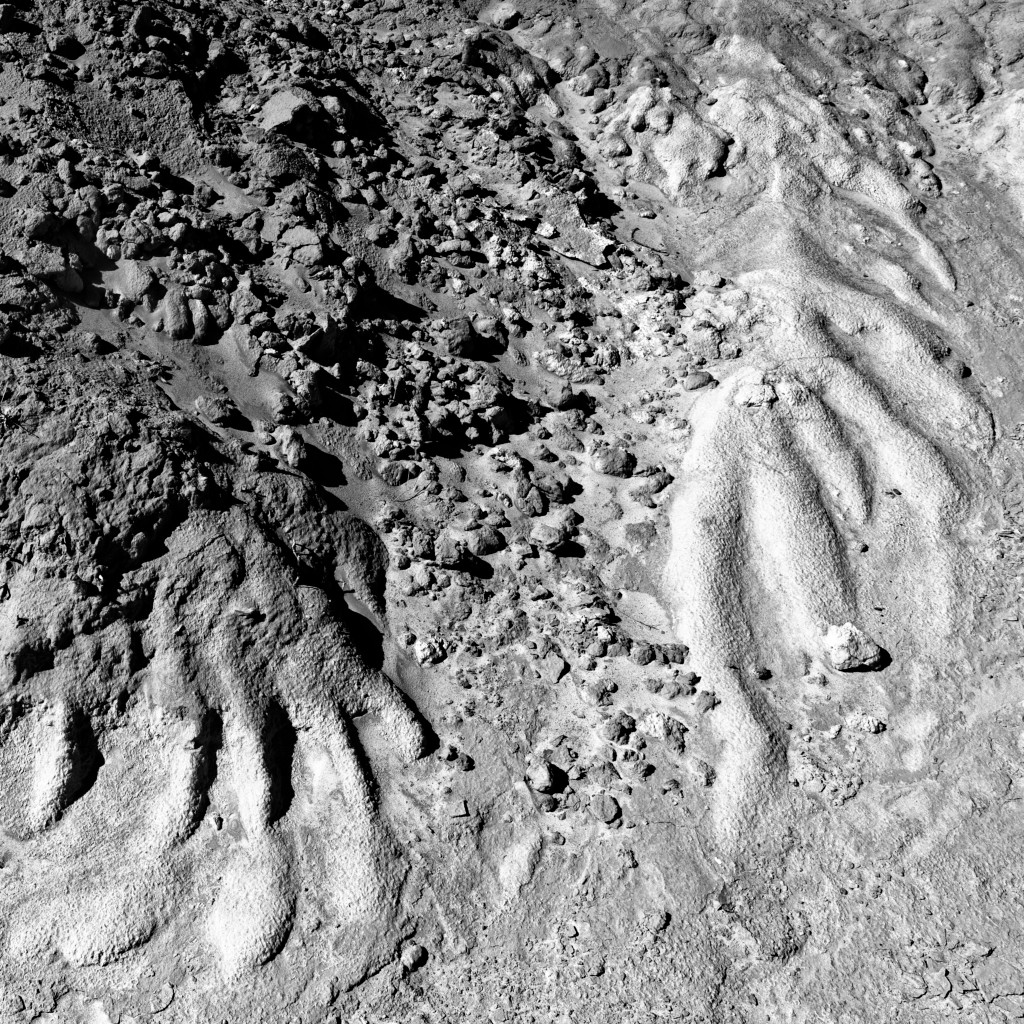
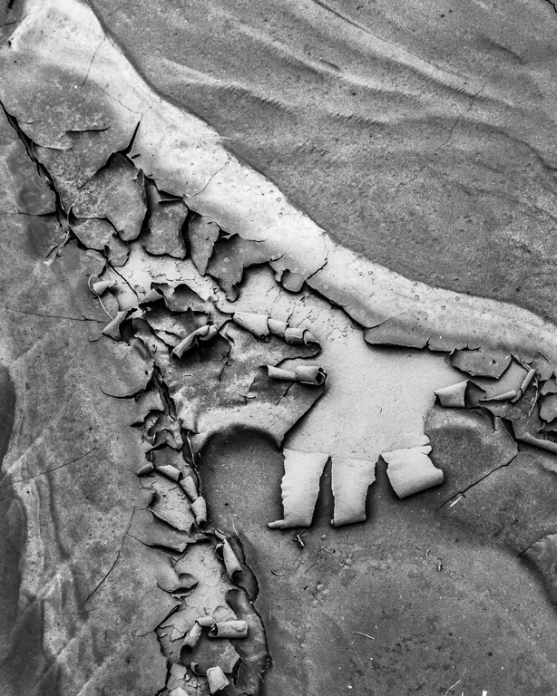
This is an interesting image with very appealing texture, especially in the leaf, but the title makes it more difficult for me, When I think of a marsh, I need to see the green. As a monochrome, the background looks more like concrete to me. |
Dec 6th |
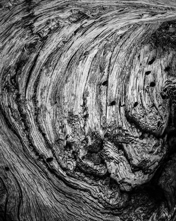
| 64 |
Dec 18 |
Comment |
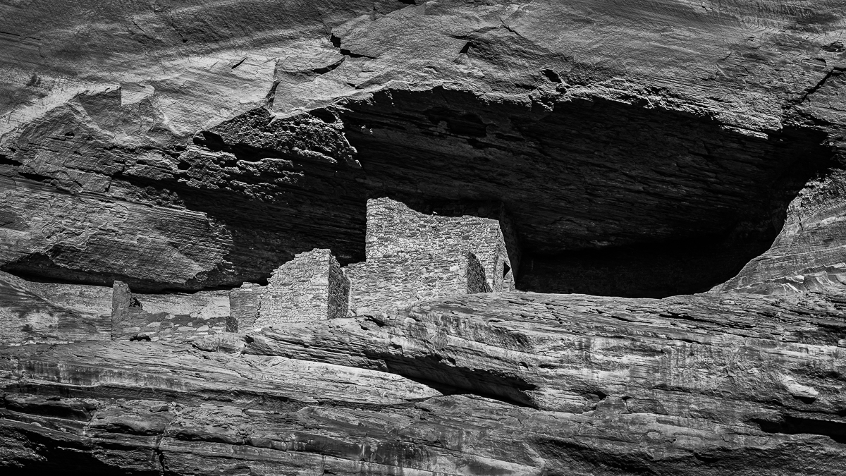
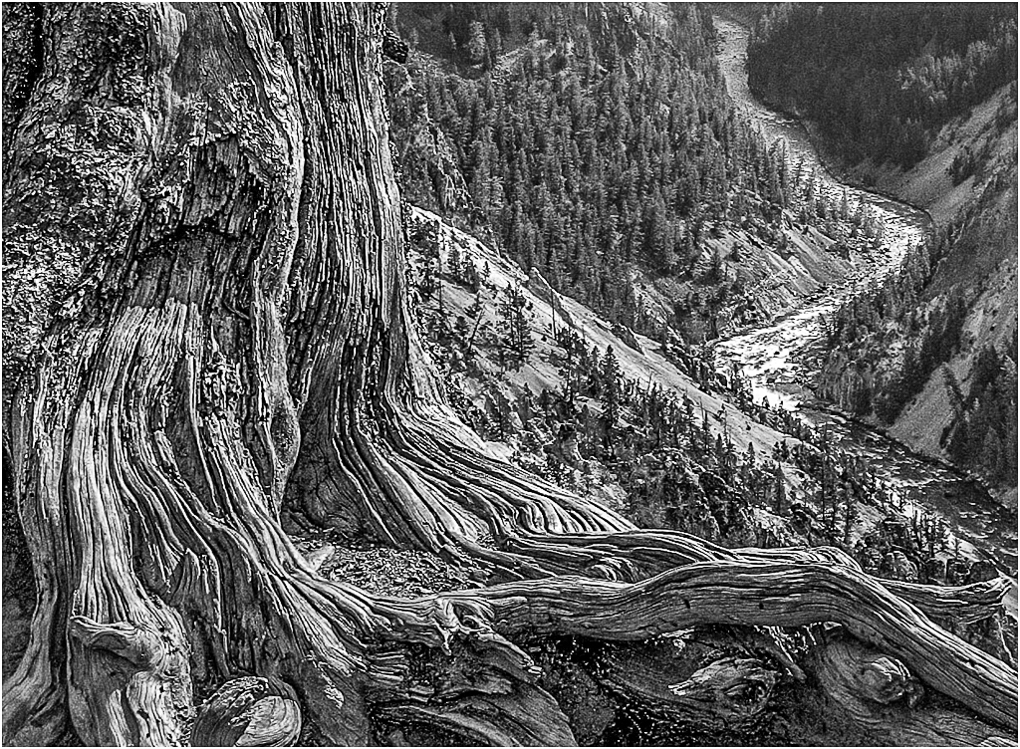
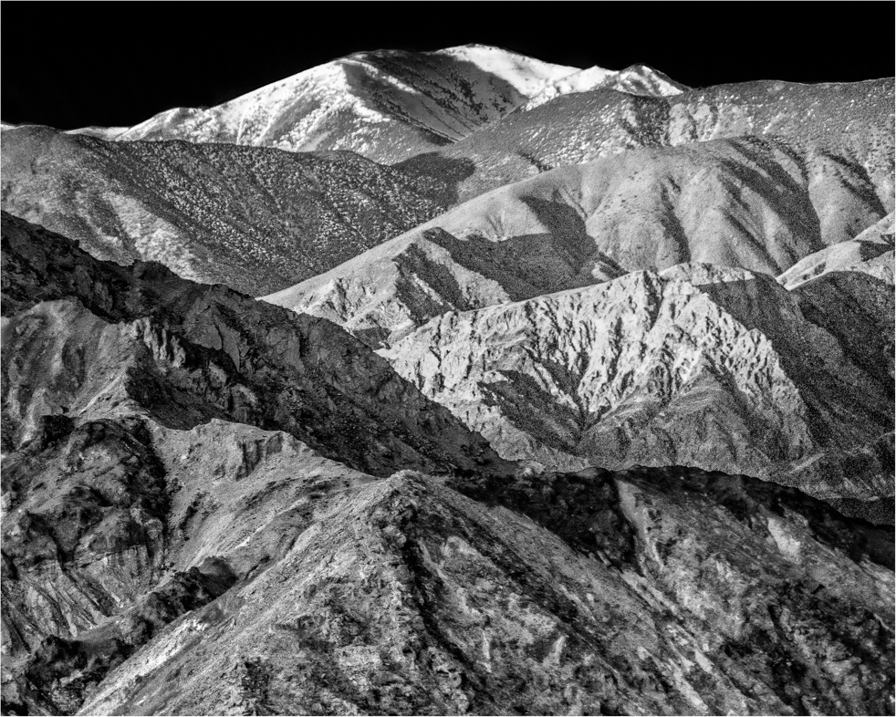
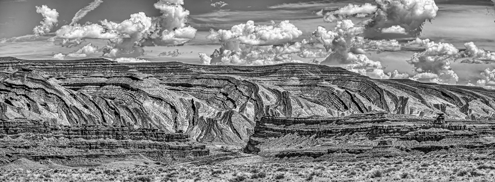
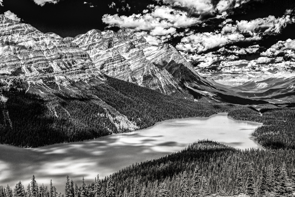
I think this is an excellent image with great detail and range of tones.
If I only captured images during " the right time of day" i wouldn't have much. The right time is when you see it. |
Dec 5th |
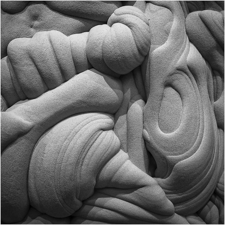
| 64 |
Dec 18 |
Comment |
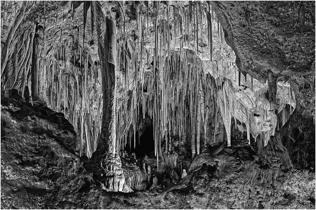
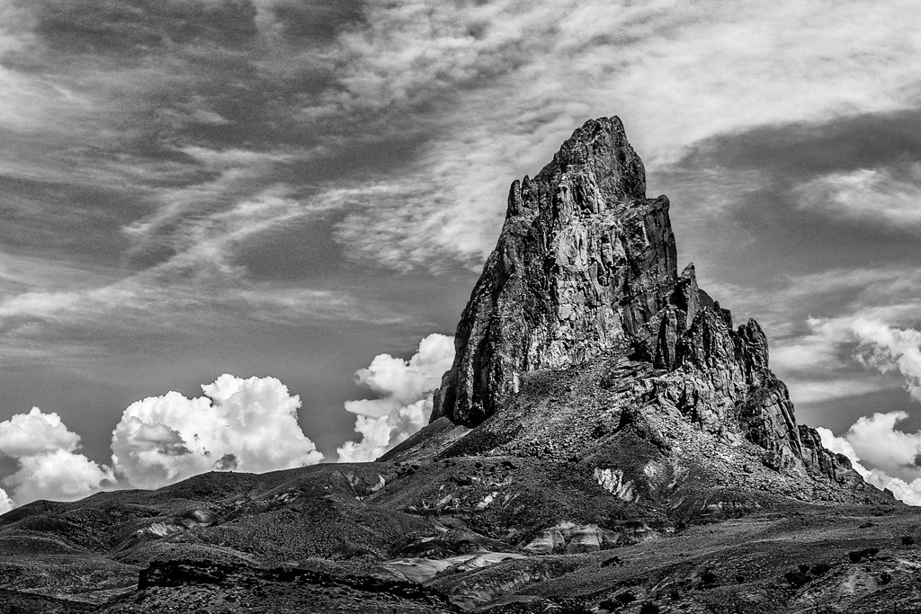
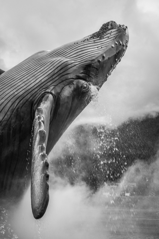
When i've tried to capture similar images, I was surprised by its difficulties as you mentioned. Once, I combined two images cloning the head onto the second frame having a better composition.
Good job. |
Dec 5th |
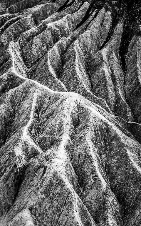
| 64 |
Dec 18 |
Comment |
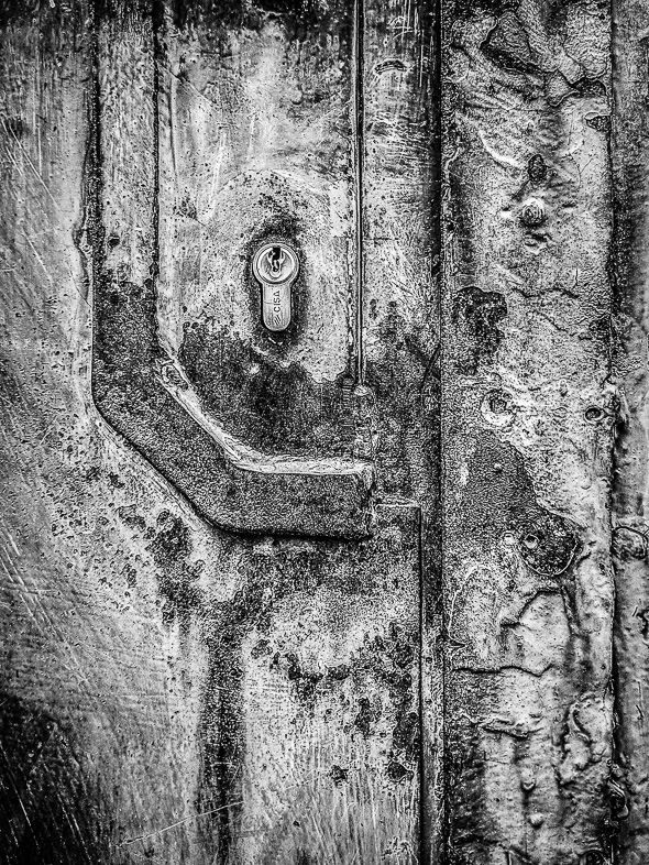
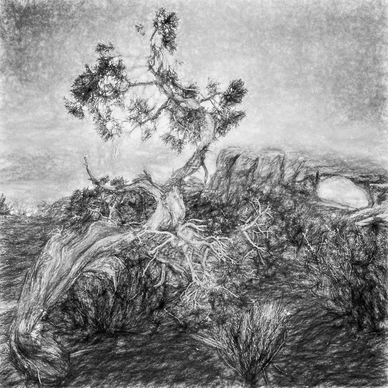
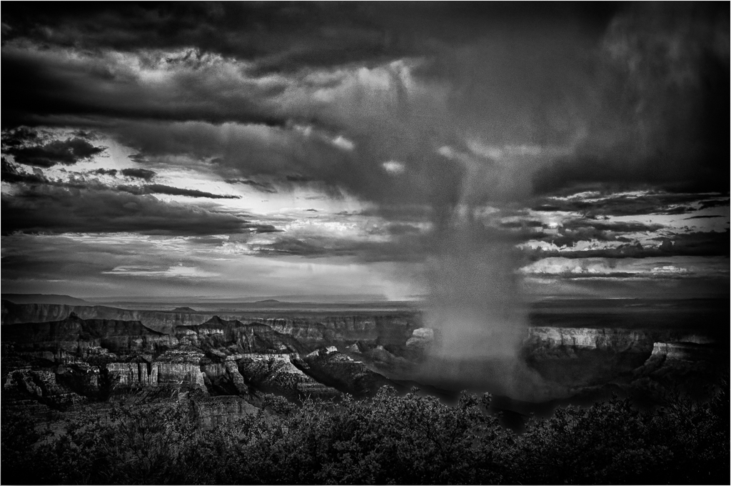
I commend you for seeing this interesting image and sharing your vision. Well done.
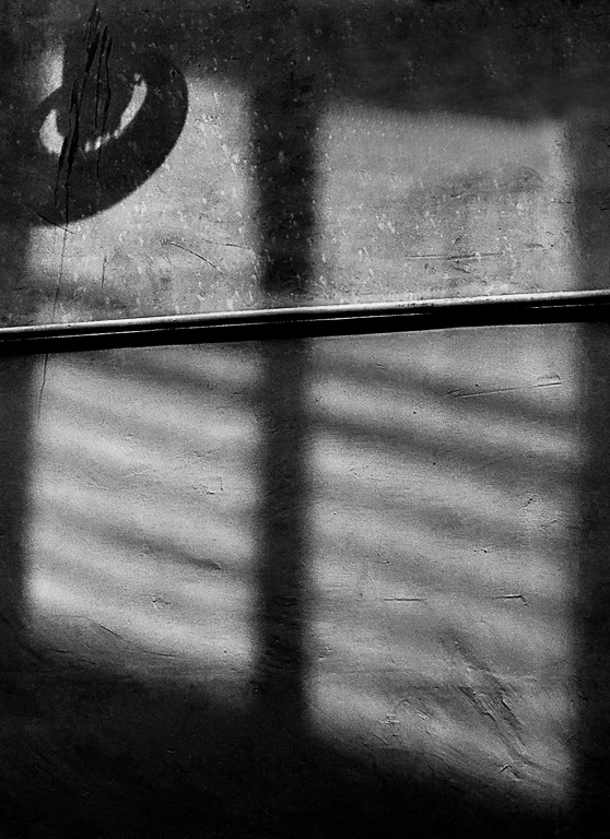
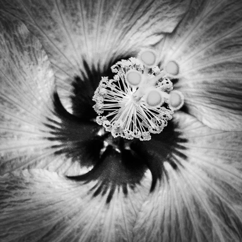
Yes adding more contrast is one possibility. The look of the bottom right drew my attention though and I would try to soften, and blur the rest of the image to match it. Just an idea.
Also clone out the few white specks.
|
Dec 5th |
4 comments - 4 replies for Group 64
|
15 comments - 8 replies Total
|