|
| Group |
Round |
C/R |
Comment |
Date |
Image |
| 18 |
Nov 18 |
Comment |
Well done! Very interesting. |
Nov 17th |
1 comment - 0 replies for Group 18
|
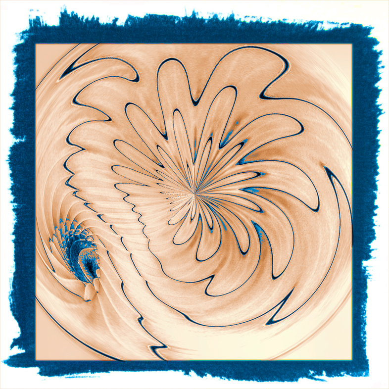
| 20 |
Nov 18 |
Reply |
Excellent border. Thanks. |
Nov 19th |
| 20 |
Nov 18 |
Reply |
Thanks.
My new top will be pointed, but it will some time to construct. I'll also change the base to simplify it.
I too will use Cindy's procedure in the future. |
Nov 19th |
| 20 |
Nov 18 |
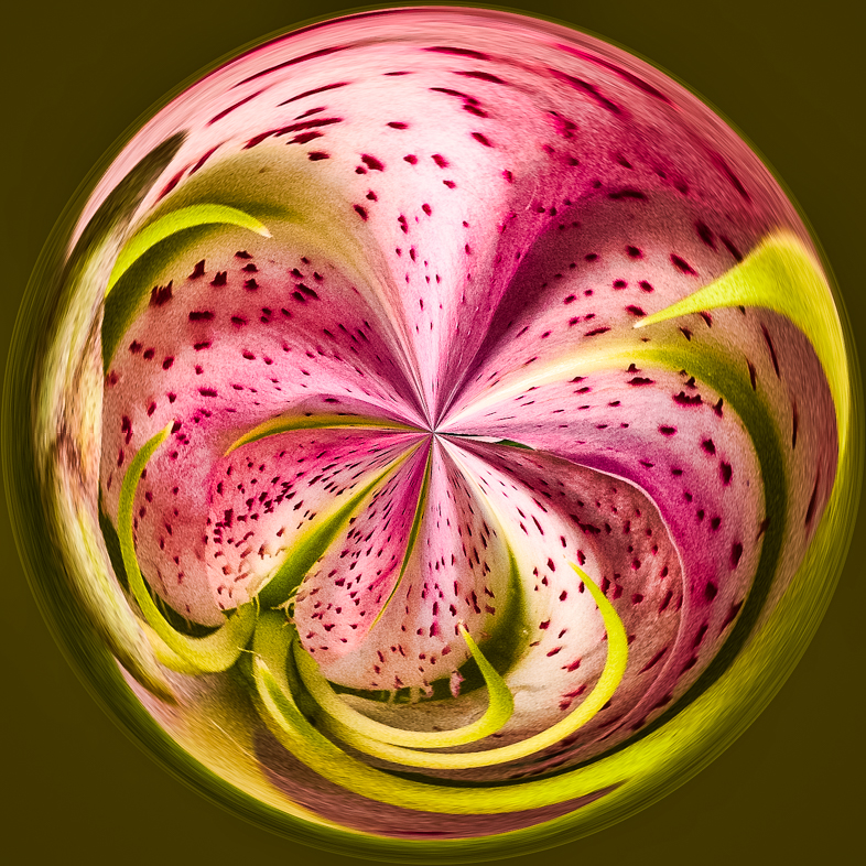
Comment |
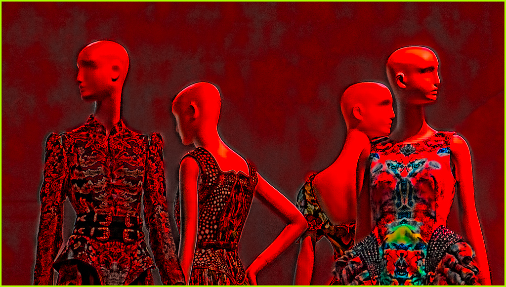
I postponed my review of this and developed an idea for you to consider. I like the composition and creative treatment as is, but I find the lady distracting. If she could be shrunken and moved to replace the figure in the back right, my eye would be led in by the leading lines and her bright sweater. Yes, remove the man in the white shirt too. |
Nov 17th |
| 20 |
Nov 18 |
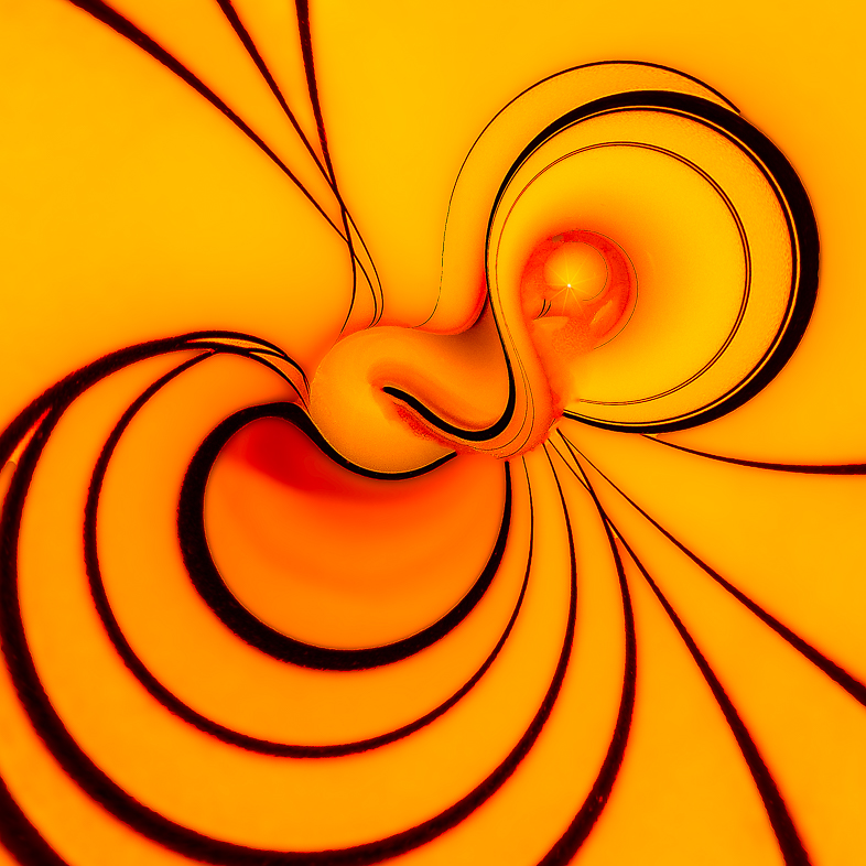
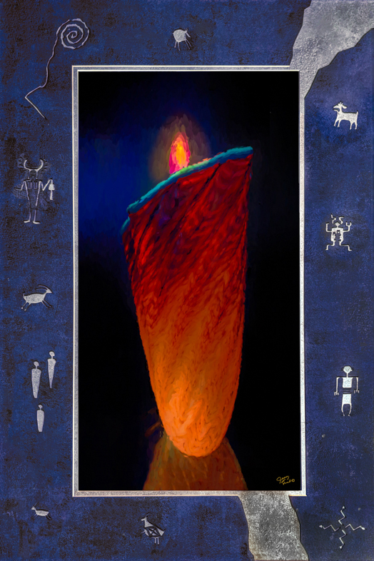
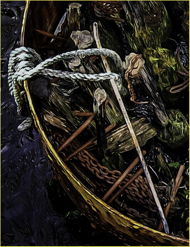
Comment |
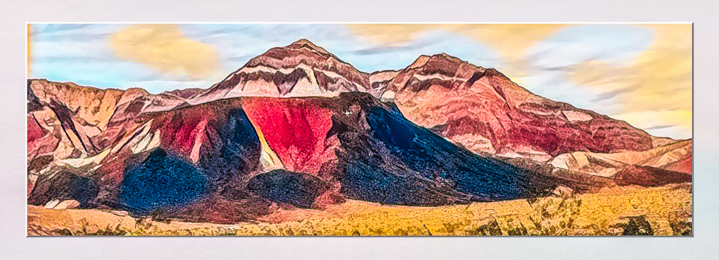
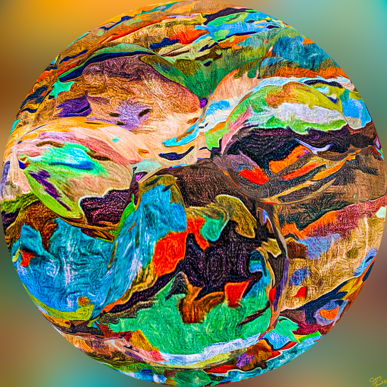
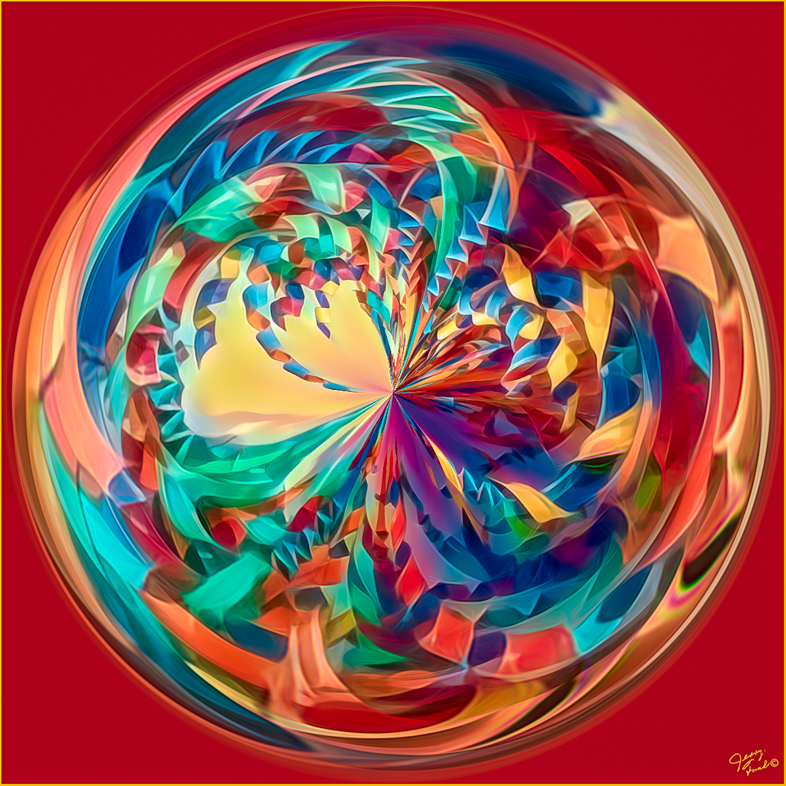
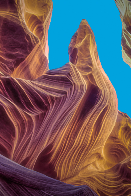
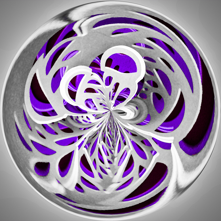
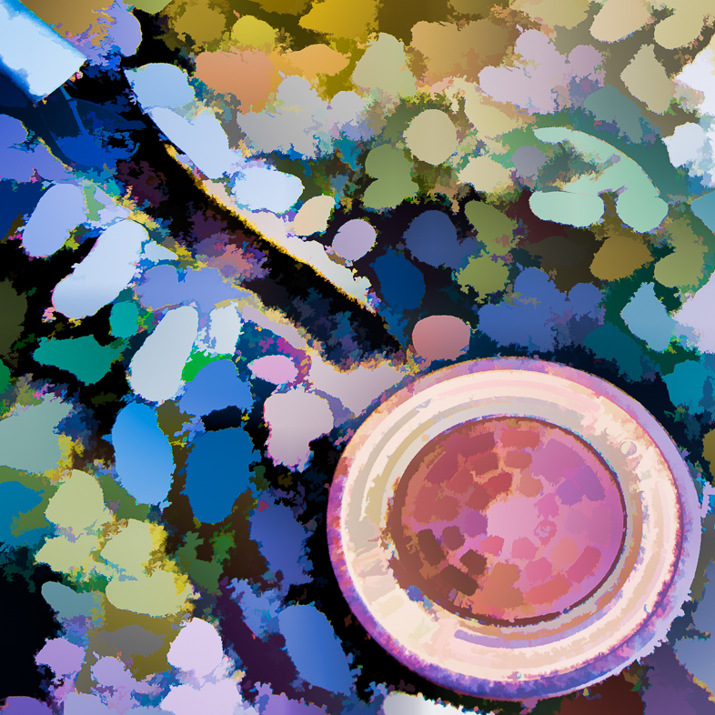
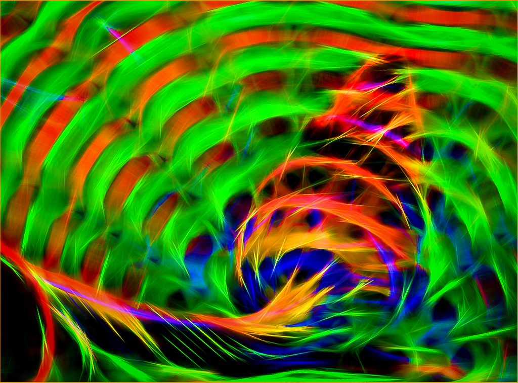
I delayed commenting, because I thought I might change my opinion. I do like the colorful abstract but the shaft of light is distracting to me in this version. The bottom half is most appealing to me, so perhaps I would prefer to see the top darkened a bit. |
Nov 17th |
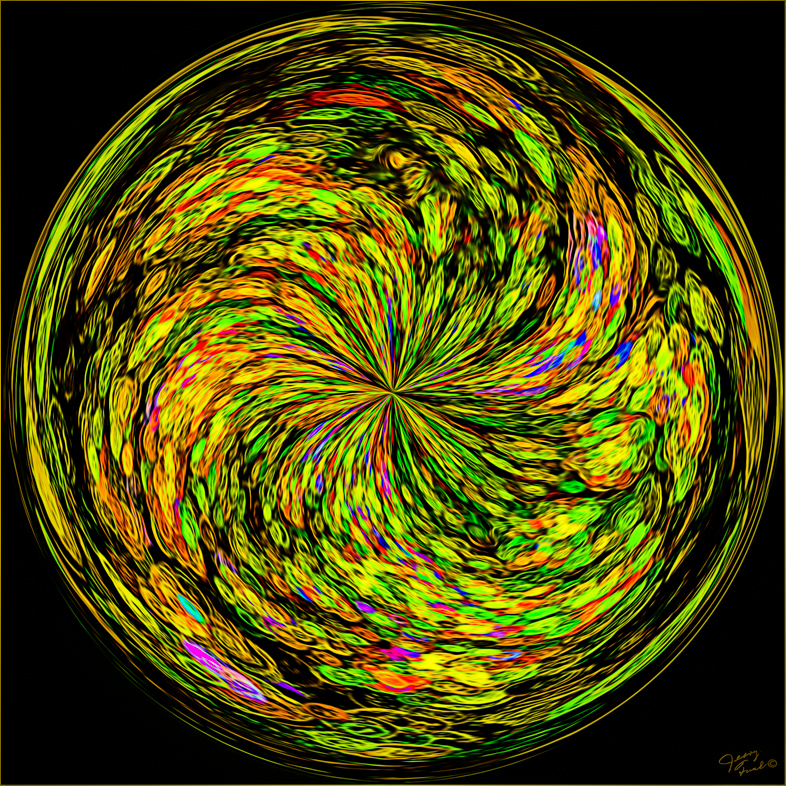
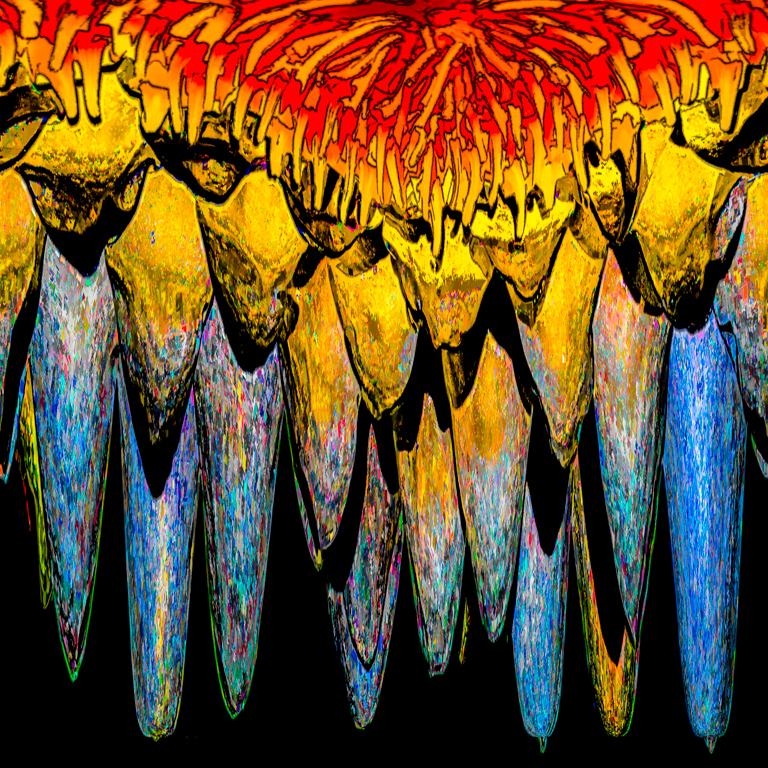
| 20 |
Nov 18 |
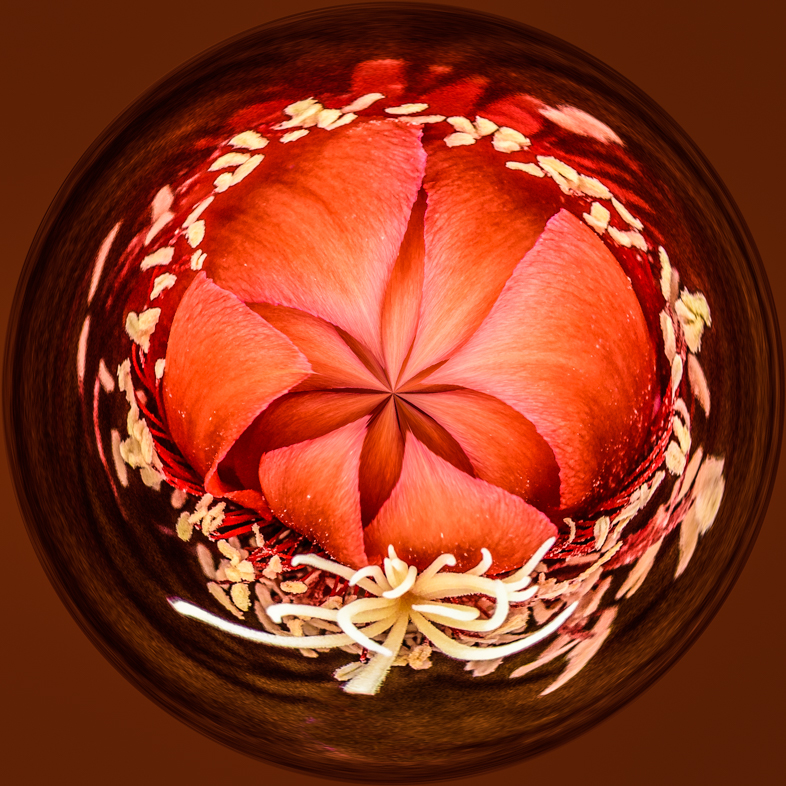
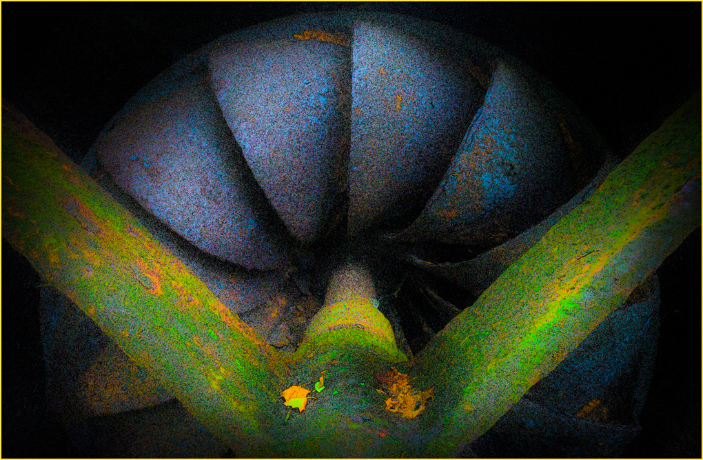
Comment |
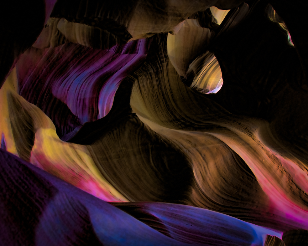
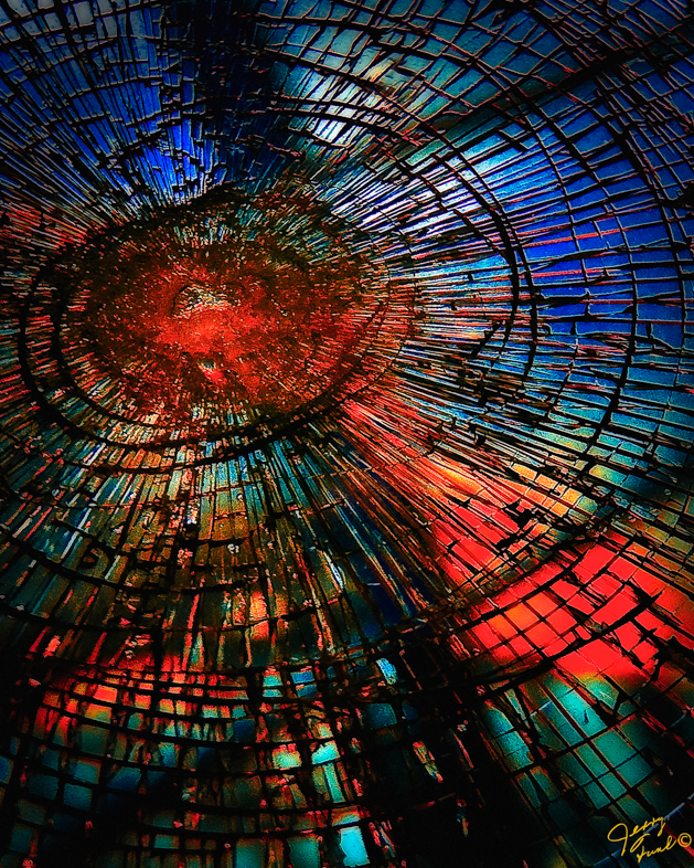
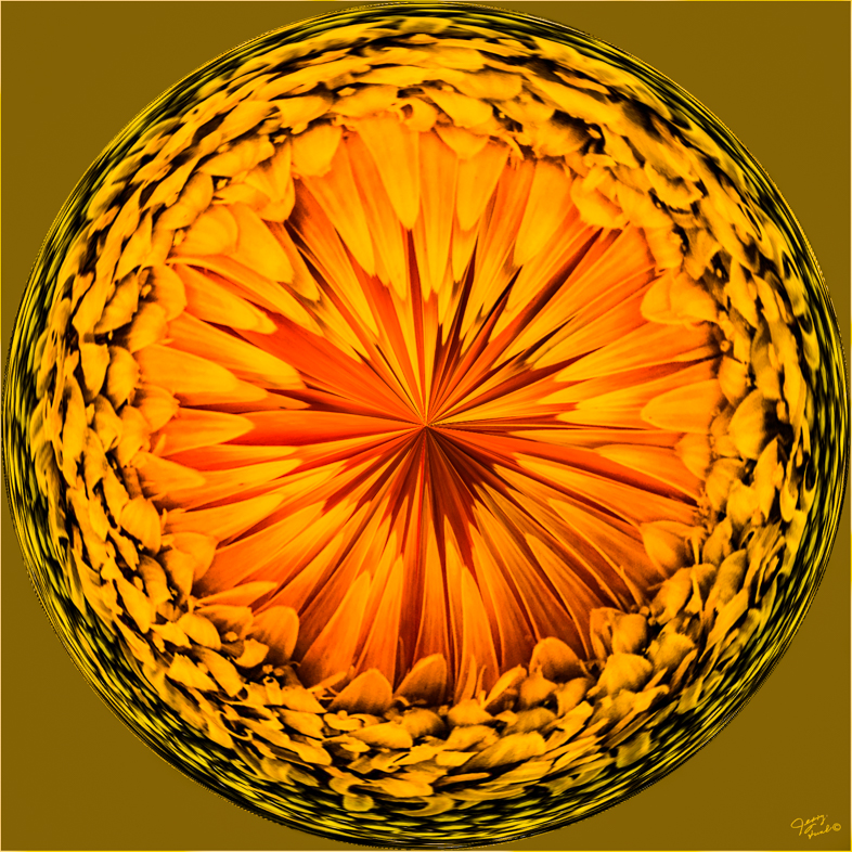
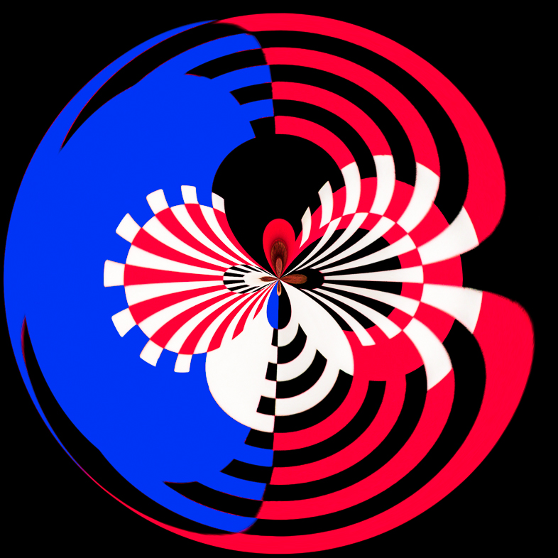
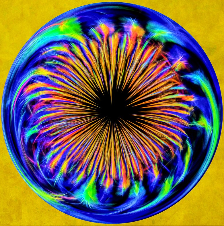
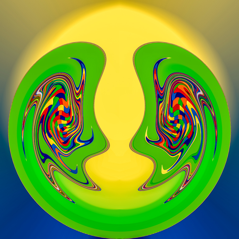
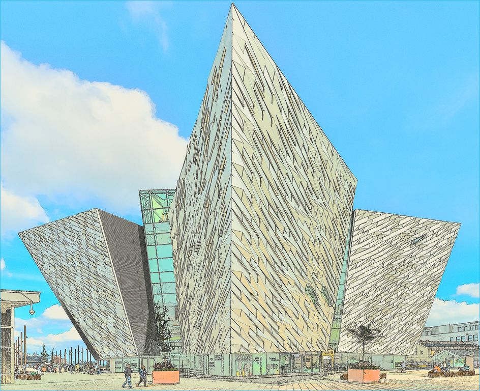
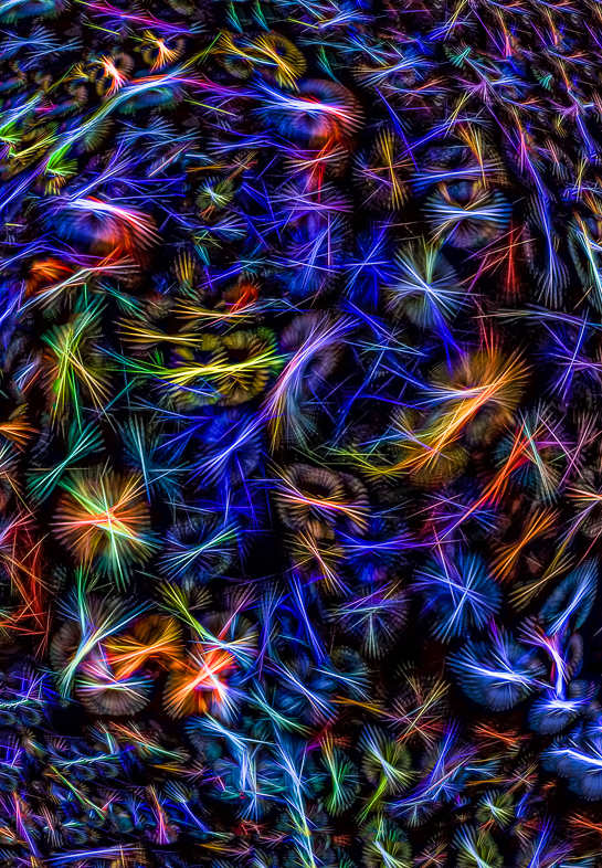
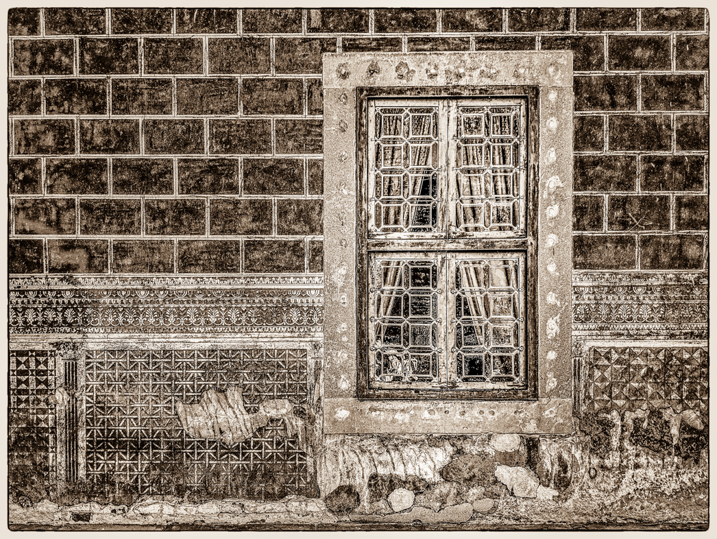
I like composition and your emphasis of the colorful elements by muting the fans. The frame and darkening of the corners contributes to the whole very well. |
Nov 8th |
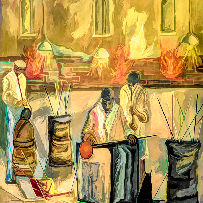
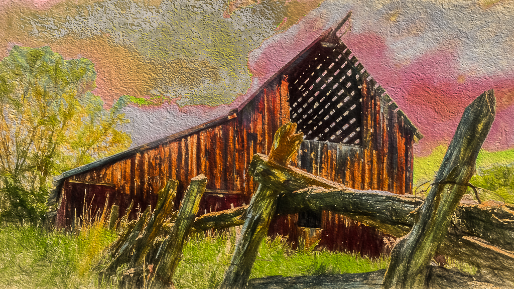
| 20 |
Nov 18 |
Comment |
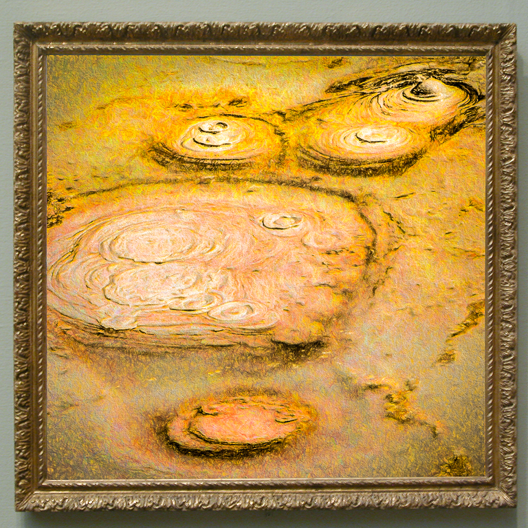
What a wonderful transformation of a common subject! Perhaps, you have motivated me to work with PS layers rather than taking shortcuts with plug-in software.
Perhaps a frame color matching the brown barn would add a bit for my eye. |
Nov 8th |
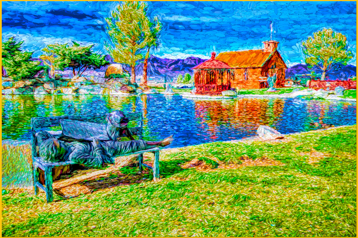
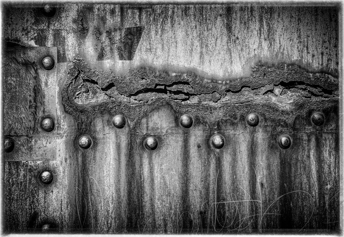
| 20 |
Nov 18 |
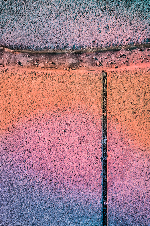
Comment |
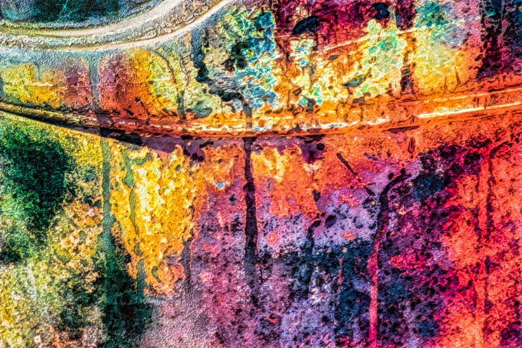
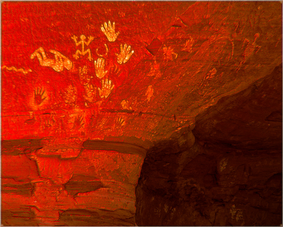
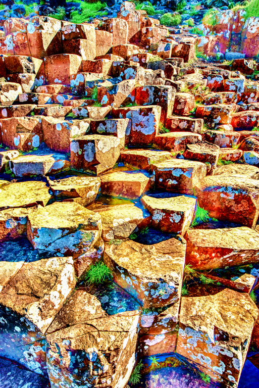
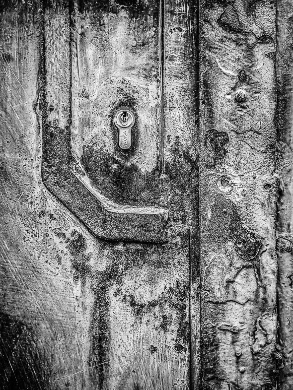
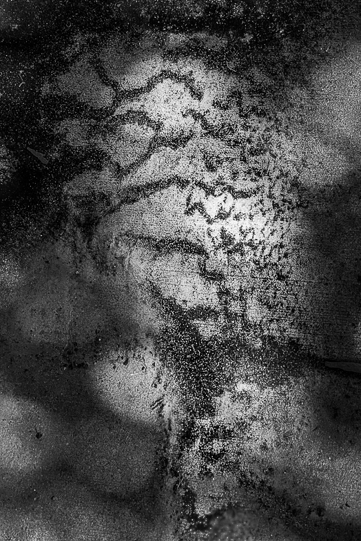
I really like the gritty effect you created.
The key to straightening is to first rotate it to make a center vertical line straight. Then apply the vertical transform tool in LR. Occasionally, the horizontal tool helps too, especially when photographing paintings at an angle to avoid reflections. |
Nov 8th |
| 20 |
Nov 18 |
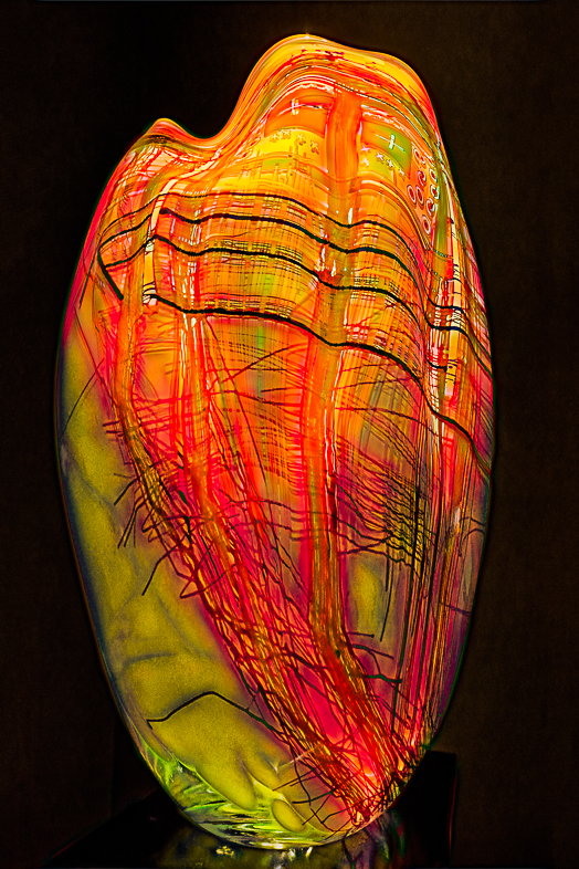
Comment |
I think you made an excellent composite. The all important lighting, blending, etc. is perfect to my idea.
My preference though would be to pose the model with more bend to her knee or better yet crouched in a fetal position emerging from the shell.
Well done. |
Nov 8th |
| 20 |
Nov 18 |
Reply |
If you were judging this is the frame a positive, negative or neutral element? |
Nov 8th |
6 comments - 3 replies for Group 20
|
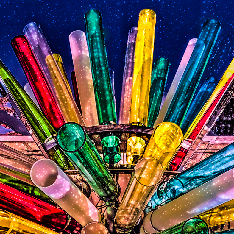
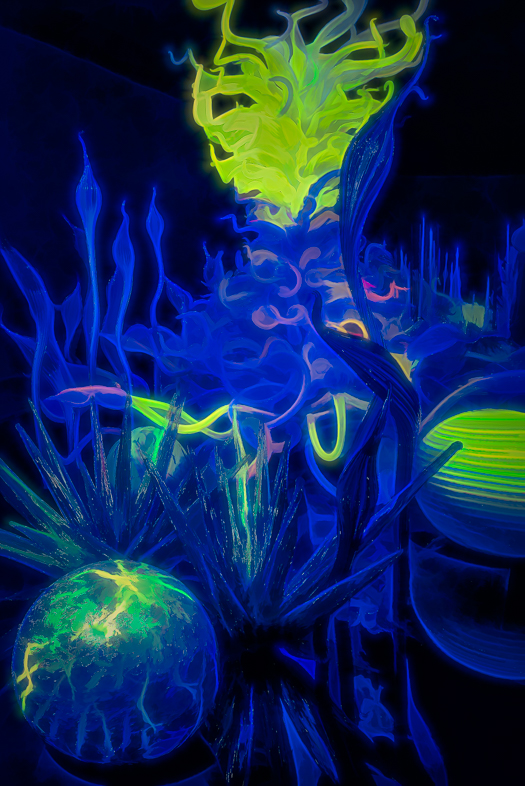
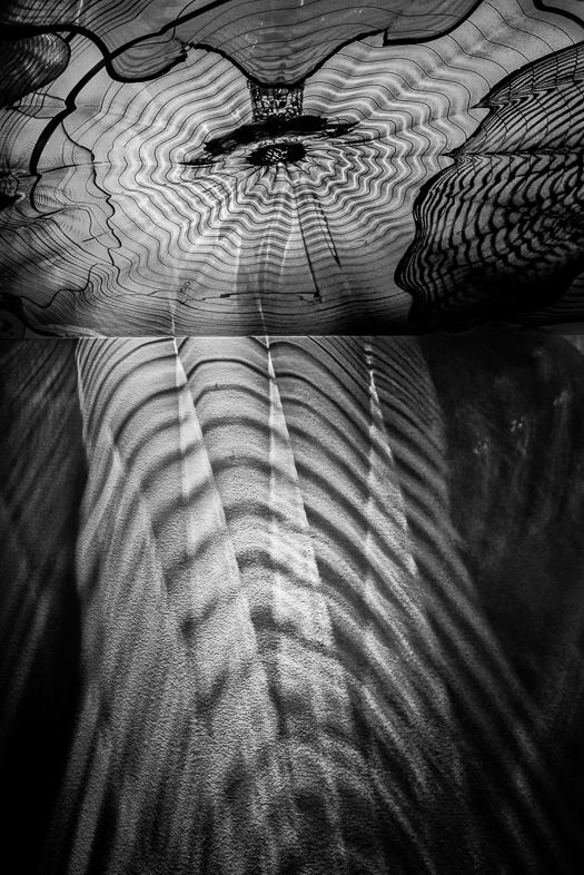
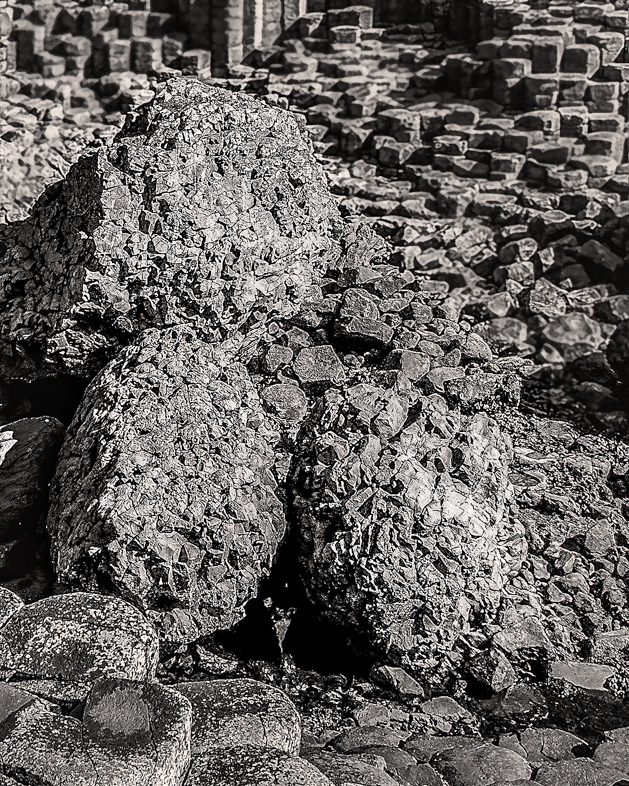
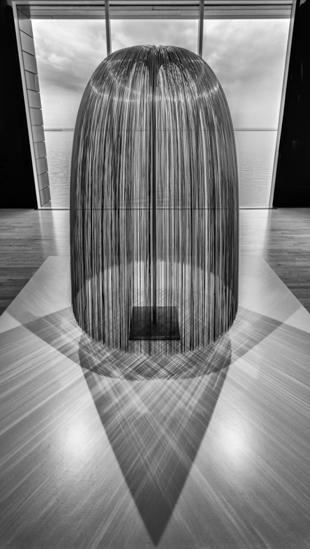
| 39 |
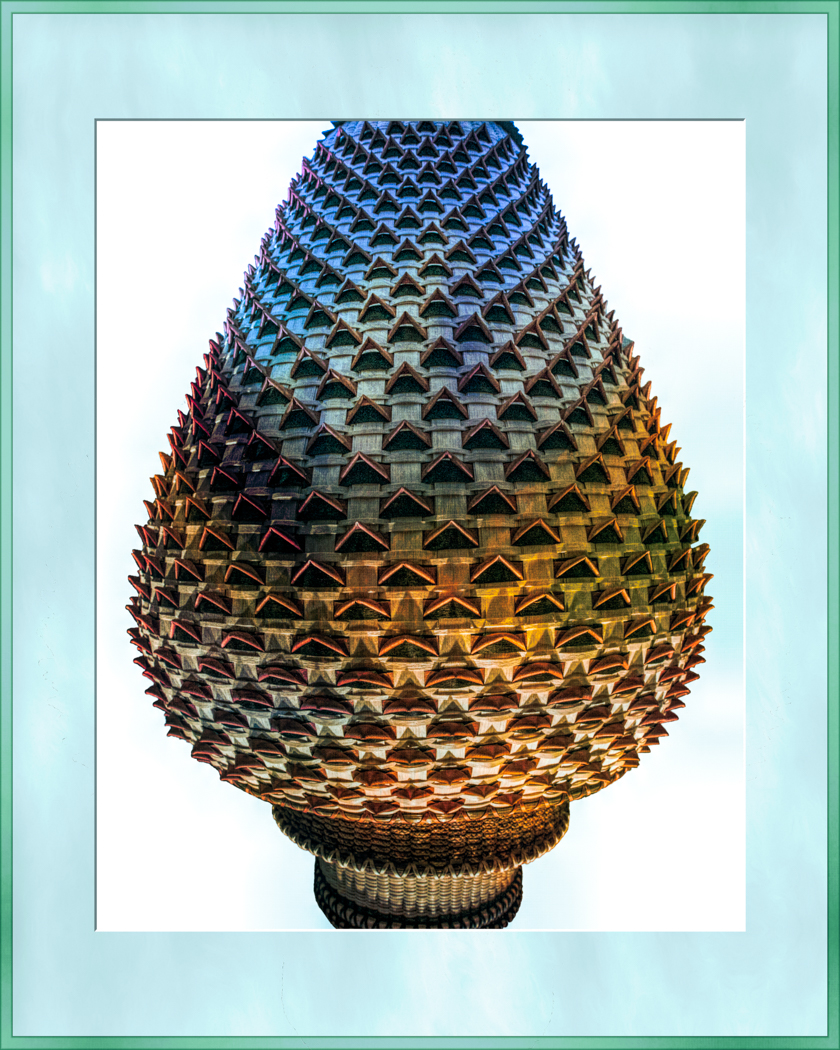
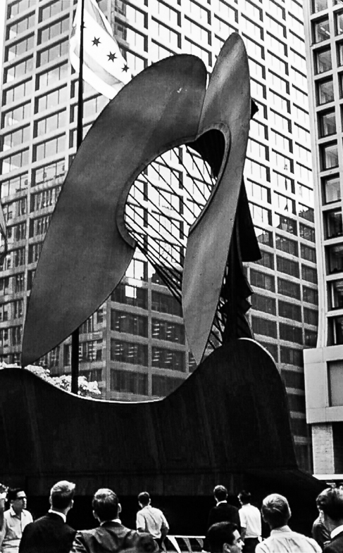
Nov 18 |
Comment |
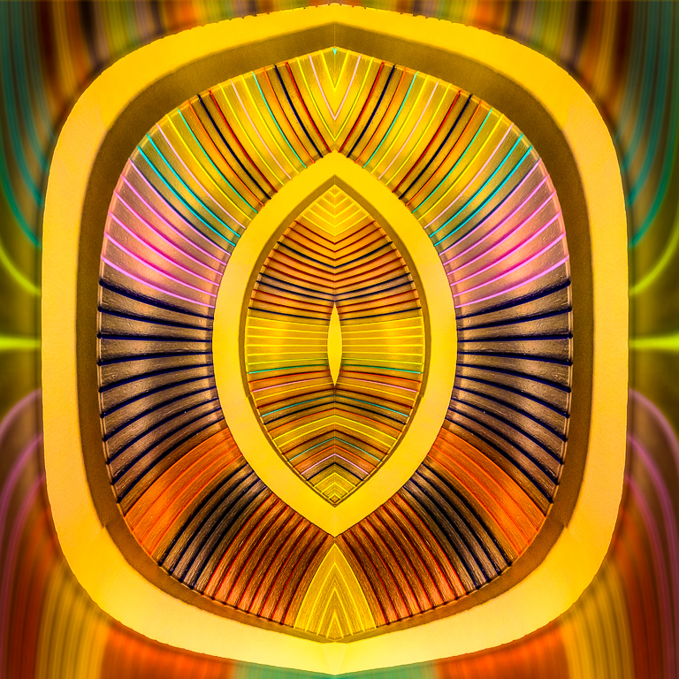
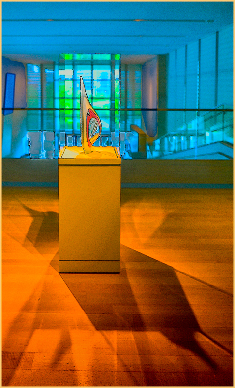
Just visiting and like your image. This is an excellent Chihuly piece that you have represented very well.
I have captured thousands of images of his works in many different cities, but the Chihuly Gallery in Seattle is by far the best.
You probably diddn't darken the center. I think it was just shaded by the surrounding pieces as i've Often seen. Nevertheless, as the others said, the shadows need to be opened up. There is probably a 1 degree tilt to the right too.
Add Seattle to your bucket list. |
Nov 21st |
| 39 |
Nov 18 |
Comment |
I'm glad I visited to see this excellent, interesting image.
Perhaps you would like to consider an alternative composition, rotating clockwise and following the diagonal 3/8 guidelines overlay in LR crop. That's my preference, but yours is excellent. |
Nov 21st |
| 39 |
Nov 18 |
Comment |
This subject is so interesting to me that I think it's worth experimenting with many alternative compositions and lighting. Here's a couple ideas.
Crop off the bottom to 3x2 an burn the sides.
Crop the center to a vertical 4x5, burning the edges and increasing the contrast a bit.
Happy Thanksgiving! |
Nov 21st |
3 comments - 0 replies for Group 39
|
| 51 |
Nov 18 |
Comment |
Just visiting and really appreciate the composition and detail of your image. Great both color and mono.
As a Jr. College baseball player I had a tour of this working prison in 1964. I will always remember going through multiple security checks and seeing a small frail prisoner in chains carrying a duffle bag being followed by a 350# guard! The luncheon meal we shared with the guards was bad.
We also saw one of the original small stone cells. |
Nov 22nd |
1 comment - 0 replies for Group 51
|
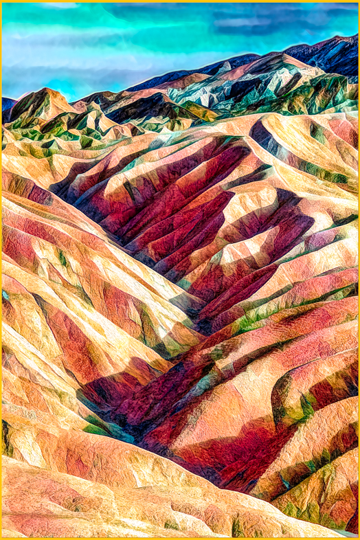
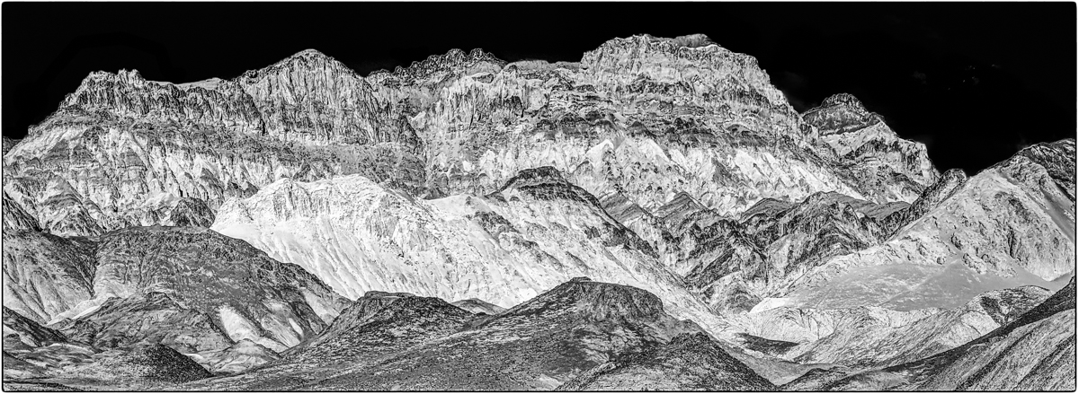
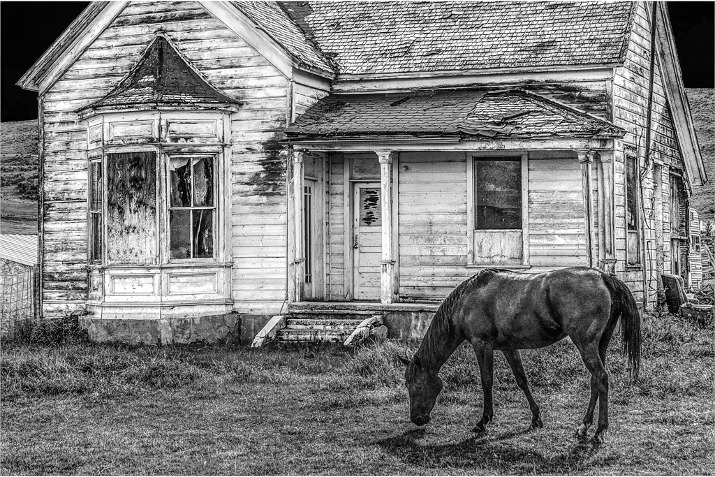
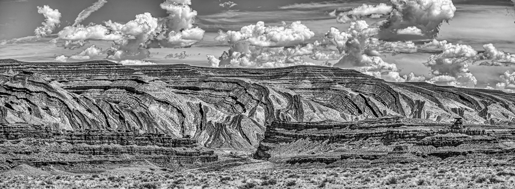
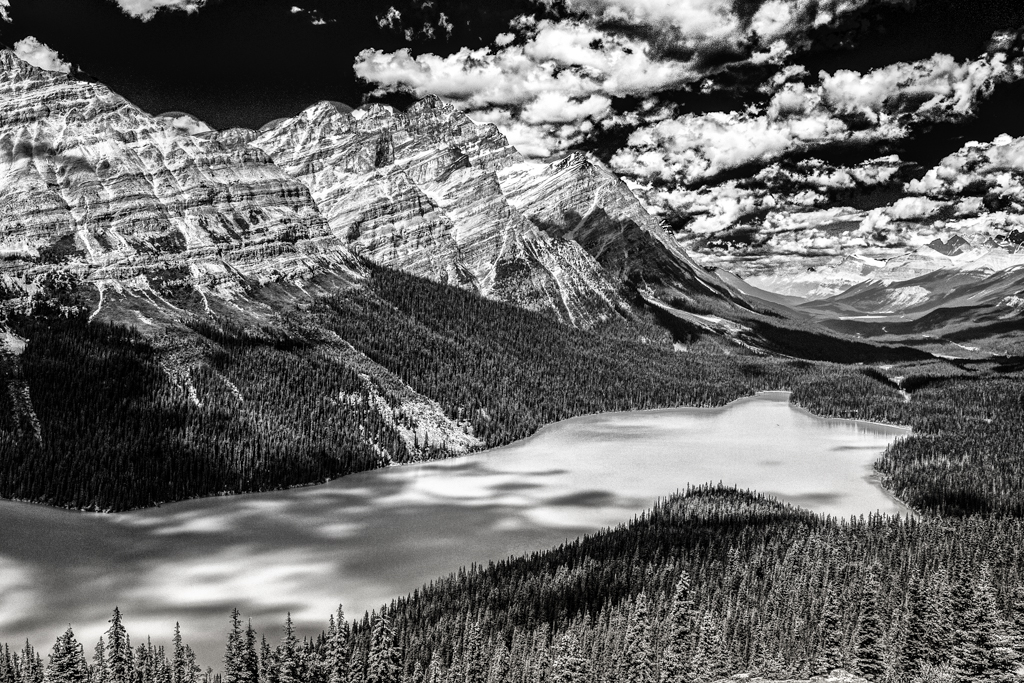
| 64 |
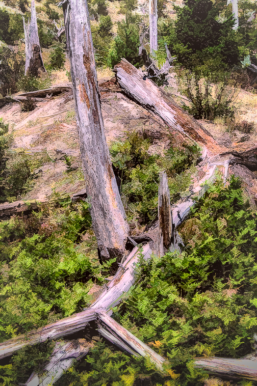
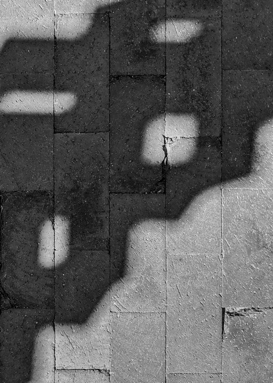
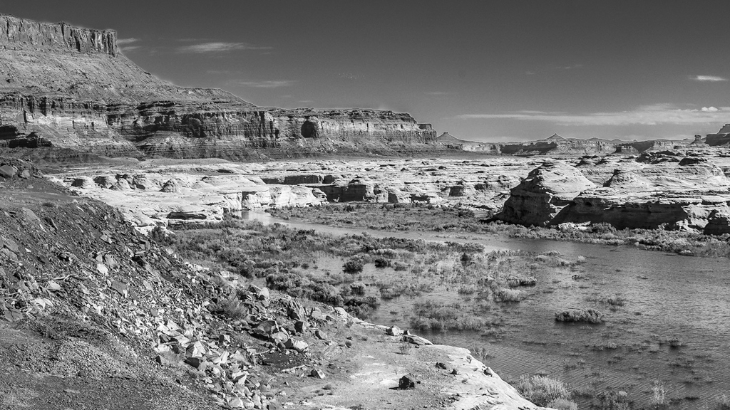
Nov 18 |
Comment |
I like the image as is. A broad vista like this can only make viewers curious about the missing detail. I'm confident your camera has captured the detail that would be revealed with a closer crop. Of course that would tell a different story.
I've recently reviewed some old images of my own at even slower shutter speeds, but no longer. I still always hand hold and am glad technology has advanced to alllow higher ISOs to facilitate that. |
Nov 17th |
| 64 |
Nov 18 |
Reply |
Thanks. |
Nov 17th |
| 64 |
Nov 18 |
Comment |
Nothing to add. I agree totally with John. |
Nov 17th |
| 64 |
Nov 18 |
Reply |
Any ideas on how to make the balls stand out from the background? I did blur the background a bit and increased the contrast of the balls.
The artificial intelligence of my new Google Pixel 3 far surpasses that of this GP1! I won't upgrade from my D810 until Nikon makes use of advanced AI too. |
Nov 9th |
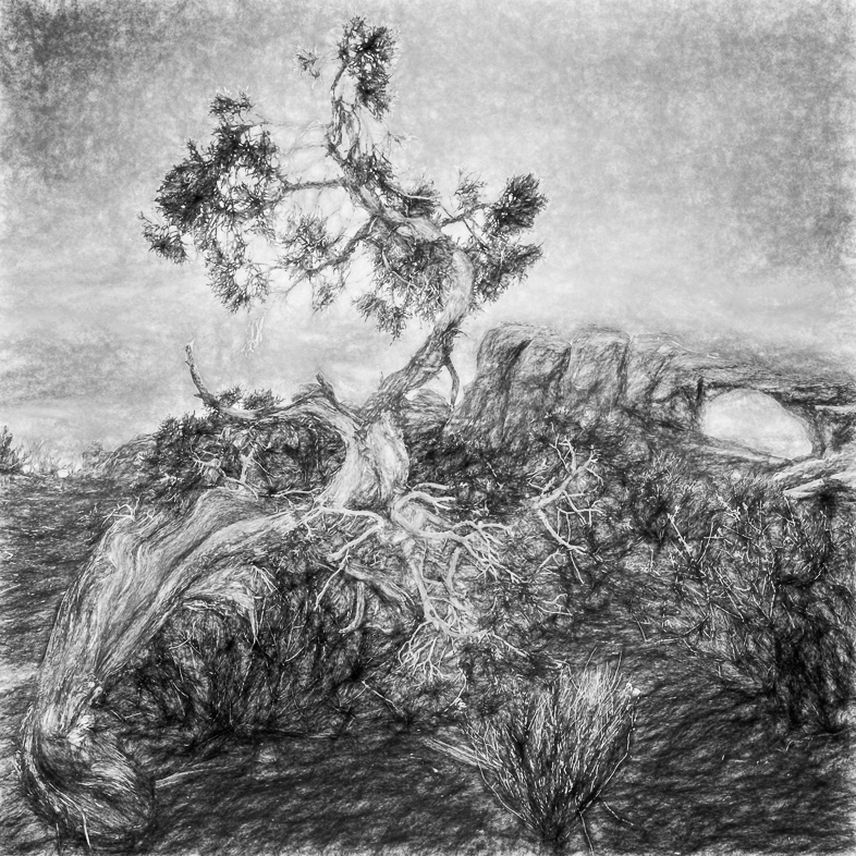
| 64 |
Nov 18 |
Comment |
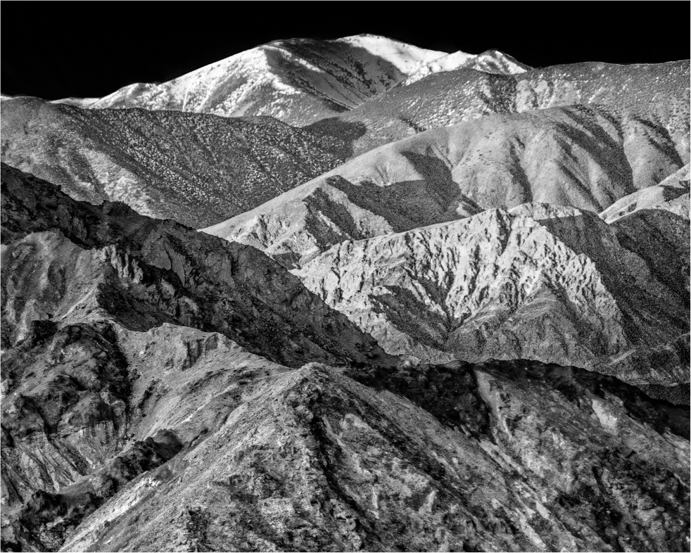
I really like this image a lot, but I think the rhinos and tree are leaning a tad to the right. |
Nov 3rd |
| 64 |
Nov 18 |
Comment |
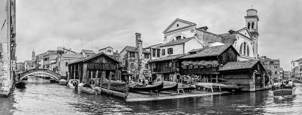
I'm a Chicago native that moved almost 30 years ago. So, I enjoy trying to place the location. My first guess was Van Buren St. but then I read the inscription "Washington Block". So, I think it's the elevated on Wabash at Washington. My visiting daughter, works in downtown Chicago and says it is more likely Welles at Washington.
Anyway, we like the action you captured, though it took awhile for me distinguish the nearby train. Ideally, I would like that train to be in focus, but I know that was impossible to capture.
I don't need it leveled but would prefer a slight crop off the bottom to remove the bright horizontal beam. Alternatively, it could be darkened slightly.
|
Nov 3rd |
| 64 |
Nov 18 |
Comment |
Yes, I too think you did excellent. Editing.
I'm being very picky, but my preference would be to clone out the feathers covering a part of the eye and add a catch light there too. |
Nov 3rd |
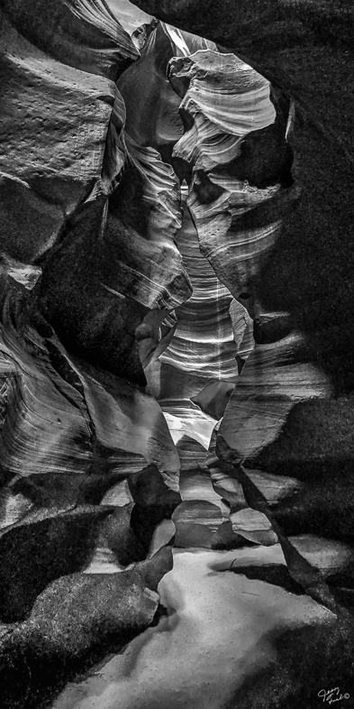
| 64 |
Nov 18 |
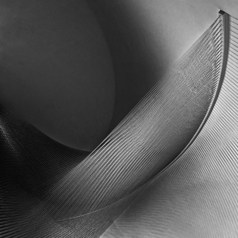
Comment |
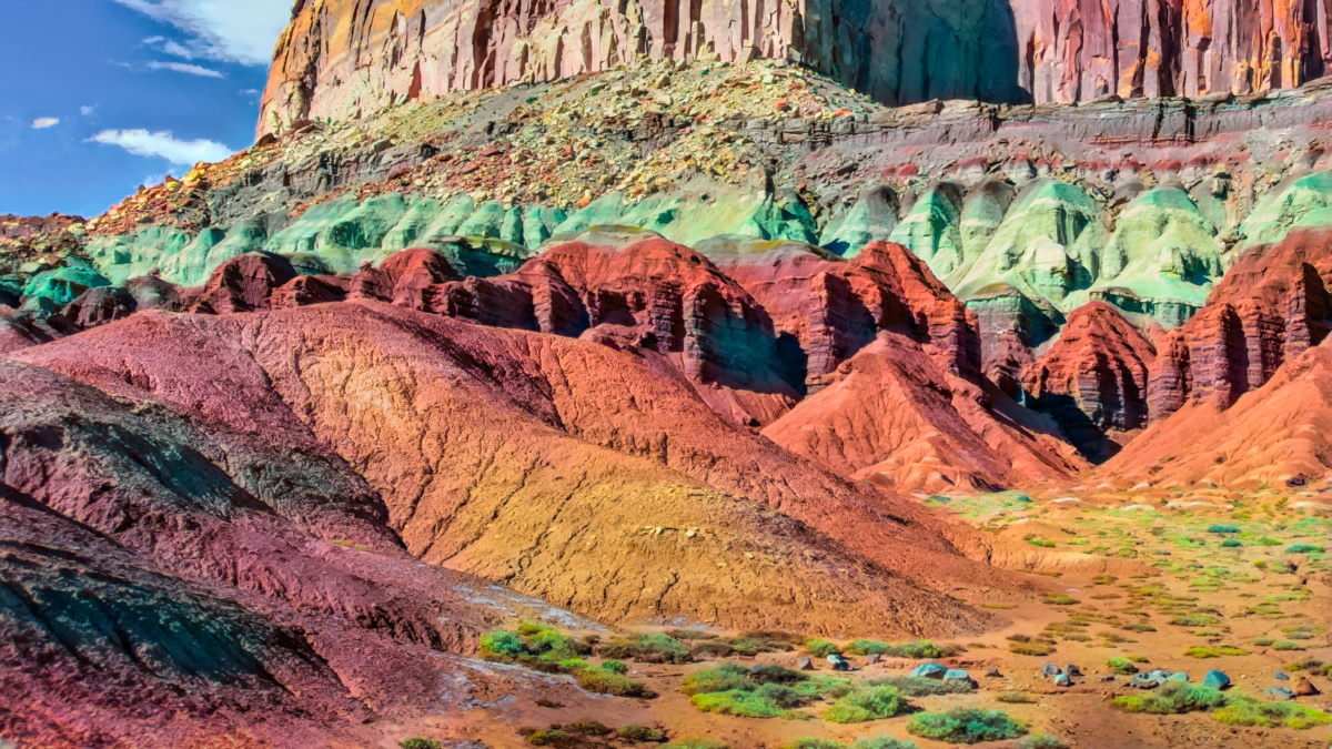
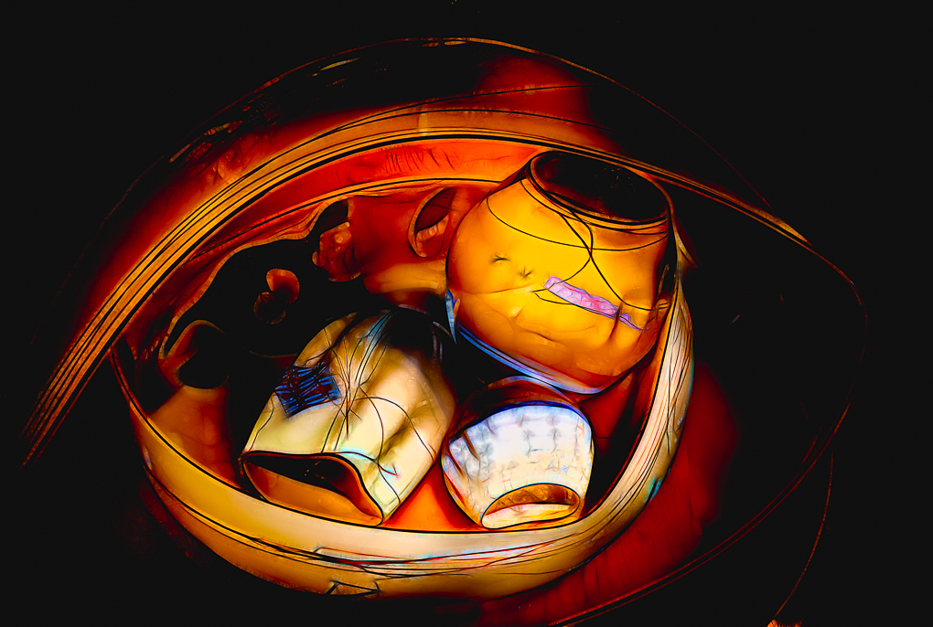
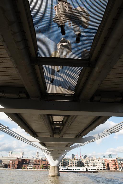
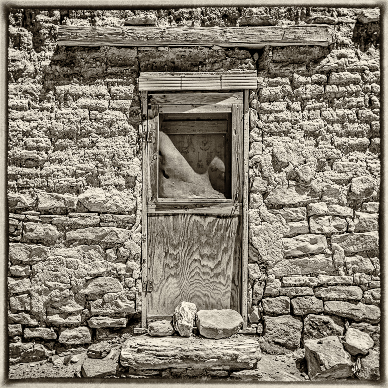
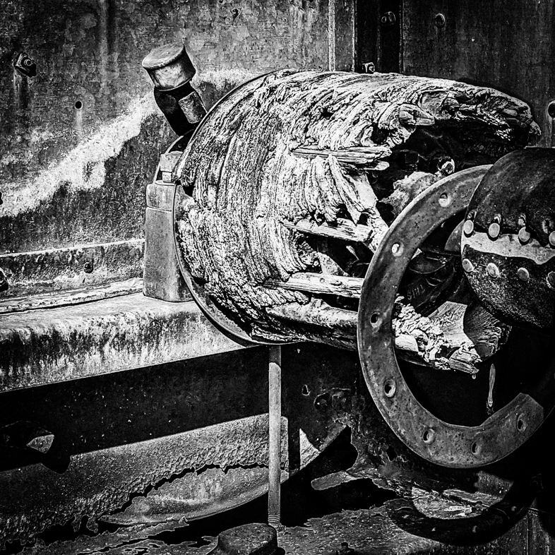
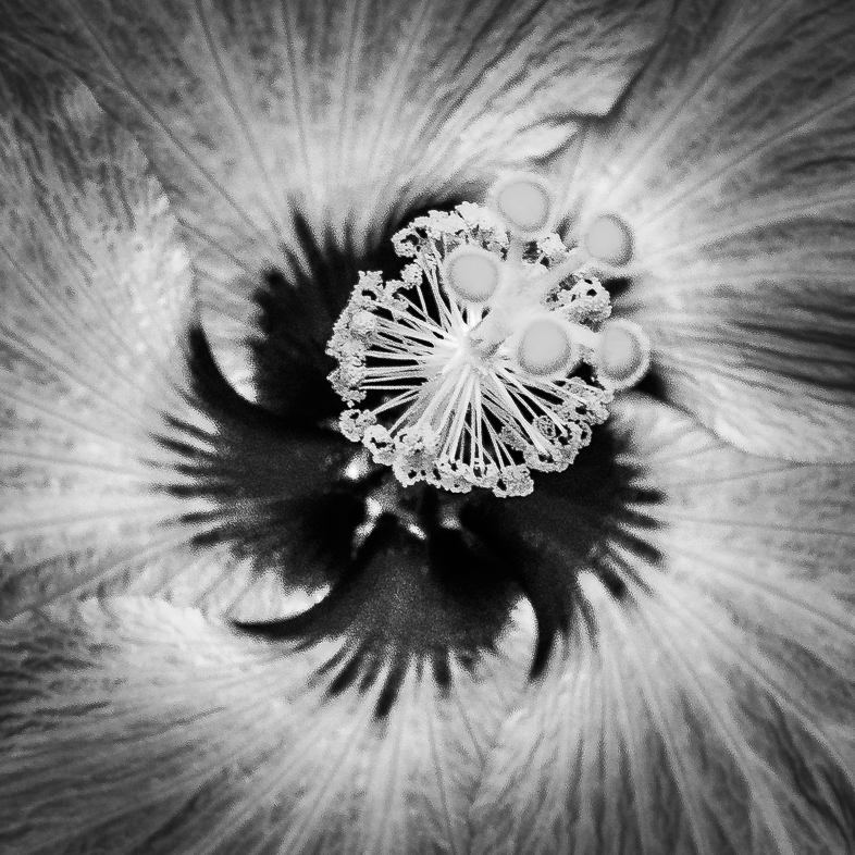
I find this a very interesting subject, excellently composed, but the contrast is too high for my taste.
I would prefer to see more detail in the bright areas of the pipes and also clone out the bright inverted U at the top middle. Could you also reveal more detail in the black pipes and bar on the bottom right? |
Nov 3rd |
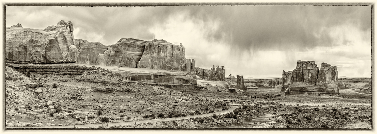
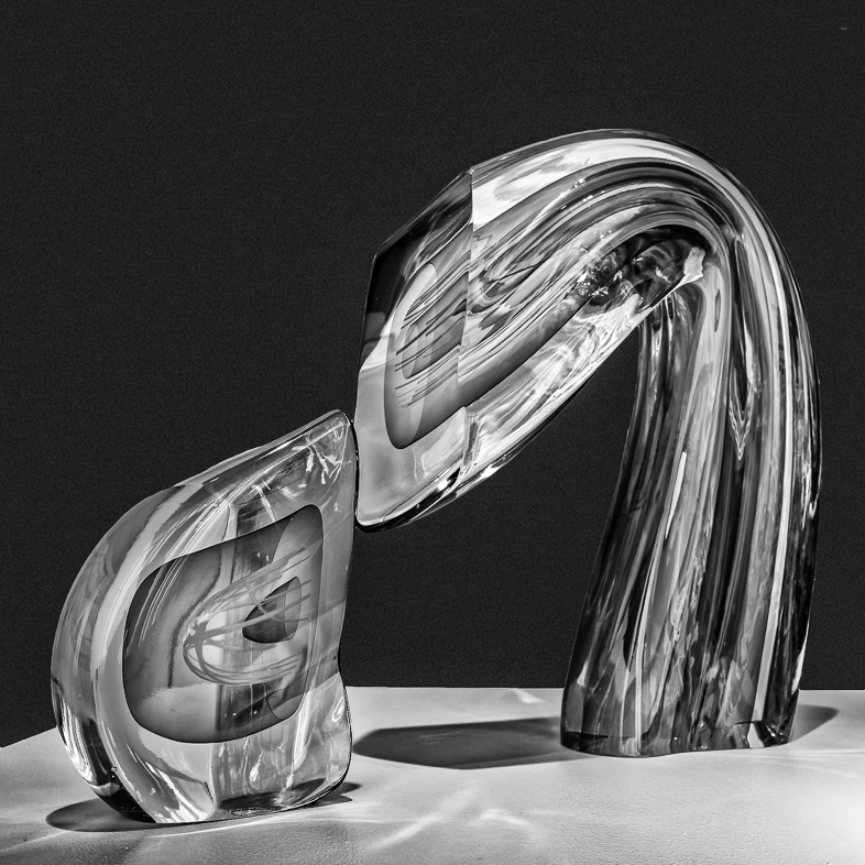
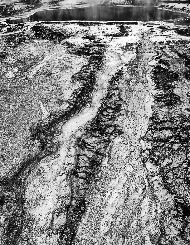
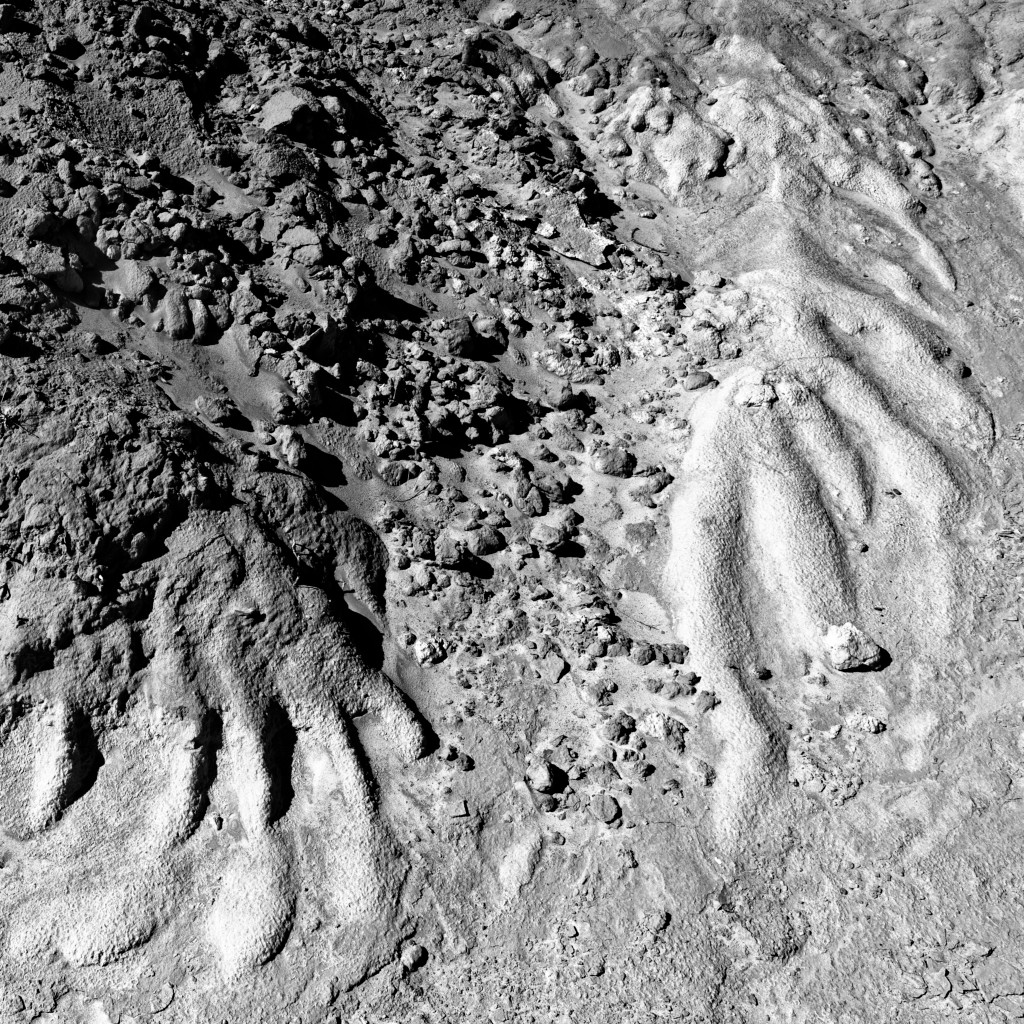
| 64 |
Nov 18 |
Comment |
This was a beautiful site and I did make a number of color panoramics including the Atlantic Ocean that is out of view to the left. I also cloned out all the people except for the one in red.
Yes, I found making a monochrome image very challenging and look forward to hearing suggestions to improve it. I'll try lightening and blurring the background to the right of the third ball. I've also made a version toning the balls, but it's no longer monochromatic. |
Nov 3rd |
7 comments - 2 replies for Group 64
|
18 comments - 5 replies Total
|