|
| Group |
Round |
C/R |
Comment |
Date |
Image |
| 20 |
Sep 18 |
Reply |
Just my wishful thinking and imagination. |
Sep 23rd |
| 20 |
Sep 18 |
Comment |
Sorry, I have problems with this image apart from the story.
The shirt is over exposed and the stone column is not perpendicular. I'm also distracted by the extended arm. i Would have preferred you only work with original 2 because I think it tells the story better when closely cropped. |
Sep 11th |
| 20 |
Sep 18 |
Comment |
I think you created an image worthy of printing on canvas on displaying in most homes I can't suggest a single thing to improve it. |
Sep 11th |
| 20 |
Sep 18 |
Comment |
I think you have 2 exceellent images. I especially appreciate the leading lines in the foreground that many images lack. |
Sep 11th |
| 20 |
Sep 18 |
Comment |
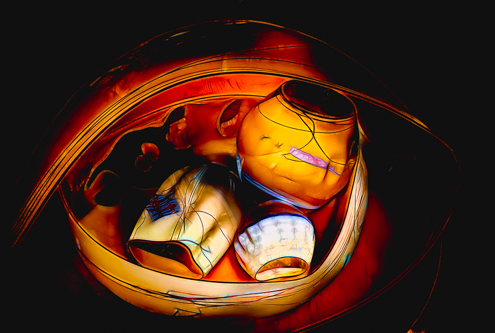
Very well done, in my opinion. I think it's extremely challenging to combine images and it took me some time to determine the small detail that just doesn't blend perfectly for my eye. I think the bottles may be more sharply focused than all the other elements. |
Sep 11th |
| 20 |
Sep 18 |
Comment |
You succeeded in creating an eerie feeling. I think the composition stands very well as it is. Good job! |
Sep 11th |
| 20 |
Sep 18 |
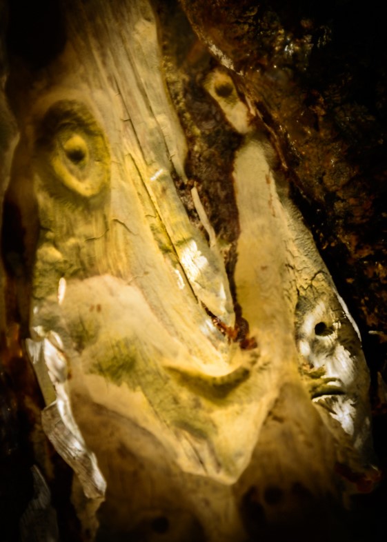
Comment |
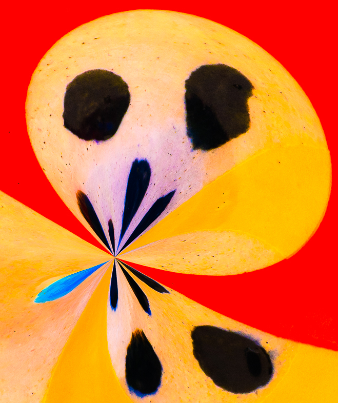
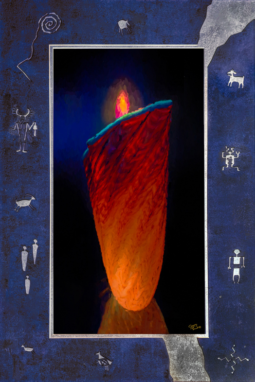
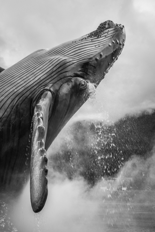
I think the reaction on the face is so good that I would emphasize it by cropping. That would also eliminate the need for shadows.
Good job! |
Sep 11th |
| 20 |
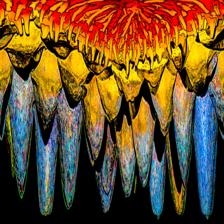
Sep 18 |
Reply |
I agree. I use my imagination and see an angel with a trumpet harolding us to come. |
Sep 4th |
| 20 |
Sep 18 |
Reply |
I think capturing a 14-bit image recovers additional otherwise unseen data. |
Sep 4th |
6 comments - 3 replies for Group 20
|
| 64 |
Sep 18 |
Reply |
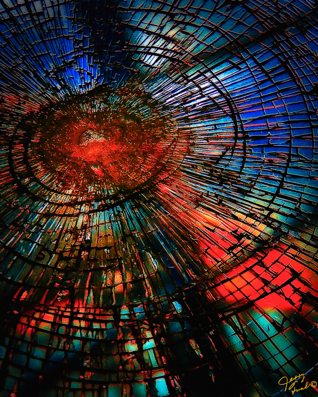
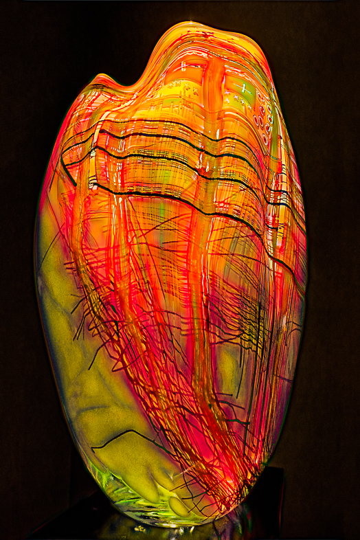
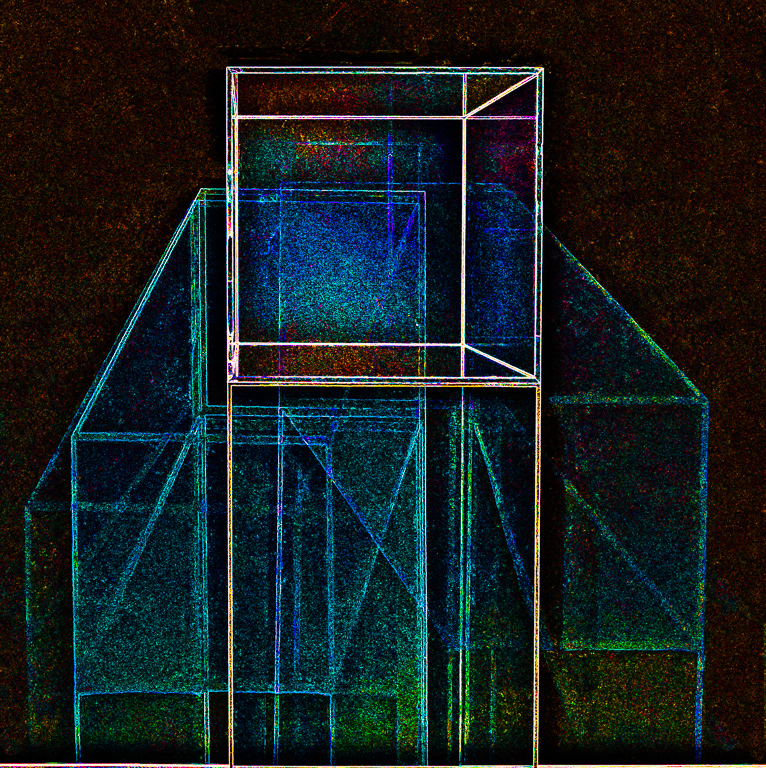
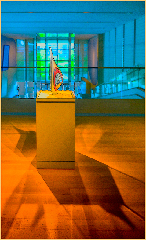
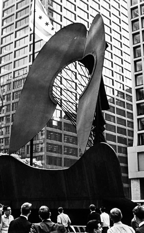
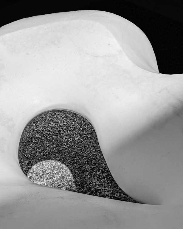
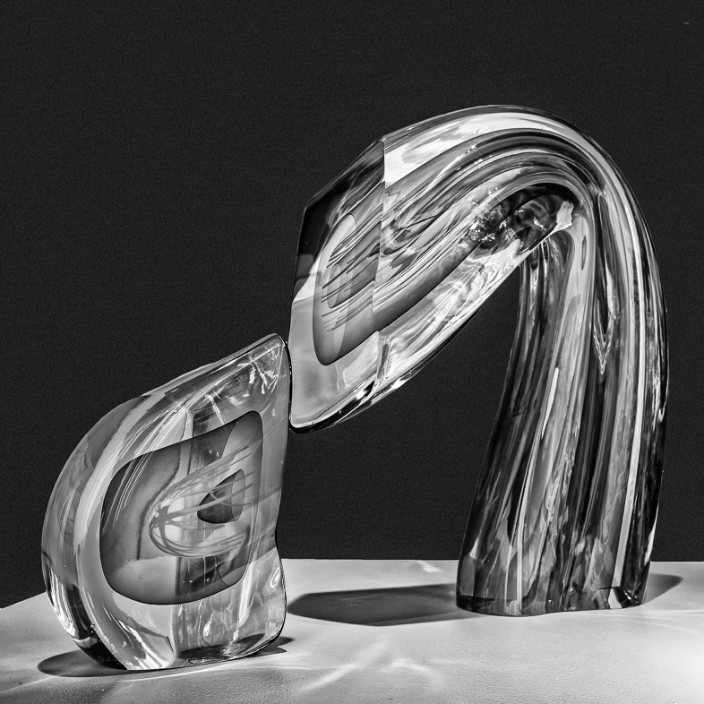
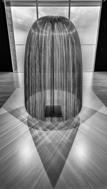
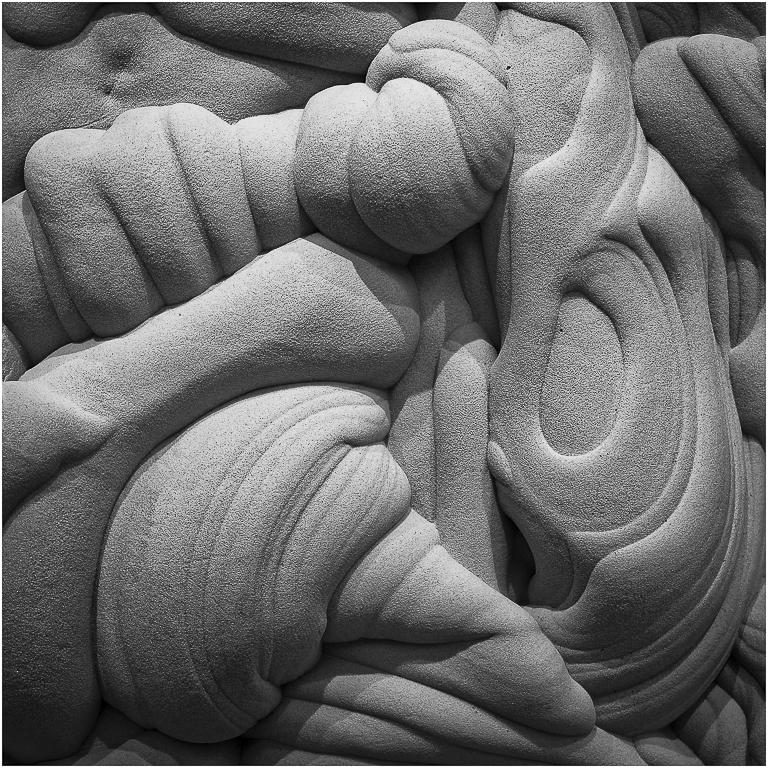
I agree with your ideas, but they are beyond my capabilities.
I was unsuccessful in eliminating the hot spots and the rectangular base of the sculpture.
Maybe, I should take up painting and start from scratch? |
Sep 28th |
| 64 |
Sep 18 |
Comment |
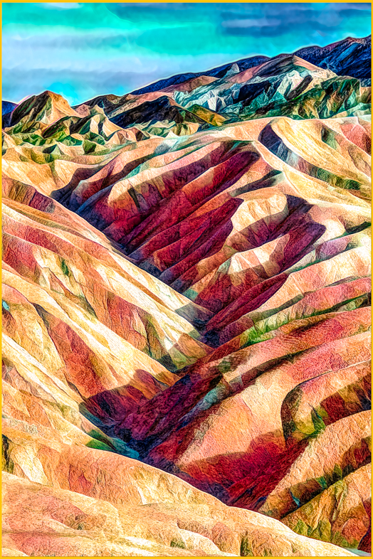
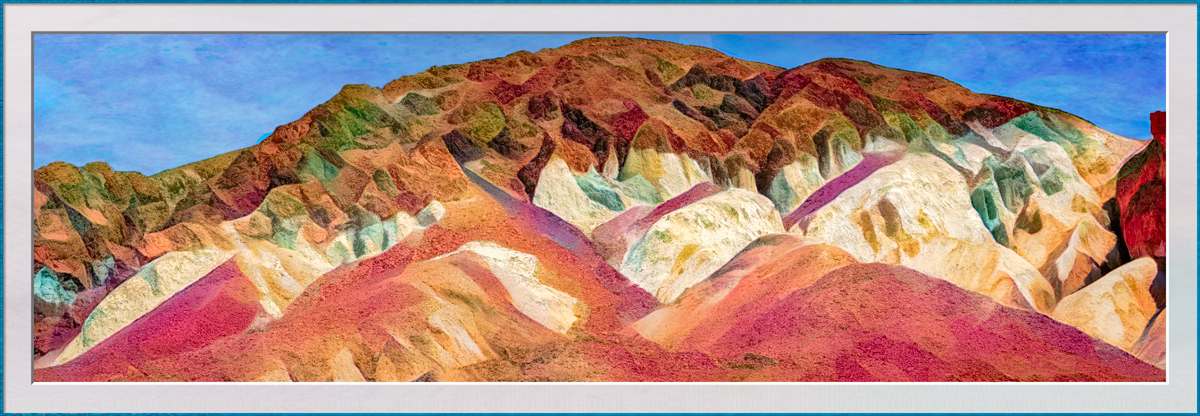
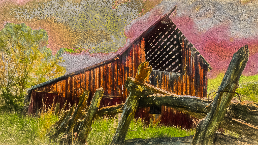
Both images are very appealing to me. Certainly very serene. The building in the shadows doesn't bother me.
I would like to see the halos on the edges cloned out though. |
Sep 10th |
| 64 |
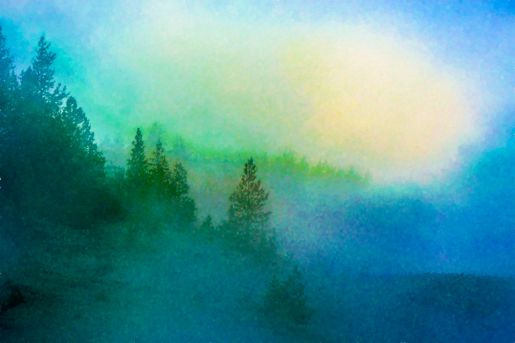
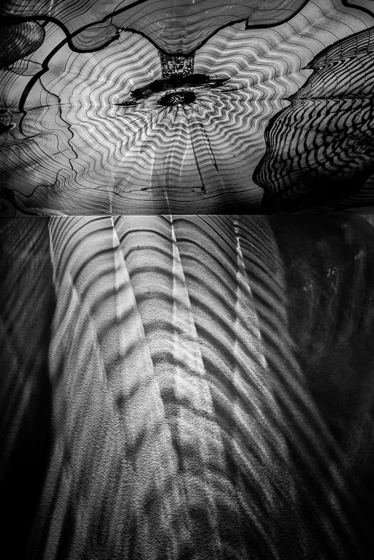
Sep 18 |
Comment |
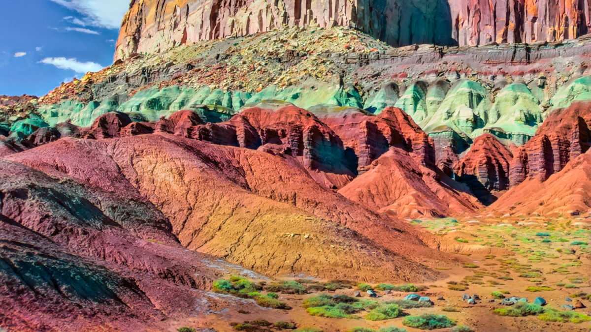
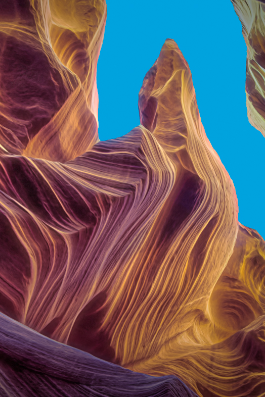
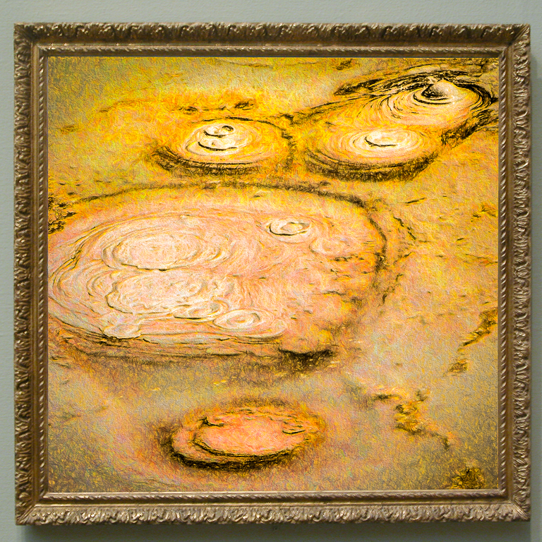
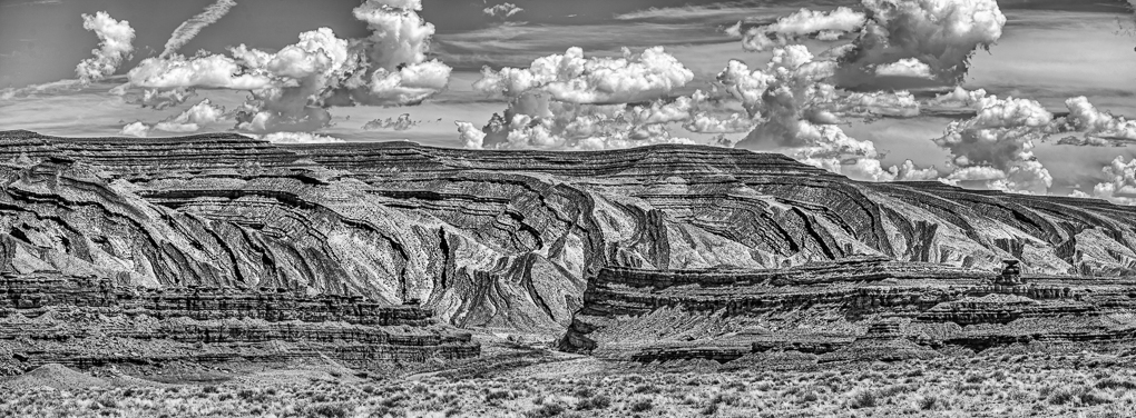
This likable image reminds me of oriental fine art. So, I'd prefer to see the trees at the bottom cloned out. That, to me, would emphasize the primary subject.
I'd Also like to see a version with greater depth of field because I think the pattern of the background may then make a greater contribution to the composition.
Isn't it always surprising when each individual sees things differently? But you did say you could have spent hours at that location. |
Sep 10th |
| 64 |
Sep 18 |
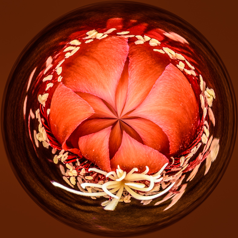
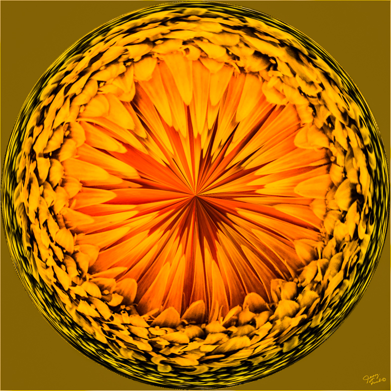
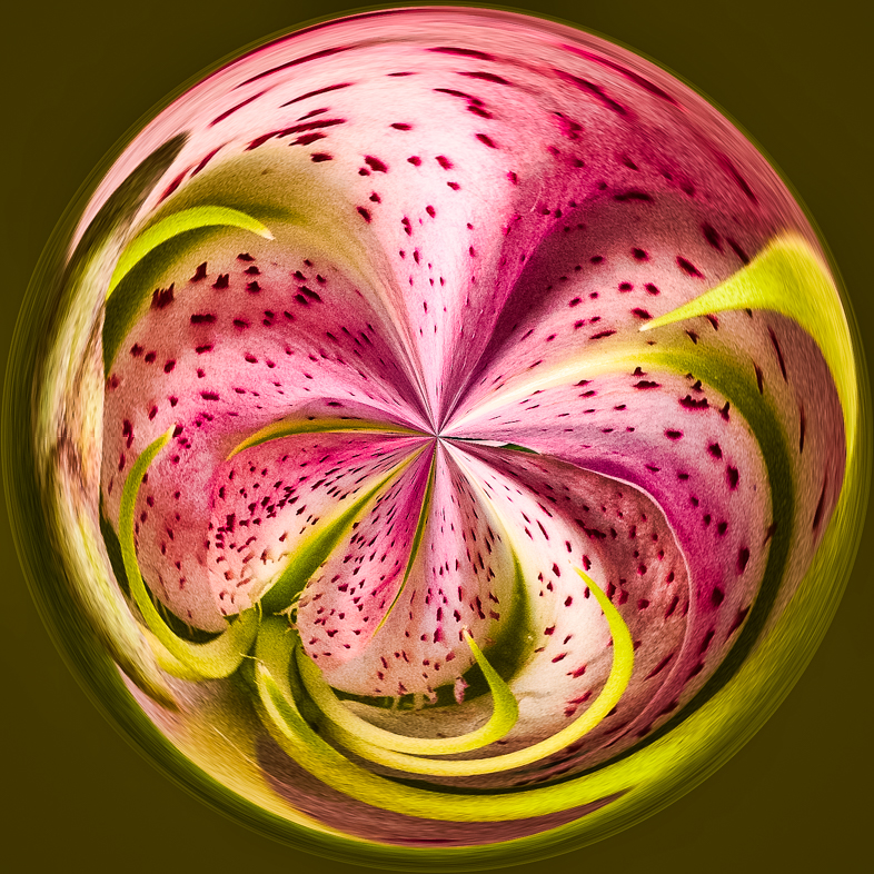
Comment |
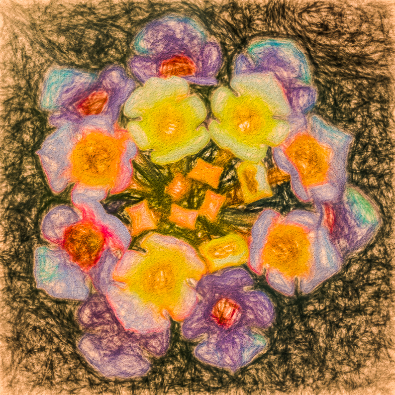
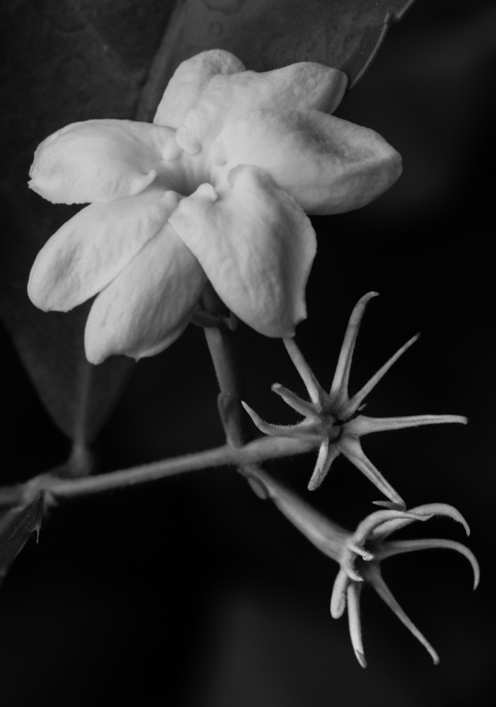
I find orchids appeal to me first of all because of their colors but also because of their shapes and patterns. I like the pure mono version because it does a great job of incorporating the shapes of the leaves into the design I see. That leads me to suggest that you also brighten the leaf line in the lower right to make it continuous.
You might also consider brightening the dark area of the stem or leave that alone and darken the bright part of the stem.
The mono version is very well done but my preference is for the original. |
Sep 10th |
| 64 |
Sep 18 |
Comment |
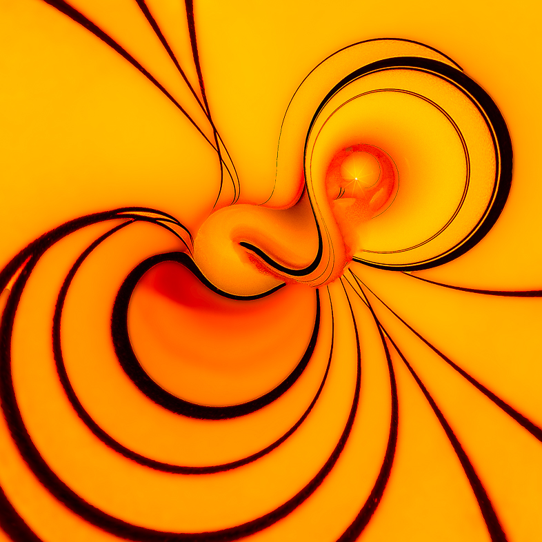
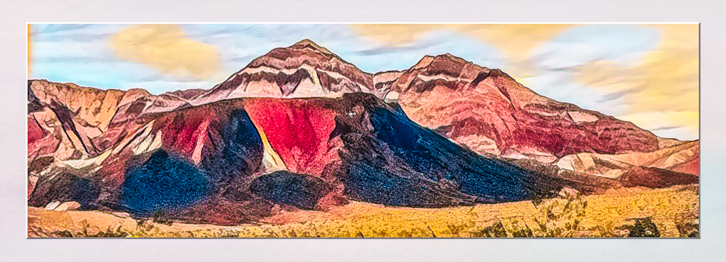
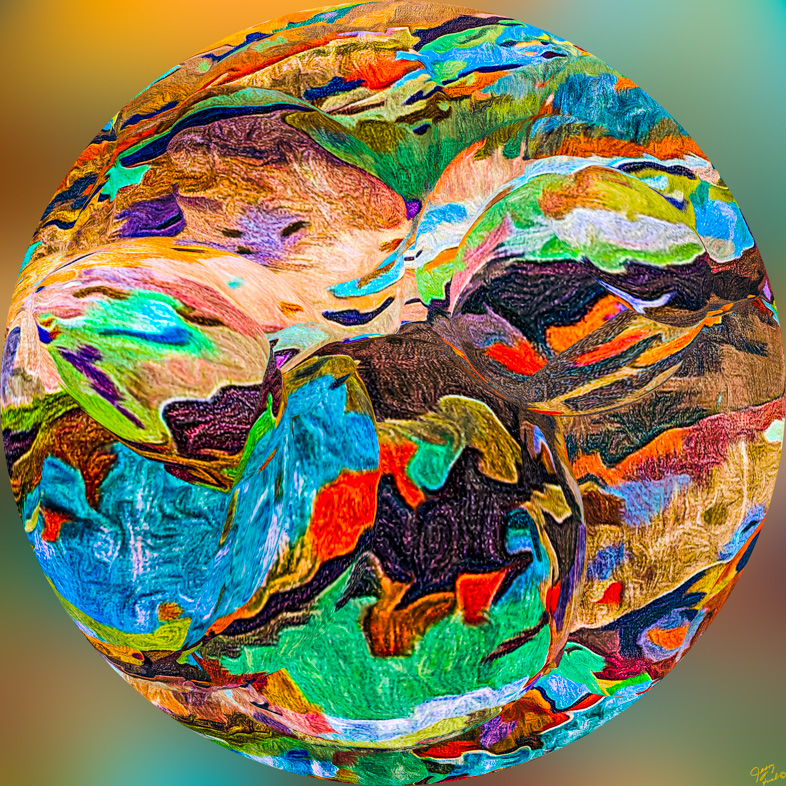
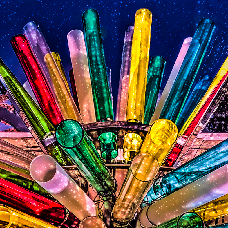
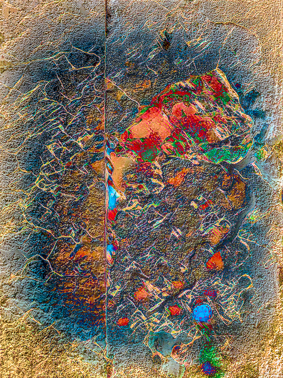
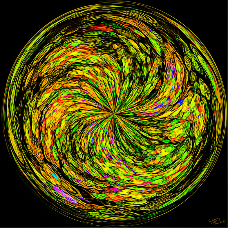
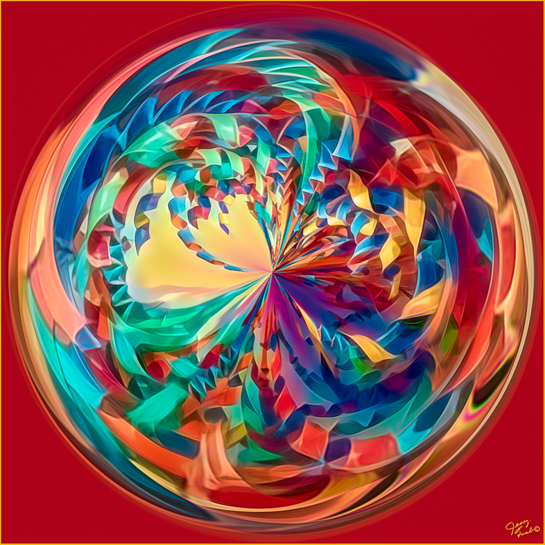
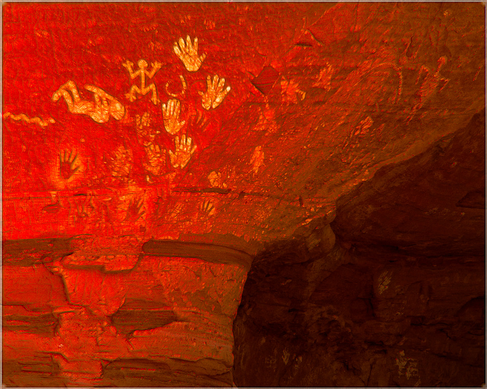
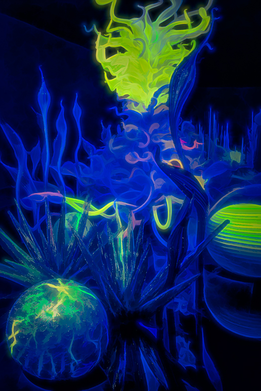
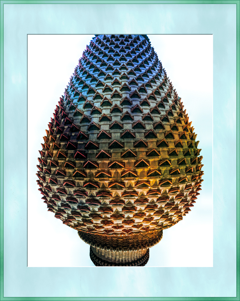
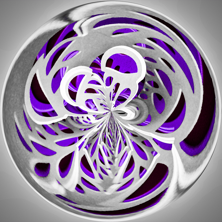
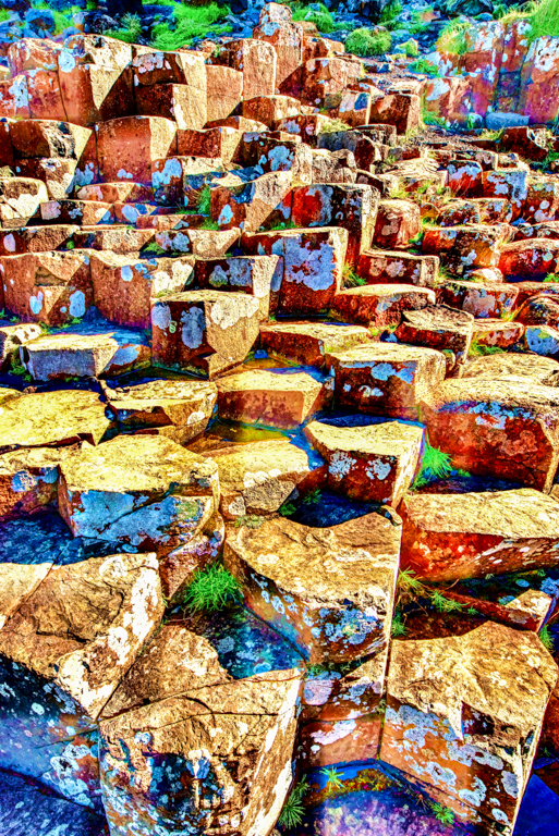
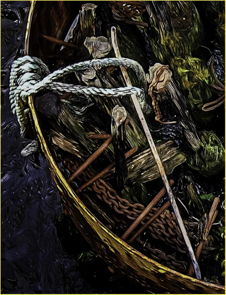
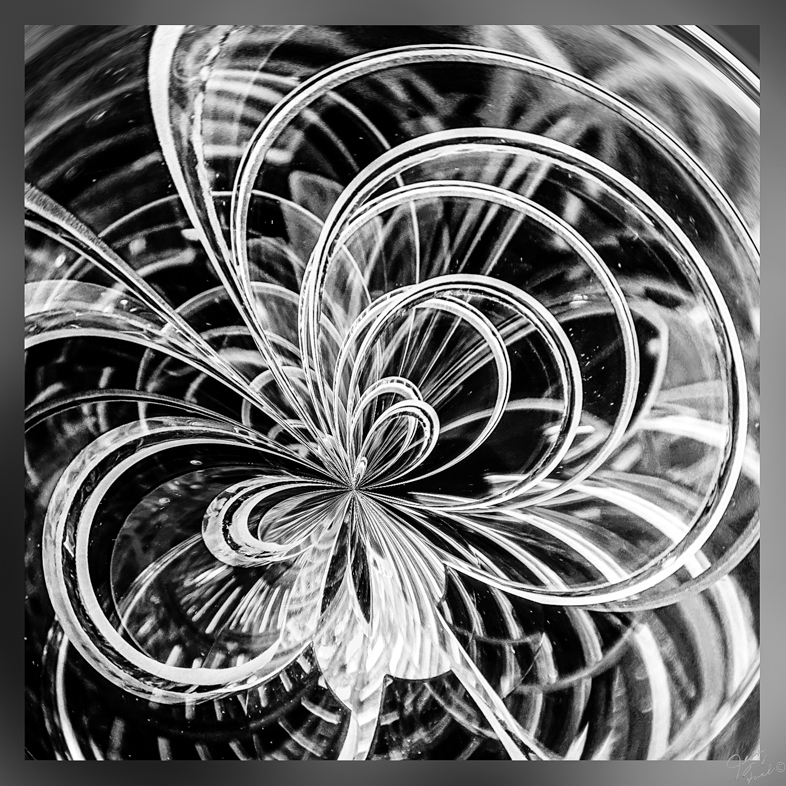
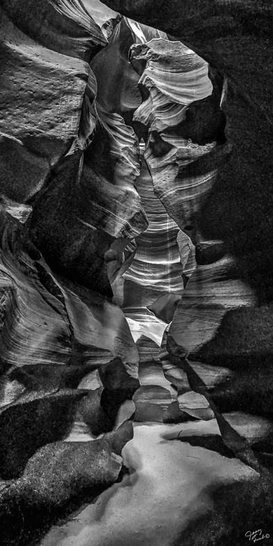
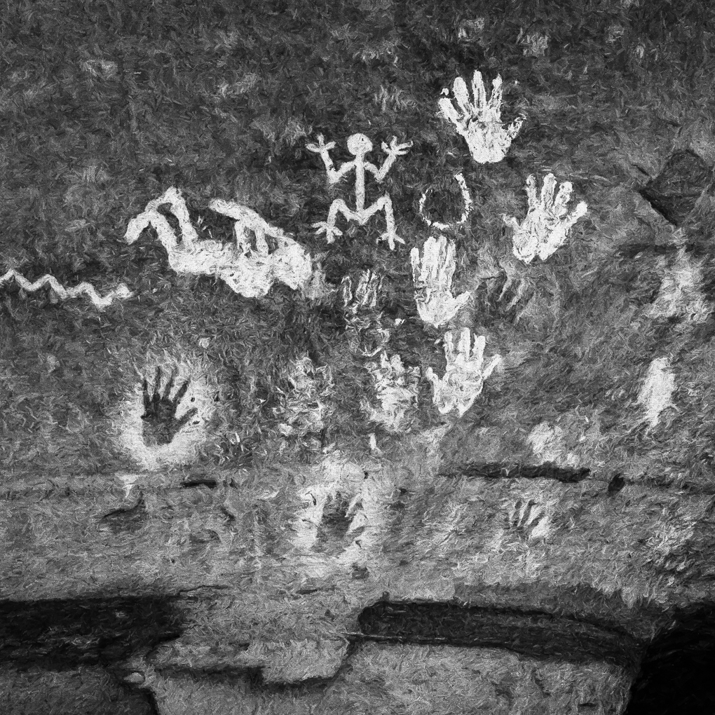
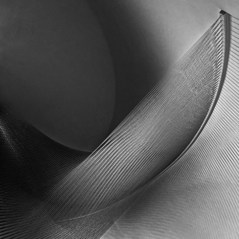
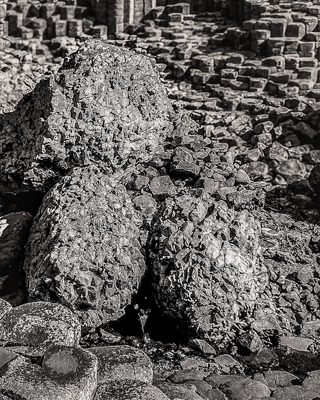
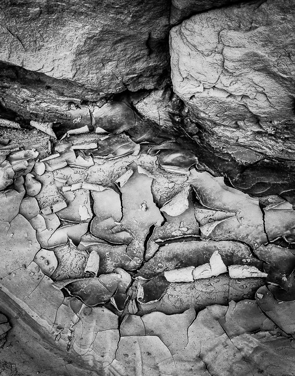
I find this image extremely interesting, bewildering and confusing. Yes, it looks like two images.
I would put this on my "to do list" to play with coloring all the pieces. I think it may make a very interesting color abstract too.
The only suggestion I have is to clone out the bright piece just left of the middle. |
Sep 10th |
| 64 |
Sep 18 |
Reply |
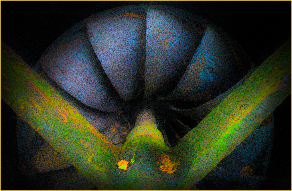
Thanks. I was hoping someone would comment on cropping the top. I considered it and will now do it.
This sculpture is on a floor and, if I recall, is probably. 5' in diameter and perhaps 8' tall. That's why I had to hold my camera so high to capture the desired perspective.
If i'm lucky the highlights are not blown out and may be recovered. I don't want to eliminate them though. |
Sep 10th |
4 comments - 2 replies for Group 64
|
10 comments - 5 replies Total
|