|
| Group |
Round |
C/R |
Comment |
Date |
Image |
| 20 |
Mar 18 |
Reply |
See below. |
Mar 16th |
| 20 |
Mar 18 |
Comment |
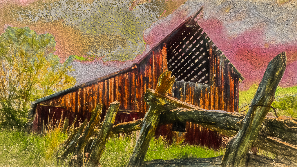
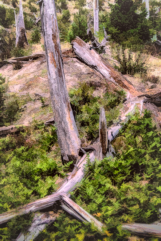
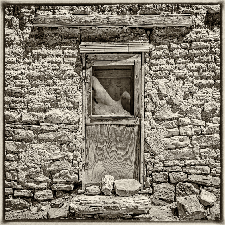
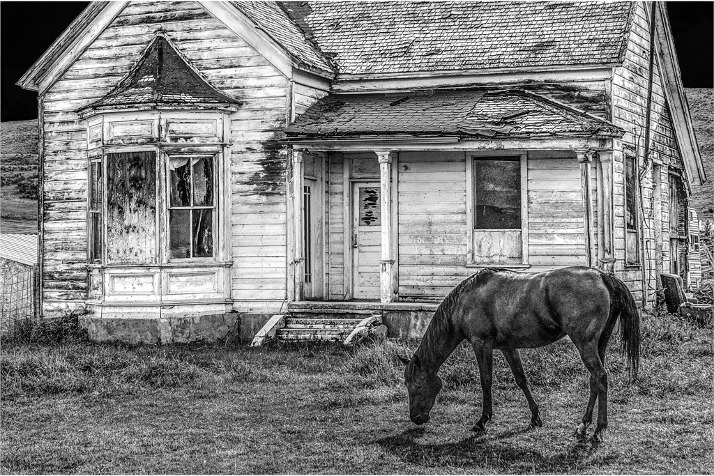
I have found a number of these old barns in rural Utah and Idaho near where I stay each summer. The problem is that many are on private land with NO TRESSPASSING signs. That leaves only distant snap shot possibities, because I don't have a long telephoto lens.
Thanks for your comments. |
Mar 16th |
| 20 |
Mar 18 |
Comment |
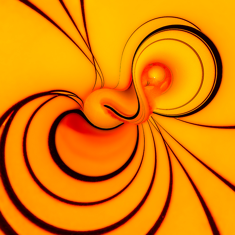
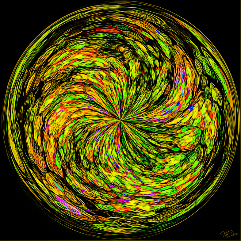
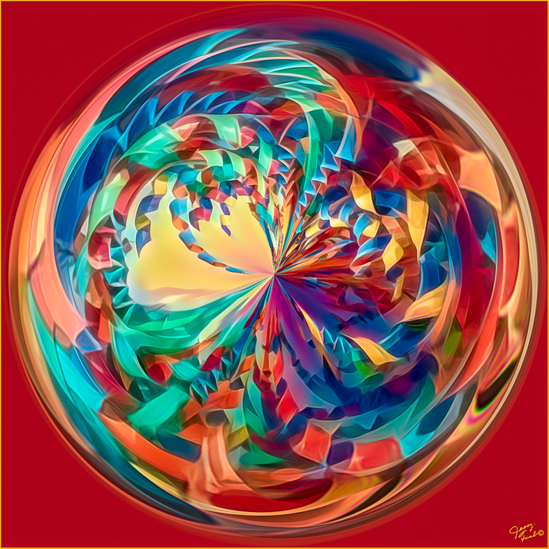
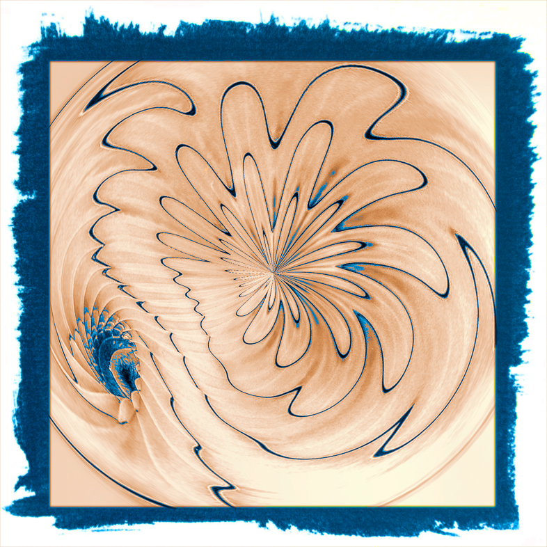
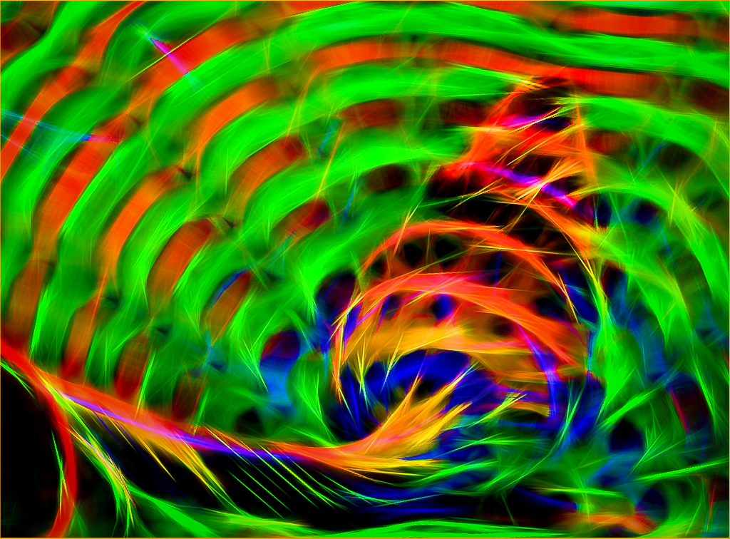
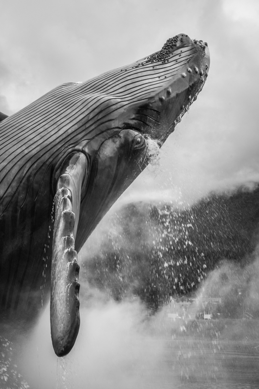
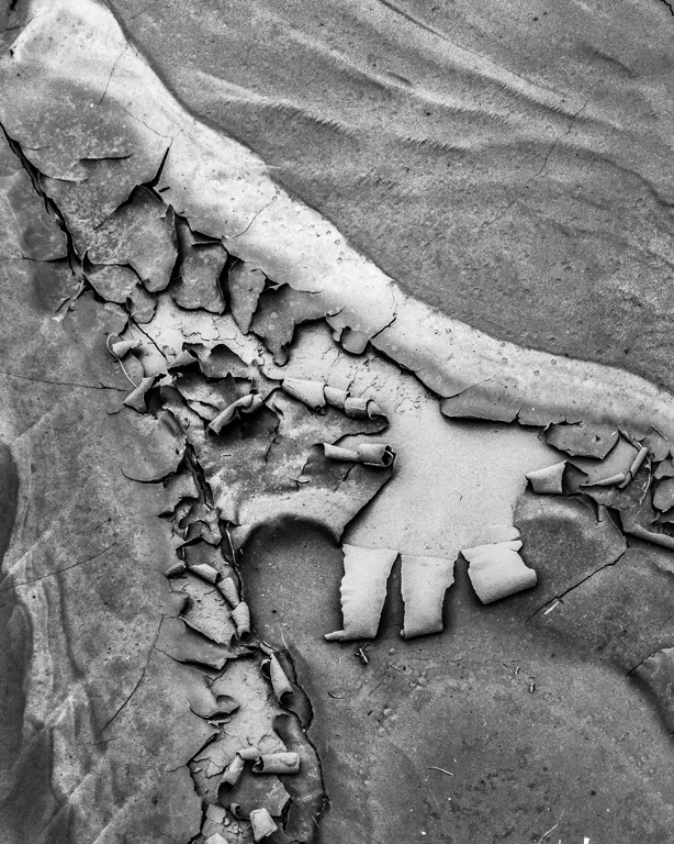
Overall, the combinations of images is incongruous to me. My first thought seeing the tail was of a swirling tornado, so maybe I'll do something on that theme sometime. |
Mar 9th |
| 20 |
Mar 18 |
Comment |
Spooky! Wonderful!
My initial reaction was that the dog is too small but in reality bulldogs are short, so I think it's sized realistically.
Perhaps a small shadow could be added beneath the dog.
Well done.
Question. In a creative category of competition must the primary elements be derived from original photographs? I've been thinking of photographing freeze frames on my 4K TV. |
Mar 9th |
| 20 |
Mar 18 |
Comment |
I like the composition as is and don't want anything removed. I would like to see the edges including the background less prominent. My preference for edge effects is to use Topaz simplify because it gives me greater control, but this comes from my lack of knowledge of using layers directly in Photoshop rather than through a plug-in. |
Mar 9th |
| 20 |
Mar 18 |
Reply |
see below |
Mar 6th |
| 20 |
Mar 18 |
Comment |
How's this? Blue didn't look good to me. |
Mar 6th |
 |
| 20 |
Mar 18 |
Comment |
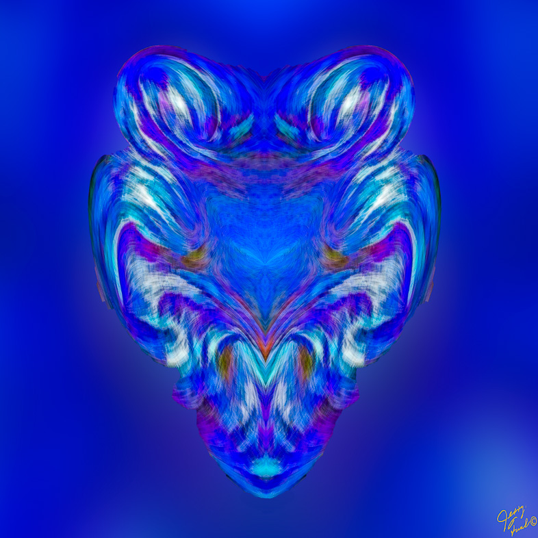
Yes, I agree and would add one more adjective - romantic.
Excellent, well worth You efforts. |
Mar 5th |
| 20 |
Mar 18 |
Comment |
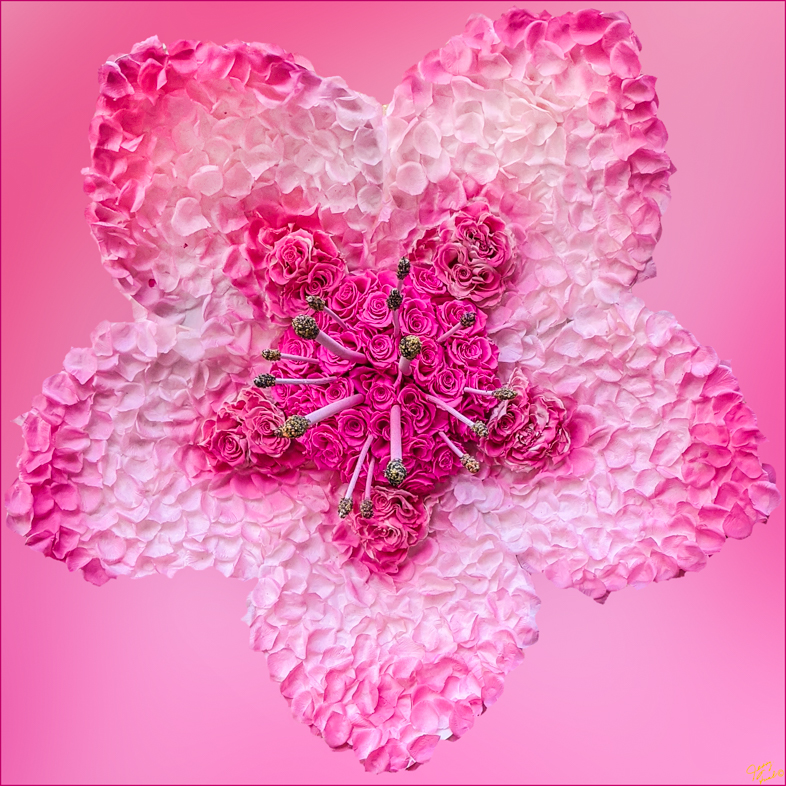
Excellent! I agree with the earlier comments. Perhaps the heron would appear more grounded if the sea weed less blended with the texture.
I would purchase a greeting card with this image as it is. A small print for my bathroom would be good too. You started with a fine image of a heron and made it very artistic. |
Mar 5th |
| 20 |
Mar 18 |
Comment |
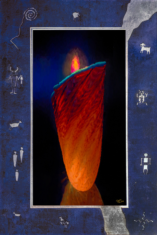
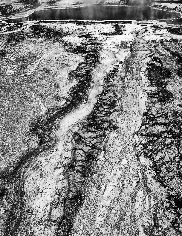
Welcome Paul.
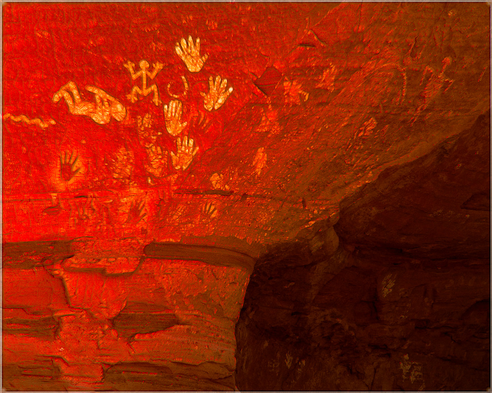
I view your image as an appealing realistic interpretation of heat radiation. I would like to see an unrealistic but dramatic evidence of radiation rising into the sky. Perhaps it could be derived from a image of fire.
Obviously, everyone's imagination will go in different directions to build on your image. I think you have done well but I think the subject lends itself to further exploration. |
Mar 5th |
| 20 |
Mar 18 |
Reply |
Yes, I had second thoughts and will make a new version with blue replacing the pink. |
Mar 5th |
8 comments - 3 replies for Group 20
|
| 64 |
Mar 18 |
Comment |
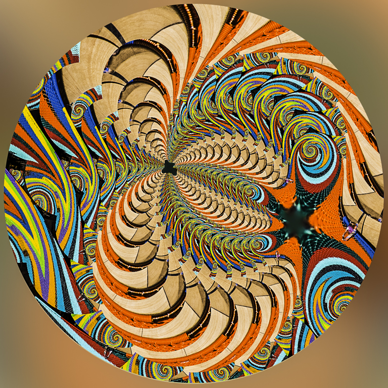
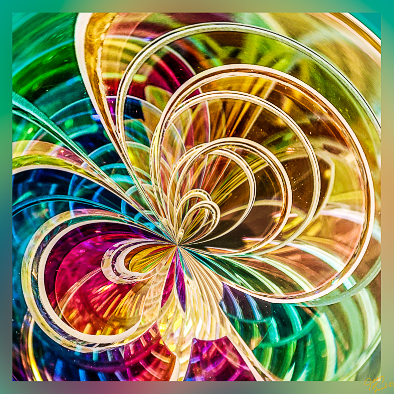
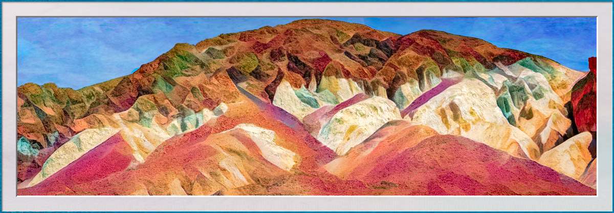
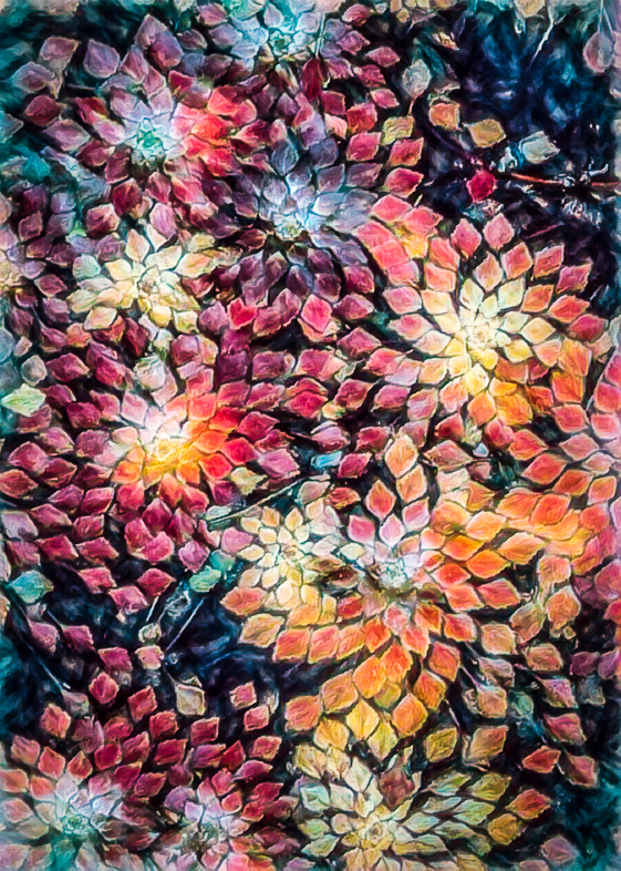
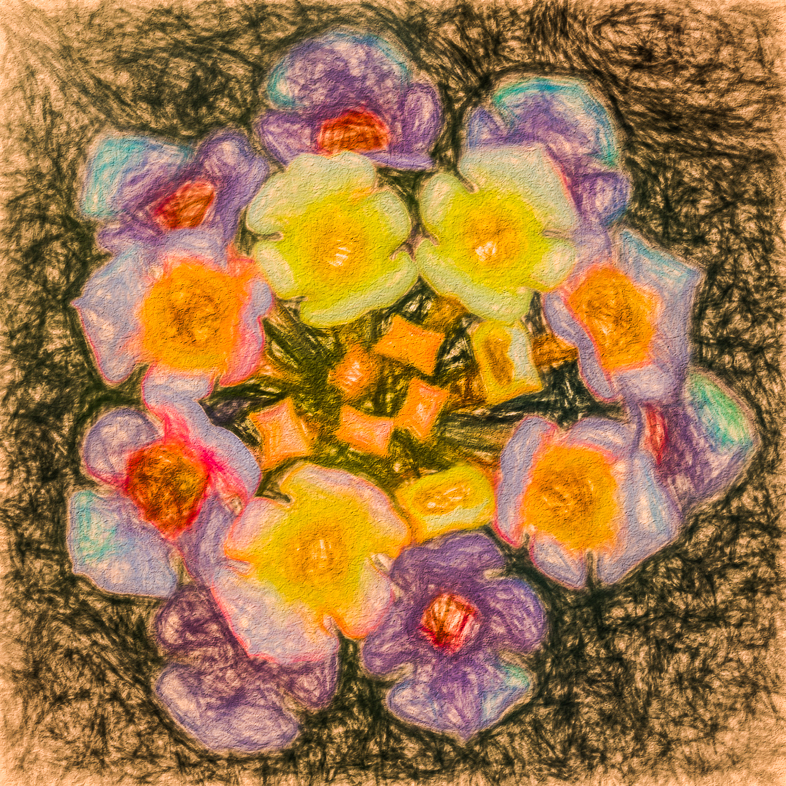
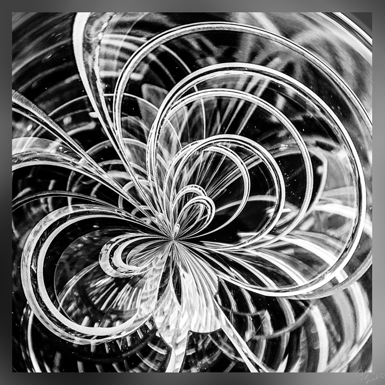
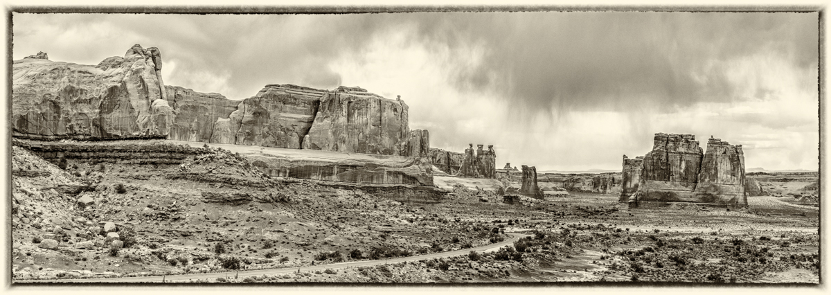
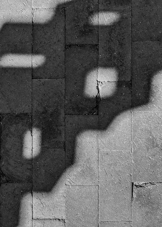
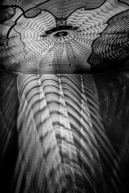
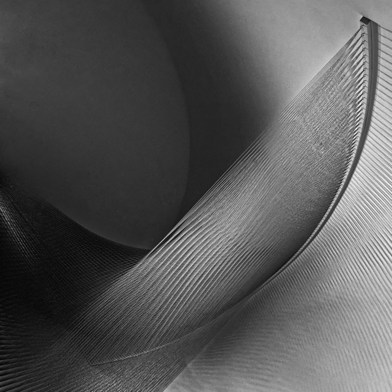
Strangely, I started with a square format but wanted to make a 4x5 print for a local competition and test it here. I have my answer!
My frequent thought regarding abstracts, which I favor, is that my favorites can be turned and viewed multiple ways. Most often, they are also square. To often, I forget to try a flipped version. |
Mar 14th |
| 64 |
Mar 18 |
Comment |
I think that I will crop a bit from both the top and bottom.
Thanks. |
Mar 14th |
| 64 |
Mar 18 |
Reply |
Excellent new version. |
Mar 14th |
| 64 |
Mar 18 |
Reply |
Thanks, i'll Try that again. |
Mar 9th |
| 64 |
Mar 18 |
Reply |
That?s a good idea . I was restricting myself to a 4x5 aspect ratio for a print. |
Mar 9th |
| 64 |
Mar 18 |
Comment |
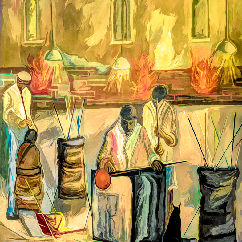
I think this is an interesting image, but the bottom right is a major distraction. I suggest cloning in the backs of additional onlookers to replace the window light, umbrella and man. |
Mar 8th |
| 64 |
Mar 18 |
Comment |
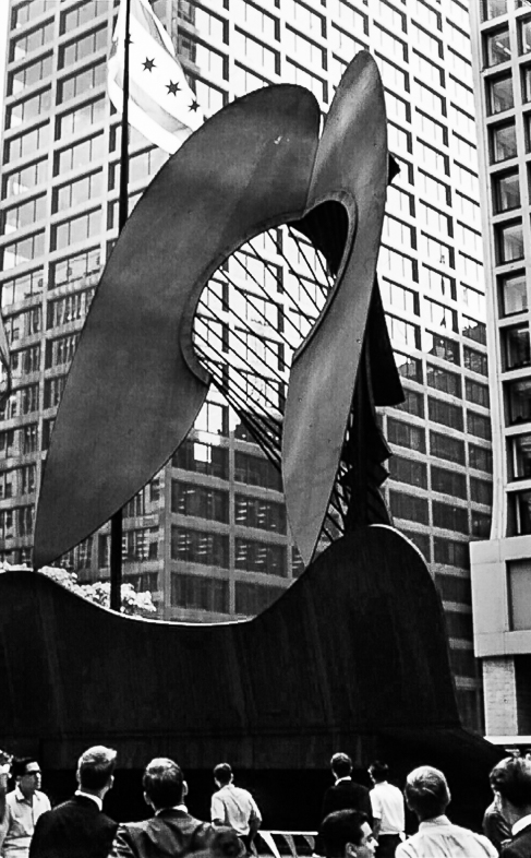
Yes, I agree with your choice of sepia to achieve a nostalgic effect. The image is interesting to me and I think the composition is strong, but would have expected to see greater detail at f8 in the most distant spitfire. Perhaps it was lost because of weak lens quality. Perhaps someone else knows if spot metering and continuous focus may have helped.
I once took photos of an aerial display of planes looking down on them from the 95th floor observatory of a building in Chicago. |
Mar 8th |
| 64 |
Mar 18 |
Comment |
I think this is a very interesting composition and great memory for you. It's too bad you didn't have a better camera to avoid the pixelization and halo. Perhaps the pixelization could be overcome with localized blurring while the halo could be cloned out. |
Mar 8th |
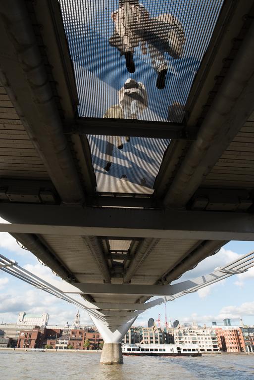
| 64 |
Mar 18 |
Comment |
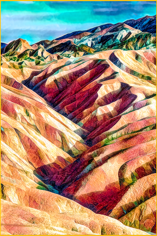
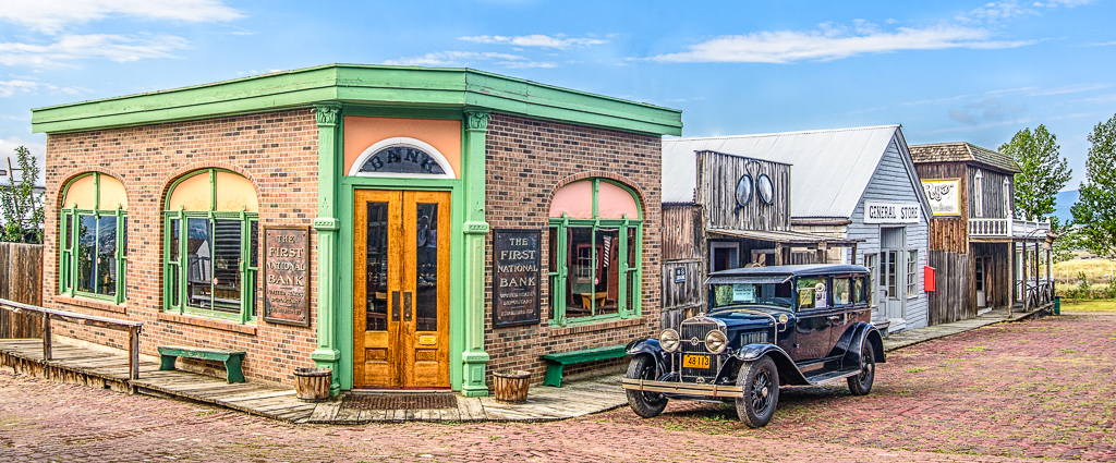
I think your cropping produced an excellent composition and greater impact than would an image of the entire building. I found myself doing the same type of cropping of London buildings that had modernized the ground floor while retaining the beautiful facade of the upper floors.
Excellent! |
Mar 8th |
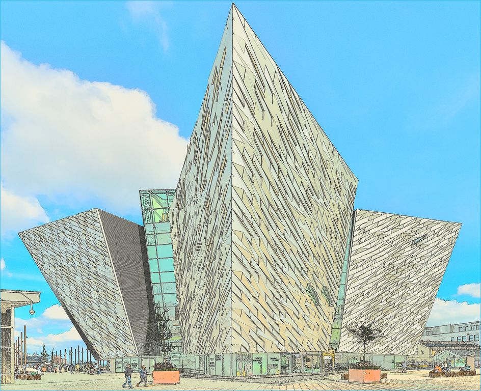
| 64 |
Mar 18 |
Comment |
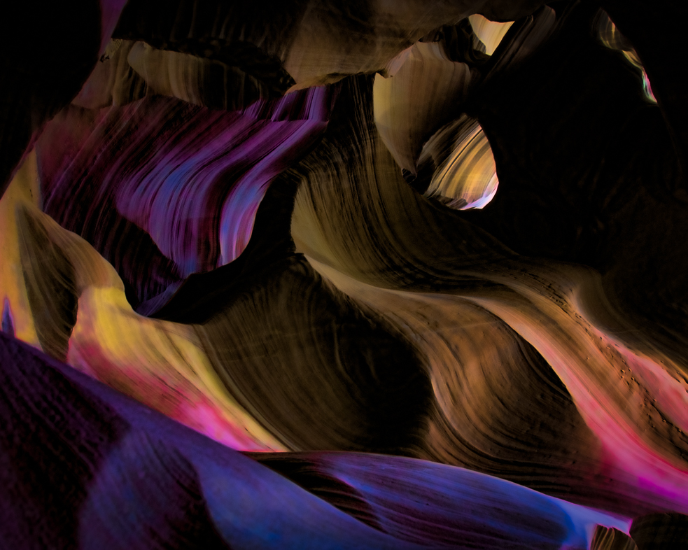
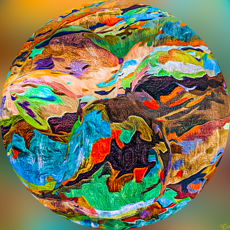
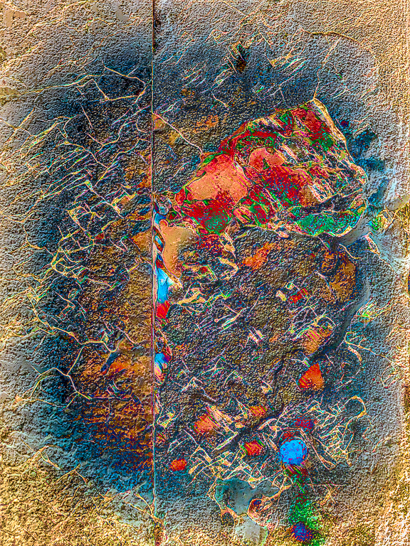
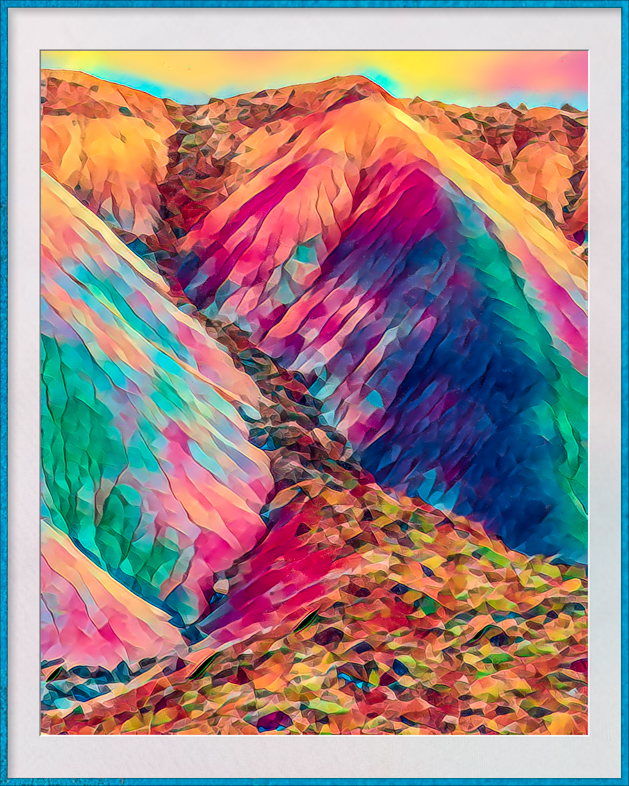
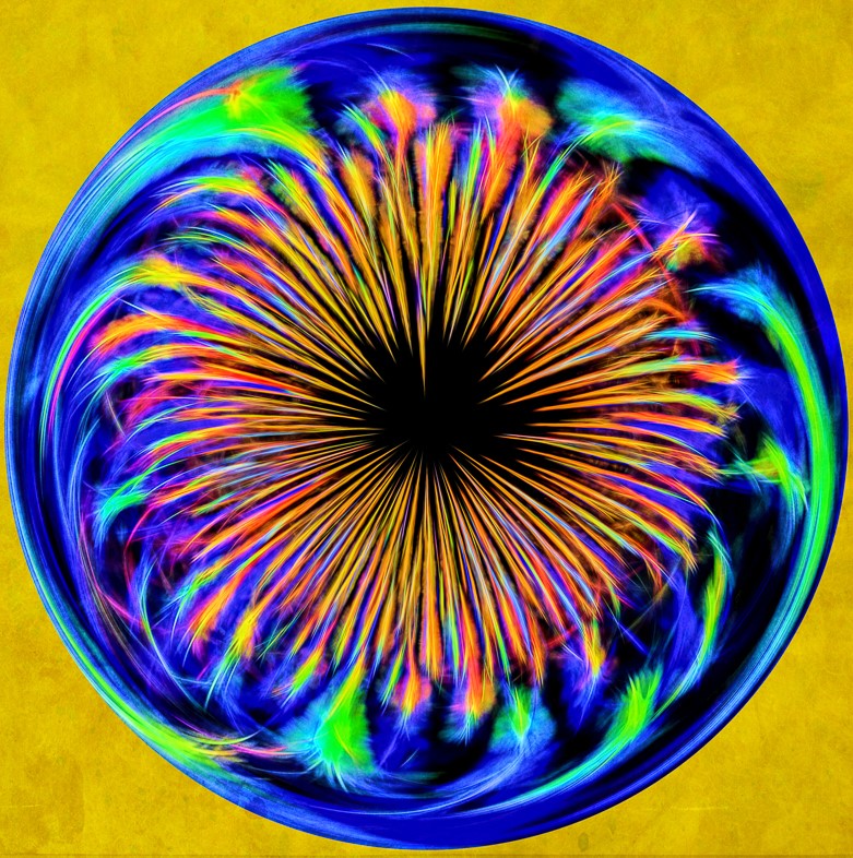
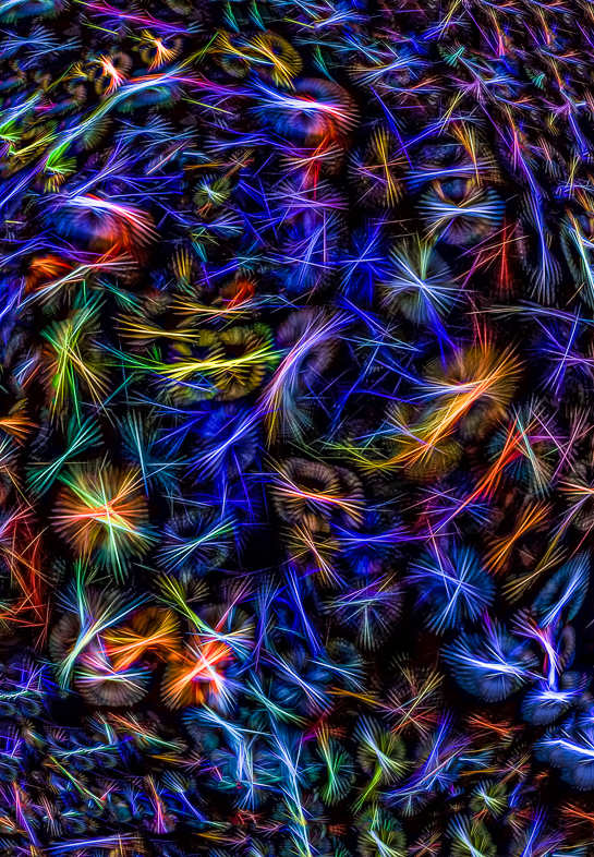
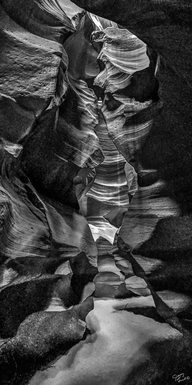
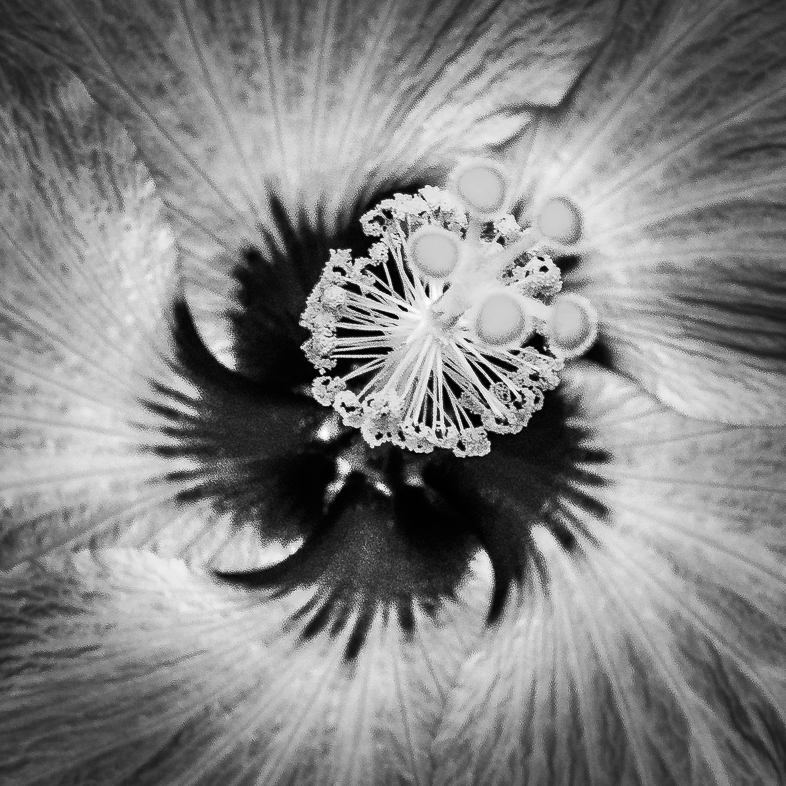
I think this is an excellent composition and I see details everywhere to make this an image worthy of my time studying it. I know some would apply localized contrast to perhaps lend greater emphasis to the details but I like it as is. |
Mar 8th |
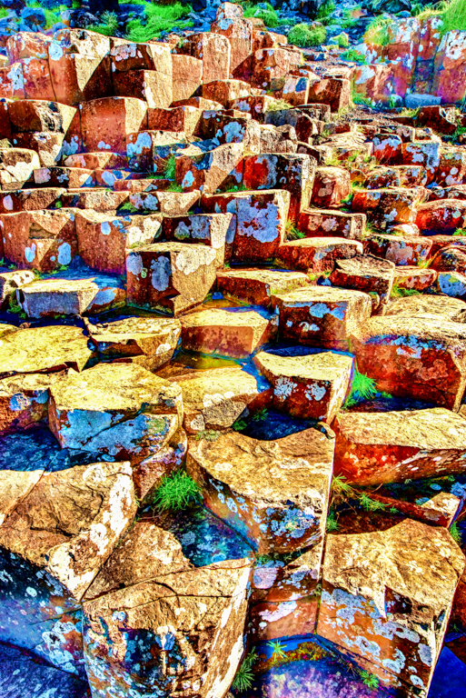
| 64 |
Mar 18 |
Comment |
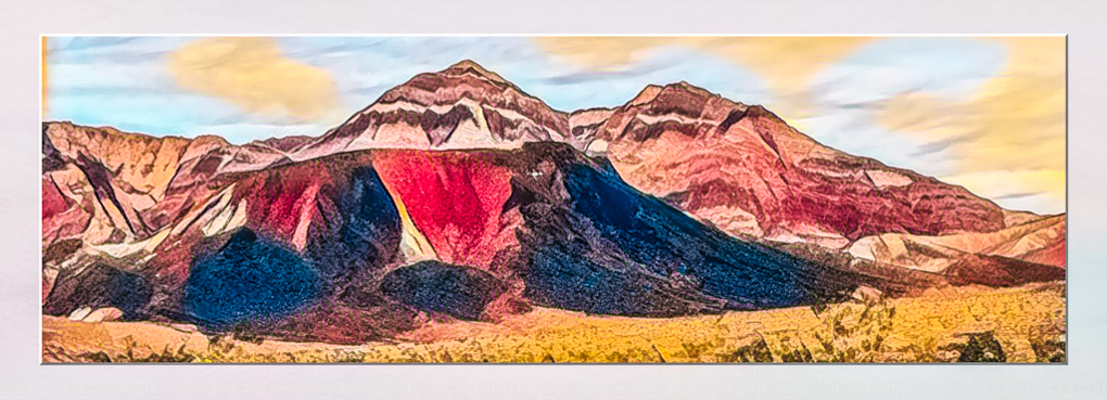
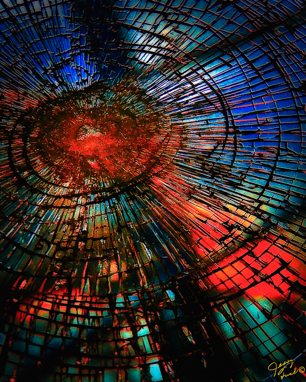
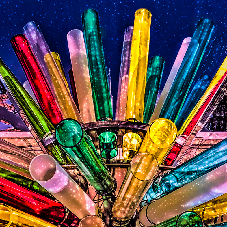
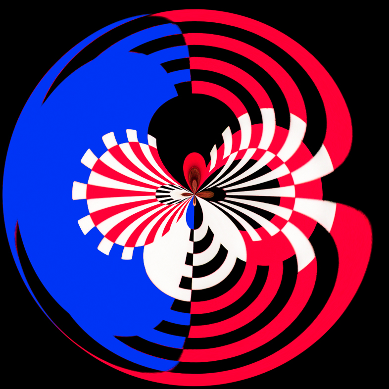
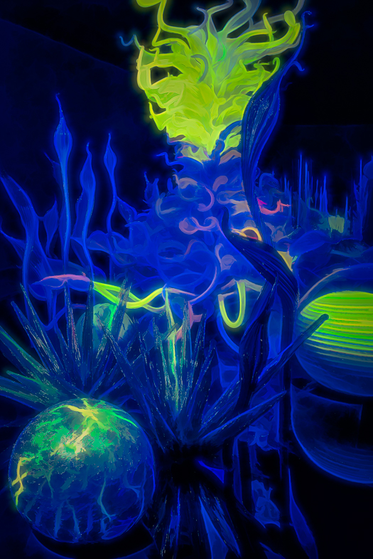
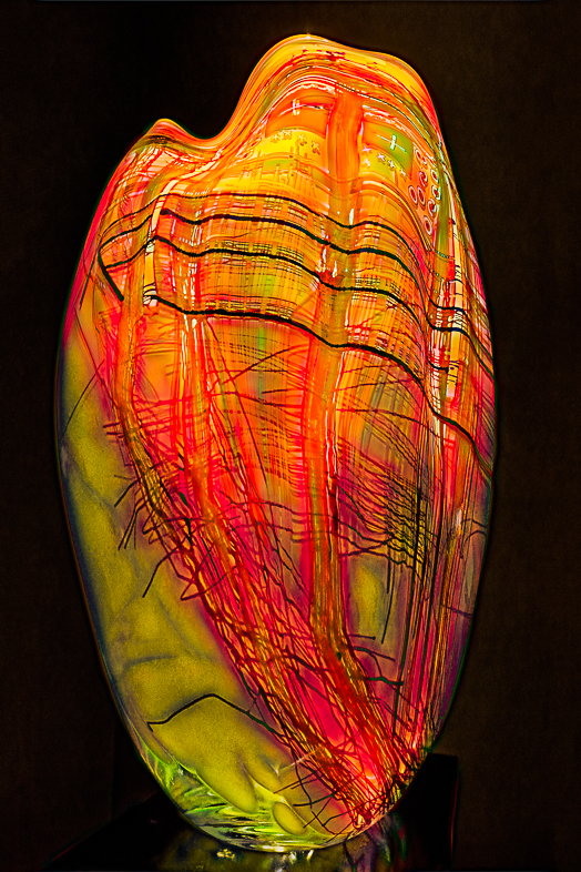
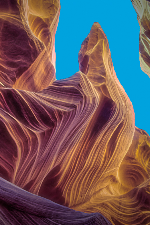
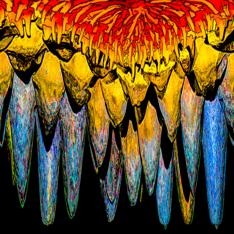
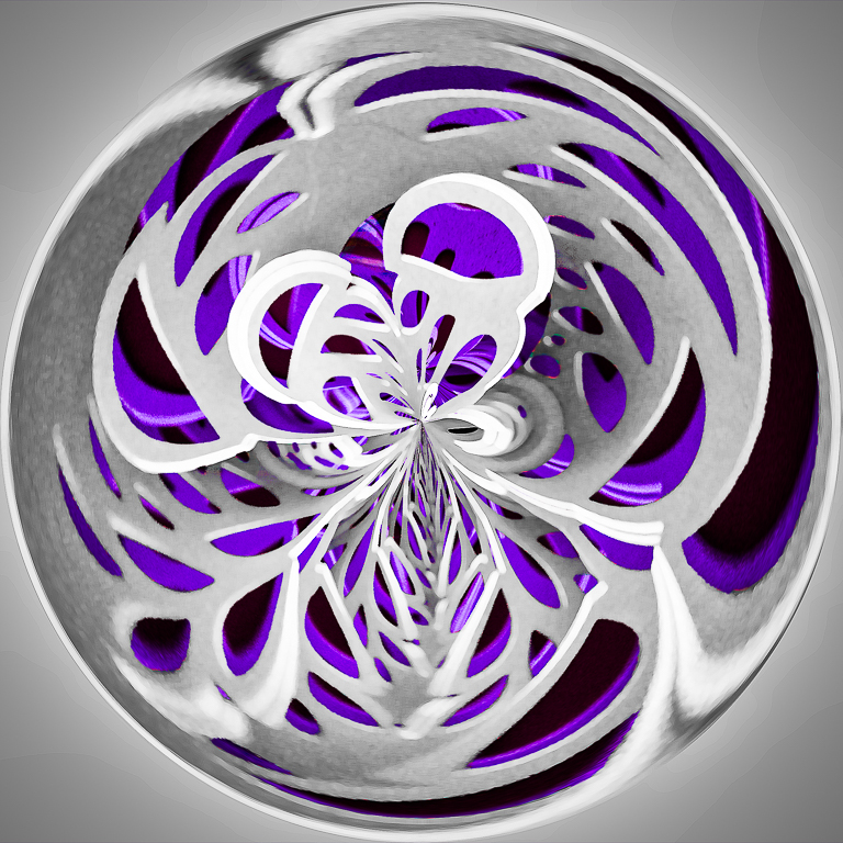
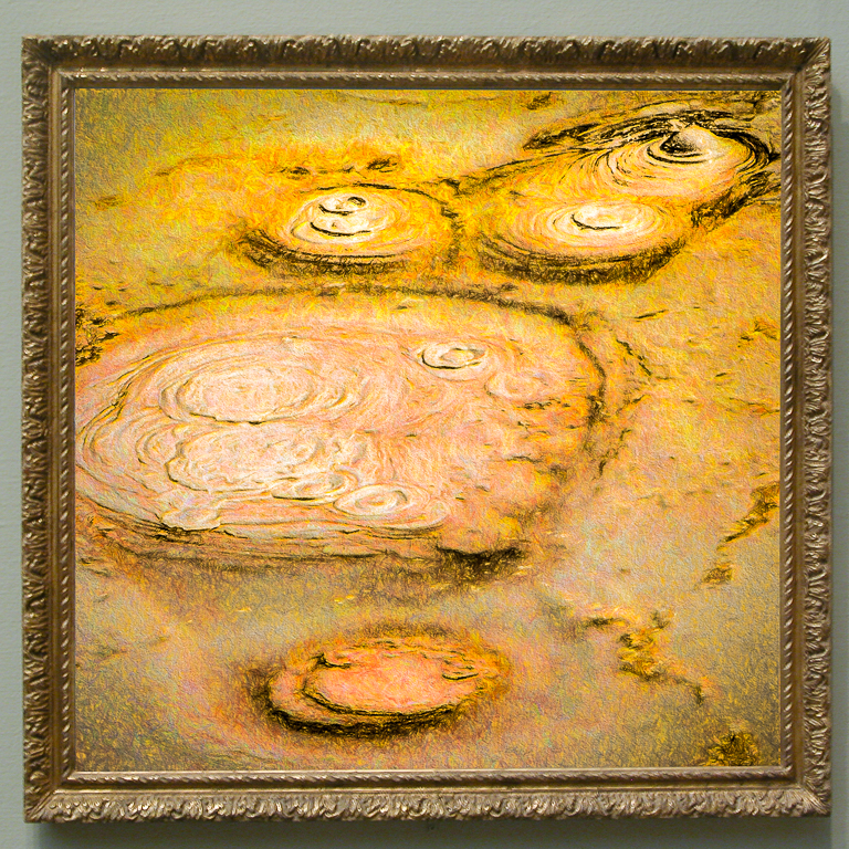
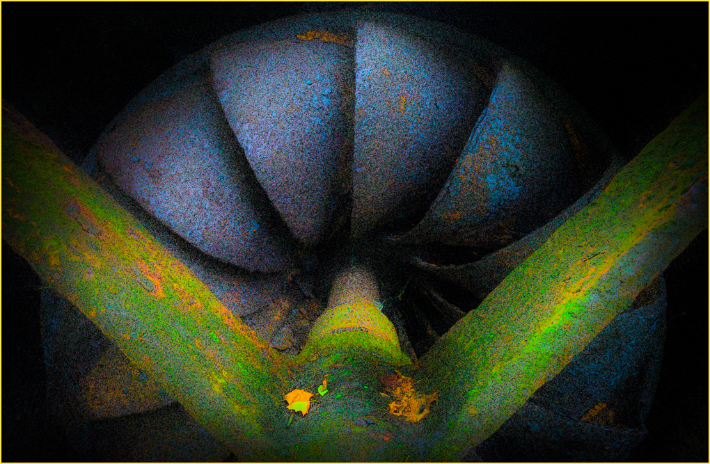
I don't think this monochrome image provides the impact of your excellent original image. I think you have excellent detail and perfect exposure to work with but need contrast.
I suggest darkening all of the purple and the 5 blue elements on the bottom to emphasize its leading lines. Perhaps applying clarity to the yellow areas would also increase its local contrast too. |
Mar 8th |
| 64 |
Mar 18 |
Comment |
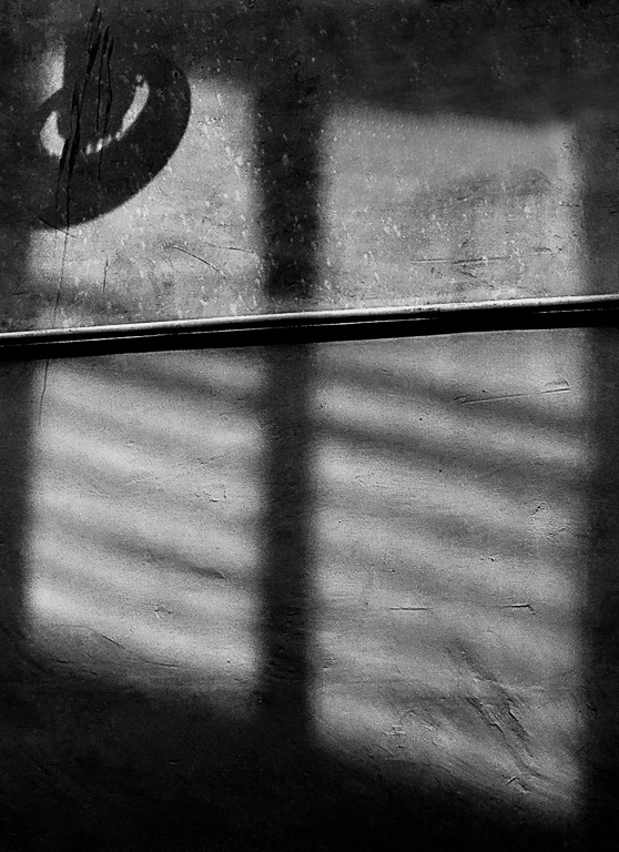
My post-processing was entirely in Lightroom 6, converting to Black and White and maximizing contrast and emphasizing it more by increasing the blacks and whites, maximizing clarity, a little localized burning, reducing the highlights to avoid a pure white, and finally adding a vignette |
Mar 8th |
9 comments - 3 replies for Group 64
|
17 comments - 6 replies Total
|