|
| Group |
Round |
C/R |
Comment |
Date |
Image |
| 20 |
Jan 18 |
Comment |
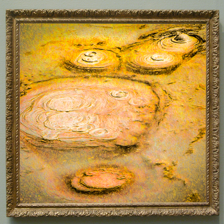
Ok. I'll use a plain gold frame too.
I will also make a 1' square print on glossy metal without a frame.
The coloring is relatively easy playing with Topaz Simplify and Lightroom but I can't reproduce the exact colors easily. |
Jan 30th |
| 20 |
Jan 18 |
Comment |
I thank everyone for their comments. I'll be making a new version or two with changes to the background. |
Jan 12th |
| 20 |
Jan 18 |
Comment |
The following is a link to the free NIK software.
Windows:
https://download-center.dxo.com/nikcollection/1.2.11/nikcollection-full-1.2.11.exe
MAC as above but replace exe with dmg |
Jan 10th |
| 20 |
Jan 18 |
Comment |
DxO is the name of a French software company. I recently read on its website that the NIK package was still available from them. However I just searched its web site and couldn't find it. I submitted a request to them for help and expect an answer soon. |
Jan 9th |
| 20 |
Jan 18 |
Comment |
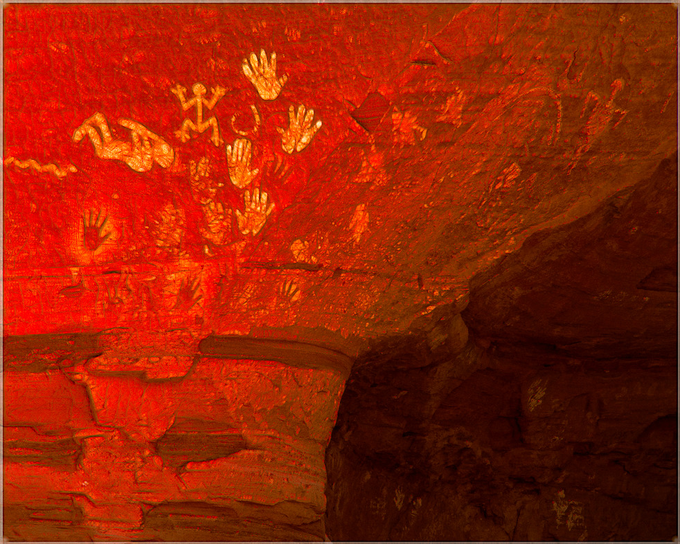
Yours, is a super family image that should be enjoyed for generations to come. I think it's an Excellent composition and good blending. I too would like to see additional detail and think a sepia tone might give it a slightly better look. I wish I had some images on which to use your concept. |
Jan 7th |
| 20 |
Jan 18 |
Comment |
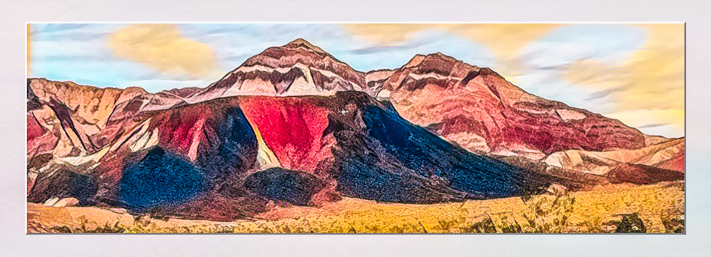
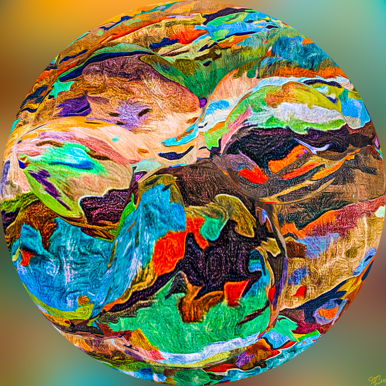
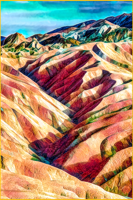
You have an excellent composition and did a great job of bringing out the hidden colors. My personal preference and bias is to brighten the mood and use the right side of your histogram. Excellent compositions always seem to yield the possibility of many variations.
If anyone wants the free NIK package it's now available from DxO. In addition it's excellent Photolab software incorporates that technology too. |
Jan 7th |
| 20 |
Jan 18 |
Comment |
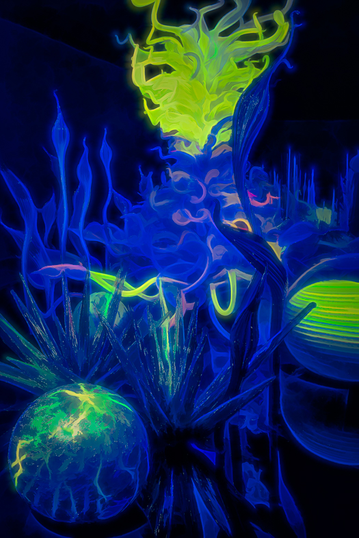
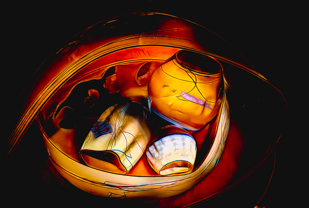
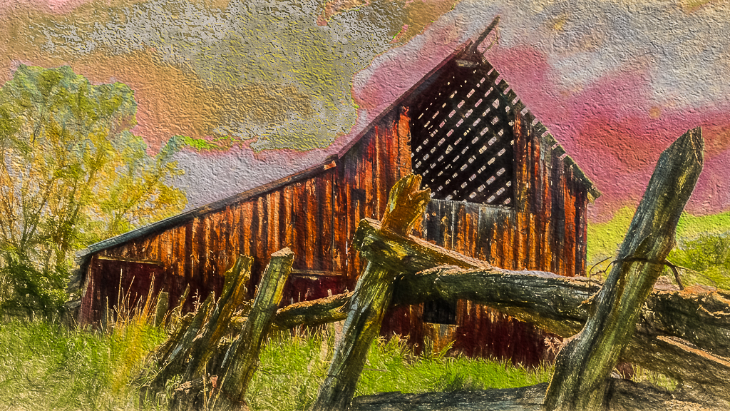
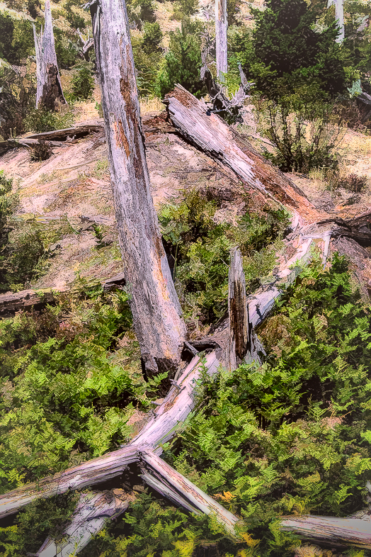
I compliment you on seeing the potential of the box of squash. I like the composition but agree with Cindy's comments on colors. I like the yellow but see the texture on the squash a bit bothersome. Perhaps you can experiment a little more while maintaining the dark edges and squash colors. |
Jan 7th |
| 20 |
Jan 18 |
Comment |
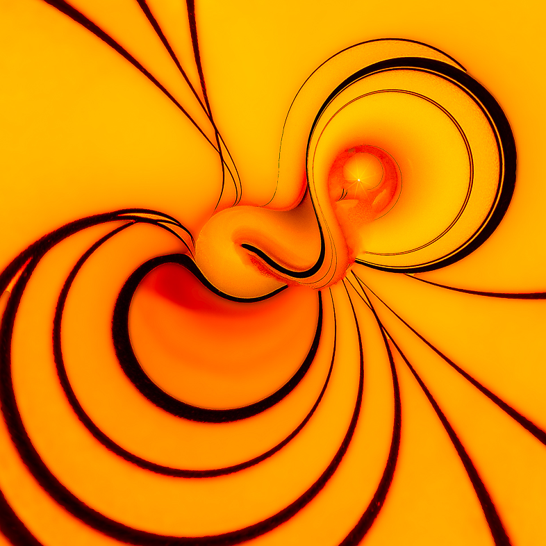
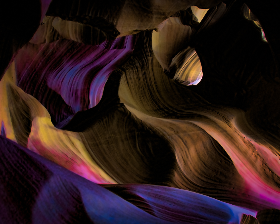
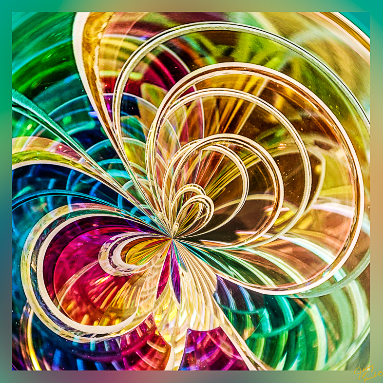
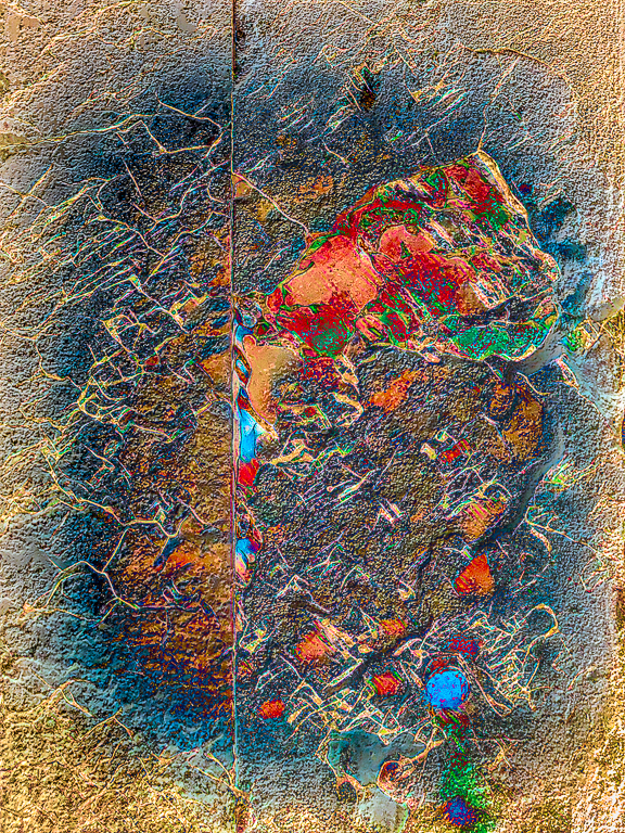
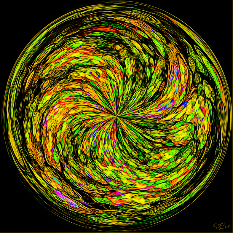
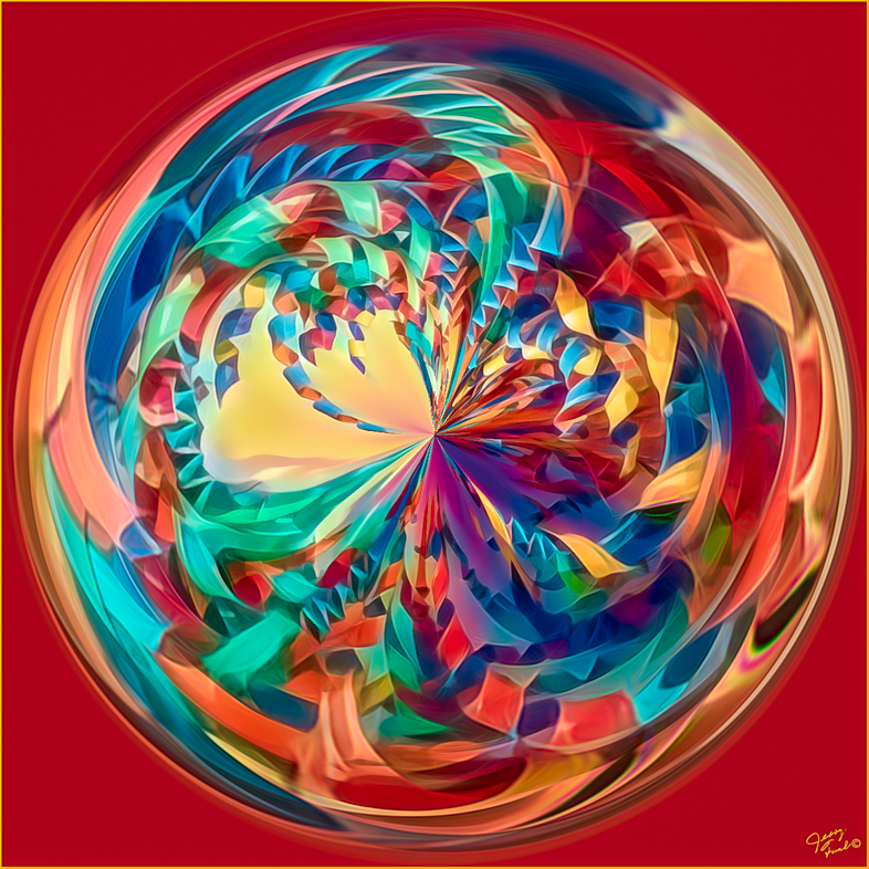
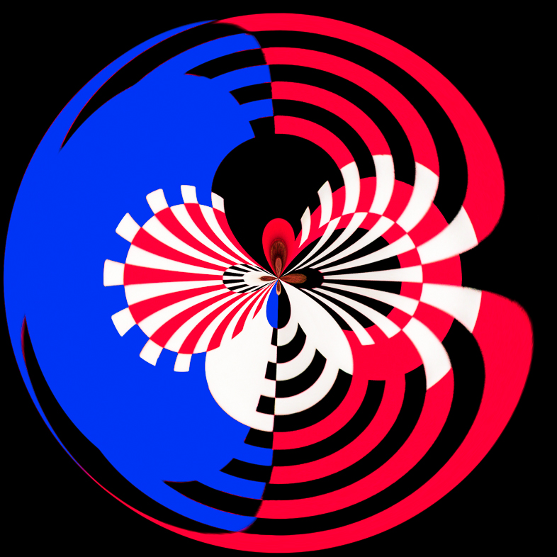
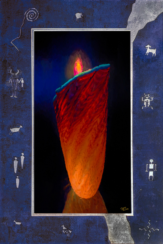
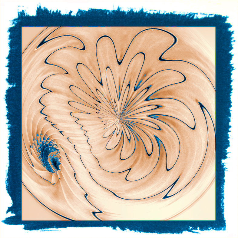
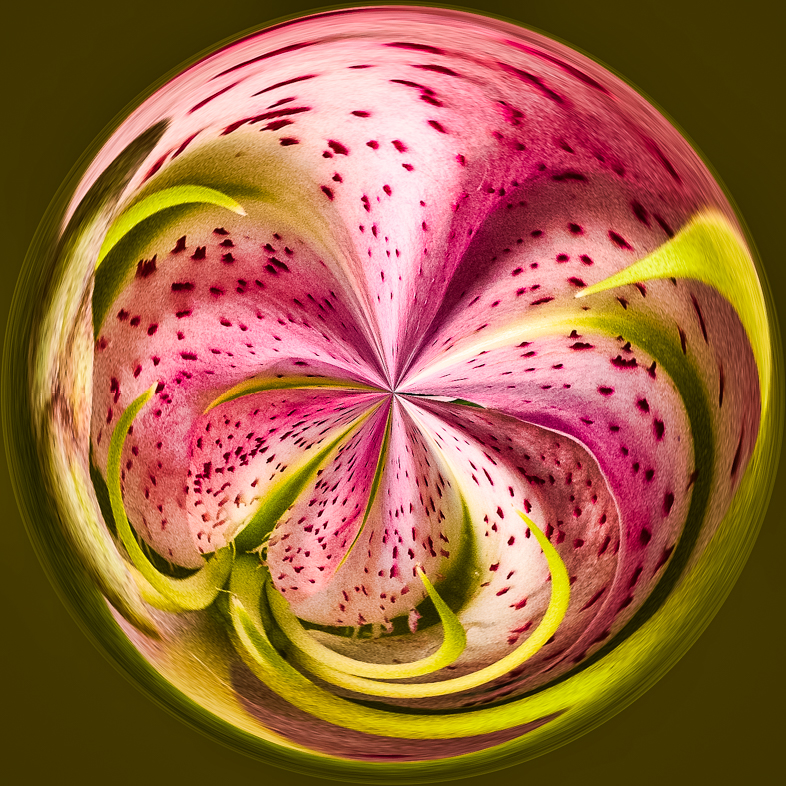
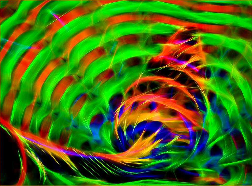
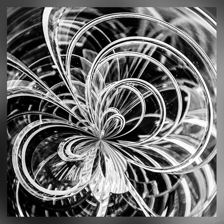
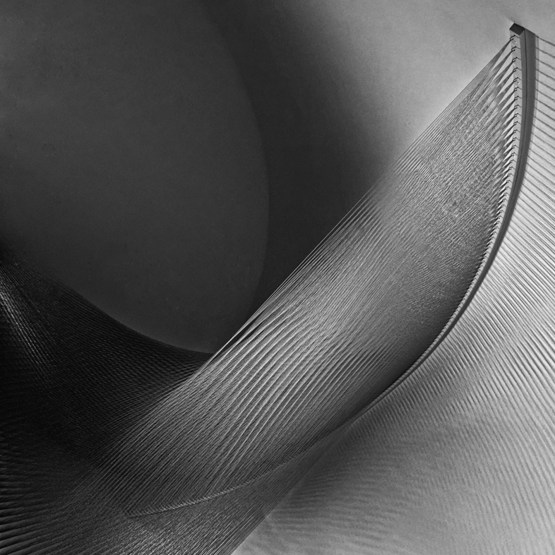
I have used the distort filter a lot but never got anything like the beautiful, graceful result you have. The lavender gradient was an excellent choice. I think my preference though would be to use the art history brush to erase it on the yellow but perhaps that would destroy the wonderful mood you created. |
Jan 7th |
| 20 |
Jan 18 |
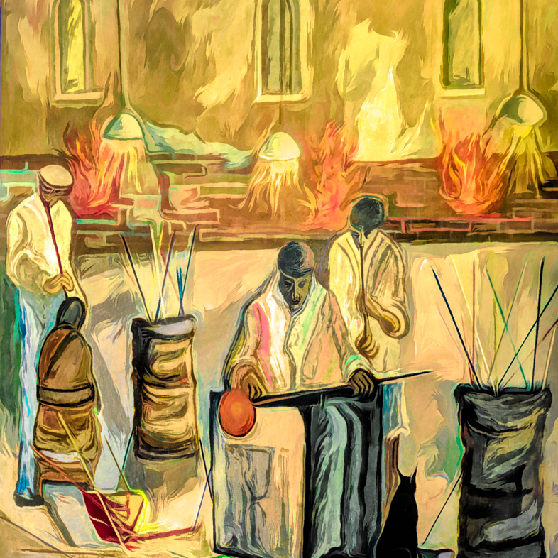
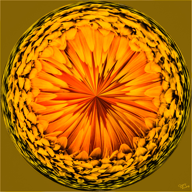
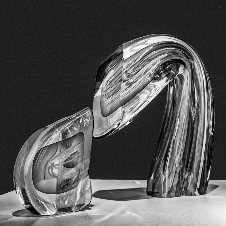
Comment |
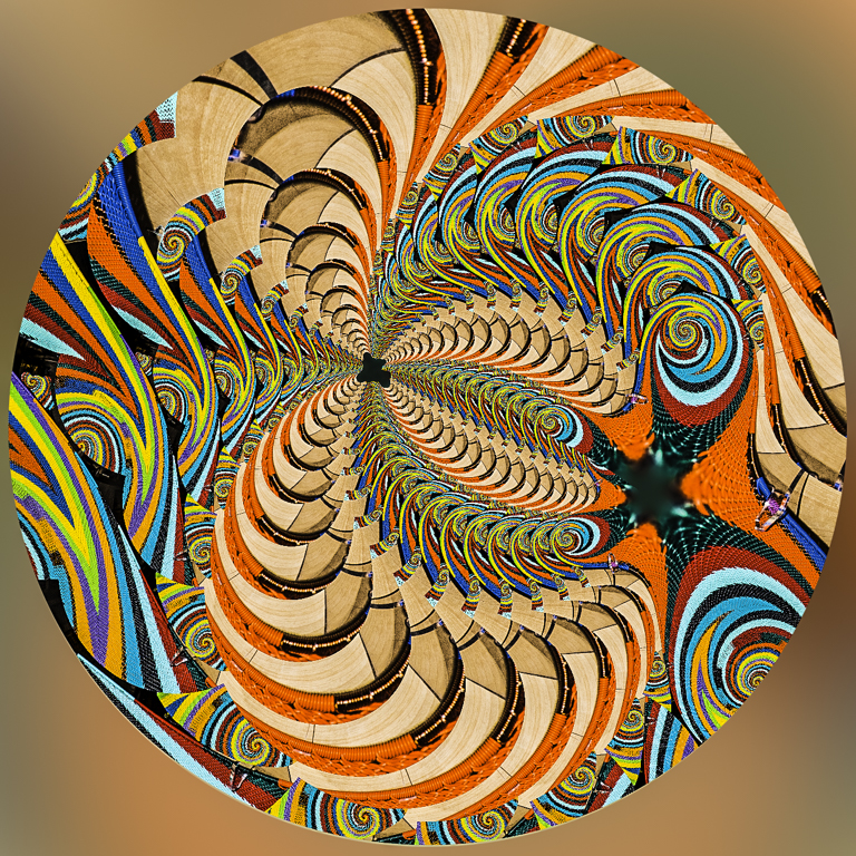
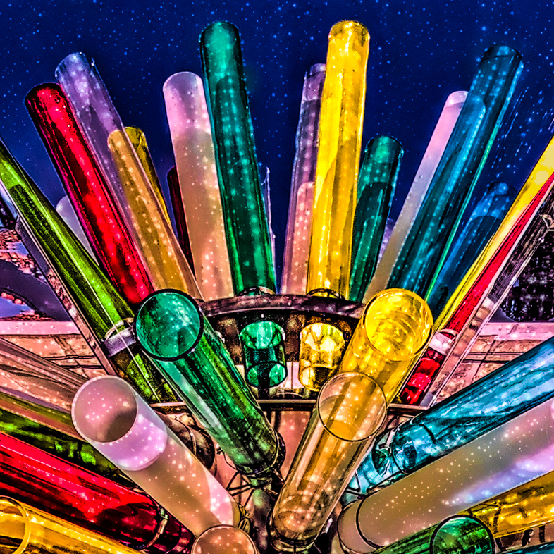
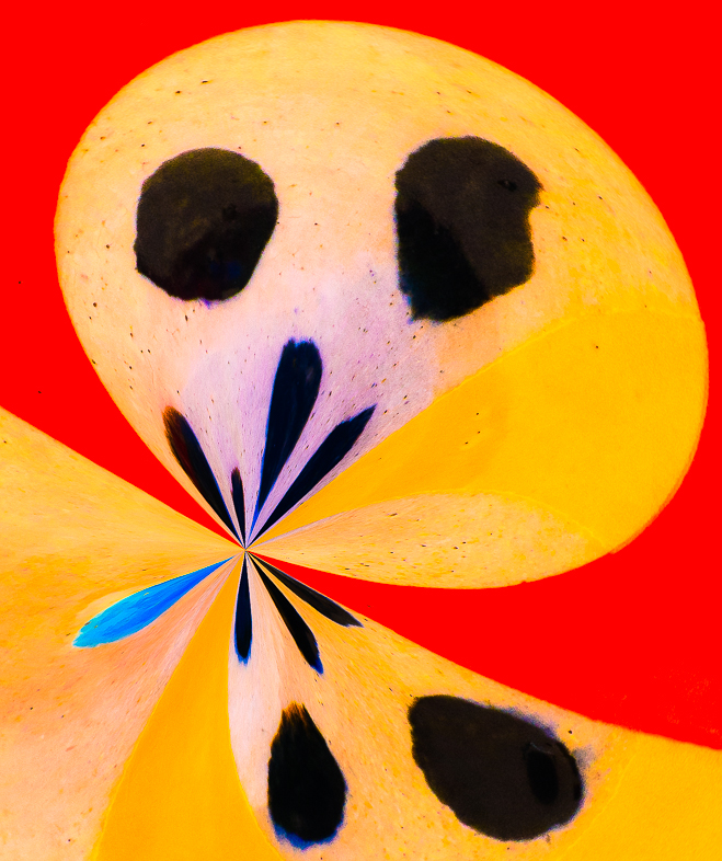
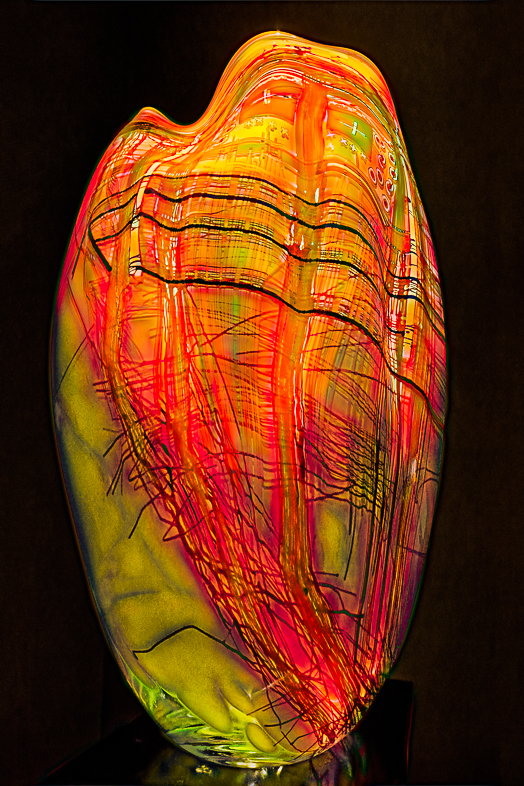
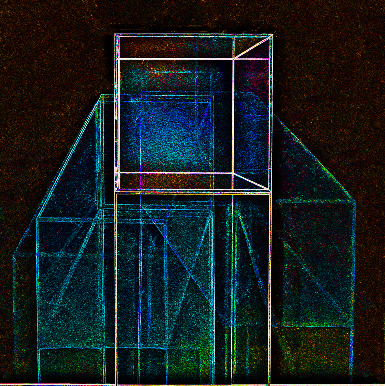
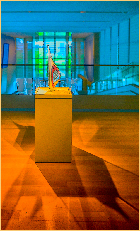
What a clever, creative image. I like every element of it and your choice of extrusion was perfect. I don't see any way to improve your image. Congratulations, and thanks for sharing your techniques. |
Jan 7th |
| 20 |
Jan 18 |
Comment |
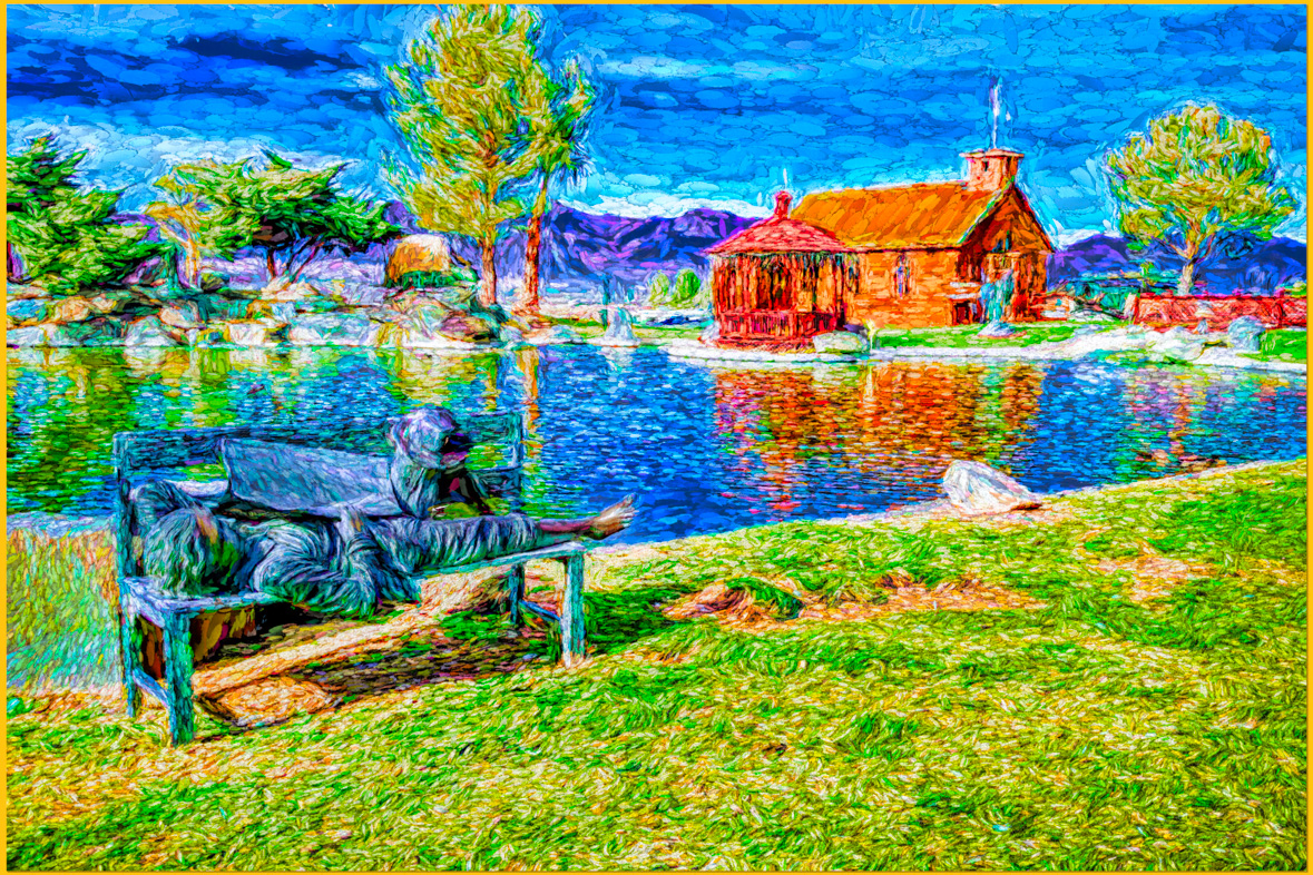
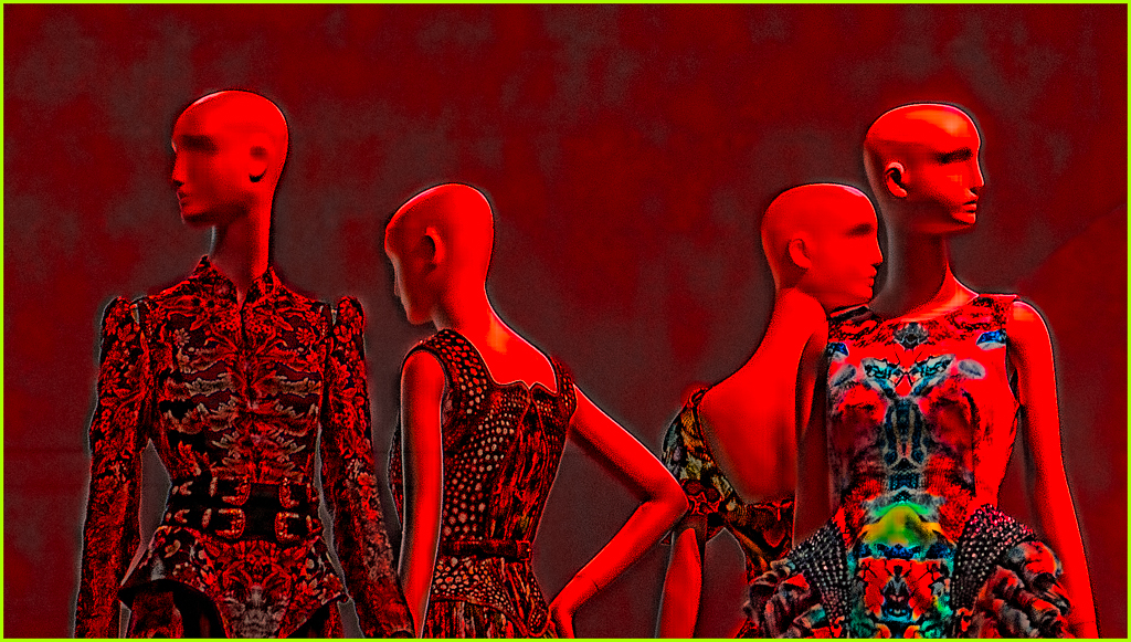
Welcome to the Group!
Your image looks great to me! Excellent photos and composition to my eye. I don't think i've Ever given anyone that comment previously. Unfortunately, i'm My ViewPoint is on an iPad, so ican't Comment on the background. Personally, I am lazy and use Topaz Impression when I want a background. It's options, including blend modes are countless. |
Jan 7th |
| 20 |
Jan 18 |
Comment |
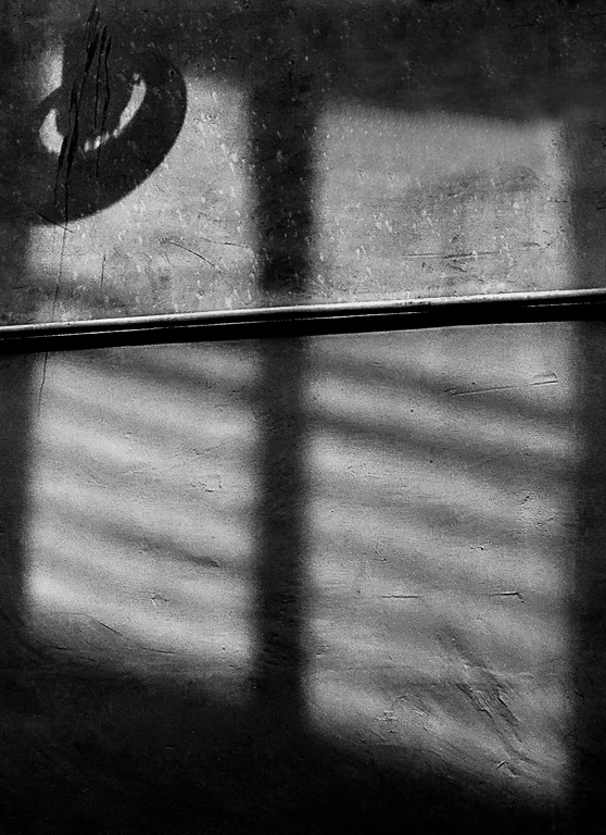
Thanks for your comments. The green background and drop shadow were original to the frame. Eliminating them just didn't look right perhaps because I didn't feather the edge of the frame. I'll try that now, because I hadn't thought of. That earlier.
If that doesn't work, i'll Try changing the wall to black. |
Jan 7th |
11 comments - 0 replies for Group 20
|
| 64 |
Jan 18 |
Comment |
Stuart,
My library offers free digital magazines, including National Geographic. I copied these 2 pages but didn't know how to upload them here.
You might want to check with your local library. |
Jan 23rd |
| 64 |
Jan 18 |
Comment |
Stan,
I invite you to attend my presentation to Photography West at the Stardust Theater on Friday, Jan.26 at 10 AM. |
Jan 23rd |
| 64 |
Jan 18 |
Comment |
Wow! I'm not a birder but I am always fascinated by natural patterns. |
Jan 13th |
| 64 |
Jan 18 |
Comment |
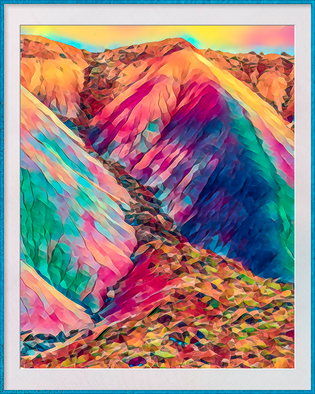
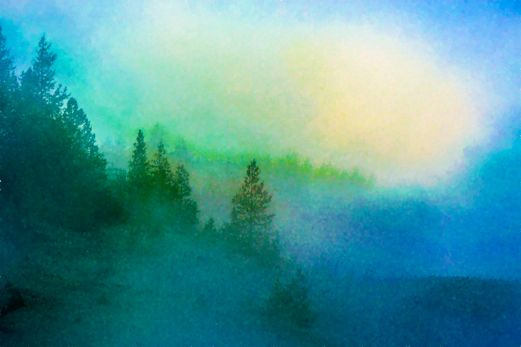
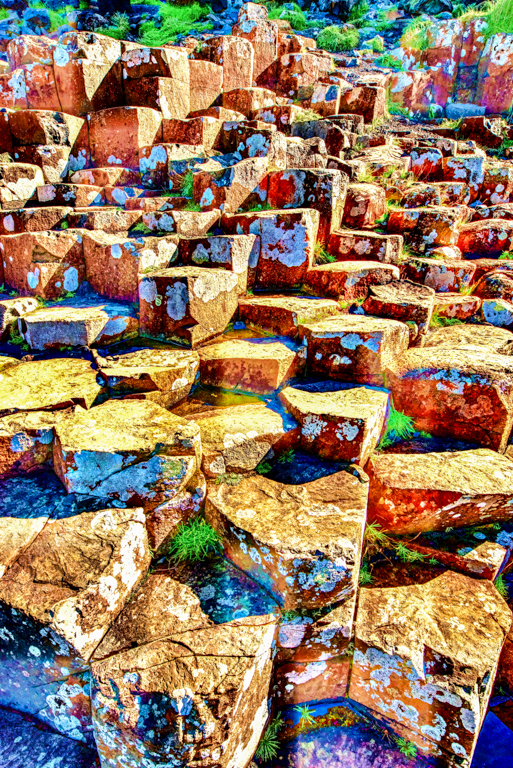
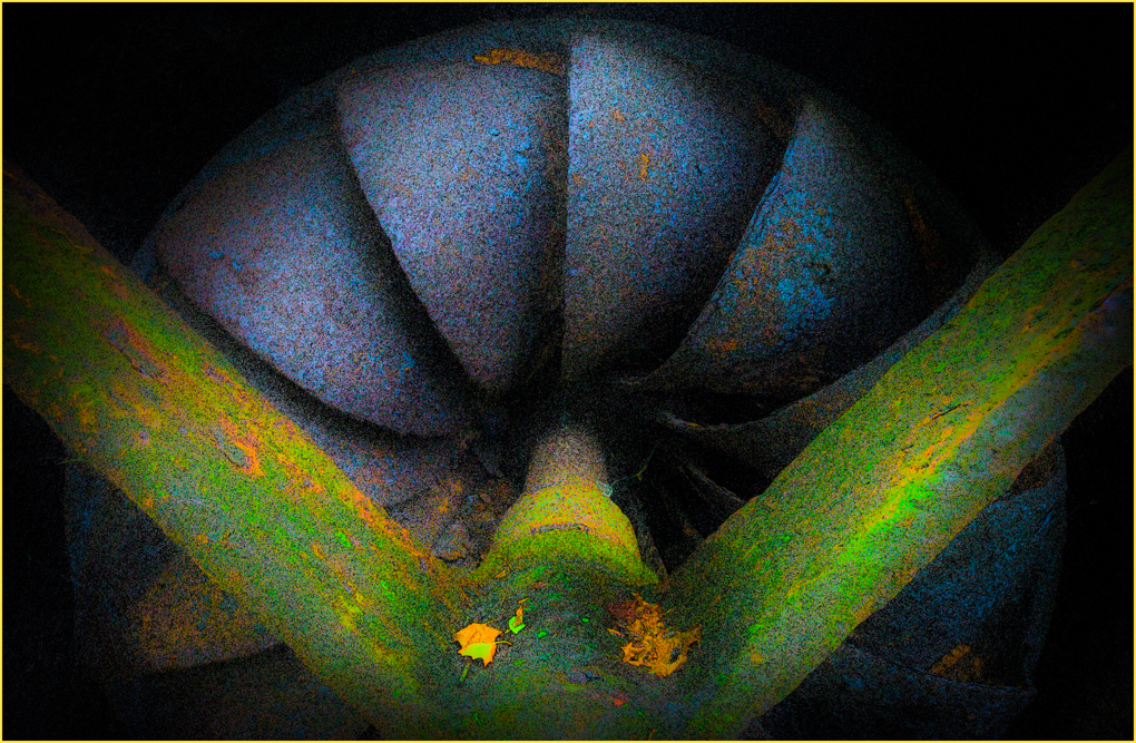
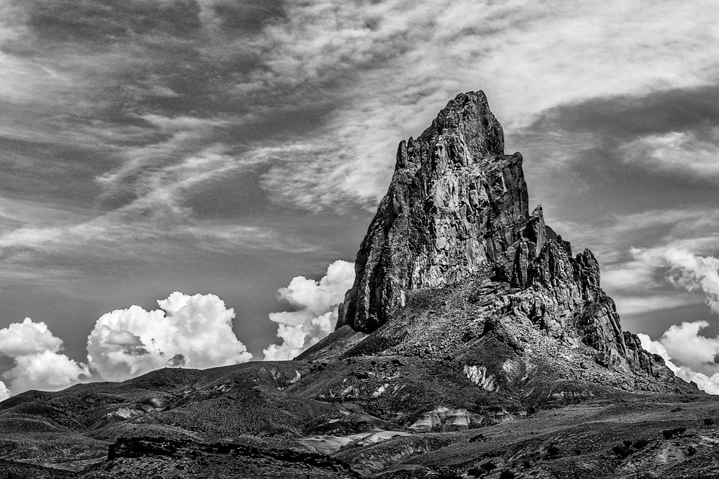
When I correct strong converging lines ( usually from a wide angle lens pointed up) I generally find that also changing the aspect ratio provides a more natural appearance to me. Maybe, changing the aspect ratio would produce a more natural appearing dome but it's of course just judgmental.
DxO ViewPoint has a feature for correcting foreground distortions of wide angle images. I just started using it and find it useful sometimes. I also recommend DxO Photolab in combination with ViewPoint for its intelligent processing. I regard DxO as a science driven and Adobe as a marketing driven company with features that will be surpassed by the competition in coming years. |
Jan 13th |
| 64 |
Jan 18 |
Comment |
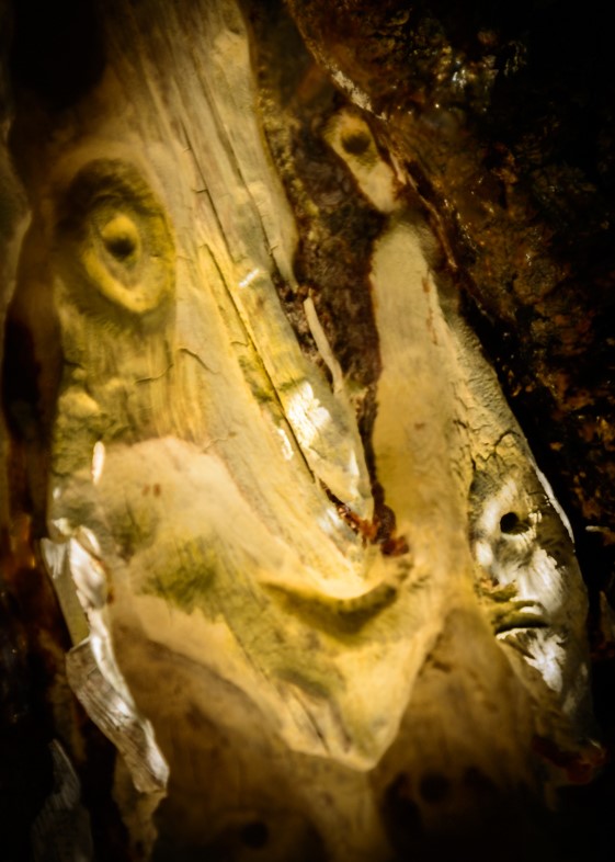
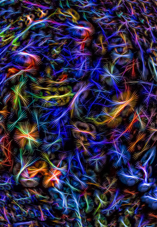
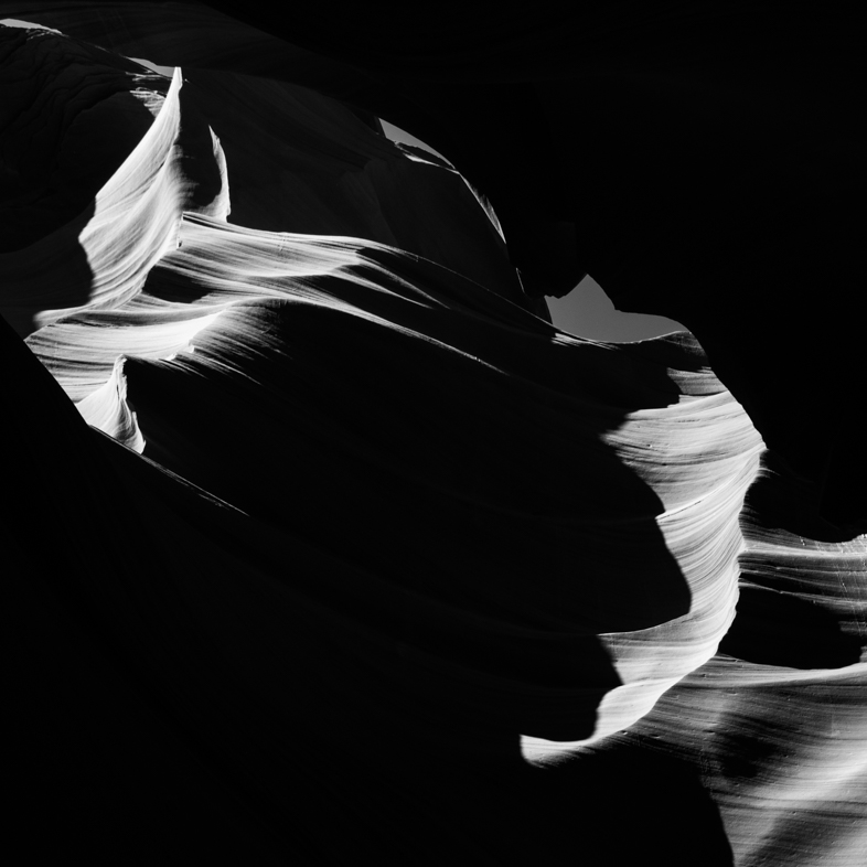
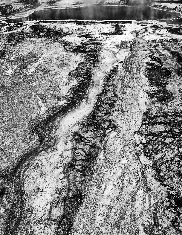
I think your presentation of this image is excellent. I am left wondering what story is to be told with the one highlighted cell. That's what makes this image most memorable to me. |
Jan 10th |
| 64 |
Jan 18 |
Comment |
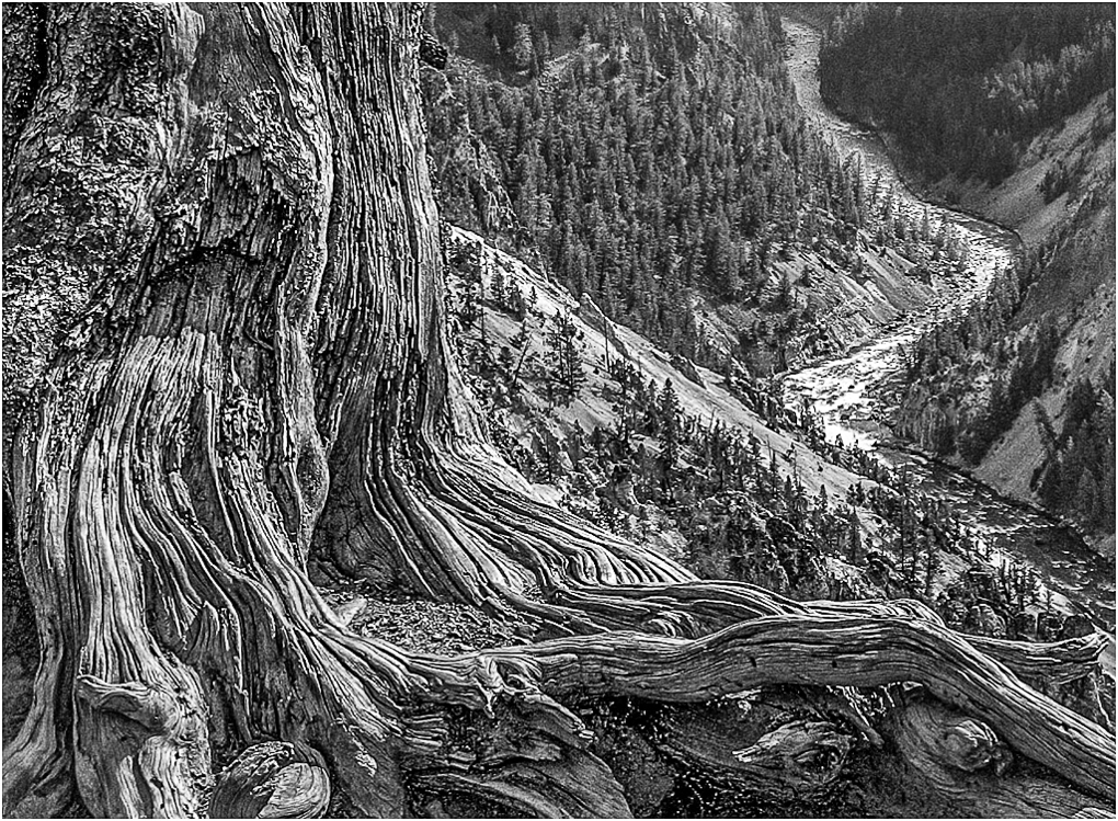
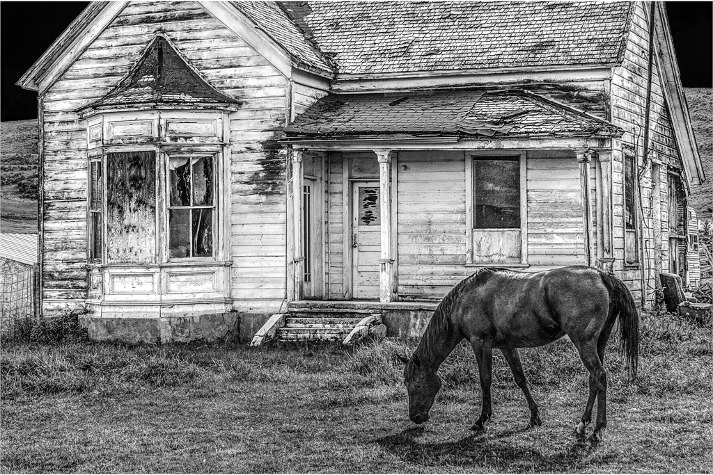
Yes, I have printed about 40 3'x3' images on glossy metal (9 square pieces joined with rings, unframed and hanging on a rod) and others somewhat smaller. Initially, I didn't have optimum sharpness but nevertheless viewers still viewed and appreciated these large prints as art. I have had 3 dentists as clients and they have requested more, but I haven't pursued it.
It was very surprising to hear someone call me an artist for the first time and a greater honor to me than winning a ribbon from judges who make snap judgments.
Cost and space are major issues for private individuals. I have considered printing on metallic paper to reduce the cost, but I haven't bothered to do it. Similarly, I have considered piecing together numerous small prints like wallpaper to make one large print. Maybe, I will someday.
At least at present, I prefer to be retired and relive my travels through my photo editing and creations. I appreciate seeing and learning from PSA members who kindly share their insights. |
Jan 10th |
| 64 |
Jan 18 |
Comment |
Stan,
You mentioned NIK is still free. I too have told friends that, but I just went to the DxO site in order to send a link to someone and I no longer could find it. Do you have a link to it? |
Jan 10th |
| 64 |
Jan 18 |
Comment |
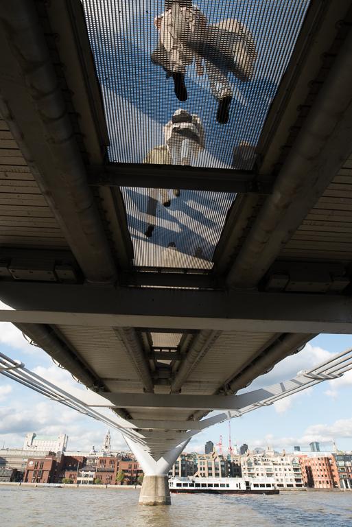
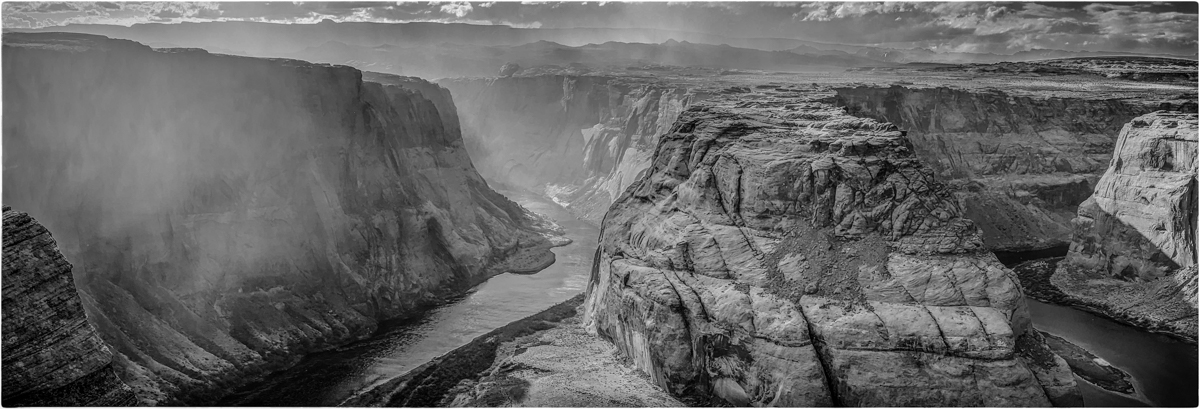
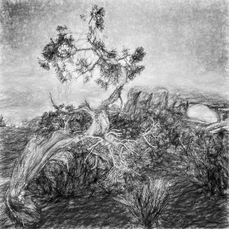
I captured many crooked images from moving vehicles this year, so I had a lot of practice correcting perspective. What I learned was that if you have a vertical line in the center of the image you should rotate the image to make that line perfectly perpendicular. (If it's not in the center the adjustment becomes more difficult and may require a pause and a second look to be sure it's right.). Then, you can balance the sides. I usually choose to make those lines perpendicular but I think slight inward tilts are ok too, but I think there needs to be balance from side to side.
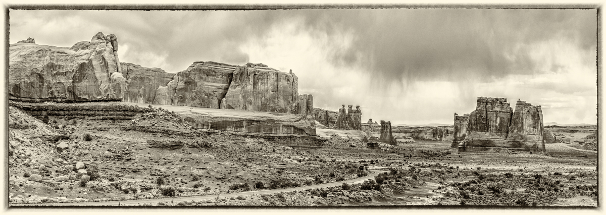
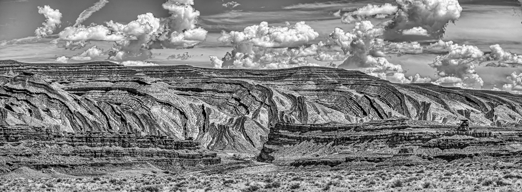
Bottom line, I think you have an excellent image that just needs a bit of straightening or balance. I think the implied movement in the clouds contributes a lot to what could be a static though very dynamic image. |
Jan 10th |
| 64 |
Jan 18 |
Comment |
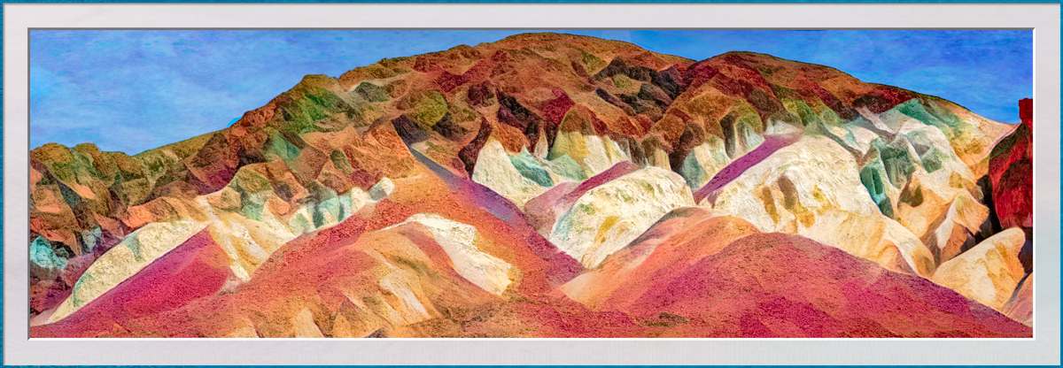
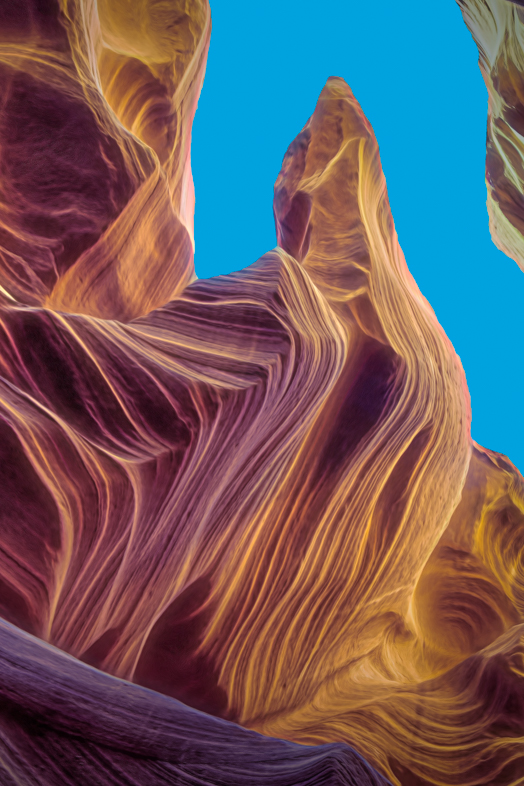
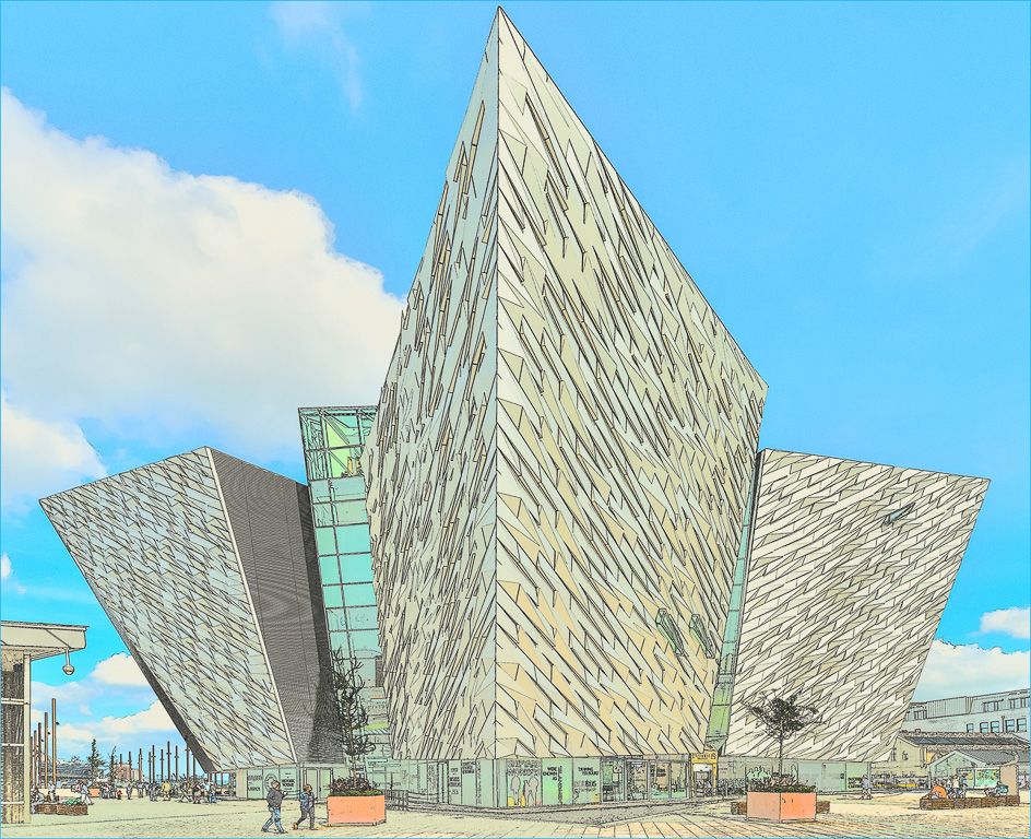
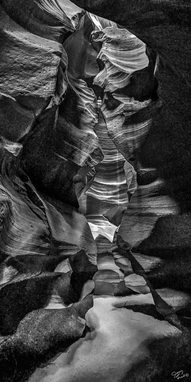
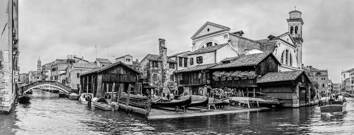
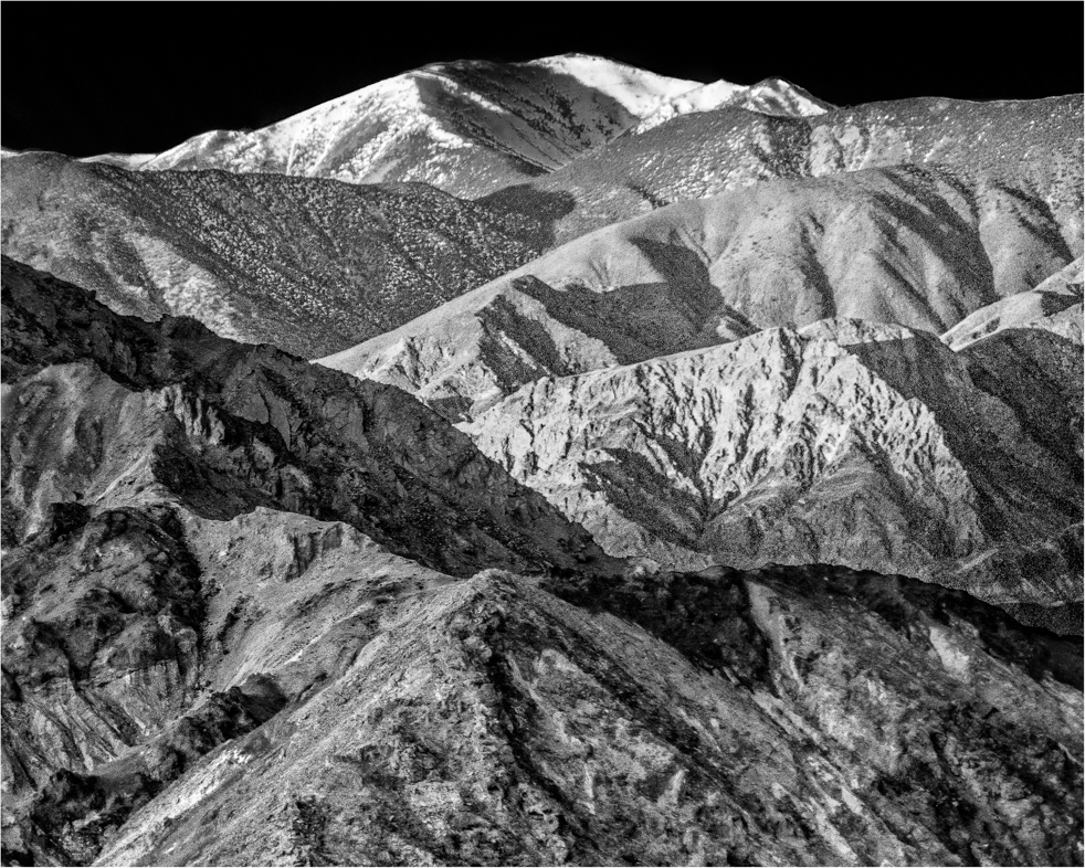
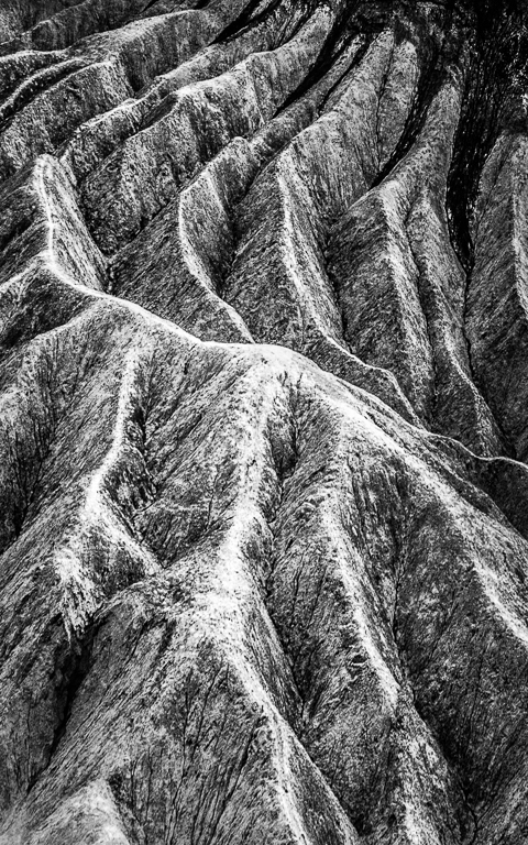
If I searched my catalog I think I would find a very similar image that I captured two years ago. However, I'm sure I didn't process it as well as you have. I think the only thing this image lacks to be fully appreciated is to be printed extremely large. Then, all the detail and beautiful lines and shapes would be easier to study and enjoy.
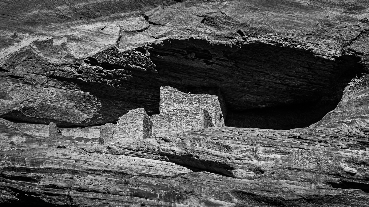
I printed an image of Canyon De Chelly 4'x7' for a dentist's office and I can assure you it's worlds better than a 16"x 20" print. I wish everyone would make a very large print for their homes. If that became more common perhaps photography would be more readily accepted as art. I know some observers have voiced that opinion to me.
I agree with your comments about competition. I don't enter competitions routinely, but most often when I now compete I submit images that I like rather than ones that I know from experience that judges will prefer.
When I chaired our local print competition, I told the judges that we are trying to create art and that's how they should judge our prints. I think it sometimes made a difference, because I heard negative feedback from entrants. I am amazed when I hear most good photographers say that don't consider themselves producing art. |
Jan 9th |
| 64 |
Jan 18 |
Comment |
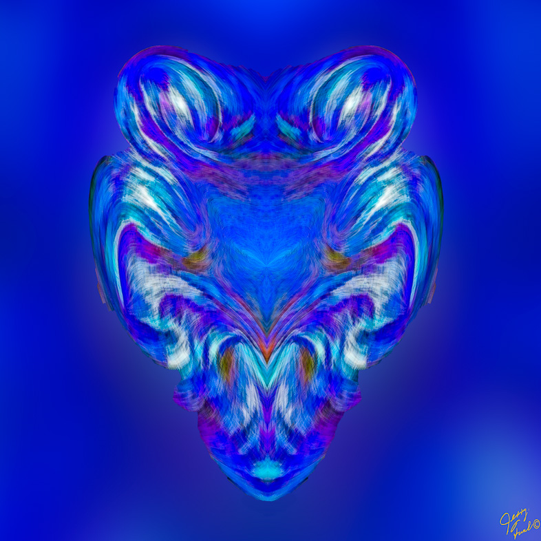
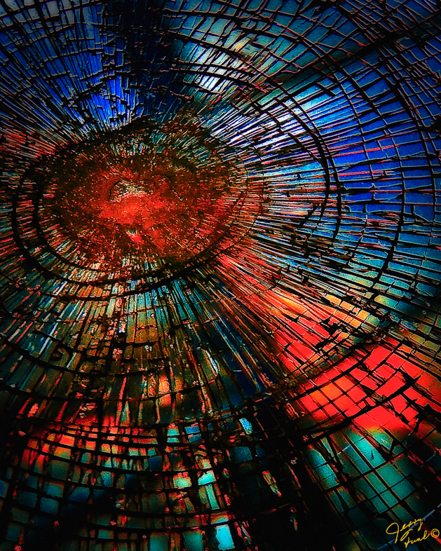
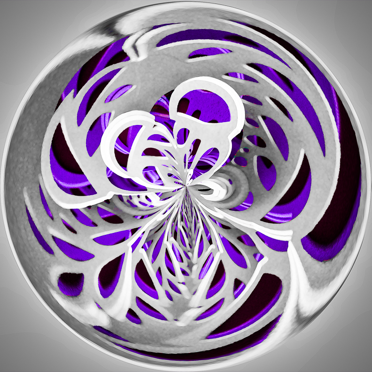
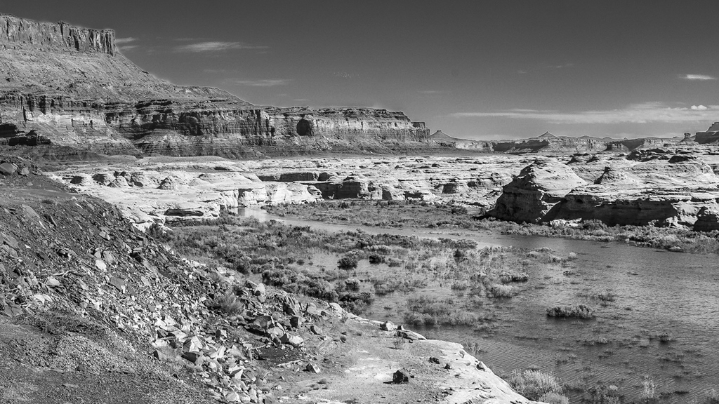
You have created a very dramatic image. I don't see a pure black anywhere, so you might consider adding that to make it even more dramatic. |
Jan 8th |
| 64 |
Jan 18 |
Comment |
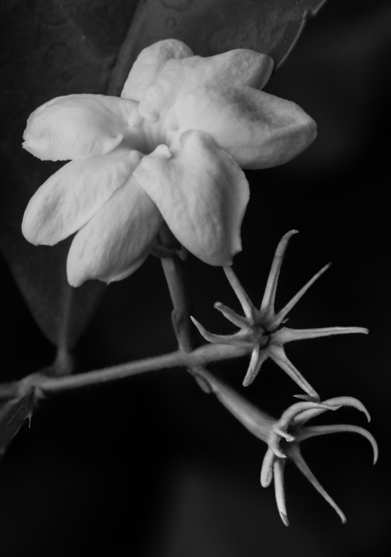
I think a clean white background would contribute to your simple composition. A bit more open space on the right may also help. I think the birds need space to move. |
Jan 8th |
| 64 |
Jan 18 |
Comment |
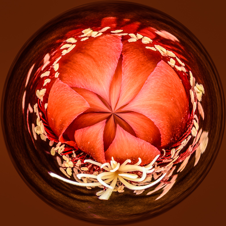
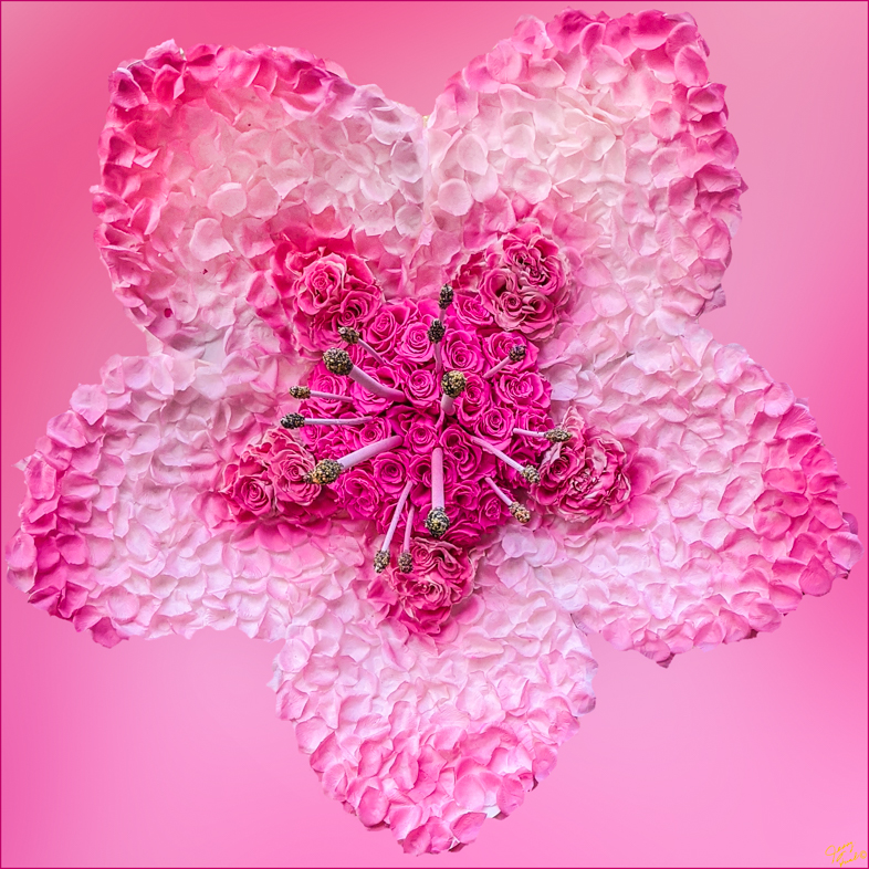
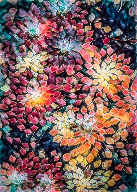
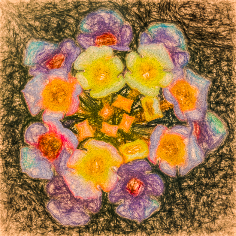
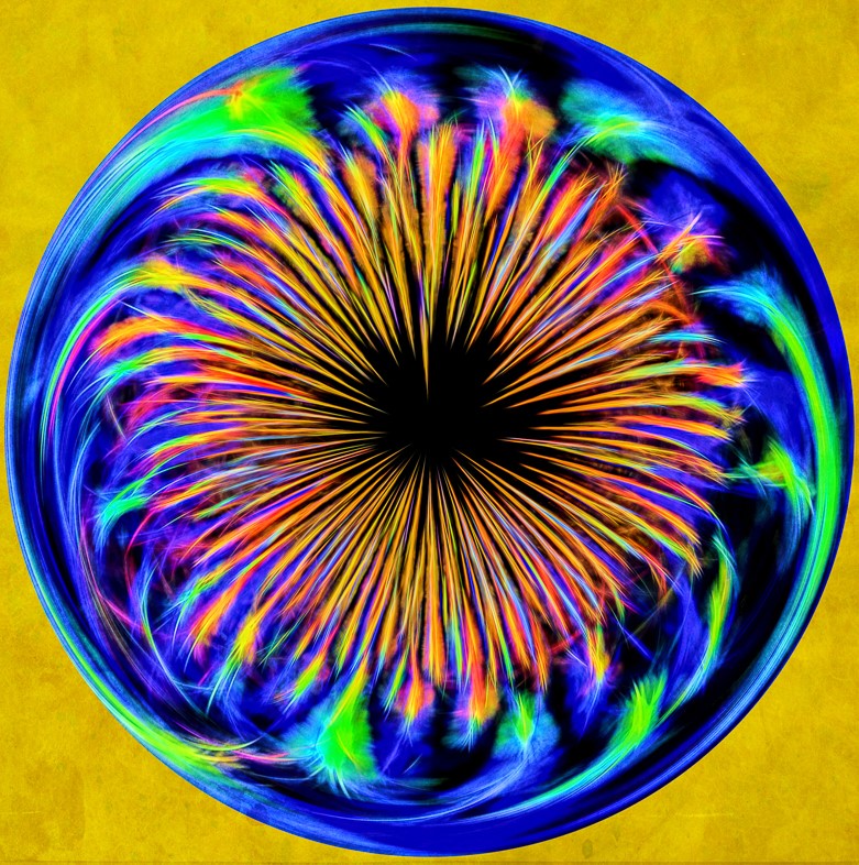
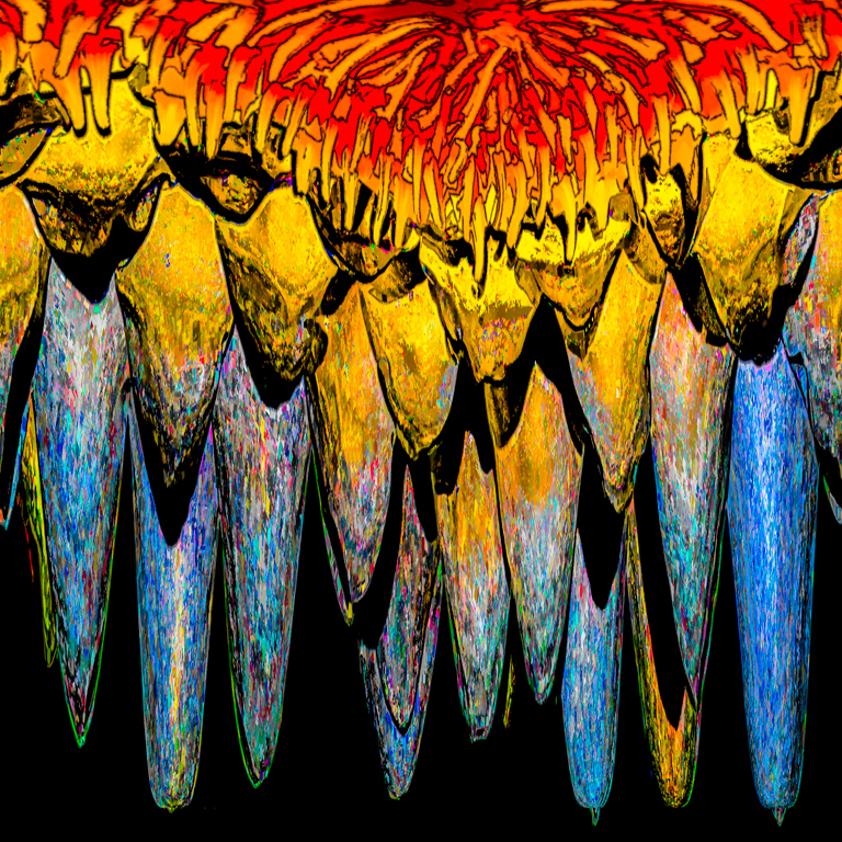
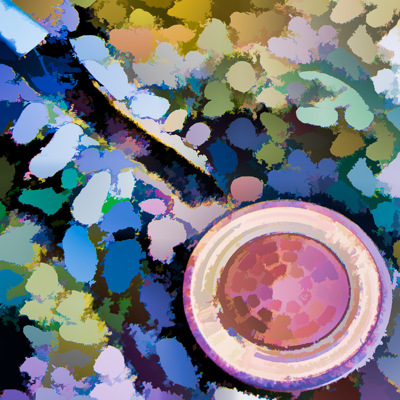
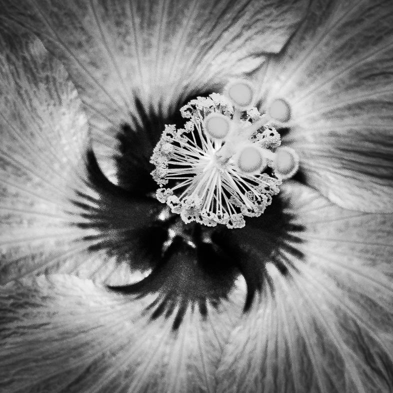
My first impression, is that of fireworks exploding in the sky, or perhaps an artists impression of fireworks using globs of paint. I like what you have done and the textures add to its interest. I find the bright petals distracting though and would like detail added to them. I think this was a very difficult subject to render as well as you have done. |
Jan 8th |
12 comments - 0 replies for Group 64
|
23 comments - 0 replies Total
|