|
| Group |
Round |
C/R |
Comment |
Date |
Image |
| 20 |
Dec 17 |
Comment |
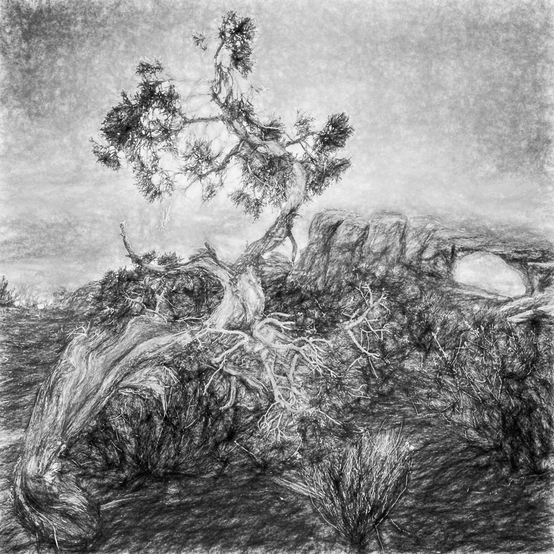
I like your idea, but to my eye the building alone is not interesting enough for fulfill your concept. I think the beautiful tree dominates the image and would like to see it colored too. |
Dec 10th |
| 20 |
Dec 17 |
Comment |
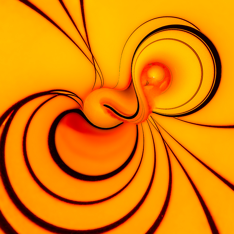
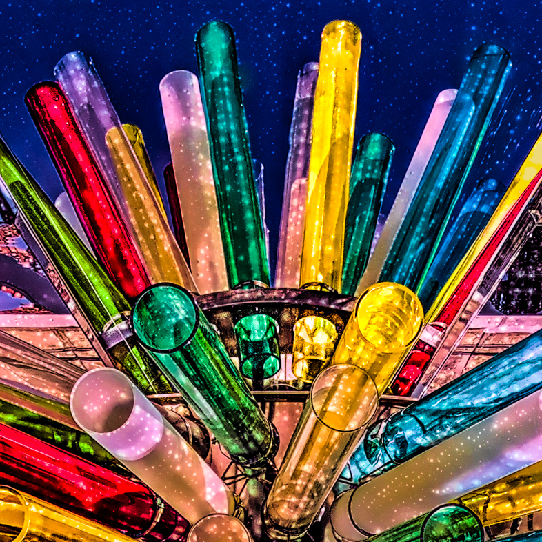
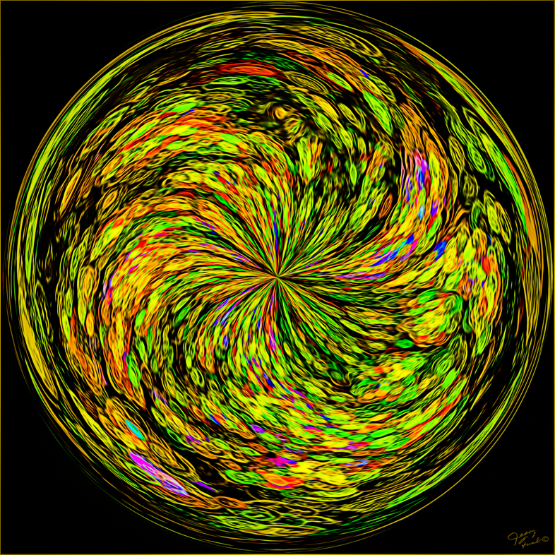
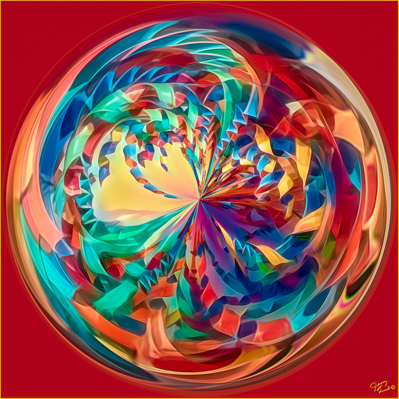
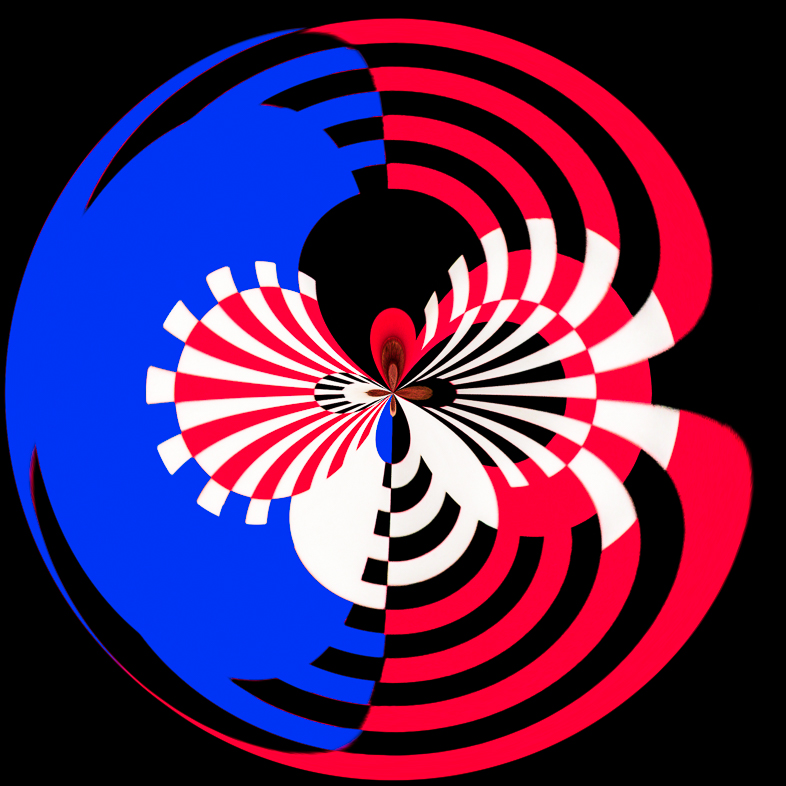
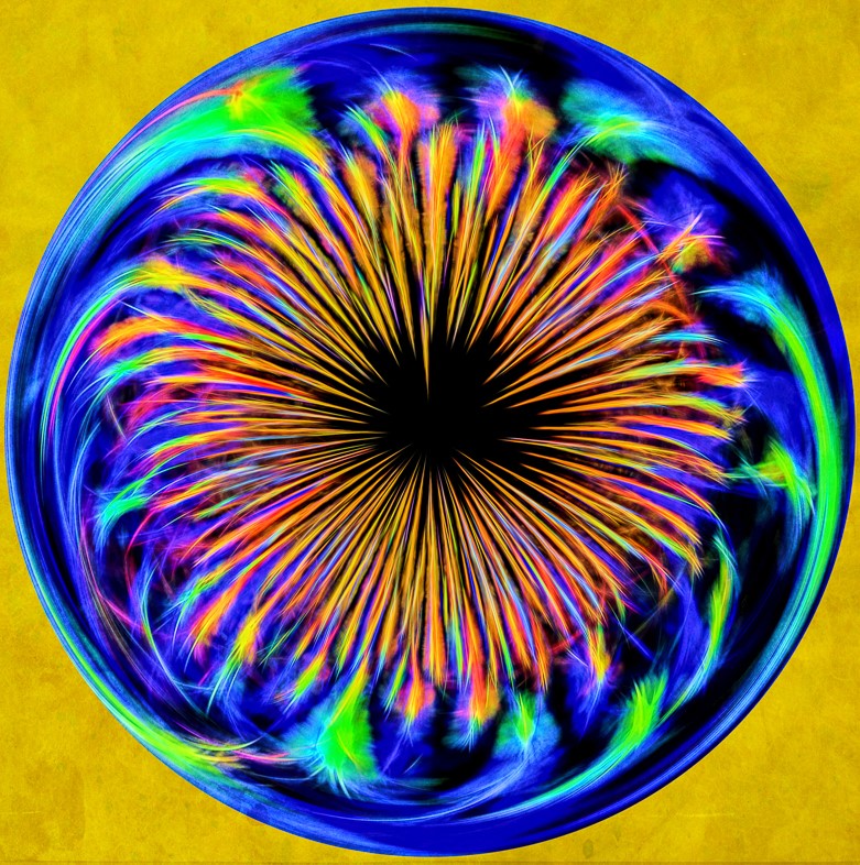
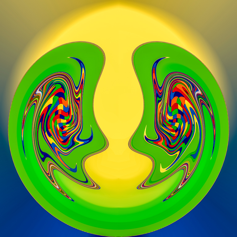
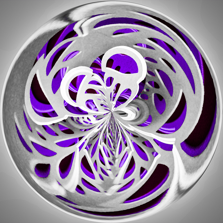
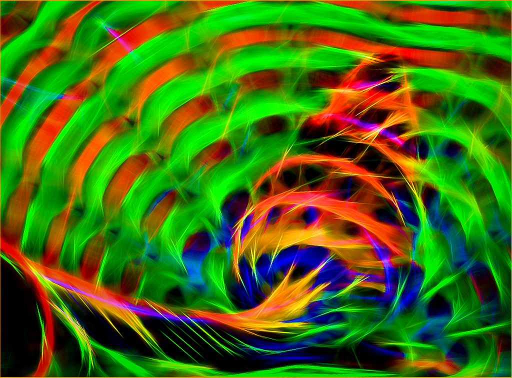
Yes, it appeals to a limited audience, but I achieved pretty much what I had in mind when I captured the image.
I'll try other variations with distortions and other colors. I enjoy working on colorful graphic images.
I look forward to years of learning from everyone and contributing my ideas and experience to this Group. |
Dec 4th |
| 20 |
Dec 17 |
Comment |
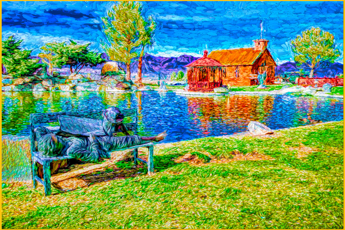
I really like all the creative aspects of this image, you've given me some new ideas.
I have an idea for a different perspective to try. I'd like to see it as a panoramic with the sky cropped to just above the trees on the left. I'd also crop the right to place your main subject to the right of center. I'd add grass to the bottoms and fill the stone path with grasss too. I think the result will provide leading lines and focus my eye on your subject.
Yes, I often crop to create alternative versions of my images too. |
Dec 4th |
| 20 |
Dec 17 |
Comment |
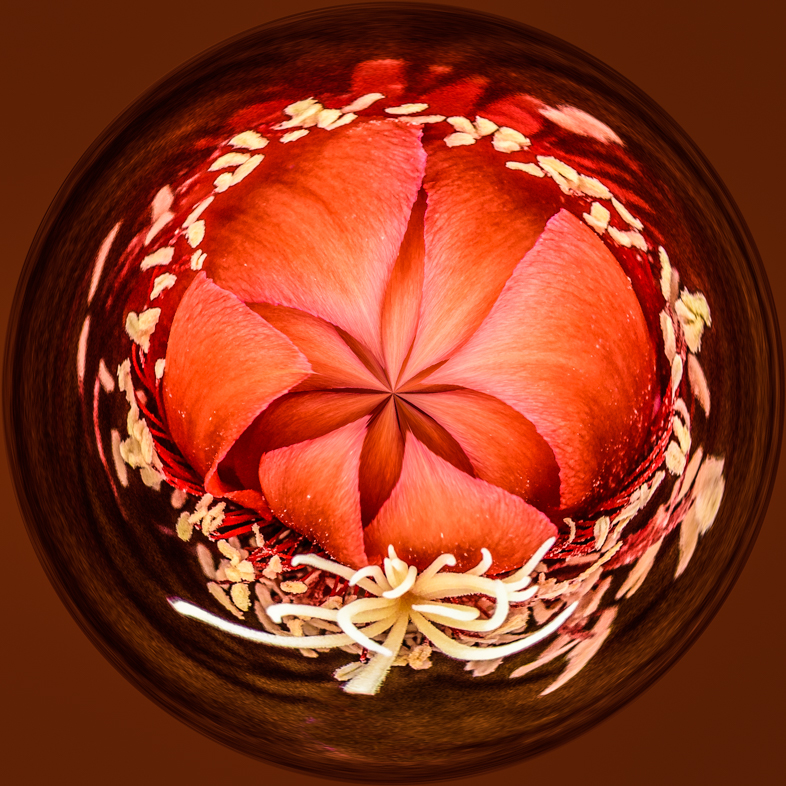
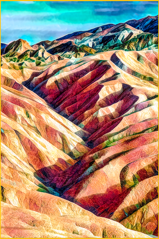
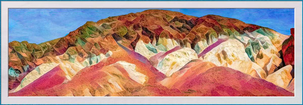
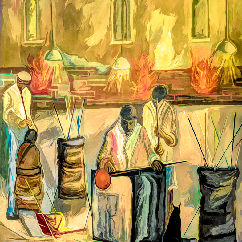
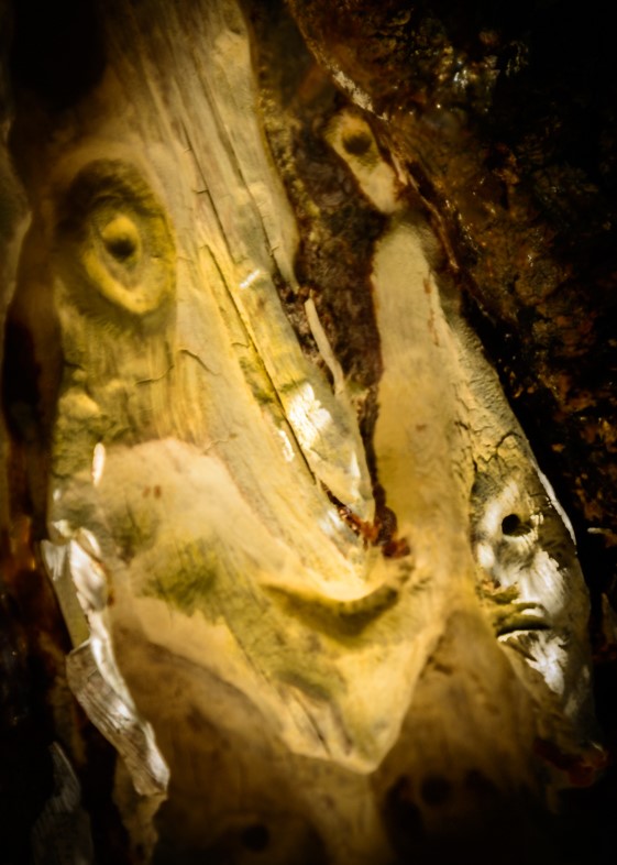
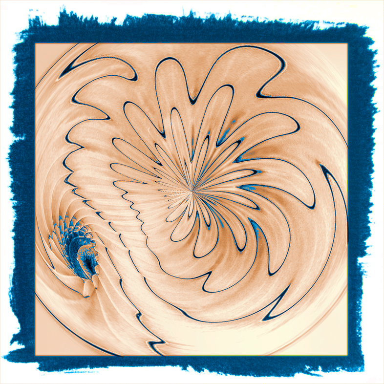
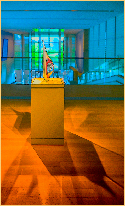
As the others suggested, this image could use a filter, possibly Nik glamour glow and or a sepia tone.
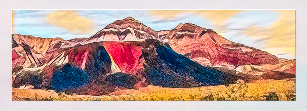
I'm fortunate living in the desert and still enjoying 80 degrees and full sunshine. This image could be of our visitors. |
Dec 4th |
| 20 |
Dec 17 |
Comment |
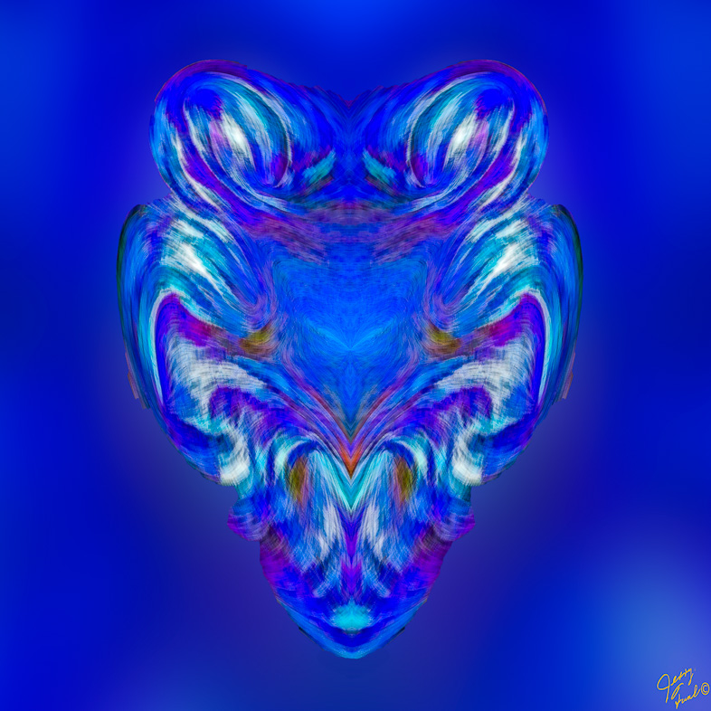
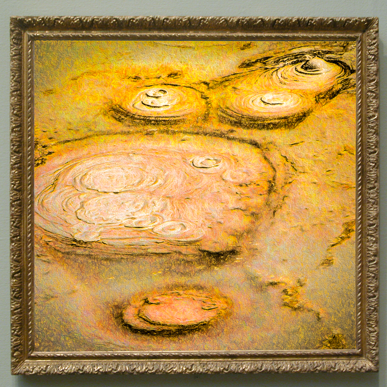
Beautiful image! Well chosen background and border definitely complement the image.
My only suggestion is to darken the bright spot adjacent to the right eye. It distracted me. |
Dec 4th |
| 20 |
Dec 17 |
Comment |
Excellent image, every element and blending are done perfectly.
My eye would prefer to see a slightly different composition with your subject moved up a bit and to the right. Alternatively, crop a bit off the top and move the cat very slightly to the right. |
Dec 4th |
| 20 |
Dec 17 |
Comment |
Thanks for the detailed suggestions.
I had darkened the hot spots and lower the saturation of the green but they sure popped out again. I'll rework them. |
Dec 4th |
7 comments - 0 replies for Group 20
|
| 64 |
Dec 17 |
Comment |
I agree with John |
Dec 26th |
| 64 |
Dec 17 |
Reply |
Thanks, i'm definitely a slow learner in that respect. |
Dec 15th |
| 64 |
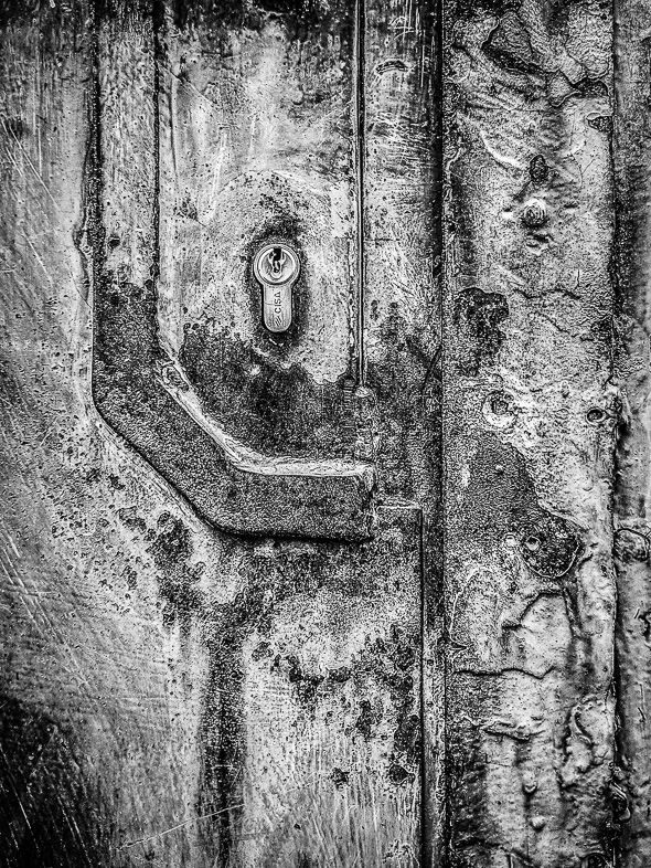
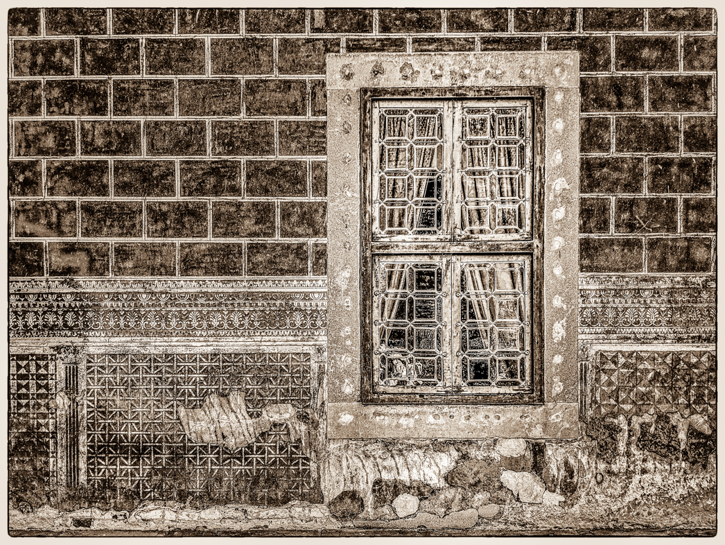
Dec 17 |
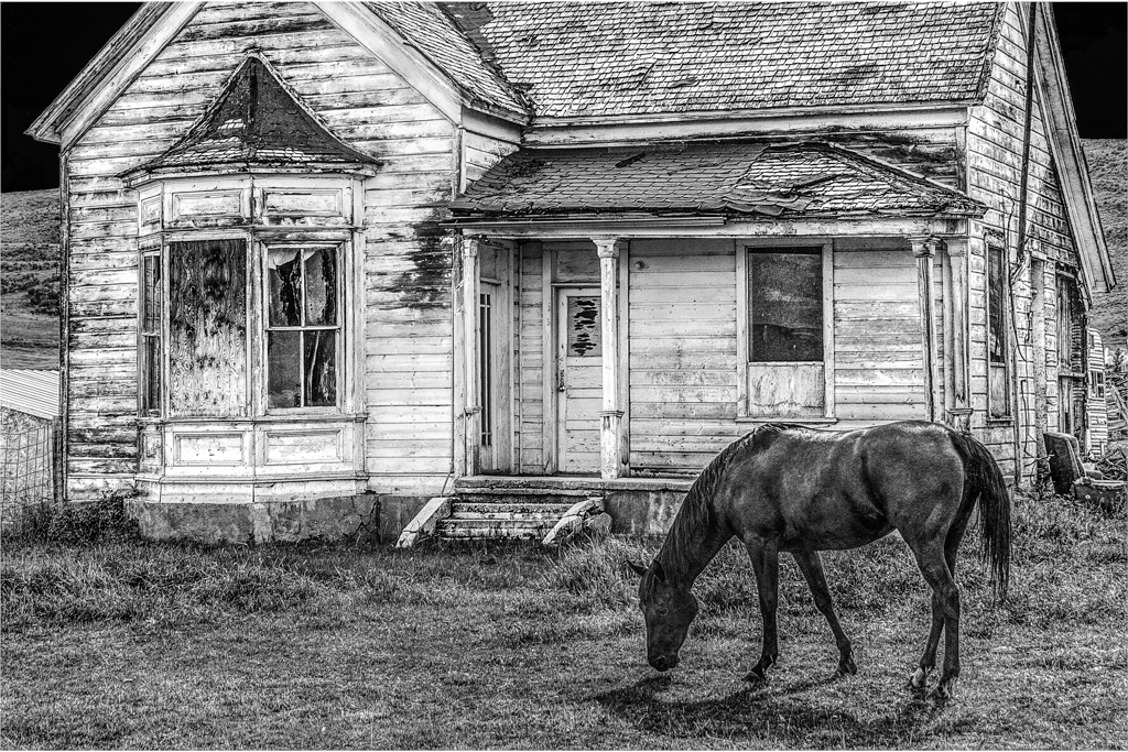
Comment |
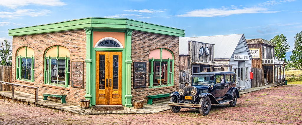
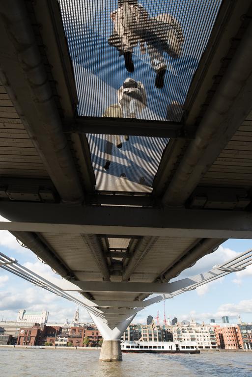
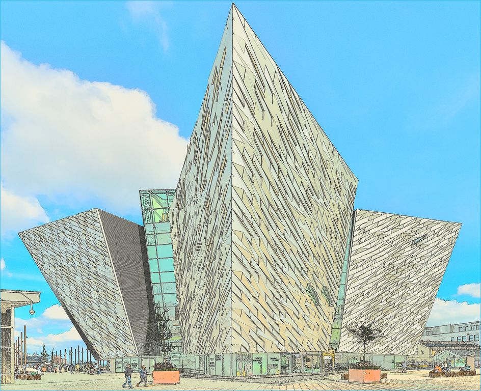
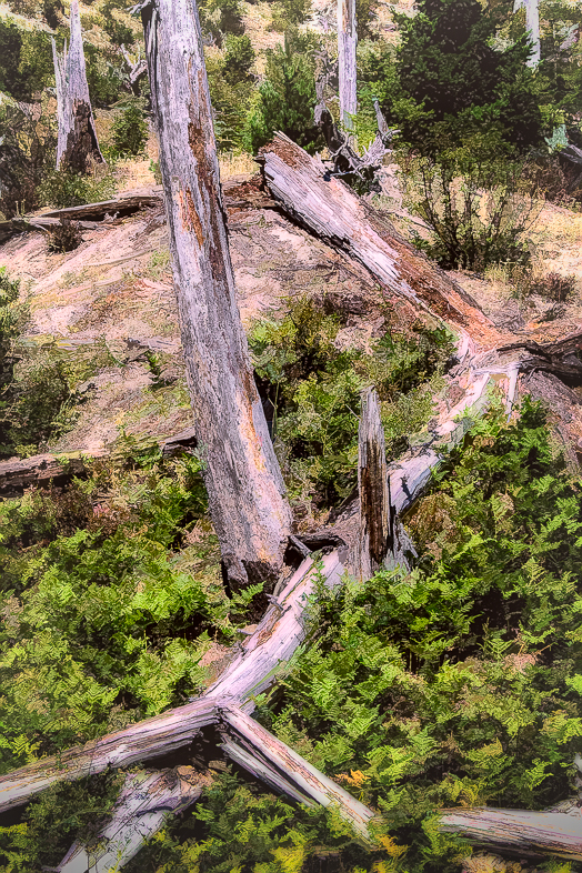
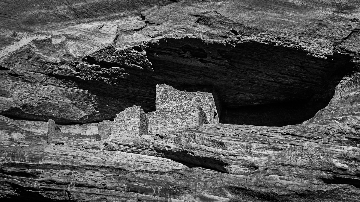
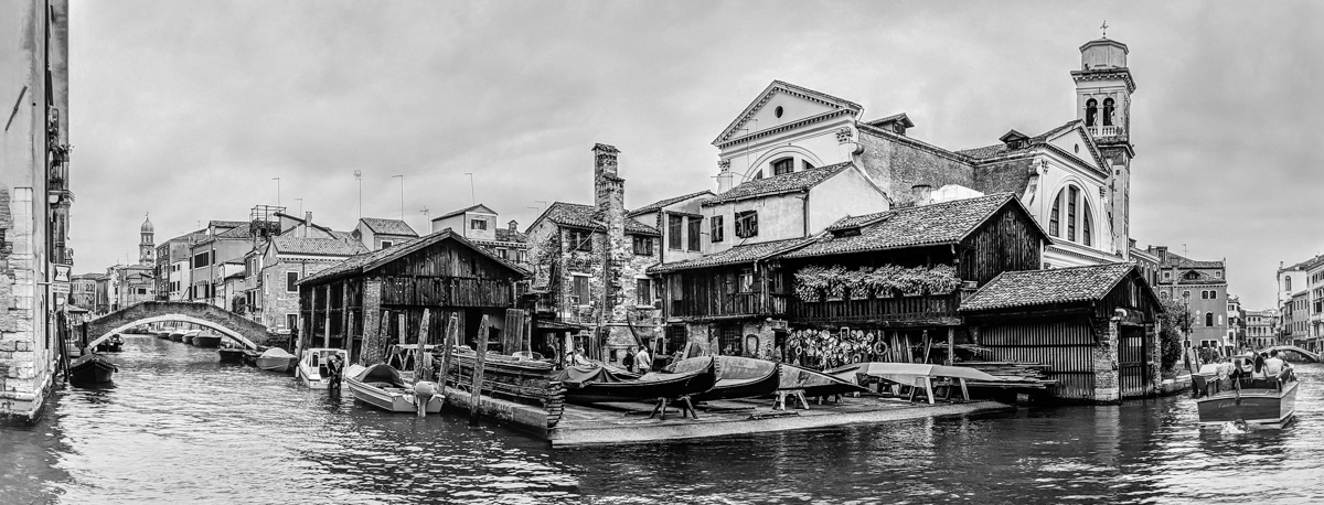
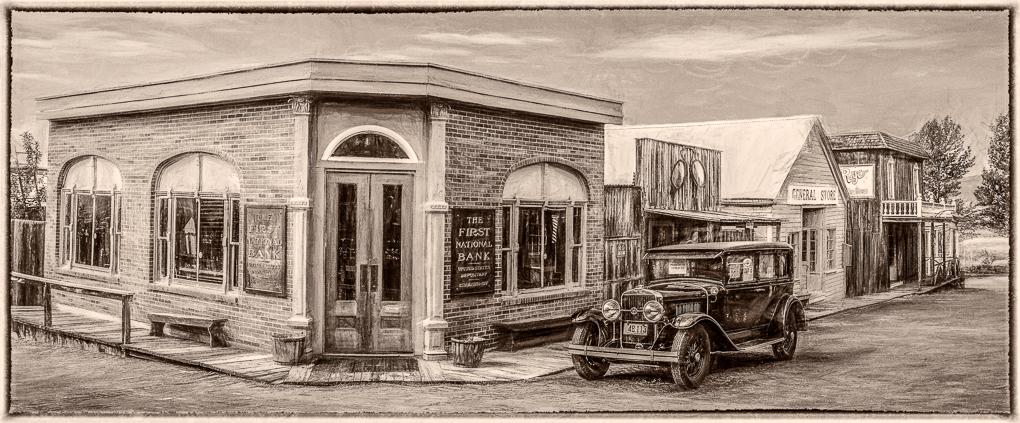
I like the image and agree with the earlier comments. I'm sure this building is out of square but I also think it was shot at an upward angle. I think it could be corrected for that, but it won't be easy. |
Dec 11th |
| 64 |
Dec 17 |
Reply |
Sorry, my shorthand for black and white is BxW. I'm not used to saying monochrome or mono. |
Dec 11th |
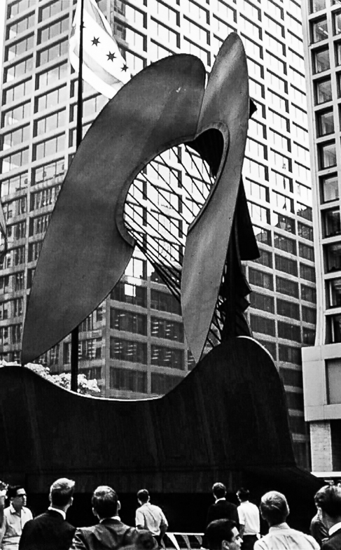
| 64 |
Dec 17 |
Reply |
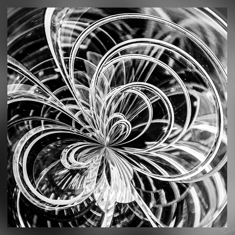
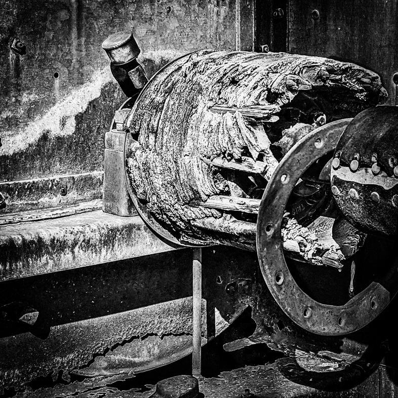
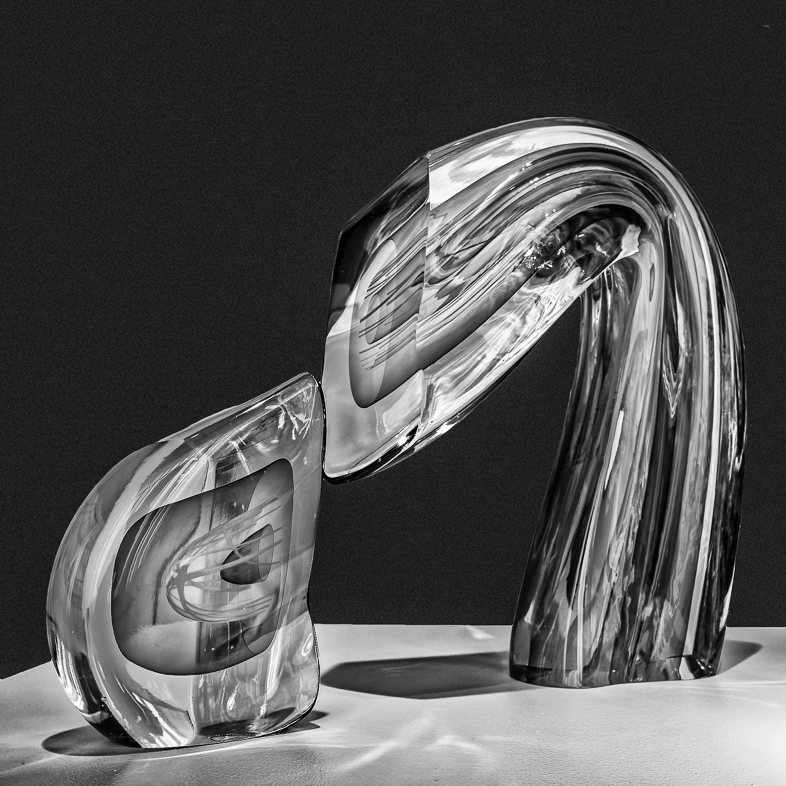
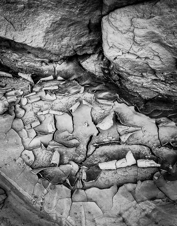
Actually, I do have another based on a piece at the lower right. You have encouraged me to submit it next month. |
Dec 11th |
| 64 |
Dec 17 |
Comment |
For me, this image is about the chess board on the ground, the chess pieces and the lady standing like another chess piece. I would crop down from the top to emphasize that idea, remove the distraction on the lower right and the two boys. Blurring the background would focus my eyes on the primary subjects too. |
Dec 9th |
| 64 |
Dec 17 |
Comment |
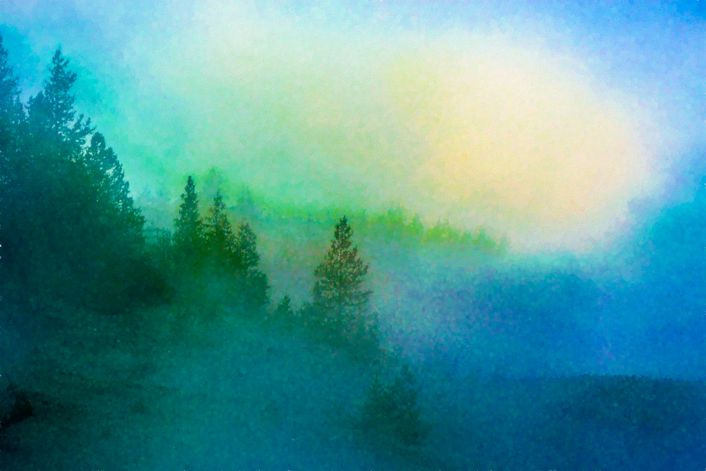
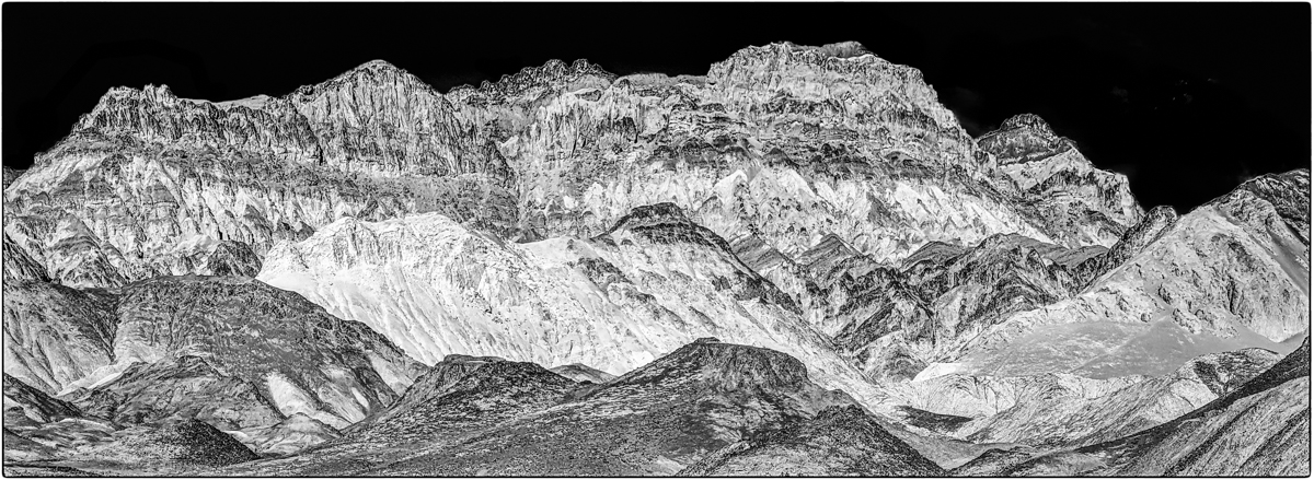
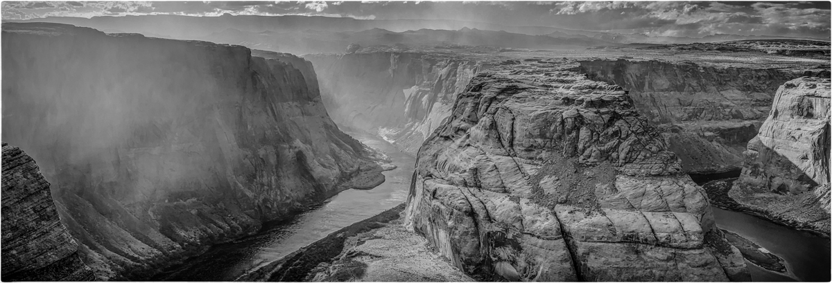
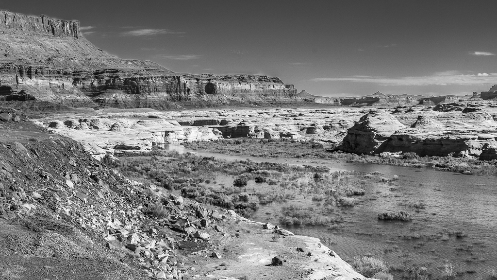
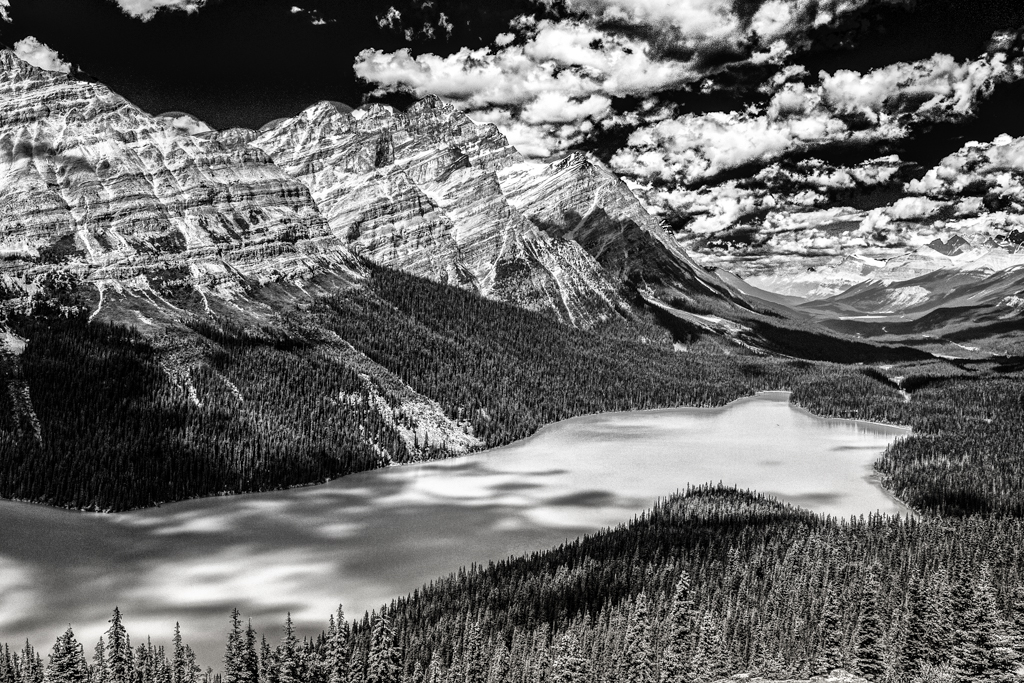
In this case, I think the static look of the mid-line horizon contributes to the overall tranquil feeling I have viewing this image. Very nice. The near silhouette look is very good, but I think I would prefer to see the shadows opened up.
I purchased a good phone camera (Google Pixel) earlier this year and am slowly learning to use it. I think it's smart algofhythms for auto exposure can teach me something. |
Dec 9th |
| 64 |
Dec 17 |
Comment |
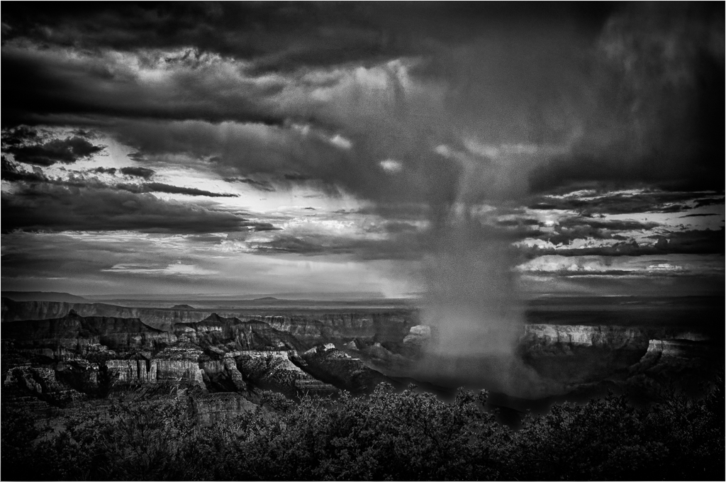
You made an excellent image out of what must have been a high contrast situation. ( I would have liked to have seen your original.). I respect the fact that you did not open the shadows on the people, because they are incidental to the image while providing scale. I think a version with a slight vignette may be very interesting too. |
Dec 9th |
| 64 |
Dec 17 |
Comment |
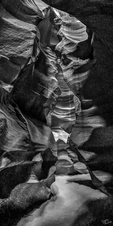
I think this image speaks volumes. Wonderful! Excellent detail and contrast.
While the composition with the raised arm creates a nice line, I prefer to not see the hand out of focus and would consider cropping it to a square format. |
Dec 9th |
| 64 |
Dec 17 |
Comment |
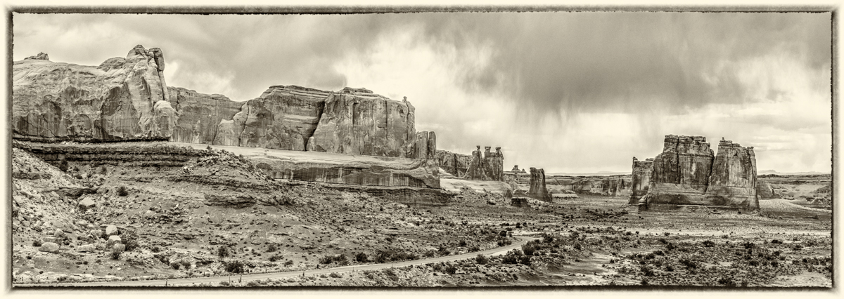
I think Stan described your image perfectly.
By coincidence I visited this site and stood in the same location at mid-day this past Oct. 5 with a 20mm lens. My image captured the symmetry but was very flat and colorless and the fountain was off. That was the reality. I read of the coming light show and wished I could be there to experience it. You captured it much better than I imagined.
Both of your images are excellent. |
Dec 9th |
| 64 |
Dec 17 |
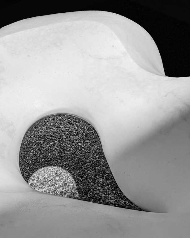
Comment |
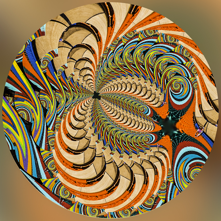
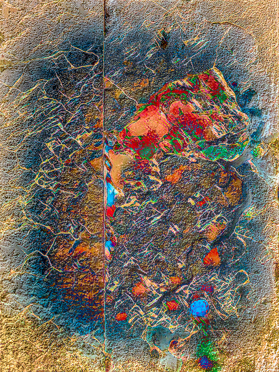
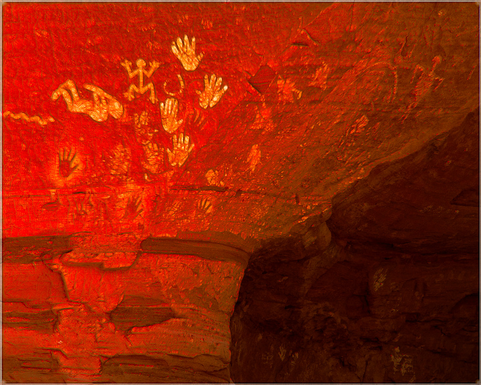
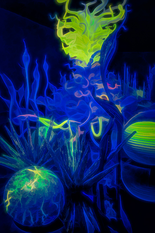
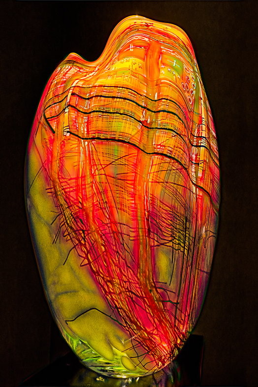
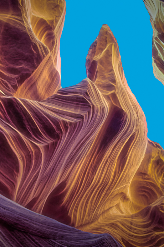
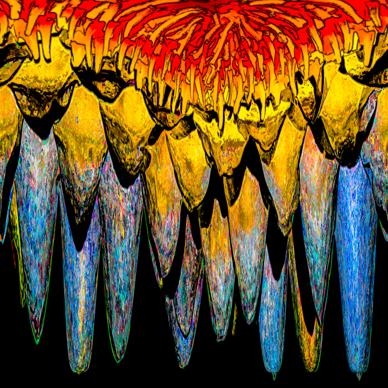
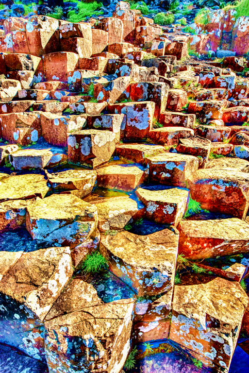
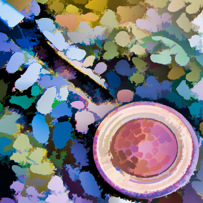
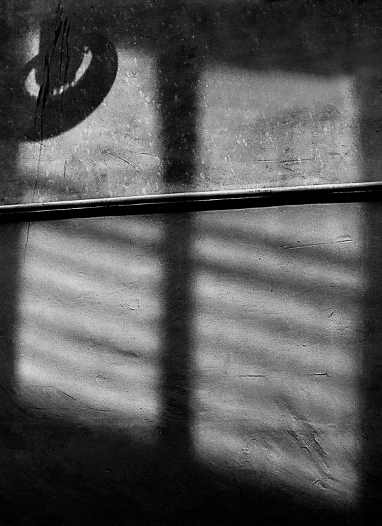
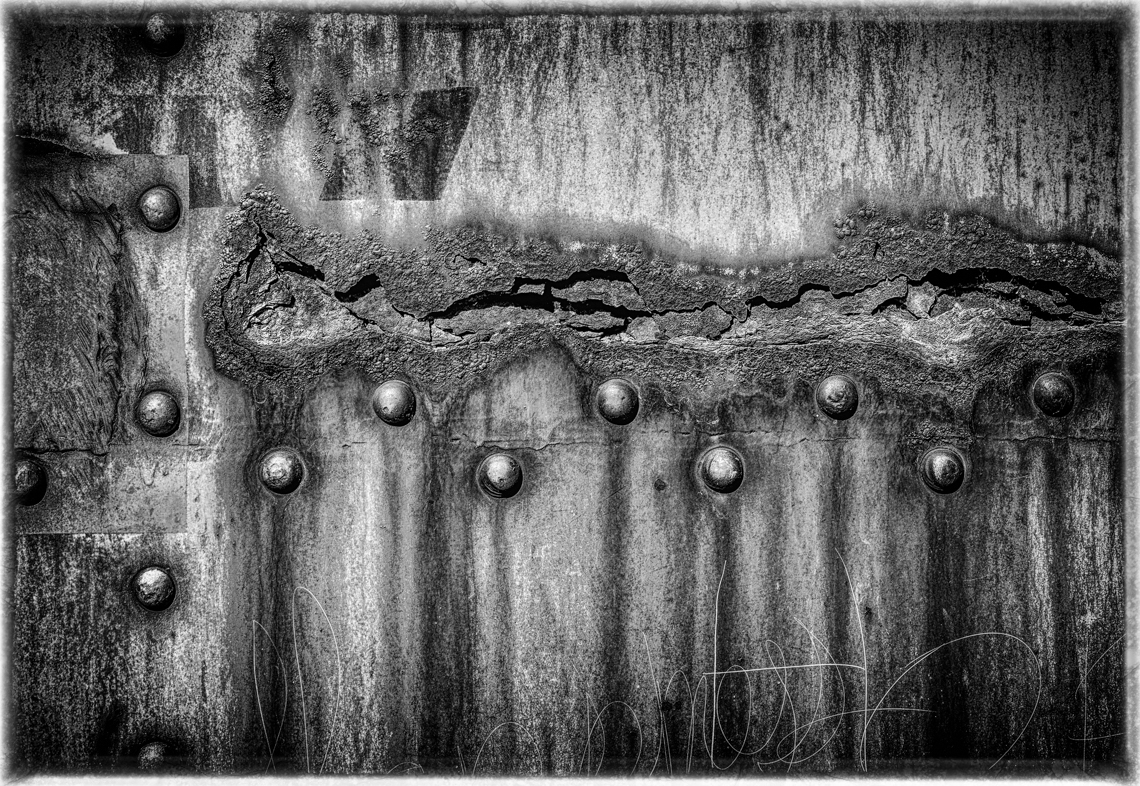
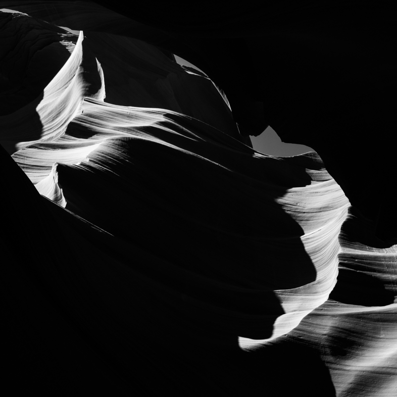
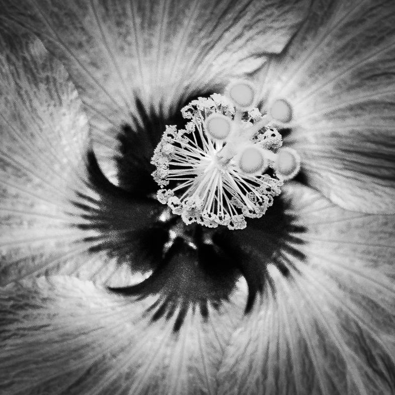
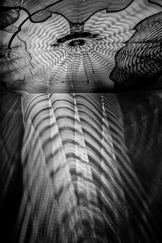
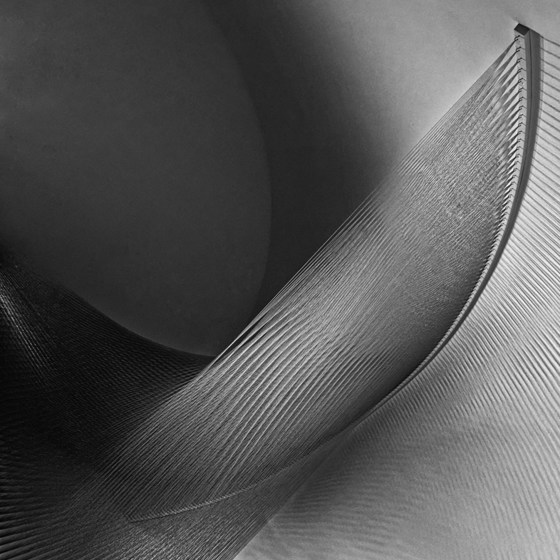
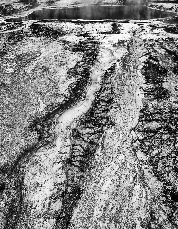
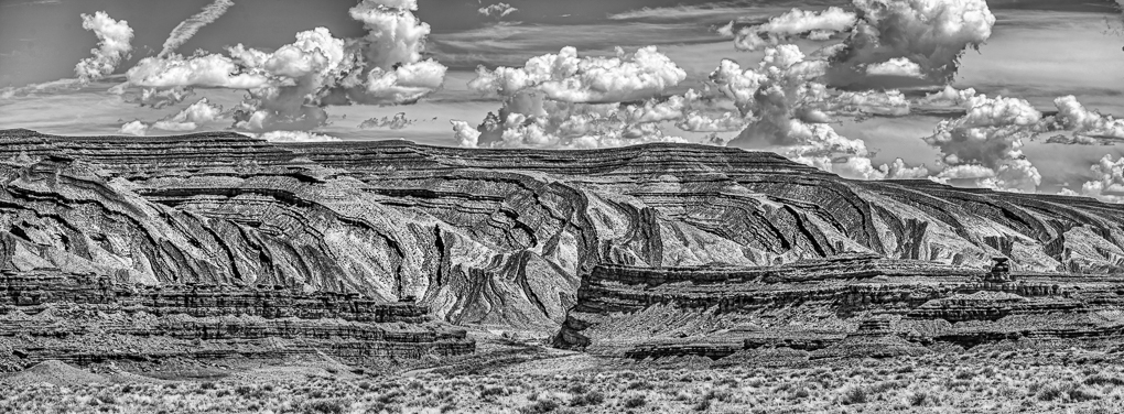
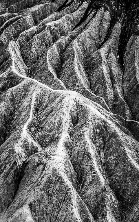
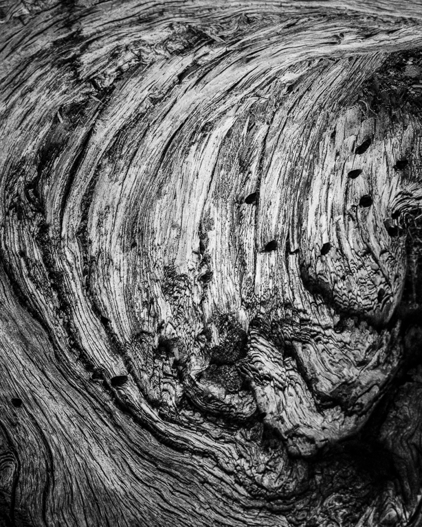
Thanks. I really like to work on natural abstracts, but had only previously done color. Since this lacks natural color impact I considered tried a BXW version.
I am just starting to take BXW seriously, so I was expecting to read suggested ways to improve it. Next, I have to learn how to print it well. |
Dec 8th |
8 comments - 3 replies for Group 64
|
15 comments - 3 replies Total
|