|
| Group |
Round |
C/R |
Comment |
Date |
Image |
| 18 |
Dec 22 |
Comment |
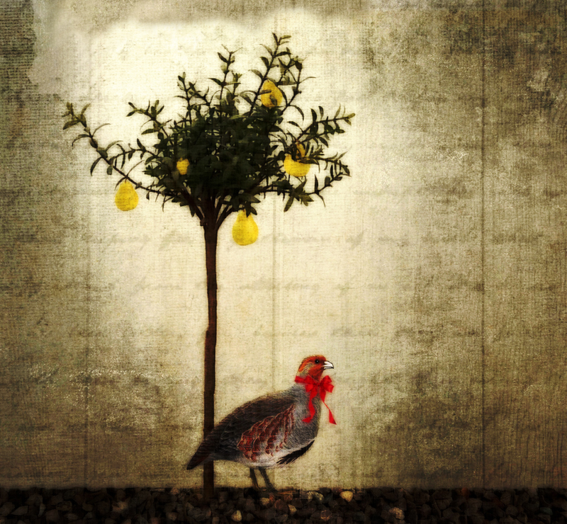
Terrific picture and some great manipulation. I don't mind the stem bottom left mixing with the frame, but for some reason the
branch bottom right cutting into the frame irritates a little. The square format suits, but if the frame was slightly bigger this would solve my fussiness! |
Dec 9th |
1 comment - 0 replies for Group 18
|
| 34 |
Dec 22 |
Reply |
I think that your suggestion works well Gunter, and is an improvement! |
Dec 16th |
| 34 |
Dec 22 |
Reply |
I like the additional vibrance Steve, but I feel that the revision is now a little dark and loses some of the detail because of that. |
Dec 16th |
| 34 |
Dec 22 |
Comment |
I like what you have done with all the ingredients to make a super seasonal image. I think that this would make a great Christmas card mage for friends and relatives. I agree that festive partridge works well on the ground rather than on the tree. My only suggestions would be to lighten the image slightly I have used the equalise filter, and to darken the top centre a tad to imitate a rough frame. |
Dec 16th |
 |
| 34 |
Dec 22 |
Comment |
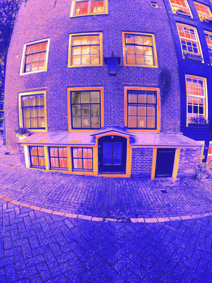
I think the original taken with the amazing miniature camera is great in it's own right, and the colourful work you have done makes a great creative image. Like the other Steve, my eye goes to the light area on the LHS, and I would prefer this to be cloned down to the rest of the brickwork colour. The crooked post in the middle also irritates slightly, as do the scattered leaves on the tiles. I have made some rough adjustments which might explain what I mean. |
Dec 16th |
 |
| 34 |
Dec 22 |
Comment |
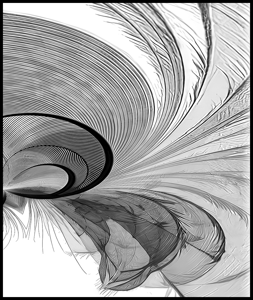
A gorgeous graphic image which works extremely well. My only thought is that by keeping the original feather dimensions the shape if the new image is perhaps a little too long. I have taken the liberty of changing the size slightly and added a small black frame which I think emphasises the creation. |
Dec 16th |
 |
| 34 |
Dec 22 |
Comment |
A very eye-catching image well created from a fairly ordinary original. The best thing about the original was the y bit, and I am pleased to see that you have highlighted this by keeping it green. New growth from a fading leaf. I was going to suggest the leaf should be on a diagonal but Gunter has beaten me to it!
The frame is an important part of your submission. |
Dec 16th |
| 34 |
Dec 22 |
Comment |
A lot of hard work has gone into these successful creations. My only minor criticisms are that the face on the right is much lighter than that on the left, and could do with darkening down slightly, and the image on the right has a double frame compared with the single on the left, and it might be better for both frames to be doubles! |
Dec 16th |
| 34 |
Dec 22 |
Reply |
Thanks Ian. |
Dec 5th |
| 34 |
Dec 22 |
Comment |
Thanks Andrew. I did do a mono version which worked quite well. |
Dec 4th |
6 comments - 3 replies for Group 34
|
7 comments - 3 replies Total
|