|
| Group |
Round |
C/R |
Comment |
Date |
Image |
| 18 |
Oct 22 |
Reply |
Thanks. An interesting suggestion! |
Oct 24th |
| 18 |
Oct 22 |
Reply |
Thanks for the comment, but since I no longer enter exhibitions there will not be any judges around to hate it! |
Oct 24th |
| 18 |
Oct 22 |
Comment |
Welcome to the group Joan.
The idea is great and colourful.
Perhaps a slight lightening of the arm and neck would help, but this is my only real criticism.
The white line certainly extends round the edge of the arm and down the right-hand side, but can easily be corrected. Since this was not a cut out, I wonder if it was caused by an over-sharpening of the original which sometimes happens.
A good creative, and well constructed image! |
Oct 10th |
| 18 |
Oct 22 |
Reply |
Yes Joan. I think the crop might work! |
Oct 9th |
| 18 |
Oct 22 |
Comment |
If that isn't creative I don't know what is! I love the way the lighthouse and building bend as if affected by being inside the glass of the globe. Super idea for a snow shaker! Base and background are also well planned. The whole CREATION works beautifully! P.S. I would have chosen the first three choices and no way the fourth! |
Oct 6th |
| 18 |
Oct 22 |
Comment |
Love it! It really works well. Normally I have suggestions to make, but I think you have done a great job. I think the head has been placed perfectly, and I actually like the red overlap because it emphasises the fact that the head is behind the framework. |
Oct 6th |
| 18 |
Oct 22 |
Comment |
Can you imagine what life would be like with two suns? Apart from your really good creation, it has got me thinking about any advantages or disadvantages that would arise. The earths orbit would be confusing as a starter, and would we have continual daylight! As a great shot it works on many levels! |
Oct 6th |
| 18 |
Oct 22 |
Comment |
Not sure about this one. I think that the blurring might be overdone, although the white daisy seems more ok with it than the main bloom! Perhaps a less fierce arrangement of filters may help! |
Oct 6th |
| 18 |
Oct 22 |
Comment |
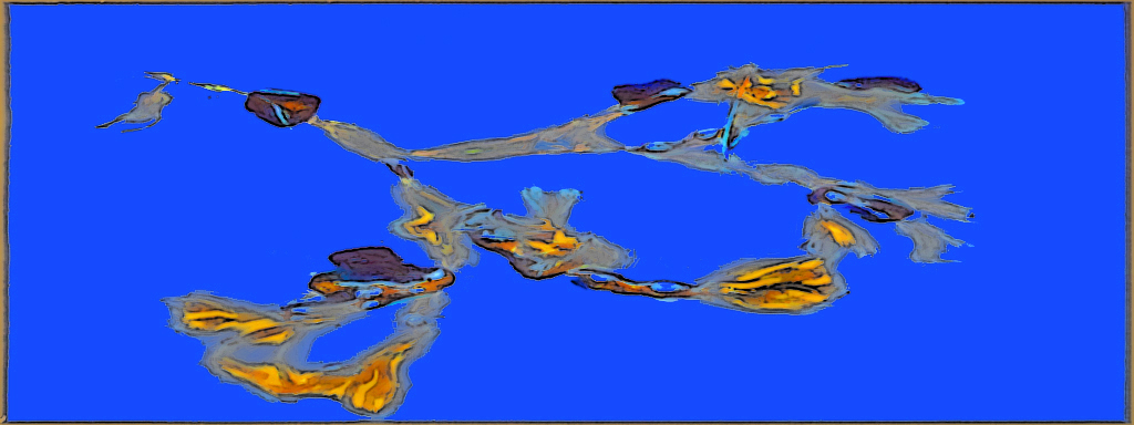
Very colourful and the blue background suits. It's one of those pictures that grows on you the more you look at it. I felt that the shape of the shot might lend itself to a bit of letterboxing, and the background could do with some cleaning up. Forgive me for mucking about with it, but I gave it a shape change, and homogenised the background. Lastly I gave it a basic treat of poster edges. I don't claim that it is any better, just a tad different! |
Oct 6th |
 |
6 comments - 3 replies for Group 18
|
6 comments - 3 replies Total
|