|
| Group |
Round |
C/R |
Comment |
Date |
Image |
| 18 |
Nov 20 |
Reply |
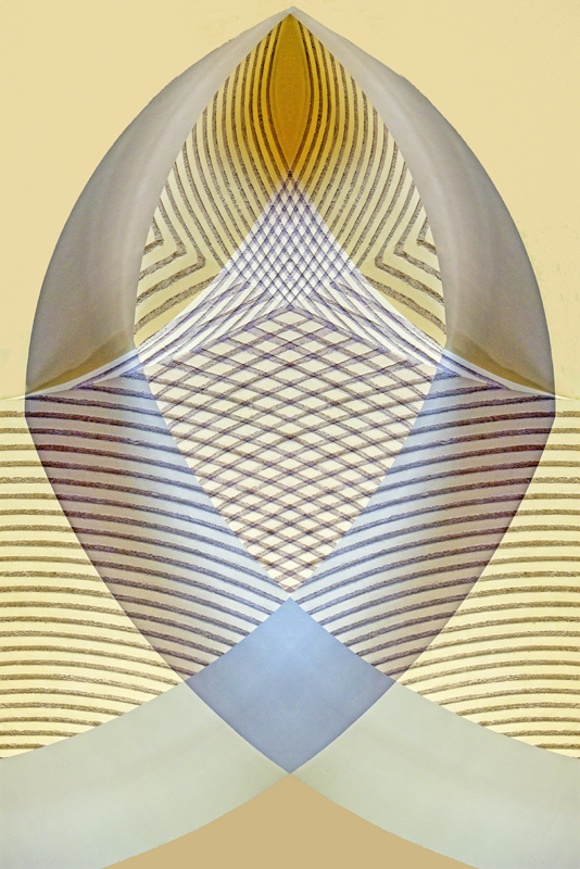
Thanks for your comment Jerry. I have actually amassed more than 50 images using the mirror technique! I have tried various different colour on the bottom section, and the only thing that seems to work is a deepening of the existing colour. I have also corrected for some lack of smoothness at the top of the egg that I only noticed when Ian posted this image for me. |
Nov 12th |
 |
| 18 |
Nov 20 |
Reply |
I did try the crop that you suggested Ian, but I felt that it spoiled the overall balance of the image. |
Nov 12th |
| 18 |
Nov 20 |
Comment |
I think that your final production works really well John. You have used the technique effectively to produce a unique image. The only thing that jars slightly for me is the blurry green section with a straight line at the inner left of centre. Perhaps soften the harsh line, and change to a lighter, more compatible colour. |
Nov 12th |
| 18 |
Nov 20 |
Comment |
I am going to make myself unpopular I suspect. I think Original 2 is a great image, and Original 1 works as stand alone, but I really don't think that the combined image is as good as either of the individual shots.I find it all a little confusing. The ray of light is a good addition, and I think that a vertical crop removing the left hand 40% of the image would actually create a much more enjoyable picture. I have read the remarks prior to mine, and am quite happy to concede that my thoughts are probably totally wrong. |
Nov 8th |
| 18 |
Nov 20 |
Comment |
Cleverly done, and I love the thought process behind this. I agree with Mark that the plate and jar appear to be floating, but since this is a fantasy, I'm not too worried about that. A really wacky idea would be to have cherries rolling down the road to join the jam, and provide a link between them! I love it as it is though! |
Nov 8th |
| 18 |
Nov 20 |
Comment |
A delicate image. I would like to see the original. Your technique has turned the vase into a floral design. In fact, before I saw the title, I had thought that the original was a flower. The black outlines are slightly heavy for me. Perhaps a lighter colour might work a little better. |
Nov 8th |
| 18 |
Nov 20 |
Comment |
I like this a lot. The cartoon-like effect works well on the subject. I agree with Mark about the sky colouration and I think the top could also be cropped to just above the mountain. The subject itself is fascinating too. |
Nov 8th |
| 18 |
Nov 20 |
Comment |
I really like this Ian. It works well as an image on the screen because there is a lot to take in and enjoy. At first glance I was not so sure, but once you start to look more closely there are lots more interesting features. The technique that you have used is responsible for that. I also love the occluded border! |
Nov 8th |
6 comments - 2 replies for Group 18
|
6 comments - 2 replies Total
|