|
| Group |
Round |
C/R |
Comment |
Date |
Image |
| 18 |
Jan 17 |
Reply |
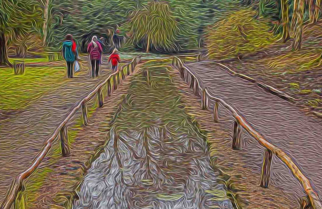
Hi Meg. It's all to do with the size of the distorting circle which should be quite large, and the pressure level which needs to be fairly high. Just attack the edge of the part where you want the wobble, in a circular motion. In 2013 I did about 40 similar images that I called my wibbly wobblies using this technique, and having exhausted most possibilities, this is the first one that I have tried since! |
Jan 28th |
| 18 |
Jan 17 |
Comment |
|
Jan 10th |
 |
| 18 |
Jan 17 |
Comment |
Great creativity in turning the original image into the final product. The simplicity of the result works very well indeed. I wouldn't change a thing! |
Jan 10th |
| 18 |
Jan 17 |
Comment |
Good use of the filter which works well. The result is similar to that produced by the Fractalius filter. I might be inclined to crop the image up to the water reflection level. This then places the people in a better compositional position! |
Jan 10th |
| 18 |
Jan 17 |
Reply |
Hi Barbara. The background was taken earlier in the year at our local Nature Reserve. The Telephone boxes are actually sited on The Strand in London. These 2 parts were combined, and subjected to the distort/liquify filter in Elements. The tern and Toby were then pasted in to complete the shot. Toby thinks the picture resembles a dream he once had. |
Jan 5th |
| 18 |
Jan 17 |
Comment |
Not sure about this one JoAnn. I feel that the treatment is not particularly sensitive to the young child. I would like to see the original from which this line drawing has been produced. I do like the way that the eyes have been coloured in, and perhaps a sympathetic toning of the rest of the picture would help to improve things. |
Jan 5th |
| 18 |
Jan 17 |
Comment |
A bright and colourful image, which demonstrates a lot of creative skill. The treatment suits the subject well. I particularly like the way that the curves of the shell have been emphasised, and the black background and framing. |
Jan 5th |
| 18 |
Jan 17 |
Comment |
I love the change of colours that you have made from the original, which suit the subject well. The treatment you have given, reminds me of the impressionists, with their depiction of cafe scenes. A strong image which I like very much. Have you considered a horizontal flip, so that the subject reads from left to right? |
Jan 5th |
6 comments - 2 replies for Group 18
|
6 comments - 2 replies Total
|