|
| Group |
Round |
C/R |
Comment |
Date |
Image |
| 35 |
Aug 21 |
Comment |
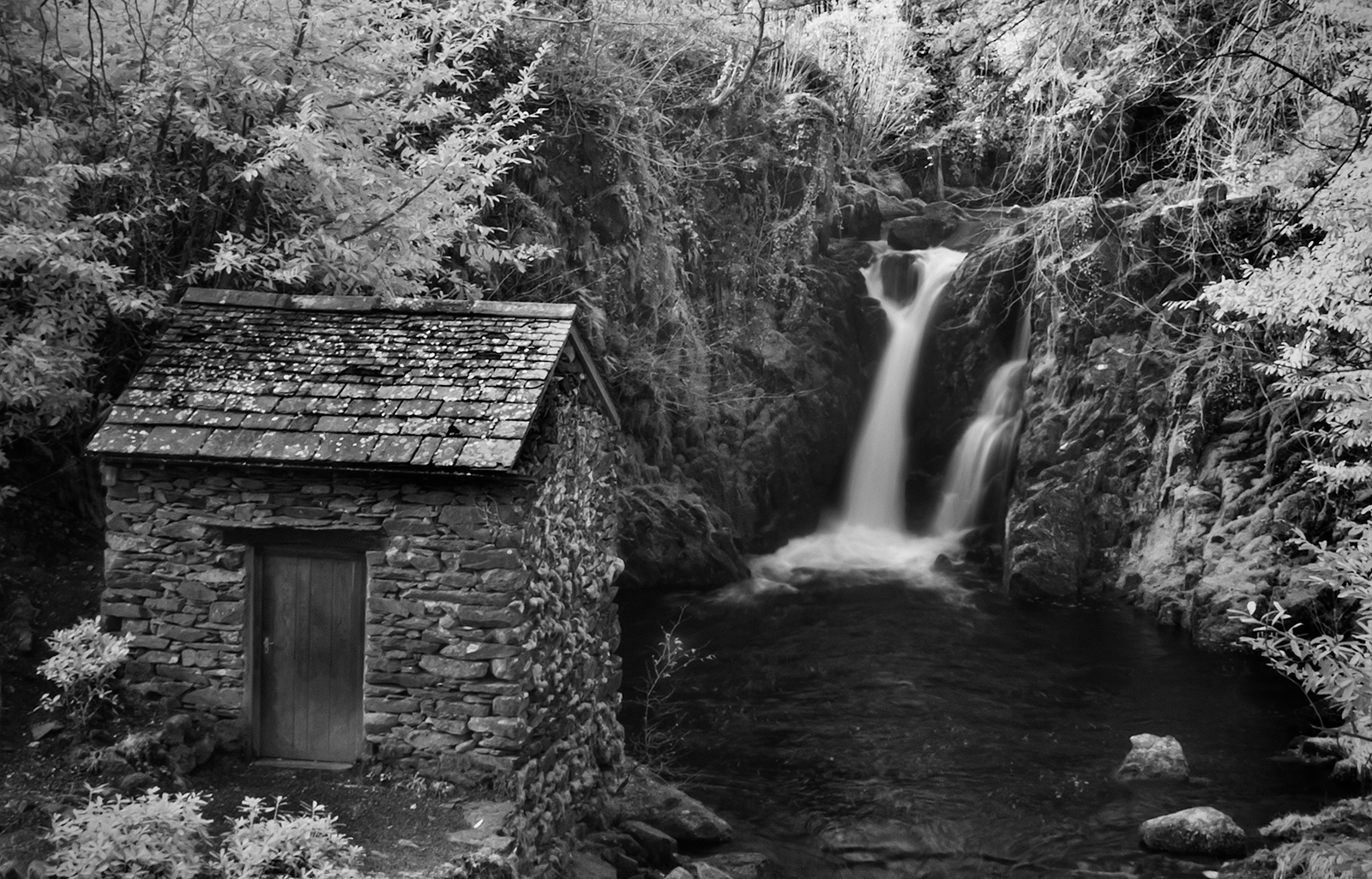
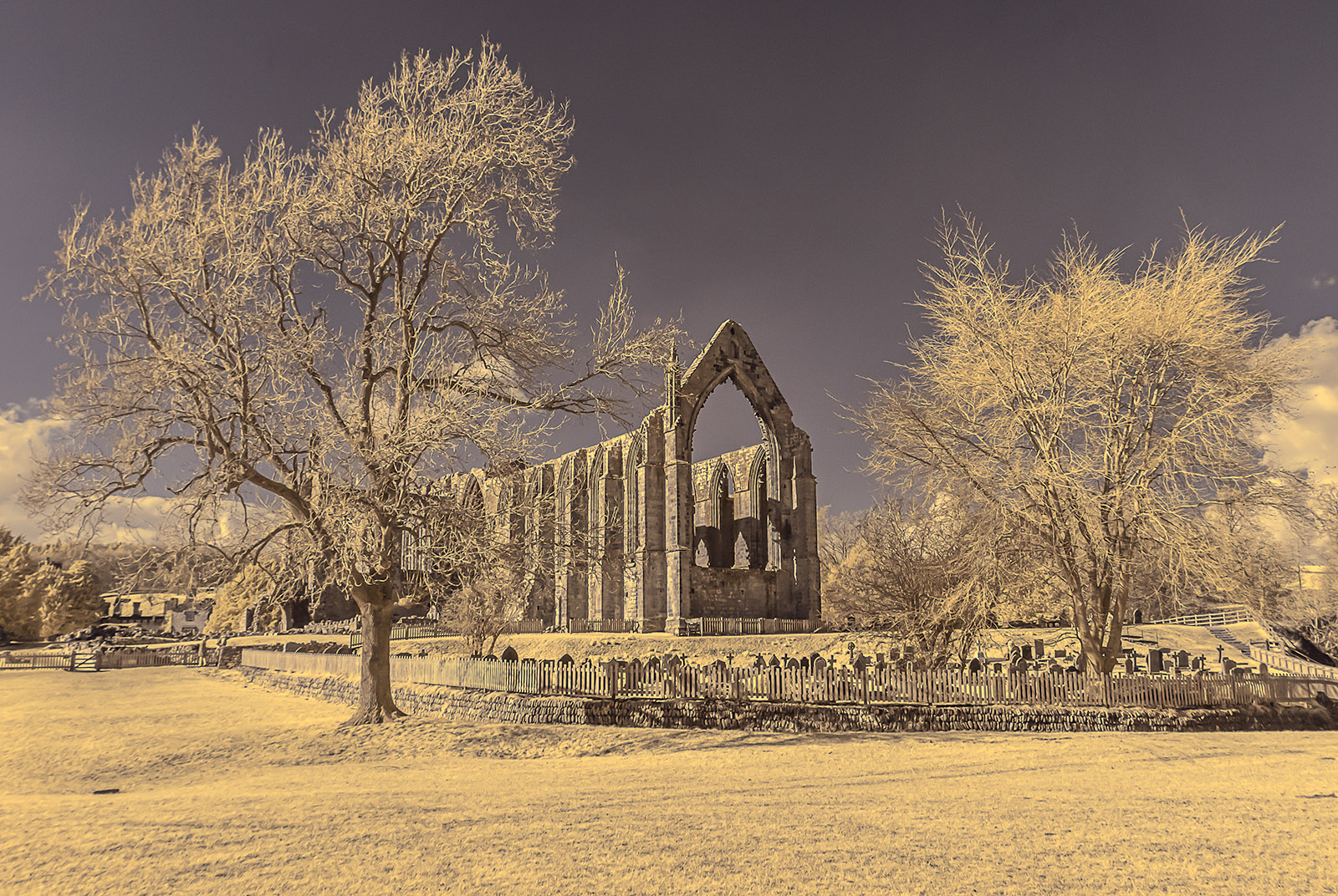
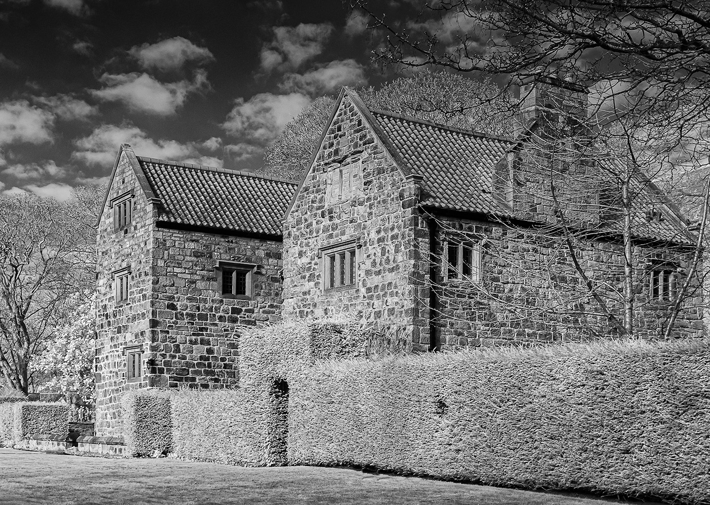
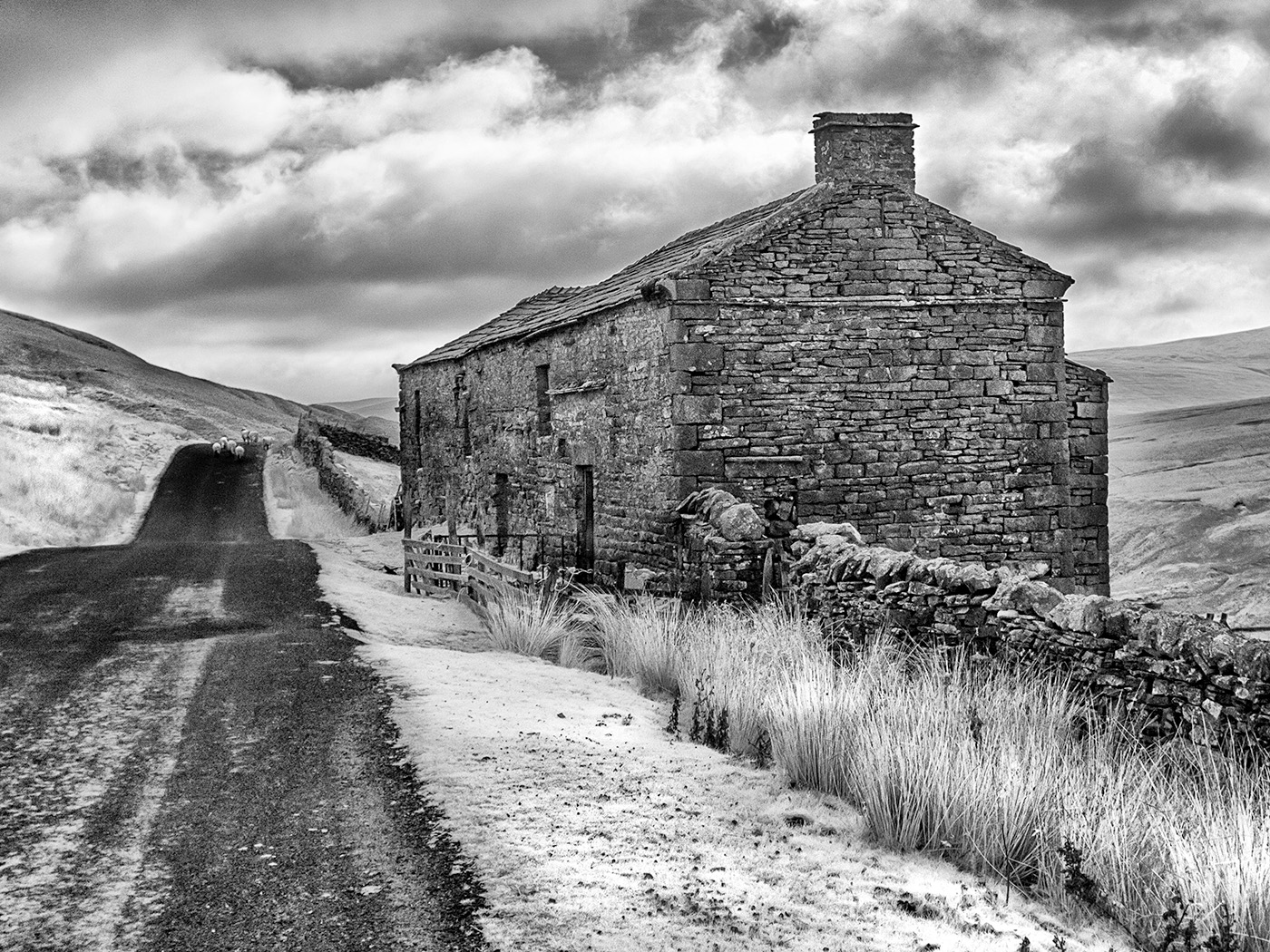
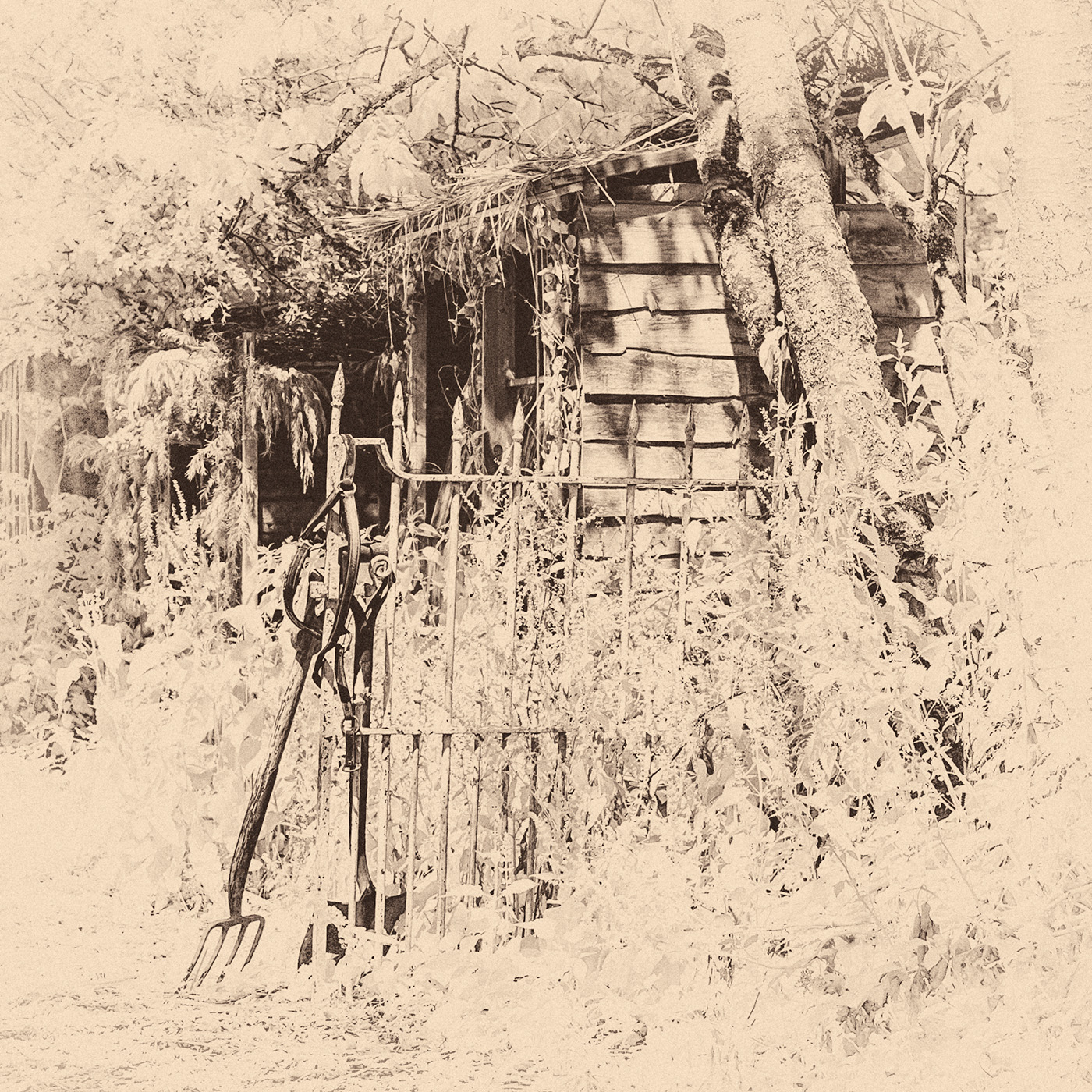
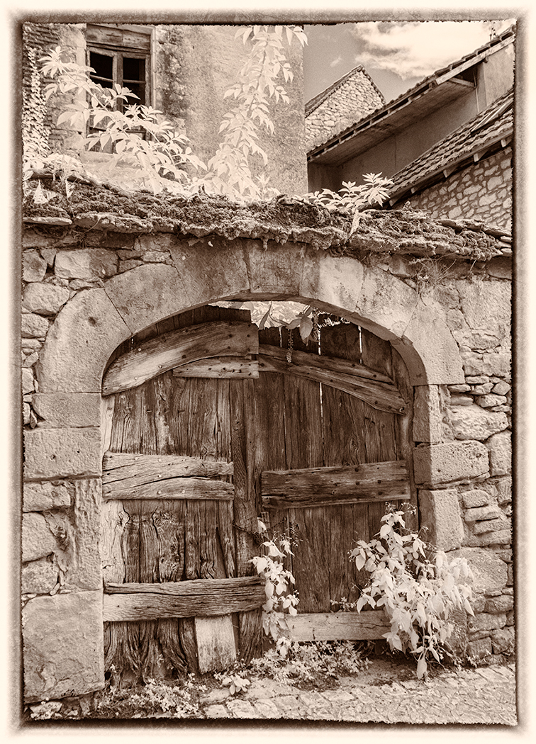
Your added clouds certainly enhance the image but I too feel that they need to be sharp. The barn is fascinating. I love the patterns in the wood, particularly under the eaves. Did you take any close ups? There is an interesting line of shadows under the fence on the right and I think you could create a stronger lead in line by strengthening the blacks in these as Sharon suggests. I also wonder whether cropping the bottom to eliminate the wooden posts and rails in the foreground and also cropping from the left to leave just part of the barn would create an alternative, although not necessarily stronger, image, just a thought. |
Aug 20th |
| 35 |
Aug 21 |
Comment |
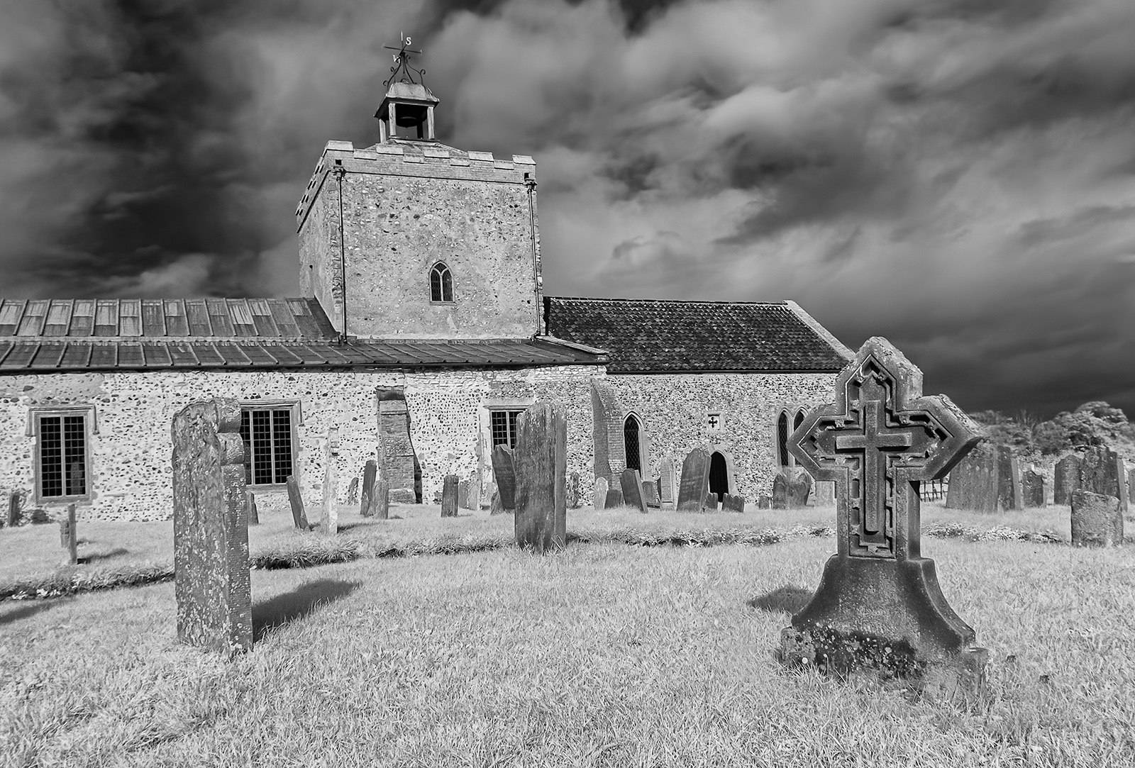
Hi Lauren, welcome to the group. When I first looked at your image I was amazed by the colours that you have achieved. Looking at your image I also found myself curious about the building that housed these objects so I searched the Cataldo Mission on the internet. Was your image taken inside the mission or the Parish House? It looks as if there is plenty to photograph on this site so perhaps we will see some more IR images of there from you. It is always difficult to balance a dark interior with a bright scene outside but I think yours is a reasonable effort although the clouds do look a little burnt out on my screen. I too feel that the main interest in the image is the items on the shelves and that a better image might have been achieved if you had taken them from a different angle, however in a confined space this simply may not have been possible. I look forward to seeing more of your images. |
Aug 20th |
| 35 |
Aug 21 |
Comment |
A lovely tranquil scene and I like the colours but there appears to be an area that is burnt out and maybe some lens flare in the right hand top corner which is a little distracting. I like the way the shadows of the trees add interest to the fore and middle ground. |
Aug 20th |
| 35 |
Aug 21 |
Comment |
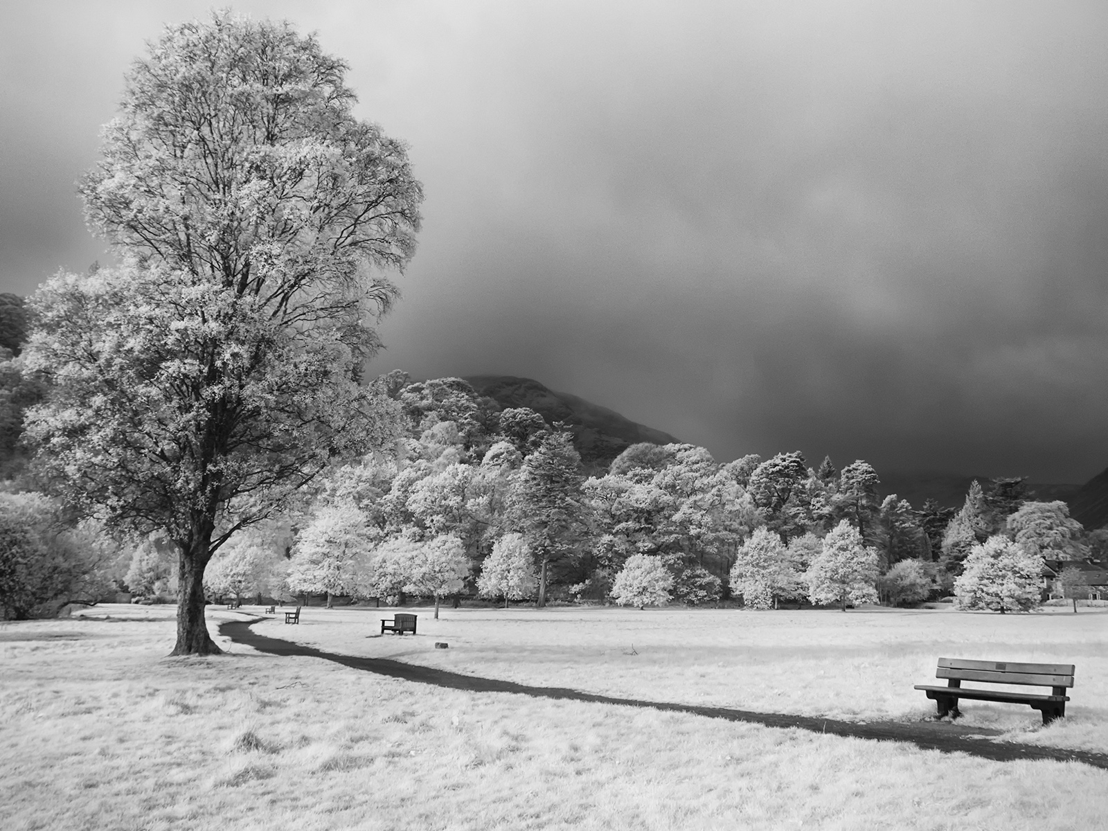
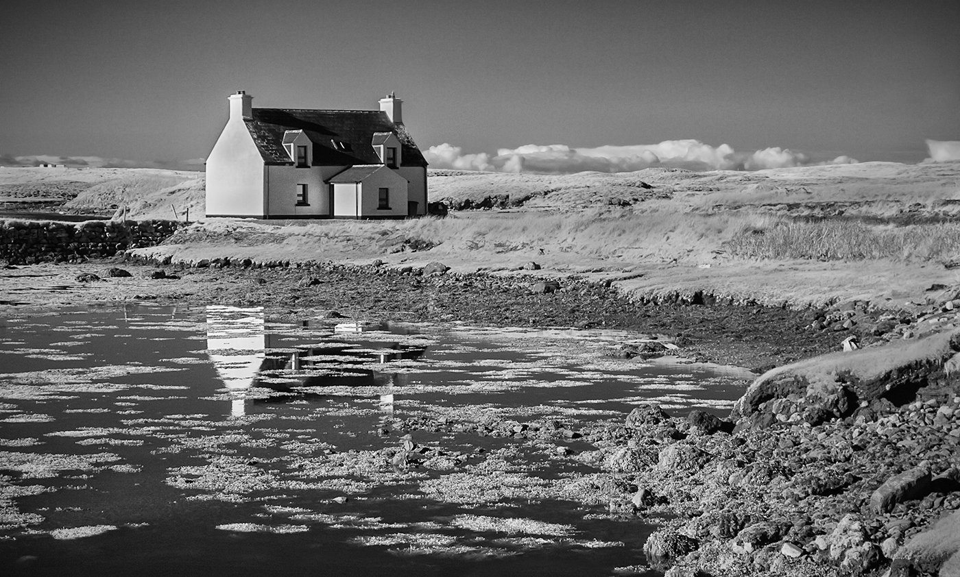
I find the sky in this very interesting and attractive but there is a lot of grey water in the foreground. My suggestion would be to turn this into a letterbox by cropping most of the water out to the point where the reflection of the trees on the right ends. This would place much more emphasis on the sky making it the main focus of the image. |
Aug 20th |
| 35 |
Aug 21 |
Comment |
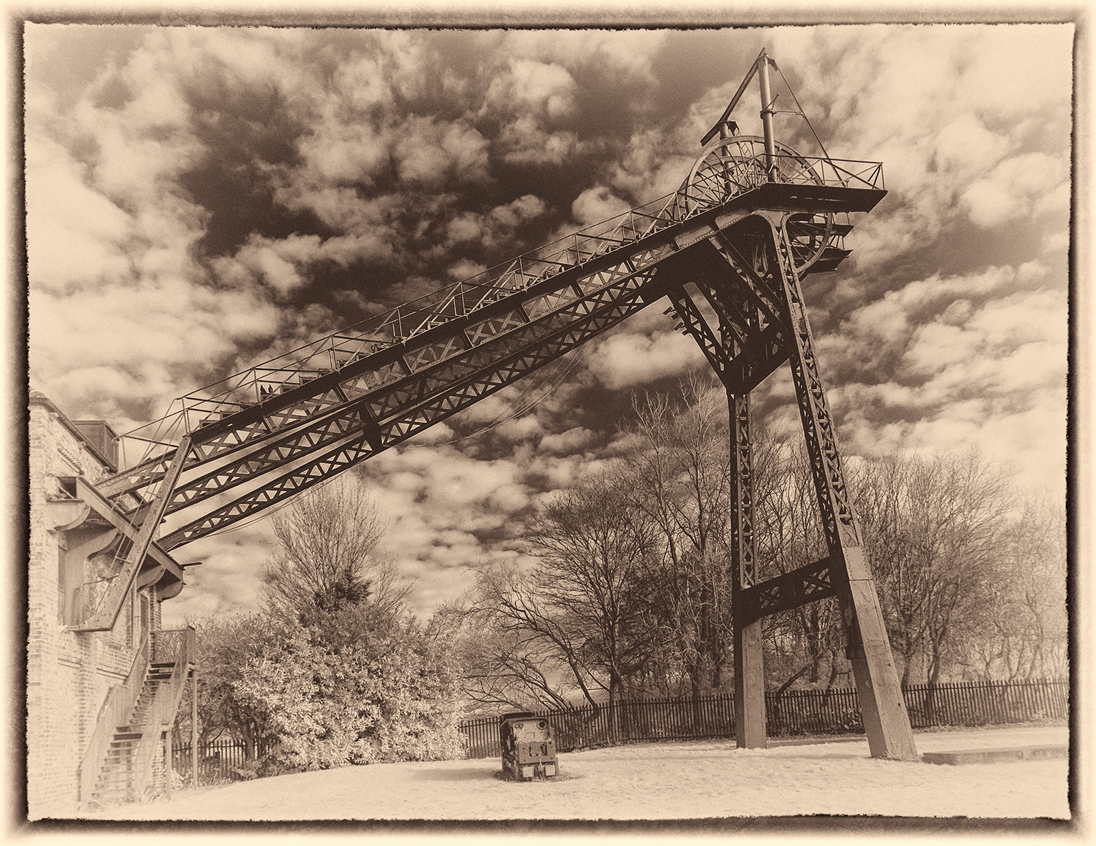
When I look at this image I wonder what purpose the railway originally served. As Sharon says it really does conjure up a vision of desolation. Although a simple image I think it makes a powerful statement, it gives a sense of loss. There appears to be some slight banding in the sky but other than addressing this I don't think I would change it at all. |
Aug 20th |
| 35 |
Aug 21 |
Comment |
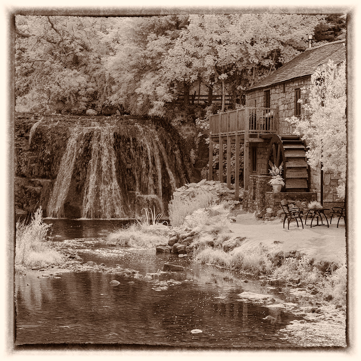
I too love the colours but also find the out of focus background distracting. I like the original very much, particularly the way the canoes point to the jetty and this then leads to the trees in the background and their reflection. The jetty might need a little straightening but I think it is worth doing more work on this image. |
Aug 20th |
6 comments - 0 replies for Group 35
|
6 comments - 0 replies Total
|