|
| Group |
Round |
C/R |
Comment |
Date |
Image |
| 35 |
May 21 |
Comment |
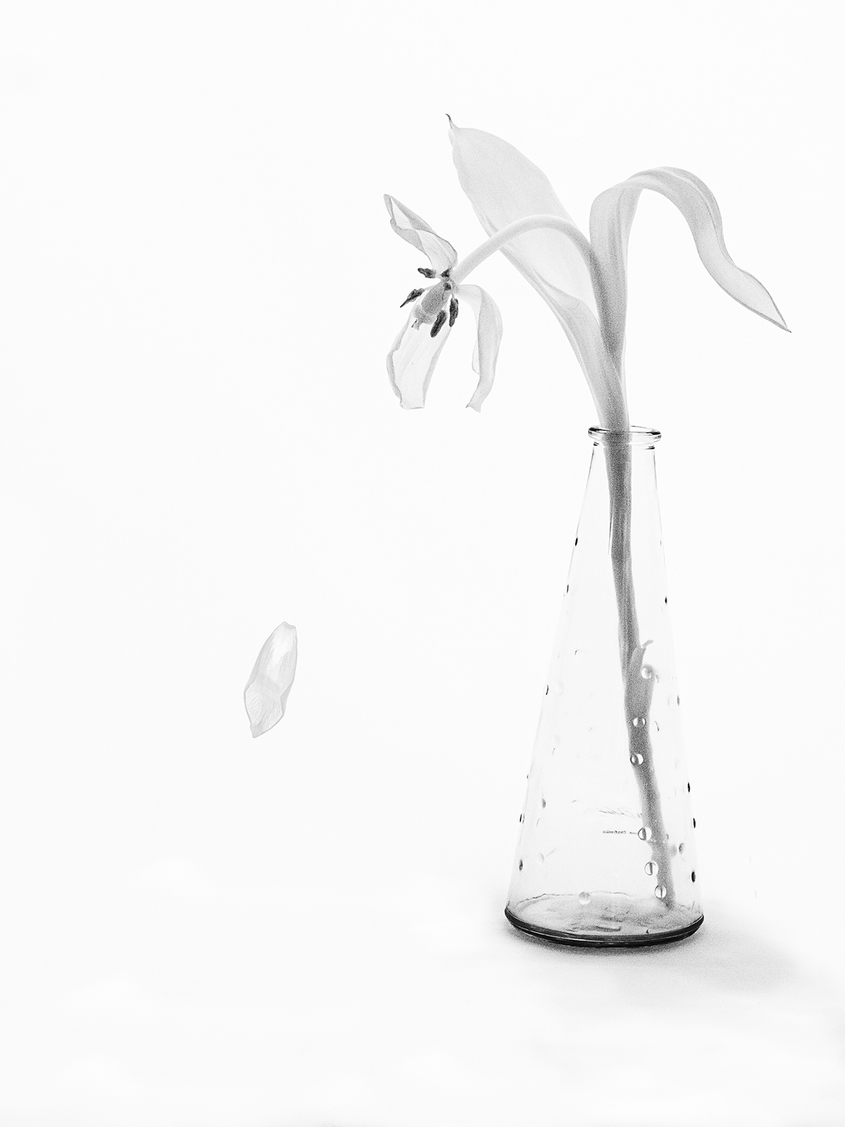
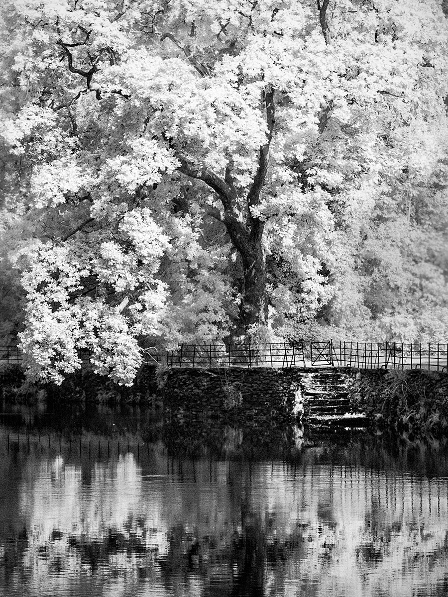
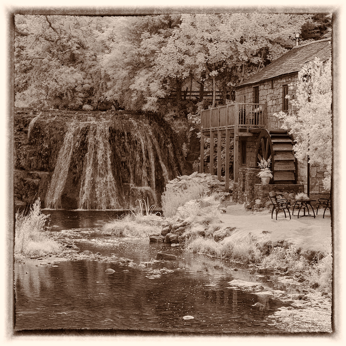
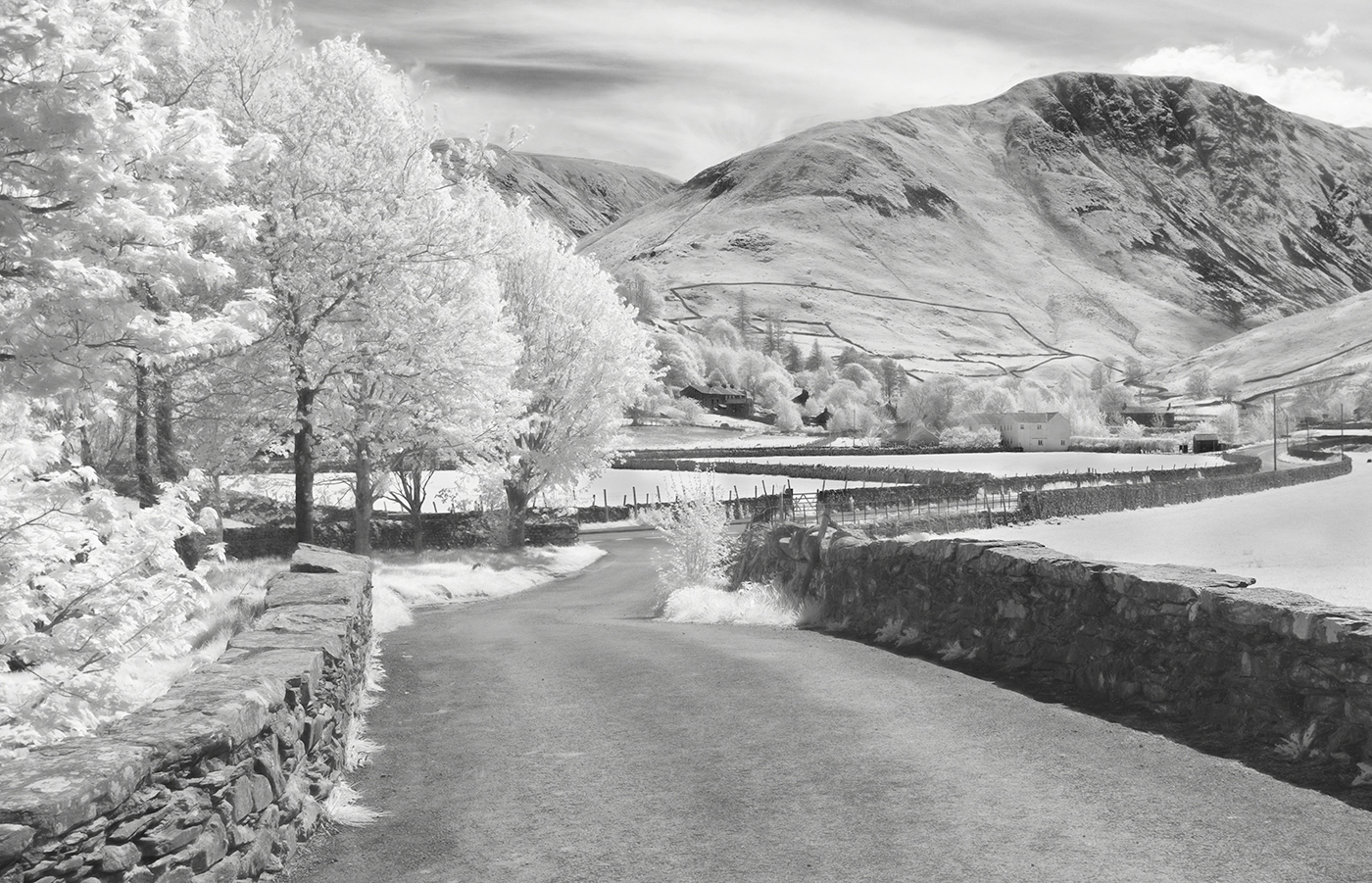
This is a fascinating image. The subtle tones are lovely and the reflection is interesting. I just find it a little confusing as there is so much to look at. I think I'd crop some of the background out to place greater emphasis on the little island with the stick protruding from it. |
May 14th |
| 35 |
May 21 |
Comment |
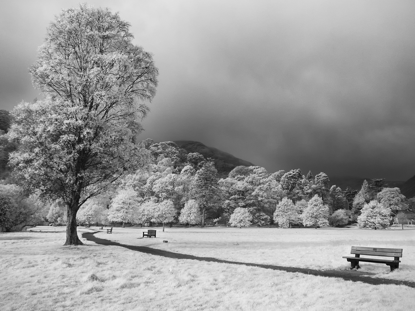
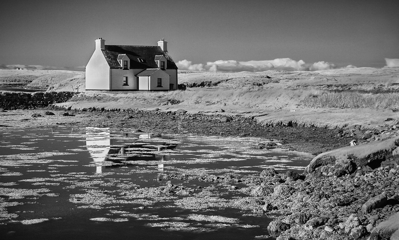
I agree with Helen's suggestion I.e. crop out the dark base just leaving a high key image of the trees and clouds which I think would be beautiful. The dark base is just a distraction from the lovely tree and the interesting clouds Less is more or so the 'saying goes. |
May 14th |
| 35 |
May 21 |
Comment |
I love the simplicity of this. I just wonder whether you tried this in a high key version which might produce a more subtle image rather than the high contrast you have here. This might not appeal to you as it is a matter of personal taste and I may be talking rubbish. I too like the combination of the fern and the ivy(?) leaves. |
May 14th |
| 35 |
May 21 |
Reply |
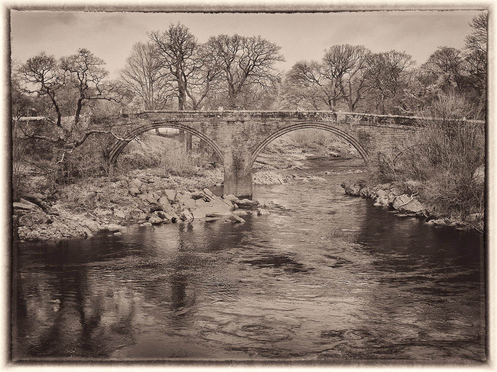
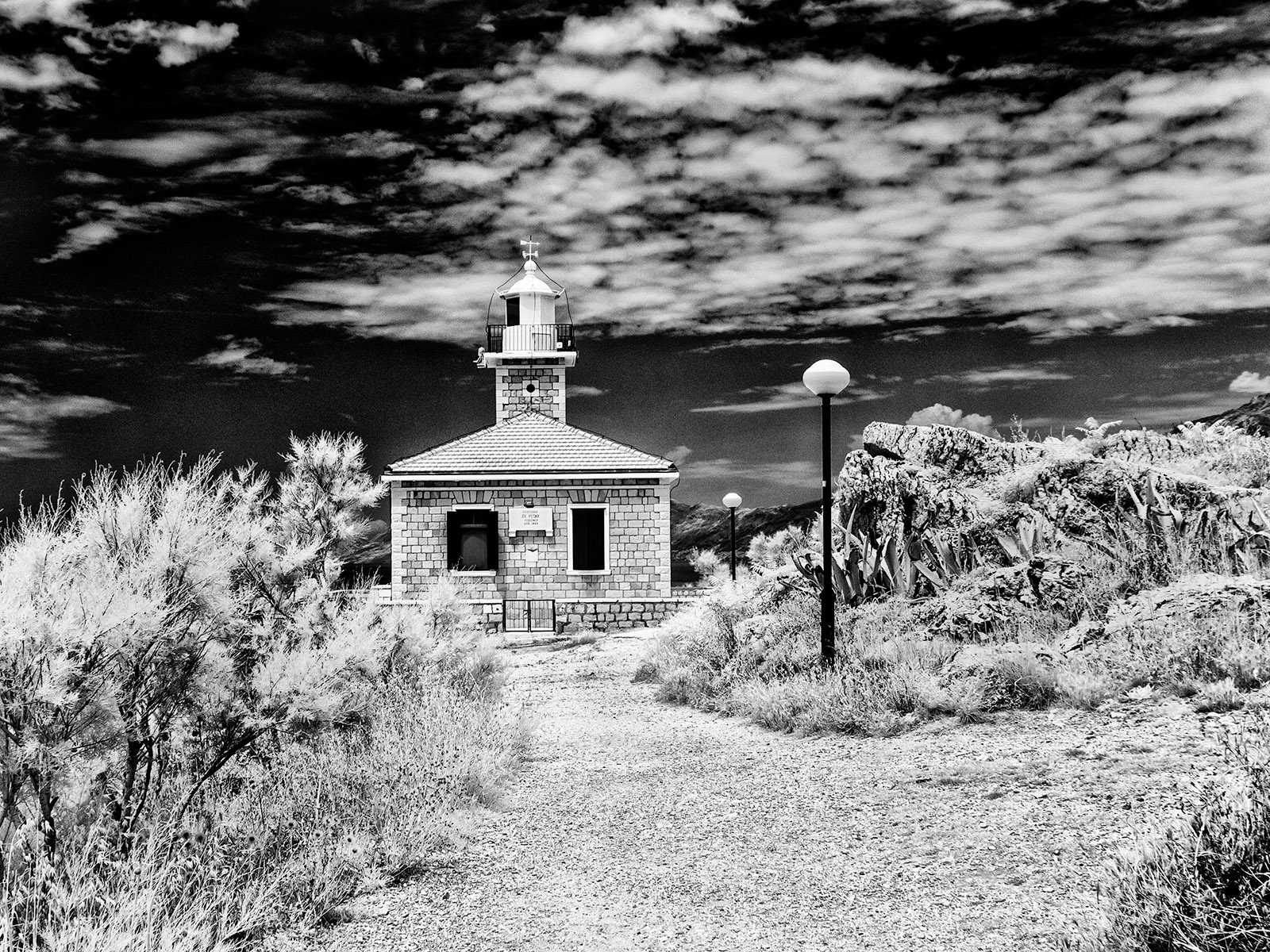
I agree with you. I think I will have to go back in winter when it is less likely that there will be any boats moored up. I did try to remove the wires and poles but gave up after an hour or so of trying! |
May 14th |
| 35 |
May 21 |
Comment |
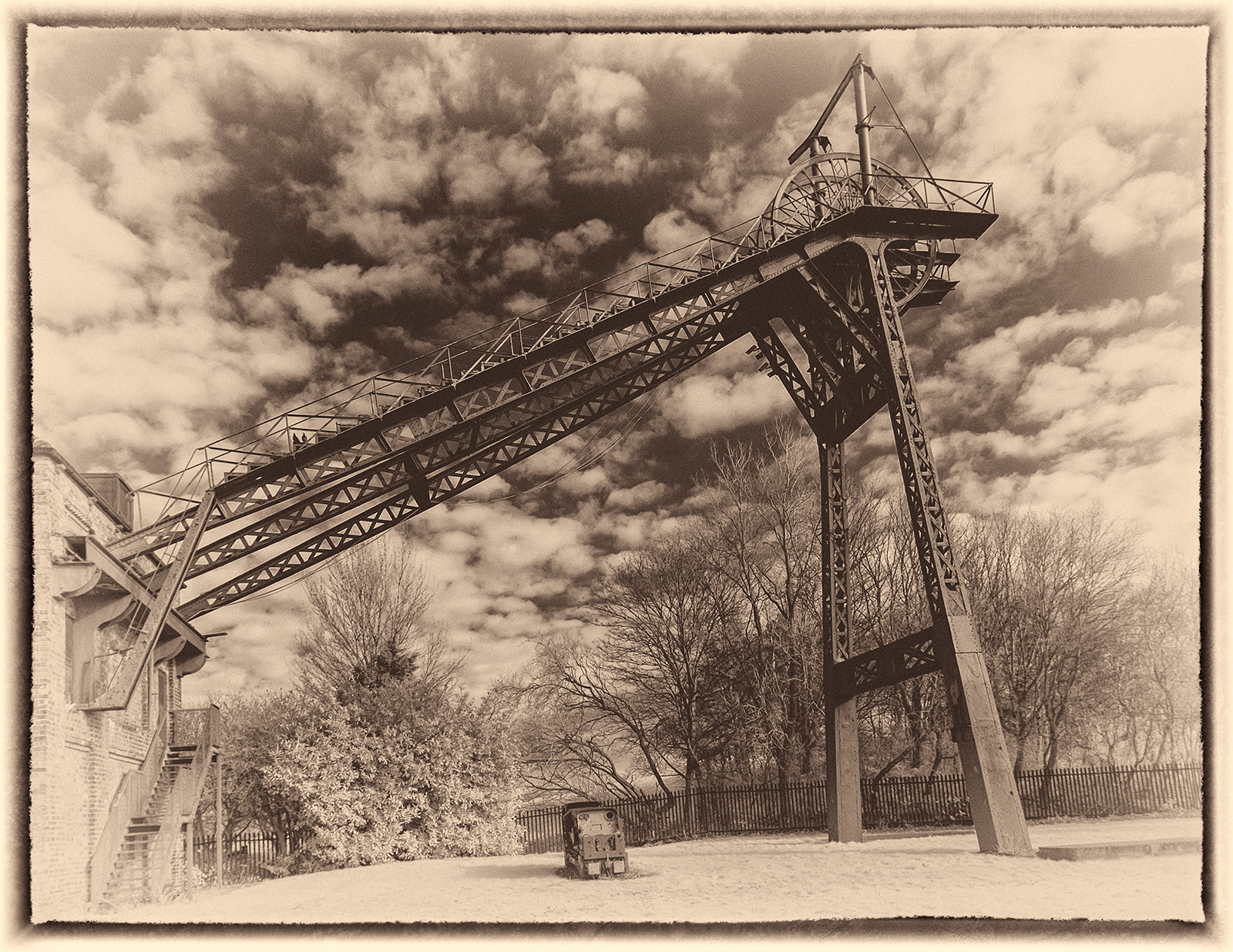
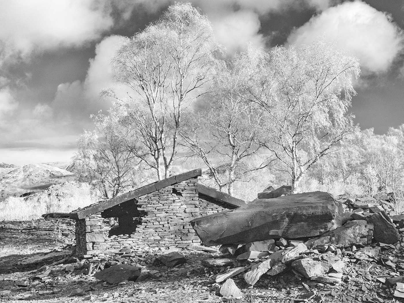
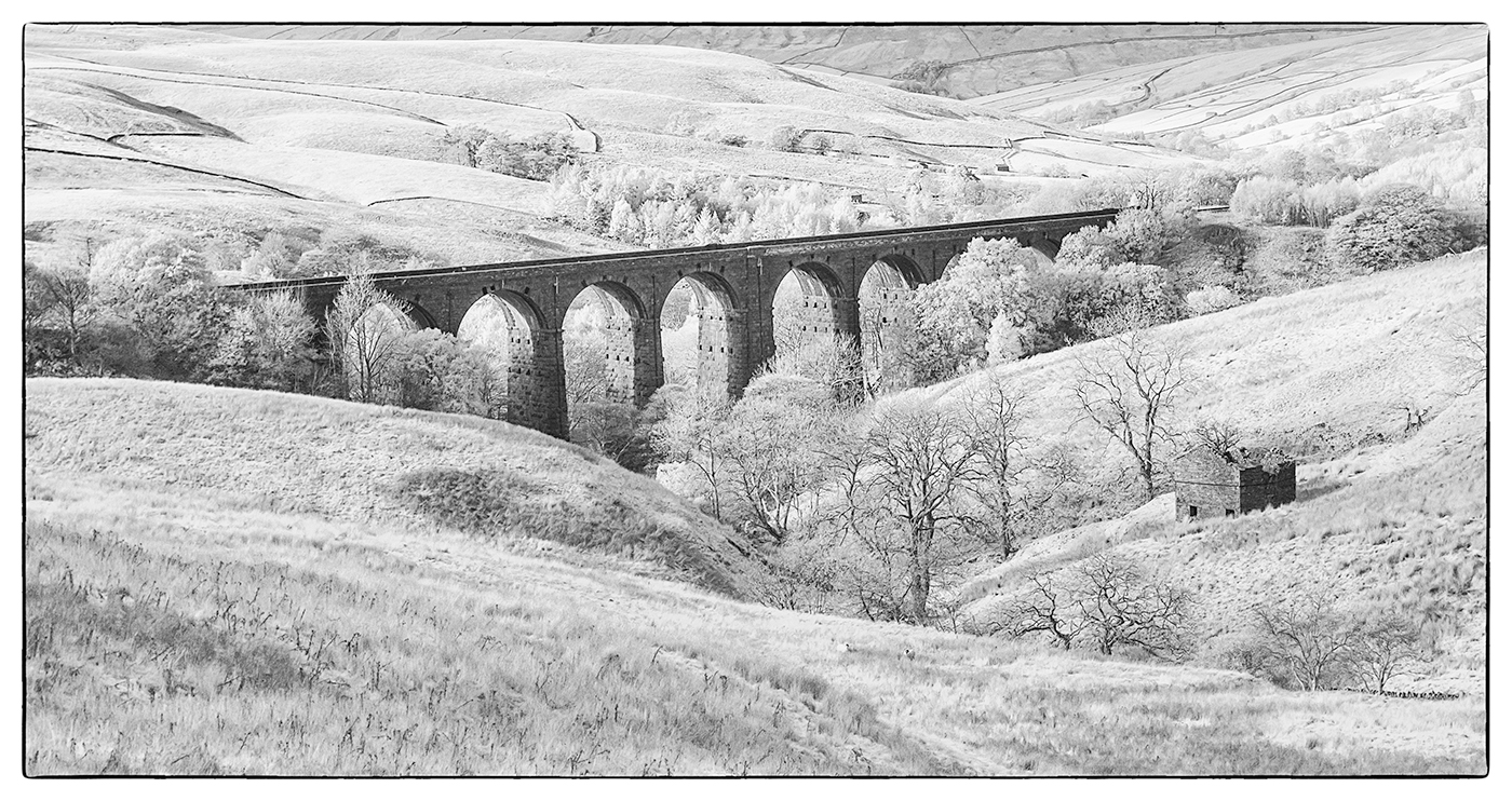
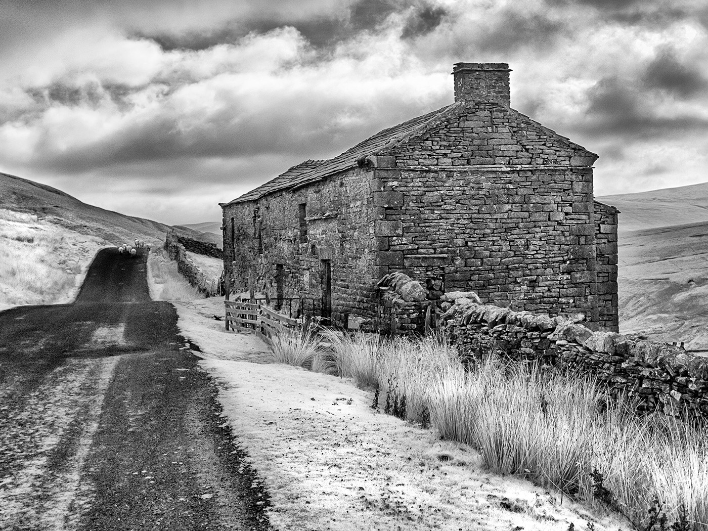
For me it is the lovely barns that are the most interesting aspect of this image. If you have enough pixels I would be inclined to crop the image immediately to the left of the barns making them the main focus of attention. I think this would simplify it and thus make a stronger picture. |
May 14th |
| 35 |
May 21 |
Comment |
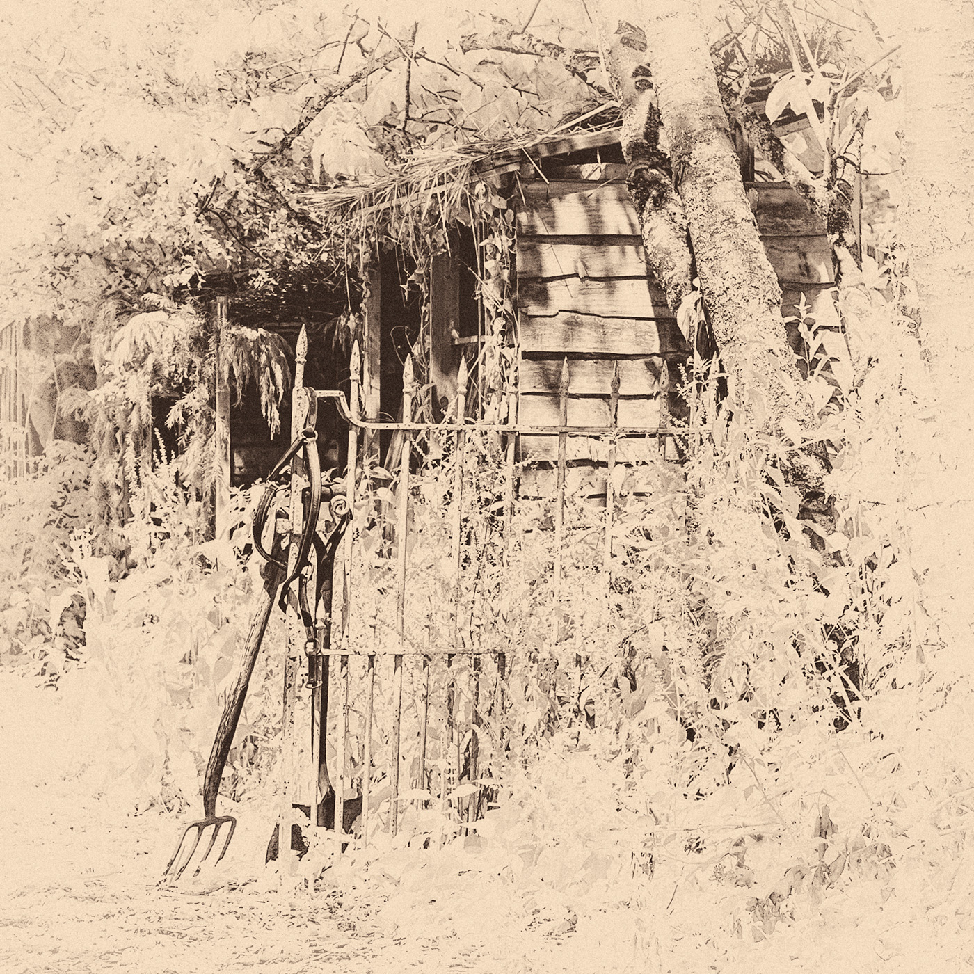
I love the old fuel pumps in this image, they almost look like people and have a character of their own. I'm not sure that you need much of the sky at all so I would be inclined to crop some of it out. I think I would try sepia toning too as Helen suggests to give it an older feel. Definitely worth a try in competition.
|
May 14th |
5 comments - 1 reply for Group 35
|
5 comments - 1 reply Total
|