|
| Group |
Round |
C/R |
Comment |
Date |
Image |
| 35 |
Sep 20 |
Comment |
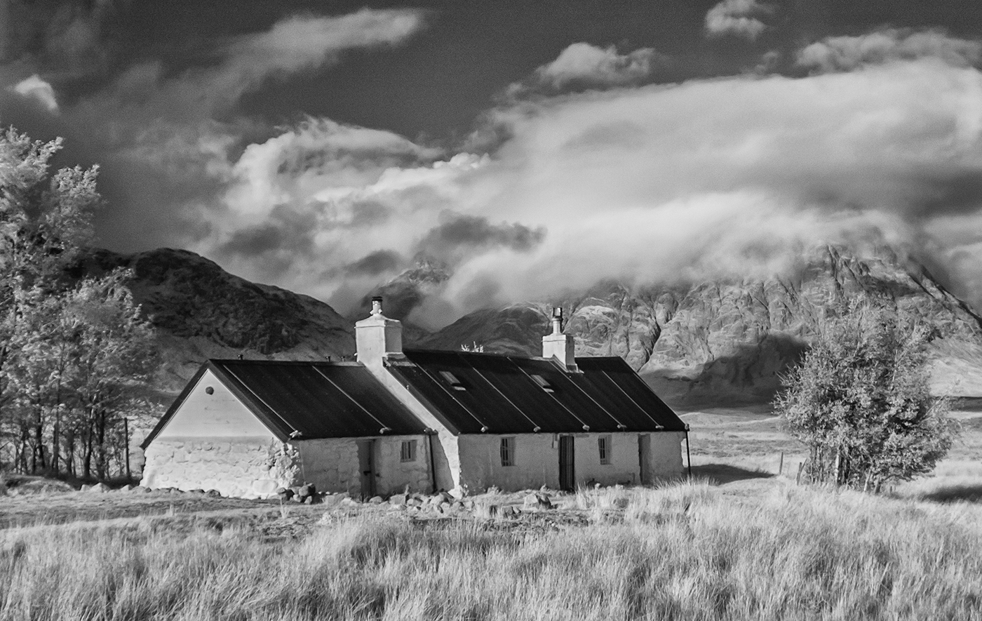
It's the trees in the foreground in this photo that immediately struck me. The texture of the trunks and the foliage are lovely. That they lean to the right doesn't, in my opinion, detract from the image but the tree in the background on the right looks a little odd so I too would suggest cropping the image on this side albeit that it might mean losing a little of the building. |
Sep 13th |
| 35 |
Sep 20 |
Comment |
I think it was well worth the effort it took to paint the telephone booth red, it really brings the image alive. I admire the lengths you went to to achieve this. |
Sep 13th |
| 35 |
Sep 20 |
Comment |
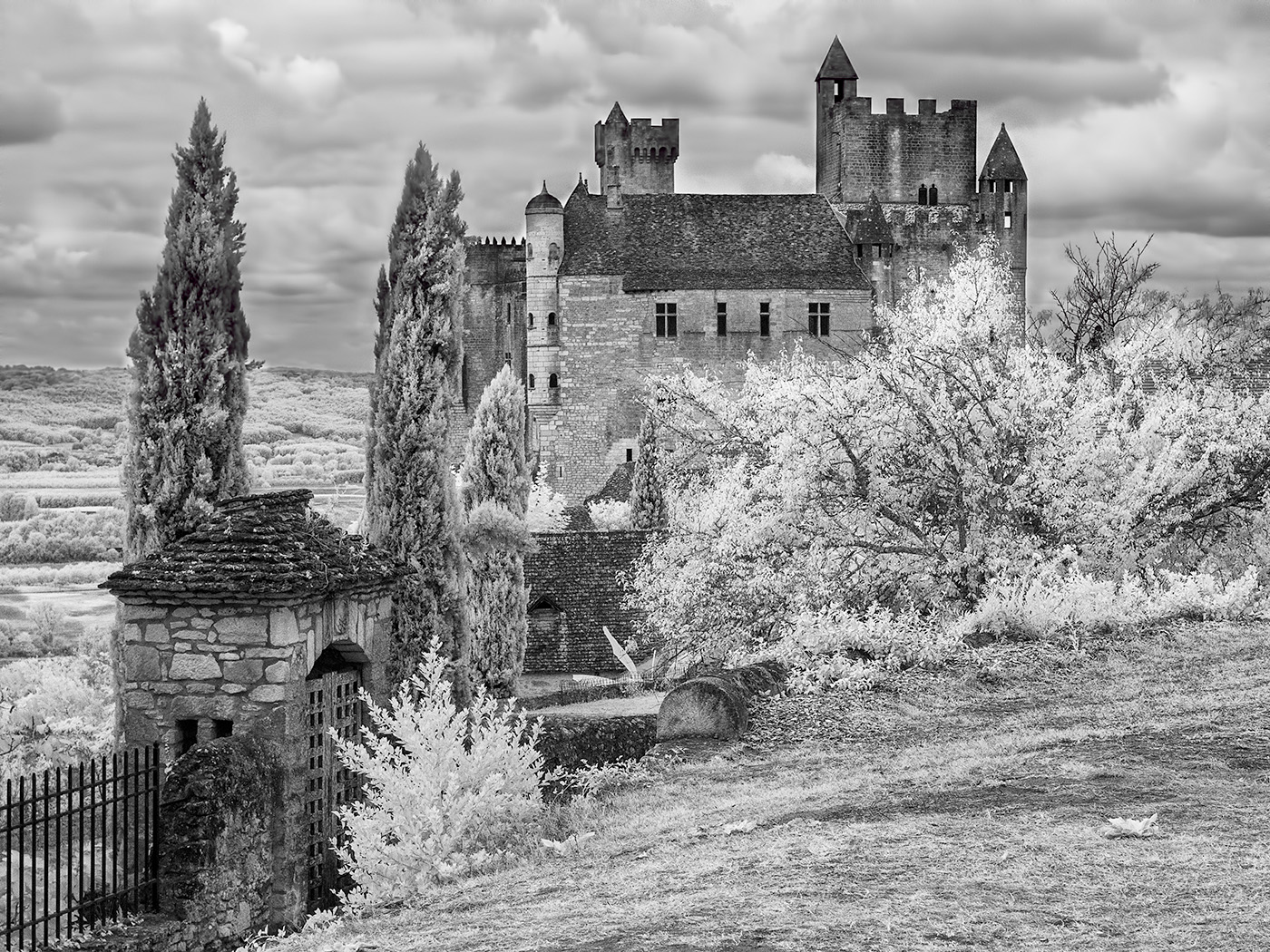
I think bridges are fascinating structures and your image shows off the repetitive elements of this suspension bridge to great effect. The shadows add to the interest. I agree with Helen's suggestion to crop the top of the image. I might also have added a figure walking across the bridge as a focal point. You were lucky to find the bridge so empty, was it taken early in the morning or is it no longer in use? |
Sep 13th |
| 35 |
Sep 20 |
Comment |
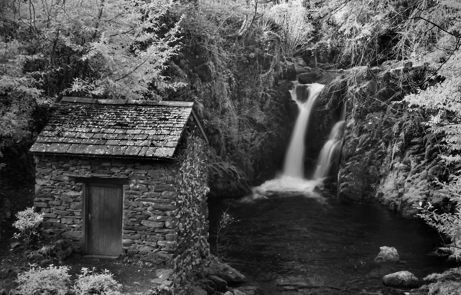
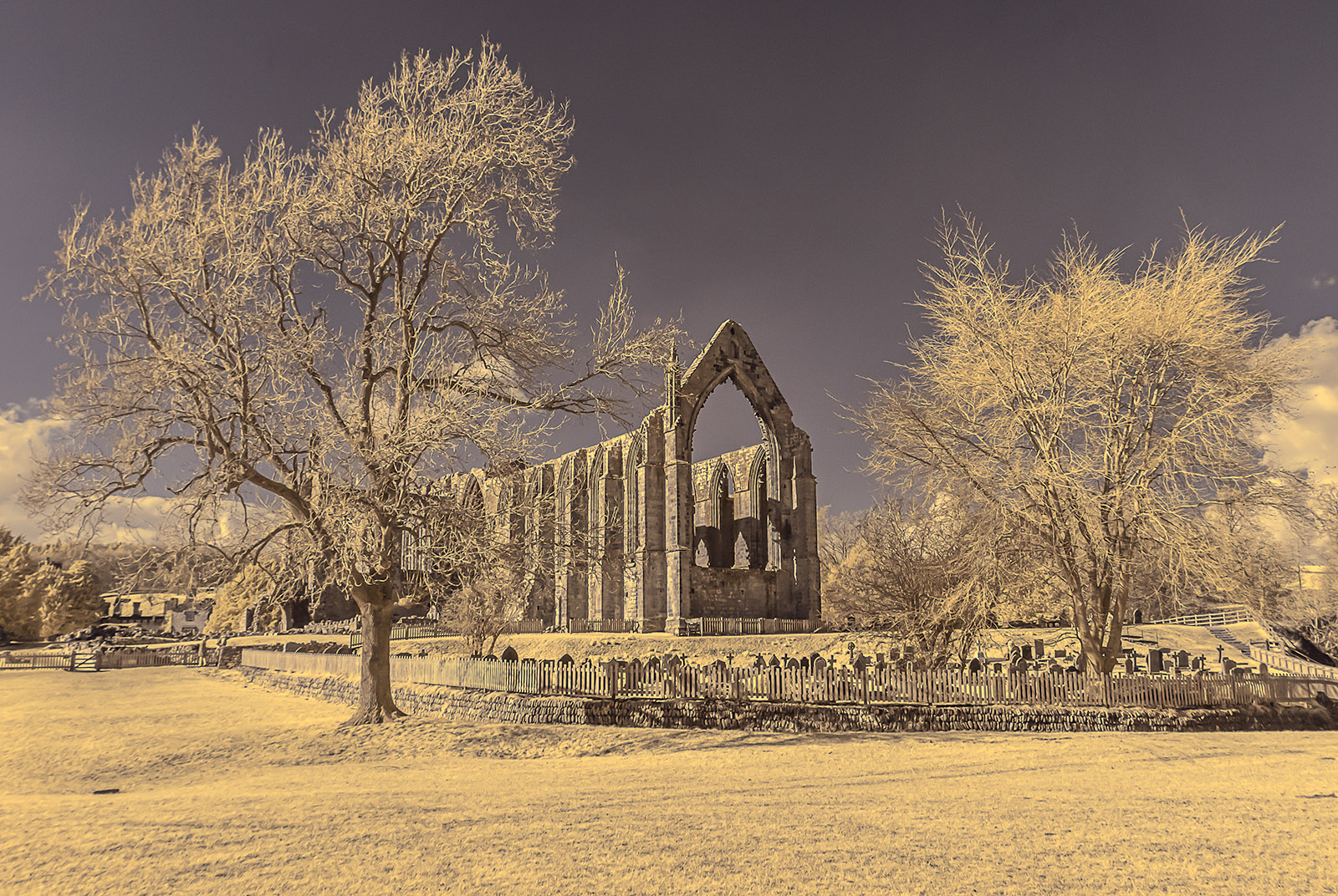
When looking at this image I find I want to move everything to the right to straighten it as everything is tilting to the left. Maybe if there was more symmetry in the scene the use of the fish eye lens would have worked better. The trees are very beautiful and I too feel that it would have improved the image if you had moved closer to them. |
Sep 13th |
| 35 |
Sep 20 |
Comment |
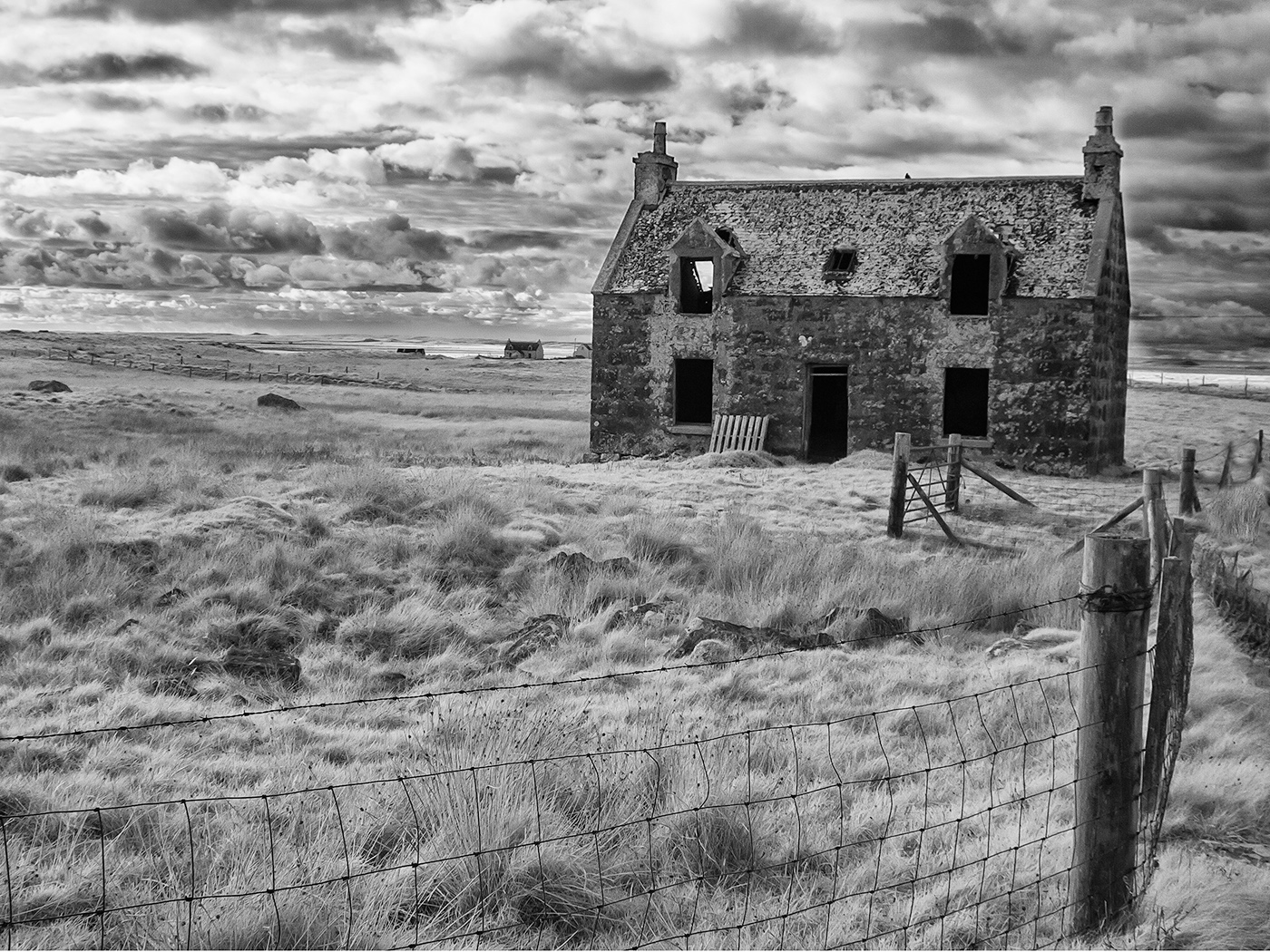
I can see that the wild mustard must have been a very colourful sight. I like the yellow of the mustard you have achieved in your image but I too find the blue of the building and sky too strong. The clouds have also picked up a yellow cast which I think detracts from an interesting sky. I like the three trees next to and behind the barn which I think add interest to the scene, it looks as if there are nests of some kind hanging from the branches, is this the case? |
Sep 13th |
| 35 |
Sep 20 |
Comment |
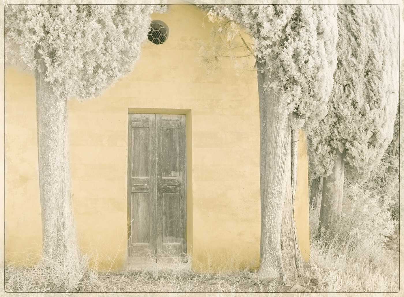
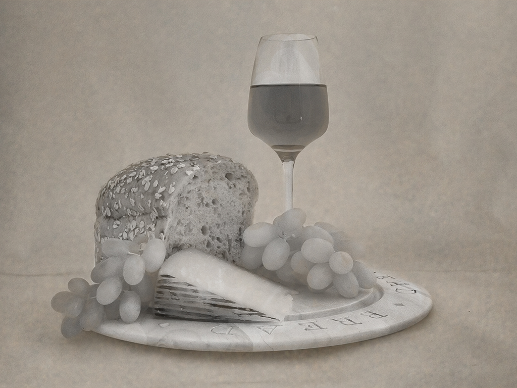
This image has a graphic quality about it which I find very appealing. It almost looks like a pastel drawing. The colours are very subtle and pleasing. I've reached the point where I think it is more important to take pleasure in your own work rather than trying to please judges as I've found this can be very disheartening. |
Sep 13th |
6 comments - 0 replies for Group 35
|
6 comments - 0 replies Total
|