|
| Group |
Round |
C/R |
Comment |
Date |
Image |
| 35 |
Aug 20 |
Comment |
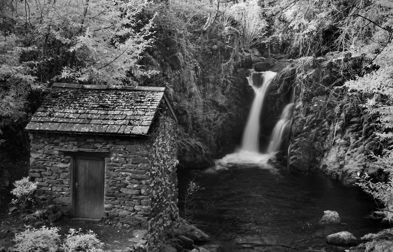
The ferns on the tree trunk and the texture of the bark are lovely but I find the background a little busy and hence distracting. Did you take any close ups without the background? As it stands I think you could improve the image by darkening down the background and blurring it so that it is less intrusive. |
Aug 12th |
| 35 |
Aug 20 |
Comment |
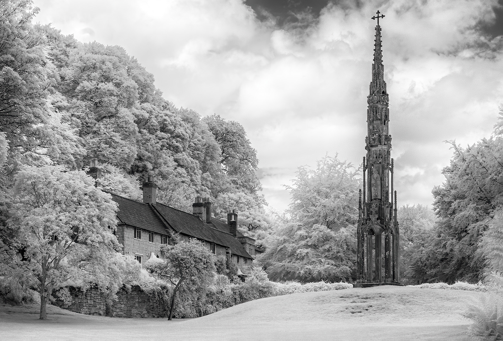
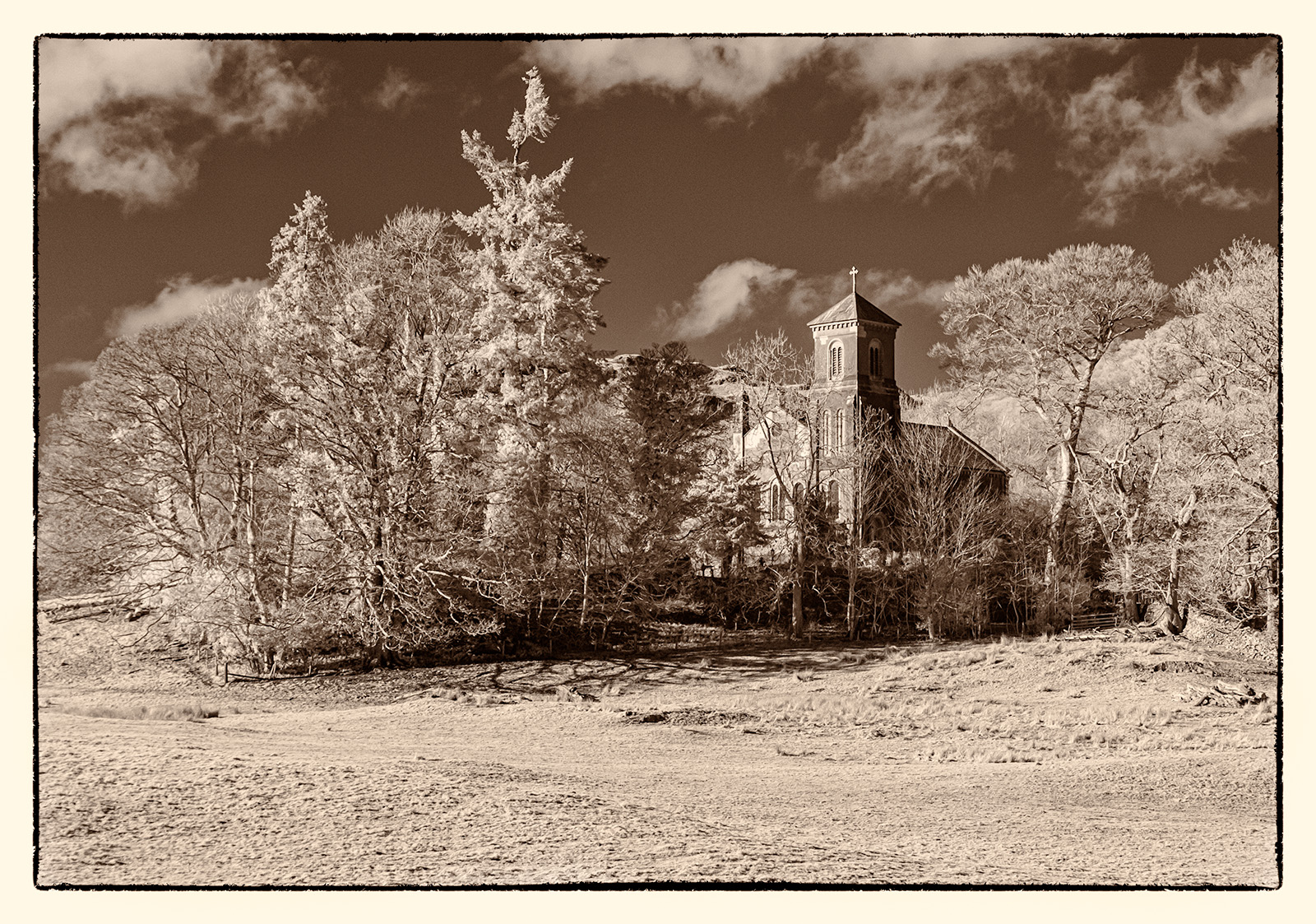
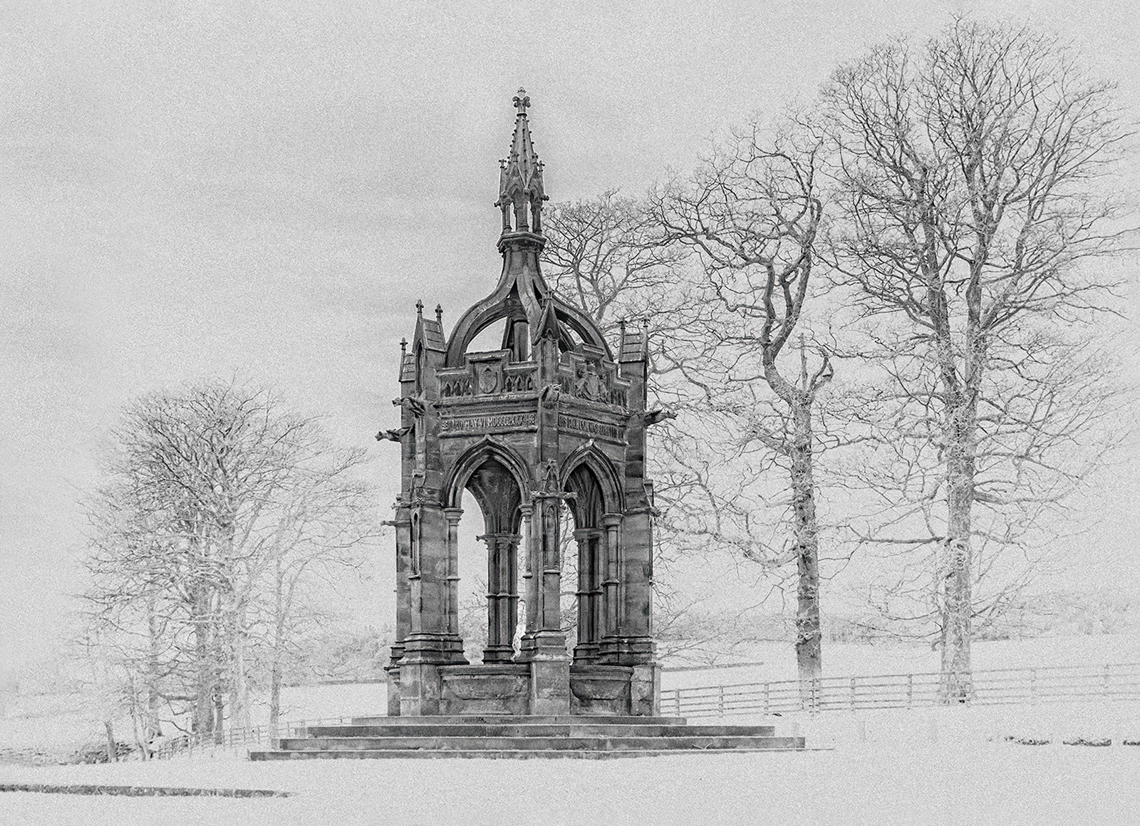
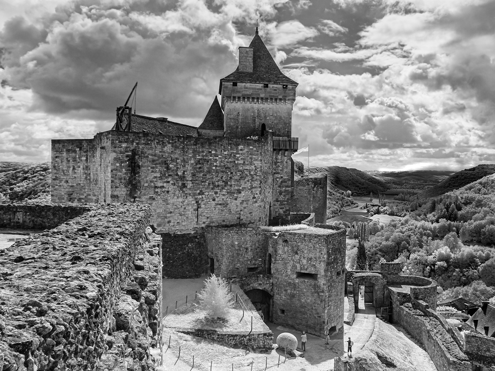
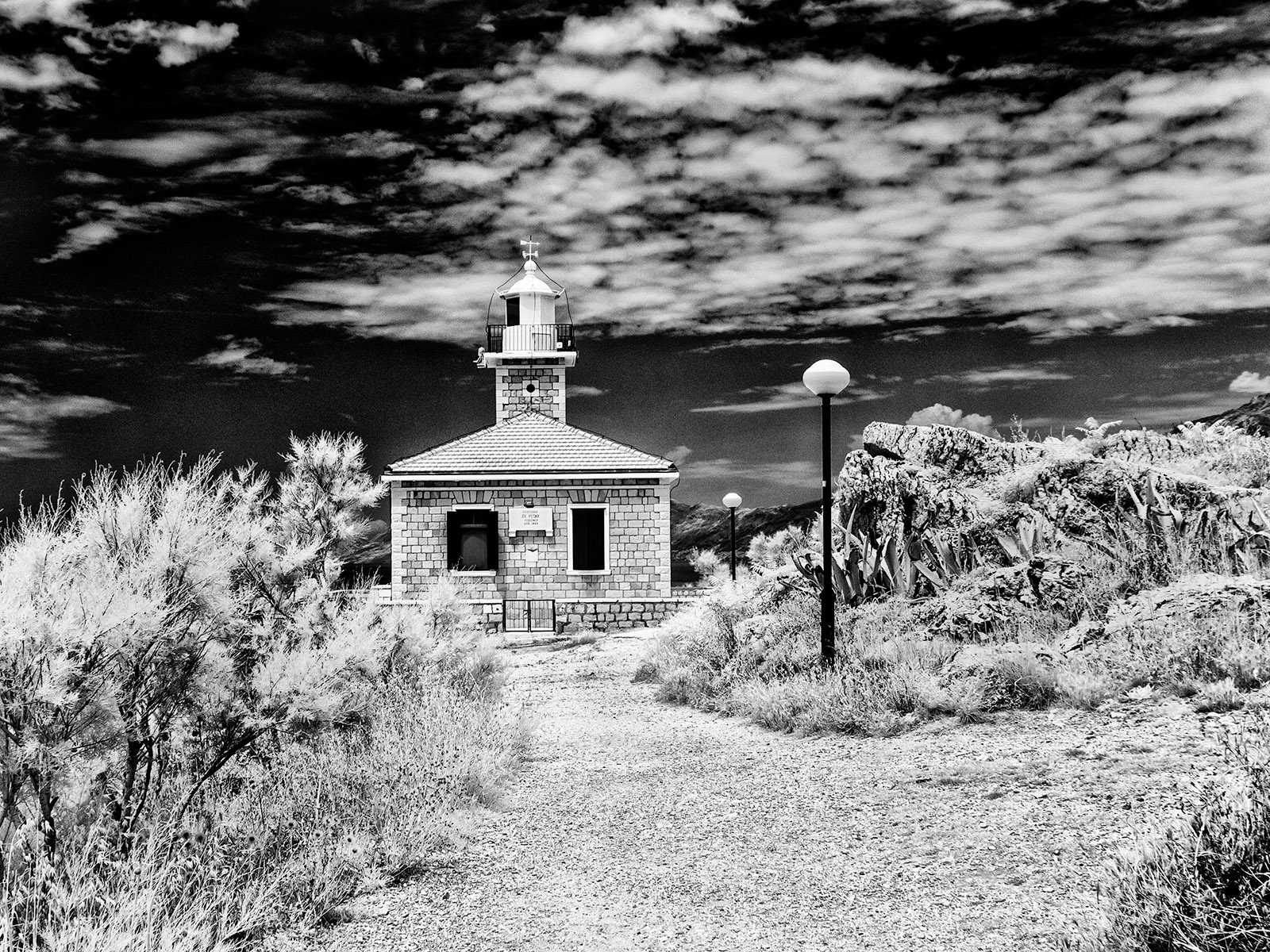
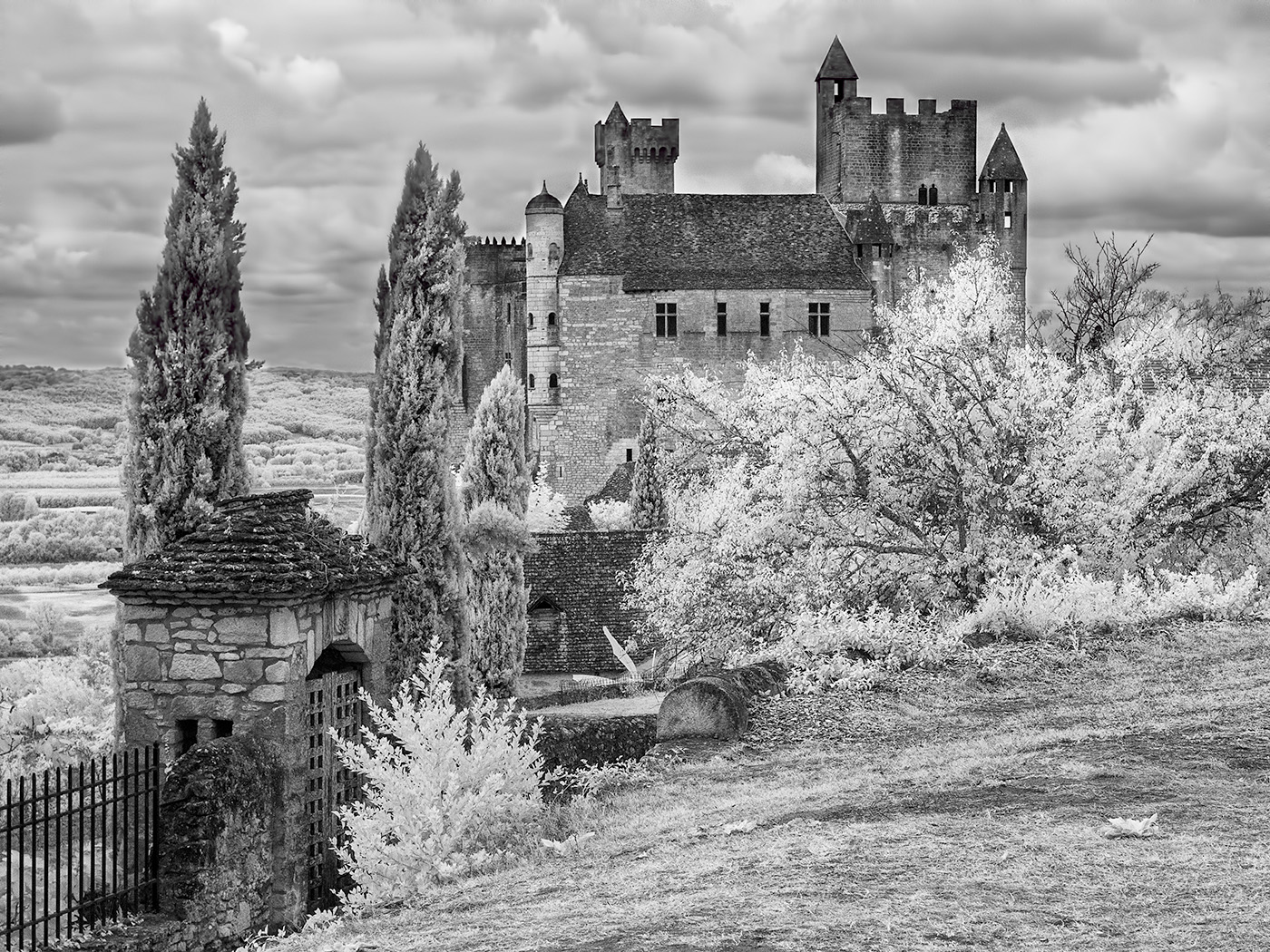
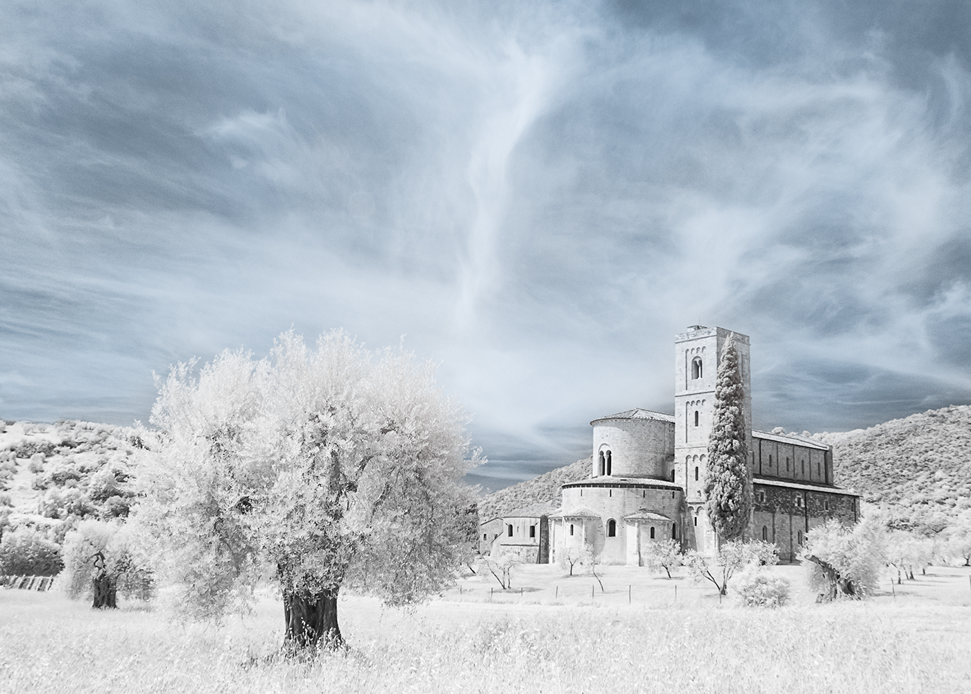
I like the colours you have achieved in this image as well as the composition. I think the figures in front of the tower are quite important as they give it scale. It looks as if there are a few vapour trails in the sky which could be removed but otherwise I cannot suggest any improvements. Another lovely image from you Helen. |
Aug 12th |
| 35 |
Aug 20 |
Comment |
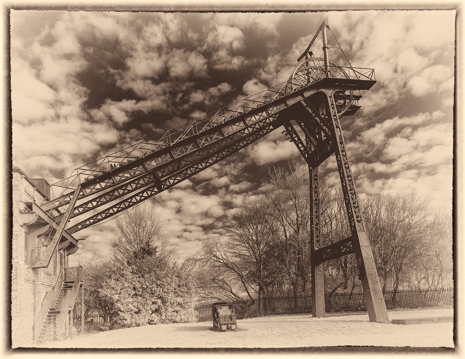
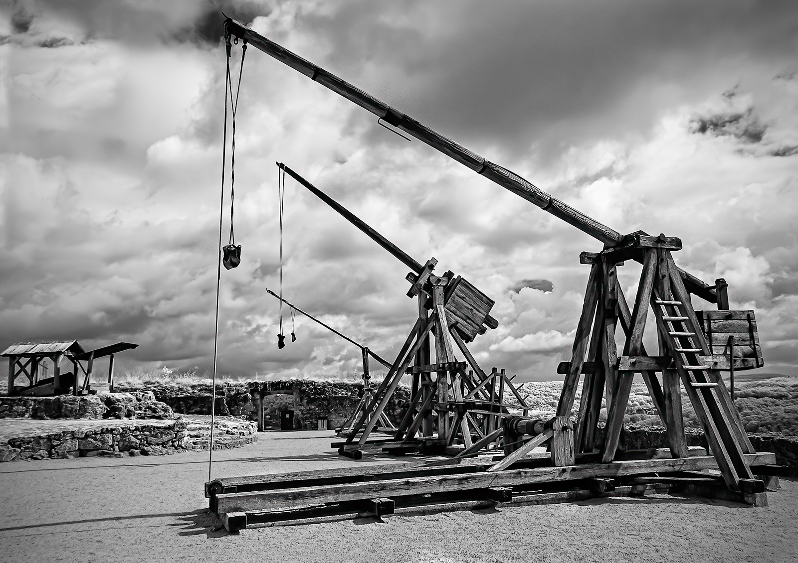
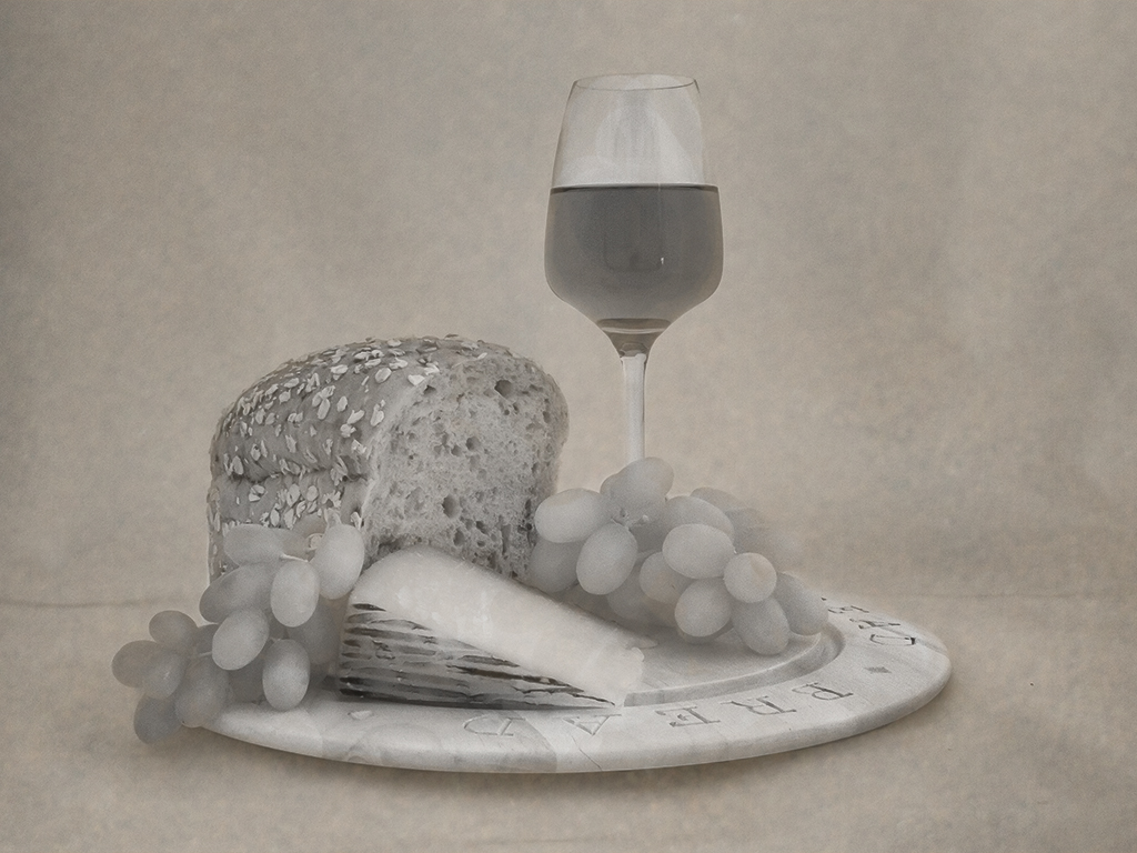
This is a great image and I like the texture you have added.I'd be interested to know how you achieved the scratches. Photographing a shiny object without blowing the highlights is quite an achievement. A lovely image full of character. |
Aug 12th |
| 35 |
Aug 20 |
Comment |
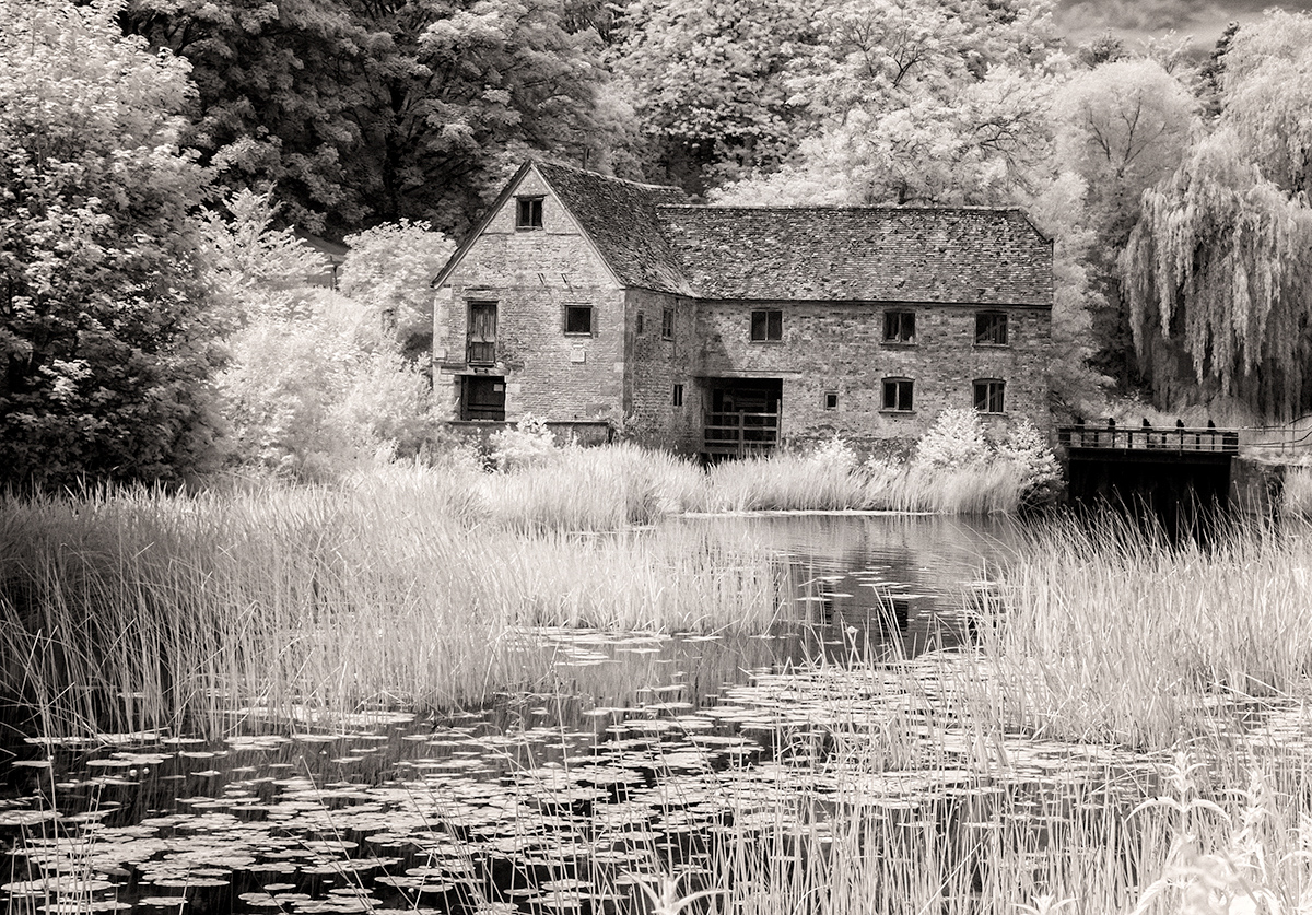
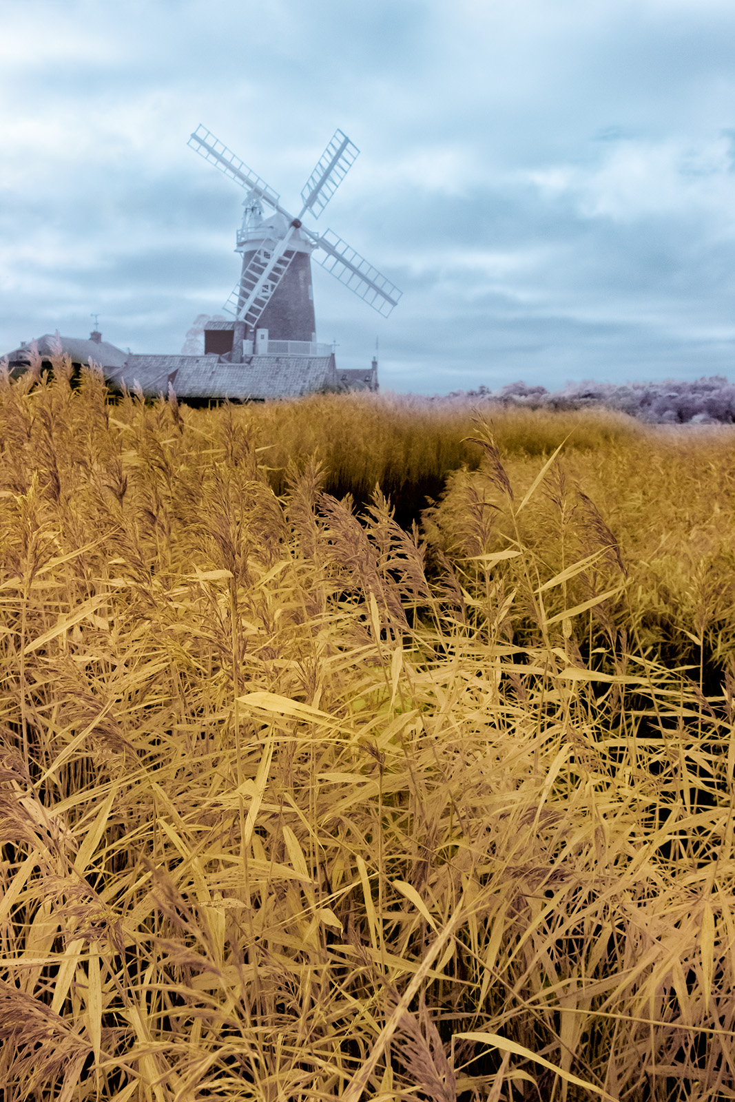
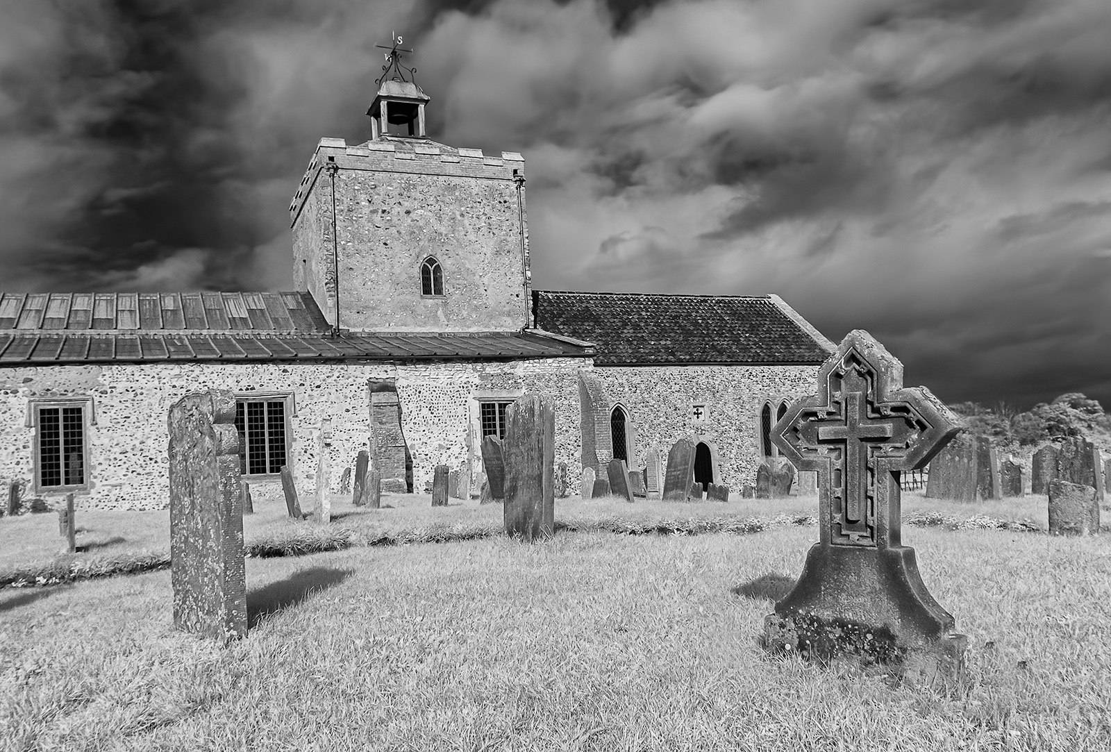
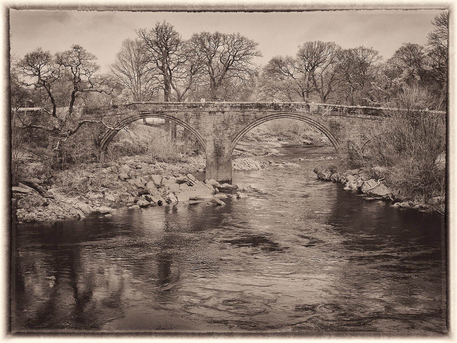
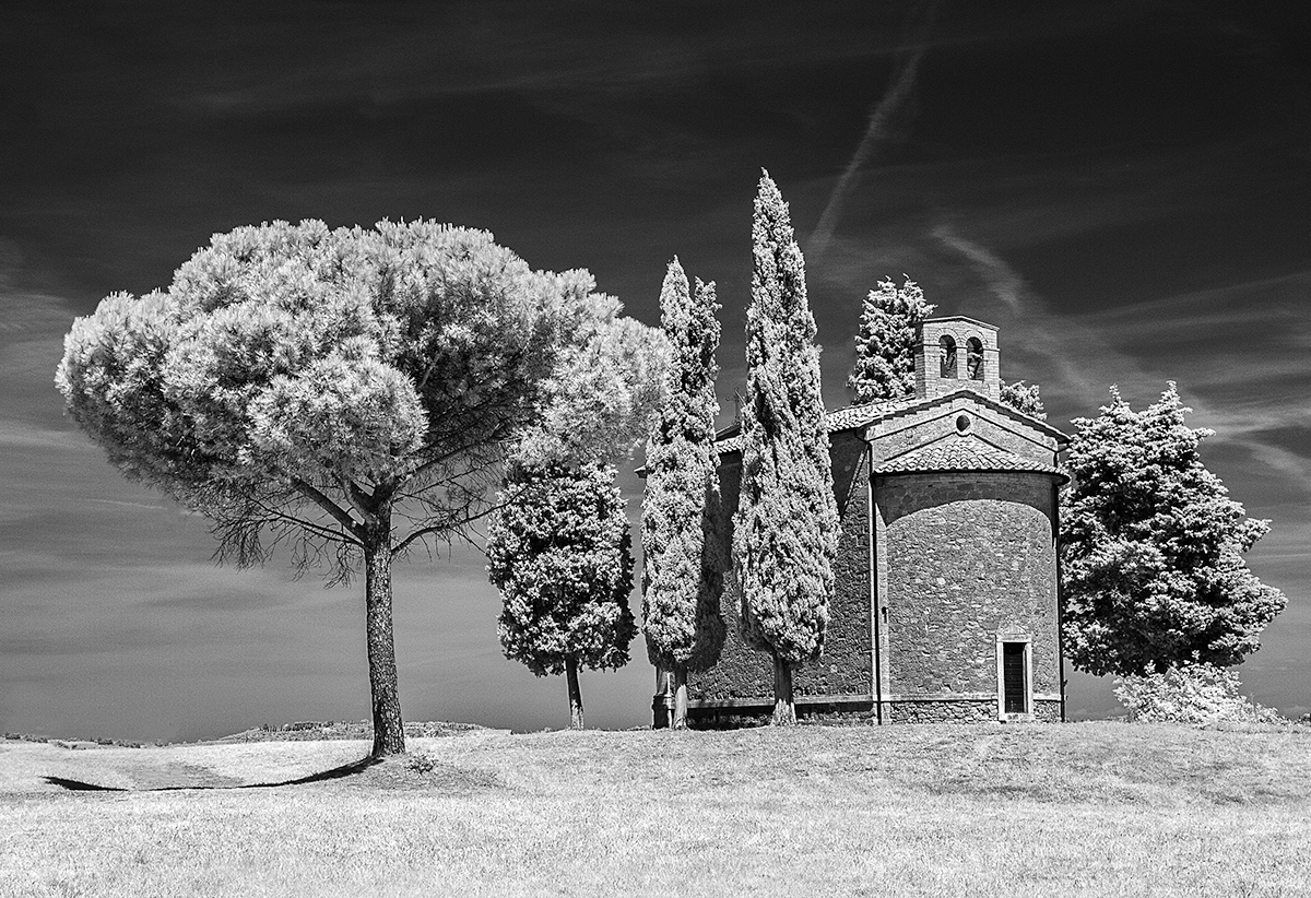
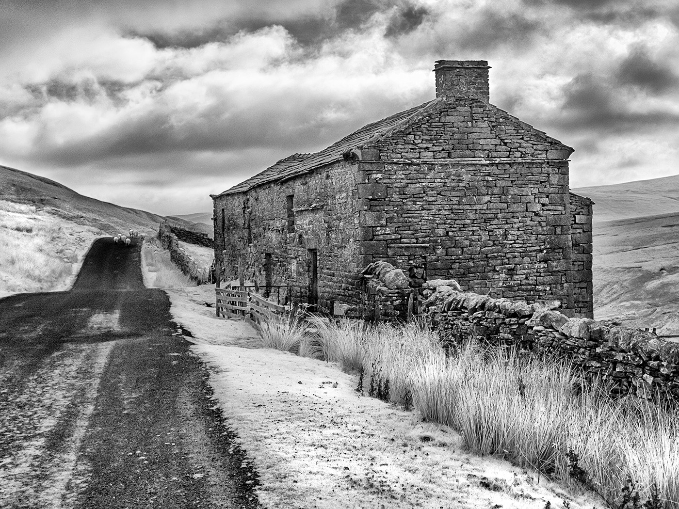
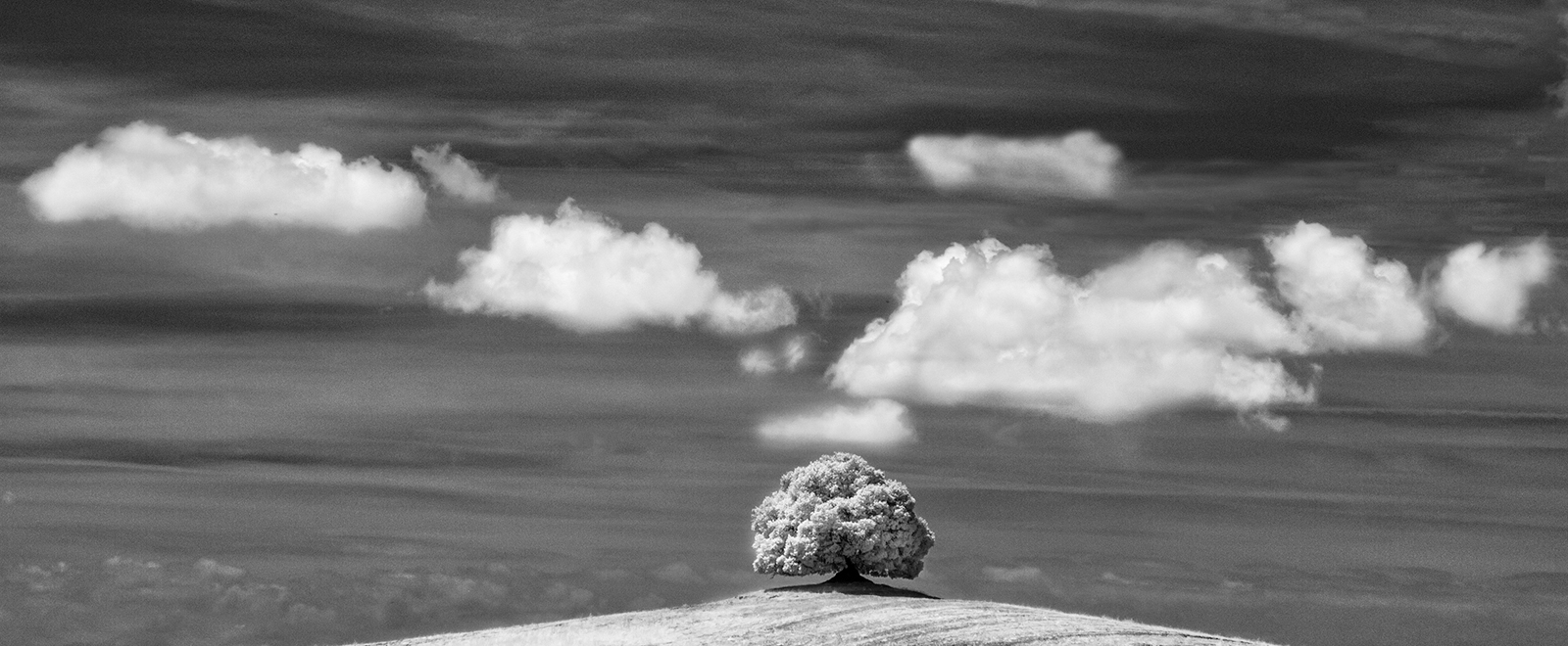
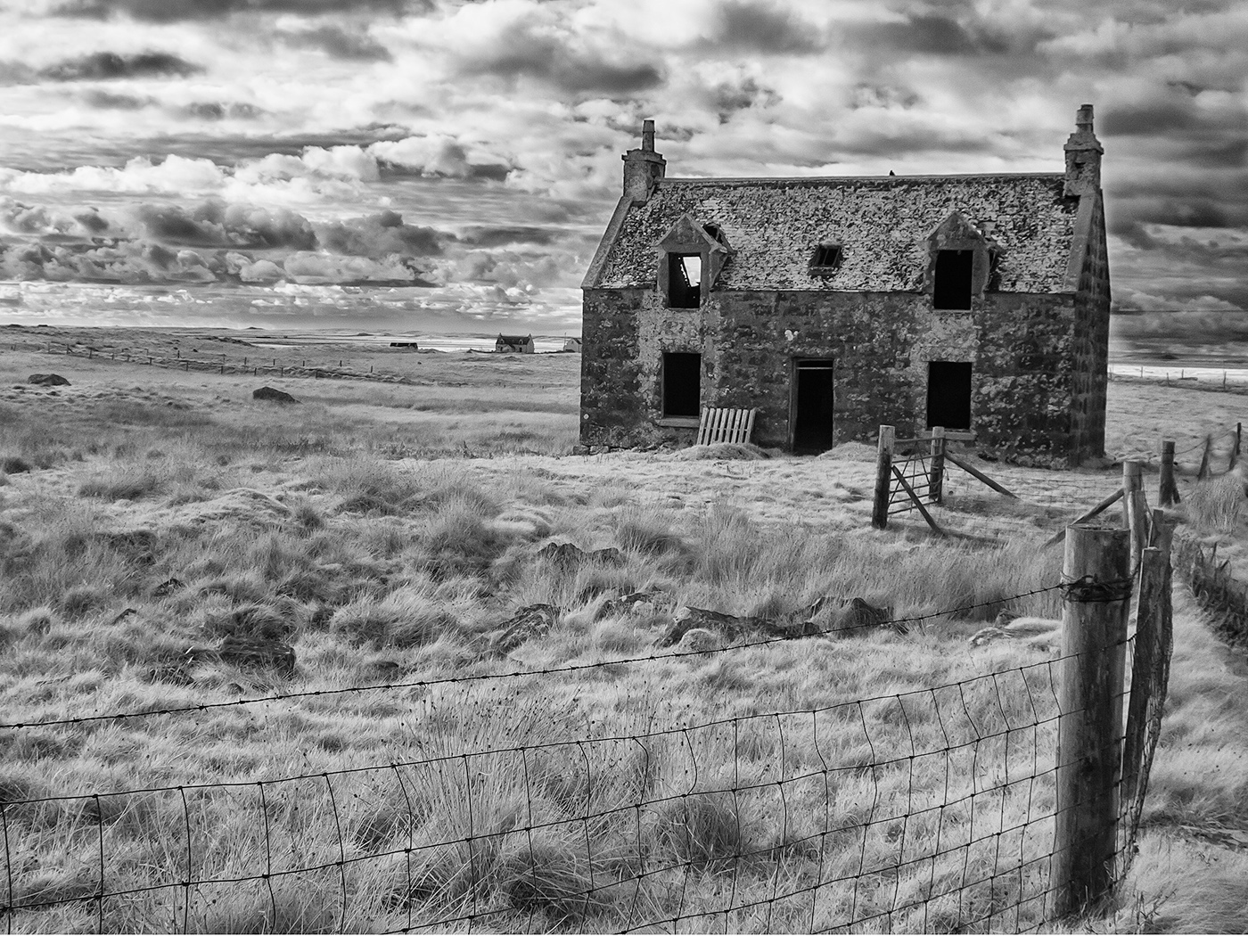
I really enjoy your work Terry. While there are similarities between your image and Stuart's I think this works better because the red of the barn is not so strong hence it tones in more effectively with the monochrome. I do find this image very appealing. I did look at cropping the sky but it is so dramatic in my opinion it adds to the scene. I don't think there is anything that I would change. |
Aug 12th |
| 35 |
Aug 20 |
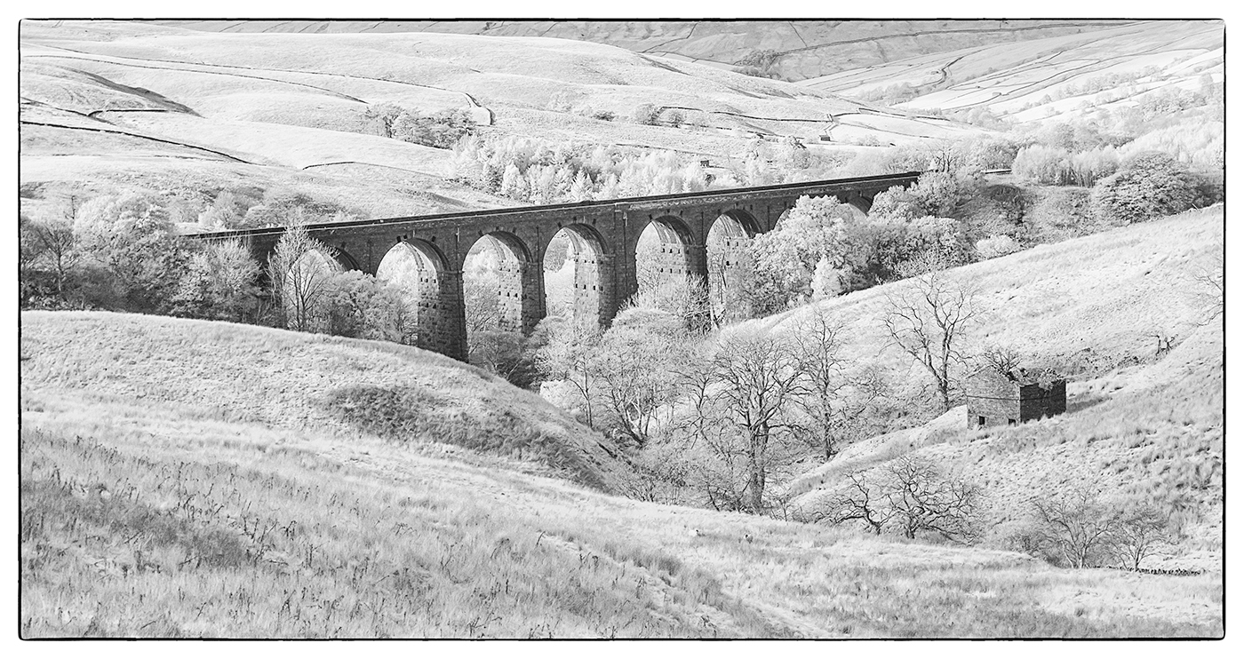
Reply |
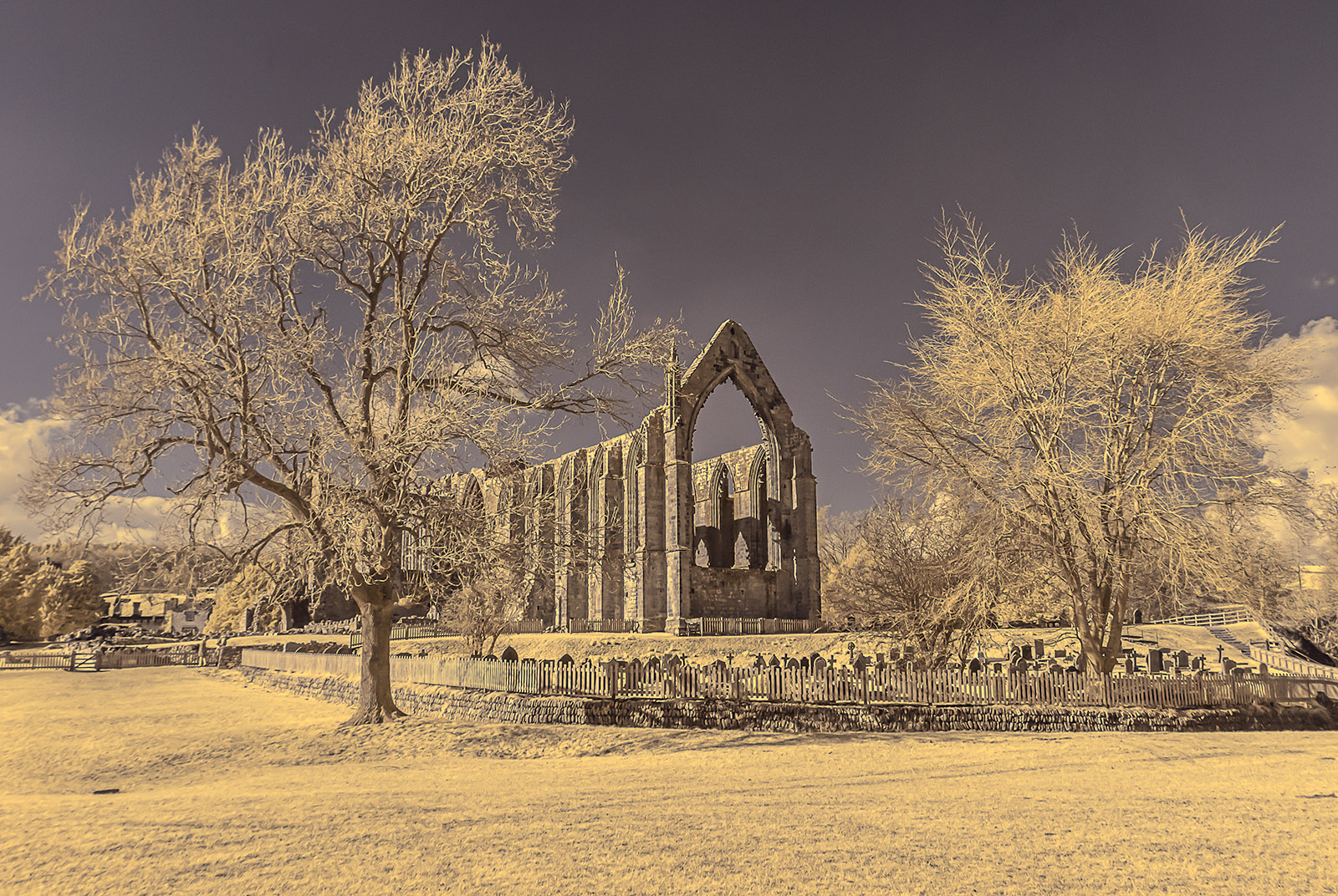
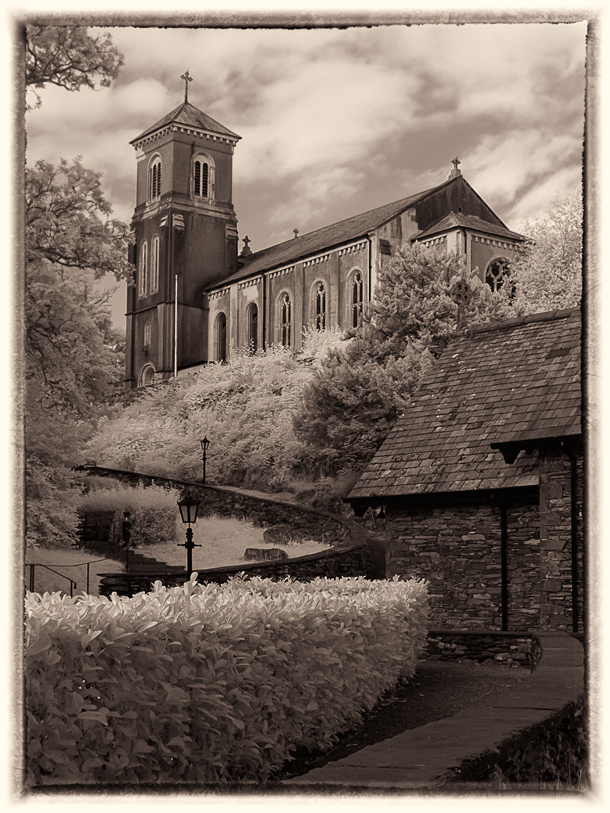
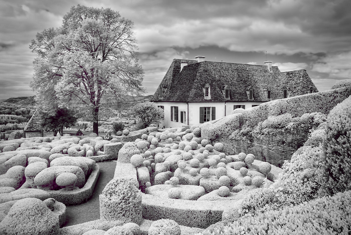
This is a location I have visited on several occasions but this is the first time I have used infrared. I have many detailed shots of the building but they are all in colour. On this occasion unfortunately I did't have much time. I think I may have reduced the contrast by darkening the highlights and lightening the shadows in processing it as it was a very bright day with strong shadows but I will have another attempt at processing it as you suggest. |
Aug 12th |
| 35 |
Aug 20 |
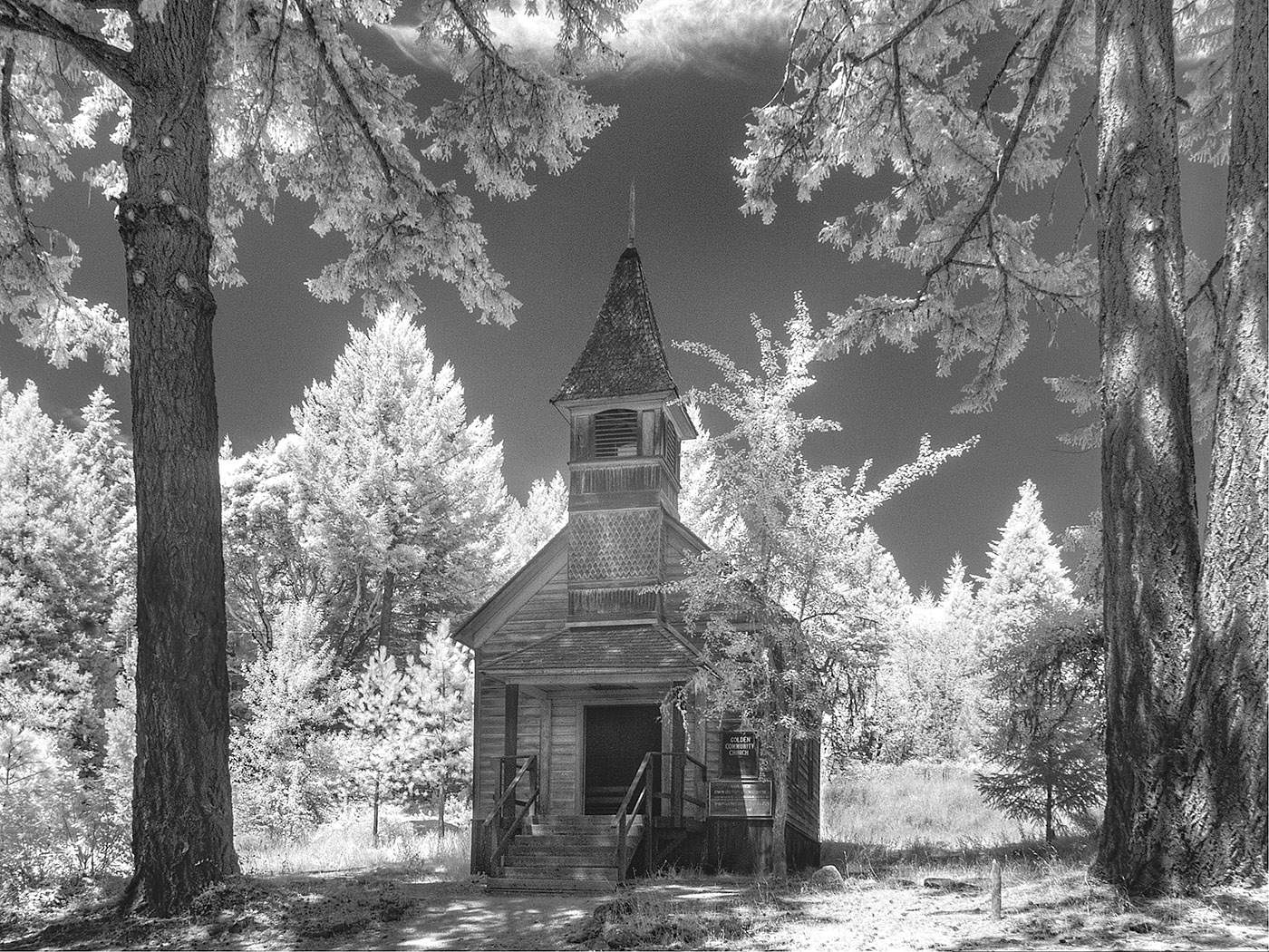
Comment |
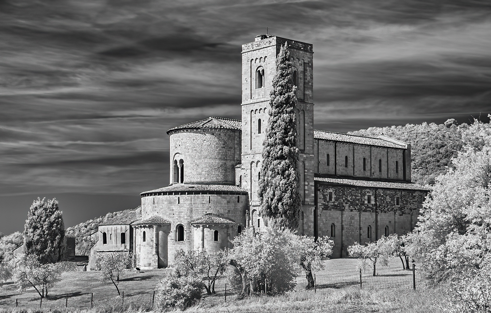
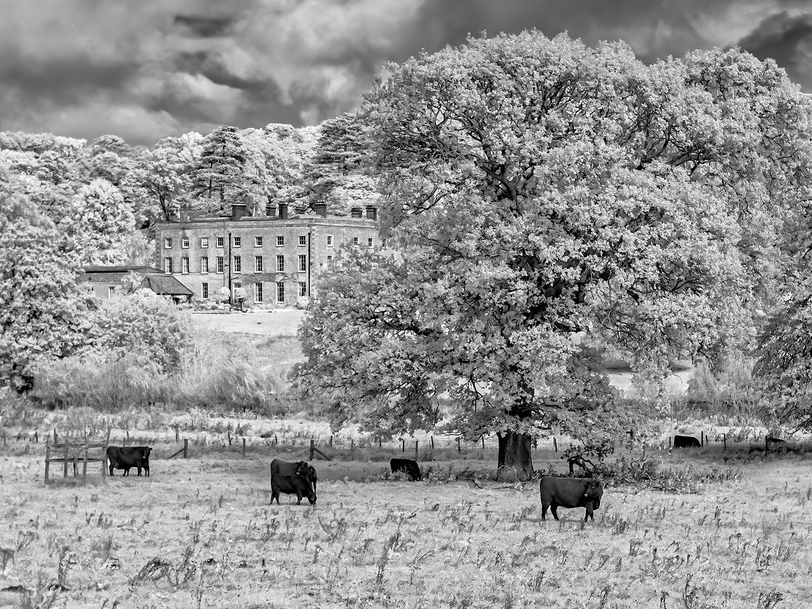
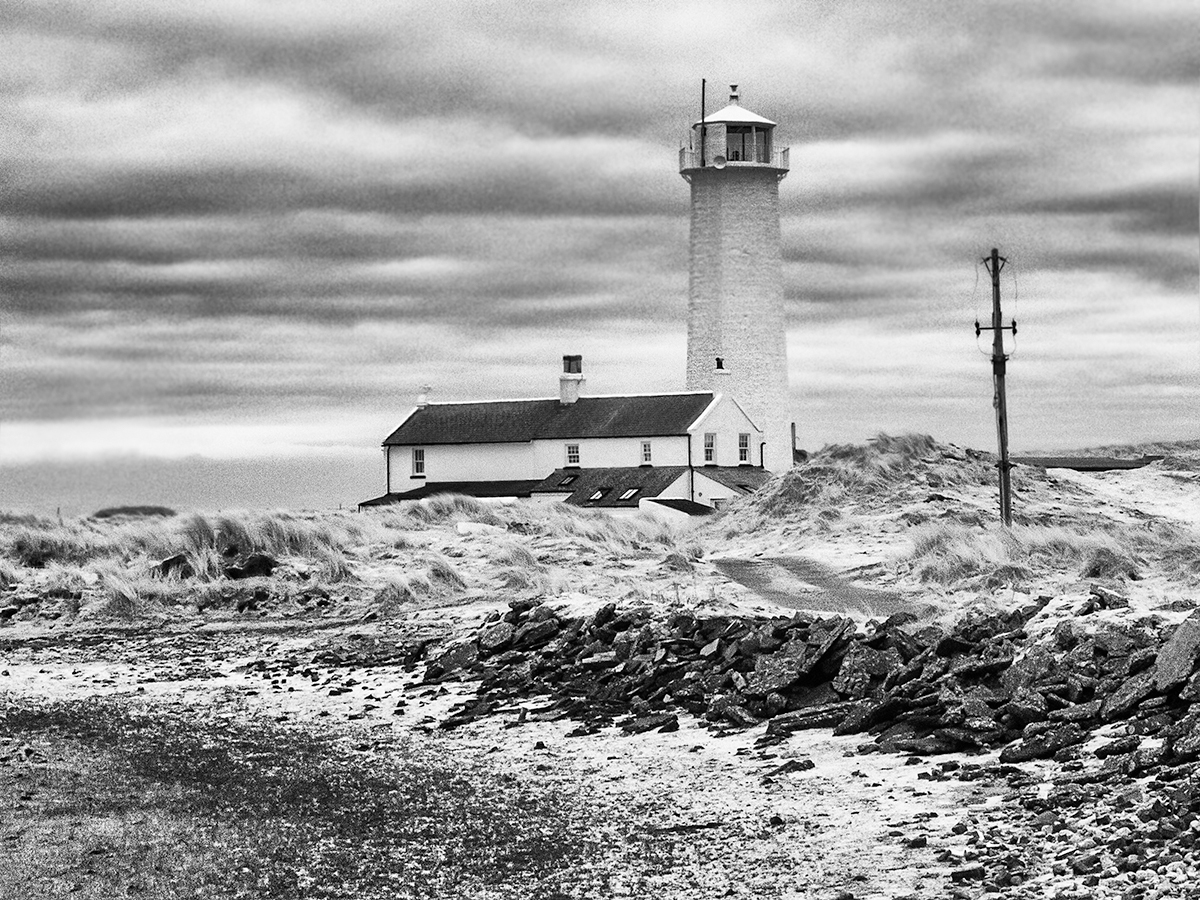
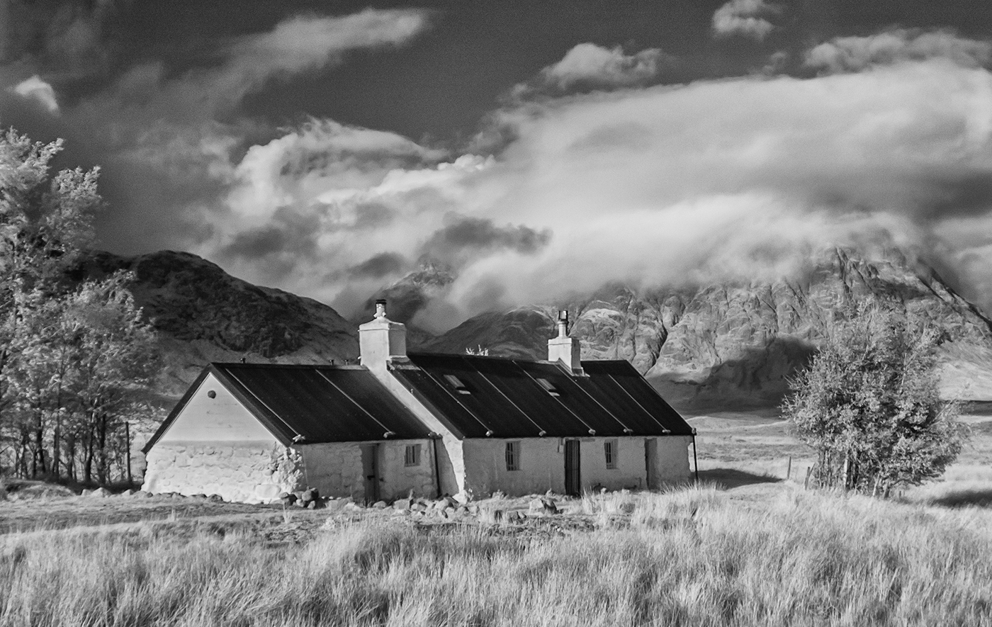
The colour of the building is very striking but for me the juxtaposition of the red against the monochrome doesn't really work. I would have preferred to see some colour in the background as well which in my opinion would have linked the two elements together more successfully. Nevertheless an interesting experiment and I like the composition. |
Aug 12th |
| 35 |
Aug 20 |
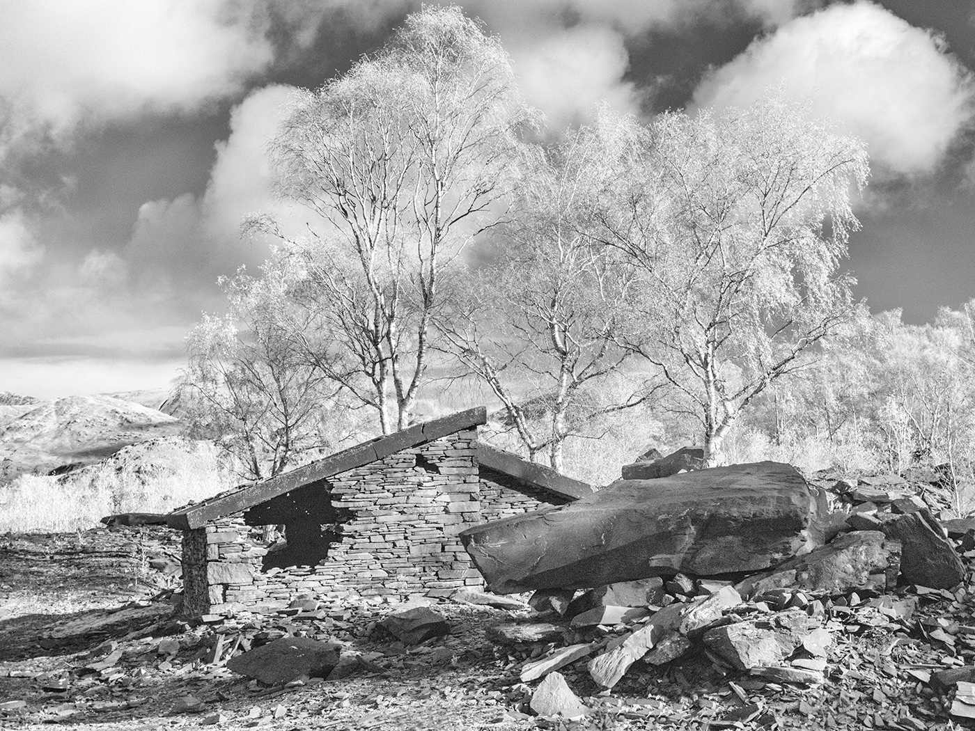
Comment |
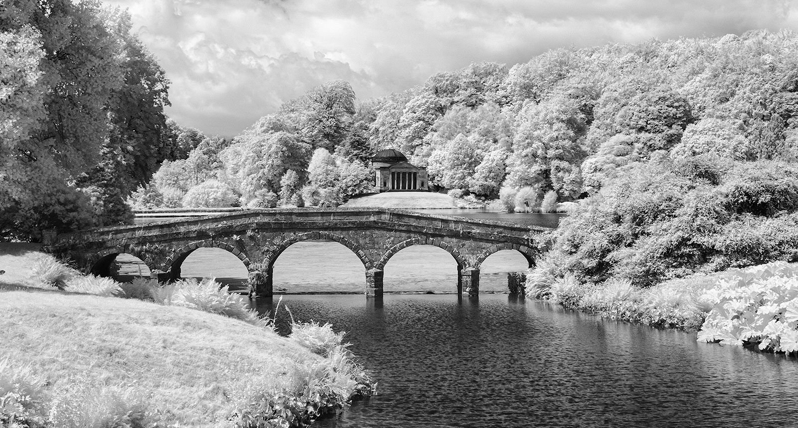
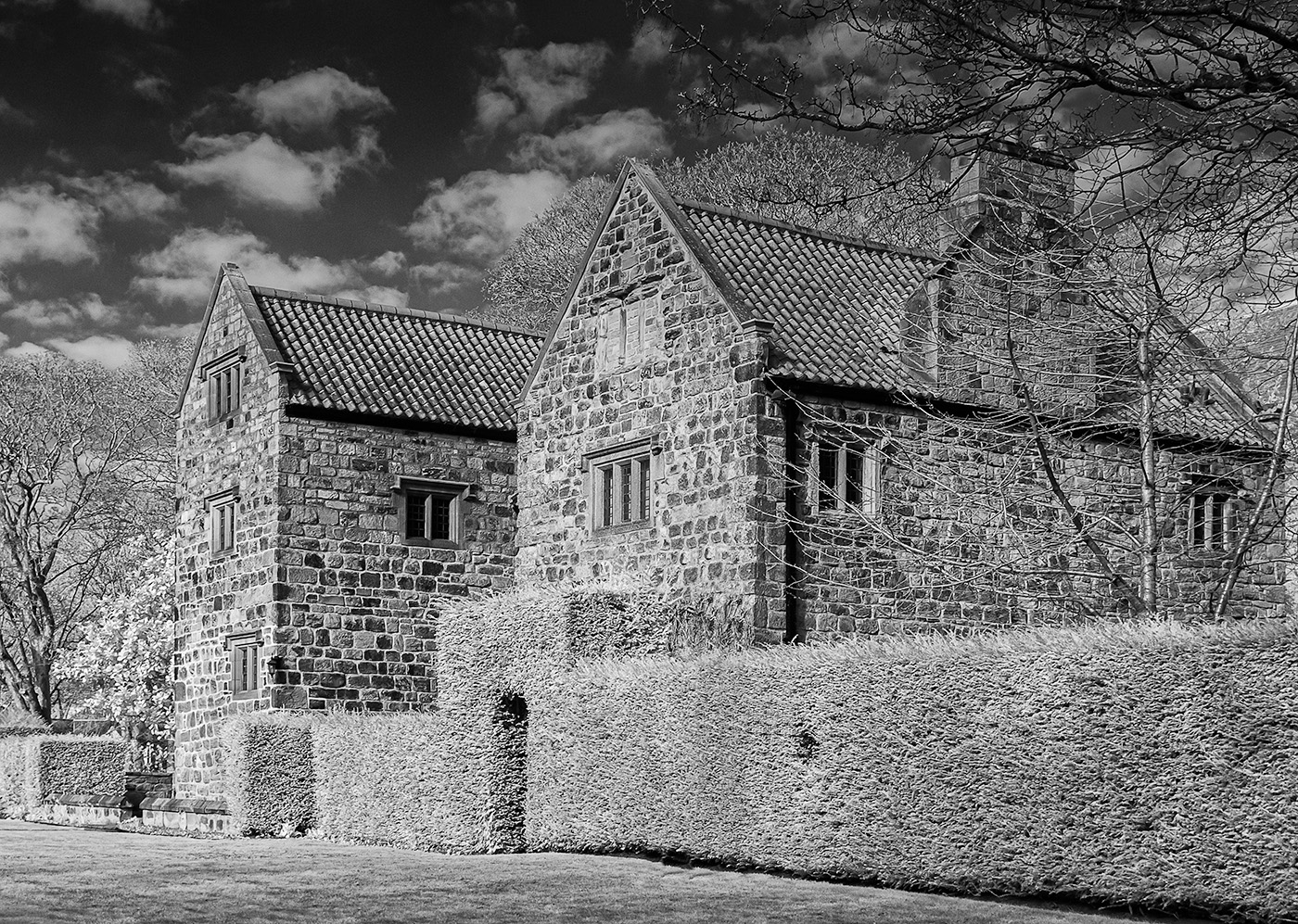
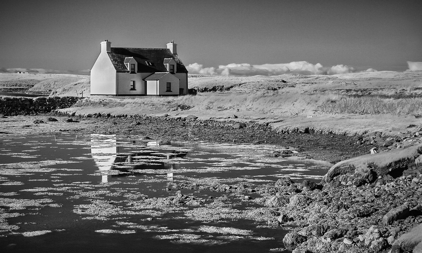
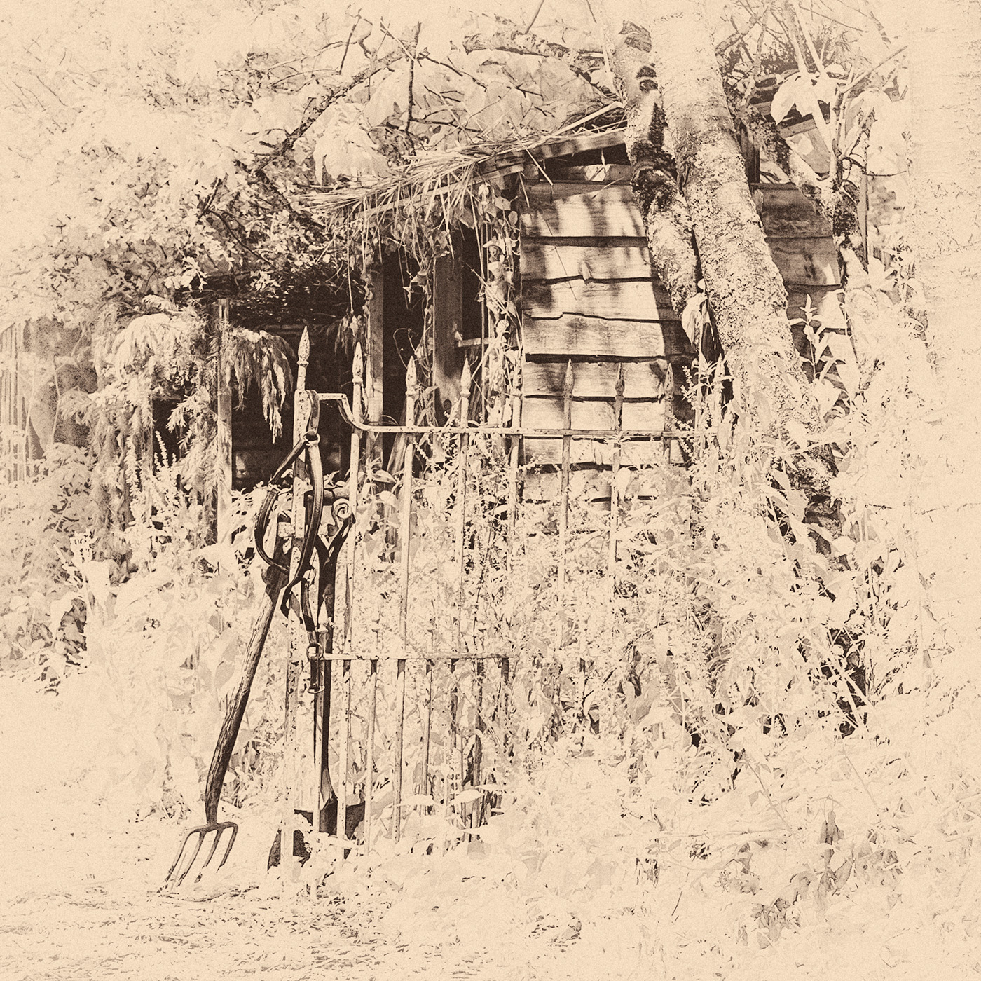
Yes you definitely needed to remove the roof and dormers in the background as they were quite distracting. Your replacement sky looks convincing although there is a lighter area just below the branch. Would it have been possible to fade the new area of sky a little more gradually in to the brighter area. It's only a small point and it doesn't really detract from the interesting building and the lovely foliage growing over it.I agree with Terry and Helen regarding darkening the trees above the wall. |
Aug 12th |
6 comments - 1 reply for Group 35
|
6 comments - 1 reply Total
|