|
| Group |
Round |
C/R |
Comment |
Date |
Image |
| 35 |
Aug 18 |
Comment |
The sky in this is lovely and I wonder whether you have a sufficiently large file to crop in to this image leaving only the central area. This would place more emphasis on the sky and distant mountains. I like the colours you have achieved both in the sky and the foliage. The curved lines that Stuart has mentioned do look man made and in my view the image would be improved if they were cloned out. |
Aug 13th |
| 35 |
Aug 18 |
Comment |
I too really like the composition and think that this image is worth more work. I find the way you have combined a colour image with the IR image to achieve your final version very interesting. I like the green which looks fairly natural but I find the blue a little dominant. I too think cropping a little off the base strengthens the image. |
Aug 13th |
| 35 |
Aug 18 |
Comment |
Another lovely image Helen. I particularly like the treatment you have given this which has inspired me to try something similar myself in the future. I also read with interest the advice to Debbie as I have not thought of applying this technique to IR images myself. I cannot think of any way to improve this image, I just love it! |
Aug 13th |
| 35 |
Aug 18 |
Comment |
I really like your second version of this image as I feel it tells more of the story. I am always inspired by the use of IR on subjects that are different from the normal landscapes etc. and I think it works well on the horses. All I would suggest with regard to this version is that you crop the foal's tail and leg off the left side. With regard to your final image I think I too would crop the tail and legs of the foal on the left and darken around the edges. |
Aug 13th |
| 35 |
Aug 18 |
Comment |
For me the wave is the most important part of this image. I think I would have cropped a little off the base of the image and some off the left to make the wave more dominant but not too much as there is some lovely detail in the water swirling around the rocks. |
Aug 13th |
| 35 |
Aug 18 |
Comment |
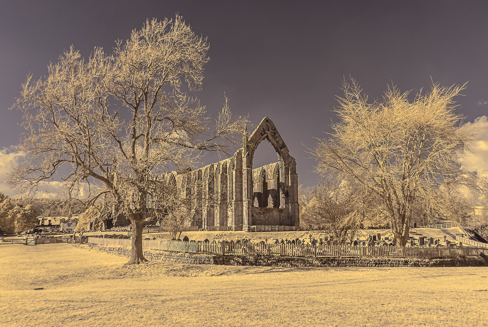
This is a lovely image, as well as the composition I particularly like the colour. Only a suggestion as I don't think it needs improving but I wondered if tinting the arch blue to tone in with the sky and church roof might be an alternative. I agree with Stuart about removing the tomb stones. |
Aug 13th |
6 comments - 0 replies for Group 35
|
6 comments - 0 replies Total
|