|
| Group |
Round |
C/R |
Comment |
Date |
Image |
| 35 |
May 18 |
Comment |
Hello Debbie. It reminds me of a scene from a UK TV series called "The Prisoner" starring Patrick McGoohan. I am not sure if this was ever screened in the USA, in any case it dates back to the late 1960's. It featured, amongst other things, a rather sinister bubble that was released by those in charge to recapture "The Prisoner". I think I would crop roughly a third off the top of your image to eliminate most of the flare and to focus attention on the bubble. Definitely an intriguing image. |
May 17th |
| 35 |
May 18 |
Comment |
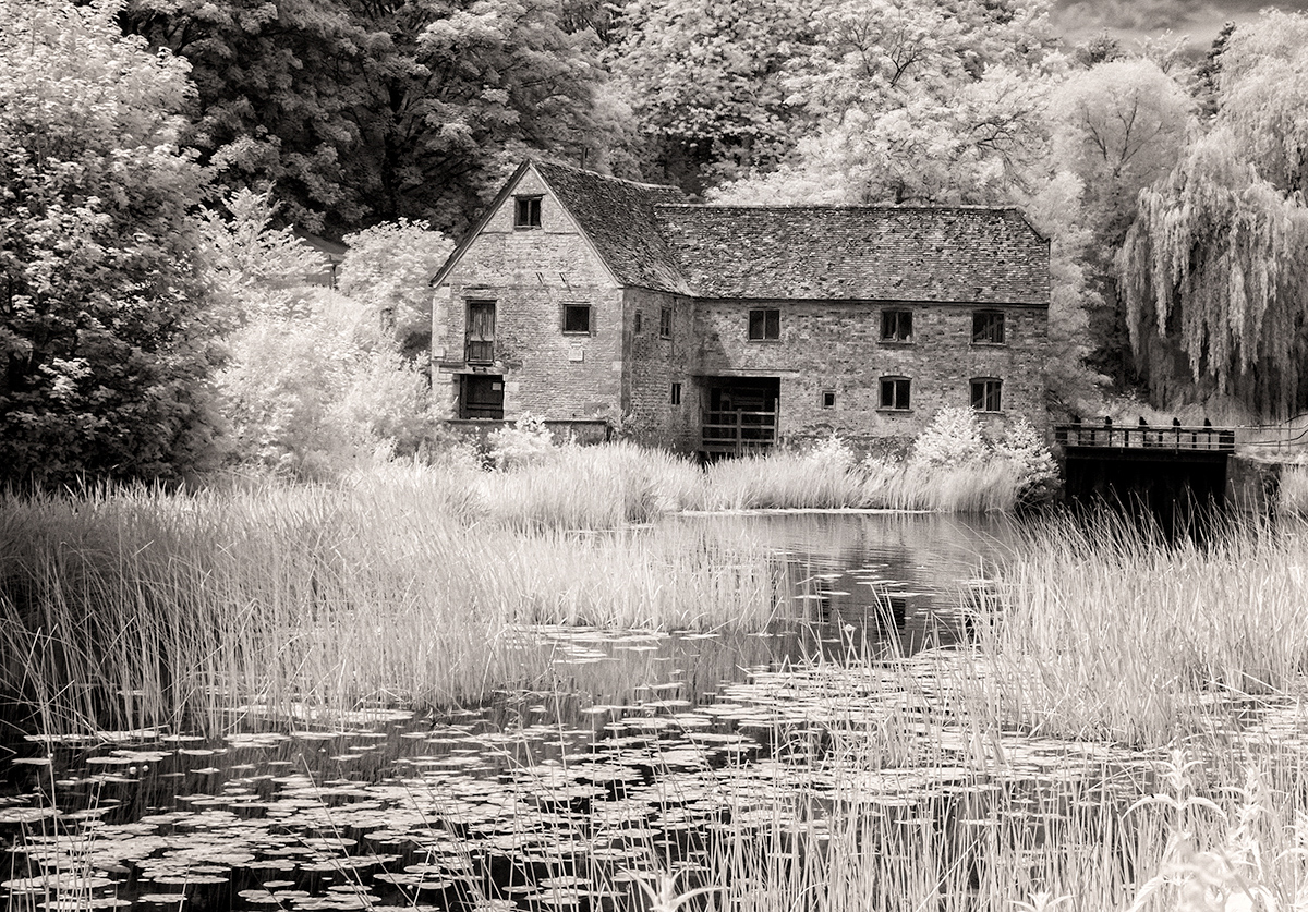
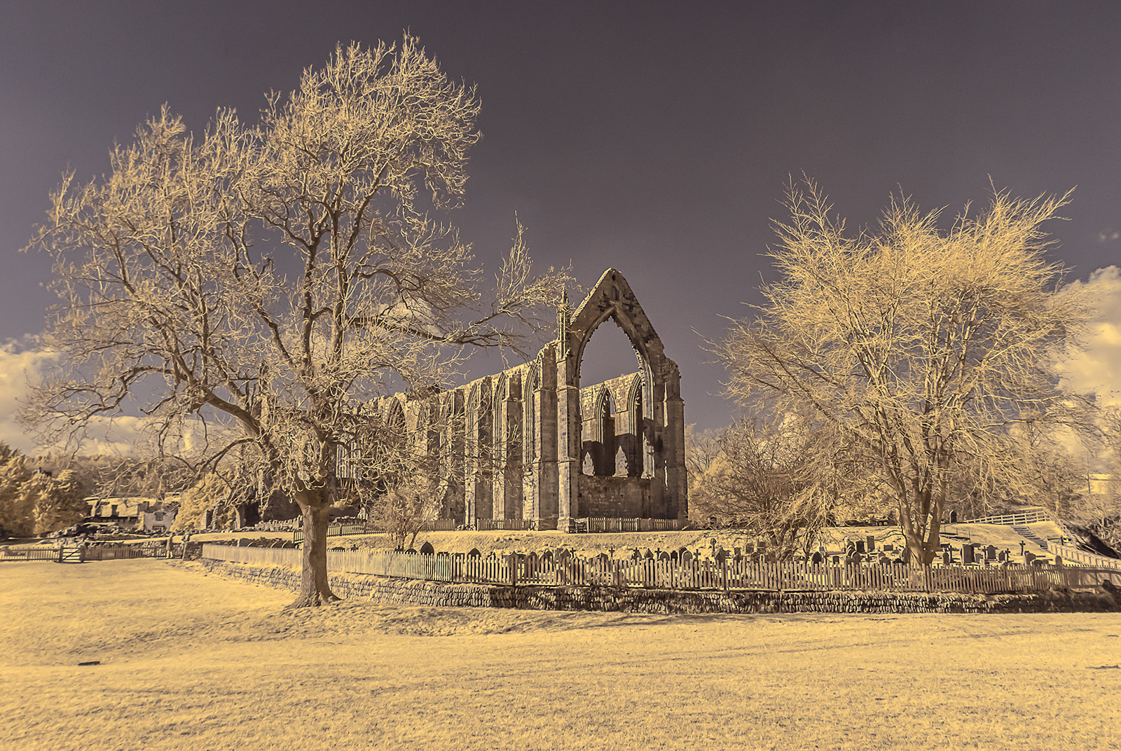
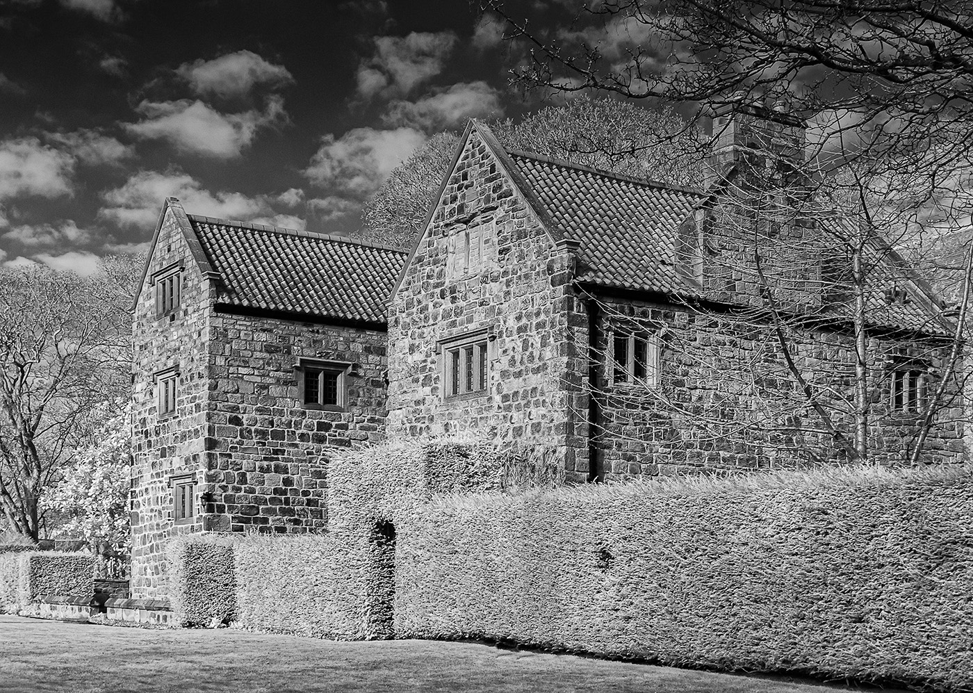
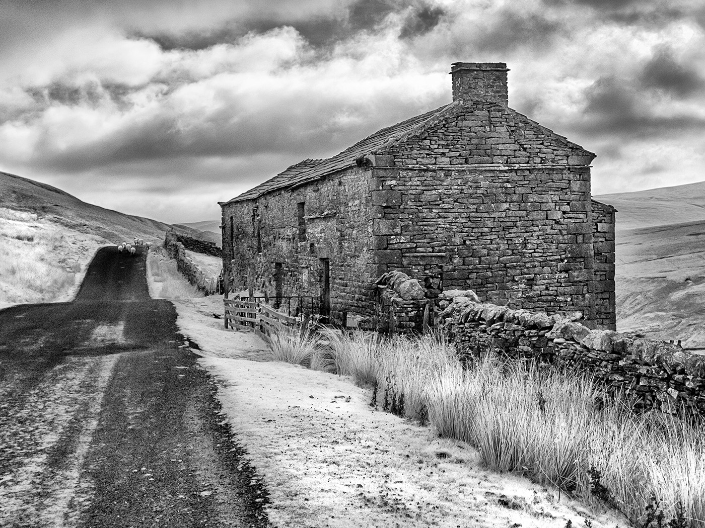
This is a charming image Helen. The light is lovely, I particularly like the shadows and the patches of light on the trees. By combining three exposures I think you have achieved a well balanced image and made the most of the scene. The composition is also strong with the path and shadows providing a perfect lead in line to the building. Lovely. I may have a go at taking this myself next time we are over on the west coast, I have previously walked past this scene without realising its potential so full marks to you for spotting it. |
May 17th |
| 35 |
May 18 |
Comment |
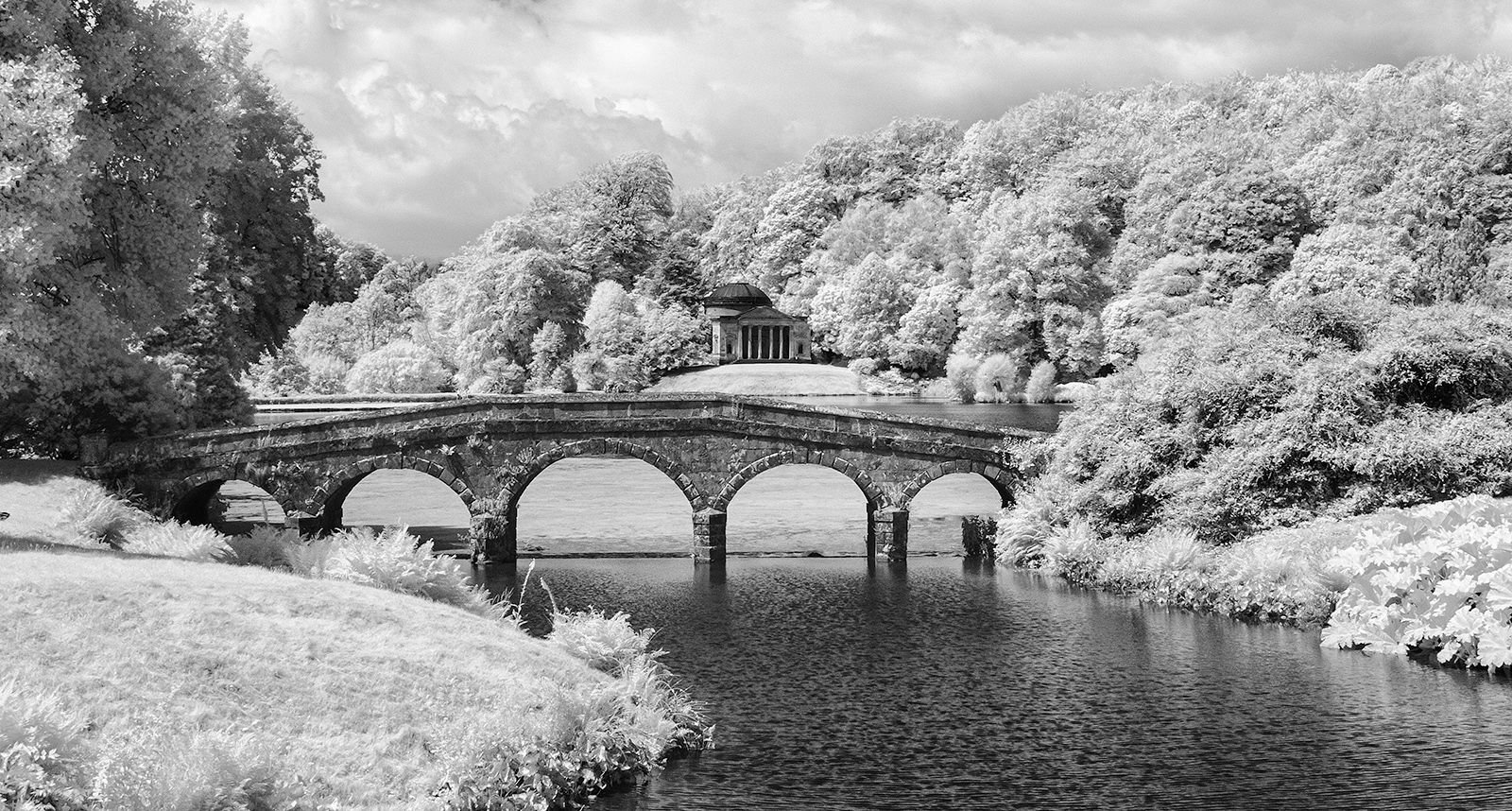
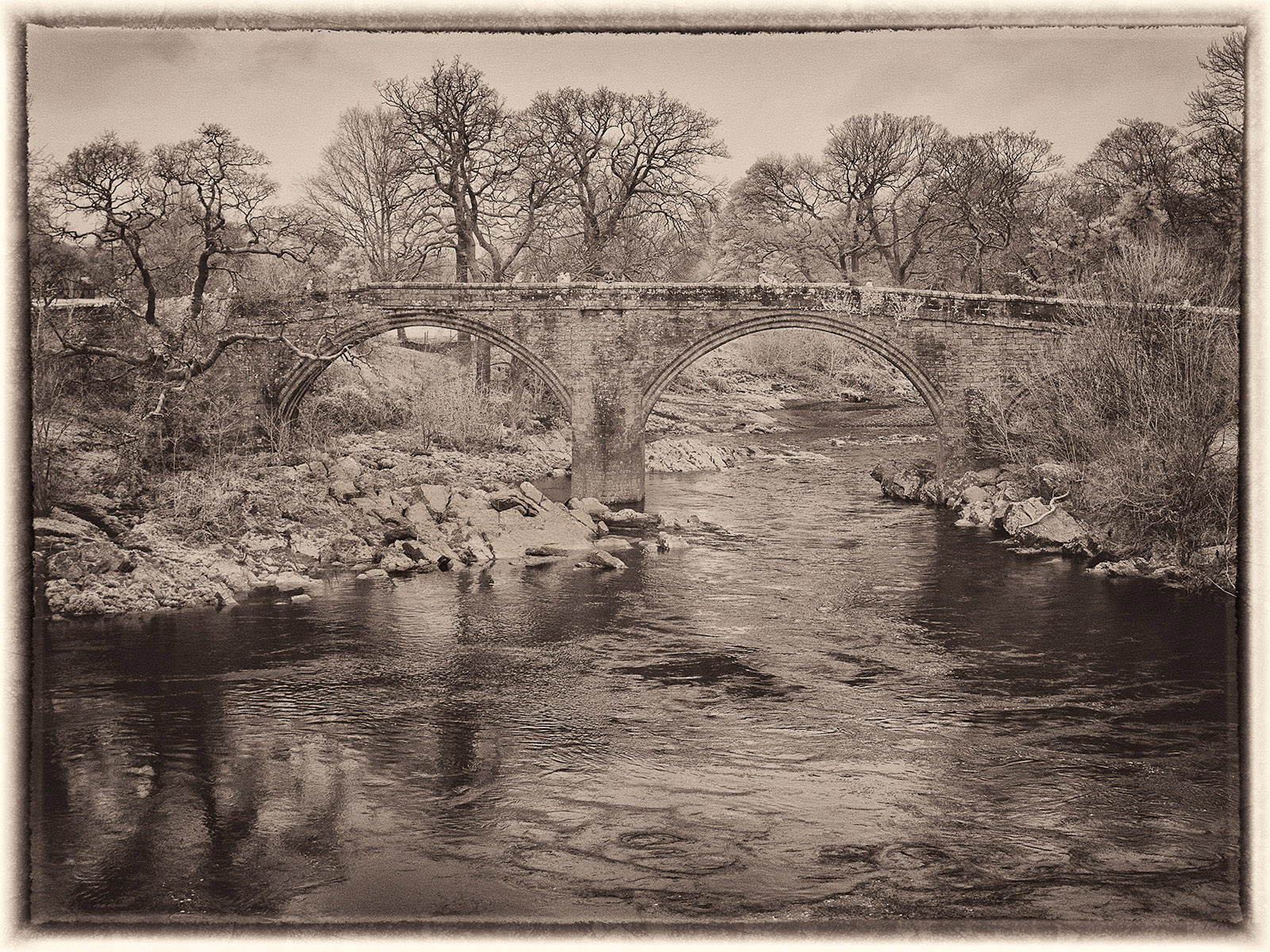
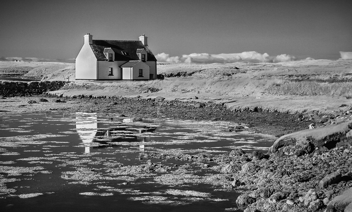
This is a lovely scene and I particularly like the reflections in the water. I also like the way the water leads my eye through to the open area in the background. The contrast in your processed version is very strong and I do find the blue a little dominant so I too would be tempted to tone this down a little but, as Helen says, it is purely a matter of personal taste rather than there being a "right" or "wrong" version. |
May 17th |
| 35 |
May 18 |
Comment |
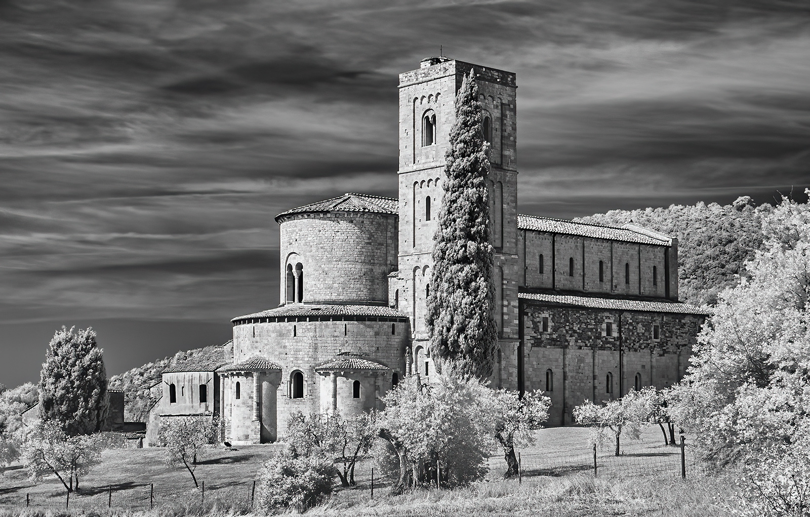
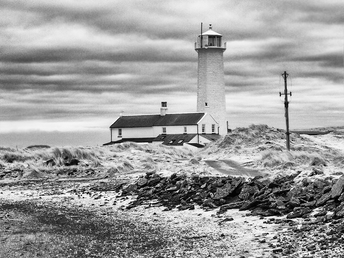
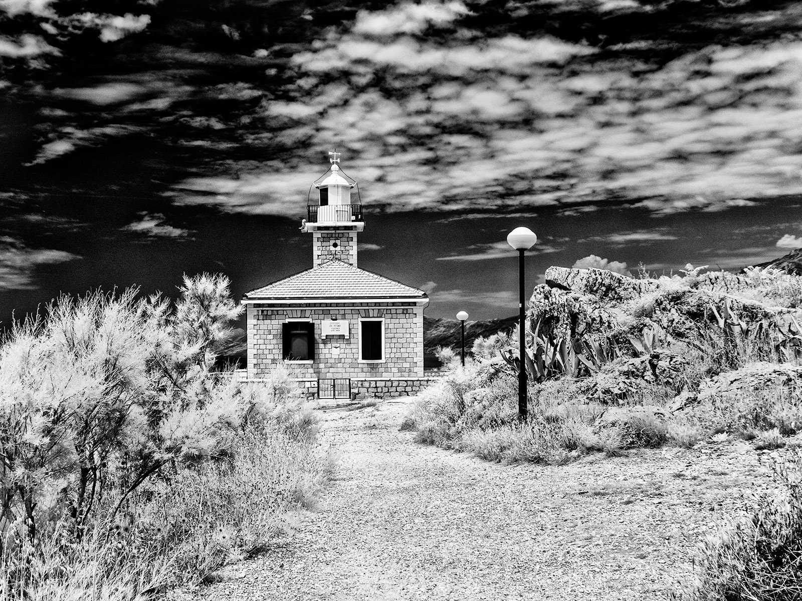
Lighthouses always make good subjects for photographers. I think I too would try to reduce the haziness in the background to reveal more detail in the buildings as I feel that a better balance would be achieved between the lighthouse and the foreground. In my opinion more contrast in the sky would also enhance the image. I like your composition, particularly the way the rocks in the foreground provide a lead in line to the headland and lighthouse but I might be tempted to crop a little off the left hand side although Helen has a good point about removing some of the highlights by cropping the right. |
May 17th |
| 35 |
May 18 |
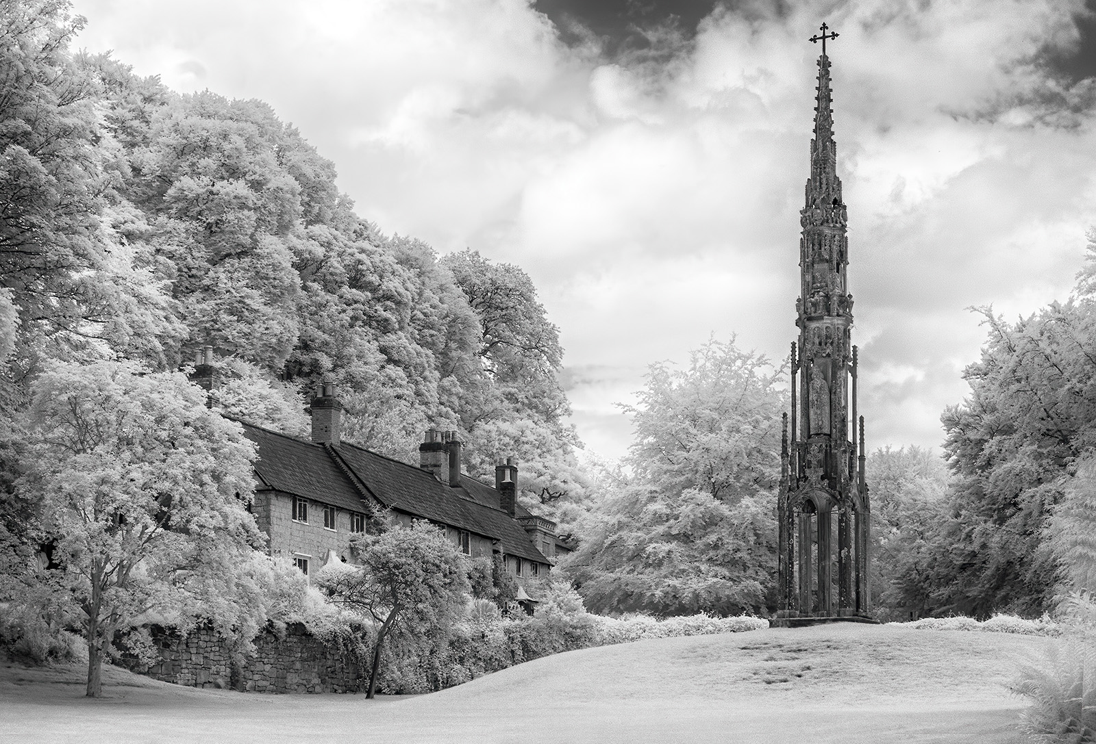
Comment |
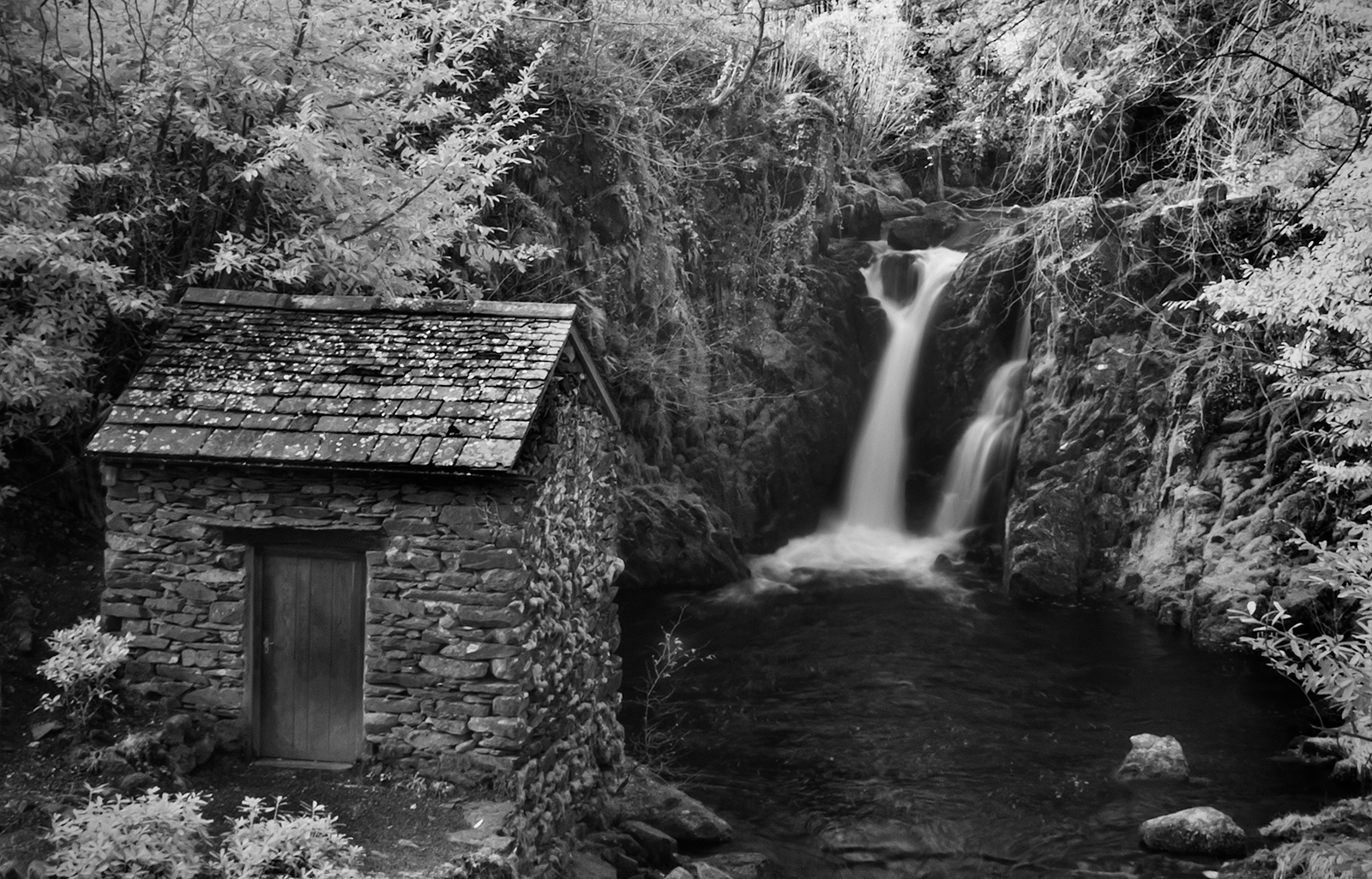
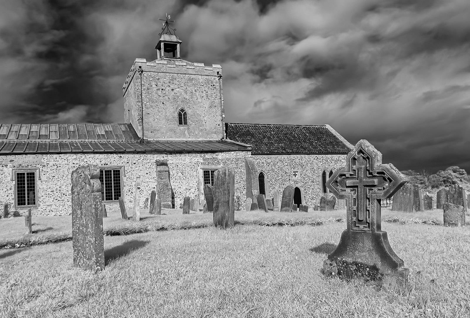
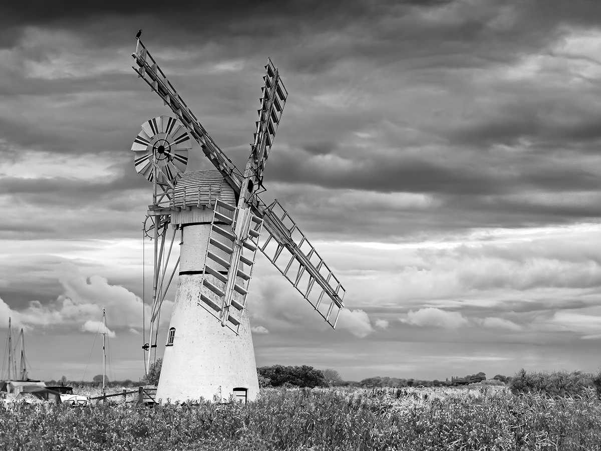
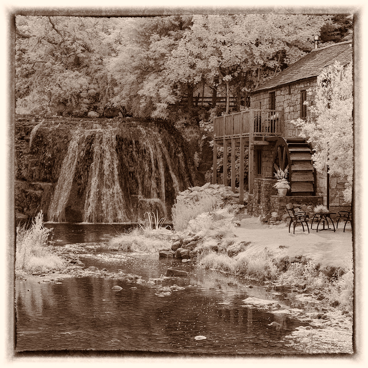
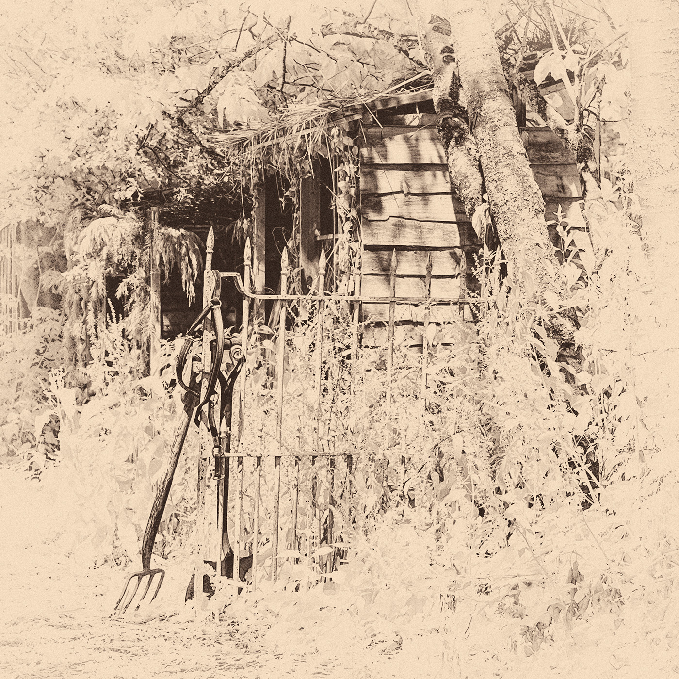
This is a lovely image, I am sure I have see the colour version which I admired without realising it was yours. As Helen says this version is quite busy and I too feel that the pencil sketch simplifies it and thus works better as the old mill is more prominent. |
May 17th |
5 comments - 0 replies for Group 35
|
5 comments - 0 replies Total
|