|
| Group |
Round |
C/R |
Comment |
Date |
Image |
| 35 |
Dec 17 |
Reply |
Thank you for letting me know how you lit this. The colour version is lovely too. Good luck with the competitions. |
Dec 12th |
| 35 |
Dec 17 |
Comment |
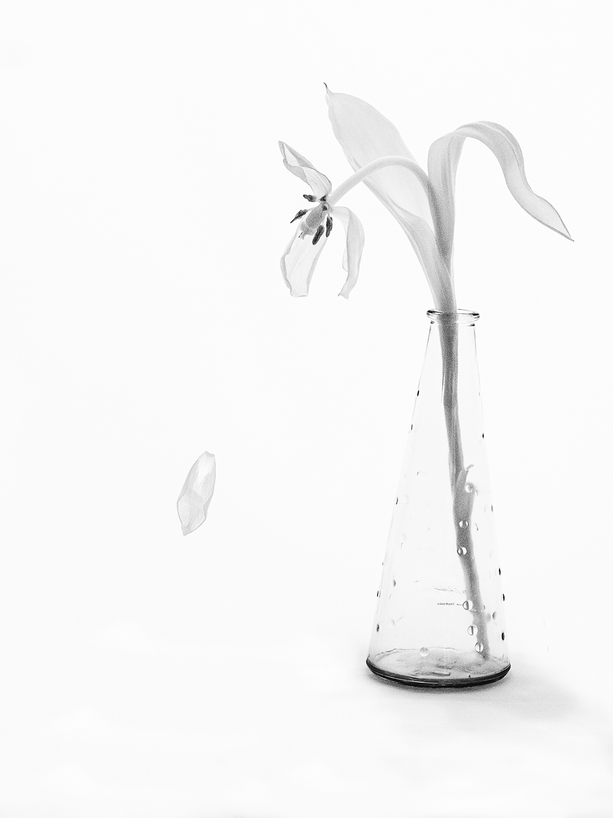
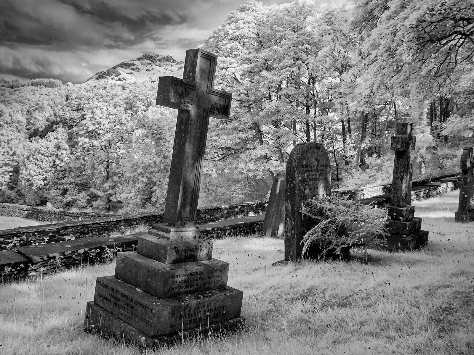
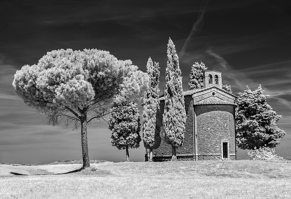
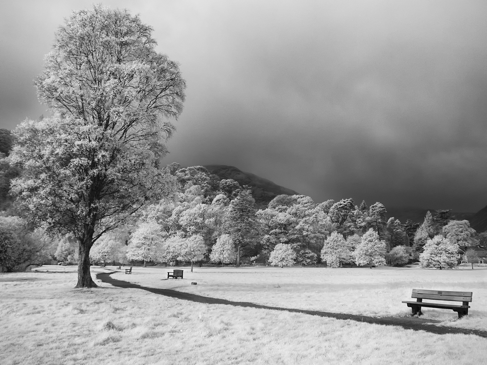
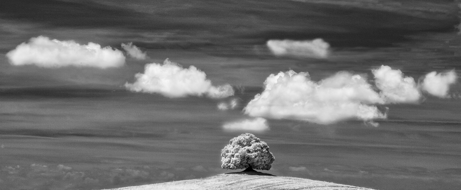
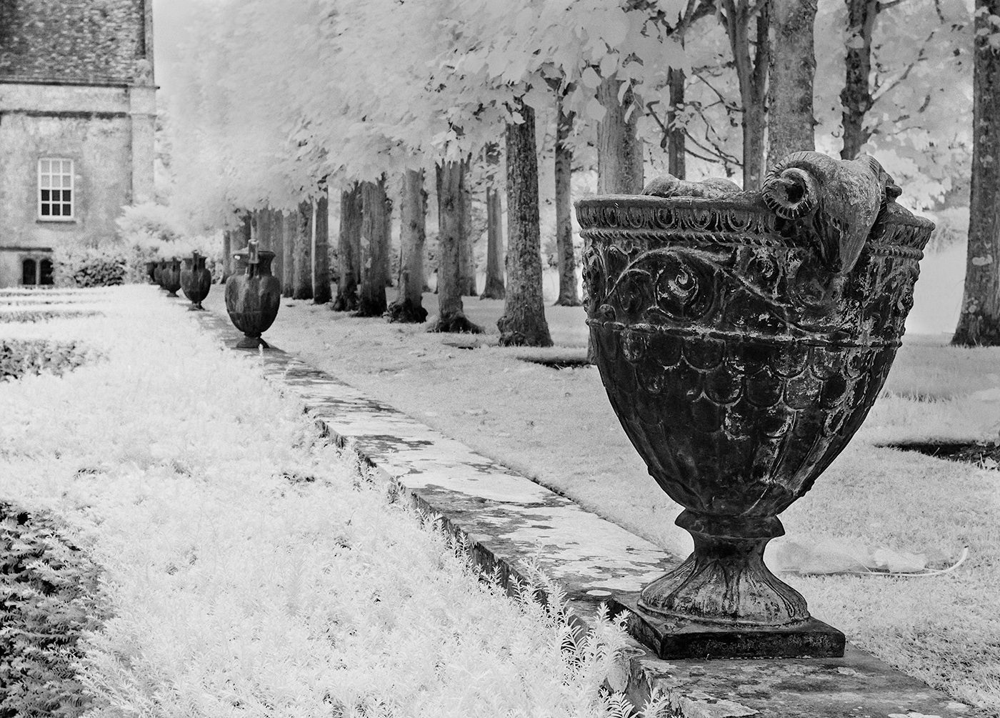
I think this is a lovely image. I like both your processed image and the original and I find the light coming through the petals particularly appealing. For this reason I would not adjust the highlights. On my Ipad there seems to be detail in all the areas although there is always a danger with whites that a judge might find them to be blown out. It's always difficult to predict how an individual judge will react to IR but I do think the IR version stands out. I'd be interested to know how you lit this. |
Dec 11th |
| 35 |
Dec 17 |
Comment |
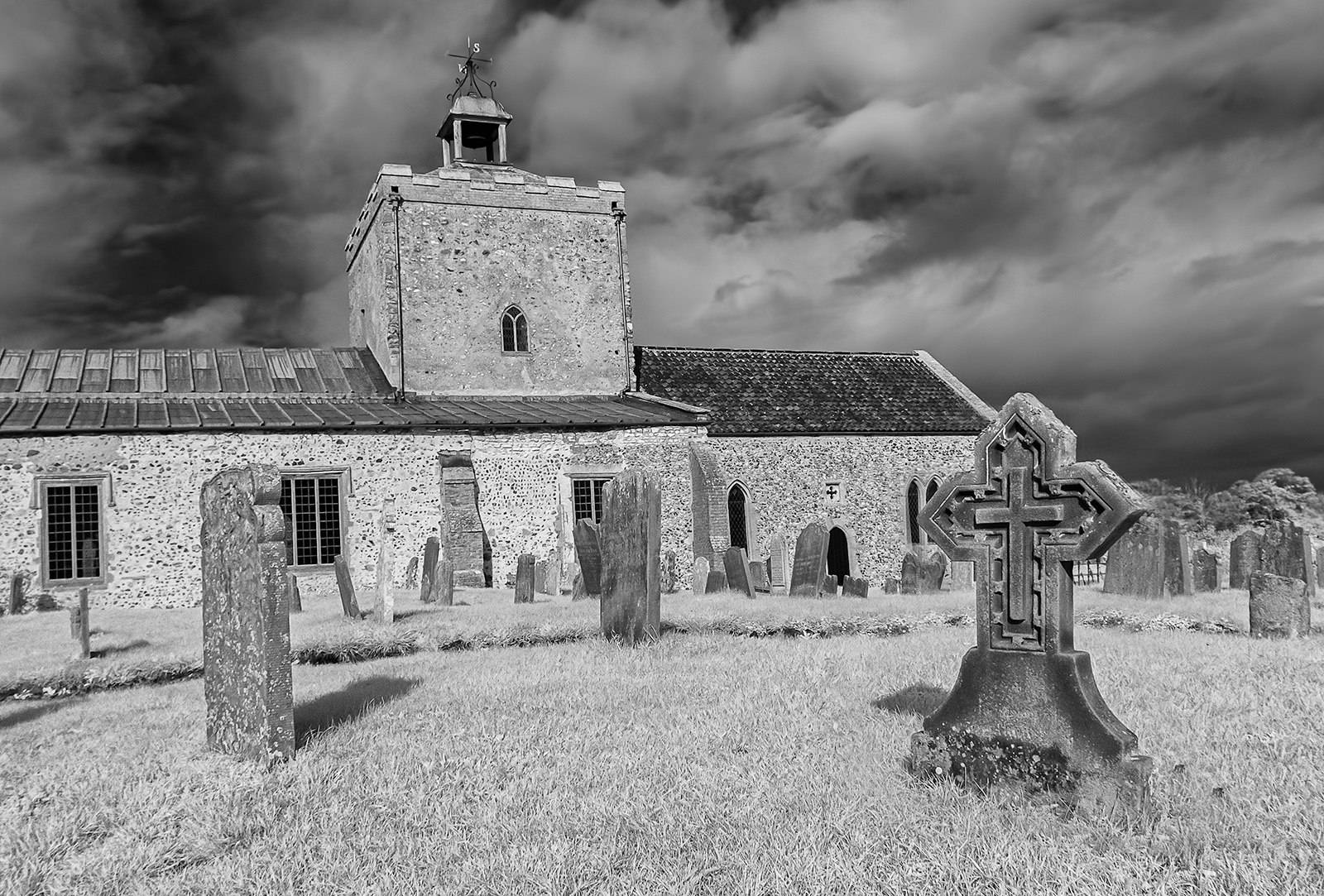
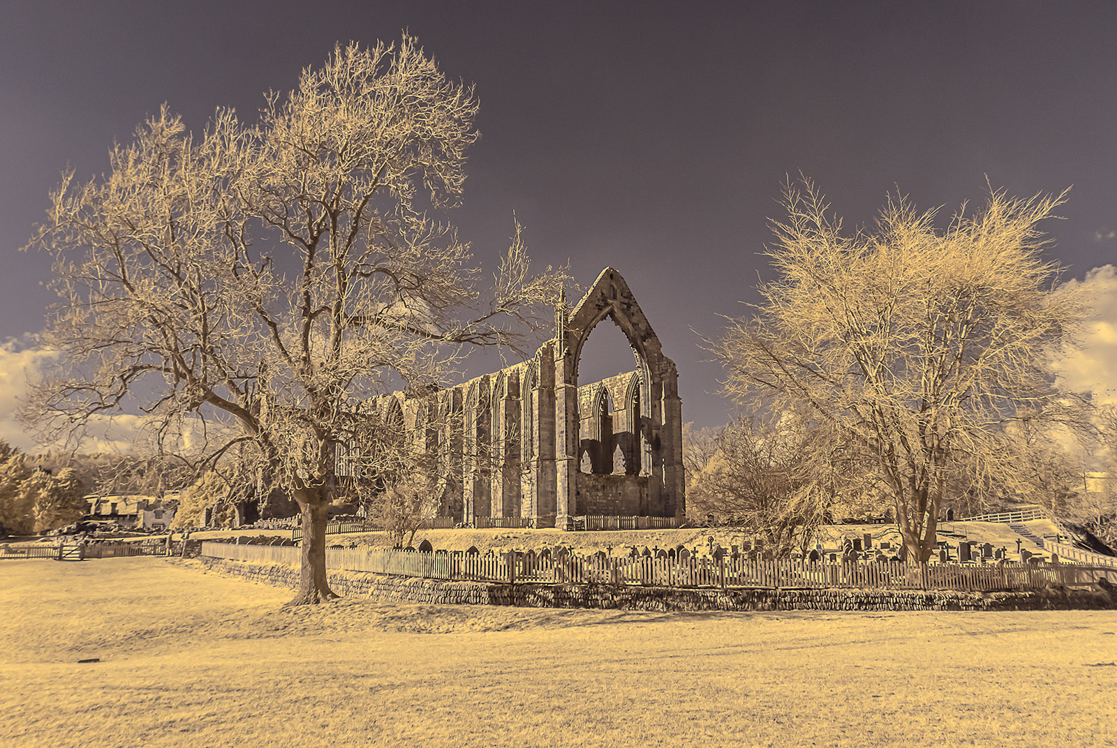
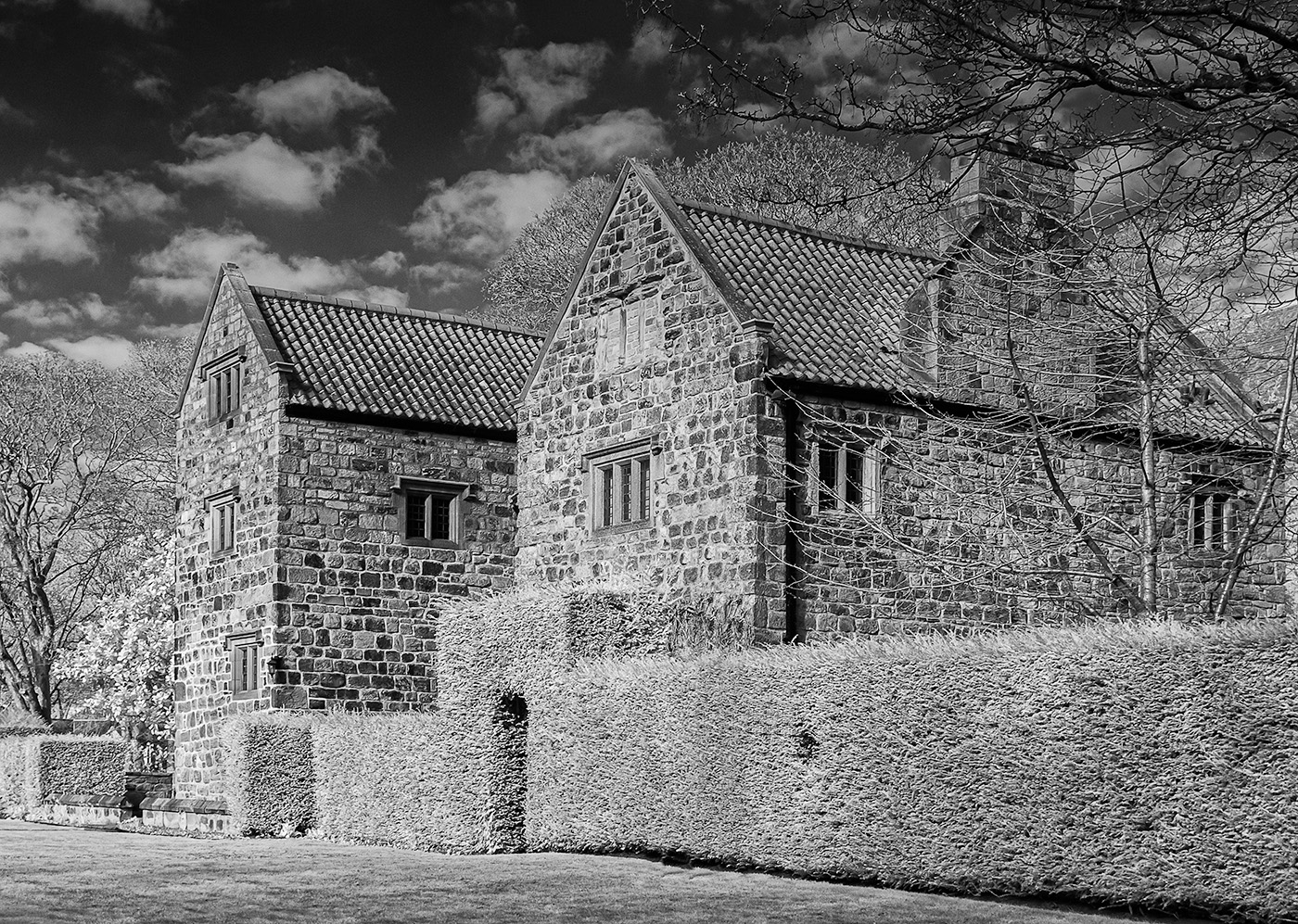
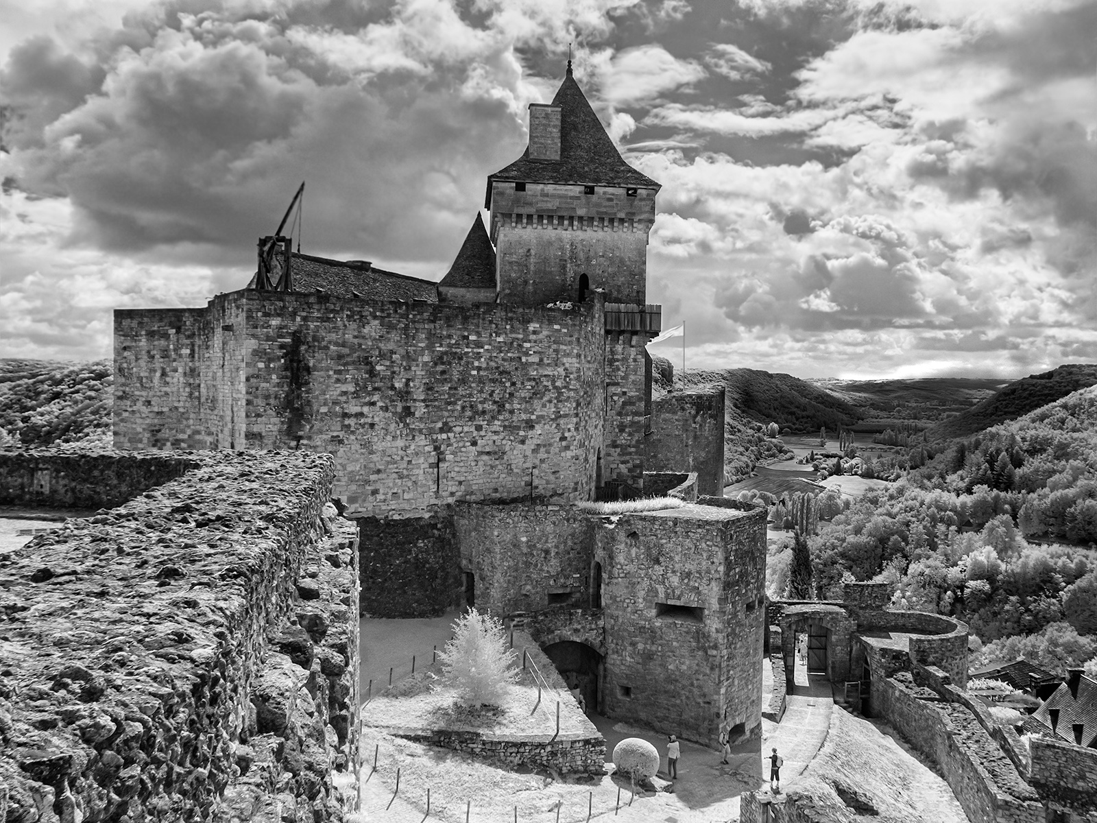
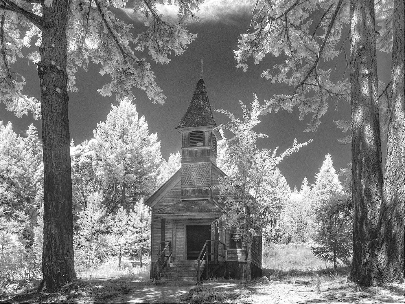
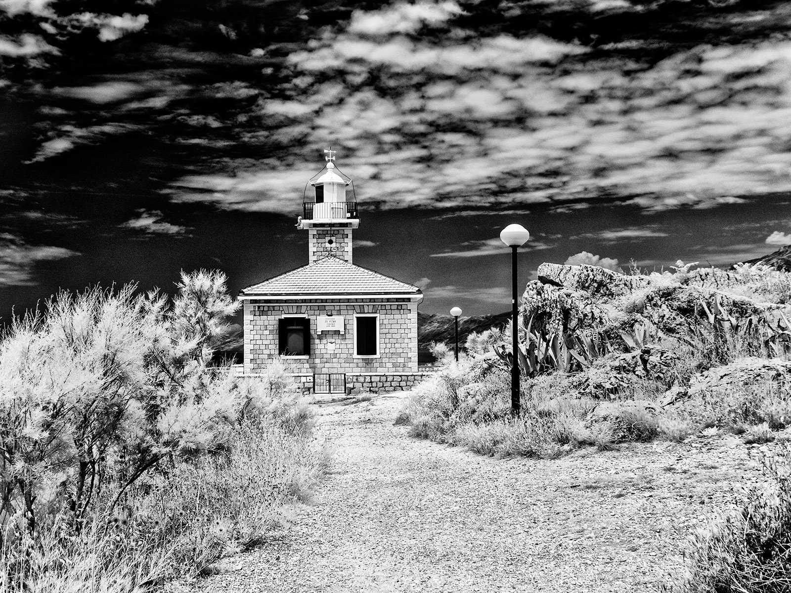
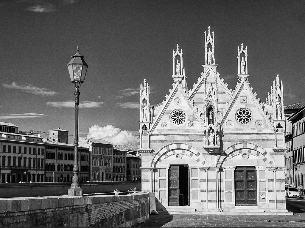
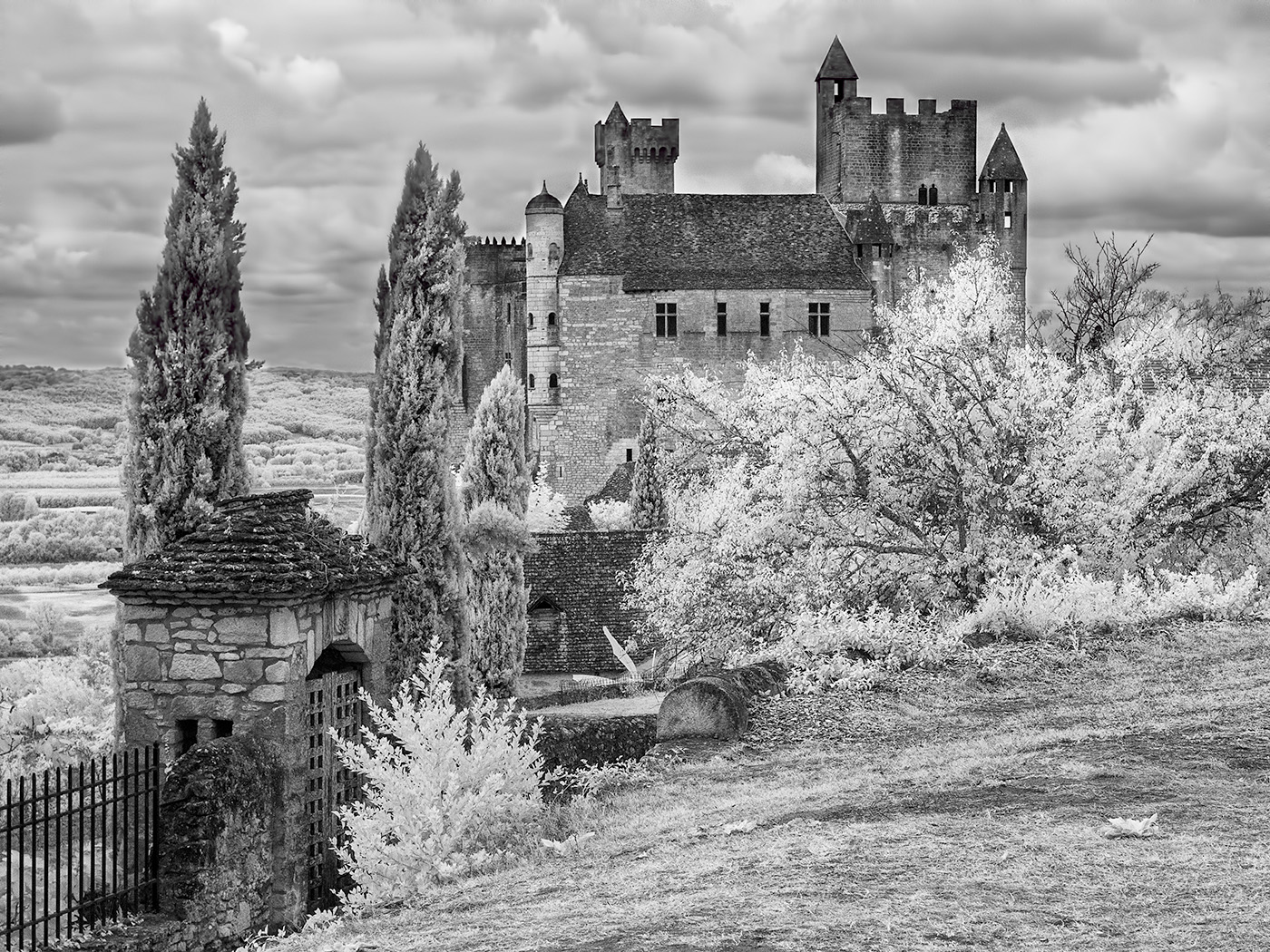
I like the angle you have taken the tower from i.e. straight on and find the tones and detail in the stonework particularly appealing. However for me the interesting part of this image is all on the right hand side. If it were mine I would crop the left hand side off. I feel this would emphasise the tower. You could either crop it just to the left hand side of the tower or leave a little more in so as to include the two figures which give a sense of scale. I think the former which creates a portrait format works particularly well as it simplifies the image and creates a much stronger impression. |
Dec 11th |
| 35 |
Dec 17 |
Comment |
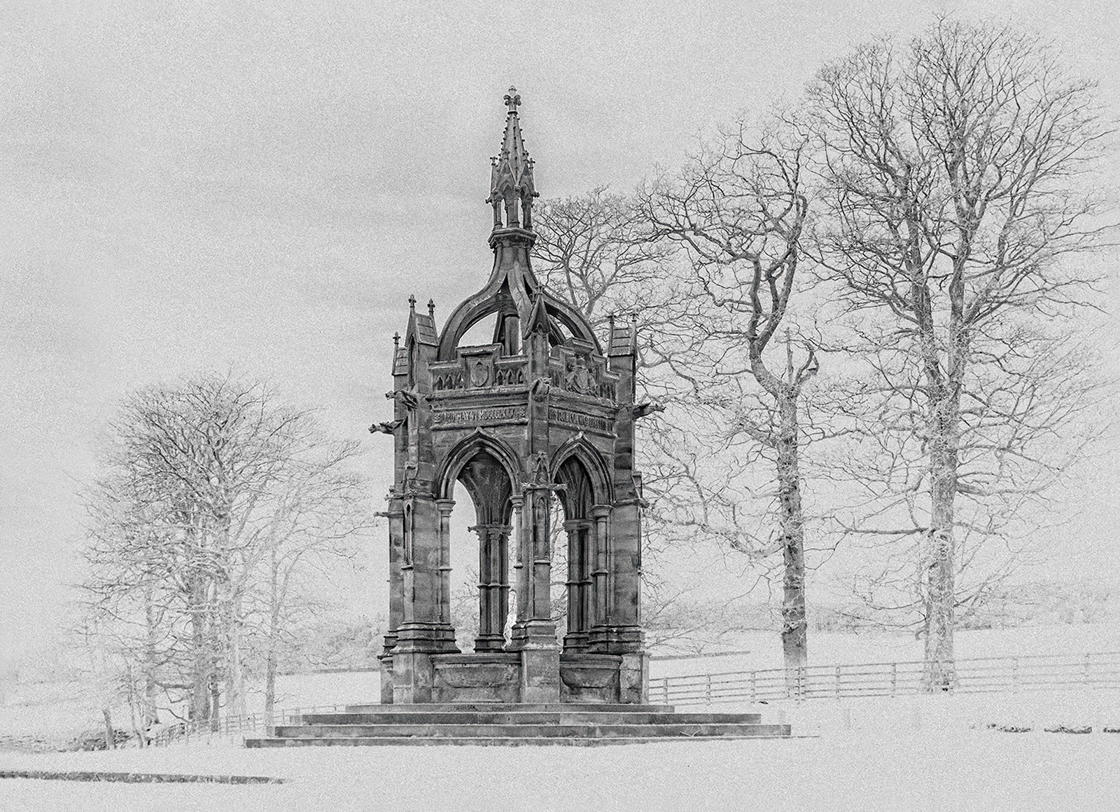
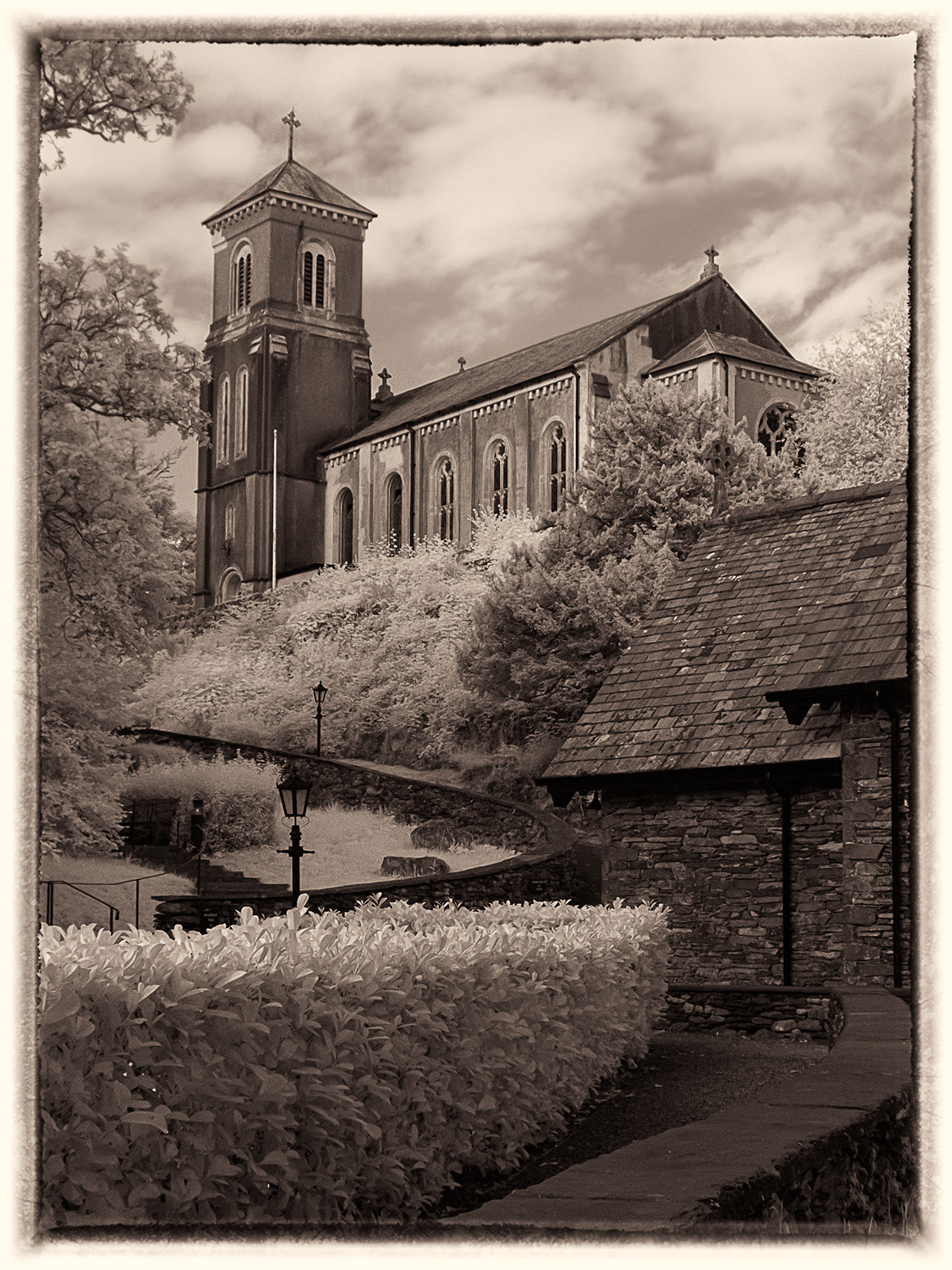
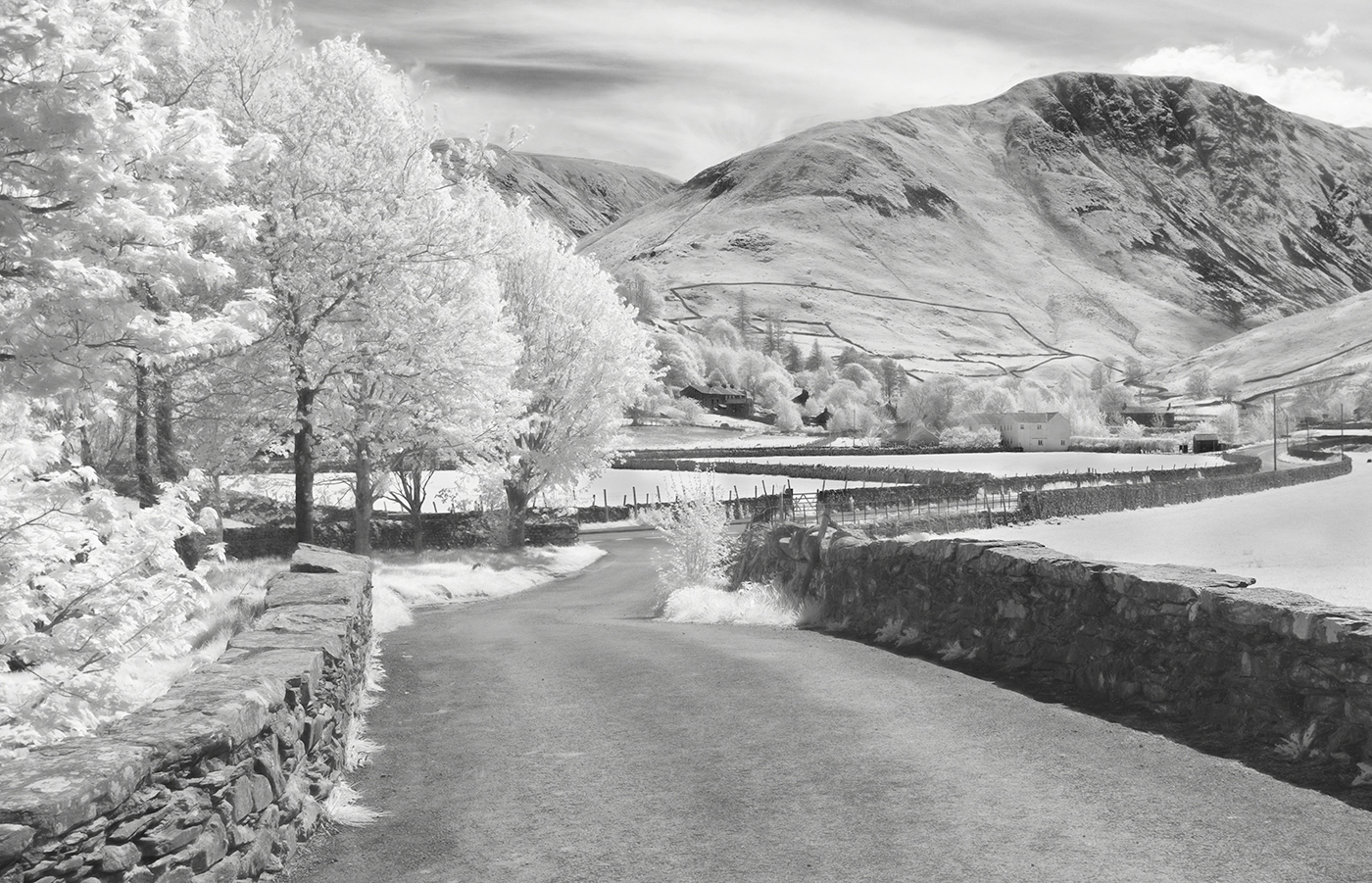
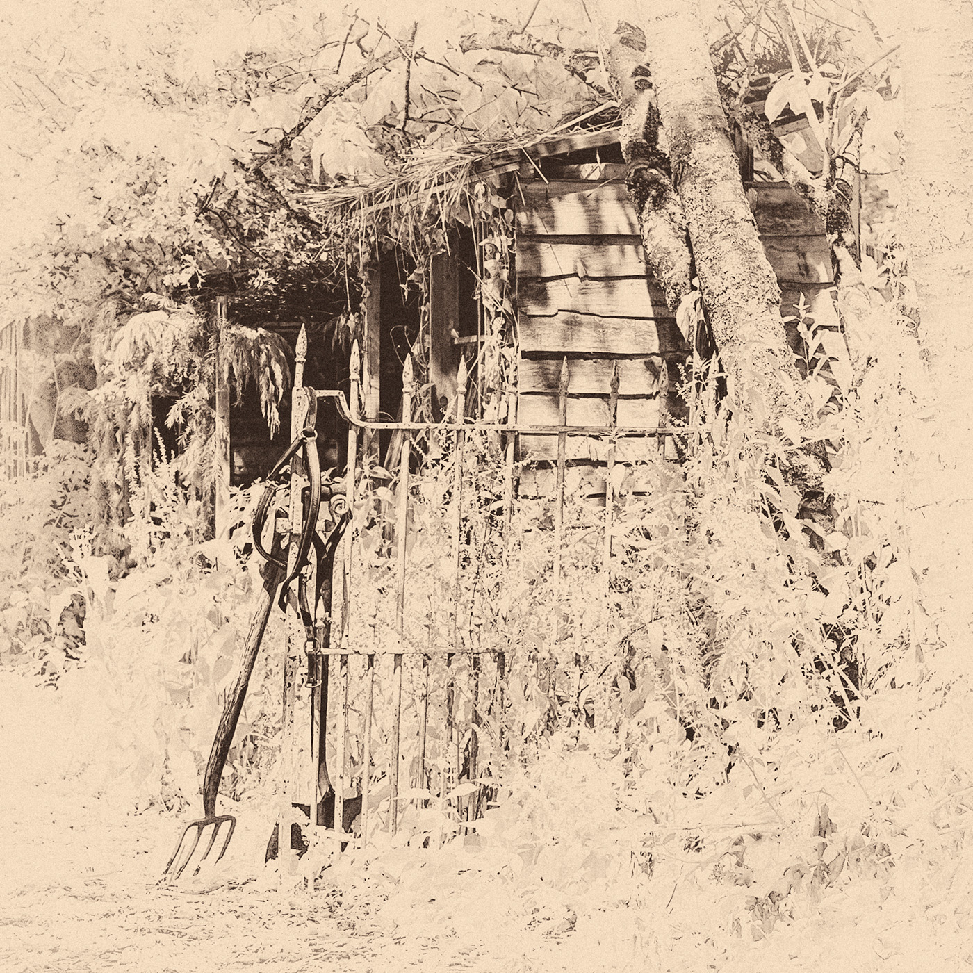
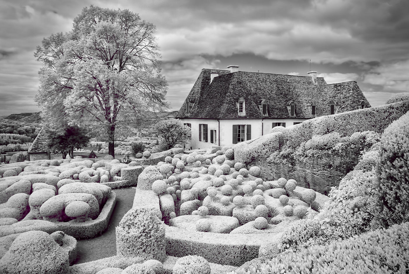
This image is full of interest. I like the rows of vines that lead to the building and water tower which provides a strong focal point. The sky is rather bland and in my opinion adds nothing to the image. I feel that cropping the top of the image above the little tree on the right in the background which I rather like, and cropping the image on the left would improve it. I would also clone out the telegraph pole on the right hand side. Changing these few elements would I feel turn it in to a strong image. |
Dec 11th |
| 35 |
Dec 17 |
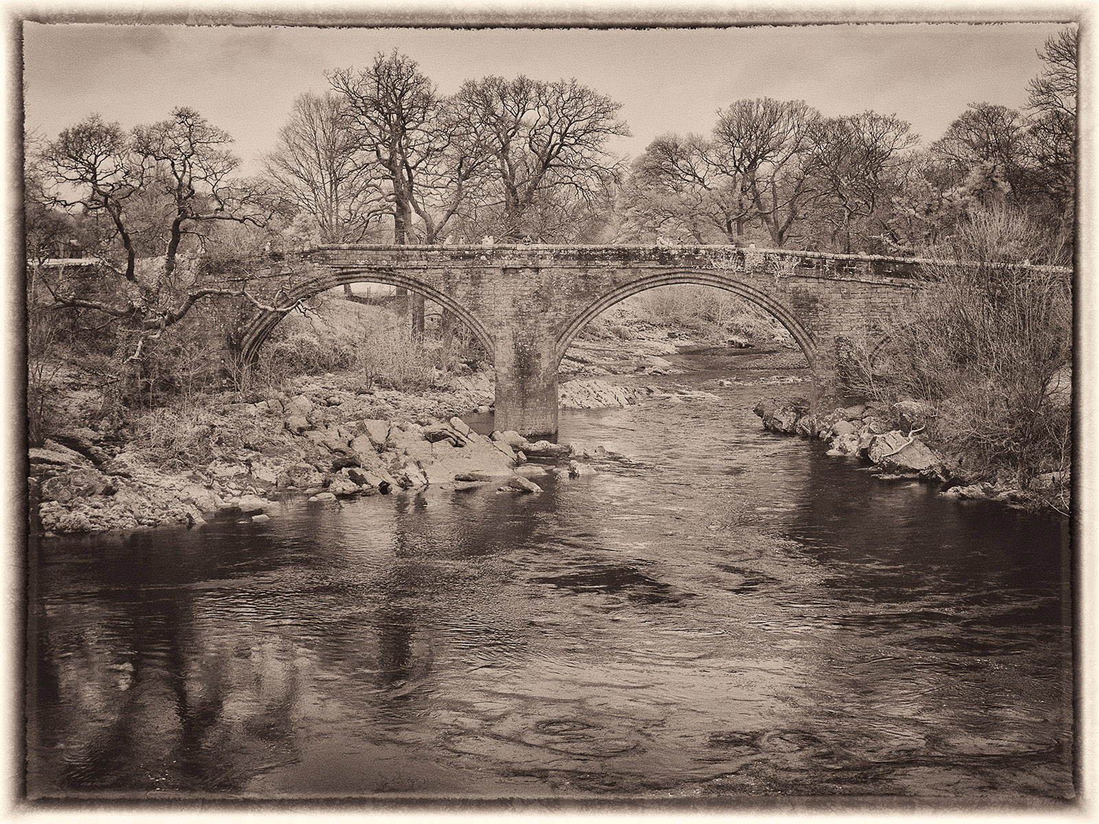
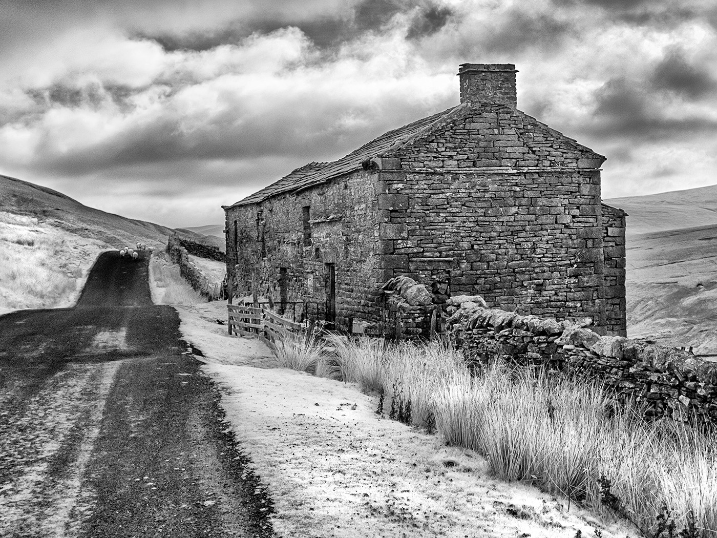
Comment |
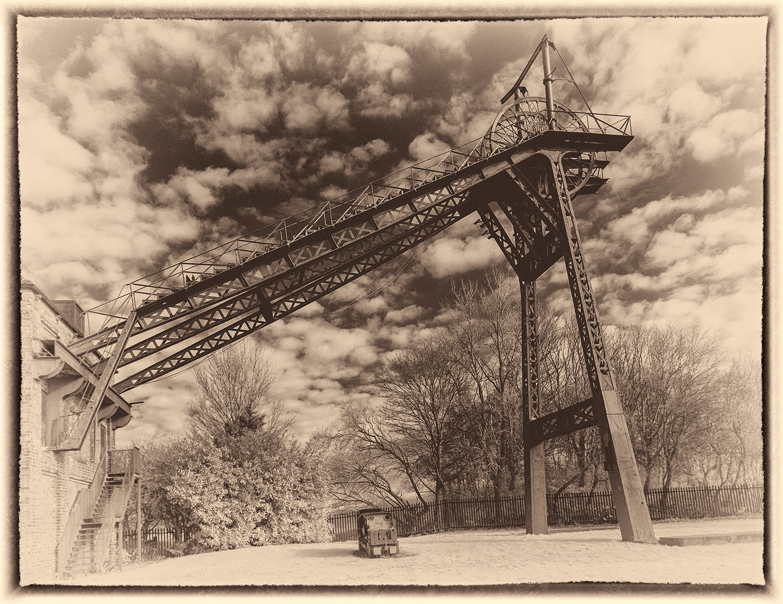
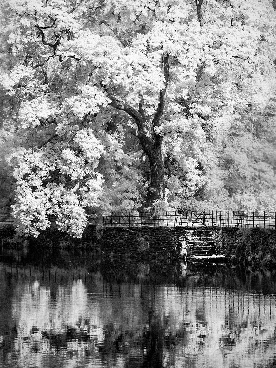
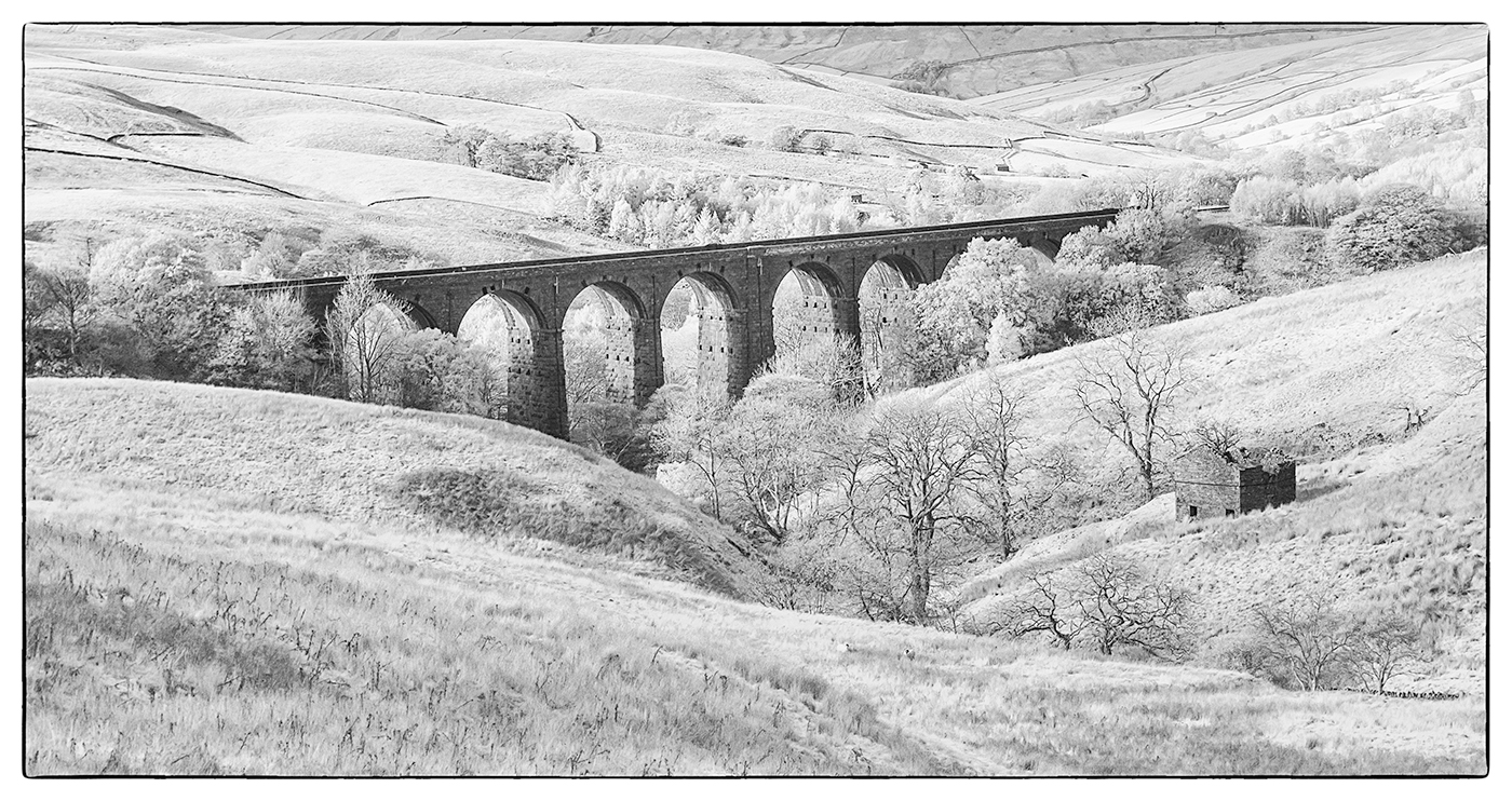
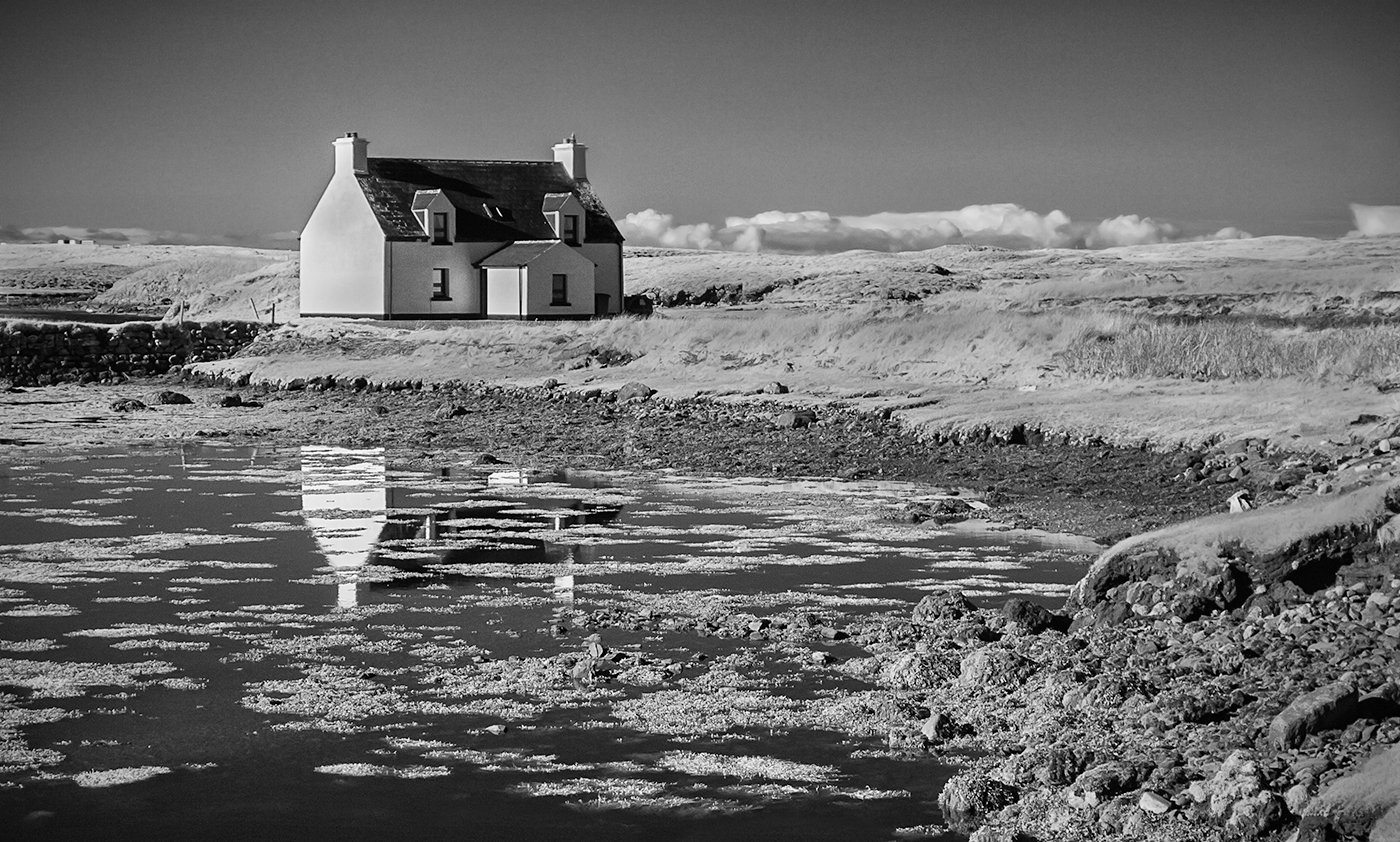
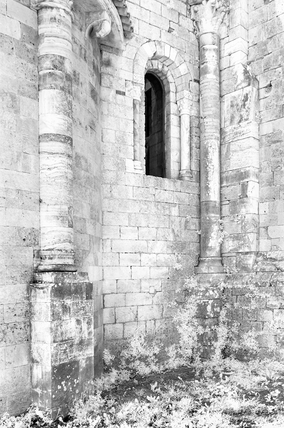
This was probably a scene with a huge difference between the highlights and shadows so you have wisely chosen to use HDR which has given you a good range of tones. I like the way you have used the river valley as a strong diaganol in the image and I also like the details of the trees in the foreground. For me though I would like to see a stronger focal point in the image. I appreciate that this may not have been possible from your chosen view point. |
Dec 11th |
4 comments - 1 reply for Group 35
|
4 comments - 1 reply Total
|