|
| Group |
Round |
C/R |
Comment |
Date |
Image |
| 35 |
Apr 17 |
Reply |
Thank you Arnold. Still life is a relatively new area of photography for me and I am still struggling to work out which lighting effects suit different types of images the best. I will certainly have a look at the RPS article, thank you for the suggestion. |
Apr 30th |
| 35 |
Apr 17 |
Comment |
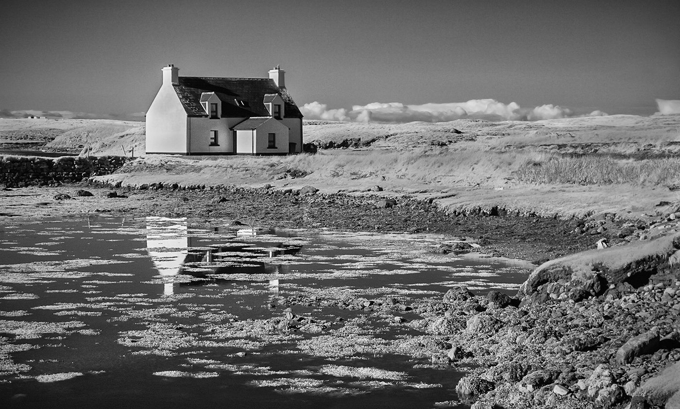
I really like the sky in this image, particularly the clouds. I also like the treatment you have given the bench. I just feel that the image needs another element, maybe a ship on the horizon, some people on the bench or even more seagulls in the sky to add interest. I might also have cropped more of the road out on the left hand side as it leads my eye out of the image. Just my opinion of course. |
Apr 11th |
| 35 |
Apr 17 |
Comment |
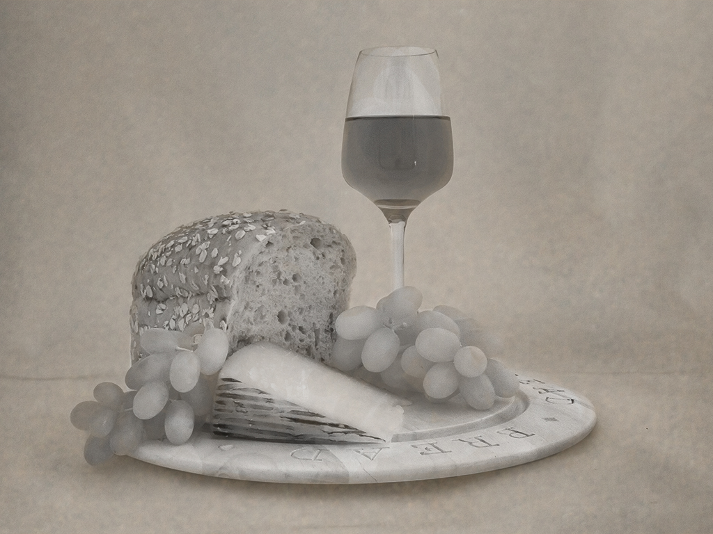
Thank you for your comments Sharon. As you can see from my response to Helen I was expecting there to be a greater tonal range in the original. I will have a go at selectively lightening and darkening areas as you suggest as I agree that this would improve the image. |
Apr 11th |
| 35 |
Apr 17 |
Reply |
Thank you for your comments Helen. When I took this I rather expected the green grapes to turn out white and the red wine to be darker which would have given a wider range of tones in the image. I'm not sure why they didn't. I had several attempts at converting this to mono but still couldn't get the effect I was seeking, hence my conclusion that the light was just too soft. I will have another go. |
Apr 11th |
| 35 |
Apr 17 |
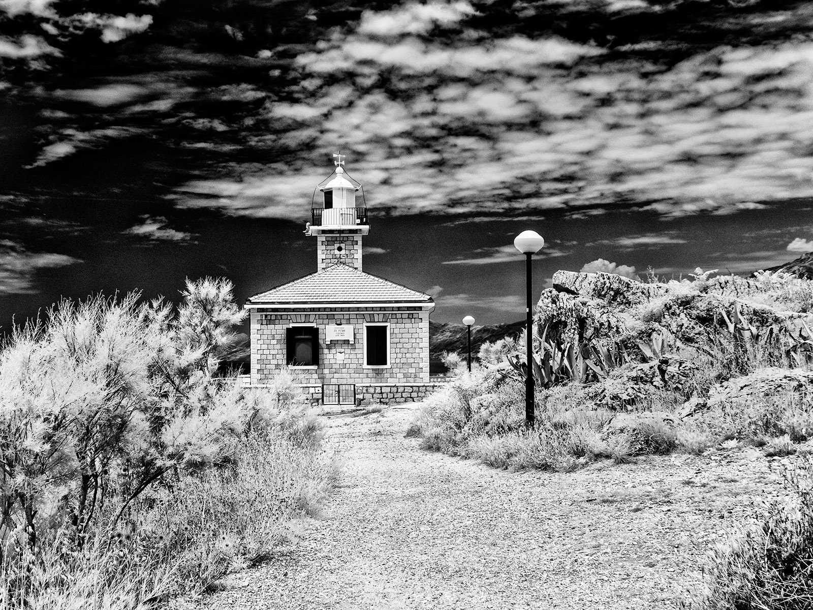
Comment |
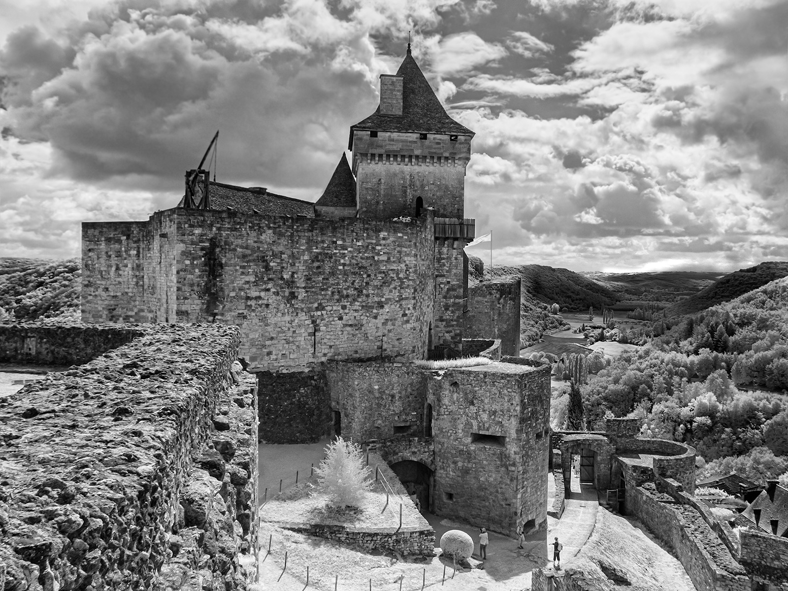
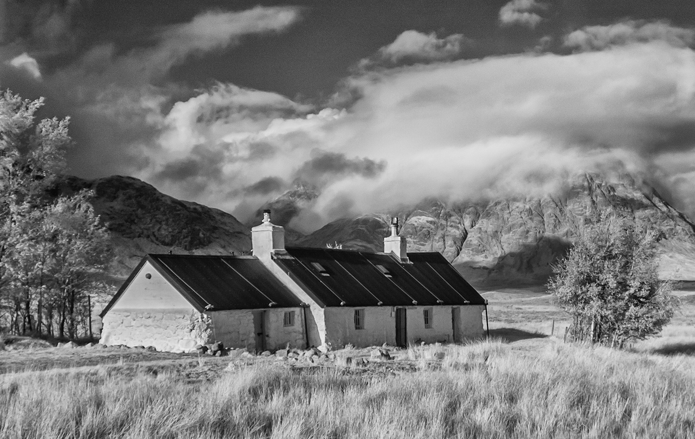
I really like the humour of this image. It is a perfect subject for IR and the contrast between the foliage and the figure works well. This is not a location that I have visited but I will add it to my list. My only suggestion would be to darken down the foliage in the background to make the leaves of the tree stand out more. |
Apr 11th |
| 35 |
Apr 17 |
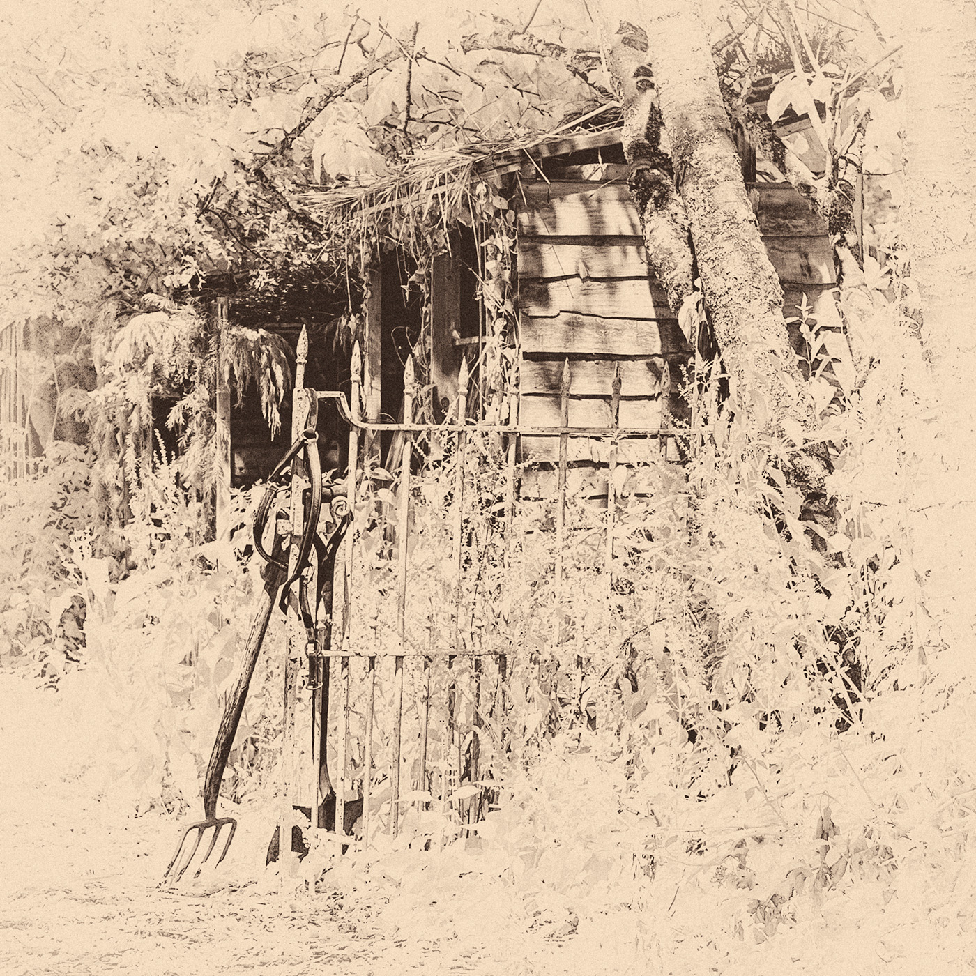
Comment |
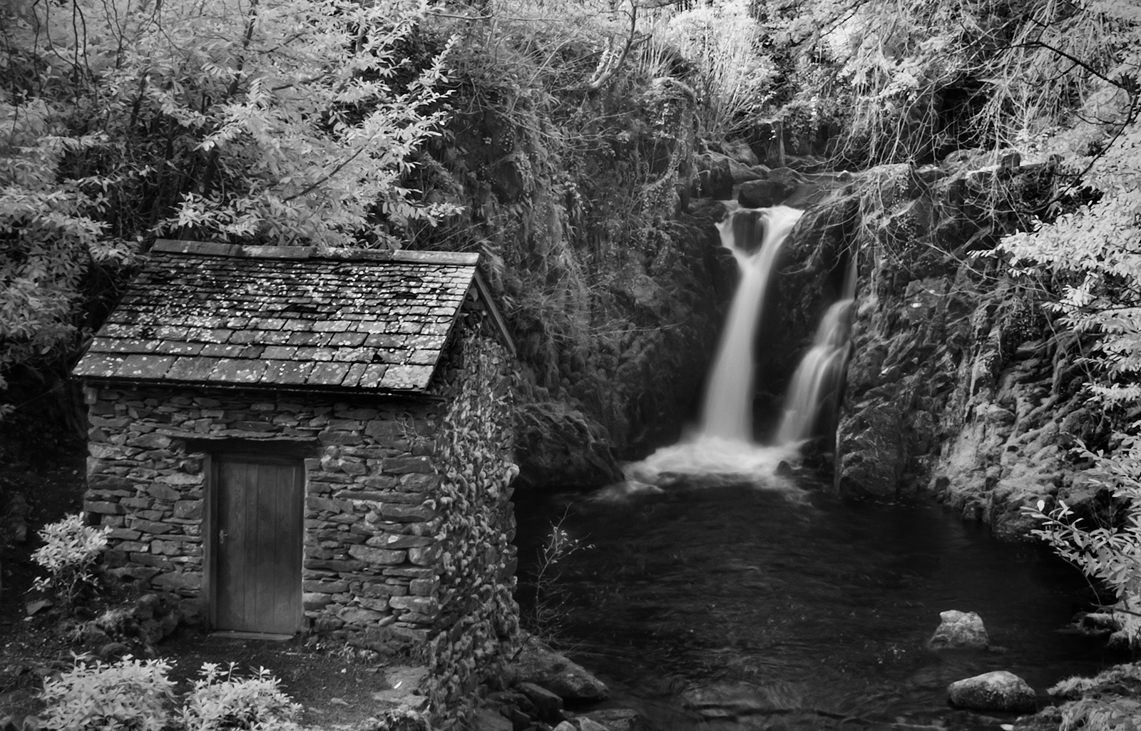
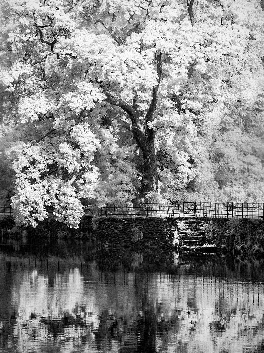
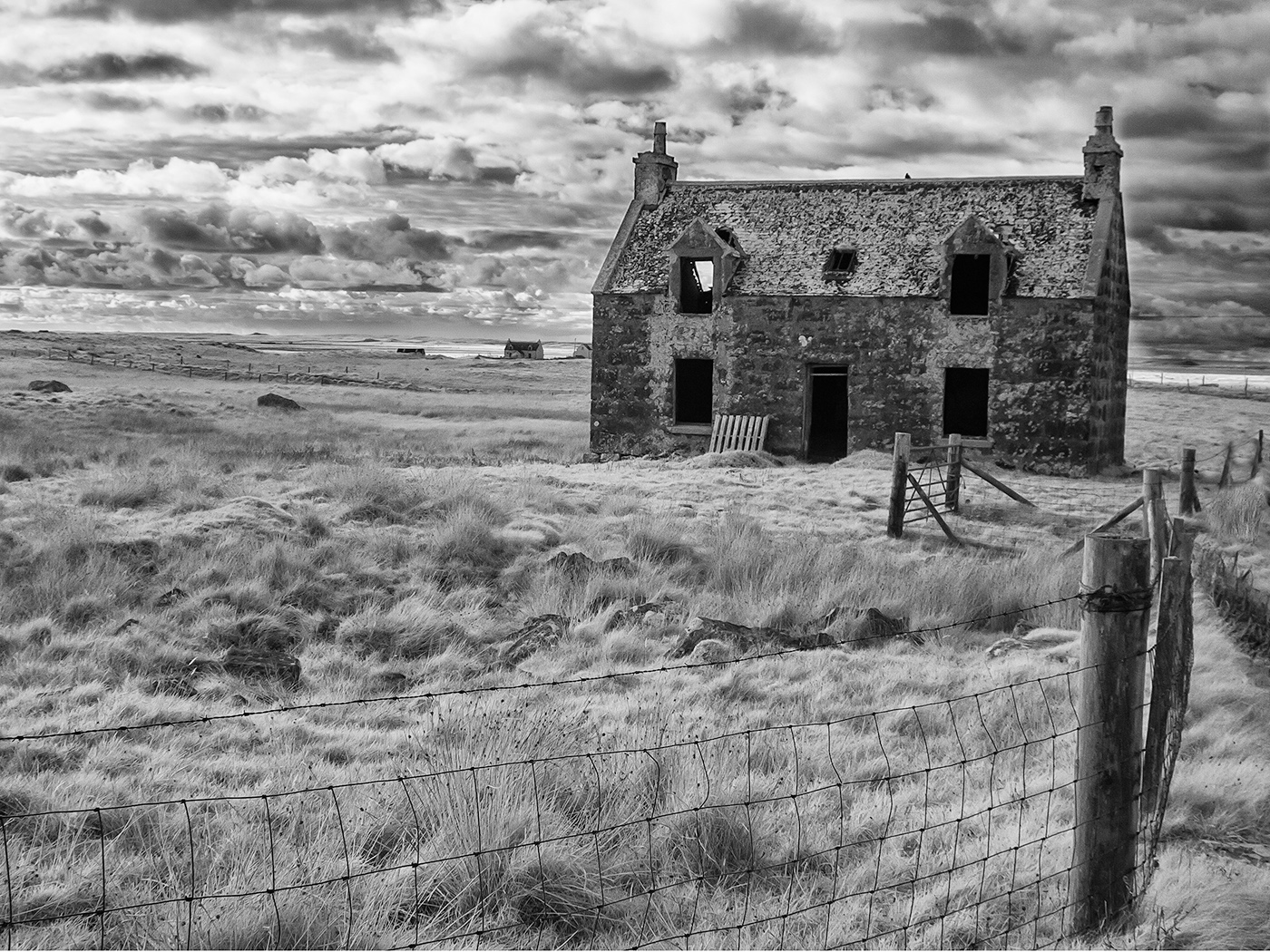
I agree with Helen regarding the fence and posts in the foreground, I think I might have been tempted to clone them out. Having said that the vines make a perfect subject for IR. I like the way the gap in the vines leads the eye through the image but I think the image might be improved with a tree or building at the end of this to provide a focal point. |
Apr 11th |
| 35 |
Apr 17 |
Reply |
Unfortunately it is so often the case that it is not possible to move off the path, or there are bushes, or a sheer drop that gets in the way!. It is as much a problem here as in the USA. |
Apr 11th |
| 35 |
Apr 17 |
Comment |
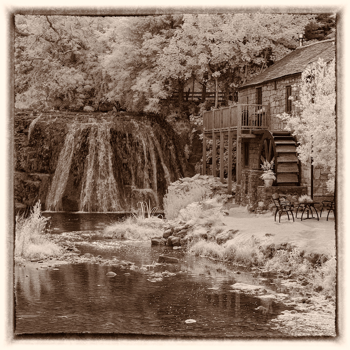
My initial reaction was also that the colours were a little saturated but having read your response to Helen I now appreciate that they are not. As Helen says we are more used to dull skies here in Cumbria and this may influence our perception and taste in terms of colour. I like the painterly effect that the oil paint filter gives and also that it seems to have eliminated most of the bland sky. For me the image is a little fussy and the path tends to lead my eye out of the picture. I don't know if it is possible to take the pool from a slightly different angle? |
Apr 11th |
5 comments - 3 replies for Group 35
|
5 comments - 3 replies Total
|