|
| Group |
Round |
C/R |
Comment |
Date |
Image |
| 50 |
Jan 20 |
Reply |
Thanks. |
Jan 29th |
| 50 |
Jan 20 |
Comment |
I like the expression on their faces and the action. The problem is with the goal post, it does bother me. If only it was on the other side, it sort of stops your eye looking at it and you cannot get into the rest of the image. Maybe showing more of the post. It would be a perfect image if you could flip it, but that won't work. Cropping the post off, you then lose what is happening, hard to tell it is a goal post. I think that is the main problem with the image, the post is just on the wrong side of the image. I would try it, but if it does poorly then you can blame it on the goal post. |
Jan 26th |
| 50 |
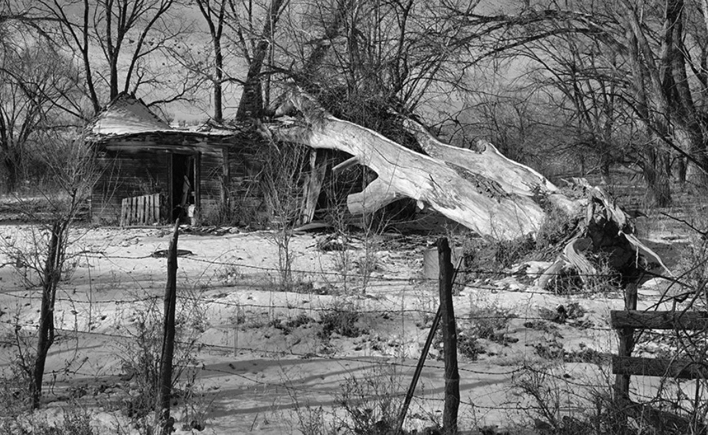
Jan 20 |
Comment |
I like the mono version the best, the only change would be to crop off some of the top, I think think it is really necessary. I would also crop some off of the sides, especially if the tree and the house are the main subject. |
Jan 26th |
 |
| 50 |
Jan 20 |
Comment |
I think it is a great shot, a cannot think of anything I would change.
|
Jan 26th |
| 50 |
Jan 20 |
Comment |
That certainly looks better. I like the eye a lot more in this as well, nicely done. |
Jan 25th |
| 50 |
Jan 20 |
Comment |
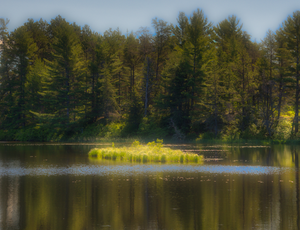
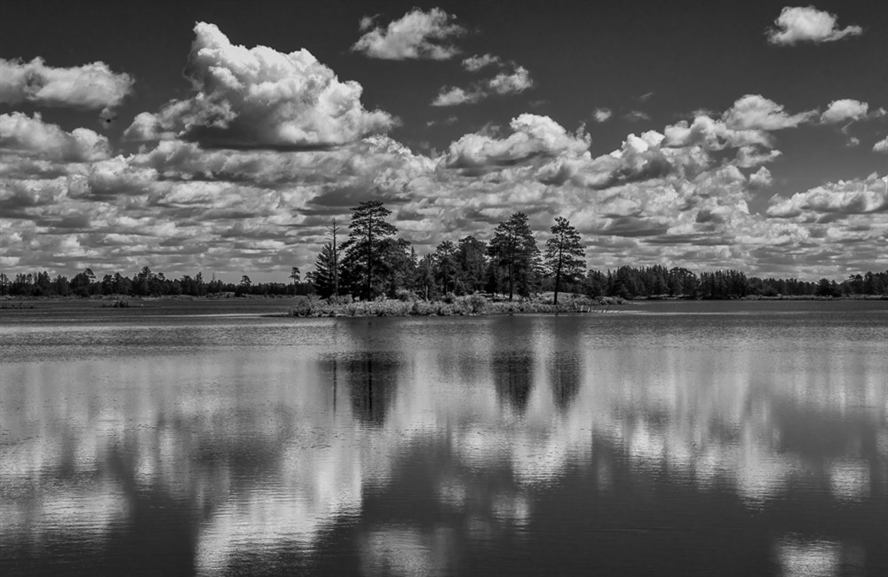
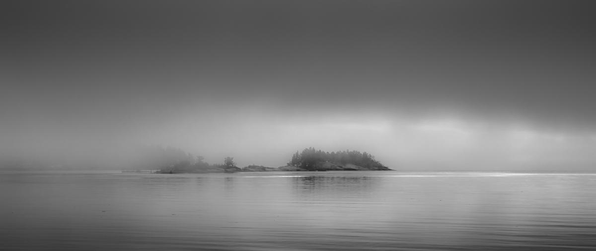
I like foggy shots like this. Just a few suggestions, to me the color looks foggier than the mono versions, so I took the mono version and dropped both Clarity and Dehaze to almost -100, this brought back more of the foggy look. I then used a grad filter to darken the very bottom of the water, plus I also did a -100 in clarity and dehaze to soften the water. I did the same thing to the very top of the clouds. This makes the island lighter and draws your eye to it more. |
Jan 24th |
 |
| 50 |
Jan 20 |
Comment |
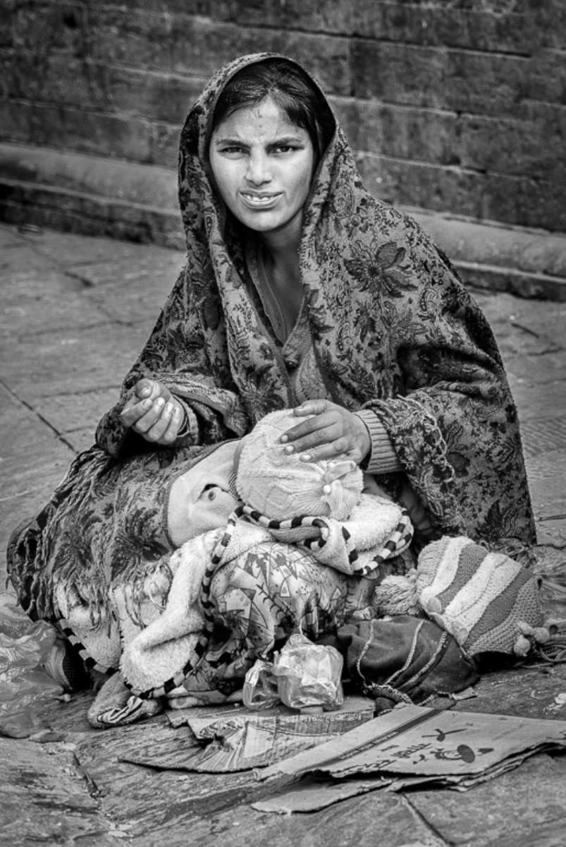
I agree with both Cindy and Lorna, the mouth is distracting on this one, otherwise, the mono version gets rid of distractions and draws your attention to the person.
I did some retouching to the face, I got rid of the lines from the nose to the mouth, plus the line across her nose. I then used liquify to make her mouth look happier than she does now. This probably goes too far, but I like this look quite a bit more than the sour look on her face. An Interesting person. |
Jan 24th |
 |
| 50 |
Jan 20 |
Comment |
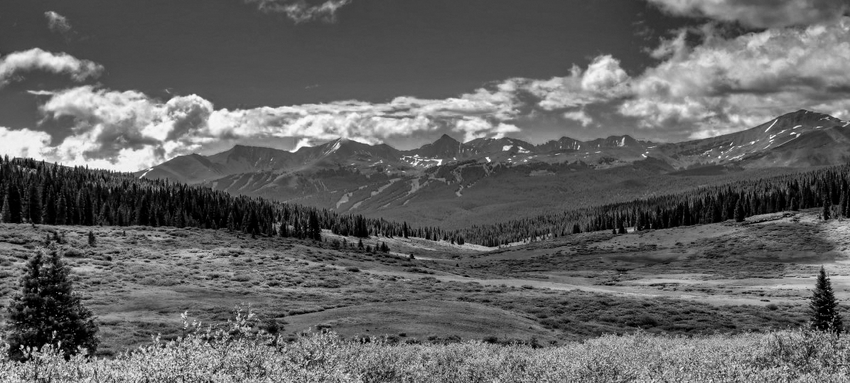
I like what David did to remove some dead space, I also darkened the sky by using the camera raw in photoshop under the B/W sliders, I did a +15 yellow, +19 Green, -14 Blue, -34 Purple. This darkened the sky lightened the grass and some trees. Plus opened the shadows and darkened the highlights. |
Jan 24th |
 |
7 comments - 1 reply for Group 50
|
| 59 |
Jan 20 |
Comment |
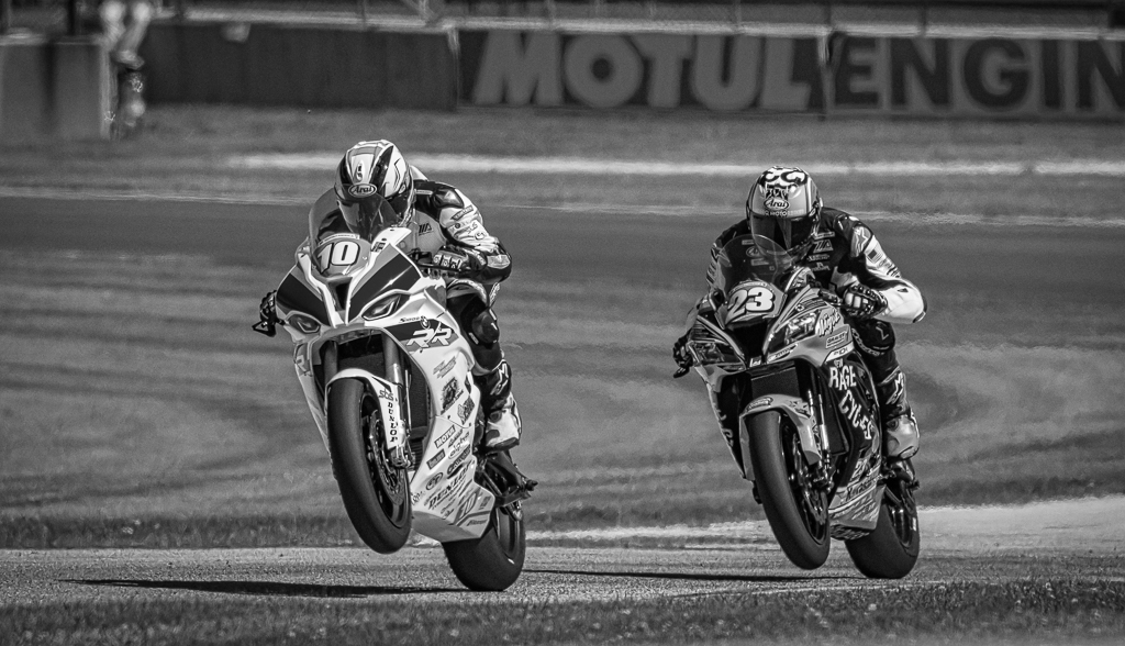
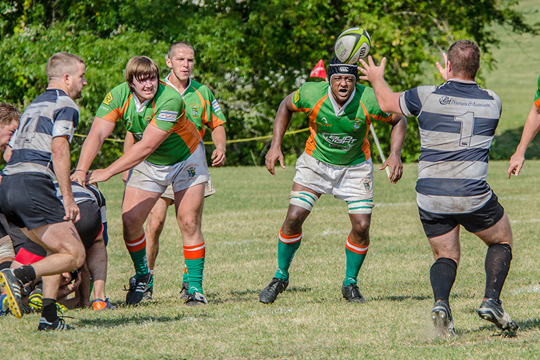
Here is a second cropping idea, get rid of the two players on the right, they are not as much of a part of the story as the ones on the left. The one arm is a little distracting, but the story comes across better. |
Jan 28th |
 |
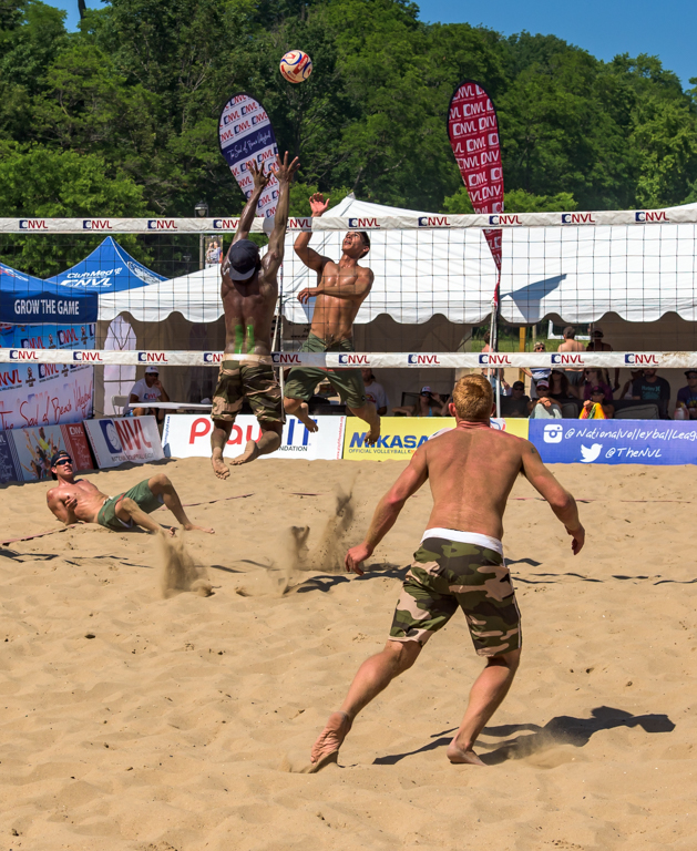
| 59 |
Jan 20 |
Comment |
I think you need to keep all the players in the shot, it tells more of a story, otherwise, you do not know where the ball is coming from, so the image makes more sense. I would crop off from the top and bottom, neither is needed for the image. |
Jan 28th |
|
2 comments - 0 replies for Group 59
|
9 comments - 1 reply Total
|