Activity for User 571 - Jeffrey Klug - kpw1255@me.com
Avatar
Close this Tab when done
440 Comments / 54 Replies Posted
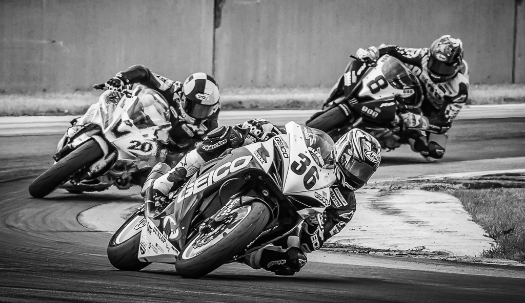
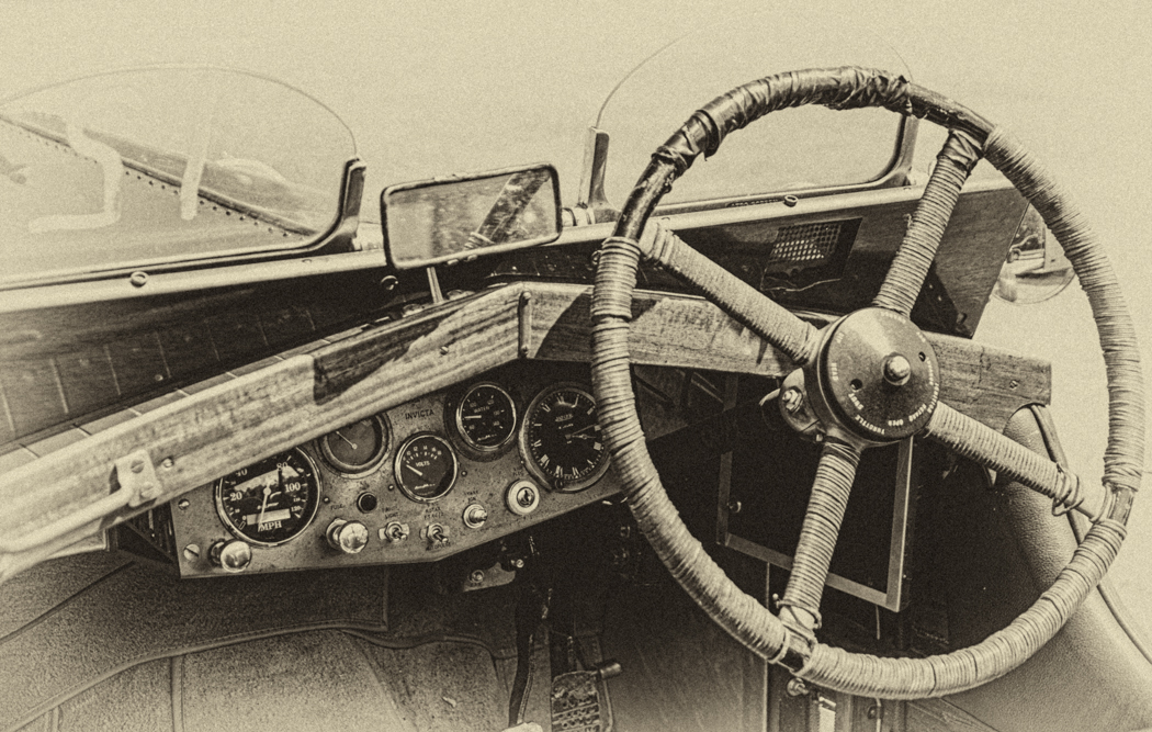
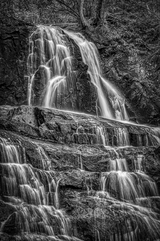
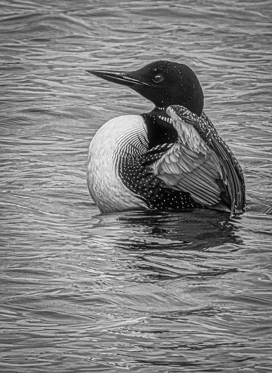
82 Images Posted
| = Current Round | = Previous Round |
| Group 46 | |||||||||||
|---|---|---|---|---|---|---|---|---|---|---|---|
 Jun 18 |
 May 18 |
 Mar 18 |
 Feb 18 |
 Jan 18 |
 Dec 17 |
 Nov 17 |
 Oct 17 |
 Sep 17 |
 Aug 17 |
 Jul 17 |
 Jun 17 |
 May 17 |
 Apr 17 |
 Mar 17 |
 Feb 17 |
 Jan 17 |
|||||||
| Group 50 | |||||||||||
 Jul 21 |
 Jun 21 |
 Apr 21 |
 Mar 21 |
 Feb 21 |
 Jan 21 |
 Dec 20 |
 Oct 20 |
 Aug 20 |
 Jul 20 |
 Jun 20 |
 May 20 |
 Apr 20 |
 Mar 20 |
 Feb 20 |
 Jan 20 |
 Dec 19 |
 Nov 19 |
 Oct 19 |
 Sep 19 |
 Aug 19 |
 Jul 19 |
 Jun 19 |
 May 19 |
 Apr 19 |
 Mar 19 |
 Feb 19 |
 Jan 19 |
 Dec 18 |
 Nov 18 |
 Oct 18 |
 Sep 18 |
 Aug 18 |
 Jul 18 |
 Jun 18 |
 May 18 |
 Mar 18 |
 Feb 18 |
 Jan 18 |
 Dec 17 |
 Nov 17 |
 Oct 17 |
 Sep 17 |
 Aug 17 |
 Jul 17 |
 Jun 17 |
 May 17 |
 Apr 17 |
 Mar 17 |
 Feb 17 |
 Jan 17 |
|||||||||
| Group 59 | |||||||||||
 Jun 18 |
 May 18 |
 Mar 18 |
 Feb 18 |
 Jan 18 |
 Nov 17 |
 Oct 17 |
 Sep 17 |
 Aug 17 |
 Jul 17 |
 Jun 17 |
 Mar 17 |
 Feb 17 |
 Jan 17 |
||||||||||