|
| Group |
Round |
C/R |
Comment |
Date |
Image |
| 46 |
Jun 18 |
Reply |
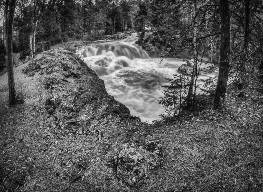
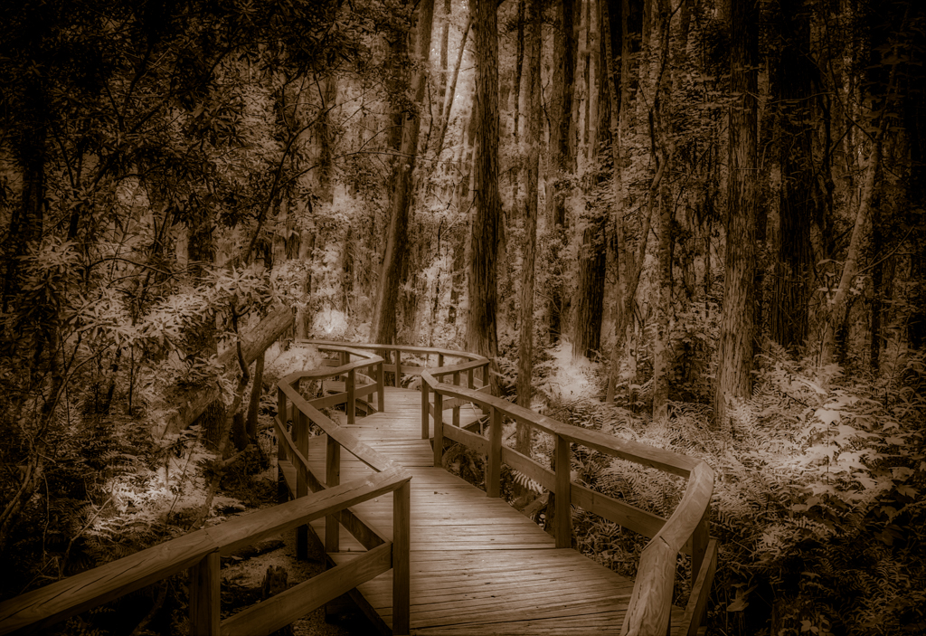
Don, that was somewhat the idea, as I walk through I really did not see any birds except at the entrance, partway through I wanted to get something from this walk and thought of how peaceful and dreamlike it was. Gatorland has a lot to offer, my favorite place for bird photography. |
Jun 30th |
| 46 |
Jun 18 |
Reply |
Richard, thanks that is what I was trying to do. |
Jun 30th |
| 46 |
Jun 18 |
Comment |
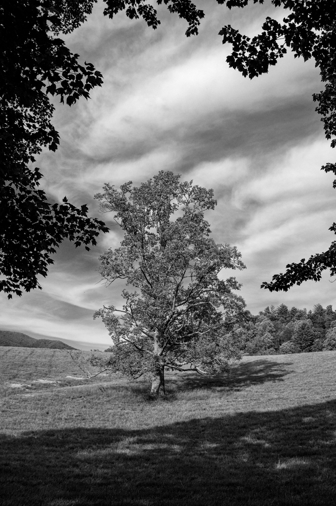
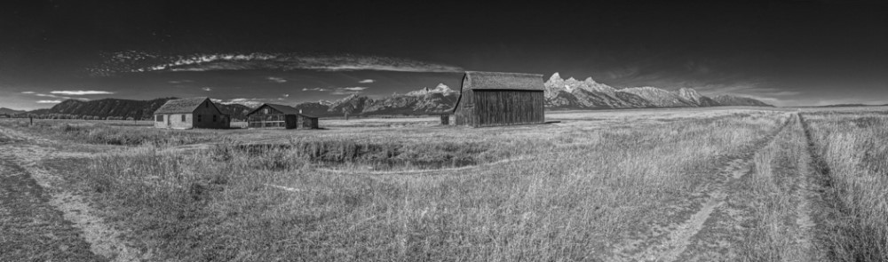
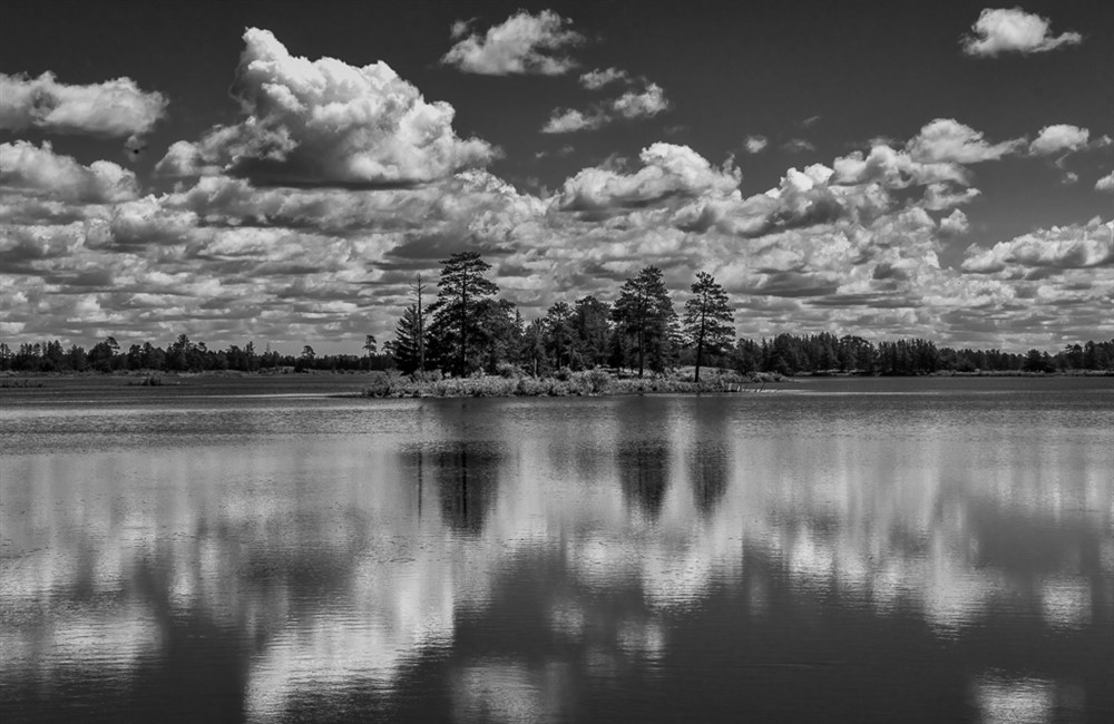
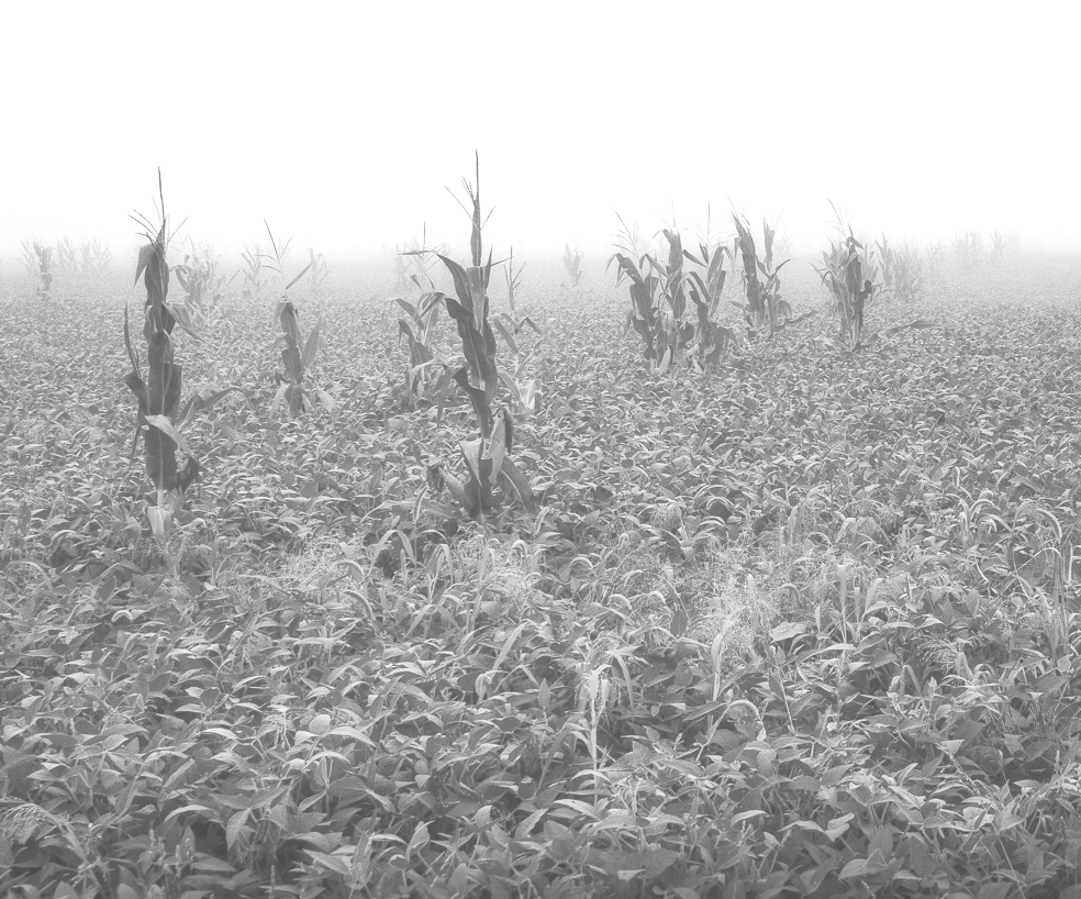
Wanda, such a nice peaceful image, I agree with Gary's fixes, otherwise I would not change a thing, I love fog and old barns. You do fine some interesting subjects to photograph. |
Jun 30th |
| 46 |
Jun 18 |
Comment |
Paul,
Nice shot, does seem a little soft, I added just a bit more contrast and then added glow filter from On1 Raw to make it look like less out of focus or soft. I like your clouds and composition and the softness of the image is not a big deal. You might also fix that using a little negative clarity to give the image a little bit of glow. |
Jun 30th |
 |
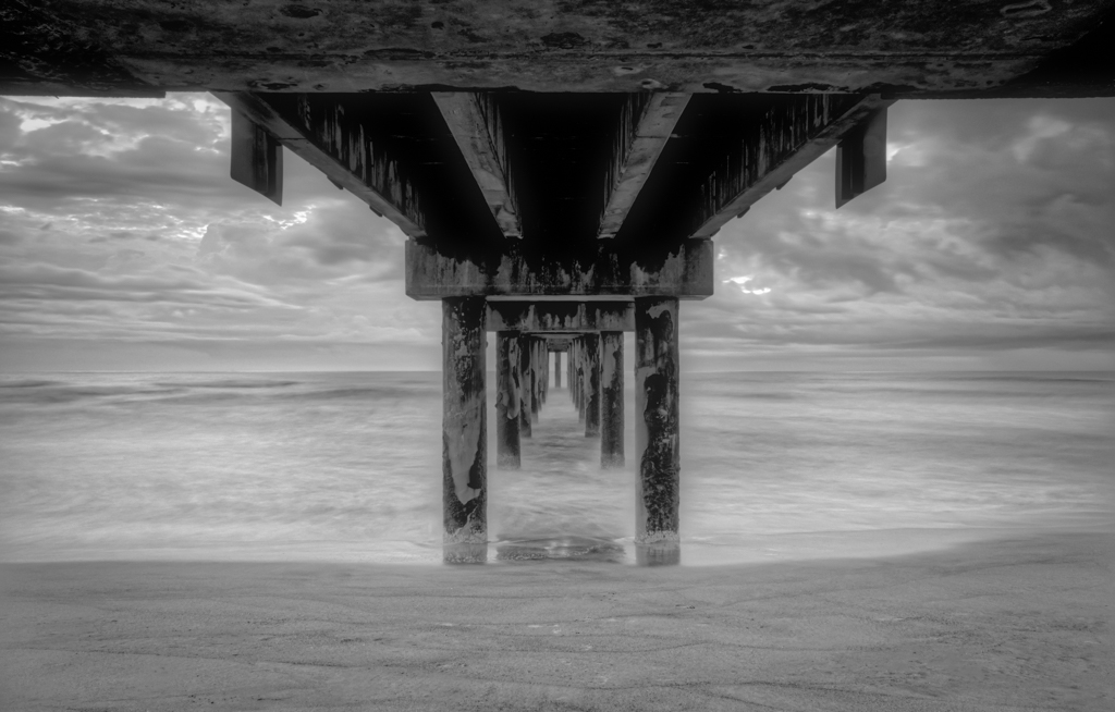
| 46 |
Jun 18 |
Comment |
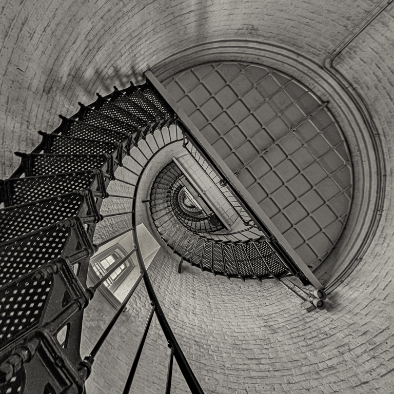
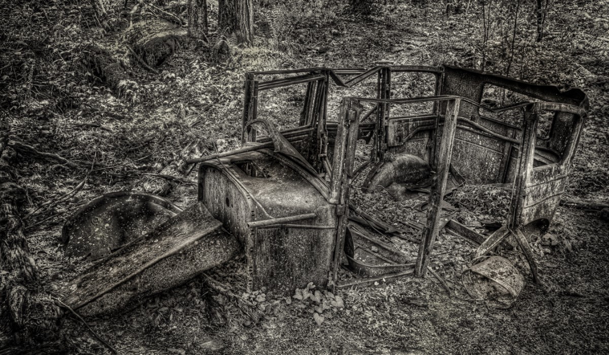
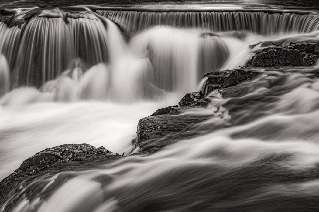
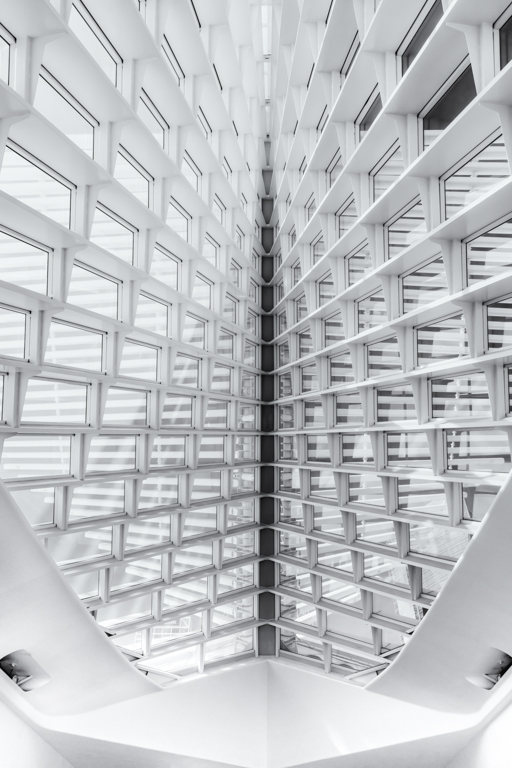
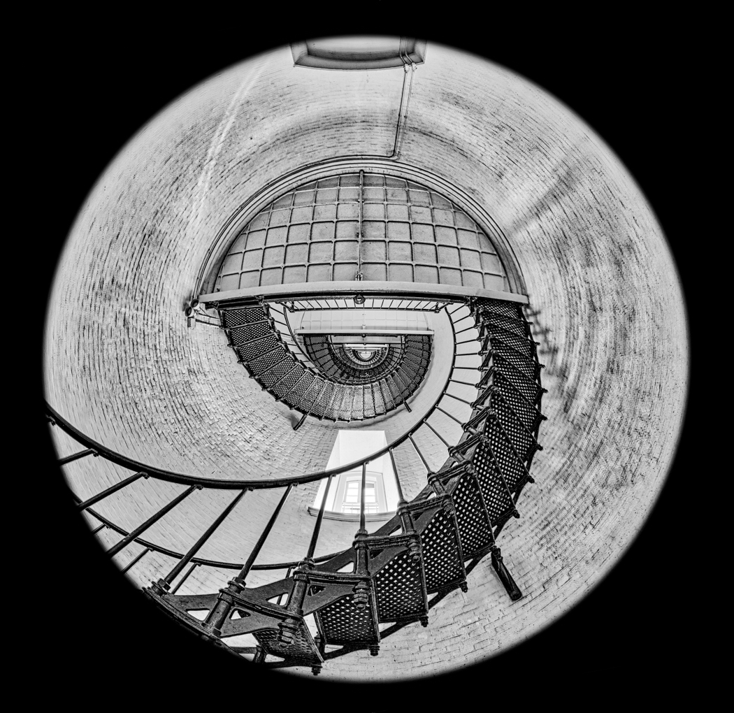
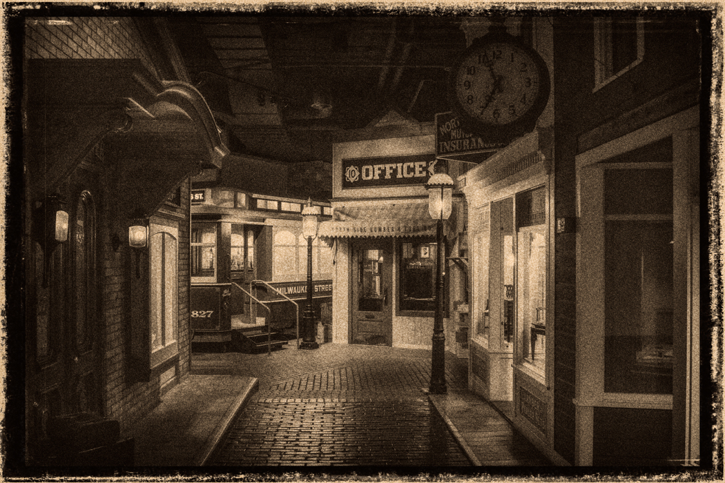
Richard,
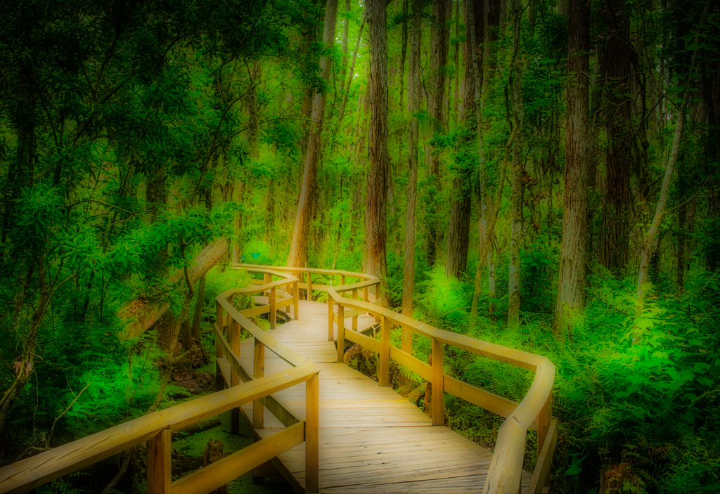
interesting detail, I could see spending hours in there. Have you tried using a flashlight to light different sections using light painting techniques? It could bring out such interesting detail.
I like the vignetted images it does focus you in a one section. There are so many different images in your one image, it is hard to stay in one place. The vignette does help.
I hope I can get there one of these days, it looks so interesting. |
Jun 30th |
| 46 |
Jun 18 |
Comment |
Don,
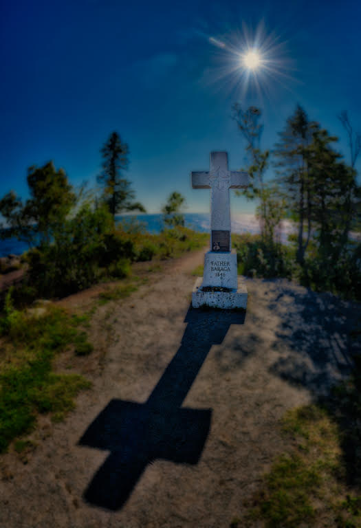
I have noticed that when I use Aurora HDR that I get the same, I am not sure it is really noise, it maybe more that it is bringing out detail that looks like noise. Sometimes it comes from being too aggressive with the processing in the HDR Structure section of Aurora, which the presets sometimes (or maybe I should say usually) do. I sometime dial back the HDR Structure section and also use the denoise to get rid of it. It can be a tight balance between reducing noise and detail. I know it shows up in sky the most and certain other areas, with a predominate color. I use the noise filter in Lightroom to help keep it under control, besides using the denoise in Aurora. I also add a little glow to my image to help reduce it, I have tried a lot of different solutions, the good thing for me, is I like the detail and tend to over push the HDR. I guess it reminds me of the old film days. I hope you can find a solution that works for you. Good luck. See attached image for the area that you might adjust down to help get rid of the noise. |
Jun 30th |
 |
| 46 |
Jun 18 |
Comment |
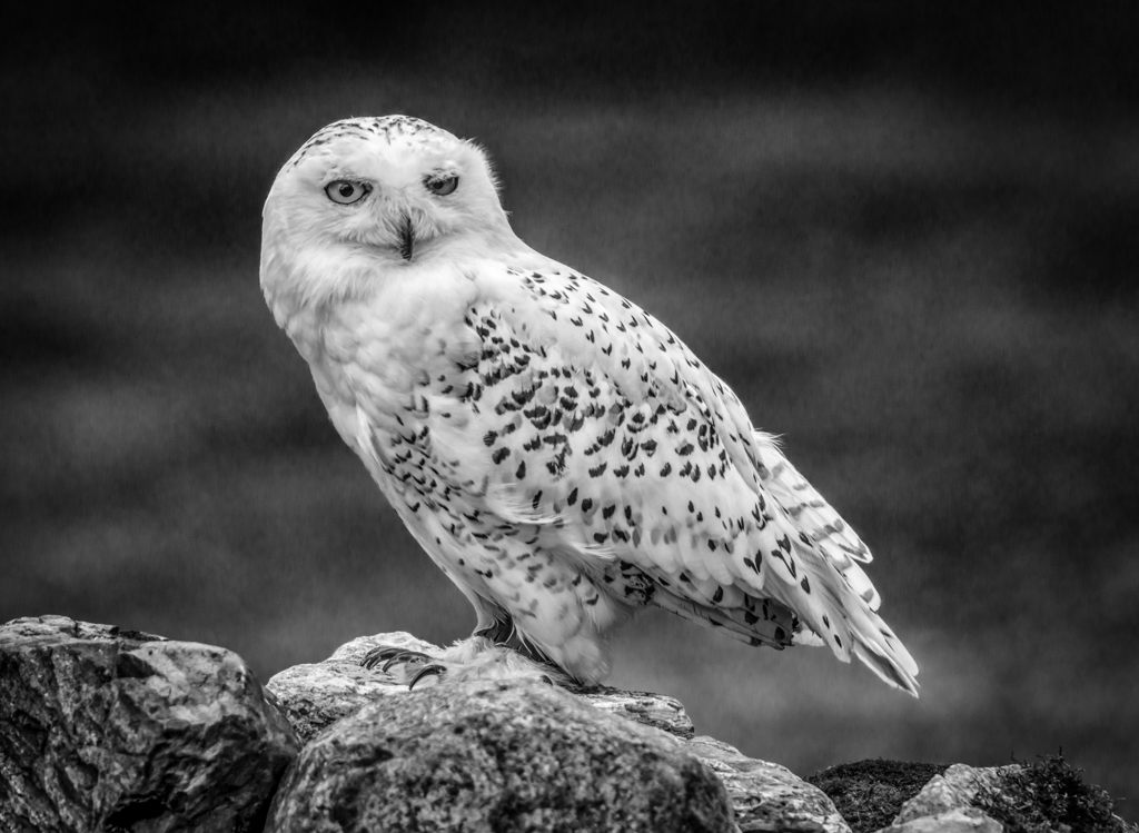
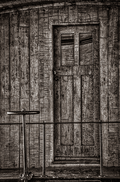
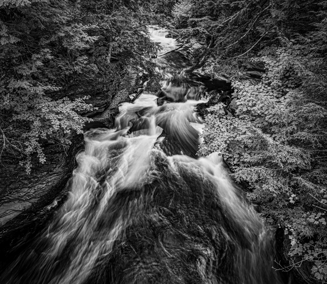
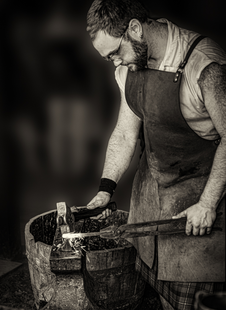
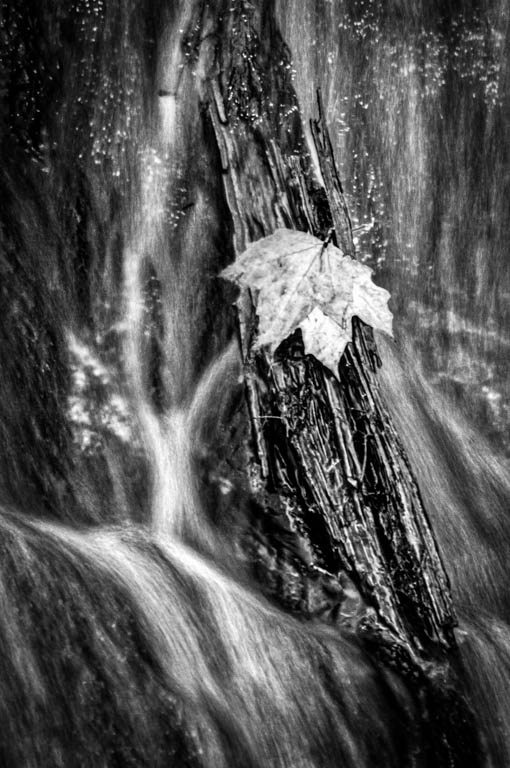
Great detail, good background, interesting shot. I don't mind the shadow, did not notice it when I first looked at the image. I like the texture in the wood. Cannot suggest any changes. Nice shot. |
Jun 30th |
| 46 |
Jun 18 |
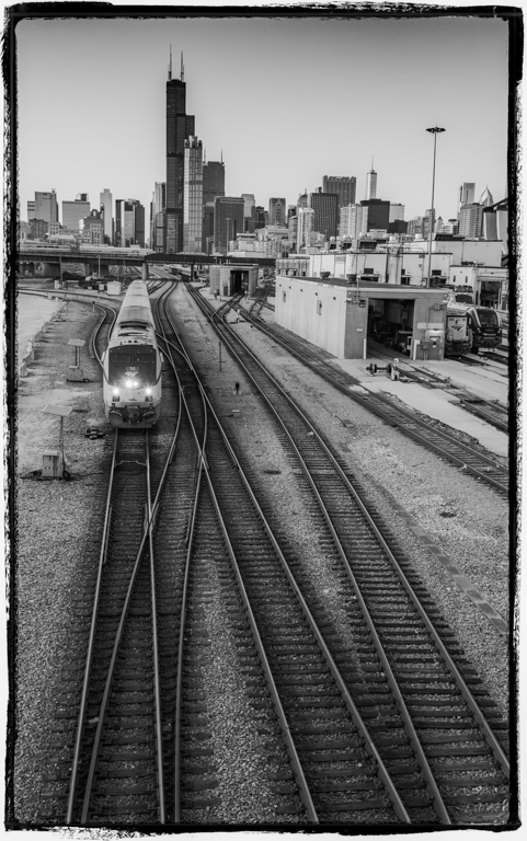
Comment |
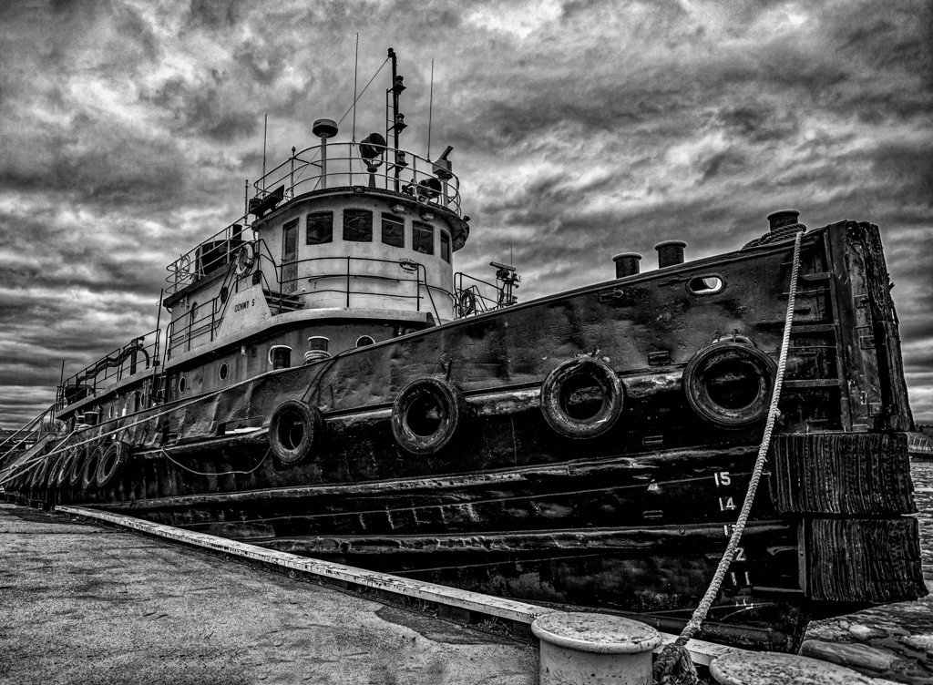
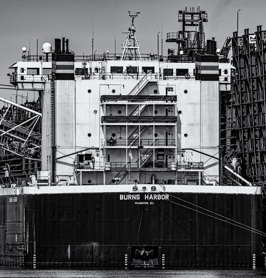
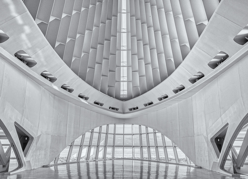
I like your processing and how the building came out, I would work a little more with the sky, it just does not look right, it is not terrible, just looks a little wrong. Might just need a little more contrast in the sky itself. Otherwise I really nice looking image. |
Jun 30th |
| 46 |
Jun 18 |
Reply |
Yes, I like how that sharpen it, I will try it on this image. |
Jun 9th |
6 comments - 3 replies for Group 46
|
| 50 |
Jun 18 |
Comment |
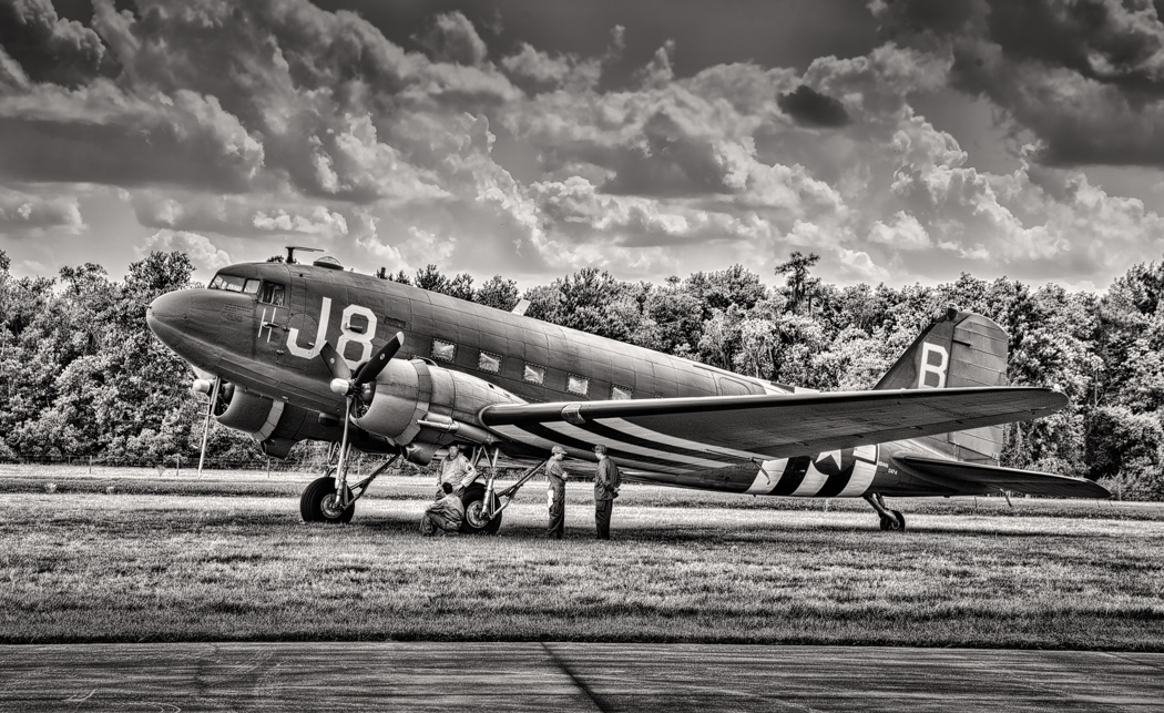
I like the overall image, but I would like to see both wing tips, both blend in too much, one in the blue sky and one on the ground. Also, I agree that the building is distracting and would clone it out or change the angle so that it is not as noticeable. |
Jun 18th |
| 50 |
Jun 18 |
Comment |
Good angle, good processing equals a great shot. I would not change a thing. |
Jun 18th |
| 50 |
Jun 18 |
Comment |
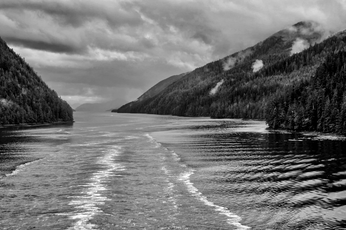
Interesting image, I would agree with cropping out a little more of the sky and maybe just a little from the bottom. Just for fun, I added a little more fog to the image as well. I don't like the gradient, it looks a little too muddy, it should look foggy. |
Jun 18th |
 |
| 50 |
Jun 18 |
Comment |
I like Cindy's approach to your image, I also agree that the window on the right should be removed. Nice processing and I like the sepia toning, it fits the image. |
Jun 18th |
| 50 |
Jun 18 |
Comment |
I also think you handled the lighting well and I like your composition. I do have a little problem with the persons face, I like the grittiness of it but the face looks a little fake, maybe a little less contrast, I actually like the persons face in the color a little better, but it too is a little too gritty. |
Jun 12th |
| 50 |
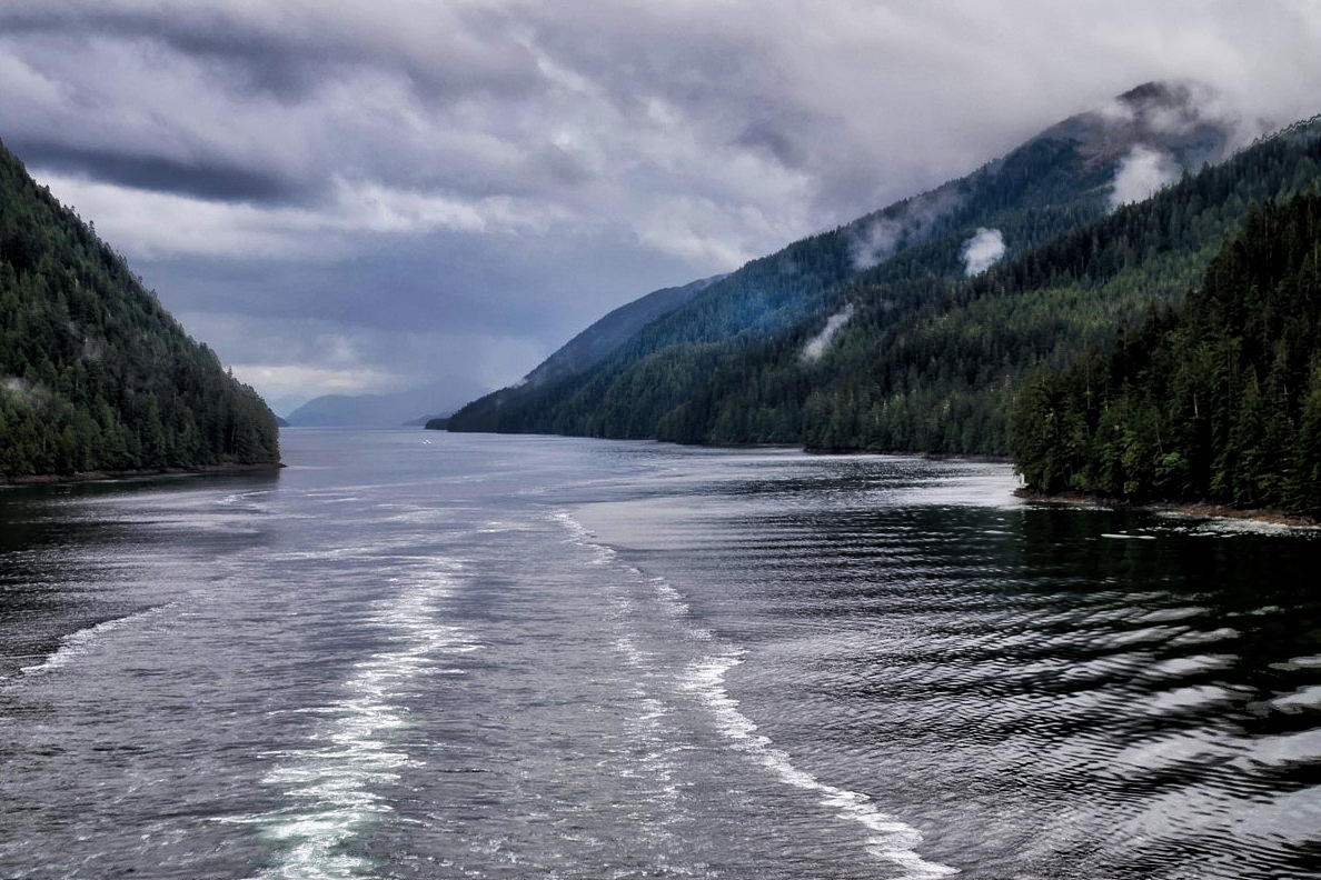
Jun 18 |
Comment |
Nice shot, the waves make a nice leading line into the image. I find the clouds a little soft, I think if you added about +30 in clarity and +15 in dehaze it brings out the clouds better, plus makes the lower clouds stand out more. |
Jun 12th |
 |
6 comments - 0 replies for Group 50
|
| 59 |
Jun 18 |
Comment |
Great timing, I like her position, it works with the flag pretty well. It would be nice to see the face, but understandable with the position she is in. |
Jun 18th |
| 59 |
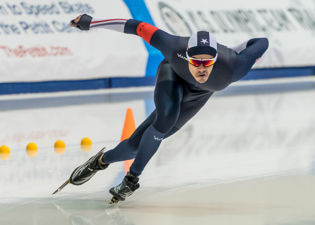
Jun 18 |
Comment |
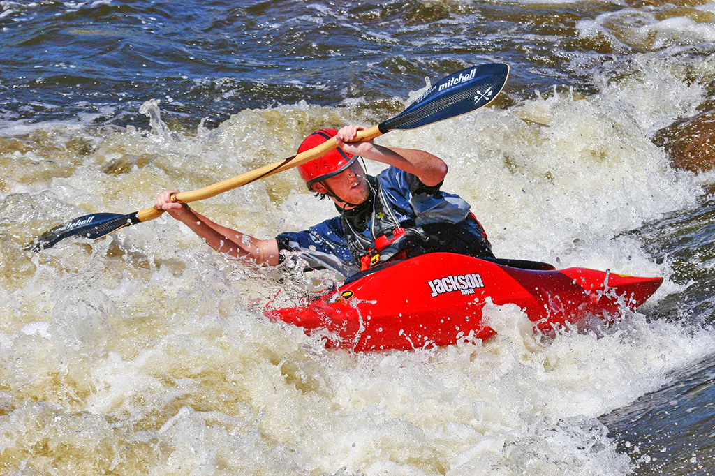
Good action, I like being able to see the face, although I think I would lighten the face slightly, it is a little dark. I just use the dodge tool on his face to lighten it slightly. Otherwise good exposure, good timing and good action. |
Jun 18th |
 |
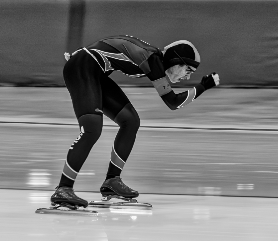
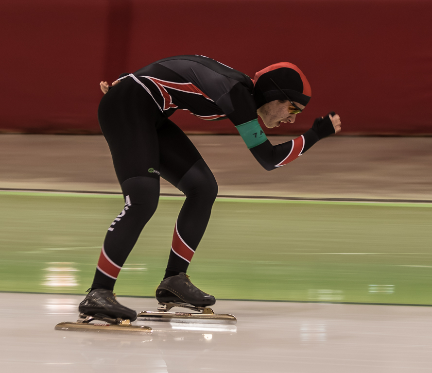
| 59 |
Jun 18 |
Comment |
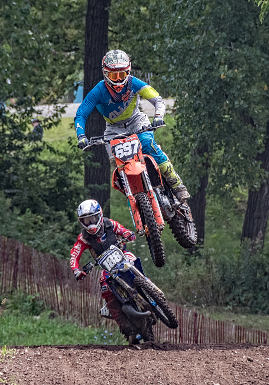
They are both nice shots, the one with the second skater I think is better, the second skater adds drama to the image.
The main image with the single skater, you are right the head position somewhat makes the image not as exciting. Also, her lower arm is blended into the leg, I would like to see it a little more forward, maybe just a frame or two later. |
Jun 18th |
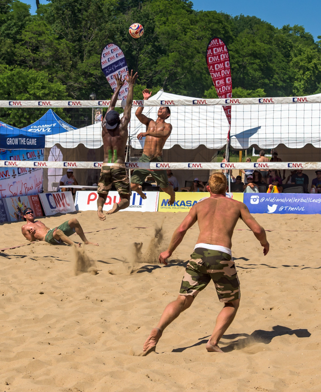
| 59 |
Jun 18 |
Comment |
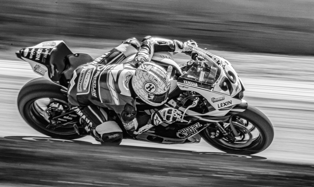
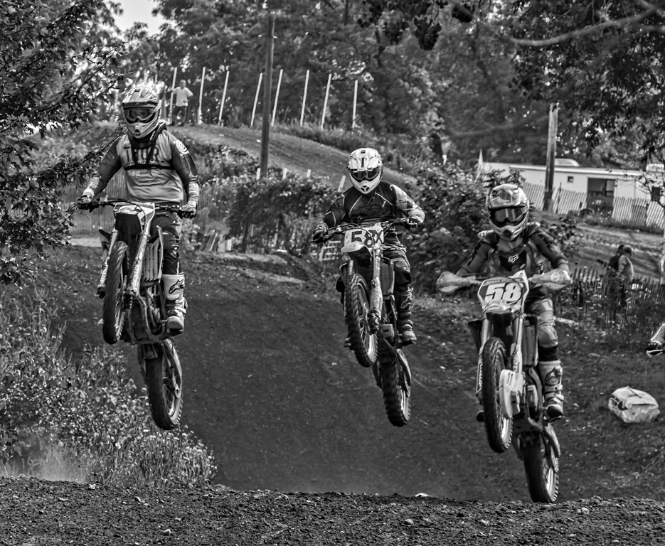
Good action, the must have been very close and you are pretty brave to be sitting on the ground with the players coming at you. It would be better with the players separated more from each other. I would also crop off some of the skies and both the left and right side, none of it is needed. I know that may not achieve what you wanted for a wide angle shot, but it makes the image a little better to understand. Otherwise good exposure, good timing. |
Jun 18th |
| 59 |
Jun 18 |
Comment |
The emotion on the face is good, but I don't get the image, it could be that I do not follow hockey, but there is nothing happening that gives a story to the image. It would help with a puck in the shot and other players doing something to give the image some meaning. Sorry, I just don't get the shot at all. |
Jun 18th |
| 59 |
Jun 18 |
Comment |
Great action shot, getting the puck in the shot with everyone looking at it makes the image. The image does look a little warm, but the exposure looks good to me. |
Jun 18th |
6 comments - 0 replies for Group 59
|
18 comments - 3 replies Total
|