|
| Group |
Round |
C/R |
Comment |
Date |
Image |
| 46 |
Dec 17 |
Comment |
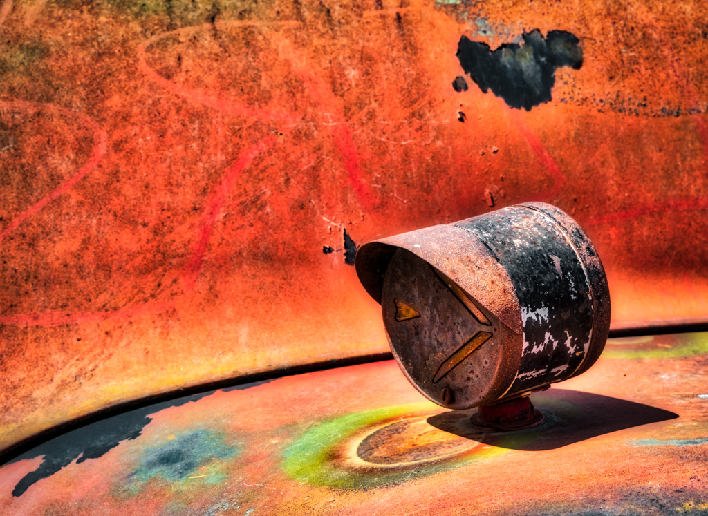
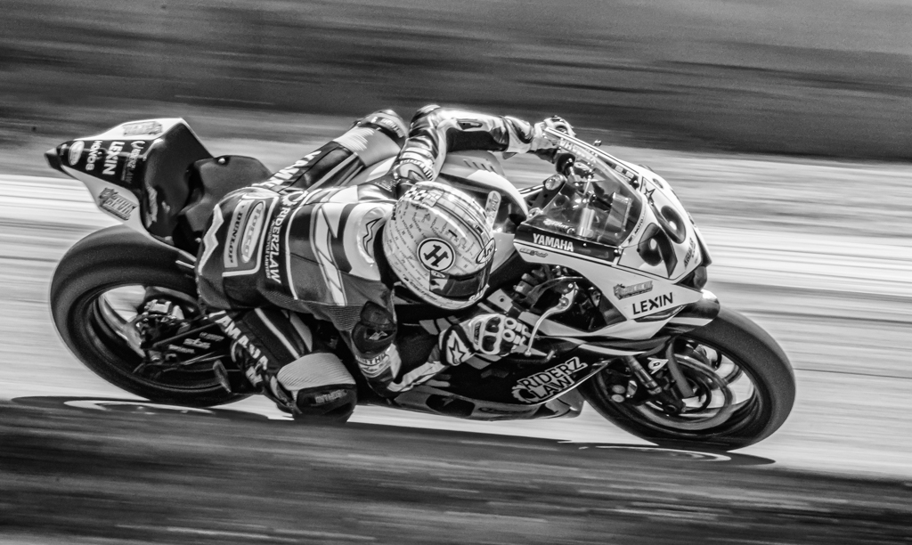
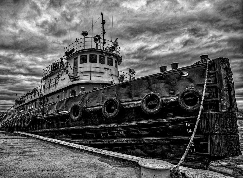
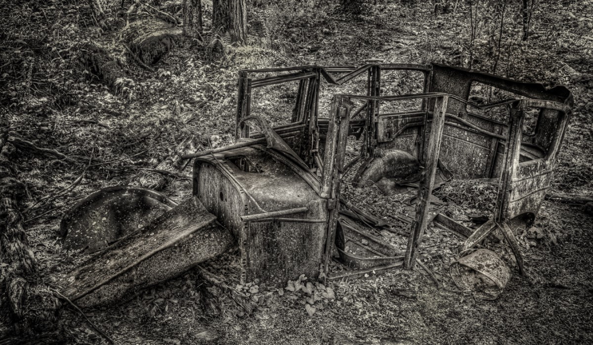
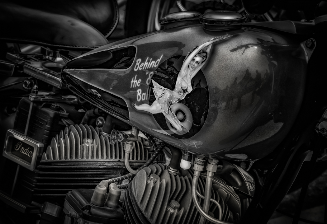
Everyone gave you good ideas, mine would be to add more contrast I did about +30 and +20 on clarity, this cleared the glass a little more than you had it. Then I just started cleaning up the little distractions in the image. Cleaning up the image will take a fair amount of time. |
Dec 7th |
 |
| 46 |
Dec 17 |
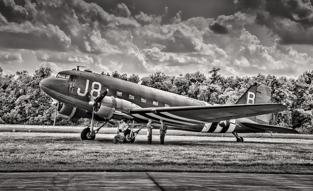
Comment |
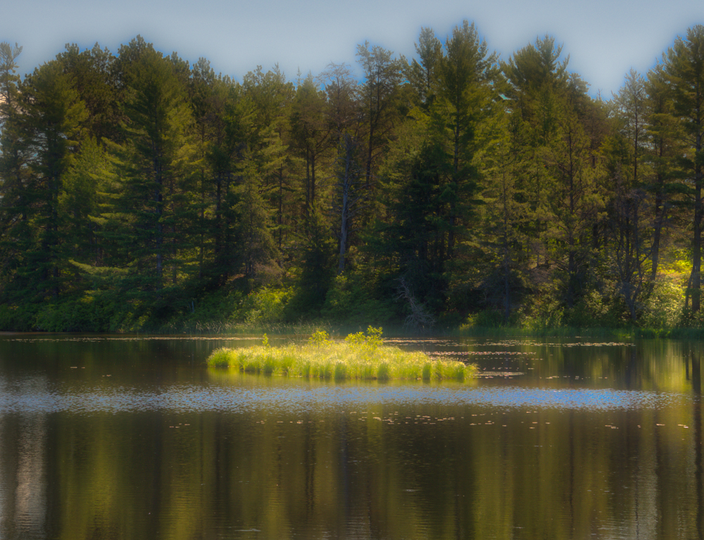
Nice shot, I would try to darken the sky and add some contrast to the sky, maybe by using a graduated filter in the sky. It worked a little on the jpeg, but on the original it might work better. |
Dec 7th |
 |
| 46 |
Dec 17 |
Comment |
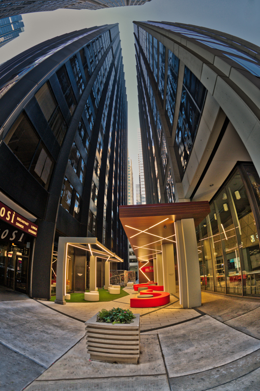
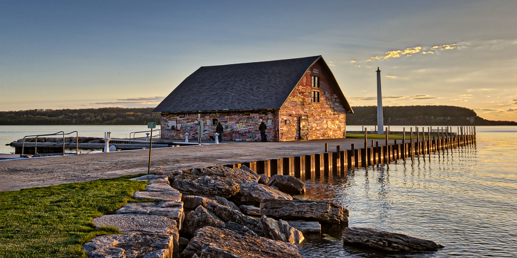
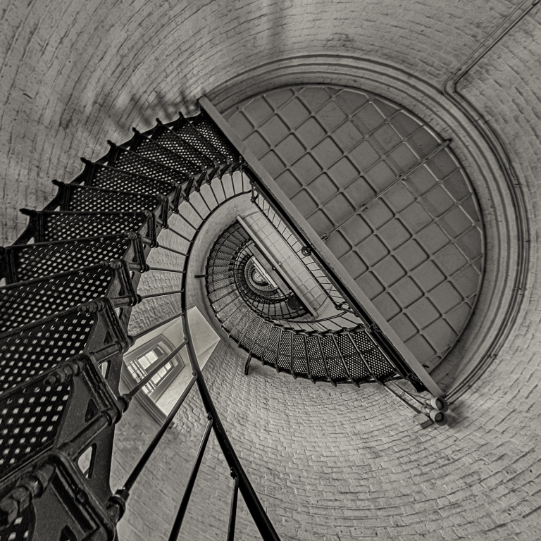
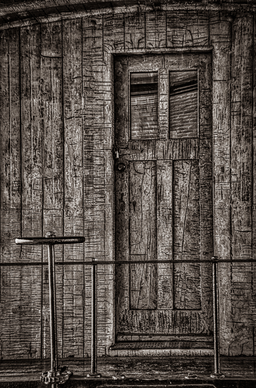
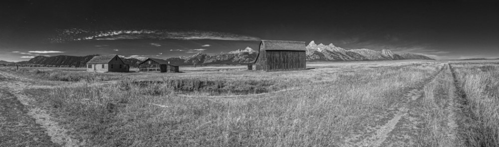
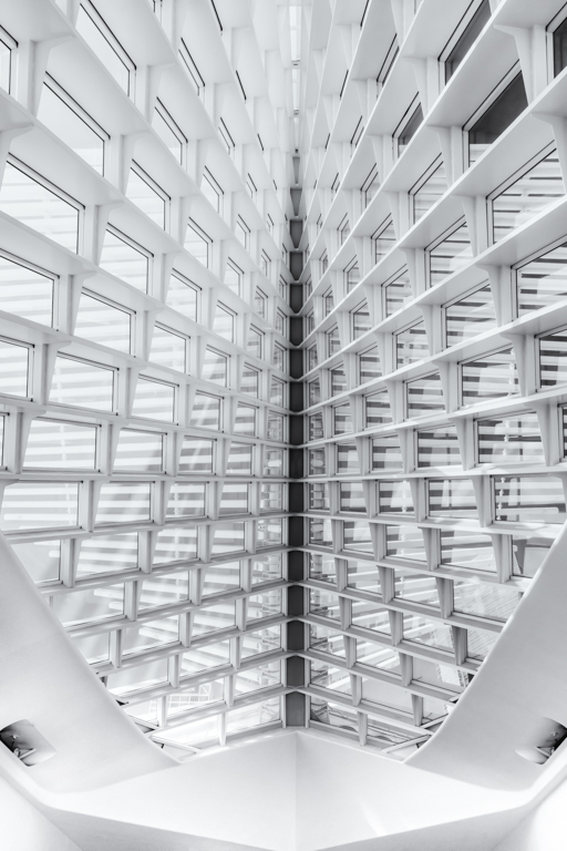
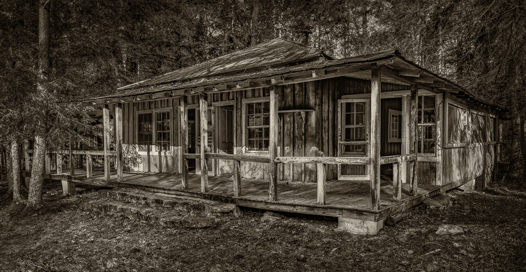
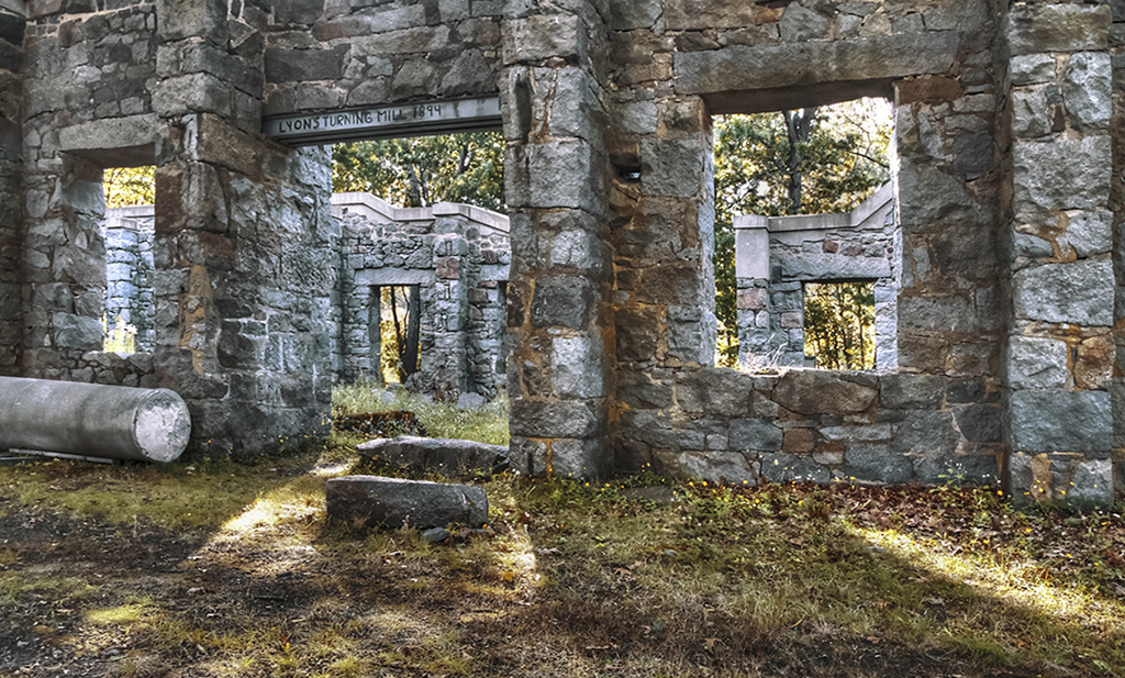
Richard, I do like Gary crop, the light leads right into the building. I also like the whole structure, but found the tilt a little distracting. So I straightened up both the left and right side. Then I cropped off a little of the bottom so the light draws you into the doorway. This is an interesting image. |
Dec 7th |
 |
| 46 |
Dec 17 |
Comment |
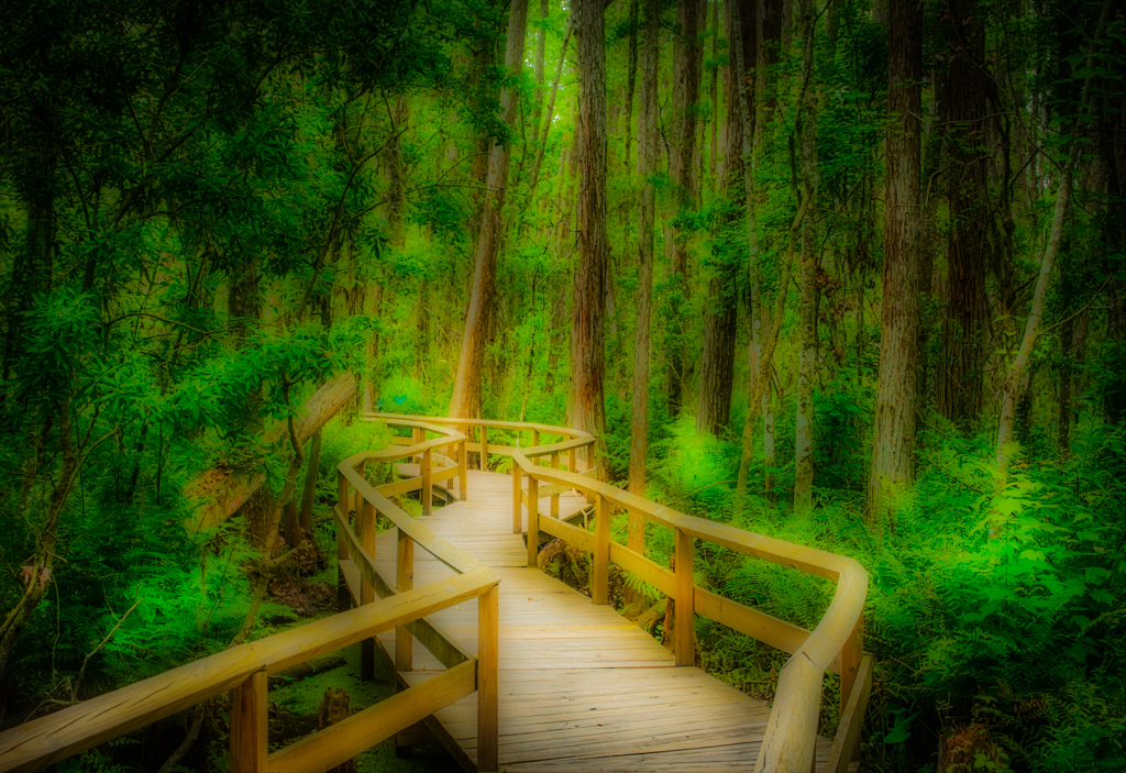
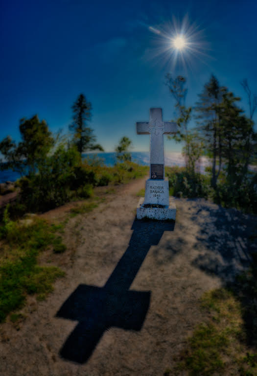
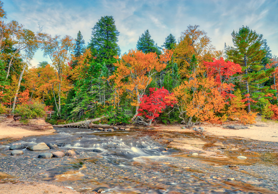
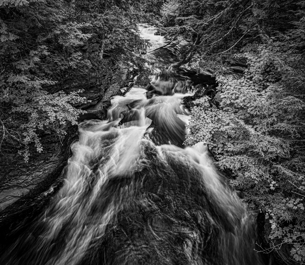
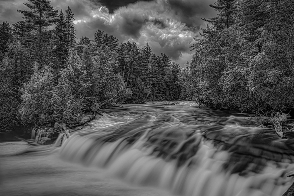
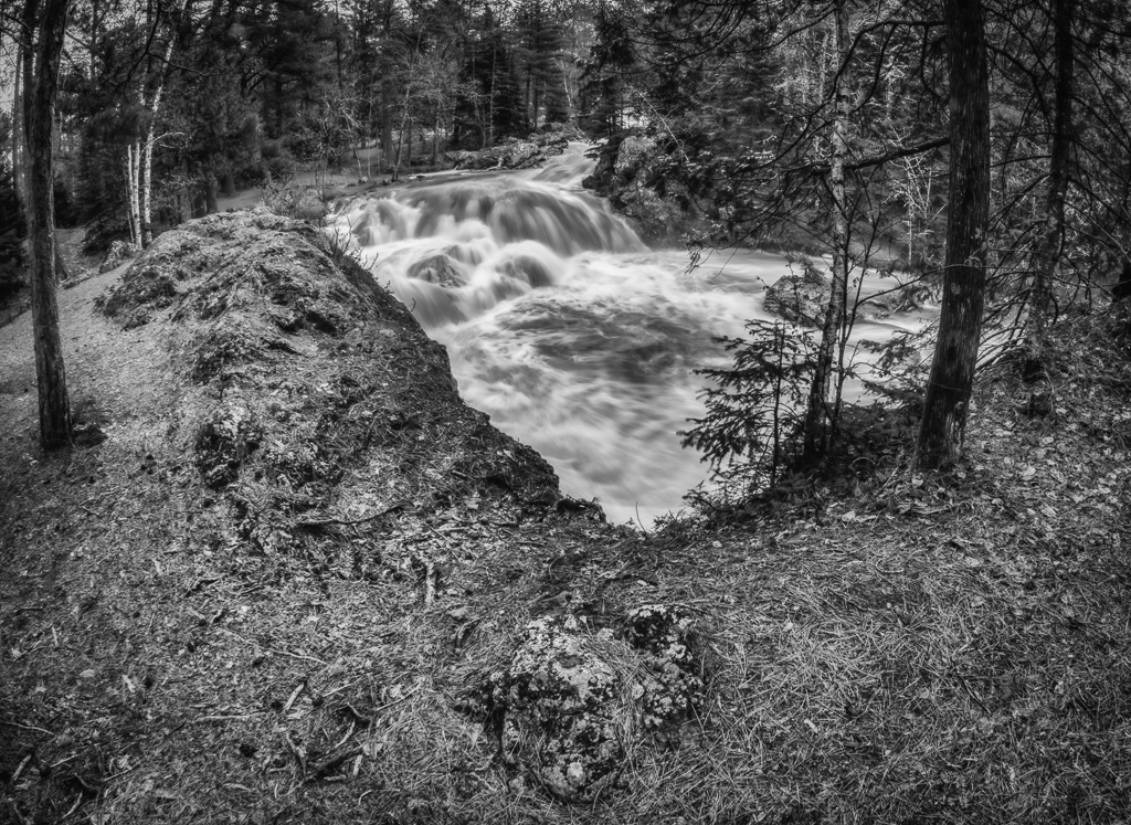
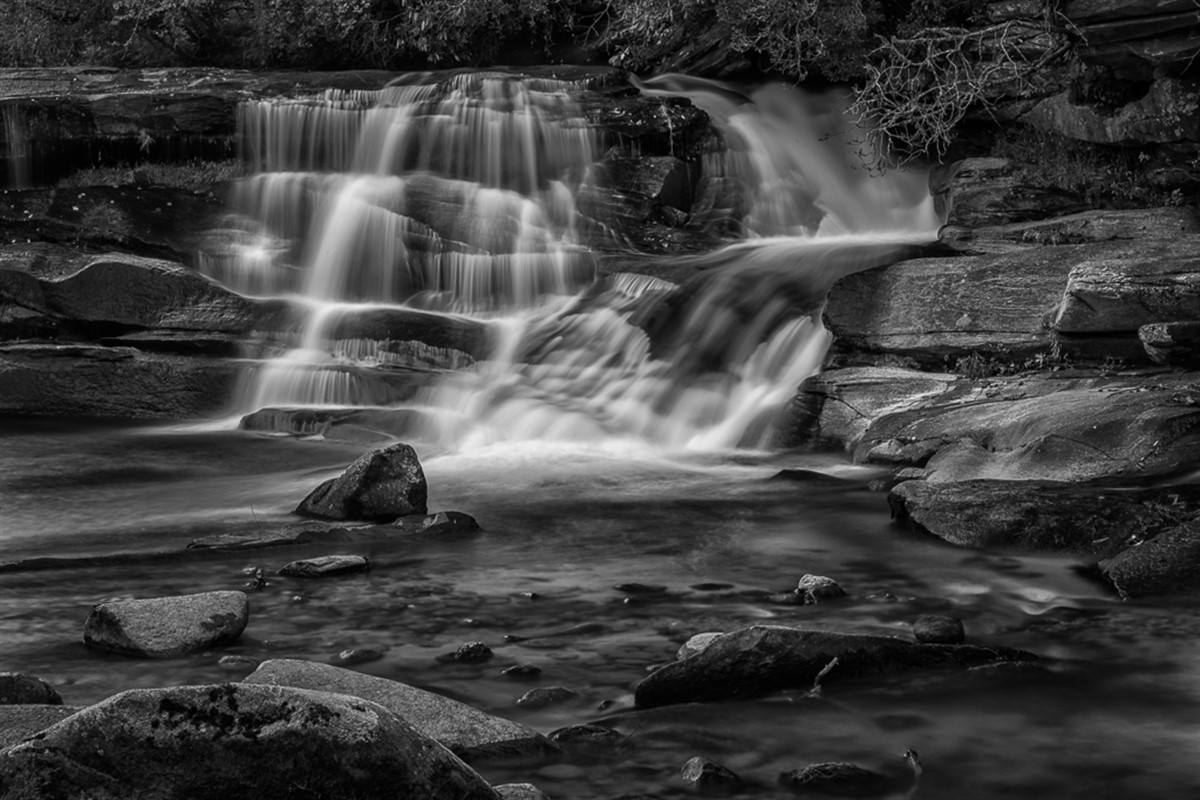
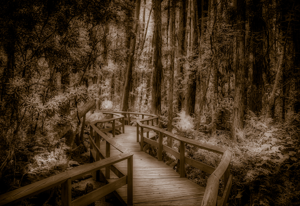
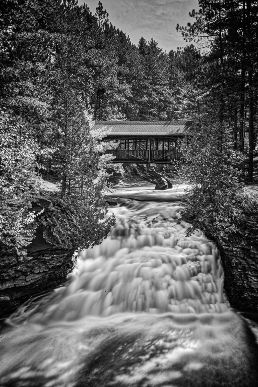
I like what you have done the bridge and the foreground came out good and sharp, my eyes get pulled to the trees above the bridge, they are either a little blurry or out of alignment. It might help if you crop out the top closer to the top of the bridge or maybe use just one image for the tops of the trees to get one solid set of trees. |
Dec 7th |
| 46 |
Dec 17 |
Reply |
Wanda,
See the comment and image below for another way I went with the image. Thanks for the comments. |
Dec 7th |
| 46 |
Dec 17 |
Reply |
Gary, see my comment below, thanks for the info. |
Dec 7th |
| 46 |
Dec 17 |
Comment |
Wanda, Richard, & Gary,
Thanks for the suggestions, I had also done a monochrome version of this image, which was what I thought it should be, takes some of your thoughts into account. I will probably try reworking it or scrapping the whole project, it was shot poorly and in a hurry. You just never know. Not every image will be a winner. I really appreciate the feedback. |
Dec 7th |
 |
| 46 |
Dec 17 |
Comment |
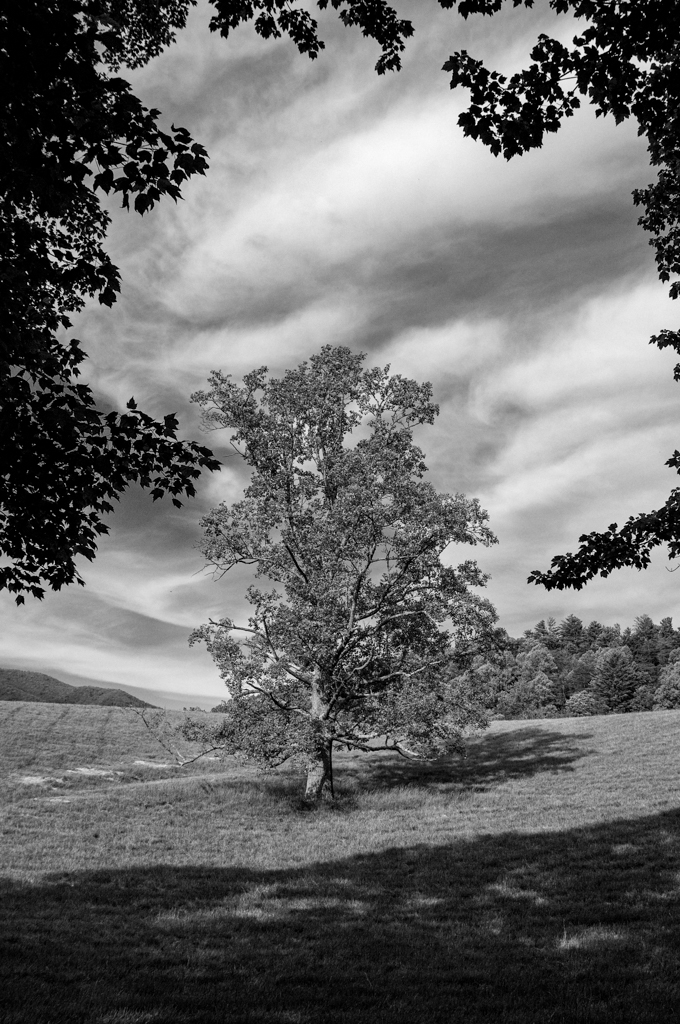
Richard, Thanks, I had an idea in my head when I came across this image. I appreciate the different ideas. I have a mono version that works slightly better, but I don't know what to do with the image. I needed other opinions to see if I should keep working on it. Thanks. |
Dec 3rd |
6 comments - 2 replies for Group 46
|
| 50 |
Dec 17 |
Comment |
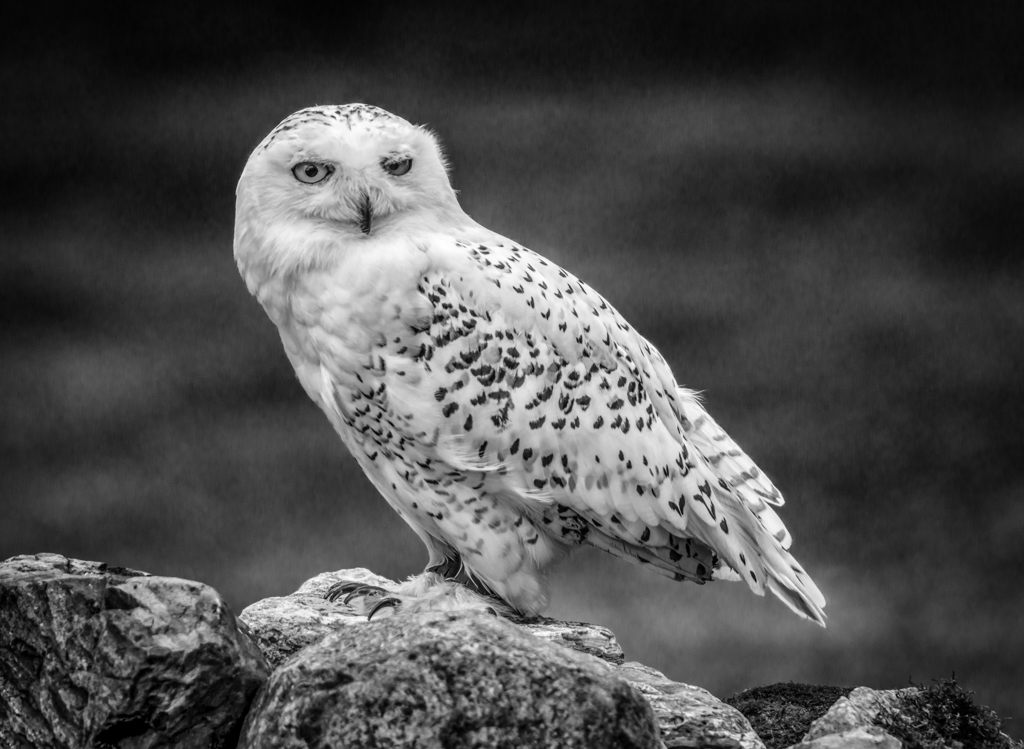
It is an OK image, if the dog was looking at the camera that would help. Nice job on getting detail in the fur. The background looks a little noisy, I would try to reduce the noise or maybe it was too much sharpening. |
Dec 7th |
| 50 |
Dec 17 |
Comment |
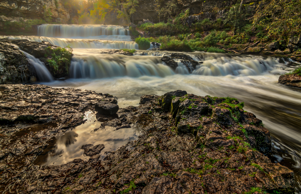
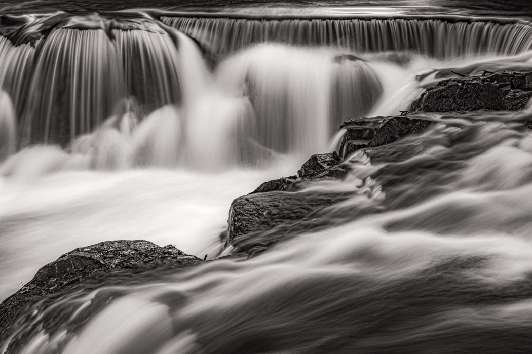
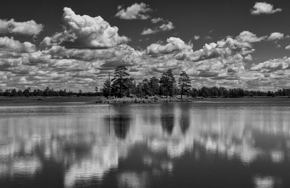
I like this shot, your exposure choice was good, it makes the water look like it is flowing. It has good leading lines and is an interesting image. |
Dec 7th |
| 50 |
Dec 17 |
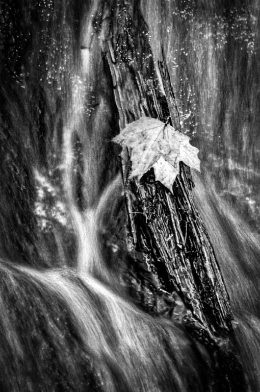
Comment |
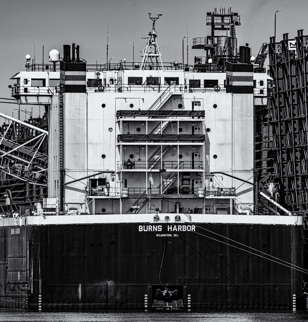
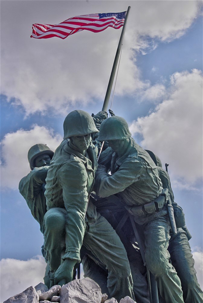
It has a lot of possibilities, I would crop and rotate the piece, plus I would add a vignette and reduced the noise. Rotating the piece makes it a little less static. I also add about +30 contrast. |
Dec 7th |
 |
| 50 |
Dec 17 |
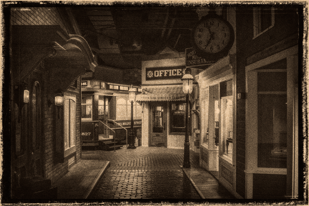
Comment |
I like how Cindy fixed the skew of the building. The reflection makes this image and I like how the monochrome version looks. |
Dec 7th |
| 50 |
Dec 17 |
Comment |
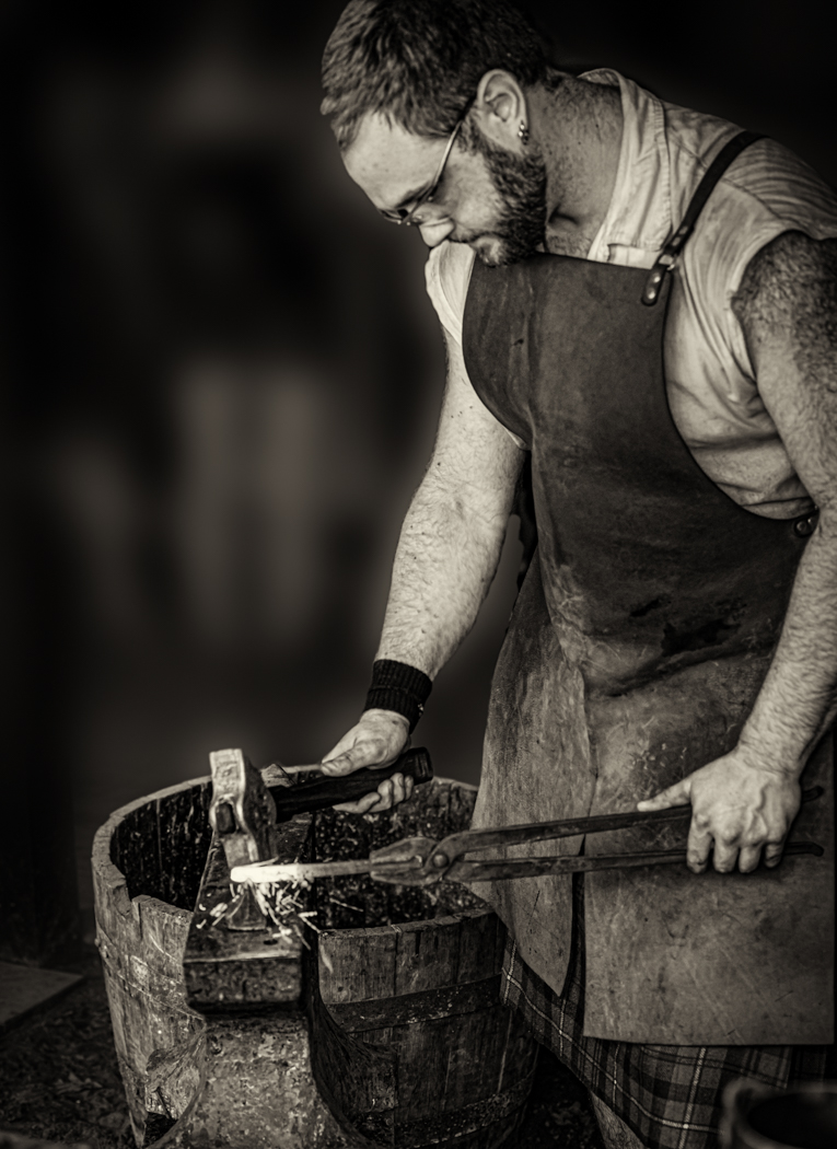
I like the look of the monochrome image, the people are interesting and I like your composition. Maybe a little more contrast. Otherwise a nice shot. |
Dec 7th |
| 50 |
Dec 17 |
Comment |
Paul,
Nice shot, I like the curves and the way you composed the image. I agree with Kathy, it needs a little more contrast otherwise a great shot.
|
Dec 7th |
6 comments - 0 replies for Group 50
|
12 comments - 2 replies Total
|