|
| Group |
Round |
C/R |
Comment |
Date |
Image |
| 46 |
Sep 17 |
Comment |
The image is very interesting, I can agree the mast closest to the signs is a little distracting, but not that much. |
Sep 29th |
| 46 |
Sep 17 |
Comment |
I like the detail in the house, you did a nice job of processing the image. The sky also adds to the image as well. A very interesting image. |
Sep 29th |
| 46 |
Sep 17 |
Comment |
I like the image, except for the bright background in the upper left. Your eye just goes to that area first. The foreground and all the rocks are good for me. |
Sep 17th |
 |
| 46 |
Sep 17 |
Comment |
This is an interesting approach, I like your idea of focus stacking, you have the added problem that you did HDR and have moving objects. I think it worked out well. I appreciate all the work and the info you have given us. |
Sep 17th |
4 comments - 0 replies for Group 46
|
| 50 |
Sep 17 |
Comment |
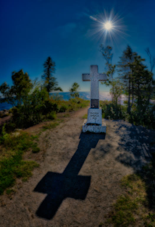
A very interesting image, I agree you need more texture in the headstone. I would try any plug in that has dynamic contrast or even using an HDR program to bring in more detail. I would not crop any tighter, I think the background adds to the image. |
Sep 29th |
| 50 |
Sep 17 |
Comment |
This is a really nice shot, I like the choice of background and the tones are just great. The patterns are very interesting. Very well done. |
Sep 29th |
| 50 |
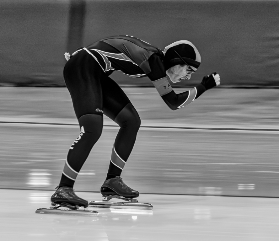
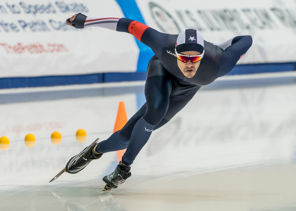
Sep 17 |
Comment |
The color shot is the better shot, it makes the skater stand out more than the mono. You might try increasing the contrast in the mono shot to help him stand out more. Otherwise a good sharp skating image. |
Sep 29th |
| 50 |
Sep 17 |
Comment |
Great shot, nice leading lines, interesting pattern. I like both images, but probably the Mono the best. The light does not bother me on the lower left, but might help keep the eye from being drawn to it over the center of the image. |
Sep 29th |
| 50 |
Sep 17 |
Comment |
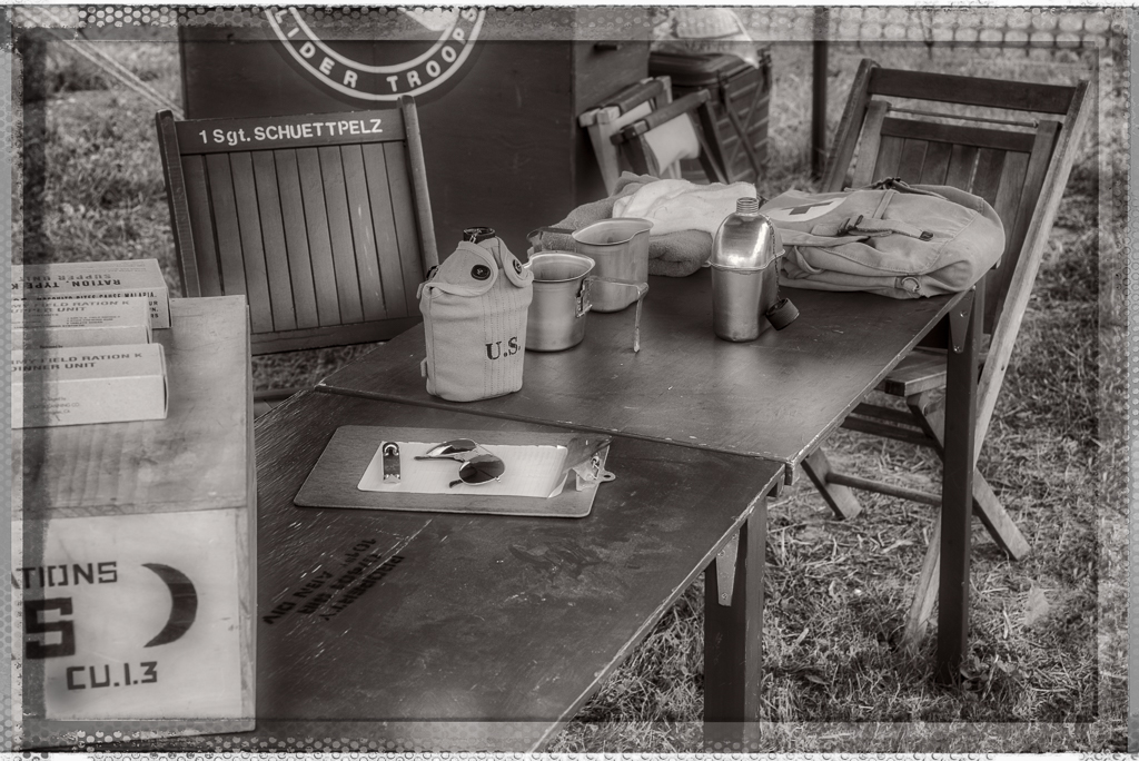
Great job adding the person in, and the background does fit the image. I would probably add a slight warm tone to it, which would make it fit the period more, not much just a little. The mono is my choice as well. |
Sep 29th |
| 50 |
Sep 17 |
Comment |
I will also agree with the group, nice shot and I would bring out the clouds more, like Chuck suggested. |
Sep 29th |
6 comments - 0 replies for Group 50
|
| 59 |
Sep 17 |
Reply |
I have not entered it yet, plan to in the future. |
Sep 29th |
| 59 |
Sep 17 |
Comment |
I also like the horizontal image better than the cropped one, the images needs a little more room for the surfers to move into. Otherwise I think it is a very good shot. |
Sep 17th |
| 59 |
Sep 17 |
Comment |
Nice and sharp, good freezing of action of the skater. If anything I would give the skater a little more room in front of the skater. |
Sep 17th |
| 59 |
Sep 17 |
Comment |
Wow, great action and good timing. The expression on their faces is great so is the ball position. I cannot really suggest any improvements. |
Sep 17th |
| 59 |
Sep 17 |
Comment |
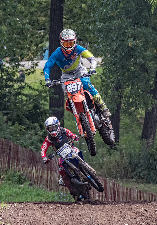
The action is great and the looks on their faces tells it all. Plus you have them looking in your direction. I agree with Bruce to straighten the fence, it does seem to help. The bright blue could be toned down using HSL in camera raw, by desaturating the blue just a touch, but then it might not look like their field, so I don't know if that would be a good idea or not. I did both the straightening and color adjustment. |
Sep 17th |
 |
4 comments - 1 reply for Group 59
|
14 comments - 1 reply Total
|