|
| Group |
Round |
C/R |
Comment |
Date |
Image |
| 46 |
Jun 17 |
Reply |
Gary,
Thanks, I was debating on the removal of the sign, most of my shots had it covering the building, with this shot I moved it out of the way, but you are right, it needs to be removed. Thanks. |
Jun 15th |
| 46 |
Jun 17 |
Comment |
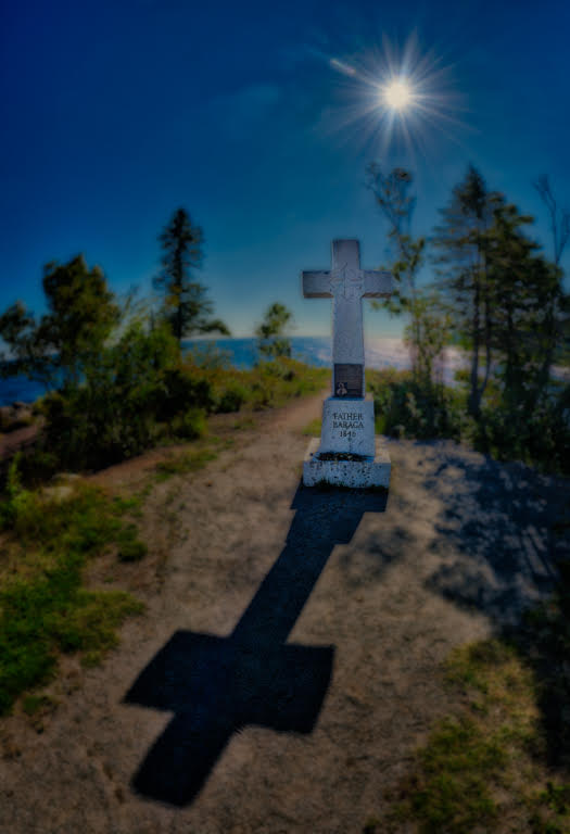
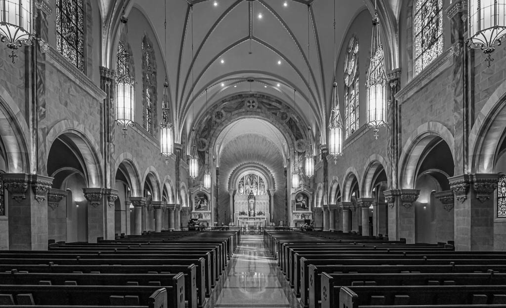
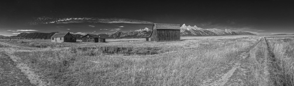
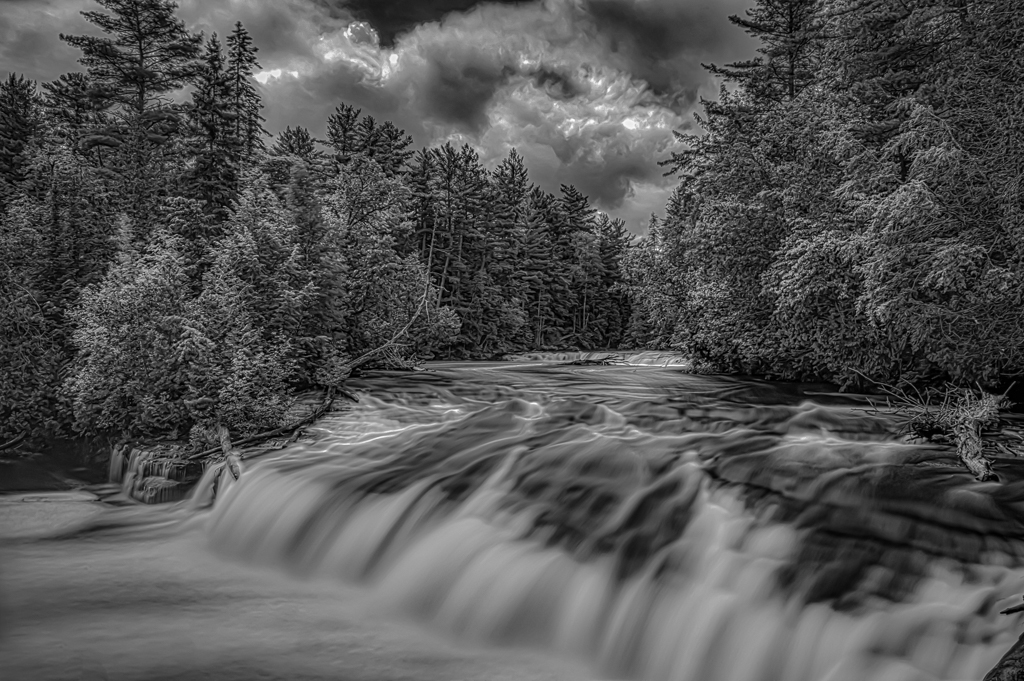
Great detail and nice warm color, I like how the grass is softer letting your eye go to the church. Nice shot. |
Jun 15th |
| 46 |
Jun 17 |
Comment |
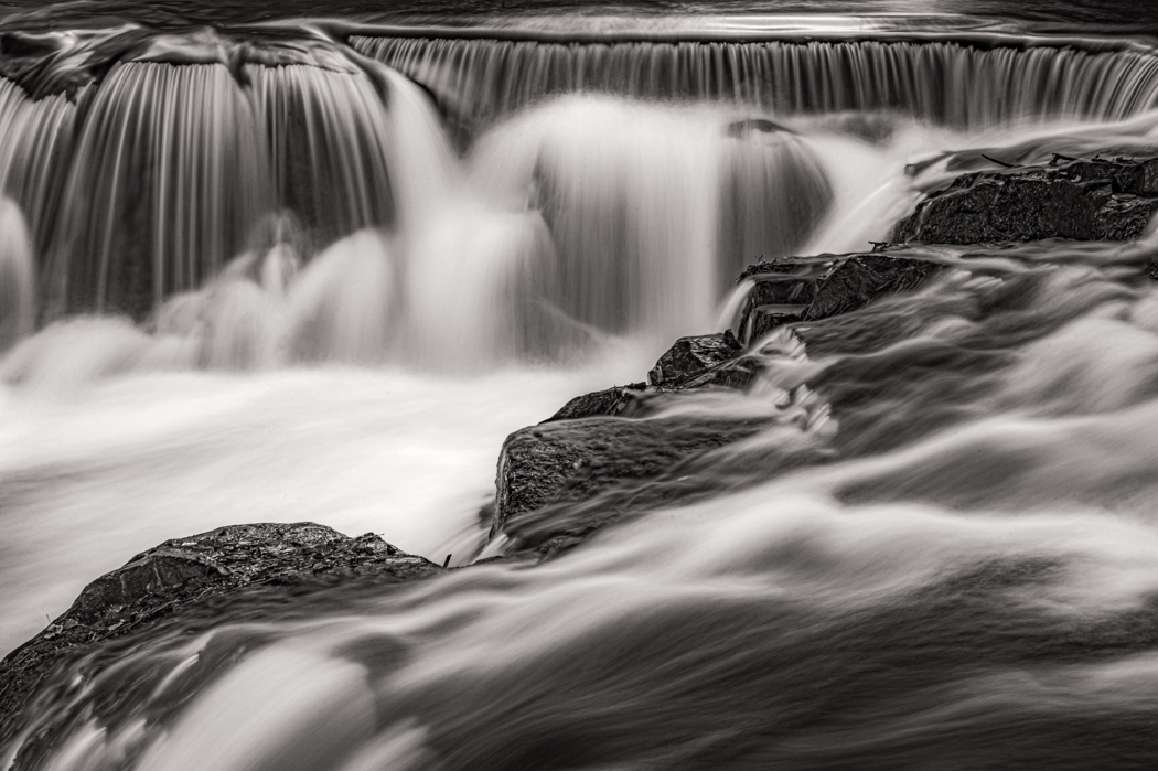
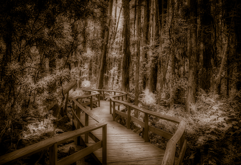
Nice detail, like the graffiti, the tracks give a nice leading line and the sky give a nice moody feeling to the bridge. Good shot. |
Jun 15th |
| 46 |
Jun 17 |
Comment |
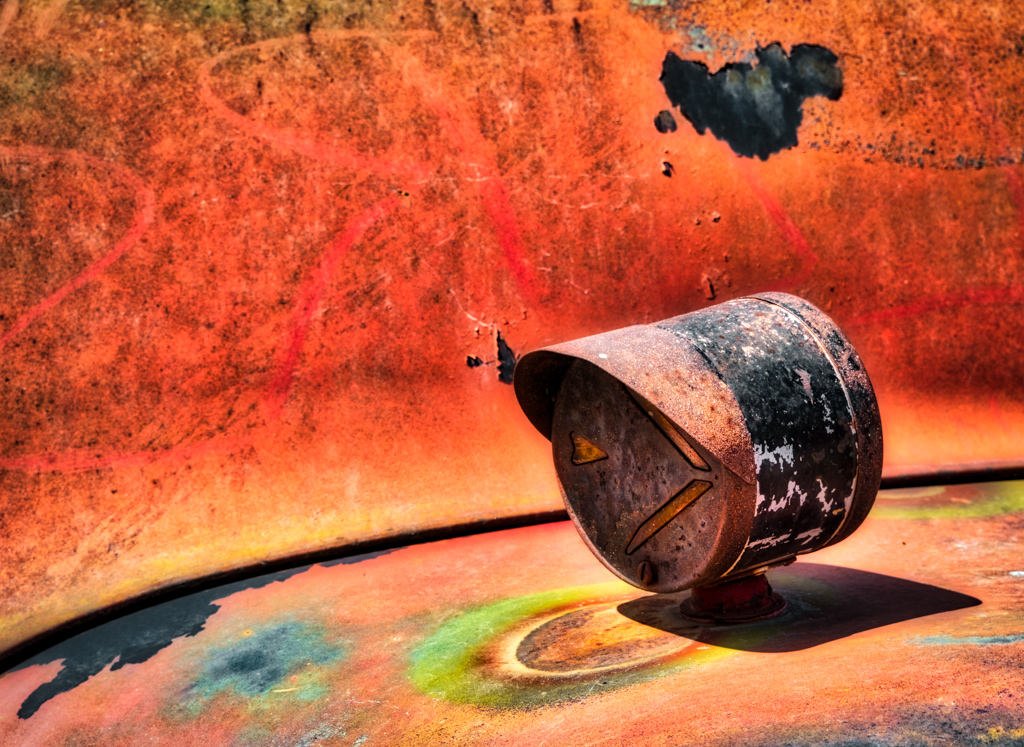
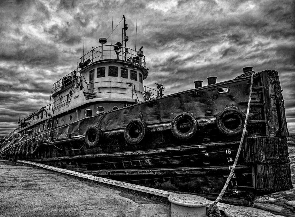
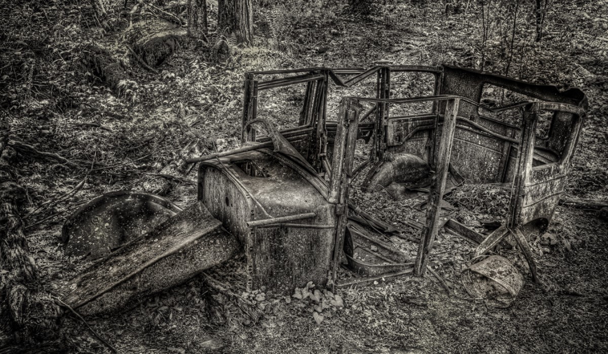
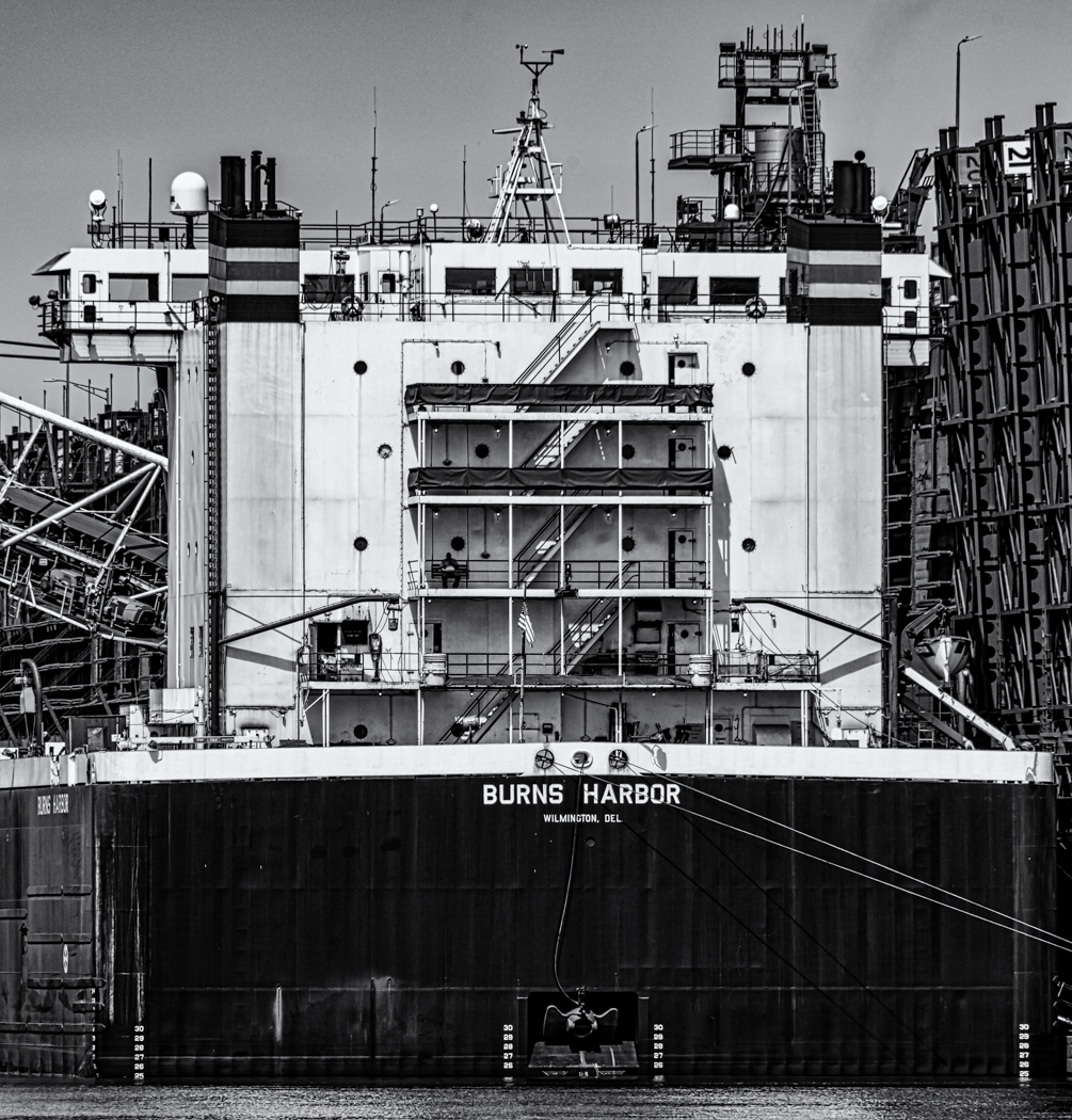
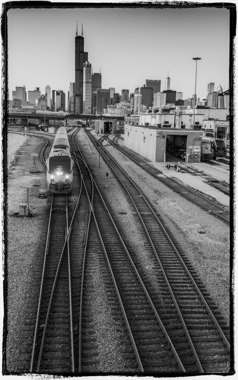
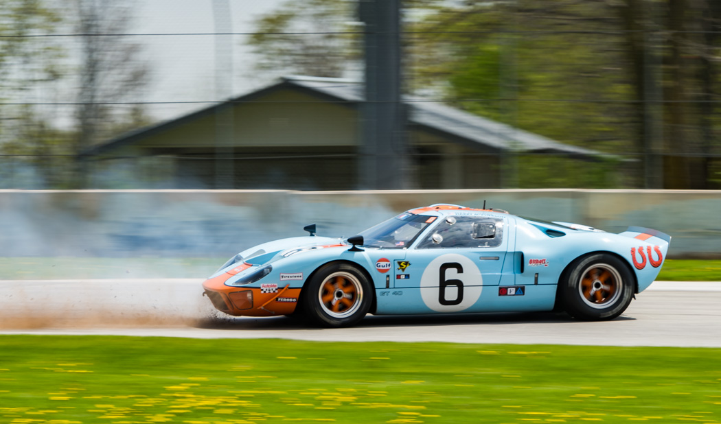
Nice image, really like the detail in the truck and buildings. The distracting part is the halo around the trees, I hate when that happens. Try taking your darkest image and mask most of the image out except for around the trees, you can then adjust the brightness till you get rid of the halo, sometime that works. I did a sloppy one using your original image and darkening. Plus getting rid of the power line helps as well. |
Jun 15th |
 |
| 46 |
Jun 17 |
Reply |
Richard,
Thanks, I will try that, I do tend to over saturate my colors. |
Jun 7th |
3 comments - 2 replies for Group 46
|
| 50 |
Jun 17 |
Comment |
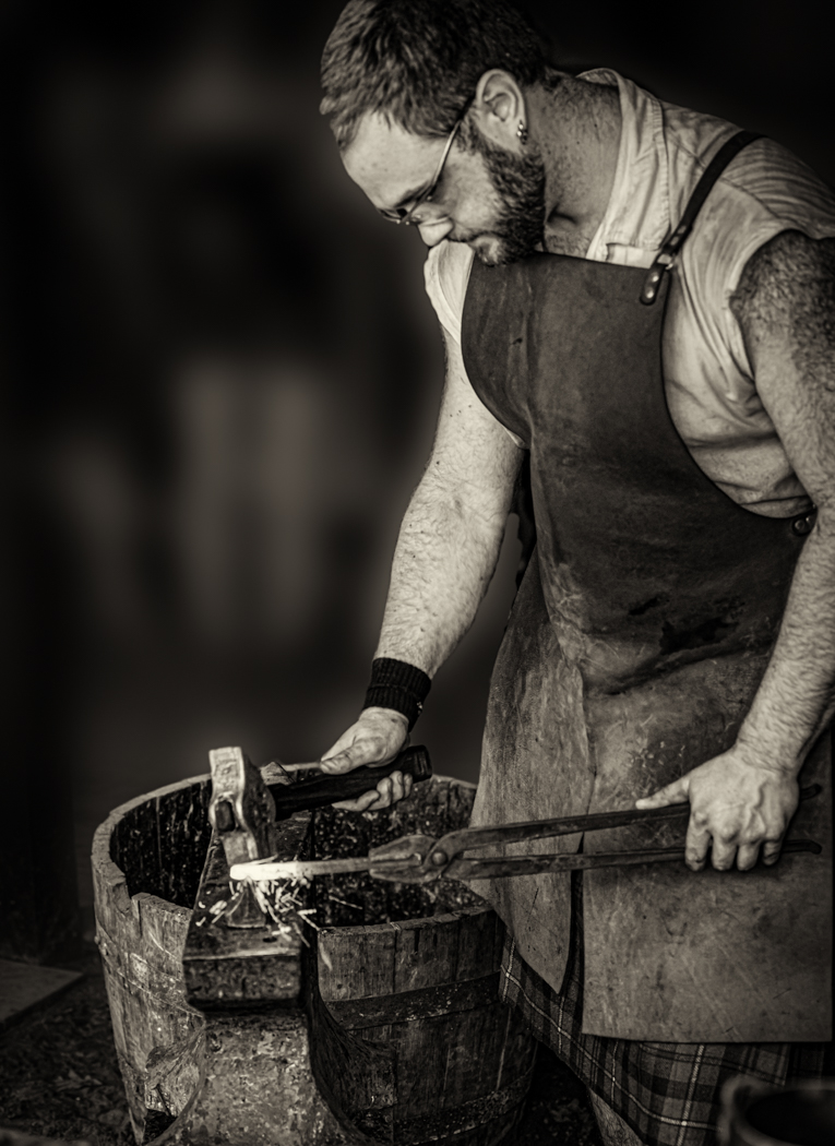
Nice portrait, I think the mono works well and I like Cindy's cropping. |
Jun 15th |
| 50 |
Jun 17 |
Comment |
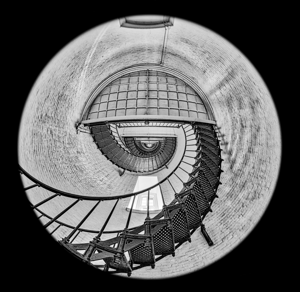
I like the composition and the tonal quality of the image, very interesting and full of detail, nice shot. |
Jun 15th |
| 50 |
Jun 17 |
Comment |
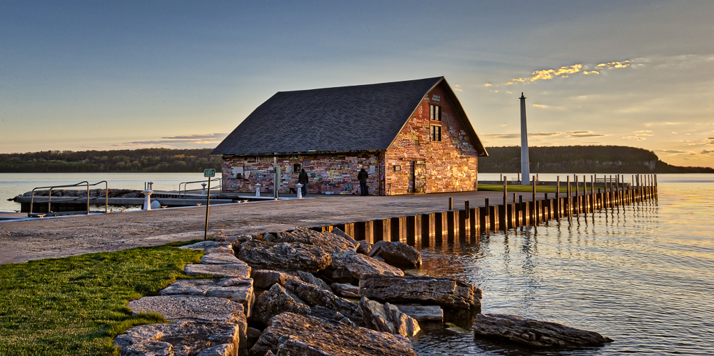
I like the reflections on the building, the sky is a problem, when converting, try different filters to see if you can get more detail in the sky. I would also work on straightening the building. The birds are a nice touch. |
Jun 15th |
 |
| 50 |
Jun 17 |
Comment |
Kathy,
I am sorry, I just don't like it, to me it looks like a slightly out of focus poor shot. The important thing is you like it and so does the group, so it is probably just me. I did play with it using On1 and vivid dreams preset, and to me is a little better with more detail but still foggy looking. |
Jun 15th |
 |
| 50 |
Jun 17 |
Comment |
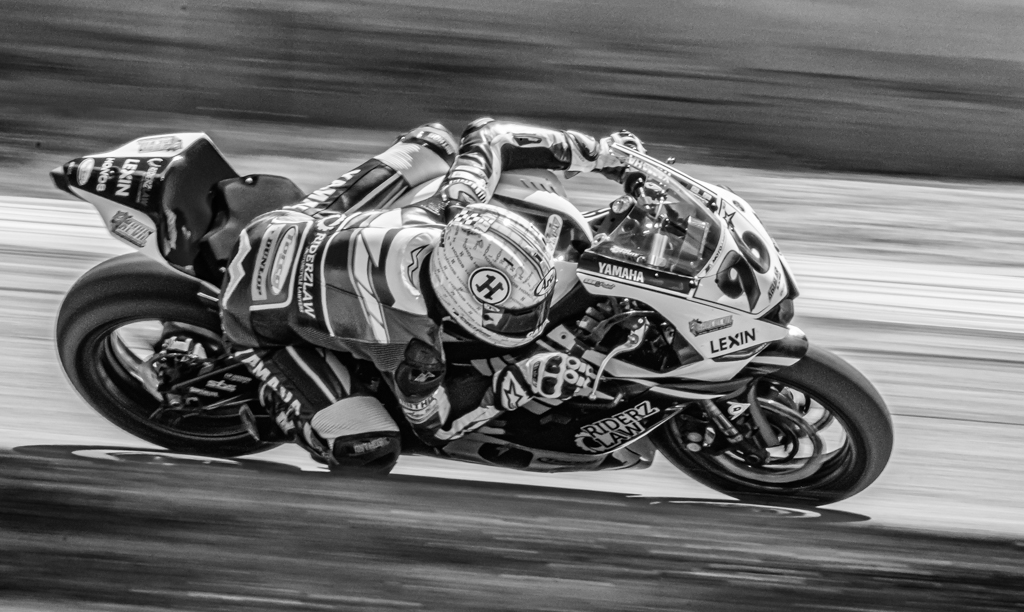
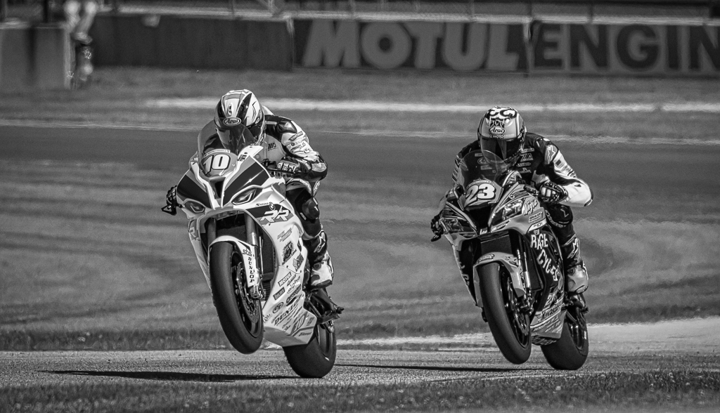
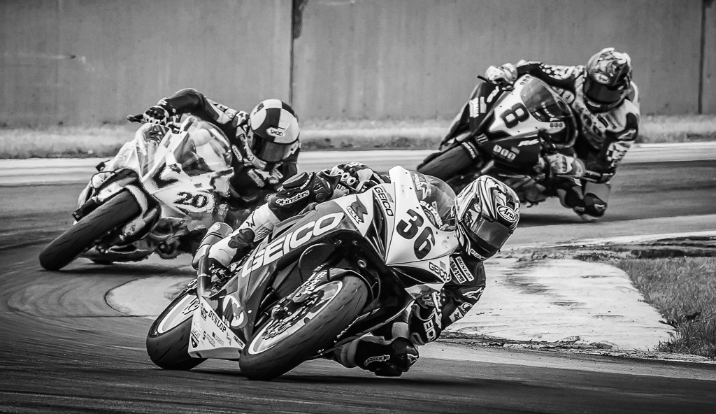
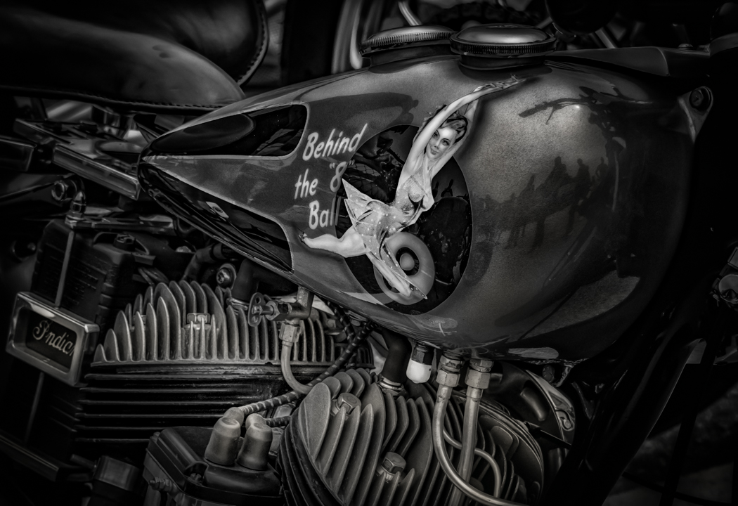
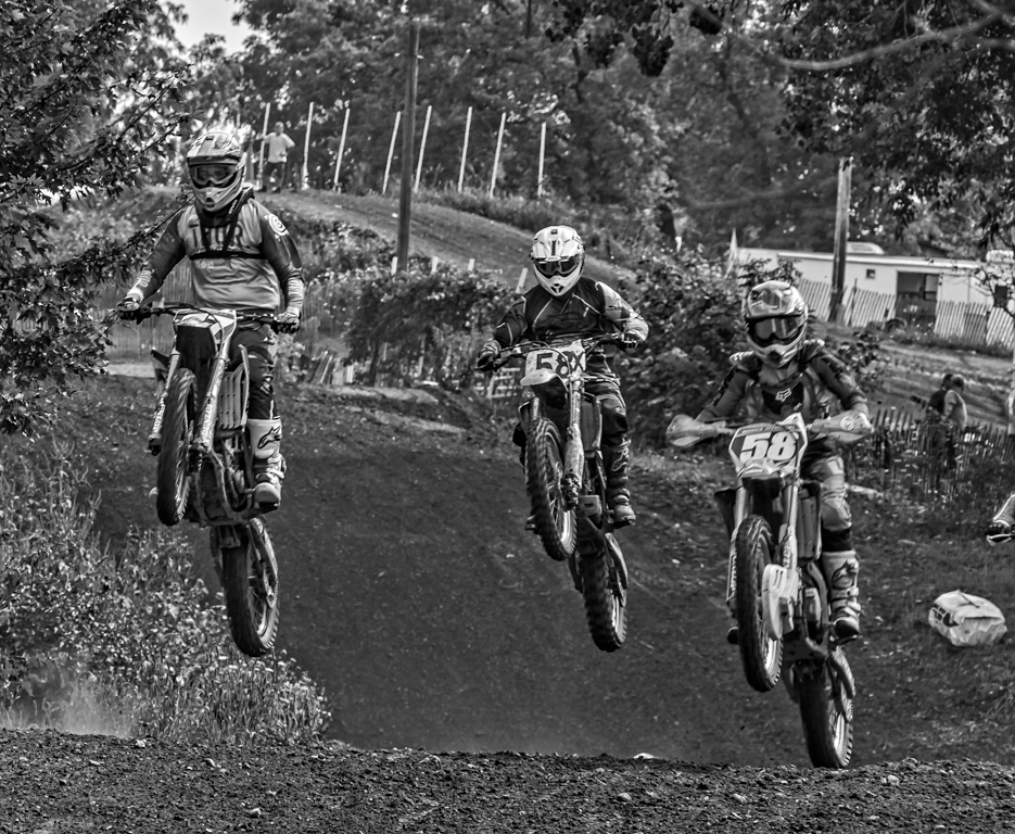
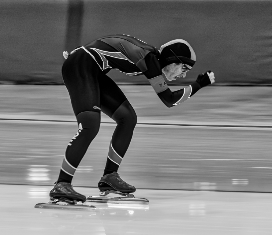
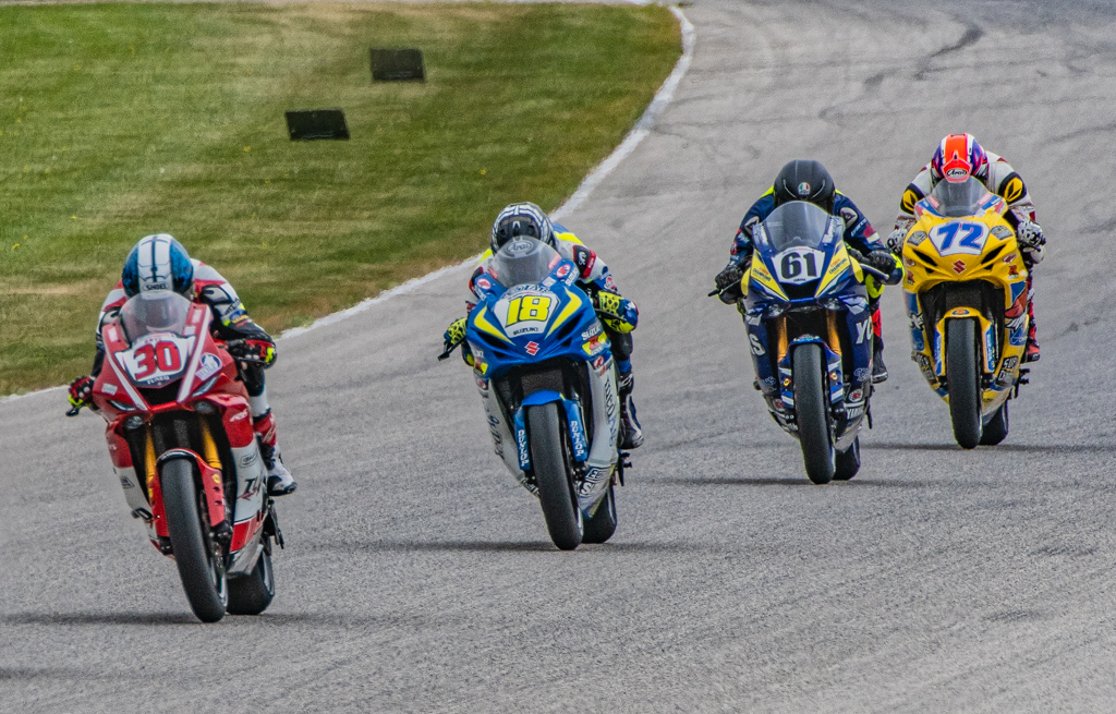
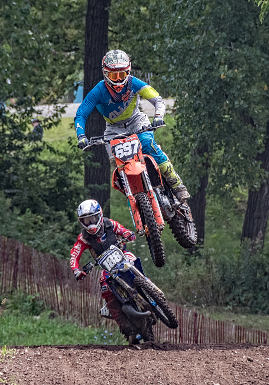
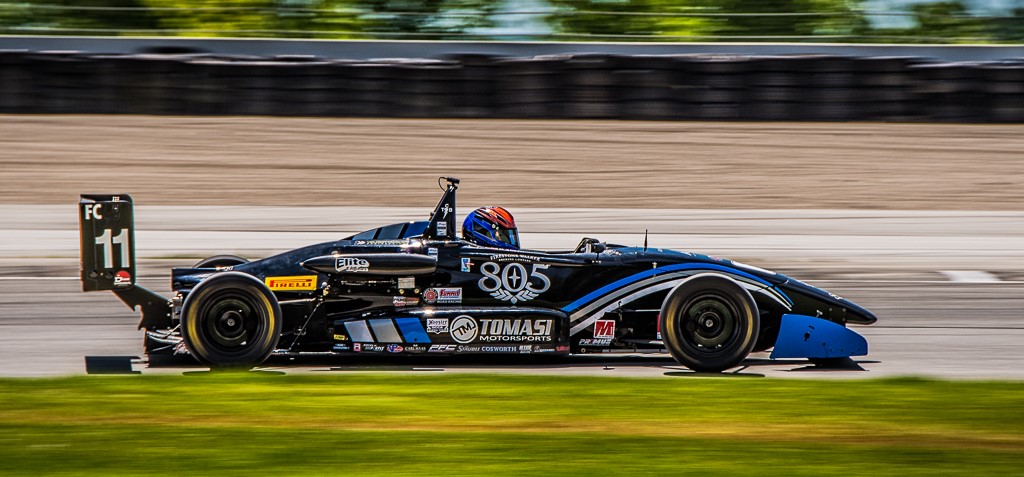
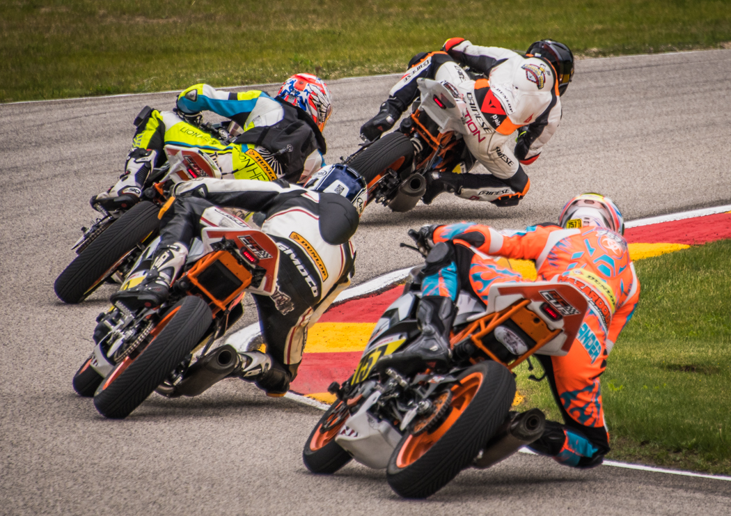
Great action and interesting layout of the bikers. Very good detail in the whole image. Nice job. |
Jun 14th |
| 50 |
Jun 17 |
Comment |
Nice image, I converted it using camera raw and with the HSL sliders darkened the background, plus brought more detail to the petals. Just another version of yours which is pretty good. I would add a little more contrast to yours and maybe vignette the corners more to darken the BG. |
Jun 14th |
 |
6 comments - 0 replies for Group 50
|
| 59 |
Jun 17 |
Comment |
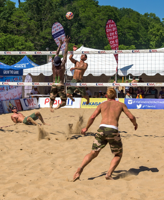
I like the perspective, it is a little different, but shows the expression on their faces and a lot of action, plus good timing with the play in the air and the defensive player going for the block. I would think it would do well in PJ, not sure about PIDC. |
Jun 15th |
| 59 |
Jun 17 |
Comment |
I like original 2 best, I like the hands and his eyes staring straight ahead. For the main image I would add about +20 Clarity and +20 contrast, it looks a little soft in the contrast areas plus lighten by .65 on exposure, the other two look OK to me. |
Jun 15th |
 |
| 59 |
Jun 17 |
Comment |
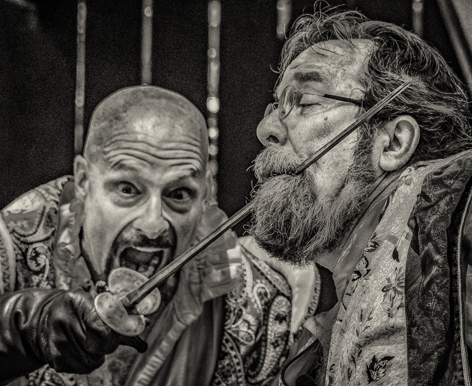
This is an interesting attempt, the first girl on the left, it looks like her arm is cut off and that her hand is on her knee, it is hard to tell in this image, but the hand on the knee is distracting, I would clone that out or see if the arm is straight or inside her body, the rest looks pretty good, you did a nice job of combining everything. Very Interesting. |
Jun 15th |
| 59 |
Jun 17 |
Comment |
I didn't even notice the background, then read your comments, it does improve by making the background neutral looking and less distracting. It also makes the catcher stand out more, makes for a far more interesting shot. |
Jun 15th |
4 comments - 0 replies for Group 59
|
13 comments - 2 replies Total
|