|
| Group |
Round |
C/R |
Comment |
Date |
Image |
| 46 |
May 17 |
Comment |
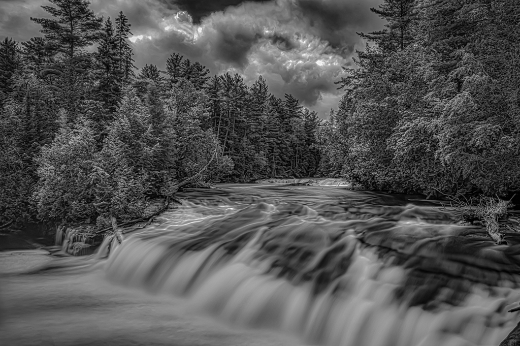
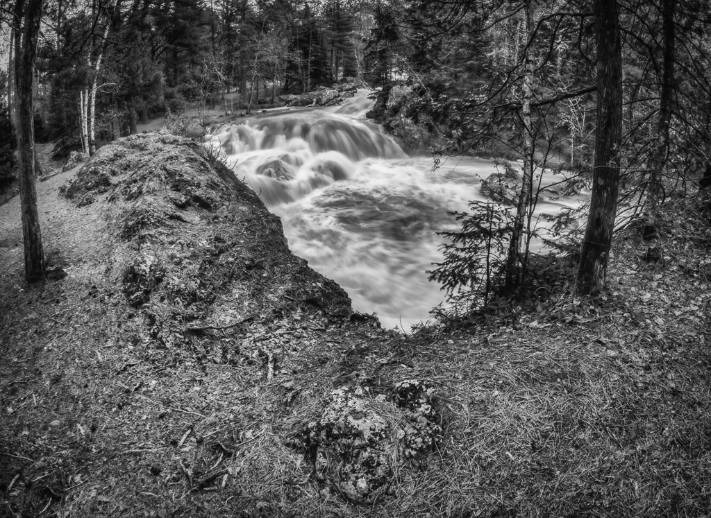
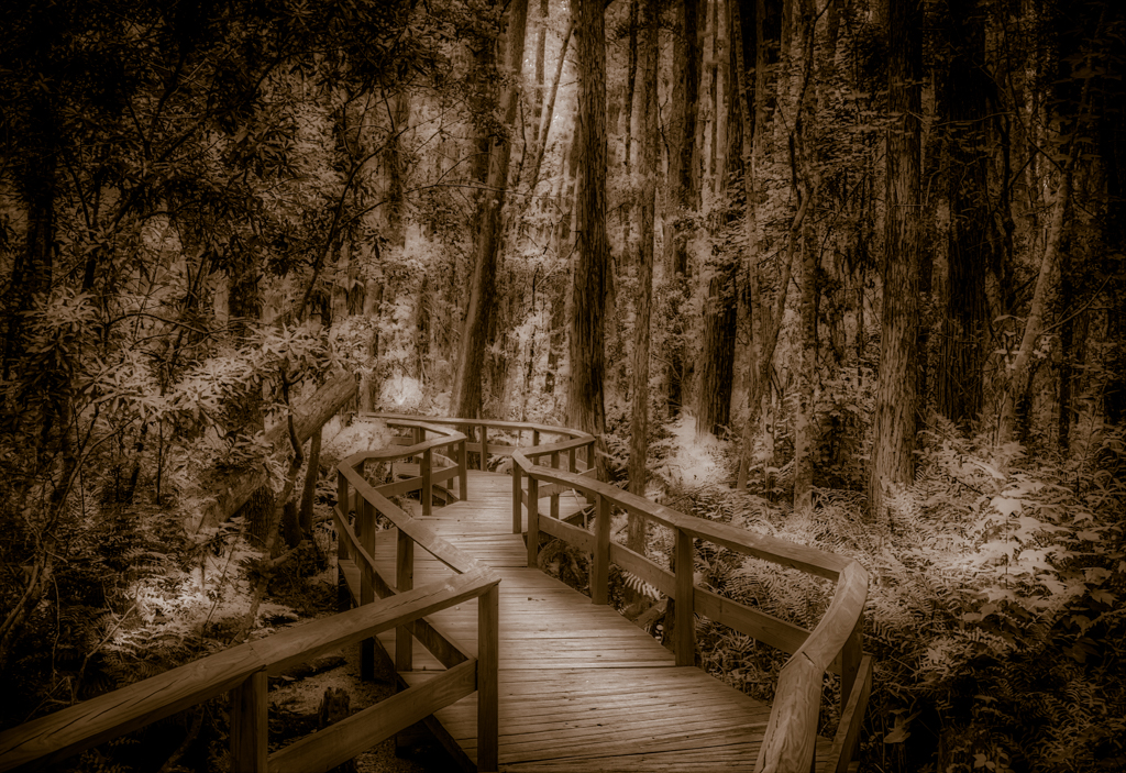
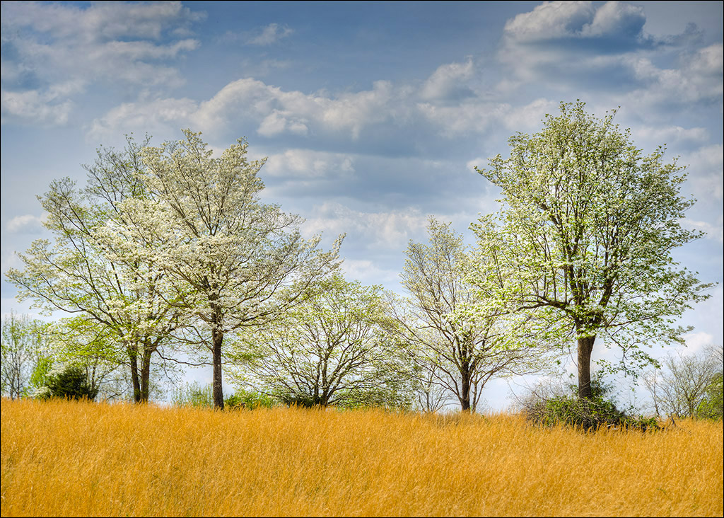
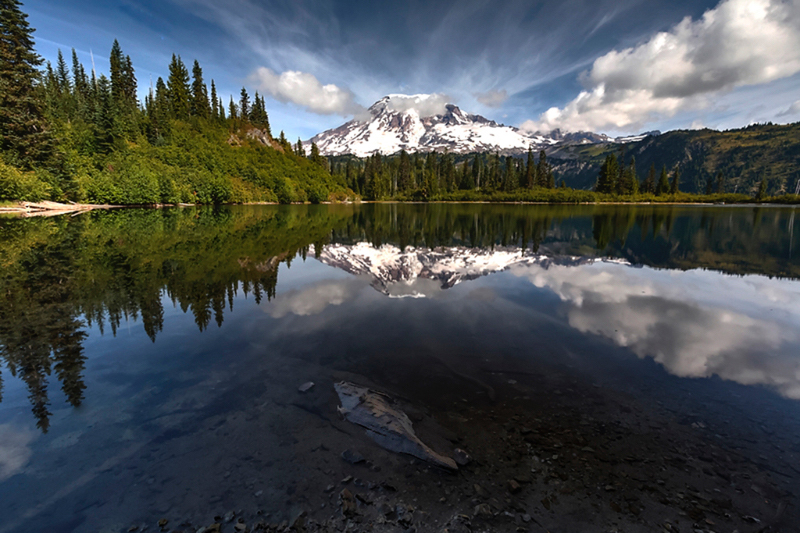
Nice shot, I like the grouping of trees and the yellow grass contrasting with the blossoms. I would get rid of the log and stick in the right front tree, it is a little distracting. I also took it into Camera Raw and used the graduated filter to darken the sky and add a little contrast to the sky. I used + .5 on exposure and +20 on contrast, then erased the effect on the trees.
All you need is a deer running through the field to top this one off. |
May 7th |
 |
| 46 |
May 17 |
Comment |
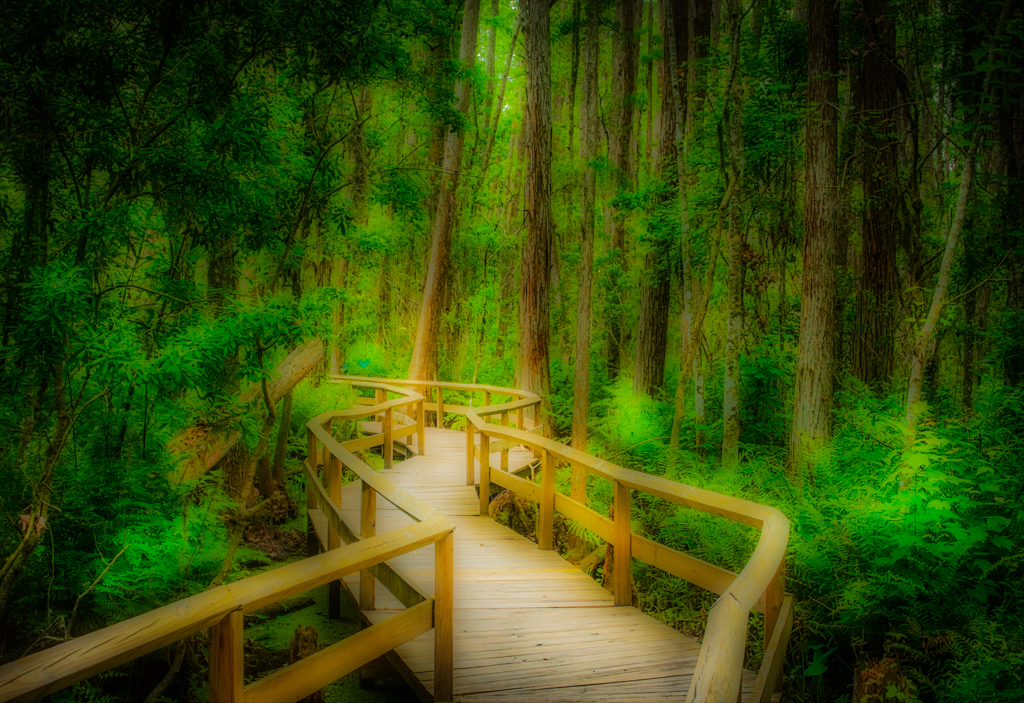
Excellent shot, nice composition. I would change two small items, the stick in the lower right corner I would clone out, it is a little bright and draws your attention away from the overall theme. The other would be to just slight dodge the log as Gary suggested, I used the adjustment brush in Camera Raw and upped the exposure by +.5 and the shadows + 10. It brings a little more attention to the log, but this is not that important of a changes to me as the stick in the lower right. |
May 7th |
 |
| 46 |
May 17 |
Comment |
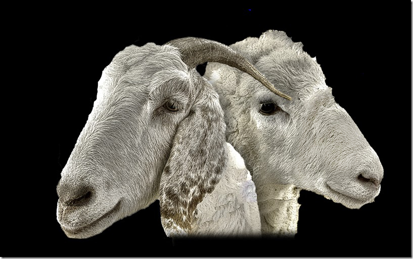
You really did a nice job of combining the two images. The detail in the hair is great. The shadows of the fence does bother me a little. I went in PS and used camera raw filter and the brush to lighten the shadows, I upped the exposure by .7 and upped the shadows by about 5, that made the shadow blend in a little better. Otherwise nice work, you did an excellent job combining the two images. |
May 7th |
 |
| 46 |
May 17 |
Comment |
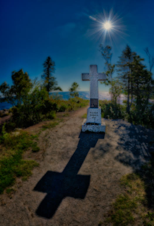
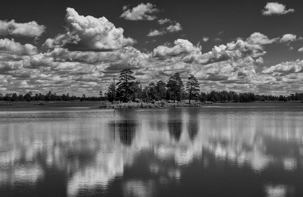
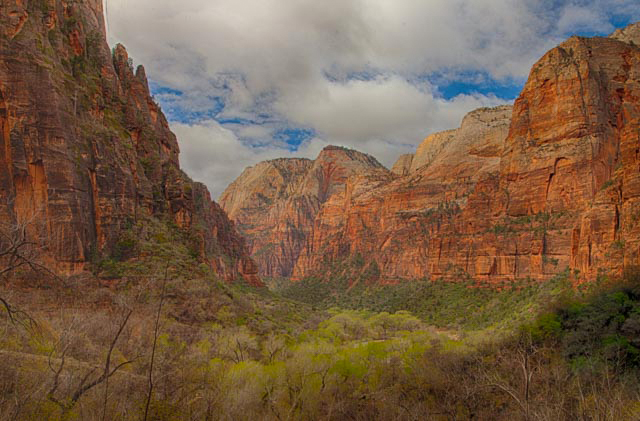
I like your composition and the tones and colors of the image, I find it a bit too low in contrast, I would up the contrast about 15 points. It still give the soft look, but the sky is a little better. I was going to comment on the trees in the lower left, but I read that you already took care of that. Nice image. |
May 7th |
 |
| 46 |
May 17 |
Reply |
The images were originally shot as raw, which helped fix some of the problems. It is a fun place to shoot the Milkyway in fall, nice trees, away from lights and nice background and foreground. You image is not too bad, I do like more saturation in colors, but that is just me. Thanks for the comments. |
May 7th |
4 comments - 1 reply for Group 46
|
| 50 |
May 17 |
Reply |
I have not submitted it to anything I can think of probably should. After looking at it later, I also like the color better. |
May 27th |
| 50 |
May 17 |
Comment |
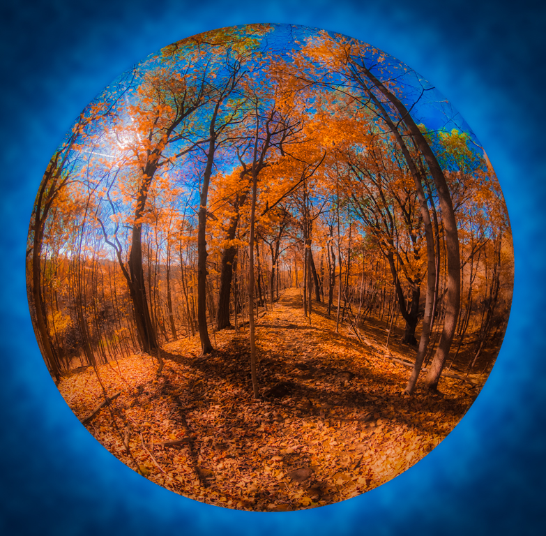
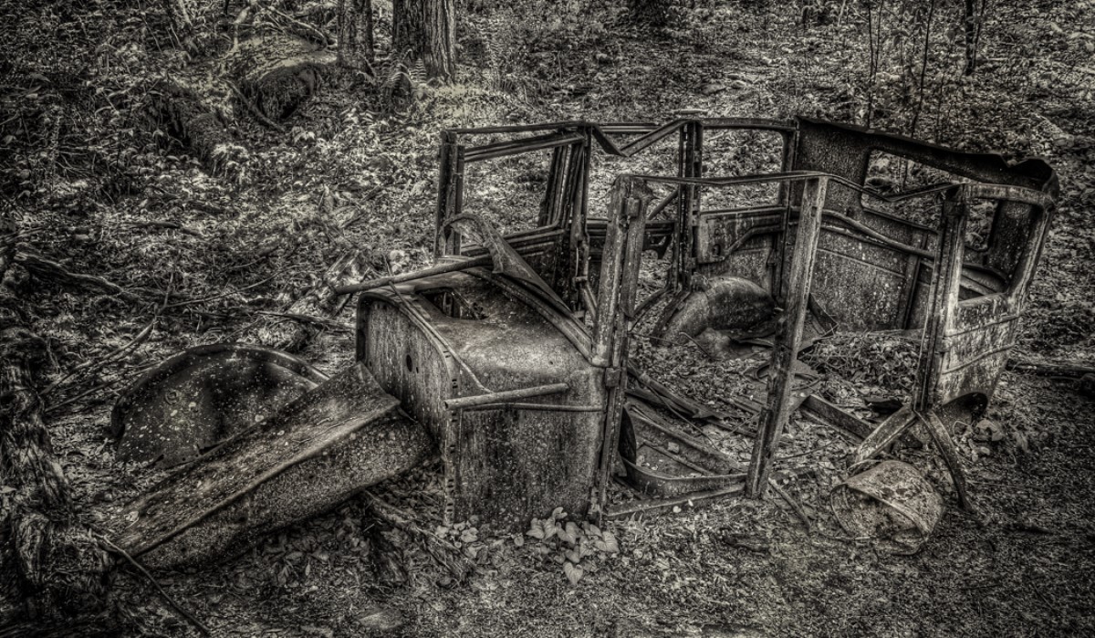
A interesting treatment, I like all of the image except for the road in the foreground, it just looks too strange, otherwise it make for an interesting image. |
May 26th |
| 50 |
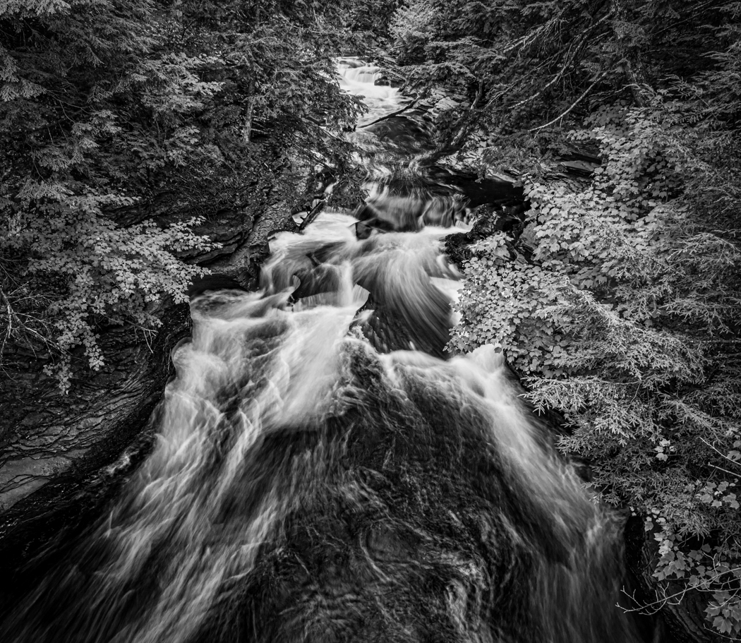
May 17 |
Comment |
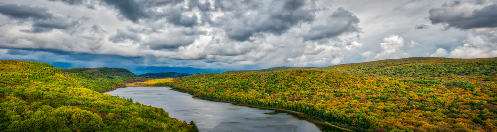
I like your grouping, the tones are super, I very well done shot. |
May 26th |
| 50 |
May 17 |
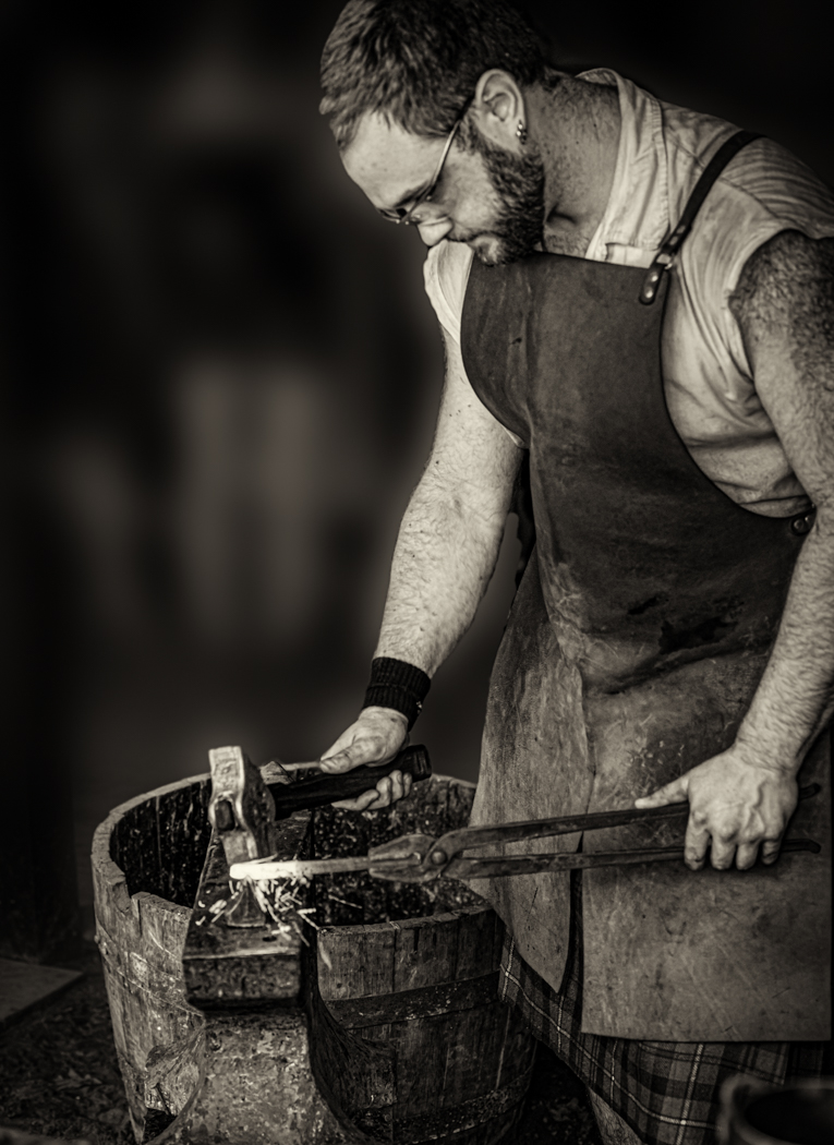
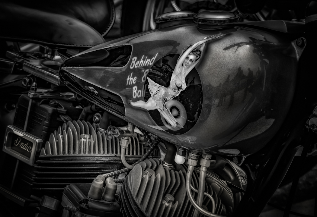
Comment |
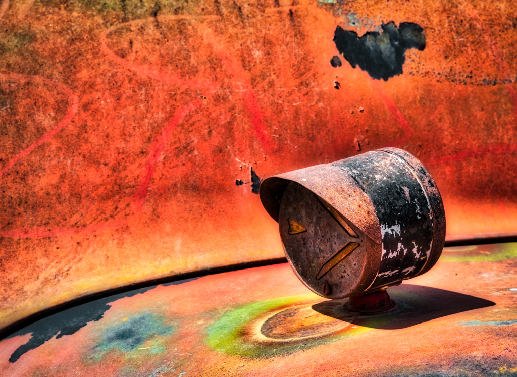
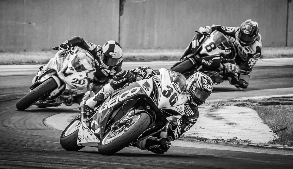
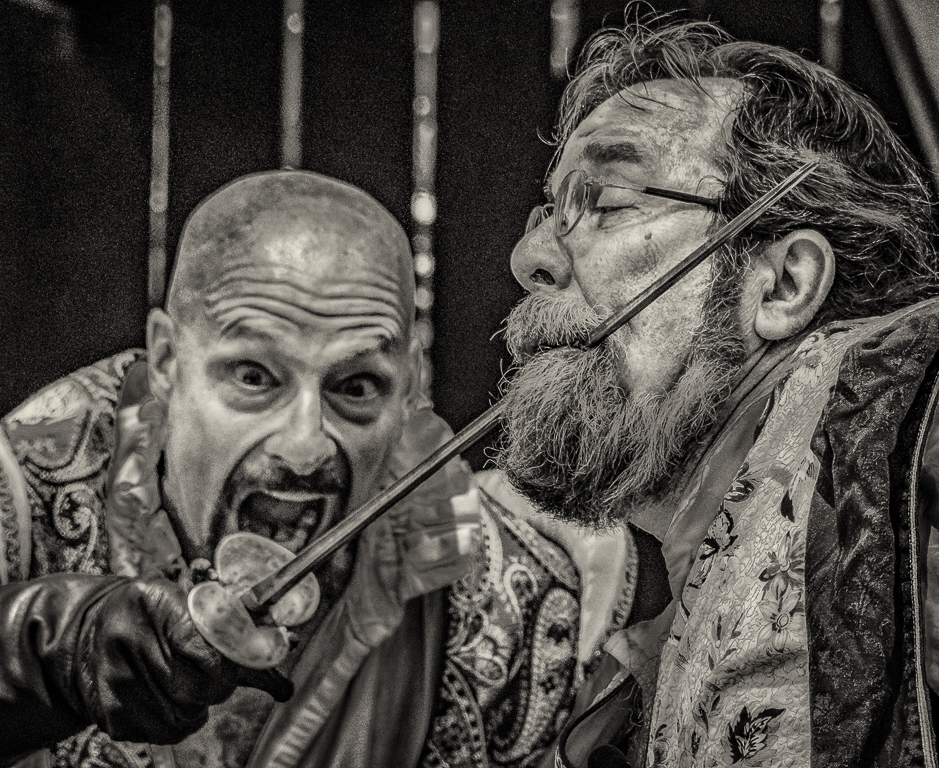
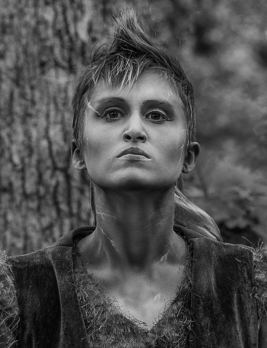
Neat Ren Faire shot, I agree with the background, but I would keep some texture in it. I also darkened the image by -.45 stop, added +24 contrast, -18 highlights and -20 clarity. It gave it more of a mood, I think the skin needed to be darker, it brings out the makeup. |
May 26th |
 |
| 50 |
May 17 |
Comment |
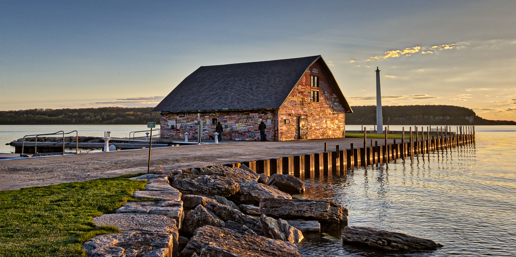
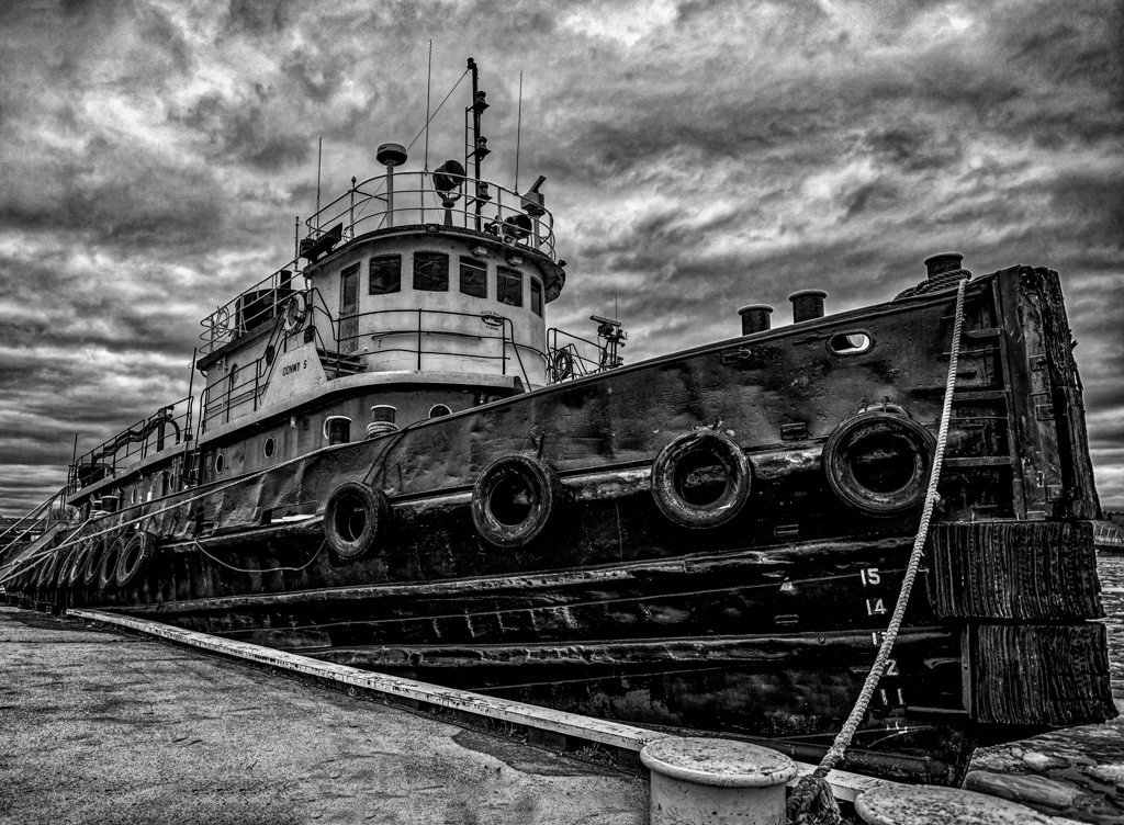
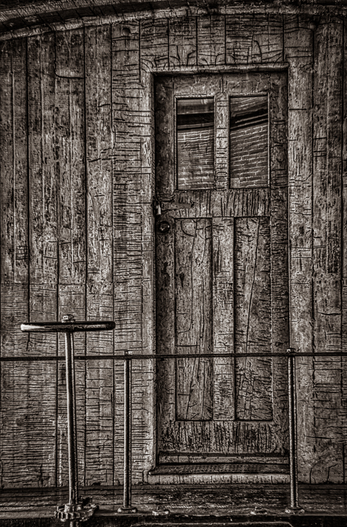
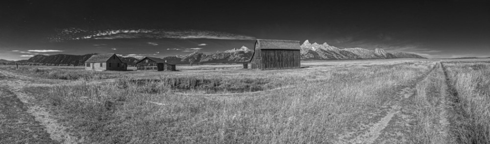
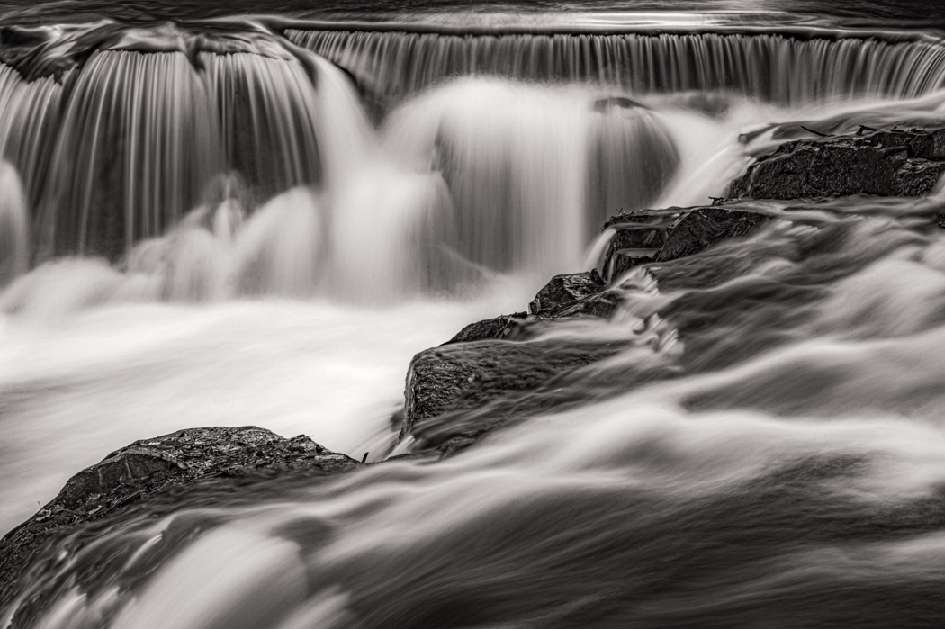
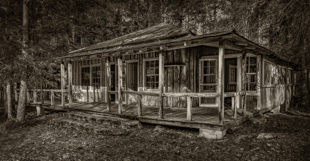
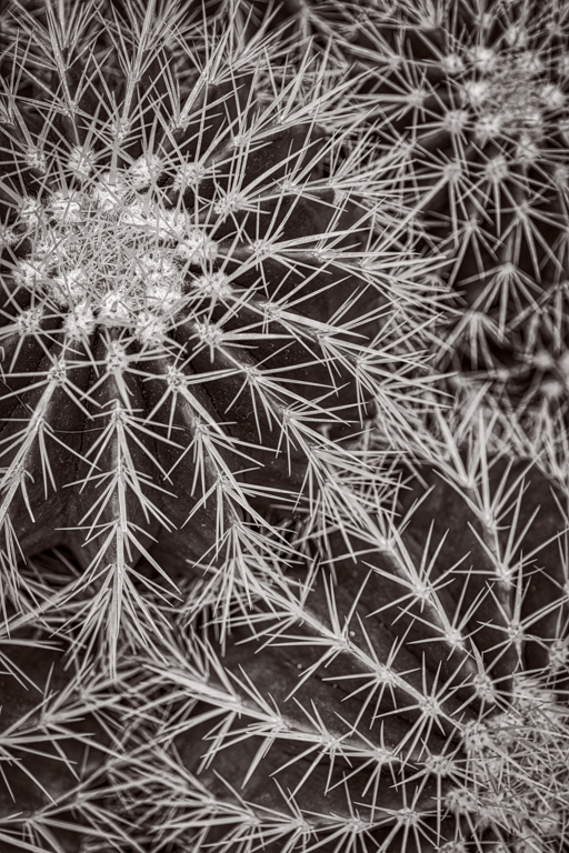
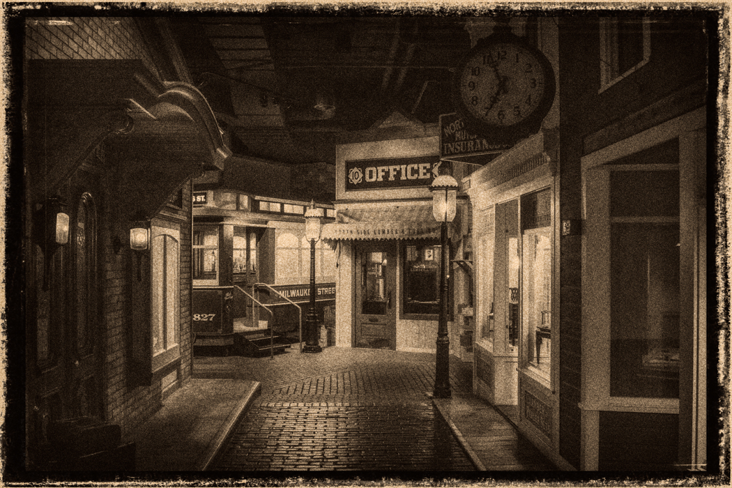
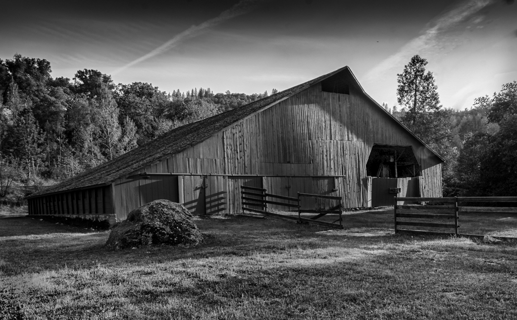
It is an interesting subject, I like what you have done, I would try to get more detail in the dark space over the doors, you can see the detail in the color not the mono. Old barns are interesting. |
May 26th |
 |
| 50 |
May 17 |
Comment |
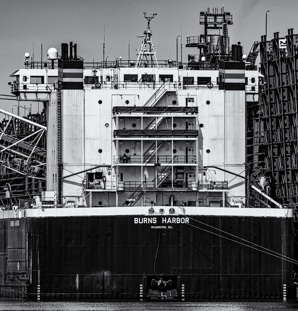
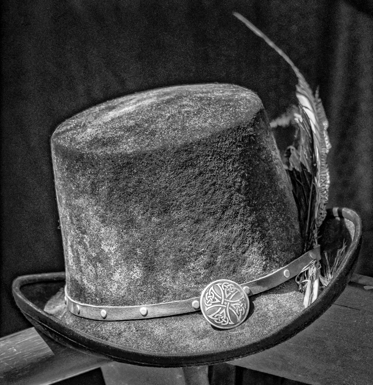
I like the image and I like the flip, having the building on the right anchors it while on the left it blocks your eye. Everything else looks great. |
May 26th |
| 50 |
May 17 |
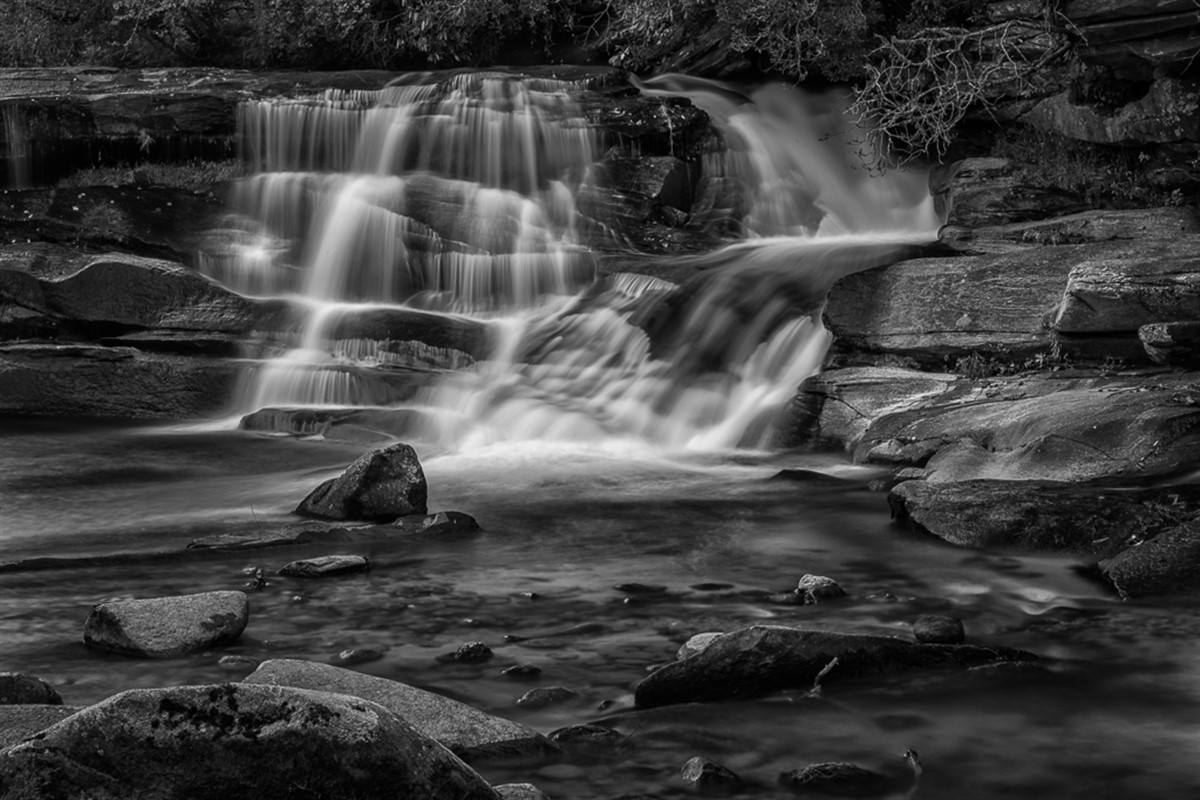
Comment |
I agree with all on the interesting texture and I do like the subject, I created a Mono from your color and when I did it I darkened the reds and the orange colors, plus I darkened the sky and cropped from the bottom. I also added 20 of contrast and 20 of clarity. I think David and I are somewhat close to the same image, but here is my version. |
May 26th |
 |
6 comments - 1 reply for Group 50
|
10 comments - 2 replies Total
|