|
| Group |
Round |
C/R |
Comment |
Date |
Image |
| 46 |
Apr 17 |
Comment |
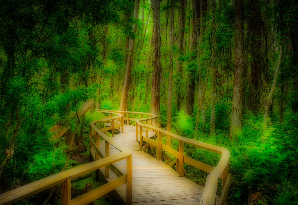
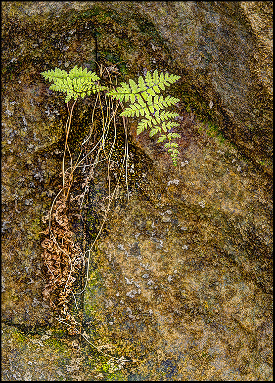
I like your processing, I think the colors in the rock help direct you to the fern it self, the roots or grass do get a little lost, which also helps bring you to the fern. Maybe adding a little contrast to that area might help. I used the brush in camera raw on the grass or roots, the settings were Exposure -.35, Contrast +50, White +25, Clarity +30, it makes just a slight difference. |
Apr 7th |
 |
| 46 |
Apr 17 |
Comment |
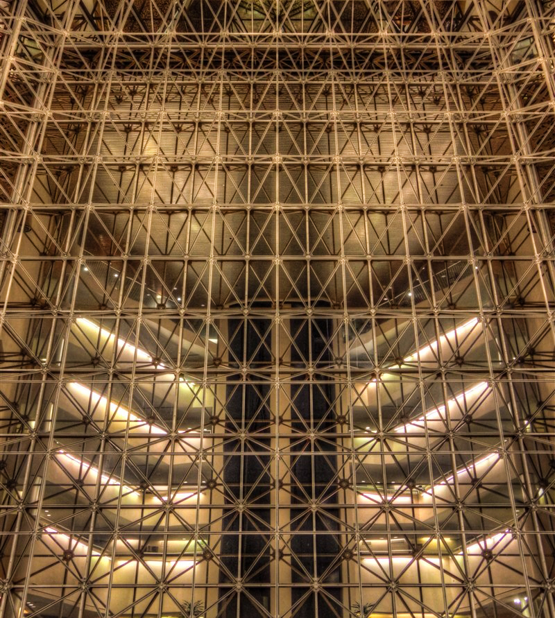
I like the pattern and the lights, it makes an interesting image to me. I would add about +20 in contrast and +30 in Clarity. This sharpens it up a little more. |
Apr 7th |
 |
| 46 |
Apr 17 |
Comment |
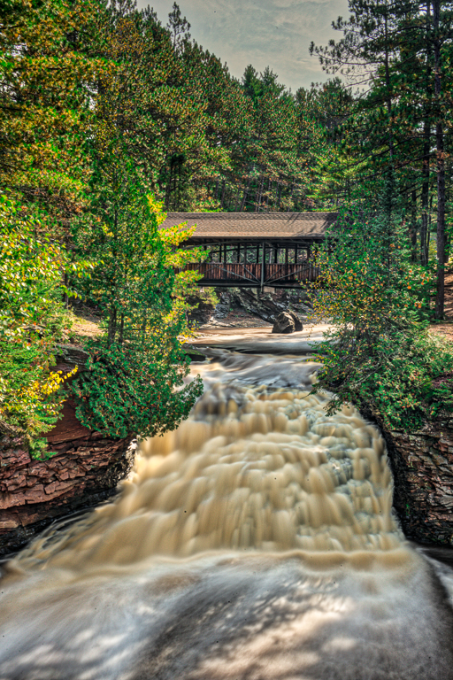
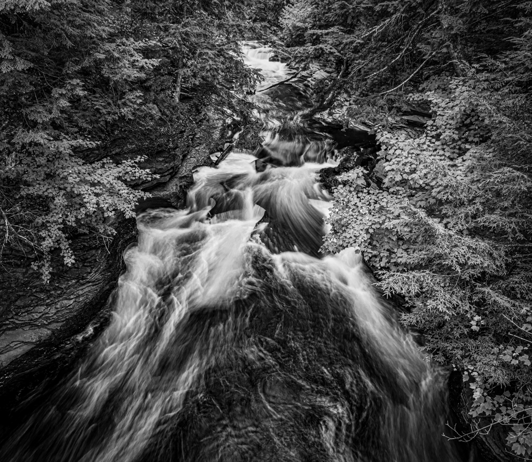
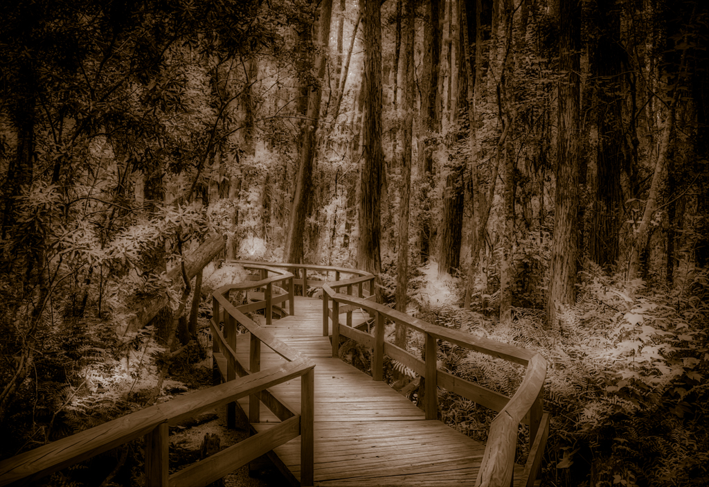
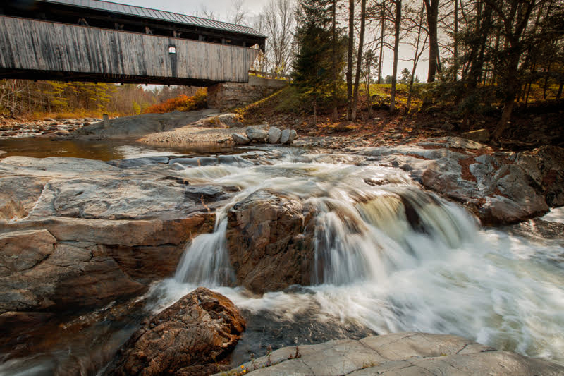
Nice shot, I like the softness of the water, the covered bridge. The upper right side is a little bright, I used a graduated filter in Photoshop Camera Raw to darken the corner 1.65 stops and warmed it a bit. That seems to keep your eye in the photo longer. Overall a nice shot. |
Apr 7th |
 |
| 46 |
Apr 17 |
Comment |
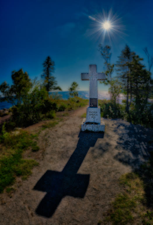
That is an interesting statue, I like your cropping and that you got rid of all the distracting items around the statue, the top of the glass by the statue is a little strange, but is pretty minor, probably from cleaning up the items below it. The processing looks good as well. I think it looks good to me. |
Apr 7th |
| 46 |
Apr 17 |
Comment |
That is a neat crystal. I like the shadows from the crystal and the placement, I maybe would have used a different background or maybe cleaned up the background a little more. I think you got the shot you were looking for. |
Apr 7th |
| 46 |
Apr 17 |
Reply |
Thanks. |
Apr 7th |
5 comments - 1 reply for Group 46
|
| 50 |
Apr 17 |
Comment |
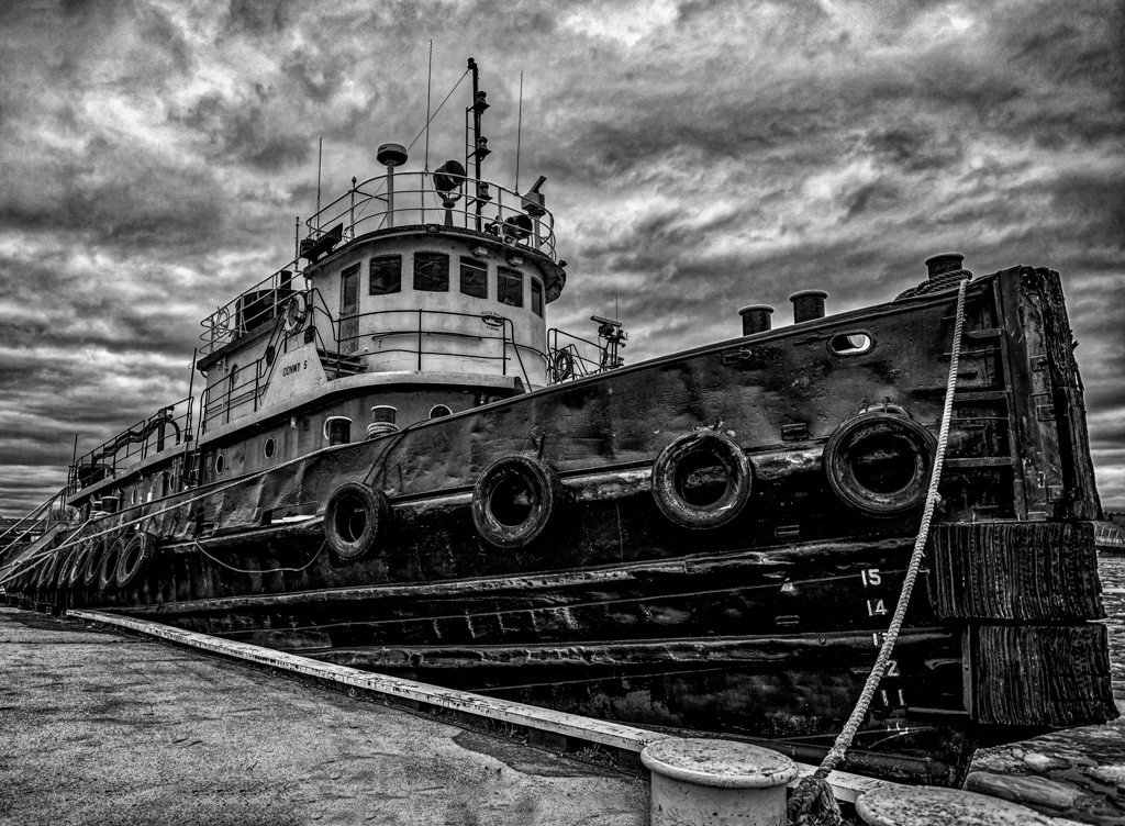
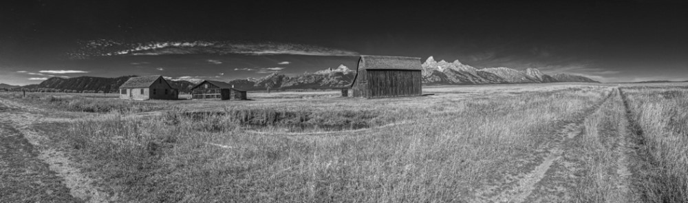
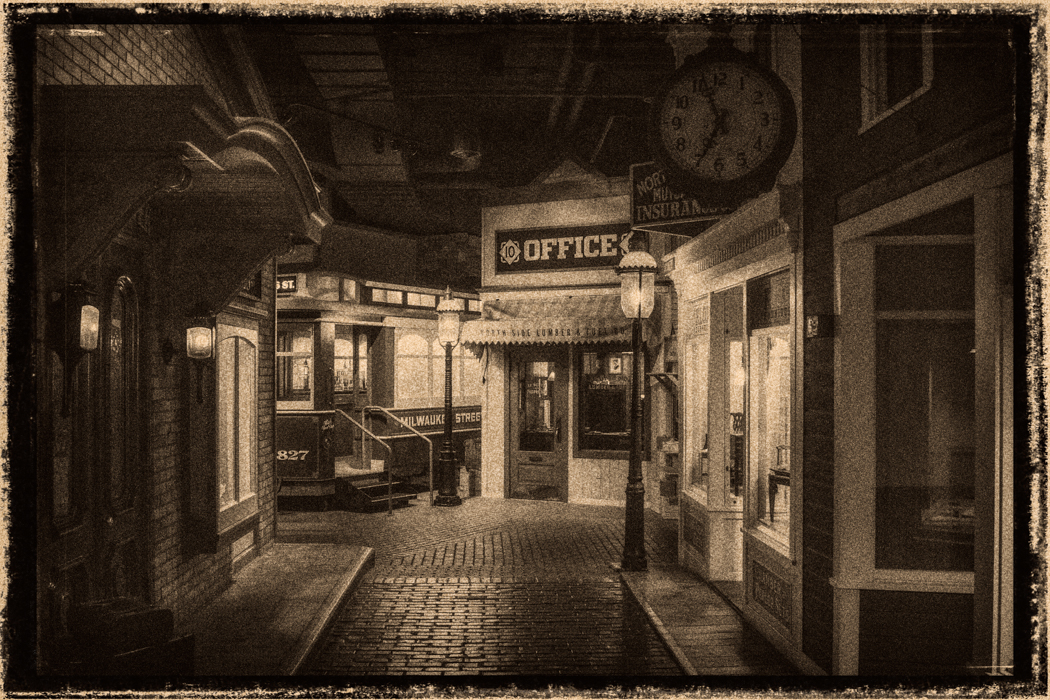
I think you did a great job in processing, except for the sky which is too black. I think I would cropped some of it out so it is not so noticeable. I also do not like the door and would crop that out. I played with the image and adjusted the perspective a little then cropped and centered the image. I think it works a little better. I think since the sign is the main interest of the image it needs to be a little more center and make it the highlight of the image. Here is the resulting image. I do like the detail in the image and the contrast, so it is an interesting image. |
Apr 28th |
 |
| 50 |
Apr 17 |
Comment |
I like your composition, the simplicity of the image, the reflection. It is a pleasing shot. I would not change anything. |
Apr 28th |
| 50 |
Apr 17 |
Comment |
Both good shots, I like the arms in the original shot better than the main shot, but I like the background in your main shot. It is all a matter of timing and watching the background. Good job as usual. |
Apr 27th |
| 50 |
Apr 17 |
Comment |
I think it is an interesting image, such possibilities. I like what Cindy did, especially the signs, I would probably crop off from the bottom a bit as well. |
Apr 27th |
| 50 |
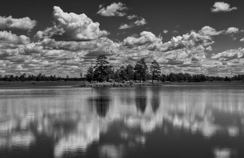
Apr 17 |
Comment |
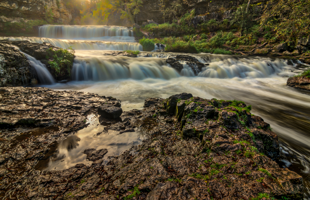
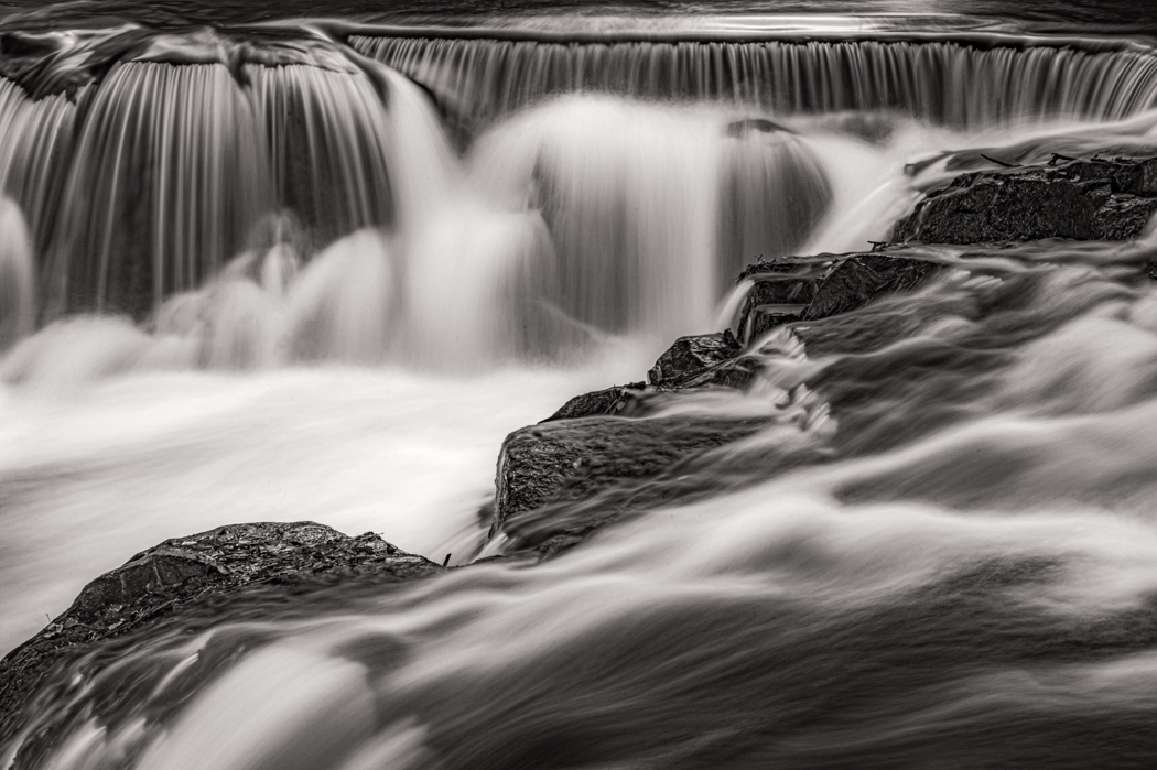
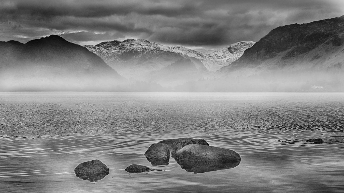
I like it, I like that you have a good foreground subject and the fog in the background. If I was to suggest any changes is to clone out the small rocks on the right side especially the one that is midway up and goes off frame, along with the 3 others on the right, it just cleans it up a little. I think it is a really nice shot. |
Apr 27th |
 |
| 50 |
Apr 17 |
Reply |
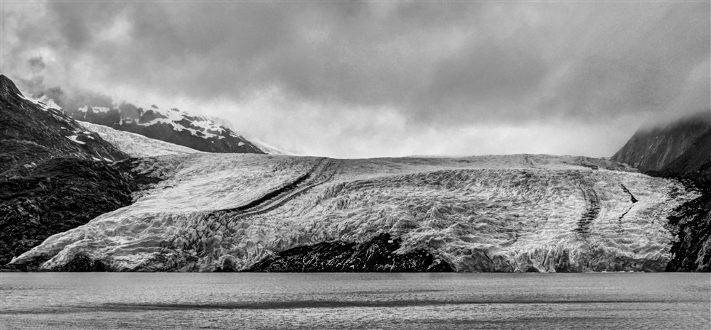
The grain is from shooting it at ISO 51200, I had to hand hold it. I did think the grain added to the old look. |
Apr 10th |
| 50 |
Apr 17 |
Reply |
Hard to tell on a small jpeg, but you could use the grad filter in camera raw to reduce the noise and soften the clouds. Working with the full size image will also be better than the small jpeg. It's worth a shot. It is a nice image and has interesting details. I will be curious what others have to say. |
Apr 7th |
| 50 |
Apr 17 |
Comment |
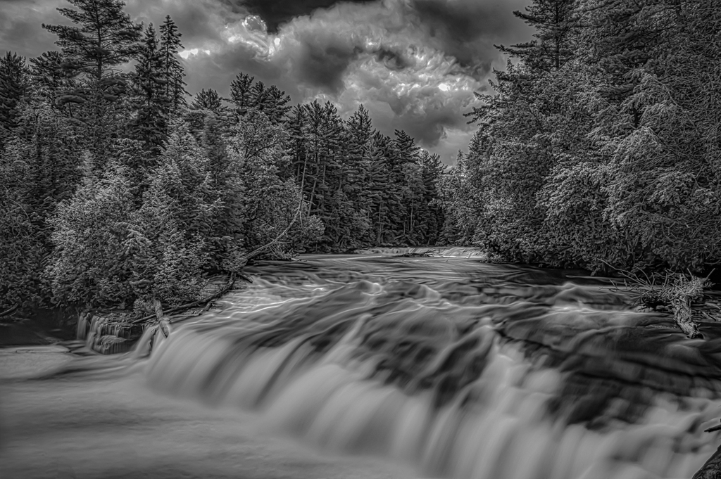
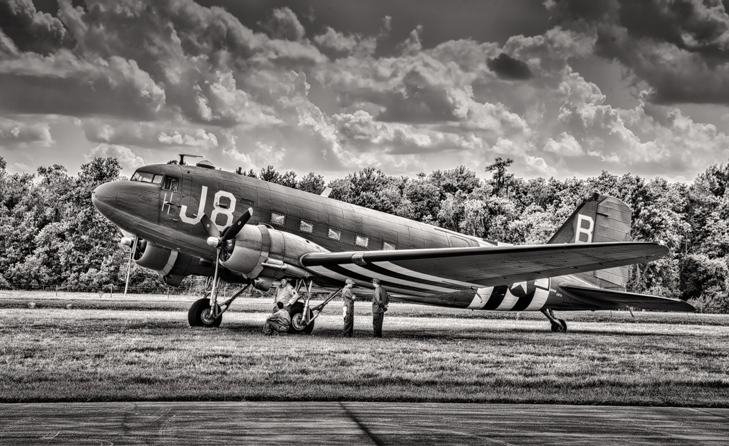
Nice shot, I would add some more contrast, in camera raw I added +30 in contrast and +30 in clarity. It brings out the detail in the glacier, plus in the clouds. I don't think I would do any more dodging. |
Apr 7th |
 |
6 comments - 2 replies for Group 50
|
11 comments - 3 replies Total
|