|
| Group |
Round |
C/R |
Comment |
Date |
Image |
| 43 |
May 22 |
Comment |
Very nice image with or without the plane. I had to look at this image several times to figure out what was bothering me. At first I thought, putting the plane back at the point of infinity at horizon because it wasn't lining up with the runway in my mind. I turned it upside down and think if you flipped it you would have the rocks and a triangle with the runway and the shore line. Which settles me down and makes me more comfortable with the image. Perhaps, I still would make the plane smaller. or the opposite. It is late and I need to get to bed. I may get back to you on this.
|
May 12th |
| 43 |
May 22 |
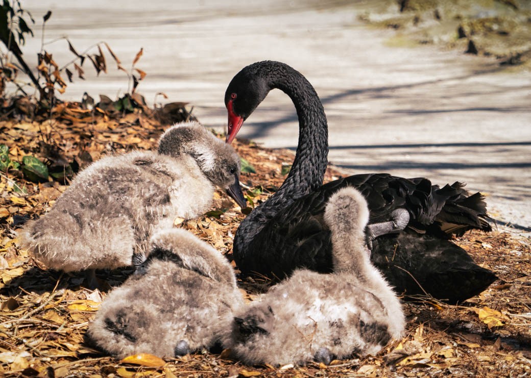
Comment |
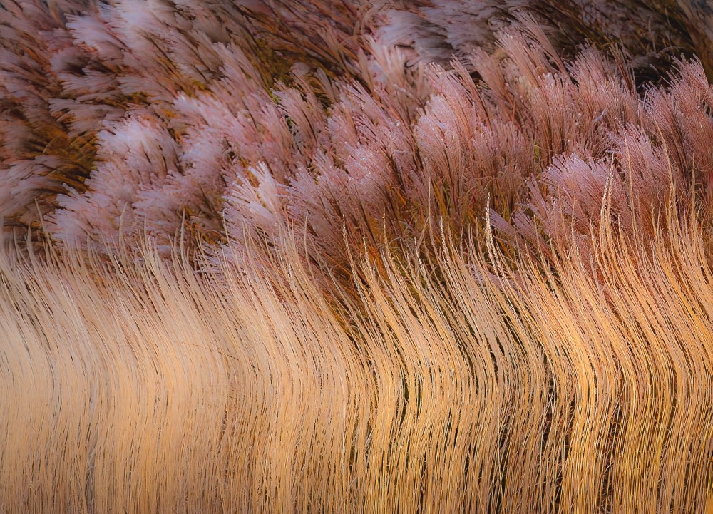
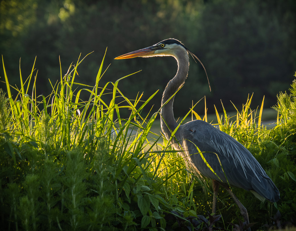
Pretty bird, love the texture in the feathers. To my eye, This image is a bit oversaturated and everything blends together. I would like to see some tonal differences and perhaps make the background darker. At present the grasses or trees are blending in with his tail in the water because they are all the same tone.
Does this bird have that strong gold? I don't think I have ever seen one so I don't know. It just looks a bit cooked. The "escargot" really doesn't make or break the image and if that is what he/she is having for lunch , so be it. The eye is sharp but there is a white glow right by it which I find distracting. Also, the end of it's beak gets very fuzzy. ( You might give it a go with the pen tool in PS to fix it, if you wanted too.)
If you want a twofer, You could crop into it's back and make a wonderful abstract with the feathers!!!!!
|
May 11th |
| 43 |
May 22 |
Comment |
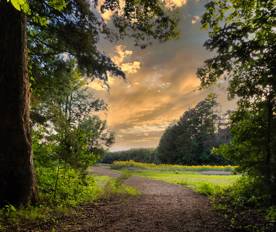
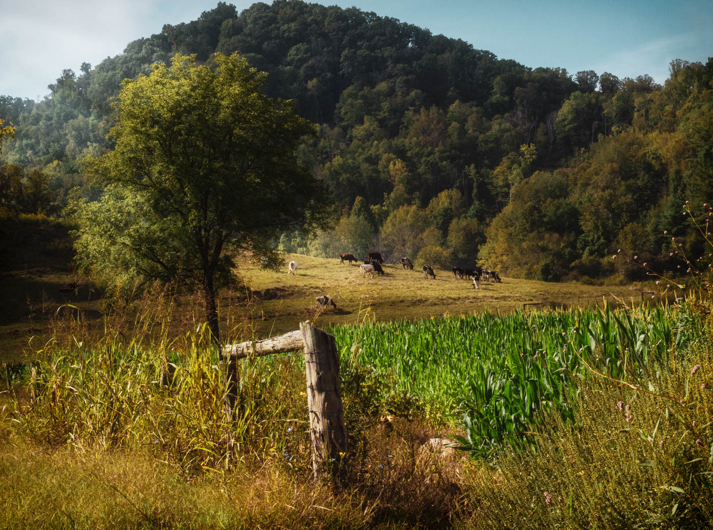
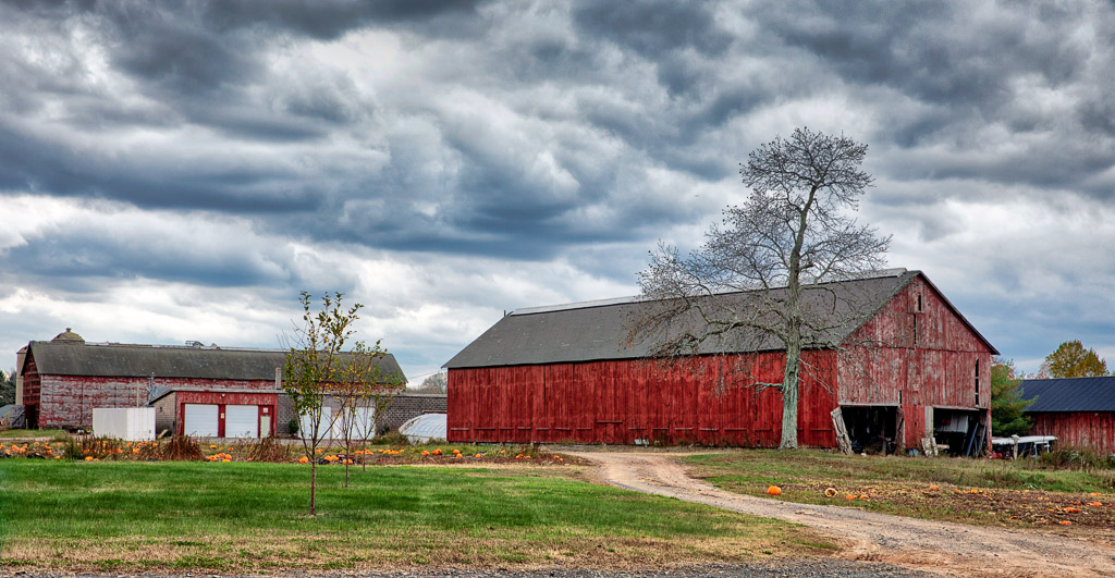
I have seen images of these fields and would love to see them in person some time.
I feel the this is on a tilt. Once I see that, I have a hard time correcting it. So, I will let you play around with that. The image has a moody feel because of the sky. Having said that, I would be tempted to replace it . The reason being, I don't see much separation of the field and sky, the other is you have a blue gray(sky) and a clear blue (flowers) and navy blue ( shirt ). I would like to see the clear blue flowers be the star of the show. There are too many different shades of blue which for me its distracting. (The values are all different.) You could make the shirt on the man the same orange/red as the flower or a complimentary color to the blue flower, a lavender with the same tonal value. Also, I would crop some of the top of the image in order for the flowers to be more prominent.
It is lovely and if you enjoy it as is, you are the maker, enjoy what you have created. That is why you can have ten people making an image of the same thing and get 10 different interpretations! |
May 11th |
| 43 |
May 22 |
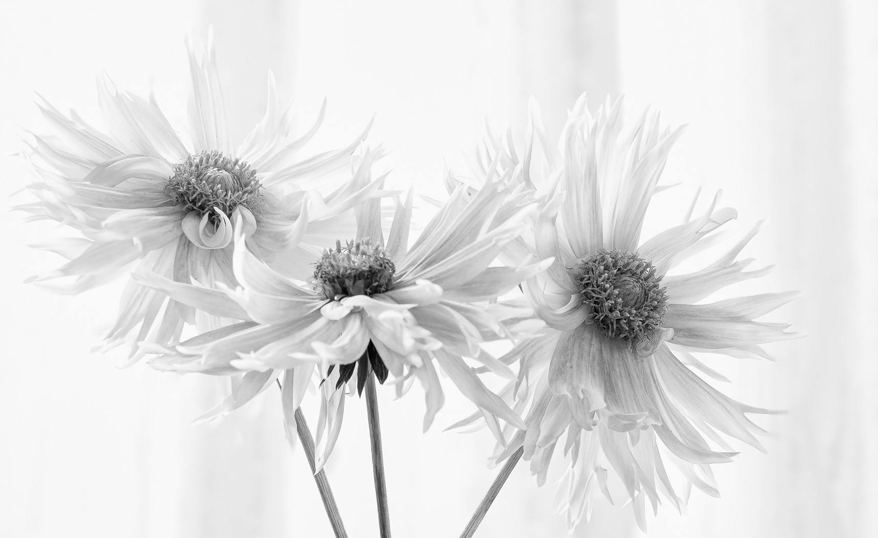
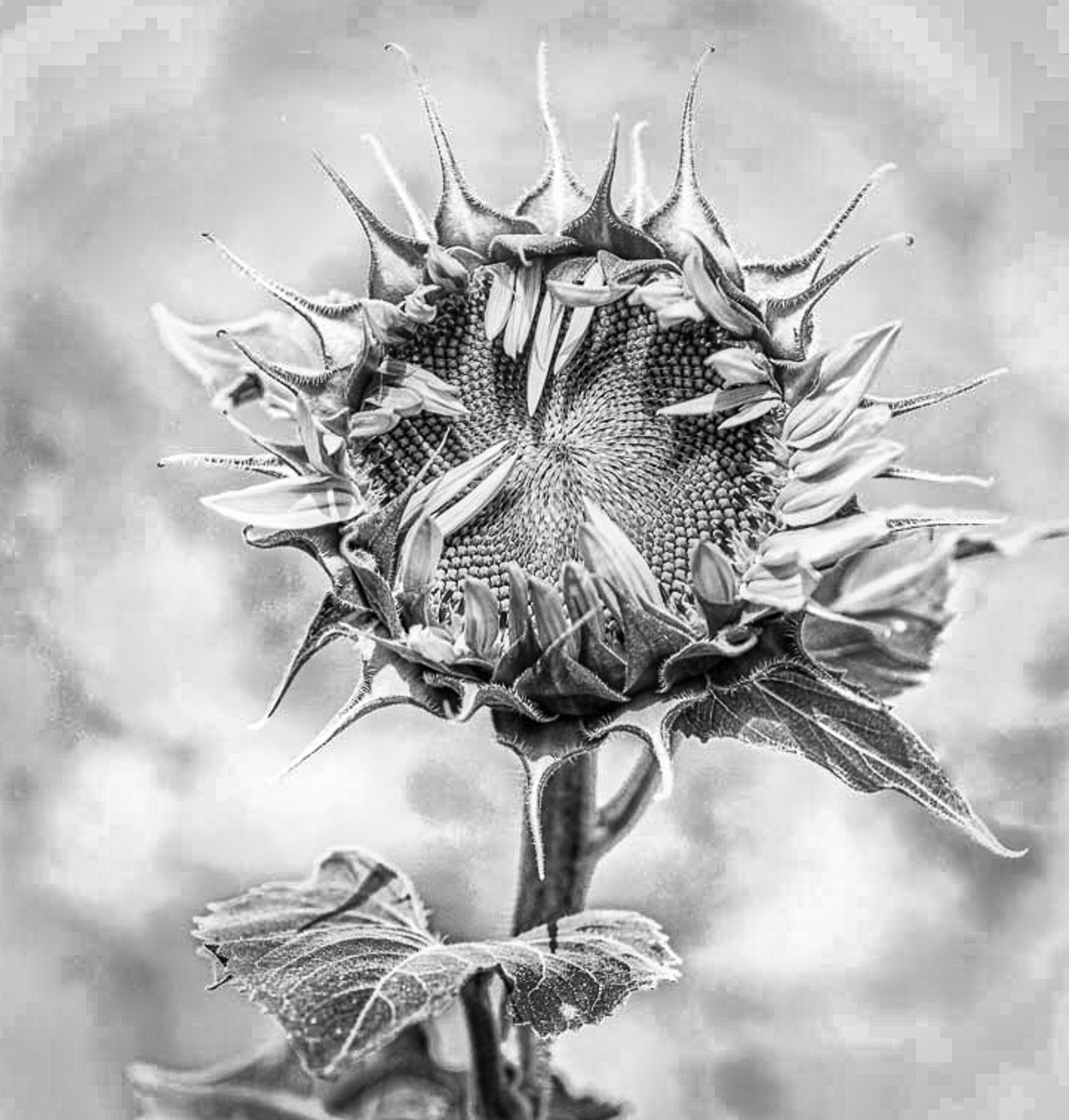
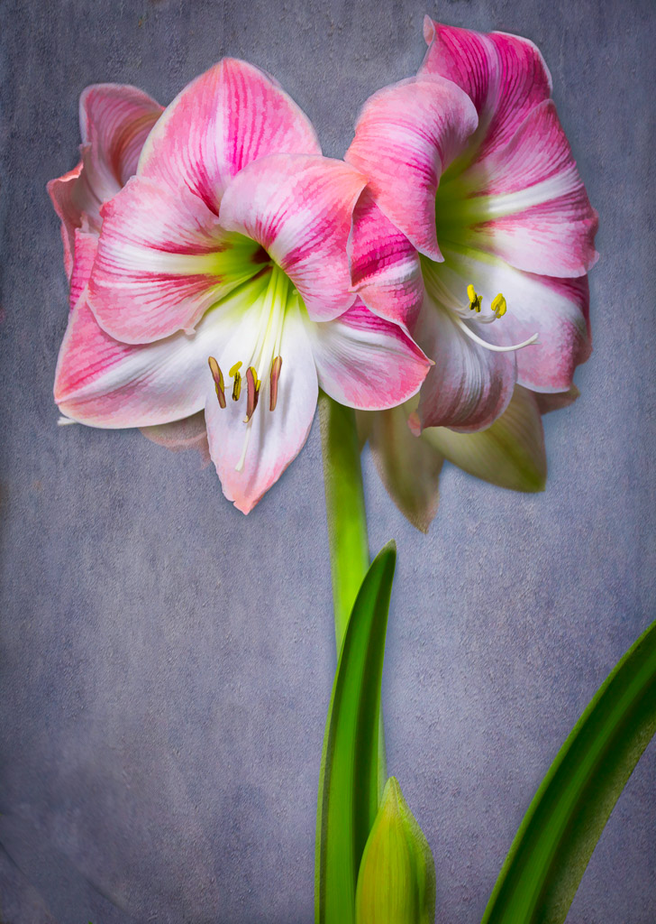
Comment |
This must be flower month! I think the composition of the three is very good. I would like to see the right side cloned out and smoothed. Also, would get rid of the little stuff on top by blending or cloning. Also, it is my opinion that the yellow is a bit crunchy and would ease off a bit . My comments are only what I feel would bring it to another level.
I see Linda did what I suggested on the right side. ( I don't read the comments until after I have made mine. I don't want to be influenced by them.) |
May 11th |
| 43 |
May 22 |
Reply |
Thanks Linda,
I didn't include a stem which normally I would like to see. However I was shooting down on it and the green are the leaves on the bush. Unlike a regular peony which grows on a long stem and is sorta droopy, this being an Itoh peony grows on a bush it is supposed to be a tree, maybe when it matures. Anyway, I was happy to see it bloom. It had two blooms, one more blush and this yellow. It lasted quite a long time and now that I know they will bloom here in SC will save up to buy another.
Thanks everyone for your comments. I was told they can be difficult to get to bloom. So, I was so excited when it had two blooms about two weeks apart. It is 2 years old.
If and when I get more blooms in years to come, I will cut a bloom and take a nice portrait hopefully, without having to deal with the wind and elements. |
May 11th |
 |
| 43 |
May 22 |
Comment |
I see the subject" broken " which is out of focus which leads me to the flower that is in focus which is not broken. I think you could rework it and get the message across.
I like the original version in color. |
May 8th |
5 comments - 1 reply for Group 43
|
5 comments - 1 reply Total
|